On Sunday’s BBC Politics, Luke Johnson asked for evidence that the recent Dubai flooding was due to climate change. Chris Packham glibly responded: “It comes from something called science.”
This simply highlighted his poor scientific understanding. The issue is his and others’ confusion over what scientific modelling is and what it can do. This applies to any area of science dealing with systems above a single atom – everything, in practice.
My own doctoral researchwas on the infrared absorption and fragmentation of gaseous molecules using lasers. The aim was to quantify how the processes depended on the laser’s physical properties.
I then modelled my results. This was to see if theory correctly predicted how my measurements changed as one varied the laser pulse. Computed values were compared under different conditions with those observed.
The point is that the underlying theory is being tested
against the variations it predicts.
This applies – on steroids – to climate modelling, where the atmospheric systems are vastly more complex. All the climate models assume agreement at some initial point and then let the model show future projections. Most importantly, for the projected temperature variations, the track record of the models in predicting actual temperature observations is very dubious, as Professor Nicola Scafetta’s chart below shows.
For the climate sensitivity – the amount of global surface warming that will occur in response to a doubling of atmospheric CO2 concentrations over pre-industrial levels – there’s an enormous range of projected temperature increases, from 1.5° to 4.5°C. Put simply, that fits everything – and so tells us almost nothing about the underlying theories.
That’s a worrying problem. If the models can’t be shown to predict the variations, then what can we say about the underlying theory of manmade climate change? But the public are given the erroneous impression that the ‘settled science’ confirms that theory – and is forecasting disastrously higher temperatures.
Such a serious failing has forced the catastrophe modellers to (quietly) switch tack into ‘attribution modelling’. This involves picking some specific emotive disaster – say the recent flooding in Dubai – then finding some model scenario which reproduces it. You then say: “Climate change modelling predicted this event, which shows the underlying theory is correct.”
What’s not explained is how many other scenarios didn’t fit this specific event. It’s as if, in my research, I simply picked one observation and scanned through my modelling to find a fit. Then said: “Job done, the theory works.” It’s scientifically meaningless. What’s happening is the opposite of a prediction.
It’s working backwards from an event and showing
that it can happen under some scenario.
My points on the modelling of variations also apply to the work done by Neil Ferguson at Imperial College on catastrophic Covid fatalities. The public were hoodwinked into thinking ‘the Science’ was predicting it. Not coincidentally, Ferguson isn’t a medical doctor but a mathematician and theoretical physicist with a track record of presenting demented predictions to interested parties.
I’m no fan of credentialism. But when Packham tries it, maybe he needs questioning on his own qualifications – a basic degree in a non-physical ‘soft’ science then an abandoned doctorate.
Footnote: INMCM–One Low Sensitivity Model Does Replicate Past Temperatures
Benjamin Zycher celebrates how plastics benefit humans and the environment, in case this earth saver be overlooked by the Greens. His Real Energy article is Earth Day 2024: How Plastic Can the Enviros Get?
Excerpts in italics with my bolds and added images.
It is Earth Day 2024, an annualexercise in self-applausethatalwaysistoomuchfun because of the inanities, hypocrisies, mendacities, and sheer stupidity of the Earth Day slogans, arguments, propaganda, and exhortations. And also because of the embarrassing spectacle of long queues of corporate officials and public relations gasbags desperate to advertise their environmental bona fides so that the green alligators might eat them last.
The Earth Day slogan for this year is “Planet vs Plastics,” and the list of horror stories is staggering. Plastics “flow through our blood stream, adhere to our internal organs, and carry with [them] heavy metals known to cause cancer and disease.” They “transmit hormone-disrupting chemicals.” They “can starve birds and suffocate sea life.” They “are a dangerous blight.”
One would think that this horror parade would have made life on earth ever more sickly, disease-ridden, and short. And one would be wrong: human life expectancy at birth now is 73.33 years, an increase of over 61% from the life expectancy of 45.51 years in 1950. Has the production of plastics declined? Of course not: From 2 million metric tons in 1950, production in 2019 was 459.8 million metric tons. Why else would the environmental left find plastics worthy of its annual screaming?
Such as: “More plastic has been produced in the last ten years than in the entire 20th century, and the industry plans to grow explosively for the indefinite future.” “More than 500 billion plastic bags … were produced worldwide last year.” “100 billion plastic beverage containers were sold last year in the United States.”
One would think that such massive output just might lead the Earth Day sloganeers to hypothesize that plastics offerreal benefits for ordinary people. Again one would be wrong. And if you think that the wreckage wrought by plastics is limited to such direct effects, think again. According to Earth Day 2024 propaganda — remember the slogan is Planet vs. Plastics — the fashion industry produces over 100 billion garments per year, 85% of which “end up in landfills or incinerators,” people buy 60% more clothing than was the case fifteen years ago, and over two-thirds of clothing is made “from” (that is, with the use of) crude oil, that evil of evils. The clothing industry is characterized by “exploitative working conditions, low wages, and widespread child labor.”
What does this have to do with plastics? The Earth Day 2024 rant about garments — inserted amid the larger rant about plastics — fails to mention plastics at all, a curiosity fully consistent with the disinterest on the part of the environmental left in rigorous thinking.
What is not so curious is the deafening Earth Day sermonizing about the evils of plastics, the importance of wind and solar power, and the worsening climate crisis, even as the scientific literature increasingly challenges the central Earth Day assumptions. Nonetheless, the Earth Day proponents applaud themselves for their devotion to science, that is, Science! So what does actual scientific research tell us about the relative greenhouse gas emissions engendered by plastics and the important alternatives? In brief:
We assess 16 applications where plastics are used across five key sectors: packaging, building and construction, automotive, textiles, and consumer durables. These sectors account for about 90% of the global plastic volume. Our results show that in 15 of the 16 applications a plastic product incurs fewer GHG emissions than their alternatives. In these applications, plastic products release 10% to 90% fewer emissions across the product life cycle. Furthermore, in some applications, such as food packaging, no suitable alternatives to plastics exist.
Maybe ensuing research will yield different conclusions — although the common argument that GHG emissions have created a crisis is supported by no evidence whatever — but the Earth Day cacophony ignores such subtleties, because Earth Day is the central religious holiday of modern left-wing environmentalism. But it reverses the traditional introspection, repentance, self-improvement, service to others, and faith in the moral requirements imposed by a higher authority. Instead, under the religious dogma of modern left-wing environmentalism generally and on Earth Day in particular, it is others who must examine their lifestyles, repent, purify themselves, suffer economically, and answer to the ideological demands of elite superiors. As I have noted many times, Dogbert perceived matters correctly: “You can’t save the Earth unless you’re willing to make other people sacrifice.”
Just as the pagans for millennia attempted to prevent destructive weather by worshiping golden idols, so do modern left-wing environmentalists now attempt to prevent destructive weather by bowing down before recycling bins. And so the Earth Day 2024 environmentalist Book of Genesis now begins as follows: “In the beginning, Earth was the Garden of Eden. But Mankind, having consumed the forbidden fruit of the Tree of Technological Knowledge, has despoiled it. After all, Plastics! And only through Repentance and economic suffering can Mankind return to the loving embrace of Mother Gaia.”
Smartphones and social media have taken a toll on young people’s development. But one man has an idea about how to fix Gen Z. In his new book, “The Anxious Generation,” social psychologist Jonathan Haidt (JH) investigates the sudden collapse of mental health among adolescents. The author joins Hari Sreenivasan (HS) to discuss ways for parents to head off the damage. Below is a transcript from the closed captions in italics with my bolds and added images.
HS: Jonathan thanks so much for joining us. Your latest book is called the anxious generation, How the great rewiring of childhood is causing an epidemic of mental illness. You and I have talked before and you have been very careful about not seeming alarmist. This book is fascinating to me in that you supplement so much of your ideas with empirical data and research that is proving this point. What is the epidemic of mental illness and where do we find the data for that?
JH: When you and I first spoke about this it might have been back in 2019 I was not as alarmist because we weren’t sure it was clear that something was going wrong with Teen Mental Health. We had graphs showing that around 2013 rates of anxiety depression and self harm began rising rapidly. But there was an academic debate and there still is academic debate about whether it’s caused by social media. It’s correlated with girls who use it heavily, who are three times as likely to be depressed. But you know scientists are going to debate is it causal or is it just a correlation.
Since then I have learned a lot; I’ve gathered all the studies I can find including experiments. There are now a lot of experiments showing that when you randomly assign people to different conditions, it causes them to get more depressed or less depressed. So we have experimental research. But the really shocking thing that made me an alarm ringer, not an alarmist, is the discovery that the exact same thing that what happened to us in America also happened in Canada, Britain, Australia, New Zealand and Scandinavia.
At the same time, in the the same way, it was
hitting girls hardest and young girls even harder.
So it became clear this is an international epidemic of Teen Mental Illness and it began in the early 2010s. It’s hitting girls hardest, although the boys’ story is really interesting and different but is also very bad. That’s why as you say I’m leaving my old self behind and saying we need to act now, not waiting for 2025. We need to really make changes this year because otherwise another year of kids is going to be consigned to this phone-based childhood which interferes with development.
HS: So your argument is that it’s not the technology that’s bad or the internet that’s bad. You actually try to draw kind of a timeline from getting one of these supercomputers in your pocket to the front-facing selfie camera to broadband and then social media. What have each of these kind of technological evolutions done to how our brains evolve?
JH: So the technology is great, the internet is great, but things really change in the early 2010s. I really go into this in detail in the book, but let me briefly walk you through it. In 2010 only about 20% of American teens had a smartphone, kids were still using flip phones. They did not have high-speed internet. Most of did not have unlimited data plans. You used your flip phone to text or call your friends to get together and that was it. Kids were still seeing other kids in 2010.
The beginning of what I call the great rewiring happened over the next few years. The smartphone gets a front-facing camera in 2010, Instagram comes out in 2010 but becomes super popular in 2012 when Facebook buys it. So that’s when the girls really rush on, they move their social lives on to Instagram in particular also Tumbler and a few others. So you get these super viral social media platforms, it wasn’t like that in 2005. So with front facing camera and high-speed data, you get notifications. The original iPhone didn’t interrupt you; you pulled it out when you wanted it.
So in 2010 there is no sign of a mental health crisis everything’s fine so we were all super optimistic in 2011 even up to 2012. But that’s when the mental illness crisis begins and all the numbers go way up for girls and also up substantially for boys. By 2015 we have the Millennials who just barely made it through puberty before they got this. So the Millennials were in college or late high school when they adopted this phone based life. Because we’re all doing it, we’re all dominated by our our technology.
HS: Walk us through the actual harms that’s now scientifically connected to kids use and increased use of screens and social media specifically on smartphones.
JH: First we have to establish the numbers here which are stunning. The latest data from Gallup is around 9 hours a day that they spend on their phones and screens. Of that, five hours a day is social media, another 3 to five is all the other stuff that they do. So imagine if you take nine or 10 hours out of your child’s day every single day, where’s it going to come from? They spend less time sleeping, less time with other kids, less time outside, less time exercising, a lot more time just being sedentary and solitary.
For all those reasons, and oh, very little reading of books, no Hobbies, there’s no time for anything. So that’s the first thing: it pushes out all the good things of childhood that we want our kids to have. When you give a kid a smartphone it’s likely to move to the center of her life, and that’s what she’s going to do for the rest of her life. That’s one of the main ways of harm it just deprives you of everything else.
Another thing it does is to fragment your attention. Probably you and I know we can pay attention to things, we can do our work, but it’s harder now than it was 10 years ago. There’s constant interruptions, we’re still able to do it, but it’s a struggle. A teenager just starting puberty age 10, 11, 12, the prefrontal cortex is has not yet rewired for the adult configuration. They’re not very good at paying attention and early puberty is when that skill really develops. Imagine having them trying to develop that skill while being interrupted every few minutes. One study found the average teen now gets 257 notifications a day, 257 interruptions every day. It’s very hard to focus on anything, so you get fragmented attention, and we don’t know how permanent this is.
Another harm is addiction. The brain adapts to that constant level of stimulations so that when you’re not getting it, you’re in a deficit mode: you’re irritable, you’re unhappy and feel terrible. So these devices are designed to grab hold of our kids attention and never let go, and they’re very effective at that. I could go on there are so many other avenues of harm, but those are some of the big ones that I cover in the book.
HS: Can we talk a little bit about also the data and how it forks on the impacts to girls versus boys?
JH: When I started writing the book I thought it was going to be a story primarily about what social media is doing to girls, because I’ve got a lot of data on that, and because the graphs as you said are like hockey sticks. It’s like they’re going along, nothing is happening and then all of a sudden one day in 2013 they all start shooting upwards.
The hospitalizations for self harm are the most stunning,
and they’re the same in Britain, Canada, Australia.
It’s absolutely stunning what’s happened to girls since 2013.
For boys I couldn’t find a Smoking Gun. I couldn’t say oh well it’s video games or it’s social media for boys. The rise in mental illness is slower, and the key thing about boys: It’s not so much that this Modern Age is giving them diagnosable mental illness. Working with my research partner Zach Rausch we finally figured out that for boys the issue is they’ve been withdrawing from the Real World really since the 80s and 90s. They’ve been spending much more time online, they don’t go outside, they don’t wrestle. So boys are basically blocked in their development; they’re not turning into men, they’re dropping out of school, dropping out of the workforce. We’re losing a generation of boys.
It’s not as clear when you look at wealthy educated groups, there the gender gap is not so big. Once you get to middle class and below, the girls are doing okay in terms of school and work and the boys are just not. So the problems are more diffuse but they’re extremely serious for boys now.
HS: So many parents that will tell you that if you take a smartphone away from a child that it’s almost like that you’ve broken this tractor beam that they’ve had this lock on. And they’re generally speaking really aggressive. It’s a very strange equation. If it was any other kind of an addictive substance or drug, a parent would probably say: Well, let’s get that out of the house and not use it.
JH The most powerful argument a kid can make: “Mom, I have to have a smartphone because everyone else has one, and I’ll be left out. I have to have Instagram because everyone else has it and I’ll be left out.” That’s what’s called a collective action problem; it’s hard for us as parents because everyone else is doing this. So I’m proposing that we coordinate to set some Norms. Norms that would be hard to do on our own but much easier to do if we do them together.
Go back to the the parent struggling to put limits on use or to maybe give a warning. You were describing actually quintessential withdrawal symptoms from any drug. When brain circuits are used to getting this stimulation, whether from cocaine, heroin, slot machines or or social media. If that happens every day, when you take the kid off they feel horrible for a couple of weeks. It takes three or four weeks actually to detox for the brain to reset. So it’s vital that we delay the entry into this craziness and that we give our kids time away.
HS: Let’s deal with some of the reservations that I’m sure you’ve heard. Besides my kid is going to miss out, parents are concerned about giving their kids devices to be able to get in touch with them in an emergency. What are ways to do that without necessarily giving them a full smartphone loaded with social media?
JH: As a parent of two high school kids I totally understand the desire to be able to reach your children and the desire for them to reach you if something goes wrong. So first thing, we’re not saying cut them off and don’t communicate. We’re saying don’t give them the most powerful distraction device ever invented to have in their pocket all the time, including when they’re going to sleep, when they’re in class etc. So give them a flip phone; the Millennials had flip phones and they turned out fine.
My second point though is school security experts say there are procedures in place to deal with a school shooting, and and they involve listening and cooperating and working together with the teacher and the administration. So I would ask any parents who have this concern, and we all have the concern, would you rather send your kid to a school in which when there’s when there’s a potential problem everyone stays silent, they follow directions, they do what they’re supposed to do and follow the procedure. Or would you rather have one where at the first sign of a serious problem everyone pulls out their phone. They’re crying to their parents, they’re making a lot of noise, they’re not listening. I understand the human urge to talk to your kid if there’s a crisis. But the teacher has a phone as do all the administrators. We have to let th professionals do their job and not interfere as parents.
HS: What about the idea that there are so many different types of communities who have found each other over social media? In a section of your book you talk about how ironically some of these communities that might find the most benefit are also the ones susceptible to the largest negative effects by being on social media. Please explain that.
JH: Yes. You know we often confuse the internet and social media. You’ve described a problem that the internet largely solved. Kids who were isolated in the 90s they could find you know if you’re gay if you’re bi if you’re trans, they could find other kids beginning in the 90s the internet is amazing for that. Once you start getting communities on social media, what often happens is a move to the extreme. Look at mental health Tumblr or mental health Instagram or mental health Tik Tok. You might think if a person has a particular disorder it’s great that they can interact with other people to share their disorder. I don’t think that’s true.
There’s increasing amounts of research that social media is spreading mental illness. It’s just not a good idea to have teenagers hanging out with influencers who are motivated to be more extreme to get followers. So I don’t buy the argument that this is somehow good for members of historically marginalized communities. As I report in the book, studies show that while most kids recognize that these platforms are bad for them, LGTBQ kids are even more vociferous in saying these platforms are bad for us. These platforms lead to bullying and harassment. So the internet is amazing but social media does far more harm to kids than whatever shreds of benefit you can find from it.
HS: You have taken this message to social media companies directly. Are they getting it?
JH: Well there’s been no response certainly. I think they’re kind of hemmed in. Meta did try a small thing, they tried hiding the like counter. That didn’t work to have an effect. I’ve spoken with their research staff and with leadership there. I do believe that if they could make it healthier and not lose any users they would do it. But Meta in particular has shown it’s always prioritized growth over everything else.
Many internal whistleblowers have pointed out problems, and they generally don’t respond. They don’t do the things that would be effective. For example kicking off underage users is possible, they know how old everybody is. But you when most 11 and 12 year olds have an Instagram account they should be kicked off but meta won’t do that. Snapchat won’t do that because they’d lose most of their users. So they know what are the problems. There have been many internal reports and they don’t act. And they don’t have to because Congress gave them immunity from lawsuits. This is one of the most insane things about our country. We have this environment that is incredibly toxic for our kids development, and we can’t sue them.
HS: At a senate hearing CEO of meta Mark Zuckerberg said: “the existing body of scientific work has not shown a causal link between using social media and young people having worse mental health.” Is he misinformed by his lawyers?
JH: No he’s properly informed by his lawyers. He can point to studies that support that conclusion, such a few Meta analyses and a study by the National Academy of Science that came to that conclusion. But there is so much evidence on the other side, so they’re cherry-picking. Even that National Academy’s report that claimed that there’s not enough evidence to prove causation, in that very report people should read chapter 4. It’s an amazing catalog of of the research that shows causality. So it’s a bizarre report which itself documents dozens and dozens of avenues of harm and dozens and dozens of experiments, but yet for some reason they said well we can’t prove that it’s causal.
If you go to my substack after babel.com I’ve gone through all of the studies, we itemize them, we show how the correlational studies come out, how the longitudinal studies come out, how the experimental studies come out.
There is a ton of evidence and the preponderance of the evidence
shows it’s not just a Correlation, it’s a Cause.
Zuckerberg was pointing to the few studies he could, but in the long run I believe they’re going to lose that case because the evidence keeps mounting and by now everybody sees it, including the teachers and the parents. We saw all those parents at that Senate hearing testifying that their that their kid is dead because of something that happened on social media. Were they all wrong about that? At this point in time it just defies belief that social media isn’t contributing to this Mental Health crisis.
HS: Do you think that legislation like what Ron DeSantis is proposing in Florida or other states are thinking about doing to try to delay or ban the use of social media by a certain age will work?
JH: I think the DeSantis bill, the Florida bill is great. We have to delay the age at which they get into social media. I think 16 is the right age; I mean for health reasons it should be 18, but realistically we’re not going to get 18. I think 16 is a reasonable compromise at which we can begin treating kids like adults on the internet. Right now current law says 13. At 13 companies can do whatever the hell they want to your kids. They can take their data, they can do anything, they don’t need your permission, they can treat them like adults. That’s current law and there’s zero enforcement as long as they don’t know your kid is 10. they can do whatever they want to your kid.
So the current law is horrible: it’s not enforced, the age of 13 is too low. We need to raise that to 16 and enforce it, and that’s what the Florida bill is going to do. They have a little carve out so that if parents really want their kid to be on at 14 and 15 they can specifically sign a permission. That’ll be interesting to see how the tech companies Implement that but I’m a big fan of the Florida bill. I hope all 50 states do it because there is no way to make social media safe for middle school children.
Author and Professor Jonathan Haidt, thanks so much for joining us.
Jonathan Newman provides a brief overview of economic fundamentals for a free society in his article What are Mises’s Six Lessons? Excerpts in italics with my bolds and added images. H/T Tyler Durden
Ludwig von Mises’s Economic Policy: Thoughts for Today and Tomorrow has become quite popular recently. The Mises Book Store has sold out of its physical copies, and the PDF, which is available online for free, has seen over 50,000 downloads in the past few days.
This surge in interest in Mises’s ideas was started by UFC fighter Renato Moicano, who declared in a short post-fight victory speech, “I love America, I love the Constitution…I want to carry…guns. I love private property. Let me tell you something. If you care about your…country, read Ludwig von Mises and the six lessons of the Austrian economic school.”
The “six lessons” he is referring to is Mises’s book, Economic Policy: Thoughts for Today and Tomorrow, which was republished by our friends in Brazil under the title “As Seis Lições” (“The Six Lessons”). If you are interested in what Mises has to say in this book, which is a transcription of lectures he gave in Argentina in 1959, here’s a brief preview, which I hope inspires you to read the short book in full.
Lecture One: Capitalism
Mises begins his first lecture with an overview of the development of capitalism out of feudalism. Businesses began “mass production to satisfy the needs of the masses” instead of focusing on producing luxury goods for the elite. These big businesses succeeded because they served the needs of a larger group of people, and their success wholly depended on their ability to give this mass of consumers what they wanted.
Despite the amazing and undeniable increases in standards of living, even for a growing population, capitalism had its detractors, including Karl Marx, who gave capitalism its name. Mises says that while Marx hated capitalism and that Marx dubbed it thusly as an attack on the system, the name is a good one:
because it describes clearly the source of the great social improvements brought about by capitalism. Those improvements are the result of capital accumulation; they are based on the fact that people as a rule, do not consume everything they have produced, that they save—and invest—a part of it.
Prosperity is the result of providing for the future—more precisely it is the result of setting aside consumption today by saving and investing resources in production. Mises says that this principle explains why some countries are more prosperous than others. When it comes to economic growth, “there are no miracles.” There is only “the application of the principles of the free market economy, of the methods of capitalism.”
Your Country’s Future: Market or Jungle?
Lecture Two: Socialism
In the second lecture, Mises takes a closer look at Marx’s proposed system: socialism. Economic freedom means that people can choose their own careers and use their resources to accomplish their own ends. Economic freedom is the basis for all other freedoms. For example, when the government seizes whole industries, like that of the printing press, it determines what will be published and what won’t and the “freedom of the press disappears.”
Mises acknowledges that there is no such thing as “perfect freedom” in a metaphysical sense. We must obey the laws of nature, especially if we intend to use and transform nature according to our ends. And even economic freedom means that there is a fundamental interdependence among individuals: “Freedom in society means that a man depends as much on other people as other people depend upon him.” This is also true for big businesses and the entrepreneurs who lead them. The true “bosses” in the market economy are not those who shout orders to the workers, but the consumers.
Socialists despise the idea of consumer sovereignty because
it means allowing mistakes. In their mind, the state should
play the paternalistic role of deciding what is good for everyone.
Thus Mises sees no difference between socialism and a system of slavery: “The slave must do what his superior orders him to do, but the free citizen—and this is what freedom means—is in a position to choose his own way of life.” In capitalism, this freedom makes it possible for people to be born into poverty but then achieve great success as they provide for their fellow man. This kind of social mobility is impossible under systems like feudalism and socialism.
Mises ends this lecture with a short explanation of the economic calculation critique of socialism. When the private ownership of the means of production is prohibited, then economic calculation is made impossible. Without market prices for factors, we cannot economize production and provide for the needs of the masses, no matter who oversees the socialist planning board. The result is mass deprivation and chaos.
If only arm-twisting were illegal outside the ring.
Lecture Three: Interventionism
Interventionism describes a situation in which the government “wants to interfere with market phenomena.” Each intervention involves an abrogation of the consumer sovereignty Mises had explained in the two previous lectures.
The government wants to interfere in order to force businessmen to conduct their affairs in a different way than they would have chosen if they had obeyed only the consumers. Thus, all the measures of interventionism by the government are directed toward restricting the supremacy of consumers.
Mises gives an example of a price ceiling on milk. While those who enact such an intervention may intend to make milk more affordable for poorer families, there are many unintended consequences:increased demand, decreased supply, non-price rationing in the form of long queues at shops that sell milk, and, importantly, grounds for the government to intervene in new ways now that their initial intervention has not achieved its intended purpose. So, in Mises’s example, he traces through the new interventions, like government rationing, price controls for cattle food, price controls for luxury goods, and so on until the government has intervened in virtually every part of the economy, i.e., socialism.
After providing some historical examples of this process, Mises gives the big picture. Interventionism, as a “middle-of-the-road policy,” is actually a road toward totalitarianism.
Lecture Four: Inflation
There can be no secret way to the solution of the financial problems of a government; if it needs money, it has to obtain the money by taxing its citizens (or, under special conditions, by borrowing it from people who have the money). But many governments, we can even say most governments, think there is another method for getting the needed money; simply to print it.
If the government taxes citizens to build a new hospital, then the citizens are forced to reduce their spending and the government “replaces” their spending with its own. If, however, the government uses newly printed money to finance the construction of the hospital, then there is no replacement of spending, but an addition, and “prices will tend to go up.”
Mises, per usual, explodes the idea of a “price level” that rises and falls, as if all prices change simultaneously and proportionally. Instead, prices rise “step by step.” The first receivers of new money increase their demands for goods, which provides new income to those who sell those goods. Those sellers may now increase their demands for goods. This explains the process by which some prices and some people’s incomes increase before others. The result is a “price revolution,” in which prices and incomes rise in a stepwise fashion, starting with the origin of the new money. In this way, new money alters the distribution of incomes and the arrangement of real resources throughout the economy, creating “winners” and “losers.”
The gold standard offers a strict check against the inflationist tendencies of governments. In such a system, the government cannot create new units of money to finance its spending, so it must resort to taxation, which is notably unpopular. Fiat inflation, however, is subtle and its effects are complex and delayed, which makes it especially attractive to governments that can wield it.
In this lecture Mises also executes a thorough smackdown of Keynes and Keynesianism, but I’ll leave that for readers to enjoy.
Lecture Five: Foreign Investment
Mises returns to a principle he introduced in the first lecture, that economic growth stems from capital accumulation. The differences in standards of living between countries is not attributable to technology, the qualities of the workers, or the skills of the entrepreneurs, but to the availability of capital.
One way that capital may be accumulated within a country is through foreign investment. The British, for example, provided much of the capital that was required to develop the rail system in the United States and in Europe. This provided mutual benefit for both the British and the countries on the receiving end of this investment. The British earned profits through their ownership of the rail systems and the receiving countries, even with a temporary “unfavorable” balance of trade, obtained the benefits of the rail system including expanded productivity which, over time, allowed them to purchase stock in the rail companies from the British.
Foreign investment allows the capital accumulation in one country to speed up the development of other countries, all without a one-sided sacrifice on the part of the country providing the investment. Wars (especially world wars), protectionism, and domestic taxation destroy this mutually beneficial process. When countries impose tariffs or expropriate the capital that belongs to foreign investors, they “prevent or to slow down the accumulation of domestic capital and to put obstacles in the way of foreign capital.”
Lecture Six: Politics and Ideas
The classical liberal ideas of the philosophers of the eighteenth and early-nineteenth centuries helped create the constrained governments and economic freedom that led to the explosion of economic growth Mises discussed in the first lecture. But the emergence of minority “pressure groups,” what we would call “special interest groups” today, directed politicians away from classical liberal ideals and toward interventionism. The groups that would benefit from various interventions lobby the government to grant them favors like monopoly privileges, taxes on competition (including tariffs), and subsidies. And, as we have seen, this interventionist spiral tends toward socialism and totalitarianism. The “resurgence of the warlike spirit” in the twentieth century brought about world wars and exacerbated the totalitarian trends even in the once exemplary nations.
The concomitant rise in government expenditures made fiat money and inflation too tempting. The wars and special projects advocated by the pressure groups were expensive, and so budget constraints were discarded in favor of debasement.
This, Mises says, explains the downfall of civilization. He points to the Roman Empire as an example:
What had taken place? What was the problem? What was it that caused the disintegration of an empire which, in every regard, had attained the highest civilization ever achieved before the eighteenth century? The truth is that what destroyed this ancient civilization was something similar, almost identical to the dangers that threaten our civilization today: on the one hand it was interventionism, and on the other hand, inflation.
Mises finds hope in the fact that the detractors of economic freedom, like Marx and Keynes, do not represent the masses or even a majority. Marx, for example, “was not a man from the proletariat. He was the son of a lawyer. … He was supported by his friend Friedrich Engels, who—being a manufacturer—was the worst type of ‘bourgeois,’ according to socialist ideas. In the language of Marxism, he was an exploiter.”
This implies that the fate of civilization depends on a battle of ideas, and Mises thought that good ideas would win:
I consider it as a very good sign that, while fifty years ago, practically nobody in the world had the courage to say anything in favor of a free economy, we have now, at least in some of the advanced countries of the world, institutions that are centers for the propagation of a free economy.
May we continue Mises’s project and fulfill his hope. What the world needs is “Menos Marx, Mais Mises, ” I.e. Less Marx, More Mises.
The recent autumn and winter months have seen Britain beset by more than the usual number of storms, and more than average amount of rainfall. For most of us, this has been merely unpleasant weather, but it has seemingly caused rivers to breach their banks and put much farmland under water. This is a real problem in its own right. Predictably, now the waters are receding, adherents of green ideology are turning the farming drama into the climate crisis, with talk of “failed harvests” and predictions of our imminent hunger. But where is the evidence?
The Guardian, as we would expect, has been leading the alarmist chorus. “The U.K. faces food shortages and price rises as extreme weather linked to climate breakdown causes low yields on farms locally and abroad,” it proclaimed, adding that “scientists have said this is just the beginning of shocks to the food supply chain caused by climate breakdown”. “I wish people understood the urgent climate threat to our near-term food security,” mourned Associate Professor of Environmental Change at Leiden University in the Netherlands to the newspaper.
Citing his experiences as a carrot farmer, Extinction Rebellion (XR) co-founder Roger Hallam declared on X that, “I know what is going to happen – not because of these particularly bad years, but because of the speed at which things are getting worse now.” Only “urgent revolution” can save us. And this in a nutshell is what the entire green movement has long been warning us of – extreme weather that will force us into hunger, which will drive us into political extremism and social breakdown and the end of civilisation. So are these floods a warning from Gaia that she made no covenant with us, unlike that other God, and that clouds stand ready to unleash her revenge on us for our SUV sins?
Are these greens latter-day Noahs, or just a ship of fools?
The problem for Hallam is that carrot production in the U.K. shows very little sign of sensitivity to climate change. Since the 1950s, carrot and turnip production has quadrupled. More significantly, yield per hectare – the indicator which is more sensitive to climate and weather – has more than tripled. If Britain was experiencing a climate-related carrot crisis, we would see this indicator plunge, rather than rise. Consequently, and contrary to fears about price rises, supermarkets are selling a kilo of British-grown carrots for 65p. ‘Wonky’ or ‘imperfect’ carrots are being sold at 45p/Kg. The struggle for carrot farmers may therefore be less high water than low prices for their products.
And the same story is revealed in UN data for nearly all British-grown vegetables. Inspection of the data reveals nothing resembling a pattern of climate change for the yield of wheat, oats, and cereals in general, onions, apples and pears, dry peas and other pulses, plums, potatoes and other roots and tubers, rapeseed, raspberries and strawberries, sugar beet and tomatoes. The only reductions in yield relate to the production of cauliflower and broccoli, and green peas. However, given that these data are significant outliers, we can for the moment assume that other reasons, perhaps economic or regulatory, better account for apparent declines in yield. Meanwhile, there is plenty of evidence in the U.K. and beyond that the era of global warming – or climate crisis – has been an era of bumper harvests.
Caution is required here. The point that sceptics rightly make to alarmists is that weather is not climate. It would be foolish to say that just because there exists no climate signal in agricultural production statistics, there is no evidence of weather affecting farming. There is.
In the 60 years of data about the production of potatoes in the U.K. there have been two unquestionable impacts of weather. The first occurred in the drought and heat years of 1975 and ’76. The second occurred in the washout year of 2012, though not, curiously, in the non-summer of 2008 and the ‘barbecue summer’ of 2009, which left the U.K. Met Office with egg on its face. However, the consequences of these disappointing years for society more broadly is very far from famine. Whereas potato famers produced 100kg of their crop per person in the U.K. in 2011, in 2012 this fell to 72Kg, the difference being made up by imports, mostly the following year. Chips and crisps may have cost slightly more, but nobody went hungry. And imports are perhaps the explanation for the gradual decline of overall production of the crop, too. Despite the ‘crisis’, potatoes are retailing for as little as 75p/kg in supermarkets.
It remains to be seen whether or not, and to what extent, recent weather events have affected agricultural production statistics. Nonetheless, farmers across the U.K. are reporting real problems. A mostly sober article in January’s Farmer’s Guide features the experiences of farmers from Gloucestershire, Oxfordshire, Essex and Lincolnshire following the deluge delivered by Storm Henk, leaving in some places the “highest flood level in more than 70 years”. Again, these are reports of serious problems that can ruin a farm. But the climate change narrative distracts from this necessary discussion. The article concludes with the words of Dr. Jonathan Clarke from the Institute for Global Sustainable Development at the University of Warwick, who claims that “there is an urgent need to consider how our society can become more resilient to the worst effects of a changing climate”. But weather conditions the same as we experienced 70 years ago are not evidence of an “urgent need” as much as they are a reminder of weather being a constant problem, and therefore of academics’ and scientists’ recent departure from both reality and historical fact.
So what has been the signal from weather? The Met Office’s data show that, for the country as a whole, March, February, December, October and September of last year brought significantly more than average rainfall. In a series of monthly data spanning 188 years, those months respectively were the 19th, 4th, 11th, 8th, and 63rd wettest of those months for England, and the 31st, 11th, 9th, 7th, and 32nd for the U.K. as a whole. Nasty for all of us, and especially difficult for famers. But does it even stand as evidence of “extreme weather”, as the Guardian claims, let alone man-made climate change-induced “extreme weather”, requiring “urgent” interventions to prevent it getting worse? Isn’t it just… you know… weather?
The worst of those months for the U.K. – the ninth wettest December – can be seen in its historical context. The Met Office provides a running average, which would seem to stand as an approximation of ‘climate change’. But despite that moving trendline, there were plenty of comparable Decembers in the mid to late 19th Century, and in the early and late 20th Century.
Moreover, the inter-annual variation of December rainfall spans nearly an entire order of magnitude, from 25mm to just under 225mm. The averaging of such noisy data does not and cannot reveal any underlying changing reality because it does not and cannot tell us anything useful – the trend is a phantom. Even if we were to follow on the Guardian’s and scientists’ injunction to eliminate emissions from fossil fuels, farmers would be no better protected from either drought or deluge. Moreover, if those trends were to be interpreted as probabilistic forecasts on which decisions are based, farmers would go bust in short order, because gambling on either more or less rain is guaranteed to produce a busted flush.
Farmers are not automata whose cyclic programming requires the same conditions each year. Farming is not a process with narrow operating thresholds that have been exceeded. Farming is an art, which requires careful judgement based on experience acquired by generations of farmers developing expertise in coping with hostile circumstances, including both different weather and market conditions.
The evidence clearly shows that continuous and increasing supplies of food are produced despite radical interannual monthly, seasonal and yearly shifts in weather, regardless of any semblance of trends in those variations. It has no doubt been a wet winter and spring. And this wetness may well have an effect on this year’s harvests.
But the notion that this has anything to do with climate change,
as per the framing of the Guardian‘s radical activists and equally
ideologically-driven scientists, puts ideology before reality.
Many farmers have taken to social media to show videos of their submerged farms. And this speaks to the absurdity of framing first-order problems like flooding as extremely abstract climate-related phenomena, for which there exist little if any evidence. The extant raw data, which span 188 years, tell us all that we need to know: some months there is very little rain, and these months may coincide; some months there is a great deal more rain, and likewise this can add up to create a backlog that needs to be drained. That is the full extent of the data that policymakers require to develop drought and flood mitigation strategies, and those parameters are completely unchanged by climate change, if any climate metrics can be squeezed out of the data at all.
In other words, we already know how dry it can be, and we already know how wet it can be. Therefore, we know what we need to do to ensure that there is sufficient water in drought and sufficient drainage in times of excess rainfall. We know, therefore, how badly politicians are already failing at their job. Their preferences for saving us with policies that ban cars and domestic gas boilers, tax flights and cover agricultural land with turbines and solar panels will not change these parameters. And by pushing up the prices of energy and feedstocks, it will likely create an agricultural crisis where none needs to exist.
Climate change is a massive distraction from our real and present problems.
The post below updates the UAH record of air temperatures over land and ocean. Each month and year exposes again the growing disconnect between the real world and the Zero Carbon zealots. It is as though the anti-hydrocarbon band wagon hopes to drown out the data contradicting their justification for the Great Energy Transition. Yes, there has been warming from an El Nino buildup coincidental with North Atlantic warming, but no basis to blame it on CO2.
As an overview consider how recent rapid cooling completely overcame the warming from the last 3 El Ninos (1998, 2010 and 2016). The UAH record shows that the effects of the last one were gone as of April 2021, again in November 2021, and in February and June 2022 At year end 2022 and continuing into 2023 global temp anomaly matched or went lower than average since 1995, an ENSO neutral year. (UAH baseline is now 1991-2020). Now we have an usual El Nino warming spike of uncertain cause, but unrelated to steadily rising CO2.
For reference I added an overlay of CO2 annual concentrations as measured at Mauna Loa. While temperatures fluctuated up and down ending flat, CO2 went up steadily by ~60 ppm, a 15% increase.
Furthermore, going back to previous warmings prior to the satellite record shows that the entire rise of 0.8C since 1947 is due to oceanic, not human activity.
The animation is an update of a previous analysis from Dr. Murry Salby. These graphs use Hadcrut4 and include the 2016 El Nino warming event. The exhibit shows since 1947 GMT warmed by 0.8 C, from 13.9 to 14.7, as estimated by Hadcrut4. This resulted from three natural warming events involving ocean cycles. The most recent rise 2013-16 lifted temperatures by 0.2C. Previously the 1997-98 El Nino produced a plateau increase of 0.4C. Before that, a rise from 1977-81 added 0.2C to start the warming since 1947.
Importantly, the theory of human-caused global warming asserts that increasing CO2 in the atmosphere changes the baseline and causes systemic warming in our climate. On the contrary, all of the warming since 1947 was episodic, coming from three brief events associated with oceanic cycles. And now in 2023 we are seeing an amazing episode with a temperature spike driven by ocean air warming in all regions, with some cooling the last two months.
Update August 3, 2021
Chris Schoeneveld has produced a similar graph to the animation above, with a temperature series combining HadCRUT4 and UAH6. H/T WUWT
March 2024 El Nino Persists While Oceans Cool, Land Warms
With apologies to Paul Revere, this post is on the lookout for cooler weather with an eye on both the Land and the Sea. While you heard a lot about 2020-21 temperatures matching 2016 as the highest ever, that spin ignores how fast the cooling set in. The UAH data analyzed below shows that warming from the last El Nino had fully dissipated with chilly temperatures in all regions. After a warming blip in 2022, land and ocean temps dropped again with 2023 starting below the mean since 1995. Spring and Summer 2023 saw a series of warmings, continuing into October, but with cooling since.
UAH has updated their tlt (temperatures in lower troposphere) dataset for March 2024. Posts on their reading of ocean air temps this month precedes updates from HadSST4. I posted last month on SSTs using HadSST4 Ocean Cools as El Nino Recedes February 2024. This month also has a separate graph of land air temps because the comparisons and contrasts are interesting as we contemplate possible cooling in coming months and years.
Sometimes air temps over land diverge from ocean air changes. November 2023 was notable for a dichotomy between Ocean and Land air temperatures in UAH dataset. Remarkably a new high for Ocean air temps appeared with warming in all regions, while Land air temps dropped with cooling in all regions. As a result the Global Ocean and Land anomaly result remained little changed. Last month in February 2024, both ocean and land air temps went higher driven by SH, while NH and the Tropics cooled slightly, resulting in Global anomaly matching October 2023 peak. Now in March Ocean anomalies cooled while Land anomalies rose everywhere.
Note: UAH has shifted their baseline from 1981-2010 to 1991-2020 beginning with January 2021. In the charts below, the trends and fluctuations remain the same but the anomaly values changed with the baseline reference shift.
Presently sea surface temperatures (SST) are the best available indicator of heat content gained or lost from earth’s climate system. Enthalpy is the thermodynamic term for total heat content in a system, and humidity differences in air parcels affect enthalpy. Measuring water temperature directly avoids distorted impressions from air measurements. In addition, ocean covers 71% of the planet surface and thus dominates surface temperature estimates. Eventually we will likely have reliable means of recording water temperatures at depth.
Recently, Dr. Ole Humlum reported from his research that air temperatures lag 2-3 months behind changes in SST. Thus cooling oceans portend cooling land air temperatures to follow. He also observed that changes in CO2 atmospheric concentrations lag behind SST by 11-12 months. This latter point is addressed in a previous post Who to Blame for Rising CO2?
After a change in priorities, updates are now exclusive to HadSST4. For comparison we can also look at lower troposphere temperatures (TLT) from UAHv6 which are now posted for March. The temperature record is derived from microwave sounding units (MSU) on board satellites like the one pictured above. Recently there was a change in UAH processing of satellite drift corrections, including dropping one platform which can no longer be corrected. The graphs below are taken from the revised and current dataset.
The UAH dataset includes temperature results for air above the oceans, and thus should be most comparable to the SSTs. There is the additional feature that ocean air temps avoid Urban Heat Islands (UHI). The graph below shows monthly anomalies for ocean air temps since January 2015.
Note 2020 was warmed mainly by a spike in February in all regions, and secondarily by an October spike in NH alone. In 2021, SH and the Tropics both pulled the Global anomaly down to a new low in April. Then SH and Tropics upward spikes, along with NH warming brought Global temps to a peak in October. That warmth was gone as November 2021 ocean temps plummeted everywhere. After an upward bump 01/2022 temps reversed and plunged downward in June. After an upward spike in July, ocean air everywhere cooled in August and also in September.
After sharp cooling everywhere in January 2023, all regions were into negative territory. Note the Tropics matched the lowest value, but since have spiked sharply upward +1.7C, with the largest increases in April to July, and continuing through adding to a new high January 2024. NH also spiked upward to a new high, while Global ocean rise was more modest due to slight SH cooling. In February, NH and Tropics cooled slightly, while greater warming in SH resulted in a small Global rise. Now in March both NH and SH cooled, pulling down the Global anomaly despite a persisting peak in the Tropics.
Land Air Temperatures Tracking in Seesaw Pattern
We sometimes overlook that in climate temperature records, while the oceans are measured directly with SSTs, land temps are measured only indirectly. The land temperature records at surface stations sample air temps at 2 meters above ground. UAH gives tlt anomalies for air over land separately from ocean air temps. The graph updated for March is below.
Here we have fresh evidence of the greater volatility of the Land temperatures, along with extraordinary departures by SH land. Land temps are dominated by NH with a 2021 spike in January, then dropping before rising in the summer to peak in October 2021. As with the ocean air temps, all that was erased in November with a sharp cooling everywhere. After a summer 2022 NH spike, land temps dropped everywhere, and in January, further cooling in SH and Tropics offset by an uptick in NH.
Remarkably, in 2023, SH land air anomaly shot up 2.1C, from -0.6C in January to +1.5 in September, then dropped sharply to 0.6 in January 2024, matching the SH peak in 2016. Now in February and March SH anomaly jumped up nearly 0.7C, and Tropics went up to a new high of 1.5C, pulling up the Global land anomaly to match 10/2023.
The Bigger Picture UAH Global Since 1980
The chart shows monthly Global anomalies starting 01/1980 to present. The average monthly anomaly is -0.04, for this period of more than four decades. The graph shows the 1998 El Nino after which the mean resumed, and again after the smaller 2010 event. The 2016 El Nino matched 1998 peak and in addition NH after effects lasted longer, followed by the NH warming 2019-20. An upward bump in 2021 was reversed with temps having returned close to the mean as of 2/2022. March and April brought warmer Global temps, later reversed
With the sharp drops in Nov., Dec. and January 2023 temps, there was no increase over 1980. Then in 2023 the buildup to the October/November peak exceeded the sharp April peak of the El Nino 1998 event. It also surpassed the February peak in 2016. December and January were down slightly, and now March is matching the October peak. Where it goes from here, up or down further, remains to be seen, though there is evidence that El Nino is weakening.
The graph reminds of another chart showing the abrupt ejection of humid air from Hunga Tonga eruption.
TLTs include mixing above the oceans and probably some influence from nearby more volatile land temps. Clearly NH and Global land temps have been dropping in a seesaw pattern, nearly 1C lower than the 2016 peak. Since the ocean has 1000 times the heat capacity as the atmosphere, that cooling is a significant driving force. TLT measures started the recent cooling later than SSTs from HadSST4, but are now showing the same pattern. Despite the three El Ninos, their warming has not persisted prior to 2023, and without them it would probably have cooled since 1995. Of course, the future has not yet been written.
This report is produced by re.Climate, who are disappointed in Canadians weakening support for Net Zero alarm and expensive emissions initiatives. More on the findings, but first some facts about the source.
About Re.Climate
Re.Climate is Canada’s go-to centre for training, research and strategy on Climate Change communications and public engagement. We provide strategic services to help practitioners reach new audiences, overcome polarization, communicate urgency, and motivate change.
Re.Climate works closely with experts conducting research in misinformation and climate change communications.
Re.Climate Major Funders with mission slogans
Environment Funders Canada: A national network of philanthropic foundations and other organizations supporting efforts to transition toward a more sustainable world.
Ivey Foundation: A private charitable foundation dedicated to supporting Canada’s transition to a net-zero future while ensuring the country’s long-term economic competitiveness.
McConnell Foundation: We are dedicated to tackling the climate crisis and supporting communities coast to coast to coast in transitioning to net-zero carbon.
Donner Canada Foundation: Supporting Canada’s Transition to a Net-zero Carbon Future While Fostering Economic Prosperity
Clean Economy Fund: Supporting giant leaps toward net zero.
European Climate Foundation: Help tackle the climate crisis by fostering the development of a net zero emissions society at the national, European and global level.
The report is a meta-analysis by people dedicated to reduce hydrocarbon energy use in Canada. So while they claim to be non-partisan, their advocacy is aligned with the Trudeau government. Public opinion organizations conducted surveys in the last year, and Re.Climate consolidated and interpreted the findings.
Executive Summary
Canadians report high levels of concern about climate change and are connecting the dots between wildfires, extreme weather and global warming. But the affordability crisis has displaced climate action on the list of priorities while concerted opposition has dampened support for key policies.
The world is experiencing record temperatures and we are skirting 1.5 C above pre-industrial levels over a full year for the first time. But climate policies and actions are hindered by narratives framing them as costly, unfair and ineffective.
The competing concerns and undermining narratives are impacting public attitudes. Many Canadians say they do not believe we can meet our energy and climate objectives, even when they agree that climate change is a serious threat that requires concerted effort. There is a worrying gap between general concern about climate change and the erosion of support for specific climate actions.
Theme: Mind the Gaps
The report contains communications advice to activists concerning declines in support and shifts away from desired initiatives. Examples of some of the gaps are excerpted below.
My Comment:
All opinion surveys are testing the effectiveness of media messaging upon public awareness. This one seems to show that Canadians have been frightened by what they are told, but are not convinced that current and proposed actions will be practical and effective solutions to the claimed problem.
How did the current obsession with decarbonization arise?
Part of a lecture given by Prof. R, Lindzen to MIT Students for Free Inquiry on March 6, 2024 is posted by John Ray at his blog Greenie Watch. Excerpts in italics with my bold and added images.
Currently, there is great emphasis on the march through the educational institutions: first the schools of education and then higher education in the humanities and the social sciences and now STEM.
What is usually ignored is that the first institutions to be captured were professional societies. My wife attended a meeting of the Modern Language Association in the late 60’s , and it was already fully ‘woke.’ While there is currently a focus on the capture of education, DEI was not the only goal of the march through the institutions. I think it would be a mistake to ignore the traditional focus of revolutionary movements on the means of production.
The vehicle for this was the capture of the environmental movement.
Prior to 1970, the focus of this movement was on things like whales, endangered species, landscape, clean air and water, and population. However, with the first Earth Day in April of 1970 , the focus turned to the energy sector which, after all, is fundamental to all production, and relatedly, involves trillions of dollars. This was accompanied by the creation of new environmental organizations like Environmental Defense and the Natural Resources Defense Council. It was also accompanied by new governmental organizations like the EPA and the Department of Transportation.
Once again, professional societies were easy pickings: the American Meteorological Society, the American Geophysical Union, and even the honorary societies like the National Academy of Science, the American Academy of Arts and Sciences, etc. There was a bit of floundering to begin with. The movement initially attempted to focus on global cooling due to the reflection of sunlight by sulfate aerosols emitted by coal fired generators . After all, there seemed to have been global cooling between the 1930’s and the 1970’s. However, the cooling ended in the 1970’s.
There was an additional effort to tie the sulfates to acid rain which was allegedly killing forests. This also turned out to be a dud. In the 70’s, attention turned to CO2 and its contribution to warming via the greenhouse effect. The attraction of controlling CO2 to political control freaks was obvious. It was the inevitable product of all burning of carbon – based fuels. It was also the product of breathing.
However, there was a problem: CO2 was a minor greenhouse gas compared to the naturally produced water vapor. Doubling CO2 would only lead to warming of less than 1°C. A paper in the early 70’s by Manabe and Wetherald came to the rescue. Using a highly unrealistic one – dimensional model of the atmosphere, they found that assuming (without any basis) that relative humidity remained constant as the atmosphere warmed would provide a positive feedback that would amplify the impact of CO2 by a factor of 2. This violated Le Chatelier’s Principle that held that natural systems tended to oppose change, but to be fair, the principle was not something that had been rigorously proven.
Positive feedbacks now became the stock in trade of all climate models which now were producing responses to doubling CO2 of 3°C and even 4°C rather than a paltry 1°C or less.
The enthusiasm of politicians became boundless. Virtue signaling elites promised to achieve net zero emissions within a decade or 2 or 3 with no ideaof how to achieve this without destroying their society. Ordinary people, confronted with impossible demands on their own well – being, have not found warming of a few degrees to be very impressive. Few of them contemplate retiring to the arctic rather than Florida.
Excited politicians, confronted by this resistance, have frantically changed their story. Rather than emphasizing miniscule changes in their temperature metric, they now point to weather extremes which occur almost daily some place on earth, as proof not only of climate change but of climate change due to increasing CO2 (and now also to the even more negligible contributors to the greenhouse effect like methane and nitrous oxide) even though such extremes show no significant correlation with the emissions.
From the political point of view, extremes provide convenient visuals that have more emotional impact than small temperature changes.
The desperation of political figures often goes beyond this to claiming that climate change is an existential threat (associated with alleged ‘tipping points’) even though the official documents produced to support climate concerns never come close to claiming this, and where there is no theoretical or observational basis for tipping points .
I should note that there was one exception to the focus on warming, and that was the ozone depletion issue. However, even this issue served a purpose. When Richard Benedick, the American negotiator of the Montreal Convention which banned Freon passed through MIT on his way back from Montreal, he gloated over his success, but assured us that we hadn’t seen anything yet; we should wait to see what they would do with CO2 . In brief the ozone issue constituted a dry run for global warming.
Yes, they are projecting more than 100 Trillion US$.
To be sure, the EPA ’ s activities still include conventional pollution control, but energy dominates. Of course, the attraction of power is not the only thing motivating politicians. The ability to award trillions of dollars to reorient our energy sector means that there are recipients of these trillions of dollars, and these recipients must only share a few percent of these trillions of dollars to support the campaigns of these politicians for many election cycles and guarantee the support of these politicians for the policies associated with the reorientation.
The animation shows Arctic ice melting season picking up first half of April 2024. Typically, the Pacific side goes to water first, this year Okhotsk (top left) is ahead of schedule. Also Baffin Bay (bottom right) is opening up early. Elsewhere Arctic drift ice remains, and Barents Sea ice (top center) is well above average for mid April.
The graph below shows mid-March to mid-April daily ice extents for 2024 compared to 18 year averages, and some years of note.
The black line shows on average Arctic ice extents decline from a maximum near 14.9M km2 on day 76 down to ~14.1M Km2 by day 105. Exceptionally 2024 started with 15.1M km2 and exceeded the 18-year average throughout. SII was somewhat lower than MASIE in most of April until ending nearly the same. Both 2021 melted faster than average, while 2006 ice started and ended much in deficit.
Why is this important? All the claims of global climate emergency depend on dangerously higher temperatures, lower sea ice, and rising sea levels. The lack of additional warming prior to 2023 El Nino is documented in a post UAH February 2024: SH Saves Global Warming.
The table below shows the distribution of Sea Ice on day 105 across the Arctic Regions, on average, this year and 2006.
Region
2024105
Day 105 Ave
2024-Ave.
2006105
2024-2006
(0) Northern_Hemisphere
14244041
14119733
124309
13589226
654815
(1) Beaufort_Sea
1070983
1069820
1163
1068683
2301
(2) Chukchi_Sea
966006
964681
1325
965591
415
(3) East_Siberian_Sea
1087137
1085571
1567
1083591
3546
(4) Laptev_Sea
897845
893528
4316
896528
1317
(5) Kara_Sea
935023
922957
12066
912379
22645
(6) Barents_Sea
856908
608844
248064
495112
361796
(7) Greenland_Sea
802111
653203
148908
599062
203049
(8) Baffin_Bay_Gulf_of_St._Lawrence
1179443
1279861
-100418
1042266
137178
(9) Canadian_Archipelago
854860
852951
1909
851056
3804
(10) Hudson_Bay
1231701
1247129
-15428
1235951
-4250
(11) Central_Arctic
3247180
3233303
13877
3168930
78250
(12) Bering_Sea
639179
647219
-8040
667951
-28772
(13) Baltic_Sea
31107
44493
-13386
84568
-53461
(14) Sea_of_Okhotsk
442660
610735
-168075
507143
-64483
The overall surplus to average is 124k km2, (1%). The only major deficits are in Baffin Bay and in Sea of Okhotsk, the latter going to open water quite early. Those are more than offset by surpluses everywhere, especially in Barents and Greenland seas. In fact, Barents is 120% of its 2023 maximum.
Illustration by Eleanor Lutz shows Earth’s seasonal climate changes. If played in full screen, the four corners present views from top, bottom and sides. It is a visual representation of scientific datasets measuring Arctic ice extents.
There is no charge for content on this site, nor for subscribers to receive email notifications of postings.
In the video Rupert Darwall is interviewed by Lee Hall discussing the plight of UK obsessing over global warming/climate change. For those preferring to read, below is an excerpted transcript lightly edited from closed captions. In italics with my bolds and added images. (RD is Rupert Darwall and LH is Lee Hall)
Keynotes
Britain is in a deep in a growth trap and we’ll remain in this growth trap. You know someone says if you’re in a hole stop digging. What we’re doing with Net Zero, we’re just digging harder and harder.
Today environmentalism is against economic growth and the green policies allow the ultra wealthy to feel virtuous. If you’re a multi-billionaire, like say Mike Bloomberg, you love it. Because what can you do to protect yourself from people complaining about your wealth? Well I’m saving the planet he says.
Europe’s green push is bringing economic benefit but not to Europe. German trade unions were promised during at the beginning of the energy transition there would be lots of green jobs and there were . . . in China. That’s where the green jobs went.
Green Policies and Economics
LH: Let’s talk about green policies and economics and how to really understand it all.
RD: So setting the scene: 2008 was quite a tough year and we had the financial crisis but then we also had the Climate Change Act. And was there a connection between Britain’s economic woes and then the introduction of what was arguably the most extreme green policies in the world.
The British economy was deeply scarred by the financial crisis and its trend growth of productivity has basically flatlined since 2008, and as you point out 2008 is the same year that parliament passed the Climate Change Act. Which as a result saw huge amounts of capital deployed on very low yielding to negative yielding assets in the power generation sector; namely wind and solar.
It’s very difficult to disentangle the long-term effects of the financial crisis and the so-called energy transition. But it is unquestionably the case that mandating very aggressive decarbonization worsens the productive potential of the economy. To give you an idea of how bad is the energy transition for a Net Zero: The International Energy Agency produced a net zero plan, and by 2030 under its Net Zero assumptions, the global energy sector will be employing 25 million more people using 16 and a half trillion more dollars of capital. 16 and a half trillion dollars more Capital using vast land areas of the combined size of Mexico, France, California, New Mexico and Texas to produce 7% less energy.
So the the critical thing to understand about the energy transition is it means you need more more resources to produce less.
That’s exactly what we’re seeing, what effect the push for Renewables has had on our Energy prices, and thus on our economy and our competitiveness. Well it’s made Britain one of the most expensive places in the world for businesses in terms of of the electricity bills. We’re seeing steel making basically being put out of business in this country. We’re seeing oil refining with the Grangemouth oil refinery being closed. The petrochemical industry is going to have a very hard time to survive.
So a lot of industry is basically going to be wiped out. But then you look at the automotive industry where we have effectively mandates for EV adoption requiring rising proportions of car sales must be EV. If car manufacturers don’t meet those targets, they get taxed and that will basically lead to almost obliterating the British automotive industry, apart from some really very upscale names like Bentley. Essentially you’re looking at the death of the British automotive sector.
LH: Could you give us a a Layman’s introduction to what’s happened with wind power in Britain and what this teaches us about environmentalism?
RD: In 2022 Boris Johnson said offshore wind is the the cheapest form of electricity in the country. It was a line fed to him by Carbon Brief, which is heavily funded by the European Climate Foundation, which in turn is funded by multi-billion philanthropic foundations in the US. It is pure propaganda; there is not any basis for saying that.
Remember that at the time of the energy crisis following Russia’s invasion of Ukraine, then about 40% of the increase of the natural gas price was actually artificial carbon taxes and the price of carbon. So take that that out; these are completely artificial. This cost isn’t about supply and demand of fossil fuels, it is simply government imposed taxes to basically tax natural gas production out of the system.
Then offshore wind is inherently expensive. If you think about it, putting very large wind turbines in the middle of a hostile marine environment like the North Sea you need to have a big question mark over it. This defies common sense. What happened was the wind industry telling the government and the government believing that the cost of offshore wind was about 50 pounds per megawatt hour. In fact analysis of the accounting data for the financial entities shows that the break even price of North Sea power above 100 pounds per megawatt hour.
Basically the wind industry had conned the government into saying wind is cheap. And of course then they’ve now turned around and said actually our costs are a lot higher than you thought. But you’ve got the climate change act which gives a legal Duty on the government to reach Net Zero. So if you don’t give us more subsidy you’ll be defying your legal duty to reach Net Zero, and we just might take you to court to to have the courts decide whether you are.
LH: We heard recently Constraint Payments that there may be a watchdog investigation into wind farms for overcharging on constraint payments, the constraint payments being getting paid to not produce electricity. Can you help us understand the logic behind this? So they get paid to not produce something then they’re overcharging on the nothing?
RD: Yes, the problem is kind of obvious when you see that the more wind capacity you have, when the wind’s blowing the more electricity is produced and that creates two problems. It may be in excess of demand so you have a sharp fall in the wholesale price of electricity. Which incidentally means that gas generators start to be loss making, and it’s very bad for the economics of the power stations that are needed to keep the lights on. It can actually go negative so you pay them to constrain.
The other thing is that the wind turbines are in remote windy locations and they have to be connected to the grid and there’s simply not enough grid connection. So the wind operators are saying well you need to you need more grid infrastructure. Well that’s not free, but they won’t pay for it, they’re expecting consumers to to pick up the tab. And indeed ofgem the energy regulator has a sort of policy, what they call socializing the cost of grid connection, so they’re picked up by customers rather than by the investors.
LH: People that push Green Growth, the green policies, are talking about green growth and green jobs a lot of the time. It seems they they don’t really materialize and we end up paying more to produce less in a less efficient way. I mean is the environmentalism actually an anti-growth strategy?
RD: In Germany for example the German trade unions were promised during at the beginning of the so-called energy transition there’ll be lots of green jobs. And there’s workers in China, that’s where the green jobs are, they’re not in Europe. I mean Europe is not competitive, doesn’t have the low energy cost that China has. To make this kit is very, very energy intensive.
Since the limits to growth debates of the early 1970s in fact limits to growth came out in 1972, greens have argued that economic growth will destroy the planet. And therefore growth is bad. Now they’re turning around and saying well we’re going to have green growth. Well don’t believe it, you should really believe that they are against growth and that their policies are designed have to knock growth on the head. That’s what we’re seeing now.
This kind of degrowth, anti-growth push is very bad news, for people’s living standards, for their aspirations, for their wanting to have a better life for their children; having greater opportunities, more enjoyable ways to to spend money, to spend your life. All that’s true but also growth is needed to fund the state and to fund fund public services. Having had very little growth since 2008, essentially green policies mean endless austerity, it means extremely high tax rates. The tax burden in Britain is the highest it’s been since since I think the late 1940s, since the post war period. So yes it’s very bad both for private consumption but also for public consumption, also public investment.
Britain has a very low level of public investment. Also we have a very low level of private investment So all together in Britain we find ourselves deep in a growth trap. And we’ll remain in this growth trap. You know someone says if you’re in a hole stop digging. What we’re doing with Net Zero is we’re just digging harder and harder.
LH: Marxism policy is to take the means of production away from private ownership whereas what we’re looking at now is to almost destroy the means of production. I often make the point, that in some respects environmentalism is a more radical ideology. Marxism is about changing the ownership of the means of production. This is about changing the means of production themselves.
RD: The early marxists like Karl Marx and Friedrich Engels, actually if you look at the Communist Manifesto, there’s this great Paean of praise to capitalism and the Bourgeois for creating these fantastic means of production that that have unlocked hitherto unknown levels of prosperity. Of course as we just discussed the greens are very much against that. But what where the greens score is although it’s a radical ideology in terms of changing the means of production and degrading the means of production, it is very socially conservative. It doesn’t challenge the existing social hierarchy.
So if you’re a member of the a feudal royal family like King Charles, you like green stuff. It doesn’t say Dethrone him or cut off their heads. If you’re a plutocrat, if you’re a multi-billionaire like say Mike Bloomberg in the US, you love it because again is what you do to protect yourself from people complaining about your wealth. You say well I’m I’m saving the planet. I’m using my money, my business and my philanthropy is about saving the planet.
So on the one hand, economically it’s very radical, but socially it’s all about maintaining existing social stratifications and of course denying people lower down the means to rise up, to better themselves.
LH: So in the original Marxism the rich guy or the top was the bad guy, but now those Rich guys can actually be the good guys in the environmentalism.
RD: The way I put it is that green policies and decarbonization are ethics for the super wealthy. You see Bill Gates when he gets asked in interviews, what about your carbon foot footprint, he’s got so much money he pays an enormous amount to have carbon dioxide sucked out of the air, direct air capture. Well of course you can do that if you’re if you’re one of the richest people on the planet. But of course but for ordinary people when they take their holiday to the Mediterranean if you’re going to expect them to pay hundreds of pounds extra, I mean it’s not going to happen. So yes this is about the super wealthy.
Another example of virtuous contradictions would be to look at say wind farms or solar panel farms. That’s supposed to be good for the environment but they’re destroying the landscape and they’re destroying the habitats and they’re chopping up birds, killing insects and threatening whales.
LH: This environmentalism expects us to suspend our beliefs to some degree yeah this is what you pointed out is a fundamental contradiction deep in the heart of modern environmentalism. It’s like saying, to save the village we had to destroy it.
RD: It is absolutely clear that the environmentalists don’t care about this. Fundamentally it’s about the precautionary principle so you’ve got to be extra specially careful. But not when it comes to wind power; they’re perfectly okay with with wind turbines destroying nature, since they see it as saving the planet.
So for the greater good we need to ruin some of the planet to save the the greater Planet.
The error is that as soon as you go from the local to the global, you sacrifice the local. And of course the global is an aggregate of the locals but for them it isn’t. This maniacal obsession with carbon dioxide emissions which has led to this tragedy that so much nature is being destroyed in the name of saving nature which it won’t do.
LH: When Rishi Sunak was Chancellor Exchequer he talked about rewiring the global financial system for Net Zero and then redeploying $130 trillion dollar of assets can you help us understand like how that would be possible and and tell us about the role that ESG is playing.
RD: He made that that speech at the Glasgow climate conference, in my opinion the single worst speech ever given by any Chancellor of Exchequer of either party. It was an absolutely appalling speech because essentially he’s saying private savings should be socialized to meet public policy objectives. ESG is very much a part of the socialization of private savings. ESG is basically politics by other means Instead of government saying we’re going to pass laws and regulations and raise taxes and spend lots of money ourselves doing it. We are going to pass regulations and we’re going to browbeat business to do this for us.
There’s a twofold cost in that. One is to investors whose capital is being basically expropriated, is being used by politicians. And the other is to Consumers who pay higher prices as a result. ESG is a very malign trend in in finance. It’s very interesting to look what’s been happening in the United States where it’s in retreat for for basically two reasons. First of all because the anti-green stocks, if you like, that is the oil and gas sector suddenly in the covid recovery suddenly put on great growth spurt in the stock market. So if you weren’t in oil and gas stocks you lost out.
And secondly there’s been a big reaction in in Republican states against these ESG mandates. However in Britain and Europe ESG continues. The government is effectively telling businesses they have to come up with Net Zero transition plans, so ESG is alive well and doing a lot of damage in Britain and Europe. In the US we saw Texas divest about 8 billion dollars from Black Rock because of their ESG measures.
LH: I mean do you think we we’ll see anything like that here or is that very much an American approach
RD: If you like the strength and vibrancy of capitalism in America there is not a peep of that in the UK or Europe. Britain’s largest asset manager is LGIM, Legal & General Investment Management, and it is completely signed up to the Net Zero ESG agenda. There’s very little sign of a backlash. Local authorities turn to be green they want to they say they want they invest want to invest their pension funds in in some nice ESG ways. You have the university superannuation funds. Universities are all kind of green and woke and so forth. so there there is unfortunately. You’ve seen that the London Stock Market until just recently, the last few weeks or so, has massively under performed the S&P 500 in the states.
LH: We seeing this contradiction again, but if I invest some money in a big investment firm, I’d expect them to use it to make money instead they’re using it for ideological means.
RD: There was this the ESG sales patter that it was doing well by doing good. They said we’ll use your money to do good and by the way you will make more money doing that than you otherwise would. That was always rubbish, it defied modern Financial portfolio Theory. But they got away with it until about 2022when oil stocks did extremely well, had a very strong run on on the stock market.
The other thing to point out, ESG used to exclude any defense stocks because armor manufacturers are evil and so forth. Then Putin invades Ukraine and they suddenly wake up saying, well actually we should have defense contractors in there. So it’s completely muddled, an ill-defined concept that is made up as it goes along.
And there’s also why should it be fund managerstaking these really important decisions about things like defense and National Security. These are preeminently decisions and policies for politicians not for market traders.
LH: You’ve very much got your finger on Green and economic issues. Are there any things coming up that you think we should keep an eye out for that are going surprises in the coming year?
RD: The big thing will be what happens in the American elections in November. On the one hand you have the Biden Administration which has set itself a net zero policy goal. The EPA is making a rule which will really take coal Off the Grid. It will cut massively the amount of natural gas power they’ve got on the grid. Biden has imposed a moratorium on new permits for export of natural gas.
On the other hand you have Trumpwho believes in what he calls American Energy dominance, he’s a hydrocarbon politician. He’s actually the only Western leader of the last couple of decades who is what I call an energy realist, who really understands energy. In his first term as president he pulled out of the Paris climate agreement. I think he would do the same again, and if that happens it will raise a huge question mark. What is the sense of persisting with Net Zero if the second largest emitter in the world pulls out of the the Paris agreement?
LH: I think it will it really kill Net Zero to anyone intelligent looking at it. We already had India and China not really buying in, but for America to join them?
RD: There is the conceit of the structure of the Paris agreement in these nationally determined contributions. So what China and India have been doing is they they’re not pledging any Cuts. They say well the carbon intensity of our economy will decline over time, which it will do anyway. One of the interesting facts of Britain is that when Rishi Sunak and British politicians boast about Britain cutting its carbon emissions. Britain’s CO2 emissions peaked in 1972 and you know as economies mature they tend to become less carbon intensive; that’s been the case in Britain.
What has happened since 2008 as we discussed at the beginning, that has been massively accelerated with quite a lot of damaging effect on manufacturing, on Energy prices um on the grid reliability and so forth.
LH: If Trump did get in and and pulled out of the agreement in that way, do you think the UK will follow along or oppose? What do you think will happen here?
RD:I don’t think a Keir Starmer government would follow particularly given Ed Miliband in the position of Energy Secretary, who was Energy Secretary when the 2008 climate Act was passed. He was at the Copenhagen conference in 2009 and played quite an important part there. There is no way they are going to have second thoughts on it.
What will change or what could change is the conservatives in opposition might actually begin to smell the coffee and say actually this is this is a really bad idea this Net Zero costs us votes, it costs people money, and therefore we need to question it. so I think the I think it will change the dynamic of politics in this country particularly if Trump were to repeat what he did between 2016 and 2020.
LH: Will there be an opposition Conservative party think in like five years time we could be seeing an opposition conservative party that’s against a lot of the green policies and quite different from what it is now?
RD: That’s a possibility. The problem is that when when a party goes into opposition quite often as happened in 1997 essentially the conservative party had a collective nervous breakdown and gave up on conservatism. That’s essentially what happened and it went through that long period and it was completely enamored with with Tony Blair and the promise of David Cameron and George Osborne.
Well are we are going to emulate Tony Blair and we’re going to get the conservative party to love the leftward drift of British politics? Will that happen again? Well Keir Starmer is no Tony Blair is he? But on the other hand the ability of the conservative party to really screw things up should never be underestimated.
There is no charge for content on this site, nor for subscribers to receive email notifications of postings.

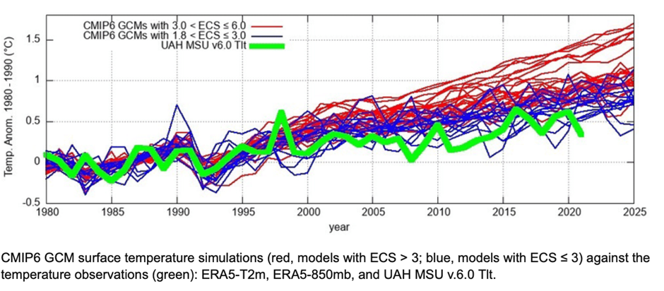


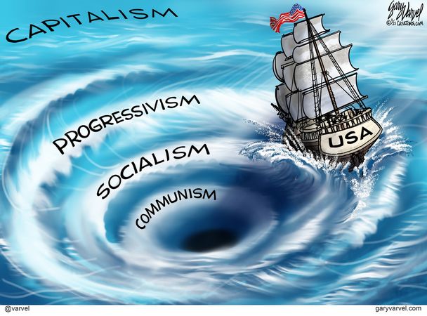 Jonathan Newman provides a brief overview of economic fundamentals for a free society in his article


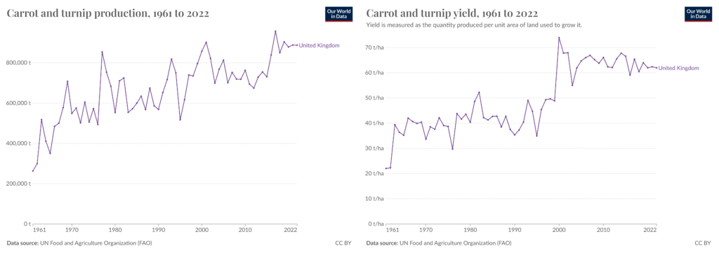
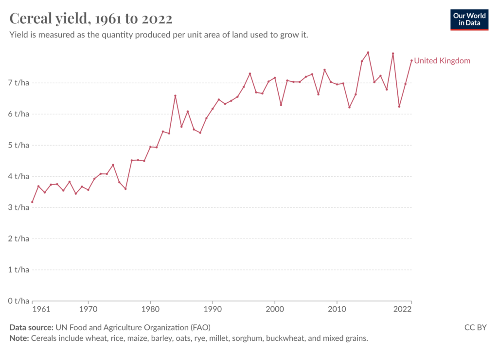
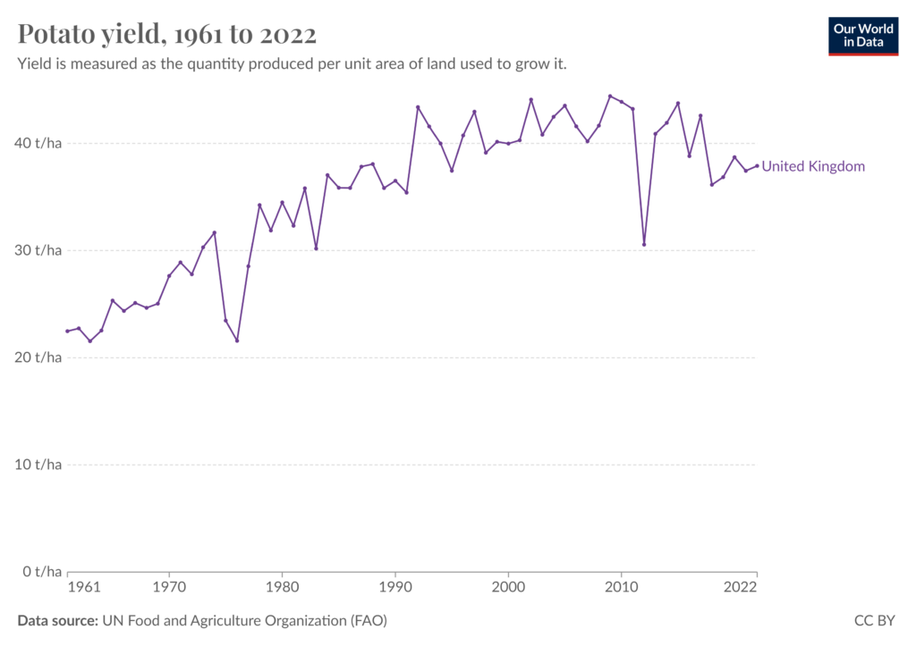
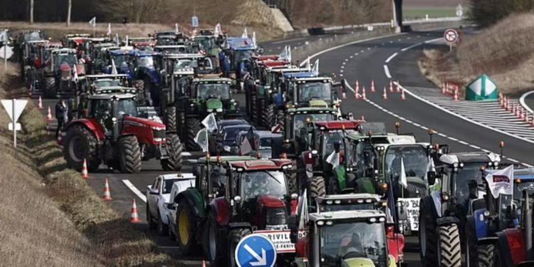
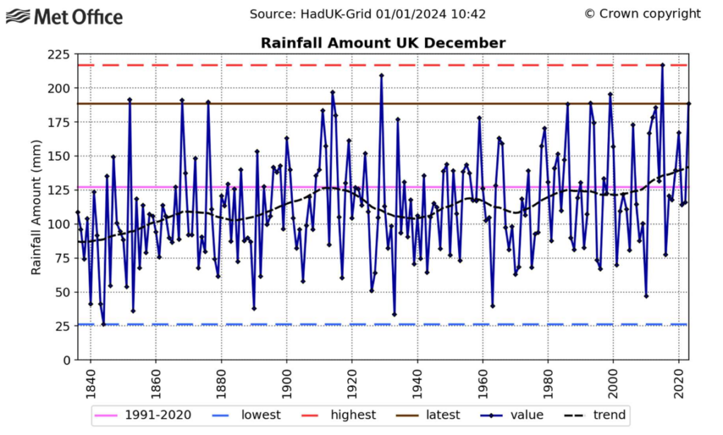

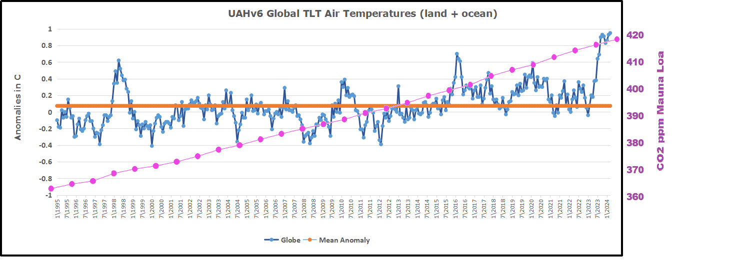


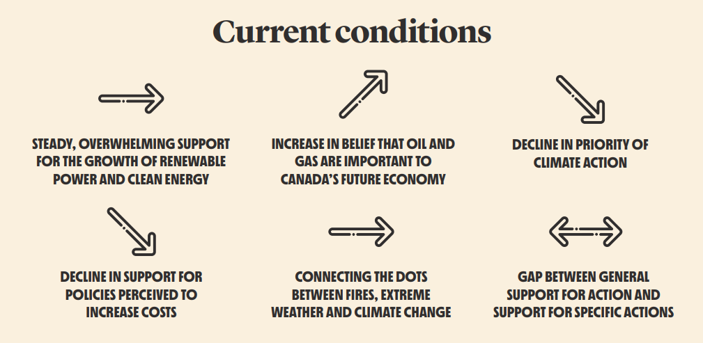
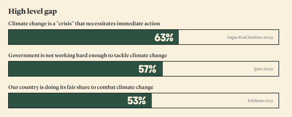
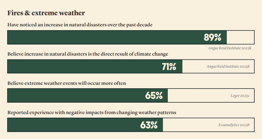
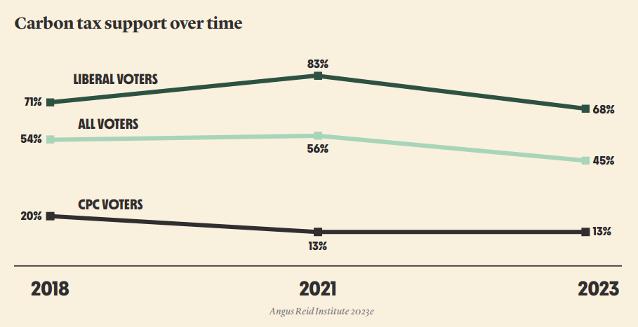
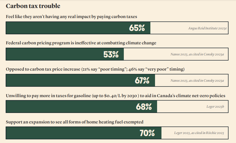
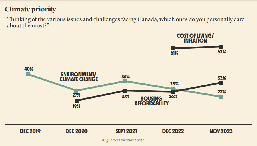
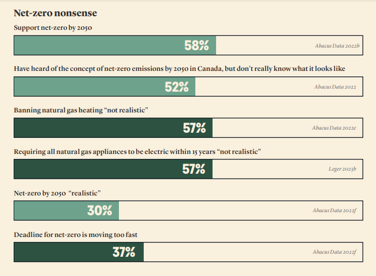
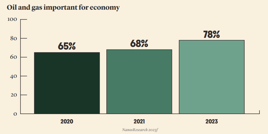


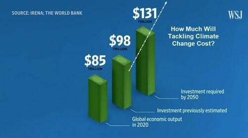
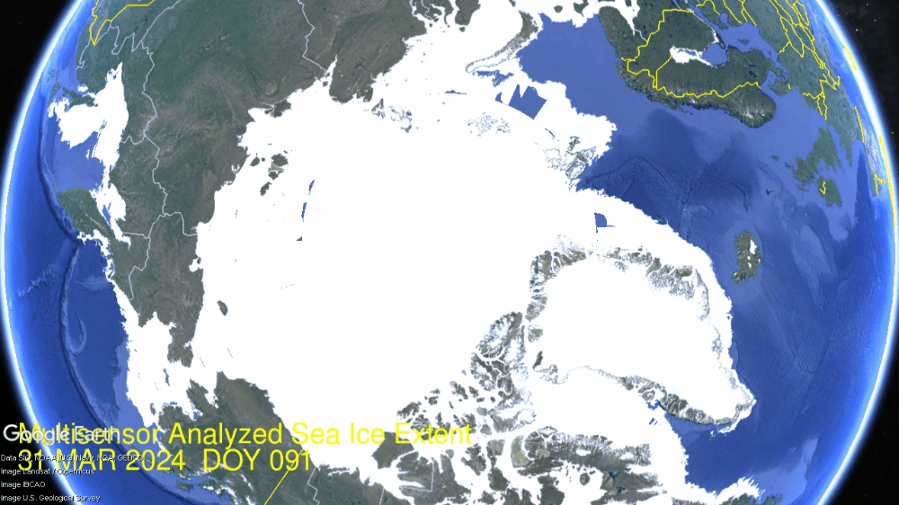
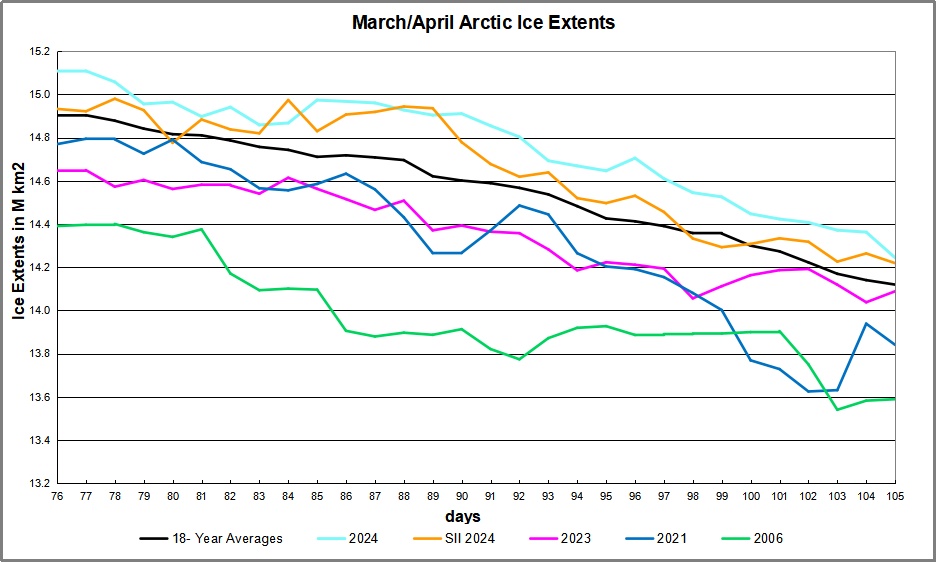

 The table below shows the distribution of Sea Ice on day 105 across the Arctic Regions, on average, this year and 2006.