
Not-so-surprising news arrived recently from the University of California at San Diego: Academically, the kids are not all right. Not even close. “Between 2020 and 2025, the number of freshmen whose math placement exam results indicate they do not meet middle school standards grew nearly thirtyfold,” a report from the university’s senate finds. “A similarly large share of students must take additional writing courses to reach the level expected of high school graduates.”
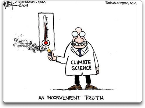
How the Kooky Climate Crisis Crumbles

Historian Victor Davis Hanson explains the collapse of climate hysteria in his Daily Signal video AI is Challenging Climate Orthodoxy:
For those who prefer reading, below is a lightly edited transcript from the closed captions in italics with my bolds and added images.
Hello, this is Victor Davis Hanson for the daily signal. For most of my life, at least for the last 35 years, we have accepted the climate change orthodoxy. We used to be global warming and then when things were not always warming but they were cooling. They changed the name to climate change to suggest whatever the temperature extreme was it was all due to carbon emissions caused in general by humans, but in particular westerners who were polluting the planet with heat.
That was the dominant narrative. I didn’t think in my lifetime that I would see an end to that dominance, even though there were inconsistencies. The planet is 4 billion years old and man has only been here for 300,000 years. And we only have accurate record keeping of temperature fluctuations for the last 150 years. And even within that period, we have cyclical changes between decades of abnormal temperatures, whether too hot or too cold. And before the industrial revolution in some cases by tree rings and ice sampling in the Arctic.

So there was always debate but the dominant narrative said:
No we have to radically change our economy and move away from
fossil fuels to renewable and that was usually wind and solar.
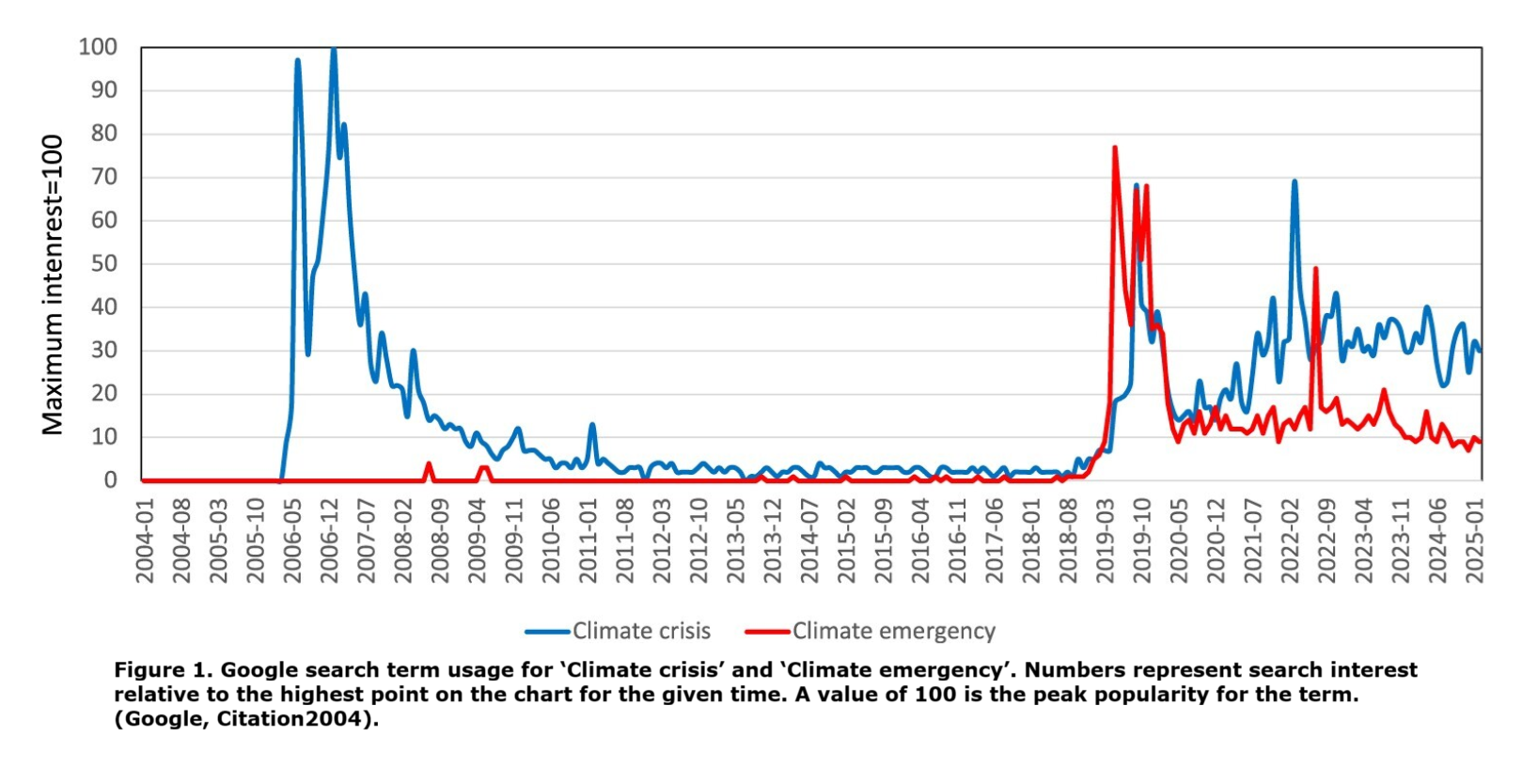
And then something’s happened lately. King Gustaf the16th the hereditary monarch of Sweden, is a symbolic figure not an actual person in power. He’s known as a rabid environmentalist, but kind of mused openly the other day, saying essentially: Why are we ruining the economy of Europe by having exorbitant power cost, electricity cost, when we only contribute to 6% of global warming worldwide? Then Bill Gates shocked the world when said he never he no longer believes that there is an impending climate change crisis. This was followed by a lot of other people who said let’s take a different look at this.
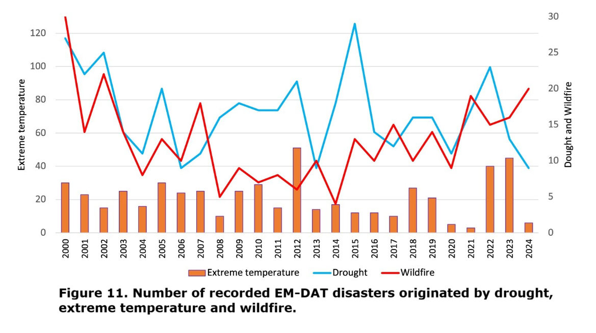
![]()
And of course the second tenure of Donald Trump has people in energy, interior, treasury who are saying, you know, we’re not going to subsidize this anymore. And this is collated with disasters that were caused by worries over climate change worries or global Armageddon. There was the highspeed rail program in California that was supposed to replace automobiles, $15 billion, $20 billion, not one foot of track laid. And the solar plant down in the desert of California that is being dismantled or the battery storage in Moss Landing near Monterey that has caught fire twice.
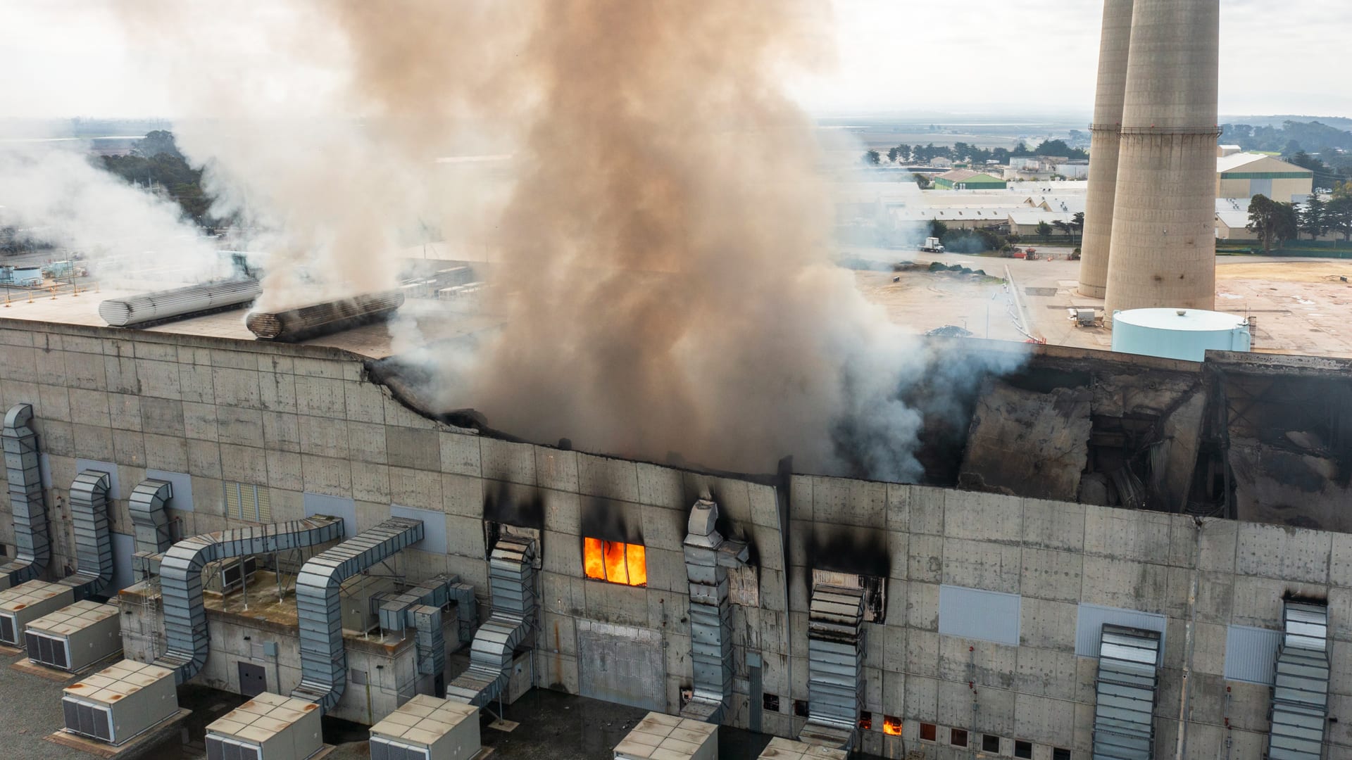
Moss Landing on fire 02/2025
I could go on. So there was a lot of skepticism both by individuals who were influential and by the general public for good cause. So what is causing this? Well, in reference to Bill Gates the first thing is artificial intelligence. It’s going to require a unprecedented level of electrical generation. It takes huge amounts of electricity. We don’t have it and we will not get it by subsidizing wind turbines and solar panels.
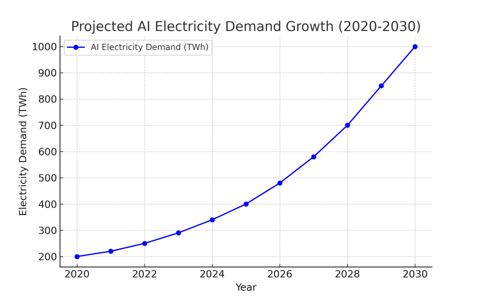
There are 1000 Gigawatts in 1 Terrawatt.
Sam Altman, one of the pioneers of artificial intelligence said, If the United States wants to achieve preeminence in the field, and this seems to be the greatest technological breakthrough since the industrial revolution, we’re going to have to build plants producing AI of one gigawatt a week. That’s the size of a large nuclear reactor, one thousand megawatts. We’re going to have to build, he says, a 100 per year or the equivalent of clean coal or natural gas. So that influenced Bill Gates, that shook him up. That’s not compatible with his prior green idea that we’re going to supplant fossil fuels.

MW refer to 1,000,000 watts of power, rate of energy generated or consumed in an instant by a system, mechanical, thermal, etc. MWe refers specifically to Megawatts of electricity.
Another reason is geostrategic. People are starting to become aware that Russia is a bad actor and Iran is a bad actor. Since they depend on oil exports, therefore the high price of oil to fuel their military ambitions. When the United States became the largest producer of fossil fuels during the first Trump administration, then Biden for all of his green rhetoric, pivoted in his third and fourth year so he could win the election and began pumping oil again. Donald Trump took that 12 to 13 million barrels and has increased it to 14 million. And the price of world oil is going down, and that hurts Iran and hurts Russia. That benefits our allies like Europe and Japan that would like more liquefied national natural gas shipped from the United States.
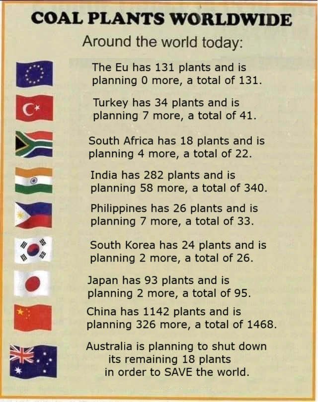
And so there were geostrategic reasons. Let’s be frank. Everybody has sort of seen what China is doing. It’s playing the West. It talks a great game about global warming. You guys, we all have to reduce our emissions. And then what does it do? Two things. It subsidizes cheap export of solar panels and wind turbines below the cost of production to bankrupt competing industries in Europe, the United States, to get the West hooked on solar and wind even though it is a very expensive andunreliable source of electricity. Meanwhile, as we get hooked on Chinese exports, they build two to three coal or nuclear plants per month. Affordable energy that will give them a competitive hedge over the west.

Then there’s the third world that has been telling us for the last 20 years that we are culpable for global warming even though the two greatest heat emission areas in the world are China and India. Nonetheless, governments in Latin America, Africa, and Asia say, “You people owe us because you started the industrial revolution in the mid-19th century, and you’ve been polluting the planet ever since. And you create all of your industries and your affluent lifestyles by burning fossil fuels. And therefore, you should pay us, not we pay you.” And we don’t have to cut back. We’re late to the game.

We should say to them, “Wait, wait, wait, wait, wait. We burned more fossil fuels in the past because we created the industrial revolution and we do today. We provide you the cars. We provide you the industrial plants. We provide you the plastics. If you want us to stop, we won’t export it to you and then maybe we’ll pay reparations and you can do your own industrialization. So then, don’t take stuff from us requiring fossil fuels, stuff that’s essential to your economies, and then tell us that we have to pay an added tax on it because we’re warming up the planet, as if it’s only for our purposes as well as yours.
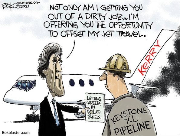
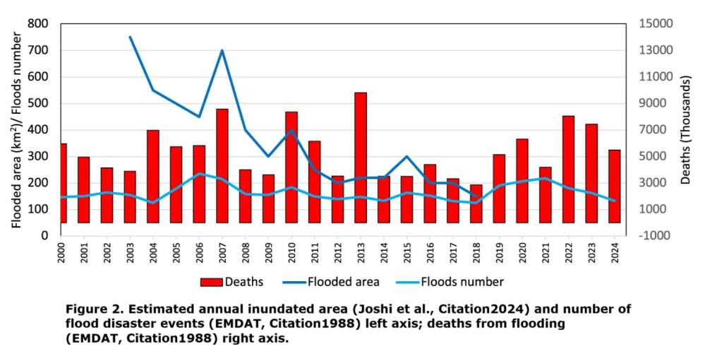
Then there’s the hypocrisy, I guess we would call it. The people who have been the avatars of climate change never suffer the consequences of their own ideology. Barack Obama said the planet would be inundated pretty soon if we didn’t address global climate change. Why would he buy a seaside estate at Martha’s Vineyard or one on the beach of Hawaii, if he really did believe that the oceans would rise and flood his multi-million dollar investment? Why would John Kerry fly all over the world on a private plane and then tell the rest of us that we’re flying too much commercial, when his carbon imprint was a thousand times more than the individual Americans? Why would people on the California coast say we have to have wind and solar and we have to get electricity up to 40 cents a kilowatt because we want to use less fossil fuels. Meanwhile, the temperature from La Jolla to Berkeley is between what, 65 and 75F year round, where here in Bakersfield or Fresno or Sacramento it can be 105 and poor people can’t afford to run their air conditioners.

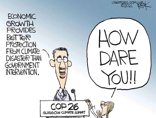
Add it all up, the inconsistency of the global warming narrative, the self-interest in the people who promote it, and the logic that they have presented no convincing empirical evidence that we have to radically transform our economies on the wishes of a few elites that do not have the evidence, but do have a lot of hypocrisy in the process.
Thank you very much. This is Victor Davis Hanson for the Daily Signal.


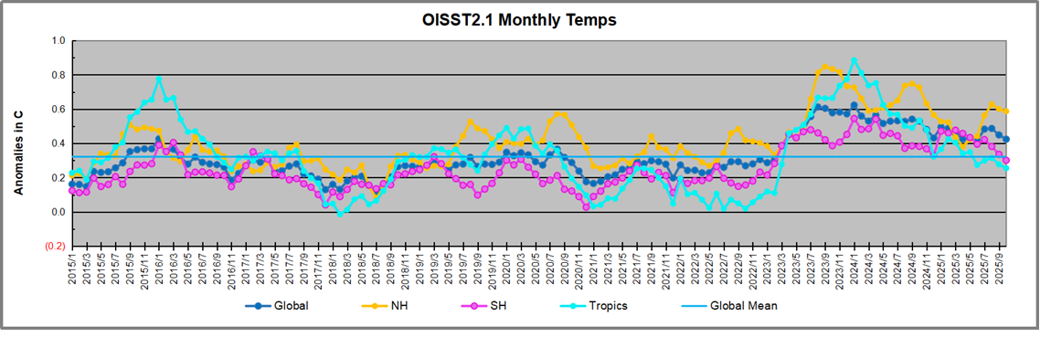
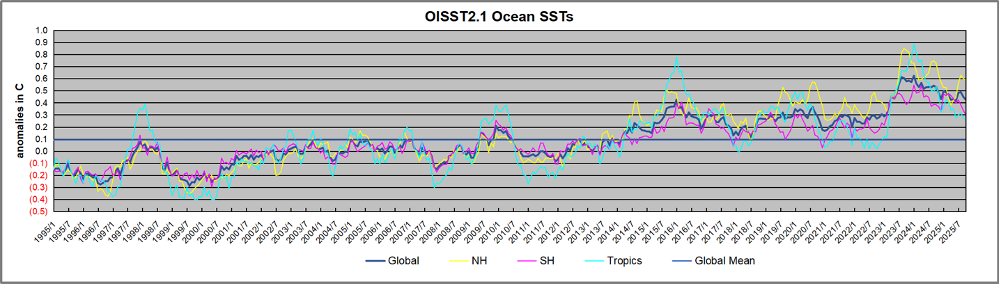
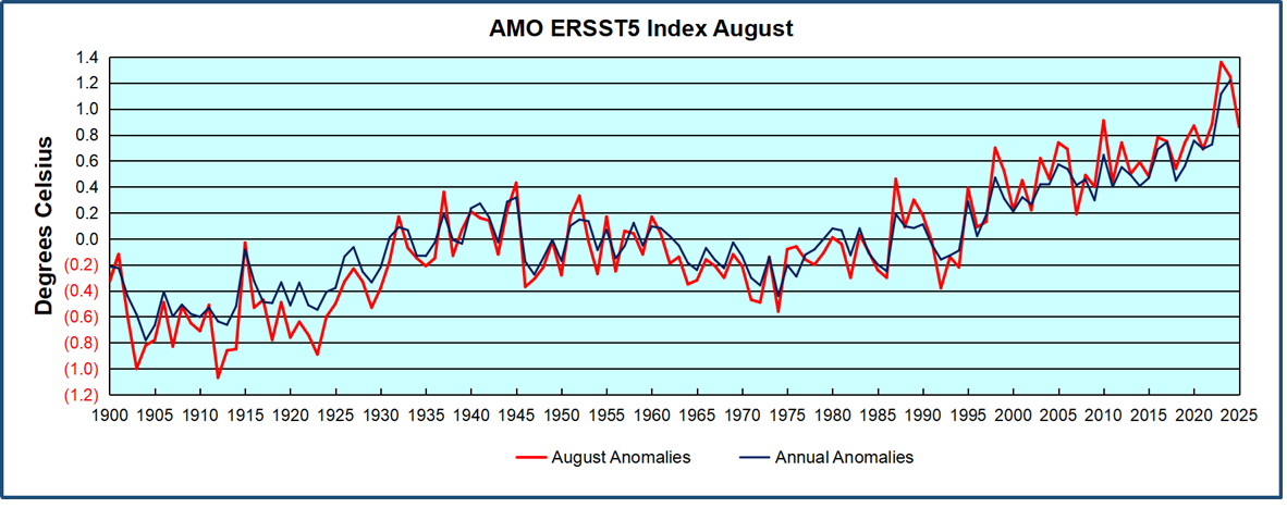

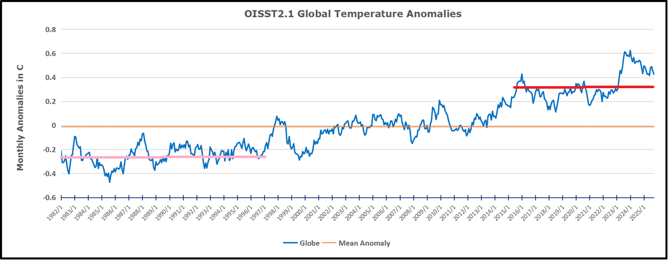


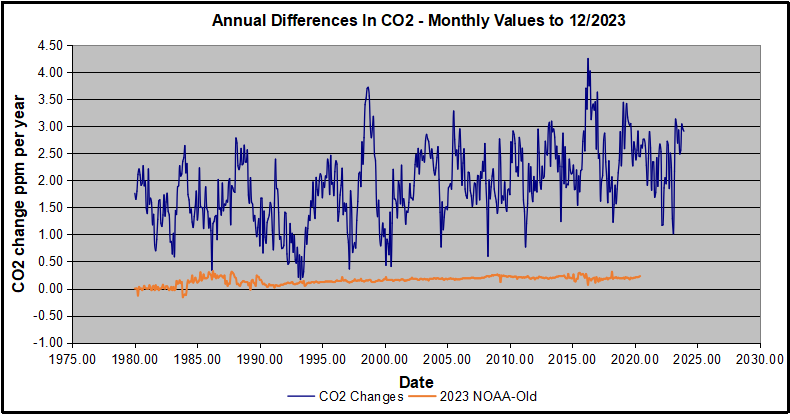
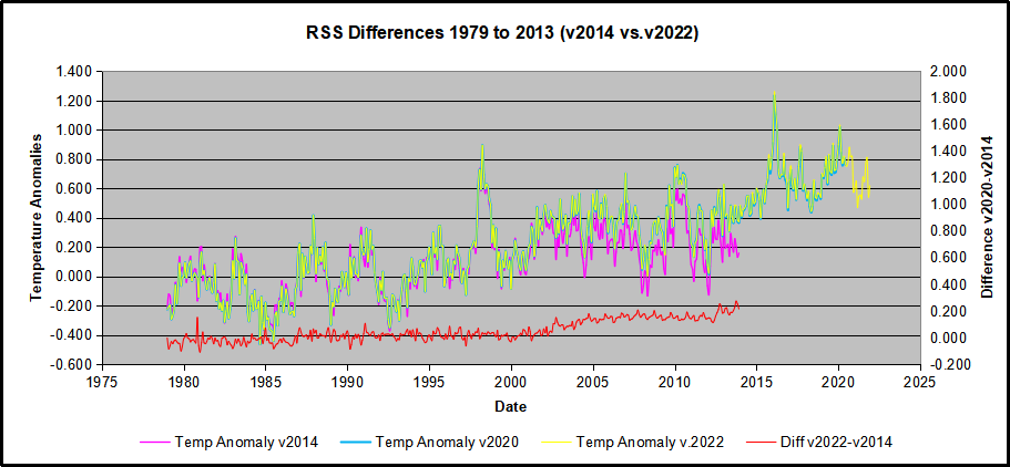
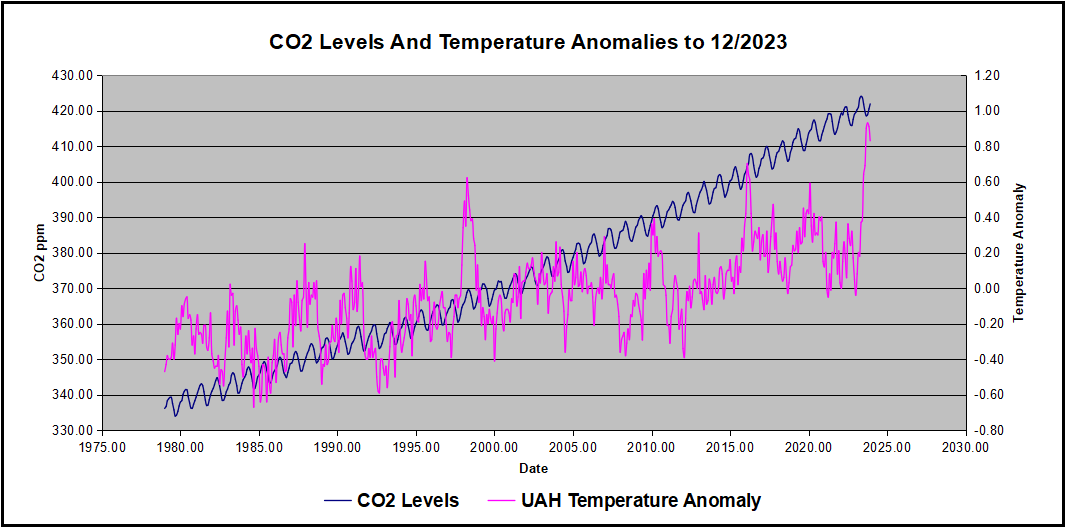
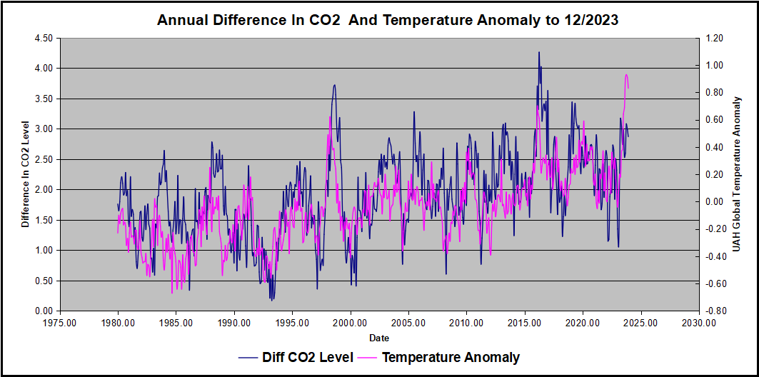


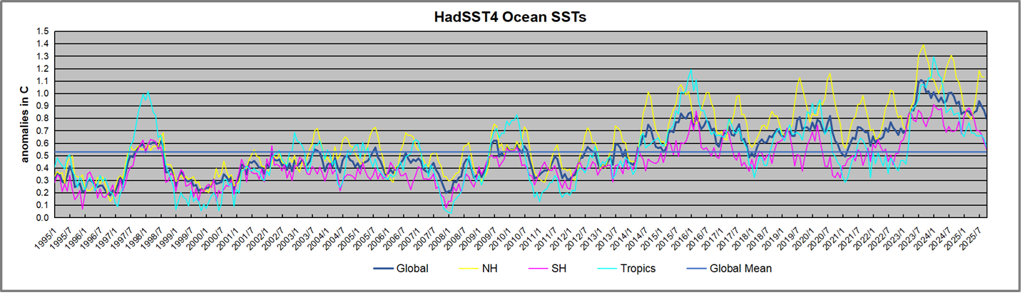
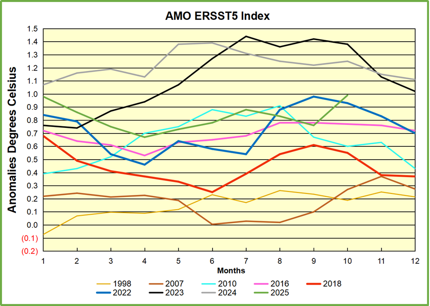
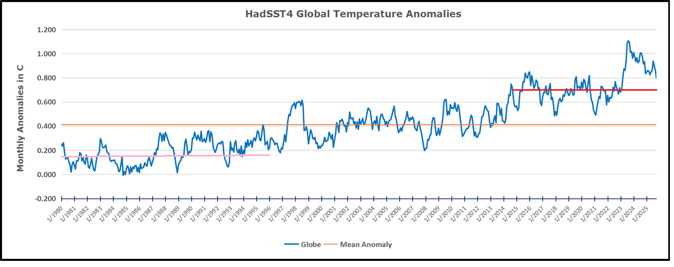
 The best context for understanding decadal temperature changes comes from the world’s sea surface temperatures (SST), for several reasons:
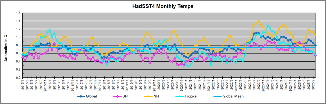


