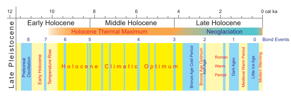
Dr. Henrik Svensmark: Sun and Cosmic Rays Drive Climate, Not CO₂
Danish astrophysicist Henrik Svensmark explains how the changes in solar activity and cosmic rays can influence cloud formation and therefore our climate on Earth. Title above is link to podcast video at Freedom Research. Below is the transcript lightly edited with my bolds and added images. FR refers to Freedom Research interviewer Hannes Sarv, and HS refers to Henrik Svensmark.
Hello, welcome. This is the Freedom Research Podcast and my name is Hannes Sarv. My guest today is a researcher from Denmark, an astrophysicist, Henrik Svensmark. He’s well known for his research on the relationship between cosmic rays and Earth’s climate. He has proposed that the variations in cosmic radiation influence cloud formation and consequently global temperature and biodiversity. Of course, we’re going to talk about climate change, cosmic rays and supernovas and how they affect Earth’s climate and biodiversity well here on Earth. So first of all, thank you, Henrik, for taking the time for this interview.
Firstly, I would actually like to ask a question. Simple, simple question, which can be puzzling, at least to a lot of people. I mean, if you’re being told that you’re living in a constant climate crisis, then probably most of the people probably fear it or they might get afraid. So if someone says to you that today there is a climate crisis. What is your answer to that?
HS: Well, it’s a very political subject and the idea that the climate is in a crisis, I don’t think that that’s actually the case. It’s much less I mean, the climate disasters and so on, I mean, they’re not really increasing at all. And, of course, the temperature has gone up a little bit, but it has not, you know, made a serious crisis that we cannot handle. So, I actually think the idea that we are in a crisis is actually not correct.
FR: So you think, probably It depends on where you live, right? If the temperature goes up, it gets warmer and well, as I have understood most of the places or the larger part of the population actually benefits from higher temperatures. What is your take?
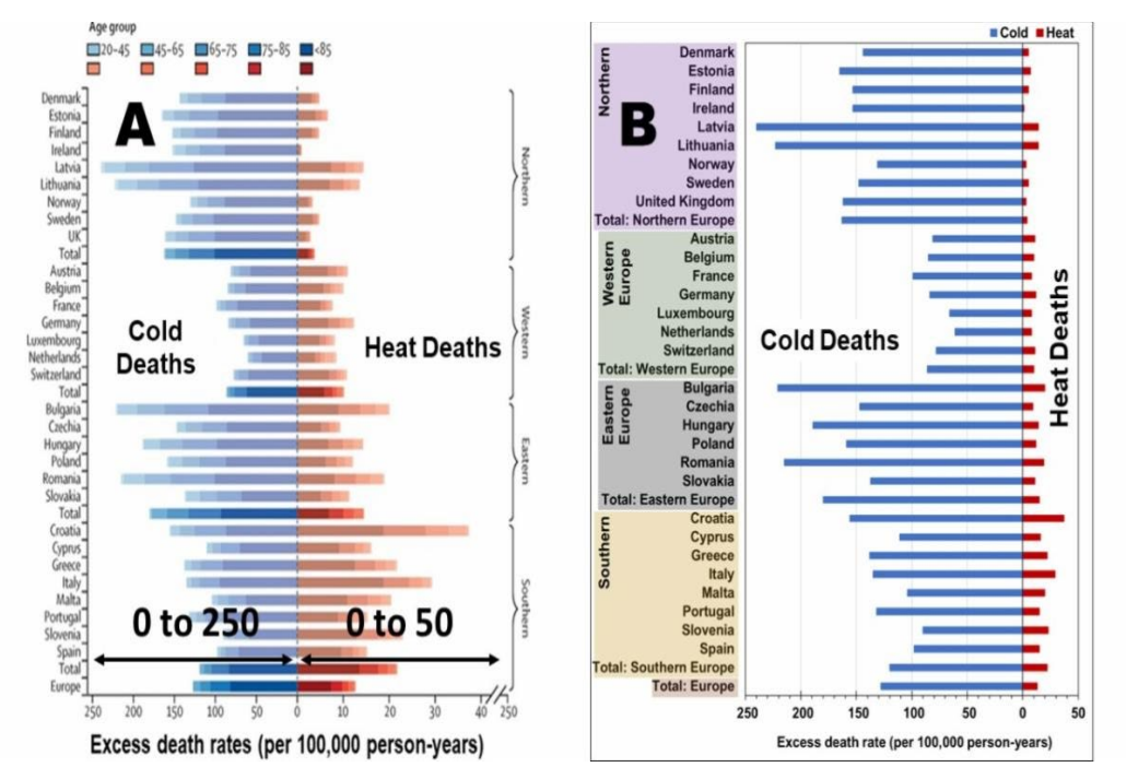
HS: Certainly, there are places where you actually benefit from it. And in many cases, it’s not because it actually gets warmer. It’s more like it’s climate’s getting milder, meaning that it’s the colder temperatures, you know, at night and in the winter that goes slightly up, which is actually a good thing. I mean, here in Denmark, we haven’t had very severe winters for a long time. which is also good. It’s good for the economy. It’s good for many things because a cold climate is much, much worse than a warmer climate. I think that, I mean, you also know that You also talk about people, you can have people dying from warm weather, but we know that it’s mainly cold weather that is the real killer of people. I think there’s almost a factor of 10 in difference. So slightly milder weather is not a problem. I mean, it’s certainly not a disaster.
FR:This is kind of puzzling also to many people, if they’re being told that the planet is going to be inhabitable. Then there’s talk of sea level rise and all those other apocalyptic things that make good movies. But the actual truth there is at least a bit more complex, would you say?
HS: Yes, there’s been so many claims. I think also people should get tired of all the predictions that are wrong. I mean, that there would be no ice in the Arctic and Greenland is melting and so on. And, you know, the islands in the Pacific should be subsiding because of the rising sea levels. And it’s not really happening, any of these things. And all these predictions, which I mean, it gets everybody’s attention, of course, because we are sort of prone to react when we hear about disasters, or coming disasters. They are not really happening fortunately. I mean, it’s actually a good thing that it’s actually not occurring.
FR: So when we look at a longer time frame, it should be brought out that there have been many such crises that have threatened all life and human life. So can you just maybe make a comparison here to today’s climate?
HS: When we talk about global warming, we say that the temperature might have got up by one degree or something like that. But if we look at geological time scales, the climate changes are much, much more severe. I mean, you have periods where you have glaciations, that is, ice almost down to the equator, and perhaps even most of the Earth is covered by ice, and you have periods where there’s no ice caps at all, and the temperature is much, much higher. I mean, you have had… Beobab trees in Antarctica, and you had alligators at the latitude of Greenland.

So you have had much, much warmer, at least 10 degrees warmer climate back in time. So if we look at geological timescales, we have had enormous changes in climate. And of course, all of this is completely natural. And the question is, why did we have such big climate changes? And this is some of my work trying to understand why we have such large climate changes even back in time.
FR: So let’s talk about that. This is interesting that we’ve been told that the climate change today is anthropogenic. So let’s talk about your perspective on that and what does your research show?
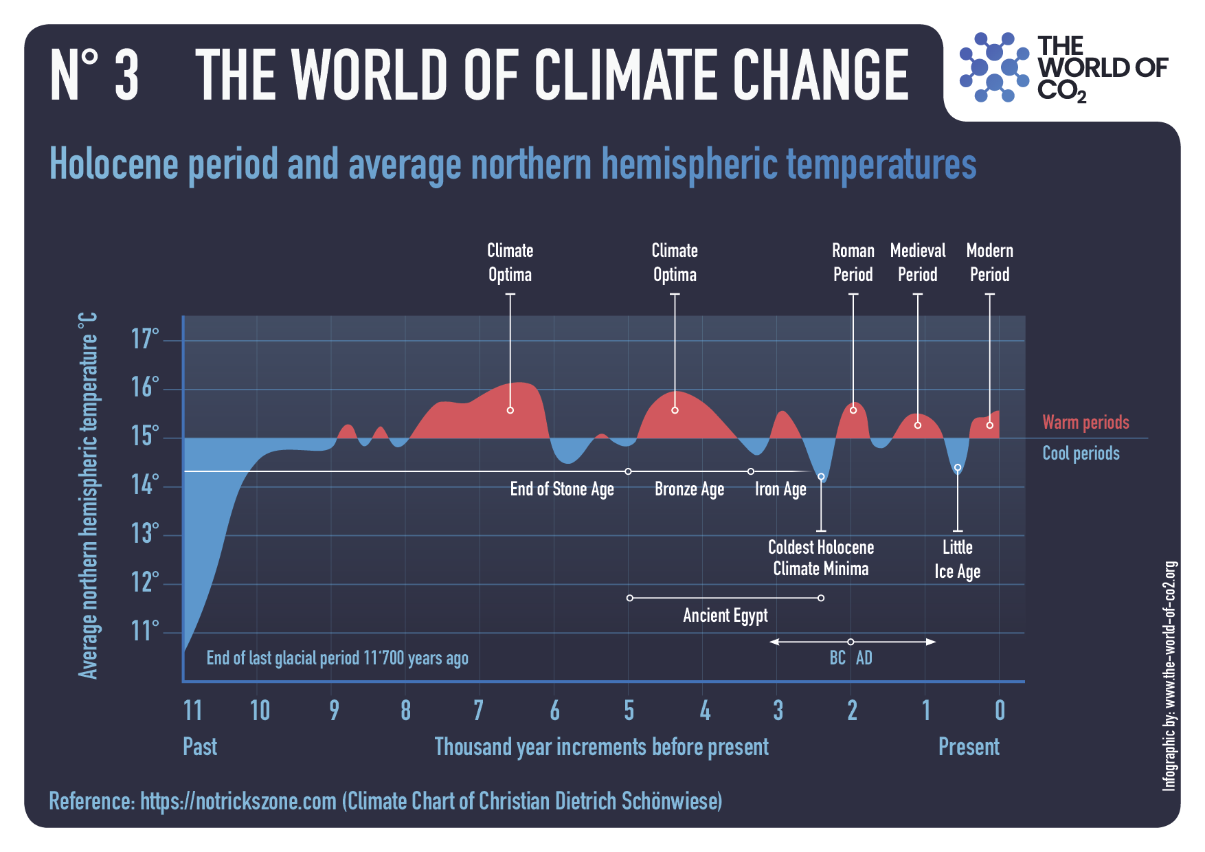
HS: There’s no doubt that CO2 is a greenhouse gas and it has some effect on the temperature.The issue has to do with climate sensitivity. How big is the climate sensitivity? And it turns out that it’s probably around one degree if you double CO2. So it’s a relatively benign effect of CO2. So, I’ve been working trying to understand why there are climate changes. When you look at climate changes, for instance, over the last 10,000 years, you can actually see that if you compare the climate changes with changes in solar activity, you actually find a very nice correlation.
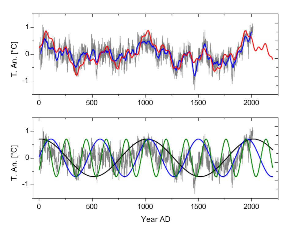
Fig. (3). (Color online) Upper panel: Global record G7 (grey), running 31 year average of G7 (blue), sine representation of G7 with three sine functions of the periods 1003, 463, and 188 years (green), with four sine functions including the period ~60 years (red), continued to AD 2200. The parameters of the sine functions are given in Table 3. The Pearson correlation between the 31 year running average of G7 and the three-sine representation (green) is 0.84, for the four-sine representation (red) 0.85. Lower panel: G7 (grey) together with the sine functions of 1003, 463, and 188 – year periods continued until AD 2200 (equal sine amplitudes for clarity) Source: Ludecke & Weiss 2019
There are so many studies that show that you had, for instance, the Little Ice Age And you have the medieval warm period. And the medieval warm period is when you had a high solar activity. The little ice age is when the solar activity was low. And the question is, why should there be such a correlation?
How can the solar activity actually affect climate? And the simplest idea that has been put forward was that the output from the sun in the form of radiation, I mean the sunlight, that is changing. But it turns out that these changes are probably too small to explain what the climate changes you’re seeing.

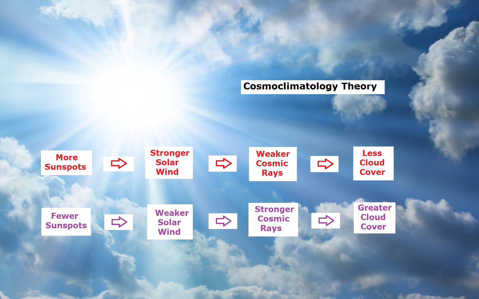
So something else is going on, something is amplifying the solar activity and the idea that I came up with this now, actually 30 years ago, was that maybe solar activity is somehow regulating the Earth’s cloud cover. And initially, I took data from satellites that looked at the Earth’s cloud cover and I looked at it over a solar cycle that’s about 11 years and compared the changes in the solar cycle with changes in the Earth’s cloud cover. There seems to be a correlation between the two. So one can say that the idea, I mean, it looked as if it was something worth pursuing. But of course, it was just a correlation at that time.
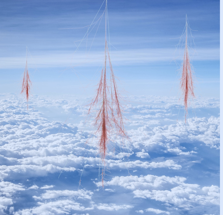
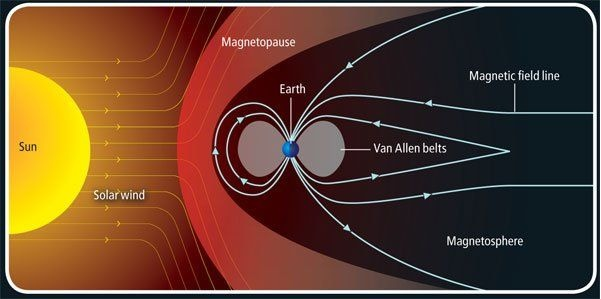
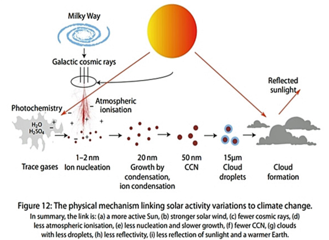
Cosmic rays interacting with the Earth’s atmosphere producing ions that helps turn small aerosols into cloud condensation nuclei — seeds on which liquid water droplets form to make clouds. A proton with energy of 100 GeV interact at the top of the atmosphere and produces a cascade of secondary particles who ionize molecules when traveling through the air. One 100 GeV proton hits every m2 at the top of the atmosphere every second.
And I couldn’t say why there should be such a connection. So the general idea has to do with the formation of clouds. How are you actually forming clouds? And it turns out it’s the ionization that is happening in the atmosphere. There’s typically about a thousand ions per cubic centimeter. So if you have a small cubic centimeter, you might have on the order of a thousand ions per cubic centimeter. And these ions are in general mainly produced because of very energetic particles that come from the Milky Way that is outside our solar system.
And they move in through the solar wind and then enter into the top of the atmosphere, where they then ionize the atmosphere. And the story is these small ions help stabilizing small molecular clusters. So you get what we call aerosols. These very small aerosols, which then grow up to a certain size. In order to make a cloud droplet, you have to have some kind of surface on which water vapor can condense. These small aerosols are actually providing these surfaces.
Cosmic Ray, Aerosol, Cloud Link

The idea is that if you have more cosmic rays coming into the atmosphere, you’re producing more of the small aerosols. They grow to become what we call cloud condensation nuclei, so they can affect the clouds, so water waves can condense and become cloud droplets. So if you have more cloud droplets, you have a more white cloud. And a more white cloud actually reflects the sunlight out to space again.
That is, of course, extremely important for the Earth’s energy balance. So that is the main idea behind the theory that I have been working on.
FR: Okay. And so if there is more clouds and reflect the sunlight back to space, I’m just gonna ask, I’m a lay person, not a scientist. Maybe I’m not, you know, a bit stupid question in that sense. But if it reflects more sunlight out, then well, logically, we get the cooler climate, right?
HS: Yes, exactly. Observations are one of the ways we can verify that it works. So on relatively rare occasions, there are some explosions at the sun. They’re called coronal mass ejections. It’s when the magnetic field lines sort of open up and the sun is throwing out a large magnetic plasma. And this magnetic plasma works more or less like an umbrella or a shield against the cosmic rays. So within a week, the cosmic rays are dropping, and they can drop maybe up to 30% or something like that. And that is like a natural experiment with the whole Earth.

And so you can actually then see if anything is happening with the Earth’s cloud cover. And this is something that we have investigated. So, for instance, we can also look at the aerosols that are produced after these events, and we can see that there is a big drop in the aerosols. And then we see a drop in the clouds following these events. And it’s not just the cloud fraction, it’s also the optical properties of clouds. So we can actually see changes in the cloud’s microphysics under these events.
So in some sense, we see the whole chain from the explosive events and the sun to changes in the cosmic rays to changes in the aerosols and then changes in the clouds. And there is a slight delay on a few days in the reaction. That’s simply because it takes about five days for the small aerosols to grow to become cloud condensation nuclei. So everything seems to be fitting very beautifully with respect to this idea.
FR: Okay. But, well, how frequently does it happen, what’s the correlation here? I mean, how frequently it happens to change the climate in that sense?
HS: I talked about this event with the explosions at the sun, which is something that happens during a week. So it’s too much too short to affect climate. But the solar activity modulates the cosmic rays. And that’s simply because the solar activity translates into changes in the solar wind. And the solar wind is covering the whole solar system and all the planets. That works like it’s a magnetic shield that screens against the cosmic rays.
So when the solar activity is high, you can say that it’s screening better against the cosmic rays. That means you get fewer cosmic rays in to the atmosphere. So solar activity can regulate the amount of cosmic rays that comes into the atmosphere. So that regulates in the cloud cover. And we can then estimate, I mean, how much it changes the cloud cover during an 11-year cycle.

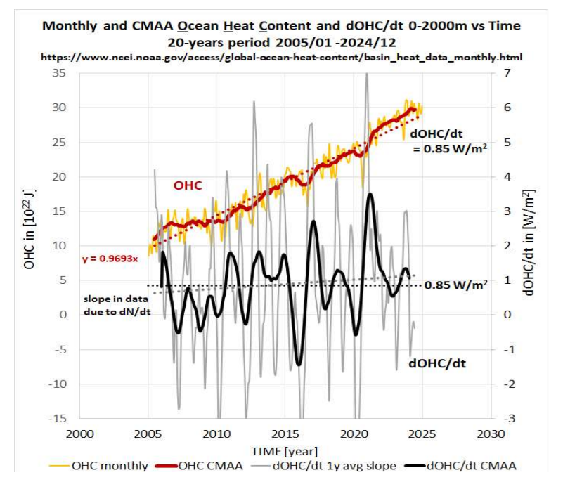
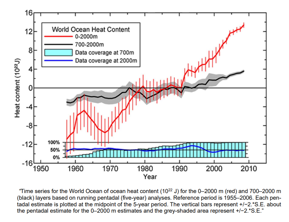
And from that, we can calculate what would be the effect on the temperature in the oceans. And there you actually see that we get about on the order of one to one and a half watt per square meter more energy in when you have a solar maximum than when you have a solar minimum.
And you can actually observe that in the ocean’s temperatures. You can see that in the heat content of the ocean. And you can even see it in the volume, because the heat goes in and out of the ocean. So when you get heat into the ocean, it expands a little bit. So in the sea level, you can actually see an 11-year cycle in the sea level. And all of this, you can quantify how much energy goes in and out of the ocean.
And it fits very beautifully with what you expect from changes in the cloud cover over a solar cycle. And it’s interesting that the solar irradiance is almost a factor of 10 too small to explain it. So there is some kind of amplification mechanism. And the idea is that it’s clouds that are responsible for this. And this is something that you should takeway with respect to the ocean temperatures and the energy that goes in and out of the ocean he has been looking at.
FR: Okay. But how does it fit this idea? How does it fit the historical records?

Figure 4. The millennial solar-climate cycle over the past 2000 years. The anomaly in 14C production levels (black curve), a proxy for solar activity, is compared to iceberg activity in the North Atlantic (dashed blue curve), a climate proxy. The pink sine curve shows the millennial frequency. It defines two warm and two cold periods, supported by a large amount of evidence, some of which are represented by red and blue bars (see main text). Source: Javier Vinos
HS: Well,If you look at solar activity going back in time, we talked about the Little Ice Age, which is from around 1300 to 1850. And then you had the medieval warm period for 900 until maybe 1200. that these changes, they fit very beautifully with changes in cosmic rays. So when it’s cold, you have more cosmic rays coming in. And when it’s warm, you have less cosmic rays entering into the atmosphere. And we know these changes in cosmic rays because when cosmic rays enter the atmosphere, They are actually producing new elements like carbon-14, which is a radioactive form of carbon. It’s slightly heavier than carbon-12.
I guess many people know that you can use carbon-14 for dating things. But this carbon becomes CO2, the heavy form from carbon, and it goes into trees. And then you can look at the annual rings of the tree rings and measure how much carbon-14 you have relative to carbon-12. And you can then measure that for all the tree rings going back in time and you can actually reproduce solar activity almost 20,000 years back in time. And if you look at these changes and you compare with how climate has been changing over that period, there is beautiful correlations again.
So it is near certain that there is a connection between solar activity and climate. And you can also quantify some of these changes and they are relatively big and it seems as if that, you know, changes in clouds is a very good candidate for explaining this. And when we look about the last 10,000 years, then the modulation of the cosmic rays, it’s caused by solar activity.
FR: Okay. Let me just ask you about those cosmic rays again. You did say, but again, I’m not that bright in your field. You did say it comes from Milky Way. Okay. Why does it come from there? Or what is it? What sends it here?
HS: Cosmic rays are very energetic particles. It’s mainly atomic nuclear, 90% is protons. So that’s the core of the hydrogen atom. So the energetic particles that we are interested in are mainly produced in what we call supernova. And a supernova, the case that we are interested in, is when you have a massive star that is maybe eight times or more massive than the sun. It only lives a relatively short period of time, you know, from maybe three million years to 40 million years.
So it’s a large star and it’s very heavy, and then in the process of burning, it burns so fast and it ends its life in a very, very violent explosion, which is called a supernova. And this supernova, when it explodes, it produces a shock front that is moving out from where the star was located. And this shock front, it works as, you can call it, a cosmic accelerator.
So it accelerates particles that move back and forth over this shock front and move them to extremely high energies. And the energies that you can obtain by this process is much higher than we can produce in any accelerator here on Earth artificially. And these particles, they are then moving in the interstellar space in the Milky Way.
And they are moving in the magnetic fields that are in between stars. So they are sort of moving like what we call diffusion. They are sort of randomly moving around, being bent by the magnetic fields. And then some of them will be outside, you know, arrive outside our solar system.

We have the heliosphere and then they move in and they feel the magnetic field from the sun. And some of them will then enter into the top of the atmosphere. And then you have maybe one proton that comes in with extremely high energy. And then it works a little bit like billiard ball where you have one particle hitting the molecules or the atoms in the atmosphere and it makes a shower, sort of a cascade of particles that goes down through the atmosphere. And these particles are called secondary particles. And so you can have one particle coming in that becomes millions and even billions of particles that move down through the atmosphere.
These particles are completely invisible to our naked eye. While we are sitting here, we are penetrated by these secondary particles that go through my body and your body all the time. And so every 24 hours, maybe 20 million particles will go through your body and you don’t really experience this. This is something that has happened since the formation of our galaxy. And of course, here on Earth, we have been showered with these particles for four and a half million years.
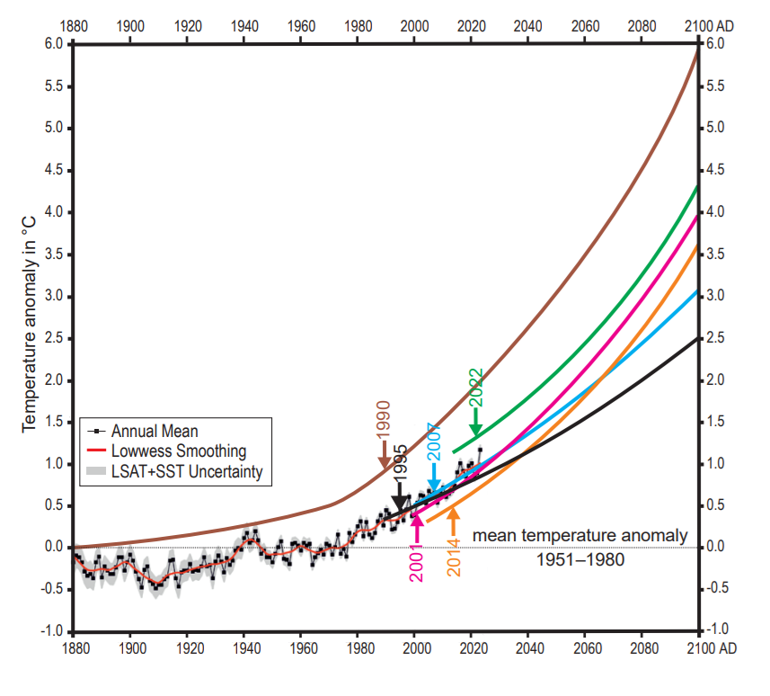
FR: Well, since you can explain past events with solar activity and how many cosmic rays are coming towards Earth, probably you can basically model what will happen as well, right? So, I mean, the question is, where are we now in terms of changing climate? Because I’ve also talked, for example, to Professor Zharkova. She said to me that we are entering another ice age soon.

HS: There’s no doubt that we will get an ice age. We have had a number of ice ages back in time. I don’t know if you’re talking about a real ice age or you’re talking about a little ice age, which is just a colder period.
FR: She was talking about the little ice age. I understood.
HS: So a little ice age. I know there are some predictions that the solar activity will go down and we might get a slightly colder period. I’m not sure it will be a little ice age, but it’s not something that I have looked at in any details. At the same time, of course we have had some heating from the CO2 increase in CO2. And then solar activity would then go the opposite way if the solar activity goes down. The problem with these predictions is that it’s extremely difficult to predict solar activity in the future.
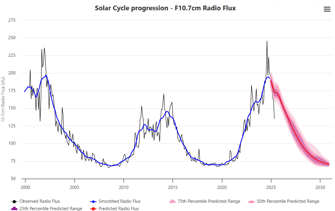
Source: spaceweatherlive
We can’t even predict the next solar cycle, whether it’s going to be high or low. There are some really amazing examples where this last solar cycle was predicted and the predictions were sort of all over the place. So it is really difficult to know because we don’t understand solar activity in a detail where we can predict what the next solar cycle will be. But that might come at some point. So something special has to happen. I think if we’re going to have a real cold period where the temperature drops by one or two degrees, that would be very special. I’m not sure that we’re going to see that, but I know that Zharkova is predicting that.
FR: Okay, yes. Anyhow, the thing is that still almost, well, all of it indicates that climate change is, there are some other factors than humans leading the climate change. But what is your opinion? What is the role of us on climate?
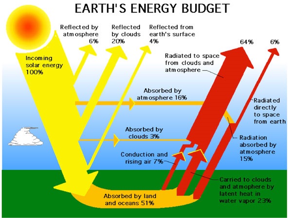
HS: Oh, the anthropogenic CO2? Yeah. So as I said, it is a greenhouse gas. So you can see if you look at the outgoing long-wave spectrum, you can actually see there is a drop in the outgoing long-wave spectrum, which has to do with CO2, which means that it is a greenhouse gas. The question is, how important is it? Is it so important that it’s changing temperature, you know, in a dramatic way? And I think there’s so much research now that seems to indicate that the climate sensitivity is on the order of, you know, one, maybe a little more than one degree for a doubling of CO2.

And that is much smaller than what you get from these climate models, which gives you between three and four degrees of that order, but at least a few times larger than what you get just from CO2 alone. Because in the climate models, the reason they get between three and four degrees is because they assume that it would be less cloudy, for instance, in the future climate. So you might have one degree from CO2, but then you get on the order of one or two degrees extra from what we call positive feedbacks. And that is something like more water vapour in the atmosphere or less clouds in a future climate.
And the problem is that water vapour and clouds are really the most uncertain thing about any prediction of climate. Clouds and aerosols are really what makes climate predictions so extremely difficult. And it’s because it’s all happening at length scales that are much, much smaller than what you can resolve in climate models. You have to remember that you have maybe, you know, 50 to 100 kilometers between two grid points in a global numerical model.
And that means that, you know, if we just take Denmark, you have maybe one or two grid points over Denmark. And in each of these grid points, you have to determine, you know, what are the clouds actually just from temperature, humidity and pressure. So you have to do some kind of a parameterization of all the physics. So you’re not resolving clouds at all, but you are trying to use, you know, temperature and pressure to say what will the cloud look like for these variables. And this is basically impossible. I mean, it’s pure guesswork.
FR: So what do you think about those climate models? I mean, are they useful then at all?
HS: Of course, they’re useful for some things, but they’re not useful to say if the climate is going up by some fractions of degrees. And I don’t think you can use them for predicting future climate.
FR: But this is what they are used for, isn’t it?
HS: Yes, but I think also that there are some kind of a consensus that climate models are not doing well, I mean, that they have real problems in predicting and saying what is going to happen in the future. So they are not a crystal ball that can tell us about the future with very much accuracy. Well, it depends on how you ask the questions, of course, but I think just recently there were some statements from people who are doing these models saying that they were running too warm.
So they are, you know, exaggerating the warmth. And I think in one of them, there was because they updated their cloud scheme. So they changed the perameters of clouds. And all of a sudden, it was running slightly warmer than before. So again, it just points to the severe problem of clouds. I should also say that if you take out clouds of the models, then the model results start agreeing with each other. Whereas when you have all the clouds in the models, then you get very different results from various models. I mean, it’s not like in particle physics where you have a standard model that you can use.
I mean, here you have a whole ensemble of the different models and they all give slightly different results. And then you make an ensemble average of all these models and try to say that that is the future. It’s, of course, not really satisfying.
FR: Of course. So what do you think about the reports that the UN IPCC puts forward, the scientific reports? Are they something that are, you know, accurate?
HS: I looked at it with respect to the things that I’m doing. One of the things that, you know, struck me was that if you look at the effect of the sun over the last hundred years, there is no effect whatsoever. I mean, it is so small that, I mean, they’re saying essentially that there’s no effect of changes in solar activity. really a shame in the sense that I mean, for instance, we see in the present climate that we’ve had over the last 50 years, you can see solar cycle variations in the ocean heat content and so on, which we talked about just before.
So the solar activity seems to be 10 times larger than what you get from solar irradiance. And in The reason that they get such a small effect of the sun is because they are only considering changes in solar irradiance, which has to do with the solar constant. The solar constant is changing, you know, about one tenth of one percent. So that is so, so small that it does not have any effect on climate. However, the changes in… In clouds, if we take the ideas that I have been working with Nir Shaviv we will get that over the last century, over 120 years, I think at least one watt per square meter has entered because of solar activity.
Solar activity does not seem to have been completely negative as well. over the last 10 years.
So when we think about how the issue is approached, the issue of climate change in society now, well now there’s the new administration in the United States that actually approaches it somewhat different, but in the EU, for example, Mrs. von der Leyen said that she’s still determined to go to net zero and so on.
So what I mean here is the somewhat hysterical tone that this issue is approached with and also the predictions of doom. So my question is if it’s the same in the academia or not. I mean scientists are in my opinion, at least, they seem very rational and fact-based. So, is it somewhat different in the inside, I mean, if you talk to your peers?
HS: I usually say that climate science is not normal science. There’s so much politics involved, even in academia. There is a sort of self-censorship. It’s a bad career move to go against the idea that CO2 is the main driver or to say what i’m saying right now so it’s not good for your career to to do that it has implications, I mean first of all it’s the only research that is being financed that can be done, if you don’t get a grant or anything, you cannot do any research.
And that’s also why I think many people will not rock the boat, because it’s a good way of getting financing for the research that you want to do. However, if you try to do things which I have done, which is perceived as controversial and not according to the general ideas, it becomes very, very difficult to obtain funding and to survive in this system. And people are very emotional about this because some people think that they are trying to save the world from a disaster. And, you know they think everybody else has really bad motives, maybe hidden motives, your multinational oil companies or something like that.
So it’s really difficult to be in opposition to these ideas. So that it’s very, very difficult for me to obtain any funding. Some people are very upset, you know, if you have been invited for giving a talk and some people find out who you are. and so on. So there’s many, many strange things happening.
FR: It’s really happening, right? I mean, it has happened to you that you’re invited to give a talk to talk about your research and there are activists who are coming to cancel you. Did I understand correctly?

Antifa thugs outside Munich Conference Center at 2019 Climate Meeting.
HS: Yes. I’ve also given talks in Germany, where the whole conference had to have police protection because of the demonstrators that tried to storm the place. Another time, on the building, they printed that we were Nazis and they put glue in the locks and so on. Yes, so one couldn’t get in. I mean, it’s just sometimes it’s very, very, very strange how emotional it is. And there’s nothing rational about it because it’s not something that you can have a discussion about. I mean, you also heard people saying that, you know, the science has been done. Now it’s only action that is needed.
FR: Yes, yes. Well, it’s being parroted all the time. I don’t know, is it 100% already or last time I checked it was 99% of climate scientists agree on something.
HS: But all of these things are simply propaganda of some kind. It has no sort of basis in reality. It’s just some talking points that are being spread out. And some people believe them and other people know that they’re not entirely correct. And that’s how it is.
But the good thing is that I tried to survive in this system. Then I started to look at very, very long timescales. And I think, I mean, maybe we should I should tell you just a few words about that, because I think it’s a completely fascinating result that has come out. Absolutely.
So we talked about these supernovas that goes off, and they are producing the cosmic rays. So you can say supernovas are the source of cosmic rays. And the interesting thing is that our solar system it is actually moving around the Milky Way galaxy. So we are in a spiral galaxy, so it’s like a flat thing.
And we are moving around the center of the galaxy, the whole solar system, within 240 million years or 230 million years it takes. Our Milky Way is a spiral galaxy. And in these spiral arms, that’s actually where you have a lot of star formation. And star formation is where you also produce the large, heavy stars that explode.
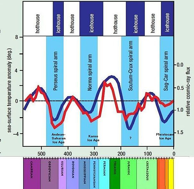
Cosmic radiation and temperature through Phanerozoic according to Nir Shaviv and Jan Veizer. Blue columns refer to Milky Way Spiral arms.
So that means that when the solar system goes through a spiral arm, it actually in an area with much higher cosmic rays, Whereas when you are in between spiral arms, you have much lower. And the changes are not 10, 20% like we have from solar activity.
Now we are talking about several hundred percent of changes in the cosmic rays. So you can say that this is a completely independent way of testing the cosmic ray climate mechanism. Because if these changes in cosmic rays are important for climate, as we see in the present time, maybe they should also be important when we go back in time. It’s something that Nir Shviv actually looked at around 2001.
And what you find is that when you are in a spiral arm, it tends to be extremely cold on Earth. So the glaciations that we have had on Earth on cold periods fit beautifully when we were in spiral arms. And when we were in between the spiral arms, it was extremely warm. The temperature changes and the climate changes we are talking about are now, you know, from what we call an ice house, that is the glaciation, very severe glaciations, that is the large ice sheets on the Earth, to where they are completely melted and, you know, the sea level has gone up maybe by 100 meters or something like that. So it’s enormous changes.
What I looked for was to see if it has implications for life on Earth. And it turns out that you can actually indirectly look at how big the biomass has been at certain times in the ocean. And that is because you can look at organic material. So when you have the ocean and you have organic material, some of the dead material falls down at the bottom. And you can actually say something about the fraction of organic carbon relative to inorganic carbon in sediments.
So when you have sedimented mountains, you can go and measure this ratio of organic carbon to inorganic carbon. And it says something about the fraction of organic material that has been buried in sediments. And it turns out when you look at this fraction as a function of time, It fits beautifully with changes in reconstructed changes in supernovae.

And you can actually see it in fairly high details over the last 500 million years. And it turns out that you can actually extend it. So from geology, you have this fraction of organic material almost four and a half billion years back in time. And even here, it fits beautifully with the changes in the cosmic rays that have happened over the whole history of the Earth. It’s completely astounding that you have this correlation over four and a half billion years. So it says that the biomass seems to have been following things which are thousands of light years away from our solar system.
So this star formation has actually influenced the conditions for life. And it’s even more interesting because when you bury organic material, the organic material is made because of photosynthesis. And photosynthesis, that is, you know, the algaes, the green algaes produce oxygen. So you have CO2 and water and sunlight that becomes, you know, sugar and oxygen. But in order for the reaction not to go back again, so the oxygen becomes CO2, you actually have to take the organic material and then have the oxygen and you bury the organic material in the sediments.
That’s the way you get the oxygen. So these variations in the organic material, these variations, they are actually also the production of oxygen that we have had over the whole history of the Earth. So supernovas have therefore indirectly produced or been responsible for changing the oxygen at Earth and all complex life. I mean, in order to get complex life, we need oxygen. So it’s really been a very important part. So it seems to say that the Earth is really a part of an ecosystem, you know, where it really involves most of the galaxy. So here we see that it fits beautifully with the changes in cosmic rays or supernova frequency over most of the history of the Earth.
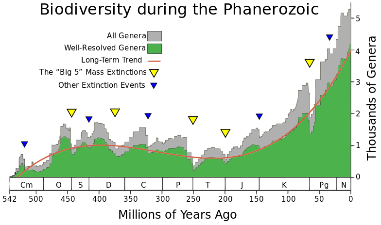
Source: Phanerozoic_Biodiversity.png Author: SVG version by Albert Mestre
I did another thing where I looked at the diversity of life, and just to cut the thing relatively short, it turns out that there’s a beautiful signal of the supernova frequency, even in the frequency, in the diversity of life, where you can see a very, very beautiful correlation over the last 500 million years. So it suggests that somehow the changes in the supernova change the climate. And by changing the climate, if it’s colder, you have a larger temperature difference between equator and polar regions.
That means you have stronger winds. And if the wind is stronger, then you have more mixing in the oceans. And what it is mixing is the nutrients that life actually needs. I mean, a lot of the nutrients, they run out from rivers because of rain. And you have, you know, phosphorus and iron and oxygen. and other important elements for life. But they are then transported so life can uptake these nutrients. And the idea is that when you have more nutrients, then you can also have a higher diversity and you also get the higher biomass and you get more sediments. So everything seems to be connected in that way. I hope this was not too complicated.
FR: Well, I mean, yes, I think it wasn’t too complicated, but it’s really interesting to actually hear about the research, yes, and to think about the connections that you pointed out there. So, the only thing I would like to ask here is that, so it’s a hypothesis, of course, and again, how… how it is welcomed in your circles? I mean, is there any discussion about it or how it is approached?
HS: I think in geology and geologists, there’s a lot of geologists that really like it because many of them, they have seen how climate is changing over these long timescales and, you know, some of them, they know that CO2 does not appear to be the driver of climate changes on these long timescales. But I should also say that even in geology, there are people who are promoting that everything should be CO2, that CO2 is also driving climate on these very long timescales. But there are many places where it simply does not fit. So I don’t think that… I don’t think it’s a good theory.
I mean, you typically hear about, for instance, having extremely high CO2 levels at the same time that you had an ice age. And there are some problems also within the last 30 million years where CO2 actually dropped a lot. There are periods where temperature actually goes up and so you don’t have this correlation over many million years and some of it is called a climate paradox. There are some problems.
FR: Yes, of course, of course. Yes. So, I mean, it has been really nice talking to you, but I can see that our time for today is almost running out. I mean, thank you really for this interesting conversations and for the insights and for talking about your research in detail. I hope my audience also listens and can hear some, well, good ideas, but they’re not only ideas because, well, this is what science actually must look like, ask questions and try to find answers, correct?
HS: Yes, I agree, that’s what we try to do.

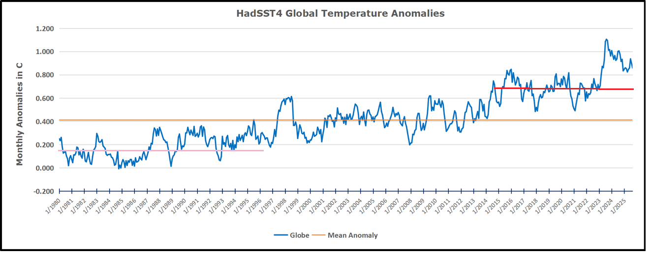
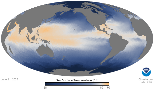
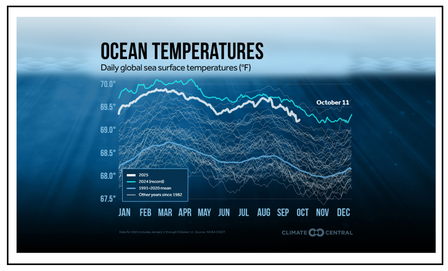
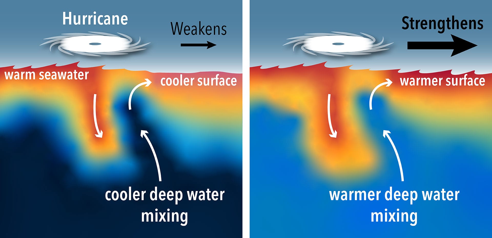
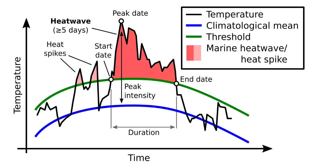
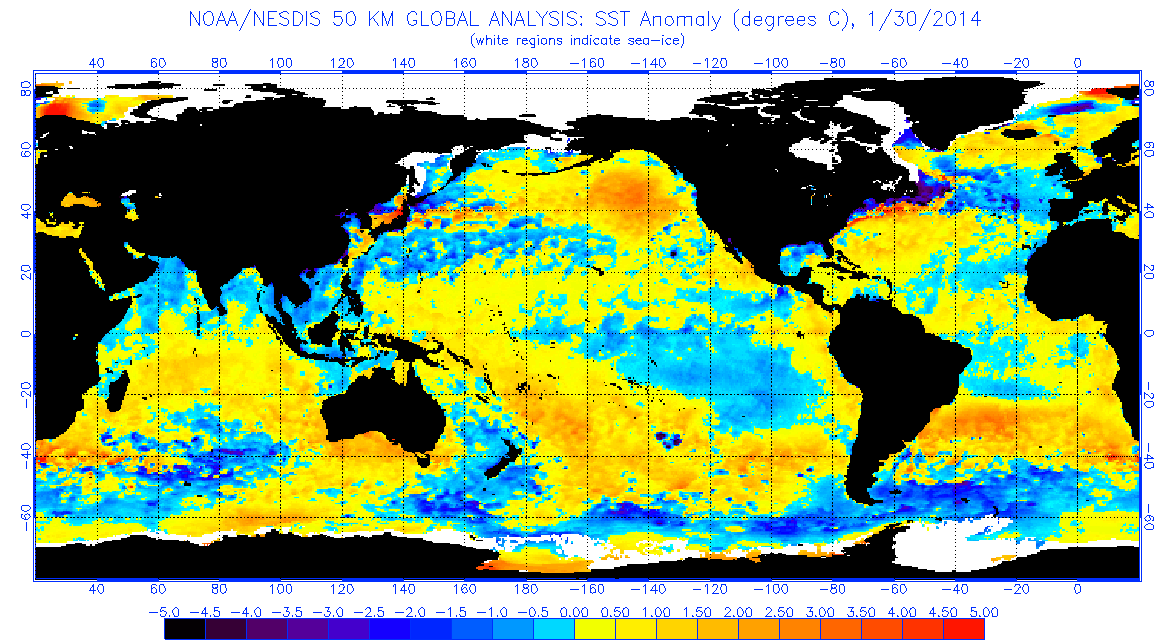
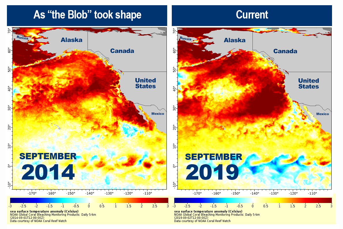
 The best context for understanding decadal temperature changes comes from the world’s sea surface temperatures (SST), for several reasons:


 But: Sea Level Rise is not accelerating.

 In fact our climate is remarkably stable, compared to the range of daily temperatures during a year where I live.