The best context for understanding decadal temperature changes comes from the world’s sea surface temperatures (SST), for several reasons:
The ocean covers 71% of the globe and drives average temperatures;
SSTs have a constant water content, (unlike air temperatures), so give a better reading of heat content variations;
A major El Nino was the dominant climate feature in recent years.
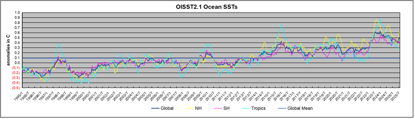
Previously I used HadSST3 for these reports, but Hadley Centre has made HadSST4 the priority, and v.3 will no longer be updated. I’ve grown weary of waiting each month for HadSST4 updates, so this report is based on data from OISST2.1. This dataset uses the same in situ sources as HadSST along with satellite indicators. Importantly, it produces daily anomalies from baseline period 1991-2020. The data is available at Climate Reanalyzer (here). Product guide is (here). The charts and analysis below is produced from the current data.
The Current Context
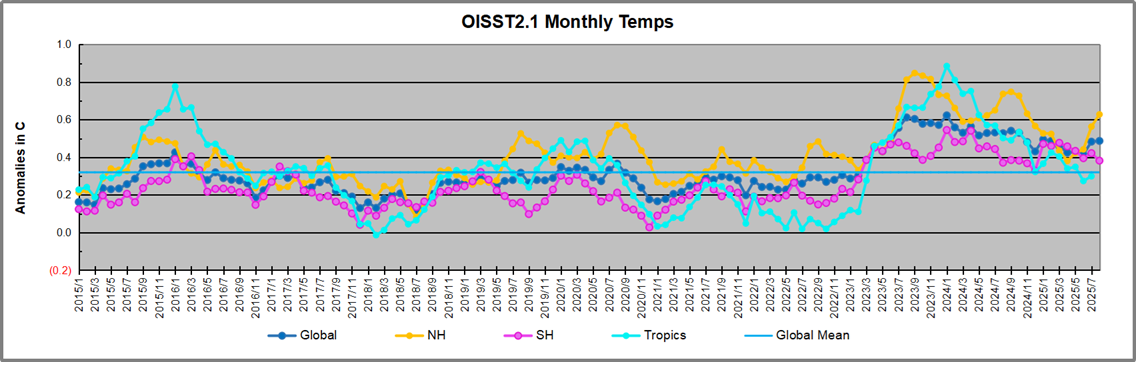
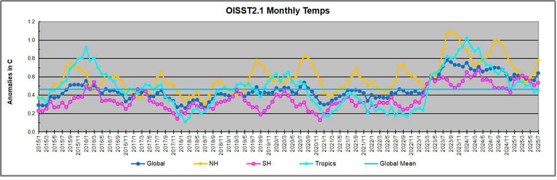
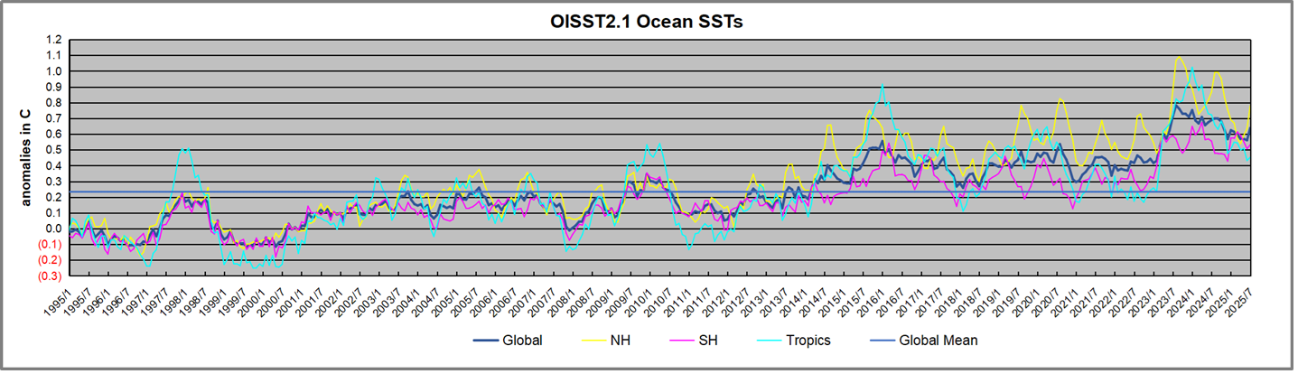
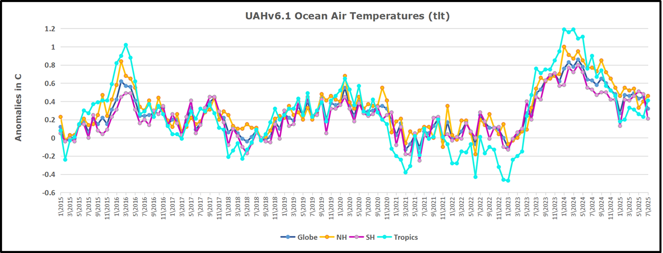
The chart below shows SST monthly anomalies as reported in OISST2.1 starting in 2015 through August 2025. A global cooling pattern is seen clearly in the Tropics since its peak in 2016, joined by NH and SH cycling downward since 2016, followed by rising temperatures in 2023 and 2024 and cooling in 2025.
Note that in 2015-2016 the Tropics and SH peaked in between two summer NH spikes. That pattern repeated in 2019-2020 with a lesser Tropics peak and SH bump, but with higher NH spikes. By end of 2020, cooler SSTs in all regions took the Global anomaly well below the mean for this period. A small warming was driven by NH summer peaks in 2021-22, but offset by cooling in SH and the tropics, By January 2023 the global anomaly was again below the mean.
Then in 2023-24 came an event resembling 2015-16 with a Tropical spike and two NH spikes alongside, all higher than 2015-16. There was also a coinciding rise in SH, and the Global anomaly was pulled up to 0.6°C in 2023, ~0.2° higher than the 2015 peak. Then NH started down autumn 2023, followed by Tropics and SH descending 2024 to the present. During 2 years of cooling in SH and the Tropics, the Global anomaly came back down, led by Tropics cooling the last 12 months from its 0.9°C peak last August, down to 0.3C in August this year. Small changes in NH and SH offset each other, leaving the global anomaly the same.
Comment:
The climatists have seized on this unusual warming as proof their Zero Carbon agenda is needed, without addressing how impossible it would be for CO2 warming the air to raise ocean temperatures. It is the ocean that warms the air, not the other way around. Recently Steven Koonin had this to say about the phonomenon confirmed in the graph above:
El Nino is a phenomenon in the climate system that happens once every four or five years. Heat builds up in the equatorial Pacific to the west of Indonesia and so on. Then when enough of it builds up it surges across the Pacific and changes the currents and the winds. As it surges toward South America it was discovered and named in the 19th century It iswell understood at this point that the phenomenon has nothing to do with CO2.
Now people talk about changes in that phenomena as a result of CO2 but it’s there in the climate system already and when it happens it influences weather all over the world. We feel it when it gets rainier in Southern California for example. So for the last 3 years we have been in the opposite of an El Nino, a La Nina, part of the reason people think the West Coast has been in drought.
It has now shifted in the last months to an El Nino condition that warms the globe and is thought to contribute to this Spike we have seen. But there are other contributions as well. One of the most surprising ones is that back in January of 2022 an enormous underwater volcano went off in Tonga and it put up a lot of water vapor into the upper atmosphere. It increased the upper atmosphere of water vapor by about 10 percent, and that’s a warming effect, and it may be that is contributing to why the spike is so high.
A longer view of SSTs
To enlarge, open image in new tab.
The graph above is noisy, but the density is needed to see the seasonal patterns in the oceanic fluctuations. Previous posts focused on the rise and fall of the last El Nino starting in 2015. This post adds a longer view, encompassing the significant 1998 El Nino and since. The color schemes are retained for Global, Tropics, NH and SH anomalies. Despite the longer time frame, I have kept the monthly data (rather than yearly averages) because of interesting shifts between January and July. 1995 is a reasonable (ENSO neutral) starting point prior to the first El Nino.
The sharp Tropical rise peaking in 1998 is dominant in the record, starting Jan. ’97 to pull up SSTs uniformly before returning to the same level Jan. ’99. There were strong cool periods before and after the 1998 El Nino event. Then SSTs in all regions returned to the mean in 2001-2.
SSTS fluctuate around the mean until 2007, when another, smaller ENSO event occurs. There is cooling 2007-8, a lower peak warming in 2009-10, following by cooling in 2011-12. Again SSTs are average 2013-14.
Now a different pattern appears. The Tropics cooled sharply to Jan 11, then rise steadily for 4 years to Jan 15, at which point the most recent major El Nino takes off. But this time in contrast to ’97-’99, the Northern Hemisphere produces peaks every summer pulling up the Global average. In fact, these NH peaks appear every July starting in 2003, growing stronger to produce 3 massive highs in 2014, 15 and 16. NH July 2017 was only slightly lower, and a fifth NH peak still lower in Sept. 2018.
The highest summer NH peaks came in 2019 and 2020, only this time the Tropics and SH were offsetting rather adding to the warming. (Note: these are high anomalies on top of the highest absolute temps in the NH.) Since 2014 SH has played a moderating role, offsetting the NH warming pulses. After September 2020 temps dropped off down until February 2021. In 2021-22 there were again summer NH spikes, but in 2022 moderated first by cooling Tropics and SH SSTs, then in October to January 2023 by deeper cooling in NH and Tropics.
Then in 2023 the Tropics flipped from below to well above average, while NH produced a summer peak extending into September higher than any previous year. Despite El Nino driving the Tropics January 2024 anomaly higher than 1998 and 2016 peaks, following months cooled in all regions, and the Tropics continued cooling in April, May and June along with SH dropping. After July and August NH warming again pulled the global anomaly higher, September through January 2025 resumed cooling in all regions, continuing February through April 2025, with little change in May,June and July despite upward bumps in NH.
What to make of all this? The patterns suggest that in addition to El Ninos in the Pacific driving the Tropic SSTs, something else is going on in the NH. The obvious culprit is the North Atlantic, since I have seen this sort of pulsing before. After reading some papers by David Dilley, I confirmed his observation of Atlantic pulses into the Arctic every 8 to 10 years.
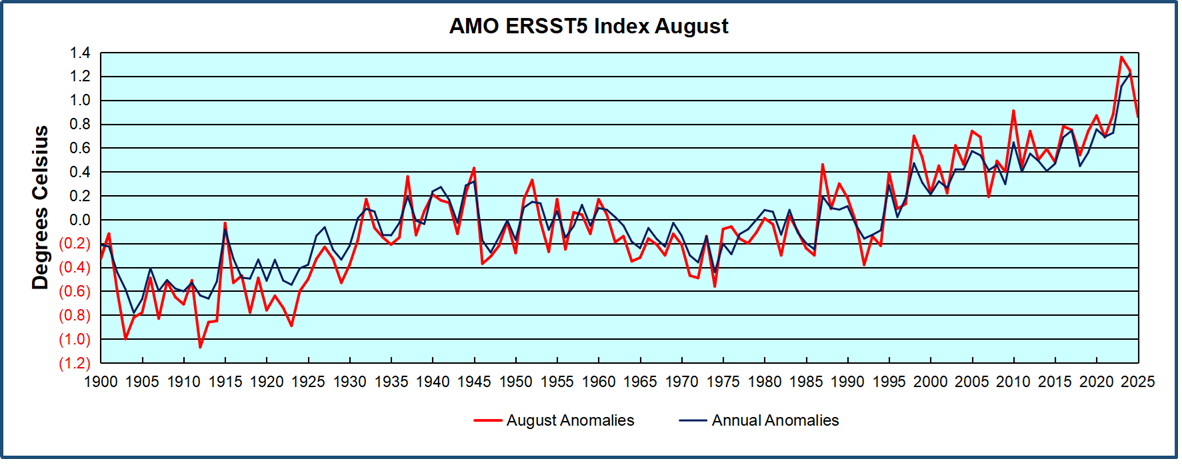
Contemporary AMO Observations
Through January 2023 I depended on the Kaplan AMO Index (not smoothed, not detrended) for N. Atlantic observations. But it is no longer being updated, and NOAA says they don’t know its future. So I find that ERSSTv5 AMO dataset has current data. It differs from Kaplan, which reported average absolute temps measured in N. Atlantic. “ERSST5 AMO follows Trenberth and Shea (2006) proposal to use the NA region EQ-60°N, 0°-80°W and subtract the global rise of SST 60°S-60°N to obtain a measure of the internal variability, arguing that the effect of external forcing on the North Atlantic should be similar to the effect on the other oceans.” So the values represent SST anomaly differences between the N. Atlantic and the Global ocean.
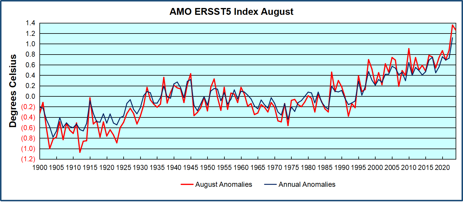
The chart above confirms what Kaplan also showed. As August is the hottest month for the N. Atlantic, its variability, high and low, drives the annual results for this basin. Note also the peaks in 2010, lows after 2014, and a rise in 2021. Then in 2023 the peak reached 1.4C before declining to 0.9 last month. An annual chart below is informative:
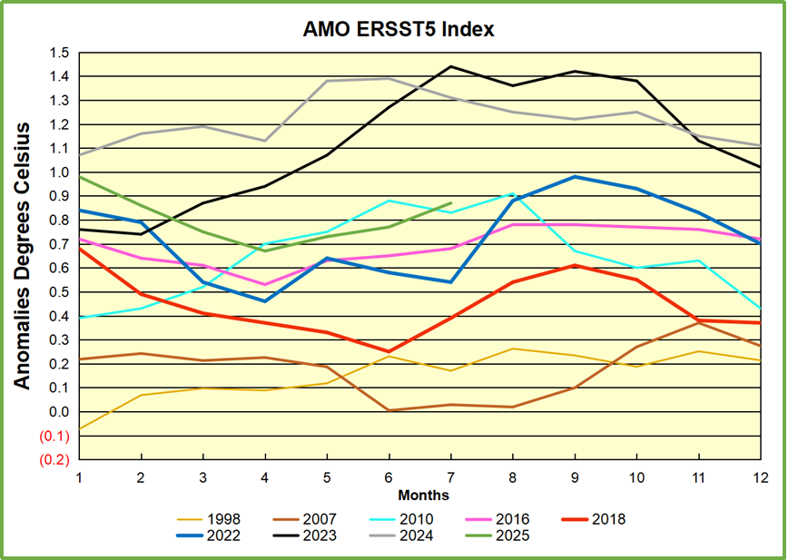
Note the difference between blue/green years, beige/brown, and purple/red years. 2010, 2021, 2022 all peaked strongly in August or September. 1998 and 2007 were mildly warm. 2016 and 2018 were matching or cooler than the global average. 2023 started out slightly warm, then rose steadily to an extraordinary peak in July. August to October were only slightly lower, but by December cooled by ~0.4C.
Then in 2024 the AMO anomaly started higher than any previous year, then leveled off for two months declining slightly into April. Remarkably, May showed an upward leap putting this on a higher track than 2023, and rising slightly higher in June. In July, August and September 2024 the anomaly declined, and despite a small rise in October, ended close to where it began. Note 2025 started much lower than the previous year and headed sharply downward, well below the previous two years, then since April through August aligning with 2010.
The pattern suggests the ocean may be demonstrating a stairstep pattern like that we have also seen in HadCRUT4.
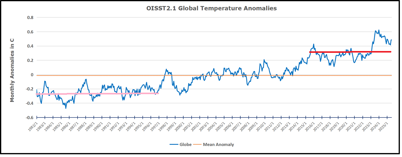
The rose line is the average anomaly 1982-1996 inclusive, value -0.25. The orange line the average 1982-2025, value -0.014 also for the period 1997-2012. The red line is 2015-2025, value 0.32. As noted above, these rising stages are driven by the combined warming in the Tropics and NH, including both Pacific and Atlantic basins.
The oceans are driving the warming this century. SSTs took a step up with the 1998 El Nino and have stayed there with help from the North Atlantic, and more recently the Pacific northern “Blob.” The ocean surfaces are releasing a lot of energy, warming the air, but eventually will have a cooling effect. The decline after 1937 was rapid by comparison, so one wonders: How long can the oceans keep this up? And is the sun adding forcing to this process?
USS Pearl Harbor deploys Global Drifter Buoys in Pacific Ocean
The post below updates the UAH record of air temperatures over land and ocean. Each month and year exposes again the growing disconnect between the real world and the Zero Carbon zealots. It is as though the anti-hydrocarbon band wagon hopes to drown out the data contradicting their justification for the Great Energy Transition. Yes, there was warming from an El Nino buildup coincidental with North Atlantic warming, but no basis to blame it on CO2.
As an overview consider how recent rapid cooling completely overcame the warming from the last 3 El Ninos (1998, 2010 and 2016). The UAH record shows that the effects of the last one were gone as of April 2021, again in November 2021, and in February and June 2022 At year end 2022 and continuing into 2023 global temp anomaly matched or went lower than average since 1995, an ENSO neutral year. (UAH baseline is now 1991-2020). Then there was an usual El Nino warming spike of uncertain cause, unrelated to steadily rising CO2, and now dropping steadily back toward normal values.
For reference I added an overlay of CO2 annual concentrations as measured at Mauna Loa. While temperatures fluctuated up and down ending flat, CO2 went up steadily by ~65 ppm, an 18% increase.
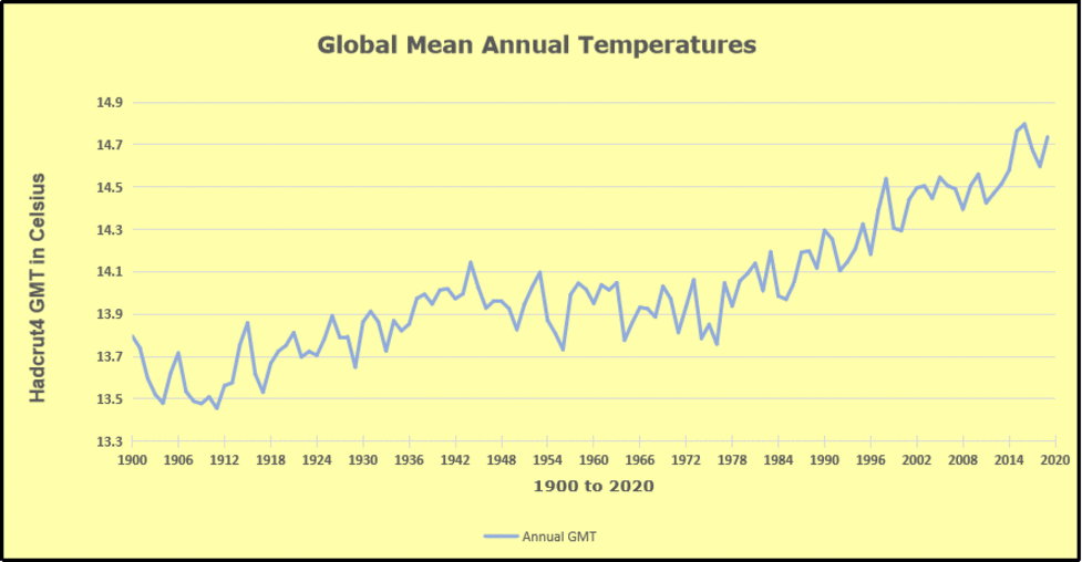
Furthermore, going back to previous warmings prior to the satellite record shows that the entire rise of 0.8C since 1947 is due to oceanic, not human activity.
The animation is an update of a previous analysis from Dr. Murry Salby. These graphs use Hadcrut4 and include the 2016 El Nino warming event. The exhibit shows since 1947 GMT warmed by 0.8 C, from 13.9 to 14.7, as estimated by Hadcrut4. This resulted from three natural warming events involving ocean cycles. The most recent rise 2013-16 lifted temperatures by 0.2C. Previously the 1997-98 El Nino produced a plateau increase of 0.4C. Before that, a rise from 1977-81 added 0.2C to start the warming since 1947.
Importantly, the theory of human-caused global warming asserts that increasing CO2 in the atmosphere changes the baseline and causes systemic warming in our climate. On the contrary, all of the warming since 1947 was episodic, coming from three brief events associated with oceanic cycles. And in 2024 we saw an amazing episode with a temperature spike driven by ocean air warming in all regions, along with rising NH land temperatures, now dropping below its peak.
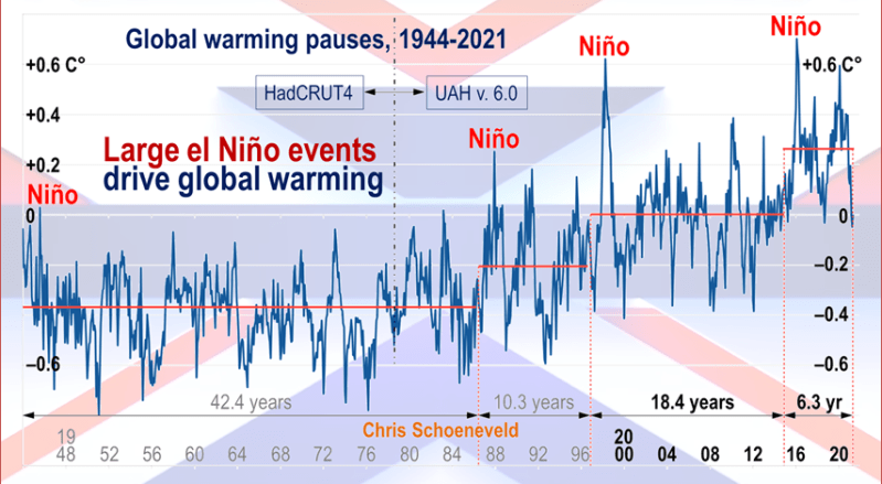
Chris Schoeneveld has produced a similar graph to the animation above, with a temperature series combining HadCRUT4 and UAH6. H/T WUWT
With apologies to Paul Revere, this post is on the lookout for cooler weather with an eye on both the Land and the Sea. While you heard a lot about 2020-21 temperatures matching 2016 as the highest ever, that spin ignores how fast the cooling set in. The UAH data analyzed below shows that warming from the last El Nino had fully dissipated with chilly temperatures in all regions. After a warming blip in 2022, land and ocean temps dropped again with 2023 starting below the mean since 1995. Spring and Summer 2023 saw a series of warmings, continuing into 2024 peaking in April, then cooling off to the present.
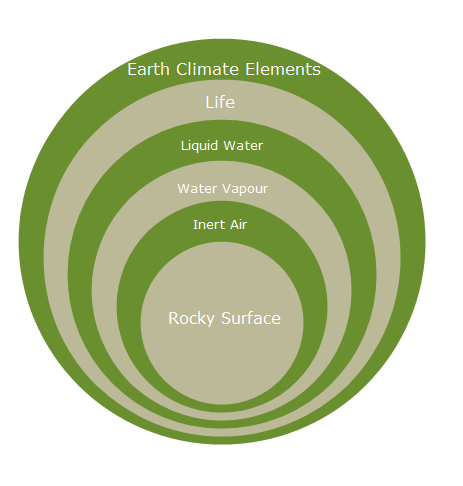
UAH has updated their TLT (temperatures in lower troposphere) dataset for August 2025. Due to one satellite drifting more than can be corrected, the dataset has been recalibrated and retitled as version 6.1 Graphs here contain this updated 6.1 data. Posts on their reading of ocean air temps this month are ahead the update from HadSST4 or OISST2.1. I posted recently on SSTs July 2025 Ocean SSTs: NH Warms Slightly. These posts have a separate graph of land air temps because the comparisons and contrasts are interesting as we contemplate possible cooling in coming months and years.
Sometimes air temps over land diverge from ocean air changes. In July 2024 all oceans were unchanged except for Tropical warming, while all land regions rose slightly. In August we saw a warming leap in SH land, slight Land cooling elsewhere, a dip in Tropical Ocean temp and slightly elsewhere. September showed a dramatic drop in SH land, overcome by a greater NH land increase. 2025 has shown a sharp contrast between land and sea, first with ocean air temps falling in January recovering in February. Then land air temps, especially NH, dropped in February and recovered in March. Now in July SH ocean dropped markedly, pulling down the Global ocean anomaly despite a rise in the Tropics. SH land also cooled by half, driving Global land temps down despite Tropics land warming.
Note: UAH has shifted their baseline from 1981-2010 to 1991-2020 beginning with January 2021. v6.1 data was recalibrated also starting with 2021. In the charts below, the trends and fluctuations remain the same but the anomaly values changed with the baseline reference shift.
Presently sea surface temperatures (SST) are the best available indicator of heat content gained or lost from earth’s climate system. Enthalpy is the thermodynamic term for total heat content in a system, and humidity differences in air parcels affect enthalpy. Measuring water temperature directly avoids distorted impressions from air measurements. In addition, ocean covers 71% of the planet surface and thus dominates surface temperature estimates. Eventually we will likely have reliable means of recording water temperatures at depth.
Recently, Dr. Ole Humlum reported from his research that air temperatures lag 2-3 months behind changes in SST. Thus cooling oceans portend cooling land air temperatures to follow. He also observed that changes in CO2 atmospheric concentrations lag behind SST by 11-12 months. This latter point is addressed in a previous post Who to Blame for Rising CO2?
After a change in priorities, updates are now exclusive to HadSST4. For comparison we can also look at lower troposphere temperatures (TLT) from UAHv6.1 which are now posted for August 2025. The temperature record is derived from microwave sounding units (MSU) on board satellites like the one pictured above. Recently there was a change in UAH processing of satellite drift corrections, including dropping one platform which can no longer be corrected. The graphs below are taken from the revised and current dataset.
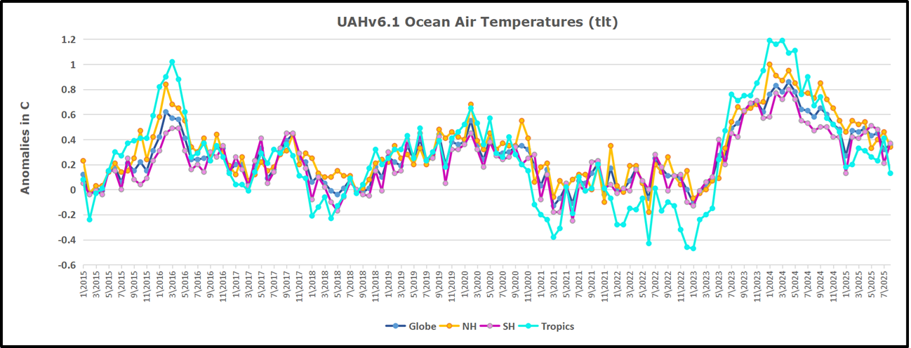
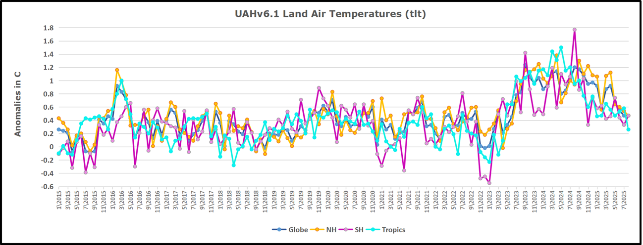
The UAH dataset includes temperature results for air above the oceans, and thus should be most comparable to the SSTs. There is the additional feature that ocean air temps avoid Urban Heat Islands (UHI). The graph below shows monthly anomalies for ocean air temps since January 2015.
In 2021-22, SH and NH showed spikes up and down while the Tropics cooled dramatically, with some ups and downs, but hitting a new low in January 2023. At that point all regions were more or less in negative territory.
After sharp cooling everywhere in January 2023, there was a remarkable spiking of Tropical ocean temps from -0.5C up to + 1.2C in January 2024. The rise was matched by other regions in 2024, such that the Global anomaly peaked at 0.86C in April. Since then all regions have cooled down sharply to a low of 0.27C in January. In February 2025, SH rose from 0.1C to 0.4C pulling the Global ocean air anomaly up to 0.47C, where it stayed in March and April. In May drops in NH and Tropics pulled the air temps over oceans down despite an uptick in SH. At 0.43C, ocean air temps were similar to May 2020, albeit with higher SH anomalies. Now in August Global ocean temps are little changed since SH rose, offsetting NH cooling and Tropics plummenting down to 0.16C from its peak of 1.24C March 2024.
Land Air Temperatures Tracking in Seesaw Pattern
We sometimes overlook that in climate temperature records, while the oceans are measured directly with SSTs, land temps are measured only indirectly. The land temperature records at surface stations sample air temps at 2 meters above ground. UAH gives tlt anomalies for air over land separately from ocean air temps. The graph updated for August is below.
Here we have fresh evidence of the greater volatility of the Land temperatures, along with extraordinary departures by SH land. The seesaw pattern in Land temps is similar to ocean temps 2021-22, except that SH is the outlier, hitting bottom in January 2023. Then exceptionally SH goes from -0.6C up to 1.4C in September 2023 and 1.8C in August 2024, with a large drop in between. In November, SH and the Tropics pulled the Global Land anomaly further down despite a bump in NH land temps. February showed a sharp drop in NH land air temps from 1.07C down to 0.56C, pulling the Global land anomaly downward from 0.9C to 0.6C. In March that drop reversed with both NH and Global land back to January values, holding there in April. In May sharp drops in NH and Tropics land air temps pulled the Global land air temps back down close to February value. In August Tropics land air dropped sharply, down from 0.58C to 0.26C, and NH land also cooled by 0.1C, offset by SH rising, resulting in no change of Global land air temps.
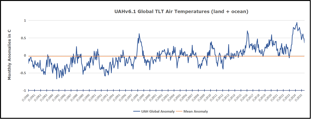
The Bigger Picture UAH Global Since 1980
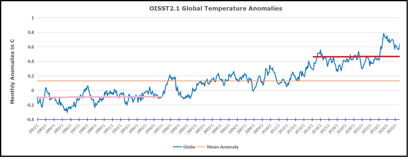
The chart shows monthly Global Land and Ocean anomalies starting 01/1980 to present. The average monthly anomaly is -0.0, 2for this period of more than four decades. The graph shows the 1998 El Nino after which the mean resumed, and again after the smaller 2010 event. The 2016 El Nino matched 1998 peak and in addition NH after effects lasted longer, followed by the NH warming 2019-20. An upward bump in 2021 was reversed with temps having returned close to the mean as of 2/2022. March and April brought warmer Global temps, later reversed
With the sharp drops in Nov., Dec. and January 2023 temps, there was no increase over 1980. Then in 2023 the buildup to the October/November peak exceeded the sharp April peak of the El Nino 1998 event. It also surpassed the February peak in 2016. In 2024 March and April took the Global anomaly to a new peak of 0.94C. The cool down started with May dropping to 0.9C, and in June a further decline to 0.8C. October went down to 0.7C, November and December dropped to 0.6C. Now in August Global Land and Ocean is down to 0.39C
The graph reminds of another chart showing the abrupt ejection of humid air from Hunga Tonga eruption.
TLTs include mixing above the oceans and probably some influence from nearby more volatile land temps. Clearly NH and Global land temps have been dropping in a seesaw pattern, nearly 1C lower than the 2016 peak. Since the ocean has 1000 times the heat capacity as the atmosphere, that cooling is a significant driving force. TLT measures started the recent cooling later than SSTs from HadSST4, but are now showing the same pattern. Despite the three El Ninos, their warming had not persisted prior to 2023, and without them it would probably have cooled since 1995. Of course, the future has not yet been written.
When Americans hear about carbon dioxide (CO2), it’s often shown as a harmful pollutant that threatens the planet. Politicians, activists, and media outlets warn that if we don’t reduce emissions right away, disaster will happen.
Preeminent “climate scientist” Al Gore told Congress in 2007, “The science is settled. Carbon dioxide emissions – from cars, power plants, buildings, and other sources – are heating the Earth’s atmosphere.” He continued warning, “The planet has a fever.”
What if the fever is instead a cold plunge? As CNN reminded us earlier this year, “Record-breaking cold: Temperatures to plunge to as much as 50 degrees below normal.”
The Weather Channel posted on Facebook last week, “Record-breaking cold temperatures for the month of August provide many their first taste of fall.” What happened to global warming?
Let’s not focus on the last year or the last fifty years. Instead, let’s look at the past 600 million years. From this perspective, the story looks very different.
Dr. Patrick Moore, cofounder of Greenpeace, authored a policy paper in 2016 titled, “The positive impact of CO2 emissions on the survival of life on earth.” Note the organization he cofounded. This is not some far-right, anti-science, fascist, Nazi, white supremacist organization, as the left would characterize anyone questioning “settled” climate science. Since its founding in 1971, Greenpeace has promoted environmental activism.
Dr. Moore, in his paper, presented this graph. The graph caption indicates that temperature and atmospheric CO2 are only loosely correlated, if at all. It’s a graph of global temperature and atmospheric CO2 concentration over the past 600 million years. Note both temperature and CO2 are lower today than they have been during most of the era of modern life on Earth since the Cambrian Period. Also, note that this does not indicate a lockstep cause-effect relationship between the two parameters.
The main point from the graph is that current CO2 levels are not dangerously high. In fact, they are quite the opposite, being some of the lowest in history. For most of Earth’s history, CO2 concentrations were many times higher than today’s 420 ppm. Even during the Cretaceous period, when dinosaurs roamed, levels were about four times higher than today.
From a geological view, our current CO2 levels are among the lowest in history. Yet climate advocates focus on a tiny rise in CO2 in recent years, ignoring the previous half billion years.
Alarmists scream that 420 ppm is unprecedented and endangers the planet’s survival. However, the reality is nearly the opposite: we could be experiencing a CO2 drought.
To my knowledge, dinosaurs didn’t drive gas-guzzling SUVs, run the air conditioner, or cook on gas stoves. Yet, miraculously, the Earth neither burned up nor became uninhabitable, as Al Gore and other climate alarmists currently predict. Instead, life thrived, diversified, and expanded to the point that I can write this article on my laptop, in the comfort of my air-conditioned home, before I fire up the grill for dinner.
What stands out is not correlation but complexity. Temperature and CO2 did not move in lockstep. Sometimes, CO2 was high during cooling periods, and other times, CO2 decreased while temperatures rose. The “lockstep causation” story falls apart when viewed over millions of years. Earth’s climate is influenced by many factors, such as solar cycles, orbital changes, volcanic activity, and ocean currents, not just a single trace gas.
CO2 makes up only 0.04% of the atmosphere, less than one part per thousand. The complexity is summarized by the Intergovernmental Panel on Climate Change (IPCC):
If CO2 has in the past reached ten times current levels without causing a runaway greenhouse effect, how can today’s modest increase be seen as an existential threat? The Earth system is more resilient than many activists admit. That resilience, demonstrated over hundreds of millions of years of survival, should humble today’s doom prophets.
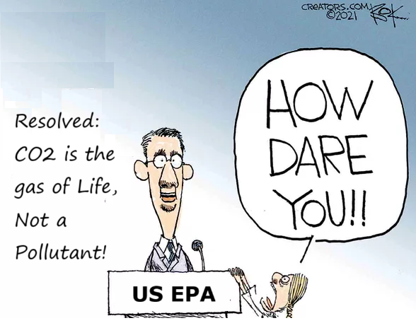
Fortunately, policymakers are beginning to see that climate alarmism is based on shaky ground. As ZeroHedge reported, Trump’s EPA plans to remove greenhouse gases from the list of regulated pollutants, recognizing that treating CO₂ like sulfur dioxide or mercury isn’t scientifically justified. They summarized the rationale well.
Trump’s reversal of EPA standards and deregulation will help the U.S. economy. More importantly, it starts the much-needed process of removing climate change brainwashing from the federal government’s vernacular. It’s time for Western civilization to abandon the climate hoax and move on.
Published February, 2025
More recently, the New York Times reported a more significant development: The EPA is now revoking its Endangerment Finding on greenhouse gases. That 2009 decision served as the legal, though not scientific, foundation for the federal government’s climate policy.
By rescinding it, the agency admits what skeptics have claimed all along. CO2 is not a poison but a natural part of the biosphere, essential for plant life, agriculture, and human survival. Simply put, CO2 is plant food and vital for life on Earth.
When even the EPA admits that the case against CO2 isn’t as strong as claimed, why should the rest of us accept the narrative of “settled science,” whether it’s about CO2 or COVID-era masks, vaccines, distancing, and lockdowns?
Perhaps the most troubling result of climate panic isn’t faulty science but poor policymaking. Fear opens the door to authoritarian control. We saw this during COVID lockdowns when extreme restrictions were justified in the name of “public health.” Climate alarmists now use the same tactics, claiming that global warming is “an existential threat.”
As HotAir recently reported, three Canadian provinces have implemented sweeping bans on entering woodland areas, citing wildfire risks and climate change. Violators face heavy fines or jail time. Critics quickly pointed out the striking similarity to so-called “climate lockdowns,” once dismissed as conspiracy theories. Yet here they are, with citizens barred from a common outdoor activity in the name of climate policy.
This isn’t environmental stewardship; it’s authoritarian social control. A government willing to close forests today will be willing to restrict cars, air travel, or even personal diets tomorrow, all justified as part of a “climate emergency.”
Once rights are limited in the name of carbon, what boundaries remain? After all, humans exhale CO2, making all human activity a threat to the species, activities that should be restricted or stopped at any cost. In other words, population control by any means necessary.
None of this is to deny that climate science involves uncertainty. Proxy data are imperfect, and today’s industrial society introduces variables that weren’t present millions of years ago. Climate sensitivity to CO2, although debated, may not be zero, but is probably negligible and not worth imposing overwhelming socioeconomic regulations and burdens on working families and developing nations.
But uncertainty cuts both ways. If the science is uncertain, then the justification for strict, top-down rules collapses. Policy should demonstrate humility, not arrogance. Instead of harsh restrictions, we should focus on balanced adaptation, resilient infrastructure, responsible energy choices, and innovation, all while maintaining freedom and prosperity.
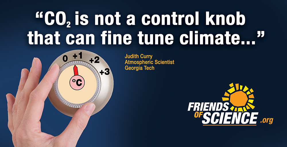
The real irony is that the more you zoom out, the less CO2 seems to be the “control knob” of climate. Over 600 million years, CO2 levels were much higher than today’s, yet Earth stayed habitable and life flourished. If anything, our current levels could be too low, raising worries about agricultural productivity and plant growth in a CO2-deficient atmosphere, which might cause starvation and desolation.
We are told to fear things that could actually be helpful. Higher CO2 levels increase crop yields, support reforestation, and restore dry lands. Calling it “pollution” goes against biology itself. CO2 is plant food, and without it, humans might face extinction like the dinosaurs.
It’s time to replace fear with perspective. Instead of shutting down people, destroying industries, or labeling farmers as villains, we should understand that CO2 is not our enemy. Climate alarmism is. Believing otherwise isn’t science; it’s superstition.
in this video, John Robson deconstructs the recent attempt to indict hydrocarbon fuel producers and deprive the world of 80% of the primary energy it needs. The transcript is in italics with my bolds and added images.
This just in. Canadian companies convicted of burning up planet after show trial. Hydrocarbon bureaucrats sentenced to economic death. As you see, this breaking news caught me on the road here in this hotel. But somebody has to say something. So for the climate discussion nexus, I’m John Robson, and this is our quick reaction response to the pseudoscientific claim that Canadian companies are destroying the earth a bit.
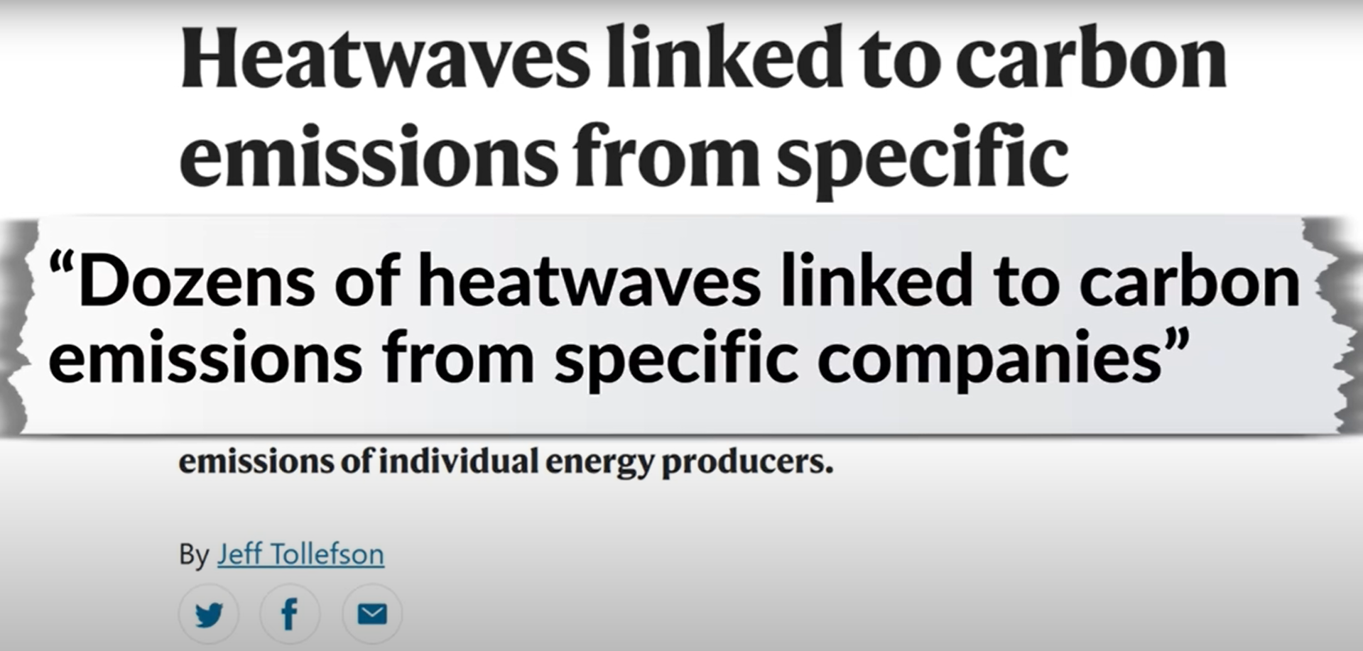
And that response is that this court has no legitimacy at all. What it’s doing is no more science than what Lysenko did. It’s politics in a wig and ugly politics at that. According to a media friendly study in Nature, complete with its own lurid press release, sorry, news article:
The weather attribution wizards have nailed not just human CO2, but yes, individual firms for causing bad weather, and they shall be sued into extinction. After all, this new weather attribution was invented to bypass the tedious necessity of detecting trends in weather before explaining them, for the very purpose not to facilitate understanding, but to facilitate lawsuits.
As Roger Pielke Jr. recently growled while examining a hatchet job on the US Department of Energy skeptical red team climate report, he said, quote, “In my areas of expertise, he had found numerous statements that were simply false. among them that world weather attribution was not created with litigation in mind.”And how does he know that that claim is false? Because he did actual research, including finding a quotation from WWA’s chief scientist, Fredericke Otto:
Unlike every other branch of climate science or science in general, event attribution was actually originally suggested with the courts in mind.”
Of course, it was. And here we go. As the Nature propaganda said:
Legal experts say it’s a line of evidence that could feed into climate litigation that focuses on specific events such as the 2021 heatwave that hammered the US Pacific Northwest in 2021. Already, a county government in Oregon has filed a 52 billion US civil lawsuit against fossil fuel companies for contributing to that event.
So, it’s revealing, and not in a good way, that the Nature Study itself credits upfront “approaches promoted by the World Weather Attribution (WWA) initiative and other Methods.”
Alarmists don’t love Weather Attribution because it conducts fair trials. They love it because it convicts everybody with roughly the subtlety of Andrey Vyshinsky or Lavrentiy Beria. But it is not science. As Patrick Brown pointed out this January, their tricks for stacking the jury box include, in this case, in order to attribute droughts to human evil and folly, they overwhelmingly studied places where drought had increased, even though globally there were more places where it decreased. You know, just in case their models let them down, but they’re not likely to. [See Beware Claims Attributing Extreme Events to Hydrocarbons]
As we noted in June, dizzy with success, the fellow travelers at CNN touted a study where:
“Using a combination of scientific theory, modern observations, and multiple sophisticated computer models, researchers found a clear signal of human-caused climate change was likely discernable with high confidence as early as 1885.”
That is before the invention of the internal combustion automobile. Now, the obvious implication here, and the correct one, is that these models would find such a signal anywhere because we’re told that in 1885, atmospheric CO2 was around 293 parts per million, just a whisker above the 280 parts per million that alarmists wrongly believe was constant in pre-industrial times. That very small change couldn’t possibly have measurably affected the weather. Such a fluctuation is very obviously noise, not signal. Especially when it’s coming from ice cores whose bubbles take decades or even centuries to seal.
Yet the source here tells us that in 1885 it was 293.3 parts per million. And this mathiness looks impressive, but it’s actually another key warning sign that something that is not science is lurching about in a stolen lab code. Real science deals in uncertainties. It shows error bars. Fake science bludgeons the public with spurious decimal places. According to the CBC’s credulous take:
“I was surprised that even the smallest carbon majors were actually very substantially contributing to the probability of the heat waves, said Yan Quilkai, a climate scientist at ETHZurich, who led the study.”
Oh, come now. Surely you suspected your rigged models would convict the defendant of a serious crime. After all, it’s what they’re for. And here we go. The study allegedly found that major oil companies alone caused more than half the supposed 1.3° C warming since pre-industrial times. And that of that share, Canadian companies caused 0.01°C.
I mean, one might retort, De minimis non curat lex ( The law does not concern itself about trifles.) if not educated in a government school, but instead in Latin or in sound constitutional and legal principles. Or you might say, get the heck out of my lab if you’ve been educated in science because there is no way, no way at all that 0.01 out of 1.30 is signal and not noise here.
Now to his credit or that of the shattered remains of his conscience, nature’s Jeff Tollefson does admit that:
“despite the eyepopping estimates for responsibilities allocated to individual carbon majors, the uncertainties remain high in many instances in large part because the most extreme heat waves are statistically rare.”
Yeah, indeed they’re so rare that there’s no statistically sound way of determining how likely they are. As we pointed out in our turning down the heat waves fact check video with regard to that 2021 Pacific Northwest heat dome that the alarmists so love:
“The heatwave could be viewed as virtually impossible without global warming. But it was virtually impossible with it as well. Sometimes weird things happen.”
What’s more, World Weather Attribution’s gleeful attribution of it to humans and our carbon original sin was eventually submitted to a serious journal and so rubbished by one of the reviewers that they had to add a bunch of disclaimers saying that of course they couldn’t really know. But did it dent their popularity or their self-confidence? Hooha. This study in Nature says, “The median estimate indicates that climate change has also increased the probability of heat waves by more than 10,000.” 10,000 what? we ask. Percent? Times?
But it gets worse because this kind of talk suggests that they know how common and intense heat waves were around 1850, and how common and intense they are now. But they don’t. They have no idea. There weren’t systematic measurements of daily temperature in most of the world even into the mid 20th century. And the proxies when you go further back certainly give no idea how common or intense they were even a century ago, let alone 500 years.
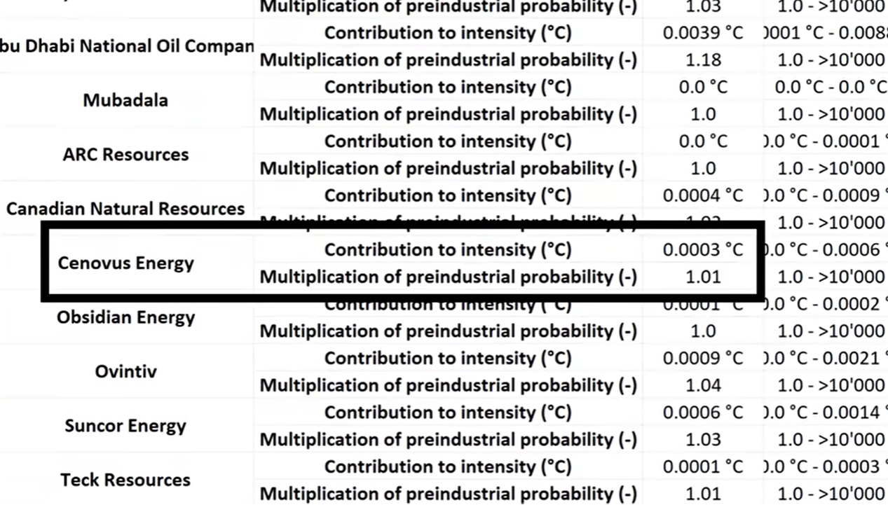
So they’re making it up, then hiding it with decimals, saying in a spreadsheet attached to the study that, for instance, Cenovus Energy alone increased the probability of an early 2009 heatwave in Victoria, New South Wales and Tasmania’s northern provinces by 1.01% and its intensity by, get this, 0.0003°C. Four decimal places. As the Duke of Wellington once said, “If you believe that, you’ll believe anything.”
It’s also anti-scientific to claim to give a change in global temperature to two decimal places over the last 175 years when nobody knows the temperature anywhere to within one decimal place a century ago. And another thing we actually do know that during the Holocene era the earth has cycled regularly between warmer and cooler periods including down from the medieval warm period into the little ice age and back up after 1850.
So at least some of the warming since must by any logical standard have been natural. In which case they’re blaming oil companies alone for more than the entire human contribution. But the attributors duck this absurdity by absurdly assuming that it’s basically all on us. The chutzpah here is astounding. But it’s exactly the kind of thing they do.
And if you use the same warped modeling to assess the shares of some other human activity, you’d dependably get a searing indictment. And in fact, if you used it on all of them, I’ll bet you you’d get over a 100% of that 1.3 degrees C, never mind if whatever smaller share actually wasn’t natural. But they don’t run that kind of test because what they’re doing isn’t science. They’re not seeking truth and testing theories ruthlessly. They’re zealots shrieking about enemies of the people.
They also write:
“with reference to 1850 to 1900, climate change has increased the median intensity of heat waves by 1.36°C over 2000 to 2009, of which 0.44°C is traced back to the 14 top carbon majors and 0.22°C to the 166 others. These contributions correspond respectively to 32% and 16% of the overall effect of climate change.”
And again, it sounds precise, all right, but climate change is a statistical description of changes in long-term weather. It isn’t a causal force. So, they don’t even know what climate change is. And all those double decimals swirling around trying to hypnotize you are a dead giveaway that they’re in over their heads or worse. And it is worse because they also don’t know what science is. They don’t do counterfactuals and consider what extreme events might have been prevented by warming as well as caused by it.
And they’re certainly not comparing known extreme events today with known extreme events in the past.Instead, they take what did happen and sometimes what didn’t, match it against invented scenarios to prove that we caused bad weather. And then they say, “Gotcha.” when the computer Julie says, “Yes, we caused bad weather.” And then they speed dial their lawyer.
That CBC item included the usual guff from the usual suspects, including Naomi Oreskes. It said,
“referring to previous research from her and other experts showing major oil companies knew about the impacts of carbon emissions and the dangers of global warming decades before countries started enacting climate policies.”
Right? Trotsky was a conscious agent of fascism and imperial oil has been trying to incinerate the earth for half a century and now it’s been proved to two decimal places to the satisfaction of people in the media who barely survived grade 10 math. So, while speaking of people not doing science when it is their job, let us also mention people not doing journalism when it is their job.
CTV, for instance, pounced on the supposed study and shrieked, “These Canadian companies among humanity’s biggest carbon emitters study says.” But the study says nothing of the kind. And in fact, nor really does the story, which includes this bit:
“The 14 largest carbon emitters were led by fossil fuel and coal producers from the former Soviet Union and China, followed by oil companies Saudi Aramco, Gasprom, and Exxon Mobile. Together, they made the same contribution to climate change as the remaining 166 entities, according to the study.”
So, Canada’s eight enemies of humanity actually ranked between 70th and 163rd. And together, they supposedly warmed the planet by 0.01°C over nearly two centuries. Which means if they kept at it for another 1750 years, they might warm the place by 0.1° C. And anyone who tells you they can calculate the impact on the weather of such a trivial change is a charlatan and a rogue. And journalists who parrot such claims without any attempt to do basic math, let alone probe how the authors think they know these things, or what other views exist, belong at Pravda, not in free world newspapers.
Now, before concluding, your honor, we wish to say one thing directly to the prisoners currently slumped in the dock or on the lam. The CBC reported that it: “reached out to several carbon majors mentioned in the story, but they either declined to comment or didn’t respond by publication time.” Likewise: “Nature also reached out to the following companies for comment on the study’s findings, but did not receive a response. BP, Shell, Chevron, National Iranian Oil Company, and Coal India.”
And what indeed could they say? The hydrocarbon energy companies have for too long and with too few exceptions followed a strategy of appeasement, confessing on the science and groveling on the policy, endorsing net zero in the hope of being the last one shot. But since everybody gets shot, it was always a terrible plan. And with the execution fast approaching, it’s time to abandon it.
Of course, if you honestly believe that your product is destroying the Earth, you should say so and get the heck out of that line of work. But if you don’t believe it, stand up for yourselves and not just by saying that the other companies are worse. Because these climate fanatics are not going to stop. They plan to destroy you using pseudoscience to win lawfare. They intend to sue you into oblivion. You, the companies that the rest of us rely on to avoid starving and freezing, and then they’re going to wonder why it got dark all of a sudden. And darkness at noon in the lab definitely has something to do with it.
So, please don’t just stand there. Say something.
Plead not guilty because you’re not and they are.
For the climate discussion nexus, I’m John Robson and that’s our quick response to this Nature study indicting oil companies for setting the planet on fire.
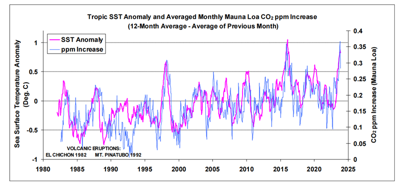
Close examination of the small perturbations within the atmospheric CO2 trend, as measured at Mauna Loa, reveals a strong correlation with variations in sea surface temperatures (SSTs), most notably with those in the tropics. The temperature-dependent process of CO2 degassing and absorption via sea surfaces is well-documented, and changes in SSTs will also coincide with changes in terrestrial temperatures, and temperature-dependent changes in the marine and terrestrial biospheres with their associated carbon cycles.
Using SST and Mauna Loa datasets, three methods of analysis are presented that seek to identify and estimate the anthropogenic and, by default, natural components of recent increases in atmospheric CO2, an assumption being that changes in SSTs coincide with changes in nature’s influence, as a whole, on atmospheric CO2 levels. The findings of the analyses suggest that an anthropogenic component is likely to be around 20 %, or less, of the total increase since the start of the industrial revolution.
The inference is that around 80 % or more of those increases are of natural origin, and indeed the findings suggest that nature is continually working to maintain an atmospheric/surface CO2 balance, which is itself dependent on temperature. A further pointer to this balance may come from chemical measurements that indicate a brief peak in atmospheric CO2 levels centred around the 1940s, and that coincided with a peak in global SSTs.
Research into the influence SSTs have on changes in atmospheric CO2 includes the work by Humlum et al. (2013). When examining phase relationships, they found a maximum correlation for changes in atmospheric CO2 lagging 11-12 months behind those of global SSTs [1]. A paper by the late Fred Goldberg (2008) noted their correlation by examining El Niño events [2]. He also considered Henry’s law [3] in relation to SSTs, i.e. a temperature-dependent equilibrium between atmospheric CO2 and its solubility in seawater. Spencer (2008) also noted similarities between surface temperature variations with changes in atmospheric CO2 [4].
For the oceans specifically, areas of surface CO2 absorption and degassing are shown in maps provided by NOAA [5] and ESA [6] for example. These maps show that colder sea surfaces towards the poles are net absorbers of CO2 whilst the warmer surface waters of the tropics are net emitters. An analogy often cited is the greater ability of carbonated drinks to retain CO2 at cooler temperatures; this ability drops as the drinks get warmer.
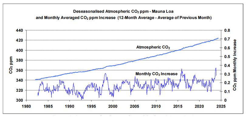
Figure 1: Deseasonalised atmospheric CO2 data (Mauna Loa).
A strong correlation between changes in atmospheric CO2 and SSTs can be readily discerned from the relevant datasets. To illustrate, the upper graph in Fig. 1 plots atmospheric CO2 in parts per million (ppm) as measured at Mauna Loa, Hawaii, since 1982. The data [7] has been ‘deseason-alised’ by NOAA to remove natural annual CO2 cycles.
The similarity between the two traces is striking: short-term fluctuations in CO2 readings at Mauna Loa appear particularly sensitive to tropic conditions (if tropic SSTs are substituted for global SSTs in Fig. 2, the correlation is less strong). Warm tropical seas, with surface temperatures typically around 25-30 oC, cover almost one third of the earth’s surface. The most prominent peaks in the figure coincide with strong El Niño events. Taken at face value, and ignoring any influence from anthropogenic emissions, Fig. 2 suggests that if the tropic SST anomaly dropped to around -1 oC (with related drops globally) then the concentration of CO2 in the atmosphere, as measured at Mauna Loa, would level off.
Robbins, 2025 Figure 2: Global tropic SSTs overlaid onto monthly atmospheric CO2 increases (Mauna Loa)
An important point is that changes in SSTs will coincide with those of terrestrial temperatures, temperature-dependent changes to both terrestrial and marine carbon cycles and, taking into consideration the research by Humlum et al. (2013) who found that changes in atmospheric CO2 followed changes in SSTs, an assumption in the work presented here is that nature’s influence on atmospheric CO2 levels, as a whole, follows on from changes in SSTs.
Discussion
The techniques used in Analyses 1 and 2, aimed at discerning and estimating the human contribution to recent increases in atmospheric CO2, are based on processing of monthly data from both SST and atmospheric CO2 datasets. Using the technique described in Analysis 1, no contribution from human emissions to the measured increases in atmospheric CO2, since 1995, was discerned. Given an approximate 60 % increase in annual human emissions since 1995 this suggests, by itself, that any human contribution to the measured increases is likely to be relatively small compared to nature’s contribution.
For the technique described in Analysis 2, a figure of ~27 ppm was estimated for a possible human contribution out of a total increase of 143 ppm since 1850, equating to around 19 % of the total increase in atmospheric CO2 since the start of the industrial revolution. Thus the results of these two analyses, taken together, suggest that nature appears to account for around 80 % or more of increases in atmospheric CO2 since 1995.
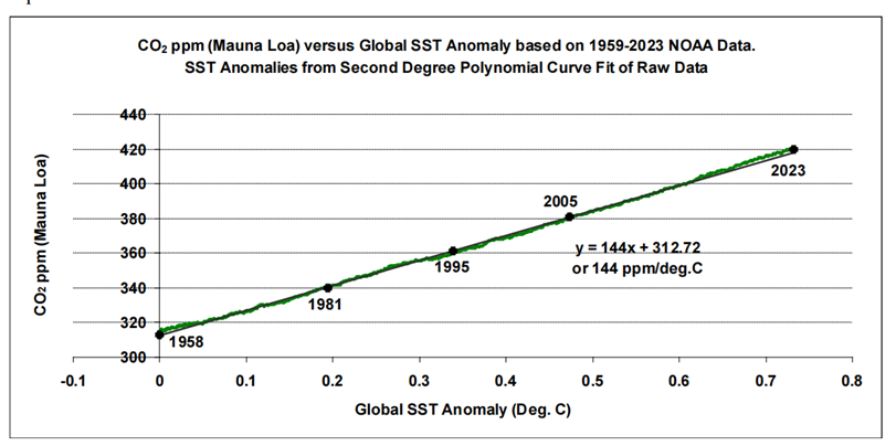
The technique described in Analysis 3 examines the relationship between longer-term trends in SST datasets and atmospheric CO2 measurements. This data analysis goes as far back as the late 1950s, when the ongoing acquisition of atmospheric CO2 measurements began at Mauna Loa. The resulting three graphs show an apparent almost-linear long-term relationship between SSTs and atmospheric CO2. Linear trend lines fitted to these graphs produce gradients of between ~120 and ~145 ppm/ 0C for the three SST datasets examined.
Figure 15: Atmospheric CO2 as a function of global SST trend since 1958
As for anthropogenic CO2, published figures (e.g. GCB data) suggest a roughly linear relationship between cumulative anthropogenic emissions as a function of time, and atmospheric CO2 measurements from Mauna Loa. If it’s reasoned that this mostly accounts for the linear trends as calculated in Analysis 3, this reasoning would not fit with the findings of the first two analysis methods that suggest 80 % or more of recent atmospheric CO2 increases are of natural origin.
Conclusions
Analyses of SST and atmospheric CO2 data, acquired since 1995, produce an estimated atmospheric CO2 increase, possibly attributed to human emissions, of around 20 %, or less, of the total increase since the industrial revolution, thus inferring that around 80 % or more of the increase is of natural origin.
Further data examination points to an almost linear longer-term relationship between SSTs and atmospheric CO2 since at least the late 1950s, and is suggestive of nature working to maintain a temperature-dependent atmosphere/surface CO2 balance. Recent historical evidence of such a balance may come from chemical measurements that indicate a brief peak in atmospheric CO2 levels centred around the 1940s, and that coincided with a peak in global SSTs.
Human emissions of CO2 are about 1/20-th of the natural turnover, and the findings of the analyses presented here suggest that this relatively-small human contribution is being readily incorporated into nature’s carbon cycles as they continually adjust to our constantly-changing climate.
As for surface temperatures, the research by Humlum et al. concluded that changes in atmospheric temperature are an ‘effect’ of changes in SSTs and not a ‘cause’ as some might advocate. And Humlum’s ‘take home’ message from a recent presentation was:
‘What controls the ocean surface temperature, controls the global climate’ [33]. He suggests the sun would be a good candidate, modulated with the cloud cover.
The best context for understanding decadal temperature changes comes from the world’s sea surface temperatures (SST), for several reasons:
The ocean covers 71% of the globe and drives average temperatures;
SSTs have a constant water content, (unlike air temperatures), so give a better reading of heat content variations;
A major El Nino was the dominant climate feature in recent years.
Previously I used HadSST3 for these reports, but Hadley Centre has made HadSST4 the priority, and v.3 will no longer be updated. I’ve grown weary of waiting each month for HadSST4 updates, so this report is based on data from OISST2.1. This dataset uses the same in situ sources as HadSST along with satellite indicators. Importantly, it produces daily anomalies from baseline period 1982-2010. The data is available at Climate Reanalyzer (here). Product guide is (here). The charts and analysis below is produced from the current data.
The Current Context
The chart below shows SST monthly anomalies as reported in OISST2.1 starting in 2015 through July 2025. A global cooling pattern is seen clearly in the Tropics since its peak in 2016, joined by NH and SH cycling downward since 2016, followed by rising temperatures in 2023 and 2024 and cooling in 2025.
Note that in 2015-2016 the Tropics and SH peaked in between two summer NH spikes. That pattern repeated in 2019-2020 with a lesser Tropics peak and SH bump, but with higher NH spikes. By end of 2020, cooler SSTs in all regions took the Global anomaly well below the mean for this period. A small warming was driven by NH summer peaks in 2021-22, but offset by cooling in SH and the tropics, By January 2023 the global anomaly was again below the mean.
Then in 2023-24 came an event resembling 2015-16 with a Tropical spike and two NH spikes alongside, all higher than 2015-16. There was also a coinciding rise in SH, and the Global anomaly was pulled up to 0.8°C in 2023, ~0.2° higher than the 2015 peak. Then NH started down autumn 2023, followed by Tropics and SH descending 2024 to the present. During 2 years of cooling in SH and the Tropics, the Global anomaly came back down, led by NH cooling the last 12 months from its 1.0°C peak last August, down to 0.5C in April this year.. Further declines in Tropics and SH offset NH warming in May and June, and now in July 2025 a slight upward bump in Global anomaly over 0.6°C.
Comment:
The climatists have seized on this unusual warming as proof their Zero Carbon agenda is needed, without addressing how impossible it would be for CO2 warming the air to raise ocean temperatures. It is the ocean that warms the air, not the other way around. Recently Steven Koonin had this to say about the phonomenon confirmed in the graph above:
El Nino is a phenomenon in the climate system that happens once every four or five years. Heat builds up in the equatorial Pacific to the west of Indonesia and so on. Then when enough of it builds up it surges across the Pacific and changes the currents and the winds. As it surges toward South America it was discovered and named in the 19th century It iswell understood at this point that the phenomenon has nothing to do with CO2.
Now people talk about changes in that phenomena as a result of CO2 but it’s there in the climate system already and when it happens it influences weather all over the world. We feel it when it gets rainier in Southern California for example. So for the last 3 years we have been in the opposite of an El Nino, a La Nina, part of the reason people think the West Coast has been in drought.
It has now shifted in the last months to an El Nino condition that warms the globe and is thought to contribute to this Spike we have seen. But there are other contributions as well. One of the most surprising ones is that back in January of 2022 an enormous underwater volcano went off in Tonga and it put up a lot of water vapor into the upper atmosphere. It increased the upper atmosphere of water vapor by about 10 percent, and that’s a warming effect, and it may be that is contributing to why the spike is so high.
A longer view of SSTs
To enlarge, open image in new tab.
The graph above is noisy, but the density is needed to see the seasonal patterns in the oceanic fluctuations. Previous posts focused on the rise and fall of the last El Nino starting in 2015. This post adds a longer view, encompassing the significant 1998 El Nino and since. The color schemes are retained for Global, Tropics, NH and SH anomalies. Despite the longer time frame, I have kept the monthly data (rather than yearly averages) because of interesting shifts between January and July. 1995 is a reasonable (ENSO neutral) starting point prior to the first El Nino.
The sharp Tropical rise peaking in 1998 is dominant in the record, starting Jan. ’97 to pull up SSTs uniformly before returning to the same level Jan. ’99. There were strong cool periods before and after the 1998 El Nino event. Then SSTs in all regions returned to the mean in 2001-2.
SSTS fluctuate around the mean until 2007, when another, smaller ENSO event occurs. There is cooling 2007-8, a lower peak warming in 2009-10, following by cooling in 2011-12. Again SSTs are average 2013-14.
Now a different pattern appears. The Tropics cooled sharply to Jan 11, then rise steadily for 4 years to Jan 15, at which point the most recent major El Nino takes off. But this time in contrast to ’97-’99, the Northern Hemisphere produces peaks every summer pulling up the Global average. In fact, these NH peaks appear every July starting in 2003, growing stronger to produce 3 massive highs in 2014, 15 and 16. NH July 2017 was only slightly lower, and a fifth NH peak still lower in Sept. 2018.
The highest summer NH peaks came in 2019 and 2020, only this time the Tropics and SH were offsetting rather adding to the warming. (Note: these are high anomalies on top of the highest absolute temps in the NH.) Since 2014 SH has played a moderating role, offsetting the NH warming pulses. After September 2020 temps dropped off down until February 2021. In 2021-22 there were again summer NH spikes, but in 2022 moderated first by cooling Tropics and SH SSTs, then in October to January 2023 by deeper cooling in NH and Tropics.
Then in 2023 the Tropics flipped from below to well above average, while NH produced a summer peak extending into September higher than any previous year. Despite El Nino driving the Tropics January 2024 anomaly higher than 1998 and 2016 peaks, following months cooled in all regions, and the Tropics continued cooling in April, May and June along with SH dropping. After July and August NH warming again pulled the global anomaly higher, September through January 2025 resumed cooling in all regions, continuing February through April 2025, with little change in May,June and July despite upward bumps in NH.
What to make of all this? The patterns suggest that in addition to El Ninos in the Pacific driving the Tropic SSTs, something else is going on in the NH. The obvious culprit is the North Atlantic, since I have seen this sort of pulsing before. After reading some papers by David Dilley, I confirmed his observation of Atlantic pulses into the Arctic every 8 to 10 years.
Contemporary AMO Observations
Through January 2023 I depended on the Kaplan AMO Index (not smoothed, not detrended) for N. Atlantic observations. But it is no longer being updated, and NOAA says they don’t know its future. So I find that ERSSTv5 AMO dataset has current data. It differs from Kaplan, which reported average absolute temps measured in N. Atlantic. “ERSST5 AMO follows Trenberth and Shea (2006) proposal to use the NA region EQ-60°N, 0°-80°W and subtract the global rise of SST 60°S-60°N to obtain a measure of the internal variability, arguing that the effect of external forcing on the North Atlantic should be similar to the effect on the other oceans.” So the values represent SST anomaly differences between the N. Atlantic and the Global ocean.
The chart above confirms what Kaplan also showed. As August is the hottest month for the N. Atlantic, its variability, high and low, drives the annual results for this basin. Note also the peaks in 2010, lows after 2014, and a rise in 2021. Then in 2023 the peak was holding at 1.4C before declining. An annual chart below is informative:
Note the difference between blue/green years, beige/brown, and purple/red years. 2010, 2021, 2022 all peaked strongly in August or September. 1998 and 2007 were mildly warm. 2016 and 2018 were matching or cooler than the global average. 2023 started out slightly warm, then rose steadily to an extraordinary peak in July. August to October were only slightly lower, but by December cooled by ~0.4C.
Then in 2024 the AMO anomaly started higher than any previous year, then leveled off for two months declining slightly into April. Remarkably, May showed an upward leap putting this on a higher track than 2023, and rising slightly higher in June. In July, August and September 2024 the anomaly declined, and despite a small rise in October, ended close to where it began. Note 2025 started much lower than the previous year and headed sharply downward, well below the previous two years, then in May, June and now July aligning with 2010.
The pattern suggests the ocean may be demonstrating a stairstep pattern like that we have also seen in HadCRUT4.
The rose line is the average anomaly 1982-1996 inclusive, value -0.10. The orange line the average 1982-2025, value 0.13, also for the period 1997-2012. The red line is 2015-2025, value 0.46. As noted above, these rising stages are driven by the combined warming in the Tropics and NH, including both Pacific and Atlantic basins.
The oceans are driving the warming this century. SSTs took a step up with the 1998 El Nino and have stayed there with help from the North Atlantic, and more recently the Pacific northern “Blob.” The ocean surfaces are releasing a lot of energy, warming the air, but eventually will have a cooling effect. The decline after 1937 was rapid by comparison, so one wonders: How long can the oceans keep this up? And is the sun adding forcing to this process?
USS Pearl Harbor deploys Global Drifter Buoys in Pacific Ocean
When it comes to the recent DOE Climate Review, legacy media coverage is lop-sided and limited to declarations of disgust and dismissal from climate insiders. Andrew Bolt in Australia is an exception, interested as he is in why climatists find the study so annoying. So his interview with one of the authors explores the controversy and why the media is averting their attention.
For those preferring to read, below is a transcript from the closed captions in italics wtih my bolds and added images. AB refers to Bolt and SK to Koonin
AB: I’m amazed how little attention the media has given to a new report on global warming I mentioned last week. I’m not that surprised to be honest. I mean, I’ve seen how the media ignores proof that the warming scare is grossly exaggerated, but I think you deserve to know more about this report.
In the United States, Chris Wright is the brilliant gas tycoon who now leads the US Department of Energy. He hired five very prominent climate experts to report back to the government on what the climate was really doing and whether we could trust predictions by the most popular climate models that we’re facing dangerous warming of at least 3 degrees this century and we’re already copying all sorts of climate disasters.
Well, the authors’ conclusion was that the climate models are actually unreliable. They’re all over the shop. They predict probably one degree more warming than is likely and we aren’t getting many of the predicted climate disasters. Plus, global warming also has benefits that are often ignored, especially a big increase in trees and crops that we’ve been seeing, a greening of the planet.
And in this report, the authors sum it all up like this. models, the climate models and experience suggests that carbon dioxide induced warming may be less damaging economically than commonly believed and excessively aggressive mitigation policies, you might include our own net zero schemes, could prove more detrimental than beneficial. [See DOE Climate Team: Twelve Keys in Assessing Climate Change]
So, you can understand why the authors have since been absolutely trashed for daring to doubt the climate scare and upsetting the climate industry. They’ve been called all sorts of names painted as fools, frauds, Donald Trump Toadies, even Stalinists, would you believe? But don’t be fooled by the abuse because the five authors are in fact very prominent experts. Professor emeritus Judith Curry has published 192 peer-reviewed papers on the climate. Dr. Roy Spencer, NASA senior scientist runs probably the most accurate measure of world temperature. Professor Ross McKitrick is an expert reviewer of the last three reports of the IPCC (intergovernmental panel on climate change). And distinguished professor John Christie, is a former lead author of an IPCC report. I mean, these are very serious people.
Plus Steven Koonin. He’s a physicist and former under secretary of science for President Barack Obama, a Democrat. And I am joined by Steven, Steve thank you so much for your time. Why did you and the other four experts behind this report actually agree to do it when you must have known the climate industry and the media would really go after you?
SK: Indeed. But you know, all five of us scientists have long felt that the science was misrepresented to the public and the decision makers, and we wanted to do our best to set the record straight.
AB: Well, on many points your report agrees with what I’ll call the consensus, the alarmist position, perhaps the position of the United Nations Intergovernmental Panel on Climate Change. You say, “Yes, global warming is real. Yes, it’s a problem. Yes, it’s caused in part by humans.” Now, tell us where you disagree with this consensus.
SK: Well, you know, people have said 95% of our report agrees with or is taken right out of the IPCC. It’s just that there are aspects of what the consensus says that do not find their way to the public. For example:
♦ There are no detectable trends in the great majority of extreme weather types.
♦ The models that we use to project climates into the future are demonstrably deficient. They’re in many ways all over the place in terms of their projections. And,
♦ The projected impacts of future climate change, even using those deficient models, are minimal.
These are very important central points that are there in the report
but do not make their way into the public discussion.
AB: You actually point out that the models tend to run hot, as in predict more warming than we’ve had. They’re unreliable. A number of basing false assumptions of how much emissions we’re going to get. You actually predict almost one degree less warming over the century than the IPCC model consensus. How important is that?
SK: Well, to be clear, we don’t predict. We simply cite and assess the work of others. But certainly, if the warming is a degree less than what the IPCC consensus says, that’s a big deal.
AB: And what about the climate disasters? I mean, every time like we’ve got it right now, you know, we’ve got some algae blooming off the South Australian coast. Global warming. We get heavy rain, global warming. We get a drought, global warming. How much influence has man-made warming really had from the work that you’ve done in this report? How much has it really influenced the natural disasters we tend to see?
SK: Yeah, you know, people have a very short memory for weather disasters. There’s a lovely example that turned up at the beginning of July, having to do with the floods in Texas that we that were a terrible tragedy. But if you look back in the records, you can find the same kind of event happening in the same place in 1900. And of course, human influences on the climate were much smaller in 1900. And so you have a very hard time to logically attributing the recent disaster to carbon dioxide.
The same is true for many other severe weather phenomena.
They happened in the past. They’re just relatively rare. And so
we get surprised when we see them happen in the present day.
AB: Yeah. I noticed for instance in your report you say the number of heat waves in America actually peaked nearly 100 years ago.
SK: The number of heat waves that were striking America at the time, and what we see now is much less, you know. The damning thing about the heat waves is that we really don’t understand why the 30s were so much warmer than it has been in many subsequent decades. And that speaks to our rather poor understanding of the ways in which the climate varies.
AB: I think the real thing about your report that’s annoying so many people in the climate industry is this. You say the warming will be less than what most people are claiming. You say the disasters from the warming we’ve seen are basically exaggerated. They’re not that many that you can point to. And the the attempts we make to stop all this are very expensive. And well, do they really work? Isn’ it the takeaway here, that it might not actually be worth trying to stop what isn’t the the climate disaster that many claim.
SK: Absolutely. You know, in deciding what to do, we have to balance the hazards, the certainties and uncertainties in the changing climate against other considerations. Like the world needs more and more energy, and in deciding what to do you have to look at the costs. Are they going to be effective? What about equity between generations, between countries, and so on. It’s not simply that, oh my god, we’ve broken the climate and we’ve got to fix it. And I do think some people get annoyed when we start to expose those nuances of the situation.
AB: Oh yes. So you’ve really offended in the church of climate. And of course you also stress what’s undeniably true. The greening of the planet is actually a benefit of extra carbon dioxide in the atmosphere. More trees, more plants, more food.
SK:Agricultural yields have in fact doubled over the last 60 years or so. And a good fraction of that, NASA says 75% is attributable to higher carbon dioxide levels. You know, if you look inside a hot house, we put the carbon dioxide levels typically up to about 1,200 parts per million, which is just about three times what you find in the atmosphere even now.
AB: Now, you’ve come under massive attack, of course, Steve Koonin. I mean, environmental groups are even suing to censor the report. You’ve got media outlets of the left demonizing you, running so-called fact checks. I’ve had a look at a few, and they’re not persuasive. Some climate scientists are abusing you, claiming, you know, the group of you are just handpicked skeptics, even though you used to be with the Obama administration. Have there been any criticisms of your report that you think, “Yep, that’s fairenough. we’ve goofed here or we haven’t taken this into consideration. Any criticism you think you can you should take on the chin?
SK: Well, we’ve seen one already that we basically made a a typographical error in one of the footnotes. We have acknowledged that to the person who pointed it out and of course we will fix it. But you know, we’re refraining right now from looking in detail at the criticisms till they come in over the next couple weeks through the public portal. Then as we have promised, we will deal with every serious criticism seriously and like good scientists we will modify the report as might be warranted from those criticisms.
AB: Steve Koonin, you’ve been fighting the alarmism for some time now. I think this is your your weightiest blow against the scaremongering. So congratulations and thank you so much for your time.
The above interview was conducted by NTD news with CO2 Coalition founder William Happer (WH) and Executive Director Gregory Wrightstone (GW). For those preferring to read, below is a transcript from the closed captions in italics with my bolds and added images.
NTD: The Environmental Protection Agency’s Lee Z eldin announced a proposal earlier this week to overturn a 16-year-old scientific finding from the Obama administration. It allowed three administrations to regulate greenhouse gas emissions like CO2. If successful, this would roll back climate rules on cars, undo $1 trillion in regulatory costs, and save over $54 billion each year. With the public comment period now open, here to break down what all of this means are two guests. William Happer, professor emeritus at Princeton University department of physics, and Gregory Wrightstone, geologist and executive director of the CO2 coalition. Thank you both so much for being here.
Now, first, how big of a deal would this be, repealing the 2009 endangerment finding? Who has benefited under it so far?
WH: Well, I’m not sure who you asked this question, but I will answer it and Greg can add to what I say. This is something that was long overdue. I mean, it was a ridiculous regulation that purported that carbon dioxide, which all of us breathe out, is a pollutant. I mean, I can’t think of anything dumber than that, but that’s what it was. And so finally there’s been an administration with the courage to tell the truth, that it isn’t a pollutant at all and it’s actually good for the earth to have more carbon dioxide.
NTD: What is the likely legal process of repealing this? And Gregory, this finding was the legal prerequisite used by the Obama and Biden administrations to regulate new car and engine emissions. What is the likely legal process of repealing this now?
GW: Well, this right now is just dealing with cars and light trucks and vehicles, but it’s sure to extend into the other things. Your viewers have had their freedom systematically eroded using the endangerment finding. With this endangerment finding, they’ve been able to tell you what car kind of car to drive. Look at the ceiling fan over your head, regulate that. All these electrical devices, your washer, dryer, dishwasher. the only ones you can buy today are government approved devices because of the endangerment finding. So what this does is to actually liberate Americans for freedom to choose what kind of appliances they want. If they want to buy a dishwasher that’s very efficient in terms of washing dishes, not in terms of how much electricity you use. That should be my choice and your choice and all of your viewers’ choices. So, this is really liberation day for America and restoring a lot of the freedoms that were lost based on this failed endangerment finding.
NTD: Expanding on that, William, what about the science needed to decide whether or not this will get repealed? Besides the legal angle, break down for us the science that’s needed to decide whether or not this will get repealed.
GW: Well, the science is quite clear. Understand what they did in 2009, they excluded any contrary science. By contrary science, anything that indicated that CO2 was not a pollutant. But the Supreme Court rulings in 2024 now say you have to consider all of the science. And there’s just a huge amount of of science right now that that disputes endangerment, that actually confirms carbon dioxide has hugely beneficial aspects. Greening the earth, vegetation growth, crop production is exploding. And Dr. Happer can perhaps talk about how the the greenhouse gas warming potential is not at all what they say it is.
NTD:Will CO2 cause dangerous warming? On that note, will you break down that aspect for us ?
WH: Well, as Greg said, the accusation against CO2 is that it would cause dangerous warming of the earth. And as usual there’s a grain of truth that CO2 will cause some warming, but the warming will be trivial. It will almost certainly be beneficial to most of the earth. The reason it warms is CO2 is a greenhouse gas. It lets sunlight come through and warm the surface of the earth. But it retards the cooling of the earth by infrared radiation to space. And it’s the balance of those two that determines the earth’s temperature.
But it’s a very inefficient greenhouse gas. It doesn’t much matter if you double CO2. You only change the cooling radiation into space by 1%, a tiny effect. And so, it’s amazing they’ve managed to blow up this molehill into this mountainous threat. It’s not a threat at all. It’s a benefit.
NTD: On that note, Gregory, in terms of how we got to the endangerment finding, was contradictory science a factor in that decision?
Well, actually, no. There was no contradictory science. And again, now bear in mind things are different today than they were even just two years ago. with two Supreme Court rulings last year. In Ohio vs. state farm case the US Supreme Court ruled that these regulatory agencies like the DOE, EPA, DOT, all of these alphabet soup regulatory bodies need to consider all significant science that affects their judgment which EPA in the endangerment finding did not do.
And the evidence we say is is entirely overwhelming. We see by almost every metric you look at, we find that Earth’s ecosystems are thriving and prospering, and the human conditions are improving because of increases in CO2. It’s really the greatest untold story of the 21st century, that of a thriving earth and the benefits to humanity. It’s a feel-good story, but they’ve turned this into fear-mongering where children can’t sleep at night because they’re being lied to by this the promoters we call the climate industrial complex.
Let’s get back to true science, the scientific method. Enough of this consensus science and group think. We support the scientific method and critical thinking which has been removed from many of these government agencies for 30 years or longer.
Climate models
NTD: And William, on that note, there is a big focus on climate change or climate alarm as some might say. Talk to us about some of the climate models that are used. What did these models get wrong?
WH: Well, I think the main thing the models get wrong is that they they know perfectly well that the direct effects of carbon dioxide will cause a very small warming of the earth if there are no other effects. If you double CO2 100% increase, which would take more than a century by the way, that would only warm the earth by a little less than one degree centigrade. It’s a trivial amount and we may never double it anyway.
So here’s what they’ve done. They’ve taken this trivial warming is agreed by most people who understand how this works, and they’ve multiplied it by factors three, four, five and saying that there’s these enormous positive feedbacks on the direct warming. That’s completely crazy because most feedbacks in nature are negative. With most other systems in nature, the first thing you calculate is usually too big, not too small. It’s even got a fancy name. It’s called Chatelier’s principle.
And so everything they’ve done violates Chatelier’s principle that works for everything else in nature, but it apparently doesn’t work for climate alarmists.
China
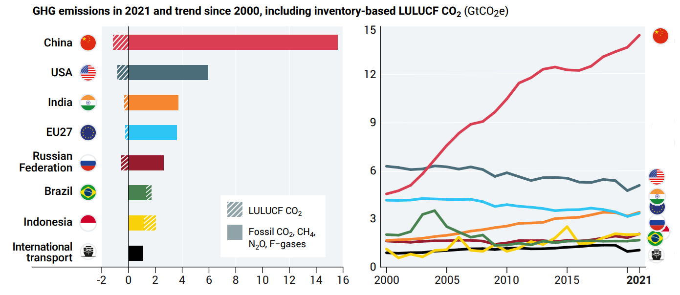
NTD: And staying with you, William, we often hear the US and Europe talking about cutting emissions, whether that’s in cars or cows even. But at the same time, the carbon brief notes that China is the world’s largest annual greenhouse gas emitter and leads in coal use. How should we look at this if the argument is global warming and not regional?
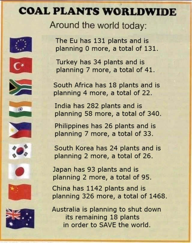
WH: Well, of course, China has built lots of very efficient new coal plants in the last 10 years. they’re ultra supercritical plants many of them. They’re really good plants and so they’ve raised the standard of living there. Part of their policy is is quite okay and the CO2 they’re emitting is good for the earth you know.
I’m not supporting any of the political things that they do but I don’t think there’s a thing wrong with releasing carbon dioxide. More power to them for that.
CO2 Coalition
NTD: On that note, Gregory, you’re the executive director of the CO2 coalition. Give us a sense of what this coalition does and how this fits in with environmental discussions.
GW: We’re 10 years old now. It was founded in 2015 by Dr. William Happer, our chair that was just on here. And we’re some 200 of the top experts and scientists in the world that don’t buy into the company line on climate change. We don’t believe that increases in human emissions of CO2 are leading to harmful warming. Rather just the opposite, we see huge benefits. Crop growth records are being broken year after year and they attribute 70% of that to increasing CO2. Crop growth and crop productivity is outpacing population growth. That’s a good thing, a really good thing.
We are in a warming trend. Yes, we are. It’s been warming for more than 300 years. But you know what that does? That means since 1900, our growing seasons in the continental United States have increased by more than two weeks. That’s a really good thing for agriculture. Your farmers will tell you they love that. So at the CO2 Coalition, our unofficial motto is: We love CO2 and so should you.
The post below updates the UAH record of air temperatures over land and ocean. Each month and year exposes again the growing disconnect between the real world and the Zero Carbon zealots. It is as though the anti-hydrocarbon band wagon hopes to drown out the data contradicting their justification for the Great Energy Transition. Yes, there was warming from an El Nino buildup coincidental with North Atlantic warming, but no basis to blame it on CO2.
As an overview consider how recent rapid cooling completely overcame the warming from the last 3 El Ninos (1998, 2010 and 2016). The UAH record shows that the effects of the last one were gone as of April 2021, again in November 2021, and in February and June 2022 At year end 2022 and continuing into 2023 global temp anomaly matched or went lower than average since 1995, an ENSO neutral year. (UAH baseline is now 1991-2020). Then there was an usual El Nino warming spike of uncertain cause, unrelated to steadily rising CO2, and now dropping steadily back toward normal values.
For reference I added an overlay of CO2 annual concentrations as measured at Mauna Loa. While temperatures fluctuated up and down ending flat, CO2 went up steadily by ~65 ppm, an 18% increase.
Furthermore, going back to previous warmings prior to the satellite record shows that the entire rise of 0.8C since 1947 is due to oceanic, not human activity.
The animation is an update of a previous analysis from Dr. Murry Salby. These graphs use Hadcrut4 and include the 2016 El Nino warming event. The exhibit shows since 1947 GMT warmed by 0.8 C, from 13.9 to 14.7, as estimated by Hadcrut4. This resulted from three natural warming events involving ocean cycles. The most recent rise 2013-16 lifted temperatures by 0.2C. Previously the 1997-98 El Nino produced a plateau increase of 0.4C. Before that, a rise from 1977-81 added 0.2C to start the warming since 1947.
Importantly, the theory of human-caused global warming asserts that increasing CO2 in the atmosphere changes the baseline and causes systemic warming in our climate. On the contrary, all of the warming since 1947 was episodic, coming from three brief events associated with oceanic cycles. And in 2024 we saw an amazing episode with a temperature spike driven by ocean air warming in all regions, along with rising NH land temperatures, now dropping below its peak.
Chris Schoeneveld has produced a similar graph to the animation above, with a temperature series combining HadCRUT4 and UAH6. H/T WUWT
With apologies to Paul Revere, this post is on the lookout for cooler weather with an eye on both the Land and the Sea. While you heard a lot about 2020-21 temperatures matching 2016 as the highest ever, that spin ignores how fast the cooling set in. The UAH data analyzed below shows that warming from the last El Nino had fully dissipated with chilly temperatures in all regions. After a warming blip in 2022, land and ocean temps dropped again with 2023 starting below the mean since 1995. Spring and Summer 2023 saw a series of warmings, continuing into 2024 peaking in April, then cooling off to the present.
UAH has updated their TLT (temperatures in lower troposphere) dataset for July 2025. Due to one satellite drifting more than can be corrected, the dataset has been recalibrated and retitled as version 6.1 Graphs here contain this updated 6.1 data. Posts on their reading of ocean air temps this month are behind the update from HadSST4. I posted recently on SSTs June 2025 Ocean SSTs: NH Warms, SH Cools.These posts have a separate graph of land air temps because the comparisons and contrasts are interesting as we contemplate possible cooling in coming months and years.
Sometimes air temps over land diverge from ocean air changes. In July 2024 all oceans were unchanged except for Tropical warming, while all land regions rose slightly. In August we saw a warming leap in SH land, slight Land cooling elsewhere, a dip in Tropical Ocean temp and slightly elsewhere. September showed a dramatic drop in SH land, overcome by a greater NH land increase. 2025 has shown a sharp contrast between land and sea, first with ocean air temps falling in January recovering in February. Then land air temps, especially NH, dropped in February and recovered in March. Now in July SH ocean dropped markedly, pulling down the Global ocean anomaly despite a rise in the Tropics. SH land also cooled by half, driving Global land temps down despite Tropics land warming.
Note: UAH has shifted their baseline from 1981-2010 to 1991-2020 beginning with January 2021. v6.1 data was recalibrated also starting with 2021. In the charts below, the trends and fluctuations remain the same but the anomaly values changed with the baseline reference shift.
Presently sea surface temperatures (SST) are the best available indicator of heat content gained or lost from earth’s climate system. Enthalpy is the thermodynamic term for total heat content in a system, and humidity differences in air parcels affect enthalpy. Measuring water temperature directly avoids distorted impressions from air measurements. In addition, ocean covers 71% of the planet surface and thus dominates surface temperature estimates. Eventually we will likely have reliable means of recording water temperatures at depth.
Recently, Dr. Ole Humlum reported from his research that air temperatures lag 2-3 months behind changes in SST. Thus cooling oceans portend cooling land air temperatures to follow. He also observed that changes in CO2 atmospheric concentrations lag behind SST by 11-12 months. This latter point is addressed in a previous post Who to Blame for Rising CO2?
After a change in priorities, updates are now exclusive to HadSST4. For comparison we can also look at lower troposphere temperatures (TLT) from UAHv6.1 which are now posted for July 2025. The temperature record is derived from microwave sounding units (MSU) on board satellites like the one pictured above. Recently there was a change in UAH processing of satellite drift corrections, including dropping one platform which can no longer be corrected. The graphs below are taken from the revised and current dataset.
The UAH dataset includes temperature results for air above the oceans, and thus should be most comparable to the SSTs. There is the additional feature that ocean air temps avoid Urban Heat Islands (UHI). The graph below shows monthly anomalies for ocean air temps since January 2015.
In 2021-22, SH and NH showed spikes up and down while the Tropics cooled dramatically, with some ups and downs, but hitting a new low in January 2023. At that point all regions were more or less in negative territory.
After sharp cooling everywhere in January 2023, there was a remarkable spiking of Tropical ocean temps from -0.5C up to + 1.2C in January 2024. The rise was matched by other regions in 2024, such that the Global anomaly peaked at 0.86C in April. Since then all regions have cooled down sharply to a low of 0.27C in January. In February 2025, SH rose from 0.1C to 0.4C pulling the Global ocean air anomaly up to 0.47C, where it stayed in March and April. In May drops in NH and Tropics pulled the air temps over oceans down despite an uptick in SH. At 0.43C, ocean air temps were similar to May 2020, albeit with higher SH anomalies. Now in July Global temps are down to 0.32C due to SH dropping from 0.48C to 0.21C.
Land Air Temperatures Tracking in Seesaw Pattern
We sometimes overlook that in climate temperature records, while the oceans are measured directly with SSTs, land temps are measured only indirectly. The land temperature records at surface stations sample air temps at 2 meters above ground. UAH gives tlt anomalies for air over land separately from ocean air temps. The graph updated for July is below.
Here we have fresh evidence of the greater volatility of the Land temperatures, along with extraordinary departures by SH land. The seesaw pattern in Land temps is similar to ocean temps 2021-22, except that SH is the outlier, hitting bottom in January 2023. Then exceptionally SH goes from -0.6C up to 1.4C in September 2023 and 1.8C in August 2024, with a large drop in between. In November, SH and the Tropics pulled the Global Land anomaly further down despite a bump in NH land temps. February showed a sharp drop in NH land air temps from 1.07C down to 0.56C, pulling the Global land anomaly downward from 0.9C to 0.6C. In March that drop reversed with both NH and Global land back to January values, holding there in April. In May sharp drops in NH and Tropics land air temps pulled the Global land air temps back down close to February value. In July SH land dropped sharply, down from 0.47C to 0.23C, and NH land also cooled by 0.08C pulling Global land air down as well.
The Bigger Picture UAH Global Since 1980
The chart shows monthly Global Land and Ocean anomalies starting 01/1980 to present. The average monthly anomaly is -0.03, for this period of more than four decades. The graph shows the 1998 El Nino after which the mean resumed, and again after the smaller 2010 event. The 2016 El Nino matched 1998 peak and in addition NH after effects lasted longer, followed by the NH warming 2019-20. An upward bump in 2021 was reversed with temps having returned close to the mean as of 2/2022. March and April brought warmer Global temps, later reversed
With the sharp drops in Nov., Dec. and January 2023 temps, there was no increase over 1980. Then in 2023 the buildup to the October/November peak exceeded the sharp April peak of the El Nino 1998 event. It also surpassed the February peak in 2016. In 2024 March and April took the Global anomaly to a new peak of 0.94C. The cool down started with May dropping to 0.9C, and in June a further decline to 0.8C. October went down to 0.7C, November and December dropped to 0.6C. Now in July Global Land and Ocean is down to 0.36C
The graph reminds of another chart showing the abrupt ejection of humid air from Hunga Tonga eruption.
TLTs include mixing above the oceans and probably some influence from nearby more volatile land temps. Clearly NH and Global land temps have been dropping in a seesaw pattern, nearly 1C lower than the 2016 peak. Since the ocean has 1000 times the heat capacity as the atmosphere, that cooling is a significant driving force. TLT measures started the recent cooling later than SSTs from HadSST4, but are now showing the same pattern. Despite the three El Ninos, their warming had not persisted prior to 2023, and without them it would probably have cooled since 1995. Of course, the future has not yet been written.
Physicist Donald Rapp retired from the Jet Propulsion Laboratory and has authored many books including Ice Ages and Interglacials: Measurements, Interpretation and Models; Assessing Climate Change: Temperatures, Solar Radiation and Heat Balance; and Use of Extraterrestrial Resources for Human Space Missions to Moon or Mars (Astronautical Engineering). Most recently he published Revisiting 2,000 Years of Climate Change (Bad Science and the “Hockey Stick”)
Abstract
The widespread explanations of the greenhouse effect taught to millions of schoolchildren are misleading. The objective of this work is to clarify how increasing CO2 produces warming in current times. It is found that there are two contexts for the greenhouse gas effect. In one context, the fundamental greenhouse gas effect, one imagines a dry Earth starting with no water or CO2 and adding water and CO2 . This leads to the familiar “thermal blanket” that strongly inhibits IR transmission from the Earth to the atmosphere. The Earth is much warmer with H2 O and CO2 . In the other context, the current greenhouse gas effect, CO2 is added to the current atmosphere. The thermal blanket on IR radiation hardly changes. But the surface loses energy primarily by evaporation and thermals. Increased CO2 in the upper atmosphere carries IR radiation to higher altitudes. The Earth radiates to space at higher altitudes where it is cooler, and the Earth is less able to shed energy. The Earth warms to restore the energy balance. The “thermal blanket” is mainly irrelevant to the current greenhouse gas effect. It is concluded that almost all discussions of the greenhouse effect are based on the fundamental greenhouse gas effect, which is a hypothetical construct, while the current greenhouse gas effect is what is happening now in the real world.
Adding CO2 does not add much to a “thermal blanket” but instead,
drives emission from the Earth to higher, cooler altitudes.
Background
Were it not for the Sun, the Earth would be a frozen hulk in space. The Sun sends a spectrum of irradiance to the Earth, the Earth warms, and the Earth radiates energy out to space. This process continues until the Earth warms enough to radiate about as much energy to space as it receives from the Sun, reaching an approximate steady state. If for some reason, the Earth is unable to radiate all the energy received from the Sun, the Earth will warm until it can radiate all the energy received. It is widely accepted that rising CO2 concentration reduces the ability of the Earth to radiate energy to space. In a dynamic situation where the CO2 concentration is continually increasing with time, the Earth will continuously warm as it tries to “catch up” to the effect of increasing CO2 and reestablish a steady state. It is a conundrum that while it is widely accepted that rising CO2 concentration produces global warming, the exact mechanism by which warming is induced in the current atmosphere by rising CO2 is not widely understood. The concept of a “thermal blanket” imposed by greenhouse gases to warm the Earth has merit in some contexts but is mainly irrelevant to the question of how adding CO2 to the current atmosphere produces warming.
Before attempting to deal with the question of how rising CO2 concentration affects the current Earth’s climate, it is appropriate to first discuss the Earth’s energy budget. The exact values for each energy flow are not important, but the relative values are important to show which processes dominate.
Finally, we provide an explanation of how adding CO2 to the current atmosphere produces global warming in the current atmosphere. The mechanism is not widely known and is likely to be surprising to some. Warming does not occur by increasing the thickness of the thermal blanket but instead occurs by raising the altitude at which the Earth radiates to space.
IR radiation
A fundamental law of physics states that all bodies emit a spectrum of radiant power proportional to the fourth power of their absolute temperature. A body at absolute temperature T (K) emits power per unit area: P = σ T 4 = 5.67 x 10 -8 T 4 (W/m 2 ) For example, a body at T = 280 K is said to emit 348 W/m 2 . However, this law of physics is academic and not directly applicable to real-world experience. In the real world, we never have a single isolated body emitting radiation, instead, we deal with pairs of bodies where the warmer one radiates a net flux to the cooler one. (If you stand next to a body at 280 K, you don’t feel an incoming heat flux of 348 W/m 2 ). For example, if there is one body at 280 K and a second body at 275 K, the warmer body will radiate through a vacuum to the cooler body at a net of 24 W/m 2 . That is a real-world parameter that can be measured. But the academic model involves calculating the emission of the warm body as 348 W/m 2 and the emission of the cooler body as 324 W/m 2, and subtracting, the net transfer from the warm body to the cool body is 24 W/m 2 . But the calculated values are academic and cannot be measured in the real world with 348 W/m 2 in one direction and 324 W/m 2 in the opposite direction. Those values are only of academic use to infer the measurable net of about 24 W/m 2 . See the simple model in Figure 1 presented here for illustration.
Figure 1: Radiant heat transfer between warm and cool bodies
The two contexts of the greenhouse effect
We are all aware of the widely discussed greenhouse effectthat warms the Earth as the concentration of greenhouse gases increases. But just how does it work?Here, we define two contexts for greenhouse gas effects:
1) The fundamental greenhouse gas effectcan be described by a “gedanken experiment” in which one imagines a dry Earth starting with no water or CO 2 and begins adding water and CO 2 . The original atmosphere, lacking water and CO 2 , will transmit IR radiation completely. As a result, the Earth will be quite cool. As H 2 O and CO 2 are added to the atmosphere, the transmission of IR radiation from the Earth’s surface is increasingly inhibited, and the Earth warms. As the Earth warms, evaporation and thermals transmit more energy from the Earth to the atmosphere. By the time H 2 O and CO 2levels reach current levels, the atmosphere is almost opaque to IR radiation, and a “thermal blanket” greatly reduces IR transmission from the Earth to the atmosphere. The Earth cools primarily by evaporation and thermals, and it is much warmer than if CO 2 and water were absent. The notion of a “thermal blanket” of IR absorbing gases warming the Earth has validity in this context starting with a transmitting atmosphere and adding greenhouse gases. However, once the thermal blanket is established with ~ 400 ppm CO 2 , adding more CO 2 has only a small effect on reducing IR radiation from the surface.
2) The current greenhouse gas effectdeals with the question: How does the addition of CO 2 to the atmosphere affect the global average temperature in 2024 and beyond, with CO 2 around 400+ ppm? It was shown previously that starting with no water or CO 2 , adding H 2 O and CO 2 to the atmosphere generates a “thermal blanket” for radiation. But once that “thermal blanket” is well established and the lower atmosphere is very opaque to IR radiation, what is the effect of adding even more CO 2 ? Dufresne, et al. provide a detailed technical analysis to show how the current greenhouse effect works [7]. However, this reference is complex and written for expert specialists in IR transmission through the atmosphere. In the sections that follow, a simpler, qualitative interpretation will be presented.
Figure 3: Energy flows in the Earth’s system. (Based on LTWS references).
Energy budget of the earth
Energy transfer in the Earth system can take place by thermal transfers (“thermals”) where winds carry warm air up to colder regions, evaporation from the surface (removes heat), and condensation in the atmosphere (deposits heat) and radiation (further discussion follows).
After analyzing the data in the LTWS references (see Section 1.2), a rough estimate of key energy flows per unit time in the Earth system is given as follows. The exact numbers are not critical; only their relative values are important for this discussion.
These results can be visualized in Figure 3 which is based on the references LTWS. As shown in Figure 3, incoming solar irradiance (341 W/ m 2 ) is partly reflected by the lower atmosphere back out tospace (79 W/m 2 ), partly reflected by the Earth’s surface back out to space (23 W/m 2 ), partly absorbed by the lower atmosphere (76 W/m 2 ), and finally about 163 W/m 2 is absorbed by the surface.
Radiation from the Earth’s surface to the lower atmosphere requires further discussion. The LTWS references show high up and down radiation flows. For example, Trenberth, et al. did not show radiation transfer between the Earth’s surface as a simple 25 W/m 2 net radiative transfer from the surface to the lower atmosphere. Instead, they showed 356 W/m 2 radiated upward from the surface and 333 W/m 2 of “back radiation” from the atmosphere to the surface [2]. The figure 356 W/m 2 radiated upward from the surface corresponds to the theoretical radiation from a blackbody at 281.5 K. The claimed downward figure is difficult to explain. But both of these figures are academic. What is happening is that the warm Earth is radiating upward through an optically thick gas of H 2 O and CO 2 absorbers, and the radiant transfer through that thick gas is estimated to be only a mere ~25 W/m 2. This is the “thermal blanket” so often referred to in discussions of global warming. The thermal blanket is real. But the problem with so many discussions of the greenhouse effect is that there is a preoccupation with radiant energy transfer between the Earth and the atmosphere (which is “blanketed”) while neglecting the more important transfers of energy to the atmosphere by processes other than radiation.
Figure 4: Pressure, temperature, and relative humidity vs. altitude [8].
The terms “lower atmosphere” and “upper atmosphere” are defined next. Following Miscolczi, Figure 4 shows that the demarcation between upper and lower atmospheres occurs at an altitude of roughly 12 km above which H 2 O is frozen out and the temperature roughly stabilizes [8].
Energy transfer in the lower atmosphere takes place by conduction,
convection, and radiation. Energy transfer in the upper atmosphere
takes place primarily by radiation.
The greenhouse effect
The greenhouse effect can only be fully understood by comprehensive modeling of upward energy flows in the Earth system. Excellent studies by Dufresne, et al. and Pierrehumbert provide detailed physics [7,9]. Here, we interpret these results qualitatively.
Within the Earth system of land, ocean, atmosphere, and clouds, energy transfer is taking place continuously. There is a net energy flow upward toward higher altitudes. From the surface of the Earth, much of the upward flow of energy in the lower atmosphere is through evaporation and convection. The lower atmosphere is almost opaque to IR radiation due to water vapor and CO 2.
Figure 5: Qualitative sketch to show radiation is dominant at the highest altitude. By adding CO2 to the atmosphere, radiative energy transport is carried to a higher altitude where it is colder, reducing the radiant power emitted by the upper atmosphere.
Radiation energy transfer will persist out toward a high altitude until the CO 2 concentration diminishes. Each CO 2 molecule that absorbs an IR photon can reradiate in all directions, but in a thin atmosphere, some upward IR radiation will be lost, and on a net basis, this allows the Earth to radiate out to space. The presence of an IR transmitting/absorbing gas (CO 2 ) will allow energy transport to higher altitudes. The highest altitude where there is enough thin gas to maintain radiation is the region of the atmosphere that mainly radiates energy outward to space. This is illustrated on the left side of Figure 5. Figure 5 was created here to illustrate how the predominant energy transfer mechanisms gradually change to IR radiation at higher altitudes, and the presence of CO 2 carries the IR radiation to higher altitudes.
Conclusion
There are two different contexts for discussion of the effect of greenhouse gases on the Earth’s climate.
In one context, one can imagine an Earth with no water vapor or CO 2 in the atmosphere. This Earth can radiate effectively to space and is relatively cold. As water vapor and CO 2 are added to the atmosphere, the IR-opacity of the atmosphere increases and the Earth system warms. The greenhouse gases act as a “thermal blanket” to warm the Earth by impeding upward IR radiation. This is labeled the fundamental greenhouse gas effect. However, once the thermal blanket is established, adding more CO 2 has only a minimal effect on the thermal blanket, and reduced upward IR radiation from the surface does not produce significant warming. This is referred to by Dufresne, et al. [7] as the “saturation paradox”.
In the other context, we are concerned with the effect of adding more CO 2 to the current atmosphere where the CO 2 concentration is already 400+ ppm, and the thermal blanket is already in place, restricting upward IR-radiation. This is labeled the current greenhouse gas effect, and it is quite different from the fundamental greenhouse gas effect. In the current atmosphere, energy transfer from the Earth to the atmosphere is primarily by evaporation and thermals, and IR-radiant energy transfer is significantly impeded by an almost opaque lower atmosphere. The “thermal blanket” is in place, but it doesn’t change much as CO 2 is added to the atmosphere. Adding CO 2 to the current atmosphere slightly increases the opacity of the lower atmosphere but this is of little consequence.
In the upper atmosphere, CO 2 is the major means of energy transport by IR radiation. The greatest effect of adding CO 2 to the current atmosphere is to extend the upward range of IR-radiant transmission to higher altitudes. The main region where the Earth radiates to space is thereby extended to higher altitudes where it is colder, and the Earth cannot radiate as effectively as it could with less CO 2in the atmosphere. The Earth warms until the region in the upper atmosphere where the Earth radiates to space is warm enough to balance incoming solar energy.
My Comment:
The explanation above is clear and understandable in qualititative terms. It does not reference empirical evidence regarding a GHG effect from a raised effective radiating level (ERL). Studies investigating this theory find that the effect is too small to appear in the data.
The following diagram by Andy May shows the pattern of emissions by GHGs, mainly H2O and CO2.
Helpfully, it shows the altitudes where the emissions occur. As stated in the text above, the upper and lower tropopsphere shift occurs about 12km high, with variations lower at poles and higher in tropics. Note the large CO2 notch appears at 85km, which puts it into the thermosphere, where temperatures increase with altitude. Raising the ERL there means greater cooling, not less. The Ozone notch at 33km is in the stratosphere, where temperatures also rise with altitude. Otherwise almost all of the IR effect is from H2O.
 The best context for understanding decadal temperature changes comes from the world’s sea surface temperatures (SST), for several reasons: