Last week saw the release of A Critical Review of Impacts of Greenhouse Gas Emissions on the U.S. Climate by the U.S. DOE Climate Working Group. This post provides the key points from the twelve chapters of the document, comprised of the chapter summaries plus some salient explanations. This is a synopsis and readers are encouraged to access additional detailed information at the link in red above. I added some pertinent images along with some from the report.
Report to U.S. Energy Secretary Christopher Wright July 23, 2025
Climate Working Group:
John Christy, Ph.D.
Judith Curry, Ph.D.
Steven Koonin, Ph.D.
Ross McKitrick, Ph.D.
Roy Spencer, Ph.D.
Introduction
This report reviews scientific certainties and uncertainties in how anthropogenic carbon dioxide (CO2) and other greenhouse gas emissions have affected, or will affect, the Nation’s climate, extreme weather events, and selected metrics of societal well-being. Those emissions are increasing the concentration of CO2 in the atmosphere through a complex and variable carbon cycle, where some portion of the additional CO2 persists in the atmosphere for centuries.
Chapter 1 Carbon Dioxide as a Pollutant
Carbon dioxide (CO2) differs in many ways from the so-called Criteria Air Pollutants. It does not affect local air quality and has no human toxicological implications at ambient levels. The growing amount of CO2 in the atmosphere directly influences the earth system by promoting plant growth (global greening), thereby enhancing agricultural yields, and by neutralizing ocean alkalinity. But the primary concern about CO2 is its role as a greenhouse gas (GHG) that alters the earth’s energy balance, warming the planet. How the climate will respond to that influence is a complex question that will occupy much of this report.

Chapter 2 Direct impact of CO2 on the Environment
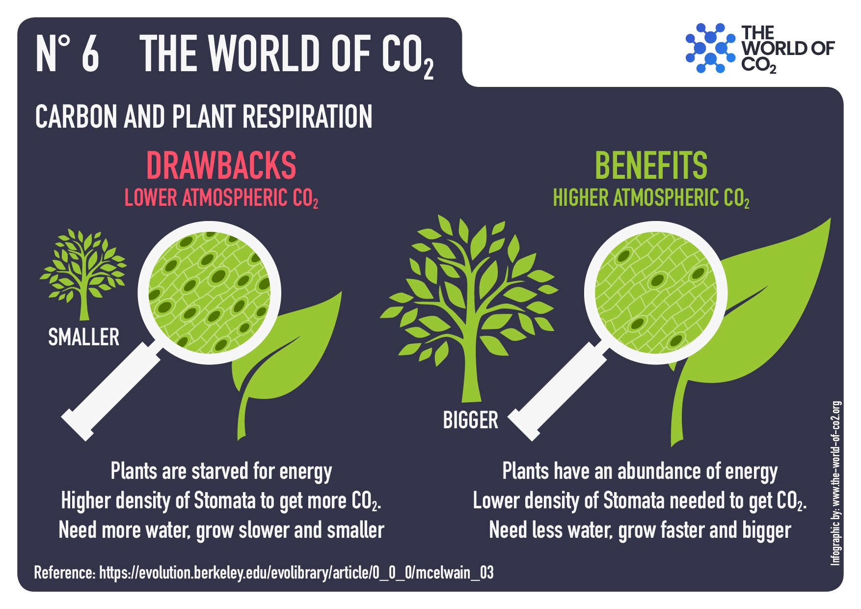
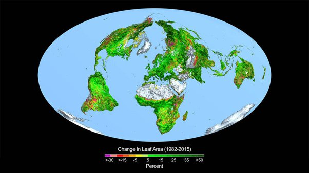
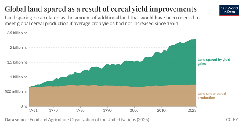
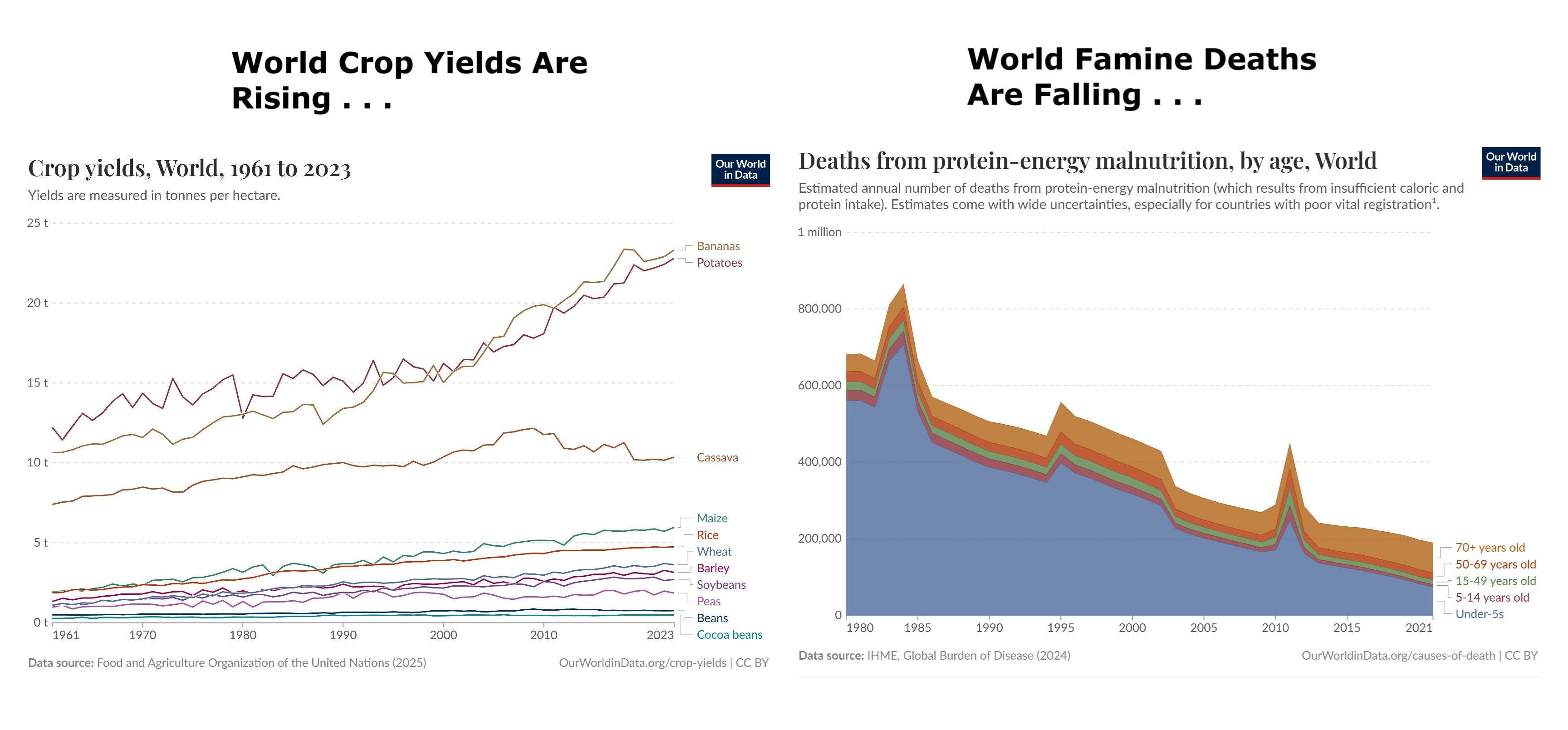
CO2 enhances photosynthesis and improves plant water use efficiency, thereby promoting plant growth. Global greening due in part to increased CO2 levels in the atmosphere is well-established on all continents. The growing CO2 concentration in the atmosphere has the important positive effect of promoting plant growth by enhancing photosynthesis and improving water use efficiency. That is evident in the “global greening” phenomenon discussed below, as well as in the improving agricultural yields discussed in Chapter 10.
The IPCC has only minimally discussed global greening and CO2 fertilization of agricultural crops. The topic is briefly acknowledged in a few places in the body of the IPCC 6th and earlier Assessment Reports but is omitted in all Summary documents. Section 2.3.4.3.3 of the AR6 Working Group I report, entitled “global greening and browning,” points out that the IPCC Special Report on Climate Change and Land had concluded with high confidence that greening had increased globally over the past 2-3 decades.
It then discusses that there are variations in the greening trend among data sets, concluding that while they have high confidence greening has occurred, they have low confidence in the magnitude of the trend. There are also brief mentions of CO2 fertilization effects and improvements in water use efficiency in a few other chapters in the AR6 Working Groups I and II Reports. Overall, however, the Policymaker Summaries, Technical Summaries, and Synthesis Reports of AR5 and AR6 do not discuss the topic.
CO2 absorption in sea water makes the oceans less alkaline. While this process is often called “ocean acidification”, that is a misnomer because the oceans are not expected to become acidic; “ocean neutralization” would be more accurate. Even if the water were to turn acidic, it is believed that life in the oceans evolved when the oceans were mildly acidic with pH 6.5 to 7.0 (Krissansen-Totton et al., 2018).
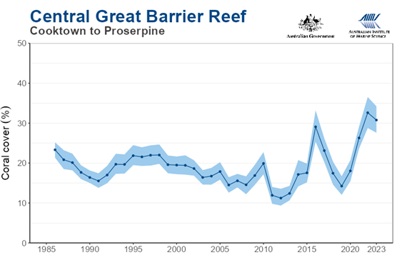
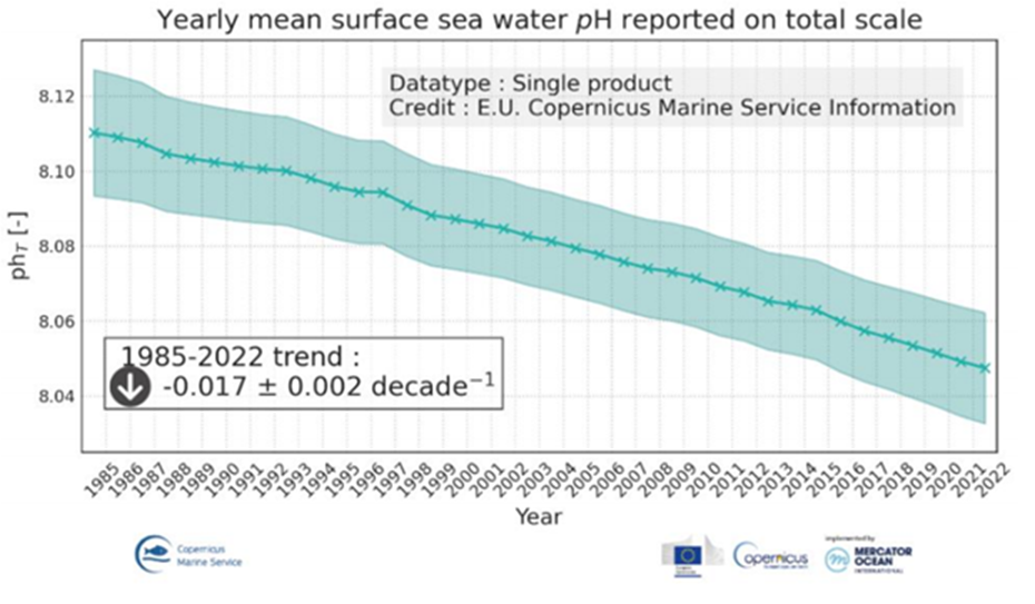 The recent decline in pH is within the range of natural variability on millennial time scales. Most ocean life evolved when the oceans were mildly acidic. Decreasing pH might adversely affect corals, although the Australian Great Barrier Reef has shown considerable growth in recent years.
It is being increasingly recognized that publication bias (alarming ocean acidification results preferred by high-impact research publications) exaggerates the reported impacts of declining ocean pH. An ICES Journal of Marine Science Special Issue addressed this problem with an article entitled, Towards a Broader Perspective on Ocean Acidification Research. In the Introduction to that Special Issue, H. I. Browman stated, “As is true across all of science, studies that report no effect of ocean acidification are typically more difficult to publish.” (Browman, 2016).
In summary, ocean life is complex and much of it evolved when the oceans were acidic relative to the present. The ancestors of modern coral first appeared about 245 million years ago. CO2 levels for more than 200 million years afterward were many times higher than they are today. Much of the public discussion of the effects of ocean “acidification” on marine biota has been one-sided and exaggerated.

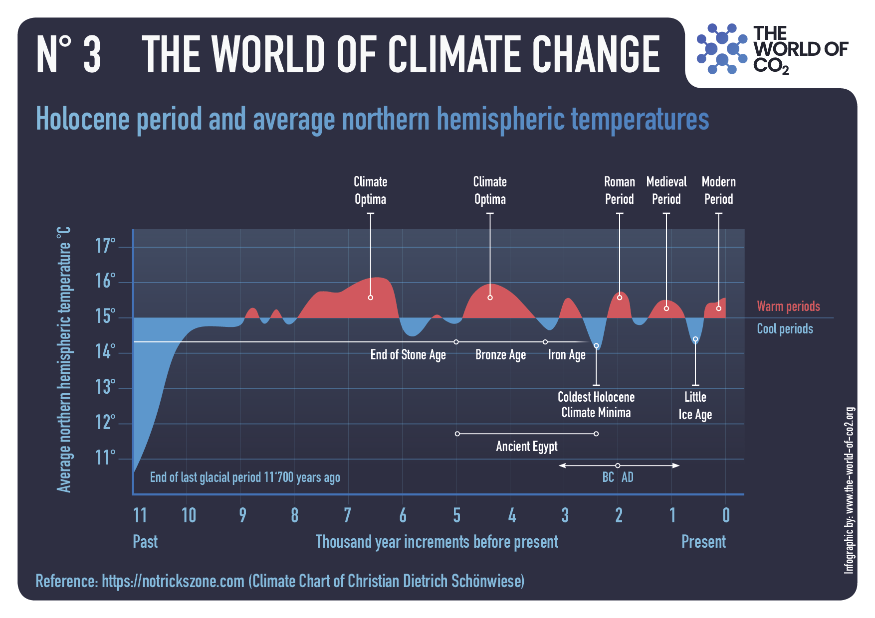
Chapter 3 Human Influences on the Climate
- The global climate is naturally variable on all time scales. Anthropogenic CO2 emissions add to that variability by changing the total radiative energy balance in the atmosphere.
- The IPCC has downplayed the role of the sun in climate change but there are plausible solar irradiance reconstructions that imply it contributed to recent warming.
- Climate projections are based on IPCC emission scenarios that have tended to exceed observed trends.
- Most academic climate impact studies in recent years are based upon the extreme RCP 8.5 scenario that is now considered implausible; its use as a business-as-usual scenario has been misleading.
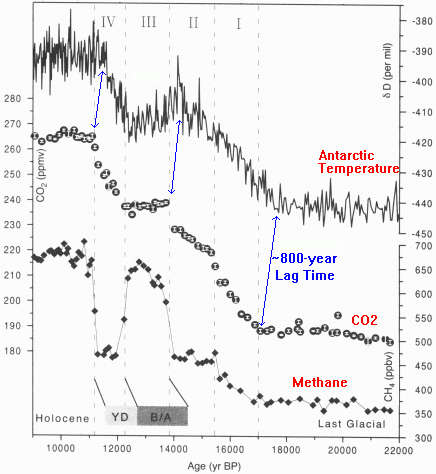
- Carbon cycle models connect annual emissions to growth in the atmospheric CO2 stock. While models disagree over the rate of land and ocean CO2 uptake, all agree that it has been increasing since 1959.
- There is evidence that urbanization biases in the land warming record have not been completely removed from climate data sets.
There are about 850 Gt of carbon (GtC) in the Earth’s atmosphere, almost all of it in the form of CO2. Each year, biological processes (plant growth and decay) and physical processes (ocean absorption and outgassing) exchange about 200 GtC of that carbon with the Earth’s surface (roughly 80 GtC with the land and 120 GtC with the oceans). Before human activities became significant, removals from the atmosphere were roughly in balance with additions. But burning fossil fuels (coal, oil, and gas) removes carbon from the ground and adds it to the annual exchange with the atmosphere. That addition (together with a much smaller contribution from cement manufacturing) amounted to 10.3 GtC in 2023, or only about 5 percent of the annual exchange with the atmosphere.

The carbon cycle accommodates about 50 percent of humanity’s small annual injection of carbon into the air by naturally sequestering it through plant growth and oceanic uptake, while the remainder accumulates in the atmosphere (Ciais et al., 2013). For that reason, the annual increase in atmospheric CO2 concentration averages only about half of that naively expected from human emissions. The historical near constancy of that 50 percent fraction means that the more CO2 humanity has produced, the faster nature removed it from the atmosphere.

While land vegetation has been responding positively to more atmospheric CO2, uptake of extra CO2 by ocean biological processes remains too uncertain to be measured reliably.

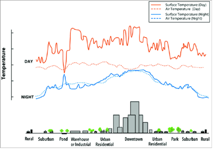
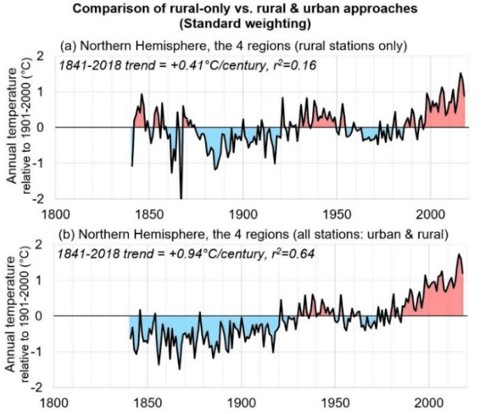
Historical temperature data over land has been collected mainly where people live. This raises the problem of how to filter out non-climatic warming signals due to Urban Heat Islands (UHI) and other changes to the land surface. If these are not removed the data might over- attribute observed warming to greenhouse gases. The IPCC acknowledges that raw temperature data are contaminated with UHI effects but claims to have data cleaning procedures that remove them. It is an open question whether those procedures are sufficient.

The challenge in measuring UHI bias is relating local temperature change to a corresponding change in population or urbanization, rather than to a static classification variable such as rural or urban. Spencer et al. (2025) used newly available historical population archives to undertake such an analysis and found evidence of significant UHI bias in U.S. summertime temperature data.
In summary, while there is clearly warming in the land record, there is also evidence that it is biased upward by patterns of urbanization and that these biases have not been completely removed by the data processing algorithms used to produce climate data sets.
Chapter 4 Climate Sensitivity to CO2 Forcing
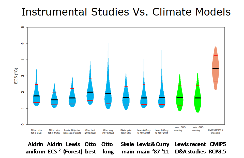
There is growing recognition that climate models are not fit for the purpose of determining the Equilibrium Climate Sensitivity (ECS) of the climate to increasing CO2. The IPCC has turned to data driven approaches including historical data and paleoclimate reconstructions, but their reliability is diminished by data inadequacies.
Data-driven ECS estimates tend to be lower than climate model-generated values. The IPCC AR6 upper bound for the likely range of ECS is 4.0°C, lower than the AR5 value of 4.5°C. This lowering of the upper bound seems well justified by paleoclimatic data. The AR6 lower bound for the likely range of ECS is 2.5°C, substantially higher than the AR5 value of 1.5°C. This raising of the lower bound is less justified; evidence since AR6 finds the lower bound of the likely range to be around 1.8°C.
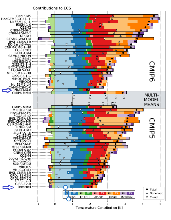
In principle, ECS is an emergent property of GCMs—that is, it is not directly parameterized or tuned but rather emerges in the results of the simulation. Otherwise plausible GCMs and parameter selections have been discarded because of perceived conflict with an expected warming rate, or aversion to a model’s climate sensitivity being outside an accepted range (Mauritsen et al. 2012). This practice was commonplace for the models used in AR4; modelers have moved away from this practice with time. However, even in a CMIP6 model, the MPI (Max Planck Institute) modelers chose an ECS value of 3°C and then tuned the cloud parameterizations to match their intended result.
The Transient Climate Reponse (TCR) provides a more useful observational constraint on climate sensitivity. TCR is the global temperature increase that results when CO2 is increased at an annual rate of 1 percent over a period of 70 years (i.e., doubled gradually). Relative to the ECS, observationally determined values of TCR avoid the problems of uncertainties in ocean heat uptake and the fuzzy boundary in defining equilibrium arising from a range of timescales for the longer-term feedback processes (e.g., ice sheets). TCR is better constrained by historical warming, than ECS. AR6 judged the very likely range of TCR to be 1.2–2.4°C. In contrast to ECS, the upper bound of TCR is more tightly constrained. For comparison, the TCR values determined by Lewis (2023) are 1.25 to 2.0°C, showing much better agreement with AR6 values than was seen in a comparison of the ECS values.
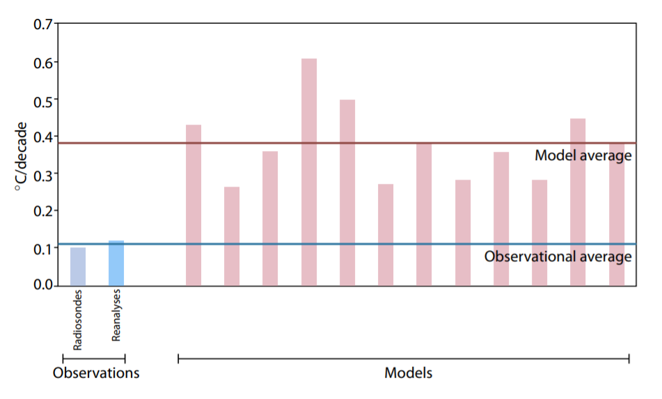
Figure 8: Warming in the tropical troposphere according to the CMIP6 models.
Trends 1979–2014 (except the rightmost model, which is to 2007), for 20°N–20°S, 300–200 hPa.
Chapter 5 Discrepancies Between Models and Instrumental Observations
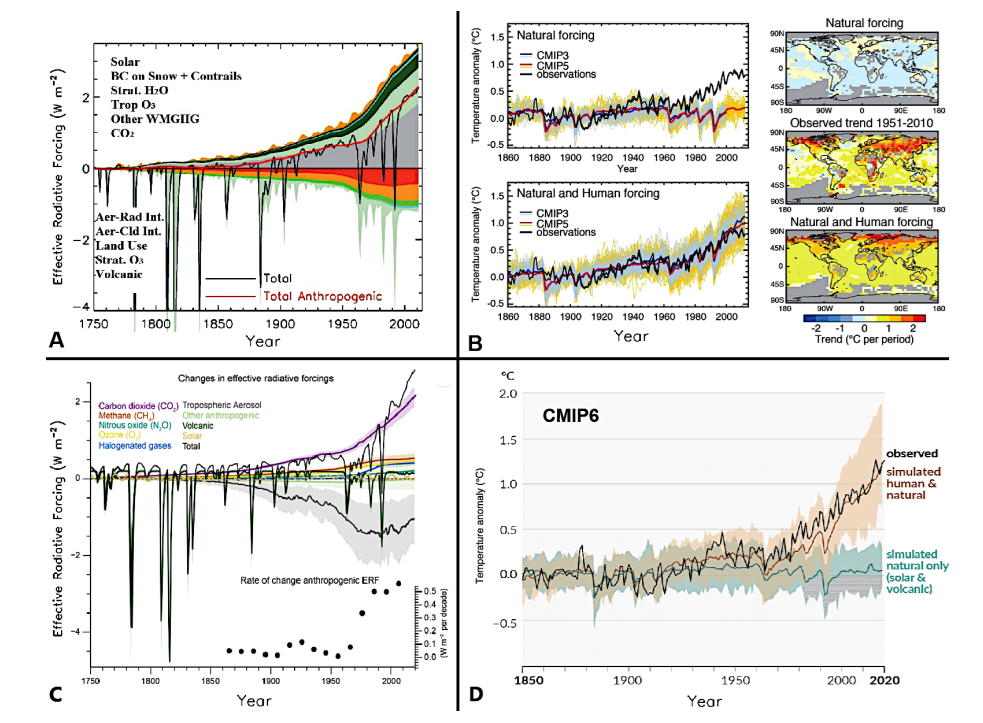
Climate models show warming biases in many aspects of their reproduction of the past several decades. In response to estimated changes in forcing they produce too much warming at the surface (except in the models with lowest ECS), too much warming in the lower-and mid-troposphere and too much amplification of warming aloft.

Climate models also produce too much recent stratospheric cooling, invalid hemispheric albedos, too much snow loss, and too much warming in the Corn Belt. The IPCC has acknowledged some of these issues but not all.
The wide range of choices made by modelers to characterize the physical processes in the models (see Box: Climate Modeling in Section 5.1 above) is seen by the large spread of trends in the middle troposphere, ±40 percent about the median (Figure 5.6). This vividly illustrates the uncertainties in attempts to model (parameterize) a complex system involving turbulence, moist thermodynamics, and energy fluxes over the full range of the tropical atmosphere’s time and space scales. The atmosphere’s temperature profile is a case where models are not merely uncertain but also show a common warming bias relative to observations. This suggests that they misrepresent certain fundamental feedback processes.
The IPCC AR6 did not assess this issue.

An important element of the expected general “fingerprint” of anthropogenic climate change is simultaneous warming of the troposphere and cooling of the stratosphere. The latter feature is also influenced by ozone depletion and recovery. AR6 acknowledged that cooling had been observed but only until the year 2000. The stratosphere has shown some warming since, contrary to model projections.

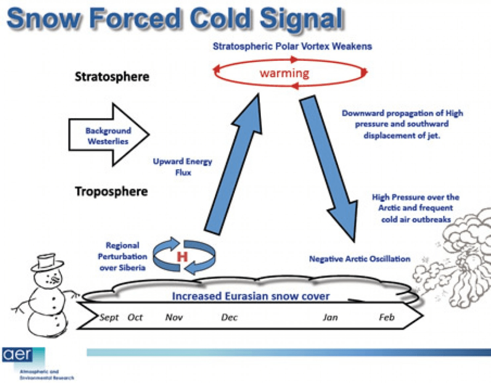
The climate models were found to poorly explain the observed trends [in Northern Hemisphere snow cover]. While the models suggest snow cover should have steadily decreased for all four seasons, only spring and summer exhibited a long-term decrease, and the pattern of the observed decreases for these seasons was quite different from the modelled predictions. Moreover, the observed trends for autumn and winter suggest a long-term increase, although these trends were not statistically significant.
Beyond the models’ ability to reproduce features of today’s climate, the critical issue for society is how well they predict responses to subtle human influences, such as greenhouse gas emissions, aerosol cooling, and landuse changes. The most crucial aspect that models must capture correctly is “feedbacks.” These occur when climate changes either amplify or suppress further warming. In general, the modeled net effect of all feedbacks doubles or triples the direct warming impact of CO₂.
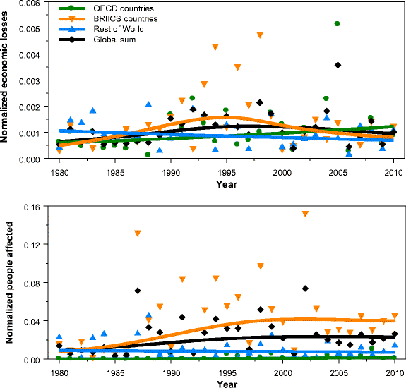
Economic losses normalized for wealth (upper panel) and the number of people affected normalized for population size (lower panel). Sample period is 1980–2010. Solid lines are IRW trends for the corresponding data. EM-DAT database.
Chapter Six Extreme Weather
This chapter is concerned with detection of trends in extreme weather, while Chapter 8 considers causal attribution, with Section 8.4 specifically addressing extreme weather. If no trend is detected, then clearly there is no basis for attribution. But even where a trend is observed, attribution to human-caused warming does not necessarily follow.

With these caveats in mind, we examine the evidence for changes in selected weather and climate extremes. A recurring theme is the wide gap between public perceptions and scientific evidence. It has become routine in media coverage, government and private sector discussions, and even in some academic literature to make generalized assertions that extreme weather of all types is getting worse due to GHGs and “climate change.” Yet expert assessments typically have not drawn such sweeping conclusions and instead have emphasized the difficulty both of identifying specific trends and establishing a causal connection with anthropogenic forcing.

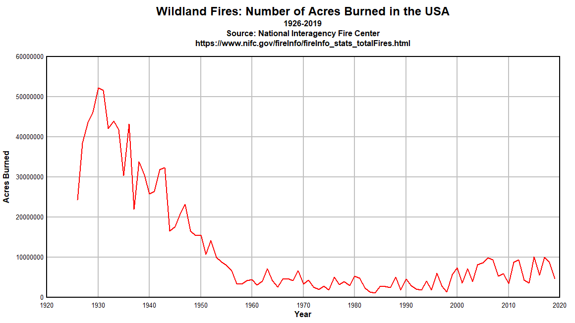
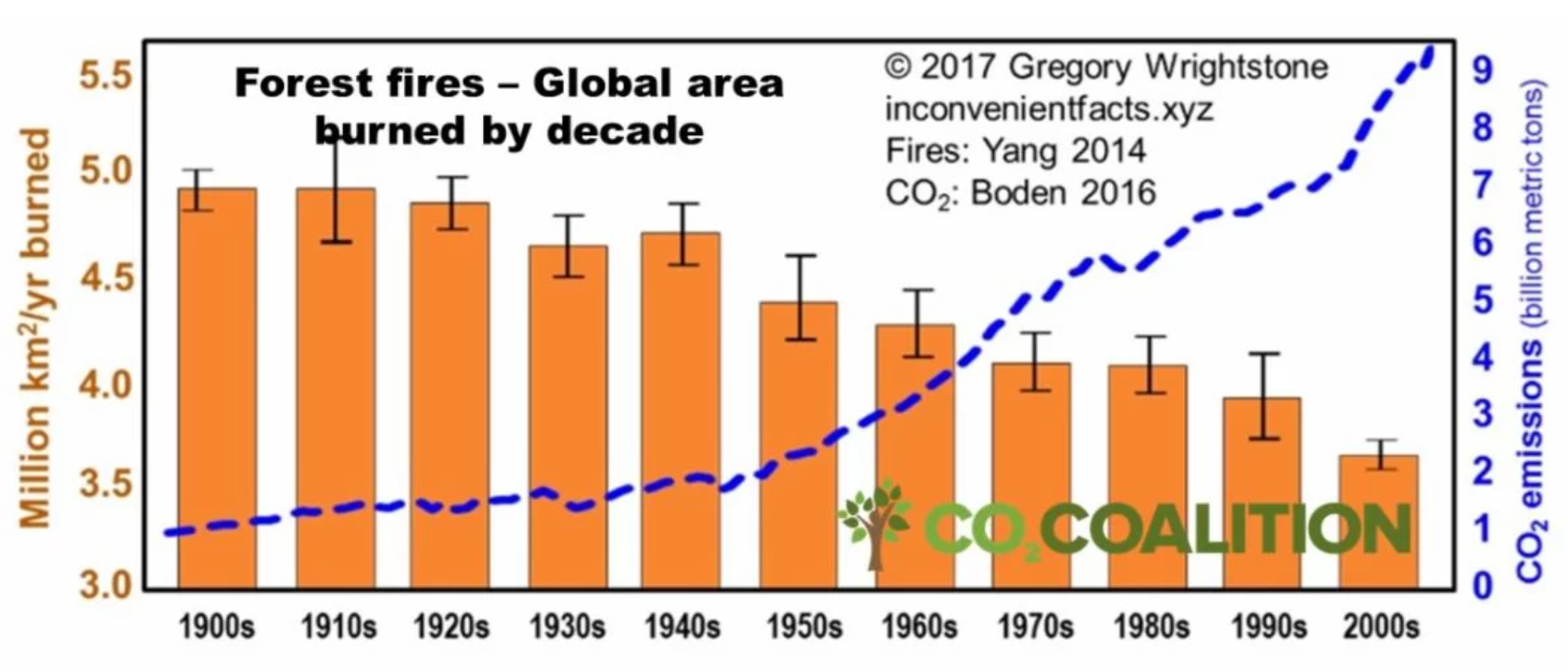
Most types of extreme weather exhibit no statistically significant long-term trends over the available historical record. While there has been an increase in hot days in the U.S. since the 1950s, a point emphasized by AR6, numbers are still low relative to the 1920s and 1930s. Extreme convective storms, hurricanes, tornadoes, floods and droughts exhibit considerable natural variability, but long-term increases are not detected. Some increases in extreme precipitation events can be detected in some regions over short intervals, but the trends do not persist over long periods and at the regional scale. Wildfires are not more common in the U.S. than they were in the 1980s. Burned area increased from the 1960s to the early 2000’s, however it is low compared to the estimated natural baseline level. U.S. wildfire activity is strongly affected by forest management practices.

Chapter 7 Changes in Sea Level
Since 1900, global average sea level has risen by about 8 inches. Sea level change along U.S. coasts is highly variable, associated with local variations in processes that contribute to sinking and also with ocean circulation patterns. The largest sea level increases along U.S. coasts are Galveston, New Orleans, and the Chesapeake Bay regions – each of these locations are associated with substantial local land sinking (subsidence) unrelated to climate change.
Extreme projections of global sea level rise are associated with an implausible extreme emissions scenario and inclusion of poorly understood processes associated with hypothetical ice sheet instabilities. In evaluating AR6 projections to 2050 (with reference to the baseline period 1995-2014), almost half of the interval has elapsed by 2025, with sea level rising at a lower rate than predicted. U.S.tide gauge measurements reveal no obvious acceleration beyond the historical average rate of sea level rise.
The concern over sea level rise is not about the roughly eight inches of global rise since 1900. Rather,it is about projections of accelerated rise based upon simulations of a warming climate through the 21st century. . .There is deep uncertainty surrounding projections of sea level rise to 2100 owing to uncertainties in ice sheet instabilities, particularly for the higher emissions scenarios.
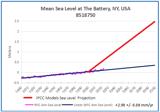
In February 2022, NOAA issued its projections of sea level rise for various sites along the U.S. coast (Sweet et al., 2022). They claim that by 2050, the sea will have risen one foot at The Battery in Manhattan (relative to 2020). A one-foot rise in thirty years would be more than twice the current rate and about three times the average rate over the past century. In that historical context, NOAA’s projection is remarkable—as shown in Figure 7.6, it would require a dramatic acceleration beyond anything observed since the early 20th century. But even more noteworthy is that Sweet et al. (2022) say this rise is “locked in”—it will happen no matter what future emissions are. We should know in a decade or so whether that prediction has legs.
Chapter 8 Uncertainties in Climate Change Attribution
“Attribution” refers to identifying the cause of some aspect of climate change, specifically with reference to anthropogenic activity. There is an ongoing scientific debate around attribution methods, particularly regarding extreme weather events. Attribution is made difficult by high natural variability, the relatively small expected anthropogenic signal, lack of high-quality data, and reliance on deficient climate models. The IPCC has long cautioned that methods to establish causality in climate science are inherently uncertain and ultimately depend on expert judgement.
Substantive criticism of the main IPCC assessments of the role of CO2 in recent warming focus on inadequate assessment of natural climate variability, uncertainties in measurement of solar variability and in aerosol forcing, and problems in the statistical methods used for attribution.
As discussed in Chapter 6 natural variability dominates patterns of extreme weather systems and simplistic assertions of trend detection are frequently undermined by regional heterogeneity and trend reversals over time. Table 8.1 makes the related point that it is not currently possible to attribute changes in most extreme weather types to human influences. Taking wind as an example, the IPCC claims that an anthropogenic signal has not emerged in average wind speeds, severe windstorms, tropical cyclones or sand and dust storms, nor is one expected to emerge this century even under an extreme emissions scenario. The same applies to drought and fire weather.
The IPCC does not make attribution claims for most climate impact drivers related to extreme events. Statements related to statistics of global extremes (e.g. event probability or return times, magnitude and frequency) are not generally considered accurate owing to data limitations and are made with low confidence. Attribution of individual extreme weather events is challenging due to their rarity. Conflicting claims about the causes of the 2021 Western North America Heatwave illustrate the perils of hasty attribution claims about individual extreme events.
There are three areas of substantive criticism of the IPCC’s assessment of the causes of the recent warming: inadequate assessment of natural climate variability, inappropriate statistical methods, and substantial discrepancies between models and observations. The last is discussed in Chapter 5, while this chapter discusses the first two factors. All of these criticisms are relevant to the IPCC’s attribution of the recent warming, which also underpins extreme event attribution.
A sharp recent increase in global average temperatures has raised the question of short-term drivers of climate. One such candidate is the fraction of absorbed solar radiation which has also increased abruptly in recent years. The question is whether the change is an internal feedback to warming caused by greenhouse gases, or whether something else increased the fraction of absorbed radiation which then caused the recent warming.
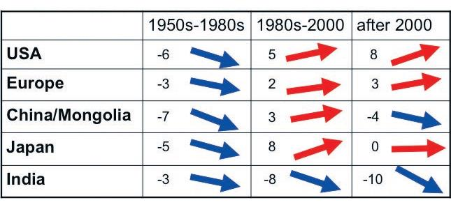
Fig. 1. Qualitative tendencies in decadal SSR (Surface Solar Radiation) changes over the periods 1950s to 1980s, 1980s to 2000, and post-2000 in different world regions that are well covered by historic SSR records.
Arguably the most striking change in the Earth’s climate system during the 21st century is a significant reduction in planetary albedo since 2015, which has coincided with at least two years of record global warmth. Figure 8.2 shows the planetary albedo variations since 2000, when there are good satellite observations. The 0.5 percent reduction in planetary albedo since 2015 corresponds to an increase of 1.7 W/m2 in absorbed solar radiation averaged over the planet (Hansen and Karecha, 2025). For comparison, Forster et al. (2024) estimate the current forcing from the increase in atmospheric CO2 compared to preindustrial times to be 2.33 W/m2.
Changes in surface characteristics cannot explain this decrease in planetary albedo since 2015:
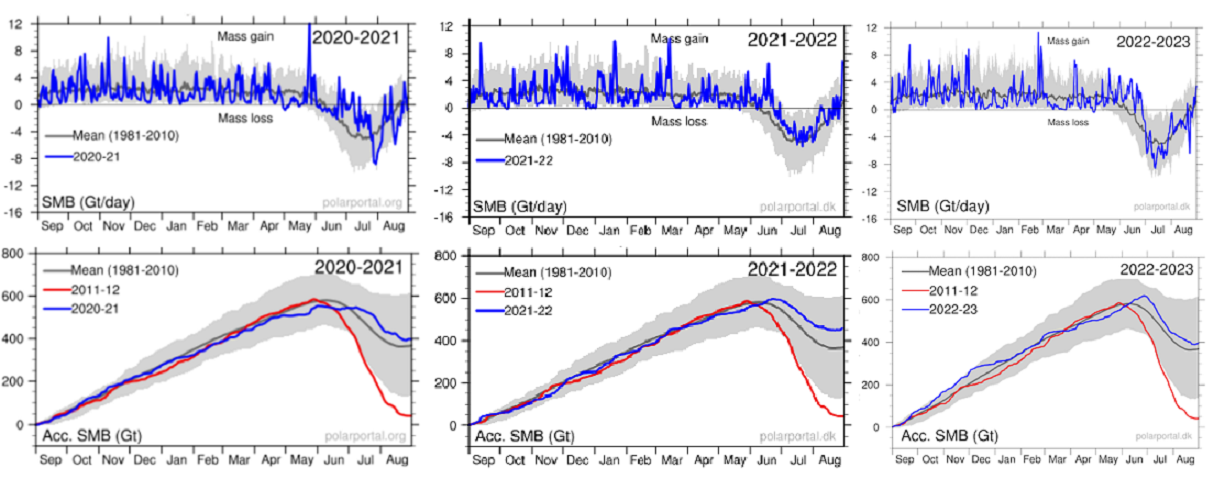
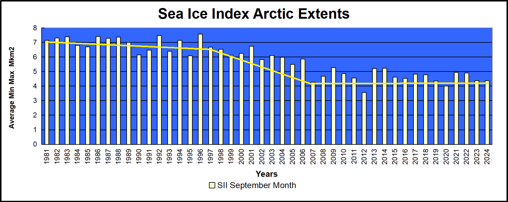
• Arctic sea ice extent has declined by about 5 percent since 1980, although following 2007 there has been a pause in the Arctic sea ice decline (England et al., 2025)
• Regarding Antarctic sea ice, the IPCC AR6 concludes that “There has been no significant trend in Antarctic sea ice area from 1979 to 2020 due to regionally opposing trends and large internal variability.” (Summary for Policymakers, A.1.5)
• Northern hemispheric annual snow cover has been slowly declining since 1967, with barely
significant trends. The data show the Northern Hemisphere has snowier winters, accompanied by more rapid melt in spring and summer.
• Global greening (Chapter 2) is contributing to the decrease in planetary albedo, as forests have a lower albedo than open lands or snow. However, there is some evidence that forests increase cloud cover (high reflectivity), which counteracts the direct albedo decrease associated with increasing forested area.
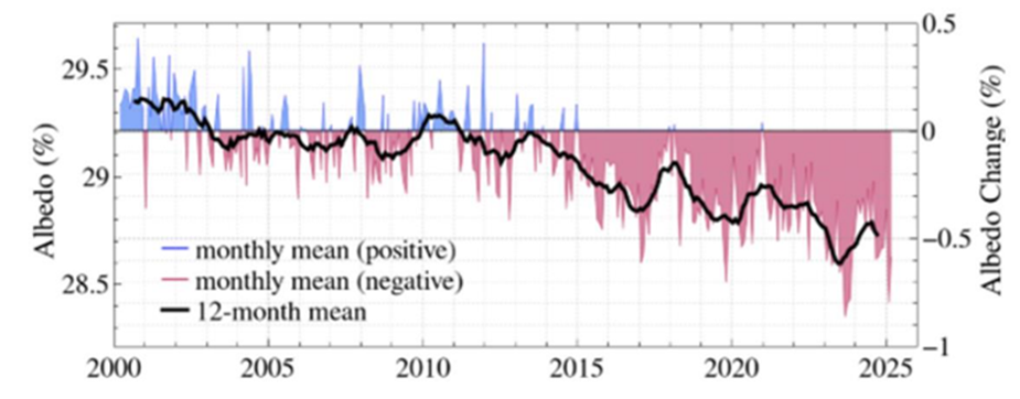
Figure 8.2. Earth’s albedo (reflectivity, in percent), with seasonality removed. From Hansen and Karecha (2025)
In summary, the decline in planetary albedo and the concurrent decline in cloudiness have emphasized the importance of clouds and their variations to global climate variability and change. A change of 1- 2 percent in global cloud cover has a greater radiative impact on the climate than the direct radiative effect of doubling CO2. While it is difficult to untangle causes of the recent trend, the competing explanations for the cause of the declining cloud cover have substantial implications for assessing the Equilibrium Climate Sensitivity and for the attribution of the recent warming. An additional 10 years of data should help clarify
whether this is a strong positive cloud feedback associated with warming or a temporary fluctuation driven by natural variability.

Chapter 9 Climate Change and US Agriculture
There has been abundant evidence going back decades that rising CO2 levels benefit plants, including agricultural crops, and that CO2-induced warming will be a net benefit to U.S. agriculture. The increase in ambient CO2 has also boosted productivity of all major U.S. crop types. There is reason to conclude that on balance climate change has been and will continue to be neutral or beneficial for most U.S. agriculture.
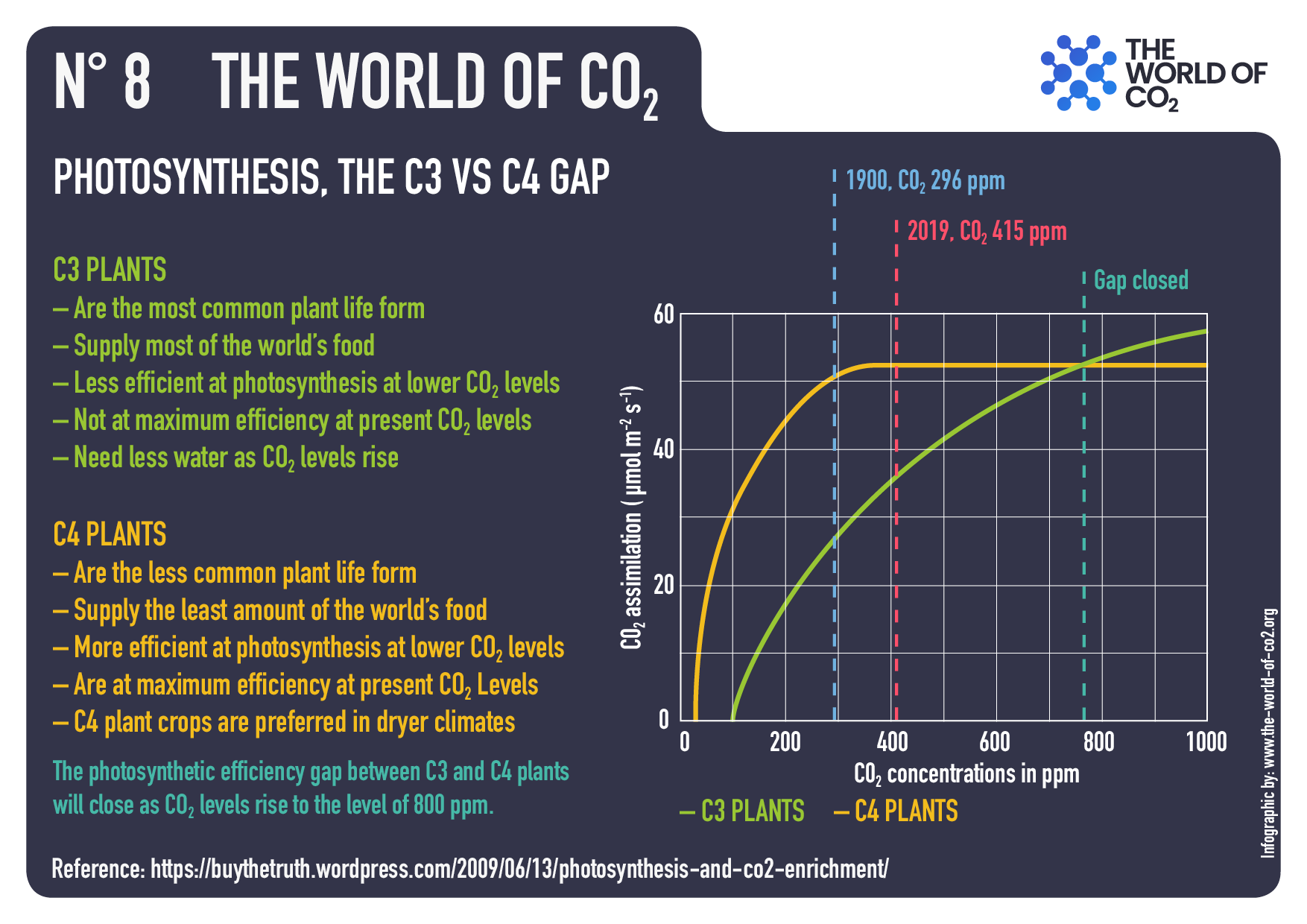 A major deficiency of all these [econometric] studies is that they omit the role of CO2 fertilization. Climate change as it relates to this report is caused by GHG emissions, chiefly CO2. The econometric analyses referenced above focus only on temperature and precipitation changes and do not take account of the beneficial growth effect of the additional CO2 that drives them. As explained in Chapter 2, CO2 is a major driver of plant growth, so this omission biases the analysis towards underestimation of the benefits of climate change to agriculture.
A 2021 report from the U.S. National Bureau of Economic Research (Taylor and Schlenker 2021) used satellite-measured observations of outdoor CO2 levels across the United States, matched to county-level agricultural output data and other economic variables. After controlling for the effects of weather, pollution and technology the authors concluded that CO2 emissions had boosted U.S. crop production since 1940 by 50 to 80 percent, attributing much larger gains than had previously been estimated using FACE experiments. They found that every ppm of increase in CO2 concentration boosts corn yields by 0.5 percent, soybeans by 0.6 percent, and wheat by 0.8 percent.
Notwithstanding the abundant evidence for the direct benefits of CO2 and of CO2-induced warming on crop growth, in 2023 the U.S. Environmental Protection Agency (EPA 2023) boosted its estimate of the Social Cost of Carbon (SCC) about five-fold based largely on a very pessimistic 2017 estimate of global agricultural damages from climate warming (Moore et al., 2017). One of the two damage models used by the EPA attributed nearly half of the 2030 SCC to projected global agricultural damages based on the Moore et al. (2017) analysis. This study was a meta-analysis of crop model studies simulating yield changes for agricultural crops under various climate warming scenarios. Moore et al. projected declining global crop yields for all crop types in all regions due to warming.
In summary, there is abundant evidence going back decades that rising CO2 levels benefit plants,including agricultural crops, and that CO2-induced warming will be a net benefit to U.S. agriculture. To the extent nutrient dilution occurs there are mitigating strategies available that will need to be researched and adapted to local conditions.

Chapter 10 Managing Risks of Extreme Weather
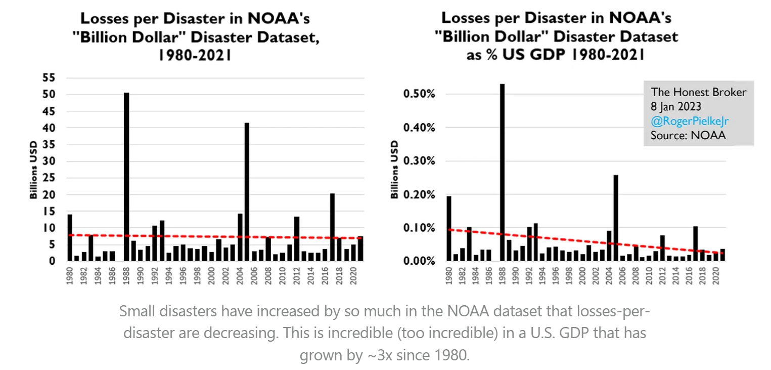
Trends in losses from extreme weather and climate events are dominated by population increases and economic growth. Technological advances such as improved weather forecasting and early warning systems have substantially reduced losses from extreme weather events. Better building codes, flood defenses, and disaster response mechanisms have lowered economic losses relative to GDP. The U.S. economy’s expansion has diluted the relative impact of disaster costs, as seen in the comparison of historical and modern GDP percentages. Heat-related mortality risk has dropped substantially due to adaptive measures including the adoption of air conditioning, which relies on the availability of affordable energy. U.S. mortality risks even under extreme warming scenarios are not projected to
increase if people are able to undertake adaptive responses.
There is strong evidence that people adapt to weather risks. Lee and Dessler (2023) reported that 86 percent of temperature-related deaths across 40 cities in the U.S. were due to cold-related mortality, and that due to adaptation the relative risk of death declined in hot and cold cities alike as seasonal temperatures increased. Allen and Sheridan (2018) found that short, early-season cold events were 2 to 5 times deadlier than hot events, but the mortality risk of both cold and hot extremes drops to nearly zero if the events occur late in the season.
In the context of large declines in heat-related mortality, rising temperatures are associated with a net saving of lives since they reduce mortality from cold events. AR6 Working Group 2 Chapter 16.2.3.5 (O’Neill et al. 2022) acknowledges that heat-related mortality risk is declining over time:
Heat-attributable mortality fractions have declined over time in most countries owing to general improvements in health care systems, increasing prevalence of residential air conditioning, and behavioral changes. These factors, which determine the susceptibility of the population to heat, have predominated over the influence of temperature change.
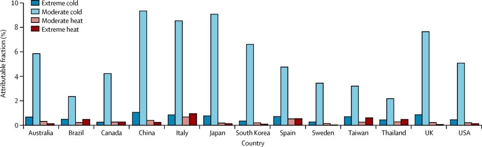
Yet the IPCC misrepresents the overall situation in its AR6 Synthesis report. Section A.2.5 of that document states: “In all regions increases in extreme heat events have resulted in human mortality and morbidity (very high confidence).” But it is silent on the larger decline of deaths during extreme cold events.
Chapter 11 Climate Change, the Economy, and Social Cost of Carbon
Economists have long considered climate a relatively unimportant factor in economic growth, a view echoed by the IPCC itself in AR5. Mainstream climate economics has recognized that CO2-induced warming might have some negative economic effects, but they are too small to justify aggressive abatement policy and that trying to “stop” or cap global warming even at levels well above the Paris target would be worse than doing nothing. An influential study in 2012 suggested that global warming would harm growth in poor countries, but the finding has subsequently been found not to be robust. Studies that take full account of modeling uncertainties either find no evidence of a negative effect on global growth from CO2 emissions or find poor countries as likely to benefit as rich countries.
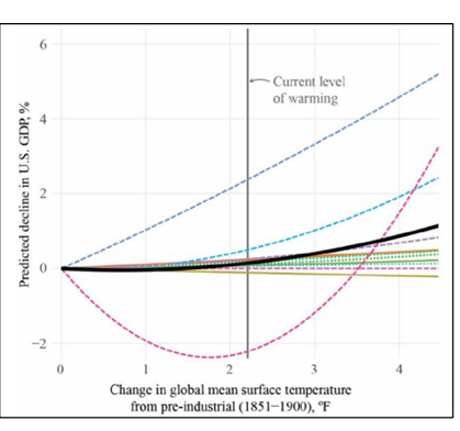
Figure 11.2: Decline in U.S. GDP per degree of warming. Source: CEA-OMB (2023)
Social Cost of Carbon (SCC) estimates are highly uncertain due to unknowns in future economic growth, socioeconomic pathways, discount rates, climate damages, and system responses. The SCC is not intrinsically informative as to the economic or societal impacts of climate change. It provides an index connecting large networks of assumptions about the climate and the economy to a dollar value. Some assumptions yield a high SCC and others yield a low or negative SCC (i.e. a social benefit of emissions). The evidence for or against the underlying assumptions needs to be established independently; the resulting SCC adds no additional information about the validity of those assumptions. Consideration of potential tipping points does not justify major revisions to SCC estimates.
Although the literature refers to “estimates” of the SCC, it is not estimated in the way other economic statistics are estimated. For instance, data on market transactions including prices and quantities can be used to estimate the current inflation rate or the growth rate of per capita real Gross Domestic Product, and there are well-understood uncertainties associated with these quantities. But there are no market data available to measure many, if not most, of the marginal damages or benefits believed to be associated with CO2 emissions, so these need to be imputed using economic models.
For example, an influential component of some SCC calculations is the perceived social cost associated with a changed risk of future mortality due to extreme weather. There is no market in which people can directly attach a price to that risk. At best economists can try to infer such values by looking at transactions in related markets such as real estate or insurance, but isolating the component of price changes attributable to atmospheric CO2 levels is very difficult.
It is increasingly being argued that the SCC is too variable to be useful for policymakers. Cambridge Econometrics (Thoung, 2017) stated it’s “time to kill it” due to uncertainties. The UK and EU no longer use SCC for policy appraisal, opting for “target-consistent” carbon pricing (UK Department for Energy Security and Net Zero 2022, Dunne 2017). However, the uncertainty of SCC estimates doesn’t mean that other regulatory instruments are inherently better or more efficient. Many emissions regulations (such as electric vehicle mandates, renewable energy mandates, energy efficiency regulations and bans on certain types of home appliances) cost far more per tonne of abatement than any mainstream SCC estimate, which
is sufficient to establish that they fail a cost-benefit test.
Chapter 12 Global Climate Impact of US Emissions Policies
U.S. policy actions are expected to have undetectably small direct impacts on the global climate and any effects will emerge only with long delays.
The emissions rates and atmospheric concentrations of criteria air contaminants are closely connected because their lifetimes are short and their concentrations are small; when local emissions are reduced the local pollution concentration drops rapidly, usually within a few days. But the global average CO2 concentration behaves very differently, since emissions mix globally and the global carbon cycle is vast and slow. Any change in local CO2 emissions today will have only a very small global effect, and only with a long delay.
Consequently, any reduction in U.S. emissions would only modestly slow, but not prevent, the rise of global CO2 concentration. And even if global emissions were to stop tomorrow, it would take decades or centuries to see a meaningful reduction in the global CO2concentration and hence human influences on the climate. The practice of referring to unilateral U.S. reductions as “combatting climate change” or “taking action on climate” on the assumption we can stop climate change therefore reflects a profound misunderstanding of the scale of the issue.
Concluding thoughts
This report supports a more nuanced and evidence-based approach for informing climate policy that explicitly acknowledges uncertainties. The risks and benefits of a climate changing under both natural and human influences must be weighed against the costs, efficacy, and collateral impacts of any “climate action”, considering the nation’s need for reliable and affordable energy with minimal local pollution. Beyond continuing precise, un-interrupted observations of the global climate system, it will be important to make realistic assumptions about future emissions, re-evaluate climate models to address biases and uncertainties, and clearly acknowledge the limitations of extreme event attribution studies. An approach that acknowledges both the potential risks and benefits of CO2, rather than relying on flawed models and extreme scenarios, is essential for informed and effective decision-making.


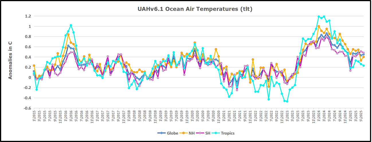
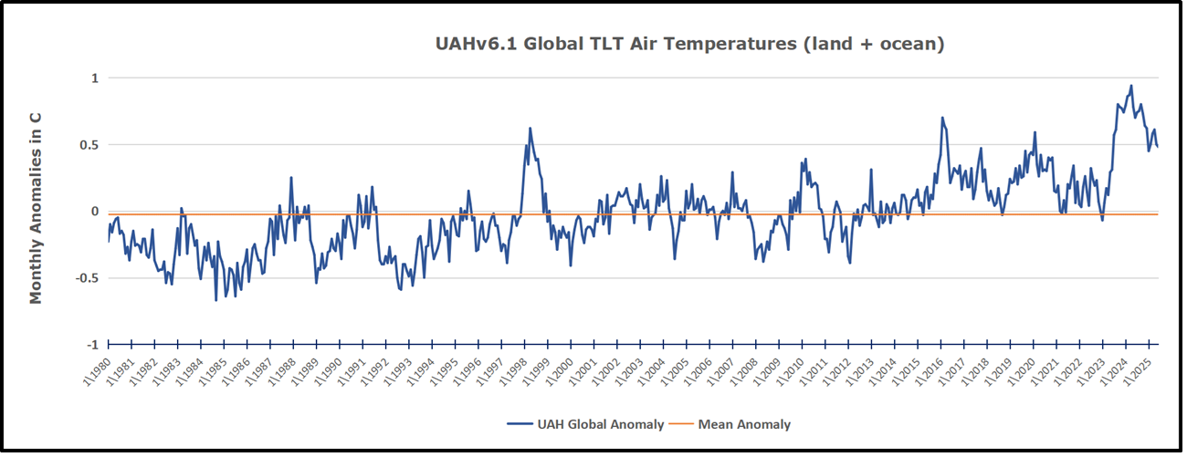

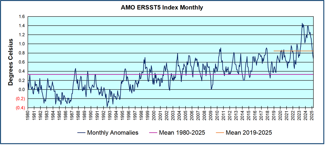
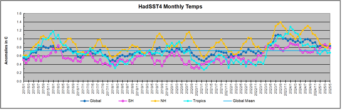
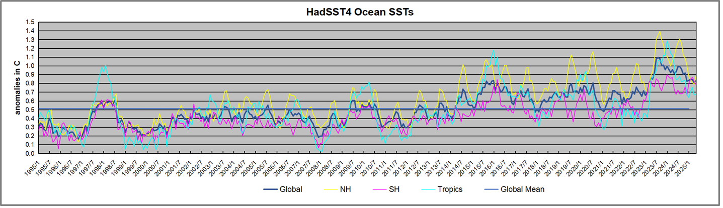
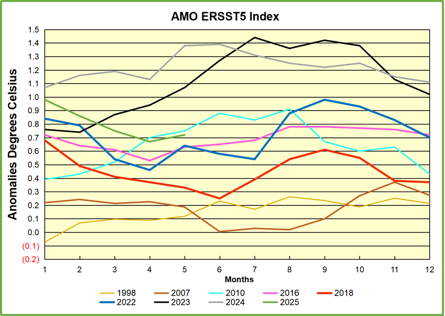
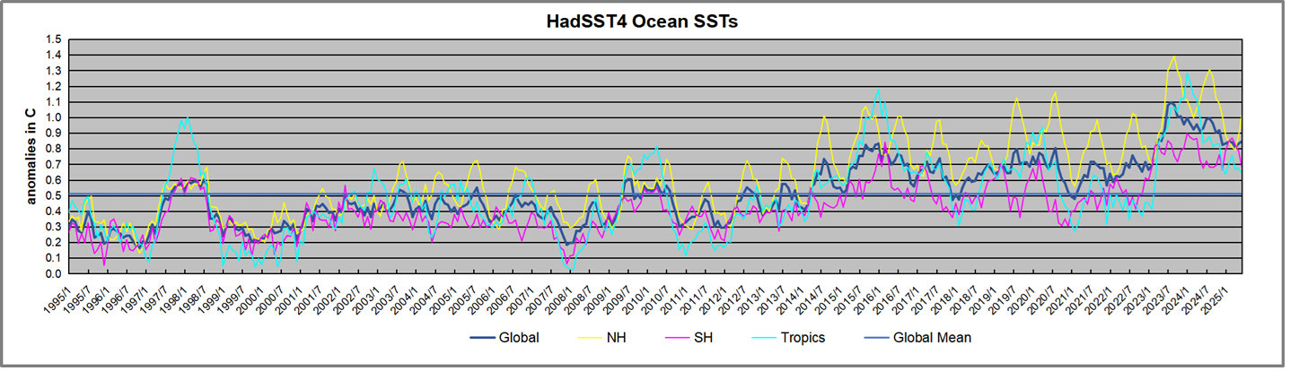
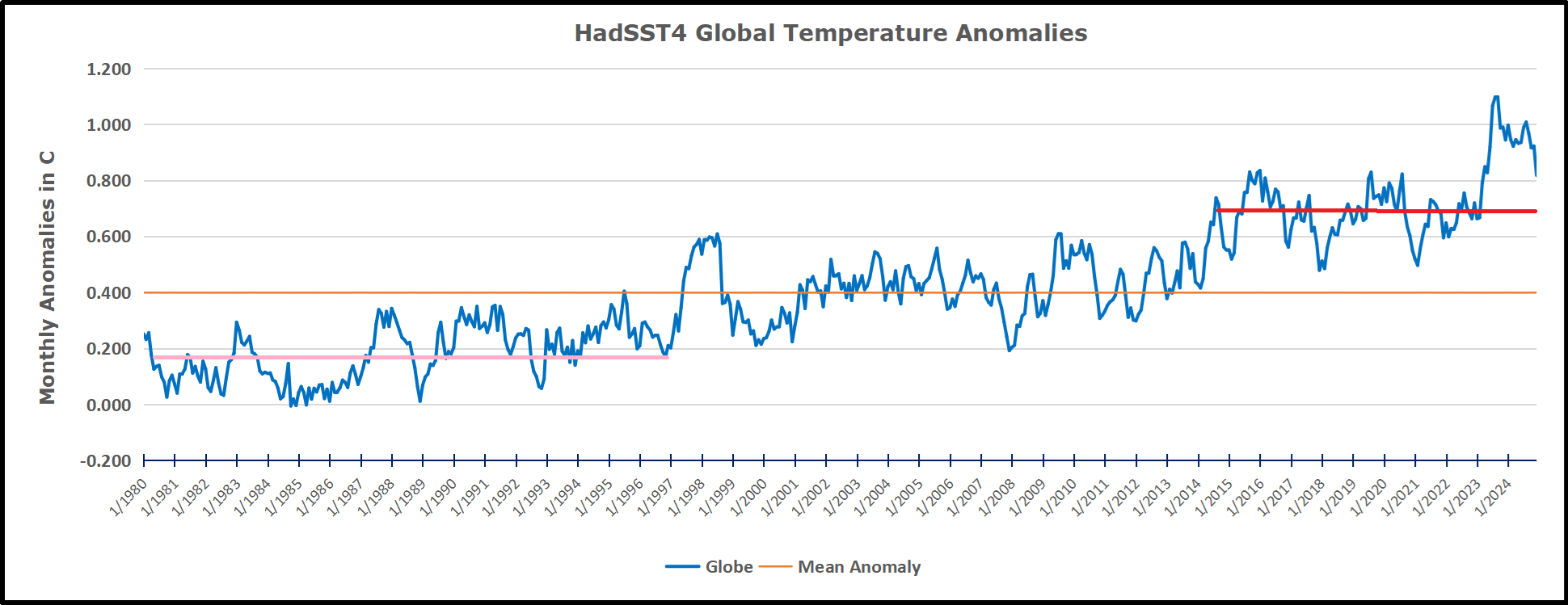
 The best context for understanding decadal temperature changes comes from the world’s sea surface temperatures (SST), for several reasons:
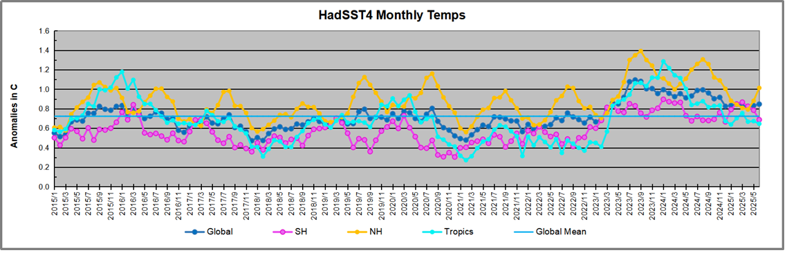


 Other scientists are more interested in the truth than in hype. An example is this AGU publication by D.A Smeed et al.