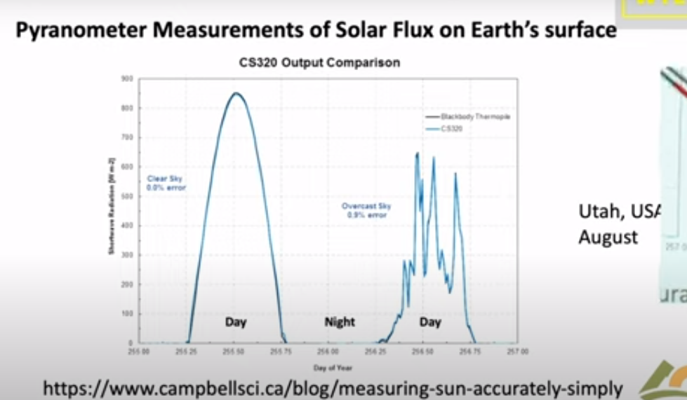
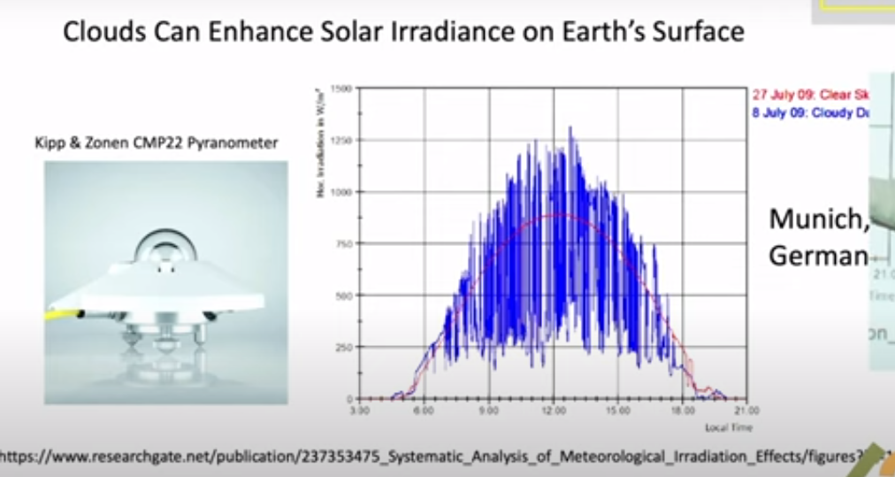
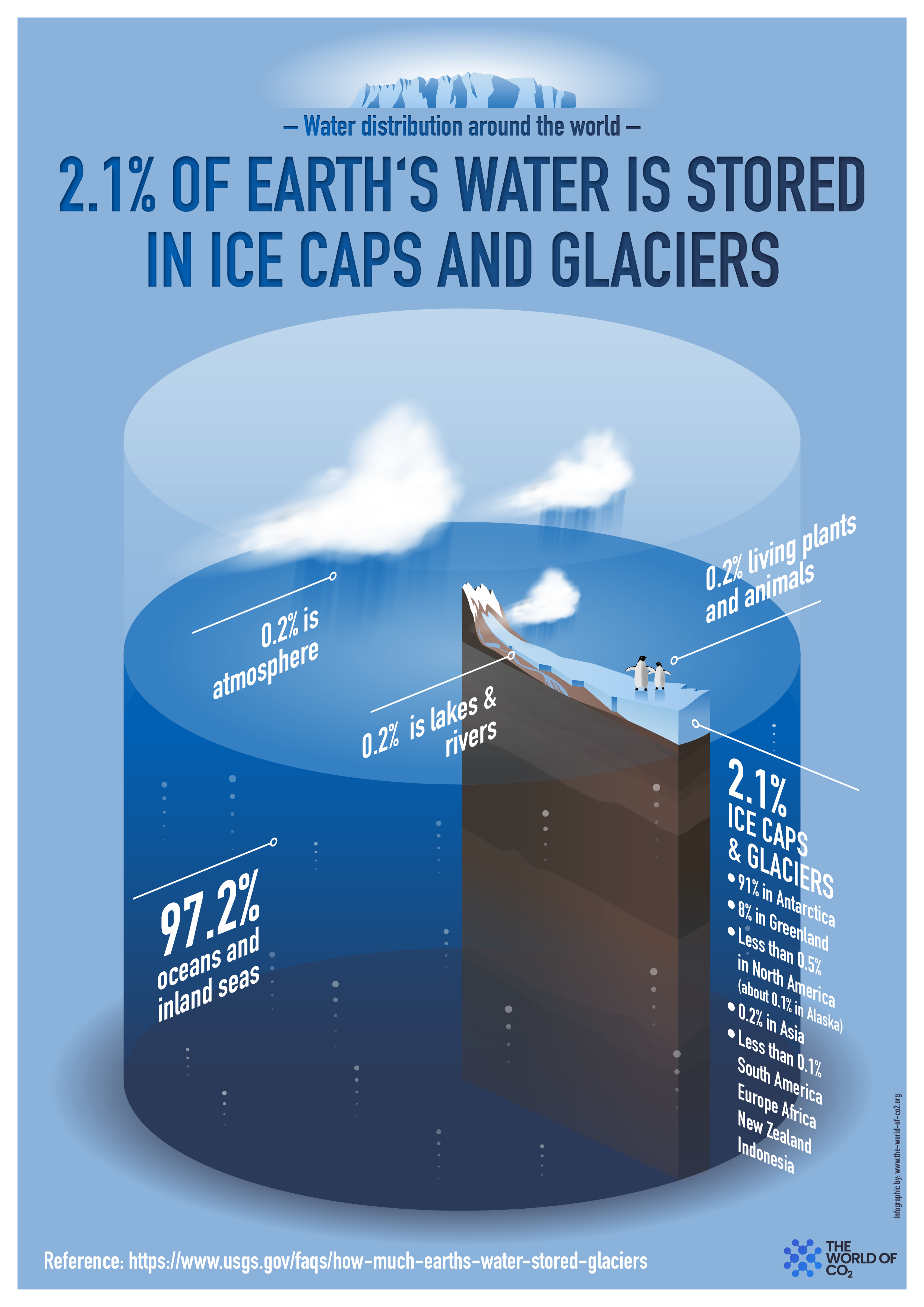
After a recent contretemps at Climate Etc. with CO2 warmists, I was again reminded how insistent are zero carbon zealots to deny multiple natural climate factors, in order to attribute all modern warming to humans burning hydrocarbons. A large part of this blindness comes from constraints dictated by the IPCC to climate model builders. Simply put, natural causes of warming (and cooling) are systematically excluded from CIMP models for the sake of the narrative blaming humans for all climate activity: “Climate Change is real, dangerous and man-made.” A previous post later on analyzes how models deceive by excluding natural forcings.
Let’s start with a paper that seeks objectively to consider both internal and external climate forcings, including human and natural processes. The paper by Bokuchava & Semenov was published last October and is behind a paywall at Springer. An open access copy is here: Factors of natural climate variability contributing to the Early 20th Century Warming in the Arctic. Excerpt in italics with my bolds and added images.
Abstract
The warming in the first half of the 20th century in the Northern Hemisphere (NH) (early 20th century warming (ETCW)) was comparable in magnitude to the current warming, but occurred at a time when the growth rate of the greenhouse gas (GG) concentration in the atmosphere was 4–5 times slower than in recent decades. The mechanisms of the early warming are still a subject of discussion. The ETCW was most pronounced in the high latitudes of the NH, and the recent reconstructions consistently indicate a significant negative anomaly of the Arctic sea ice area during early warming period linked with enhanced Atlantic water inflow to the Arctic and amplified warming in high latitudes of the NH.
Assessing the contributions of internal variability and external natural and anthropogenic factors to this climatic anomaly is key for understanding historical and modern climate dynamics. This paper considers mechanisms of ETCW associated with various internal variability and external anthropogenic and natural factors. An analysis of the findings on the topic of long-term studies of climate variations in the NH during the period of instrumental observations does not allow one to attribute the ETCW to one particular mechanism of internal climate variability or external forcing of the climate.
Most likely, this event was caused by a combined effect of long-term climatic fluctuations in the North Atlantic and the North Pacific with a noticeable contribution of external radiative forcing associated with a decrease in volcanic activity, changes in solar activity, and an increase in GG concentration in the atmosphere due to anthropogenic emissions. Furthermore, this climate variation in high latitudes of the NH has been enhanced by a number of positive feedbacks. An overview of existing research is given, as are the main mechanisms of internal and external climate variability in the NH in the early 20th century. Despite the fact that the internal variability of the climate system is apparently the main mechanism that explains the ETCW, the quantitative assessment of the contribution of each factor remains uncertain, since it significantly depends on the initial conditions in the models and the lack of instrumental data in the early 20th century, especially in polar latitudes.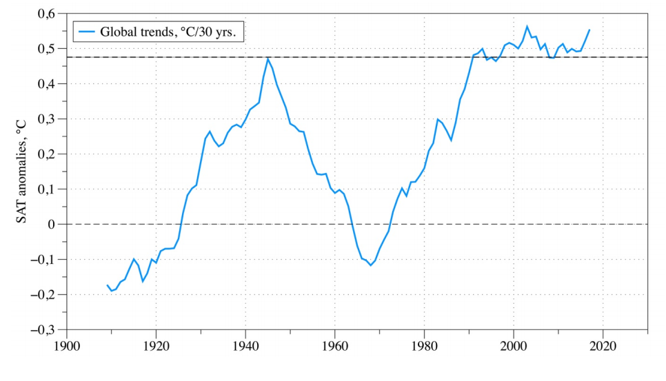
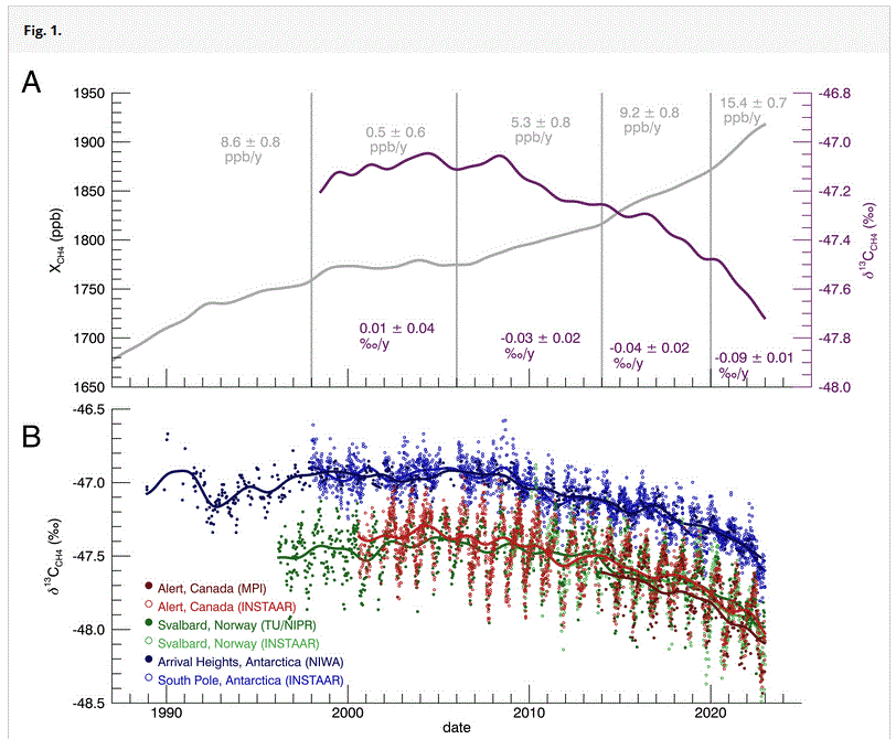
Figure 1. 30-year moving trends in global surface air temperature
(°C / 30 years) according to Berkley dataset [4]
The main cause of the recent warming is considered to be due to the anthropogenic forcing primarily the carbon dioxide (CO2) concentration growth causing a greenhouse effect [5]. But the role of CO2 for ETCW could not be as important since this period precedes the time of the accelerating growth of radiative forcing by greenhouse gases (GHG). This GHG increase after 1950s is also inconsistent with the global SAT decline from 1940s to 1970s.
Numerical experiments with different climate model generations [6,7] show that modern warming is well reproduced when averaged over model ensembles (indicating external influence as major factor). The ETCW amplitude, despite the increasing accuracy of model simulations, still differs significantly in climate models. This may indicate the important role of internal climate variability [2], as well as the uncertainty of results of model experiments due to incorrectly specified forcing.
The majority of studies [8,9] agree that such a strong warming can be explained by a combination of internal climate system variability as quasi-periodic oscillation or random climate fluctuation with increasing global temperature in the background associated with external anthropogenic and natural forcings (increased GHGs emissions and a pause in volcanic eruptions, in particular).
This paper provides an overview of the existing hypotheses that may explain ECTW, describes the main mechanisms of internal climate variability during the twentieth century, in particular in the Arctic region.

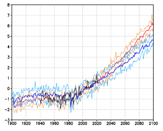
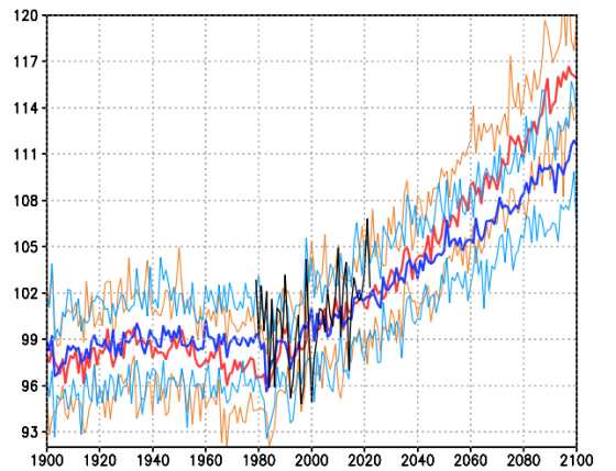
Figure 2. Average annual SAT (°C) anomalies in the period 1900-2015,
according to Berkley observational dataset (5-year running mean), global (black curve),
Northern Hemisphere (blue curve), Southern Hemisphere (orange curve),
NH high latitudes (60°-90° N) (red curve), and NH high latitudes
without 5-yr running mean smoothing (gray curve)
Internal variability in the Arctic can be enhanced by positive radiation feedbacks [12], including surface albedo – temperature feedback, which can strongly impact the absorption of solar shortwave radiation. This mechanism manifests itself during prolonged warm periods, mainly in autumn, when a growing ice-free ocean surface with low albedo absorbs more solar radiation and warms the upper ocean layer that leads to further sea ice melting [10]. This positive radiation feedback contributes to the faster temperature increase in the Arctic. This phenomenon is now well-known as “Arctic (or Polar) Amplification”.
However, other positive feedbacks also play major roles in the Arctic Amplification. There are positive feedbacks related to long-wave radiation, for instance, an increase of water vapor content and cloud cover leads to a greenhouse effect, which is more pronounced at high latitudes [13], as well as dynamic feedbacks, which imply strengthened oceanic and atmospheric ocean heat transfer to the Arctic in the conditions of the shrinking sea ice extent [14,15].
Arctic Amplification may also be a consequence of non-local mechanisms such as enhanced northward latent heat transfer in the warmer atmosphere [16] Quasi-periodic fluctuations of North Atlantic sea surface temperature (SST) of 60-80 year time scale [17] suggest a possible role of oceanic heat transfer as a driver of long-term SAT anomalies in the Arctic that can be enhanced by positive feedbacks [18].
Thus, the amplitude of SST oscillations in the NH polar latitudes can be a combination of both regional response to global climate change and the formation of internal oscillations in the ocean atmosphere system.
Natural internal factors – ocean-atmosphere system variability
Atmosphere circulation variability
 Figure 3. Winter Arctic (60°-90°N) SAT anomalies for according to
Berkley observations (5-year running mean) (black curve); NAO index (pink curve),
PNA index (blue curve) according to HadSLP2.0 dataset [25]
The North Atlantic Oscillation (NAO) and the closely related Arctic Oscillation (AO) is the dominant mode of large-scale winter atmospheric variability in the North Atlantic, characterized by sea level pressure dipole with one center over Greenland (Icelandic minimum) and another center of the opposite sign in the North Atlantic mid latitudes (Azores maximum). NAO controls the strength and direction of westerly winds and the position of storm tracks in the North Atlantic sector, thus crucially impacting the European climate [23].
During the first two decades of the 20th century, the positive phase of NAO was expressed in a stronger than usual zonal circulation over the North Atlantic (Fig. 3). The long-term dominance of these atmospheric circulation pattern led to an advection of heat to the northeastern part of the North Atlantic. However, the NAO transition to the negative phase after 1920s and in general inconsistency between NAO and Arctic SAT variations in the first half of the 20th century do not support an hypothesis of NAO contribution to the ETCW warming [24].
The Pacific North American Oscillation index (PNA) characterizes the pressure gradient between the North Pacific (Aleutian minimum) and the East of North America (Canadian maximum) and is related to fluctuations of North Pacific zonal flow. An important feature of PNA in the context of the ETCW is that both (positive and negative) PNA phases may contribute to atmospheric heat advection to the Arctic. In the 1930s and 1950s, the negative phase (Fig. 3) led to the transfer of warm air masses to the pole across the northwestern Pacific Ocean, and the positive phase of the 1940s forced increased zonal transfer to the Western coast of Canada and Alaska [8]. PNA is strongly influenced by the Pacific Southern Oscillation (El Nino Southern Oscillation – ENSO) – the positive index phase is associated with the El Nino phenomena, and the negative with La Niña events.
Atmospheric circulation in the mid-latitudes of the Pacific Ocean may also depend on fluctuations of the Pacific trade winds [28]. The trade winds weakening is manifested in the SAT growth in Pacific mid-latitudes, which coincides on the time scale with the warming of 1910-1940s in the high Arctic latitudes and in the lowering of temperatures during the cooling period between 1940s and 1970s when the strength of the trade winds had been increasing.
Ocean circulation variability

Figure 4. Winter Arctic (60°-90°N) SAT anomalies according to
Berkley dataset (5-year running mean, black curve); AMO index (pink curve),
PDO index (blue curve) according to HadiSST2.0 dataset [37]
Arctic Amplification in the 20th century, including ETCW period can be associated not only with an increase of atmospheric heat transport, but also with an enhancement of ocean heat inflow in the North Atlantic to the extratropical latitudes of the NH from its equatorial part [30].
Instrumental data show that SST variability in the North Atlantic during the 20th century was dominated by cyclic fluctuations on time scales of 50-80 years, showing two warm periods in the 1930s-1940s and at the end of the 20th century and two cold periods in the beginning of the century and in the 1960s-1970s. SST oscillations in the North Atlantic are called Atlantic Multidecadal Oscillation (AMO). The observational data also indicate AMO-like cycles in the Arctic SAT (Fig. 4).
Paleo-reconstructions of AMO [33] demonstrate that strong, low-frequency (60-100 years) SSTnvariability is a robust feature of the North Atlantic climate over the past five centuries. There are also indications of a significant correlation between Arctic sea ice area and AMO index including a sharp change during ECTW period [34].
There is another pronounced internal climate variability that may act synchronously with AMO. This is the Pacific Decadal Oscillation (PDO), which reflects a variability of the Pacific SSTs north of 20° N and has 20-40 years periodicity [35]. PDO might have played an equally important role in the heat advection to the Arctic in the middle of the century. Several current studies [36,29] suggest the synchronous phase shift of AMO and PDO largely contributed to the accelerated Arctic warming, both the ongoing and ETCW.
Сonclusions
Understanding the mechanisms of ETCW and subsequent cooling is a key to determine the relative contribution of internal natural variability to global climate change on multi-decadal time scale. Studies of climate changes in high latitudes in the mid-twentieth century allows us to identify a number of possible mechanisms involving natural variability and positive feedbacks in the Arctic climate system that may partially explain ETCW.
Based on the recent literature it can be concluded that internal oceanic variability, together with additional impact of natural atmospheric circulation variations are important factors for ETCW. Recently, a number of results indicating the Pacific Ocean as a source of multidecadal fluctuation both on a global scale and in high latitudes has increased. Howewer, assessment of a relative contribution to ETCW in the Atlantic and Pacific sectors remains uncertain.
Climate model simulations [9,43,44] argue that the internal variability of the ocean-atmosphere system cannot explain the entire amplitude of temperature fluctuations in the first half of the 20th century as a single factor, and must act in combination with external forcings (solar and volcanic activity), positive feedbacks in the Arctic climate system, and anthropogenic factors. Quantifying the contribution of each factor still remains a matter of debate.
Climate Deception: Models Hide the Paleo Incline
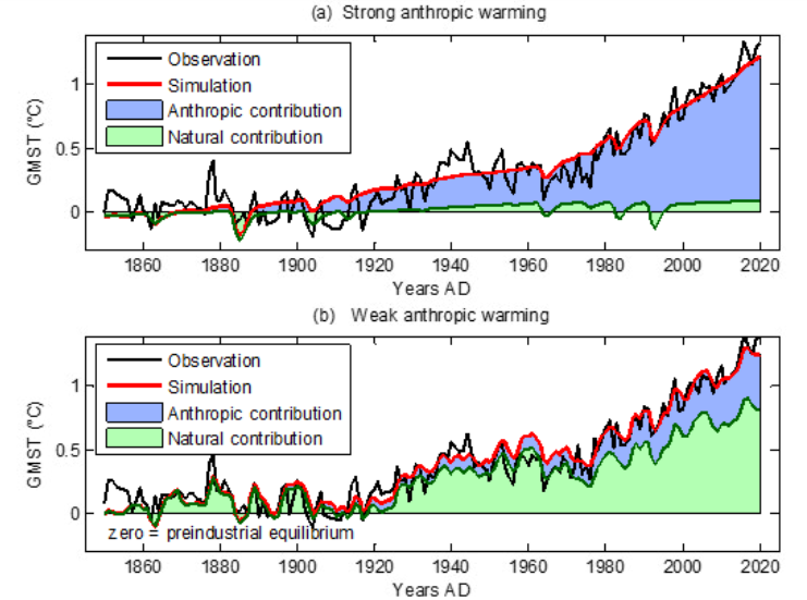
Figure 1. Anthropgenic and natural contributions. (a) Locked scaling factors, weak Pre Industrial Climate Anomalies (PCA). (b) Free scaling, strong PCA
In 2009, the iconic email from the Climategate leak included a comment by Phil Jones about the “trick” used by Michael Mann to “hide the decline,” in his Hockey Stick graph, referring to tree proxy temperatures cooling rather than warming in modern times. Now we have an important paper demonstrating that climate models insist on man-made global warming only by hiding the incline of natural warming in Pre-Industrial times. The paper is From Behavioral Climate Models and Millennial Data to AGW Reassessment by Philippe de Larminat. H/T No Tricks Zone. Excerpts in italics with my bolds.
Abstract
Context. The so called AGW (Anthropogenic Global Warming), is based on thousands of climate simulations indicating that human activity is virtually solely responsible for the recent global warming. The climate models used are derived from the meteorological models used for short-term predictions. They are based on the fundamental and empirical physical laws that govern the myriad of atmospheric and oceanic cells integrated by the finite element technique. Numerical approximations, empiricism and the inherent chaos in fluid circulations make these models questionable for validating the anthropogenic principle, given the accuracy required (better than one per thousand) in determining the Earth energy balance.
Aims and methods. The purpose is to quantify and simulate behavioral models of weak complexity, without referring to predefined parameters of the underlying physical laws, but relying exclusively on generally accepted historical and paleoclimate series.
Results. These models perform global temperature simulations that are consistent with those from the more complex physical models. However, the repartition of contributions in the present warming depends strongly on the retained temperature reconstructions, in particular the magnitudes of the Medieval Warm Period and the Little Ice Age. It also depends on the level of the solar activity series. It results from these observations and climate reconstructions that the anthropogenic principle only holds for climate profiles assuming almost no PCA neither significant variations in solar activity. Otherwise, it reduces to a weak principle where global warming is not only the result of human activity, but is largely due to solar activity.
Discussion
GCMs (short acronym for AOCGM: Atmosphere Ocean General Circulation Models, or for Global Climate model) are fed by series related to climate drivers. Some are of human origin: fossil fuel combustion, industrial aerosols, changes in land use, condensation trails, etc. Others are of natural origin: solar and volcanic activities, Earth’s orbital parameters, geomagnetism, internal variability generated by atmospheric and oceanic chaos. These drivers, or forcing factors, are expressed in their own units: total solar irradiance (W m–2), atmospheric concentrations of GHG (ppm), optical depth of industrial or volcanic aerosols (dimless), oceanic indexes (ENSO, AMO…), or by annual growth rates (%). Climate scientists have introduced a metric in order to characterize the relative impact of the different climate drivers on climate change. This metric is that of radiative forcings (RF), designed to quantify climate drivers through their effects on the terrestrial radiation budget at the top of the atmosphere (TOA).
However, independently of the physical units and associated energy properties of the RFs, one can recognize their signatures in the output and deduce their contributions. For example, volcanic eruptions are identifiable events whose contributions can be quantified without reference to either their assumed radiative forcings, or to physical modeling of aerosol diffusion in the atmosphere. Similarly, the Preindustrial Climate Anomalies (PCA) gathering the Medieval Warm Period (MWP) and the Little Ice Age (LIA), shows a profile similar to that of the solar forcing reconstructions. Per the methodology proposed in this paper, the respective contributions of the RF inputs are quantified through behavior models, or black-box models.
Now, Figures 1-a and 1-b presents simulations obtained from the models identified under two different sets of assumptions, detailed in sections 6 and 7 respectively.
Figure 1. Anthropgenic and natural contributions. (a) Locked scaling factors, weak Pre Industrial Climate Anomalies (PCA). (b) Free scaling, strong PCA
In both cases, the overall result for the global temperature simulation (red) fits fairly well with the observations (black). Curves also show the forcing contributions to modern warming (since 1850). From this perspective, the natural (green) and anthropogenic (blue) contributions are in strong contradiction between panels (a) and (b). This incompatibility is at the heart of our work.
Simulations in panel (a) are calculated per section 6, where the scaling multipliers planned in the model are locked to unity, so that the radiative forcing inputs are constrained to strictly comply with the IPCC quantification. The remaining parameters of the black-box model are adjusted in order to minimize the deviation between the observations (black curve) and the simulated outputs (red). Per these assumptions, the resulting contributions (blue vs. green) comply with the AGW principle. Also, the conformity of the results with those of the CMIP supports the validity of the type of behavioral model adopted for our simulations.
Paleoclimate Temperatures
Although historically documented the Medieval Warm Period (MWP) and the Little Ice Age (LIA) don’t make consensus about their amplitudes and geographic extensions [2, 3]. In Fig. 7.1-c of the First Assessment Report of IPCC, a reconstruction from showed a peak PCA amplitude of about 1.2 °C [4]. Then later on, a reconstruction by the so-called ‘hockey stick graph’, was reproduced five times in the IPCC Third Assessment Report (2001), wherein there was no longer any significant MWP [5].
After, 2003 controversies reference to this reconstruction had disappeared from subsequent IPCC reports:it is not included among the fifteen paleoclimate reconstructions covering the millennium period listed in the fifth report (AR5, 2013) [6]. Nevertheless, AR6 (2021) revived a hockey stick graph reconstruction from a consortium initiated by a network “PAst climate chanGES” [7,8]. The IPCC assures (AR6, 2.3.1.1.2): “this synthesis is generally in agreement with the AR5 assessment”.
Figure 2 below puts this claim into perspective. It shows the fifteen reconstructions covering the preindustrial period accredited by the IPCC in AR5 (2013, Fig. 5.7 to 5.9, and table 5.A.6), compiled (Pangaea database) by [7]. Visibly, the claimed agreement of the PAGES2k reconstruction (blue) with the AR5 green lines does not hold.
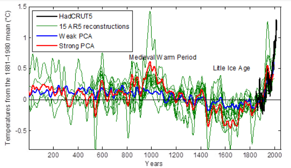
Figure 2. Weak and strong preindustrial climate anomalies, respectively from AR5 (2013) in green and AR6 (2021) in blue.
Conclusion
In section 8 above, a set of consistent climate series is explored, from which solar activity appears to be the main driver of climate change. To eradicate this hypothesis, the anthropogenic principle requires four simultaneous assessments:
♦ A strong anthropogenic forcing, able to account for all of the current warming.
♦ A low solar forcing.
♦ A low internal variability.
♦ The nonexistence of significant pre-industrial climate anomalies, which could indeed be explained by strong solar forcing or high internal variability.
None of these conditions is strongly established, neither by theoretical knowledge nor by historical and paleoclimatic observations. On the contrary, our analysis challenges them through a weak complexity model, fed by accepted forcing profiles, which are recalibrated owning to climate observations. The simulations show that solar activity contributes to current climate warming in proportions depending on the assessed pre-industrial climate anomalies.
Therefore, adherence to the anthropogenic principle requires that when reconstructing climate data, the Medieval Warming Period and the Little Ice Age be reduced to nothing, and that any series of strongly varying solar forcing be discarded.
Background on Disappearing Paleo Global Warming

The first graph appeared in the IPCC 1990 First Assessment Report (FAR) credited to H.H.Lamb, first director of CRU-UEA. The second graph was featured in 2001 IPCC Third Assessment Report (TAR) the famous hockey stick credited to M. Mann.
Rise and Fall of the Modern Warming Spike