2023 Observing N. Atlantic Oscillations

A continuing theme of this blog is Oceans Make Climate, coined by Dr. Arnd Bernaerts.  He further explained: ” Climate is the continuation of ocean by other means.”  The focus of this post is the North Atlantic which directly impacts weather and climate experienced by the populated continents of Europe and North America.

North Atlantic is a Climate Driver

The importance of this basin is described by Börgel et al. (2020) The Atlantic Multidecadal Oscillation controls the impact of the North Atlantic Oscillation on North European climate.  Excerpts in italics with my bolds.

Abstract

European climate is heavily influenced by the North Atlantic Oscillation (NAO). However, the spatial structure of the NAO is varying with time, affecting its regional importance. By analyzing an 850-year global climate model simulation of the last millennium it is shown that the variations in the spatial structure of the NAO can be linked to the Atlantic Multidecadal Oscillation (AMO). The AMO changes the zonal position of the NAO centers of action, moving them closer to Europe or North America. During AMO+ states, the Icelandic Low moves further towards North America while the Azores High moves further towards Europe and vice versa for AMO- states. The results of a regional downscaling for the East Atlantic/European domain show that AMO-induced changes in the spatial structure of the NAO reduce or enhance its influence on regional climate variables of the Baltic Sea such as sea surface temperature, ice extent, or river runoff.

Natural Factors Operating in N. Atlantic

The main mechanisms operating in this basin are defined as follows:

AMO (Atlantic Multidecadal Oscillation) refers to the phase changes of N. Atlantic SSTs (Sea Surface Temperatures).  There is also the AMOC (Atlantic Multidecadal Overturning Oscillation) referring to the oceanic “conveyer belt” transporting water between the warm tropics and the cold poles. The NAO (North Atlantic Oscillation) is the air pressure dipole alternating highs and lows between the Azores and Iceland.

The current state of scientific understanding is indicated by a recent paper Seip and Wang (2022) The North Atlantic Oscillations: Lead–Lag Relations for the NAO, the AMO, and the AMOC—A High-Resolution Lead–lag Analysis.  Excerpts in italics with my bolds.

Abstract

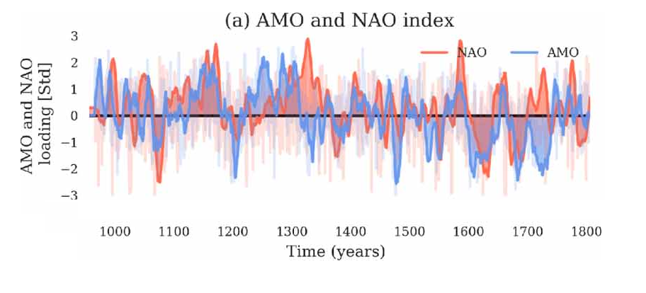
Several studies examine cycle periods and the interactions between the three major climate modes over the North Atlantic, namely the Atlantic meridional overturning circulation (AMOC), the Atlantic multidecadal oscillation (AMO), and the North Atlantic oscillation (NAO). Here, we use a relatively novel high-resolution lead–lag (LL) method to identify short time windows with persistent LL relations in the three series during the period from 1947 to 2020. We find that there are roughly 20-year time windows where LL relations change direction at both interannual, high-frequency and multidecadal, low-frequency timescales. However, with varying LL strength, the AMO leads AMOC for the full period at the interannual timescale. During the period from 1980 to 2000, we had the sequence NAO→AMO→AMOC→NAO at the interannual timescale. For the full period in the decadal time scale, we obtain NAO→AMO→AMOC. The Ekman variability closely follows the NAO variability. Both single time series and the LL relation between pairs of series show pseudo-oscillating patterns with cycle periods of about 20 years. We list possible mechanisms that contribute to the cyclic behavior, but no conclusive evidence has yet been found.

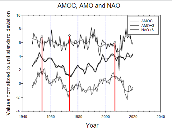
Figure 2.AMOC, AMO and NAO. (a) Time series raw and LOESS(0.3)-smoothed. The detrendedand LOESS(0.3)-smoothed versions of AMOC shifts sign from starting with (+) in 1947, then 1969,1997, 2010. AMO starting from (+) in 1947, 1996, 1999. NAO starting from (+) in 1947, 1952, 1972,1997, 2014, 2020.

Contemporary AMO Observations

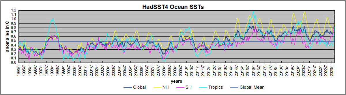
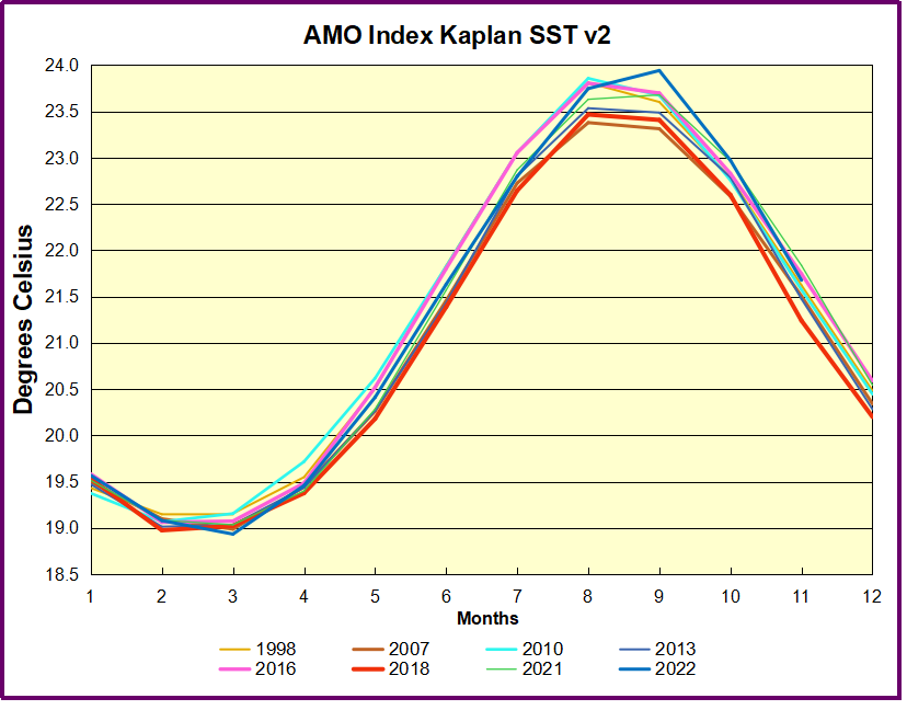
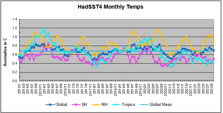
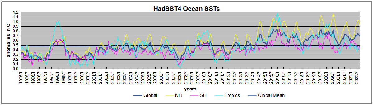
Through January 2023 I depended on the Kaplan AMO Index (not smoothed, not detrended) for N. Atlantic observations. But it is no longer being updated, and NOAA says they don’t know its future.  So I find only the Hadsst AMO dataset has Feb. and March data.  It differs from Kaplan, which reported average absolute temps measured in N. Atlantic.  “Hadsst AMO  follows Trenberth and Shea (2006) proposal to use the NA region EQ-60°N, 0°-80°W and subtract the global rise of SST 60°S-60°N to obtain a measure of the internal variability, arguing that the effect of external forcing on the North Atlantic should be similar to the effect on the other oceans.”  So the values represent differences between the N. Atlantic and the Global ocean.

The AMO index as defined as the SST averaged over 0°-60°N, 0°-80°W minus SST averaged over 60°S-60°N.

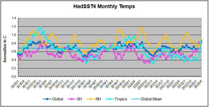
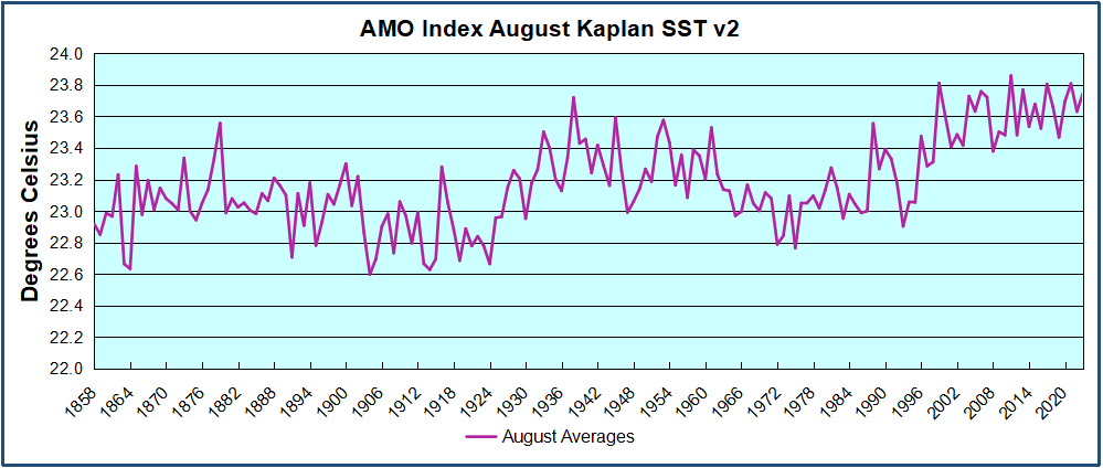
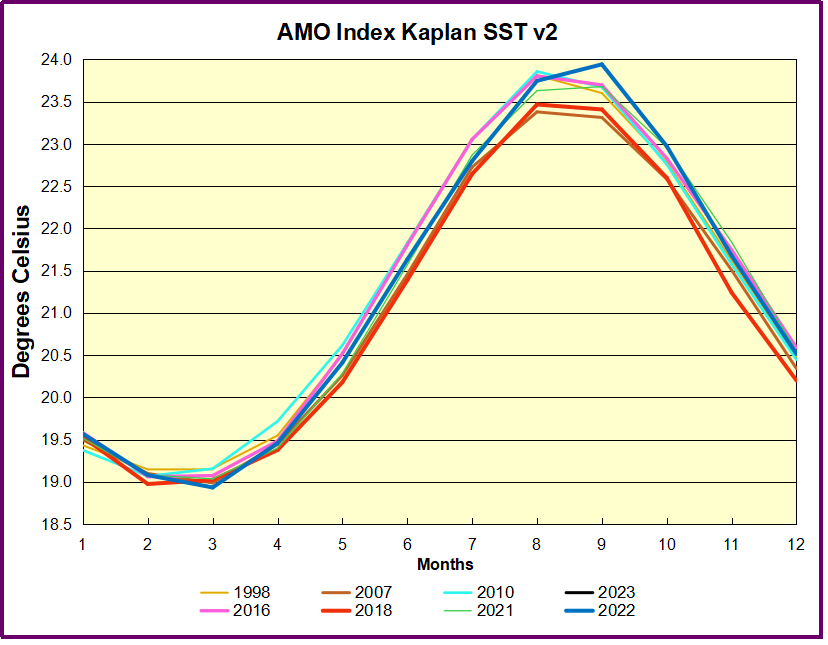
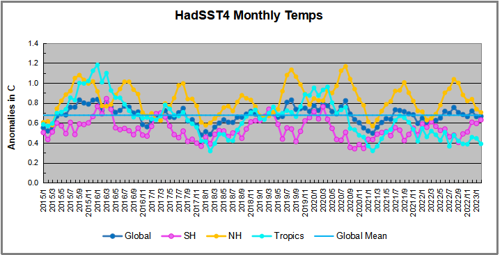
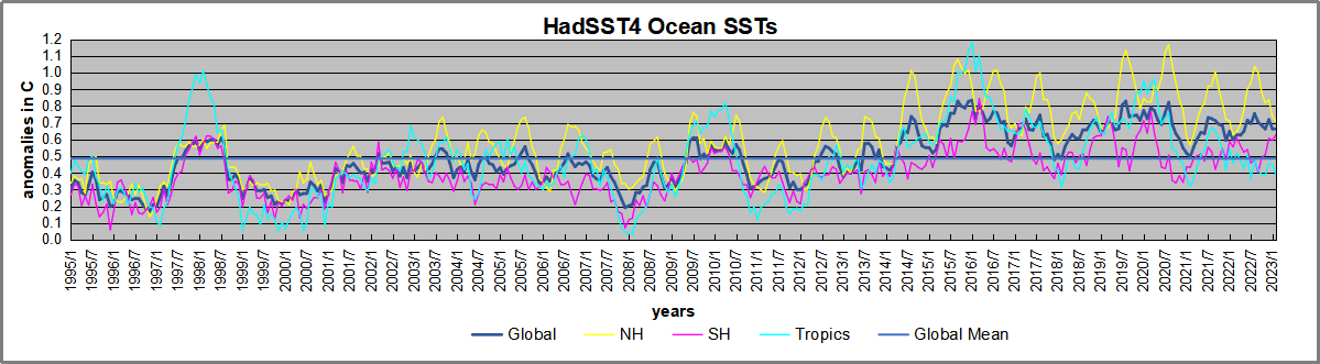
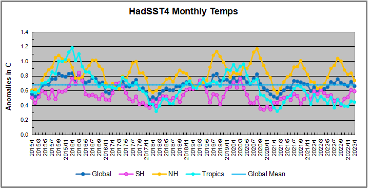
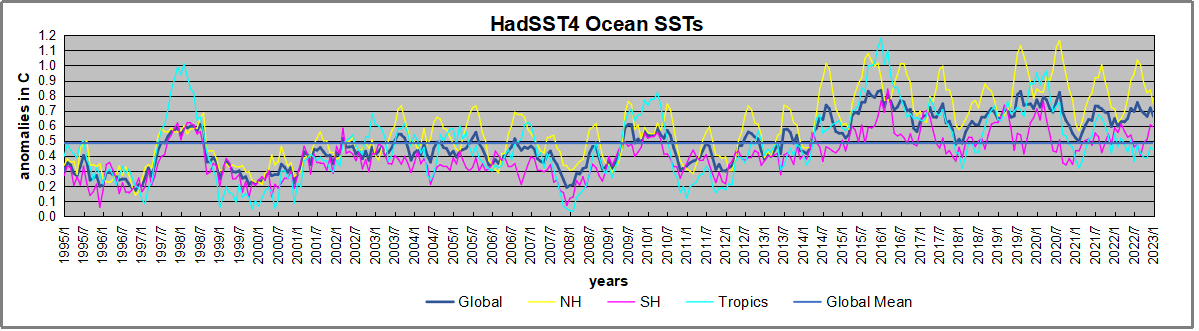
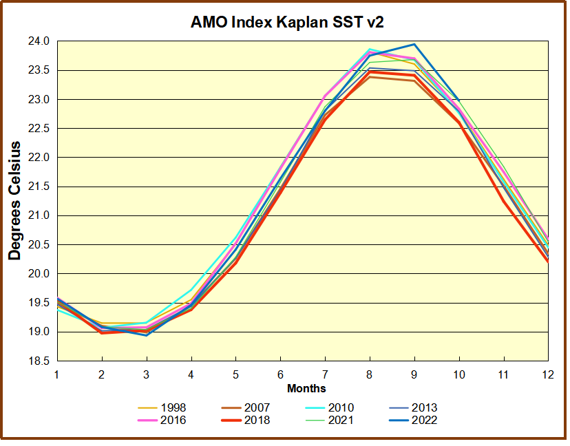
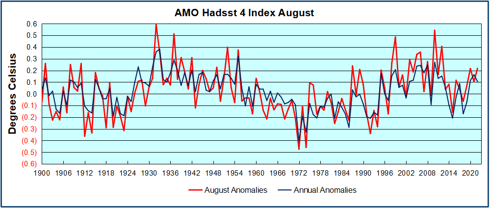
The chart above confirms what Kaplan also showed.  As August is the hottest month for the N. Atlantic, its varibility, high and low, drives the annual results for this basin.  Note also the peaks in 2010, lows after 2014, and a rise in 2021. An annual chart below is informative:

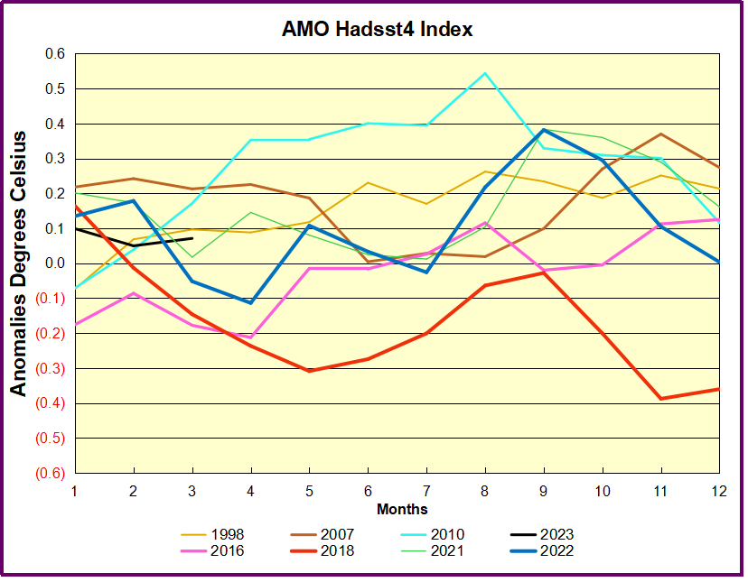
Note the difference between blue/green years, beige/brown, and purple/red years.  2010, 2021, 2022 all peaked strongly in August or September.  1998 and 2007 were mildly warm.  2016 and 2018 were matching or cooler than the global average.  2023 is starting out slightly warm.

The background post below provides more detail on AMO and AMOC measuring systems, but there is a growing concern that funding for oceanic data is being reduced or cut off.  For example this report from Srokosz et al. (2020):

Despite the tremendous progress in AMOC-related research as articulated in the Special Issue manuscripts, there are many remaining challenges that should be addressed to further our understanding. From the observational side, such challenges include gaps in the observing system (e.g., shelf regions and deep oceans), disparate observational strategies, and reductions in funding that jeopardize sustained observations (Frajka-Williams et al., 2019; McCarthy et al., 2020). Earth system models continue to show persistent biases, particularly in the North Atlantic, and AMOC variability mechanisms and their characteristics vary significantly across models (e.g., Danabasoglu et al., 2019; Zhang et al., 2019).

Although the US AMOC Program formally “sunsets” in 2021, research on the AMOC in the United States will continue. The original motivation for AMOC observations, the possibility of AMOC decline or rapid collapse under anthropogenically induced climate change, remains. The latest IPCC special report on the ocean and cryosphere (Pörtner et al., 2019) states that “Observations, both in situ (2004–2017) and based on sea surface temperature reconstructions, indicate that the AMOC has weakened relative to 1850–1900 (medium confidence),” and that “The AMOC is projected to weaken in the 21st century under all RCPs (very likely), although a collapse is very unlikely (medium confidence).” These conclusions and the above challenges present new opportunities and motivations for the community. Specifically, collaborative research that includes a hierarchy of models, theory, high-resolution paleo records, and sustained and processed-based observations promises to advance our understanding, potentially leading to improved models and prediction skills, among others, of AMOC variability and its associated climate impacts.

Comment:  It seems that data showing errors in the climate models, or failing to support climate alarm, will disappear when funding is withdrawn.

Background: AMOC Update: Oceans Moderate Climate Threat

Update Feb.1, 2019 New Publication from M.S. Lozier et al. 

f1.medium

The article is A sea change in our view of overturning in the subpolar North Atlantic which is reporting on the first 21 months of observations from the newly installed OSNAP array described in a previous post from a year ago (reprinted below).  The article is paywalled, but the main findings are provided at a Science Daily article European waters drive ocean overturning, key for regulating climate.  Excerpts in italics with my bolds.

Summary:
An international study reveals the Atlantic meridional overturning circulation, which helps regulate Earth’s climate, is highly variable and primarily driven by the conversion of warm, salty, shallow waters into colder, fresher, deep waters moving south through the Irminger and Iceland basins. This upends prevailing ideas and may help scientists better predict Arctic ice melt and future changes in the ocean’s ability to mitigate climate change by storing excess atmospheric carbon.

190131143344_1_540x360

New research shows the Atlantic meridional overturning circulation, which regulates climate, is primarily driven by waters west of Europe.
Credit: Carolina Nobre, WHOI Media

In a departure from the prevailing scientific view, the study shows that most of the overturning and variability is occurring not in the Labrador Sea off Canada, as past modeling studies have suggested, but in regions between Greenland and Scotland. There, warm, salty, shallow waters carried northward from the tropics by currents and wind, sink and convert into colder, fresher, deep waters moving southward through the Irminger and Iceland basins.

Overturning variability in this eastern section of the ocean was seven times greater than in the Labrador Sea, and it accounted for 88 percent of the total variance documented across the entire North Atlantic over the 21-month study period.

“Overturning carries vast amounts of anthropogenic carbon deep into the ocean, helping to slow global warming,” said co-author Penny Holliday of the National Oceanography Center in Southampton, U.K. “The largest reservoir of this anthropogenic carbon is in the North Atlantic.”

“Overturning also transports tropical heat northward,” Holliday said, “meaning any changes to it could have an impact on glaciers and Arctic sea ice. Understanding what is happening, and what may happen in the years to come, is vital.”

MIT’s Carl Wunsch and other outside experts said the study was helpful, but pointed out that 21 months of study is not enough to know if this different location is temporary or permanent.

[Note: The comment about oceans taking up CO2 could be misleading.  The ocean contains dissolved CO2 amounting to 50 times atmospheric CO2.  Each year about 20% of all CO2 in the air goes into the ocean, replaced by outgassing CO2.  The tiny fraction of atmospheric CO2 from humans is exchanged proportionately.  Henry’s law applies to the water/air interface, so that a warmer ocean absorbs slightly less, and a colder ocean absorbs slightly more CO2.  The exchange equilibrium is hardly disturbed by the little bit of human produced CO2.  Thus the ocean serves as a massive buffer against human emissions.]

Previous Post: AMOC 2018:  Not Showing Climate Threat

myrtle_jc174_small

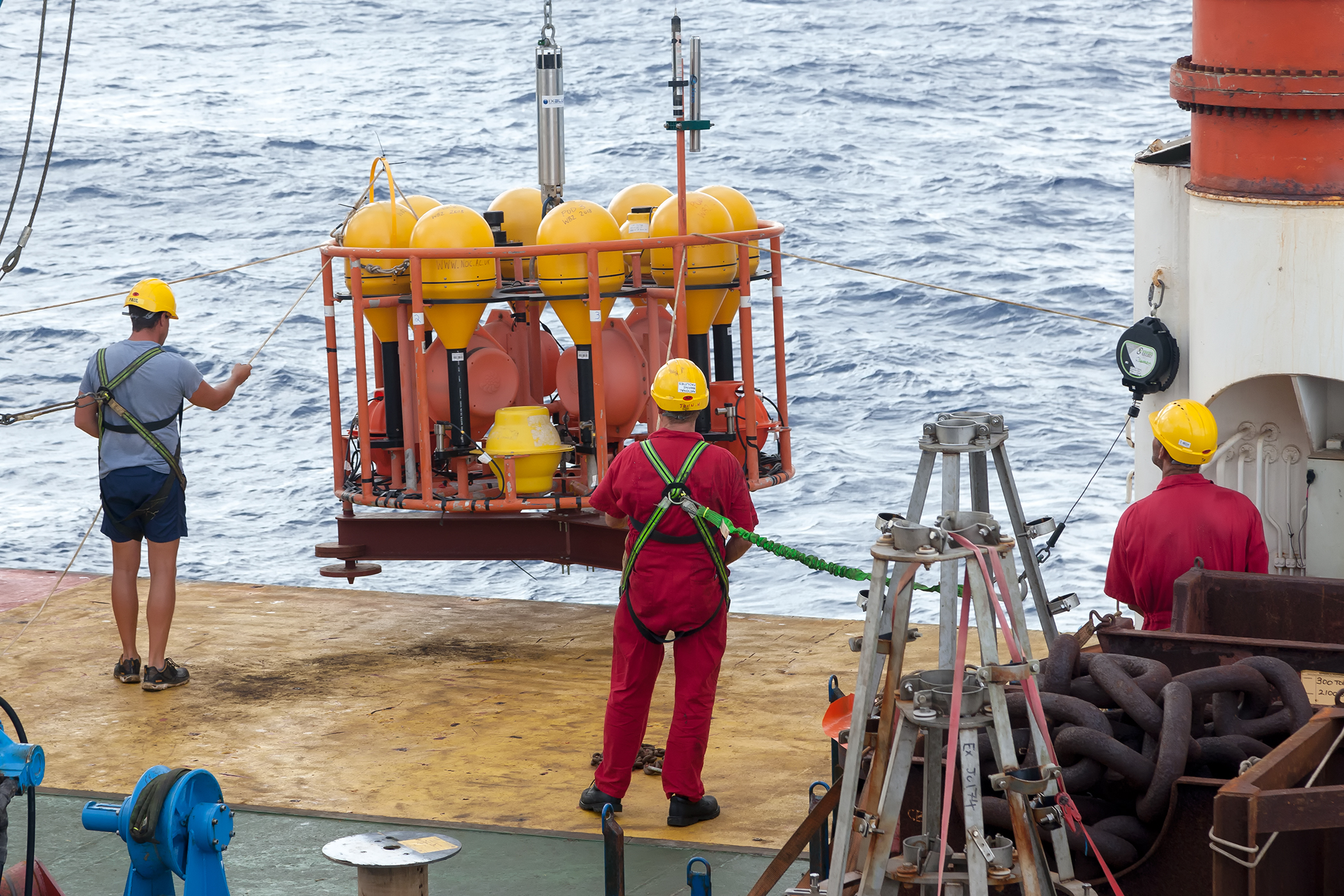
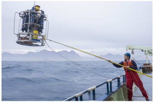
The RAPID moorings being deployed. Credit: National Oceanography Centre.

The AMOC is back in the news following a recent Ocean Sciences meeting.  This update adds to the theme Oceans Make Climate. Background links are at the end, including one where chief alarmist M. Mann claims fossil fuel use will stop the ocean conveyor belt and bring a new ice age.  Actual scientists are working away methodically on this part of the climate system, and are more level-headed.  H/T GWPF for noticing the recent article in Science Ocean array alters view of Atlantic ‘conveyor belt’  By Katherine Kornei Feb. 17, 2018 . Excerpts with my bolds.

The powerful currents in the Atlantic, formally known as the Atlantic meridional overturning circulation (AMOC), are a major engine in Earth’s climate. The AMOC’s shallower limbs—which include the Gulf Stream—transport warm water from the tropics northward, warming Western Europe. In the north, the waters cool and sink, forming deeper limbs that transport the cold water back south—and sequester anthropogenic carbon in the process. This overturning is why the AMOC is sometimes called the Atlantic conveyor belt.

bams-d-16-0057.1-f1

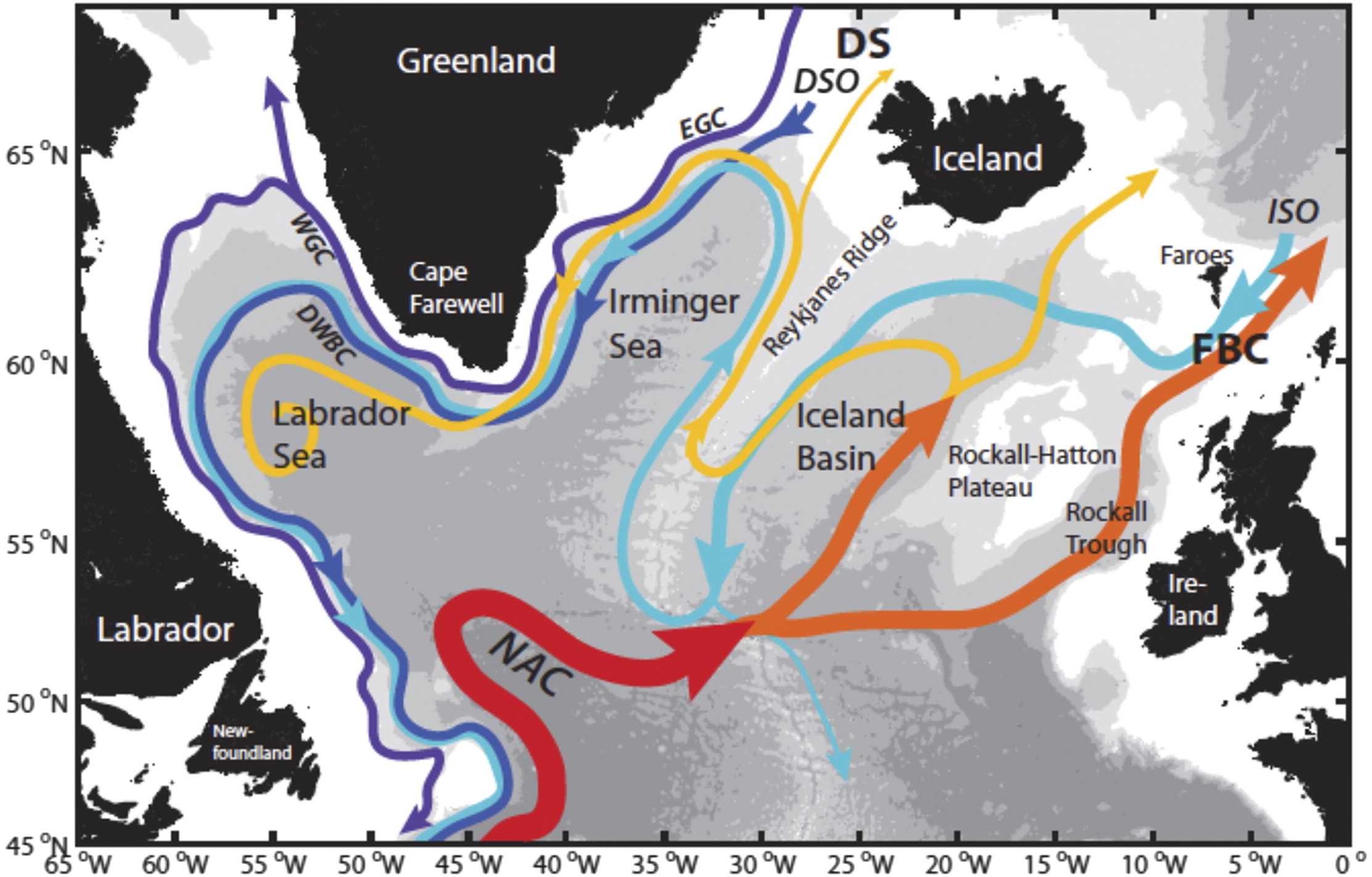
Fig. 1. Schematic of the major warm (red to yellow) and cold (blue to purple) water pathways in the NASPG (North Atlantic subpolar gyre ) credit: H. Furey, Woods Hole Oceanographic Institution): Denmark Strait (DS), Faroe Bank Channel (FBC), East and West Greenland Currents (EGC and WGC, respectively), NAC, DSO, and ISO.

Last week, at the American Geophysical Union’s (AGU’s) Ocean Sciences meeting here, scientists presented the first data from an array of instruments moored in the subpolar North Atlantic. The observations reveal unexpected eddies and strong variability in the AMOC currents. They also show that the currents east of Greenland contribute the most to the total AMOC flow. Climate models, on the other hand, have emphasized the currents west of Greenland in the Labrador Sea. “We’re showing the shortcomings of climate models,” says Susan Lozier, a physical oceanographer at Duke University in Durham, North Carolina, who leads the $35-million, seven-nation project known as the Overturning in the Subpolar North Atlantic Program (OSNAP).

bams-d-16-0057.1-f2

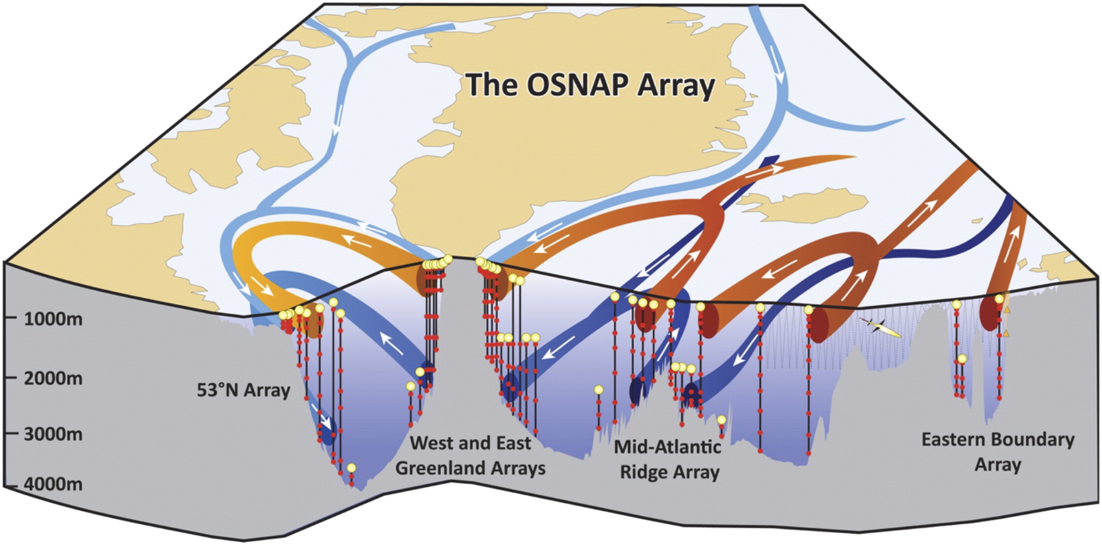
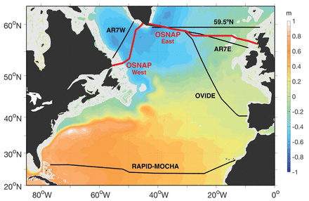
Fig. 2. Schematic of the OSNAP array. The vertical black lines denote the OSNAP moorings with the red dots denoting instrumentation at depth. The thin gray lines indicate the glider survey. The red arrows show pathways for the warm and salty waters of subtropical origin; the light blue arrows show the pathways for the fresh and cold surface waters of polar origin; and the dark blue arrows show the pathways at depth for waters that originate in the high-latitude North Atlantic and Arctic.

The research and analysis is presented by Dr. Lozier et al. in this publication Overturning in the Subpolar North Atlantic Program: A New International Ocean Observing System Images above and text excerpted below with my bolds.

For decades oceanographers have assumed the AMOC to be highly susceptible to changes in the production of deep waters at high latitudes in the North Atlantic. A new ocean observing system is now in place that will test that assumption. Early results from the OSNAP observational program reveal the complexity of the velocity field across the section and the dramatic increase in convective activity during the 2014/15 winter. Early results from the gliders that survey the eastern portion of the OSNAP line have illustrated the importance of these measurements for estimating meridional heat fluxes and for studying the evolution of Subpolar Mode Waters. Finally, numerical modeling data have been used to demonstrate the efficacy of a proxy AMOC measure based on a broader set of observational data, and an adjoint modeling approach has shown that measurements in the OSNAP region will aid our mechanistic understanding of the low-frequency variability of the AMOC in the subtropical North Atlantic.

Fig. 7. (a) Winter [Dec–Mar (DJFM)] mean NAO index. Time series of temperature from the (b) K1 and (c) K9 moorings.

Finally, we note that while a primary motivation for studying AMOC variability comes from its potential impact on the climate system, as mentioned above, additional motivation for the measure of the heat, mass, and freshwater fluxes in the subpolar North Atlantic arises from their potential impact on marine biogeochemistry and the cryosphere. Thus, we hope that this observing system can serve the interests of the broader climate community.

Fig. 10. Linear sensitivity of the AMOC at (d),(e) 25°N and (b),(c) 50°N in Jan to surface heat flux anomalies per unit area. Positive sensitivity indicates that ocean cooling leads to an increased AMOC—e.g., in the upper panels, a unit increase in heat flux out of the ocean at a given location will change the AMOC at (d) 25°N or (e) 50°N 3 yr later by the amount shown in the color bar. The contour intervals are logarithmic. (a) The time series show linear sensitivity of the AMOC at 25°N (blue) and 50°N (green) to heat fluxes integrated over the subpolar gyre (black box with surface area of ∼6.7 × 10 m2) as a function of forcing lead time. The reader is referred to Pillar et al. (2016) for model details and to Heimbach et al. (2011) and Pillar et al. (2016) for a full description of the methodology and discussion relating to the dynamical interpretation of the sensitivity distributions.

In summary, while modeling studies have suggested a linkage between deep-water mass formation and AMOC variability, observations to date have been spatially or temporally compromised and therefore insufficient either to support or to rule out this connection.

Current observational efforts to assess AMOC variability in the North Atlantic.

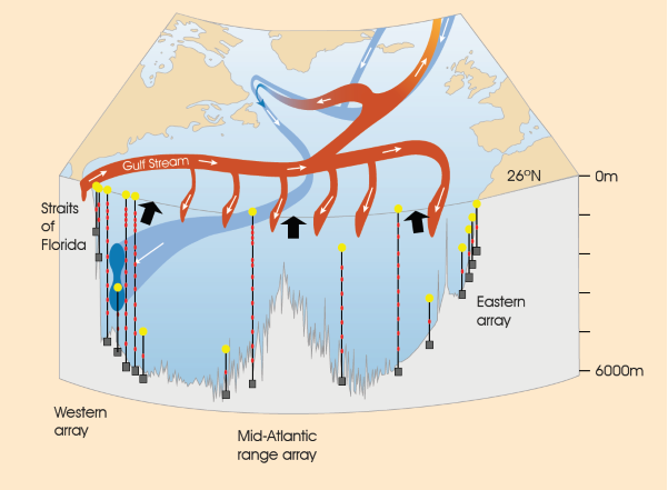
The U.K.–U.S. Rapid Climate Change–Meridional Overturning Circulation and Heatflux Array (RAPID–MOCHA) program at 26°N successfully measures the AMOC in the subtropical North Atlantic via a transbasin observing system (Cunningham et al. 2007; Kanzow et al. 2007; McCarthy et al. 2015). While this array has fundamentally altered the community’s view of the AMOC, modeling studies over the past few years have suggested that AMOC fluctuations on interannual time scales are coherent only over limited meridional distances. In particular, a break point in coherence may occur at the subpolar–subtropical gyre boundary in the North Atlantic (Bingham et al. 2007; Baehr et al. 2009). Furthermore, a recent modeling study has suggested that the low-frequency variability of the RAPID–MOCHA appears to be an integrated response to buoyancy forcing over the subpolar gyre (Pillar et al. 2016). Thus, a measure of the overturning in the subpolar basin contemporaneous with a measure of the buoyancy forcing in that basin likely offers the best possibility of understanding the mechanisms that underpin AMOC variability. Finally, though it might be expected that the plethora of measurements from the North Atlantic would be sufficient to constrain a measure of the AMOC within the context of an ocean general circulation model, recent studies (Cunningham and Marsh 2010; Karspeck et al. 2015) reveal that there is currently no consensus on the strength or variability of the AMOC in assimilation/reanalysis products.

Atlantic Meridional Overturning Circulation (AMOC). Red colours indicate warm, shallow currents and blue colours indicate cold, deep return flows. Modified from Church, 2007, A change in circulation? Science, 317(5840), 908–909. doi:10.1126/science.1147796

In addition we have a recent report from the United Kingdom Marine Climate Change Impacts Partnership (MCCIP) lead author G.D. McCarthy Atlantic Meridional Overturning Circulation (AMOC) 2017.

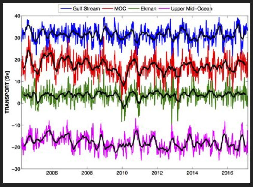
Figure 1: Ten-day (colours) and three month (black) low-pass filtered timeseries of Florida Straits transport (blue), Ekman transport (green), upper mid-ocean transport (magenta), and overturning transport (red) for the period 2nd April 2004 to end- February 2017. Florida Straits transport is based on electromagnetic cable measurements; Ekman transport is based on ERA winds. The upper mid-ocean transport, based on the RAPID mooring data, is the vertical integral of the transport per unit depth down to the deepest northward velocity (~1100 m) on each day. Overturning transport is then the sum of the Florida Straits, Ekman, and upper mid-ocean transports and represents the maximum northward transport of upper-layer waters on each day. Positive transports correspond to northward flow.

The RAPID/MOCHA/WBTS array (hereinafter referred to as the RAPID array) has revolutionized basin scale oceanography by supplying continuous estimates of the meridional overturning transport (McCarthy et al., 2015), and the associated basin-wide transports of heat (Johns et al., 2011) and freshwater (McDonagh et al., 2015) at 10-day temporal resolution. These estimates have been used in a wide variety of studies characterizing temporal variability of the North Atlantic Ocean, for instance establishing a decline in the AMOC between 2004 and 2013.

Summary from RAPID data analysis

MCCIP reported in 2006 that:

  • a 30% decline in the AMOC has been observed since the early 1990s based on a limited number of observations. There is a lack of certainty and consensus concerning the trend;
  • most climate models anticipate some reduction in strength of the AMOC over the 21st century due to increased freshwater influence in high latitudes. The IPCC project a slowdown in the overturning circulation rather than a dramatic collapse.
  • And in 2017 that:
  • a substantial increase in the observations available to estimate the strength of the AMOC indicate, with greater certainty, a decline since the mid 2000s;
  • the AMOC is still expected to decline throughout the 21st century in response to a changing climate. If and when a collapse in the AMOC is possible is still open to debate, but it is not thought likely to happen this century.

And also that:

  • a high level of variability in the AMOC strength has been observed, and short term fluctuations have had unexpected impacts, including severe winters and abrupt sea-level rise;
  • recent changes in the AMOC may be driving the cooling of Atlantic ocean surface waters which could lead to drier summers in the UK.

Conclusions

  • The AMOC is key to maintaining the mild climate of the UK and Europe.
  • The AMOC is predicted to decline in the 21st century in response to a changing climate.
  • Past abrupt changes in the AMOC have had dramatic climate consequences.
  • There is growing evidence that the AMOC has been declining for at least a decade, pushing the Atlantic Multidecadal Variability into a cool phase.
  • Short term fluctuations in the AMOC have proved to have unexpected impacts, including being linked
    with severe winters and abrupt sea-level rise.

Background:

Climate Pacemaker: The AMOC

Evidence is Mounting: Oceans Make Climate

Mann-made Global Cooling

Ocean Warming Spike March 2023

The best context for understanding decadal temperature changes comes from the world’s sea surface temperatures (SST), for several reasons:

  • The ocean covers 71% of the globe and drives average temperatures;
  • SSTs have a constant water content, (unlike air temperatures), so give a better reading of heat content variations;
  • A major El Nino was the dominant climate feature in recent years.

HadSST is generally regarded as the best of the global SST data sets, and so the temperature story here comes from that source. Previously I used HadSST3 for these reports, but Hadley Centre has made HadSST4 the priority, and v.3 will no longer be updated.  HadSST4 is the same as v.3, except that the older data from ship water intake was re-estimated to be generally lower temperatures than shown in v.3.  The effect is that v.4 has lower average anomalies for the baseline period 1961-1990, thereby showing higher current anomalies than v.3. This analysis concerns more recent time periods and depends on very similar differentials as those from v.3 despite higher absolute anomaly values in v.4.  More on what distinguishes HadSST3 and 4 from other SST products at the end. The user guide for HadSST4 is here.

The Current Context

The chart below shows SST monthly anomalies as reported in HadSST4 starting in 2015 through March 2023.  A global cooling pattern is seen clearly in the Tropics since its peak in 2016, joined by NH and SH cycling downward since 2016. 

Note that in 2015-2016 the Tropics and SH peaked in between two summer NH spikes.  That pattern repeated in 2019-2020 with a lesser Tropics peak and SH bump, but with higher NH spikes. By end of 2020, cooler SSTs in all regions took the Global anomaly well below the mean for this period.  In 2021 the summer NH summer spike was joined by warming in the Tropics but offset by a drop in SH SSTs, which raised the Global anomaly slightly over the mean.

Then in 2022, another strong NH summer spike peaked in August, but this time both the Tropic and SH were countervailing, resulting in only slight Global warming, later receding to the mean.   Oct./Nov. temps dropped  in NH and the Tropics took the Global anomaly below the average for this period. After an uptick in December, temps in January 2023 dropped everywhere, strongest in NH, with the Global anomaly further below the mean since 2015.

In February Global SSTs stayed cool, but in March temps everywhere spiked upward.  SH and the Tropics both showed anomalies 0.16C higher than February, pulling the Global anomaly up 0.12C. Both SH and NH are now close to the Global anomaly of 0.78C

A longer view of SSTs

To enlarge image open in new tab.

The graph above is noisy, but the density is needed to see the seasonal patterns in the oceanic fluctuations.  Previous posts focused on the rise and fall of the last El Nino starting in 2015.  This post adds a longer view, encompassing the significant 1998 El Nino and since.  The color schemes are retained for Global, Tropics, NH and SH anomalies.  Despite the longer time frame, I have kept the monthly data (rather than yearly averages) because of interesting shifts between January and July.1995 is a reasonable (ENSO neutral) starting point prior to the first El Nino. 

The sharp Tropical rise peaking in 1998 is dominant in the record, starting Jan. ’97 to pull up SSTs uniformly before returning to the same level Jan. ’99. There were strong cool periods before and after the 1998 El Nino event. Then SSTs in all regions returned to the mean in 2001-2. 

SSTS fluctuate around the mean until 2007, when another, smaller ENSO event occurs. There is cooling 2007-8,  a lower peak warming in 2009-10, following by cooling in 2011-12.  Again SSTs are average 2013-14.

Now a different pattern appears.  The Tropics cooled sharply to Jan 11, then rise steadily for 4 years to Jan 15, at which point the most recent major El Nino takes off.  But this time in contrast to ’97-’99, the Northern Hemisphere produces peaks every summer pulling up the Global average.  In fact, these NH peaks appear every July starting in 2003, growing stronger to produce 3 massive highs in 2014, 15 and 16.  NH July 2017 was only slightly lower, and a fifth NH peak still lower in Sept. 2018.

The highest summer NH peaks came in 2019 and 2020, only this time the Tropics and SH were offsetting rather adding to the warming. (Note: these are high anomalies on top of the highest absolute temps in the NH.)  Since 2014 SH has played a moderating role, offsetting the NH warming pulses. After September 2020 temps dropped off down until February 2021.  Now in 2021-22 there are again summer NH spikes, but in 2022 moderated first by cooling Tropics and SH SSTs, then in October to January 2023 by deeper cooling in NH and Tropics.  The graph shows the warming spikes since 2015, including one last month,  lifted the Global anomaly by about 0.2C above the mean since 1995 (an ENSO neutral year).

What to make of all this? The patterns suggest that in addition to El Ninos in the Pacific driving the Tropic SSTs, something else is going on in the NH.  The obvious culprit is the North Atlantic, since I have seen this sort of pulsing before.  After reading some papers by David Dilley, I confirmed his observation of Atlantic pulses into the Arctic every 8 to 10 years.

But the peaks coming nearly every summer in HadSST require a different picture.  Let’s look at August, the hottest month in the North Atlantic from the Kaplan dataset.

The AMO Index is from from Kaplan SST v2, the unaltered and not detrended dataset. By definition, the data are monthly average SSTs interpolated to a 5×5 grid over the North Atlantic basically 0 to 70N. The graph shows August warming began after 1992 up to 1998, with a series of matching years since, including 2020, dropping down in 2021.  Because the N. Atlantic has partnered with the Pacific ENSO recently, let’s take a closer look at some AMO years in the last 2 decades.

This graph shows monthly AMO temps for some important years. The Peak years were 1998, 2010 and 2016, with the latter emphasized as the most recent. The other years show lesser warming, with 2007 emphasized as the coolest in the last 20 years. Note the red 2018 line is at the bottom of all these tracks. The heavy blue line shows that 2022 started warm, dropped to the bottom and stayed near the lower tracks.  Note the strength of that summer’s warming pulse, in September peaking to nearly 24 Celsius, a new record for this dataset. January 2023 starts similar to 2022. (Note:  No data updates for February or March so far.)

Summary

The oceans are driving the warming this century.  SSTs took a step up with the 1998 El Nino and have stayed there with help from the North Atlantic, and more recently the Pacific northern “Blob.”  The ocean surfaces are releasing a lot of energy, warming the air, but eventually will have a cooling effect.  The decline after 1937 was rapid by comparison, so one wonders: How long can the oceans keep this up? 

Footnote: Why Rely on HadSST4

HadSST is distinguished from other SST products because HadCRU (Hadley Climatic Research Unit) does not engage in SST interpolation, i.e. infilling estimated anomalies into grid cells lacking sufficient sampling in a given month. From reading the documentation and from queries to Met Office, this is their procedure.

HadSST4 imports data from gridcells containing ocean, excluding land cells. From past records, they have calculated daily and monthly average readings for each grid cell for the period 1961 to 1990. Those temperatures form the baseline from which anomalies are calculated.

In a given month, each gridcell with sufficient sampling is averaged for the month and then the baseline value for that cell and that month is subtracted, resulting in the monthly anomaly for that cell. All cells with monthly anomalies are averaged to produce global, hemispheric and tropical anomalies for the month, based on the cells in those locations. For example, Tropics averages include ocean grid cells lying between latitudes 20N and 20S.

Gridcells lacking sufficient sampling that month are left out of the averaging, and the uncertainty from such missing data is estimated. IMO that is more reasonable than inventing data to infill. And it seems that the Global Drifter Array displayed in the top image is providing more uniform coverage of the oceans than in the past.

uss-pearl-harbor-deploys-global-drifter-buoys-in-pacific-ocean

USS Pearl Harbor deploys Global Drifter Buoys in Pacific Ocean


CO2 Fluxes Not What IPCC Telling You

The latest rebuttal of IPCC CO2 hysteria comes from Peter Stallinga in his 2023 publication Residence Time vs. Adjustment Time of Carbon Dioxide in the Atmosphere.  Excerpts in italics with my bolds and added comments and images.

1. Introduction

One of the major points in discussion of the anthropogenic global warming (AGW) scenario is the time the added carbon dioxide (CO2) stays in the atmosphere. In an extensive study, Solomon concluded that the residence time of carbon atoms in the atmosphere is of the order of 10 years [1], see Table 1. Such a short time would undermine the prime tenet of AGW, since a molecule of CO2  will not have time to contribute to any greenhouse effect before it disappears to sinks where it cannot do any thermal harm.

However, some claim that the residence time (the amount of time a molecule on average spends in the atmosphere before it disappears from it) is not relevant for this discussion; what matters is the adjustment time (or relaxation time or (re)-equilibration time), the time it takes for a new equilibrium to establish, the time constant seen in the observed transient, and, allegedly, these two are different. In a recent work, Cawley explains it as [3]

natural fluxes into and out of the atmosphere are closely balanced and, hence, comparatively small anthropogenic fluxes can have a substantial effect on atmospheric concentrations.

In the current work, we use these exact two concepts, with turnover time called residence time. We also focus on first-order systems mentioned here by the IPCC. We discuss the difference between residence time on the one hand, and adjustment time on the other hand, and test the hypothesis that the adjustment time can be longer than the residence time by mathematical methods. After having addressed this core point, we perform a calculation based on the available data to see how they fit.

2. Residence Time and Adjustment Time (Methods, Data, Results and Analysis)

Figure 1. Two-box model of the carbon dioxide cycle. The top box represents the atmosphere, with a total carbon dioxide mass of 3403 Gt. Humans add 38 Gt per year to the system. Nature adds Fn+ and takes away Fn− to a sink represented by the bottom box. That sink has a total CO2 mass equal to S. The residence time in the atmosphere, τa is well known and estimated to be 5 years, the residence time in the sink τs is not well known.

In what follows, we will use a simple two-box first-order model, see Figure 1. The atmosphere has a mass of carbon dioxide equal to A. CO2 molecules can be captured into a sink and this occurs at a certain rate, a fraction of the molecules being trapped per time unit. Each individual molecule has a certain probability to be captured over time. In other words, a molecule has a residence time τa in the atmosphere (also sometimes called the ’turnover time’), which is the reciprocal of the rate, ka. Likewise, in the sink, there is a carbon dioxide mass equal to S, where molecules have a residence time τs; an individual molecule has a certain probability over time to be released by the sink into the atmosphere, or a rate ks.

Humans add an extra flux into the atmosphere labeled Fh. On the basis of this, we can determine the adjustment time τ of the atmosphere in terms of the residence times. This requires solving a simple mathematical differential equation; we do not have to worry at this moment about the thermodynamics and explain why the reaction constants are what they are. The questions we ask are, if we add an amount of carbon dioxide ΔA to it:

    • What are the new equilibrium values of A and S?
    • How long does it take to establish this new equilibrium?

Figure 2. (a) A two-box simulation of atmosphere (A) and sink (S) of Figure 1.

Before injection of 100 into the atmosphere, the atmosphere-sink system was in equilibrium at 100 each, with the residence ‘times’ in both atmosphere and sink 1000 iterations. At each iteration A/τa is moved from atmosphere to sink and S/τs moved from sink to atmosphere. As can be seen, the observed adjustment time (relaxation time) of the system is 500 iterations, as predicted by Equation (9). After 500 iterations, the surplus quantity in the atmosphere relative to the new equilibrium has been reduced to 1/e, a level indicated by a horizontal dashed line. Further, a half-life can be defined, a time at which half of the transient amplitude has passed, t1/2=τln(2)= 347. This is indicated by a dotted line. (b) The adjustment time τ, as a function of the sink residence time τs, normalized by the atmospheric residence time τa. The dot indicates the value of the plot in (a), τs=τa, resulting in τ=τa/2 .

As can be seen, the adjustment time is shorter than the atmospheric residence time
for all values of the sink residence time, with, for large τs,
the adjustment time τ approaching the atmospheric residence time τa.

We, thus, refute the claim of the climate-skeptics-skeptics [skepticalscience.com] that:

“individual carbon dioxide molecules have a short life time of around 5 years in the atmosphere. However, when they leave the atmosphere, they are simply swapping places with carbon dioxide in the ocean. The final amount of extra CO2 that remains in the atmosphere stays there on a time scale of centuries.”

Their flawed reasoning is that the adjustment time (relaxation time) is the mass perturbation in the atmosphere divided by the flux balance, and, so goes the reasoning, while fluxes can be great (and the residence time short), the balance is close to zero and the relaxation time can then approach infinity.

3. Scenarios

We can now do a more detailed analysis based on the available data.

Table 2. Carbon dioxide facts, with the natural outflux Fn− derived from the mass in the atmosphere and the residence time. Other important parameters, influx Fn+, sink mass S, and sink residence time τs are less well known and should be considered adjustable.

The residence time in the atmosphere can be estimated quite well from the above-ground atomic bomb tests [1], which makes us happy that these at least served the purpose of advancing atmospheric science, if nothing else. The best estimate is about τa= 5 years [9]. Other references mention different times, with the IPCC mentioning the shortest (4 years) in their 5th Assessment Report (p. 1457 of Ref. [4]), showing that this value is not settled yet; we will use 5 years in this work. The equilibrium amount of carbon dioxide in the atmosphere is open for debate, but, for this purpose, we might use the consensus value of 280 ppm (A∗= 2250 Gt). To estimate the amount of CO2 in the sink is very difficult. However, there seems to be a general view that it is fifty times more than in the atmosphere, S=50A=113,400 Gt (relatively unchanged since pre-industrial times). Using the combination of these values does not allow for consistent bookkeeping, as the reader can easily verify. Something has to yield. In what follows, we will try out some scenarios based on specific assumptions.

3.1. Scenario: Pre-Industrial Atmosphere Was at Equilibrium

First we assume that the pre-industrial level of 280 ppm was indeed an equilibrium value with influx equal to outflux in the absence of human flux, as we are wont to believe, but that the mass in the sink S and the residence time τs in the sink are unknown.

Figure 4. Above-ground atomic-bomb explosions produced a lot of 14 C that stopped in the 1960s. From a fit (dashed line) of data from 1965, we find an adjustment time of τ = 14.0 a, and an amplitude of ΔA = 740, with a final value of A′∞ = 30. This enables stating that the sink must be at least 24 times larger than the atmosphere. Data from Enting (blue) found in a work of Perruchoud [11] and Nydal et al. [10] (green), extracted with WebPlotDigitizer [12].

It seems that the idea of the pre-industrial level stable at 280 ppm (with Fn+=Fn−at 280 ppm) is untenable. It seems very likely that the sink was already off-balance and emitting amounts of carbon dioxide at the beginning of the industrial era and the increase in the atmospheric CO2 at any time in human history is not solely due to human activity. This would also explain the large pre-Mauna-Loa values found with chemical methods summarized by Beck [13] and Slocum [14]. For instance, values of 500 ppm have been observed around 1940. Ignoring these facts, on the other hand, would be equivalent to throwing entire generations of scientists under the bus.

[Comment:  CO2 higher concentrations prior to 20th century are also indicated by use of plant stomata as paleo proxies for CO2 estimations.]


3.2. Scenario: The Sink Is Fifty Times Larger Than the Atmosphere

Next, we adopt the assumption that the sink at this moment really has 50 times more carbon than the atmosphere, in other words, S=50A= 170,000 Gt, and release the restriction that the atmosphere was stable at 280 ppm; in pre-industrial times there can have been a flux imbalance.

We see indeed a tremendous outgassing from the sink in pre-industrial times. The system was far from equilibrium, with an imbalance being a net influx of F∗n+−F∗n−= 207 Gt/a. Where, at the moment, there is a net natural flux of 18 Gt/a out of the atmosphere, in pre-industrial times, in this two-box first-order model with a sink 50 times larger than the atmosphere, there was a net natural influx of 207 Gt/a.

Somewhere, we must have passed the equilibrium value and,
considering the above numbers,  this value must be
rather close to today’s concentration of 420 ppm.

3.3. Scenario: Residence Time in the Sink Is Much Larger Than in the Atmosphere

If we only assume that the residence time in the sink is much larger than in the atmosphere, τs≫τa, then we can get a good idea of what has happened to our anthropogenic contribution to the carbon in the atmosphere, Fh, based on the two-box model.

Figure 3. (a) Yearly global CO 2 emissions from fossil fuels. (b) Cumulative emissions (integral of left plot). The yellow curve is the remainder of the anthropogenic CO 2 in the atmosphere if we assume a residence time in the sink much longer than the 5-year residence time in the atmosphere; in this case τs=50τa was used. (Source of data: Our World In Data [8]).

Figure 3 shows the yearly carbon dioxide emissions into the atmosphere (left panel; data source: Our World In Data [8]). The total amount so far emitted is 1696.5 Gt. The right panel shows the cumulative emissions, ∑yeariFh(i). If at every year we apply the fluxes according to Equation (1), then we can see at each year how much of the anthropogenic CO2 is still in the atmosphere. The right panel of Figure 3 shows this for τs=50τa.

We see that only 202.3 Gt of the total injected 1696.5 Gt is still in the atmosphere.

In these years, the amount of CO2 in the atmosphere has risen from 280 ppm (2268 Gt) to 420 ppm (3403 Gt), an increment of 1135 Gt. Of these, 202.3 Gt (17.8%) would be attributable to humans and the rest, 932.7 Gt (82.2%), must be from natural sources.

In view of this, curbing carbon emissions seems rather fruitless;
even if we destroy the fossil-fuel-based economy (and human wealth with it),
we would only delay the inevitable natural scenario by a couple of years.

3.4. Scenario: Abandoning Constant Residence Times

We have seen here how the first-order-kinetics two-box model results in conclusions contrary to data. We could, of course, change our model. We could abandon the idea of first-order kinetics (where flux is proportional to mass), but that would be problematic to justify with physics.

We could also add more boxes to the system, distinguishing the sinks, or differentiating between deep ocean and shallow ocean, dissolved carbon dioxide gas, CO2 (aq), and dissolved organic carbon (sea-shells), or between CO2 disappearing in the oceans and being sequestered in biological matter on land, etc.

However, we expect the most likely improvement to the model to come from
abandoning the idea that the residence times τa and τs are constant.

They, in fact, are very much dependent on temperature. As an example, the ratio between the two that tells us the concentrations (and, thus, the masses) between carbon dioxide in the atmosphere and in the sink, if we assume this sink to be the oceans, is governed by Henry’s Law, and this concentration ratio is then dependent on temperature.

When including such effects, we might even conclude that the entire concentration of carbon dioxide in the atmosphere is fully governed by such environmental parameters and fully independent of human injections into the system. A is simply a function of many parameters, including the temperature T, but not Fh. It is as if the relaxation time is extremely short and any disturbances introduced by humans, or by other means, rapidly disappear, rapidly reaching the equilibrium determined by nature.

This fits very nicely with the recent finding that the stalling of the economy and the accompanying severe reduction in carbon emissions during the Covid pandemic had no visible impact on the dynamics of the atmosphere whatsoever [15]. The result of that research, the hypothesis that the carbon dioxide increments in the atmosphere were fully due to natural causes and not humans, fits the experimental data very well, and the hypothesis that humans are fully responsible for the increments can equally be rejected scientifically. This then also agrees with the conclusions of Segalstad that “The rising atmospheric CO2 is the outcome of rising temperature rather than vice versa” [16].

The pre-industrial atmosphere might indeed have been in equilibrium,
and we are currently also in, or close to, equilibrium.
That seems to us to be the most likely scenario.

Once we admit the possibility of non-anthropogenic sources of carbon dioxide, we can start finding out what they might be. Examples such as volcanic sources, planetary and solar cycles spring to mind. It might well be that the climate puzzle is solved in such areas as the link between solar activity and seismic activity and climate [17].

This is, however, not the focus of this work. We conclude here by summarizing the major findings of this analysis using a first-order-kinetics two-box model:

(1) The adjustment time is never larger than the residence time and is less than 5 years.

(2) The idea of the atmosphere being stable at 280 ppm in pre-industrial times is untenable.

(3) Nearly 90% of all anthropogenic carbon dioxide has already been removed from the atmosphere.

Footnote:  Human CO2 Emissions Flat Last Decade

Annual total global CO2 emissions – from fossil and land-use change – between 2000 and 2021 for both the 2020 and 2021 versions of the Global Carbon Project’s Global Carbon Budget. Shaded area shows the estimated one-sigma uncertainty for the 2021 budget. Data from the Global Carbon Project; chart by Carbon Brief using Highcharts.

Previously, the GCP data showed global CO2 emissions increasing by an average of 1.4 GtCO2 per year between 2011 and 2019 – prior to Covid-related emissions declines. The new revised dataset shows that global CO2 emissions were essentially flat – increasing by only 0.1GtCO2 per year from 2011 and 2019. When 2020 and 2021 are included, the new GCP data actually shows slightly declining global emissions over the past decade, though this should be treated with caution due to the temporary nature of Covid-related declines. Source: Global CO2 emissions have been flat for a decade, new data reveals

[Comment: Note the earlier chart above showing MLO atmospheric CO2 rising continuously while human emissions were flat.]

Oceans Stay Cool February 2023

The best context for understanding decadal temperature changes comes from the world’s sea surface temperatures (SST), for several reasons:

  • The ocean covers 71% of the globe and drives average temperatures;
  • SSTs have a constant water content, (unlike air temperatures), so give a better reading of heat content variations;
  • A major El Nino was the dominant climate feature in recent years.

HadSST is generally regarded as the best of the global SST data sets, and so the temperature story here comes from that source. Previously I used HadSST3 for these reports, but Hadley Centre has made HadSST4 the priority, and v.3 will no longer be updated.  HadSST4 is the same as v.3, except that the older data from ship water intake was re-estimated to be generally lower temperatures than shown in v.3.  The effect is that v.4 has lower average anomalies for the baseline period 1961-1990, thereby showing higher current anomalies than v.3. This analysis concerns more recent time periods and depends on very similar differentials as those from v.3 despite higher absolute anomaly values in v.4.  More on what distinguishes HadSST3 and 4 from other SST products at the end. The user guide for HadSST4 is here.

The Current Context

The chart below shows SST monthly anomalies as reported in HadSST4 starting in 2015 through February 2023.  A global cooling pattern is seen clearly in the Tropics since its peak in 2016, joined by NH and SH cycling downward since 2016. 

Note that in 2015-2016 the Tropics and SH peaked in between two summer NH spikes.  That pattern repeated in 2019-2020 with a lesser Tropics peak and SH bump, but with higher NH spikes. By end of 2020, cooler SSTs in all regions took the Global anomaly well below the mean for this period.  In 2021 the summer NH summer spike was joined by warming in the Tropics but offset by a drop in SH SSTs, which raised the Global anomaly slightly over the mean.

Then in 2022, another strong NH summer spike peaked in August, but this time both the Tropic and SH were countervailing, resulting in only slight Global warming, later receding to the mean.   Oct./Nov. temps dropped  in NH and the Tropics took the Global anomaly below the average for this period. After an uptick in December, temps in January 2023 dropped everywhere, strongest in NH, with the Global anomaly further below the mean since 2015. In February Global SSTs stayed the same, with slight warming in SH offset by further cooling in NH and Tropics

A longer view of SSTs

To enlarge image open in new tab.

The graph above is noisy, but the density is needed to see the seasonal patterns in the oceanic fluctuations.  Previous posts focused on the rise and fall of the last El Nino starting in 2015.  This post adds a longer view, encompassing the significant 1998 El Nino and since.  The color schemes are retained for Global, Tropics, NH and SH anomalies.  Despite the longer time frame, I have kept the monthly data (rather than yearly averages) because of interesting shifts between January and July.1995 is a reasonable (ENSO neutral) starting point prior to the first El Nino. 

The sharp Tropical rise peaking in 1998 is dominant in the record, starting Jan. ’97 to pull up SSTs uniformly before returning to the same level Jan. ’99. There were strong cool periods before and after the 1998 El Nino event. Then SSTs in all regions returned to the mean in 2001-2. 

SSTS fluctuate around the mean until 2007, when another, smaller ENSO event occurs. There is cooling 2007-8,  a lower peak warming in 2009-10, following by cooling in 2011-12.  Again SSTs are average 2013-14.

Now a different pattern appears.  The Tropics cooled sharply to Jan 11, then rise steadily for 4 years to Jan 15, at which point the most recent major El Nino takes off.  But this time in contrast to ’97-’99, the Northern Hemisphere produces peaks every summer pulling up the Global average.  In fact, these NH peaks appear every July starting in 2003, growing stronger to produce 3 massive highs in 2014, 15 and 16.  NH July 2017 was only slightly lower, and a fifth NH peak still lower in Sept. 2018.

The highest summer NH peaks came in 2019 and 2020, only this time the Tropics and SH were offsetting rather adding to the warming. (Note: these are high anomalies on top of the highest absolute temps in the NH.)  Since 2014 SH has played a moderating role, offsetting the NH warming pulses. After September 2020 temps dropped off down until February 2021.  Now in 2021-22 there are again summer NH spikes, but in 2022 moderated first by cooling Tropics and SH SSTs, then in October to January 2023 by deeper cooling in NH and Tropics.  The graph shows the warming spikes since 2015 lifted the Global anomaly by about 0.2C above the mean since 1995.

What to make of all this? The patterns suggest that in addition to El Ninos in the Pacific driving the Tropic SSTs, something else is going on in the NH.  The obvious culprit is the North Atlantic, since I have seen this sort of pulsing before.  After reading some papers by David Dilley, I confirmed his observation of Atlantic pulses into the Arctic every 8 to 10 years.

But the peaks coming nearly every summer in HadSST require a different picture.  Let’s look at August, the hottest month in the North Atlantic from the Kaplan dataset.

The AMO Index is from from Kaplan SST v2, the unaltered and not detrended dataset. By definition, the data are monthly average SSTs interpolated to a 5×5 grid over the North Atlantic basically 0 to 70N. The graph shows August warming began after 1992 up to 1998, with a series of matching years since, including 2020, dropping down in 2021.  Because the N. Atlantic has partnered with the Pacific ENSO recently, let’s take a closer look at some AMO years in the last 2 decades.

This graph shows monthly AMO temps for some important years. The Peak years were 1998, 2010 and 2016, with the latter emphasized as the most recent. The other years show lesser warming, with 2007 emphasized as the coolest in the last 20 years. Note the red 2018 line is at the bottom of all these tracks. The heavy blue line shows that 2022 started warm, dropped to the bottom and stayed near the lower tracks.  Note the strength of that summer’s warming pulse, in September peaking to nearly 24 Celsius, a new record for this dataset. January 2023 starts similar to 2022.

Summary

The oceans are driving the warming this century.  SSTs took a step up with the 1998 El Nino and have stayed there with help from the North Atlantic, and more recently the Pacific northern “Blob.”  The ocean surfaces are releasing a lot of energy, warming the air, but eventually will have a cooling effect.  The decline after 1937 was rapid by comparison, so one wonders: How long can the oceans keep this up? If the pattern of recent years continues, NH SST anomalies will likely decline in coming months, along with ENSO also weakening will probably determine a cooler outcome.

Footnote: Why Rely on HadSST4

HadSST is distinguished from other SST products because HadCRU (Hadley Climatic Research Unit) does not engage in SST interpolation, i.e. infilling estimated anomalies into grid cells lacking sufficient sampling in a given month. From reading the documentation and from queries to Met Office, this is their procedure.

HadSST4 imports data from gridcells containing ocean, excluding land cells. From past records, they have calculated daily and monthly average readings for each grid cell for the period 1961 to 1990. Those temperatures form the baseline from which anomalies are calculated.

In a given month, each gridcell with sufficient sampling is averaged for the month and then the baseline value for that cell and that month is subtracted, resulting in the monthly anomaly for that cell. All cells with monthly anomalies are averaged to produce global, hemispheric and tropical anomalies for the month, based on the cells in those locations. For example, Tropics averages include ocean grid cells lying between latitudes 20N and 20S.

Gridcells lacking sufficient sampling that month are left out of the averaging, and the uncertainty from such missing data is estimated. IMO that is more reasonable than inventing data to infill. And it seems that the Global Drifter Array displayed in the top image is providing more uniform coverage of the oceans than in the past.

uss-pearl-harbor-deploys-global-drifter-buoys-in-pacific-ocean

USS Pearl Harbor deploys Global Drifter Buoys in Pacific Ocean

Footnote Rare Triple Dip La Nina Likely This Winter

Here’s Where a Rare “Triple Dip La Niña” Might Drop the Most Snow This Winter Ski Mag

The unusual weather phenomenon might result in the snowiest season in years for some parts of the country.

The long-range winter forecast could be good news for skiers living in the certain parts of the U.S. and Canada. The National Oceanic and Atmospheric Administration (NOAA) estimates that the chance of a La Niña occurring this fall and early winter is 86 percent, and the main beneficiary is expected to be mountains in the Northwest and Northern Rockies.

If NOAA’s predictions pan out, this will be the third La Niña in a row—a rare phenomenon called a “Triple Dip La Niña.” Between now and 1950, only two Triple Dips have occurred.

Smith also notes that winters on the East Coast are similarly tricky to predict during La Niña years. “In the West, you’re simply looking for above-average precipitation, which typically translates to above-average snowfall, but in the East, you have temperature to worry about as well … that adds another complication.” In other words, increased precip could lead to more rain if the temperatures aren’t cooperative.

The presence of a La Niña doesn’t always translate to higher snowfall in the North, either, as evidenced by last ski season, which saw few powder days.

However, in consecutive La Niña triplets, one winter usually involves above-average snowfall. While this historical pattern isn’t tied to any documented meteorological function, it could mean that the odds of a snowy 2022’-’23 season are higher, given the previous two La Niñas didn’t deliver the goods.


Ahoy! Cooler Ocean Ahead, January 2023

The best context for understanding decadal temperature changes comes from the world’s sea surface temperatures (SST), for several reasons:

  • The ocean covers 71% of the globe and drives average temperatures;
  • SSTs have a constant water content, (unlike air temperatures), so give a better reading of heat content variations;
  • A major El Nino was the dominant climate feature in recent years.

HadSST is generally regarded as the best of the global SST data sets, and so the temperature story here comes from that source. Previously I used HadSST3 for these reports, but Hadley Centre has made HadSST4 the priority, and v.3 will no longer be updated.  HadSST4 is the same as v.3, except that the older data from ship water intake was re-estimated to be generally lower temperatures than shown in v.3.  The effect is that v.4 has lower average anomalies for the baseline period 1961-1990, thereby showing higher current anomalies than v.3. This analysis concerns more recent time periods and depends on very similar differentials as those from v.3 despite higher absolute anomaly values in v.4.  More on what distinguishes HadSST3 and 4 from other SST products at the end. The user guide for HadSST4 is here.

The Current Context

The chart below shows SST monthly anomalies as reported in HadSST4 starting in 2015 through January 2023.  A global cooling pattern is seen clearly in the Tropics since its peak in 2016, joined by NH and SH cycling downward since 2016. 

Note that in 2015-2016 the Tropics and SH peaked in between two summer NH spikes.  That pattern repeated in 2019-2020 with a lesser Tropics peak and SH bump, but with higher NH spikes. By end of 2020, cooler SSTs in all regions took the Global anomaly well below the mean for this period.  In 2021 the summer NH summer spike was joined by warming in the Tropics but offset by a drop in SH SSTs, which raised the Global anomaly slightly over the mean.

Then in 2022, another strong NH summer spike peaked in August, but this time both the Tropic and SH were countervailing, resulting in only slight Global warming, later receding to the mean.   Oct./Nov. temps dropped  in NH and the Tropics took the Global anomaly below the average for this period. After an uptick in December, temps in January 2023 dropped everywhere, strongest in NH, with the Global anomaly further below the mean since 2015.

A longer view of SSTs

To enlarge image open in new tab.

The graph above is noisy, but the density is needed to see the seasonal patterns in the oceanic fluctuations.  Previous posts focused on the rise and fall of the last El Nino starting in 2015.  This post adds a longer view, encompassing the significant 1998 El Nino and since.  The color schemes are retained for Global, Tropics, NH and SH anomalies.  Despite the longer time frame, I have kept the monthly data (rather than yearly averages) because of interesting shifts between January and July.1995 is a reasonable (ENSO neutral) starting point prior to the first El Nino. 

The sharp Tropical rise peaking in 1998 is dominant in the record, starting Jan. ’97 to pull up SSTs uniformly before returning to the same level Jan. ’99. There were strong cool periods before and after the 1998 El Nino event. Then SSTs in all regions returned to the mean in 2001-2. 

SSTS fluctuate around the mean until 2007, when another, smaller ENSO event occurs. There is cooling 2007-8,  a lower peak warming in 2009-10, following by cooling in 2011-12.  Again SSTs are average 2013-14.

Now a different pattern appears.  The Tropics cooled sharply to Jan 11, then rise steadily for 4 years to Jan 15, at which point the most recent major El Nino takes off.  But this time in contrast to ’97-’99, the Northern Hemisphere produces peaks every summer pulling up the Global average.  In fact, these NH peaks appear every July starting in 2003, growing stronger to produce 3 massive highs in 2014, 15 and 16.  NH July 2017 was only slightly lower, and a fifth NH peak still lower in Sept. 2018.

The highest summer NH peaks came in 2019 and 2020, only this time the Tropics and SH were offsetting rather adding to the warming. (Note: these are high anomalies on top of the highest absolute temps in the NH.)  Since 2014 SH has played a moderating role, offsetting the NH warming pulses. After September 2020 temps dropped off down until February 2021.  Now in 2021-22 there are again summer NH spikes, but in 2022 moderated first by cooling Tropics and SH SSTs, then in October to January 2023 by deeper cooling in NH and Tropics.  The graph shows the warming spikes since 2015 lifted the Global anomaly by about 0.2C above the mean since 1995.

What to make of all this? The patterns suggest that in addition to El Ninos in the Pacific driving the Tropic SSTs, something else is going on in the NH.  The obvious culprit is the North Atlantic, since I have seen this sort of pulsing before.  After reading some papers by David Dilley, I confirmed his observation of Atlantic pulses into the Arctic every 8 to 10 years.

But the peaks coming nearly every summer in HadSST require a different picture.  Let’s look at August, the hottest month in the North Atlantic from the Kaplan dataset.

The AMO Index is from from Kaplan SST v2, the unaltered and not detrended dataset. By definition, the data are monthly average SSTs interpolated to a 5×5 grid over the North Atlantic basically 0 to 70N. The graph shows August warming began after 1992 up to 1998, with a series of matching years since, including 2020, dropping down in 2021.  Because the N. Atlantic has partnered with the Pacific ENSO recently, let’s take a closer look at some AMO years in the last 2 decades.

This graph shows monthly AMO temps for some important years. The Peak years were 1998, 2010 and 2016, with the latter emphasized as the most recent. The other years show lesser warming, with 2007 emphasized as the coolest in the last 20 years. Note the red 2018 line is at the bottom of all these tracks. The heavy blue line shows that 2022 started warm, dropped to the bottom and stayed near the lower tracks.  Note the strength of that summer’s warming pulse, in September peaking to nearly 24 Celsius, a new record for this dataset. January 2023 starts similar to 2022.

Summary

The oceans are driving the warming this century.  SSTs took a step up with the 1998 El Nino and have stayed there with help from the North Atlantic, and more recently the Pacific northern “Blob.”  The ocean surfaces are releasing a lot of energy, warming the air, but eventually will have a cooling effect.  The decline after 1937 was rapid by comparison, so one wonders: How long can the oceans keep this up? If the pattern of recent years continues, NH SST anomalies will likely decline in coming months, along with ENSO also weakening will probably determine a cooler outcome.

Footnote: Why Rely on HadSST4

HadSST is distinguished from other SST products because HadCRU (Hadley Climatic Research Unit) does not engage in SST interpolation, i.e. infilling estimated anomalies into grid cells lacking sufficient sampling in a given month. From reading the documentation and from queries to Met Office, this is their procedure.

HadSST4 imports data from gridcells containing ocean, excluding land cells. From past records, they have calculated daily and monthly average readings for each grid cell for the period 1961 to 1990. Those temperatures form the baseline from which anomalies are calculated.

In a given month, each gridcell with sufficient sampling is averaged for the month and then the baseline value for that cell and that month is subtracted, resulting in the monthly anomaly for that cell. All cells with monthly anomalies are averaged to produce global, hemispheric and tropical anomalies for the month, based on the cells in those locations. For example, Tropics averages include ocean grid cells lying between latitudes 20N and 20S.

Gridcells lacking sufficient sampling that month are left out of the averaging, and the uncertainty from such missing data is estimated. IMO that is more reasonable than inventing data to infill. And it seems that the Global Drifter Array displayed in the top image is providing more uniform coverage of the oceans than in the past.

uss-pearl-harbor-deploys-global-drifter-buoys-in-pacific-ocean

USS Pearl Harbor deploys Global Drifter Buoys in Pacific Ocean

Footnote Rare Triple Dip La Nina Likely This Winter

Here’s Where a Rare “Triple Dip La Niña” Might Drop the Most Snow This Winter Ski Mag

The unusual weather phenomenon might result in the snowiest season in years for some parts of the country.

The long-range winter forecast could be good news for skiers living in the certain parts of the U.S. and Canada. The National Oceanic and Atmospheric Administration (NOAA) estimates that the chance of a La Niña occurring this fall and early winter is 86 percent, and the main beneficiary is expected to be mountains in the Northwest and Northern Rockies.

If NOAA’s predictions pan out, this will be the third La Niña in a row—a rare phenomenon called a “Triple Dip La Niña.” Between now and 1950, only two Triple Dips have occurred.

Smith also notes that winters on the East Coast are similarly tricky to predict during La Niña years. “In the West, you’re simply looking for above-average precipitation, which typically translates to above-average snowfall, but in the East, you have temperature to worry about as well … that adds another complication.” In other words, increased precip could lead to more rain if the temperatures aren’t cooperative.

The presence of a La Niña doesn’t always translate to higher snowfall in the North, either, as evidenced by last ski season, which saw few powder days.

However, in consecutive La Niña triplets, one winter usually involves above-average snowfall. While this historical pattern isn’t tied to any documented meteorological function, it could mean that the odds of a snowy 2022’-’23 season are higher, given the previous two La Niñas didn’t deliver the goods.


Ocean Temps Warm Slightly December 2022


The best context for understanding decadal temperature changes comes from the world’s sea surface temperatures (SST), for several reasons:

  • The ocean covers 71% of the globe and drives average temperatures;
  • SSTs have a constant water content, (unlike air temperatures), so give a better reading of heat content variations;
  • A major El Nino was the dominant climate feature in recent years.

HadSST is generally regarded as the best of the global SST data sets, and so the temperature story here comes from that source. Previously I used HadSST3 for these reports, but Hadley Centre has made HadSST4 the priority, and v.3 will no longer be updated.  HadSST4 is the same as v.3, except that the older data from ship water intake was re-estimated to be generally lower temperatures than shown in v.3.  The effect is that v.4 has lower average anomalies for the baseline period 1961-1990, thereby showing higher current anomalies than v.3. This analysis concerns more recent time periods and depends on very similar differentials as those from v.3 despite higher absolute anomaly values in v.4.  More on what distinguishes HadSST3 and 4 from other SST products at the end. The user guide for HadSST4 is here.

The Current Context

The chart below shows SST monthly anomalies as reported in HadSST4 starting in 2015 through December 2022.  A global cooling pattern is seen clearly in the Tropics since its peak in 2016, joined by NH and SH cycling downward since 2016. 

Note that in 2015-2016 the Tropics and SH peaked in between two summer NH spikes.  That pattern repeated in 2019-2020 with a lesser Tropics peak and SH bump, but with higher NH spikes. By end of 2020, cooler SSTs in all regions took the Global anomaly well below the mean for this period.  In 2021 the summer NH summer spike was joined by warming in the Tropics but offset by a drop in SH SSTs, which raised the Global anomaly slightly over the mean.

Then in 2022, another strong NH summer spike peaked in August, but this time both the Tropic and SH were countervailing, resulting in only slight Global warming, later receding to the mean.   Oct./Nov. temps dropped  in NH and the Tropics took the Global anomaly below the average for this period. Now in December an uptick in SH has lifted the Global anomaly slightly above the mean.

A longer view of SSTs

To enlarge image open in new tab.

The graph above is noisy, but the density is needed to see the seasonal patterns in the oceanic fluctuations.  Previous posts focused on the rise and fall of the last El Nino starting in 2015.  This post adds a longer view, encompassing the significant 1998 El Nino and since.  The color schemes are retained for Global, Tropics, NH and SH anomalies.  Despite the longer time frame, I have kept the monthly data (rather than yearly averages) because of interesting shifts between January and July.1995 is a reasonable (ENSO neutral) starting point prior to the first El Nino. 

The sharp Tropical rise peaking in 1998 is dominant in the record, starting Jan. ’97 to pull up SSTs uniformly before returning to the same level Jan. ’99. There were strong cool periods before and after the 1998 El Nino event. Then SSTs in all regions returned to the mean in 2001-2. 

SSTS fluctuate around the mean until 2007, when another, smaller ENSO event occurs. There is cooling 2007-8,  a lower peak warming in 2009-10, following by cooling in 2011-12.  Again SSTs are average 2013-14.

Now a different pattern appears.  The Tropics cooled sharply to Jan 11, then rise steadily for 4 years to Jan 15, at which point the most recent major El Nino takes off.  But this time in contrast to ’97-’99, the Northern Hemisphere produces peaks every summer pulling up the Global average.  In fact, these NH peaks appear every July starting in 2003, growing stronger to produce 3 massive highs in 2014, 15 and 16.  NH July 2017 was only slightly lower, and a fifth NH peak still lower in Sept. 2018.

The highest summer NH peaks came in 2019 and 2020, only this time the Tropics and SH were offsetting rather adding to the warming. (Note: these are high anomalies on top of the highest absolute temps in the NH.)  Since 2014 SH has played a moderating role, offsetting the NH warming pulses. After September 2020 temps dropped off down until February 2021.  Now in 2021-22 there are again summer NH spikes, but in 2022 moderated first by cooling Tropics and SH SSTs, now in October and November by deeper cooling in NH and Tropics.

What to make of all this? The patterns suggest that in addition to El Ninos in the Pacific driving the Tropic SSTs, something else is going on in the NH.  The obvious culprit is the North Atlantic, since I have seen this sort of pulsing before.  After reading some papers by David Dilley, I confirmed his observation of Atlantic pulses into the Arctic every 8 to 10 years.

But the peaks coming nearly every summer in HadSST require a different picture.  Let’s look at August, the hottest month in the North Atlantic from the Kaplan dataset.

The AMO Index is from from Kaplan SST v2, the unaltered and not detrended dataset. By definition, the data are monthly average SSTs interpolated to a 5×5 grid over the North Atlantic basically 0 to 70N. The graph shows August warming began after 1992 up to 1998, with a series of matching years since, including 2020, dropping down in 2021.  Because the N. Atlantic has partnered with the Pacific ENSO recently, let’s take a closer look at some AMO years in the last 2 decades.

This graph shows monthly AMO temps for some important years. The Peak years were 1998, 2010 and 2016, with the latter emphasized as the most recent. The other years show lesser warming, with 2007 emphasized as the coolest in the last 20 years. Note the red 2018 line is at the bottom of all these tracks. The heavy blue line shows that 2022 started warm, dropped to the bottom and stayed near the lower tracks.  Note the strength of this summer’s warming pulse, in September peaking to nearly 24 Celsius, a new record for this dataset. In November the SSTs were closer to the middle.

Summary

The oceans are driving the warming this century.  SSTs took a step up with the 1998 El Nino and have stayed there with help from the North Atlantic, and more recently the Pacific northern “Blob.”  The ocean surfaces are releasing a lot of energy, warming the air, but eventually will have a cooling effect.  The decline after 1937 was rapid by comparison, so one wonders: How long can the oceans keep this up? If the pattern of recent years continues, NH SST anomalies will likely decline in coming months, along with ENSO also weakening will probably determine a cooler outcome.

Footnote: Why Rely on HadSST4

HadSST is distinguished from other SST products because HadCRU (Hadley Climatic Research Unit) does not engage in SST interpolation, i.e. infilling estimated anomalies into grid cells lacking sufficient sampling in a given month. From reading the documentation and from queries to Met Office, this is their procedure.

HadSST4 imports data from gridcells containing ocean, excluding land cells. From past records, they have calculated daily and monthly average readings for each grid cell for the period 1961 to 1990. Those temperatures form the baseline from which anomalies are calculated.

In a given month, each gridcell with sufficient sampling is averaged for the month and then the baseline value for that cell and that month is subtracted, resulting in the monthly anomaly for that cell. All cells with monthly anomalies are averaged to produce global, hemispheric and tropical anomalies for the month, based on the cells in those locations. For example, Tropics averages include ocean grid cells lying between latitudes 20N and 20S.

Gridcells lacking sufficient sampling that month are left out of the averaging, and the uncertainty from such missing data is estimated. IMO that is more reasonable than inventing data to infill. And it seems that the Global Drifter Array displayed in the top image is providing more uniform coverage of the oceans than in the past.

uss-pearl-harbor-deploys-global-drifter-buoys-in-pacific-ocean

USS Pearl Harbor deploys Global Drifter Buoys in Pacific Ocean

Footnote Rare Triple Dip La Nina Likely This Winter

Here’s Where a Rare “Triple Dip La Niña” Might Drop the Most Snow This Winter Ski Mag

The unusual weather phenomenon might result in the snowiest season in years for some parts of the country.

The long-range winter forecast could be good news for skiers living in the certain parts of the U.S. and Canada. The National Oceanic and Atmospheric Administration (NOAA) estimates that the chance of a La Niña occurring this fall and early winter is 86 percent, and the main beneficiary is expected to be mountains in the Northwest and Northern Rockies.

If NOAA’s predictions pan out, this will be the third La Niña in a row—a rare phenomenon called a “Triple Dip La Niña.” Between now and 1950, only two Triple Dips have occurred.

Smith also notes that winters on the East Coast are similarly tricky to predict during La Niña years. “In the West, you’re simply looking for above-average precipitation, which typically translates to above-average snowfall, but in the East, you have temperature to worry about as well … that adds another complication.” In other words, increased precip could lead to more rain if the temperatures aren’t cooperative.

The presence of a La Niña doesn’t always translate to higher snowfall in the North, either, as evidenced by last ski season, which saw few powder days.

However, in consecutive La Niña triplets, one winter usually involves above-average snowfall. While this historical pattern isn’t tied to any documented meteorological function, it could mean that the odds of a snowy 2022’-’23 season are higher, given the previous two La Niñas didn’t deliver the goods.


Ocean Temps Dropping November 2022


The best context for understanding decadal temperature changes comes from the world’s sea surface temperatures (SST), for several reasons:

  • The ocean covers 71% of the globe and drives average temperatures;
  • SSTs have a constant water content, (unlike air temperatures), so give a better reading of heat content variations;
  • A major El Nino was the dominant climate feature in recent years.

HadSST is generally regarded as the best of the global SST data sets, and so the temperature story here comes from that source. Previously I used HadSST3 for these reports, but Hadley Centre has made HadSST4 the priority, and v.3 will no longer be updated.  HadSST4 is the same as v.3, except that the older data from ship water intake was re-estimated to be generally lower temperatures than shown in v.3.  The effect is that v.4 has lower average anomalies for the baseline period 1961-1990, thereby showing higher current anomalies than v.3. This analysis concerns more recent time periods and depends on very similar differentials as those from v.3 despite higher absolute anomaly values in v.4.  More on what distinguishes HadSST3 and 4 from other SST products at the end. The user guide for HadSST4 is here.

The Current Context

The chart below shows SST monthly anomalies as reported in HadSST4 starting in 2015 through November 2022.  A global cooling pattern is seen clearly in the Tropics since its peak in 2016, joined by NH and SH cycling downward since 2016. 

Note that in 2015-2016 the Tropics and SH peaked in between two summer NH spikes.  That pattern repeated in 2019-2020 with a lesser Tropics peak and SH bump, but with higher NH spikes. By end of 2020, cooler SSTs in all regions took the Global anomaly well below the mean for this period.  In 2021 the summer NH summer spike was joined by warming in the Tropics but offset by a drop in SH SSTs, which raised the Global anomaly slightly over the mean. Now in 2022, another strong NH summer spike has peaked in August, but this time both the Tropic and SH are countervailing, resulting in only slight Global warming, now receding to the mean.  Now dropping Oct./Nov. temps in NH and the Tropics have taken the Global anomaly below the average for this period. Note that 2022/11 Tropical SSTs are 0.8C below their peak in 2015.

A longer view of SSTs

To enlarge image open in new tab.

The graph above is noisy, but the density is needed to see the seasonal patterns in the oceanic fluctuations.  Previous posts focused on the rise and fall of the last El Nino starting in 2015.  This post adds a longer view, encompassing the significant 1998 El Nino and since.  The color schemes are retained for Global, Tropics, NH and SH anomalies.  Despite the longer time frame, I have kept the monthly data (rather than yearly averages) because of interesting shifts between January and July.1995 is a reasonable (ENSO neutral) starting point prior to the first El Nino. 

The sharp Tropical rise peaking in 1998 is dominant in the record, starting Jan. ’97 to pull up SSTs uniformly before returning to the same level Jan. ’99. There were strong cool periods before and after the 1998 El Nino event. Then SSTs in all regions returned to the mean in 2001-2. 

SSTS fluctuate around the mean until 2007, when another, smaller ENSO event occurs. There is cooling 2007-8,  a lower peak warming in 2009-10, following by cooling in 2011-12.  Again SSTs are average 2013-14.

Now a different pattern appears.  The Tropics cooled sharply to Jan 11, then rise steadily for 4 years to Jan 15, at which point the most recent major El Nino takes off.  But this time in contrast to ’97-’99, the Northern Hemisphere produces peaks every summer pulling up the Global average.  In fact, these NH peaks appear every July starting in 2003, growing stronger to produce 3 massive highs in 2014, 15 and 16.  NH July 2017 was only slightly lower, and a fifth NH peak still lower in Sept. 2018.

The highest summer NH peaks came in 2019 and 2020, only this time the Tropics and SH were offsetting rather adding to the warming. (Note: these are high anomalies on top of the highest absolute temps in the NH.)  Since 2014 SH has played a moderating role, offsetting the NH warming pulses. After September 2020 temps dropped off down until February 2021.  Now in 2021-22 there are again summer NH spikes, but in 2022 moderated first by cooling Tropics and SH SSTs, now in October and November by deeper cooling in NH and Tropics.

What to make of all this? The patterns suggest that in addition to El Ninos in the Pacific driving the Tropic SSTs, something else is going on in the NH.  The obvious culprit is the North Atlantic, since I have seen this sort of pulsing before.  After reading some papers by David Dilley, I confirmed his observation of Atlantic pulses into the Arctic every 8 to 10 years.

But the peaks coming nearly every summer in HadSST require a different picture.  Let’s look at August, the hottest month in the North Atlantic from the Kaplan dataset.

The AMO Index is from from Kaplan SST v2, the unaltered and not detrended dataset. By definition, the data are monthly average SSTs interpolated to a 5×5 grid over the North Atlantic basically 0 to 70N. The graph shows August warming began after 1992 up to 1998, with a series of matching years since, including 2020, dropping down in 2021.  Because the N. Atlantic has partnered with the Pacific ENSO recently, let’s take a closer look at some AMO years in the last 2 decades.

This graph shows monthly AMO temps for some important years. The Peak years were 1998, 2010 and 2016, with the latter emphasized as the most recent. The other years show lesser warming, with 2007 emphasized as the coolest in the last 20 years. Note the red 2018 line is at the bottom of all these tracks. The heavy blue line shows that 2022 started warm, dropped to the bottom and stayed near the lower tracks.  Note the strength of this summer’s warming pulse, in September peaking to nearly 24 Celsius, a new record for this dataset. Now in November the SSTs are closer to the middle.

Summary

The oceans are driving the warming this century.  SSTs took a step up with the 1998 El Nino and have stayed there with help from the North Atlantic, and more recently the Pacific northern “Blob.”  The ocean surfaces are releasing a lot of energy, warming the air, but eventually will have a cooling effect.  The decline after 1937 was rapid by comparison, so one wonders: How long can the oceans keep this up? If the pattern of recent years continues, NH SST anomalies will likely decline in coming months, along with ENSO also weakening will probably determine a cooler outcome.

Footnote: Why Rely on HadSST4

HadSST is distinguished from other SST products because HadCRU (Hadley Climatic Research Unit) does not engage in SST interpolation, i.e. infilling estimated anomalies into grid cells lacking sufficient sampling in a given month. From reading the documentation and from queries to Met Office, this is their procedure.

HadSST4 imports data from gridcells containing ocean, excluding land cells. From past records, they have calculated daily and monthly average readings for each grid cell for the period 1961 to 1990. Those temperatures form the baseline from which anomalies are calculated.

In a given month, each gridcell with sufficient sampling is averaged for the month and then the baseline value for that cell and that month is subtracted, resulting in the monthly anomaly for that cell. All cells with monthly anomalies are averaged to produce global, hemispheric and tropical anomalies for the month, based on the cells in those locations. For example, Tropics averages include ocean grid cells lying between latitudes 20N and 20S.

Gridcells lacking sufficient sampling that month are left out of the averaging, and the uncertainty from such missing data is estimated. IMO that is more reasonable than inventing data to infill. And it seems that the Global Drifter Array displayed in the top image is providing more uniform coverage of the oceans than in the past.

uss-pearl-harbor-deploys-global-drifter-buoys-in-pacific-ocean

USS Pearl Harbor deploys Global Drifter Buoys in Pacific Ocean

Footnote Rare Triple Dip La Nina Likely This Winter

Here’s Where a Rare “Triple Dip La Niña” Might Drop the Most Snow This Winter Ski Mag

The unusual weather phenomenon might result in the snowiest season in years for some parts of the country.

The long-range winter forecast could be good news for skiers living in the certain parts of the U.S. and Canada. The National Oceanic and Atmospheric Administration (NOAA) estimates that the chance of a La Niña occurring this fall and early winter is 86 percent, and the main beneficiary is expected to be mountains in the Northwest and Northern Rockies.

If NOAA’s predictions pan out, this will be the third La Niña in a row—a rare phenomenon called a “Triple Dip La Niña.” Between now and 1950, only two Triple Dips have occurred.

Smith also notes that winters on the East Coast are similarly tricky to predict during La Niña years. “In the West, you’re simply looking for above-average precipitation, which typically translates to above-average snowfall, but in the East, you have temperature to worry about as well … that adds another complication.” In other words, increased precip could lead to more rain if the temperatures aren’t cooperative.

The presence of a La Niña doesn’t always translate to higher snowfall in the North, either, as evidenced by last ski season, which saw few powder days.

However, in consecutive La Niña triplets, one winter usually involves above-average snowfall. While this historical pattern isn’t tied to any documented meteorological function, it could mean that the odds of a snowy 2022’-’23 season are higher, given the previous two La Niñas didn’t deliver the goods.


NH Leads Ocean Cooler October 2022

The best context for understanding decadal temperature changes comes from the world’s sea surface temperatures (SST), for several reasons:

  • The ocean covers 71% of the globe and drives average temperatures;
  • SSTs have a constant water content, (unlike air temperatures), so give a better reading of heat content variations;
  • A major El Nino was the dominant climate feature in recent years.

HadSST is generally regarded as the best of the global SST data sets, and so the temperature story here comes from that source. Previously I used HadSST3 for these reports, but Hadley Centre has made HadSST4 the priority, and v.3 will no longer be updated.  HadSST4 is the same as v.3, except that the older data from ship water intake was re-estimated to be generally lower temperatures than shown in v.3.  The effect is that v.4 has lower average anomalies for the baseline period 1961-1990, thereby showing higher current anomalies than v.3. This analysis concerns more recent time periods and depends on very similar differentials as those from v.3 despite higher absolute anomaly values in v.4.  More on what distinguishes HadSST3 and 4 from other SST products at the end. The user guide for HadSST4 is here.

The Current Context

The chart below shows SST monthly anomalies as reported in HadSST4 starting in 2015 through October 2022.  A global cooling pattern is seen clearly in the Tropics since its peak in 2016, joined by NH and SH cycling downward since 2016. 

Note that in 2015-2016 the Tropics and SH peaked in between two summer NH spikes.  That pattern repeated in 2019-2020 with a lesser Tropics peak and SH bump, but with higher NH spikes. By end of 2020, cooler SSTs in all regions took the Global anomaly well below the mean for this period.  In 2021 the summer NH summer spike was joined by warming in the Tropics but offset by a drop in SH SSTs, which raised the Global anomaly slightly over the mean. Now in 2022, another strong NH summer spike has peaked in August, but this time both the Tropic and SH are countervailing, resulting in only slight Global warming, now receding to the mean.  October shows a small SH rise, not enough to offset a sharp drop in NH and slight Tropics cooling.

A longer view of SSTs

Open image in new tab to enlarge.

The graph above is noisy, but the density is needed to see the seasonal patterns in the oceanic fluctuations.  Previous posts focused on the rise and fall of the last El Nino starting in 2015.  This post adds a longer view, encompassing the significant 1998 El Nino and since.  The color schemes are retained for Global, Tropics, NH and SH anomalies.  Despite the longer time frame, I have kept the monthly data (rather than yearly averages) because of interesting shifts between January and July.1995 is a reasonable (ENSO neutral) starting point prior to the first El Nino. 

The sharp Tropical rise peaking in 1998 is dominant in the record, starting Jan. ’97 to pull up SSTs uniformly before returning to the same level Jan. ’99. There were strong cool periods before and after the 1998 El Nino event. Then SSTs in all regions returned to the mean in 2001-2. 

SSTS fluctuate around the mean until 2007, when another, smaller ENSO event occurs. There is cooling 2007-8,  a lower peak warming in 2009-10, following by cooling in 2011-12.  Again SSTs are average 2013-14.

Now a different pattern appears.  The Tropics cooled sharply to Jan 11, then rise steadily for 4 years to Jan 15, at which point the most recent major El Nino takes off.  But this time in contrast to ’97-’99, the Northern Hemisphere produces peaks every summer pulling up the Global average.  In fact, these NH peaks appear every July starting in 2003, growing stronger to produce 3 massive highs in 2014, 15 and 16.  NH July 2017 was only slightly lower, and a fifth NH peak still lower in Sept. 2018.

The highest summer NH peaks came in 2019 and 2020, only this time the Tropics and SH were offsetting rather adding to the warming. (Note: these are high anomalies on top of the highest absolute temps in the NH.)  Since 2014 SH has played a moderating role, offsetting the NH warming pulses. After September 2020 temps dropped off down until February 2021.  Now in 2021-22 there are again summer NH spikes, but in 2022 moderated first by cooling Tropics and SH SSTs, now in October by NH and Tropics cooling.

What to make of all this? The patterns suggest that in addition to El Ninos in the Pacific driving the Tropic SSTs, something else is going on in the NH.  The obvious culprit is the North Atlantic, since I have seen this sort of pulsing before.  After reading some papers by David Dilley, I confirmed his observation of Atlantic pulses into the Arctic every 8 to 10 years.

But the peaks coming nearly every summer in HadSST require a different picture.  Let’s look at August, the hottest month in the North Atlantic from the Kaplan dataset.

The AMO Index is from from Kaplan SST v2, the unaltered and not detrended dataset. By definition, the data are monthly average SSTs interpolated to a 5×5 grid over the North Atlantic basically 0 to 70N. The graph shows August warming began after 1992 up to 1998, with a series of matching years since, including 2020, dropping down in 2021.  Because the N. Atlantic has partnered with the Pacific ENSO recently, let’s take a closer look at some AMO years in the last 2 decades.

This graph shows monthly AMO temps for some important years. The Peak years were 1998, 2010 and 2016, with the latter emphasized as the most recent. The other years show lesser warming, with 2007 emphasized as the coolest in the last 20 years. Note the red 2018 line is at the bottom of all these tracks. The heavy blue line shows that 2022 started warm, dropped to the bottom and stayed near the lower tracks.  Note the strength of this summer’s warming pulse, in September peaking to nearly 24 Celsius, a new record for this dataset. Now in October the SSTs are still high but closer to the middle.

Summary

The oceans are driving the warming this century.  SSTs took a step up with the 1998 El Nino and have stayed there with help from the North Atlantic, and more recently the Pacific northern “Blob.”  The ocean surfaces are releasing a lot of energy, warming the air, but eventually will have a cooling effect.  The decline after 1937 was rapid by comparison, so one wonders: How long can the oceans keep this up? If the pattern of recent years continues, NH SST anomalies will likely decline in coming months, along with ENSO also weakening will probably determine a cooler outcome.

Footnote: Why Rely on HadSST4

HadSST is distinguished from other SST products because HadCRU (Hadley Climatic Research Unit) does not engage in SST interpolation, i.e. infilling estimated anomalies into grid cells lacking sufficient sampling in a given month. From reading the documentation and from queries to Met Office, this is their procedure.

HadSST4 imports data from gridcells containing ocean, excluding land cells. From past records, they have calculated daily and monthly average readings for each grid cell for the period 1961 to 1990. Those temperatures form the baseline from which anomalies are calculated.

In a given month, each gridcell with sufficient sampling is averaged for the month and then the baseline value for that cell and that month is subtracted, resulting in the monthly anomaly for that cell. All cells with monthly anomalies are averaged to produce global, hemispheric and tropical anomalies for the month, based on the cells in those locations. For example, Tropics averages include ocean grid cells lying between latitudes 20N and 20S.

Gridcells lacking sufficient sampling that month are left out of the averaging, and the uncertainty from such missing data is estimated. IMO that is more reasonable than inventing data to infill. And it seems that the Global Drifter Array displayed in the top image is providing more uniform coverage of the oceans than in the past.

uss-pearl-harbor-deploys-global-drifter-buoys-in-pacific-ocean

USS Pearl Harbor deploys Global Drifter Buoys in Pacific Ocean

Footnote Rare Triple Dip La Nina Likely This Winter

Here’s Where a Rare “Triple Dip La Niña” Might Drop the Most Snow This Winter Ski Mag

The unusual weather phenomenon might result in the snowiest season in years for some parts of the country.

The long-range winter forecast could be good news for skiers living in the certain parts of the U.S. and Canada. The National Oceanic and Atmospheric Administration (NOAA) estimates that the chance of a La Niña occurring this fall and early winter is 86 percent, and the main beneficiary is expected to be mountains in the Northwest and Northern Rockies.

If NOAA’s predictions pan out, this will be the third La Niña in a row—a rare phenomenon called a “Triple Dip La Niña.” Between now and 1950, only two Triple Dips have occurred.

Smith also notes that winters on the East Coast are similarly tricky to predict during La Niña years. “In the West, you’re simply looking for above-average precipitation, which typically translates to above-average snowfall, but in the East, you have temperature to worry about as well … that adds another complication.” In other words, increased precip could lead to more rain if the temperatures aren’t cooperative.

The presence of a La Niña doesn’t always translate to higher snowfall in the North, either, as evidenced by last ski season, which saw few powder days.

However, in consecutive La Niña triplets, one winter usually involves above-average snowfall. While this historical pattern isn’t tied to any documented meteorological function, it could mean that the odds of a snowy 2022’-’23 season are higher, given the previous two La Niñas didn’t deliver the goods.


Ocean Climate Flywheel Science (Updated)

A continuing theme at this blog has been our planetary fact that Oceans Make Climate.  The initial inspiration came from Dr. Arnd Bernaerts’ insightful phrase:  “Climate is the continuation of ocean by other means.”

Posts on this topic can be accessed by the category link Ocean Climate Science.

An early post provides relevant background to today’s discussion:  The Climate Water Wheel

6m (20ft) flywheel, weighs 15 tonnes. Used at Gepps Cross, Adelaide, South Australia Meatworks

The image at the top is the cover of a fresh presentation of the ocean flywheel paradigm written by William Kininmonth, and posted at GWPF Rethinking the Greenhouse Effect.

Dr. Ralph Alexander summarized the paper in his article Ocean Currents More Important than the Greenhouse Effect.   Excerpts in italics with my bolds and added images.

A rather different challenge to the CO2 global warming hypothesis from the challenges discussed in my previous posts postulates that human emissions of CO2 into the atmosphere have only a minimal impact on the earth’s temperature. Instead, it is proposed that current global warming comes from a slowdown in ocean currents.

The daring challenge has been made in a recent paper by retired Australian meteorologist William Kininmonth, who was head of his country’s National Climate Centre from 1986 to 1998. Kininmonth rejects the claim of the IPCC (Intergovernmental Panel on Climate Change) that greenhouse gases have caused the bulk of modern global warming. The IPCC’s claim is based on the hypothesis that the intensity of cooling longwave radiation to space has been considerably reduced by the increased atmospheric concentration of gases such as CO2.

But, he says, the IPCC glosses over the fact that the earth is spherical,
so what happens near the equator is very different from what happens at the poles.

Most absorption of incoming shortwave solar radiation occurs over the tropics, where the incident radiation is nearly perpendicular to the surface. Yet the emission of outgoing longwave radiation takes place mostly at higher latitudes. Nowhere is there local radiation balance.

ERBE measurements of radiative imbalance.

In an effort by the climate system to achieve balance, atmospheric winds and ocean currents constantly transport heat from the tropics toward the poles. Kininmonth argues, however, that radiation balance can’t exist globally, simply because the earth’s average surface temperature is not constant, with an annual range exceeding 2.5 degrees Celsius (4.5 degrees Fahrenheit). This shows that the global emission of longwave radiation to space varies seasonally, so radiation to space can’t define Earth’s temperature, either locally or globally.

In warm tropical oceans, the temperature is governed by absorption of solar shortwave radiation, together with absorption of longwave radiation radiated downward by greenhouse gases; heat carried away by ocean currents; and heat (including latent heat) lost to the atmosphere. Over the last 40 years, the tropical ocean surface has warmed by about 0.4 degrees Celsius (0.7 degrees Fahrenheit).

But the warming can’t be explained by rising CO2 that went up from 341 ppm in 1982 to 417 ppm in 2022. This rise boosts the absorption of longwave radiation at the tropical surface by only 0.3 watts per square meter, according to the University of Chicago’s MODTRAN model, which simulates the emission and absorption of infrared radiation in the atmosphere. The calculation assumes clear sky conditions and tropical atmosphere profiles of temperature and relative humidity.

The 0.3 watts per square meter is too little to account for the increase in ocean surface temperature of 0.4 degrees Celsius (0.7 degrees Fahrenheit), which in turn increases the loss of latent and “sensible” (conductive) heat from the surface by about 3.5 watts per square meter, as estimated by Kininmonth.

So twelve times as much heat escapes from the tropical ocean to the atmosphere as the amount of heat entering the ocean due to the increase in CO2 level. The absorption of additional radiation energy due to extra CO2 is not enough to compensate for the loss of latent and sensible heat from the increase in ocean temperature.

The minimal contribution of CO2 is evident from the following table, which shows how the amount of longwave radiation from greenhouse gases absorbed at the tropical surface goes up only marginally as the CO2 concentration increases. The dominant greenhouse gas is water vapor, which produces 361.4 watts per square meter of radiation at the surface in the absence of CO2; its value in the table (surface radiation) is the average global tropical value.

You can see that the increase in greenhouse gas absorption from preindustrial times to the present, corresponding roughly to the CO2 increase from 300 ppm to 400 ppm, is 0.62 watts per square meter. According to the MODTRAN model, this is almost the same as the increase of 0.63 watts per square meter that occurred as the CO2 level rose from 200 ppm to 280 ppm at the end of the last ice age – but which resulted in tropical warming of about 6 degrees Celsius (11 degrees Fahrenheit), compared with warming of only 0.4 degrees Celsius (0.7 degrees Fahrenheit) during the past 40 years.

Therefore, says Kininmonth, the only plausible explanation left for warming of the tropical ocean is a slowdown in ocean currents, those unseen arteries carrying the earth’s lifeblood of warmth away from the tropics. His suggested slowing mechanism is natural oscillations of the oceans, which he describes as the inertial and thermal flywheels of the climate system.

Kininmonth observes that the overturning time of the deep-ocean thermohaline circulation is about 1,000 years. Oscillations of the thermohaline circulation would cause a periodic variation in the upwelling of cold seawater to the tropical surface layer warmed by solar absorption; reduced upwelling would lead to further heating of the tropical ocean, while enhanced upwelling would result in cooling.

Such a pattern is consistent with the approximately 1,000-year interval between the Roman and Medieval Warm Periods, and again to current global warming.

See also About Meridional Cooling and Climate Change

Arctic “Amplification” Not What You Think

Ocean Cooling September 2022


The best context for understanding decadal temperature changes comes from the world’s sea surface temperatures (SST), for several reasons:

  • The ocean covers 71% of the globe and drives average temperatures;
  • SSTs have a constant water content, (unlike air temperatures), so give a better reading of heat content variations;
  • A major El Nino was the dominant climate feature in recent years.

HadSST is generally regarded as the best of the global SST data sets, and so the temperature story here comes from that source. Previously I used HadSST3 for these reports, but Hadley Centre has made HadSST4 the priority, and v.3 will no longer be updated.  HadSST4 is the same as v.3, except that the older data from ship water intake was re-estimated to be generally lower temperatures than shown in v.3.  The effect is that v.4 has lower average anomalies for the baseline period 1961-1990, thereby showing higher current anomalies than v.3. This analysis concerns more recent time periods and depends on very similar differentials as those from v.3 despite higher absolute anomaly values in v.4.  More on what distinguishes HadSST3 and 4 from other SST products at the end. The user guide for HadSST4 is here.

The Current Context

The chart below shows SST monthly anomalies as reported in HadSST4 starting in 2015 through September 2022.  A global cooling pattern is seen clearly in the Tropics since its peak in 2016, joined by NH and SH cycling downward since 2016. 

Note that in 2015-2016 the Tropics and SH peaked in between two summer NH spikes.  That pattern repeated in 2019-2020 with a lesser Tropics peak and SH bump, but with higher NH spikes. By end of 2020, cooler SSTs in all regions took the Global anomaly well below the mean for this period.  In 2021 the summer NH summer spike was joined by warming in the Tropics but offset by a drop in SH SSTs, which raised the Global anomaly slightly over the mean. Now in 2022, another strong NH summer spike has peaked in August, but this time both the Tropic and SH are countervailing, resulting in only slight Global warming, now receding to the mean.

A longer view of SSTs

To enlarge image open in new tab.

The graph above is noisy, but the density is needed to see the seasonal patterns in the oceanic fluctuations.  Previous posts focused on the rise and fall of the last El Nino starting in 2015.  This post adds a longer view, encompassing the significant 1998 El Nino and since.  The color schemes are retained for Global, Tropics, NH and SH anomalies.  Despite the longer time frame, I have kept the monthly data (rather than yearly averages) because of interesting shifts between January and July.1995 is a reasonable (ENSO neutral) starting point prior to the first El Nino. 

The sharp Tropical rise peaking in 1998 is dominant in the record, starting Jan. ’97 to pull up SSTs uniformly before returning to the same level Jan. ’99. There were strong cool periods before and after the 1998 El Nino event. Then SSTs in all regions returned to the mean in 2001-2. 

SSTS fluctuate around the mean until 2007, when another, smaller ENSO event occurs. There is cooling 2007-8,  a lower peak warming in 2009-10, following by cooling in 2011-12.  Again SSTs are average 2013-14.

Now a different pattern appears.  The Tropics cooled sharply to Jan 11, then rise steadily for 4 years to Jan 15, at which point the most recent major El Nino takes off.  But this time in contrast to ’97-’99, the Northern Hemisphere produces peaks every summer pulling up the Global average.  In fact, these NH peaks appear every July starting in 2003, growing stronger to produce 3 massive highs in 2014, 15 and 16.  NH July 2017 was only slightly lower, and a fifth NH peak still lower in Sept. 2018.

The highest summer NH peaks came in 2019 and 2020, only this time the Tropics and SH were offsetting rather adding to the warming. (Note: these are high anomalies on top of the highest absolute temps in the NH.)  Since 2014 SH has played a moderating role, offsetting the NH warming pulses. After September 2020 temps dropped off down until February 2021.  Now in 2021-22 there are again summer NH spikes, but in 2022 moderated by cooling Tropics and SH SSTs.

What to make of all this? The patterns suggest that in addition to El Ninos in the Pacific driving the Tropic SSTs, something else is going on in the NH.  The obvious culprit is the North Atlantic, since I have seen this sort of pulsing before.  After reading some papers by David Dilley, I confirmed his observation of Atlantic pulses into the Arctic every 8 to 10 years.

But the peaks coming nearly every summer in HadSST require a different picture.  Let’s look at August, the hottest month in the North Atlantic from the Kaplan dataset.

The AMO Index is from from Kaplan SST v2, the unaltered and not detrended dataset. By definition, the data are monthly average SSTs interpolated to a 5×5 grid over the North Atlantic basically 0 to 70N. The graph shows August warming began after 1992 up to 1998, with a series of matching years since, including 2020, dropping down in 2021.  Because the N. Atlantic has partnered with the Pacific ENSO recently, let’s take a closer look at some AMO years in the last 2 decades.

This graph shows monthly AMO temps for some important years. The Peak years were 1998, 2010 and 2016, with the latter emphasized as the most recent. The other years show lesser warming, with 2007 emphasized as the coolest in the last 20 years. Note the red 2018 line is at the bottom of all these tracks. The heavy blue line shows that 2022 started warm, dropped to the bottom and stayed near the lower tracks.  Note the strength of this summer’s warming pulse, in September peaking to nearly 24 Celsius, a new record for this dataset.

Summary

The oceans are driving the warming this century.  SSTs took a step up with the 1998 El Nino and have stayed there with help from the North Atlantic, and more recently the Pacific northern “Blob.”  The ocean surfaces are releasing a lot of energy, warming the air, but eventually will have a cooling effect.  The decline after 1937 was rapid by comparison, so one wonders: How long can the oceans keep this up? If the pattern of recent years continues, NH SST anomalies will likely decline in coming months, along with ENSO also weakening will probably determine a cooler outcome.

Footnote: Why Rely on HadSST4

HadSST is distinguished from other SST products because HadCRU (Hadley Climatic Research Unit) does not engage in SST interpolation, i.e. infilling estimated anomalies into grid cells lacking sufficient sampling in a given month. From reading the documentation and from queries to Met Office, this is their procedure.

HadSST4 imports data from gridcells containing ocean, excluding land cells. From past records, they have calculated daily and monthly average readings for each grid cell for the period 1961 to 1990. Those temperatures form the baseline from which anomalies are calculated.

In a given month, each gridcell with sufficient sampling is averaged for the month and then the baseline value for that cell and that month is subtracted, resulting in the monthly anomaly for that cell. All cells with monthly anomalies are averaged to produce global, hemispheric and tropical anomalies for the month, based on the cells in those locations. For example, Tropics averages include ocean grid cells lying between latitudes 20N and 20S.

Gridcells lacking sufficient sampling that month are left out of the averaging, and the uncertainty from such missing data is estimated. IMO that is more reasonable than inventing data to infill. And it seems that the Global Drifter Array displayed in the top image is providing more uniform coverage of the oceans than in the past.

uss-pearl-harbor-deploys-global-drifter-buoys-in-pacific-ocean

USS Pearl Harbor deploys Global Drifter Buoys in Pacific Ocean

Footnote Rare Triple Dip La Nina Likely This Winter

Here’s Where a Rare “Triple Dip La Niña” Might Drop the Most Snow This Winter Ski Mag

The unusual weather phenomenon might result in the snowiest season in years for some parts of the country.

The long-range winter forecast could be good news for skiers living in the certain parts of the U.S. and Canada. The National Oceanic and Atmospheric Administration (NOAA) estimates that the chance of a La Niña occurring this fall and early winter is 86 percent, and the main beneficiary is expected to be mountains in the Northwest and Northern Rockies.

If NOAA’s predictions pan out, this will be the third La Niña in a row—a rare phenomenon called a “Triple Dip La Niña.” Between now and 1950, only two Triple Dips have occurred.

Smith also notes that winters on the East Coast are similarly tricky to predict during La Niña years. “In the West, you’re simply looking for above-average precipitation, which typically translates to above-average snowfall, but in the East, you have temperature to worry about as well … that adds another complication.” In other words, increased precip could lead to more rain if the temperatures aren’t cooperative.

The presence of a La Niña doesn’t always translate to higher snowfall in the North, either, as evidenced by last ski season, which saw few powder days.

However, in consecutive La Niña triplets, one winter usually involves above-average snowfall. While this historical pattern isn’t tied to any documented meteorological function, it could mean that the odds of a snowy 2022’-’23 season are higher, given the previous two La Niñas didn’t deliver the goods.