May Makes Both Land and Sea Cooler

With apologies to Paul Revere, this post is on the lookout for cooler weather with an eye on both the Land and the Sea. UAH has updated their tlt (temperatures in lower troposphere) dataset for May. Previously I have done posts on their reading of ocean air temps as a prelude to updated records from HADSST3. This month also has a separate graph of land air temps because the comparisons and contrasts are interesting as we contemplate possible cooling in coming months and years.

Presently sea surface temperatures (SST) are the best available indicator of heat content gained or lost from earth’s climate system. Enthalpy is the thermodynamic term for total heat content in a system, and humidity differences in air parcels affect enthalpy. Measuring water temperature directly avoids distorted impressions from air measurements. In addition, ocean covers 71% of the planet surface and thus dominates surface temperature estimates. Eventually we will likely have reliable means of recording water temperatures at depth.
Recently, Dr. Ole Humlum reported from his research that air temperatures lag 2-3 months behind changes in SST. He also observed that changes in CO2 atmospheric concentrations lag behind SST by 11-12 months. This latter point is addressed in a previous post Who to Blame for Rising CO2?
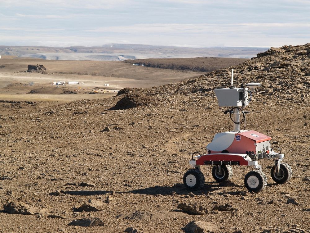
After a technical enhancement to HadSST3 delayed March and April updates, May has just been posted, hopefully a signal the future months will also appear more promptly. For comparison we can look at lower troposphere temperatures (TLT) from UAHv6 which are now posted for May. The temperature record is derived from microwave sounding units (MSU) on board satellites like the one pictured above. Last month also involved a change in UAH processing of satellite drift corrections, including dropping one platform which can no longer be corrected. The graphs below are taken from the new and current dataset.
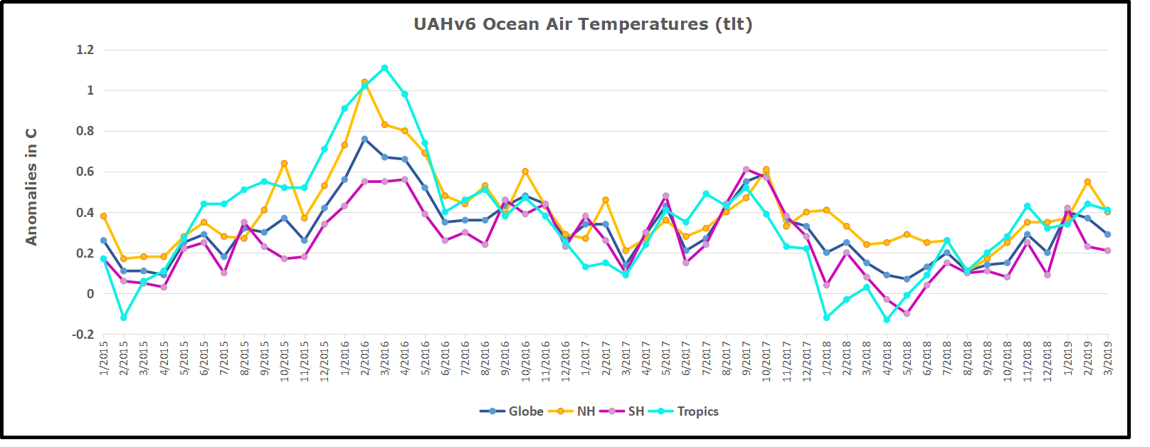
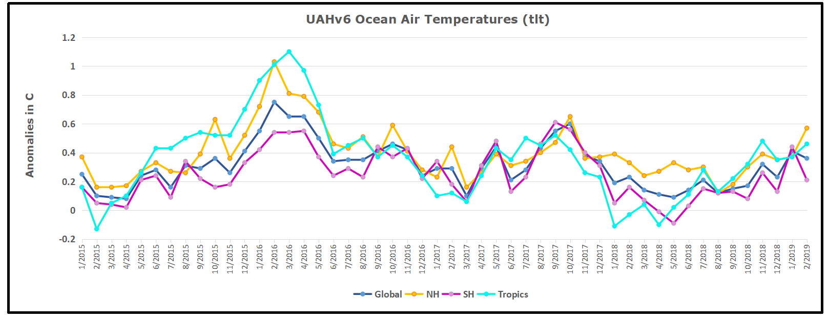
The UAH dataset includes temperature results for air above the oceans, and thus should be most comparable to the SSTs. There is the additional feature that ocean air temps avoid Urban Heat Islands (UHI). The graph below shows monthly anomalies for ocean temps since January 2015.
 May ocean air temps dropped in all regions after April’s rise, resulting in the Global average back down below January 2019. NH warming in February has been reversed, and April warming in SH and the Tropics is also gone. The temps this May are warmer than 2018, but lower than 05/2017, and of course lower than 2016.
Land Air Temperatures Tracking Downward in Seesaw Pattern
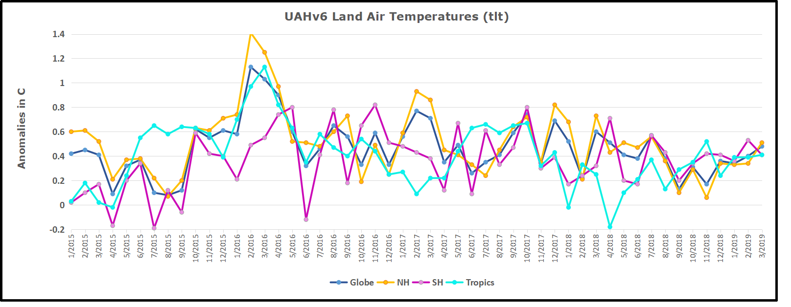
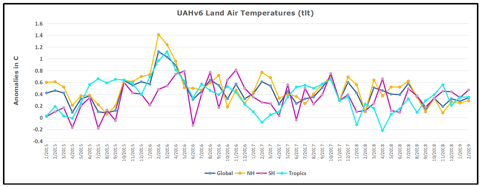
We sometimes overlook that in climate temperature records, while the oceans are measured directly with SSTs, land temps are measured only indirectly. The land temperature records at surface stations record air temps at 2 meters above ground. UAH gives tlt anomalies for air over land separately from ocean air temps. The graph updated for May is below.

The greater volatility of the Land temperatures was evident earlier, but has calmed down recently. Also the NH dominates, having twice as much land area as SH. Note how global peaks mirror NH peaks. In January 2019 all Land air temps were close but have now diverged. In May both SH and the Tropics dropped sharply (comparable to ocean temps), and the much larger NH land surface also cooled, pulling the Global anomaly down nearly 0.2C. The Tropical land air temps could not be more different from 05/2018, yet the Global, NH and SH are much cooler.
TLTs include mixing above the oceans and probably some influence from nearby more volatile land temps. Clearly NH and Global land temps have been dropping in a seesaw pattern, now more than 1C lower than the peak in 2016. TLT measures started the recent cooling later than SSTs from HadSST3, but are now showing the same pattern. It seems obvious that despite the three El Ninos, their warming has not persisted, and without them it would probably have cooled since 1995. Of course, the future has not yet been written.


/https://public-media.si-cdn.com/filer/0b/1f/0b1f80a6-748b-405a-a08a-5f35e3a59290/ev115-020.jpg)


 Any warming is good, even this small amount seen in the context of a year in the life of a typical American. Moreover, the details of the statistics reveal that the rise is the result of cold months being warmer, while hotter months have cooled very slightly. False Alarm.