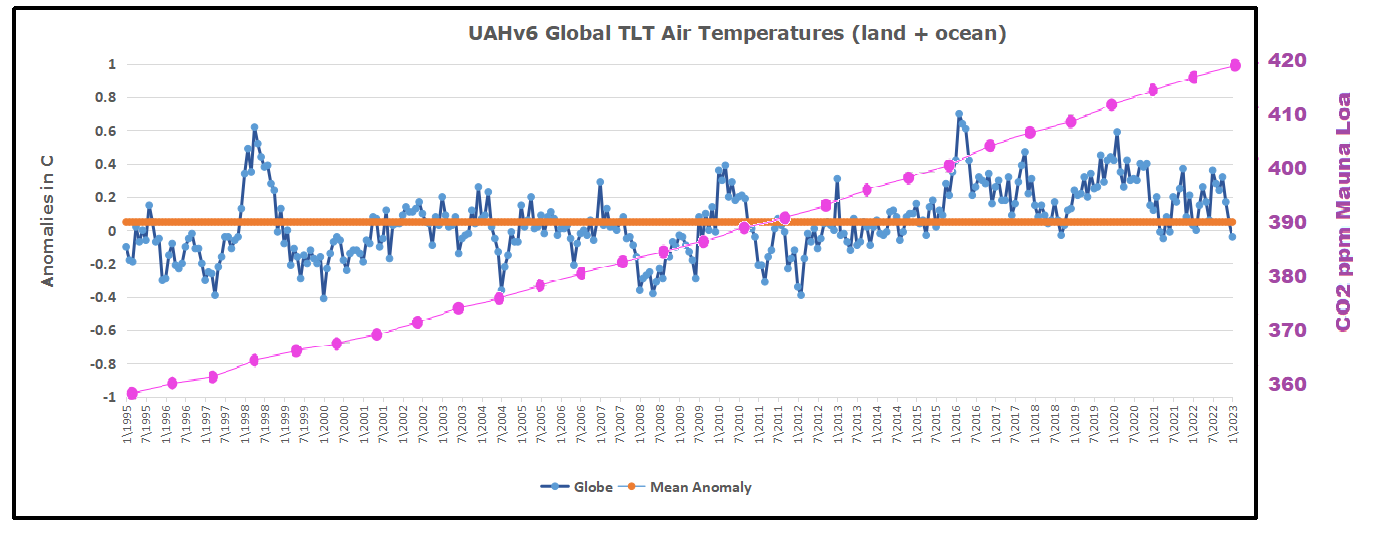
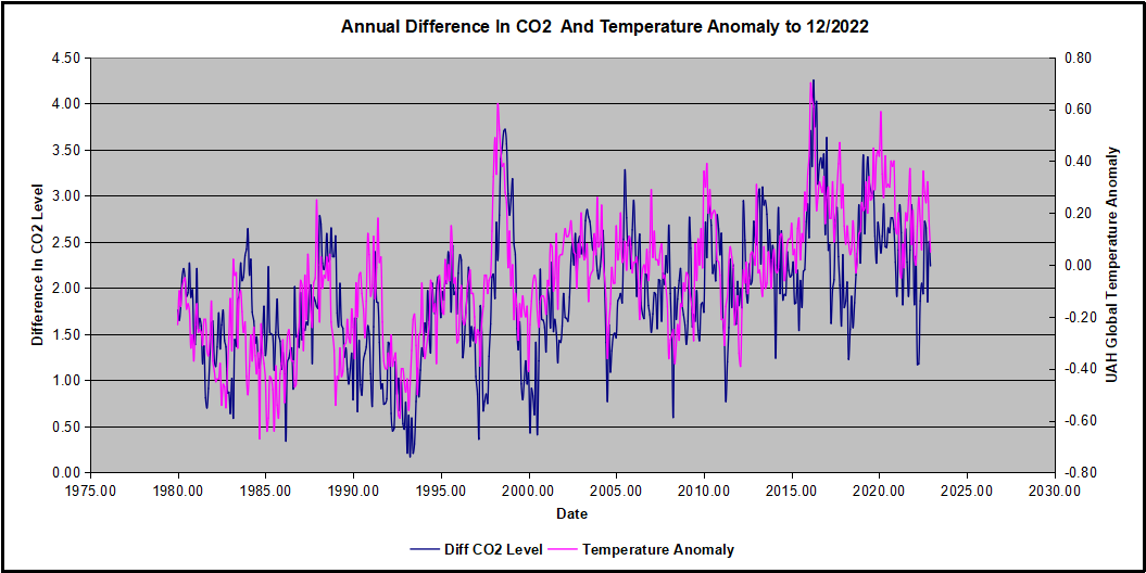
The post below updates the UAH record of air temperatures over land and ocean. Each month and year exposes again the growing disconnect between the real world and the Zero Carbon zealots. It is as though the anti-hydrocarbon band wagon hopes to drown out the data contradicting their justification for the Great Energy Transition.
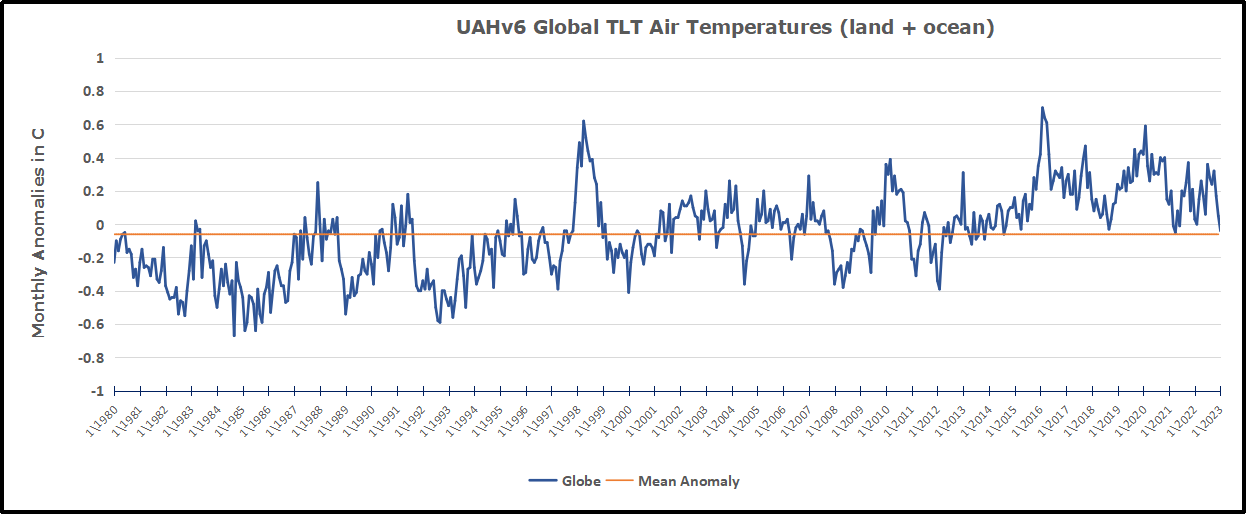
As an overview consider how recent rapid cooling completely overcame the warming from the last 3 El Ninos (1998, 2010 and 2016). The UAH record shows that the effects of the last one were gone as of April 2021, again in November 2021, and in February and June 2022 Now at year end 2022 and continuing into 2023 global temp anomaly is matching or lower than average since 1995, an ENSO neutral year. (UAH baseline is now 1991-2020).
For reference I added an overlay of CO2 annual concentrations as measured at Mauna Loa. While temperatures fluctuated up and down ending flat, CO2 went up steadily by ~60 ppm, a 15% increase.
Furthermore, going back to previous warmings prior to the satellite record shows that the entire rise of 0.8C since 1947 is due to oceanic, not human activity.
The animation is an update of a previous analysis from Dr. Murry Salby. These graphs use Hadcrut4 and include the 2016 El Nino warming event. The exhibit shows since 1947 GMT warmed by 0.8 C, from 13.9 to 14.7, as estimated by Hadcrut4. This resulted from three natural warming events involving ocean cycles. The most recent rise 2013-16 lifted temperatures by 0.2C. Previously the 1997-98 El Nino produced a plateau increase of 0.4C. Before that, a rise from 1977-81 added 0.2C to start the warming since 1947.
Importantly, the theory of human-caused global warming asserts that increasing CO2 in the atmosphere changes the baseline and causes systemic warming in our climate. On the contrary, all of the warming since 1947 was episodic, coming from three brief events associated with oceanic cycles.
Update August 3, 2021
Chris Schoeneveld has produced a similar graph to the animation above, with a temperature series combining HadCRUT4 and UAH6. H/T WUWT
March 2023 Update Land and Sea Temps Little Changed
With apologies to Paul Revere, this post is on the lookout for cooler weather with an eye on both the Land and the Sea. While you will hear a lot about 2020-21 temperatures matching 2016 as the highest ever, that spin ignores how fast the cooling set in. The UAH data analyzed below shows that warming from the last El Nino was fully dissipated with chilly temperatures in all regions. After a warming blip in 2022, land and ocean temps dropped again with 2023 starting below the mean since 1995.
UAH has updated their tlt (temperatures in lower troposphere) dataset for March 2023. Posts on their reading of ocean air temps this month came ahead of updated records from HadSST4. I have previously posted on SSTs using HadSST4 Oceans Stay Cool February 2023.This month also has a separate graph of land air temps because the comparisons and contrasts are interesting as we contemplate possible cooling in coming months and years. Sometimes air temps over land diverge from ocean air changes. For example in February, Tropical ocean temps alone moved upward, while temps in all land regions rebounded after hitting bottom..
Note: UAH has shifted their baseline from 1981-2010 to 1991-2020 beginning with January 2021. In the charts below, the trends and fluctuations remain the same but the anomaly values change with the baseline reference shift.
Presently sea surface temperatures (SST) are the best available indicator of heat content gained or lost from earth’s climate system. Enthalpy is the thermodynamic term for total heat content in a system, and humidity differences in air parcels affect enthalpy. Measuring water temperature directly avoids distorted impressions from air measurements. In addition, ocean covers 71% of the planet surface and thus dominates surface temperature estimates. Eventually we will likely have reliable means of recording water temperatures at depth.
Recently, Dr. Ole Humlum reported from his research that air temperatures lag 2-3 months behind changes in SST. Thus the cooling oceans now portend cooling land air temperatures to follow. He also observed that changes in CO2 atmospheric concentrations lag behind SST by 11-12 months. This latter point is addressed in a previous post Who to Blame for Rising CO2?
After a change in priorities, updates are now exclusive to HadSST4. For comparison we can also look at lower troposphere temperatures (TLT) from UAHv6 which are now posted for March. The temperature record is derived from microwave sounding units (MSU) on board satellites like the one pictured above. Recently there was a change in UAH processing of satellite drift corrections, including dropping one platform which can no longer be corrected. The graphs below are taken from the revised and current dataset.
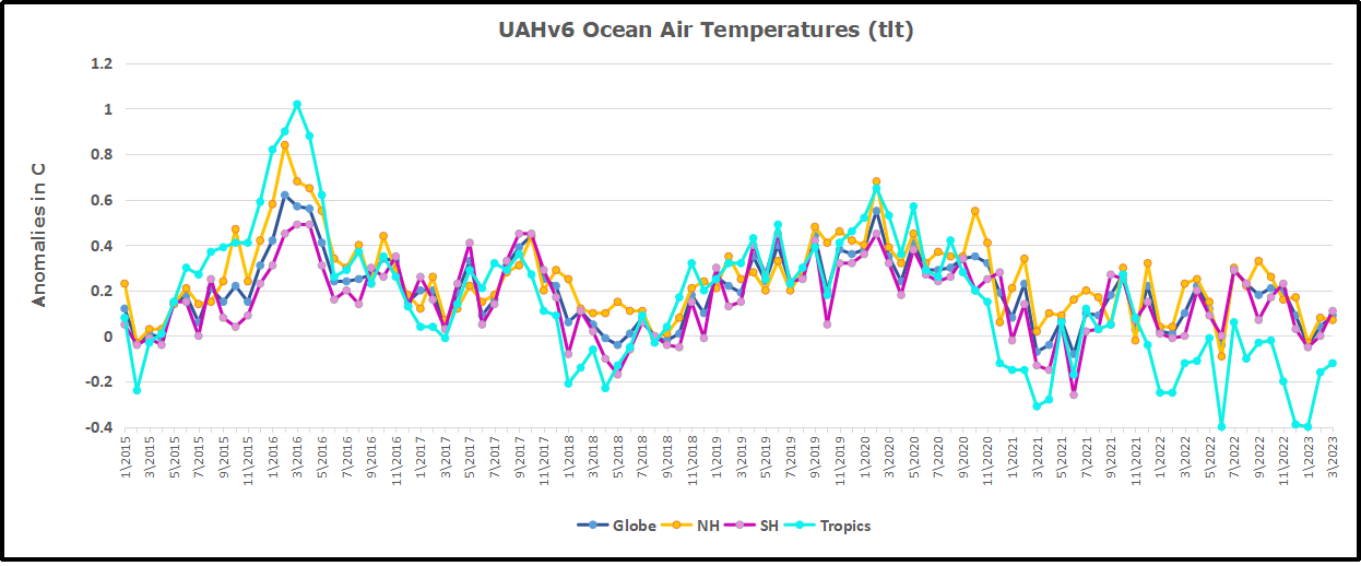
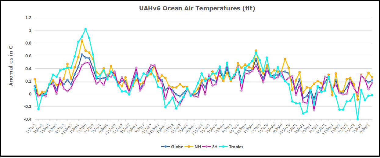
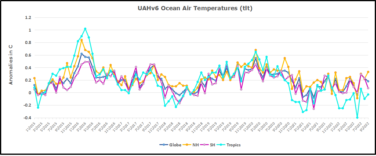
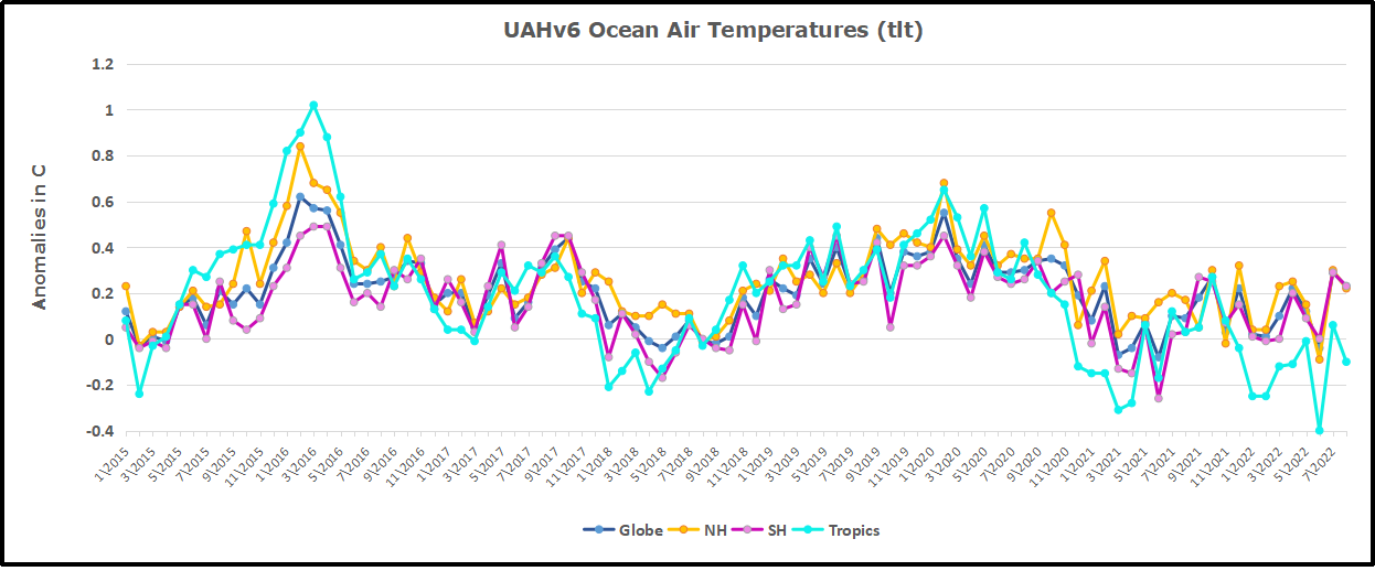
The UAH dataset includes temperature results for air above the oceans, and thus should be most comparable to the SSTs. There is the additional feature that ocean air temps avoid Urban Heat Islands (UHI). The graph below shows monthly anomalies for ocean air temps since January 2015.
Note 2020 was warmed mainly by a spike in February in all regions, and secondarily by an October spike in NH alone. In 2021, SH and the Tropics both pulled the Global anomaly down to a new low in April. Then SH and Tropics upward spikes, along with NH warming brought Global temps to a peak in October. That warmth was gone as November 2021 ocean temps plummeted everywhere. After an upward bump 01/2022 temps reversed and plunged downward in June. After an upward spike in July, ocean air everywhere cooled in August and also in September. After sharp cooling everywhere in January 2023, all regions were into negative territory. Now in February and March, an uptick in the Tropics led to a small rise globally slightly above zero.
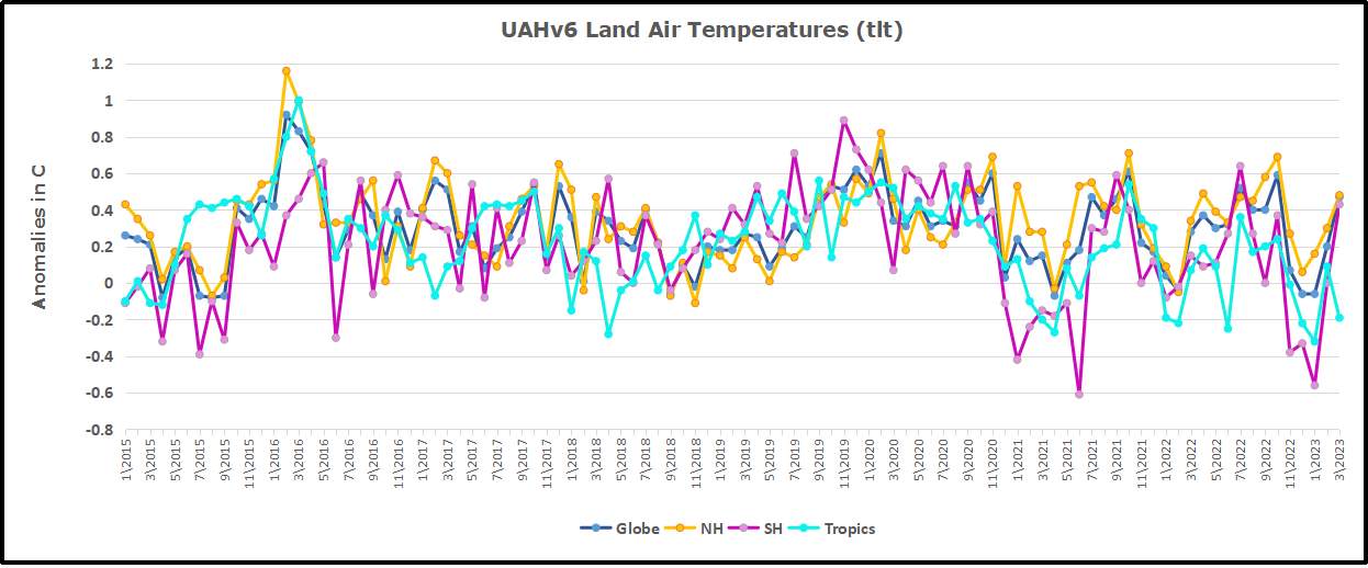
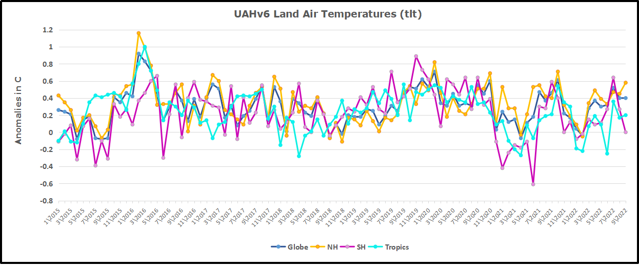
Land Air Temperatures Tracking Downward in Seesaw Pattern
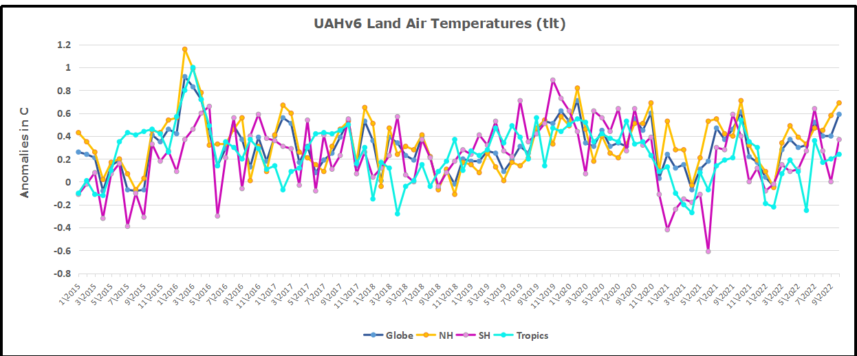
We sometimes overlook that in climate temperature records, while the oceans are measured directly with SSTs, land temps are measured only indirectly. The land temperature records at surface stations sample air temps at 2 meters above ground. UAH gives tlt anomalies for air over land separately from ocean air temps. The graph updated for March is below.
Here we have fresh evidence of the greater volatility of the Land temperatures, along with extraordinary departures by SH land. Land temps are dominated by NH with a 2021 spike in January, then dropping before rising in the summer to peak in October 2021. As with the ocean air temps, all that was erased in November with a sharp cooling everywhere. After a summer 2022 NH spike, land temps dropped everywhere, and in January, further cooling in SH and Tropics offset by an uptick in NH. Now in February and March both SH and Tropics along with NH pulled up the Global land anomaly.
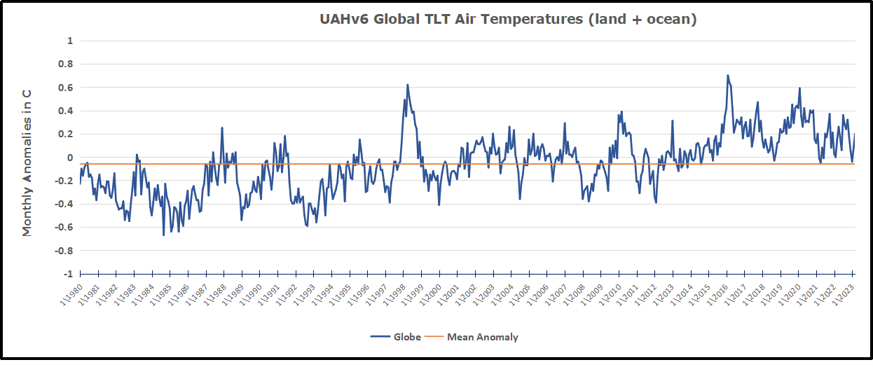
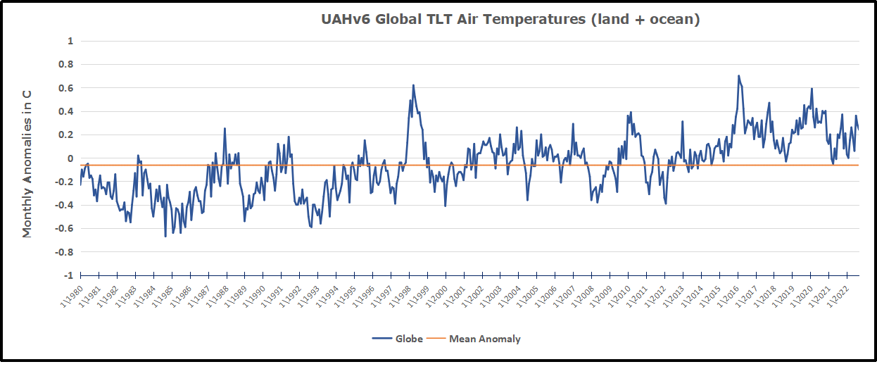
The Bigger Picture UAH Global Since 1980
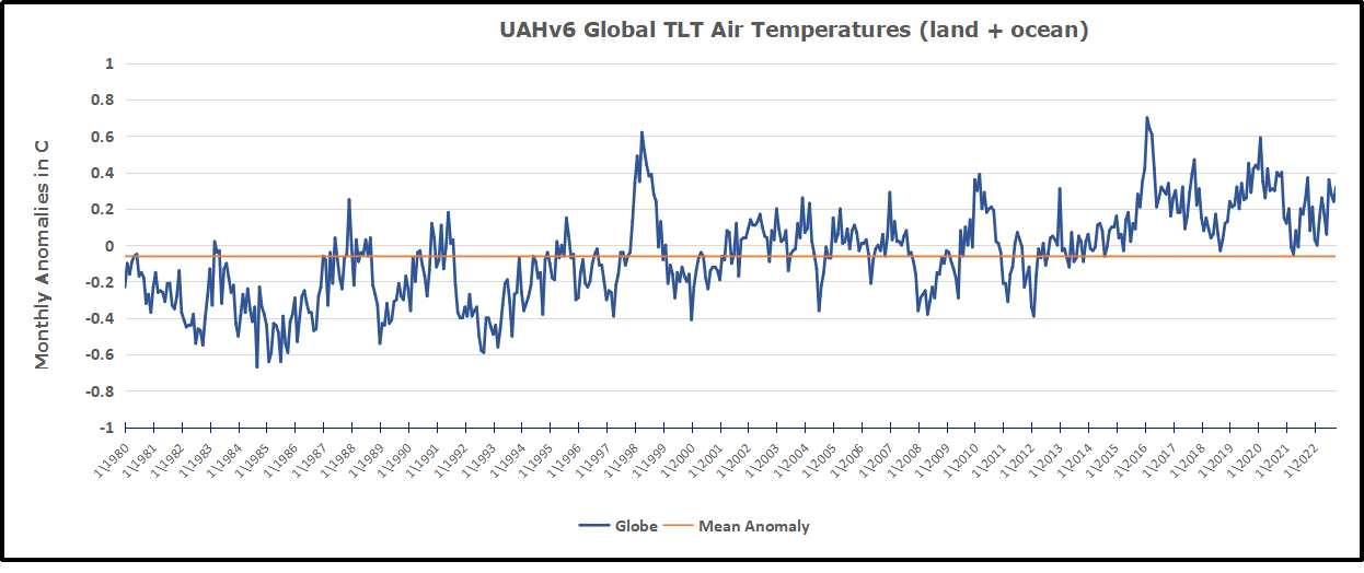
The chart shows monthly Global anomalies starting 01/1980 to present. The average monthly anomaly is -0.06, for this period of more than four decades. The graph shows the 1998 El Nino after which the mean resumed, and again after the smaller 2010 event. The 2016 El Nino matched 1998 peak and in addition NH after effects lasted longer, followed by the NH warming 2019-20. An upward bump in 2021 was reversed with temps having returned close to the mean as of 2/2022. March and April brought warmer Global temps, later reversed, and with the sharp drops in Nov., Dec. and January 2023 temps, there was no increase over 1980. Now in February and March there is a slight rebound over zero.
TLTs include mixing above the oceans and probably some influence from nearby more volatile land temps. Clearly NH and Global land temps have been dropping in a seesaw pattern, nearly 1C lower than the 2016 peak. Since the ocean has 1000 times the heat capacity as the atmosphere, that cooling is a significant driving force. TLT measures started the recent cooling later than SSTs from HadSST3, but are now showing the same pattern. It seems obvious that despite the three El Ninos, their warming has not persisted, and without them it would probably have cooled since 1995. Of course, the future has not yet been written.
The post below updates the UAH record of air temperatures over land and ocean. But as an overview consider how recent rapid cooling completely overcame the warming from the last 3 El Ninos (1998, 2010 and 2016). The UAH record shows that the effects of the last one were gone as of April 2021, again in November 2021, and in February and June 2022 Now at year end 2022 and continuing into January 2023 we have again global temp anomaly lower than average since 1995. (UAH baseline is now 1991-2020).
For reference I added an overlay of CO2 annual concentrations as measured at Mauna Loa. While temperatures fluctuated up and down ending flat, CO2 went up steadily by ~60 ppm, a 15% increase.
Furthermore, going back to previous warmings prior to the satellite record shows that the entire rise of 0.8C since 1947 is due to oceanic, not human activity.
The animation is an update of a previous analysis from Dr. Murry Salby. These graphs use Hadcrut4 and include the 2016 El Nino warming event. The exhibit shows since 1947 GMT warmed by 0.8 C, from 13.9 to 14.7, as estimated by Hadcrut4. This resulted from three natural warming events involving ocean cycles. The most recent rise 2013-16 lifted temperatures by 0.2C. Previously the 1997-98 El Nino produced a plateau increase of 0.4C. Before that, a rise from 1977-81 added 0.2C to start the warming since 1947.
Importantly, the theory of human-caused global warming asserts that increasing CO2 in the atmosphere changes the baseline and causes systemic warming in our climate. On the contrary, all of the warming since 1947 was episodic, coming from three brief events associated with oceanic cycles.
Update August 3, 2021
Chris Schoeneveld has produced a similar graph to the animation above, with a temperature series combining HadCRUT4 and UAH6. H/T WUWT
With apologies to Paul Revere, this post is on the lookout for cooler weather with an eye on both the Land and the Sea. While you will hear a lot about 2020-21 temperatures matching 2016 as the highest ever, that spin ignores how fast the cooling set in. The UAH data analyzed below shows that warming from the last El Nino was fully dissipated with chilly temperatures in all regions. After a warming blip in 2022, land and ocean temps dropped again with 2023 starting below the mean since 1995.
UAH has updated their tlt (temperatures in lower troposphere) dataset for February 2023. Posts on their reading of ocean air temps this month came ahead of updated records from HadSST4. I have previously posted on SSTs using HadSST4 Ahoy! Cooler Ocean Ahead, January 2023 This month also has a separate graph of land air temps because the comparisons and contrasts are interesting as we contemplate possible cooling in coming months and years. Sometimes air temps over land diverge from ocean air changes. For example in February, Tropical ocean temps alone moved upward, while temps in all land regions rebounded after hitting bottom..
Note: UAH has shifted their baseline from 1981-2010 to 1991-2020 beginning with January 2021. In the charts below, the trends and fluctuations remain the same but the anomaly values change with the baseline reference shift.
Presently sea surface temperatures (SST) are the best available indicator of heat content gained or lost from earth’s climate system. Enthalpy is the thermodynamic term for total heat content in a system, and humidity differences in air parcels affect enthalpy. Measuring water temperature directly avoids distorted impressions from air measurements. In addition, ocean covers 71% of the planet surface and thus dominates surface temperature estimates. Eventually we will likely have reliable means of recording water temperatures at depth.
Recently, Dr. Ole Humlum reported from his research that air temperatures lag 2-3 months behind changes in SST. Thus the cooling oceans now portend cooling land air temperatures to follow. He also observed that changes in CO2 atmospheric concentrations lag behind SST by 11-12 months. This latter point is addressed in a previous post Who to Blame for Rising CO2?
After a change in priorities, updates are now exclusive to HadSST4. For comparison we can also look at lower troposphere temperatures (TLT) from UAHv6 which are now posted for February. The temperature record is derived from microwave sounding units (MSU) on board satellites like the one pictured above. Recently there was a change in UAH processing of satellite drift corrections, including dropping one platform which can no longer be corrected. The graphs below are taken from the revised and current dataset.
The UAH dataset includes temperature results for air above the oceans, and thus should be most comparable to the SSTs. There is the additional feature that ocean air temps avoid Urban Heat Islands (UHI). The graph below shows monthly anomalies for ocean air temps since January 2015.
Note 2020 was warmed mainly by a spike in February in all regions, and secondarily by an October spike in NH alone. In 2021, SH and the Tropics both pulled the Global anomaly down to a new low in April. Then SH and Tropics upward spikes, along with NH warming brought Global temps to a peak in October. That warmth was gone as November 2021 ocean temps plummeted everywhere. After an upward bump 01/2022 temps reversed and plunged downward in June. After an upward spike in July, ocean air everywhere cooled in August and also in September. After sharp cooling everywhere in January 2023, all regions were into negative territory. Now in February, an uptick in the Tropics led a small rise globally slightly above zero.
Land Air Temperatures Tracking Downward in Seesaw Pattern
We sometimes overlook that in climate temperature records, while the oceans are measured directly with SSTs, land temps are measured only indirectly. The land temperature records at surface stations sample air temps at 2 meters above ground. UAH gives tlt anomalies for air over land separately from ocean air temps. The graph updated for February is below.
Here we have fresh evidence of the greater volatility of the Land temperatures, along with extraordinary departures by SH land. Land temps are dominated by NH with a 2021 spike in January, then dropping before rising in the summer to peak in October 2021. As with the ocean air temps, all that was erased in November with a sharp cooling everywhere. After a summer 2022 NH spike, land temps dropped everywhere, and in January, further cooling in SH and Tropics offset by an uptick in NH. Now in February both SH and Tropics along with NH pulled up the Global land anomaly.
The Bigger Picture UAH Global Since 1980
The chart shows monthly Global anomalies starting 01/1980 to present. The average monthly anomaly is -0.06, for this period of more than four decades. The graph shows the 1998 El Nino after which the mean resumed, and again after the smaller 2010 event. The 2016 El Nino matched 1998 peak and in addition NH after effects lasted longer, followed by the NH warming 2019-20. An upward bump in 2021 was reversed with temps having returned close to the mean as of 2/2022. March and April brought warmer Global temps, later reversed, and with the sharp drops in Nov., Dec. and January temps, there was no increase over 1980. Now in February there is a slight rebound over zero.
TLTs include mixing above the oceans and probably some influence from nearby more volatile land temps. Clearly NH and Global land temps have been dropping in a seesaw pattern, nearly 1C lower than the 2016 peak. Since the ocean has 1000 times the heat capacity as the atmosphere, that cooling is a significant driving force. TLT measures started the recent cooling later than SSTs from HadSST3, but are now showing the same pattern. It seems obvious that despite the three El Ninos, their warming has not persisted, and without them it would probably have cooled since 1995. Of course, the future has not yet been written.
The post below updates the UAH record of air temperatures over land and ocean. But as an overview consider how recent rapid cooling completely overcame the warming from the last 3 El Ninos (1998, 2010 and 2016). The UAH record shows that the effects of the last one were gone as of April 2021, again in November 2021, and in February and June 2022 Now at year end 2022 and continuing into January 2023 we have again global temp anomaly lower than average since 1995. (UAH baseline is now 1991-2020).
For reference I added an overlay of CO2 annual concentrations as measured at Mauna Loa. While temperatures fluctuated up and down ending flat, CO2 went up steadily by ~60 ppm, a 15% increase.
Furthermore, going back to previous warmings prior to the satellite record shows that the entire rise of 0.8C since 1947 is due to oceanic, not human activity.
The animation is an update of a previous analysis from Dr. Murry Salby. These graphs use Hadcrut4 and include the 2016 El Nino warming event. The exhibit shows since 1947 GMT warmed by 0.8 C, from 13.9 to 14.7, as estimated by Hadcrut4. This resulted from three natural warming events involving ocean cycles. The most recent rise 2013-16 lifted temperatures by 0.2C. Previously the 1997-98 El Nino produced a plateau increase of 0.4C. Before that, a rise from 1977-81 added 0.2C to start the warming since 1947.
Importantly, the theory of human-caused global warming asserts that increasing CO2 in the atmosphere changes the baseline and causes systemic warming in our climate. On the contrary, all of the warming since 1947 was episodic, coming from three brief events associated with oceanic cycles.
Update August 3, 2021
Chris Schoeneveld has produced a similar graph to the animation above, with a temperature series combining HadCRUT4 and UAH6. H/T WUWT
With apologies to Paul Revere, this post is on the lookout for cooler weather with an eye on both the Land and the Sea. While you will hear a lot about 2020-21 temperatures matching 2016 as the highest ever, that spin ignores how fast the cooling set in. The UAH data analyzed below shows that warming from the last El Nino was fully dissipated with chilly temperatures in all regions. After a warming blip in 2022, land and ocean temps dropped again with 2023 starting below the mean since 1995.
UAH has updated their tlt (temperatures in lower troposphere) dataset for January 2023. Posts on their reading of ocean air temps this month came ahead of updated records from HadSST4. I have previously posted on SSTs using HadSST4 Ocean Temps Dropping November 2022This month also has aO separate graph of land air temps because the comparisons and contrasts are interesting as we contemplate possible cooling in coming months and years. Sometimes air temps over land diverge from ocean air changes. However, in January temps in all land and ocean regions dropped sharply.
Note: UAH has shifted their baseline from 1981-2010 to 1991-2020 beginning with January 2021. In the charts below, the trends and fluctuations remain the same but the anomaly values change with the baseline reference shift.
Presently sea surface temperatures (SST) are the best available indicator of heat content gained or lost from earth’s climate system. Enthalpy is the thermodynamic term for total heat content in a system, and humidity differences in air parcels affect enthalpy. Measuring water temperature directly avoids distorted impressions from air measurements. In addition, ocean covers 71% of the planet surface and thus dominates surface temperature estimates. Eventually we will likely have reliable means of recording water temperatures at depth.
Recently, Dr. Ole Humlum reported from his research that air temperatures lag 2-3 months behind changes in SST. Thus the cooling oceans now portend cooling land air temperatures to follow. He also observed that changes in CO2 atmospheric concentrations lag behind SST by 11-12 months. This latter point is addressed in a previous post Who to Blame for Rising CO2?
After a change in priorities, updates are now exclusive to HadSST4. For comparison we can also look at lower troposphere temperatures (TLT) from UAHv6 which are now posted for January. The temperature record is derived from microwave sounding units (MSU) on board satellites like the one pictured above. Recently there was a change in UAH processing of satellite drift corrections, including dropping one platform which can no longer be corrected. The graphs below are taken from the revised and current dataset.
The UAH dataset includes temperature results for air above the oceans, and thus should be most comparable to the SSTs. There is the additional feature that ocean air temps avoid Urban Heat Islands (UHI). The graph below shows monthly anomalies for ocean air temps since January 2015.
Note 2020 was warmed mainly by a spike in February in all regions, and secondarily by an October spike in NH alone. In 2021, SH and the Tropics both pulled the Global anomaly down to a new low in April. Then SH and Tropics upward spikes, along with NH warming brought Global temps to a peak in October. That warmth was gone as November 2021 ocean temps plummeted everywhere. After an upward bump 01/2022 temps reversed and plunged downward in June. After an upward spike in July, ocean air everywhere cooled in August and also in September. Now in January 2023, sharp cooling everywhere brought all regions into negative territory.
Land Air Temperatures Tracking Downward in Seesaw Pattern
We sometimes overlook that in climate temperature records, while the oceans are measured directly with SSTs, land temps are measured only indirectly. The land temperature records at surface stations sample air temps at 2 meters above ground. UAH gives tlt anomalies for air over land separately from ocean air temps. The graph updated for January is below.
Here we have fresh evidence of the greater volatility of the Land temperatures, along with extraordinary departures by SH land. Land temps are dominated by NH with a 2021 spike in January, then dropping before rising in the summer to peak in October 2021. As with the ocean air temps, all that was erased in November with a sharp cooling everywhere. After a summer 2022 NH spike, land temps dropped everywhere, and in January, a NH upward bump offset further cooling in SH and Tropics to leave Global land anomaly unchanged.
The Bigger Picture UAH Global Since 1980
The chart shows monthly Global anomalies starting 01/1980 to present. The average monthly anomaly is -0.06, for this period of more than four decades. The graph shows the 1998 El Nino after which the mean resumed, and again after the smaller 2010 event. The 2016 El Nino matched 1998 peak and in addition NH after effects lasted longer, followed by the NH warming 2019-20. An upward bump in 2021 was reversed with temps having returned close to the mean as of 2/2022. March and April brought warmer Global temps, later reversed, and with the sharp drops in Nov., Dec. and now January temps, there is no increase over 1980.
TLTs include mixing above the oceans and probably some influence from nearby more volatile land temps. Clearly NH and Global land temps have been dropping in a seesaw pattern, nearly 1C lower than the 2016 peak. Since the ocean has 1000 times the heat capacity as the atmosphere, that cooling is a significant driving force. TLT measures started the recent cooling later than SSTs from HadSST3, but are now showing the same pattern. It seems obvious that despite the three El Ninos, their warming has not persisted, and without them it would probably have cooled since 1995. Of course, the future has not yet been written.
This post is about proving that CO2 changes in response to temperature changes, not the other way around, as is often claimed. In order to do that we need two datasets: one for measurements of changes in atmospheric CO2 concentrations over time and one for estimates of Global Mean Temperature changes over time.
Climate science is unsettling because past data are not fixed, but change later on. I ran into this previously and now again in 2021 and 2022 when I set out to update an analysis done in 2014 by Jeremy Shiers (discussed in a previous post reprinted at the end). Jeremy provided a spreadsheet in his essay Murray Salby Showed CO2 Follows Temperature Now You Can Too posted in January 2014. I downloaded his spreadsheet intending to bring the analysis up to the present to see if the results hold up. The two sources of data were:
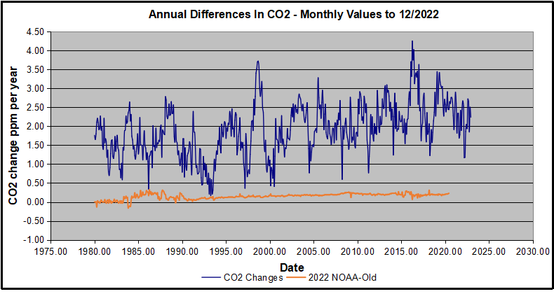
Uploading the CO2 dataset showed that many numbers had changed (why?).
The blue line shows annual observed differences in monthly values year over year, e.g. June 2020 minus June 2019 etc. The first 12 months (1979) provide the observed starting values from which differentials are calculated. The orange line shows those CO2 values changed slightly in the 2020 dataset vs. the 2014 dataset, on average +0.035 ppm. But there is no pattern or trend added, and deviations vary randomly between + and -. So last year I took the 2020 dataset to replace the older one for updating the analysis.
Now I find the NOAA dataset starting in 2021 has almost completely new values due to a method shift in February 2021, requiring a recalibration of all previous measurements. The new picture of ΔCO2 is graphed below.
The method shift is reported at a NOAA Global Monitoring Laboratory webpage, Carbon Dioxide (CO2) WMO Scale, with a justification for the difference between X2007 results and the new results from X2019 now in force. The orange line shows that the shift has resulted in higher values, especially early on and a general slightly increasing trend over time. However, these are small variations at the decimal level on values 340 and above. Further, the graph shows that yearly differentials month by month are virtually the same as before. Thus I redid the analysis with the new values.
Global Temperature Anomalies (ΔTemp)
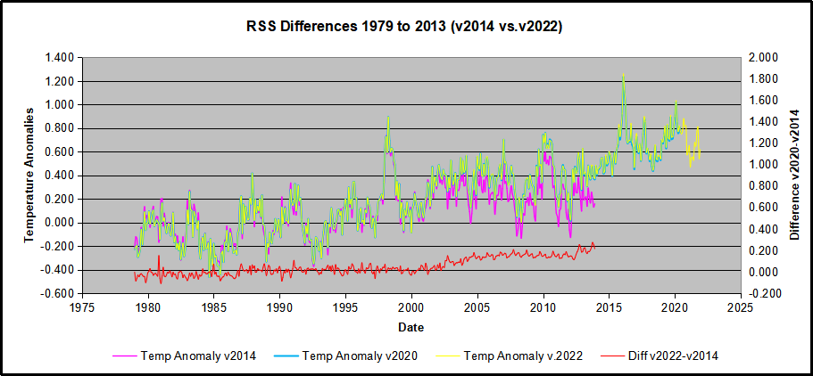
The other time series was the record of global temperature anomalies according to RSS. The current RSS dataset is not at all the same as the past.
Here we see some seriously unsettling science at work. The purple line is RSS in 2014, and the blue is RSS as of 2020. Some further increases appear in the gold 2022 rss dataset. The red line shows alterations from the old to the new. There is a slight cooling of the data in the beginning years, then the three versions mostly match until 1997, when systematic warming enters the record. From 1997/5 to 2003/12 the average anomaly increases by 0.04C. After 2004/1 to 2012/8 the average increase is 0.15C. At the end from 2012/9 to 2013/12, the average anomaly was higher by 0.21. The 2022 version added slight warming over 2020 values.
RSS continues that accelerated warming to the present, but it cannot be trusted. And who knows what the numbers will be a few years down the line? As Dr. Ole Humlum said some years ago (regarding Gistemp): “It should however be noted, that a temperature record which keeps on changing the past hardly can qualify as being correct.”
Given the above manipulations, I went instead to the other satellite dataset UAH version 6. UAH has also made a shift by changing its baseline from 1981-2010 to 1991-2020. This resulted in systematically reducing the anomaly values, but did not alter the pattern of variation over time. For comparison, here are the two records with measurements through December 2022.
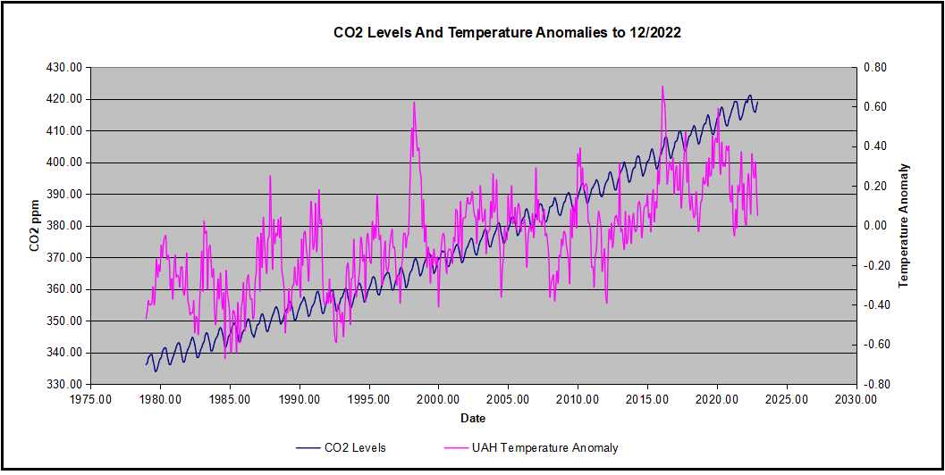
Comparing UAH temperature anomalies to NOAA CO2 changes.
Here are UAH temperature anomalies compared to CO2 monthly changes year over year.
Changes in monthly CO2 synchronize with temperature fluctuations, which for UAH are anomalies now referenced to the 1991-2020 period. As stated above, CO2 differentials are calculated for the present month by subtracting the value for the same month in the previous year (for example June 2022 minus June 2021). Temp anomalies are calculated by comparing the present month with the baseline month.
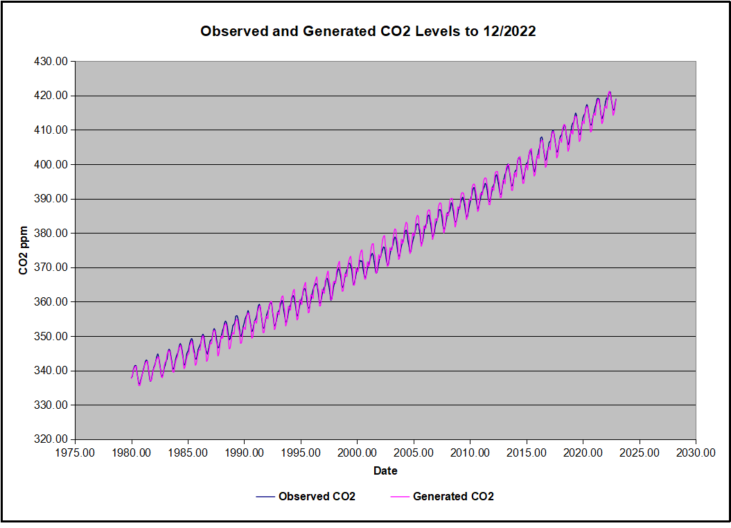
The final proof that CO2 follows temperature due to stimulation of natural CO2 reservoirs is demonstrated by the ability to calculate CO2 levels since 1979 with a simple mathematical formula:
For each subsequent year, the co2 level for each month was generated
CO2 this month this year = a + b × Temp this month this year + CO2 this month last year
Jeremy used Python to estimate a and b, but I used his spreadsheet to guess values that place for comparison the observed and calculated CO2 levels on top of each other.
In the chart calculated CO2 levels correlate with observed CO2 levels at 0.9985 out of 1.0000. This mathematical generation of CO2 atmospheric levels is only possible if they are driven by temperature-dependent natural sources, and not by human emissions which are small in comparison, rise steadily and monotonically.
Previous Post: What Causes Rising Atmospheric CO2?
This post is prompted by a recent exchange with those reasserting the “consensus” view attributing all additional atmospheric CO2 to humans burning fossil fuels.
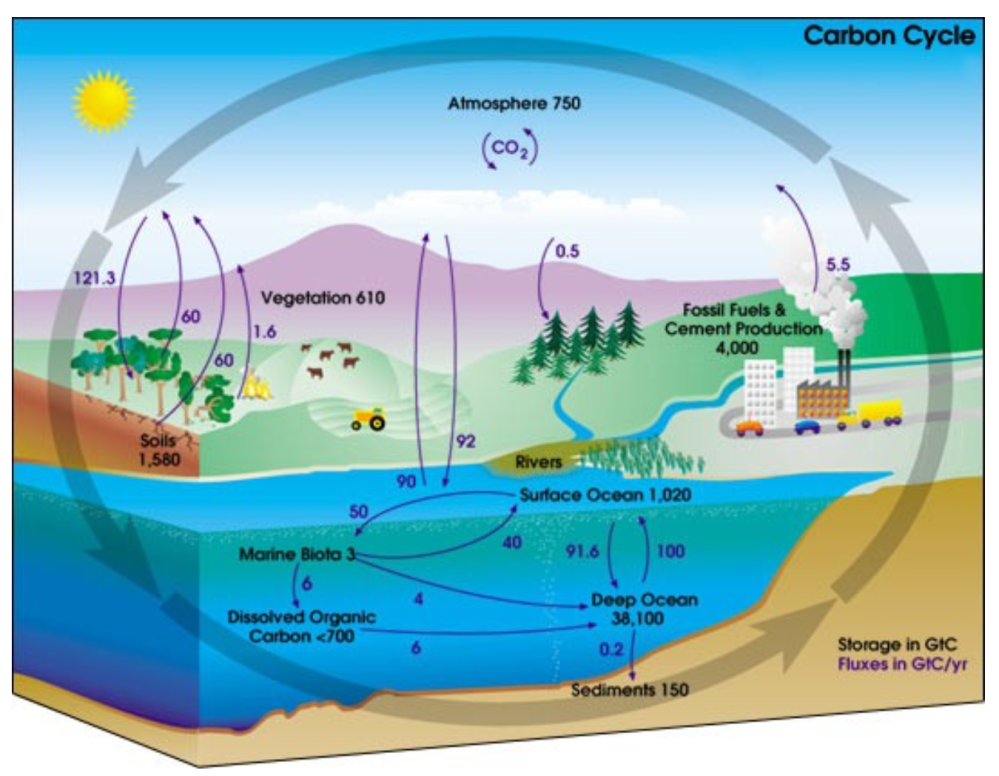
The IPCC doctrine which has long been promoted goes as follows. We have a number over here for monthly fossil fuel CO2 emissions, and a number over there for monthly atmospheric CO2. We don’t have good numbers for the rest of it-oceans, soils, biosphere–though rough estimates are orders of magnitude higher, dwarfing human CO2. So we ignore nature and assume it is always a sink, explaining the difference between the two numbers we do have. Easy peasy, science settled.
What about the fact that nature continues to absorb about half of human emissions, even while FF CO2 increased by 60% over the last 2 decades? What about the fact that in 2020 FF CO2 declined significantly with no discernable impact on rising atmospheric CO2?
These and other issues are raised by Murray Salby and others who conclude that it is not that simple, and the science is not settled. And so these dissenters must be cancelled lest the narrative be weakened.
The non-IPCC paradigm is that atmospheric CO2 levels are a function of two very different fluxes. FF CO2 changes rapidly and increases steadily, while Natural CO2 changes slowly over time, and fluctuates up and down from temperature changes. The implications are that human CO2 is a simple addition, while natural CO2 comes from the integral of previous fluctuations. Jeremy Shiers has a series of posts at his blog clarifying this paradigm. See Increasing CO2 Raises Global Temperature Or Does Increasing Temperature Raise CO2 Excerpts in italics with my bolds.
The following graph which shows the change in CO2 levels (rather than the levels directly) makes this much clearer.
Note the vertical scale refers to the first differential of the CO2 level not the level itself. The graph depicts that change rate in ppm per year.
There are big swings in the amount of CO2 emitted. Taking the mean as 1.6 ppmv/year (at a guess) there are +/- swings of around 1.2 nearly +/- 100%.
And, surprise surprise, the change in net emissions of CO2 is very strongly correlated with changes in global temperature.
This clearly indicates the net amount of CO2 emitted in any one year is directly linked to global mean temperature in that year.
For any given year the amount of CO2 in the atmosphere will be the sum of
all the net annual emissions of CO2
in all previous years.
For each year the net annual emission of CO2 is proportional to the annual global mean temperature.
This means the amount of CO2 in the atmosphere will be related to the sum of temperatures in previous years.
So CO2 levels are not directly related to the current temperature but the integral of temperature over previous years.
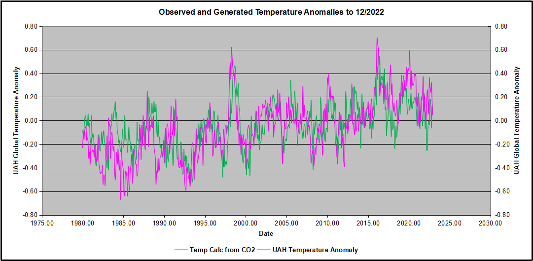
The following graph again shows observed levels of CO2 and global temperatures but also has calculated levels of CO2 based on sum of previous years temperatures (dotted blue line).
Summary:
The massive fluxes from natural sources dominate the flow of CO2 through the atmosphere. Human CO2 from burning fossil fuels is around 4% of the annual addition from all sources. Even if rising CO2 could cause rising temperatures (no evidence, only claims), reducing our emissions would have little impact.
Addendum:
Roland Van den Broek makes the valid point in his comments below that any two data sets generally trending positive will show a high degree of correlation, not proving any causation. Certainly, UAH reports rising GMA (Global Mean Anomalies) and MLO reports rising CO2. Note however that Δ GMA predicts Δ CO2 with a correlation of 0.9985. For comparison, I generated GMA from CO2 differentials, resulting in a lower correlation of 0.6030. I conclude that Δ CO2 ⇒ Δ GMA is spurious, while Δ GMA ⇒ Δ CO2 is real.
The post below updates the UAH record of air temperatures over land and ocean. But as an overview consider how recent rapid cooling completely overcame the warming from the last 3 El Ninos (1998, 2010 and 2016). The UAH record shows that the effects of the last one were gone as of April 2021, again in November 2021, and in February and June 2022 Now at year end 2022, we have again global temp anomaly matching zero warming since 1995. (UAH baseline is now 1991-2020).
For reference I added an overlay of CO2 annual concentrations as measured at Mauna Loa. While temperatures fluctuated up and down ending flat, CO2 went up steadily by ~55 ppm, a 15% increase.
Furthermore, going back to previous warmings prior to the satellite record shows that the entire rise of 0.8C since 1947 is due to oceanic, not human activity.
The animation is an update of a previous analysis from Dr. Murry Salby. These graphs use Hadcrut4 and include the 2016 El Nino warming event. The exhibit shows since 1947 GMT warmed by 0.8 C, from 13.9 to 14.7, as estimated by Hadcrut4. This resulted from three natural warming events involving ocean cycles. The most recent rise 2013-16 lifted temperatures by 0.2C. Previously the 1997-98 El Nino produced a plateau increase of 0.4C. Before that, a rise from 1977-81 added 0.2C to start the warming since 1947.
Importantly, the theory of human-caused global warming asserts that increasing CO2 in the atmosphere changes the baseline and causes systemic warming in our climate. On the contrary, all of the warming since 1947 was episodic, coming from three brief events associated with oceanic cycles.
Update August 3, 2021
Chris Schoeneveld has produced a similar graph to the animation above, with a temperature series combining HadCRUT4 and UAH6. H/T WUWT
With apologies to Paul Revere, this post is on the lookout for cooler weather with an eye on both the Land and the Sea. While you will hear a lot about 2020-21 temperatures matching 2016 as the highest ever, that spin ignores how fast the cooling set in. The UAH data analyzed below shows that warming from the last El Nino was fully dissipated with chilly temperatures in all regions. May NH land and SH ocean showed temps matching March, reversing an upward blip in April, and then June was virtually the mean since 1995.
UAH has updated their tlt (temperatures in lower troposphere) dataset for December 2022. Posts on their reading of ocean air temps this month came ahead of updated records from HadSST4. I have previously posted on SSTs using HadSST4 Ocean Temps Dropping November 2022This month also has a separate graph of land air temps because the comparisons and contrasts are interesting as we contemplate possible cooling in coming months and years. Sometimes air temps over land diverge from ocean air changes. However, in December temps in all land and ocean regions dropped sharply.
Note: UAH has shifted their baseline from 1981-2010 to 1991-2020 beginning with January 2021. In the charts below, the trends and fluctuations remain the same but the anomaly values change with the baseline reference shift.
Presently sea surface temperatures (SST) are the best available indicator of heat content gained or lost from earth’s climate system. Enthalpy is the thermodynamic term for total heat content in a system, and humidity differences in air parcels affect enthalpy. Measuring water temperature directly avoids distorted impressions from air measurements. In addition, ocean covers 71% of the planet surface and thus dominates surface temperature estimates. Eventually we will likely have reliable means of recording water temperatures at depth.
Recently, Dr. Ole Humlum reported from his research that air temperatures lag 2-3 months behind changes in SST. Thus the cooling oceans now portend cooling land air temperatures to follow. He also observed that changes in CO2 atmospheric concentrations lag behind SST by 11-12 months. This latter point is addressed in a previous post Who to Blame for Rising CO2?
After a change in priorities, updates are now exclusive to HadSST4. For comparison we can also look at lower troposphere temperatures (TLT) from UAHv6 which are now posted for December. The temperature record is derived from microwave sounding units (MSU) on board satellites like the one pictured above. Recently there was a change in UAH processing of satellite drift corrections, including dropping one platform which can no longer be corrected. The graphs below are taken from the revised and current dataset.
The UAH dataset includes temperature results for air above the oceans, and thus should be most comparable to the SSTs. There is the additional feature that ocean air temps avoid Urban Heat Islands (UHI). The graph below shows monthly anomalies for ocean air temps since January 2015.
Note 2020 was warmed mainly by a spike in February in all regions, and secondarily by an October spike in NH alone. In 2021, SH and the Tropics both pulled the Global anomaly down to a new low in April. Then SH and Tropics upward spikes, along with NH warming brought Global temps to a peak in October. That warmth was gone as November 2021 ocean temps plummeted everywhere. After an upward bump 01/2022 temps reversed and plunged downward in June. After an upward spike in July, ocean air everywhere cooled in August and also in September. Now in December 2022, sharp cooling everywhere brings the global anomaly to zero.
Land Air Temperatures Tracking Downward in Seesaw Pattern
We sometimes overlook that in climate temperature records, while the oceans are measured directly with SSTs, land temps are measured only indirectly. The land temperature records at surface stations sample air temps at 2 meters above ground. UAH gives tlt anomalies for air over land separately from ocean air temps. The graph updated for December is below.
Here we have fresh evidence of the greater volatility of the Land temperatures, along with extraordinary departures by SH land. Land temps are dominated by NH with a 2021 spike in January, then dropping before rising in the summer to peak in October 2021. As with the ocean air temps, all that was erased in November with a sharp cooling everywhere. Land temps dropped sharply for four months, even more than did the Oceans. March and April 2022 saw some warming, reversed In May when all land regions cooled pulling down the global anomaly. In July, Tropics and SH land rose sharply, NH slightly, pulling up the Global land anomaly. Note the sharp drop in SH land temps in August and September, while NH Land rose, leaving the Global anomaly unchanged. Nov. and Dec. saw steep declines in air temps over land.
The Bigger Picture UAH Global Since 1980
The chart shows monthly Global anomalies starting 01/1980 to present. The average monthly anomaly is -0.06, for this period of more than four decades. The graph shows the 1998 El Nino after which the mean resumed, and again after the smaller 2010 event. The 2016 El Nino matched 1998 peak and in addition NH after effects lasted longer, followed by the NH warming 2019-20. A small upward bump in 2021 has been reversed with temps having returned close to the mean as of 2/2022. March and April brought warmer Global temps, reversed in May and the June anomaly was almost zero. With the sharp drop in Nov. and Dec. temps, there is only about 0.1C increase since 1980.
TLTs include mixing above the oceans and probably some influence from nearby more volatile land temps. Clearly NH and Global land temps have been dropping in a seesaw pattern, nearly 1C lower than the 2016 peak. Since the ocean has 1000 times the heat capacity as the atmosphere, that cooling is a significant driving force. TLT measures started the recent cooling later than SSTs from HadSST3, but are now showing the same pattern. It seems obvious that despite the three El Ninos, their warming has not persisted, and without them it would probably have cooled since 1995. Of course, the future has not yet been written.
BizNews TV interviewed Dr. John Christy last week as shown in the video above. For those who prefer to read what was said, I provide a lightly edited transcript below in italics with my bolds and added images. BN refers to questions from the interviewer and JC refers to responses from Christy.
BN: Joining me today is Dr John Christy, climate scientist at the University of Alabama in Huntsville and Alabama State climatologist since 2000. Dr Christy, thank you so much for your time. You’ve described yourself as a climate nerd and apparently you were 12 when your unwavering desire to understand weather and climate started. Why climate?
JC: Well I think it was more like 10 years old when I was fascinated with some unusual weather events that happened in my home area of California. So that began a fascination for me, and I wanted to try to figure out why things happen the way they did. Why did one year have more rain–that’s a big story in California, does it rain or not–and another year would be very dry. Why were the mountains covered with snow in one April and not another. In fact I have here April 1967 that I recorded as a teenager. This has been a passion of mine forever, and as it turns out now that I’m as old as I am, I still can’t figure out why one year is wetter than the other.
BN: Well you seem to be getting a lot closer than most people would. I think it was in 1989 when you and NASA scientist Roy Spencer pioneered a new method of measuring and monitoring temperature recordsvia satellites, since that time up until now. Why did you feel you needed to develop a new method to begin with, and how did it differ in terms of the readings of established methods at the time?
JC: Well the issue was we only had surface temperature measurements and they are scattered over the world. They don’t cover much of the world at all, actually mainly just the land regions and scattered places on the ocean. And the measurement itself is not that robust. The stations move, the instruments changed through time, and so it’s a very difficult thing to detect. In fact a small little change in the area right around the station can really affect the temperature of that station
So Roy Spencer and Dick Mcknight came up with an idea about looking at some satellite data. This is the temperature of the deep layer of the atmosphere, so this is like the surface to about 8000 meters. And so if we could see the temperature of that bulk atmospheric layer, we would have a very robust measurement, and the microwave sensors on the NOAA Polo orbiting satellites did precisely that. And so we were the first to really put those data into a simple data set that had the temperature, at that time, for month by month since about November 1978.
BN: Okay, and how do readings differ from the climate science at the time?
JC:First of all they differed because we had a global measurement. We really did see the entire Globe from satellite, because the orbit of that satellite is polar and the Earth spins around underneath. So every day we have 14 orbits as the Earth spins around underneath. We see the entire planet so that’s one big difference.
The other one is that the actual result did not show as much warming as what the surface temperatures showed. And we’re doing even more work now to demonstrate that a lot of the surface stations are spuriously affected by the growth of an infrastructure around them. And so there’s kind of a false warming signal there. You don’t get the background climate signal with surface temperature measurements; you get a bit of what’s happening in the local area.
BN: Your research has to do with testing the theories posited by climate model forecasts, so you don’t actually do any modeling yourself. But what criteria do you use to test these theories?
JC: That’s a very good question, because in climate you hear all kinds of claims and theories being thrown out there. For a lot of people who don’t really understand the climate system it’s a quick and easy answer just to say: Oh humans caused that, you know it’s global warming, something like that is the answer. When in fact the climate system is very complex, so we look at these claims and Roy Spencer and I are just a few of the people around the world that actually build data sets from scratch. I mean we start with the photon counts of the satellite radiometers, or the original paper records of 19th century East Africa, for example. We do all this from scratch so that we can test the claims that people make.
Once we build the data set, we test it to make sure we have confidence in the data set, that it’s telling us a truth about what’s happening over time. And then we check the claim. So for example, we make surface temperature data sets that go back to the 19th century. Someone will say: Well this is now the hottest decade, or that more records happen this decade than in the past. And we can demonstrate, in the United States especially, that’s not the case. You would need to go back to the 1930s if you want to see real record temperatures that occurred at that time.
And for climate models we like to use the satellite data set since it’s a robust deep layer measurement; it’s measuring lots of mass of the atmosphere, the heat content really. That’s a direct value we can get out of the climate model, so we are comparing Apples to Apples: What the satellite produces and observes is what the climate model also generates, and we can compare them one to one.
In a paper Ross McKitrick and I wrote a couple of years ago, we found that 100 of the climate models we’re warming the atmosphere faster than it was actually warming. So that’s not a good result if you’re trying to test your theory of how the climate works with the model against what actually happens.
BN: How much do you think the deeply over-exaggerated predictions of Doom and Gloom have to do with the methodology substantiated by confirmation bias?
JC: That’s an interesting question because we’re a bit confused as well. We have been publishing these papers since 1994 that have demonstrated models warm too much relative to the actual climate, and yet we don’t see an improvement in climate models and trying to match reality with their model output. Now I think a number of modelers understand that: yes the there is a difference there and the models are just too hot. But what is the process that’s gone wrong in the models is a difficult question for these folks. Because models have hundreds of places you can turn a little knob, change a coefficient, and that will change the result. It’s not a physical thing, it’s not based on physics; it’s the model parameterizations— the little pieces of the model that try to represent an actual part of the atmosphere. For example, when do clouds form? That’s a pretty big question. How much humidity in the atmosphere is required to create a cloud? Because once the cloud forms it reflects sunlight and cools the Earth. So that’s it that’s one of the big questions.
So in testing the models we like to use the bulk atmospheric temperature; it’d a very direct measurement that models produce and so we can then say there’s a problem here with climate models.
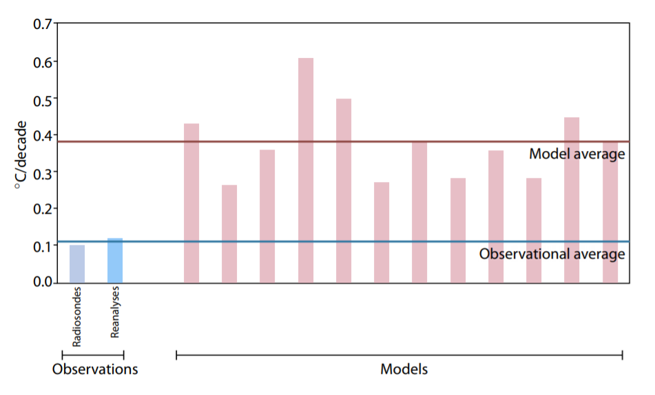
BN: To what degree did your observation on data differ from their forecasts?
Generally it’s about a factor of two. At times it’s been more, but on average the latest models (CMIP6) for the Deep layer of the atmosphere are warming about twice too fast, and that’s a real problem. I think when now we’re looking at over 40 years with which we can test these models, and they’re already that far off.
Figure 8: Warming in the tropical troposphere according to the CMIP6 models. Trends 1979–2014 (except the rightmost model, which is to 2007), for 20°N–20°S, 300–200 hPa.
So we should not use them to to tell us what’s going to happen in the future since they haven’t even gotten us to the right place in the last 40 years.
BN: Given that your real world data refuted what the forecasts were every time for decades, why then (and I recognize that this is conjecture) why are, let’s say, 97 or 99 % of scientists so firmly behind climate crisis narrative?
JC: Yeah I don’t know how many are really fully behind that crisis climate narrative. I saw a recent survey where about 55 percent might have been of the opinion that the climate warming was going to be a problem. Warming itself is not a problem: I mean the Earth has been warmer in the past than it is today, so the Earth has survived that before. And I don’t think putting extra plant food in the atmosphere is going to be a real problem for us to overcome. I do think the world is going to warm some from the extra CO2, but there are a lot of benefits that come from that.
You’re you’re dealing with a question about human nature and funding and so on. I think we all know that the more dramatic the story is, especially in the political world, the more attention you will get. Therefore your work can be highlighted and that helps you with funding and attention and so on. And part of what’s going on here. Then there’s the other real stronger political narrative: that there are groups and in the world political Elite that like to have a narrative that scares people, so that they can then offer a solution. And so it’s a simple way to say: elect me to this office and I will be able to solve this problem.
Then you are facing people like us who actually produce the data and we can report on extreme events and so on and say: Well you know there isn’t any change in these extreme events, so what’s the problem you’re trying to solve? And then we look at the other side of that issue and say: Okay if you actually implement this regulation or this law, it’s not going to make any difference on the climate end, so it’s a you kind of lose on two ends on that story.
BN: You’re a distinguished professor of atmospheric science and also director of Earth Sciences also at Alabama in Huntsville, these are prominent positions. How have you managed to hold on to them with climate views that are so divergent from the norm?
JC: Well the environment in the state of Alabama is different than what you have in Washington. I’m from California way across the country, and I tell people that one of the reasons I like to live in Alabama because in Alabama you can call a duck a duck; that you can just be direct about what’s going on and and you’re not going to be given the evil eye or cast out. As it is now in the climate establishment, you know, saying that all the models are warming too much and that there is not a disaster arising that causes great consternation.Because the narrative has been built over the last 30 years that we are supposed to be in a catastrophe. To come out and say, well here’s the data and the data show there is no catastrophe looming; we’re doing fine, the world is doing fine, human life is thriving in places it’s allowed to. So what’s the problem here you’re trying to solve.
BN:Did you ever manage to get your findings to policy makers that have influence to do something about it?
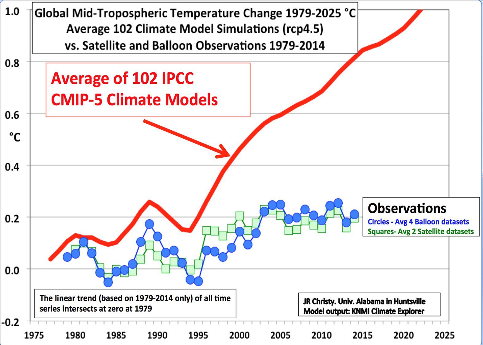
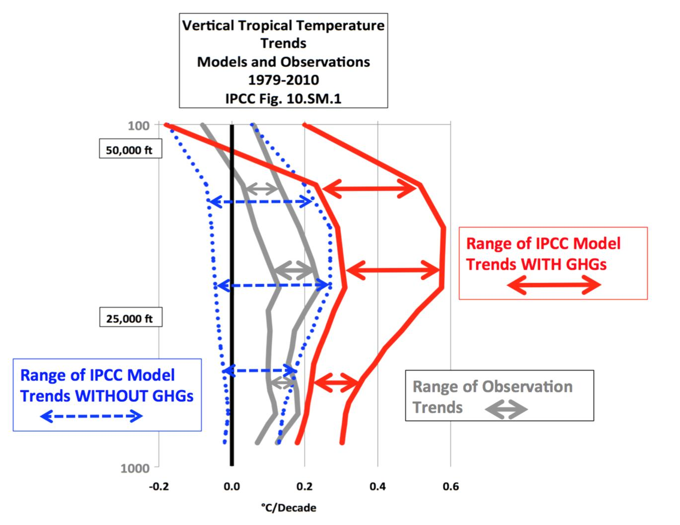
[An important proof against the CO2 global warming claim was included in John Christy’s testimony 29 March 2017 at the House Committee on Science, Space and Technology. The text and diagram below are from that document which can be accessed here.
IPCC Assessment Reports show that the IPCC climate models performed best versus observations when they did not include extra GHGs and this result can be demonstrated with a statistical model as well.
Figure 5. Simplification of IPCC AR5 shown above in Fig. 4. The colored lines represent the range of results for the models and observations. The trends here represent trends at different levels of the tropical atmosphere from the surface up to 50,000 ft. The gray lines are the bounds for the range of observations, the blue for the range of IPCC model results without extra GHGs and the red for IPCC model results with extra GHGs.The key point displayed is the lack of overlap between the GHG model results (red) and the observations (gray). The nonGHG model runs (blue) overlap the observations almost completely.
JC: Well, I’ve been to Congress 20 times, testified before hearings. So the information is there and available, but I can’t force Congress to make legislation that matches the real world. The Congressional world is a political world, and things happen there that are kind of out of my reach and ability to influence.
BN: According to your research, you’ve also said that the climate models underestimate negative feedback loops. Can you explain to me what is this mechanism and the effect of overestimation of the loops on understanding climate for what it is?
JC: That’s a very complicated issue, and I don’t understand it all for sure, but we can say just from some general results and general observation what’s going on here. One of those General observations is that when a climate model warms up the atmosphere one degree Kelvin, it sends out 1.4 watts per metersquared so the air atmosphere warms up and energy escapes to space 1.4 watts. When we use actual observations of the atmosphere, when the real atmosphere warms up one Kelvin it sends out 2.6 watts of energy. That’s almost twice as much so that tells you right there that the climate models are retaining or holding on to energy that the real world allows to escape when it warms. So that’s a negative feedback: as the atmosphere warms for a bit the real real world knows how to let that heat escape; whereas the models don’t and they retain it and that’s why they keep building up heat over time.
BN: What other variables do you look at?
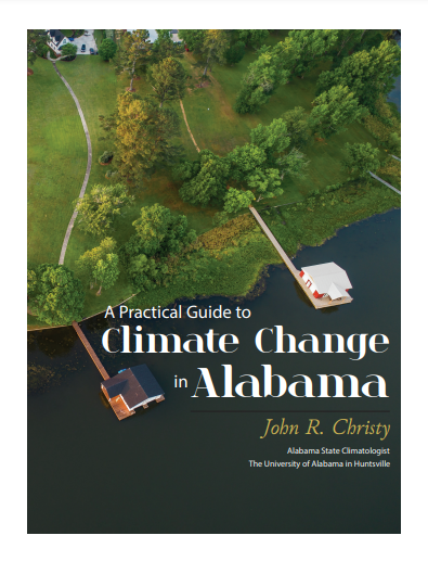
JC: The state climatologists I deal a lot get very practical questions that people ask. They want to know: is it getting hot or is it getting wetter. Are rain storms getting heavier and are the Hurricanes getting worse and so on. I actually wrote a booklet called a practical guide to climate change in Alabama. But it covers a lot of the country as well. It’s free, you can download it from the first page of my website The Alabama State climatologist. I answer a lot of these very practical questions and as we go down the list: droughts are not getting worse over time, heavy rainstorms are not getting worse over time, here in the Southeast in fact. Ross McKitrick and I also had a paper where we went back to 1878 and demonstrated that the trends are not significant. Hurricanes are not going up at all; in fact 2022 is going to be one of the quietest that we’ve had in a while. Tornadoes are not becoming more numerous, heat waves are not becoming worse. So one after another, the weather that people really care about, that if it changes could cause problem or catastrophe, we find those events are not changing, they’ve always been around.[Title below in red is link to Christy’s booklet.]
BN: Some of the biggest critics of climate skeptics say: okay yeah it’s not fair one extreme weather event doesn’t say much, but they argue that there are very particular trends that have been on the increase. Recently have you observed this at all?
JC: That’s exactly the kind of thing we build data sets to discover. For example there is a story, and there is some evidence for it, that in the last hundred years there’s been an increase in in heavy rain events in part of our country, not all of it just part of the country. So I built a data set that went back in fact back to the 1860s. And we looked at that very carefully, and found that when you go back far enough, there were a lot of heavy events back then. And so over the long time period of 140 years or more we don’t see an upward trend. It’s unusual in that sample of time 140 years that we don’t see a change in those kind of events. So that’s why I think it has great value to build these data sets so you can specifically answer the question and the claim that is being made
One of the worst ones was made by the New York Times when they were talking about how many record high temperatures occurred in a recent heat wave around the country. So I looked at that carefully, and they were allowing stations to be included that only had 30 years or even less than 30 years of data. Some had a hundred years but a lot of them just had 30 years. Well when you become very systematic, you say: I’m only going to allow stations that have a hundred years so that every station that measured in 2022 can be compared with the entire time series. Then their story falls apart because the 1930s and the 50s were so hot in our country that they still hold the records for the number of high temperature events.
The scary thing for me is that as much as it completely falls apart, there’s no logic to it,
yet it’s still firmly stands as what most people believe.
You have to credit those in the climate establishment and the media or whoever is behind all this, that they have been successful in scaring people about the climate. Because now you find that even in grade school textbooks. Almost every new story that comes out, and this is where this establishment is very good, they make sure every story has some kind of line in it about climate change. They don’t ever go back and talk to someone who actually builds these data sets who says is that really the worst it’s been was 120 years ago. They just make those claims.
Other than the fact that sea level is rising a bit, the extreme events are just not there to really cause problems now. We are in a problem of having greater damages occur because of extreme events, and mainly because we’ve just built so much more stuff and placed It In harm’s way. Our coastlines are crowded with Condominiums, entertainment parks and retirement villages, and so on. There’s so many more of them that when a hurricane does come, it’s going to wipe out a lot more and so for the absolute value of those damages has gone up. But the number of hurricanes, their strength and so on, the background climate has not caused that problem. It’s just that we like to build things in places that are dangerous.
We have records of sea level rise, and it’s on the order of about an inch per decade, except in places where the land’s sinking. You can find that on the Louisiana Gulf Coast and places like that, but otherwise it’s about an inch per decade. I tell folks that an inch per decade, two and a half centimeters a decade is not your problem. It’s 10 feet in six hours from the next hurricane that’s your problem. If you can withstand a rise of sea level of 10 feet in six hours then you’re probably going to be okay. But if you can’t then a hurricane can really cause problems, and so we just have more exposure to that kind of his situation now than we’ve had before.
BN: What about the trend with sea level rise? Should we be worried about future Generations having to deal with issues that might not affect us in our lifetime but eventually will threaten their lives?
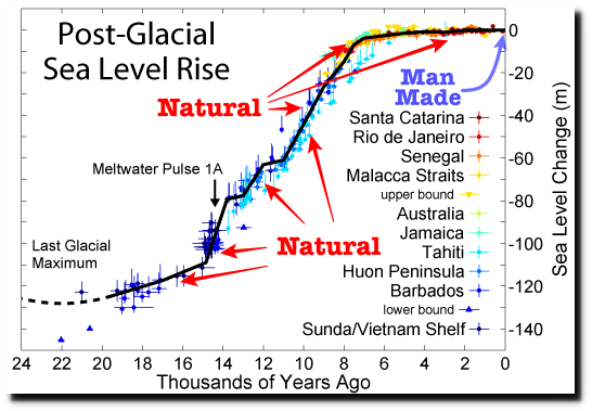
I think your listeners would need to understand that sea level is a dynamic variable–It goes up, it goes down. It has been over a hundred meters lower than today just in the last 25,000 years, and there was a period from about 15 000 years ago to 8 000 years ago where the sea level rose about 12 centimeters per decade for seven thousand years. That’s a lot more than two and a half centimeters a decade as it’s doing now, so the world has managed to deal with rising sea levels before. If we go back to the last warm period about 130 000 years ago, the sea level then was higher than it is now by about five meters or so. So just naturally we would expect at least another five meters of sea level; it won’t happen tomorrow, it won’t happen this Century. But slowly it will likely continue to rise and so that should be placed in your thinking if you’re building a dock for say a military port or something you want to last a long time. Put a cushion in there, a way to handle another half meter of seat level rise in the next hundred years, and you should be okay.
BN: About your temperature records: How much has the Earth warmed let’s say over the last four years?
JC: Yes. With this November we finished 43 years of measurements. In that time the temperature has risen half a degree Celsius. And you might want to look at other things about the world. World agricultural production has expanded tremendously. Nations are now exporting grain more than they had before, because people are pretty smart and figure out how to do things better all the time. Growing food is one thing they figured out how to do better as time passed, so the climate warming of a half degree has not caused a a major catastrophe at all. Wealth has increased around the planet, now some governments are trying to prevent you from growing your wealth, but that’s a hard thing to stop people who like to have food; they like to have conveniences in their life and that’s hard to pass laws that say you can’t enjoy the life the way you want to.
BN:How much of the warming are you reliably able to say is as a result of human activity?
JC: Okay. The answer is none in the sense that you said reliably. I can’t come up with an answer for that reliably. Warming from humans assumes warming that is not due to El Nino; or warming that’s not due to volcanic suppression of temperatures earlier in the record, which comes up to about a tenth of a degree per decade.
Are there other factors that we can say for sure have played a role in the incremental warming of the planet over the last few decades. We see that we’ve had a couple of volcanoes in the first half of that period Eyjafjallajökull and Pinatubo and those cool the planet in the first half of that 40 years. So that tilted the trend up and that’s where I come up with a one-tenth per decade is the warming rate, which means the climate is not very sensitive to carbon dioxide or greenhouse gas warming. It’s probably half or even less as sensitive as models tend to report.
BN: So if CO2 exposure or insertion into the atmosphere were to double what would the results be?
JC: I actually had a little paper on that and we’re kind of expecting maybe about 2070 or 2080 it will be double from what it was back in 1850. And the warming of that amount uh will be about a degree, 1.3 C is what I calculated. The general rule I found about people is they don’t mind an extra degree on their temperature. In fact if you look at the United States the average American experiences a much warmer temperature now than they did a hundred years ago. Because the average American has moved South; the average American has moved to much warmer climates–California, Arizona Texas, Alabama, Florida and so on. Because cold is not a whole lot of fun. You know, skiing, snowmobiling and ice fishing and so on, that’s fine. But the average person likes it to be warm and so that’s why many people in our country have moved to warmer areas. So I don’t think that 1.3 Kelvin is going to matter much whether people really care about those extreme events and so on.
BN: What do you your temperature records tell you about previous hotter temperatures?
JC: Since 1979, what we see is an upward trend in the in the global temperature that I think is manageable. But it goes up and down the 1997-98 El Nino was a big event and in 2016 El Nino was a big event. We also see the downs that come from a volcano that might go off and cool off the planet. Those are bigger effects than that small trend that’s going up. The global temperature can change by two tenths of a degree from month to month when we’re talking about a tenth per decade. Then people say, you know a month to month we can handle but we can’t handle 20 years worth of a small change. That just doesn’t make sense and and the real world evidence is pretty clear that that humans have done extremely well as our planet has been warming a little bit, whether it’s natural or not.
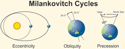
BN: Can you tell me about the Milankovich Cycles?
Milankovich Cycles are the orbital cycles of the earth orbit around the Sun and its tilt of the axis and the distance from the Sun. It is not a perfect circular orbit around the sun, it’s kind of an ellipse and it changes through time. All those factors work together to put a little bit more solar energy in certain places and less than others. These cycles are likely related to the Ice Ages we talk about.
If you can melt the snow in Canada in the summer, then you won’t have an ice age. So the snow falls in the winter and if you can’t melt the snow in Canada in the summer because the Earth is tilted away a bit in July and August. Then the snow hangs around all summer long, the next winter more snow that piles up the next summer it doesn’t melt and so on the next year. You get this mechanism that adds and extends snow cover leading to an ice age
So the tilt of the axis and other parameters I just mentioned can moderate how much sunlight comes in the summertime in Canada. And it’s up to 100 watts per meter squared which is a lot of energy difference over time. That’s probably the strongest theory that has a good amount of evidence that those orbital changes can cause huge changes in the climate from ice ages to the current interglacial.
BN: There’s claims that the way that humans are living is causing daily Extinction of two to three hundred different species. Is this a natural course of Evolution?
JC: You know 99 % of the species that have ever lived are extinct, so extinction is is pretty natural. Obviously humans cause some extinctions. When you destroy the environment of a small place and that was the only place that particular species lived then yes you know humans caused that extinction Did climate change from humans cause any extinctions? I think that jury is still out because most species love the extra carbon dioxide. Plants do specifically and then everything that eats plants loves that, so you might want to say the extra carbon dioxide actually helped in some sense the whole biosphere.
But I think that what humans do to the surface and to water, if it’s not clean properly and if you just really poison the surface in the air, then that can cause some real problems for the species that are living out there. And that’s why we have rules about not putting poison in air or in the water.
BN: Does that qualify as climate change?
JC: No. To say carbon dioxide is a poison, you really have to scratch your head on that because plants love the stuff. It invigorates the biosphere. When did all of this Greenery evolve and the corals occur and grow and develop? it was when there was two to four or five times as much CO2 as is in the air now. Carbon dioxide invigorates the biosphere, so we’re just actually putting back carbon dioxide that had been in the atmosphere earlier. And I don’t think the world is going to have much problem with that in terms of its biosphere. The issue is about the climate going to become so bad that some things can’t handle it and I don’t really see the evidence for that happening.
BN: Critics of your views on climate have argued that you undercut your credibility by making claims that exceed your data and that you’re unwilling to agree with different findings. How do you respond to that?
JC: Show me a finding and let me look at it and if it’s a valid finding, fine I’ll agree with it. But you know you can find anything on the web these days about claims that someone might make but you show me the evidence. Let me see what you’re complaining about and we can have a discussion about that. I just had a paper published last week on snowfall in the western states of the United States that shows for the main snowfall regions there is no trend in snowfall. The amount of snow that’s falling right now is the same as it was 120 years ago. So snow is still falling out in the western mountains of the United States–that’s evidence, that’s data. And so when someone claims that oh my, snowfall is going away out in the west, I said well well here look at this evidence from real station data that people recorded back in 1890 to now.
So I can answer that question with real information. You don’t see many people like me in debates because they’re not offered to me. In fact I’ve been uninvited you know. Someone on a particular panel would say hey let’s get this guy to come here and speak to us, and then I receive the disinvitation because I was not going to go along with the theme of their climate change as a catastrophe presentation
BN: You referred to times in the past that CO2 levels were significantly higher than they are now. Do records show any negative effects as a result of such high CO2?
JC: Well when you say negative, that’s almost a moral question: good or bad that the dinosaurs went extinct? I think they’d the dinosaurs would have an opinion about that. Let me rephrase: If it had to be on those levels today would it negatively impact Humanity? We see carbon dioxide has increased as humans are producing energy so that their lives can be enhanced. There’s a direct relationship between how much carbon or energy you’re able to use and carbon is the main source today and your ability to thrive.
Think about it we didn’t leave the Stone Age because we ran out of rocks. We left the Stone Age because something better came along, you know, Iron, Bronze and so on. In terms of energy we didn’t leave the wood and dung age because we ran out of trees or excrement, we found a better source that was carbon: coal, oil and so on. And transportation: we didn’t leave the horse and buggy age because we ran out of horses. It was because Henry Ford made a vehicle that was cheap and affordable. My great grandfather who was in destitute poverty in Oklahoma in the 1930s had a Model T. And another thing about Henry Ford: He didn’t go around getting the government to kill all the horses so you’d have to buy his cars. Horses were still available for the poorest people you know. And he didn’t make the government go out and build gas stations or drill for oil, that was done at the market for the private level.
But today we have a government that says this is what we want for the energy structure, and so we’re going to be using your taxpayer money to put out all these charging stations and force you to buy electric cars or at least subsidize them tremendously, and put up all these windmills and so on at Great expense and great environmental wreckage.
I can assure you that without energy life is brutal and short, and so energy is a thing that has caused our lifespans to double so that children no longer fear about diseases that used to wipe out Millions. Because of the advances that energy has brought through electricity and experimentation and all the sciences that we have developed now. All that’s based upon that access to energy.
So yes developing countries are going to get their energy, they’re going to find the energy they need. I’m not making this as a prediction, just using this as an observation. Right now it’s carbon that’s the cheapest and most effective and very high density. So we will see these countries use carbon to advance and we should not stand in their way. Because they want to live like us who already have pretty big carbon Footprints.
If you want to have some comfort in that, remember the carbon dioxide we’re putting back into the atmosphere is invigorating the biosphere and it also represents people living longer and better lives. Just no question that as energy is made available and affordable people live longer and better lives. I think that’s going to ultimately be the the inertia that’s going to carry forward this issue past all the preaching about carbon dioxide problems.
Environmentalists would argue that they’re not against electricity and prosperity, they’re just advocating for a better cleaner way to do it. It’s a tremendous misconception that a windmill or a solar panel can somehow give you cleaner and more reliable energy than what you have now. That’s just not true. To build a windmill, there’s tremendous environmental wreckage that you have to go through in terms of all the minerals you have to yank out of the earth and process. And processing takes energy by the way. And then building all these transmission lines. The energy is so diffuse, it is so weak in wind and solar that you have to gather up huge amounts of land to put it together. Robert Price said it well when he called it the iron law of power: the weaker the source of energy the more stuff and material you need to gather it, to concentrate it and to make it useful.
You have to spend huge amounts of dollars in environmental cost to make a windmill or make a solar panel, which by the way doesn’t last forever. So this carbon that already has a tremendous amount of energy in a very small dense space means that its environmental footprint is much much smaller than what you have with solar or wind. In fact it’s about one to a thousand or two thousand in terms of the square footage you need.
Look at windmill and solar panel farms. Not only are they just ugly but they cause tremendous environmental damage in their construction and maintenance. What are the long-term effects decades from now? If we just continue to get our energy from fossil fuels how bad can it get?
Well start with how good it can get. People will have access to affordable energy so they’re going to live longer and they’re going to live better lives when you have access to this. The impact on the climate is about the only thing you can think of. Well the sea level is going to continue to rise since it’s been rising for several hundred years, and at a manageable rate by the way. And the atmosphere might warm some more, but certainly not in terms of some catastrophic effect that will cause us to lose our ability to thrive.
I’m just very optimistic that people are clever and they can figure out how to adapt to whatever is going to happen. The real issues I deal with as a state climatologist are the extreme events that we know are going to happen that you’re not ready for. I mean that flood that happened 50 years ago is going to come back again. And it’s going to cause some real problems if you don’t build your infrastructure and put your houses or industry where they can be safe. If you don’t build up on the coast too much, so then you won’t be clobbered by a hurricane or something like that. It’s these kind of natural extreme events to which we’re far more vulnerable right now, rather than some small and gradual change that the climate system might undergo.
BN: I did read somewhere that someone has said, and I’m sure you must get it a lot, whether you get any funding from the fossil fuel industry. Do you?
JC: No I do not, and I made that decision way back in the early 1990s. I might make a fossil fuel company mad by some of them information I would produce, but so be it. I can put my head to bed at night and not be worried about: Did I accommodate some agenda somewhere? I’m just after what observations say. Can I build the best observational data sets to answer the questions of climate that we have, and that’s what I want to do.
BN: I suppose one of the biggest tragedies about it would be that it would discredit the real science and the fundamental research that you’re doing. Just that it’ll be a non-starter because people will immediately dismiss it.
JC: That’s unfortunate because the perception then is that, well if a fossil fuel company paid someone to do some research they really wanted to know the answer about something and this person was completely honest did the work properly and provided the answer to the fossil fuel companies is as. Well that answer would be tainted because it came from a fossil fuel company. Well hello: Think about what environmental advocacy groups and pressure groups do all of the time. They pay tremendous sums to people so they can come up with an answer that gives them their leverage in claiming this is a catastrophic problem. So I can at least take that perception off the table.
BN: Lastly are you aware of any ways in which geoengineering could possibly be affecting the natural balance of things? Is it being done more than we’re aware of and could it backfire?
JC: Anytime humansdo something they’re going to have an impact, no question about that. So you could call it geoengineering but inadvertently we have made some desert valleys cooler because now we irrigate crops. We have taken water that fell someplace and moved it to another place. So that’s a bit of geoengineering there. And by the way a lot of those places feed a lot of the world, so you can’t say it’s bad I suppose.
But the other question about geoengineering is:
Can we do something to prevent a perceived problem here?
And that’s the real danger I think, because you don’t know the consequences when you start tinkering with a very complex and dynamic system. And so I would say stay away from that. Suppose someone did a big geoengineering experiment and something bad happened somewhere. Well that country would sue the world and say: look you made this bad thing happen to us you are liable. And so then we’re getting nowhere in terms of preventing some problem on the planet.
The post below updates the UAH record of air temperatures over land and ocean. But as an overview consider how recent rapid cooling completely overcame the warming from the last 3 El Ninos (1998, 2010 and 2016). The UAH record shows that the effects of the last one were gone as of April 2021, again in November 2021, and in February and June 2022 (UAH baseline is now 1991-2020).
For reference I added an overlay of CO2 annual concentrations as measured at Mauna Loa. While temperatures fluctuated up and down ending flat, CO2 went up steadily by ~55 ppm, a 15% increase.
Furthermore, going back to previous warmings prior to the satellite record shows that the entire rise of 0.8C since 1947 is due to oceanic, not human activity.
The animation is an update of a previous analysis from Dr. Murry Salby. These graphs use Hadcrut4 and include the 2016 El Nino warming event. The exhibit shows since 1947 GMT warmed by 0.8 C, from 13.9 to 14.7, as estimated by Hadcrut4. This resulted from three natural warming events involving ocean cycles. The most recent rise 2013-16 lifted temperatures by 0.2C. Previously the 1997-98 El Nino produced a plateau increase of 0.4C. Before that, a rise from 1977-81 added 0.2C to start the warming since 1947.
Importantly, the theory of human-caused global warming asserts that increasing CO2 in the atmosphere changes the baseline and causes systemic warming in our climate. On the contrary, all of the warming since 1947 was episodic, coming from three brief events associated with oceanic cycles.
Update August 3, 2021
Chris Schoeneveld has produced a similar graph to the animation above, with a temperature series combining HadCRUT4 and UAH6. H/T WUWT
With apologies to Paul Revere, this post is on the lookout for cooler weather with an eye on both the Land and the Sea. While you will hear a lot about 2020-21 temperatures matching 2016 as the highest ever, that spin ignores how fast the cooling set in. The UAH data analyzed below shows that warming from the last El Nino was fully dissipated with chilly temperatures in all regions. May NH land and SH ocean showed temps matching March, reversing an upward blip in April, and then June was virtually the mean since 1995.
UAH has updated their tlt (temperatures in lower troposphere) dataset for October 2022. Posts on their reading of ocean air temps this month came after updated records from HadSST4. So I have already posted on SSTs using HadSST4 NH Leads Ocean Cooler October 2022.This month also has a separate graph of land air temps because the comparisons and contrasts are interesting as we contemplate possible cooling in coming months and years. Sometimes air temps over land diverge from ocean air changes. However, July showed air temps over all ocean regions warmed sharply, lifting up Global ocean temps. Then in August air over both land and ocean cooled off again. Now in September both land and ocean in SH dropped sharply offsetting slight warming elsewhere.
Note: UAH has shifted their baseline from 1981-2010 to 1991-2020 beginning with January 2021. In the charts below, the trends and fluctuations remain the same but the anomaly values change with the baseline reference shift.
Presently sea surface temperatures (SST) are the best available indicator of heat content gained or lost from earth’s climate system. Enthalpy is the thermodynamic term for total heat content in a system, and humidity differences in air parcels affect enthalpy. Measuring water temperature directly avoids distorted impressions from air measurements. In addition, ocean covers 71% of the planet surface and thus dominates surface temperature estimates. Eventually we will likely have reliable means of recording water temperatures at depth.
Recently, Dr. Ole Humlum reported from his research that air temperatures lag 2-3 months behind changes in SST. Thus the cooling oceans now portend cooling land air temperatures to follow. He also observed that changes in CO2 atmospheric concentrations lag behind SST by 11-12 months. This latter point is addressed in a previous post Who to Blame for Rising CO2?
After a change in priorities, updates are now exclusive to HadSST4. For comparison we can also look at lower troposphere temperatures (TLT) from UAHv6 which are now posted for September. The temperature record is derived from microwave sounding units (MSU) on board satellites like the one pictured above. Recently there was a change in UAH processing of satellite drift corrections, including dropping one platform which can no longer be corrected. The graphs below are taken from the revised and current dataset.
The UAH dataset includes temperature results for air above the oceans, and thus should be most comparable to the SSTs. There is the additional feature that ocean air temps avoid Urban Heat Islands (UHI). The graph below shows monthly anomalies for ocean air temps since January 2015.
Note 2020 was warmed mainly by a spike in February in all regions, and secondarily by an October spike in NH alone. In 2021, SH and the Tropics both pulled the Global anomaly down to a new low in April. Then SH and Tropics upward spikes, along with NH warming brought Global temps to a peak in October. That warmth was gone as November 2021 ocean temps plummeted everywhere. After an upward bump 01/2022 temps reversed and plunged downward in June. After an upward spike in July, ocean air everywhere cooled in August and also in September. In October NH cooled, the Tropics changed little, and a spike in SH was enough to mildly warm the Global anomaly.
Land Air Temperatures Tracking Downward in Seesaw Pattern
We sometimes overlook that in climate temperature records, while the oceans are measured directly with SSTs, land temps are measured only indirectly. The land temperature records at surface stations sample air temps at 2 meters above ground. UAH gives tlt anomalies for air over land separately from ocean air temps. The graph updated for October is below.
Here we have fresh evidence of the greater volatility of the Land temperatures, along with extraordinary departures by SH land. Land temps are dominated by NH with a 2021 spike in January, then dropping before rising in the summer to peak in October 2021. As with the ocean air temps, all that was erased in November with a sharp cooling everywhere. Land temps dropped sharply for four months, even more than did the Oceans. March and April 2022 saw some warming, reversed In May when all land regions cooled pulling down the global anomaly. In July, Tropics and SH land rose sharply, NH slightly, pulling up the Global land anomaly. Note the sharp drop in SH land temps in August and September, while NH Land rose, leaving the Global anomaly unchanged. Now in October NH and SH land temps spiked warming the Global land anomaly.
The Bigger Picture UAH Global Since 1980
The chart shows monthly Global anomalies starting 01/1980 to present. The average monthly anomaly is -0.06, for this period of more than four decades. The graph shows the 1998 El Nino after which the mean resumed, and again after the smaller 2010 event. The 2016 El Nino matched 1998 peak and in addition NH after effects lasted longer, followed by the NH warming 2019-20. A small upward bump in 2021 has been reversed with temps having returned close to the mean as of 2/2022. March and April brought warmer Global temps, reversed in May and the June anomaly was almost zero. The upward spike in July was almost 0.3C, lower in August and September and a slight rise in October.
TLTs include mixing above the oceans and probably some influence from nearby more volatile land temps. Clearly NH and Global land temps have been dropping in a seesaw pattern, nearly 1C lower than the 2016 peak. Since the ocean has 1000 times the heat capacity as the atmosphere, that cooling is a significant driving force. TLT measures started the recent cooling later than SSTs from HadSST3, but are now showing the same pattern. It seems obvious that despite the three El Ninos, their warming has not persisted, and without them it would probably have cooled since 1995. Of course, the future has not yet been written.
The post below updates the UAH record of air temperatures over land and ocean. But as an overview consider how recent rapid cooling completely overcame the warming from the last 3 El Ninos (1998, 2010 and 2016). The UAH record shows that the effects of the last one were gone as of April 2021, again in November 2021, and in February and June 2022 (UAH baseline is now 1991-2020).
For reference I added an overlay of CO2 annual concentrations as measured at Mauna Loa. While temperatures fluctuated up and down ending flat, CO2 went up steadily by ~55 ppm, a 15% increase.
Furthermore, going back to previous warmings prior to the satellite record shows that the entire rise of 0.8C since 1947 is due to oceanic, not human activity.
The animation is an update of a previous analysis from Dr. Murry Salby. These graphs use Hadcrut4 and include the 2016 El Nino warming event. The exhibit shows since 1947 GMT warmed by 0.8 C, from 13.9 to 14.7, as estimated by Hadcrut4. This resulted from three natural warming events involving ocean cycles. The most recent rise 2013-16 lifted temperatures by 0.2C. Previously the 1997-98 El Nino produced a plateau increase of 0.4C. Before that, a rise from 1977-81 added 0.2C to start the warming since 1947.
Importantly, the theory of human-caused global warming asserts that increasing CO2 in the atmosphere changes the baseline and causes systemic warming in our climate. On the contrary, all of the warming since 1947 was episodic, coming from three brief events associated with oceanic cycles.
Update August 3, 2021
Chris Schoeneveld has produced a similar graph to the animation above, with a temperature series combining HadCRUT4 and UAH6. H/T WUWT
With apologies to Paul Revere, this post is on the lookout for cooler weather with an eye on both the Land and the Sea. While you will hear a lot about 2020-21 temperatures matching 2016 as the highest ever, that spin ignores how fast the cooling set in. The UAH data analyzed below shows that warming from the last El Nino was fully dissipated with chilly temperatures in all regions. May NH land and SH ocean showed temps matching March, reversing an upward blip in April, and then June was virtually the mean since 1995.
UAH has updated their tlt (temperatures in lower troposphere) dataset for September 2022. Posts on their reading of ocean air temps this month came after updated records from HadSST4. So I have already posted on SSTs using HadSST4 Ocean Cooling September 2022 This month also has a separate graph of land air temps because the comparisons and contrasts are interesting as we contemplate possible cooling in coming months and years. Sometimes air temps over land diverge from ocean air changes. However, July showed air temps over all ocean regions warmed sharply, lifting up Global ocean temps. Then in August air over both land and ocean cooled off again. Now in September both land and ocean in SH dropped sharply offsetting slight warming elsewhere.
Note: UAH has shifted their baseline from 1981-2010 to 1991-2020 beginning with January 2021. In the charts below, the trends and fluctuations remain the same but the anomaly values change with the baseline reference shift.
Presently sea surface temperatures (SST) are the best available indicator of heat content gained or lost from earth’s climate system. Enthalpy is the thermodynamic term for total heat content in a system, and humidity differences in air parcels affect enthalpy. Measuring water temperature directly avoids distorted impressions from air measurements. In addition, ocean covers 71% of the planet surface and thus dominates surface temperature estimates. Eventually we will likely have reliable means of recording water temperatures at depth.
Recently, Dr. Ole Humlum reported from his research that air temperatures lag 2-3 months behind changes in SST. Thus the cooling oceans now portend cooling land air temperatures to follow. He also observed that changes in CO2 atmospheric concentrations lag behind SST by 11-12 months. This latter point is addressed in a previous post Who to Blame for Rising CO2?
After a change in priorities, updates are now exclusive to HadSST4. For comparison we can also look at lower troposphere temperatures (TLT) from UAHv6 which are now posted for September. The temperature record is derived from microwave sounding units (MSU) on board satellites like the one pictured above. Recently there was a change in UAH processing of satellite drift corrections, including dropping one platform which can no longer be corrected. The graphs below are taken from the revised and current dataset.
The UAH dataset includes temperature results for air above the oceans, and thus should be most comparable to the SSTs. There is the additional feature that ocean air temps avoid Urban Heat Islands (UHI). The graph below shows monthly anomalies for ocean air temps since January 2015.
Note 2020 was warmed mainly by a spike in February in all regions, and secondarily by an October spike in NH alone. In 2021, SH and the Tropics both pulled the Global anomaly down to a new low in April. Then SH and Tropics upward spikes, along with NH warming brought Global temps to a peak in October. That warmth was gone as November 2021 ocean temps plummeted everywhere. After an upward bump 01/2022 temps reversed and plunged downward in June. After an upward spike in July, ocean air everywhere cooled in August. Now in September strong SH cooling pulled the Global ocean anomaly down.
Land Air Temperatures Tracking Downward in Seesaw Pattern
We sometimes overlook that in climate temperature records, while the oceans are measured directly with SSTs, land temps are measured only indirectly. The land temperature records at surface stations sample air temps at 2 meters above ground. UAH gives tlt anomalies for air over land separately from ocean air temps. The graph updated for September is below.
Here we have fresh evidence of the greater volatility of the Land temperatures, along with extraordinary departures by SH land. Land temps are dominated by NH with a 2021 spike in January, then dropping before rising in the summer to peak in October 2021. As with the ocean air temps, all that was erased in November with a sharp cooling everywhere. Land temps dropped sharply for four months, even more than did the Oceans. March and April saw some warming, reversed In May when all land regions cooled pulling down the global anomaly. Then in June Tropics land dropped sharply while SH land rose, NH cooled slightly leaving the Global land anomaly little changed. In July, Tropics and SH land rose sharply, NH slightly, pulling up the Global land anomaly. Note the sharp drop in SH land temps in August and September, while NH Land rose, leaving the Global anomaly unchanged.
The Bigger Picture UAH Global Since 1980
The chart shows monthly Global anomalies starting 01/1980 to present. The average monthly anomaly is -0.06, for this period of more than four decades. The graph shows the 1998 El Nino after which the mean resumed, and again after the smaller 2010 event. The 2016 El Nino matched 1998 peak and in addition NH after effects lasted longer, followed by the NH warming 2019-20. A small upward bump in 2021 has been reversed with temps having returned close to the mean as of 2/2022. March and April brought warmer Global temps, reversed in May and the June anomaly was almost zero. The upward spike in July was almost 0.3C, now lower in August and September.
TLTs include mixing above the oceans and probably some influence from nearby more volatile land temps. Clearly NH and Global land temps have been dropping in a seesaw pattern, nearly 1C lower than the 2016 peak. Since the ocean has 1000 times the heat capacity as the atmosphere, that cooling is a significant driving force. TLT measures started the recent cooling later than SSTs from HadSST3, but are now showing the same pattern. It seems obvious that despite the three El Ninos, their warming has not persisted, and without them it would probably have cooled since 1995. Of course, the future has not yet been written.
The post below updates the UAH record of air temperatures over land and ocean. But as an overview consider how recent rapid cooling completely overcame the warming from the last 3 El Ninos (1998, 2010 and 2016). The UAH record shows that the effects of the last one were gone as of April 2021, again in November 2021, and in February and June 2022 (UAH baseline is now 1991-2020).
For reference I added an overlay of CO2 annual concentrations as measured at Mauna Loa. While temperatures fluctuated up and down ending flat, CO2 went up steadily by ~55 ppm, a 15% increase.
Furthermore, going back to previous warmings prior to the satellite record shows that the entire rise of 0.8C since 1947 is due to oceanic, not human activity.
The animation is an update of a previous analysis from Dr. Murry Salby. These graphs use Hadcrut4 and include the 2016 El Nino warming event. The exhibit shows since 1947 GMT warmed by 0.8 C, from 13.9 to 14.7, as estimated by Hadcrut4. This resulted from three natural warming events involving ocean cycles. The most recent rise 2013-16 lifted temperatures by 0.2C. Previously the 1997-98 El Nino produced a plateau increase of 0.4C. Before that, a rise from 1977-81 added 0.2C to start the warming since 1947.
Importantly, the theory of human-caused global warming asserts that increasing CO2 in the atmosphere changes the baseline and causes systemic warming in our climate. On the contrary, all of the warming since 1947 was episodic, coming from three brief events associated with oceanic cycles.
Update August 3, 2021
Chris Schoeneveld has produced a similar graph to the animation above, with a temperature series combining HadCRUT4 and UAH6. H/T WUWT
With apologies to Paul Revere, this post is on the lookout for cooler weather with an eye on both the Land and the Sea. While you will hear a lot about 2020-21 temperatures matching 2016 as the highest ever, that spin ignores how fast the cooling set in. The UAH data analyzed below shows that warming from the last El Nino was fully dissipated with chilly temperatures in all regions. May NH land and SH ocean showed temps matching March, reversing an upward blip in April, and then June was virtually the mean since 1995.
UAH has updated their tlt (temperatures in lower troposphere) dataset for August 2022. Previously I have done posts on their reading of ocean air temps as a prelude to updated records from HadSST3 (which is now discontinued). So I have separately posted on SSTs using HadSST4 SH and Tropics Lead Ocean Cooling July 2022. This month also has a separate graph of land air temps because the comparisons and contrasts are interesting as we contemplate possible cooling in coming months and years. Sometimes air temps over land diverge from ocean air changes. However, July showed air temps over all ocean regions warmed sharply, lifting up Global ocean temps. Now in August air over both land and ocean cooled off again.
Note: UAH has shifted their baseline from 1981-2010 to 1991-2020 beginning with January 2021. In the charts below, the trends and fluctuations remain the same but the anomaly values change with the baseline reference shift.
Presently sea surface temperatures (SST) are the best available indicator of heat content gained or lost from earth’s climate system. Enthalpy is the thermodynamic term for total heat content in a system, and humidity differences in air parcels affect enthalpy. Measuring water temperature directly avoids distorted impressions from air measurements. In addition, ocean covers 71% of the planet surface and thus dominates surface temperature estimates. Eventually we will likely have reliable means of recording water temperatures at depth.
Recently, Dr. Ole Humlum reported from his research that air temperatures lag 2-3 months behind changes in SST. Thus the cooling oceans now portend cooling land air temperatures to follow. He also observed that changes in CO2 atmospheric concentrations lag behind SST by 11-12 months. This latter point is addressed in a previous post Who to Blame for Rising CO2?
After a change in priorities, updates are now exclusive to HadSST4. For comparison we can also look at lower troposphere temperatures (TLT) from UAHv6 which are now posted for August. The temperature record is derived from microwave sounding units (MSU) on board satellites like the one pictured above. Recently there was a change in UAH processing of satellite drift corrections, including dropping one platform which can no longer be corrected. The graphs below are taken from the revised and current dataset.
The UAH dataset includes temperature results for air above the oceans, and thus should be most comparable to the SSTs. There is the additional feature that ocean air temps avoid Urban Heat Islands (UHI). The graph below shows monthly anomalies for ocean air temps since January 2015.
Note 2020 was warmed mainly by a spike in February in all regions, and secondarily by an October spike in NH alone. In 2021, SH and the Tropics both pulled the Global anomaly down to a new low in April. Then SH and Tropics upward spikes, along with NH warming brought Global temps to a peak in October. That warmth was gone as November 2021 ocean temps plummeted everywhere. After an upward bump 01/2022 temps reversed and plunged downward in June. After an upward spike in July, ocean air everywhere cooled in August.
Land Air Temperatures Tracking Downward in Seesaw Pattern
We sometimes overlook that in climate temperature records, while the oceans are measured directly with SSTs, land temps are measured only indirectly. The land temperature records at surface stations sample air temps at 2 meters above ground. UAH gives tlt anomalies for air over land separately from ocean air temps. The graph updated for July is below.
Here we have fresh evidence of the greater volatility of the Land temperatures, along with extraordinary departures by SH land. Land temps are dominated by NH with a 2021 spike in January, then dropping before rising in the summer to peak in October 2021. As with the ocean air temps, all that was erased in November with a sharp cooling everywhere. Land temps dropped sharply for four months, even more than did the Oceans. March and April saw some warming, reversed In May when all land regions cooled pulling down the global anomaly. Then in June Tropics land dropped sharply while SH land rose, NH cooled slightly leaving the Global land anomaly little changed. In July, Tropics and SH land rose sharply, NH slightly, pulling up the Global land anomaly. In August that was reversed downward.
The Bigger Picture UAH Global Since 1980
The chart shows monthly Global anomalies starting 01/1980 to present. The average monthly anomaly is -0.06, for this period of more than four decades. The graph shows the 1998 El Nino after which the mean resumed, and again after the smaller 2010 event. The 2016 El Nino matched 1998 peak and in addition NH after effects lasted longer, followed by the NH warming 2019-20. A small upward bump in 2021 has been reversed with temps having returned close to the mean as of 2/2022. March and April brought warmer Global temps, reversed in May and the June anomaly was almost zero. The upward spike in July was almost 0.3C, now lower in August.
TLTs include mixing above the oceans and probably some influence from nearby more volatile land temps. Clearly NH and Global land temps have been dropping in a seesaw pattern, nearly 1C lower than the 2016 peak. Since the ocean has 1000 times the heat capacity as the atmosphere, that cooling is a significant driving force. TLT measures started the recent cooling later than SSTs from HadSST3, but are now showing the same pattern. It seems obvious that despite the three El Ninos, their warming has not persisted, and without them it would probably have cooled since 1995. Of course, the future has not yet been written.
Fig. 7.1. Changes in the Atlantic Multidecadal Oscillation and solar activity are consistent with temperature changes. Top, above average solar activity reduces poleward transport causing warming. Bottom, the ascending half-period of the Atlantic Multidecadal Oscillation causes an even bigger reduction in transport and has a bigger temperature effect. Middle, temperature evolution for the past 120 years is consistent with the effect of these two factors on transport. Data from SILSO sunspots (top), HadCRUT4 deseasonalized temperature (middle), and AMO deseasonalized (bottom), have been smoothed with a gaussian filter.
A recent post was Seven Theories of Climate Change, summarizing an array of explanations for fluctuations in temperatures and precipitation over Earth’s surface. Now, thanks to Javier Vinós & Andy May, we have a new hypothesis combining solar variability with oceanic/atmospheric oscillations to explain the climate record. An introduction to their findings is published at Climate Etc. The Winter Gatekeeper Hypothesis (VII). A summary plus Q&A. Excerpts in italics with my bolds and some added images. My first exposure to meridional cooling was provided by Clive Best, and later on is a repost of that understanding consistent with Vinós & May.
Update September 24, 2022 at end Richard Lindzen Weighs In
A synopsis of the Winter Gatekeeper hypothesis
The IPCC assessment reports published since 1990, reflect a scientific consensus that natural forces, including solar activity and ocean-atmosphere oscillations, like the Atlantic and Pacific multidecadal oscillations, had a net zero effect on the observed global average surface temperature changes since 1951. The IPCC consensus does not allow for changes in the poleward (meridional) transport of energy to have significantly affected this average temperature over the past 75 years.
The Winter Gatekeeper hypothesis proposes that changes in the meridional transport of energy and moisture are the main way the climate changes now and in the past.
Meridional transport variability has many causes and forces that act simultaneously and in different time frames on the climate system. They integrate into a very complex poleward energy transportation system. Among these are multidecadal ocean-atmosphere oscillations, solar variability, ozone, stratospheric-reaching tropical volcanic eruptions, orbital changes, and changing luni-solar gravitational pull. Meridional transport is therefore an integrator of internal and external signals.
It is not the only way the climate changes, but evidence suggests it is the main one.
The Winter Gatekeeper hypothesis does not disprove greenhouse gas effect induced climate change—manmade or otherwise—in fact, it acts through it. But it does not require changes in the atmospheric content of non-condensing greenhouse gases to cause significant climate change. Therefore, it does refute the hypothesis that CO2 is the main climate change control knob.
Meridional transport moves energy that is already in the climate system toward its exit point at the top of the atmosphere at a higher latitude. It is carried out mainly by the atmosphere, in both the stratosphere and troposphere, with an important oceanic contribution. The greenhouse effect is not homogeneous over the planet due to the unequal distribution of water vapor, and it is stronger in the wet tropics, weaker over deserts, and much weaker at the poles in winter. When meridional transport is stronger, more energy reaches the poles. There it can more efficiently exit the climate system, particularly during the winter, when there is no Sun in the sky. Most polar imported moisture in winter freezes, emitting its latent heat. Additional CO2 molecules increase outward radiation, as they are warmer than the surface. The net result is that all imported energy into the polar regions in winter exits the climate system at the top of the atmosphere (Peixoto & Oort, 1992, p. 363), and increasing the energy transported there at that time can only increase the loss.
When meridional transport is stronger, the planet loses more energy and cools down (or warms less) in a non-homogeneous way, because the net energy loss is greater in the polar regions. However, as more energy is directed toward the poles, the Arctic region warms, even as the rest of the world cools or warms more slowly. When meridional transport is weaker, less energy reaches the poles and exits the climate system. Then the planet loses less energy and warms, while the Arctic cools, because it receives less energy from the lower latitudes.
Figure 12: The effect of strong and weak Atlantic THC. Idealized portrayal of the primary Atlantic Ocean upper ocean currents during strong and weak phases of the thermohaline circulation (THC) Source: Bill Gray: H20 is Climate Control Knob, not CO2
Most of the energy is transported through the lower troposphere and ocean track. As a result, changes in multidecadal ocean oscillations produce a greater effect on climate in the multidecadal timeframe than changes in solar activity. Solar changes have a stronger effect on stratospheric energy transport. Even so, there is a non-well defined link between changes in solar activity and changes in the multidecadal oscillations that result in major multidecadal climate shifts right after 11-year solar cycle minima (see Part IV). Nevertheless, modern global warming started c. 1850, when the Atlantic Multidecadal Oscillation increased its amplitude and period (Moore et al. 2017). The overall multidecadal oscillation (aka the stadium wave) currently has a period of c. 65 years, and the 20th century included two rising phases of the oscillation, explaining its two warming phases (1915-1945, and 1976-1997; Fig. 7.1).
Meridional transport was further reduced during the 20th century by the coincidence of the Modern Solar Maximum (Fig. 7.1 at top): A long period of above average solar activity between 1935 and 2004. It is the longest such period in at least 600 years. Solar activity acts mainly on stratospheric energy transport, but since it affects the strength of the polar vortex and the El Niño/Southern Oscillation (see Part II), it also influences tropospheric transport.
As it can be seen in Fig. 7.1, most of the warming during the 20th century can be explained by the combined effect of the ocean multidecadal oscillations and the Modern Solar Maximum on meridional transport. No other proposed factor can satisfactorily explain the early 20th century warming period, the mid-20th century shallow cooling, and the late 20th century strong warming period, without resorting to ad-hoc explanations. In a single century two periods of reduced transport (warming), coincided with the ascent of the Atlantic Multidecadal Oscillation and the effect of the modern solar maximum.
This resulted in 80 years of diminished transport that contributed to the greatest warming in 600 years, triggering political and scientific alarm.
Background Post Arctic “Amplification” Not What You Think
HT to Dr. David Whitehouse writing at GWPF regarding a recent study claiming Arctic Amplification is causing a wavey polar vortex, resulting in winter warming and cooling extremes. His critique is Extreme cold snaps and global warming: A speculative explanation.
This post is challenging the notion of Arctic Amplification itself. The term is bandied about with the connotation that man-made global warming is multiplied in the Arctic and responsible for weather extremes.
As the animation above shows, there have been in recent years alternating patterns of unusually cold or warm weather in the Northern Hemisphere. There are several problems in the attempt to link these events to global warming/climate change, i.e. claiming causation from a slow increase in baseline global average temperatures.
Arctic Amplification is an artifact of Temperature Anomalies
Arctic Surface Stations Records Show Ordinary Warming
Arctic Warmth Comes from Meridional Heat Transport, not CO2
Clive Best provides this animation of recent monthly temperature anomalies which demonstrates how most variability in anomalies occur over northern continents.
1. Arctic Amplification is an artifact of Temperature Anomalies
Beyond the issues with the measurements and the questionable adjustments, there is a more fundamental misconception about air temperatures in relation to “climate change.” Clive Best does a fine job explaining why Global Mean Temperature anomalies do not mean what people think. Below is my synopsis of his recent essay entitled Do Global Temperatures make sense? (link)
Background: Earth’s Heat Imbalance
ERBE measurements of radiative imbalance.
The earth’s temperature at any location is never in equilibrium. It changes daily, seasonally and annually. Incoming solar radiation varies enormously especially near the poles which receive more energy per day in summer than the equator.
The earth cools primarily by moving heat from hot tropical regions towards high latitudes where net IR radiation loss cools the planet, thus maintaining a certain temperature profile.
Key Point: GMT Anomalies Are Dominated by the Highest Latitudes
The main problem with all the existing observational datasets is that they don’t actually measure the global temperature at all. Instead they measure the global average temperature ‘anomaly’. . .The use of anomalies introduces a new bias because they are now dominated by the larger ‘anomalies’ occurring at cold places in high latitudes. The reason for this is obvious, because all extreme seasonal variations in temperature occur in northern continents, with the exception of Antarctica. Increases in anomalies are mainly due to an increase in the minimum winter temperatures, especially near the arctic circle.
To take an extreme example here is the monthly temperature data and calculated anomalies for Verkoyhansk in Siberia. Annual temperatures vary from -50C in winter to +20C in summer. That is a seasonal range of 70C each year, and a year to year anomaly variation of ~8C is normal. The only global warming effect evident is a slight increase in the minimum winter temperatures since 1900. That is not due to any localised enhanced greenhouse effect but rather to an enhanced meridional heat transport. Temperatures in equatorial regions meanwhile have only ~4C seasonal variations, and show essentially no warming trend.
2. Arctic Surface Stations Records Show Ordinary Warming
Locations of 118 arctic stations examined in this study and compared to observations at 50 European stations whose records averaged 200 years and in a few cases extend to the early 1700s
A recent extensive analysis of Northern surface temperature records gives no support for Arctic “amplification” fears.
The Arctic has warmed at the same rate as Europe over the past two centuries. Heretofore, it has been supposed that any global warming would be amplified in the Arctic. This may still be true if urban heat island effects are responsible for part of the observed temperature increase at European stations. However, European and Arctic temperatures have remained closely synchronized for over 200 years during the rapid growth of urban centres.
And the warming pattern in Europe and the Arctic is familiar and unalarming.
Arctic temperatures have increased during the period 1820– 2014. The warming has been larger in January than in July. Siberia, Alaska and Western Canada appear to have warmed slightly more than Eastern Canada, Greenland, Iceland and Northern Europe. The warming has not occurred at a steady rate. Much of the warming trends found during 1820 to 2014 occurred in the late 1990s, and the data show temperatures levelled off after 2000. The July temperature trend is even slightly negative for the period 1820–1990. The time series exhibit multidecadal temperature fluctuations which have also been found by other temperature reconstructions.
3. Arctic Warmth Comes from Meridional Heat Transport, not CO2
Key Point: Heat Distribution Changes, not Global Temperatures
Rising CO2 levels modify that radiation imbalance profile slightly. Surface temperatures in the tropics are not really warming at all. Any excess heat induces more clouds and more convection while surface temperatures remain constant. What really happens is that the meridional radiation profile changes. Slightly more heat is transported polewards so that hot places are shifting more heat to cold places which are doing the warming. If CO2 levels stop rising then a new temperature and radiation profile would rather quickly be reached. This is then called ‘climate change’ but any such changes are concentrated in colder regions of the world. The global ‘temperature’ itself is not changing, but instead the global distribution of temperature is changing.
Key Point: More Atmospheric Heat means Warming in the Coldest Places
Temperatures at the poles during 6 months of darkness would fall well below -150C if there was no atmosphere, similar to the moon. Instead heat is constantly being transported from lower latitudes by the atmosphere and ocean and so that temperatures never fall much below -43C. If more heat is transported northwards than previously, then minimum temperatures must rise, and this is what we observe in individual measurements.
Long term changes in temperature anomalies occur mainly in northern continents in winter months. This is not because the earth as a whole is warming up but rather that meridional heat transport from the equator to the poles has increased and the largest effect on ‘anomalies occurs in winter. The average absolute temperature of the earth’s surface is unknown. Basing the evidence for climate change on the 150 year trend in global averaged temperature anomalies still biases the result towards higher latitudes where most of the stations are located.
Summary
When heat is released into the atmosphere from the oceans, it is transported toward the poles to dissipate into space. Places in higher latitudes are warmed, not by radiative effects of greenhouse gases in those locales, but by the incursion of warmer air from the equator.
What happens if more CO2 is added into the atmosphere? No one knows, but there are many opinions, a popular one being that more heat is retained in the atmosphere. But in that case, that additional heat will be shed by the planet in exactly the same manner: transport to the poles with slightly less extremely cold air at the higher latitudes.
Why in the world would we pay anything to prevent a little bit of warming in the world’s coldest places?
London, 23 September – A prominent climate scientist has warned that the picture of climate change presented in the IPCC’s narrative is simplistic, ill-conceived, and undermined by observational evidence. In a new discussion paper, Professor Richard Lindzen of the Massachusetts Institute of Technology (MIT) points out that the official picture, focusing narrowly on carbon dioxide as a warming agent, becomes implausible when applied to the details of the climate system. According to Lindzen,
“If you are going to blame everything on carbon dioxide, you have to explain why, on all timescales, temperatures in the tropics are extremely stable while those in high latitudes are much more variable. The IPCC’s story is that small amounts of greenhouse warming near the equator are ‘amplified’ at high latitudes. But neither theory nor data support the idea of amplification.”
Instead, says Lindzen, this pattern – of stable tropical temperatures and fluctuating ones in high latitudes – is mostly a function of natural processes in the atmosphere and oceans; in other words, changes in oceanic and atmospheric currents that transport heat poleward while drawing varying amounts of heat out of the tropics. These changes in transport affect the tropics, but they are not determined by the tropics.
“The changes in the earth’s so-called temperature are mainly due to changes in the temperature difference between the tropics and the poles – at least for major changes. The changes in tropical temperature, which are influenced by greenhouse processes, are a minor contribution.”