Click on image to enlarge.
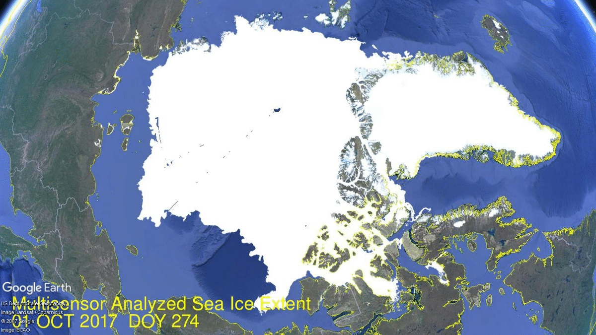
Consider the refreezing during the first half of October through yesterday, adding an average of 96k km2 per day. On the left side Laptev Sea has filled in, and just below it East Siberian Sea is also growing fast ice from the shore to meet refreezing drift ice. At the top Kara, Barents and Greenland seas are all growing ice. At the bottom, Canadian Archipelago is now full of ice.
The graph compares extents over the first 15 days of October.
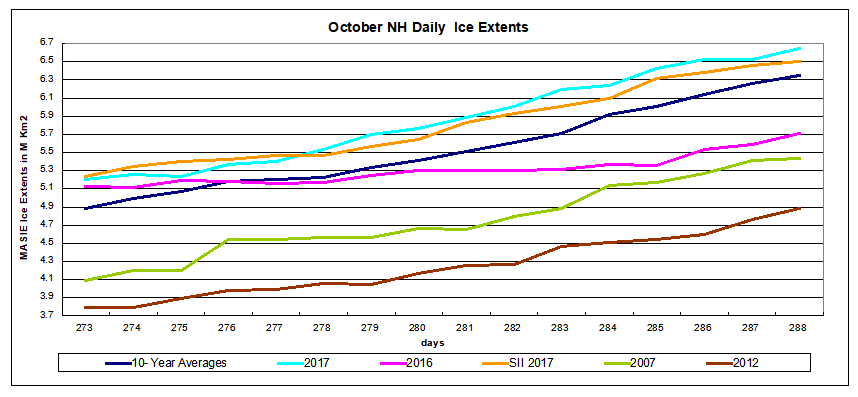 2017 has reached 6.6 M km2, 300k km2 above the 10 year average, 930k km2 more than 2016. 2007 lags 1.2M km2 behind, and 2012 remains 1.8M km2 lower than 2017. SII is showing similar ice gains in October.
The Table below shows where ice is located on day 288 in regions of the Arctic ocean. 10 year average comes from 2007 through 2016 inclusive.
| Region | 2017288 | Day 288 Average |
2017-Ave. | 2007288 | 2017-2007 |
| (0) Northern_Hemisphere | 6645242 | 6352329 | 292913 | 5431350 | 1213892 |
| (1) Beaufort_Sea | 622905 | 719153 | -96249 | 796103 | -173198 |
| (2) Chukchi_Sea | 180459 | 295507 | -115048 | 83354 | 97105 |
| (3) East_Siberian_Sea | 520320 | 561740 | -41420 | 30003 | 490317 |
| (4) Laptev_Sea | 812165 | 456507 | 355658 | 512495 | 299671 |
| (5) Kara_Sea | 234367 | 147704 | 86664 | 152144 | 82223 |
| (6) Barents_Sea | 31340 | 46071 | -14731 | 21459 | 9881 |
| (7) Greenland_Sea | 212483 | 354693 | -142209 | 431989 | -219506 |
| (8) Baffin_Bay_Gulf_of_St._Lawrence | 148173 | 85149 | 63024 | 86610 | 61563 |
| (9) Canadian_Archipelago | 714792 | 570585 | 144207 | 447438 | 267354 |
| (10) Hudson_Bay | 13452 | 11416 | 2036 | 1936 | 11515 |
| (11) Central_Arctic | 3153628 | 3102335 | 51292 | 2866544 | 287084 |
On the Pacific side are deficits to average in BCE (Barents, Chukchi, East Siberian), more than offset by a massive surplus in Laptev, plus Kara next door. Greenland Sea ice is below average, but again offset by surpluses in CAA, Baffin Bay and Central Arctic.

In recent years, October has seen some rapid recoveries of Arctic ice extents. But this year may become something special. With the early onset of Siberian snow cover and the resulting surface cooling, ice is roaring back, especially on the Asian side.
Halloween is Coming!

Footnote
Some people unhappy with the higher amounts of ice extent shown by MASIE continue to claim that Sea Ice Index is the only dataset that can be used. This is false in fact and in logic. Why should anyone accept that the highest quality picture of ice day to day has no shelf life, that one year’s charts can not be compared with another year? Researchers do this analysis, including Walt Meier in charge of Sea Ice Index. That said, I understand his interest in directing people to use his product rather than one he does not control. As I have said before:
MASIE is rigorous, reliable, serves as calibration for satellite products, and uses modern technologies to continue the long and honorable tradition of naval ice charting. More on this at my post Support MASIE Arctic Ice Dataset
Footnote on MASIE Data Sources:
National Ice Center (NIC) produces ice charts using the Interactive Multisensor Snow and Ice Mapping System (IMS). From the documentation, the multiple sources feeding IMS are:
Platform(s) AQUA, DMSP, DMSP 5D-3/F17, GOES-10, GOES-11, GOES-13, GOES-9, METEOSAT, MSG, MTSAT-1R, MTSAT-2, NOAA-14, NOAA-15, NOAA-16, NOAA-17, NOAA-18, NOAA-N, RADARSAT-2, SUOMI-NPP, TERRA
Sensor(s): AMSU-A, ATMS, AVHRR, GOES I-M IMAGER, MODIS, MTSAT 1R Imager, MTSAT 2 Imager, MVIRI, SAR, SEVIRI, SSM/I, SSMIS, VIIRS
Historical Summary: IMS Daily Northern Hemisphere Snow and Ice Analysis
The National Oceanic and Atmospheric Administration / National Environmental Satellite, Data, and Information Service (NOAA/NESDIS) has an extensive history of monitoring snow and ice coverage.Accurate monitoring of global snow/ice cover is a key component in the study of climate and global change as well as daily weather forecasting.
The Polar and Geostationary Operational Environmental Satellite programs (POES/GOES) operated by NESDIS provide invaluable visible and infrared spectral data in support of these efforts. Clear-sky imagery from both the POES and the GOES sensors show snow/ice boundaries very well; however, the visible and infrared techniques may suffer from persistent cloud cover near the snowline, making observations difficult (Ramsay, 1995). The microwave products (DMSP and AMSR-E) are unobstructed by clouds and thus can be used as another observational platform in most regions. Synthetic Aperture Radar (SAR) imagery also provides all-weather, near daily capacities to discriminate sea and lake ice. With several other derived snow/ice products of varying accuracy, such as those from NCEP and the NWS NOHRSC, it is highly desirable for analysts to be able to interactively compare and contrast the products so that a more accurate composite map can be produced.
The Satellite Analysis Branch (SAB) of NESDIS first began generating Northern Hemisphere Weekly Snow and Ice Cover analysis charts derived from the visible satellite imagery in November, 1966. The spatial and temporal resolutions of the analysis (190 km and 7 days, respectively) remained unchanged for the product’s 33-year lifespan.
As a result of increasing customer needs and expectations, it was decided that an efficient, interactive workstation application should be constructed which would enable SAB to produce snow/ice analyses at a higher resolution and on a daily basis (~25 km / 1024 x 1024 grid and once per day) using a consolidated array of new as well as existing satellite and surface imagery products. The Daily Northern Hemisphere Snow and Ice Cover chart has been produced since February, 1997 by SAB meteorologists on the IMS.
Another large resolution improvement began in early 2004, when improved technology allowed the SAB to begin creation of a daily ~4 km (6144×6144) grid. At this time, both the ~4 km and ~24 km products are available from NSIDC with a slight delay. Near real-time gridded data is available in ASCII format by request.
In March 2008, the product was migrated from SAB to the National Ice Center (NIC) of NESDIS. The production system and methodology was preserved during the migration. Improved access to DMSP, SAR, and modeled data sources is expected as a short-term from the migration, with longer term plans of twice daily production, GRIB2 output format, a Southern Hemisphere analysis, and an expanded suite of integrated snow and ice variable on horizon.
http://www.natice.noaa.gov/ims/ims_1.html

Reblogged this on Climate Collections.
LikeLike
Good to see the regrowth
With regard to so called first year ice and measurements thereof I saw a comment that from when refreezing begin, nominally around the middle of September?. All the ice suddenly becomes multi year ice.
So we have 100% multi year ice at the start which varies in both starting date and amount which would make it more difficult to quantify.
From that moment on we have a gradually increasing percentage of first year ice. Even if we lose more multi year ice to late melting after the turning point all increase in ice extent from the nominal date becomes first year ice. So each year the true amount of first year ice is slightly more than the ? official amount.
Then at peak extent ? March The estimate of percentage of first year ice should be made.
I guess.
This means that a year with large regrowth would be automatically said to have lost a large percentage of multi year ice that year [bad] when it actually did better than average [good].
Where it gets interesting is where the line is drawn for multiyear ice each year.
Of course the percentage of Multi year ice may be being worked out in a different fashion, perhaps each year with reference purely to the original 1979 start of freezing volume. Which would mean it purely reflects the September minimum. I was wondering if you knew more on this. Thanks.
LikeLike
Love your reports Ron. I am rather hoping that Northern Europe (read Germany) has a freezer and ice clogs up the wind turbines which break down, and shatters the solar panels then mother hen can spend another Trillion Euros putting them back together again.
Regards,
LikeLike
Nice to see your post reach WUWT 🙂
LikeLike
Currently geomagnetic activity is low. The wind speed of the sun is around 400 km / s.
The strength of the jet stream to the north will fall and will be more meridional.
LikeLike
This is a circulation forecast on October 24th.
LikeLike