Update: Drama in Snowflake Academy


Snowflakes: Overly sensitive persons, incapable of dealing with any opinions differing from their own. Snowflakes are light-weight and suffer meltdown when exposed to the light or heat of complex ideas in conflict. They can often be seen congregating in “safe zones” on college campuses.

Professor Jordan Peterson is pushing back against embedded social justice warfare in the faculty offerings at University of Toronto.  He is starting a website that will inform students of the words and concepts that will be used in various classes, using the actual language on display.  This is deemed unsuitable and invading of safe spaces by those exposed.

Article is Faculty requests action against Peterson from a campus newspaper, The Medium.  Excerpts with my bolds.

Faculty members from the University of Toronto’s Women and Gender Studies Institute (WGSI) have requested a meeting with the university’s vice-provost to demand that action be taken against professor Jordan Peterson, who has stated his intent to create a website ranking university courses and instructors based on “postmodern neo-Marxian” ideologies included in course content.

“We are writing to express our deep concern about a proposed website being built under the direction of Prof. Jordan Peterson for the purpose of identifying and ranking courses and professors that he advocates should be removed from the university,” read the letter, “This website, if launched, presents a serious case of harassment, fostering unsafe work and study conditions for students, faculty, and staff.”

Peterson has spoken about this digital tool since summer of 2017, recently saying that he hopes to have the site ready by January.

“In public online remarks more broadly, Prof. Peterson regularly describes women and gender studies and what he refers to as ‘racial and ethnic group studies’ as pathological, a cancer, and in other strongly denigrating terms,” the letter also reads, “The launch of this website must be put in this context in order to fully understand it as a platform that will generate harassment.”

Peterson stated his goal to establish the website as a way of “moderating the behavior of the universities.”

“It will tell you the degree to which the description is postmodern and then you can decide for yourself whether you want to take that and become a social justice warrior, if that is what you think your education should be about, or if you should avoid that like the plague that it truly is,” Peterson stated in an interview with Julie Patreon, uploaded on July 3rd of this year, “I would like to knock enrolment in the postmodern disciplines down by 75 per cent over the next five years.”

“I think that what needs to happen is that freshman and second-year university students, and students coming into university from high school, need to be educated about the postmodern cult and they need to be encouraged to not take the courses, to just drop the courses, to just stay the hell away from them,” Peterson stated in a video uploaded on July 9th.

In the same video, Peterson expressed an interest in seeing enrolment in the humanities decline at an increased rate.

The university faculty also expressed concern over the “violence-tinged language to describe the courses he hopes to prevent people from taking” in Peterson’s videos.

On November 10th, the U of T Faculty Association released a statement stating that a meeting with the provost office has been requested.

“Instructors of the potentially targeted courses believe that their autonomy as educators may be under threat. The proposed website has created a climate of fear and intimidation,” the statement reads, “The UTFA Executive has taken the unprecedented step of asking that the entire Executive meet with the Provost’s office to express our deep concern about this threat to our members and to the academic mission of the University.”

As of press time, the provost has not released a statement regarding its intent to meet with faculty from WGSI regarding Peterson, or stated any possible plan to address Peterson’s site.

Peterson has frequently spoken out regarding freedom of speech on the university campuses, has voiced his dislike towards censoring lectures for students, and the current feminism movement.

Peterson has also gained national attention last September after refusing to use gender-neutral pronouns in his lectures. Since then, he has taken to uploading videos through YouTube to discuss his views on current social issues and doing guest speeches at public events.

Background is from previous post Inside the Snowflake Academy

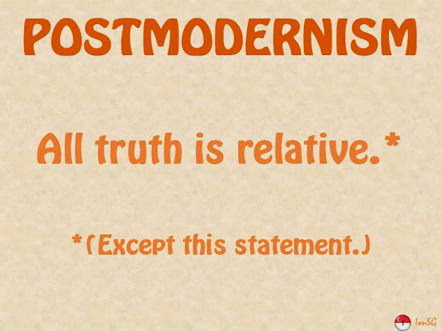
A previous post (Retreat from Reason) provided a look into the mentality of today’s college professors teaching humanities and social sciences. The dominant mindset is termed “postmodern” to distinguish this perspective from the “modern” viewpoint born of the age of reason or enlightenment.

That text came from Professor Jordan Peterson who recommended reading a book by Stephen Hicks called Explaining Postmodernism. This post provides some descriptions (lightly edited) from Hicks regarding the education of today’s students and the liberal arts attitude toward science.

Hicks presents two hypotheses regarding the world-view embraced by postmoderns, which they pass on to their students.

Hypothesis 1: Postmodernism is the first ruthlessly consistent statement of the consequences of rejecting reason, those consequences being necessary given the study of knowledge since Kant.

Thomas Kuhn published in 1962 his landmark book, The Structure of Scientific Revolutions, signifying the result of four decades of analytic philosophy and the dead end it had reached. If science’s tools are perception, logic, and language, then science, one of the Enlightenment’s prized children, is merely an evolving, socially objective enterprise with no more claim to objectivity than any other belief system. The idea that science speaks of reality or truth is an illusion. There is no Truth; there are only truths, and truths change.

Consequently, by the 1960s, the pro-objectivity, pro-science spirit had collapsed in the Anglo-American philosophical tradition.

Hypothesis 2: Postmodernism is the academic far Left’s stance in response to the crisis caused by the failures of socialism in theory and practice.

Postmodern thinkers inherit an intellectual tradition that has seen the defeat of all of its major hopes.

While the neo-Enlightenment thinkers have come to terms with the modern world, from the postmodern perspective the universe has been intellectually shattered. We can not turn to God or to nature, and we cannot trust reason or mankind.

The failure of Left politics to achieve the vision of a beautiful collectivist society was merely the last straw. To the postmodern mind, the cruel lessons of the modern world are that reality is inaccessible, that nothing can be known, that human potential is nothing, and that ethical and political ideals have come to nothing. The psychological response to the loss of everything is anger and despair.

But the postmodern thinkers also find themselves surrounded by an Enlightenment world that does not understand. Postmoderns confront a world dominated by liberalism and capitalism, by science and technology, by people who still believe in reality, in reason, and in the greatness of human potential. The world that they said was impossible and destructive has both come to be and is flourishing. The heirs of the Enlightenment are running the world, and they have marginalized the post-modernists to the academy. Resentment is then added on top of anger and despair.

The Enlightenment world is proud, confident, and knows it is the wave of the future. This is unbearable to someone invested totally in an opposed and failed outlook. That pride is what such a person wants to destroy. The best target to attack is the Enlightenment’s sense of its own moral worth. Attack it as sexist and racist, intolerantly dogmatic, and cruelly exploitative. Undermine its confidence in its reason, its science and technology. The words do not even have to be true or consistent to do the necessary damage.

The College as Snowflake Academy

In education, postmodernism rejects the notion that the purpose of education is primarily to train a child’s cognitive capacity for reason in order to produce an adult capable of functioning independently in the world. That view of education is replaced with the view that education is to take an essentially indeterminate being and give it social identity. Education’s method of molding is linguistic, and so the language to be used is that which will create a human being sensitive to its racial, sexual, and class identity.

Our current social context, however, is characterized by oppression that benefits whites, males, and the rich at the expense of everyone else. That oppression in turn leads to an educational system that reflects only or primarily the interests of those in positions of power. To counteract that bias, educational practice must be recast totally. Postmodern education should emphasize works not in the canon; it should focus on the achievements of non-whites, females, and the poor; it should highlight the historical crimes of whites, males, and the rich; and it should teach students that science’s method has no better claim to yielding truth than any other method and, accordingly, that students should be equally receptive to alternative ways of knowing.

Moderns thought science and technology are good for all, extending our knowledge of the universe and making the world healthier, cleaner, and more productive. Postmoderns say science betrays its elitism, sexism and destructiveness by making the speed of light the fastest phenomenon, thereby unfairly privileging it over other speeds–by having chosen the phallic symbol i to represent the square root of negative one–by asserting its desire to “conquer” nature and “penetrate” her secrets–and, having done so, by having its technology consummate the rape by building bigger and longer missiles to blow things up.

And previously it had been generally thought liberalism, free markets, technology, and cosmopolitanism are social achievements that can be enjoyed by all cultures. On the contrary, Postmoderns think non-Western cultures are superior, since they live simply and in harmony with nature. They find the West is arrogantly blind, elitist and imperialistic, and imposes its capitalism, its science and technology, and its ideology upon other cultures and an increasingly fragile ecosystem.

Conclusion

And thus graduates are fully equipped and predetermined to believe in climate change.


Global Cooling Celebration


Be sure to turn on the sound to appreciate the video.

So the Al Gore Global Cooling effect is muted at the COP23 site in Bonn Germany with temperatures only slightly below normal, but with rain every day.  Elsewhere in North America winter is making an early appearance.  For example in Montreal we woke up this morning with -8C and some snow in the street.

Here is the snow cover map from yesterday showing Siberia fully covered along with Alaska and northern Canada.  As seen in the video above climate realists are dancing over the demise of the warmist fantasy.


Like Your Arctic with Ice?

An imposing panorama of an ice-fjord floating along the bone-chilling water in Svalbard. From Daily Mail

Arctic ice extent went over 9M km2 yesterday, or about 60% of annual maximum.  Several seas are already maxed out:  Laptev, East Siberian, Canadian Archipelago.  The image below shows the refreezing this month.

Click on image to enlarge.

At the bottom watch Beaufort Sea filling in.  On the middle right Baffin Bay steadily adds ice, while Hudson bay starts from its top, but also gets fast ice way down the western coastline into James Bay.  At the top center is Svalbard with Greenland Sea growing on its right, and Kara and Barents filling in on its left.

Dr. Judah Cohen from Atmospheric and Environmental Research (AER) saw this coming.  From his blog November 6 2017:

The forecast for November (Figure 13a) shows cold temperatures in Canada that extend into the Eastern US. The cold temperatures in Canada seem likely but the cold temperatures in the Eastern US will likely depend on the strength of Greenland blocking. The forecast for Eurasia is relatively mild and I think that the forecast is likely to be wrong. In my opinion the predicted blocking across northern Eurasia favors more widespread cold than predicted by the CFS especially across Siberia and East Asia.

My thoughts on the weather pattern over the next several weeks  By Brett Anderson, AccuWeather senior meteorologist  11/08/2017, 4:30:48 PM

Interesting weather pattern setting up across North America as we progress through November and get into early December.

–A series of potent, Pacific storms will likely impact southern BC and the U.S. Pacific Northwest between Nov. 13 and 23. Expect several rounds of heavier rain and gusty winds for Vancouver Island and the mainland coast. Heavy snowfall for the Coastal Range and Rockies should help set the ski season off on a good start.

–A strong Arctic, cold front will press southward through Ontario and Quebec on Thursday. Behind the front, rain showers will quickly change to snow showers and a brief, heavier snow squall. There is the potential for brief whiteout conditions with any squall from southern and eastern Ontario through southern Quebec late Thursday afternoon and into the night. These squalls can quickly drop visibility making travel dangerous for motorists, especially on highways. Roads will generally be wet Thursday afternoon, but untreated roads may briefly get snow covered and icy Thursday evening and night as temperatures rapidly fall below the freezing mark.

In addition to the cold, northwesterly winds will be quite strong Thursday night into early Friday with gusts in the 60- to 80-km/h range from eastern Ontario through Quebec and into western New Brunswick.

Dr. Cohen’s view of the winter Arctic climate system is posted in Snowing and Freezing in the Arctic

SST Warming Patterns

The graph below  is noisy, but the density is needed to see the seasonal patterns in the oceanic fluctuations.  Previous posts focused on the rise and fall of the last El Nino starting in 2015.  This post takes a longer view, encompassing the significant 1998 El Nino and since.  The color schemes are retained for Global, Tropics, NH and SH anomalies.  Despite the longer time frame, I have kept the monthly data (rather than yearly averages) because of interesting shifts between January and July.

Click on image to enlarge.

1995 is a reasonable starting point prior to the first El Nino.  The sharp Tropical rise peaking in 1998 is dominant in the record, starting Jan. ’97 to pull up SSTs uniformly before returning to the same level Jan. ’99.  For the next 2 years, the Tropics stayed down, and the world’s oceans held steady around 0.2C above 1961 to 1990 average.

Then comes a steady rise over two years to a lesser peak Jan.2003., but again uniformly pulling all oceans up around 0.4C.  Something changes at this point, with more hemispheric divergence than before. Over the 4 years until Jan 2007, the Tropics go through ups and downs, NH a series of ups and SH mostly downs.  As a result the Global average fluctuates around that same 0.4C, which is also the average anomaly for the entire dataset since 1995.

2007 stands out with a sharp drop in temperatures so that Jan.08 matches the low in Jan. ’99, but starting from a lower high. The oceans all decline as well, until temps build peaking in 2010.

Now again a different pattern appears.  The Tropics cool sharply to Jan 11, then rise steadily for 4 years to Jan 15, at which point the most recent major El Nino takes off.  But this time in contrast to ’97-’99, the Northern Hemisphere produces peaks every summer pulling up the Global average.  In fact, these NH peaks appear every July starting in 2003, growing stronger to produce 3 massive highs in 2014, 15 and 16, with July 2017 only slightly lower.  Note also that starting in 2014 SH plays a moderating role, offsetting the NH warming pulses. (Note: these are high anomalies on top of the highest absolute temps in the NH.)

What to make of all this? The patterns suggest that in addition to El Ninos in the Pacific driving the Tropic SSTs, something else is going on in the NH.  IMO the culprit is the North Atlantic, since I have seen this sort of pulsing before.  After reading some papers by David Dilley, I confirmed his observation of Atlantic pulses into the Arctic every 8 to 10 years as shown by this graph:
The data is annual averages of absolute SSTs measured in the North Atlantic.  The significance of the pulses for weather forecasting is discussed in AMO: Atlantic Climate Pulse

But the peaks coming nearly every July in HadSST require a different picture.  Let’s look at August, the hottest month in the North Atlantic from the Kaplan dataset.Now the regime shift appears clearly. Starting with 2003, seven times the August average has exceeded 23.6C, a level that prior to ’98 registered only once before, in 1937.  And other recent years were all greater than 23.4C.

Summary

The best context for understanding temperature fluctuations comes from the world’s sea surface temperatures (SST), for several reasons:

  • The ocean covers 71% of the globe and drives average temperatures;
  • SSTs have a constant water content, (unlike air temperatures), so give a better reading of heat content variations;
  • Major El Ninos have been the dominant climate feature in recent decades.

The oceans are driving the warming this century.  SSTs took a step up with the 1998 El Nino and have stayed there with help from the North Atlantic, and more recently the Pacific northern “Blob.”  The ocean surfaces are releasing a lot of energy, warming the air, but eventually will have a cooling effect.  The decline after 1937 was rapid by comparison, so one wonders: How long can the oceans keep this up.

4_20_15_brian_oceanwarmingvideoshot_600_315_s_c1_c_c

Obsessed with Human CO2

A previous post described how alarmists make their case by radically reducing the climate reality down to a false simplicity, as shown in this diagram:
The full discussion of this all too common reductionism is reprinted later on.  This post focuses on the final step at the triangle bottom where all of the increase in atmospheric CO2 is attributed to us humans.

In the news last week were reports of climate scientists surprised that CO2 rose faster in 2015 and 2016 despite flat human emissions.  That should have been a wake-up call regarding their mistaken paradigm of the carbon cycle.  Fortunately there is an excellent resource to correct any such misconceptions.

Recently I was pointed to a great website and the analytical work by Dr. Edwin Berry.  (H/T NZ Climate Science Coalition) Dr. Ed has written a thorough, yet very readable explanation on the issue of human emissions vs. CO2 fluxes from natural sources and sinks.  He has a paper currently in review Why human CO2 does not change climate and I am respecting his request not to repost from it until it is published.  The link does allow you to read his convincing analysis and conclusions, supported by basic principles and math.

Dr. Berry has been working on this for some time, and I will provide excerpts from another post showing his train of thought.  The fork in the road of the climate change debate is his most recent essay aiming for a general audience.

Neither nature’s emissions nor human emissions stay in the atmosphere. They merely flow through the atmosphere. The atmosphere is like a lake where a river flows in and lake water flows out over a dam. The lake’s water level will rise or fall until the outflow over the dam equals the inflow from the river.

If the inflow increases, the level will rise until the outflow equals the inflow and the level becomes constant. Conversely, if inflow decreases, the level will decrease until, once again, outflow equals inflow. The faster the inflow, the higher the level to balance the inflow. Fig. 1 illustrates the simple physics model for both the lake and the atmosphere.

systembalanceb-665x255-1

Fig. 1. The Model shows the rate of change of the level equals the difference between Inflow and Outflow. This model applies to both the lake model and the atmosphere model.

The ratio of natural to human carbon dioxide in the atmosphere is the ratio of their inflows. Nature produces more than 95 percent of the carbon dioxide in our atmosphere and human emissions produce less than 5 percent.

In terms of the often-quoted ppm (or parts per million), these percentages show that human emissions cause an 18-ppm rise, and nature’s emissions cause a 392-ppm rise, in atmospheric carbon dioxide. The total of each inflow is today’s carbon dioxide level of 410 ppm.

edberry fig.5

The IPCC reports are clear. While the IPCC correctly assumes nature’s emissions of about 100 ppm per year balance outflow to inflow, the IPCC incorrectly assumes human emissions do not balance. The IPCC assumes 1.5 ppm per year of human emissions gets stuck in the atmosphere and stays there. That 1.5 ppm is coincidently just enough to support their claim that human emissions have caused all the increase in atmospheric carbon dioxide since 1750.

The Paris Climate Agreement proposed to reduce worldwide human emissions by 28 percent. Twenty-eight percent of 18 ppm is 5 ppm. The Paris Agreement would have reduced atmospheric carbon dioxide by only 5 ppm, which is insignificant. Even 18 ppm is insignificant. The alarmists have no case.

Thank you Dr. Berry for taking IPCC data and showing the correct analysis and conclusion to draw.  A more technical description of his paradigm is A Model for Atmospheric Carbon Dioxide: Abstract

Note the size of the human emissions next to the red arrow. (Units are in GT)


Background:  Climate Reductionism

Reductionists are those who take one theory or phenomenon to be reducible to some other theory or phenomenon. For example, a reductionist regarding mathematics might take any given mathematical theory to be reducible to logic or set theory. Or, a reductionist about biological entities like cells might take such entities to be reducible to collections of physico-chemical entities like atoms and molecules.
Definition from The Internet Encyclopedia of Philosophy

Some of you may have seen this recent article: Divided Colorado: A Sister And Brother Disagree On Climate Change

The reporter describes a familiar story to many of us.  A single skeptic (the brother) is holding out against his sister and rest of the family who accept global warming/climate change. And of course, after putting some of their interchanges into the text, the reporter then sides against the brother by taking the word of a climate expert. From the article:

“CO2 absorbs infrared heat in certain wavelengths and those measurements were made first time — published — when Abraham Lincoln was president of the United States,” says Scott Denning, a professor of atmospheric science at Colorado State University. “Since that time, those measurements have been repeated by better and better instruments around the world.”

CO2, or carbon dioxide, has increased over time, scientists say, because of human activity. It’s a greenhouse gas that’s contributing to global warming.

“We know precisely how the molecule wiggles and waggles, and what the quantum interactions between the electrons are that cause everyone one of these little absorption lines,” he says. “And there’s just no wiggle room around it — CO2 absorbs heat, heat warms things up, so adding CO2 to the atmosphere will warm the climate.”

Denning says that most of the CO2 we see added to the atmosphere comes from humans — mostly through burning coal, oil and gas, which, as he puts it, is “indirectly caused by us.”

When looking at the scientific community, Denning says it’s united, as far as he knows.

A Case Study of Climate Reductionism

Denning’s comments, supported by several presentations at his website demonstrate how some scientists (all those known to Denning) engage in a classic form of reductionism.

The full complexity of earth’s climate includes many processes, some poorly understood, but known to have effects orders of magnitude greater than the potential of CO2 warming. The case for global warming alarm rests on simplifying away everything but the predetermined notion that humans are warming the planet. It goes like this:

Our Complex Climate

Earth’s climate is probably the most complicated natural phenomenon ever studied. Not only are there many processes, but they also interact and influence each other over various timescales, causing lagged effects and multiple cycling. This diagram illustrates some of the climate elements and interactions between them.

Flows and Feedbacks for Climate Models

The Many Climate Dimensions

Further, measuring changes in the climate goes far beyond temperature as a metric. Global climate indices, like the European dataset include 12 climate dimensions with 74 tracking measures. The set of climate dimensions include:

  • Sunshine
  • Pressure
  • Humidity
  • Cloudiness
  • Wind
  • Rain
  • Snow
  • Drought
  • Temperature
  • Heat
  • Cold

And in addition there are compound measures combining temperature and precipitation. While temperature is important, climate is much more than that.  With this reduction, all other dimensions are swept aside, and climate change is simplified down to global warming as seen in temperature measurements.

Climate Thermodynamics: Weather is the Climate System at work.

Another distortion is the notion that weather is bad or good, depending on humans finding it favorable. In fact, all that we call weather are the ocean and atmosphere acting to resolve differences in temperatures, humidities and pressures. It is the natural result of a rotating, irregular planetary surface mostly covered with water and illuminated mostly at its equator.

The sun warms the surface, but the heat escapes very quickly by convection so the build-up of heat near the surface is limited. In an incompressible atmosphere, it would *all* escape, and you’d get no surface warming. But because air is compressible, and because gases warm up when they’re compressed and cool down when allowed to expand, air circulating vertically by convection will warm and cool at a certain rate due to the changing atmospheric pressure.

Climate science has been obsessed with only a part of the system, namely the atmosphere and radiation, in order to focus attention on the non-condensing IR active gases. The climate is framed as a 3D atmosphere above a 2D surface. That narrow scope leaves out the powerful non-radiative heat transfer mechanisms that dominate the lower troposphere, and the vast reservoir of thermal energy deep in the oceans.

As Dr. Robert E Stevenson writes, it could have been different:

“As an oceanographer, I’d been around the world, once or twice, and I was rather convinced that I knew the factors that influenced the Earth’s climate. The oceans, by virtue of their enormous density and heat-storage capacity, are the dominant influence on our climate. It is the heat budget and the energy that flows into and out of the oceans that basically determines the mean temperature of the global atmosphere. These interactions, plus evaporation, are quite capable of canceling the slight effect of man-produced CO2.”

The troposphere is dominated by powerful heat transfer mechanisms: conduction, convection and evaporation, as well as physical kinetic movements.  All this is ignored in order to focus on radiative heat transfer, a bit player except at the top of the atmosphere.

There’s More than the Atmosphere

Once the world of climate is greatly reduced down to radiation of infrared frequencies, yet another set of blinders is applied. The most important source of radiation is of course the sun. Solar radiation in the short wave (SW) range is what we see and what heats up the earth’s surface, particularly the oceans. In addition solar radiation includes infrared, some absorbed in the atmosphere and some at the surface. The ocean is also a major source of heat into the atmosphere since its thermal capacity is 1000 times what the air can hold. The heat transfer from ocean to air is both by way of evaporation (latent heat) and also by direct contact at the sea surface (conduction).

Yet conventional climate science dismisses the sun as a climate factor saying that its climate input is unvarying. That ignores significant fluctuations in parts of the light range, for example ultraviolet, and also solar effects such as magnetic fields and cosmic rays. Also disregarded is solar energy varying due to cloud fluctuations. The ocean is also dismissed as a source of climate change despite obvious ocean warming and cooling cycles ranging from weeks to centuries. The problem is such oscillations are not well understood or predictable, so can not be easily modeled.

With the sun and the earth’s surface and ocean dismissed, the only consideration left is the atmosphere.

The Gorilla Greenhouse Gas

Thus climate has been reduced down to heat radiation passing through the atmosphere comprised of gases. One of the biggest reductions then comes from focusing on CO2 rather than H20. Of all the gases that are IR-active, water is the most prevalent and covers more of the spectrum.

The diagram below gives you the sense of proportion.

The Role of CO2

We come now to the role of CO2 in “trapping heat” and making the world warmer. The theory is that CO2 acts like a blanket by absorbing and re-radiating heat that would otherwise escape into space. By delaying the cooling while solar energy comes in constantly, CO2 is presumed to cause a buildup of heat resulting in warmer temperatures.

How the Atmosphere Processes Heat

There are 3 ways that heat (Infrared or IR radiation) passes from the surface to space.

1) A small amount of the radiation leaves directly, because all gases in our air are transparent to IR of 10-14 microns (sometimes called the “atmospheric window.” This pathway moves at the speed of light, so no delay of cooling occurs.

2) Some radiation is absorbed and re-emitted by IR active gases up to the tropopause. Calculations of the free mean path for CO2 show that energy passes from surface to tropopause in less than 5 milliseconds. This is almost speed of light, so delay is negligible. H2O is so variable across the globe that its total effects are not measurable. In arid places, like deserts, we see that CO2 by itself does not prevent the loss of the day’s heat after sundown.

3) The bulk gases of the atmosphere, O2 and N2, are warmed by conduction and convection from the surface. They also gain energy by collisions with IR active gases, some of that IR coming from the surface, and some absorbed directly from the sun. Latent heat from water is also added to the bulk gases. O2 and N2 are slow to shed this heat, and indeed must pass it back to IR active gases at the top of the troposphere for radiation into space.

In a parcel of air each molecule of CO2 is surrounded by 2500 other molecules, mostly O2 and N2. In the lower atmosphere, the air is dense and CO2 molecules energized by IR lose it to surrounding gases, slightly warming the entire parcel. Higher in the atmosphere, the air is thinner, and CO2 molecules can emit IR into space. Surrounding gases resupply CO2 with the energy it lost, which leads to further heat loss into space.

This third pathway has a significant delay of cooling, and is the reason for our mild surface temperature, averaging about 15C. Yes, earth’s atmosphere produces a buildup of heat at the surface. The bulk gases, O2 and N2, trap heat near the surface, while IR active gases, mainly H20 and CO2, provide the radiative cooling at the top of the atmosphere. Near the top of the atmosphere you will find the -18C temperature.

Sources of CO2

Note the size of the human emissions next to the red arrow.

A final reduction comes down to how much of the CO2 in the atmosphere is there because of us. Alarmists/activists say any increase in CO2 is 100% man-made, and would be more were it not for natural CO2 sinks, namely the ocean and biosphere. The claim overlooks the fact that those sinks are also sources of CO2 and the flux from the land and sea is an order of magnitude higher than estimates of human emissions. In fact, our few Gigatons of carbon are lost within the error range of estimating natural emissions. Insects produce far more CO2 than humans do by all our activity, including domestic animals.

Why Climate Reductionism is Dangerous

Reducing the climate in this fashion reaches its logical conclusion in the Activist notion of the “450 Scenario.”  Since Cancun, IPCC is asserting that global warming is capped at 2C by keeping CO2 concentration below 450 ppm. From Summary for Policymakers (SPM) AR5

Emissions scenarios leading to CO2-equivalent concentrations in 2100 of about 450 ppm or lower are likely to maintain warming below 2°C over the 21st century relative to pre-industrial levels. These scenarios are characterized by 40 to 70% global anthropogenic GHG emissions reductions by 2050 compared to 2010, and emissions levels near zero or below in 2100.

Thus is born the “450 Scenario” by which governments can be focused upon reducing human emissions without any reference to temperature measurements, which are troublesome and inconvenient. Almost everything in the climate world has been erased, and “Fighting Climate Change” is now code to mean accounting for fossil fuel emissions.

Conclusion

All propagandists begin with a kernel of truth, in this case the fact everything acting in the world has an effect on everything else. Edward Lorenz brought this insight to bear on the climate system in a ground breaking paper he presented in 1972 entitled: “Predictability: Does the Flap of a Butterfly’s Wings in Brazil Set Off a Tornado in Texas?”  Everything does matter and has an effect. Obviously humans impact on the climate in places where we build cities and dams, clear forests and operate farms. And obviously we add some CO2 when we burn fossil fuels.

But it is wrong to ignore the major dominant climate realities in order to exaggerate a small peripheral factor for the sake of an agenda. It is wrong to claim that IR active gases somehow “trap” heat in the air when they immediately emit any energy absorbed, if not already lost colliding with another molecule. No, it is the bulk gases, N2 and O2, making up the mass of the atmosphere, together with the ocean delaying the cooling and giving us the mild and remarkably stable temperatures that we enjoy. And CO2 does its job by radiating the heat into space.

Since we do little to cause it, we can’t fix it by changing what we do. The climate will not stop changing because we put a price on carbon. And the sun will rise despite the cock going on strike to protest global warming.

Footnote: For a deeper understanding of the atmospheric physics relating to CO2 and climate, I have done a guide and synopsis of Murry Salby’s latest textbook on the subject:  Fearless Physics from Dr. Salby

Astronaut Grinds Climate Axe

Meet Julie Payette, Canada’s next Governor General

One month into her new job as Canada’s Governor General, Julie Payette was the keynote speaker at the ninth annual Canadian Science Policy Convention in Ottawa Nov. 1 where she urged her friends and former colleagues to take responsibility to shut down the misinformation about everything from health and medicine to climate change and even horoscopes that has flourished with the explosion of digital media.

“Can you believe that still today in learned society, in houses of government, unfortunately, we’re still debating and still questioning whether humans have a role in the Earth warming up or whether even the Earth is warming up, period,” she asked, her voice incredulous.

As the photo suggests, Payette has an impressive CV, but she appears not to know the difference between being Governor General and a Liberal cheerleader. I referred to “climate axe” purposely because leftist politicians in both Canada and US have employed global warmism as a wedge issue to split the electorate in their favor by marginalizing the skeptics.

Firstly, her speech shows her ignorance of the people she represents. The most recent survey of Canadian public opinion on global warming gave this result:

Sponsors of the survey and media reporting (eg. CBC) believe 100% in man-made global warming, so were disappointed in the public’s dissent and tried to hide and misconstrue the survey results. But buried in the details is the above finding showing that Payette has thrown under the bus more than half of Canadians.  Even in her home city Montreal, hotbed of climatism, she belittles 40% of the population. Details of the survey are in Uncensored: Canadians View Global Warming

Secondly, pronouncements on scientific issues should be based on personal critical examination of the facts for and against a position. Her space experience was made possible by pioneering NASA scientists who have done their homework and come to the opposite conclusion.  She is also dumping on colleagues who have actually studied the data.

NASA retirees organized TRCS research team in the Spring of 2012 and developed a website that documents our progress into understanding the AGW issue over the last 5 years. http://www.TheRightClimateStuff.com We set as our initial goal: “Determine to what extent unrestricted burning of fossil fuels can cause harmful climate change.” We have concluded that the computer model analyses used in the IPCC reports, estimating global warming increases up to 4.5 degrees C for doubling atmospheric CO2 concentration, are in error because the models do not agree with empirical data as required by the principles of the Scientific Method. Our analysis, based on principles of conservation of energy, uses well-known, measured data and predicts no more than 1.2 degrees C increase in global warming due to burning all currently known world-wide reserves of fossil fuels. Our simple model is validated by the rigor of its derivation and agreement with 167 years of empirical data since 1850. This analysis was completed with the same rigor and attention to detail used in our manned space program, where the lives of astronauts depended on our accuracy.

Excerpt with my bolds from letter to President Donald J Trump by The Right Climate Stuff Research Team. Led by Harold H Doiron, signed by 22 others including Astronauts Walter Cunningham and Charles Duke.

More information and the complete report is at The Right Climate Stuff

Has Payette done her own analysis and written a report, or is she taking someone’s word about global warming theory and its effects? That would be a secondhand opinion, an appeal to authority rather than science.

Thirdly, it is not the Governor General’s role to champion political correctness. Rex Murphy explains it clearly in his National Post article  Governor General appoints herself umpire of questions of faith and science  Excerpts below with my bolds.

In this wonderfully diverse Canada that Ms. Payette now represents, was it her intent to ridicule the religious beliefs of so very many faiths?

Merely as prelude, we should point out that the difference between elected and selected is more than a matter of the letter “s,” and add that being assigned to a state ceremonial office does not confer oracular status on a person. On the first, it must be clearly acknowledged that it is the elected, not the selected, who argue and debate the issues of the day and determine the worth and truth of the policies that emerge from that process. They write the laws: the GG, as ceremonial totem, the stand-in for an absent Regent of a hollowed-out Monarchy, affixes her signature to them.

Secondly, elevation to the GG office, delight and honour that it undoubtedly is, does not come with a certificate of intellectual authority, or the prerogative to delimit the scope of inquiry and debate on any issue the Commons or the citizenry may wish to engage. It is not at all evident that Ms. Payette is clear on these points.

Her speech had a scattering, pinball machine trajectory. In the space of a few sentences it went from climate change, to the origin of life, to newspaper horoscopes; from dicta on the “denialism” sometimes confronting the first, to the religious understandings of the second, and the vacuous absurdity of the third. The problem with this neat triad is that, while a tirade against horoscopy might be perfectly agreeable to most everyone (being a machine gun attack on a whole field of straw men — who reads horoscopes save for feeble amusement?), assertions on life and climate are on another plane entirely.

Conclusion

Naturally, Ms. Payette opined on climate science, and equally naturally placed inquiry and skepticism on what is proclaimed the consensus of that but emergent discipline as denialism – thereby endorsing the ugliest rhetorical term in this entire, explosive issue, which summons the butchery and cruelty of History’s greatest crime as a spurious backdrop to debate on an unresolved public issue. We have a right to expect better from Her Majesty’s representative.

Climate Scientist Sues Over Hurt Feelings

Article By Alex Berezow — November 2, 2017 at American Council on Science and Health (ACSH) entitled:
Climate Scientist Mark Jacobson Sues Journal For $10M Over Hurt Feelings  Excerpts below with my bolds.

ACSH has been around since 1978. We have never seen anything like this.

Climate scientist Mark Z. Jacobson of Stanford University has sued the National Academy of Sciences, which publishes the prestigious journal PNAS, for publishing an article that disagreed with him. The lawsuit claims that Dr. Jacobson was libeled and slandered. He is suing to get the journal to retract the article.  For his hurt feelings and bruised ego, he also wants a big bag of money, $10 million to be precise

Let’s set aside the scientific arguments in this debate, which revolve around the feasibility of 100% renewable energy. Smart people can disagree about whether that is a technologically and economically achievable goal. The way smart (and mature) people handle their disagreements is in the pages of a peer-reviewed scientific journal. But, apparently, that’s no longer how things operate in our litigious society.

Dr. Jacobson published a paper in PNAS that other scientists found faulty. So, they published a rebuttal, which concluded that Dr. Jacobson’s analysis “involves errors, inappropriate methods, and implausible assumptions.” While this is considered rather harsh language for the scientific literature, critiquing the work of others occurs as a matter of routine. Indeed, questioning another scientist’s conclusions is a healthy and integral part of the pursuit of knowledge.

The ACSH article goes into the details and statements that suggest Jacobson’s hurt feelings are driving his actions.  But I want to put this dispute in a larger context.  For this is a powerful example of the misuse of scientific models that goes on flagrantly in climate science, but also in other fields.  The only difference here is Jacobson’s extreme measure of going to the courts to defend his model.  For background, consider the notion of Chameleon Models, a term invented by Paul Pfleiderer  (also of Stanford), and see how it applies to this conflict.

Chameleon2

Paul Pfleiderer has done a public service in calling attention to
The Misuse of Theoretical Models in Finance and Economics (here)
h/t to William Briggs for noticing and linking

He coins the term “Chameleon” for the abuse of models, and explains in the abstract of his article:

In this essay I discuss how theoretical models in finance and economics are used in ways that make them “chameleons” and how chameleons devalue the intellectual currency and muddy policy debates. A model becomes a chameleon when it is built on assumptions with dubious connections to the real world but nevertheless has conclusions that are uncritically (or not critically enough) applied to understanding our economy. I discuss how chameleons are created and nurtured by the mistaken notion that one should not judge a model by its assumptions, by the unfounded argument that models should have equal standing until definitive empirical tests are conducted, and by misplaced appeals to “as-if” arguments, mathematical elegance, subtlety, references to assumptions that are “standard in the literature,” and the need for tractability.

Chameleon Climate Models

Pfleiderer is writing about his specialty, financial models, and even more particularly banking systems, and gives several examples of how dysfunctional is the problem. As we shall see below, climate models are an order of magnitude more complicated, and abused in the same way, only more flagrantly.

As the analogy suggests, a chameleon model changes color when it is moved to a different context. When politicians and activists refer to climate models, they assert the model outputs as “Predictions”. The media is rife with examples, but here is one from Climate Concern UK

Some predicted Future Effects of Climate Change

  • Increased average temperatures: the IPCC (International Panel for Climate Change) predict a global rise of between 1.1ºC and 6.4ºC by 2100 depending on some scientific uncertainties and the extent to which the world decreases or increases greenhouse gas emissions.
  • 50% less rainfall in the tropics. Severe water shortages within 25 years – potentially affecting 5 billion people. Widespread crop failures.
  • 50% more river volume by 2100 in northern countries.
  • Desertification and burning down of vast areas of agricultural land and forests.
  • Continuing spread of malaria and other diseases, including from a much increased insect population in UK. Respiratory illnesses due to poor air quality with higher temperatures.
  • Extinction of large numbers of animal and plant species.
  • Sea level rise: due to both warmer water (greater volume) and melting ice. The IPCC predicts between 28cm and 43cm by 2100, with consequent high storm wave heights, threatening to displace up to 200 million people. At worst, if emissions this century were to set in place future melting of both the Greenland and West Antarctic ice caps, sea level would eventually rise approx 12m.

Now that alarming list of predictions is a claim to forecast what will be the future of the actual world as we know it.

Now for the switcheroo. When climate models are referenced by scientists or agencies likely to be held legally accountable for making claims, the model output is transformed into “Projections.” The difference is more than semantics:
Prediction: What will actually happen in the future.
Projection: What will possibly happen in the future.

In other words, the climate model has gone from the bookshelf world (possibilities) to the world of actualities and of policy decision-making.  The step of applying reality filters to the climate models (verification) is skipped in order to score political and public relations points.

The ultimate proof of this is the existence of legal disclaimers exempting the modelers from accountability. One example is from ClimateData.US

Disclaimer NASA NEX-DCP30 Terms of Use

The maps are based on NASA’s NEX-DCP30 dataset that are provided to assist the science community in conducting studies of climate change impacts at local to regional scales, and to enhance public understanding of possible future climate patterns and climate impacts at the scale of individual neighborhoods and communities. The maps presented here are visual representations only and are not to be used for decision-making. The NEX-DCP30 dataset upon which these maps are derived is intended for use in scientific research only, and use of this dataset or visualizations for other purposes, such as commercial applications, and engineering or design studies is not recommended without consultation with a qualified expert. (my bold)

Conclusion:

Whereas some theoretical models can be immensely useful in developing intuitions, in essence a theoretical model is nothing more than an argument that a set of conclusions follows from a given set of assumptions. Being logically correct may earn a place for a theoretical model on the bookshelf, but when a theoretical model is taken off the shelf and applied to the real world, it is important to question whether the model’s assumptions are in accord with what we know about the world. Is the story behind the model one that captures what is important or is it a fiction that has little connection to what we see in practice? Have important factors been omitted? Are economic agents assumed to be doing things that we have serious doubts they are able to do? These questions and others like them allow us to filter out models that are ill suited to give us genuine insights. To be taken seriously models should pass through the real world filter.

Chameleons are models that are offered up as saying something significant about the real world even though they do not pass through the filter. When the assumptions of a chameleon are challenged, various defenses are made (e.g., one shouldn’t judge a model by its assumptions, any model has equal standing with all other models until the proper empirical tests have been run, etc.). In many cases the chameleon will change colors as necessary, taking on the colors of a bookshelf model when challenged, but reverting back to the colors of a model that claims to apply the real world when not challenged.

A model becomes a chameleon when it is built on assumptions with dubious connections to the real world but nevertheless has conclusions that are uncritically (or not critically enough) applied to understanding our economy. Chameleons are not just mischievous they can be harmful − especially when used to inform policy and other decision making − and they devalue the intellectual currency.

Thank you Dr. Pfleiderer for showing us how the sleight-of-hand occurs in economic considerations. The same abuse prevails in the world of climate science.


Paul Pfleiderer, Stanford University Faculty
C.O.G. Miller Distinguished Professor of Finance
Senior Associate Dean for Academic Affairs
Professor of Law (by courtesy), School of Law

Postscript:  Now we have a scientist whose model has been reality tested and found wanting by others. His response is filing a lawsuit to make the criticism go away, and to levy a penalty so heavy that no model would ever again be challenged. Onward into the post-modern abyss.

Footnote:

There are a series of posts here which apply reality filters to attest climate models.  The first was Temperatures According to Climate Models where both hindcasting and forecasting were seen to be flawed.

Others in the Series are:

Sea Level Rise: Just the Facts

Data vs. Models #1: Arctic Warming

Data vs. Models #2: Droughts and Floods

Data vs. Models #3: Disasters

Data vs. Models #4: Climates Changing

Old Arctic Ice Recovers

Click on image to enlarge.

Update November 5 at end of post

These charts come from the Arctic and Antarctic Research Institute, St. Petersburg, Russia. I downloaded the images from 2008 through 2017 without collusion from their publicly accessible website (here).

The brown blob in the middle is older ice surviving at least one summer’s melt, with the colors for first year and young ice shown in the enlarged legend above.

The 2007 chart is in a different format so appears separately.  The 2007 coverage is limited on the North American side, but it does show how much of the Central Arctic multi-year ice was gone in 2007. The subsequent charts show recovery with a decline in 2012 (Great Arctic Cyclone year), followed by increases, especially this year.

As discussed in previous posts, the technology for remotely sensing ice thickness is immature, so multi-year ice serves as a proxy.

Update: Background in response to Caleb’s query

Caleb asked about Russian satellite data sources possibly substituting for US ones going out of service.

I found a 2009 presentation in English which answers most of this. Russian Space Infrastructure applied in the Arctic: sea ice application within Roshydromet  by Vasily Smolyanitsky, Arctic and Antarctic Research Institute (AARI). Excerpts and images below.  Read the full report to appreciate the scale of their efforts.

Data acquisition
Coastal weather polar stations of Roshydromet make daily visual and instrumental ice observations on sea ice concentration and stages of ice development, ice thickness, forms of ice, ice drift and other phenomena. Icebreakers and icebreaking vessels on the NSR routes routinely (commonly once a day) report the main ice parameters describing ice navigation. Before 1994 aircraft ice reconnaissance flights were conducted in the Arctic usually on a monthly basis from November to April and on a 10-day internal during the summer navigation period.

Since 1995 aircraft (mostly helicopter) ice reconnaissance flights are conducted only occasionally during tailored hydrometeorological support of applied and scientific activities in the Eurasian Arctic. The scope of ice information collected during air ice reconnaissance includes visual observations on a full scope of sea ice parameters essential for navigation and marine safety (egg-code, icebergs, openings, dynamics, surface features). Though being nowadays not the prime sources, the stated information (coastal, aircraft) is continuously used for validation of the sea ice analysis and prognostic products at the ice centers.

The AARI and Planet satellite reception stations provide operational optical imagery for the Arctic Ocean and North Pacific from a series of satellites (NOAA, EOS TERRA, Aqua, Suomi NPP, FY3, Meteor, Ocean). Information for other regions (e.g. Antarctic), from other satellites and ranges (Sentinel-1,2,3, Radarsat-2, TerraSar-X, etc.) is received via Internet from corresponding data portals directly or from commercial satellite data providers. All data are further processed within ice information systems and utilized for regional, pan-Arctic or pan-Antarctic sea-ice analysis. Sample satellite products are available via the AARI and Planet web pages.

Most of the mentioned satellites are accessed by others with the exception of Meteor, operated by Russia.  Yes, they have numerous meteorological satellites as shown in this image:

According to the presentation, their plans called for additional Electro and Meteor platforms, as well as a new satellite type called Arctica.   It is not clear to what extent the sensors on these birds replicate the microwave data.

Suppressing Climate

The above video is how I first heard of PragerU.  Now the nonprofit organization is suing Google and Youtube for their ideological bias in suppressing Prager’s videos.

PragerU Sues YouTube For Discriminating Against Conservative Videos
is an article by Ben Weingarten at The Federalist.  Excerpts below with my bolds.

Those blackballed from social media platforms for sharing views dissenting from prevailing progressive Silicon Valley orthodoxy have to date had little recourse against the tech speech police. That is why PragerU’s newly filed suit against Google and Google-owned YouTube alleging unlawful censorship and free speech discrimination based on the educational video purveyor’s conservative political viewpoint has the potential to be groundbreaking.

The lawsuit, filed in federal court in California, details upwards of 50 PragerU educational videos that YouTube has, in PragerU’s view, unjustifiably slapped with “restricted mode” or “demonetization” filters, violating its First Amendment right to free speech. These filters limit or otherwise prevent viewers, based on characteristics like age, from consuming content deemed “inappropriate.”

More arguably provocative videos touch on topics such as Islamic terrorism, campus rape, and gender identity. According the suit, “The videos do not contain any profanity, nudity, or otherwise inappropriate ‘mature’ content. The censored videos fully comply with the letter of YouTube’s Terms of Use and Community Guidelines.” Moreover, PragerU illustrates that comparable videos from non-conservative sources like BuzzFeedVideo, CNN, and “Real Time with Bill Maher” have not been subjected to such filters.

Leaving aside the inherent subjectivity for a moment, if PragerU’s content is “appropriate,” and other publishers are able to upload similar content without being penalized, then what better explanation is there for YouTube’s censorship than viewpoint discrimination? PragerU’s dealings with YouTube over its content restrictions only strengthen the validity of this question.

As PragerU summarizes it:

Google/YouTube seek to justify…[its] animus and bias [towards PragerU’s political identity and viewpoint] not by claiming that PragerU has violated YouTube’s restricted content guidelines or criteria, but by arguing that they retain unfettered discretion to censor any video content that they deem “inappropriate,” no matter how subjective, baseless, or arbitrary that decision is…For over one year, PragerU has worked patiently and cooperatively to try to resolve the censorship issues that comprise this Lawsuit. In response, Google/YouTube have provided vague, misleading, confusing, and often contradictory information that not only has prevented resolution of the issues, but constitutes further evidence and indicia that their restricted mode filtering applied to PragerU is based on Defendants’ [Google/YouTube’s] intentional discrimination and animus

That as unimpeachable a source as the video-producing nonprofit PragerU is challenging YouTube should serve as a powerful signal that conservatives and others whose views social media companies deem unworthy will no longer permit their rights to be trampled upon. This is significant regardless of the case’s outcome.

PragerU’s efforts are essential, and may serve as the vanguard of a successful lawfare effort. But while legal action is necessary, it is by no means a sufficient and sure safeguard of our rights. As we have seen time and time again, judges routinely permit our liberties to erode, and sometimes actively assist. Preserving free speech, like all of our cherished freedoms, requires constant vigilance and persistent defense.

More on biased public and social media:

Media Duping Scandal

Ideological Fault Lines

Yellow Climate Journalism


October Arctic Ice is Back

Given the fluctuations in daily sea ice measurements, climatology typically relies on monthly averages. October daily extents are now fully reported and the 2017 October monthly results can be compared with years of the previous decade.  MASIE showed 2017 reached 6.8M km2, exceeding the 6.6M October 10 year average.  SII was close behind at 6.7M for the month.  The 11 year linear trend is more upward for MASIE, mainly due to early years, especially 2007 and 2008 reported higher in SII.  In either case, one can easily see the Arctic ice extents have not declined; MASIE shows 2017  higher than 2016 by 800k km2, and more than 2007 by 1M km2.

Sea Ice Index statistics are from newly released SIIv.3.0,  as reported in Sea Ice Index Updates to v.3.0.

The graph below shows October comparisons through day 304 (Oct. 31).

Note that 2017 in both MASIE and SII tracked the 10 year average, higher most of the month, and slipping behind toward the end.  SII is now about 200k km2 less than MASIE. 2012 recovered strongly, doubling in extent after being decimated by the August Great Arctic Cyclone. 2007 shows a inexplicable one-day jump, taking it close to average.  The lackluster 2016 recovery is also evident.

The narrative from activist ice watchers is along these lines:  2017 minimum was not especially low, but it is very thin.  “The Arctic is on thin ice.”  They are basing that notion on PIOMAS, a model-based estimate of ice volumes, combining extents with estimated thickness.  That technology is not mature, with only a decade or so of remote sensing.

The formation of ice this year does not appear thin, since it is concentrated in the central Arctic.  Watch the October refreezing of the Arctic from the center outward.

Click on image to enlarge.

The table shows ice extents in the regions for 2017, 10 year averages and 2016 for day 304. Decadal averages refer to 2007 through 2016 inclusive.

Region 2017304 Day 304
Average
2017-Ave. 2016304 2017-2016
 (0) Northern_Hemisphere 8428497 8573788 -145291 7185945 1242552
 (1) Beaufort_Sea 887831 951687 -63856 783272 104559
 (2) Chukchi_Sea 417848 482569 -64721 302185 115663
 (3) East_Siberian_Sea 983865 951426 32439 594464 389401
 (4) Laptev_Sea 897755 895915 1840 897039 717
 (5) Kara_Sea 444222 480151 -35929 129998 314224
 (6) Barents_Sea 70256 87612 -17355 13373 56883
 (7) Greenland_Sea 311020 418465 -107445 317193 -6173
 (8) Baffin_Bay_Gulf_of_St._Lawrence 359489 254836 104653 195003 164486
 (9) Canadian_Archipelago 777359 782350 -4990 728887 48473
 (10) Hudson_Bay 94614 76344 18270 71839 22775
 (11) Central_Arctic 3166490 3180626 -14136 3143363 23127

NH extent is slightly below average due to deficits in Beaufort and Chukchi.  East Siberian is growing while Laptev is maxed out. Other seas are around average except for Greenland Sea down, offset by Baffin Bay being up.

Summary

Earlier observations showed that Arctic ice extents were low in the 1940s, grew thereafter up to a peak in 1977, before declining.  That decline was gentle until 1994 which started a decade of multi-year ice loss through the Fram Strait.  There was also a major earthquake under the north pole in that period.  In any case, the effects and the decline ceased in 2007, 30 years after the previous peak.  Now we have a plateau in ice extents, which could be the precursor of a growing phase of the quasi-60 year Arctic ice oscillation.

Background on MASIE Data Sources

MASIE reports are generated by National Ice Center from the Interactive Multisensor Snow and Ice Mapping System (IMS). From the documentation, the multiple sources feeding IMS are:

Platform(s) AQUA, DMSP, DMSP 5D-3/F17, GOES-10, GOES-11, GOES-13, GOES-9, METEOSAT, MSG, MTSAT-1R, MTSAT-2, NOAA-14, NOAA-15, NOAA-16, NOAA-17, NOAA-18, NOAA-N, RADARSAT-2, SUOMI-NPP, TERRA

Sensor(s): AMSU-A, ATMS, AVHRR, GOES I-M IMAGER, MODIS, MTSAT 1R Imager, MTSAT 2 Imager, MVIRI, SAR, SEVIRI, SSM/I, SSMIS, VIIRS

Summary: IMS Daily Northern Hemisphere Snow and Ice Analysis

The National Oceanic and Atmospheric Administration / National Environmental Satellite, Data, and Information Service (NOAA/NESDIS) has an extensive history of monitoring snow and ice coverage.Accurate monitoring of global snow/ice cover is a key component in the study of climate and global change as well as daily weather forecasting.

The Polar and Geostationary Operational Environmental Satellite programs (POES/GOES) operated by NESDIS provide invaluable visible and infrared spectral data in support of these efforts. Clear-sky imagery from both the POES and the GOES sensors show snow/ice boundaries very well; however, the visible and infrared techniques may suffer from persistent cloud cover near the snowline, making observations difficult (Ramsay, 1995). The microwave products (DMSP and AMSR-E) are unobstructed by clouds and thus can be used as another observational platform in most regions. Synthetic Aperture Radar (SAR) imagery also provides all-weather, near daily capacities to discriminate sea and lake ice. With several other derived snow/ice products of varying accuracy, such as those from NCEP and the NWS NOHRSC, it is highly desirable for analysts to be able to interactively compare and contrast the products so that a more accurate composite map can be produced.

The Satellite Analysis Branch (SAB) of NESDIS first began generating Northern Hemisphere Weekly Snow and Ice Cover analysis charts derived from the visible satellite imagery in November, 1966. The spatial and temporal resolutions of the analysis (190 km and 7 days, respectively) remained unchanged for the product’s 33-year lifespan.

As a result of increasing customer needs and expectations, it was decided that an efficient, interactive workstation application should be constructed which would enable SAB to produce snow/ice analyses at a higher resolution and on a daily basis (~25 km / 1024 x 1024 grid and once per day) using a consolidated array of new as well as existing satellite and surface imagery products. The Daily Northern Hemisphere Snow and Ice Cover chart has been produced since February, 1997 by SAB meteorologists on the IMS.

Another large resolution improvement began in early 2004, when improved technology allowed the SAB to begin creation of a daily ~4 km (6144×6144) grid. At this time, both the ~4 km and ~24 km products are available from NSIDC with a slight delay. Near real-time gridded data is available in ASCII format by request.

In March 2008, the product was migrated from SAB to the National Ice Center (NIC) of NESDIS. The production system and methodology was preserved during the migration. Improved access to DMSP, SAR, and modeled data sources is expected as a short-term from the migration, with longer term plans of twice daily production, GRIB2 output format, a Southern Hemisphere analysis, and an expanded suite of integrated snow and ice variable on horizon.

http://www.natice.noaa.gov/ims/ims_1.html

Footnote

Some people unhappy with the higher amounts of ice extent shown by MASIE continue to claim that Sea Ice Index is the only dataset that can be used. This is false in fact and in logic. Why should anyone accept that the highest quality picture of ice day to day has no shelf life, that one year’s charts can not be compared with another year? Researchers do this, including Walt Meier in charge of Sea Ice Index. That said, I understand his interest in directing people to use his product rather than one he does not control. As I have said before:

MASIE is rigorous, reliable, serves as calibration for satellite products, and continues the long and honorable tradition of naval ice charting using modern technologies. More on this at my post Support MASIE Arctic Ice Dataset