
The first graph appeared in the IPCC 1990 First Assessment Report (FAR) credited to H.H.Lamb, first director of CRU-UEA. The second graph was featured in 2001 IPCC Third Assessment Report (TAR) the famous hockey stick credited to M. Mann.
A previous post Rise and Fall of CAGW described the process that began with Hansen’s flashy Senate testimony in 1988, later supported by Santer’s flashy paper in 1996. This post traces a second iteration that ensued following Michael Mann’s production of the infamous Climate Hockey Stick graph in 1998. The image at the top comes from the 2001 IPCC TAR (Third Assessment Report) signifying the immediate embrace of this alarmist tool by consensus climatists. The message of the graph was to assert a spike in modern warming unprecedented in the last 1000 years. This claim of a “Modern Warming Spike” required a flat temperature profile throughout the Middle Ages (since 1000 AD).
The background to the process steps (image below) from Ross Pomeroy’s paper is provided followed by text and references for the rise and fall of the theory intended to erase Medieval Warming comparable to the present day. Sources of material are listed at the end and included here with my bolds.
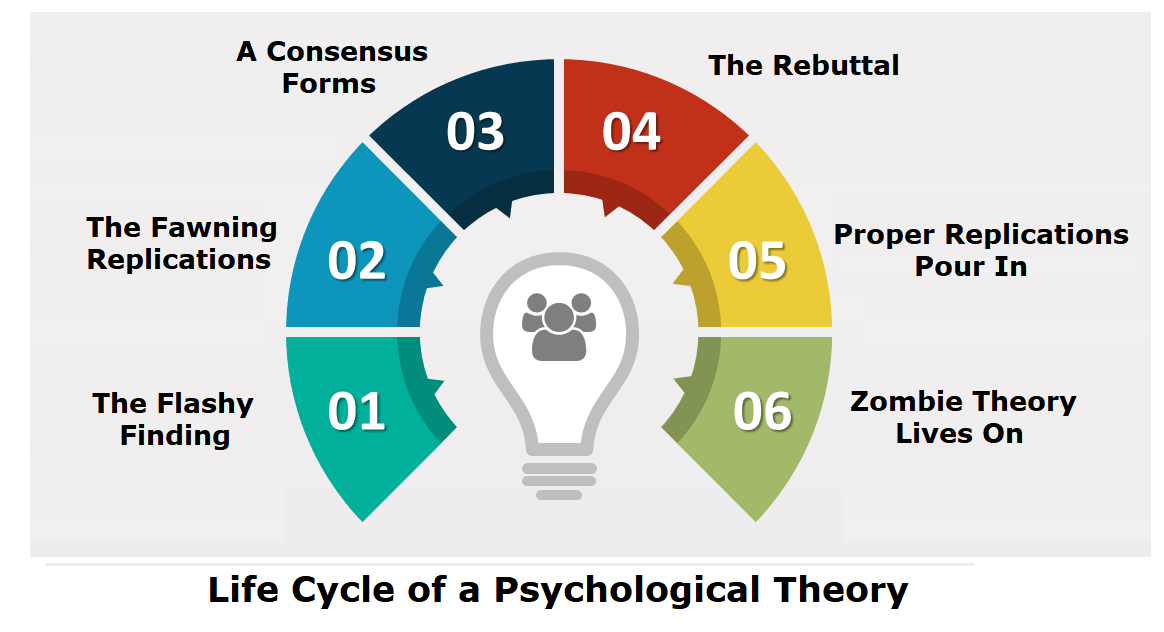
How Theories Advance and Collapse
Seeing how disarray defines psychology, it makes perfect sense that the field’s leading theories are vulnerable to collapse. Having watched this process play out a number of times, a clear pattern has emerged. Let’s call it the “Six Stages of a Failed Psychological or Sociological Theory.”
Stage 1: The Flashy Finding. An intriguing report is published with subject matter that lends itself to water cooler conversation, say, for example, that sticking a pen in your mouth to force a smile makes things seem funnier. Media outlets provide gushing coverage.
Stage 1 Modern Warming Spike Theory

Figure 2.20: Millennial Northern Hemisphere (NH) temperature reconstruction (blue) and instrumental data (red) from AD 1000 to 1999, adapted from Mann et al. (1999). Smoother version of NH series (black), linear trend from AD 1000 to 1850 (purple-dashed) and two standard error limits (grey shaded) are shown. Source: IPCC Third Assessment Report
Since the IPCC believes that the warming from 1975 to 1998 was mainly man-made, but not the warming in earlier centuries, it would like to be able to demonstrate that recent warming is ‘unprecedented’. But it isn’t. Temperatures in many parts of the world appear to be lower than they were in the Medieval Warm Period (MWP, c. 900-1400), and also in the earlier Roman Warm Period (c. 200 BC – 600 AD). During the MWP the Vikings tilled now-frozen farms in Greenland and were buried there in ground that is now permafrost (archaeology.org). Hundreds of peer-reviewed articles show that the MWP was a global phenomenon (Idso & Singer, 2009, 69-94; wattsupwiththat.com; co2science.org), and was not confined to parts of the northern hemisphere, as the IPCC likes to assert.
Those wanting to “get rid of” the MWP run into the problem that it shows up strongly in the data. Shortly after Deming’s article appeared, a group led by Shaopeng Huang of the University of Michigan completed a major analysis of over 6,000 borehole records from every continent around the world. Their study went back 20,000 years. The portion covering the last millennium is shown in Figure 4.

The similarity to the IPCC’s 1995 graph is obvious. The world experienced a “warm” interval in the medieval era that dwarfs 20th century changes. The present-day climate appears to be simply a recovery from the cold years of the “Little Ice Age.”
Huang and coauthors published their findings in Geophysical Research Letters 6 in 1997. The next year, Nature published the first Mann hockey stick paper, commonly called “MBH98.”7 Mann et al. followed up in 1999 with a paper in GRL (“MBH99”) extending their results from AD1400 back to AD1000.8 In early 2000 the IPCC released the first draft of the TAR. The hockey stick was the only paleoclimate reconstruction shown in the Summary, and was the only one in the whole report to be singled out for repeated presentation. The borehole data received a brief mention in Chapter 2 but the Huang et al. graph was not shown. A small graph of borehole data taken from another study and based on a smaller sample was shown, but it only showed a post-1500 segment, which, conveniently, trended upwards.

Figure 2.19: Reconstructed global ground temperature estimate from borehole data over the past five centuries, relative to present day. Shaded areas represent ± two standard errors about the mean history (Pollack et al., 1998). Superimposed is a smoothed (five-year running average) of the global surface air temperature instrumental record since 1860 (Jones and Briffa, 1992). Source: IPCC Third Assessment Report WG 1
Stage 2: The Fawning Replications. Other psychologists, usually in the early stages of their careers, leap to replicate the finding. Most of their studies corroborate the effect. Those that don’t are not published, perhaps because the researchers don’t want to step on any toes, or because journal editors would prefer not to publish negative findings.
Stage 2 Modern Warming Spike Theory
As the hockey stick began to appear in the scientific literature, it emerged that 1998 was the warmest year in Phil Jones’s 150-year record of thermometer data. The length of the hockey stick blade just grew. Those in charge of publicizing the work of climate scientists and making the case for man-made climate change were understandably excited. Controversial science swiftly morphed into a propaganda tool.
The World Meteorological Organization put the hockey stick on the cover of its 1999 report on climate change. Then IPCC chiefs decided to give it pride of place in their 2001 IPCC report. Moreover, based on the hockey stick, they stated that “it is likely that the 1990s was the warmest decade and 1998 the warmest year during the past thousand years”. That attracted attention — and trouble. The doubts expressed in that paper title about “uncertainties and limitations” were melting away.

1999 WMO statement on the Climate.
An article in the Guardian (here) describes the struggle leading to victory for the Hockey Stick.
Emails exchanged in September 1999 reveal intense disagreement about whether Mann’s hockey stick should go into the IPCC summary for policymakers – the only bit of the report that usually gets read outside the scientific community – or whether other reconstructions using tree ring data alone should get priority. One of the main tree-ring constructions was by Briffa. The emails also expose major tensions between a desire for scrupulous honesty about uncertainties, and the desire for a simple story to tell the policymakers. The IPCC’s core job is to present a “consensus” on the science, but in this critical case there was no easy consensus.
The tensions were summed up in an email sent on 22 September 1999 by Met Office scientist Chris Folland, in which he alerted key researchers that a diagram of temperature change over the past thousand years “is a clear favourite for the policy makers’ summary”
But there were two competing graphs – Mann’s hockey stick and another, by Jones, Briffa and others. Mann’s graph was clearly the more compelling image of man-made climate change. The other “dilutes the message rather significantly,” said Folland. “We want the truth. Mike [Mann] thinks it lies nearer his result.” Folland noted that “this is probably the most important issue to resolve in chapter 2 at present.”
Mann, Jones and Briffa eventually settled their differences. And the hockey stick was given pride of place in the IPCC report. Folland says: “My recollection is that the final version [of the IPCC summary], which contains the hockey stick, satisfied Keith and everyone else in the end — after the usual vigorous scientific debate.” And after the three came under attack from climate sceptics, all reference to these past spats disappeared from the emails as they faced a common foe.
Stage 3: A Consensus Forms. The finding is now taken for granted, regularly appearing in pop psychology stories and books penned by writers like Malcolm Gladwell or Jonah Lehrer. Millions of people read about it and “armchair” explain it to their friends and family.
Stage 3 Modern Warming Spike Theory
In its 2001 Third Assessment Report, the IPCC used the iconic ‘hockey stick’ graph to try and show that modern warming was indeed ‘unprecedented’. The graph was produced by Michael Mann (now at Penn State University in the US), Ray Bradley and Malcolm Hughes (MBH), and published in Nature and Geophysical Research Letters in 1998 and 1999. At that time, the standard view was that the Medieval Warm Period and subsequent Little Ice Age (c. 1400-1850) were global events. But some climatologists saw the MWP as an embarrassment and spoke of the need to ‘get rid of it’. MBH’s temperature reconstruction did exactly that: it showed 900 years of gradually declining temperatures followed by a dramatic increase in the 20th century. The hockey stick played a central role in mobilizing political and public opinion in favour of drastic action to curb greenhouse gas emissions.

Al Gore with a version of the Hockey Stick graph in the 2006 movie An Inconvenient Truth
“As soon as the IPCC Report came out, the hockey stick version of climate history became canonical. Suddenly it was the “consensus” view, and for the next few years it seemed that anyone publicly questioning the result was in for a ferocious reception.” Ross McKitrick.What is the ‘Hockey Stick’ Debate About?
Stage 4: The Rebuttal. After a few decades, a new generation of researchers look to make a splash by questioning prevailing wisdom. One team produces a more methodologically-sound study that debunks the initial finding. Media outlets blare the “counterintuitive” discovery.
Stage 4 Modern Warming Spike Theory

The hockey stick was based on historical temperature proxies (mainly tree rings), with the 20th-century instrumental temperature record tacked on the end. Incredibly, although the MBH articles were peer reviewed, nobody tried to replicate and verify the work, even though it overturned well-established views on climate history. It was only several years later that Steve McIntyre, a Canadian mathematician and retired mining consultant, began to investigate the matter. Mann did his best to obstruct him; he refused to release his computer code, saying that ‘giving them the algorithm would be giving in to the intimidation tactics that these people are engaged in’.
McIntyre, with the help of economist Ross McKitrick, went on to write several articles in 2003 and 2005, exposing the flaws in the hockey-stick reconstruction. They showed that the shape of the graph was determined mainly by suspect bristlecone/foxtail tree-ring data, and that Mann’s computer algorithm was so biased that it could produce hockey sticks even out of random noise; in short, Mann’s statistical methods ‘mined’ for hockey-stick signals in the proxy data, which were then assigned exaggerated weight in the reconstruction – thereby giving a whole new meaning to the term ‘Man(n)-made warming’!
In 2006 McIntyre & McKitrick’s criticisms were upheld by two expert committees in the US – the National Academy of Sciences (NAS) panel and a congressional panel headed by statistician Edward Wegman. Wegman pointed out that the palaeoclimate field is dominated by ‘a tightly knit group of individuals who passionately believe in their thesis’, and that ‘the work has been sufficiently politicized that they can hardly reassess their own public positions without losing credibility’.
McKitrick wrote in 2005:
Since our work has begun to appear we have enjoyed the satisfaction of knowing we are winning over the expert community, one at a time. Physicist Richard Muller of Berkeley studied our work last year and wrote an article about it:
“[The findings] hit me like a bombshell, and I suspect it is having the same effect on many others. Suddenly the hockey stick, the poster-child of the global warming community, turns out to be an artifact of poor mathematics.”
In an article in the Dutch science magazine Natuurwetenschap & Techniek, Dr. Rob van Dorland of the Dutch National Meteorological Agency commented “It is strange that the climate reconstruction of Mann passed both peer review rounds of the IPCC without anyone ever really having checked it. I think this issue will be on the agenda of the next IPCC meeting in Peking this May.”
In February 2005 the German television channel Das Erste interviewed climatologist Ulrich Cubasch, who revealed that he too had been unable to replicate the hockey stick (emphasis added):
He [Climatologist Ulrich Cubasch] discussed with his coworkers – and many of his professional colleagues – the objections, and sought to work them through… Bit by bit, it became clear also to his colleagues: the two Canadians were right. …Between 1400 and 1600, the temperature shift was considerably higher than, for example, in the previous century. With that, the core conclusion, and that also of the IPCC 2001 Report, was completely undermined.
Recently Steve MacIntyre and I received an email from Dr. Hendrik Tennekes, retired director of the Royal Meteorological Institute of the Netherlands. He wrote to convey comments he wished to be communicated publicly: “The IPCC review process is fatally flawed. The behavior of Michael Mann is a disgrace to the profession.”

The original MBH graph compared to a corrected version produced by MacIntyre and McKitrick after undoing Mann’s errors.
Stage 5: Proper Replications Pour In. Research groups attempt to replicate the initial research with the skepticism and precise methodology that should’ve been used in the first place. As such, the vast majority fail to find any effect.
Stage 5 Modern Warming Spike Theory
The IPCC dealt with the devastating rebuttal by hiding the hockey stick within a spaghetti graph of various paleo proxies to diffuse the issue, while still claiming unprecedented modern warming.
In the IPCC’s 2007 Fourth Assessment Report, the hockey stick was included in a ‘spaghetti diagram’ alongside six other temperature reconstructions, which showed greater variability in the past but still no pronounced MWP. These ‘independent’ studies are the work of Mann’s colleagues and make use of the same flawed proxies as well as dubious statistical techniques (Montford, 2010, 266-308). The data were carefully cherry-picked to exclude tree-ring series that showed a prominent MWP (climateaudit.files.wordpress.com). Palaeoclimatologist Rosanne D’Arrigo actually told the NAS panel that cherry-picking was necessary if you wanted to make cherry pie (i.e. hockey sticks). And Jan Esper has stated: ‘The ability to pick and choose which samples to use is an advantage unique to dendroclimatology’ – a statement that would make any reputable scientist shudder (Montford, 236, 288-9).

Sixteen of the articles cited in AR4 failed to meet the IPCC’s own publication deadlines for cited references; all of them were written by IPCC contributing authors in support of the AGW cause. The most notable case is a paper by Eugene Wahl and Caspar Ammann. The authors of chapter 6 desperately needed this paper to counter McIntyre & McKitrick’s criticisms of the hockey stick, as the authors claimed to have validated Mann’s results. The leaked emails show that members of the Team pressurized Climatic Change editor Stephen Schneider to ensure that the paper was processed quickly enough to meet IPCC deadlines, though this was not entirely successful. Wahl and Ammann referred to arguments in another unpublished paper they had written, which was not even submitted until well after the first paper had gone forward for IPCC review. Jones advised the authors to be dishonest: ‘try and change the Received date! Don’t give those skeptics something to amuse themselves with’ (1189722851). Both papers finally appeared in September 2007. The authors conceded that the hockey stick failed a key test for statistical significance, but claimed it passed another test and promised to provide details in their Supplementary Information. When this was finally made available a year later, it became clear that torturous statistical manipulations were required to enable the test to be passed (Montford, 2010, 201-19, 338-42, 424-6; bishophill.squarespace.com). The shenanigans involved in the Wahl & Ammann saga are quite breathtaking.
But the credibility of the hockey stick claims was attacked repeatedly:
Stage 6: The Theory Lives On as a Zombie. Despite being debunked, the theory lingers on in published scientific studies, popular books, outdated webpages, and common “wisdom.” Adherents in academia cling on in a state of denial – their egos depend upon it.
Stage 6 Modern Warming Spike Theory

There are still hardcore alarmist blogs that defend the hockey stick graph, but IPCC itself has dropped it without explicitly disowning it.
About 1000 years ago, large parts of the world experienced a prominent warm phase which in many cases reached a similar temperature level as today or even exceeded present-day warmth. While this Medieval Warm Period (MWP) has been documented in numerous case studies from around the globe, climate models still fail to reproduce this historical warm phase. The problem is openly conceded in the most recent IPCC report from 2013 (AR5, Working Group 1) where in chapter 5.3.5. the IPCC scientists admit (pdf here):
“Continental-scale surface temperature reconstructions show, with high confidence, multi-decadal periods during the Medieval Climate Anomaly (950 to 1250) that were in some regions as warm as in the mid-20th century and in others as warm as in the late 20th century.” pg.386
“The timing of warm and cold periods is mostly consistent across reconstructions (in some cases this is because they use similar proxy compilations) but the magnitude of the changes is clearly sensitive to the statistical method and to the target domain (land or land and sea; the full hemisphere or only the extra-tropics; Figure 5.7a). Even accounting for these uncertainties, almost all reconstructions agree that each 30-year (50-year) period from 1200 to 1899 was very likely colder in the NH than the 1983–2012 (1963–2012) instrumental temperature NH reconstructions covering part or all of the first millennium suggest that some earlier 50-year periods might have been as warm as the 1963–2012 mean instrumental temperature, but the higher temperature of the last 30 years appear to be at least likely the warmest 30-year period in all reconstructions (Table 5.4). However, the confidence in this finding is lower prior to 1200, because the evidence is less reliable and there are fewer independent lines of evidence. There are fewer proxy records, thus yielding less independence among the reconstructions while making them more susceptible to errors in individual proxy records. The published uncertainty ranges do not include all sources of error (Section 5.3.5.2), and some proxy records and uncertainty estimates do not fully represent variations on time scales as short as the 30 years considered in Table 5.4. Considering these caveats, there is medium confidence that the last 30 years were likely the warmest 30-year period of the last 1400 years.” Pg.410
Meanwhile a multitude of studies confirm that medieval warming was widespread and not limited to regions in the Northern Hemisphere, as Mann and others have claimed. For example the MWP Mapping Project led by Dr. Sebastian Luening, Prof. Dr. Fritz Vahrenholt (authors of ‘The neglected sun‘).

red: MWP warming
blue: MWP cooling (very rare)
yellow: MWP more arid
green: MWP more humid
grey: no trend or data ambiguous
Most of western North America and Africa were experiencing drought conditions during the MWP (except some areas in Southwest Africa). In contrast, Australia and the Carribean was more humid. Globally, 99% of all paleoclimatic temperature studies compiled in the map so far show a prominent warming during the MWP. This includes Antarctica and the Arctic.

Conclusion:
“Regarding the Hockey Stick of IPCC 2001 evidence now indicates, in my view, that an IPCC Lead Author working with a small cohort of scientists, misrepresented the temperature record of the past 1000 years by (a) promoting his own result as the best estimate, (b) neglecting studies that contradicted his, and (c) amputating another’s result so as to eliminate conflicting data and limit any serious attempt to expose the real uncertainties of these data.” – John Christy, Examining the Process concerning Climate Change Assessments, Testimony 31 March 2011
Resources:
A BRIEF RETROSPECTIVE ON THE HOCKEY STICK Ross McKitrick 2014
Presentation to the National Academy of Sciences Expert Panel, “Surface Temperature Reconstructions for the Past 1,000-2,000 Years Stephen Mcintyre and Ross McKitrick 2006
Climategate and the Inquiries,Ken Gregory
Climategate and the Corruption of Climate Science David Pratt
IPCC TAR and the hockey stick Judith Curry 2014
Global Warming Bombshell Richard Mueller 2004
When the IPCC ‘disappeared’ the Medieval Warm Period Frank Lansner 2010
Footnote:

Todays temperatures are cooler than the Medieval Warming Period, which was preceded by an even warmer Roman Warm Period, which followed an even warmer Minoan Warm Period. We are in an Interglacial age about 11,500 years old, and the overall trend is cooling.

Figure 37. Holocene global temperature change reconstruction. a. Red curve, global average temperature reconstruction from Marcott et al., 2013, figure 1. The averaging method does not correct for proxy drop out which produces an artificially enhanced terminal spike, while the Monte Carlo smoothing eliminates most variability information. b. Black curve, global average temperature reconstruction from Marcott et al., 2013, using proxy published dates, and differencing average. Temperature anomaly was rescaled to match biological, glaciological, and marine sedimentary evidence, indicating the Holocene Climate Optimum was about 1.2°C warmer than LIA. c. Purple curve, Earth’s axis obliquity is shown to display a similar trend to Holocene temperatures. Source: Marcott et al., 2013.
Source:Judith Curry Nature Unbound III: Holocene climate variability (Part A)

Jack, that’s a list of papers by Mann and company repeating the same processing of the data to get the same result. Here is a link to 90 new papers in 2017 with 120 graphs, all of them non-hockey sticks. Enjoy. http://notrickszone.com/2017/09/28/update-the-2017-explosion-of-non-hockey-stick-graphs-continues/#sthash.AnmwzFgs.dpbs
LikeLike
Fake news Jack. And don’t trust snopes either.
http://www.breitbart.com/big-government/2017/10/26/delingpole-an-impertinent-pup-from-snopes-tried-to-fact-check-me-on-global-warming-heres-my-reply/
You’ve made your point Jack, let’s leave it there.
LikeLike
Reblogged this on Climate Collections.
LikeLike
Although you brought up the issue with the medieval warm period being worldwide, you neglected the other side. The AGW proponents claim the little ice age was only a European event. They are still making that claim even after a number of published papers showed cooling in South Africa, China, an the US through either written records or proxies during the same time.
LikeLike
Ron,
How clearly you have presented the case against Mann’s Hockey Stick and attempts at getting rid
of the Medieval Warming Era. Excellent presentation of graphs, that MWP mapping is damming.
Great citations, will know to link here when the next fawning replications are being promoted. Thx.
LikeLike
Reblogged this on Climate- Science.
LikeLike