Arctic Ice Beats Odds July 14

ims1952007to2018

In June 2018, Arctic ice extent held up against previous years despite the Pacific basins of Bering and Okhotsk being ice-free.  The Arctic core is showing little change, perhaps due to increased thickness (volume) as reported by DMI.

The image above shows ice extents on day 195 (July 14) for years 2007, 2012, 2017 and 2018. Note this year ice is strong on both Russian and N. American sides.  Beaufort Sea and Canadian Archipelago are solid. E. Siberian and Chukchi Seas are also solid, despite early melting in Bering Sea.  Hudson and Baffin bays still have considerable ice compared to other years.

The graph below shows how the Arctic extent has faired in July compared to the 11 year average and to some years of interest.
Arctic day 195
Note that 2018 started July well above the 11 year average and other recent years.  As of day 195 (yesterday) ice extent is still greater than average and the years 2007 and 2017.  SII 2018 is tracking well below MASIE this month, a gap of 500k km2 at this point.

The table below shows ice extents by regions comparing 2018 with 11-year average (2007 to 2017 inclusive) and 2017.

Region 2018195 Day 195 
Average
2018-Ave. 2007195 2018-2007
 (0) Northern_Hemisphere 8828959 8549517 279442 8355280 473679
 (1) Beaufort_Sea 993219 826109 167110 845973 147246
 (2) Chukchi_Sea 644989 636401 8588 576079 68911
 (3) East_Siberian_Sea 1024284 950636 73648 788128 236156
 (4) Laptev_Sea 492172 633149 -140977 575520 -83347
 (5) Kara_Sea 438240 399007 39233 483785 -45545
 (6) Barents_Sea 30629 64124 -33495 75731 -45101
 (7) Greenland_Sea 285428 443318 -157890 472890 -187462
 (8) Baffin_Bay_Gulf_of_St._Lawrence 489193 305230 183963 343396 145797
 (9) Canadian_Archipelago 747737 719112 28626 730629 17109
 (10) Hudson_Bay 619471 381783 237688 248785 370686
 (11) Central_Arctic 3062425 3185383 -122959 3211275 -148850

2018 is 280k km2 above average, mostly due to Hudson and Baffin bays having surplus ice.   Laptev, Greenland Sea and Central Arctic are down, more than offset by surpluses elsewhere.  Since the two bays will melt out soon, the eventual annual minimum remains to be seen.


Climate Comics

It takes a properly skeptical mindset to see the humor in the behavior of those believing in global warming/climate change. Here are some cartoons that came to my attention recently.

Paris Accord

bok.paris_.1


Media Climate Reporting

Biased Climate Science


Misguided Climate Policies

b45fee974eb5b959a6718fbac960afbc

the-wind-should-pick-up-any-minute-now

H/T to Lisa Benson, Chip Bok,  Mike Lester, Michael Ramirez  and Gary Varvel.  Work by Rick McKee was featured in a previous post Cavemen Climate Comics


Facts Omitted by Climatists


Economist Joseph Stiglitz writes of climate change: “There is a point at which, once this harm occurs, it cannot be undone at any reasonable cost or in any reasonable period of time. Based on the best available science, our country is close to approaching that point.” Credit: Win McNamee/Getty Images

One of the world’s top economists has written an expert court report that forcefully supports a group of children and young adults who have sued the federal government for failing to act on climate change. (Source: Inside Climate News  here) Excerpts in italics with my bolds.

Stiglitz, a Columbia University economics professor and former World Bank chief economist, concludes that increasing global warming will have huge costs on society and that a fossil fuel-based system “is causing imminent, significant, and irreparable harm to the Youth Plaintiffs and Affected Children more generally.” He explains in a footnote that his analysis also examines impacts on “as-yet-unborn youth, the so-called future generations.”

But, he says, acting on climate change now—by imposing a carbon tax and cutting fossil fuel subsidies, among other steps—is still manageable and would have net-negative costs. He argues that if the government were to pursue clean energy sources and energy-smart technologies, “the net benefits of a policy change outweigh the net costs of such a policy change.”

“Defendants must act with all deliberate speed and immediately cease the subsidization of fossil fuels and any new fossil fuel projects, and implement policies to rapidly transition the U.S. economy away from fossil fuels,” Stiglitz writes. “This urgent action is not only feasible, the relief requested will benefit the economy.”

Stiglitz has been examining the economic impact of global warming for many years. He was a lead author of the 1995 report of the UN’s Intergovernmental Panel on Climate Change, an authoritative assessment of climate science that won the IPCC the 2007 Nobel Peace Prize, shared with Al Gore.

The Stiglitz expert report submitted to the court is here.

An Example of Intentional Omissions

Since this is a legal proceeding, Stiglitz wrote a brief telling the plaintiffs’ side of the story. In a scientific investigation, parties would assert theories attempting to explain all of the evidence at hand. Legal theories have no such requirement to incorporate all the facts, but rather present conclusions informed by the evidence deemed strongest and most pertinent to one party’s interests.

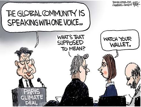
While the Pope accuses us with the Sin of Emissions, we counter with the Sins of Omissions by him and his fellow activists.

Let’s consider the Stiglitz brief according to the three suppositions comprising the Climatist (Activists and Alarmists) position. Climate change is a bundle that depends on all three assertions to be true.

Supposition 1: Humans make the climate warmer.

As an economist, Stiglitz defers to the IPCC on this scientific point, with references to reports by those deeply involved and committed to Paris Accord and other UN climate programs. In the recent California District Court case (Cities suing Big Oil companies), both sides in a similar vein stipulated their acceptance of IPCC reports as authoritative regarding global warming/climate change.

Skeptical observers must attend to the nuances of what is referenced and what is hidden or omitted in these testimonies. For example, Chevron’s attorney noted that IPCC’s reports express various opinions over time as to human influence on the climate. They noted that even today, the expected temperature effect from doubling CO2 ranges widely from 1.5C to 4.5C. No mention is made that several more recent estimates from empirical data (rather than GCMs) are at the low end or lower.

metofffig3iIn addition, there is no mention that GCMs projections are running about twice as hot as observations. Omitted is the fact GCMs correctly replicate tropospheric temperature observations only when CO2 warming is turned off. In the effort to proclaim scientific certainty, neither Stiglitz nor IPCC discuss the lack of warming since the 1998 El Nino, despite two additional El Ninos in 2010 and 2016.

Figure 5. Simplification of IPCC AR5 shown above in Fig. 4. The colored lines represent the range of results for the models and observations. The trends here represent trends at different levels of the tropical atmosphere from the surface up to 50,000 ft. The gray lines are the bounds for the range of observations, the blue for the range of IPCC model results without extra GHGs and the red for IPCC model results with extra GHGs.The key point displayed is the lack of overlap between the GHG model results (red) and the observations (gray). The nonGHG model runs (blue) overlap the observations almost completely.

Further they exclude comparisons between fossil fuel consumption and temperature changes. The legal methodology for discerning causation regarding work environments or medicine side effects insists that the correlation be strong and consistent over time, and there be no confounding additional factors. As long as there is another equally or more likely explanation for a set of facts, the claimed causation is unproven. Such is the null hypothesis in legal terms: Things happen for many reasons unless you can prove one reason is dominant.

Finally, Stiglitz and IPCC are picking on the wrong molecule. The climate is controlled not by CO2 but by H20. Oceans make climate through the massive movement of energy involved in water’s phase changes from solid to liquid to gas and back again. From those heat transfers come all that we call weather and climate: Clouds, Snow, Rain, Winds, and Storms.

Esteemed climate scientist Richard Lindzen ended a very fine recent presentation with this description of the climate system:

I haven’t spent much time on the details of the science, but there is one thing that should spark skepticism in any intelligent reader. The system we are looking at consists in two turbulent fluids interacting with each other. They are on a rotating planet that is differentially heated by the sun. A vital constituent of the atmospheric component is water in the liquid, solid and vapor phases, and the changes in phase have vast energetic ramifications. The energy budget of this system involves the absorption and reemission of about 200 watts per square meter. Doubling CO2 involves a 2% perturbation to this budget. So do minor changes in clouds and other features, and such changes are common. In this complex multifactor system, what is the likelihood of the climate (which, itself, consists in many variables and not just globally averaged temperature anomaly) is controlled by this 2% perturbation in a single variable? Believing this is pretty close to believing in magic. Instead, you are told that it is believing in ‘science.’ Such a claim should be a tip-off that something is amiss. After all, science is a mode of inquiry rather than a belief structure.

Supposition 2: The Warming is Dangerous

Billions of dollars have been spent researching any and all negative effects from a warming world: Everything from Acne to Zika virus. Stiglitz links to a recent Climate Report that repeats the usual litany of calamities to be feared and avoided by submitting to IPCC demands. The evidence does not support these claims.

Stiglitz: It is scientifically established that human activities produce GHG emissions, which accumulate in the atmosphere and the oceans, resulting in warming of Earth’s surface and the oceans, acidification of the oceans, increased variability of climate, with a higher incidence of extreme weather events, and other changes in the climate.

Moreover, leading experts believe that there is already more than enough excess heat in the climate system to do severe damage and that 2C of warming would have very significant adverse effects, including resulting in multi-meter sea level rise.

Experts have observed an increased incidence of climate-related extreme weather events, including increased frequency and intensity of extreme heat and heavy precipitation events and more severe droughts and associated heatwaves. Experts have also observed an increased incidence of large forest fires; and reduced snowpack affecting water resources in the western U.S. The most recent National Climate Assessment projects these climate impacts will continue to worsen in the future as global temperatures increase.

Alarming Weather and Wildfires

But: Weather is not more extreme.
And Wildfires were worse in the past.
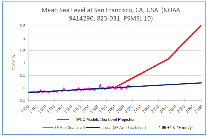
But: Sea Level Rise is not accelerating.
Litany of Changes

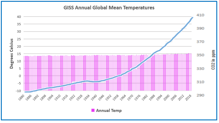
Seven of the ten hottest years on record have occurred within the last decade; wildfires are at an all-time high, while Arctic Sea ice is rapidly diminishing.

We are seeing one-in-a-thousand-year floods with astonishing frequency.

When it rains really hard, it’s harder than ever.

We’re seeing glaciers melting, sea level rising.

The length and the intensity of heatwaves has gone up dramatically.

Plants and trees are flowering earlier in the year. Birds are moving polewards.

We’re seeing more intense storms.

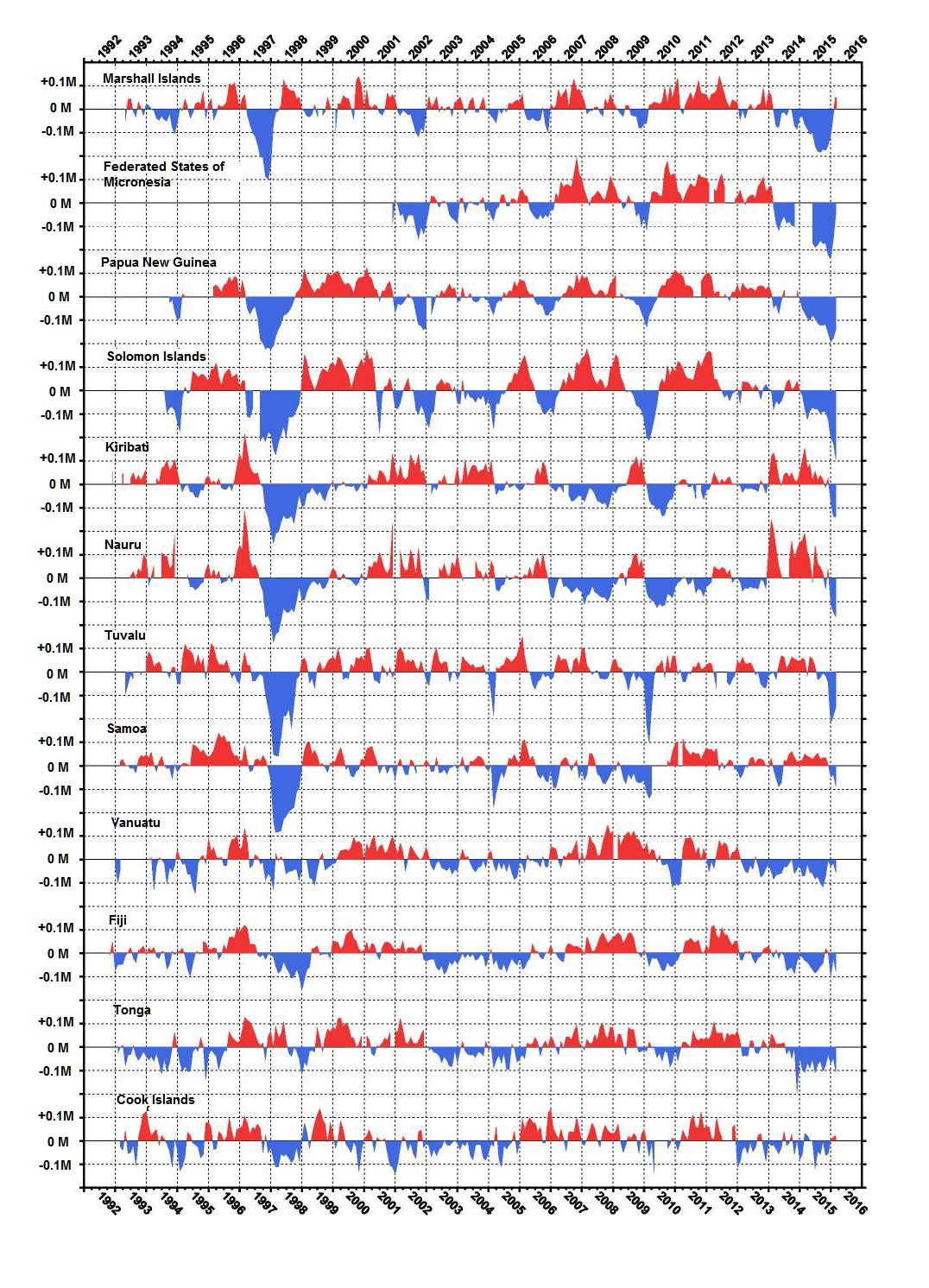
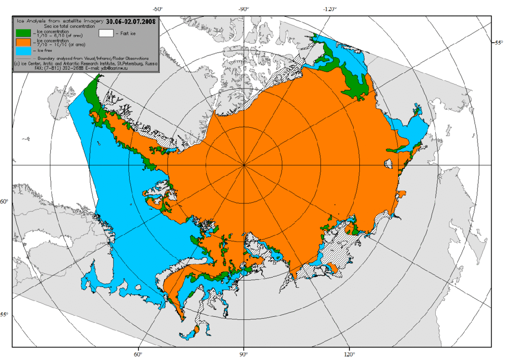
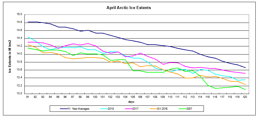
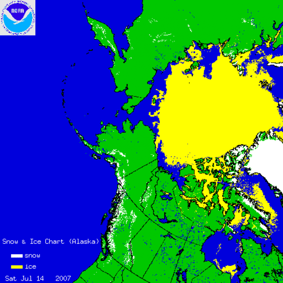
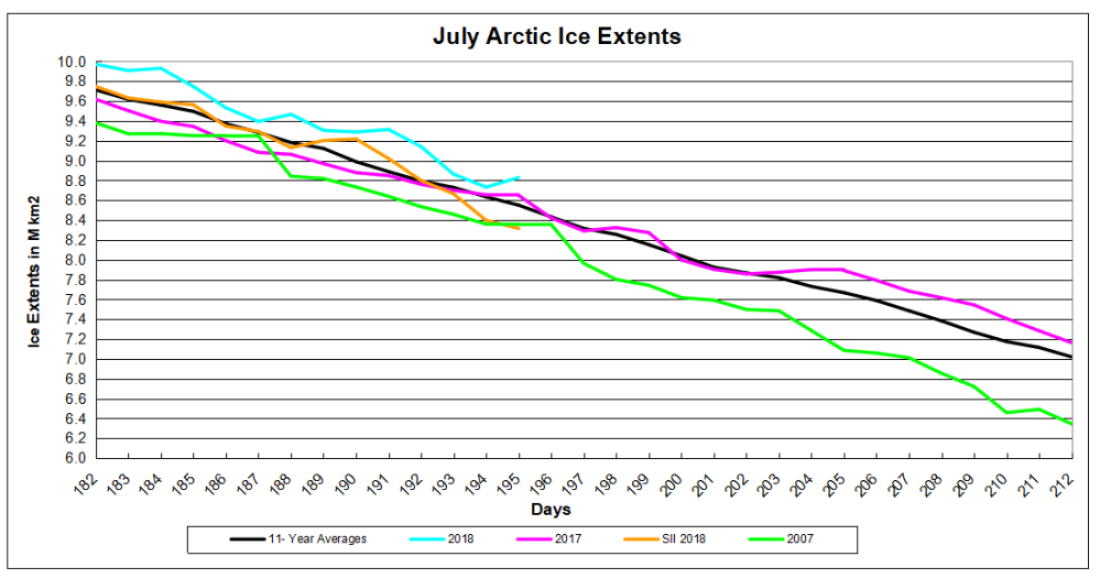
But: Arctic Ice has not declined since 2007.Sept Arctic ice 2007 to 2019 full

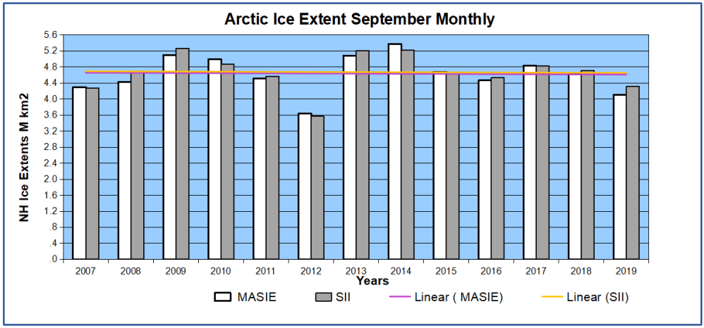
But: All of these are within the range of past variability.

US Wet Dry CO2rev

In fact our climate is remarkably stable.

GISS GMT to 2018 w CO2

And many aspects follow quasi-60 year cycles.

Climate is Changing the Weather

Stiglitz:  Other potential examples include agricultural losses. Whether or not insurance
reimburses farmers for their crops, there can be food shortages that lead to higher food
prices (that will be borne by consumers, that is, Youth Plaintiffs and Affected Children).
There is a further risk that as our climate and land use pattern changes, disease vectors
may also move (e.g., diseases formerly only in tropical climates move northward).36 This
could lead to material increases in public health costs

But: Actual climate zones are local and regional in scope, and they show little boundary change.


But: Ice cores show that it was warmer in the past, not due to humans.

Supposition 3:  Government Can Stop it!

Here it is blithely assumed that the court can rule the seas to stop rising, heat waves to cease, and Arctic ice to grow (though why we would want that is debatable).  All this will be achieved by leaving fossil fuels in the ground and powering civilization with windmills and solar panels.  While admitting that our way of life depends on fossil fuels, they ignore the inadequacy of renewable energy sources at their present immaturity.

Stiglitz: Conclusion
The choice between incurring manageable costs now and the incalculable, perhaps even
irreparable, burden Youth Plaintiffs and Affected Children will face if Defendants fail to
rapidly transition to a non-fossil fuel economy is clear. While the full costs of the climate damages that would result from maintaining a fossil fuel-based economy may be
incalculable, there is already ample evidence concerning the lower bound of such costs,
and with these minimum estimates, it is already clear that the cost of transitioning to a
low/no carbon economy are far less than the benefits of such a transition. No rational
calculus could come to an alternative conclusion. Defendants must act with all deliberate
speed and immediately cease the subsidization of fossil fuels and any new fossil fuel
projects, and implement policies to rapidly transition the U.S. economy away from fossil
fuels.

But CO2 relation to Temperature is Inconsistent.

But: The planet is greener because of rising CO2.

But: Modern nations (G20) depend on fossil fuels for nearly 90% of their energy.

But: Renewables are not ready for prime time.

People need to know that adding renewables to an electrical grid presents both technical and economic challenges.  Experience shows that adding intermittent power more than 10% of the baseload makes precarious the reliability of the supply.  South Australia is demonstrating this with a series of blackouts when the grid cannot be balanced.  Germany got to a higher % by dumping its excess renewable generation onto neighboring countries until the EU finally woke up and stopped them. Texas got up to 29% by dumping onto neighboring states, and some like Georgia are having problems.

But more dangerous is the way renewables destroy the economics of electrical power.  Seasoned energy analyst Gail Tverberg writes:

In fact, I have come to the rather astounding conclusion that even if wind turbines and solar PV could be built at zero cost, it would not make sense to continue to add them to the electric grid in the absence of very much better and cheaper electricity storage than we have today. There are too many costs outside building the devices themselves. It is these secondary costs that are problematic. Also, the presence of intermittent electricity disrupts competitive prices, leading to electricity prices that are far too low for other electricity providers, including those providing electricity using nuclear or natural gas. The tiny contribution of wind and solar to grid electricity cannot make up for the loss of more traditional electricity sources due to low prices.

These issues are discussed in more detail in the post Climateers Tilting at Windmills

Footnote regarding mention of “multi-meter” sea level rise.  It is all done with computer models.  For example, below is San Francisco.  More at USCS Warnings of Coastal Floodings

sf-ca-past-projected

dilbert-sins-of-omission-and-comission

June 2018 Ocean SSTs Resume Cooling

globpop
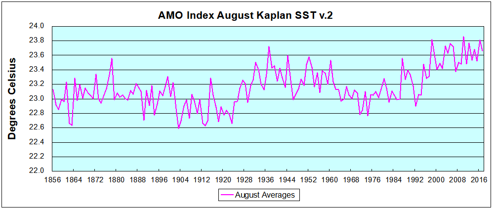
The best context for understanding decadal temperature changes comes from the world’s sea surface temperatures (SST), for several reasons:

  • The ocean covers 71% of the globe and drives average temperatures;
  • SSTs have a constant water content, (unlike air temperatures), so give a better reading of heat content variations;
  • A major El Nino was the dominant climate feature in recent years.

HadSST is generally regarded as the best of the global SST data sets, and so the temperature story here comes from that source, the latest version being HadSST3.  More on what distinguishes HadSST3 from other SST products at the end.

The Current Context

The chart below shows SST monthly anomalies as reported in HadSST3 starting in 2015 through June 2018.

Hadsst062018

A global cooling pattern has persisted, seen clearly in the Tropics since its peak in 2016, joined by NH and SH dropping since last August. Upward bumps occurred last October, in January and again in March and April 2018.  Five months of 2018 now show slight warming since the low point of December 2017, led by steadily rising NH. Since 4/2018 SH and Tropics cooled slightly while NH pulled the Global anomaly upwards. Now in June 2018  lower temps in SH and Tropics more than offset NH warming.

2018 is the coolest June since 2013 in all regions: Global, NH, SH and Tropics.

Note that higher temps in 2015 and 2016 were first of all due to a sharp rise in Tropical SST, beginning in March 2015, peaking in January 2016, and steadily declining back below its beginning level. Secondly, the Northern Hemisphere added three bumps on the shoulders of Tropical warming, with peaks in August of each year. Also, note that the global release of heat was not dramatic, due to the Southern Hemisphere offsetting the Northern one.

With ocean temps positioned the same as three years ago, we can only wait and see whether the previous cycle will repeat or something different appears.  As the analysis belows shows, the North Atlantic has been the wild card bringing warming this decade, and cooling will depend upon a phase shift in that region.

A longer view of SSTs

The graph below  is noisy, but the density is needed to see the seasonal patterns in the oceanic fluctuations.  Previous posts focused on the rise and fall of the last El Nino starting in 2015.  This post adds a longer view, encompassing the significant 1998 El Nino and since.  The color schemes are retained for Global, Tropics, NH and SH anomalies.  Despite the longer time frame, I have kept the monthly data (rather than yearly averages) because of interesting shifts between January and July.

Hadsst1995to062018

Open image in new tab to enlarge.

1995 is a reasonable starting point prior to the first El Nino.  The sharp Tropical rise peaking in 1998 is dominant in the record, starting Jan. ’97 to pull up SSTs uniformly before returning to the same level Jan. ’99.  For the next 2 years, the Tropics stayed down, and the world’s oceans held steady around 0.2C above 1961 to 1990 average.

Then comes a steady rise over two years to a lesser peak Jan. 2003, but again uniformly pulling all oceans up around 0.4C.  Something changes at this point, with more hemispheric divergence than before. Over the 4 years until Jan 2007, the Tropics go through ups and downs, NH a series of ups and SH mostly downs.  As a result the Global average fluctuates around that same 0.4C, which also turns out to be the average for the entire record since 1995.

2007 stands out with a sharp drop in temperatures so that Jan.08 matches the low in Jan. ’99, but starting from a lower high. The oceans all decline as well, until temps build peaking in 2010.

Now again a different pattern appears.  The Tropics cool sharply to Jan 11, then rise steadily for 4 years to Jan 15, at which point the most recent major El Nino takes off.  But this time in contrast to ’97-’99, the Northern Hemisphere produces peaks every summer pulling up the Global average.  In fact, these NH peaks appear every July starting in 2003, growing stronger to produce 3 massive highs in 2014, 15 and 16, with July 2017 only slightly lower.  Note also that starting in 2014 SH plays a moderating role, offsetting the NH warming pulses. (Note: these are high anomalies on top of the highest absolute temps in the NH.)

What to make of all this? The patterns suggest that in addition to El Ninos in the Pacific driving the Tropic SSTs, something else is going on in the NH.  The obvious culprit is the North Atlantic, since I have seen this sort of pulsing before.  After reading some papers by David Dilley, I confirmed his observation of Atlantic pulses into the Arctic every 8 to 10 years as shown by this graph:

The data is annual averages of absolute SSTs measured in the North Atlantic.  The significance of the pulses for weather forecasting is discussed in AMO: Atlantic Climate Pulse

But the peaks coming nearly every July in HadSST require a different picture.  Let’s look at August, the hottest month in the North Atlantic from the Kaplan dataset.Now the regime shift appears clearly. Starting with 2003, seven times the August average has exceeded 23.6C, a level that prior to ’98 registered only once before, in 1937.  And other recent years were all greater than 23.4C.

Summary

The oceans are driving the warming this century.  SSTs took a step up with the 1998 El Nino and have stayed there with help from the North Atlantic, and more recently the Pacific northern “Blob.”  The ocean surfaces are releasing a lot of energy, warming the air, but eventually will have a cooling effect.  The decline after 1937 was rapid by comparison, so one wonders: How long can the oceans keep this up?

To paraphrase the wheel of fortune carnival barker:  “Down and down she goes, where she stops nobody knows.”  As recent months show, nature moves in cycles, not straight lines, and human forecasts and projections are tenuous at best.

einsteinalbert-integratesempirically800px

Postscript:

In the most recent GWPF 2017 State of the Climate report, Dr. Humlum made this observation:

“It is instructive to consider the variation of the annual change rate of atmospheric CO2 together with the annual change rates for the global air temperature and global sea surface temperature (Figure 16). All three change rates clearly vary in concert, but with sea surface temperature rates leading the global temperature rates by a few months and atmospheric CO2 rates lagging 11–12 months behind the sea surface temperature rates.”

Footnote: Why Rely on HadSST3

HadSST3 is distinguished from other SST products because HadCRU (Hadley Climatic Research Unit) does not engage in SST interpolation, i.e. infilling estimated anomalies into grid cells lacking sufficient sampling in a given month. From reading the documentation and from queries to Met Office, this is their procedure.

HadSST3 imports data from gridcells containing ocean, excluding land cells. From past records, they have calculated daily and monthly average readings for each grid cell for the period 1961 to 1990. Those temperatures form the baseline from which anomalies are calculated.

In a given month, each gridcell with sufficient sampling is averaged for the month and then the baseline value for that cell and that month is subtracted, resulting in the monthly anomaly for that cell. All cells with monthly anomalies are averaged to produce global, hemispheric and tropical anomalies for the month, based on the cells in those locations. For example, Tropics averages include ocean grid cells lying between latitudes 20N and 20S.

Gridcells lacking sufficient sampling that month are left out of the averaging, and the uncertainty from such missing data is estimated. IMO that is more reasonable than inventing data to infill. And it seems that the Global Drifter Array displayed in the top image is providing more uniform coverage of the oceans than in the past.

uss-pearl-harbor-deploys-global-drifter-buoys-in-pacific-ocean

USS Pearl Harbor deploys Global Drifter Buoys in Pacific Ocean


Islands Adapting to Change: Tuvalu

H/T Brett Keane for pointing to research by Paul Kench regarding viability of Pacific islands. Paul S. Kench, Murray R. Ford & Susan D. Owen published: 09 February 2018 Patterns of island change and persistence offer alternate adaptation pathways for atoll nations Excerpts in italics with my bolds.

Sea-level rise and climatic change threaten the existence of atoll nations. Inundation and erosion are expected to render islands uninhabitable over the next century, forcing human migration. Here we present analysis of shoreline change in all 101 islands in the Pacific atoll nation of Tuvalu. Using remotely sensed data, change is analysed over the past four decades, a period when local sea level has risen at twice the global average (~3.90 ± 0.4 mm.yr−1). Results highlight a net increase in land area in Tuvalu of 73.5 ha (2.9%), despite sea-level rise, and land area increase in eight of nine atolls. Island change has lacked uniformity with 74% increasing and 27% decreasing in size. Results challenge perceptions of island loss, showing islands are dynamic features that will persist as sites for habitation over the next century, presenting alternate opportunities for adaptation that embrace the heterogeneity of island types and their dynamics.

Examples of island change and dynamics in Tuvalu from 1971 to 2014. a Nanumaga reef platform island (301 ha) increased in area 4.7 ha (1.6%) and remained stable on its reef platform. b Fangaia island (22.4 ha), Nukulaelae atoll, increased in area 3.1 ha (13.7%) and remained stable on reef rim. c Fenualango island (14.1 ha), Nukulaelae atoll rim, increased in area 2.3 ha (16%). Note smaller island on left Teafuafatu (0.29 ha), which reduced in area 0.15 ha (49%) and had significant lagoonward movement. d Two smaller reef islands on Nukulaelae reef rim. Tapuaelani island, (0.19 ha) top left, increased in area 0.21 ha (113%) and migrated lagoonward. Kalilaia island, (0.52 ha) bottom right, reduced in area 0.45 ha (85%) migrating substantially lagoonward. e Teafuone island (1.37 ha) Nukufetau atoll, increased in area 0.04 ha (3%). Note lateral migration of island along reef platform. Yellow lines represent the 1971 shoreline, blue lines represent the 1984 shoreline, green lines represent the 2006 shoreline and red lines represent the 2014 shoreline. Images ©2017 DigitalGlobe Inc.

Under these environmental scenarios, conjectures of habitability and mobility become entwined and have driven an urgency in socio-political discourse about atoll nation futures and human security. Strategies for adaptation to changing biophysical conditions are coupled with narratives of environmentally determined exodus. Such persistent messages have normalised island loss and undermined robust and sustainable adaptive planning in small island nations. In their place are adaptive responses characterised by in-place solutions, seeking to defend the line and include solutions such as reclamation and seawalls, potentially reinforcing maladaptive practices. Notwithstanding the maladaptive outcomes of such approaches, such dialogues present a binary of stay and defend the line or eventual displacement. There is limited space within these constructs to reflect on possibilities that a heterogeneous archipelago (size, number and dynamics of islands) may offer in terms of sustained habitability, beyond the historic imprint of colonial agendas and entrenched land tenure systems that may constrain novel adaptation responses at the national scale.

Summary data of physical island change of islands in Tuvalu between 1971 and 2014. a Absolute changes in island area in hectares with respect to island size. b Percentage change in islands per decade with respect to island size. Raw data contained in Supplementary Data 1. Note: square symbols denote reef platform islands; solid circles denote atoll rim islands; and light blue circles enclosing symbols denote populated islands

We argue that indeed there are a more nuanced set of options to be explored to support adaptation in atoll states. Existing paradigms are based on flawed assumptions that islands are static landforms, which will simply drown as the sea level rises4,23. There is growing evidence that islands are geologically dynamic features that will adjust to changing sea level and climatic conditions. However, such studies have typically examined a limited number of islands within atoll nations, and not provided forward trajectories of land availability, thereby limiting the findings for broader adaptation considerations. Furthermore, the existing range of adaptive solutions are narrowly constrained and do not reflect the inherent physical heterogeneity and dynamics of archipelagic systems.


Here we present the first comprehensive national-scale analysis of the transformation in physical land resources of the Pacific atoll nation Tuvalu, situated in the central western Pacific (Supplementary Note 1). Comprising 9 atolls and 101 individual reef islands, the nation is home to 10,600 people, 50% of whom are located on the urban island of Fogafale, in Funafuti atoll. We specifically examine spatial differences in island behaviour, of all 101 islands in Tuvalu, over the past four decades (1971–2014), a period in which local sea level has risen at twice the global average (Supplementary Note 2). Surprisingly, we show that all islands have changed and that the dominant mode of change has been island expansion, which has increased the land area of the nation. Results are used to project future landform availability and consider opportunities for a vastly more nuanced and creative set of adaptation pathways for atoll nations.

EU Seeks “Populist-Proof” Carbon Reductions

Polish coal miners protest against liquidation of Polish coal mines.

The story July 10, 2018 by Sonja van Renssen EU wants new climate policy to be “populism-proof” [EPW] Excerpts from energypost, who like the idea, with my bolds.

van Renssen: No new targets, gas is in, jobs and growth are key: the EU is designing a new climate and energy strategy for the coming decades that must reflect a new EU identity post-Brexit – and must drive economic opportunity to ensure it is “populism-proof”.

Brussels is usually deserted in summer. The institutions shut down and everyone takes a break. This year, there are two big energy projects that will keep some people busy however.

First, the Austrian EU Presidency, which took over from Bulgaria on 1 July, will lead technical talks on a new electricity market design for Europe. This is part of the EU’s Clean Energy Package. With new laws on renewables, energy efficiency and governance concluded last month, market design is the Package’s last outstanding file. Austria wants to wrap it – and therefore the EU’s climate and energy framework fror 2030 – up by the end of the year.

It organised a first “trilogue” or negotiating session between Member States, the European Parliament and the European Commission on 27 June. This was basically a “meet and greet” session. Work will now get underway at a technical level over the summer ahead of a second trilogue scheduled for 11 September.

The second big topic this summer is a new EU climate and energy strategy for 2050. European heads of state and government called for it by next spring; the European Commission aims to deliver it by November. It is holding a big two-day stakeholder conference on it in Brussels on 10-11 July – in a room big enough for 1000 people, an official said (see programme).

Next week, the Commission will launch a 3-month public consultation on the strategy, ensuring that stakeholders as well as officials are kept busy over the summer months…

Update: Climate Change Theater


Today we can see again a post discussing Chantal Bilodeau’s theatrical productions concerning warming in Arctic Canada.  At Pacific Standard is today’s article  Chantal Bilodeau Brings Climate Change to the Theater.   Thus I am reposting my previous efforts to find scientific validation for the concerns expressed in her plays, and indeed by residents on Nunavut.

Nunavut is Melting! Or not.

From Yale Climate Connections we heard last week about Nunavut melting and a theatrical production to spread news and concerns about this dangerous development.

“I come from a place of rugged mountains, imperial glaciers and tender-covered permafrost. But Nunavut, our land, is only as rich as it is cold, and today most of it is melting.”That’s Chantal Bilodeau, reading a passage from “Sila,” a play about the effects of climate change in the Arctic.

The characters in her play include polar bears, an Inuit goddess, scientists, and coast guard officers – all working together to save their land.

No doubt her personal experience and feelings for her Nunavut are sincere and profound. (Originally I thought it was her homeland, but in fact she is a New York playwright and translator, born in Montreal.) And there will be a large audience receptive to her concerns about global warming. (Bilodeau has writen six plays about the Arctic and founded the international network Artists And Climate Change.) But I wonder if scientific measurements support her belief that Nunavut is melting.

After all, we have learned from medical research that individual life experiences (anecdotes) may not be true more generally. That is why drugs are tested on population samples with double-blind studies: neither the patient nor the doctor knows who gets the medicine and who gets the placebo.  And when it comes to climate change, every weather event is proclaimed as man made global warming rearing its ugly head.

So I went looking for weather station records to see what is the warming trend in that region. As curiosity does so often, it led me on a journey of discovery, learning some new things, and relearning old ones with fresh implications.

Where are temperatures measured in Nunavut?

It is by far the Northernmost territory of Canada, just off the coast of Northern Greenland.

According to Environment Canada, weather is reported at 29 places in Nunavut. So I went to look at the record at Iqaluit, the capital of the territory. You get monthly normals for the period 1981 to 2010. Historical data (daily averages) can be accessed only 1 individual month/year at a time, the menu stops at 2004. Even then, some months are filled with “M” for missing. Historical data from which trends can be analyzed is hard to come by.

Disappearing Weather Records

It turns out that Nunavut also suffered from the great purging of weather station records that was noticed by skeptics years ago.

Graph showing the correlation between Global Mean Temperature (Average T) and the number of stations included in the global database. Source: Ross McKitrick, U of Guelph

I was aware of this because of a recent study looking at trends at stations around the Arctic circle. Arctic Warming Unalarming.  That study included graphs that showed the dramatic removal of station records in the North.  Though the depletion was not limited to the far North, many Canadian and Russian records disappeared from the global database.

arctic-europe-paper-2015_fig6annual

Fig. 6 Temperature change for annual Arctic averages relative to the temperature during 1961 to 1990 for stations in Europe having more than 150 years of observations. The red curve is the moving 5-year average while the blue curve shows the number of stations reporting in each year. 118 stations contributed to the study. W. A. van Wijngaarden, Theoretical & Applied Climatology (2015)

Eureka, Nunavut, Canada “Last Station above latitude 65N”

Eureka got considerable attention in 2010 due to its surviving the dying out of weather stations. The phrase in quotes above reflects an observation that GISS uses Eureka data to infill across the whole Arctic Circle. That single station record is hugely magnified in its global impact in that temperature reconstruction product. Somewhat like the influence of a single tree in Yamal upon the infamous hockey stick graph.

The first High Arctic Weather Station in history, Eureka was established in April 1947 at 80-degrees north latitude in the vicinity of two rivers, which provided fresh water to the six-man United States Army Air Force team that parachuted in. They erected Jamesway huts to shelter themselves and their equipment until August, when an icebreaker reached Eureka – as it has every year since – and brought permanent buildings and supplies. For decades after that, small, all-male crews would hunker down for entire winters, going a little stir-crazy from the isolation. WUWT 2010

GHCN Records for Nunavut

It turns out that in addition to Eureka, GCHN has data for Alert and Clyde (River), but the latter two histories end in 2004 and 2010, respectively. The adjusted files have a few differences in details, but little change from the unadjusted files. The chart below shows the temperatures measured at Eureka, Nunavut, Canada 79° 98’ N, 85° 93’ W.  The other two stations tell the same story as Eureka, though temperatures at Clyde are warmer in absolute terms due to its more Southerly location.

Eureka temps4

The chart shows Annual, July and January averages along with the lifetime averages of Eureka station from 1948 through 2015.  There is slight variability, and a few years higher than average, but nothing alarming or even enough for people to sense any change.  Note also that annual averages are well below freezing, because only 3 months are above 0° C.  I suppose that someone could play with anomalies and generate a chart that looked scary, but the numbers in the record do not support fears of global warming and melting in Nunavut.

Conclusion

Once again we see media announcements that confuse subjective beliefs with empirical observations of objective reality.  And unfortunately, those observations are less and less available to counter the herd instincts of fearing the future and blaming someone.

Footnote

The map at the top shows how crucial is Nunavut to the Polar Ocean Challenge.  If the Northabout  successfuly negotiates the Northern Sea Route (the Russian side), they then must pass from Beaufort Sea through the Parry Channel (or alternative passages) to get to Baffin Bay.  Laptev is the first hurdle, and Nunavut is the last one.

Updated: Pacific Sea Level Data


PSLMPThis post is about the SEAFRAME network measuring sea levels in the Pacific, and about the difficulty to discern multi-decadal trends of rising or accelerating sea levels as evidence of climate change.

Update July 9, 2018

Asked a question today about sea levels and Pacific islands, I referred to this article.  Realizing it was posted 2 years ago, it seemed important to check the most recent project report.  Thus at the bottom there are now results through May 2018.

Update May 10 below, regarding recent Solomon Islands news

Pacific Sea Level Monitoring Network

The PSLM project was established in response to concerns voiced by Pacific Island countries about the potential effects of climate change. The project aims to provide an accurate long-term record of sea levels in the area for partner countries and the international scientific community, and enable the former to make informed decisions about managing their coastal environments and resources.

In 1991, the National Tidal Facility (NTF) of the Flinders University of South Australia was awarded the contract to undertake the management of the project.  Between July 1991 and December 2000 sea level and meteorological monitoring stations were installed at 11 sites. Between 2001 and 2005 another station was established in the Federated States of Micronesia and continuous global positioning systems (CGPS) were installed in numerous locations to monitor the islands’ vertical movements.

The 14 Pacific Island countries now participating in the project provide a wide coverage across the Pacific Basin: the Cook Islands, Federated States of Micronesia, Fiji, Kiribati, Marshall Islands, Nauru, Niue, Palau, Papua New Guinea, Samoa, Solomon Islands, Tonga, Tuvalu and Vanuatu.

SPSLCM_2008_4_data_report_Image_11

Each of these SEA Level Fine Resolution Acoustic Measuring Equipment (SEAFRAME) stations in the Pacific region are continuously monitoring the Sea Level, Wind Speed and Direction, Wind Gust, Air and Water Temperatures and Atmospheric Pressure.

In addition to its system of tide gauge facilities, the Pacific Sea-Level Monitoring Network also includes a network of earth monitoring stations for geodetic observations, implemented and maintained by Geoscience Australia. The earth monitoring installations provide Global Navigation Satellite System (GNSS) measurements to allow absolute determination of the vertical height of the tide gauges that measure sea level.

Sea Level Datasets from PSLM

Data and reports are here.

Monthly reports are detailed and informative. At each station water levels are measured every six minutes in order to calculate daily maxs, mins and means, as a basis for monthly averages. So the daily mean sea level value is averaged from 240 readings, and the daily min and max are single readings taken from the 240.


untitled

A typical monthly graph appears above. It shows how tides for these stations range between 1 to 3 meters daily, as well variations during the month.

According to the calibrations, measurement errors are in the range of +/- 1 mm. Vertical movement of the land is monitored relative to a GPS benchmark. So far, land movement at these stations has also been within the +/- 1 mm range (with one exception related to an earthquake).

The PSLM Record

March SL range

In the Monthly reports are graphs showing results of six minute observations, indicating tidal movements daily over the course of a month.The chart above shows how sea level varied in each location during March 2016 compared to long term March results. Since many stations were installed in 1993, long term means about 22 years of history.

This dataset for Pacific Sea Level Monitoring provides a realistic context for interpreting studies claiming sea level trends and/or acceleration of such trends. Of course, one can draw a line through any scatter of datapoints and assert the existence of a trend. And the error ranges above allow for annual changes of a few mm to be meaningful. Here is a table produced in just that way.

Location Installation date Sea-level trend (mm/yr)
Cook Islands Feb 2003 +5.5
Federated States of Micronesia Dec 2001 +17.7
Fiji Oct 1992 +2.9
Kiribati Dec 1992 +2.9
Marshall Islands May 1993 +5.2
Nauru Jul 1993 +3.6
Papua New Guinea Sept 1994 +8.0
Samoa Feb 1993 +6.9
Solomon Islands Jul 1994 +7.7
Tonga Jan 1993 +8.6
Tuvalu Mar 1993 +4.1
Vanuatu Jan 1993 +5.3

The rising trends range from 2.9 to 8.6 mm/year (FSM is too short to be meaningful).

Looking into the details of the monthly anomalies, it is clear that sea level changes at the mm level are swamped by volatility of movements greater by orders of magnitude.  And there are obvious effects from ENSO events. The 1997-98 El Nino shows up in a dramatic fall of sea levels almost everywhere, and that event alone creates most of the rising trends in the table above.  The 2014-2016 El Nino is also causing sea levels to fall, but is too recent to affect the long term trend.

Picture17revUpdate July 9, 2018

Here are the sea level records updated to May 2018.

Pacific Sea Levels May 2018

The records are dominated by two Major El Nino events in 1997-8 and 2015-6.  When Westerly winds pick up, warm surface water is pushed from western (Asian) Pacific toward eastern (American) Pacific.  Thus sea levels decline temporarily during those periods, as seen in the blue deficits in the charts above.  Below the updated sea level trends.
Seaframe trends May 2018
Summary

Sea Level Rise is another metric for climate change that demonstrates the difficulty discerning a small change of a few millimeters in a dataset where tides vary thousands of millimeters every day. And the record is also subject to irregular fluctuations from storms, currents and oceanic oscillations, such as the ENSO.

On page 8 of its monthly reports (here), PSLM project provides this caution regarding the measurements:

The overall rates of movement are updated every month by calculating the linear slope during the tidal analysis of all the data available at individual stations. The rates are relative to the SEAFRAME sensor benchmark, whose movement relative to inland benchmarks is monitored by Geosciences Australia.
Please exercise caution in interpreting the overall rates of movement of sea level – the records are too short to be inferring long-term trends.

A longer record will bring more insight, but even then sea level trends are a very weak signal inside a noisy dataset. Even with state-of-the-art equipment, it is a fool’s errand to discern any acceleration in sea levels, in order to link it to CO2. Such changes are in fractions of millimeters when the measurement error is +/- 1 mm.

For more on the worldwide network of tidal gauges, as well as satellite systems attempting to measure sea level, sea Dave Burton’s excellent website.

May 10 update Regarding recent news about Solomon Islands.

As the charts above show, there is negligible sea level rise in the West Pacific, and receding a bit lately at Solomon Islands.  So it was curious that the media was declaring those islands inundating because of climate change.

Now the real story is coming out (but don’t wait for the retractions)

A new study published in Environmental Research Letters shows that some low-lying reef islands in the Solomon Islands are being gobbled up by “extreme events, seawalls and inappropriate development, rather than sea level rise alone.” Despite headlines claiming that man-made climate change has caused five Islands (out of nearly a thousand) to disappear from rising sea levels, a closer inspection of the study reveals the true cause is natural, and the report’s lead author says many of the headlines have been ‘exaggerated’ to ill-effect.

http://www.examiner.com/article/sinking-solomon-islands-and-climate-link-exaggerated-admits-study-s-author


Ocean Air Temps Keep Cool

Presently sea surface temperatures (SST) are the best available indicator of heat content gained or lost from earth’s climate system.  Enthalpy is the thermodynamic term for total heat content in a system, and humidity differences in air parcels affect enthalpy.  Measuring water temperature directly avoids distorted impressions from air measurements.  In addition, ocean covers 71% of the planet surface and thus dominates surface temperature estimates.  Eventually we will likely have reliable means of recording water temperatures at depth.

Recently, Dr. Ole Humlum reported from his research that air temperatures lag 2-3 months behind changes in SST.  He also observed that changes in CO2 atmospheric concentrations lag behind SST by 11-12 months.  This latter point is addressed in a previous post Who to Blame for Rising CO2?

The June update to HadSST3 will appear later this month, but in the meantime we can look at lower troposphere temperatures (TLT) from UAHv6 which are already posted for June. The temperature record is derived from microwave sounding units (MSU) on board satellites like the one pictured above.

The UAH dataset includes temperature results for air above the oceans, and thus should be most comparable to the SSTs. The graph below shows monthly anomalies for ocean temps since January 2015.

The anomalies are holding close to the same levels as 2015. In June, both the Tropics and SH rose, while NH declined slightly, resulting in a small increase in the Global average of air over oceans. Taking a longer view, we can look at the record since 1995, that year being an ENSO neutral year and thus a reasonable starting point for considering the past two decades.  On that basis we can see the plateau in ocean temps is persisting. Since last October all oceans have cooled, with offsetting bumps up and down.

UAHv6 TLT 
Monthly Ocean
Anomalies
Average Since 1995 Ocean 6/2018
Global 0.13 0.14
NH 0.16 0.28
SH 0.11 0.03
Tropics 0.12 0.11

As of June 2018, global ocean temps are slightly higher than May and close to the average since 1995.  NH remains higher, but not enough to offset much lower temps in SH and  nearly average Tropics (between 20N and 20S latitudes).  Global ocean air temps are matching the last two March temps, but are the lowest June temps since 2012.  Both NH and SH are the lowest June temps since 2014.

The details of UAH ocean temps are provided below.  The monthly data make for a noisy picture, but seasonal fluxes between January and July are important.

Open image in new tab to enlarge.

The greater volatility of the Tropics is evident, leading the oceans through three major El Nino events during this period.  Note also the flat period between 7/1999 and 7/2009.  The 2010 El Nino was erased by La Nina in 2011 and 2012.  Then the record shows a fairly steady rise peaking in 2016, with strong support from warmer NH anomalies, before returning to the 22-year average.

Summary

TLTs include mixing above the oceans and probably some influence from nearby more volatile land temps.  They started the recent cooling later than SSTs from HadSST3, but are now showing the same pattern.  It seems obvious that despite the three El Ninos, their warming has not persisted, and without them it would probably have cooled since 1995.  Of course, the future has not yet been written.


Arctic Ice Persisting in July

AARI072008to2018

In June 2018, Arctic ice extent held up against previous years despite the Pacific basins of Bering and Okhotsk being ice-free.  Now in July when ice extent typically declines, 2018 extents were flat, and now declining slowly.  The Arctic core is showing little change, perhaps due to increased thickness (volume) as reported by DMI.  The image above from AARI shows ice extents first week of July for years 2008 through 2018. (Image format was different for previous years.  In 2018, water is showing typically in Chukchi in July, a bit more than usual in Laptev and less in Beaufort.

The graph below shows how the Arctic extent has faired from mid June to July 7 (yesterday) compared to the 11 year average and to some years of interest.
Arctic day 188Note that 2018  was on average and comparable to other years from Mid June on.  Then recently ice extents have held steady just below 10M km2, while averages and other years declined.  2018 is now 288k km2 above the 11 year average,  400k km2 higher than 2017, and 624k km2 greater than 2007 at this date.   SII 2018 was tracking the same as MASIE in June but is now showing 335k km2 lower.

The table below shows ice extents by regions comparing 2018 with 11-year average (2007 to 2017 inclusive) and 2017 as of day 179.

Region 2018188 Day 179 
Average
2018-Ave. 2007188 2018-2007
 (0) Northern_Hemisphere 9465018 9181173 283844 8841116 623902
 (1) Beaufort_Sea 977561 863028 114533 871601 105960
 (2) Chukchi_Sea 635350 682991 -47641 622583 12767
 (3) East_Siberian_Sea 1037340 996766 40574 855273 182067
 (4) Laptev_Sea 545304 684244 -138941 644539 -99236
 (5) Kara_Sea 568399 477164 91236 523575 44824
 (6) Barents_Sea 54547 88754 -34206 91567 -37020
 (7) Greenland_Sea 353292 477433 -124141 506546 -153254
 (8) Baffin_Bay_Gulf_of_St._Lawrence 592755 393419 199336 411743 181013
 (9) Canadian_Archipelago 778940 756496 22444 752103 26837
 (10) Hudson_Bay 791754 543956 247798 354253 437502
 (11) Central_Arctic 3128568 3203921 -75353 3202400 -73832

2018 is above the 11 year average,  with BCE (Beaufort, Chukchi, East Siberian) higher, Laptev and Kara offsetting.  Barents and Greenland Sea are down, but Baffin and Hudson Bays have larger surpluses.

Footnote: 

Arctic extents are shaped by the three Ws: Water, Wind and Weather.  This video shows how a massive cyclone in 2012 broke up the ice, moved it around and flushed much of it out through the Fram strait.The ice has recovered since then and is now quite thick.