Arctic Ice Locks Up NWP Oct. 16
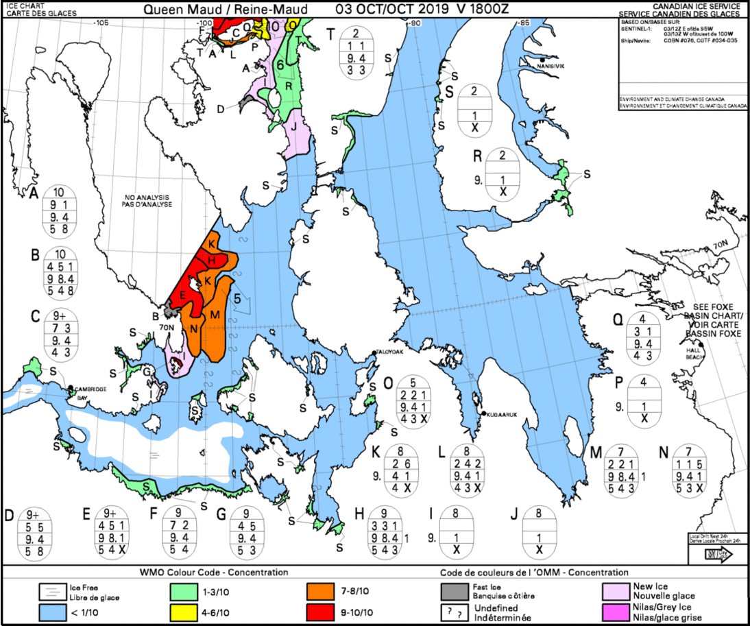
The animation of Canadian ice charts shows the Northwest Passage filling with ice over the last two weeks, choking off the open water. In the top center, ice grows south in Peel Sound closing access from Resolute. Meanwhile in the center left ice is pushing down M’Clintock channel and flling in Victoria Strait. As of yesterday, the two ice masses joined to block the Bellot strait from Fort Ross to the east.
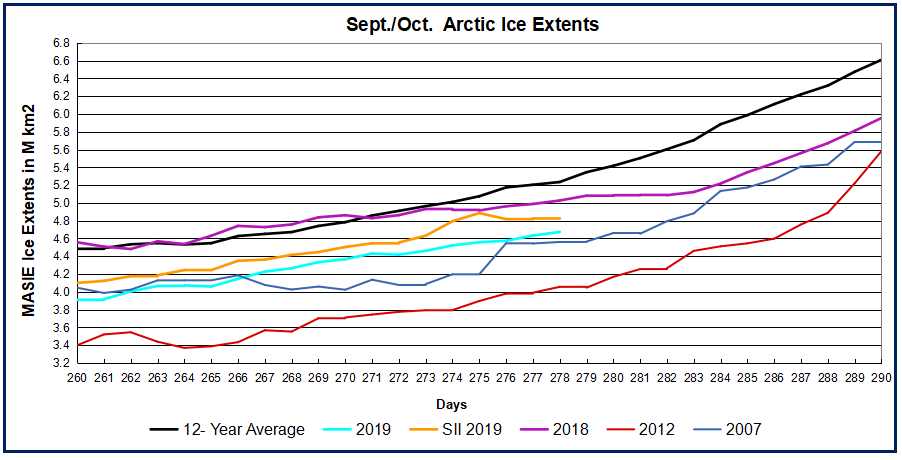
The graph below shows the ice recovery since day 260, the average daily minimum for the year.
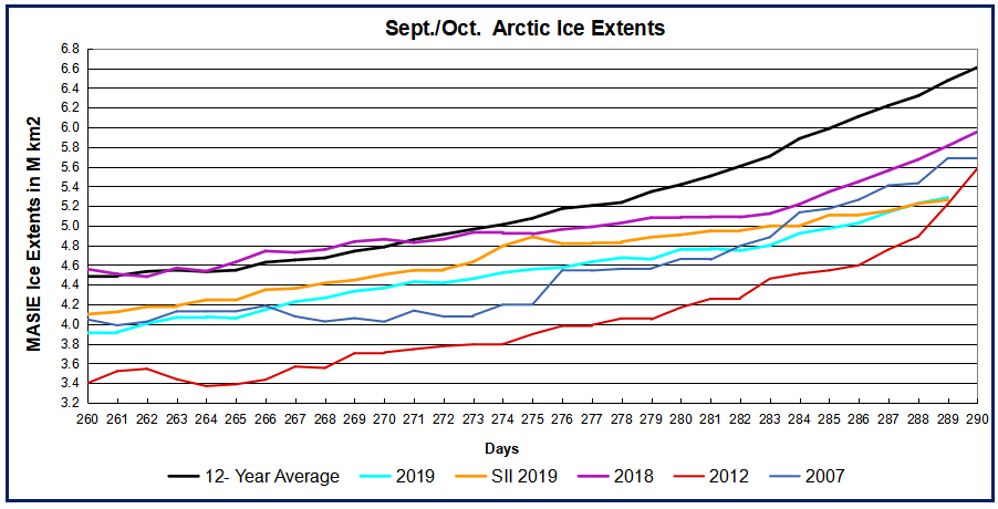
The graph shows the tracks converging while remaining below the 12 year average. Note the average annual minimum is 4.5M km2. While 2019 was well below that on day 260, just two weeks later 2019 ice extent reached the 4.5M km2 level on day 274.
Background on Northwest Passage September 1, 2019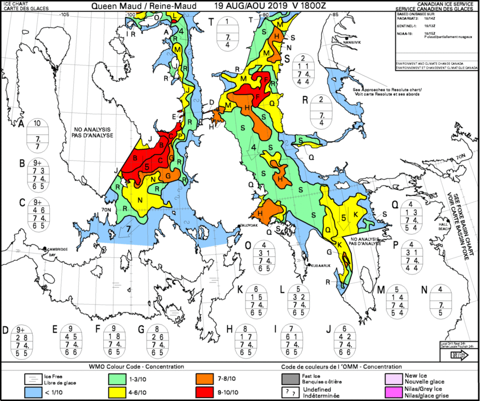
Background information is reprinted later on. Above shows the last two weeks of shifting ice concentrations in the NWP choke point, Queen Maud region. Aug. 19 Prince Regent Inlet, top center was plugged, while Peel Sound, top left opened up and allowed passage. In just a week or so, Prince Regent turned green (<3/10 covered) to blue. At the same time thick ice dissipated in Franklin Strait, center left, opening the way SW. In just the last few days a tongue of thick ice has formed at the extreme top of Peel Sound, obstructing entrance from the north.
Note on the map right edge the reference to Foxe Basin, a body of open water south of Baffin Island. The channel connecting into Gulf of Boothia is blocked most years, but was open in 2016, and passable now. This is an alternate NWP route when Bellot Strait is also open.
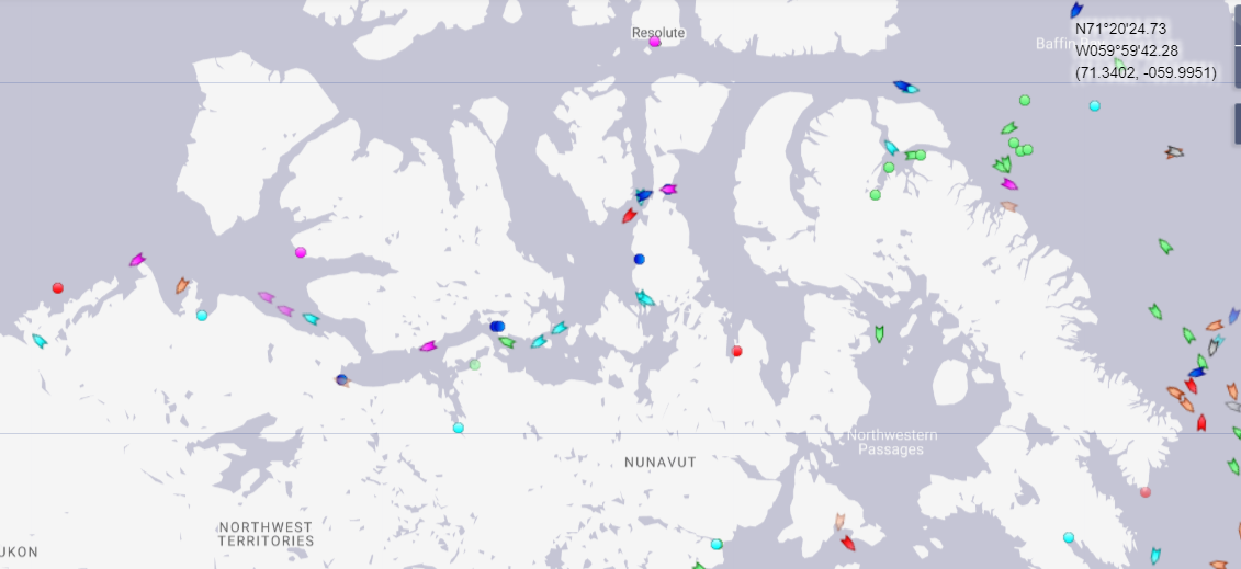
This is today’s map of vessels in the NWP. Cargo ships in green, tugs in cyan, Passenger ships in blue, yachts in purple. Note that Peel Sound was the preferred route earlier, now ships are using Bellot strait.
Less Artic Ice This year
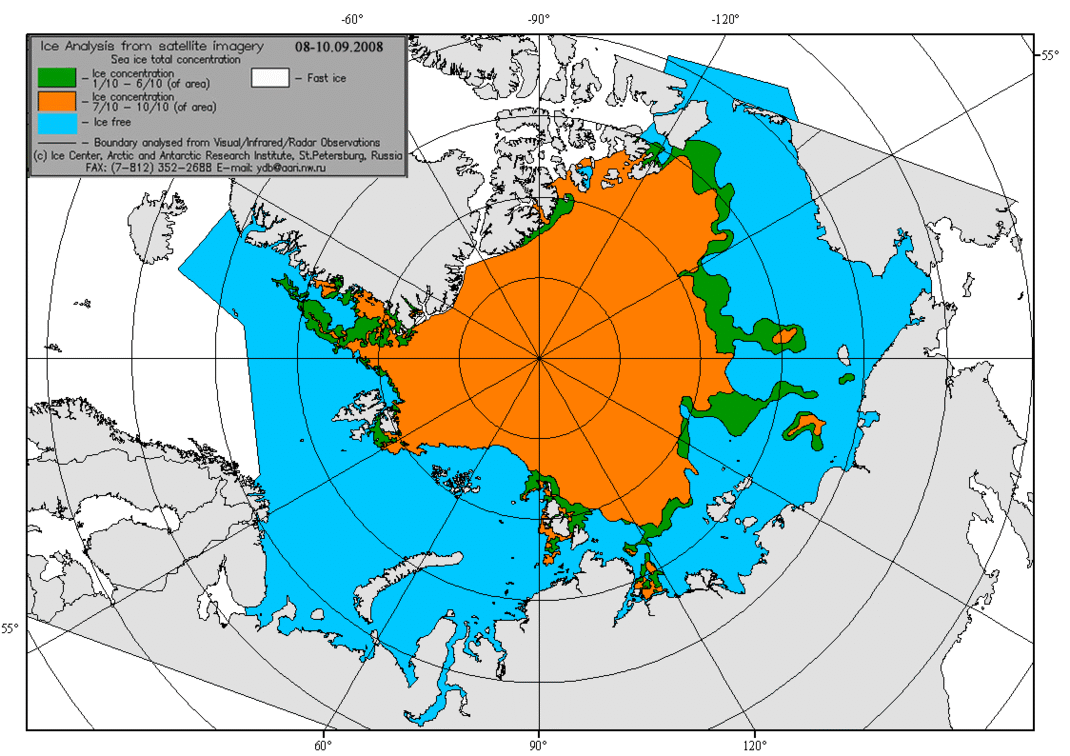
The CAA region (Canadian Arctic Archipelago) shown above has much less ice this year, along with most of the Arctic ocean.
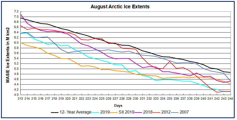
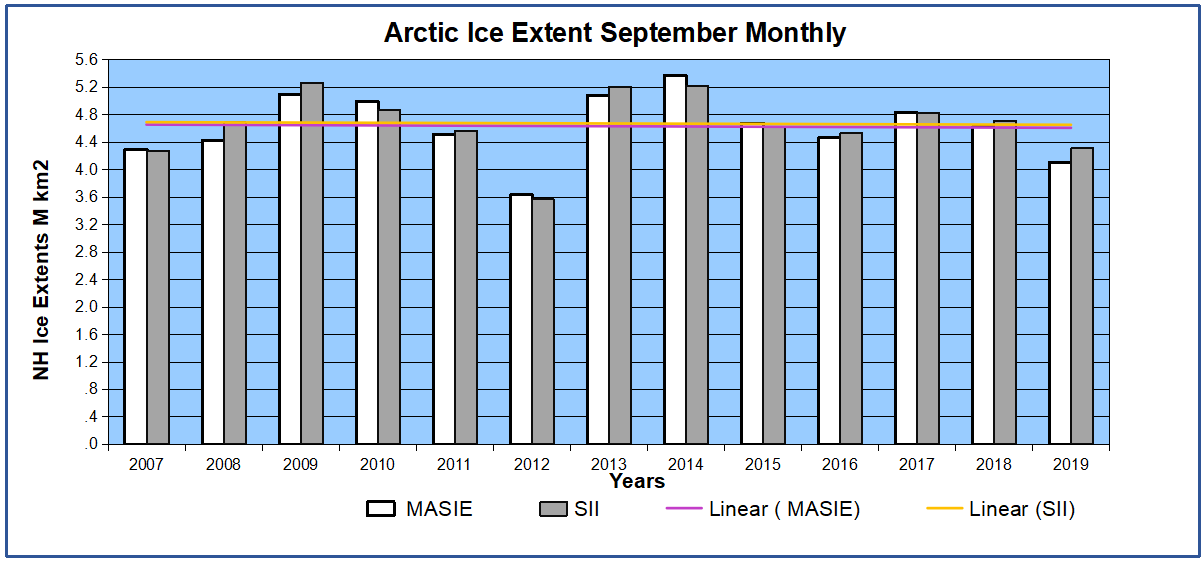
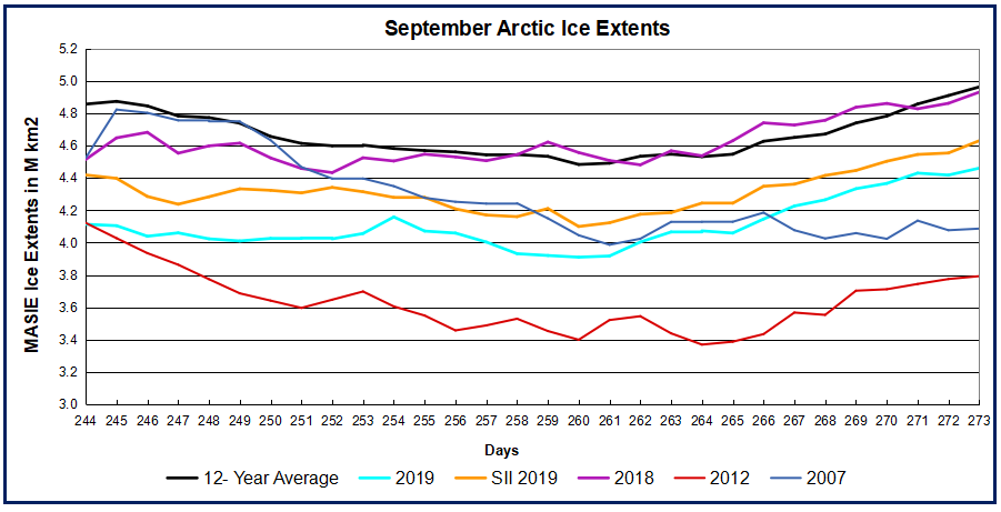
As the graph shows, MASIE ice extent this year is presently as low as 2012, year of the Great Arctic Cyclone. SII is showing about 300k km2 more ice, and matching MASIE 2018 and 2007. All are below the 12 year average at Sept. 1 (day 244).
Background: The Outlook in 2007
From Sea Ice in Canada’s Arctic: Implications for Cruise Tourism by Stewart et al. December 2007. Excerpts in italics with my bolds.
Although cruise travel to the Canadian Arctic has grown steadily since 1984, some commentators have suggested that growth in this sector of the tourism industry might accelerate, given the warming effects of climate change that are making formerly remote Canadian Arctic communities more accessible to cruise vessels. Using sea-ice charts from the Canadian Ice Service, we argue that Global Climate Model predictions of an ice-free Arctic as early as 2050-70 may lead to a false sense of optimism regarding the potential exploitation of all Canadian Arctic waters for tourism purposes. This is because climate warming is altering the character and distribution of sea ice, increasing the likelihood of hull-penetrating, high-latitude, multi-year ice that could cause major pitfalls for future navigation in some places in Arctic Canada. These changes may have negative implications for cruise tourism in the Canadian Arctic, and, in particular, for tourist transits through the Northwest Passage and High Arctic regions.
The most direct route through the Northwest Passage is via Viscount Melville Sound into the M’Clure Strait and around the coast of Banks Island. Unfortunately, this route is marred by difficult ice, particularly in the M’Clure Strait and in Viscount Melville Sound, as large quantities of multi-year ice enter this region from the Canadian Basin and through the Queen Elizabeth Islands.
As Figure 5 illustrates, difficult ice became particularly evident, hence problematic, as sea-ice concentration within these regions increased from 1968 to 2005; as well, significant increases in multi-year ice are present off the western coast of Banks Island as well. Howell and Yackel (2004) illustrated that ice conditions within this region during the 1969–2002 navigation seasons exhibited greater severity from 1969 to1979 than from 1991 to 2002. This variability likely is a reflection of the extreme light-ice season present in 1998(Atkinson et al., 2006), from which the region has since recovered. Cruise ships could use the Prince of Wales Strait to avoid the choke points on the western coast of Banks Island, but entry is difficult; indeed, Howell and Yackel (2004) showed virtually no change in ease of navigation from 1969 to 2002.
An alternative, longer route through the Northwest Passage passes through either Peel Sound or the Bellot Strait. The latter route potentially could avoid hazardous multi-year ice in Peel Sound, but its narrow passageway makes it unfeasible for use by larger vessels. Regardless of which route is selected, a choke point remains in the vicinity of the Victoria Strait (Fig. 5). This strait acts as a drain trap for multi-year ice that has entered the M’Clintock Channel region and gradually advances south-ward (Howell and Yackel, 2004; Howell et al., 2006). While Howell and Yackel (2004) showed slightly safer navigation conditions from 1991 to 2002 compared to 1969 to 1990, they attributed this improvement to the anomalous warm year of 1998 that removed most of the multi-year ice in the region. From 2000 to 2005, when conditions began to recover from the 1998 warming, atmospheric forcing was insufficient to break up the multi-year ice that entered the M’Clintock Channel. Instead the ice became mobile, flowing southward into the Victoria Strait as the surrounding first-year ice broke up earlier (Howell et al., 2006).
During the past 20 years, cruises gradually have become an important element of Canadian Arctic tourism, and currently there seems to be consensus about the cruise industry’s inevitable growth, especially in the vicinity of Baffin Bay. However, we have stressed the likelihood that sea-ice hazards will continue to exist and will present ongoing navigational challenges to tour operators, particularly those operating in the western regions of the Canadian Arctic.
Fast Forward to Summer of 2018: Northwest Passage Proved Impassable

August 23, 2018 . At least 22 vessels are affected and several have turned back to Greenland.
Reprinted from post on September 3, 2018: News today from the Northwest Passage blog that S/V CRYSTAL has given up after hanging around Fort Ross hoping for a storm or melting to break the ice barrier blocking their way west.
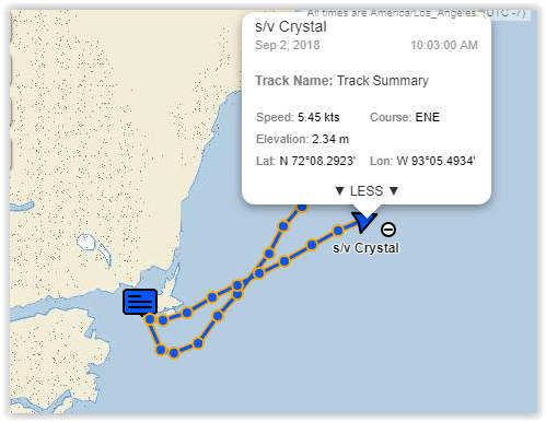
As the vessel tracker shows, they have been forced to Plan C, which is returning to Greenland and accept that the NW Passage is closed this year. The latest ice chart gave them no hope for getting through. Note yachts can sail through green (3/10), so the hope is for red to yellow to green. But that did not happen last year.
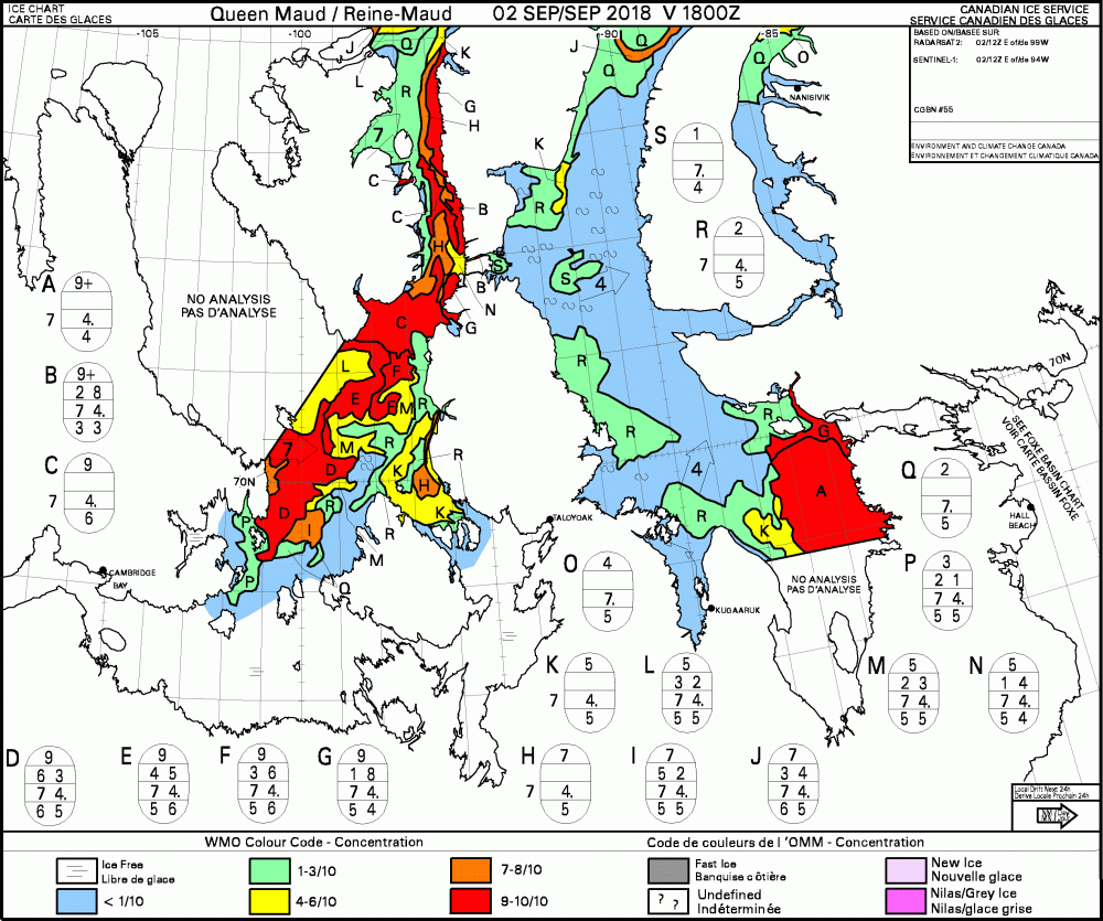
The image below shows the ice with which they were coping.
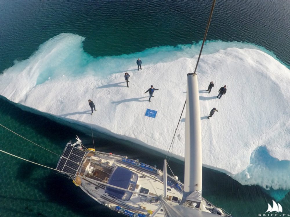
More details at NW Passage blog 20180902 S/V CRYSTAL and S/V ATKA give up and retreat back to Greenland – Score ICE 3 vs YACHTS 0


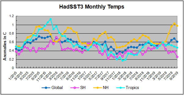
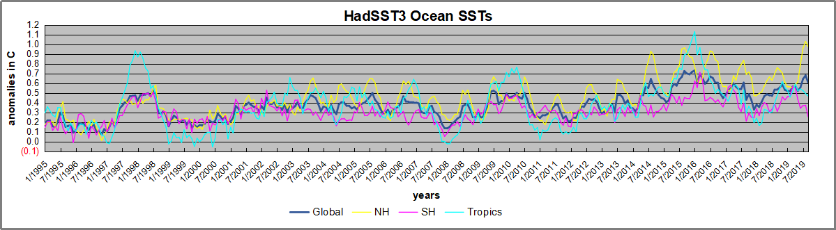
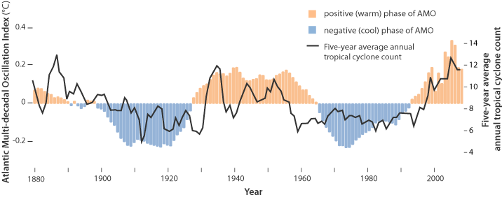
 The best context for understanding decadal temperature changes comes from the world’s sea surface temperatures (SST), for several reasons: