Pandemic Response Not Model for Climate Action

Some wise reflections from Breakthrough Institute: Why the COVID-19 Response Is No Model for Climate Action by Alex Trembath and Seaver Wang. Excerpts in italics with my bolds and images.

A global emergency. Wartime mobilization. Calls to “listen to the scientists.” Demands for radical shifts in policy and human behavior. Tradeoffs between sacrifices today and larger suffering in the future. Politicization by all sides.The parallels between the ongoing COVID-19 crisis and climate change are obvious.

But contrary to the received wisdom among many climate analysts and advocates, those parallels mostly reveal just how different the two challenges are.

The COVID-19 pandemic is unfolding rapidly, demanding all of our attention. Climate change unfolds slowly, over decades, often so imperceptibly that we term the conditions of a changing climate as the “new normal.” COVID-19 presents as a frightening but conceptually simple problem: a novel virus that can be contained by quarantine, social distancing and, hopefully, immunization. Climate change presents as a “wicked” problem, which means its causes, impacts, key actors, and optimal levers for change are heavily contested. Responding to COVID-19 through behavioral shifts means putting our lives temporarily on hold for months to a year. Responding to climate change through behavioral shifts means a lifelong if not multi-generational commitment to population-wide lifestyle changes.

Nonetheless, the rapid virus–induced decline in economic activity has turned some climate hawks’ heads. “If weeks of suspended high-carbon economic activity can cut China’s emissions by a quarter,” tweeted climate activist Genevieve Guenther, “I don’t want to hear one fucking word about how decarbonizing quickly enough to maintain a livable planet is ‘unrealistic.’”

Others were more cautious in drawing comparisons. Pandemics and recessions are “hardly formulas activists should cheer, much less try to replicate going forward,” writes Kate Aronoff at the New Republic. “Wishing for a disaster to make the large-scale changes that scientists say are necessary to prevent a planetary collapse is counterproductive,” wrote Eric Holthaus.

This pandemic should then make us interrogate what we envision when we talk about a “climate emergency.” Such frames filter up meaningfully, after all: last summer, six then-presidential candidates joined a Democratic proposal to declare a “climate change emergency” to spur “sweeping reforms” in the United States. What those reforms would entail, though, remains unclear. Holthaus, whose practice is to addend many of his tweets with the warning “We are in a climate emergency,” wrote that we should “learn to treat each other better.” Aronoff used the drop in Chinese emissions to advocate a four-day work week. Guenther suggested that enforced suspension of economic activity for the climate’s sake would, obviously, utilize “smart policy” to be more “equitable” than the Chinese government’s forced quarantine policies.

Propaganda from Grist.

Yet one wonders whether people around the world might actually be less, not more, eager to entertain the idea of sweeping and intrusive responses to climate change thanks to ongoing events.

Perhaps that is because we are witnessing what a global emergency actually looks like. School and commerce are shut down. People are confined to their homes. Trade and travel are suspended. Weddings, social gatherings, and perhaps even the Olympics are canceled. Hourly workers are losing work and many others are losing jobs altogether. Fear and isolation are dominant.

And yet despite such costly personal and collective sacrifices, we are learning that there are disappointing limits to the emissions cuts that are possible under even draconian, government-enforced reductions of demand for goods and services. New economic projections are suggesting that China’s economy may shrink by up to 40% this quarter relative to January–March. The rhythm of daily life has literally ground to a halt for many hundreds of millions of Chinese people, and yet three-quarters of emissions stubbornly remain. Extreme conditions of degrowth and reduced consumption that are near-unanimously considered intolerable in the long-term have failed to mitigate anything close to a majority of greenhouse gas impacts.

And while emissions will surely decline this year, they might rebound strongly in future years, as China and other countries relax environmental regulations on fossil fuels to boost economic recovery. In the meantime, investment in clean technologies is likely to take a significant hit. Degrowth, it turns out, impacts the sectors and technologies we like as well as those we don’t.

But perhaps we might voluntarily consider maintaining some of the shifts in our lifestyles forced upon us by the quarantine? Doesn’t this moment teach us that we can take fewer flights, telecommute, eat out less, and otherwise reduce our consumption and environmental impact? We hesitate to draw too strong a conclusion here. People like traveling, for work and for pleasure, even when they know how carbon-intensive it is. People like eating out at restaurants, even if it is more expensive and tends to waste more food than eating at home. This moment might make us realize how precious, not frivolous, those experiences are.

Besides that, the absolute environmental impact of these lifestyle shifts is questionable. Take flying. For those of us privileged to write about climate change for a living, air travel likely accounts for much of our personal carbon footprint. But less than 20% of the planet has ever stepped foot on an airplane. COVID-19 is unlikely to change projections of tens of millions of new fliers in the coming decades, as consumers in China, India, Nigeria, Indonesia, Bangladesh, and elsewhere take to the skies for the first time. And to be crystal clear, these first journeys by air will open up once-unattainable personal, economic, and educational opportunities for countless lives and are milestones to be celebrated, not dreaded. Ultimately, what matters is not how many people are consuming a product or service but how carbon-intensive the underlying technologies are.

Certainly, the COVID-19 crisis does have important overlaps with the climate crisis. If anything, COVID-19 should motivate researchers and policymakers to act faster on decarbonization and adaptation, since the incidence of diseases and pandemics is likely to rise with global temperatures. Likewise, how we respond to COVID-19 could have significant climate implications. As the nations of the world stimulate and bail their way out of the coming recession, policy and infrastructure decisions can accelerate innovation and decarbonization. And, ultimately, the long-term solution to both climate and global health problems will be scientific and technological in nature: a vaccine or battery of medical treatments in the case of the virus, and affordable, scalable low-carbon technologies in the case of climate change.

But, in both psychological and political terms, we would caution against drawing too strong a connection between the two crises. We do not think the global community will look back on this time fondly. If the emergency response to the COVID-19 pandemic is held up as a model for climate action, we should not be surprised if public support is less than enthusiastic.

Further, in light of rising xenophobia, heightened international tensions, and opportunistic, discriminatory restrictions on movement and migration precipitating out of the current health emergency, we must be wary of a more selective application of the climate “lessons” of the COVID-19 response to serve an eco-facist agenda that promotes nativism and opposes immigration.

It is an understandable impulse to draw lessons from this or that crisis for other pressing global challenges, climate change among them. We share that impulse. However, the useful take-aways from comparing crises that are fundamentally different in nature are often few and disappointing. The climate crisis may feel just as immediate and pressing as an ongoing pandemic to those working in the climate space, but that does little to change the fact that governments and communities will not accept the adaptation of measures intended to fight pandemics on time horizons of months to years towards the decades-long challenge of climate change. Advocacy of such measures will not be viewed kindly, whether in the halls of political decision-making or in the court of public opinion.

The solutions for controlling the COVID-19 outbreak are simple. As decades of debate, advocacy, and politics should have abundantly demonstrated by now, the solutions for climate change are anything but.


Coronavirus Infographics

Daily Disease Deaths 23032020

H/T Vaughn Pratt for pointing to this graphic providing context for the current pandemic.

Update March 23: CV updates and Additional slides at end

For each COVID-19 death per average day, 105 people die of worse diseases as measured by average daily death rate.

This is the 9th graphic in the Covid 19 Coronavirus Infographic Datapack at Information is Beautiful.

The final graphic is this one:Covid19 media mentions

Update March 23:  Since so much concern is driven by the death statistics, bear these facts in mind:

CV19 mild screen


CV19 Conditions

CV19 Conditions +Risk

Update March 29. 2020

Roger Kimball quotes Dr. John Lee regarding the implications of the above charts in his article It’s Not a Choice Between Lives or the Economy

Finally, a word about the difference between “from” and “with.” Over the past few weeks, I have been predicting a modest fatality rate from COVID-19. I began by predicting no more than a couple of hundred deaths and then upped my prediction to a 1,000-1,200. As of today, the number of deaths attributed to the virus is just over 2,000. So I was wrong about that.

Or was I? It is one thing to die from the effects of the coronavirus, quite another to die with the virus. Let’s say you are 87 years old, diabetic, with congestive heart failure and emphysema. You are infected with the coronavirus, get sick, and die. Did you die from it, or merely with it?

This is a point that Dr. John Lee, a retired professor of pathology in the United Kingdom, made in Spectator USA. “There is a big difference,” he writes, “between Covid-19 causing death, and Covid-19 being found in someone who died of other causes. . . . Much of the response to Covid-19 seems explained by the fact that we are watching this virus in a way that no virus has been watched before. The scenes from the Italian hospitals have been shocking, and make for grim television. But television is not science.”

First do no harm.” Dr. Lee is right to warn that the panicked response to this new virus has neglected that age-old medical advice. “Unless,” he notes, “we tighten criteria for recording death due only to the virus (as opposed to it being present in those who died from other conditions), the official figures may show a lot more deaths apparently caused by the virus than [are] actually the case. What then? How do we measure the health consequences of taking people’s lives, jobs, leisure and purpose away from them to protect them from an anticipated threat? Which causes the least harm?”

That is an excellent question. Also excellent is his concluding observation that “The moral debate is not lives vs. money. It is lives vs. lives.”

Top Climate Model Gets Better

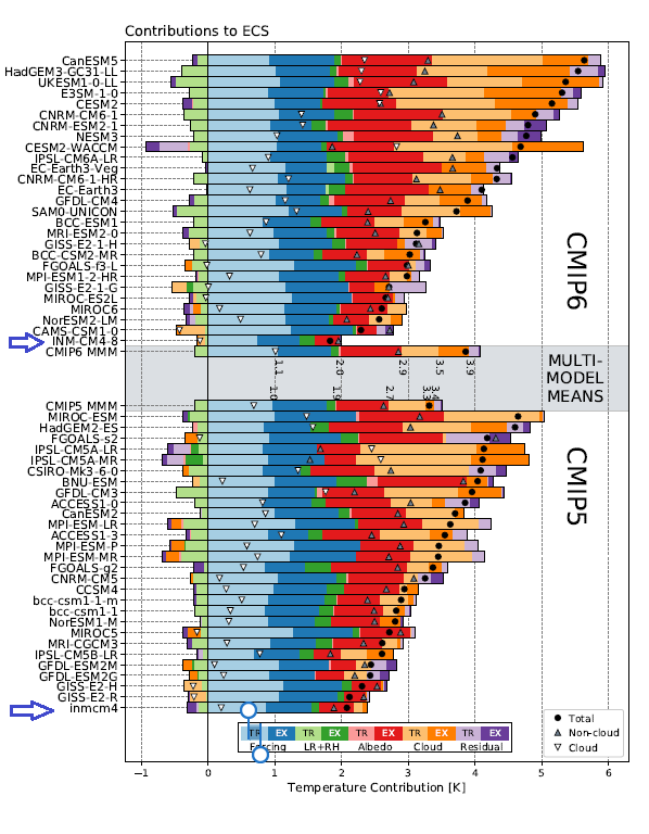
Figure S7. Contributions of forcing and feedbacks to ECS in each model and for the multimodel means. Contributions from the tropical and extratropical portion of the feedback are shown in light and dark shading, respectively. Black dots indicate the ECS in each model, while upward and downward pointing triangles indicate contributions from non-cloud and cloud feedbacks, respectively. Numbers printed next to the multi-model mean bars indicate the cumulative sum of each plotted component. Numerical values are not printed next to residual, extratropical forcing, and tropical albedo terms for clarity. Models within each collection are ordered by ECS.

A previous post here discussed discovering that INMCM4 was the best CMIP5 model in replicating historical temperature records. Additional posts described improvements built into INMCM5, the next generation model included for CMIP6 testing. Later on is a reprint of the temperature history replication and the parameters included in the revised model. This post focuses on a recent report of additional enhancements by the modelers in order to better represent precipitation and extreme rainfall events.

The paper is Influence of various parameters of INM RAS climate model on the results of extreme precipitation simulation by M A Tarasevich and E M Volodin 2019. Excerpts in italics with my bolds.

Modern models of the Earth’s climate can reproduce not only the average climate condition, but also extreme weather and climate phenomena. Therefore, there arises the problem of comparing climate models for observable extreme weather events.

In [1, 2], various extreme weather and climatic situations are considered. According to the paper,27 extreme indices are defined, characterizing different situations with high and low temperatures, with heavy precipitation or with absence of precipitation.

The results of simulation of the extreme indices with the INMCM4 [3] climate model were compared with the results of other models which took part in the CMIP5 project (Coupled Model Intercomparison Project, Phase 5) [2]. The comparison demonstrates that this model performs well for most indices except for those related to daily minimum temperature. For those indices the model shows one of the worst results.

The parameterizations of physical processes in the next model version, INMCM5, were replaced or tuned [4, 5], so that changes in the extreme indices simulation are expected.

The simulation results were compared to the ERA-Interim [6] reanalysis data, which were considered as the observational data for this study. Indices averaged for the 1981–2010 year range were compared. Mann-Whitney test with 1% significance level was used to examine where changes are significant.

To evaluate the quality of simulation of extreme weather phenomena, the extreme indices were calculated [7] using the results of computations performed by two versions of the INM RAS climate model (INMCM4 and INMCM5) and the ERA Interim reanalysis. We took the root mean square deviation of the index value computed from the modeled and reanalysis data as the measure of simulation quality. The mean is averaged over the land.

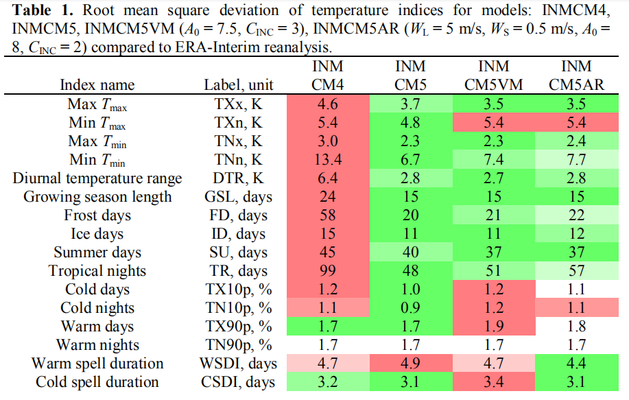
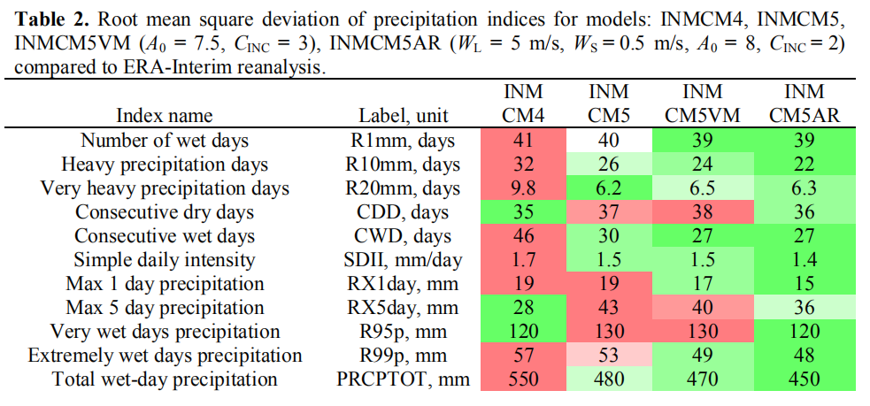
Tables 1 and 2 present the names of extreme indices related to temperature and precipitation, their labels and measurement units, as well as the land only averaged standard deviations for these indices between the ERA-Interim reanalysis and different versions of the INM RAS climate model.

Table 1 shows that the simulation of almost all temperature indices has improved in the INMCM5 compared to INMCM4. In particular, the simulation of the following extreme indices related to the minimum daily temperature improved significantly (by 37–56%): the annual daily minimum temperature (TNn), the number of frost days (FD) and tropical nights (TR), the diurnal temperature range (DTR), and the growing season length (GSL).

[Comment: Note that values in these tables are standard deviations from observations as presented by ERA reanalysis. So for example, growing season length (GSL) varied from mean ERA values by 24 days in INMCM4, but improved to a 15 day differential in INMCM5.]

Table 2 shows that the simulation of the number of heavy (R10mm) and very heavy (R20mm) precipitation days, consecutive wet days (CWD), simple daily intensity (SDII), and total wet-day precipitation (PRCPTOT) noticeably improved in INMCM5. At the same time, the simulation of indices related to the intensity (RX5day) and the amount (R95p) of precipitation on very rainy days became worse.

Improvements Added to INMCM5

To improve the simulation of extreme precipitation by the INMCM5 model, the following physical  processes were considered: evaporation of precipitation in the upper atmosphere; mixing of horizontal velocity components due to large-scale condensation and deep convection; air resistance acting on falling precipitation particles.

Both large-scale condensation and deep convection cause vertical motion, which redistributes the horizontal momentum between the nearby air layers. The implementation of mixing due to large-scale condensation was added to the model. For short we will refer to the INMCM5 version with these changes as INMCM5VM (INMCM5 Velocities Mixing).

Since precipitation particles (water droplets or ice crystals) move in the surrounding air, a drag force arises that carries the air along with the particles. This resistance force can be included in the right hand side of the momentum balance equation, which is part of the atmosphere hydrothermodynamic system of equations. Accurate accounting for the effect of this force requires numerical solving of an additional Poisson-type equation. For short, we will refer to the INMCM5 model version with the air resistance and vertical mixing of the horizontal velocity components as INMCM5AR (INMCM5 Air Resistance).

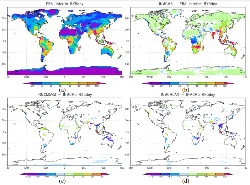
Figure 3. (a) RX5day index values averaged over 1981–2010 according to ERA-Interim data. (b-d)  Deviations of the same average obtained from INMCM5, INMCM5VM, and INMCM5AR data. Statistically insignificant deviations are presented as white.

Table 2 shows that the quality of simulation of all precipitation-related extreme indices in INMCM5AR either improved by 3–21 % compared to INMCM5 or remained unchanged.

Figures 2d, 3d show the spatial distribution of the deviations for max 1 day (RX1day) and 5 day (RX5day) precipitation according to INMCM5AR compared to INMCM5. The model with air resistance acting on falling precipitation particles compared to INMCM5 significantly underestimates RX1day and RX5day in South Africa, South and East Asia, and slightly underestimates the indicated extreme indices in Tibet.

Taking into account the air resistance acting on falling precipitation particles significantly reduces  the overestimation of RX1day and RX5day observed in INMCM5 in South Africa, South and East Asia, and leads to an improvement in the quality of extreme indices associated with the precipitation amount on very rainy days and their intensity simulation by 9–21 %. At the same time, a significant overestimation of the RX1day and RX5day indices in the Amazon basin and Southeast Asia, as well as their underestimation in West Africa, still remain.

Footnote: 

A simple analysis shows if the climate sensitivity estimated by INMCM5 (1.8C per doubling of CO2) would be realized over the next 80 years, it would mean a continuation of the warming over the last 60 years.  The accumulated rise in GMT would be 1.2C for the 21st Century, well below the IPCC 1.5C aspiration.  See I Want You Not to Panic

Update February 4, 2020

A recent comparison of INMCM5 and other CMIP6 climate models is discussed in the post
Climate Models: Good, Bad and Ugly

Updated with October 25, 2018 Report

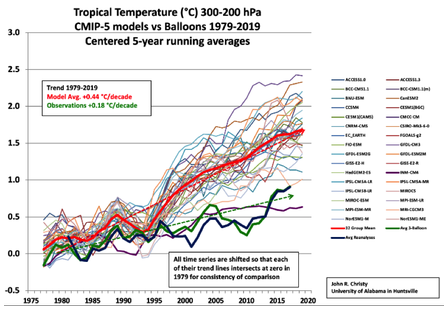
A previous analysis Temperatures According to Climate Models showed that only one of 42 CMIP5 models was close to hindcasting past temperature fluctuations. That model was INMCM4, which also projected an unalarming 1.4C warming to the end of the century, in contrast to the other models programmed for future warming five times the past.

In a recent comment thread, someone asked what has been done recently with that model, given that it appears to be “best of breed.” So I went looking and this post summarizes further work to produce a new, hopefully improved version by the modelers at the Institute of Numerical Mathematics of the Russian Academy of Sciences.

Institute of Numerical Mathematics, Russian Academy of Sciences, Moscow, Russia

A previous post a year ago went into the details of improvements made in producing the latest iteration INMCM5 for entry into the CMIP6 project.  That text is reprinted below.

Now a detailed description of the model’s global temperature outputs has been published October 25, 2018 in Earth System Dynamics Simulation of observed climate changes in 1850–2014 with climate model INM-CM5   (Title is link to pdf) Excerpts below with my bolds.

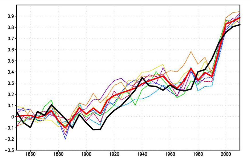
Figure 1. The 5-year mean GMST (K) anomaly with respect to 1850–1899 for HadCRUTv4 (thick solid black); model mean (thick solid red). Dashed thin lines represent data from individual model runs: 1 – purple, 2 – dark blue, 3 – blue, 4 – green, 5 – yellow, 6 – orange, 7 – magenta. In this and the next figures numbers on the time axis indicate the first year of the 5-year mean.

Abstract

Climate changes observed in 1850-2014 are modeled and studied on the basis of seven historical runs with the climate model INM-CM5 under the scenario proposed for Coupled Model Intercomparison Project, Phase 6 (CMIP6). In all runs global mean surface temperature rises by 0.8 K at the end of the experiment (2014) in agreement with the observations. Periods of fast warming in 1920-1940 and 1980-2000 as well as its slowdown in 1950-1975 and 2000-2014 are correctly reproduced by the ensemble mean. The notable change here with respect to the CMIP5 results is correct reproduction of the slowdown of global warming in 2000-2014 that we attribute to more accurate description of the Solar constant in CMIP6 protocol. The model is able to reproduce correct behavior of global mean temperature in 1980-2014 despite incorrect phases of  the Atlantic Multidecadal Oscillation and Pacific Decadal Oscillation indices in the majority of experiments. The Arctic sea ice loss in recent decades is reasonably close to the observations just in one model run; the model underestimates Arctic sea ice loss by the factor 2.5. Spatial pattern of model mean surface temperature trend during the last 30 years looks close the one for the ERA Interim reanalysis. Model correctly estimates the magnitude of stratospheric cooling.

Additional Commentary

Observational data of GMST for 1850-2014 used for verification of model results were produced by HadCRUT4 (Morice et al 2012). Monthly mean sea surface temperature (SST) data ERSSTv4 (Huang et al 2015) are used for comparison of the AMO and PDO indices with that of the model. Data of Arctic sea ice extent for 1979-2014 derived from satellite observations are taken from Comiso and Nishio (2008). Stratospheric temperature trend and geographical distribution of near surface air temperature trend for 1979-2014 are calculated from ERA Interim reanalysis data (Dee et al 2011).

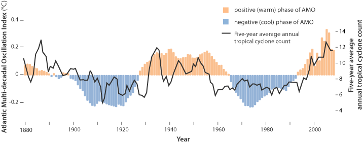
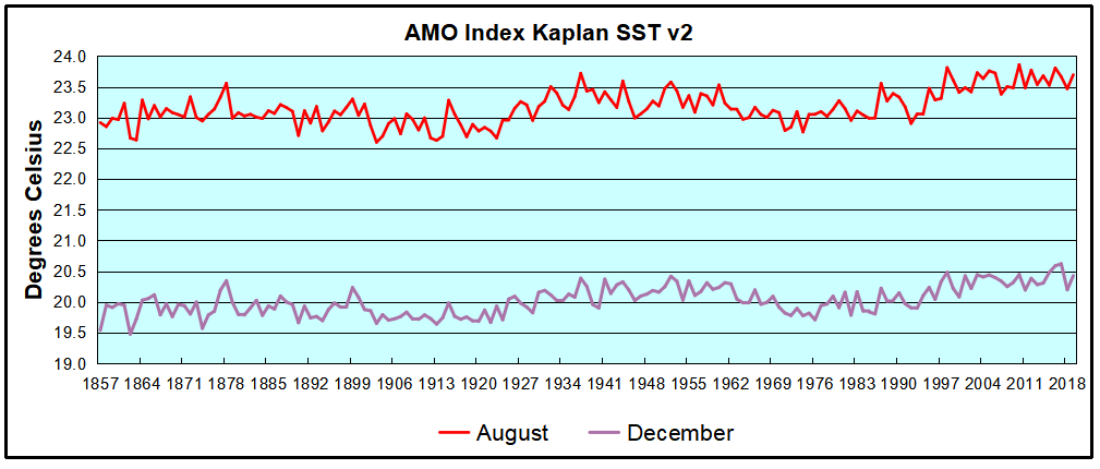
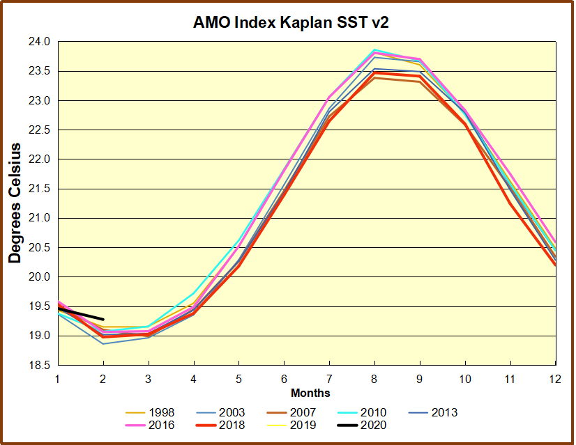
Keeping in mind the arguments that the GMST slowdown in the beginning of 21st 6 century could be due to the internal variability of the climate system let us look at the behavior of the AMO and PDO climate indices. Here we calculated the AMO index in the usual way, as the SST anomaly in Atlantic at latitudinal band 0N-60N minus anomaly of the GMST. Model and observed 5 year mean AMO index time series are presented in Fig.3. The well known oscillation with a period of 60-70 years can be clearly seen in the observations. Among the model runs, only one (dashed purple line) shows oscillation with a period of about 70 years, but without significant maximum near year 2000. In other model runs there is no distinct oscillation with a period of 60-70 years but period of 20-40 years prevails. As a result none of seven model trajectories reproduces behavior of observed AMO index after year 1950 (including its warm phase at the turn of the 20th and 21st centuries). One can conclude that anthropogenic forcing is unable to produce any significant impact on the AMO dynamics as its index averaged over 7 realization stays around zero within one sigma interval (0.08). Consequently, the AMO dynamics is controlled by internal variability of the climate system and cannot be predicted in historic experiments. On the other hand the model can correctly predict GMST changes in 1980-2014 having wrong phase of the AMO (blue, yellow, orange lines on Fig.1 and 3).

Conclusions

Seven historical runs for 1850-2014 with the climate model INM-CM5 were analyzed. It is shown that magnitude of the GMST rise in model runs agrees with the estimate based on the observations. All model runs reproduce stabilization of GMST in 1950-1970, fast warming in 1980-2000 and a second GMST stabilization in 2000-2014 suggesting that the major factor for predicting GMST evolution is the external forcing rather than system internal variability. Numerical experiments with the previous model version (INMCM4) for CMIP5 showed unrealistic gradual warming in 1950-2014. The difference between the two model results could be explained by more accurate modeling of stratospheric volcanic and tropospheric anthropogenic aerosol radiation effect (stabilization in 1950-1970) due to the new aerosol block in INM-CM5 and more accurate prescription of Solar constant scenario (stabilization in 2000-2014) in CMIP6 protocol. Four of seven INM-CM5 model runs simulate acceleration of warming in 1920-1940 in a correct way, other three produce it earlier or later than in reality. This indicates that for the year warming of 1920-1940 the climate system natural variability plays significant role. No model trajectory reproduces correct time behavior of AMO and PDO indices. Taking into account our results on the GMST modeling one can conclude that anthropogenic forcing does not produce any significant impact on the dynamics of AMO and PDO indices, at least for the INM-CM5 model. In turns, correct prediction of the GMST changes in the 1980-2014 does not require correct phases of the AMO and PDO as all model runs have correct values of the GMST while in at least three model experiments the phases of the AMO and PDO are opposite to the observed ones in that time. The North Atlantic SST time series produced by the model correlates better with the observations in 1980-2014. Three out of seven trajectories have strongly positive North Atlantic SST anomaly as the observations (in the other four cases we see near-to-zero changes for this quantity). The INMCM5 has the same skill for prediction of the Arctic sea ice extent in 2000-2014 as CMIP5 models including INMCM4. It underestimates the rate of sea ice loss by a factor between the two and three. In one extreme case the magnitude of this decrease is as large as in the observations while in the other the sea ice extent does not change compared to the preindustrial ages. In part this could be explained by the strong internal variability of the Arctic sea ice but obviously the new version of INMCM model and new CMIP6 forcing protocol does not improve prediction of the Arctic sea ice extent response to anthropogenic forcing.

Previous Post:  Climate Model Upgraded: INMCM5 Under the Hood

Earlier in 2017 came this publication Simulation of the present-day climate with the climate model INMCM5 by E.M. Volodin et al. Excerpts below with my bolds.

In this paper we present the fifth generation of the INMCM climate model that is being developed at the Institute of Numerical Mathematics of the Russian Academy of Sciences (INMCM5). The most important changes with respect to the previous version (INMCM4) were made in the atmospheric component of the model. Its vertical resolution was increased to resolve the upper stratosphere and the lower mesosphere. A more sophisticated parameterization of condensation and cloudiness formation was introduced as well. An aerosol module was incorporated into the model. The upgraded oceanic component has a modified dynamical core optimized for better implementation on parallel computers and has two times higher resolution in both horizontal directions.

Analysis of the present-day climatology of the INMCM5 (based on the data of historical run for 1979–2005) shows moderate improvements in reproduction of basic circulation characteristics with respect to the previous version. Biases in the near-surface temperature and precipitation are slightly reduced compared with INMCM4 as  well as biases in oceanic temperature, salinity and sea surface height. The most notable improvement over INMCM4 is the capability of the new model to reproduce the equatorial stratospheric quasi-biannual oscillation and statistics of sudden stratospheric warmings.


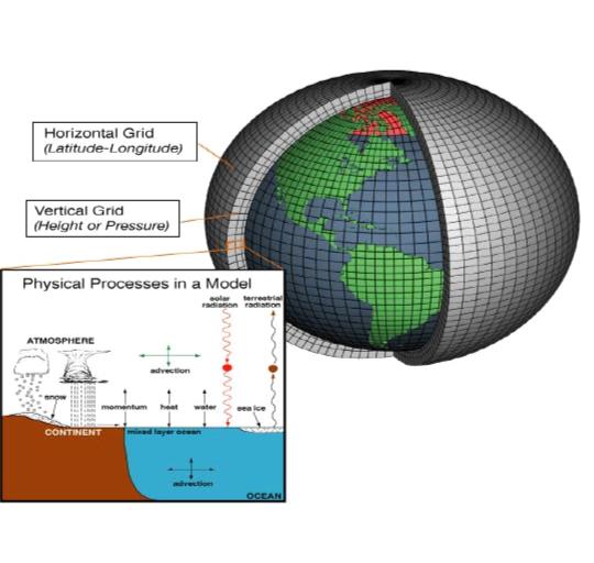
The family of INMCM climate models, as most climate system models, consists of two main blocks: the atmosphere general circulation model, and the ocean general circulation model. The atmospheric part is based on the standard set of hydrothermodynamic equations with hydrostatic approximation written in advective form. The model prognostic variables are wind horizontal components, temperature, specific humidity and surface pressure.

Atmosphere Module

The INMCM5 borrows most of the atmospheric parameterizations from its previous version. One of the few notable changes is the new parameterization of clouds and large-scale condensation. In the INMCM5 cloud area and cloud water are computed prognostically according to Tiedtke (1993). That includes the formation of large-scale cloudiness as well as the formation of clouds in the atmospheric boundary layer and clouds of deep convection. Decrease of cloudiness due to mixing with unsaturated environment and precipitation formation are also taken into account. Evaporation of precipitation is implemented according to Kessler (1969).

In the INMCM5 the atmospheric model is complemented by the interactive aerosol block, which is absent in the INMCM4. Concentrations of coarse and fine sea salt, coarse and fine mineral dust, SO2, sulfate aerosol, hydrophilic and hydrophobic black and organic carbon are all calculated prognostically.

Ocean Module

The oceanic module of the INMCM5 uses generalized spherical coordinates. The model “South Pole” coincides with the geographical one, while the model “North Pole” is located in Siberia beyond the ocean area to avoid numerical problems near the pole. Vertical sigma-coordinate is used. The finite-difference equations are written using the Arakawa C-grid. The differential and finite-difference equations, as well as methods of solving them can be found in Zalesny etal. (2010).

The INMCM5 uses explicit schemes for advection, while the INMCM4 used schemes based on splitting upon coordinates. Also, the iterative method for solving linear shallow water equation systems is used in the INMCM5 rather than direct method used in the INMCM4. The two previous changes were made to improve model parallel scalability. The horizontal resolution of the ocean part of the INMCM5 is 0.5 × 0.25° in longitude and latitude (compared to the INMCM4’s 1 × 0.5°).

Both the INMCM4 and the INMCM5 have 40 levels in vertical. The parallel implementation of the ocean model can be found in (Terekhov etal. 2011). The oceanic block includes vertical mixing and isopycnal diffusion parameterizations (Zalesny et al. 2010). Sea ice dynamics and thermodynamics are parameterized according to Iakovlev (2009). Assumptions of elastic-viscous-plastic rheology and single ice thickness gradation are used. The time step in the oceanic block of the INMCM5 is 15 min.

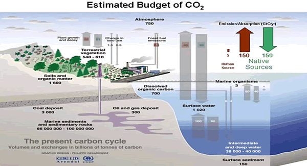
Note the size of the human emissions next to the red arrow.

Carbon Cycle Module

The climate model INMCM5 has а carbon cycle module (Volodin 2007), where atmospheric CO2 concentration, carbon in vegetation, soil and ocean are calculated. In soil, а single carbon pool is considered. In the ocean, the only prognostic variable in the carbon cycle is total inorganic carbon. Biological pump is prescribed. The model calculates methane emission from wetlands and has a simplified methane cycle (Volodin 2008). Parameterizations of some electrical phenomena, including calculation of ionospheric potential and flash intensity (Mareev and Volodin 2014), are also included in the model.

Surface Temperatures

When compared to the INMCM4 surface temperature climatology, the INMCM5 shows several improvements. Negative bias over continents is reduced mainly because of the increase in daily minimum temperature over land, which is achieved by tuning the surface flux parameterization. In addition, positive bias over southern Europe and eastern USA in summer typical for many climate models (Mueller and Seneviratne 2014) is almost absent in the INMCM5. A possible reason for this bias in many models is the shortage of soil water and suppressed evaporation leading to overestimation of the surface temperature. In the INMCM5 this problem was addressed by the increase of the minimum leaf resistance for some vegetation types.

Nevertheless, some problems migrate from one model version to the other: negative bias over most of the subtropical and tropical oceans, and positive bias over the Atlantic to the east of the USA and Canada. Root mean square (RMS) error of annual mean near surface temperature was reduced from 2.48 K in the INMCM4 to 1.85 K in the INMCM5.

Precipitation

In mid-latitudes, the positive precipitation bias over the ocean prevails in winter while negative bias occurs in summer. Compared to the INMCM4, the biases over the western Indian Ocean, Indonesia, the eastern tropical Pacific and the tropical Atlantic are reduced. A possible reason for this is the better reproduction of the tropical sea surface temperature (SST) in the INMCM5 due to the increase of the spatial resolution in the oceanic block, as well as the new condensation scheme. RMS annual mean model bias for precipitation is 1.35mm day−1 for the INMCM5 compared to 1.60mm day−1 for the INMCM4.

Cloud Radiation Forcing

Cloud radiation forcing (CRF) at the top of the atmosphere is one of the most important climate model characteristics, as errors in CRF frequently lead to an incorrect surface temperature.

In the high latitudes model errors in shortwave CRF are small. The model underestimates longwave CRF in the subtropics but overestimates it in the high latitudes. Errors in longwave CRF in the tropics tend to partially compensate errors in shortwave CRF. Both errors have positive sign near 60S leading to warm bias in the surface temperature here. As a result, we have some underestimation of the net CRF absolute value at almost all latitudes except the tropics. Additional experiments with tuned conversion of cloud water (ice) to precipitation (for upper cloudiness) showed that model bias in the net CRF could be reduced, but that the RMS bias for the surface temperature will increase in this case.


A table from another paper provides the climate parameters described by INMCM5.

Climate Parameters Observations INMCM3 INMCM4 INMCM5
Incoming solar radiation at TOA 341.3 [26] 341.7 341.8 341.4
Outgoing solar radiation at TOA   96–100 [26] 97.5 ± 0.1 96.2 ± 0.1 98.5 ± 0.2
Outgoing longwave radiation at TOA 236–242 [26] 240.8 ± 0.1 244.6 ± 0.1 241.6 ± 0.2
Solar radiation absorbed by surface 154–166 [26] 166.7 ± 0.2 166.7 ± 0.2 169.0 ± 0.3
Solar radiation reflected by surface     22–26 [26] 29.4 ± 0.1 30.6 ± 0.1 30.8 ± 0.1
Longwave radiation balance at surface –54 to 58 [26] –52.1 ± 0.1 –49.5 ± 0.1 –63.0 ± 0.2
Solar radiation reflected by atmosphere      74–78 [26] 68.1 ± 0.1 66.7 ± 0.1 67.8 ± 0.1
Solar radiation absorbed by atmosphere     74–91 [26] 77.4 ± 0.1 78.9 ± 0.1 81.9 ± 0.1
Direct hear flux from surface     15–25 [26] 27.6 ± 0.2 28.2 ± 0.2 18.8 ± 0.1
Latent heat flux from surface     70–85 [26] 86.3 ± 0.3 90.5 ± 0.3 86.1 ± 0.3
Cloud amount, %     64–75 [27] 64.2 ± 0.1 63.3 ± 0.1 69 ± 0.2
Solar radiation-cloud forcing at TOA         –47 [26] –42.3 ± 0.1 –40.3 ± 0.1 –40.4 ± 0.1
Longwave radiation-cloud forcing at TOA          26 [26] 22.3 ± 0.1 21.2 ± 0.1 24.6 ± 0.1
Near-surface air temperature, °С 14.0 ± 0.2 [26] 13.0 ± 0.1 13.7 ± 0.1 13.8 ± 0.1
Precipitation, mm/day 2.5–2.8 [23] 2.97 ± 0.01 3.13 ± 0.01 2.97 ± 0.01
River water inflow to the World Ocean,10^3 km^3/year 29–40 [28] 21.6 ± 0.1 31.8 ± 0.1 40.0 ± 0.3
Snow coverage in Feb., mil. Km^2 46 ± 2 [29] 37.6 ± 1.8 39.9 ± 1.5 39.4 ± 1.5
Permafrost area, mil. Km^2 10.7–22.8 [30] 8.2 ± 0.6 16.1 ± 0.4 5.0 ± 0.5
Land area prone to seasonal freezing in NH, mil. Km^2 54.4 ± 0.7 [31] 46.1 ± 1.1 48.3 ± 1.1 51.6 ± 1.0
Sea ice area in NH in March, mil. Km^2 13.9 ± 0.4 [32] 12.9 ± 0.3 14.4 ± 0.3 14.5 ± 0.3
Sea ice area in NH in Sept., mil. Km^2 5.3 ± 0.6 [32] 4.5 ± 0.5 4.5 ± 0.5 6.1 ± 0.5

Heat flux units are given in W/m^2; the other units are given with the title of corresponding parameter. Where possible, ± shows standard deviation for annual mean value.  Source: Simulation of Modern Climate with the New Version Of the INM RAS Climate Model (Bracketed numbers refer to sources for observations)

Ocean Temperature and Salinity

The model biases in potential temperature and salinity averaged over longitude with respect to WOA09 (Antonov et al. 2010) are shown in Fig.12. Positive bias in the Southern Ocean penetrates from the surface downward for up to 300 m, while negative bias in the tropics can be seen even in the 100–1000 m layer.

Nevertheless, zonal mean temperature error at any level from the surface to the bottom is small. This was not the case for the INMCM4, where one could see negative temperature bias up to 2–3 K from 1.5 km to the bottom nearly al all latitudes, and 2–3 K positive bias at levels of 700–1000 m. The reason for this improvement is the introduction of a higher background coefficient for vertical diffusion at high depth (3000 m and higher) than at intermediate depth (300–500m). Positive temperature bias at 45–65 N at all depths could probably be explained by shortcomings in the representation of deep convection [similar errors can be seen for most of the CMIP5 models (Flato etal. 2013, their Fig.9.13)].

Another feature common for many present day climate models (and for the INMCM5 as well) is negative bias in southern tropical ocean salinity from the surface to 500 m. It can be explained by overestimation of precipitation at the southern branch of the Inter Tropical Convergence zone. Meridional heat flux in the ocean (Fig.13) is not far from available estimates (Trenberth and Caron 2001). It looks similar to the one for the INMCM4, but maximum of northward transport in the Atlantic in the INMCM5 is about 0.1–0.2 × 10¹⁵ W higher than the one in the INMCM4, probably, because of the increased horizontal resolution in the oceanic block.

Sea Ice

In the Arctic, the model sea ice area is just slightly overestimated. Overestimation of the Arctic sea ice area is connected with negative bias in the surface temperature. In the same time, connection of the sea ice area error with the positive salinity bias is not evident because ice formation is almost compensated by ice melting, and the total salinity source for these pair of processes is not large. The amplitude and phase of the sea ice annual cycle are reproduced correctly by the model. In the Antarctic, sea ice area is underestimated by a factor of 1.5 in all seasons, apparently due to the positive temperature bias. Note that the correct simulation of sea ice area dynamics in both hemispheres simultaneously is a difficult task for climate modeling.

The analysis of the model time series of the SST anomalies shows that the El Niño event frequency is approximately the same in the model and data, but the model El Niños happen too regularly. Atmospheric response to the El Niño vents is also underestimated in the model by a factor of 1.5 with respect to the reanalysis data.

Conclusion

Based on the CMIP5 model INMCM4 the next version of the Institute of Numerical Mathematics RAS climate model was developed (INMCM5). The most important changes include new parameterizations of large scale condensation (cloud fraction and cloud water are now the prognostic variables), and increased vertical resolution in the atmosphere (73 vertical levels instead of 21, top model level raised from 30 to 60 km). In the oceanic block, horizontal resolution was increased by a factor of 2 in both directions.

The climate model was supplemented by the aerosol block. The model got a new parallel code with improved computational efficiency and scalability. With the new version of climate model we performed a test model run (80 years) to simulate the present-day Earth climate. The model mean state was compared with the available datasets. The structures of the surface temperature and precipitation biases in the INMCM5 are typical for the present climate models. Nevertheless, the RMS error in surface temperature, precipitation as well as zonal mean temperature and zonal wind are reduced in the INMCM5 with respect to its previous version, the INMCM4.

The model is capable of reproducing equatorial stratospheric QBO and SSWs.The model biases for the sea surface height and surface salinity are reduced in the new version as well, probably due to increasing spatial resolution in the oceanic block. Bias in ocean potential temperature at depths below 700 m in the INMCM5 is also reduced with respect to the one in the INMCM4. This is likely because of the tuning background vertical diffusion coefficient.

Model sea ice area is reproduced well enough in the Arctic, but is underestimated in the Antarctic (as a result of the overestimated surface temperature). RMS error in the surface salinity is reduced almost everywhere compared to the previous model except the Arctic (where the positive bias becomes larger). As a final remark one can conclude that the INMCM5 is substantially better in almost all aspects than its previous version and we plan to use this model as a core component for the coming CMIP6 experiment.
climatesystem_web

Summary

One the one hand, this model example shows that the intent is simple: To represent dynamically the energy balance of our planetary climate system.  On the other hand, the model description shows how many parameters are involved, and the complexity of processes interacting.  The attempt to simulate operations of the climate system is a monumental task with many outstanding challenges, and this latest version is another step in an iterative development.

Note:  Regarding the influence of rising CO2 on the energy balance.  Global warming advocates estimate a CO2 perturbation of 4 W/m^2.  In the climate parameters table above, observations of the radiation fluxes have a 2 W/m^2 error range at best, and in several cases are observed in ranges of 10 to 15 W/m^2.

We do not yet have access to the time series temperature outputs from INMCM5 to compare with observations or with other CMIP6 models.  Presumably that will happen in the future.

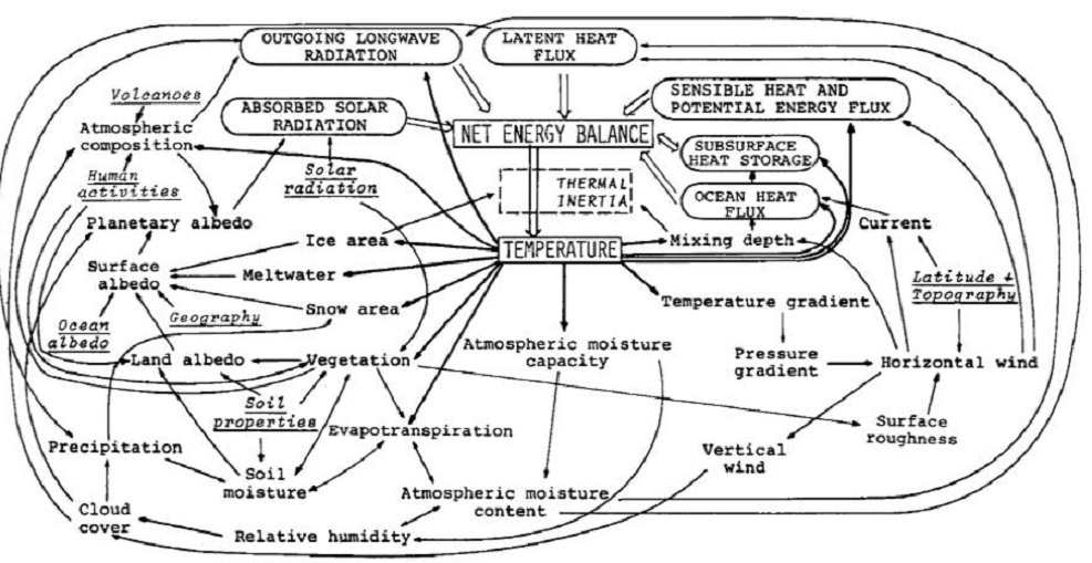
Early Schematic: Flows and Feedbacks for Climate Models

No, Climate Didn’t Cause Coronavirus

It didn’t take long for climatists to tie coronavirus to global warming/climate change; IOW, “It’s our fault for using fossil fuels.” And also: “Changes to fight coronavirus also fight climate change.” Activists have a long record of claiming that de-carbonizing is a snake oil curing all of society’s ills. The latest memes give the flavor of the warped thinking.

Coronavirus hits a critical year for nature and climate chinadialogue11:08

The threats facing our planet are interconnected ArabNews10:27

Climate change helped coronavirus spread The Independent10:20

How Science Denial In High Places Accelerates Both COVID-19 and Climate Change Ecosystem Marketplace10:12

The Corona Connection The Nation08:14

Coronavirus and the climate: How we respond to deadly threats The Gazette07:15

The Coronavirus and the Climate Movement The New Yorker07:04

The carbon disruption is here, disguised as a pandemic ImpactAlpha04:10

For pandemics and climate change, voluntary measures aren’t enough Grist Magazine03:58

“In a way, the coronavirus is climate change’s publicist” Why now is the time to focus on our… Vogue India02:43

Liberals See Good from Coronavirus: Less Pollution NewsMax20:22 Tue, 17 Mar

How changes brought on by coronavirus could help tackle the climate crisis Corporate Knights17:19 Tue, 17 Mar

Think Tank Shifts From Climate Science Denial To COVID Denial Talking Points Memo16:11 Tue, 17 Mar

Coronavirus, climate crisis, conflicts: Meme-ing our way through the ‘apocalypse’ The Conversation (Canada)13:58 Tue, 17 Mar

Key readings about climate change and coronavirus Yale Climate Connections14:19

Green Jobs Are the Answer to the Coronavirus Recession The New Republic14:19

How COVID-19 Is Like Climate Change Scientific American11:07 Tue, 17 Mar

Climate change could make the coronavirus seem like the good old days. GreenBiz

Viruses expected to increase with global warming – expert The Times of Israel08:35 Tue, 17 Mar

Social distancing? You might be fighting climate change, too New Zealand Herald20:45 Mon, 16 Mar

Can the changes brought on by coronavirus help tackle climate change? Australian Geographic20:42 Mon, 16 Ma

Climatists have a pattern of blaming every bad thing on CO2 in order to promote their agenda. Thus adding in this virus is an extension of the practice of attributing exteme weather events to global warming/climate change. A previous post provides Mike Hulme’s analysis of the flawed logic, as well as the motivations behind these attempts.

extreme-weather-events

The antidote to such feverish reporting is provided by Mike Hulme in a publication: Attributing Weather Extremes to ‘Climate Change’: a Review (here).

He has an insider’s perspective on this issue, and is certainly among the committed on global warming (color him concerned). Yet here he writes objectively to inform us on X-weather, without advocacy: real science journalism and a public service, really.

Overview

In this third and final review I survey the nascent science of extreme weather event attribution. The article proceeds by examining the field in four stages: motivations for extreme weather attribution, methods of attribution, some example case studies and the politics of weather event Attribution.

The X-Weather Issue

As many climate scientists can attest, following the latest meteorological extreme one of the most frequent questions asked by media journalists and other interested parties is: ‘Was this weather event caused by climate change?’

In recent decades the meaning of climate change in popular western discourse has changed from being a descriptive index of a change in climate (as in ‘evidence that a climatic change has occurred’) to becoming an independent causative agent (as in ‘climate change caused this event to happen’). Rather than being a descriptive outcome of a chain of causal events affecting how weather is generated, climate change has been granted power to change worlds: political and social worlds as much as physical and ecological ones.

To be more precise then, what people mean when they ask the ‘extreme weather blame’ question is: ‘Was this particular weather event caused by greenhouse gases emitted from human activities and/or by other human perturbations to the environment?’ In other words, can this meteorological event be attributed to human agency as opposed to some other form of agency?

The Motivations

Hulme shows what drives scientists to pursue the “extreme weather blame” question, noting four motivational factors.

Why have climate scientists over the last ten years embarked upon research to provide an answer beyond the stock phrase ‘no individual weather event can directly be attributed to greenhouse gas emissions’?  There seem to be four possible motives.

1.Curiosity
The first is because the question piques the scientific mind; it acts as a spur to develop new rational understanding of physical processes and new analytic methods for studying them.

2.Adaptation
A second argument, put forward by some, is that it is important to know whether or not specific instances of extreme weather are human-caused in order to improve the justification, planning and execution of climate adaptation.

3.Liability
A third argument for pursuing an answer to the ‘extreme weather blame’ question is inspired by the possibility of pursuing legal liability for damages caused. . . If specific loss and damage from extreme weather can be attributed to greenhouse gas emissions – even if expressed in terms of increased risk rather than deterministically – then lawyers might get interested.

The liability motivation for research into weather event attribution also bisects the new international political agenda of ‘loss and damage’ which has emerged in the last two years. . . The basic idea is to give recognition that loss and damage caused by climate change is legitimate ground for less developed countries to gain access to new international climate adaptation funds.

4. Persuasion
A final reason for scientists to be investing in this area of climate science – a reason stated explicitly less often than the ones above and yet one which underlies much of the public interest in the ‘extreme weather blame’ question – is frustration with and argument about the invisibility of climate change. . . If this is believed to be true – that only scientists can make climate change visible and real –then there is extra onus on scientists to answer the ‘extreme weather blame’ question as part of an effort to convince citizens of the reality of human-caused climate change.

Attribution Methods

Attributing extreme weather events to human influences requires different approaches, of which four broad categories can be identified.

1. Physical Reasoning
The first and most general approach to attributing extreme weather phenomena to rising greenhouse gas concentrations is to use simple physical reasoning.

General physical reasoning can only lead to broad qualitative statements such as ‘this extreme weather is consistent with’ what is known about the human-enhanced greenhouse effect. Such statements offer neither deterministic nor stochastic answers and clearly underdetermine the ‘weather blame question.’ It has given rise to a number of analogies to try to communicate the non-deterministic nature of extreme event attribution. The three most widely used ones concern a loaded die (the chance of rolling a ‘6’ has increased, but no single ‘6’ can be attributed to the biased die), the baseball player on steroids (the number of home runs hit increases, but no single home run can be attributed to the steroids) and the speeding car-driver (the chance of an accident increases in dangerous conditions, but no specific accident can be attributed to the fast-driving).

2. Classical Statistical Analysis
A second approach is to use classical statistical analysis of meteorological time series data to determine whether a particular weather (or climatic) extreme falls outside the range of what a ‘normal’ unperturbed climate might have delivered.

All such extreme event analyses of meteorological time series are at best able to detect outliers, but can never be decisive about possible cause(s). A different time series approach therefore combines observational data with model simulations and seeks to determine whether trends in extreme weather predicted by climate models have been observed in meteorological statistics (e.g. Zwiers et al., 2011, for temperature extremes and Min et al., 2011, for precipitation extremes). This approach is able to attribute statistically a trend in extreme weather to human influence, but not a specific weather event. Again, the ‘weather blame question’ remains underdetermined.

slide20

3. Fractional Attributable Risk (FAR)
Taking inspiration from the field of epidemiology, this method seeks to establish the Fractional Attributable Risk (FAR) of an extreme weather (or short-term climate) event. It asks the counterfactual question, ‘How might the risk of a weather event be different in the presence of a specific causal agent in the climate system?’

The single observational record available to us, and which is analysed in the statistical methods described above, is inadequate for this task. The solution is to use multiple model simulations of the climate system, first of all without the forcing agent(s) accused of ‘causing’ the weather event and then again with that external forcing introduced into the model.

The credibility of this method of weather attribution can be no greater than the overall credibility of the climate model(s) used – and may be less, depending on the ability of the model in question to simulate accurately the precise weather event under consideration at a given scale (e.g. a heatwave in continental Europe, a rain event in northern Thailand) (see Christidis et al., 2013a).

4. Eco-systems Philosophy
A fourth, more philosophical, approach to weather event attribution should also be mentioned. This is the argument that since human influences on the climate system as a whole are now clearly established – through changing atmospheric composition, altered land surface characteristics, and so on – there can no longer be such a thing as a purely natural weather event. All weather — whether it be a raging tempest or a still summer afternoon — is now attributable to human influence, at least to some extent. Weather is the local and momentary expression of a complex system whose functioning as a system is now different to what it would otherwise have been had humans not been active.

Results from Weather Attribution Studies

Hulme provides a table of numerous such studies using various methods, along with his view of the findings.

It is likely that attribution of temperature-related extremes using FAR methods will always be more attainable than for other meteorological extremes such as rainfall and wind, which climate models generally find harder to simulate faithfully at the spatial scales involved. As discussed below, this limitation on which weather events and in which regions attribution studies can be conducted will place important constraints on any operational extreme weather attribution system.

Political Dimensions of Weather Attribution

Hulme concludes by discussing the political hunger for scientific proof in support of policy actions.

But Hulme et al. (2011) show why such ambitious claims are unlikely to be realised. Investment in climate adaptation, they claim, is most needed “… where vulnerability to meteorological hazard is high, not where meteorological hazards are most attributable to human influence” (p.765). Extreme weather attribution says nothing about how damages are attributable to meteorological hazard as opposed to exposure to risk; it says nothing about the complex political, social and economic structures which mediate physical hazards.

And separating weather into two categories — ‘human-caused’ weather and ‘tough-luck’ weather – raises practical and ethical concerns about any subsequent investment allocation guidelines which excluded the victims of ‘tough-luck weather’ from benefiting from adaptation funds.

Contrary to the claims of some weather attribution scientists, the loss and damage agenda of the UNFCCC, as it is currently emerging, makes no distinction between ‘human-caused’ and ‘tough-luck’ weather. “Loss and damage impacts fall along a continuum, ranging from ‘events’ associated with variability around current climatic norms (e.g., weather-related natural hazards) to [slow-onset] ‘processes’ associated with future anticipated changes in climatic norms” (Warner et al., 2012:21). Although definitions and protocols have not yet been formally ratified, it seems unlikely that there will be a role for the sort of forensic science being offered by extreme weather attribution science.

Conclusion

Thank you Mike Hulme for a sane, balanced and expert analysis. It strikes me as being another element in a “Quiet Storm of Lucidity”.

Is that light the end of the tunnel or an oncoming train?

Calling for Apocalypse

Brendan O’Neill writes at Spiked on The luxury of apocalypticism. Excerpts in italics with my bolds and images.

The elites want us to panic about Covid-19 – we must absolutely refuse to do so.

People’s refusal to panic has been a great source of frustration for the establishment in recent years. ‘The planet is burning’, they lie, in relation to climate change, and yet we do not weep or wail or even pay very much attention. ‘I want you to panic’, instructs the newest mouthpiece of green apocalypticism, Greta Thunberg, and yet most of us refuse to do so. A No Deal Brexit would unleash economic mayhem, racist pogroms and even a pandemic of super-gonorrhoea, they squealed, incessantly, like millenarian preachers balking at the imminent arrival of the lightning bolt of final judgement, and yet we didn’t flinch. We went to work. We went home. We still supported Brexit.

Our skittish elites have been so baffled, infuriated in fact, by our calm response to their hysterical warnings that they have invented pathologies to explain our unacceptable behaviour. The therapeutic language of ‘denialism’ is used to explain the masses’ refusal to fret over climate change. Environmentalists write articles on ‘the psychology of climate-change denial’, on ‘the self-deception and mass denial’ coursing through this society that refuses to flatter or engage with the hysteria of the eco-elites. Likewise, the refusal of voters to succumb to the dire, hollow warnings of the ferociously anti-Brexit wing of the establishment was interpreted by self-styled experts as a psychological disorder. ‘[This is] people taking action for essentially psychological reasons, irrespective of the economic cost’, said one professor.

How curious. In the past it was hysteria that was seen as a malady of the mind. Now it is the reluctance to kowtow to hysteria, the preference for calm discussion over panic and dread, that is treated as a malady. Today, it is those who prefer reason over rashness, whether on climate change or Brexit, who are judged to be disordered. According to the new elites, their apocalypticism is normal, while our calm democratic commitment to a political project, such as Brexit, or our desire to treat pollution as a practical problem rather than as a swirling, cloudy hint of nature’s coming fury with man’s hubris and destructiveness, is mad, deranged, in need of treatment. Their End Times nervousness is good; our faith in moral reason is bad.

This strange, fascinating tension between the apocalypticism of the intellectual and cultural elites and the scepticism of ordinary people is coming into play in the Covid-19 crisis. Of course, Covid-19 is very different to both No Deal Brexit and climate change. It is a serious medical and social crisis. In contrast, the idea that leaving the EU without a deal would be the greatest crisis to befall Britain since the Luftwaffe dropped its deadly cargo on us was nothing more than political propaganda invented from pure cloth. And the notion that climate change is an End Times event, rather than a practical problem that can be solved with tech, especially the rollout of nuclear power, is little more than the prejudice of Malthusian elites who view the very project of modernity as an intemperate expression of speciesist supremacy by mankind.

Covid-19, on the other hand, is a real and pressing crisis. It poses a profound challenge to humankind. It requires seriousness and action to limit the number of deaths and to mitigate the economic and social costs of both the disease itself and of our strategies for dealing with it. But what ties Covid-19 to the other fashionable apocalypses of our nervous elites, including the green apocalypse and the Brexit apocalypse, is the interpretation of it through the language and ideology of the elites’ pre-existing dread, their pre-existing cultural skittishness and moral disarray. Predictably, and depressingly, Covid-19 has been folded into their narrative of horror, into their permanent state of cultural distress, and this is making the task of facing it down even harder.

The media are at the forefront of stirring up apocalyptic dread over Covid-19. In Europe, there is also a performative apocalypticism in some of the more extreme clampdowns on everyday life and social engagement by the political authorities, in particular in Italy, Spain and France. Many governments seem to be driven less by a reasoned, evidence-fuelled strategy of limiting both the spread of the disease and the disorganisation of economic life, than by an urge to be seen to be taking action. They seem motivated more by an instinct to perform the role of worriers about apocalypse, for the benefit of the dread-ridden cultural elites, rather than by the responsibility to behave as true moral leaders who might galvanise the public in a collective mission against illness and a concerted effort to protect economic life.

A key problem with this performative apocalypticism is that it fails to think through the consequences of its actions. So obsessed are today’s fashionable doom-predictors with offsetting what they see as the horrendous consequences of human behaviour – whether it’s our polluting activities or our wrong-headed voting habits – that they fail to factor in the consequences of their own agenda of fear. Greens rarely think about the devastating consequences of their anti-growth agenda on under-developed parts of the world. The Remainer elite seemed utterly impervious to warnings that their irrational contempt for the Leave vote threatened the standing of democracy itself. And likewise, the performative warriors against Covid-19 seem far too cavalier about the longer-term economic, social and political consequences of what they are doing.

First, there is the potential health consequences. Is suppression of the disease really better than mitigation? The suppression of disease preferred by China, in very authoritarian terms, or by Italy and France, in less authoritarian terms, may look successful in the short term, but the possibility of the disease’s return, in an even more virulent form, is very real. Likewise, entire economies of everyday life have been devastated already by the severity of government action in Europe. Hundreds of thousands of people in Italy and Ireland have lost their jobs already, in the night-time, hotel and entertainment sectors in particular. That is a social and health cost, too: job loss can lead to the loss of one’s home, the breakdown of one’s marriage, and to a palpable and destructive feeling of social expediency. As to keeping elderly people indoors for months on end, as is now being proposed in the UK, it is perfectly legitimate to ask whether this poses an even greater threat to our older citizens’ sense of personal and social wellbeing than their taking their chances with a disease that is not a death sentence for older people (though it impacts on them harder than it does on the young).

The point is, there is such a thing as doing too little and also such a thing as doing too much.

Doing too little against Covid-19 would be perverse and nihilistic. Society ought to devote a huge amount of resources, even if they must be commandeered from the private sector, to the protection of human life. But doing too much, or acting under the pressure to act rather than under the aim of coherently fighting disease and protecting people’s livelihoods, is potentially destructive, too. People need jobs, security, meaning, connection. They need a sense of worth, a sense of social solidarity, a sense of belonging. To threaten those things as part of a performative ‘war’ against what ought to be treated as a health challenge rather than as an End Times event would be self-defeating and utterly antithetical to the broader aim of protecting our societies from this novel new threat. To decimate the stuff of human life in the name of saving human life is a questionable moral approach.

That the practical challenge posed by this new sickness has been collapsed into the elites’ pre-existing culture of misanthropic dread is clear from some of the commentary on Covid-19. The language of ‘war’ gives Covid-19 a sentience it of course does not deserve, accentuating the idea that this is not just an illness but a fin-de-siècle menace. This illness is being interpreted as a warning. It has been speedily refashioned as a metaphor for our weakness in the face of nature. It ‘has come to tell us that we are not the kings of the world’, says one headline. This malady is blowback for ‘our foolishness, our rapacity’, says Fintan O’Toole. We must now ‘learn the humility of survivors’, he says, cynically using this crisis to seek to diminish the presumed specialness of humankind. ‘Coronavirus is an indictment of our way of life’, says a headline in the Washington Post, echoing the way that natural phenomena are constantly weaponised by apocalyptic greens to serve as judgements against the temerity of the modernising human race.

Here, we cut to the heart of the apocalyptic mindset of the modern elites. Their dread over natural calamities or novel new illnesses is not driven by the actual facts about these things, far less by the desire to overcome them through the deployment of human expertise and scientific discovery. Rather, it speaks to their pre-existing moral disorientation, their deep loss of faith in the human project itself. It is their downbeat cultural convictions that draws them to apocalypticism as surely as a light draws in moths. In her essay on the AIDS panic of the late 1980s, when that sexually transmitted disease was likewise imagined as a portent of civiliational doom, Susan Sontag talked about the West’s widespread ‘sense of cultural distress or failure’ that leads it to search incessantly for an ‘apocalyptic scenario’ and for ‘fantasies of doom’. There is a ‘striking readiness of so many to envisage the most far-reaching of catastrophes’, she wrote.

It wasn’t so much ‘Apocalypse Now’, said Sontag, as ‘Apocalypse From Now On’.

How perspicacious that was. From AIDS to climate change, from swine flu to Covid-19, it has been one apocalyptic scenario after another. The irony is that the elites who readily envisage catastrophe think they are showing how seriously they take genuine social and medical challenges, such as Covid-19. In truth, they demonstrate the opposite. They confirm that they have absolved themselves of the reason and focus required for confronting threats to our society. It isn’t their apocalypticism that captures the human urge to solve genuine problems – it is our anti-apocalypticism, our calmness, our insistence that resources and attention be devoted to genuine challenges without disrupting people’s lives or the economic health of our societies.

‘I want you to panic’, they say. But we don’t. And we shouldn’t.

Apocalypticism is a luxury of the new elites for whom crises are often little more than opportunities for the expression of their decadent disdain for modern society. To the rest of us, apocalypticism is a profound problem. It threatens to spread fear in our communities, it causes us to lose our jobs, it mitigates against economic growth, and it harms democracy itself. Resisting the apocalypticism of the comfortable doom-mongers who rule over us is unquestionably the first step to challenging Covid-19 and preserving society for the decades after this illness has wreaked its disgraceful impact.

See also:  I Want You Not to Panic

How to Fight and Win Against Covid19


Updated Review of Temperature Data

Columns in the chart show average temperature trends for four multi-decadal periods within the century depicted.

Update March 16, 2020

Several years ago I analyzed and compared temperature records from the highest quality US weather stations as assessed by surfacestations.org project.  A recent discussion at WUWT reminded me that my report had no graphs to illustrate the finding, so the image above is provided in this update.

The previous post is reprinted below with the details.  In summary, trends were computed and compiled from absolute temperatures recorded at 23 CRN#1 stations spread around the continental US.  The unadjusted records were quite mixed and collectively showed a flat century trend.  However, adjusted records from the same stations showed warming of 0.68 over the century.

Previous Post:  My Submission to Temperature Data Review Project

An International Temperature Data Review Project has been announced, along with a call for analyses of surface temperature records to be submitted. The project is described here: http://www.tempdatareview.org/

Below is my submission.

Update April 27:  Notice was received today that this submission has gone to the Panel.

Overview

I did a study of 2013 records from the CRN top rated US surface stations. It was published Aug. 20, 2014 at No Tricks Zone. Most remarkable about these records is the extensive local climate diversity that appears when station sites are relatively free of urban heat sources. 35% (8 of 23) of the stations reported cooling over the century. Indeed, if we remove the 8 warmest records, the average rate flips from +0.16°C to -0.14°C. In order to respect the intrinsic quality of temperatures, I calculated monthly slopes for each station, and averaged them for station trends.

Recently I updated that study with 2014 data and compared adjusted to unadjusted records. The analysis shows the effect of GHCN adjustments on each of the 23 stations in the sample. The average station was warmed by +0.58 C/Century, from +.18 to +.76, comparing adjusted to unadjusted records. 19 station records were warmed, 6 of them by more than +1 C/century. 4 stations were cooled, most of the total cooling coming at one station, Tallahassee. So for this set of stations, the chance of adjustments producing warming is 19/23 or 83%.

Adjustments Multiply Warming at US CRN1 Stations

A study of US CRN1 stations, top-rated for their siting quality, shows that GHCN adjusted data produces warming trends several times larger than unadjusted data.

The unadjusted files from ghcn.v3.qcu have been scrutinized for outlier values, and for step changes indicative of non-climatic biases. In no case was the normal variability pattern interrupted by step changes. Coverages were strong, the typical history exceeding 95%, and some achieved 100%.(Measured by the % of months with a reported Tavg value out of the total months in the station’s lifetime.)

The adjusted files are another story. Typically, years of data are deleted, often several years in a row. Entire rows are erased including the year identifier, so finding the missing years is a tedious manual process looking for gaps in the sequence of years. All stations except one lost years of data through adjustments, often in recent years. At one station, four years of data from 2007 to 2010 were deleted; in another case, 5 years of data from 2002 to 2006 went missing. Strikingly, 9 stations that show no 2014 data in the adjusted file have fully reported 2014 in the unadjusted file.

It is instructive to see the effect of adjustments upon individual stations. A prime example is 350412 Baker City, Oregon.

Over 125 years GHCN v.3 unadjusted shows a trend of -0.0051 C/century. The adjusted data shows +1.48C/century. How does the difference arise? The coverage is about the same, though 7 years of data are dropped in the adjusted file. However, the values are systematically lowered in the adjusted version: Average annual temperature is +6C +/-2C for the adjusted file; +9.4C +/-1.7C unadjusted.

Baker City GHCHM NOAA

How then is a warming trend produced? In the distant past, prior to 1911, adjusted temperatures decade by decade are cooler by more than -2C each month. That adjustment changes to -1.8C 1912-1935, then changes to -2.2 for 1936 to 1943. The rate ranges from -1.2 to -1.5C 1944-1988, then changes to -1C. From 2002 onward, adjusted values are more than 1C higher than the unadjusted record.

Some apologists for the adjustments have stated that cooling is done as much as warming. Here it is demonstrated that by cooling selectively in the past, a warming trend can be created, even though the adjusted record ends up cooler on average over the 20th Century.

San Antonio GHCHM NOAA

A different kind of example is provided by 417945 San Antonio, Texas. Here the unadjusted record had a complete 100% coverage, and the adjustments deleted 262 months of data, reducing the coverage to 83%. In addition, the past was cooled, adjustments ranging from -1.2C per month in 1885 gradually coming to -0.2C by 1970. These cooling adjustments were minor, only reducing the average annual temperature by 0.16C. Temperatures since 1997 were increased by about 0.5C each year.  Due to deleted years of data along with recent increases, San Antonio went from an unadjusted trend of +0.30C/century to an adjusted trend of +0.92C/century, tripling the warming at that location.

The overall comparison for the set of CRN1 stations:

Area FIRST CLASS US STATIONS
History 1874 to 2014
Stations 23
Dataset Unadjusted Adjusted
Average Trend 0.18 0.76 °C/Century
Std. Deviation 0.66 0.54 °C/Century
Max Trend 1.18 1.91 °C/Century
Min Trend -2.00 -0.48 °C/Century
Ave. Length 119 Years

These stations are sited away from urban heat sources, and the unadjusted records reveal a diversity of local climates, as shown by the deviation and contrasting Max and Min results. Seven stations showed negative trends over their lifetimes through 2014.

Adjusted data reduces the diversity and shifts the results toward warming. The average trend is 4 times warmer, only 2 stations show any cooling, and at smaller rates. Many stations had warming rates increased by multiples from the unadjusted rates. Whereas 4 months had negative trends in the unadjusted dataset, no months show cooling after adjustments.
Periodic Rates from US CRN1 Stations

°C/Century °C/Century
Start End Unadjusted Adjusted
1915 1944 1.22 1.51
1944 1976 -1.48 -0.92
1976 1998 3.12 4.35
1998 2014 -1.67 -1.84
1915 2014 0.005 0.68

Looking at periodic trends within the series, it is clear that adjustments at these stations increased the trend over the last 100 years from flat to +0.68 C/Century. This was achieved by reducing the cooling mid-century and accelerating the warming prior to 1998.

Methodology

Surfacestations.org provides a list of 23 stations that have the CRN#1 Rating for the quality of the sites. I obtained the records from the latest GHCNv3 monthly qcu report, did my own data quality review and built a Temperature Trend Analysis workbook. I made a companion workbook using the GHCNv3 qca report. Both datasets are available here:
ftp://ftp.ncdc.noaa.gov/pub/data/ghcn/v3/

As it happens, the stations are spread out across the continental US (CONUS): NW: Oregon, North Dakota, Montana; SW: California, Nevada, Colorado, Texas; MW: Indiana, Missouri, Arkansas, Louisiana; NE: New York, Rhode Island, Pennsylvania; SE: Georgia, Alabama, Mississippi, Florida.

The method involves creating for each station a spreadsheet with monthly average temperatures imported into a 2D array, a row for each year, a column for each month. The sheet calculates a trend for each month for all of the years recorded at that station. Then the monthly trends are averaged together for a lifetime trend for that station. To be comparable to others, the station trend is presented as degrees per 100 years. A summary sheet collects all the trends from all the sheets to provide trend analysis for the set of stations and the geographical area of interest. Thus the temperatures themselves are not compared, but rather the change derivative expressed as a slope.

I have built Excel workbooks to do this analysis, and have attached two workbooks: USHCN1 Adjusted and Unadjusted.

Conclusion

These 23 US stations comprise a random sample for studying the effects of adjustments upon historical records. Included are all USHCN stations inspected by surfacestations.org that, in their judgment, met the CRN standard for #1 rating. The sample was formed on a physical criterion, siting quality, independent of the content of the temperature records. The only bias in the selection is the expectation that the measured temperatures should be uncontaminated by urban heat sources.

It is startling to see how distorted and degraded are the adjusted records compared to the records submitted by weather authorities. No theory is offered here as to how or why this has happened, only to disclose the records themselves and make the comparisons.

In conclusion, it is not only a matter of concern that individual station histories are altered by adjustments. But also the adjusted dataset is the one used as input into programs computing global anomalies and averages. This much diminished dataset does not inspire confidence in the temperature reconstruction products built upon it.

Thank you for undertaking this project. Hopefully my analyses are useful in your work.

Sincerely, Ron Clutz

US CRN1 Unadjusted TTA2 2014       US CRN1 Adjusted TTA 2014

Doomsday Deja Vu

Ronald Stein writes at Eurasia Review Greta Preaches Many Of The First Earth Day’s Failed Predictions. Excerpts in italics with my bolds.

20 million Americans participated in the first Earth Day on April 22, 1970. That was more than three decades before the birth of high school dropout Greta Thunberg, the Swedish environmental activist on climate change, diagnosed with Asperger’s, high-functioning autism, and obsessive-compulsive disorder,

We now look back at quotes from Earth Day, Then and Now,” by Ronald Bailey, Reason.com. May 1, 2000 of the spectacularly wrong apocalyptic predictions from Earth Day 1970.

Considering the current doomsday predictions scaremonger activists are verbalizing about global warming that will result in the demise of civilization within the next decade, many of those unscientific 1970 predictions are being reincarnated on today’s social and news media outlets.

Many of the same are being regurgitated today, but the best prediction from the first earth day five decades ago, yes 50 years ago, was that the “the pending ice age as earth had been cooling since 1950 and that the temperature would be 11 degrees cooler by the year 2000”.

The 1970’s were a lousy decade. Embarrassing movies and dreadful music reflected the national doomsday mood following an unpopular war, endless political scandals, and a faltering economy.

The first Earth Day was celebrated in 1970— okay, “celebrated” doesn’t capture the funereal tone of the event. The events (organized in part by then hippie and now convicted murderer Ira Einhorn) predicted death, destruction and disease unless we did exactly as progressives commanded.

Behold the coming apocalypse as predicted on and around Earth Day, 1970:

  1. Civilization will end within 15 or 30 years unless immediate action is taken against problems facing mankind.” — Harvard biologist George Wald

  2. “We are in an environmental crisis which threatens the survival of this nation, and of the world as a suitable place of human habitation.” — Washington University biologist Barry Commoner

  3. “Man must stop pollution and conserve his resources, not merely to enhance existence but to save the race from intolerable deterioration and possible extinction.” — New York Times editorial

  4. “Population will inevitably and completely outstrip whatever small increases in food supplies we make. The death rate will increase until at least 100-200 million people per year will be starving to death during the next ten years.” — Stanford University biologist Paul Ehrlich

  5. “Most of the people who are going to die in the greatest cataclysm in the history of man have already been born… [By 1975] some experts feel that food shortages will have escalated the present level of world hunger and starvation into famines of unbelievable proportions. Other experts, more optimistic, think the ultimate food-population collision will not occur until the decade of the 1980s.” — Paul Ehrlich

  6. “It is already too late to avoid mass starvation,” — Denis Hayes, Chief organizer for Earth Day

  7. “Demographers agree almost unanimously on the following grim timetable: by 1975 widespread famines will begin in India; these will spread by 1990 to include all of India, Pakistan, China and the Near East, Africa. By the year 2000, or conceivably sooner, South and Central America will exist under famine conditions…. By the year 2000, thirty years from now, the entire world, with the exception of Western Europe, North America, and Australia, will be in famine.” — North Texas State University professor Peter Gunter

  8. “In a decade, urban dwellers will have to wear gas masks to survive air pollution… by 1985 air pollution will have reduced the amount of sunlight reaching earth by one half.” — Life magazine

  9. “At the present rate of nitrogen buildup, it’s only a matter of time before light will be filtered out of the atmosphere and none of our land will be usable.” — Ecologist Kenneth Watt

  10. Air pollution…is certainly going to take hundreds of thousands of lives in the next few years alone.” — Paul Ehrlich

  11. “By the year 2000, if present trends continue, we will be using up crude oil at such a rate… that there won’t be any more crude oil. You’ll drive up to the pump and say, ‘Fill ‘er up, buddy,’ and he’ll say, ‘I am very sorry, there isn’t any.’” — Ecologist Kenneth Watt

  12. “[One] theory assumes that the earth’s cloud cover will continue to thicken as more dust, fumes, and water vapor are belched into the atmosphere by industrial smokestacks and jet planes. Screened from the sun’s heat, the planet will cool, the water vapor will fall and freeze, and a new Ice Age will be born.” — Newsweek magazine

  13. “The world has been chilling sharply for about twenty years. If present trends continue, the world will be about four degrees colder for the global mean temperature in 1990, but eleven degrees colder in the year 2000. This is about twice what it would take to put us into an ice age.” — Kenneth Watt

History seems to repeat itself as there will be a disproportionately influential group of doomsters predicting that the future–and the present–never looked so bleak. I guess we’ll need to critique the 2020 doomsday predictions in the year 2050 and see if they were any better than those from the first Earth Day 50 years ago.

Footnote: For a thorough discussion of recent environmental predictions of doom, see Progressively Scaring the World (Lewin book synopsis)

And let’s not leave out the Atomic Clock:

Doomsday was predicted but failed to happen at midnight.

How to Fight and Win Against Covid19

Dr. Bruce Aylward spoke in Geneva days after he left Wuhan province. He is not a contact and you can do what he did to not get the disease.

He was in Wuhan just a few days before. But he knew he was not a contact for COVID19 and so didn’t need to take any precautions. The press asked him why he wasn’t wearing a mask. He said that if he was a contact he wouldn’t be there, he’d be in quarantine, not talking to them with a mask on, it would make no sense (would not protect them adequately).

He is a top expert on such things – he led the campaign for almost complete eradication of Polio. He knows what he is doing.

COVID-19 ‘not beyond control,’ says Canadian WHO official Bruce Aylward

“What China demonstrates is that this one is not beyond control. It’s a function of your response,” said Bruce Aylward, who led an independent fact-finding mission to study the spread of the virus in China, as well as that country’s response.

COVID-19 spreads so rapidly that one Harvard researcher has warned that 40 to 70 per cent of the world’s adults will be infected. Its deadliness has raised frightening comparisons with the Spanish flu.

But “we don’t need to end up there,” said Dr. Aylward, who came away from China convinced that the virus is not spreading as easily as feared and that the outbreak can be arrested if public-health authorities prepare well and act swiftly. In China and elsewhere, there is little evidence of widespread community transmission, he said. Instead, “it is more a whole bunch of clusters of transmission.” Take the Diamond Princess cruise ship in Japan. Or members of a sect in South Korea. Or people living in single buildings in Beijing or Hong Kong.

That, he said, “is really important. Because you can get on top of that.”  But to do so, “speed is everything here.”

It Starts with the Right Hygiene

Robert Walker at Science 2.0 explains further in his well researched article How To Stop Yourself Getting Covid19 – And Help Stop The Spread – If Everyone Did This The Epidemic Would Soon Stop Excerpts in italics with my bolds

The WHO have said many times that governments can stop this disease by containing the virus swiftly and aggressively. Their most recent statement was the most blunt yet. They declared a pandemic, but one that we can stop. They said the question is not whether we can, but whether we will. Many governments have demonstrated this by doing it, including China, South Korea and Singapore.

Meanwhile you can stop yourself from getting the virus and so can your relatives and friends, by following the same simple rules that Bruce Aylward and his team used. This international team of experts toured the worst virus hotspots in China. They came away again confident that they are not contacts for the virus and didn’t need to be quarantined before talking directly to the press.

You can keep yourself safe from this virus in the same way, with the right hygiene. If most of us did this it would soon go extinct in the wild.

All of us who do this are helping our country and the world to contain the virus.

This is a graphic about it from the BBC.


  1. Wash hands frequently and thoroughly – that includes around the nails and between the fingers and the wrist.  You just need to use normal soap (or an alcohol wipe) because this is a virus, not a microbe. No need for anything antimicrobial. Soap completely destroys these viruses.
  2. Try to get out of the habit of touching your face, especially eyes nose, or mouth.  Don’t touch your face with unwashed hands after touching surfaces that could be infected.  If you can get completely out of the habit of touching your face then you don’t need to wash your hands so often. It can’t infect through the skin. Make sure you wash your hands before touching your eyes, nose or mouth – that’s the main thing.
  3. Keep a distance of 1 -2 meters from anyone sick especially if coughing or sneezing..Also if you cough or sneeze to cough into an elbow or into a tissue and dispose of it into a closed bin.  Disinfect surfaces you work with – and wash hands before during and after preparing food.

Do that and you won’t get it. You are also helping to stop it spreading.

Why These Behaviors Can Beat This Virus

While there is still much to be learned, we already know a great deal to be confident in following this protocol individually and collectively.  Some key things to remember.

This Disease is Hard to Get

It is very difficult to get this virus. Even if you are in a subway crowded together with others – for things like the flu you need to be there for 15 minutes or so to get it. But for this disease – so far there is no evidence of it being passed on to anyone else in public transport.

That is why it is so easy to contain it. The people who get it are usually people who were in prolonged or close contact.

Even with close contacts then between 95 and 99% of people don’t get it and for people living in the same household as a family or couple, then between 90% and 97% of people don’t get it – this is without taking any precautions to protect themselves.

This Disease is Not Airborne

This disease is not airborne (this was proved early on) – people sitting next to an infected person in an hours long plane journey won’t get it.

This is an early study that found that Canadian passengers in flights who had the disease didn’t infect anyone else (for SARS then in flight infections were a significant driver)

The evidence since then has been the same.

It Typically Only Spreads to Close or Prolonged Contacts

Normally you will get it from someone you know well, have close contact with or spend a lot of time with. This is why the contact tracing has worked so well. You are not likely to get it from a stranger at a busstop or on a train or plane.

This is different from SARS – there were many people got SARS from an infected person on the same flight. This has not yet happened at all with COVID 19 despite all the people who flew back from Wuhan with the virus.

Airborne spread has not been reported for COVID-19 and it is not believed to be a major driver of transmission.  See Report of the WHO-China Joint Mission on Coronavirus Disease 2019 (COVID-19) 

Also few people get it even with close contacts. Between 1 and 5% of contacts, for people in the same households it ranges from 3 to 10%  So, even if you live in the same house as someone, 9 times out of 10 you won’t get it.  Even couples don’t get it from each other usually. Many stories of couples who are surprised their partner didn’t get it – you may have seen some on the media.

Not Likely to Catch It from Someone Without Symptoms

This is not a major factor for this disease – not a driver.

Transmission by people infected but not symptomatic is a major factor for flu but not for covid19.

Sometimes someone may be unwell but suppressing their fever using paracetemol as happened with the Chinese lady who infected many colleagues in Germany. But genuine asymptomatic spreading is exceedingly rare for covid19.

You can detect the virus before symptoms and some have such a mild version that they don’t even feel sick, these asymptomatic people don’t seem to be infecting others.

Almost No Genuine Community Spread Apart from Clusters

Although the Italian supermarkets are saying to stay a meter away from other customers – it’s the experience of China, Singapore etc that it doesn’t in fact spread this way.

They have found all the cases in Singapore through tracing close contacts all the way back to China.

Even in South Korea nearly all their over 7000 cases are from a few clusters.

The Italians are being hyper-cautious as it is a new disease and we are still learning about it. However there isn’t any evidence yet that this will make a significant difference to the spread.

As a personal guideline it is wise to keep a distance from anyone coughing and sneezing, and get out of the habit of touching your face if you can, wash hands frequently.

But even if someone coughs on you and they have covid19, in practice it is most unlikely that this infects anyone. Not just a single cough. It can’t because if it did this contact tracing would never have worked as effectively as it has.

The Disease Will Soon Stop if 75% of People Practice the Hygiene

It doesn’t need everyone to do this.

To see how it works – if you take no precautions at all, on average each person infects two others and the numbers double roughly every 4 days.

Starting with 100 people:

100 infects 200 new cases (day 4) infects 400 (day 8) infects 800 (day 12)
12 days later you have 1500 cases (100 + 200 + 400 + 800)

Now suppose we can stop 3/4 of those infections. This means that 100 people infect 50 instead of 200 (because you have stopped 3/4 of the infections)

100 infects 50 (day 4) infects 25 (day 8) infects 12 (day 12)
Now 12 days later you have 187 cases instead of 1500 (100 + 50 + 25 + 12).

This is a huge difference. Soon this outbreak will be over.

This is why the WHO say that although this is a pandemic, it can be the first pandemic we stop.

Most People Recover

Also most people get a mild version of the disease and nearly everyone recovers, 67,003 just now.

Most of the 125,865 cases will recover. Probably eventually many more than 120,000 will recover of the ones that have it so far.

For young people then its likely that out of 1000 cases 998 will recover with good health care (for under 40) and all 1000 for under 10s.

Most of the ones who haven’t recovered yet, and haven’t died yet, will recover.

Test Kits Are on the Way

Roche cobas SARS-CoV-2 Test Gets Emergency Use Authorization For Coronavirus

Coronavirus has been categorized since the 1960s, that is why the latest outbreak has a -19 on the end, so other tests will still work, but due to bizarre rules and red tape created by government – there is no point in blaming Trump, both Obama and Bush forced or allowed this bureaucracy creep – a test that worked for coronavirus in 2003 or 2018 has to be treated like a new drug.

The New York State Department of Health got fed up with it and declared they were going on their own, FDA retreated and is allowing the state to validate NY labs in lieu of pursuing an Emergency Use Authorization (EUA) with FDA.

Congratulations to Roche for being allowed to be part of the solution to a problem government created.

We Can Stop This

We can stop it by any of these, or a combination:

  • Case finding – e.g. testing anyone with flu / pneumonia symptoms with travel history with infected areas
  • Contact tracing and isolation of all contacts of known cases
  • Case finding rapidly – China can now find cases in 3 days from onset of symptoms. This requires you to have lots of testing capacity – and educate the public to report symptoms right away.
  • Personal protection through washing hands etc.

Remember you only need to stop 3/4 of the transmisisons, or even just a bit over half would do. For instance if we find all cases within 3 days of symptoms, instead of 14 days later, then they only have 3 days to infect anyone else and that alone could be enough to stop this virus in a few weeks

South Korea are doing this. Italy is doing all the right things too. It is nerve wracking when the outbreak is still rising and shows no sign of stopping but there is always a delay of several days to a week.  You don’t see the effects right away.

Good News in China and South Korea

No native covid19 cases in China outside of Hubei province on the 9th March. The 4 new cases were all imported from outside of China.

China are closing down 11 of their 16 makeshift hospitals because they are no longer needed – the largest of them with 2000 beds.

China are going to reopen schools this week and may lift the travel restrictions on Hubei province soon.

This underlines what the WHO have been saying – this virus can be contained. They only did lockdown of cities in Hubei province – in the other provinces it was mainly rapid case finding with their fever clinics, contact tracing, and public hygiene education and some other restrictions but not a total lock down.

A few weeks ago on 29th January all provinces in China were at level 1 “red” for risk the highest possible risk – the whole of China was red.

South Korea is close to containing their outbreak too, had less daily cases than they have had for two weeks.

Footnote:  A helpful chart from WHO

Meanwhile, back in the mass media world:

Arctic Ice Power Mid March

Previous posts showed 2020 Arctic Ice breaking the 15M km2 ceiling, while wondering whether the ice will have staying power.  “Yes” is the answer, at least through the first third of March.

By end of February, ice extent this year was well above the 13- year average, then dipped lower before growing again surplus to average and other recent years.  This is important since March monthly average is considered the ice extent maximum for the year. Note also the SII is matching and currently exceeding the MASIE estimates.

The chart below shows the distribution of ice across the various regions comprising the Arctic zone.

Region 2020071 Day 071 Average 2020-Ave. 2018071 2020-2018
 (0) Northern_Hemisphere 15015552 15016528 -976 14608334 407218
 (1) Beaufort_Sea 1070655 1070115 540 1070445 210
 (2) Chukchi_Sea 966006 965984 22 966006 0
 (3) East_Siberian_Sea 1087137 1087135 3 1087137 0
 (4) Laptev_Sea 897845 897645 200 897845 0
 (5) Kara_Sea 930542 923821 6721 933916 -3374
 (6) Barents_Sea 658816 625730 33086 679863 -21047
 (7) Greenland_Sea 617321 624974 -7654 526061 91259
 (8) Baffin_Bay_Gulf_of_St._Lawrence 1516513 1597523 -81010 1488350 28163
 (9) Canadian_Archipelago 854282 852766 1517 853109 1174
 (10) Hudson_Bay 1260903 1259848 1055 1260838 66
 (11) Central_Arctic 3248013 3215629 32384 3172178 75835
 (12) Bering_Sea 818900 738395 80505 401469 417431
 (13) Baltic_Sea 14681 87191 -72510 130767 -116086
 (14) Sea_of_Okhotsk 1062110 1048073 14037 1120721 -58611

As of yesterday, Day 2020071 matches the NH 13-year average and also most regions.  Two deficits to average are in Baffin Bay and Baltic Sea, offset by surpluses in Bering and Okhotsk, as well as Central Arctic and Barents Sea. Note current Bering Sea ice is twice the extent in 2018.


N. Atlantic 2020 Surprise

RAPID Array measuring North Atlantic SSTs.

For the last few years, observers have been speculating about when the North Atlantic will start the next phase shift from warm to cold.The way 2018 went and 2019 followed,suggested this may be the onset.  However, 2020 is starting out against that trend.  First some background.

. Source: Energy and Education Canada

An example is this report in May 2015 The Atlantic is entering a cool phase that will change the world’s weather by Gerald McCarthy and Evan Haigh of the RAPID Atlantic monitoring project. Excerpts in italics with my bolds.

This is known as the Atlantic Multidecadal Oscillation (AMO), and the transition between its positive and negative phases can be very rapid. For example, Atlantic temperatures declined by 0.1ºC per decade from the 1940s to the 1970s. By comparison, global surface warming is estimated at 0.5ºC per century – a rate twice as slow.

In many parts of the world, the AMO has been linked with decade-long temperature and rainfall trends. Certainly – and perhaps obviously – the mean temperature of islands downwind of the Atlantic such as Britain and Ireland show almost exactly the same temperature fluctuations as the AMO.

Atlantic oscillations are associated with the frequency of hurricanes and droughts. When the AMO is in the warm phase, there are more hurricanes in the Atlantic and droughts in the US Midwest tend to be more frequent and prolonged. In the Pacific Northwest, a positive AMO leads to more rainfall.

A negative AMO (cooler ocean) is associated with reduced rainfall in the vulnerable Sahel region of Africa. The prolonged negative AMO was associated with the infamous Ethiopian famine in the mid-1980s. In the UK it tends to mean reduced summer rainfall – the mythical “barbeque summer”.Our results show that ocean circulation responds to the first mode of Atlantic atmospheric forcing, the North Atlantic Oscillation, through circulation changes between the subtropical and subpolar gyres – the intergyre region. This a major influence on the wind patterns and the heat transferred between the atmosphere and ocean.

The observations that we do have of the Atlantic overturning circulation over the past ten years show that it is declining. As a result, we expect the AMO is moving to a negative (colder surface waters) phase. This is consistent with observations of temperature in the North Atlantic.

Cold “blobs” in North Atlantic have been reported, but they are usually winter phenomena. For example in April 2016, the sst anomalies looked like this

But by September, the picture changed to this

And we know from Kaplan AMO dataset, that 2016 summer SSTs were right up there with 1998 and 2010 as the highest recorded.

As the graph above suggests, this body of water is also important for tropical cyclones, since warmer water provides more energy.  But those are annual averages, and I am interested in the summer pulses of warm water into the Arctic. As I have noted in my monthly HadSST3 reports, most summers since 2003 there have been warm pulses in the north atlantic, and 2019 was one of them.

The AMO Index is from from Kaplan SST v2, the unaltered and not detrended dataset. By definition, the data are monthly average SSTs interpolated to a 5×5 grid over the North Atlantic basically 0 to 70N.  The graph shows the warmest month August beginning to rise after 1993 up to 1998, with a series of matching years since.  December 2017 set a record at 20.6C, but note the plunge down to 20.2C for December 2018, matching 2011 as the coldest years since 2000. December 2019 shows an uptick but still lower than 2016-2017.

December 2019 confirms the summer pulse weakening, along with 2018 well below other recent peak years since 1998.  Because McCarthy refers to hints of cooling to come in the N. Atlantic, let’s take a closer look at some AMO years in the last 2 decades.

The 2020 North Atlantic Surprise
This graph shows monthly AMO temps for some important years. The Peak years were 1998, 2010 and 2016, with the latter emphasized as the most recent. The other years show lesser warming, with 2007 emphasized as the coolest in the last 20 years. Note the red 2018 line was at the bottom of all these tracks.  The black line shows that 2019 began slightly cooler than January 2018, then tracked closely before rising in the summer months, though still lower than the peak years. Through December 2019 is again tracking warmer than 2018 but cooler than other recent years in the North Atlantic.

Now in 2020 following a warm January, N. Atlantic temps in February are the highest in the record.  This is consistent with reports of unusually warm February weather in the Norhern Hemisphere.