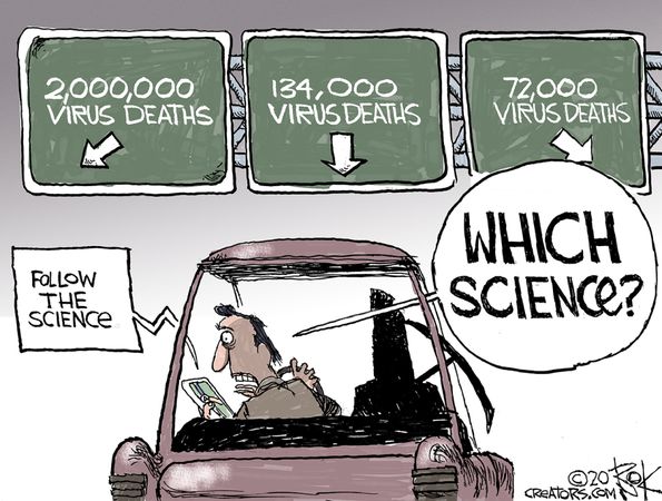
More Covid Truth Escapes the Fog

Matt Ridley writes at the Spectator We know everything – and nothing – about Covid.  Excerpts in italics with my bolds.

It is data, not modelling, that we need now

We know everything about Sars-CoV-2 and nothing about it. We can read every one of the (on average) 29,903 letters in its genome and know exactly how its 15 genes are transcribed into instructions to make which proteins. But we cannot figure out how it is spreading in enough detail to tell which parts of the lockdown of society are necessary and which are futile. Several months into the crisis we are still groping through a fog of ignorance and making mistakes. There is no such thing as ‘the science’.

This is not surprising or shameful; ignorance is the natural state of things. Every new disease is different and its epidemiology becomes clear only gradually and in retrospect. Is Covid-19 transmitted mainly by breath or by touching? Do children pass it on without getting sick? Why is it so much worse in Britain than Japan? Why are obese people especially at risk? How many people have had it? Are ventilators useless after all? Why is it not exploding in India and Africa? Will there be a second wave? We do not begin to have answers to these questions.

There is one vital fact that emerges from the fog. Countries that did a lot of testing from the start have fared much better than countries that did little testing. This is true not just of many Asian countries, such as South Korea (though Japan is an exception), but within Europe too. Up to the middle of last month, Iceland, Lithuania, Estonia and Germany had done many more tests per million people and recorded many fewer deaths per million people than Belgium, Britain, Italy and Sweden. As Max Roser of the website Our World In Data puts it: ‘The countries with the highest death rates got there by having the lowest testing rates.’

Yet it is not obvious why testing would make a difference, especially to the death rate. Testing does not cure the disease. Germany’s strange achievement of a consistently low case fatality rate seems baffling — until you think through where most early cases were found: in hospitals. By doing a lot more testing, countries like Germany might have partly kept the virus from spreading within the healthcare system. Germany, Japan and Hong Kong had different and more effective protocols in place from day one to prevent the virus spreading within care homes and hospitals.

The horrible truth is that it now looks like in many of the early cases, the disease was probably caught in hospitals and doctors’ surgeries.

That is where the virus kept returning, in the lungs of sick people, and that is where the next person often caught it, including plenty of healthcare workers. Many of these may not have realised they had it, or thought they had a mild cold. They then gave it to yet more elderly patients who were in hospital for other reasons, some of whom were sent back to care homes when the National Health Service made space on the wards for the expected wave of coronavirus patients.

The evidence from both Wuhan and Italy suggests that it was in healthcare settings, among the elderly and frail, that the epidemic was first amplified. But the Chinese authorities were then careful to quarantine those who tested positive in special facilities, keeping them away from the hospitals, and this may have been crucial. In Britain, the data shows that the vast majority of people in hospital with Covid-19 at every stage have been ‘inpatients newly diagnosed’; relatively few were ‘confirmed at the time of admission’. The assumption has been that most of the first group had been admitted on an earlier day with Covid symptoms. But maybe a lot of them had come to hospital with something else and then got the virus.

Even if you combine both groups, there are hardly enough admissions to explain the number of deaths in hospitals, unless nearly everybody admitted to hospital with Covid has died. It is likely that the frail and elderly, which the virus singles out for punishment, were more likely to be going to hospitals or clinics for other ailments and it was there that many of them got infected during February and March.

If Covid-19 is at least partly a ‘nosocomial’ (hospital-acquired) disease, then the pandemic might burn itself out quicker than expected.

The death rate here peaked on 8 April, just two weeks after lockdown began, which is surprisingly early given that it is usually at least four weeks after infection that people die if they die. But it makes sense if this was the fading of the initial, hospital–acquired wave. If you look at the per capita numbers for different countries in Europe, they all show a dampening of the rate of growth earlier than you would expect from the lockdowns.

This idea could be wrong, of course: as I keep saying, we just don’t know enough. But if it is right, it drives a coach and horses through the assumptions of the Imperial College model, on which policy decisions were hung. The famous ‘R’ (R0 at the start), or reproductive rate of the virus, could have been very high in hospitals and care homes, and much lower in the community. It makes no sense to talk of a single number for the whole of society. The simplistic Imperial College model, which spread around the world like a virus, should be buried. It is data, not modelling, that we need now.

If the elderly, obese and frail are not just at greater risk of dying, but also more susceptible and more infectious, then by definition everybody else is less so.

Gabriela Gomes and colleagues at the Liverpool School of Tropical Medicine looked at what would happen if the susceptibility of different segments of the population to the virus is very different, and concluded that in some circumstances effective herd immunity could be achieved with as little as 10 per cent of the population immunised. In the words of the study: ‘Individuals that are frailer, and therefore more susceptible or more exposed, have higher probabilities of being infected, depleting the susceptible subpopulation of those who are at higher risk of infection, and thus intensifying the deceleration in occurrence of new cases.’

If this is right, then it is good news. Once the epidemic is under control in hospitals and care homes, the disease might die out anyway, even without lockdown. In sharp contrast to the pattern among the elderly, children do not transmit the virus much if at all. This makes models based on flu, a disease that hits the young hard, misleading. The more the coronavirus has to use younger people to get around, the weaker its chances of surviving. Summer sunlight should slow it further, both by killing the virus directly and by boosting vitamin D levels.

It won’t be straightforward and there will be setbacks, but testing, followed by track and trace, is plainly now the way out. Britain is belatedly catching up. Matt Hancock’s ambitious dare to the healthcare system to get to 100,000 tests a day had the desired effect. We are now brimming with testing capacity, albeit still too centralised and slow in getting results back to people.

 In the light of what we know, it is vital that the government now switches from urging us to stay at home to urging us to return to as much of normal life as possible.  Be in no doubt that the strangulation that is asphyxiating the economy will have to be gradually lifted long before we know the full epidemiology of the virus.

Perilous though the path is, we cannot wait for the fog to lift before we start down the mountain.


On Following the Science

H/T to Luboc Motl for posting at his blog Deborah Cohen, BBC, and models vs theories  Excerpts in italics with my bolds

Dr Deborah Cohen is an award-winning health journalist who has a doctor degree – which actually seems to be related to medical sciences – and who is working for the BBC Newsnight now. I think that the 13-minute-long segment above is an excellent piece of journalism.

It seems to me that she primarily sees that the “models” predicting half a million of dead Britons have spectacularly failed and it is something that an honest health journalist simply must be interested in. And she seems to be an achieved and award-winning journalist. Second, she seems to see through some of the “more internal” defects of bad medical (and not only medical) science. Her PhD almost certainly helps in that. Someone whose background is purely in humanities or the PR-or-communication gibberish simply shouldn’t be expected to be on par with a real PhD.

So she has talked to the folks at the “Oxford evidence-based medicine” institute and others who understand the defect of the “computer models” as the basis of science or policymaking. Unsurprisingly, she is more or less led to the conclusion that the lockdown (in the U.K.) was a mistake.

If your equation – or computer model – assumes that 5% of those who contract the virus die (i.e. the probability is 5% that they die in a week if they get the virus), then your predicted fatality count may be inflated by a factor of 25 assuming that the case fatality rate is 0.2% – and it is something comparable to that. It should be a common sense that if someone makes a factor-of-25 error in the choice of this parameter, his predictions may be wrong by a factor-of-25, too. It doesn’t matter if the computer program looks like SimCity with 66.666 million Britons represented by a piece of a giant RAM memory of a supercomputer. This brute force obviously cannot compensate for a fundamental ignorance or error in your choice of the fatality rate.

I would think that most 3-year-old kids get this simple point and maybe this opinion is right. Nevertheless, most adults seem to be completely braindead today and they don’t get this point. When they are told that something was calculated by a computer, they worship the predictions. They don’t ask “whether the program was based on a realistic or scientifically supported theory”. Just the brute power of the pile of silicon seems to amaze them.

So we always agreed e.g. with Richard Lindzen that an important part of the degeneration of the climate science was the drift away from the proper “theory” to “modeling”. A scientist may be more leaning towards doing experiments and finding facts and measuring parameters with her hands (and much of the experimental climate science remained OK, after all, Spencer and Christy are still measuring the temperature by satellites etc.); and a theorist for whom the brain is (even) more important than for the experimenter. Experimenters sort of continued to do their work. However, it’s mainly the “theorists” who hopelessly degenerated in the climate science, under the influence of toxic ideology, politics, and corruption.

The real problem is that proper theorists – those who actually understand the science – can solve basic equations on the top of their heads, and are aware of all the intricacies in the process of finding the right equations, equivalence and unequivalence of equations, universal behavior, statistical effects etc. – were replaced by “modelers” i.e. people who don’t really have a clue about science, who write a computer-game-like code, worship their silicon, and mindlessly promote what comes out of this computer game. It is a catastrophe for the field – and the same was obviously happening to “theoretical epidemiology”, too.

“Models” and “good theory” aren’t just orthogonal. The culture of “models” is actively antiscientific because it comes with the encouragement to mindlessly trust in what happens in computer games. This isn’t just “different and independent from” the genuine scientific method. It just directly contradicts the scientific method. In science, you just can’t ever mindlessly trust something just because expensive hardware was used or a high number of operations was made by the CPU. These things are really negative for the trustworthiness and expected accuracy of the science, not positive. In science, you want to make things as simple as possible (because the proliferation of moving parts increases the probability of glitches) but not simpler; and you want to solve a maximum fraction of the issues analytically, not numerically or by a “simulation”.

Science is a systematic framework to figure out which statements about Nature are correct and which are incorrect.

And according to quantum mechanics, the truth values of propositions must be probabilistic. Quantum mechanics only predicts the “similarity [of propositions] to the truth” which is the translation of the Czech word for probability (pravděpodobnost).

It is the truth values (or probabilities) that matter in science – the separation of statements to right and wrong ones (or likely and unlikely ones). Again, I think that I am saying something totally elementary, something that I understood before I was 3 and so did many of you. But it seems obvious that the people who need to ask whether Leo’s or Stephen’s pictures are “theories of everything” must totally misunderstand even this basic point – that science is about the truth, not just representation of objects.

See also: The Deadly Lockdowns and Covid19 Linked to Affluence

Footnote:  Babylon Bee Has Some Fun with this Topic.

‘The Science On Climate Change Is Settled,’ Says Man Who Does Not Believe The Settled Science On Gender, Unborn Babies, Economics

PORTLAND, OR—Local man Trevor J. Gavyn pleaded with his conservative coworker to “believe the science on climate change,” though he himself does not believe the science on the number of genders there are, the fact that unborn babies are fully human, and that socialism has failed every time it has been tried.

“It’s just like, the science is settled, man,” he said in between puffs on his vape. “We just need to believe the scientists and listen to the experts here.”

“Facts don’t care about your feelings on the climate, bro,” he added, though he ignores the fact that there are only two biological genders. He also hand-waves away the science that an unborn baby is 100% biologically human the moment it is conceived and believes economics is a “conservative hoax foisted on us by the Illuminati and Ronald Reagan.”

“That whole thing is, like, a big conspiracy, man,” he said.

The conservative coworker, for his part, said he will trust the science on gender, unborn babies, and economics while simply offering “thoughts and prayers” for the climate.

Covid19 Linked to Affluence

To enlarge, open image in new tab.

Colby Cosh writes at National Post COVID-19 is showing us what a real First World problem looks like Excerpts in italics with my bolds.

On Monday, a reader, Max Anderson of Vancouver, wrote in to observe that, at this point in the COVID-19 epic, Canada does not appear to be doing so well by the developed world’s standards at preventing coronavirus deaths. The case isn’t complicated. It involves looking beyond the United States for comparisons, always a difficult optical exercise for Canadians.

Consider the OECD, the 37-member club of high-income liberal democracies. If you pull the COVID-19 death rates for these countries off of Wikipedia, you find a vast range of figures. Lucky Australia, as I write this, reports 4 fatalities per million residents; Japan and New Zealand are also at 4, with Slovakia and South Korea at 5. At the high end, Belgium, known to be liberal in its definition of a “COVID-19 death”, tops the table with 688 deaths per million. Spain is at 540, Italy at 483, and the U.K. in fourth place at 433.

But the median rate for the OECD countries is just 42 deaths per million, and Canada is at 99. So we probably shouldn’t feel smug because the U.S. stands at 209. Maybe we should be angry. Well, a lot of us are angry anyway.

A defence of Canada could start with the same data. A median is just the middle in a set of data points, the value at which half the things you measured are above and half below. The actual average, the mean, of OECD COVID-19 death rates is 128 per million. Suddenly Canada is doing better than average! A median and a mean can spread pretty far apart when a set of numbers isn’t symmetrically distributed, and in this case there are many small countries with death rates in the teens and 20s, including Latin American OECD members. (Those, with their rates, are Colombia, 7 per million; Chile, 14; and Mexico, 17.)

What’s astonishing here, I think, is the even-bigger-picture. Early in SARS-CoV-2’s bust-out from China, it became apparent that the heaviest impacts were in the very wealthiest countries. Eight or 10 weeks ago, there was widespread terror at the thought of what the virus would do when it reached the less developed world. This has, so far, proven to be the proverbial unbarking dog.

The website Our World in Data has a chart of countries with their per-capita GDP on the x-axis and their confirmed deaths per million on the y-axis. With logarithm scales on both axes, the data points on the chart are still, in May of the plague year, damned close to a straight line sloping upward from left to right. Allowing for differences in COVID case definition, there is, at the moment, no very poor country anywhere on Earth which has been hit significantly harder than Canada — and no large richer country that isn’t worse off aside from Norway.

Wealthy Canada is therefore more or less exactly where you would expect it to be on that chart (as is, for that matter, the U.S.A.). On the May 4 version of the chart we are in a little cluster, a mini-Pleiades, quite close to Germany, Austria and Denmark. Those are pretty comforting neighbours to have, I think (at least in this century). Denmark has perhaps the world’s best population-health data system. Germany is being celebrated for mobilizing the resources of the Robert Koch Institute, a federal disease control agency that can boast of actually controlling disease.

I think we can start believing, tentatively, that COVID-19 may be inherently a disease of affluence.

The assumption that it is only so circumstantially has prevailed for an awkwardly long moment. If GDP remains tightly correlated to national death tolls, countries are likely to judge themselves on whether they are high in the death table, or low, for their own particular degree of economic development.

It is not difficult to think of mediating factors that feed into the wealth-COVID relationship. Richer countries undertake more international business and pleasure travel, and attract more of it. The citizens within them are generally more mobile and more urbanized. People in the richer countries live longer, so their populations tend to have more old and vulnerable persons. Obesity is a known co-morbidity of COVID, and the rich countries have more of that, too — along with higher rates of hypertension and type 2 diabetes. And those countries are, of course, concentrated in one hemisphere of the globe: nobody knows anything meaningful yet about how weather (or any other regional phenomenon) affects SARS-CoV-2.

Add it all up and you get that (log-log) “straight-line” relationship. The trick, if the straight line continues to hold, will be sorting out exactly which correlates of GDP contribute, and how much. But the straight line is, in itself, quite surprising.

Anyone would have expected — and most experts still half-expect — that our lack of social deprivation, by itself, would more than compensate for lifestyle excesses and material privileges in a crisis like this. This is to say nothing of Canada’s sophisticated, and publicly provided, health-care system, which doesn’t seem to have bought us much extra protection against a nightmare from the past. No one expected an infectious disease with these special characteristics, which remain mysterious. We all joked around about “First World problems” for a long time. Anybody having a laugh at this one?

Footnote:  Background on Modern Affluence

Alex Epstein (here) is among those who demonstrate from public information sources comparisons between societies who use carbon fuels extensively and those who do not. The contrast is remarkable: Societies with fossil fuels have citizens who are healthier, live longer, have higher standards of living, and enjoy cleaner air and drinking water, to boot. Not only do healthier, more mobile people create social wealth and prosperity, carbon-based energy is heavily taxed by every society that uses it. Those added government revenues go (at least some of it) into the social welfare of the citizenry. By almost any measure, carbon-based energy makes the difference between developed and underdeveloped populations.

In addition, developed societies protect most of their citizenry from natural disasters, including extreme weather events.

The EM-DAT database provides three disaster impact indicators for each disaster event: economic losses, the number of people affected and the number of people killed. . .The data show large differences across disaster indicators and regions: economic losses are largest in the OECD countries, the number of people affected is largest in the BRIICS countries and the number of people killed is largest in the RoW countries.

Fig. 3 Economic losses normalized for wealth (upper panel) and the number of people affected normalized for population size (lower panel). Sample period is 1980–2010. Solid lines are IRW trends for the corresponding data.

Clearly, the wealthier nations build and maintain more robust structures and infrastructures, which incur costly damages from natural events, but which greatly reduce human deprivation and deaths.  Ironically, these advantaged nations now provide large numbers of attractive hosts for this novel coronavirus, absent defences from medical technology.  It is also the case that these privileged populations are so rooted in presumed physical security that the hysterical media has triggered a panic pandemic, overshadowing the actual viral outbreak.

Postscript: For the latest social distancing etiquette as restaurants reopen:

Global Land & Ocean Air Cooling in April

banner-blog

With apologies to Paul Revere, this post is on the lookout for cooler weather with an eye on both the Land and the Sea.  UAH has updated their tlt (temperatures in lower troposphere) dataset for April 2020.  Previously I have done posts on their reading of ocean air temps as a prelude to updated records from HADSST3. This month also has a separate graph of land air temps because the comparisons and contrasts are interesting as we contemplate possible cooling in coming months and years.

Presently sea surface temperatures (SST) are the best available indicator of heat content gained or lost from earth’s climate system.  Enthalpy is the thermodynamic term for total heat content in a system, and humidity differences in air parcels affect enthalpy.  Measuring water temperature directly avoids distorted impressions from air measurements.  In addition, ocean covers 71% of the planet surface and thus dominates surface temperature estimates.  Eventually we will likely have reliable means of recording water temperatures at depth.

Recently, Dr. Ole Humlum reported from his research that air temperatures lag 2-3 months behind changes in SST.  He also observed that changes in CO2 atmospheric concentrations lag behind SST by 11-12 months.  This latter point is addressed in a previous post Who to Blame for Rising CO2?

HadSST3 results were delayed with February and March updates only appearing together end of last month.  For comparison we can look at lower troposphere temperatures (TLT) from UAHv6 which are now posted for April. The temperature record is derived from microwave sounding units (MSU) on board satellites like the one pictured above.

The UAH dataset includes temperature results for air above the oceans, and thus should be most comparable to the SSTs. There is the additional feature that ocean air temps avoid Urban Heat Islands (UHI). In 2015 there was a change in UAH processing of satellite drift corrections, including dropping one platform which can no longer be corrected. The graphs below are taken from the new and current dataset, Version 6.0.

The graph above shows monthly anomalies for ocean temps since January 2015. After all regions peaked with the El Nino in early 2016, the ocean air temps dropped back down with all regions showing the same low anomaly August 2018.  Then a warming phase ensued which seems now to peak in February 2020. As was the case in 2015-16, the warming was driven by the Tropics and NH, with SH lagging behind.

Land Air Temperatures Showing a Seesaw Pattern

We sometimes overlook that in climate temperature records, while the oceans are measured directly with SSTs, land temps are measured only indirectly.  The land temperature records at surface stations sample air temps at 2 meters above ground.  UAH gives tlt anomalies for air over land separately from ocean air temps.  The graph updated for February 2020 is below.

Here we have fresh evidence of the greater volatility of the Land temperatures, along with extraordinary departures, first by NH land with SH often offsetting.   The overall pattern is similar to the ocean air temps, but obviously driven by NH with its greater amount of land surface. The Tropics synchronized with NH for the 2016 event, but otherwise follow a contrary rhythm.  SH seems to vary wildly, especially in recent months.  Note the extremely high anomaly last November, cold in March 2020, and then again a spike in April. With its smaller land mass, SH fluctuations have less impact on the Global results.

The longer term picture from UAH is a return to the mean for the period starting with 1995.  2019 average rose but currently lacks any El Nino to sustain it.

These charts demonstrate that underneath the averages, warming and cooling is diverse and constantly changing, contrary to the notion of a global climate that can be fixed at some favorable temperature.

TLTs include mixing above the oceans and probably some influence from nearby more volatile land temps.  Clearly NH and Global land temps have been dropping in a seesaw pattern, more than 1C lower than the 2016 peak, prior to these last several months. TLT measures started the recent cooling later than SSTs from HadSST3, but are now showing the same pattern.  It seems obvious that despite the three El Ninos, their warming has not persisted, and without them it would probably have cooled since 1995.  Of course, the future has not yet been written.

The Deadly Lockdowns

H/T to Paul Noel writing at Quora responding to the question:

How much impact would current shelter-in-place practices have on the climate crisis if we were to continue them indefinitely?

Don’t try it you will die. This is a common misunderstanding of medical treatments. If I shoot your heart with Epinephrine during a heart attack it may save your life. It may even take a second shot or a third to work. But don’t even consider doing it a 4th time.

You see this is how that drug works. It causes the heart which in a heart attack is already dying for lack of energy to burn through its energy reserves even faster. The few doses work but by the 4th dose the heart has no reserve energy. You couldn’t get it to move if you tried.

All of the “good things” you think are happening with the COVID-19 lockdowns are exactly the same as with that heart. You are seeing a lockdown that appears to you to have no harm and the energy from outside is dropping so you think you have no problem. What you are not seeing is your society is fast burning through its vital resources. Very soon all the tricks will burn through all the resources and then NOTHING will work. Then people will be dying in masses from the treatment. If we get the world back to running as usual it make take a bit of “rehab” but we will get back and burn even more fuel to make up for the burned up reserves. It will take that to get us back to strong again.

What you are celebrating is DEATH happening! The reduction in fuel use must come from somewhere. Right now it is coming from the grain bins and from the prepackaged stores of energy that you call food. The nation states have commanded with lockdown and stimulus packages the exact situation with the heart and the epinephrine. They have told a dying economy to kick in the reserves. Stupid people think this can work for a long time. It cannot. It is fatal. You and your economy are being poisoned to try to cure a dangerous situation. Epinephrine is a deadly poison! Yes I do know the use of it very well I am ACLS and Heart Transplant qualified.

What is happening with the world’s ships parked and our cities shut down is that we are running out of energy. Oh yes the oil bins are full but the vital energy like fertilizer is not reaching the people in Africa etc. When they don’t get their stuff and their food and etc, the game will end very badly.

I think people arguing this have no idea what saved the whales from extinction. They think it was Greenpeace. It wasn’t. It was the discovery of Oil in Pennsylvania. You see the world was about to come to a halt from lack of whale oil and that was what drove the discovery. Oil saved the whales. You shut down the oil gas and coal and you will soon see all life swept from the land and the seas. You are not going to see a wonderful world, you are going to see a massive FAMINE!

Summary:  Hunger and Poverty are the two greatest killers of humanity, and hundreds of millions of people are now at risk because of the global economic shutdown.

Scott Atlas explains the medical realities for ending the shutdowns now.

“Woke” Capitalists High on ESG

Rupert Darwall writes at The Hill BlackRock’s choice: Investment fiduciary or political activist? Excerpts in italics with my bolds.

Something more disruptive and longer lasting than COVID-19 is at work in BlackRock’s New York offices — and its implications may well extend beyond one financial firm and its shareholders.

Astonishingly, BlackRock now threatens to vote against directors who don’t incorporate its views on environmental and social issues, the “E” and the “S” in ESG social-investing criteria. (The “G” stands for “governance.”) BlackRock says it will take a “harsh view” of companies that fail to provide it with the hard data it demands, even though Fink himself tells corporate CEOs that such reporting requires “significant time, analysis and effort.” And it proposes to make good on its threat by aligning its proxy vote with single-issue activist campaigners when it judges a company is not effectively dealing with an issue it deems “material” or might not be dealing with ESG issues “appropriately.”

Unsurprisingly, BlackRock camouflages this shift with language about its fiduciary duty to its customers — American savers and investors. “BlackRock’s primary concern is the best long-term economic interest of shareholders,” its investment stewardship guidelines state. “We do not see it as our role to make social, ethical, or political judgments on behalf of clients.”

It’s hard keeping up the pretense, though — and sometimes the mask slips. The goal cannot be transparency for transparency’s sake, Fink says: “Disclosure should be a means to achieving a more sustainable and inclusive capitalism.” Companies must commit to serving all their stakeholders and embrace purpose, as distinct from profit. This goal is nothing if not controversial. It also is inherently political.

In their critique of the Business Roundtable’s recent adoption of such stakeholder capitalism, former Secretary of State George Shultz and his coauthors suggest that the demotion of profit and shareholder accountability should be seen as a response to a resurgence of a socialist impulse in American politics; it will result in decisions that sacrifice shareholder value and is a formula for endless legal wrangling and litigation. In a March 2020 working paper, “The Illusory Promise of Stakeholder Governance,” Harvard Law School’s Lucian Bebchuk and Roberto Tallarita conclude that the stakeholderism advocated by the Business Roundtable and BlackRock should be viewed “largely as a PR move.”  Yet, what may have started out as a sham, pain-free PR exercise to signal E&S virtue has morphed into something of a monster, with real-world consequences for BlackRock, the companies it invests in, its customers and for society in general.

This raises the question of the demarcation between the rightful domains of democratic politics and business.

BlackRock’s contention that its stewardship engagement is not about making political judgments on behalf of its clients falls apart when it comes to climate, reflecting its capitulation to shareholder activists. At a minimum, BlackRock is imposing its political judgment on companies about climate regulation that future presidents and future Congresses might or might not enact. Given the tortured political and judicial history of attempted climate legislation and regulation in the U.S., this is an unusually difficult call to make.

In fact, BlackRock goes much further. In January, BlackRock joined Climate Action 100+ (the clue’s in the name) to press companies to “take necessary action on climate change,” a formulation that dispenses with any pretense that BlackRock is doing anything but acting as a political activist with a $3 trillion equity portfolio.

Thus, BlackRock and its shareholder activists are using corporate governance statutes to usurp regulatory functions that properly belong to government. Whatever BlackRock’s motives in allowing itself to be strong-armed by shareholder activists – expediency, political benefit or poor judgment – the outcome is that BlackRock is subordinating its core responsibility as an investor fiduciary to political activism.

This incurs a double democratic deficit: The first is not formally soliciting its clients’ permission to use their money to advance BlackRock’s new political agenda; the second is bypassing the democratic process of electing officials to political positions to pass laws and appoint regulators. Whatever one’s views on climate change and ESG in general, the means used by shareholder activists and BlackRock’s capitulation to them amount to an abuse of corporate governance structures put in place to protect shareholders and not intended to be a channel for political campaigning by other means.

Addendum from the Financial Times

Excluding oil from the definition of fossil fuels is everything but straightforward,’ says MEP Paul Tang © Essam Al-Sudani/Reuters

Investors blast EU’s omission of oil from ESG disclosures

Under draft proposals for the EU’s sustainable disclosure regime, the European authorities responsible for banking, insurance and securities markets define fossil fuels as only applying to “solid” energy sources such as coal and lignite.

This means asset managers and other financial groups would have to follow tougher disclosure requirements for holdings in coal producers than for oil and gas company exposure.

The huge rise in popularity of ESG investing over the past decade has prompted regulators to take measures to confront the risk of greenwashing.

The latest EU proposals represent a significant watering down of its ambitious sustainable disclosure rules, which aim to give end investors clear information on the environmental, social and governance risks of their funds.

But critics also argue they risk undermining the EU’s commitment to becoming a world leader in sustainable finance, a key priority for the bloc as it seeks to tie the coronavirus recovery to creating a greener economy.

See also Financiers Failed Us: Focused on Fake Crisis


Stay At Home Orders Don’t Limit Covid Cases

A sign informing visitors that Mulholland Scenic Overlook is closed during the coronavirus outbreak, Los Angeles, Calif., April 5, 2020. (Lisa Girion/Reuters)

Jeffrey D. Klausner and Rajiv Bhatia write at National Review Most States Can Safely Relax Some Coronavirus Restrictions.  Excerpts in italics with my bolds.

Continue more modest restrictions, keep watching the data, and focus on hospitals and protecting the most vulnerable.

One of the main questions on the minds of Americans is when government restrictions aimed at controlling the coronavirus epidemic can be safely lifted. In most states, we now have enough information to say that the strictest measures can be relaxed.

For our part, we have looked at the relationship between the timing of stay-at-home orders and the peaks in the number of reported cases in 31 U.S. states. We could not find a clear pattern relating the timing of such orders to the peaks in case numbers, suggesting no association between the orders and the limitation of cases. One would have expected, if there had been an effect of such state-at-home orders on the number of new cases, a consistent time-dependent effect —that is, a clear, observable average time, say ten to 14 days from the date of the order to the peak. That was not seen.

Closing down large sectors of society is a blunt tool, and its use comes with huge costs—the disruption of education, economic activity, and social interactions. The ongoing, and possibly future, use of such stay-at-home orders deserves timely and rigorous evaluation. As much as possible, we want to know how necessary, and how costly, each intervention (e.g., limiting gatherings, closing restaurants and retail businesses) is on its own. In the realm of public health, first principles of disease control dictate the use of the least costly set of interventions sufficient to prevent and mitigate illness.

Overall, several pieces of evidence suggest that the pace of new SARS-CoV-2 infections had declined significantly before government officials imposed the most severe restrictions. Those findings, along with the fact that most hospitals, outside of certain severely affected areas like New York City, had adequate capacity throughout the month of April, should give us confidence that self-protective changes in personal behavior along with testing, isolation, and quarantine can adequately mitigate the epidemic.

It is time to step back from restrictions like prohibition of access to outdoor spaces, universal orders for home confinement, and closure of small businesses. In stages, and watching the data on test-positivity in key populations and COVID-19–related emergency-room visits and hospital admissions, we can get back to work and school while limiting person-to-person contact with measures such as occupancy limits, promoting hand-washing, and adopting policies for paid sick leave to enable ill workers to avoid others and reduce the spread of infection. Public health should focus on protecting the most vulnerable with screening and rapid response to outbreaks in nursing homes and shelters.

Finally, ensuring that we’re using the least restrictive means necessary also requires that we focus on keeping hospitals above water. That can be done by adjusting policies specifically to hospital-admission rates of COVID-19 patients and local bed-capacity for their care (e.g., dedicating 50 percent of acute-care beds). Leading indicators like daily COVID-19–related outpatient and emergency-room visits can now be monitored to provide an early warning system.

The findings described above, and increasing experience in other settings, lead us to believe that relaxing the strictest interventions while continuing more modest ones will not cause an unmanageable resurgence in cases.

Jeffrey D. Klausner, a former CDC medical officer, is a professor of medicine and public health at UCLA. Rajiv Bhatia, a former San Francisco City and County deputy health officer, is an assistant clinical professor of medicine (affiliated) at Stanford School of Medicine.

See also Good Virus News from the Promised Land


April Arctic Ice Melting as Usual

The image above shows springtime melting of Arctic sea ice extent over the month of April 2020.  As usual the process of declining ice extent follows a LIFO pattern:  Last In First Out.  That is, the marginal seas are the last to freeze and the first to melt.  Thus at the top of the image, the Pacific basins of Bering and Okohtsk seas show a steady decline in ice.  Meanwhile at bottom left, Baffin Bay ice retreats from south to north.  Note center left Hudson Bay loses very little ice during the month.  The central mass of Arctic ice is  intact with some fluctuations back and forth bottom right, as patches of water appear in Barents and Kara Seas.

The graph below shows the ice extent retreating during April compared to some other years and the 13 year average (2007 to 2019 inclusive).

Note that the  MASIE NH ice extent 13 year average loses about 1.2M km2 during April, down to 13.5M km2. MASIE 2019 started much lower and lost ice at a similar rate, ending nearly 800k km2 below average.  This year started in the middle of the other tracks, the most interesting thing being the wide divergence between SII and MASIE reports for April, with a sawtooth pattern alternating loses and gains.  The two indices were close in the beginning, but the gap grew to 600k km2 before narrowing at the end.  I inquired whether NIC had experienced any measurement issues, but their response indicated nothing remarkable.  It is notable that MASIE is the low estimate of the two.

Region 2020121 Day 121 Average 2020-Ave. 2019121 2020-2019
 (0) Northern_Hemisphere 13091644 13517638  -425994  12730893 360751 
 (1) Beaufort_Sea 1070307 1067944  2363  1070463 -156 
 (2) Chukchi_Sea 961124 952949  8175  909505 51619 
 (3) East_Siberian_Sea 1081646 1085858  -4212  1082230 -585 
 (4) Laptev_Sea 851288 891300  -40012  897845 -46557 
 (5) Kara_Sea 860722 909170  -48448  917303 -56581 
 (6) Barents_Sea 588361 546921  41440  557814 30547 
 (7) Greenland_Sea 769073 634171  134902  487626 281446 
 (8) Baffin_Bay_Gulf_of_St._Lawrence 1001748 1240703  -238955  1113262 -111514 
 (9) Canadian_Archipelago 849940 848790  1150  853337 -3397 
 (10) Hudson_Bay 1209082 1242060  -32978  1255410 -46328 
 (11) Central_Arctic 3245999 3236485  9514  3245152 846 
 (12) Bering_Sea 337849 466262  -128413  93641 244208 
 (13) Baltic_Sea 5973 20676  -14703  10318 -4345 
 (14) Sea_of_Okhotsk 257268 371173  -113905  235299 21969 

The table shows where the ice is distributed compared to average.  Baffin Bay has the largest deficit to average followed by Bering and Okhotsk. Greenland Sea and Barents Sea are in surplus, offsetting small deficits in Kara, Laptev and Hudson Bay.

Footnote:  Interesting comments recently by Dr. Judah Cohen at his blog regarding the Arctic fluctuations this winter and spring. Excerpts with my bolds.

As I sit here in home, enduring a second day of cloudy, wet, relatively cold and windy weather from a storm passing to our south and had this been winter would have brought a crippling snowstorm. And this storm or pattern isn’t unique. It seems that every few days here in the Northeastern US we get a rainstorm that had it been winter would have produced a snowstorm, though even these late season storms are bringing snow to the higher elevations of the Northeast. I find myself asking (and I realize that I am not unique asking this question) – where was this pattern in winter?

I reflexively look to the PV for answers. The winter was characterized by a stronger than normal stratospheric PV that was hostile to meridional (north to south), large amplitude flow and high latitude blocking that is so favorable for sustained cold air outbreaks and snowstorms. Instead the strong PV supported fast zonal flow of the Jet Stream that was displaced to the north that favored overall mild temperatures and rainfall across the US except for higher elevations and near the Canadian border. Similarly, an even milder and snowless pattern persisted across Europe all winter.

Then once winter was over, high pressure/blocking returned to the North Atlantic sector that excited the vertical transfer of energy from the troposphere to the stratosphere and has weakened the stratospheric PV. This increase in vertical energy transfer has decelerated a hyperactive PV and it does appear that the weakening of the PV will actually overshoot the typical weakening resulting in stronger easterly winds in the polar stratosphere than the climatological average (see Figure i). Easterly winds in the polar stratosphere are the telltale sign of the Final Warming (where the stratospheric PV disappears until the fall).

Illustration by Eleanor Lutz shows Earth’s seasonal climate changes. If played in full screen, the four corners present views from top, bottom and sides. It is a visual representation of scientific datasets measuring Arctic ice extents.

Coronavirus Censors


Matt Taibbi writes The Inevitable Coronavirus Censorship Crisis is Here. Conclusion excerpted in italics with my bolds and images.

As the Covid-19 crisis progresses, censorship programs advance, amid calls for China-style control of the Internet

In the Trump years the sector of society we used to describe as liberal America became a giant finger-wagging machine. The news media, academia, the Democratic Party, show-business celebrities and masses of blue-checked Twitter virtuosos became a kind of umbrella agreement society, united by loathing of Trump and fury toward anyone who dissented with their preoccupations.

Because Conventional Wisdom viewed itself as being solely concerned with the Only Important Thing, i.e. removing Trump, there was no longer any legitimate excuse for disagreeing with Conventional Wisdom’s takes on Russia, Julian Assange, Jill Stein, Joe Rogan, the 25th amendment, Ukraine, the use of the word “treason,” the removal of Alex Jones, the movie Joker, or whatever else happened to be the #Resistance fixation of the day.

When the Covid-19 crisis struck, the scolding utopia was no longer abstraction. The dream was reality! Pure communism had arrived! Failure to take elite advice was no longer just a deplorable faux pas. Not heeding experts was now murder. It could not be tolerated. Media coverage quickly became a single, floridly-written tirade against “expertise-deniers.” For instance, the Atlantic headline on Kemp’s decision to end some shutdowns was, “Georgia’s Experiment in Human Sacrifice.”

At the outset of the crisis, America’s biggest internet platforms – Facebook, Twitter, Google, LinkedIn, and Reddit – took an unprecedented step to combat “fraud and misinformation” by promising extensive cooperation in elevating “authoritative” news over less reputable sources.

H.L. Mencken once said that in America, “the general average of intelligence, of knowledge, of competence, of integrity, of self-respect, of honor is so low that any man who knows his trade, does not fear ghosts, has read fifty good books, and practices the common decencies stands out as brilliantly as a wart on a bald head.”

We have a lot of dumb people in this country. But the difference between the stupidities cherished by the Idiocracy set ingesting fish cleaner, and the ones pushed in places like the Atlantic, is that the jackasses among the “expert” class compound their wrongness by being so sure of themselves that they force others to go along. In other words, to combat “ignorance,” the scolders create a new and more virulent species of it: exclusive ignorance, forced ignorance, ignorance with staying power.

The people who want to add a censorship regime to a health crisis are more dangerous and more stupid by leaps and bounds than a president who tells people to inject disinfectant. It’s astonishing that they don’t see this.

Footnote:  How to Respond to a Scold–Imitate the Nip/Tuck plastic surgeons.