Economic Freedom is the Way Forward, Reject Woke ESG Corporatism

Anthony B. Kim and Patrick Tyrrell write at Daily Signal Economic Freedom Is the Path to Healthy Environments, Social Progress, and Good Governance—Not Woke Corporatism.  Excerpts in italics with my bolds.

The left is trying to refashion how policy makers and private-sector leaders understand their roles by insisting that their actions must have an “environmental, social, and governance” focus. This agenda is frequently abbreviated to “ESG”—a buzzword that is now being heavily circulated online and in D.C. It’s also completely misguided.

The environmental, social, and governance agenda insists that policy makers and private-sector leaders see themselves as the stewards of a newly “woke” planet. In actuality, it is a way to force companies to take positions in the political arena on issues that may have nothing to do with the company’s actual business activities.

Economic freedom, not the environmental, social, and governance agenda, makes the world cleaner, safer, and better governed. It is not hard to find the economic damage that is inflicted by heavy-handed and misguided government policies, which result in lingering uncertainty, deteriorating entrepreneurial environments, and lower employment growth.

The true path to ensuring environmental, social, governance improvements lies in focusing on policies that enhance economic freedom. As documented in The Heritage Foundation’s annual Index of Economic Freedom, the linkage between economic freedom, individual liberty, and prosperity around the world is unambiguous.

This prosperity is not just an end in itself. As the index catalogues, preserving and advancing economic freedom enables individuals, entrepreneurs, and companies to better care for the poor and their environments, create better health care and education systems, ensure an abundance of food and clean water, and solve many of the other societal problems that makes life better for a greater number people.

In countries around the world, economic freedom has been shown to increase the capacity for environmentally friendly innovation. The positive link between economic freedom and higher levels of innovation ensures greater capacity to cope with environmental challenges, and the most remarkable improvements in clean energy use and energy efficiency over the past decades have occurred not as a result of government regulation, but rather because of advances in economic freedom and freer trade.

Equally notable is that countries that provide an environment that is conducive to social progress also largely embrace economic freedom. Countries that allow private-sector competitiveness to thrive free from government interference and open their societies to new ideas, products, and innovations have largely achieved the high levels of social progress that their citizens demand.

It is not massive redistributions of wealth or government dictates on income level that produce the most positive social outcomes.

Greater economic freedom can also provide more fertile ground for effective and democratic governance. Undoubtedly, the achievement of political freedom through a well-functioning democratic system is a messy and often excruciating process, but the positive relationship between economic freedom and democratic governance is undeniable.

By empowering people to exercise greater control of their daily lives, economic freedom ultimately nurtures political reform by making it possible for individuals to gain the economic resources that they can use to challenge entrenched interests or compete for political power, thereby encouraging the creation of more pluralistic societies.

By building on what works, we can accelerate our progress in the face of even the most difficult challenges and chart ever greater success. The key to that is to advance the four pillars of economic freedom—the rule of law, limited government, efficient regulation, and market openness.

Real-world trends already reveal how to advance environmental, social, and responsible governance principles and results. Twenty-seven years of the annual Index of Economic Freedom provide compelling evidence that the pathway to such improvements is not with infringing on people’s economic freedom, but through allowing their economic freedom to flourish.

That responsibility is to advance free people and free markets.


2021 Evidence Confirming Cosmoclimatology theory

David Whitehouse writes at NetZeroWatch New study confirms Sun/Cosmic-Ray climate connection. Excerpts in italics with my bolds.

A new study published in Nature Scientific Reports by researchers at the Danish National Space Institute at the Technical University of Denmark (DTU) and The Hebrew University of Jerusalem suggests that the Sun’s activity in screening cosmic rays affects clouds and, ultimately, the Earth’s energy budget with concomitant climatic effects.

Eruptions on the Sun screen the Earth from galactic cosmic rays – energetic particles raining down on our planet from exploded stars. “The Sun carries out fantastic natural experiments that allow us to test our ideas about cosmic ray effects on the atmosphere,” professor Henrik Svensmark, lead author of the study told the GWPF.

Solar explosions produce magnetised gas that sweeps past the Earth reducing the cosmic ray flux reaching us. These events are called Forbush decreases taking their name from the American physicist Scott E. Forbush, who first noticed them more than 80 years ago. They lead to a temporarily lower production of small aerosols – molecular clusters in the air – that normally grow to seed the water droplets of low-level clouds. This, in turn, reduces the cloud cover which is known to affect climate.

CC Theory1

The recent breakthrough is that the effect on the Earth’s energy budget has been quantified using satellite observations from the CERES instrument on NASA’s Terra and Aqua satellites.

The observational data indicate that the Earth absorbs almost 2 Watts per square metre additional energy within 4 to 6 days of the cosmic-ray minimum. Such a large effect is a major surprise since the general consensus of the climate community, recently expressed in the 2021 released IPCC report AR6 (chapter 7.3.4.5), is that, “… the GCR [galactic cosmic rays] effect on CCN [cloud condensation nuclei] is too weak to have any detectable effect on climate and no robust association was found between GCR and cloudiness. … There is high confidence that GCRs contribute a negligible ERF [effective radiative forcing] over the period 1750 to 2019.”

These new results show the IPCC’s conclusion will need to be reassessed. Two Watts per square metre can be compared with the IPCC report’s estimate of solar effective radiative forcing over the period 1750 to 2019 of only 0.01 Watts per square metre (obtained by only considering solar irradiance changes).

“We now have simultaneous observations of decreases cosmic rays, aerosols, clouds, and the energy budget” says professor Nir Shaviv.

Background from previous post The Cosmoclimatology theory 

An article at GWPF provides a concise description linking solar activity to earth’s climate. It pulls together several strands of observations and thought presented in recent posts, which are referenced at the end.

The GWPF article (here) is from Deepak Lal and focuses on why India should follow the US out of the Paris accord, but I am more interested in the scientific rationale. The author nicely summarizes an alternative explanation for climate fluctuations to that of IPCC “consensus” scientists. Excerpts below with my bolds.

Propounded by Danish physicist Henrik Svensmark and his associates, the cosmoclimatology theory states that climate is controlled by low cloud cover, which when widespread has a cooling effect by reflecting solar energy back into space and vice versa. These low clouds, in turn, are formed when sub-atomic particles called cosmic rays, emitted by exploding stars, combine with water vapour rising from the oceans.

The constant bombardment of the planet by cosmic rays is modulated by the solar wind, which when it is blowing prevents cosmic rays from reaching the earth and creating low clouds. The solar wind in turn is caused by the varying sunspot activity of the sun.

When, as recently, sunspot activity decreases we get the global ‘cooling’ observed during the recent ‘pause’ in global warming. Furthermore, as noted by the Princeton physicist William Happer (see my column “Clouds of Climate Change”, September 2011), the millennial ‘ice core’ records of the correlation between CO2 and temperature show “that changes in temperature preceded changes in CO2 levels, so that CO2 levels were an effect of temperature changes.

Much of this was probably due to outgassing of CO2 from the warming oceans or the reverse in cooling” (“The truth about greenhouse gasses”). For the oceans are the primary sinks as well as emitters of CO2. Given their vastness relative to the earth’s surface, it takes a long time for the ocean to warm from rises in terrestrial temperatures (and vice versa), hence the lag between temperature and CO2 levels.

cern-cloud

The CLOUD experiment is studying whether cosmic rays play a role in cloud formation. Maximilien Brice / CERN

The missing piece in the cosmoclimatology theory was the physical link between cosmic rays and cloud formation. The first confirmation of the basic hypothesis that “ions [cosmic rays] are fundamental for the nucleation of aerosols [tiny liquid or solid particles that provide a nucleus around which droplets can form from water vapour in the air]” was confirmed by the CLOUD experiment at CERN — the particle physics laboratory in 2011. (See Kirby et al, Nature, (2011), 476, 429-433: Cloud formation may be linked to cosmic rays  Experiment probes connection between climate change and radiation bombarding the atmosphere.

But there was still a problem with the hypothesis. It was that, even if as the CLOUD experiment showed ions helped aerosols to form and become stable against evaporation — a process called nucleation — these small aerosols “need to grow nearly a million times in mass in order to have an effect on cloud formation.”

The latest research by Svensmark and his associates (reported in H Svensmark et al. “Increased ionisation supports growth of aerosols into cloud condensation nuclei” Nature Communications 2017;8(1) shows“ both theoretically and empirically and experimentally, how interactions between ions and aerosols can accelerate the growth by adding material to the small aerosols and thereby help them survive to become cloud condensation nuclei” (David Whitehouse: “Cosmic Rays Climate Link Found”). This implies, Prof Svensmark argues, that the effect of the sun on climate could be “5-7 times stronger than that estimated due to changes in the radiant output of the sun alone.”

It also explains why over geological time, there have been much larger variations in climate correlated with changes in cosmic rays. He adds that “it also negates the idea that carbon dioxide has been controlling the climate on the se timescales. ”Thus, the Medieval Warm period around 1000 AD and the subsequent Little Ice Age between 1300AD and 1900AD fit with changes in solar activity.

It also explains climate change observed over the 20th century. Similarly, coolings and warmings around 2 degrees Celsius have occurred repeatedly over the last 10,000 years with variations in the Sun’s activity and cosmic ray influx. While over longer time periods there are much larger variations of up to 10 degrees Celsius as “the Sun and Earth travel through the Galaxy visiting regions with varying numbers of exploding stars”. Svensmark concludes that ‘finally we have the last piece of the puzzle explaining how particles from space affect climate on Earth. It gives an understanding of how changes caused by solar activity or by supernova activity can change climate”.

Surely with this confirmation of the cosmo-climatology theory a Nobel Prize in physics for Svensmark and his associates cannot be far off, and with that the end of the hubristic theory of anthropogenic CO2 generated climate change.

CC Theory1

Last word to Svensmark from his December 2017 publication

The missing link between exploding stars, clouds, and climate on Earth  Breakthrough in understanding of how cosmic rays from supernovae can influence Earth’s cloud cover and thereby climate

Summary: The study reveals how atmospheric ions, produced by the energetic cosmic rays raining down through the atmosphere, helps the growth and formation of cloud condensation nuclei — the seeds necessary for forming clouds in the atmosphere.

screenshot-2017-12-19-09.20.33

Cosmic rays interacting with the Earth’s atmosphere producing ions that helps turn small aerosols into cloud condensation nuclei — seeds on which liquid water droplets form to make clouds. A proton with energy of 100 GeV interact at the top of the atmosphere and produces a cascade of secondary particles who ionize molecules when traveling through the air. One 100 GeV proton hits every m2 at the top of the atmosphere every second.

The hypothesis in a nutshell

  • Cosmic rays, high-energy particles raining down from exploded stars, knock electrons out of air molecules. This produces ions, that is, positive and negative molecules in the atmosphere.
  • The ions help aerosols — clusters of mainly sulphuric acid and water molecules — to form and become stable against evaporation. This process is called nucleation. The small aerosols need to grow nearly a million times in mass in order to have an effect on clouds.
  • The second role of ions is that they accelerate the growth of the small aerosols into cloud condensation nuclei — seeds on which liquid water droplets form to make clouds. The more ions the more aerosols become cloud condensation nuclei. It is this second property of ions which is the new result published in Nature Communications.
  • Low clouds made with liquid water droplets cool the Earth’s surface.
  • Variations in the Sun’s magnetic activity alter the influx of cosmic rays to the Earth.
  • When the Sun is lazy, magnetically speaking, there are more cosmic rays and more low clouds, and the world is cooler.
  • When the Sun is active fewer cosmic rays reach the Earth and, with fewer low clouds, the world warms up.

Figure 2 It is crucial to look at the baseline closely that in 2009 actually touched zero for months on end. This is not normal for the low point of the cycle. Figure 3 shows how cycle 24 was feeble compared with recent cycles. And it looks like it will have a duration of ~10 years (2009-2019) which as the low end of the normal range which is 9 to 14 years with mean of 11 years. Chart adapted from SIDC is dated 1 January 2018.

Update October 2021

Additional Resources:

Nature’s Sunscreen

Magnetic Pole Swapping and Cooling

Autumnal Climate Change

Why The Left Cancels Any Climate Questioning

(KIRILL KUDRYAVTSEV/AFP via Getty Images)

Daniel Turner writes at The Spectator Big Tech is censoring the climate change debate.  Excerpts in italics with my bolds.

Ludwig Wittgenstein, Tractatus Logico-Philosophicus, 1922

Wittgenstein wrote that as an ontological and epistemological foundation for his larger belief in freedom of speech. He who controls the language also controls reality, something that today’s left understands brilliantly, even devilishly. America historically has not limited freedom of thought and speech, and the resulting clash of ideas has improved our national discourse. The language police makes us weaker intellectually by limiting the world in which we live.

The language around climate change and the green movement is one more area the left wants to control, especially given that trillions of dollars in spending are on the line. Big tech is now doing its part to protect the Green New Deal and radical green ideology from dissenting views.

Google and YouTube’s recent announcement that they now prohibit “climate deniers” to monetize their platforms would have caused Wittgenstein to ask a clarifying question: what is a climate denier?

“This includes content referring to climate change as a hoax or a scam,” the announcement answers. And surely there is no hoax about the climate: data shows that since the 1880s the global temperature has risen one degree Fahrenheit. But what else can we measure? In that same period, the world population increased sevenfold and food production increased even more. Remarkably the number of people not living in extreme poverty increased at the same rate. The infant mortality rate decreased from 165 per 100,000 to 7. In 1880, more than 80 percent of the global population was illiterate. Today, that number is around 13 percent.

The question is: why? The answer is simple: fossil fuels. Inexpensive, abundant, reliable fossil fuels have turned 10,000 years of stagnant human existence into flourishing and prosperity. Illnesses that took the lives of kings and peasants alike are nearly eradicated thanks to medicine and refrigeration and electricity.

All of this growth for one degree of temperature increase. That’s quite the bargain.

Without fossil fuels humanity would still be mired in misery and darkness. Do we really want to ban that miracle? Do we want to “keep it in the ground” as the green movements cry? That’s a conversation we need to have.

The reader might argue that I’m wrong. My claims are just conjecture, he might say, and not based on science or data. Yet what if thousands of thinkers and philosophers agree with me? Is that enough to engage in this debate? It is thus curious that Google in its announcement calls denying the “scientific consensus around the existence and causes of climate change” reason enough to get deplatformed. The evidence of the causes of climate change are far weaker than the evidence of fossil fuels causing the past 200 years of human flourishing, but neither is scientific fact. Could there be any intellectual framework less scientific than “consensus”?

This discussion now cannot take place on the platforms of the big tech thought police, and we are all worse for it.

Google also says that “claims denying that long-term trends show the global climate is warming” will not be allowed. Who is making that claim? The data once again show that the earth’s temperature indeed warming, but Wittgenstein might ask for a clarification on “long-term.” One hundred years is not a very long time, not even for America which is one of the world’s youngest nations. If you look at the last 500 million years, the current trend still has us in a very cool period. The earth spent millions of years 30 to 40 degrees warmer than the current average temperature, and that doesn’t come close to covering the earth’s entire 4.5 billion years of age.

The question is: why? Why did the earth heat and cool so dramatically when there were no humans to cause the warming? After all, the tech language police tell of “unequivocal” evidence showing that human emissions of greenhouse gases are causing global warming. Because Google cannot answer that question, they have shown they have no idea what the word “unequivocal” means in philosophical or even philological discourse.

Darn. Now I’m the language police.

Stifling speech does not make us a better nation. It does not make any truths truer or any falsehoods falser. It does eliminate competing or unwanted ideas from the conversation, which is the real goal here.

The current administration is looking to spend nearly $5 trillion to combat “climate change.” Some are going to benefit immensely from that spending. Yet before we open up the nation’s wallet (who am I kidding, before we put the nation’s grandchildren further into debt), there are some larger questions we should be asking. Eliminating those questions from our national conversation doesn’t make the conversation stronger.

Those afraid of language are not looking for a better world. Wittgenstein understood that. Let’s hope America does, too, before the left and the big tech thought police determine the world they want us to live in.

Daniel Turner is the founder and executive director of Power The Future, a national nonprofit organization that advocates for American energy jobs.

Footnote: 

A positive development: Injunction Ruling Against YouTube/Google Censorship! Removal Of Lockdown-Critical Videos “Illegal”.  Excerpt in italics with my bolds.

Yesterday we reported here how YouTube had removed videos posted by prominent German actors who criticized the German government in what appeared to targeted censorship of legitimate views. But the prominent group of actors and artists refused to stand silent and took legal action against YouTube, a platform owned by mighty Google.

“The Cologne Regional Court issued an injunction, ruling that YouTube’s deletion of the videos was illegal,” reported Bild, which has a copy of the court order. “According to the court, the deletion of the videos in which the artists interviewed Leipzig mathematics professor Stephan Luckhaus (68) and neurobiologist Gerald Hüther (70) was ‘unjustified’.”

The court found that YouTube citing the content “violate our guidelines on medical misinformation” is an adequate basis for deletion and that the platform must be more specific.

See also:  Why the Leftist Backlash Against Ivermectin

Liberals have no monopoly on gullibility or lazy journalism, but the biased coverage of ivermectin springs from one of the worst pathologies of liberal discourse in particular: conflation of respect for science with fealty to established scientific institutions. A “pro-science” disposition has long been integral to American liberals’ self-conception (a ubiquitous yard sign reads, in part, “In this house, we believe science is real”); it grew especially strong during the George W. Bush years as a reaction to the administration’s stance on global warming and alliance with the religious Right.

But most Americans are scientists neither by training nor by temperament, and “pro-science” politics usually calcifies into blind trust in a few politically congenial authorities—such as universities and government health agencies, which have enjoyed high levels of liberal confidence throughout the pandemic despite such actions as reversing longstanding advice on face masks based on a dubious judgment call.

Ivermectin is safe and effective, Merck’s New Pill is Dangerous

A previous post discussed how Merck debunked its own drug Ivermectin as a Covid fighter to clear the way for a new Merck patent pill costing 40 times the generic Ivermectin.  Now comes a revelation that the PR about the new drug Molnupiravir’s trial being cut short, was not because it was so successful, but because it didn’t work on moderate Covid cases, and is capable of dangerous long-term side effects (which won’t appear for months or years, long after the trial period). See Why Merck Dissed Its Own Invention Ivermectin

Leo Goldstein provides the analytics in his essay Merck Ignores Molnupiravir’s Cytotoxicity,  His report was also referenced at Trial Site News Is Molnupiravir a Global Catastrophic Threat? Excerpts in italics with my bolds.

Overview from Trial Site News:

Merck’s Molnupiravir (also known as EIDD-2801 and MK-4482) is a mutagenic nucleotide analogue [1]. It introduces errors in the SARS-COV-2 RNA at the time of replication after proofreading, and causes lethal mutagenesis [2]. This threatens to accelerate the evolution of the coronavirus.

Any major variant of the coronavirus represents local optimum (in mutations space), maximizing coronavirus’ fitness. One- or two-point mutations cannot accomplish this. A new variant can only rise through the change of the virus-host-conditions systems, or through larger mutations set. Even a moderate increase in the point mutations frequency causes a big increase in the frequency of multi-point mutations and dangerous recombinations. Such events are too rare to be caught in small trials, but inevitable in large populations, and might lead to catastrophic consequences.

The authorization and broad use of Molnupiravir is likely to breed very dangerous SARS-COV-2 variants.

Leo Goldstein:

Merck has just applied to the FDA for an emergency use authorization of Molnupiravir for early treatment of COVID-19. Molnupiravir is a mutagenic nucleotide analogue. It increases the rate of mutations in the coronavirus’ RNA and in human DNA.

The application is based on alleged interim results of an unfinished trial, where this drug was given to 385 patients in 173 sites all over the world, and the patients were then observed for 29 days since recruitment and randomization.

Molnupiravir is mutagenic and toxic for human cells. Merck and Ridgeback Biotherapeutics have flatly denied this and proceeded with human trials. The consequences of Molnupiravir’s DNA mutagenesis, such as cancer or birth defects, take months or years to develop. The 24 days of patient observation after 5 days treatment is obviously not enough to detect anything.

The broad use of Molnupiravir is a global catastrophic risk because the increased rate of coronavirus mutations is likely to create more dangerous variants.

All Molnupiravir trials were conducted by Merck or its partners. No results have been published in peer reviewed journals. Nevertheless, Dr. Fauci gave it a nod of approval. The US government has already purchased 1.7 million “treatment courses” from Merck, and it is on the course to manufacture and ship 10 million of them by the end of 2021. The relevant parties act as if the EUA approval is just a formality and are proceeding as if it were already granted.

Cytotoxicity

Molnupiravir is a mutagenic [2] [3] [4] [5] [6] nucleotide analogue, and its potential cytotoxicity and genotoxicity are not in doubt [7]. Its use for some categories of patients could be justified if benefits were exceeding harm and risk. Instead, Merck elected to deny existence of these risks. Molnupiravir’s metabolites cause mutations in human DNA [4], just like they do in viral RNA. This is not in question. If the rate of mutations at therapeutic doses were sufficiently low, Merck should have shown that. Merck’s researchers dismissed this danger by alleging that they had conducted tests showing an absence of cytotoxicity [8], without showing any data. Their response was rebutted [7 [9] and laughed at by other scientists [9]
.
The therapeutic dosage — 800 mg, twice daily, for 5 days — is at the upper limit of the investigated range 50 – 800 mg [10], suggesting it is higher than what was initially expected.  Molnupiravir was initially developed to treat Equine Encephalitis virus diseases, and its most valuable property was its ability to cross brain-body barrier and achieve high concentration in the brain and very high concentrations in spleen [11] . Its concentration in the spleen is higher than in lungs [3]
.
[3]showed that meaningful inhibition of SARS-COV-2 without cytotoxicity is impossible in Vero cells (Fig.1B) . The data for human epithelial cells is inconsistent but does suggest cytotoxicity (Supplementary Materials, the data for Fig. S1).

More Mercky Business

[9] Merck researchers admitted to the necessity of in-vivo mutagenicity studies for this drug before proceeding to human trials. They therefore claimed that such studies (Pig-a and the Big Blue® (cII Locus)) have been conducted and that no danger of mutagenicity was found even at higher doses [12]. This is highly unlikely. Moreover, other scientists argued that these studies had significant limitations and do not allow Merck to make such claims [9]. To make matters worse, Merck failed to publish any data from these studies, making it impossible to peer review or replicate them.

This raises suspicions not only about the toxicity of Molnupiravir, but also about Merck’s conduct before and during clinical trials.

No data about concentrations and effects of Molnupiravir’s metabolites in the most vulnerable tissues, such as bone marrow, can be found.

Dubious Results from Animal Trials

Animal trials also failed to provide evidence of Molnupiravir’s effectiveness, at the manufacturer’s recommended dose – 800 mg (equivalent of 10 mg/kg or 370 mg/m2) twice daily. The mass of the drug per body area of the human or animal is the preferred quick approximation for comparison between human and animal doses [13].

The “Phase 3” Trial

In this trial, Merck gave patients in the treatment group 800 mg x 2/day x 5 days. After observing 775 participants (including 385 in the treatment group) for 24 (= 29-5) days after that, Merck published a press release [17] claiming that the trial was successful.

It is not true. A formally registered clinical trial should be conducted according to the plan until the end to provide statistically valid results. It was registered to enroll, randomize, and observe 1550 participants, and Merck had to spend another month to do that. Its October 1 press-release stated that the recruitment was more than 90% complete at the time it was stopped, between September 5 and September 30.

After 20 months of the pandemic, making decisions one month before completion of the single Phase 3 trial looks fishy.

If we combine this trial with a few dozen patients who received the same dose of Molnupiravir in other trials, there are less than 500 patients in total, who were treated with this drug and observed for 29 days. Should a drug be authorized for tens of millions of people, based on a trial involving less than 500 patients?

This trial was conducted in 173 sites all over the world. Such a wide range of sites cannot be properly controlled. This trial looks like a reality show, in which the organizers control the outcome. Gilead used a similar methodology to push Remdesivir, with deadly results. Merck’s Molnupiravir gambit is even more dangerous, because it can be administered to millions, with catastrophic global risks [18]
.
Finally, no study plan or protocol of the trial has been published and of course, no results. The only morsels of information to be found on this trial comes from Merck’s press release and ClinicalTrials.gov [16], which does not contain even the protocol ID.

Two Indian companies also started clinical trials for Molnupiravir but decided to stop, apparently because of futility [19], but another Indian company Hetero applied for an EUA in India.  See Aurobindo Pharma, MSN Seek CDSCO Panel Nod To Cease Molnupiravir Trial On Moderate COVID Patients

Conflicts of Interest and Hidden Motives

The conflict of interest is unusually high. Merck has been manufacturing Molnupiravir at risk [17] Payment is conditional on EUA:

“In anticipation of the results from MOVe-OUT, Merck has been producing molnupiravir at risk. Merck expects to produce 10 million courses of treatment by the end of 2021, with more doses expected to be produced in 2022.”

The US and other governments, who ordered Molnupiravir [20], carry an even bigger risk. They have created expectations that would go unfulfilled if Molnupiravir is properly rejected. Such an evident alignment of interests between government bureaucracies and Merck is very dangerous and requires extreme scrutiny.

Conclusion

With the current limited information about Molnupiravir, one might compare its effects, at the “therapeutic dosage”, to a medium dose of radiation. There might be acute sickness, temporary immune-suppression, and long-term consequences including cancer and birth defects. The specific dosage may have been selected to be just below the threshold of acute sickness. We will not know until the results are published.

Footnote: In a separate article, another researcher drew this analogy.  Suppose that your body has four doors by which SARS-CV2 can enter.  Molnupiravir can close one door, while Ivermectin closes them all. There is no reason for this new Merck pill except for obscene profits to be gained.

For Ivermectin Background, see Ivermectin Invictus: The Unsung Covid Victor


Covid Data Are Tortured to Scare Us, How to Fix That

Early on I did a lot of digging into the reported Covid data in Canada and Quebec where I live. (Example at the end)  I finally gave up because the authorities made it difficult (data dumps, retroactive adjustments, etc.) to sort out realistic risk factors comparable to other diseases. This post from statisticians who had a similar experience provides advice on how to empower individuals with information rather than confuse them.  Leslie Bienen, Eric Happel, and Tracy Beth Høeg write How to Fix Our Broken Relationship With COVID Math.  Excerpts in italics with my bolds.

Four rules to improve reporting about risk.

It is essential that we use better, more thoughtful COVID-19 math so we can get an accurate idea of the real risks of COVID-19, and of the potential downsides of interventions. Nearly two years into this pandemic, we are still estimating risk as though it were March 2020. We are failing to acknowledge that we have a sizable amount of data telling us what the actual risks are and who is least and most at risk—if we would just do the math. For example, quarantine policies have removed thousands of “exposed” children and staff from school, even though very few—63 out of 30,000 quarantined, in recent data from Los Angeles United School District—subsequently tested positive. This is not a good way to balance harms and benefits.

An underlying cause of confusion is the fact that local data—essential for decision-making around COVID-19 risks—are not easily accessible or understandable to the public, including the media. If hospitals are full in Missouri, that does not mean the health system in Massachusetts is teetering on the brink of collapse.

In Oregon, for example, it is difficult, if not impossible (depending on what you are looking for) to access data from weeks prior on the Oregon Health Authority website. Important data are not updated in a timely fashion and, in the case of hospitalizations, are extremely difficult to interpret. Meanwhile, not enough states release data showing who is hospitalized in terms of age and vaccination status.

Age, as we show below, is the most important influence on COVID-19 risk, both as a stand-alone risk factor and as it compounds other risk factors.

The problem of inadequate and inaccessible local data could be remedied relatively easily. Every state should promptly release hospitalization and mortality data—the two most important outcomes when it comes to COVID-19—in the form of simple tables and graphs. These should be stratified by vaccination status, age, race and ethnicity, local employment categories, and important comorbidities such as obesity, diabetes status, and heart disease.

Data presented in an easy-to-use way, so people can see precisely which risk category they and their loved ones fit into, would be enormously useful. Getting an accurate sense of the risk involved in normal activities such as going to school, a doctor’s office, or dinner at a friend’s house would allow individuals to more promptly return to doing things that are important to them at a level of risk they are comfortable with.

The media also play a crucial role in informing Americans’ perceptions of COVID-19 risk. A recent article in The Washington Post provides an excellent example of Americans’ statistical confusion. The article linked to, but did not adequately discuss, data on the very low risk of a serious COVID-19 outcome for unvaccinated children (who, the story fails to clarify, have, on average, a similar risk of severe disease and a lower risk of death from COVID-19 than their vaccinated parents).

Reporters often fail to integrate and contextualize pertinent data even when they are available.

With this in mind, we have devised four rules to help identify and prevent common mistakes in reporting about COVID risks. We hope these guidelines can provide an important toolkit for improving everyone’s COVID math.

1. One size fits none: Don’t frame risk in terms of a generic person.

Specific demographic factors such as race and ethnicity, obesity, diabetes, and other comorbidities make an enormous difference in determining risk of a bad COVID-19 outcome. But the single most important risk factor, age, is often relegated to a few short lines in too much news coverage. Downplaying the huge decreased risk of mortality in children compared with mortality risk in the elderly is simply not factual reporting.

It can be tempting to frame risk using a generic person who is ageless and has no particular health status—but this makes accurate discussion of risk impossible. As The New York Times reported, in response to the question, “What are the chances somebody with COVID-19 must be hospitalized?” 41% of Democrats and 28% of Republicans surveyed answered that the risk was “over 50%.” Not only did answers differ widely by political affiliation, but a large swath of respondents was not even close to a correct answer.

Part of the misunderstanding on display here is that none of us identify as a generic “somebody.” The correct answer to this question depends greatly on age, and other risk factors, of the individual. The actual risk of COVID-19 hospitalization for a child under 18 who has COVID-19 is less than 0.2% per infection, or less than 1% per diagnosed case by current estimates; but it is 23% for an adult 65 or older, and even higher for those over 65 with comorbidities. Respondents to The New York Times poll entirely missed this distinction.

2. Place risk assessment in the context of other risks.

This rule has two parts. The first is that discussions of COVID-19 risk need context. A number such as 2/100,000—the approximate current hospitalization rate for children in Oregon due to COVID-19—means nothing to most people. Road accidents and drowning kill many more children between 4 and 14 than COVID-19, yet we still let them get in cars and go to pools. Another example is that children are around 20 times more likely to contract COVID outside of school than in school. The media need to put COVID-19 numbers into perspective instead of quoting a stand-alone number that readers cannot adequately assess compared to other risks they are willing to accept.

Second, it’s important to remember that policies designed to mitigate against COVID often cause other risks to increase. Depression, obesity, eating disorders, opioid overdoses, and suicidality have all gone up markedly during the pandemic. The CDC’s own research showed recently that children who were already struggling with weight gain more than doubled their weight increase during the pandemic. The report pointed to school and sports closures as an important cause. This is one of many tragic consequences of our failure to take into account all harms, not just those caused by COVID-19, during this pandemic.

3. Report raw numbers instead of percentages.

We often read that cases in children now make up over 20% of new infections. But news outlets often fail to point out that, as vaccination rates climb in older age groups and new infections fall in those groups, new cases in children will logically make up a greater proportion of all new infections.

Similarly, although the number of cases has gone up due to the increased transmissibility of the Delta variant, hospitalization rates per infection in children, an indicator of the severity of disease, have not. Using raw numbers instead of relative percentages when describing rises and declines in COVID-19 data is essential, as is correcting for proportions in the population of different age groups by using numbers per 100,000 of population. Presenting COVID-19 data without taking these two steps can badly distort reporting on surges—or declines, for that matter—and make them look more dramatic than they are. It obscures important information, such as the fact that Delta is not significantly more harmful to children than previous variants.

4. Break down data by age category to avoid confounding variables.

While our first rule was to stop framing risk in general terms, our final rule relates to a specific problem that occurs when data are not broken down by risk factors.

Since May, when the Delta variant spread worldwide, much attention has been paid to the question of whether vaccines work against this new variant as well as they did against earlier variants. The data show that vaccine protection has certainly decreased, at least against mild or asymptomatic infection. But the degree to which vaccines still offer protection to the general population from severe disease requiring hospitalization is being underestimated—or at least, the full complexity of the picture risks being obscured—largely due to a statistical phenomenon called Simpson’s paradox.

Simpson’s paradox refers to a situation where, when you look at a single group of data, you draw one conclusion, but when you look at the same data after separating it into subgroups, you end up drawing the opposite or a different conclusion.

In this case, Simpson’s paradox is making our vaccines appear less effective overall than they are in each individual age group.

This is because the vaccinated group has a lot of older people in it who are at high risk for hospitalization if they fall ill, and the unvaccinated group has a lot of younger people in it who are at low risk for hospitalization. This “lurking” variable of a much higher vaccination rate among the highest-risk group distorts the apparent protectiveness of vaccination against hospitalization.

When we separate the vaccinated and unvaccinated by age, this distortion is effectively removed. Take Oregon, where data relating to vaccination status of hospitalized people recently became available statewide. Oregon has the 11th highest proportion of older people in the U.S. As in every state, older people make up a high proportion of its vaccinated cohort. In addition, younger, healthier people make up a large share of the unvaccinated cohort.

Table 1 (below) shows how immensely protective vaccination is against hospitalization with COVID-19, including against the Delta variant, when you stratify by age group. Using a dataset that lumps Oregon’s data across ages, if you are unvaccinated, you have a 7.8 times greater chance of being hospitalized with COVID-19 than if you are vaccinated. This is still a high level of protection, but 7.8 times is significantly lower than the protection level that vaccination offers in every individual age group under 60.

Table 1

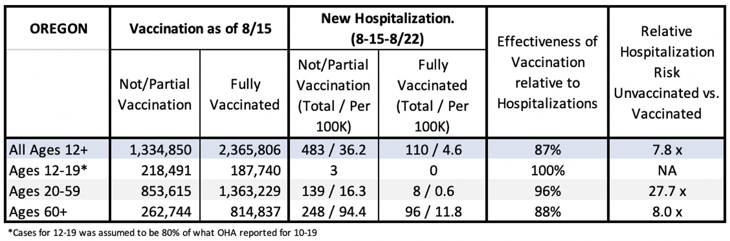
In 20-59 year-olds, vaccination is protective for hospitalization by a factor of 28. Breaking that group down further, vaccination protects people aged 30-39 by a factor of 38. If you are over 60, by contrast, vaccination protects from hospitalization by a factor of 8.0. This last number is much smaller than in younger groups, but still higher than the total effectiveness when you lump all ages together.

Math—specifically, accurate and transparent epidemiological analyses—should have been a major ally in minimizing overall harm from COVID-19. Sadly, it was not.

The fact that the vast majority of children have multiple greater threats to their health and well-being than COVID-19, and that those threats to health worsened as we tried to shelter children from any risk of COVID, should have been quickly integrated into our public health plans. Instead, school and sports closure policies in many cases aggravated these threats, while failing to have any major impact on controlling COVID-19 spread. The fact that vaccines are incredibly effective—way more so than is often reported—at preventing hospitalizations and severe disease should have been constantly and consistently emphasized and re-emphasized.

Research has shown that people will make rational decisions when they have the right information. Cutting through the barrage of misinformation around vaccination, and understanding clearly who is and is not at high risk from COVID-19, will remain difficult unless we can do a better job at helping people get a handle on COVID math.

Leslie Bienen is a veterinarian, scientific editor, and professor of public health at the OHSU-Portland State School of Public Health.

Tracy Beth Høeg is a private practice physician in Northern California with a PhD in epidemiology and public health researching COVID-19-related topics in children.

Eric Happel is director of global strategy, capabilities, and excellence for Nike value stores.

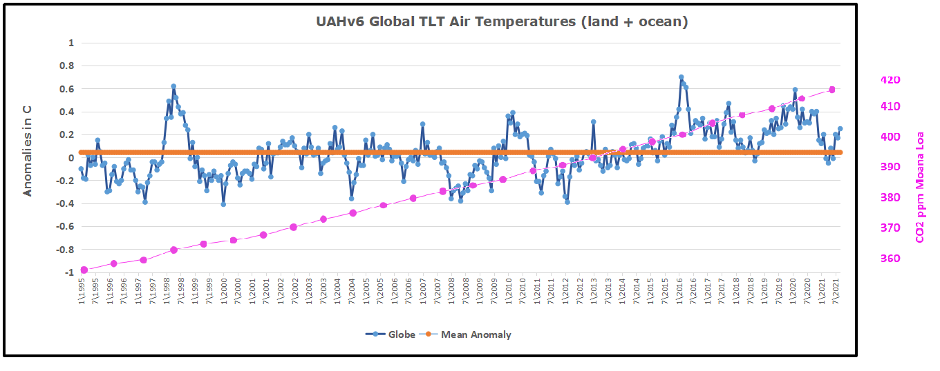
Footnote:  A previous post illustrates the difficulties to get a realistic risk profile from the publicly reported data.

Covid Burnout in Canada August 28

The map shows that in Canada 9108 deaths have been attributed to Covid19, meaning people who died having tested positive for SARS CV2 virus.  This number accumulated over a period of 210 days starting January 31. The daily death rate reached a peak of 177 on May 6, 2020, and is down to 6 as of yesterday.  More details on this below, but first the summary picture. (Note: 2019 is the latest demographic report)

Canada Pop Ann Deaths Daily Deaths Risk per
Person
2019 37589262 330786 906 0.8800%
Covid 2020 37589262 9108 43 0.0242%

Over the epidemic months, the average Covid daily death rate amounted to 5% of the All Causes death rate. During this time a Canadian had an average risk of 1 in 5000 of dying with SARS CV2 versus a 1 in 114 chance of dying regardless of that infection. As shown later below the risk varied greatly with age, much lower for younger, healthier people.

It is really quite difficult to find cases and deaths broken down by age groups.  For Canadian national statistics, I resorted to a report from Ontario to get the age distributions, since that province provides 69% of the cases outside of Quebec and 87% of the deaths.  Applying those proportions across Canada results in this table. For Canada as a whole nation:

Age  Risk of Test +  Risk of Death Population
per 1 CV death
<20 0.05% None NA
20-39 0.20% 0.000% 431817
40-59 0.25% 0.002% 42273
60-79 0.20% 0.020% 4984
80+ 0.76% 0.251% 398

In the worst case, if you are a Canadian aged more than 80 years, you have a 1 in 400 chance of dying from Covid19.  If you are 60 to 80 years old, your odds are 1 in 5000.  Younger than that, it’s only slightly higher than winning (or in this case, losing the lottery).

As noted above Quebec provides the bulk of cases and deaths in Canada, and also reports age distribution more precisely,  The numbers in the table below show risks for Quebecers.

Age  Risk of Test +  Risk of Death Population
per 1 CV death
0-9 yrs 0.13% 0 NA
10-19 yrs 0.21% 0 NA
20-29 yrs 0.50% 0.000% 289,647
30-39 0.51% 0.001% 152,009
40-49 years 0.63% 0.001% 73,342
50-59 years 0.53% 0.005% 21,087
60-69 years 0.37% 0.021% 4,778
70-79 years 0.52% 0.094% 1,069
80-89 1.78% 0.469% 213
90  + 5.19% 1.608% 62

While some of the risk factors are higher in the viral hotspot of Quebec, it is still the case that under 80 years of age, your chances of dying from Covid 19 are better than 1 in 1000, and much better the younger you are.

Summary

I and others published this information, but media and official sources in Canada and Quebec provided no such perspective lest the public question the regime of social distancing, masking, quarantines, vax passports, etc. which are still in effect.

Arctic Ice Already Exceeds Six Wadhams

The images above come from MASIE showing ice extents starting day 266, the lowest daily extent in 2021. Over the last 18 days, Arctic ice has grown by 1 Wadham (1M km2) to now exceed 6 Wadhams, about 276k km2 greater than the 14-year average for day 284. At the bottom center Barents Sea ice reaches out to Iceland.  Svalbard bottom right becomes encircled by ice.  East Siberian Sea top right has ice connecting to the shore. Top center Beaufort and Chukchi seas are also adding ice rapidly.

The ice recovery since September minimum is shown in the graph below.

Day 260 was the 14 year average annual daily minimum at 4.39m km2. MASIE 2021 was 776k km2 above average, and SII was 427k km2 lower than MASIE.  Note that 2007, 2019 and 2020 weere much lower than average throughout the period. SII is again tracking MASIE since day 274.

Region 2021284 Day 284 Average 2021-Ave. 2007284 2021-2007
 (0) Northern_Hemisphere 6010191 5733557 276634 5134886 875305
 (1) Beaufort_Sea 787643 662884 124759 718210 69433
 (2) Chukchi_Sea 547815 242829 304986 60352 487463
 (3) East_Siberian_Sea 571575 434918 136657 311 571265
 (4) Laptev_Sea 164089 298559 -134470 409211 -245122
 (5) Kara_Sea 110917 80208 30710 128294 -17377
 (6) Barents_Sea 18 26816 -26797 14013 -13995
 (7) Greenland_Sea 221491 318518 -97027 423939 -202449
 (8) Baffin_Bay_Gulf_of_St._Lawrence 53199 77124 -23925 84058 -30859
 (9) Canadian_Archipelago 474565 531008 -56443 444876 29689
 (10) Hudson_Bay 119 9213 -9093 1936 -1817
 (11) Central_Arctic 3077617 3050338 27279 2848411 229206

The main deficits to average are in Laptev and Greenland Seas, and CA, offset by surpluses elsewhere, especially in BCE (Beaufort, Chukchi, East Siberian seas).

The Bigger Picture 

We have passed the annual Arctic ice extent minimum, which typically occurs on or about day 260 (mid September). Some take any year’s slightly lower minimum as proof that Arctic ice is dying, but the image above shows the Arctic heart is beating clear and strong.

Over this decade, the Arctic ice minimum has not declined, but since 2007 looks like fluctuations around a plateau. By mid-September, all the peripheral seas have turned to water, and the residual ice shows up in a few places. The table below indicates where ice is found in September. Numbers are area units of Mkm2 (millions of square kilometers).

Day 260 14 year
Arctic Regions 2007 2010 2012 2014 2015 2017 2018 2019 2020 2021 Average
Central Arctic Sea 2.67 3.16 2.64 2.98 2.93 3.07 2.91 2.97 2.50 2.95 2.90
BCE 0.50 1.08 0.31 1.38 0.89 0.84 1.16 0.46 0.65 1.55 0.89
LKB 0.29 0.24 0.02 0.19 0.05 0.26 0.02 0.11 0.01 0.13 0.16
Greenland & CAA 0.56 0.41 0.41 0.55 0.46 0.52 0.41 0.36 0.59 0.50 0.46
B&H Bays 0.03 0.03 0.02 0.02 0.10 0.07 0.05 0.01 0.02 0.04 0.04
NH Total 4.05 4.91 3.40 5.13 4.44 4.76 4.56 3.91 3.77 5.17 4.48

The table includes some early years of note along with the last 5 years compared to the 14 year average for five contiguous arctic regions. BCE (Beaufort, Chukchi and East Siberian) on the Asian side are quite variable as the largest source of ice other than the Central Arctic itself.   Greenland Sea and CAA (Canadian Arctic Archipelago) together hold almost 0.5M km2 of ice at annual minimum, fairly consistently.  LKB are the European seas of Laptev, Kara and Barents, a smaller source of ice, but a difference maker some years, as Laptev was in 2016.  Baffin and Hudson Bays are inconsequential as of day 260.

2021 stands out from lower ice years by the higher extents in Central Arctic, BCE and LKB, especially Kara Sea this year.

Resources:  Climate Compilation II Arctic Sea Ice

Alberta Hurting from Biased Covid Policy

Two Sides of the Same Tyranny Coin

The Canadian province of Alberta has seen a coronavirus surge in recent weeks, and medical practitioners are calling into question the one-dimensional public health policy there.  Two things are striking about this report.  Firstly, as an oil producing province, most Albertans have seen through the climate crisis, anti-fossil fuel crusade.  But their officials have implemented an unskeptical tyrannical covid regime.  Secondly, in order to speak out against the suppression of alternative views and facts, doctors are forced to use a law firm as a shield against retaliation.

At Palmer Foundation is this article Canada: Alberta Failing on COVID-19 Vaccines and Treatment.  Excerpts in italics with my bolds. H\T Trial Site News

On October 4, attorneys Rath & Company sent a stinging letter to the College of Physicians and Surgeons of Alberta (CPSA) regarding letters from CPSA’s Council to both doctors and the public in Alberta province. The lawyers note that they represent both vaccinated and unvaccinated doctors who are anonymous based on veiled threats from CPSA.

Key issues in the letter include interference with patient autonomy and “colluding in the coercion” of patients into taking experimental vaccines. The other concern raised is discouragement of doctors using their own judgement for “alternative treatments” like ivermectin.

Rath & Company also raises concern about an Open Letter from CPSA’s panel of experts from October 1. Misinformation in the Open Letter includes the claim that “there is 1 in 20 risk of hospitalization with documented COVID-19 infections in Alberta,” while ignoring the government’s own position that at any given time, there are four times as many folks infected as the number of reported cases. Thus, the correct ratio would be one in 80.

And a problem with scaremongering is that we can lose sight of key facts; the bulk of hospitalizations and death are in folks over 70, and “the average age of death of someone from COVID-19 is higher than the average age of provincial life expectancy.”

So, to mandate vaccination upon young and healthy doctors, nurses, etc., violates their rights under generally accepted medical ethics. CPSA’s Open Letter also suggests that 12-year-olds should be able to consent on their own to vaccination.

Recommended Consent Language

Government of Ontario data shows that the Moderna vaccine leads to myocarditis in about 1-in-5,000 of 18–24-year old’s; the comparable figure for Pfizer is 1 in 28,000. And Canada’s vaccine rollout was experimental from the outset; Astra-Zeneca’s product was pulled when it was shown to corollate with thrombosis in 1 out of 58,000 persons over 80. Then that same product was “mixed and matched with Pfizer and Moderna injections without adequate research having been done as to possible adverse effects.”

There is also evidence that people who have recovered from COVID-19 are at an increased risk from the mRNA products. And especially as to young folks, the “government of Ontario’s data demonstrates that this is likely more harmful to that group than AstraZeneca‘s product] was to people over 80.”

Citing Canada’s definition of assault along with the voluntary consent requirements of the Nuremburg principles, the lawyers argue that the threat of losing one’s livelihood vitiates any consent thereby obtained.

The Rath law firm goes on to list items that should be included in advising potential vaccinees:

• That this mRNA therapy program does not provide immunity for COVID-19 and only provides an unknown amount of protection from the virus for a limited time;

• that people who receive injections can, in fact, get infected with COVID themselves and pass the virus on to other members of their family, including their aging parents;

• that there is insufficient data over a multi-year period to advise that the injection is safe and that serious life-threatening conditions, including permanent damage to the heart muscle (myocarditis) and DEATH, may occur in healthy people under the age of 50 as a result of taking the injection;

• that if you are under the age of 50, with no comorbidities, you are at a greater risk of a serious illness or adverse event, including COVID-like sickness, including fever, and DEATH from the vaccine than you are in actually suffering permanent harm from COVID itself;

• that the incidence of COVID-19 “vaccines” causing death or seriously adverse outcomes in children is greater than the potential for children to have any serious outcome from actually contracting COVID-19; and

• that pregnant women should be advised that the effects of the Pfizer and Moderna injections on fetal health are in fact unknown and that vaccine side effects may, in fact, include spontaneous miscarriage and fetal abnormalities.

New Mutation, Old Vaccine

Next, the Rath letter notes that the CPSA has effectively threatened doctors about granting vaccine exemptions while at the same time denying the science from Israel, showing that natural immunity is over 10 times as effective as an mRNA product. And at this point, the vaccinated are now dying at a higher rate than the unvaccinated in the UK.

The attorneys note that their “clients are extremely concerned that we have now reached a stage in the course of the mutation of the virus that using a vaccine developed for an extinct pathogen in regard to viruses that have mutated is dangerous. It now appears that the virus has mutated specifically to avoid the original ‘vaccine’ in a manner that will cause further widespread transmission of the virus and death amongst those fully-vaccinated.” And the clients think that the vaccinated need to be more fully aware that they can spread this disease.

Ivermectin Saves Lives

Rath’s clients also fault CPSA for its position on ivermectin. Having banned this drug’s use for COVID-19 patients, the group is ignoring the fact that,

“Physicians of good conscience in the Province of Alberta, having read studies indicating that Ivermectin is effective in the earliest stages of COVID in lessening viral replication within the patient, have properly prescribed Ivermectin to their patients in this province.

Numerous studies and clinical observation of thousands of patients has indicated that Ivermectin is highly effective in this regard. Even low dose studies that were designed to reach the conclusion that ivermectin was not effective found a signal that indicated that Ivermectin effectively interacted with the COVID virus molecule to prevent or lessen replication of the virus.”

And even poorer nations have used this drug to achieve dramatic reductions in morbidity.


Covid/Climate Tyranny: Two sides of same Ideology

Two Sides of the Same Tyranny Coin

Today I saw this tweet:

 I askеd KD about his view on all of this, he said ‘It’s an individual dеcision.’ That’s the antithеsis of what a pandеmic is. You do not havе the privilеge of just looking at yoursеlf. You havе to look at the pеople nеxt to you. That’s how we got to this bеing the most dеadly pandеmic.

Sound familiar? Climatists want to cancel individual satisfactions in order to save the human race. Covid Nazis make the same demand: Give up your individual opinions and choices for humanity.

There are many posts here and elsewhere debunking the climate crisis hoax, but it may be new to realize that covid is neither a pandemic nor as deadly as claimed.  Dr. Ted Noel explains in his American Thinker article Why Is the COVID Case Count So High? Excerpts in italics with my bolds.

The CDC used to define a “case” as a patient whose characteristic signs, symptoms, and physical examination matched a disease. Labs were only done if clinically needed. Since the “pandemic,” however, the move to boost case numbers is everywhere.

Instantly, a “positive” RT-PCR test in an asymptomatic person after a drive-through tonsillectomy became a “case.” The CARES Act gives thousands extra to hospitals for every “positive,” with a big bonus if the patient’s shadow is seen in an ICU. It’s a classic “one hand washes the other scenario” between outside labs and hospitals. “If you give me more positive results, I get more money, so I’ll send more tests to you.”

My hospital’s Medical Staff President flatly denied any CARES Act benefits at our 2020 Medical Staff Extravaganza, but the incentives can’t be denied. My hospital still sends “coders” out to demand that staff order COVID tests to get more payments. Put bluntly, there’s no way to know what any test means medically if the patient isn’t sick. But “positives” definitely mean money!

MIQE standards list eighty-five parameters that must be met in RT-PCR testing. Does every lab meet them all every time? Around the world, celebrities who test “positive” one day and “negative” the next strongly suggest that a lot of mistakes are being made. This is unsurprising since as early as 2017, the technique was well known for “lack of reproducibility.”

The inventor of the test stated that RT-PCR was never intended to be a diagnostic test and using it as one was scientifically illegitimate. “[It’s] like trying to say whether somebody has bad breath by looking at his fingerprint.”

Proper testing requires checking three genetic elements, widely separated in the genome. For CDC counts and CARES Act payments, only two segments get tested, automatically increasing the number of positive tests – by a lot. The lab starts the RT-PCR by doubling genetic material multiple times to make it easier to identify. In research, if it’s not positive by thirty-five “amplification cycles,”, it’s not positive. FDA guidance indicates that anything found up to 40 cycles is considered “positive.” At forty cycles a glass of water may test positive. Stopping at thirty-five would show that COVID-19 wasn’t any worse than flu, if it was that bad.

There is no pandemic. There never was.

Since only 6% of “COVID deaths” were from only the bug, there have only been about 40,000 total, roughly equal to seasonal flu. In the early days, we didn’t know how to treat it and rationally feared that the new Black Death had arrived. But by May of last year, we already knew that HCQ was probably effective in early cases. Early treatment would cause a (non)crisis to go to waste, and that could not be allowed. So very effective treatments and excellent prophylactic measures were suppressed.

Ineffective masks, social distancing, vaccine passports, lockdowns, and the like were mandated. They became part of an “Orange Man Bad” publicity campaign. Anthony Fauci gave President Trump awful advice following that game plan. Trump’s flair for publicity boomeranged in news conferences where he trumpeted his successes, but all anyone really heard was panic porn.

Certainly, the prospect of centralizing power is intoxicating to the elect. But is that it? Are hospitals the only recipients of largess?

For about twenty years, Fauci’s NIAID used taxpayer money to do “invisible” research on deadly viruses. It received unlawful patents related to a certain virus that might become worth a king’s ransom. Such filthy lucre could become very attractive.

Before you start throwing rotten tomatoes and soiled work boots, please watch David Martin Ph.D. and Reiner Fuellmich tell why they believe Anthony Fauci and his cohorts were neck-deep in the COVID gain-of-function and patent process for at least the last twenty-two years. Among the key patents are some that, if they are for a naturally occurring virus, are illegal according to the Supreme Court. If they’re for an engineered virus, they’re contrary to the Biological Weapons Convention, which became effective in 1975. Martin and Fuellmich allege that the parties to this corrupt process include Anthony Fauci, Ralph Baric, Peter Daszak, Dr. Shi Zhengli (the Wuhan Bat Lady), and—drum roll, please—none other than Bill Gates. Dr. Martin has made available a long list of documents he contends support this claim.

These alleged conspirators have spent a considerable amount of time and effort to set themselves up to profit from a vaccine industry that would likely be given huge subsidies and immunities to respond to a “coronavirus pandemic.” Yes, that’s what they literally war-gamed along the way. Martin and Fuellmich present strong evidence of collusion between the virus creators and vaccine manufacturers. Is it any surprise that an mRNA COVID-19 “vaccine” was ready for early testing within four months of the announcement of the virus?

We cannot leave this subject without asking if the vaccines actually stop infection.

No vaccine can prevent infection. That’s because you must be infected before your T-cells and antibodies (humoral immunity) can crank up.

In COVID-19, the problem is more complicated. Even if you’re vaccinated, COVID aerosols still enter your lungs, where the virus attaches to pneumocytes in your air sacs (alveoli). It multiplies inside those cells, and they shed a lot of virus back into the alveoli, where you can now share it with the next person as effectively as someone who’s sick. Voila! Asymptomatic transmission!

You’ll also be a “case” at your next drive-through impalement. But you aren’t sick and don’t get sick. You don’t have a clinical “case” of COVID, but you’ll be one for the next Panic Porn Live at 6:30! Your vaccination status won’t matter. “At the country-level, there appears to be no discernable relationship between percentage of population fully vaccinated and new COVID-19 cases in the last 7 days.”

If you are immune, some of that virus will still find its way across the alveolar basement membrane into your bloodstream. That’s where your humoral immunity will mop it up and keep you from getting sick. But you are a “case!” And your house cat may be as well. Big cats in the National Zoo have been treated for the Wuhan Flu. Fido can get it, too.

There is nothing we can do to slow down COVID-19. It rapidly spread through society because it was “in the wild.” Vaccinated and unvaccinated can spread the virus equally. Even if every person gets vaccinated, we still won’t have perfect protection because the virus mutates, leaving older vaccine-induced immunity less effective. That’s why two of the most vaccinated regions in the world, Israel and Gibraltar, are having huge spikes in the bug.

The CDC definition of a “COVID case” is a political construct designed to funnel taxpayer money to favored individuals and institutions.

It has nothing to do with the course of the disease. Only 6% of “COVID deaths” were exclusively from COVID. The other 94% would likely have died of their other diseases without the virus. Many of those who died would still be alive if the Feds weren’t suppressing HCQ and Ivermectin early treatment protocols…which our “betters” in Congress are themselves reported to be using.


Killing the Golden Energy Goose in 2021

Lubos Motl provides an insightul article by Alexander Tomský Where the policy of decarbonising the economy is taking us at his blog Reference Frame. Excerpts below in italics with my bolds.

We now know that the total, often disguised, cost of renewable energy is prohibitive, the zero carbon ideal mere wishful thinking. Only the brave will say it fully; Western democracy no longer professes freedom of speech, and careers depend on agreement with the ruling ideology as they did under the communists.

How could it be that fossil fuel prices, with such huge (known) world reserves – oil enough for 200 years, coal and gas enough for at least 1000 years (International Energy Agency) – have suddenly risen so rapidly and the world is facing an economic crisis?

The first thing that springs to mind is the inflated volume of cheap money that governments are pumping into the economy for dear life and the post-Covid demand. The broken global supply chains are responding badly, not to mention the shortage of people in transport and elsewhere who have found better jobs during the pandemic. After the winter season, things will calm down a bit and fuel will get a bit cheaper. But the bottom line will not change; the fossil fuel extraction and industry has been vilified for at least a decade. Many investors have left because of bad conscience, others want to make as much money as they can before immoral extraction is banned by governments altogether. An industry that used to spend two-thirds of its annual profits on maintenance and investment is not going to invest without a secure future. The international oil cartel OPEC + Russia have refused to increase production (October 4) and this time US producers are also waiting. Annual investment by oil producers has fallen from $750 billion since 2014 to an estimated $350 billion by the end of this year (Trafigura) and half of the major projects have been abandoned by entrepreneurs.

The decline in investment will inevitably drive the fossil fuel-dependent world into recession.

In vain do the greens rejoice that this will give a relative boost to the price of renewable energy, which, too, is soaring, as are battery prices, with demand artificially driven up by the scarcity of precious metals and copper for windmill masts, By the end of September, the average price of electricity in Europe had risen by 40 per cent.

A paradoxical consequence of the crisis unleashed by Western policies is the situation in China, which is opening one coal-fired power plant after another due to the rising cost of fuel and is estimated to build twice as many (120) next year. It is not worried about global warming and will not let its heavy industry be destroyed. It is strange that the zero-emission advocates do not criticize the Chinese dictator.

The ideology of total decarbonisation of the world is totally unrealistic, it is the science fiction of a sick mind, even the Western advanced economy is not capable of completely replacing fossil fuels at today’s technical level, unless – and this is an incomprehensible question – we return to building nuclear power stations, which ideological unreason forbids.

Poverty, power cuts, social and political disintegration and perhaps even a world economic crisis await us.

Affordable, reliable FF Energy is the Golden Goose of Modern Society

Footnote:  Aesop’s Fable of The Man and the Golden Eggs

A man had a hen that laid a golden egg for him each and every day. The man was not satisfied with this daily profit, and instead he foolishly grasped for more. Expecting to find a treasure inside, the man slaughtered the hen. When he found that the hen did not have a treasure inside her after all, he remarked to himself, ‘While chasing after hopes of a treasure, I lost the profit I held in my hands!’

The Moral: People often grasp for more than they need and thus lose the little they have.

See also: Killing the Energy Goose

Winter Fuel Short Due to CO2 Hysteria


NH Land and Oceans Cooling Sept. 2021

The post below updates the UAH (U. of Alabama in Huntsville) record of air temperatures over land and ocean.  But as an overview consider how recent rapid cooling  completely overcame the warming from the last 3 El Ninos (1998, 2010 and 2016).  The UAH record shows that the effects of the last one were gone as of March 2021. (UAH baseline is now 1991-2020). Now in September, cooling has reversed in both NH land and ocean, offset by SH land and ocean warming.For reference I added an overlay of CO2 annual concentrations as measured at Mauna Loa. While temperatures fluctuated up and down ending flat, CO2 went up steadily by ~55 ppm by 2020, a 15% increase.

Furthermore, going back to previous warmings prior to the satellite record shows that the entire rise of 0.8C since 1947 is due to oceanic, not human activity.

gmt-warming-events

The animation is an update of a previous analysis from Dr. Murry Salby.  These graphs use Hadcrut4 and include the 2016 El Nino warming event.  The exhibit shows since 1947 GMT warmed by 0.8 C, from 13.9 to 14.7, as estimated by Hadcrut4.  This resulted from three natural warming events involving ocean cycles. The most recent rise 2013-16 lifted temperatures by 0.2C.  Previously the 1997-98 El Nino produced a plateau increase of 0.4C.  Before that, a rise from 1977-81 added 0.2C to start the warming since 1947.

Importantly, the theory of human-caused global warming asserts that increasing CO2 in the atmosphere changes the baseline and causes systemic warming in our climate.  On the contrary, all of the warming since 1947 was episodic, coming from three brief events associated with oceanic cycles. 

September Update Cooler NH Ocean and Land Air Temps 

banner-blog

With apologies to Paul Revere, this post is on the lookout for cooler weather with an eye on both the Land and the Sea.  While you will hear a lot about 2020 temperatures matching 2016 as the highest ever, that spin ignores how fast has the cooling set in.  The UAH data analyzed below shows that warming from the last El Nino is now fully dissipated with chilly temperatures setting in all regions.  The peak NH summer month of July saw some warming most pronounced in the SH, now reversed by cooling in August and September.

UAH has updated their tlt (temperatures in lower troposphere) dataset for September.  Previously I have done posts on their reading of ocean air temps as a prelude to updated records from HADSST3. This month also has a separate graph of land air temps because the comparisons and contrasts are interesting as we contemplate possible cooling in coming months and years. Last month showed air temps over SH land and ocean moved upward, while NH land and ocean cooled.

Note:  UAH has shifted their baseline from 1981-2010 to 1991-2020 beginning with January 2021.  In the charts below, the trends and fluctuations remain the same but the anomaly values change with the baseline reference shift. Data for lower troposphere is here .

Presently sea surface temperatures (SST) are the best available indicator of heat content gained or lost from earth’s climate system.  Enthalpy is the thermodynamic term for total heat content in a system, and humidity differences in air parcels affect enthalpy.  Measuring water temperature directly avoids distorted impressions from air measurements.  In addition, ocean covers 71% of the planet surface and thus dominates surface temperature estimates.  Eventually we will likely have reliable means of recording water temperatures at depth.

Recently, Dr. Ole Humlum reported from his research that air temperatures lag 2-3 months behind changes in SST.  Thus the cooling oceans now portend cooling land air temperatures to follow.  He also observed that changes in CO2 atmospheric concentrations lag behind SST by 11-12 months.  This latter point is addressed in a previous post Who to Blame for Rising CO2?

After a technical enhancement to HadSST3 delayed updates Spring 2020, May resumed a pattern of HadSST updates toward the following month end.  For comparison we can look at lower troposphere temperatures (TLT) from UAHv6 which are now posted for September.  The temperature record is derived from microwave sounding units (MSU) on board satellites like the one pictured above. Recently there was a change in UAH processing of satellite drift corrections, including dropping one platform which can no longer be corrected. The graphs below are taken from the new and current dataset.

The UAH dataset includes temperature results for air above the oceans, and thus should be most comparable to the SSTs. There is the additional feature that ocean air temps avoid Urban Heat Islands (UHI).  The graph below shows monthly anomalies for ocean temps since January 2015.In Jan-March 2021 SH dropped sharply, pulling the Global anomaly down with SH matching the coldest in this period. March drops in the Tropics and NH made those regions at their coldest since 01/2015.  In June 2021 despite an uptick in NH, the Global anomaly dropped back down due to a record low in SH along with a Tropical cooling.  The summer warm pulse in NH was mild this year, with NH peaking in July, pulling up Global anomaly slightly with an assist from the Tropics.  Now in September Tropics are flat, NH is down, offset by SH warming.

Land Air Temperatures Tracking Downward in Seesaw Pattern

We sometimes overlook that in climate temperature records, while the oceans are measured directly with SSTs, land temps are measured only indirectly.  The land temperature records at surface stations sample air temps at 2 meters above ground.  UAH gives tlt anomalies for air over land separately from ocean air temps.  The graph updated for September is below.

Here we have fresh evidence of the greater volatility of the Land temperatures, along with extraordinary departures by SH land.  Land temps are dominated by NH with a 2021 spike in February, followed by cooling down to April.  Then NH land warmed with a second NH spike peaking in July. Note how cold have been SH land temperatures in 2021, with two lows in Jan. and again in July.  Now SH has spiked upward, raising the Global land anomaly despite NH cooling.

The Bigger Picture UAH Global Since 1995

The chart shows monthly anomalies starting 01/1995 to present.  The average anomaly is 0.04, since this period is the same as the new baseline, lacking only the first 4 years.  1995 was chosen as an ENSO neutral year.  The graph shows the 1998 El Nino after which the mean resumed, and again after the smaller 2010 event. The 2016 El Nino matched 1998 peak and in addition NH after effects lasted longer, followed by the NH warming 2019-20, with temps having returned again to the mean March-June, with an uptick in July-September.

TLTs include mixing above the oceans and probably some influence from nearby more volatile land temps.  Clearly NH and Global land temps have been dropping in a seesaw pattern, more than 1C lower than the 2016 peak.  Since the ocean has 1000 times the heat capacity as the atmosphere, that cooling is a significant driving force.  TLT measures started the recent cooling later than SSTs from HadSST3, but are now showing the same pattern.  It seems obvious that despite the three El Ninos, their warming has not persisted, and without them it would probably have cooled since 1995.  Of course, the future has not yet been written.