Raymond has produced another in his Simple Science series, this one providing images explaining how the world uses its energy and where the energy comes from. It’s a pictorial representation of statistics compiled by the International Energy Agency (IEA) in their 2020 World Report, the latest year being 2018.
World of Energy, World of CO2, and World of Climate Change are projects at RiC-Communications, based in Zurich. The exhibits are available for download at the following linked titles:
In addition there is an introductory video to the CO2 series The three titles above link to summary posters suitable for printing. In addition there a some charts related to water and ice:
The World of Energy Infographics
Energy consumption is an important topic and on everyone’s lips. Since fire has been used as an energy source, fossil fuel use has played an important role in the evolution of our species. The rise of carbon in our atmosphere can be traced back to the beginning of industrialization and contributes in part to today’s levels of 420 ppm. Fossil fuels account for 81% of our total energy supply, a dependence that has not diminished to this day. This valuable resource drives the global economy and helps to reduce poverty worldwide. However, fossil fuels are not evenly distributed across the world and have always been the source of conflict or leverage. Renewable energy is becoming more popular, but efforts to replace the high density of fossil fuels will not be easy.
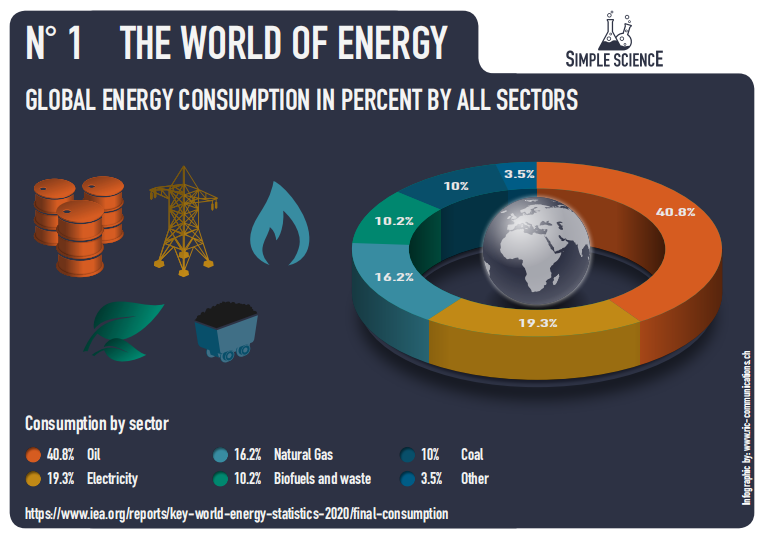
– N° 1 Global Energy consumption in percent by all sectors
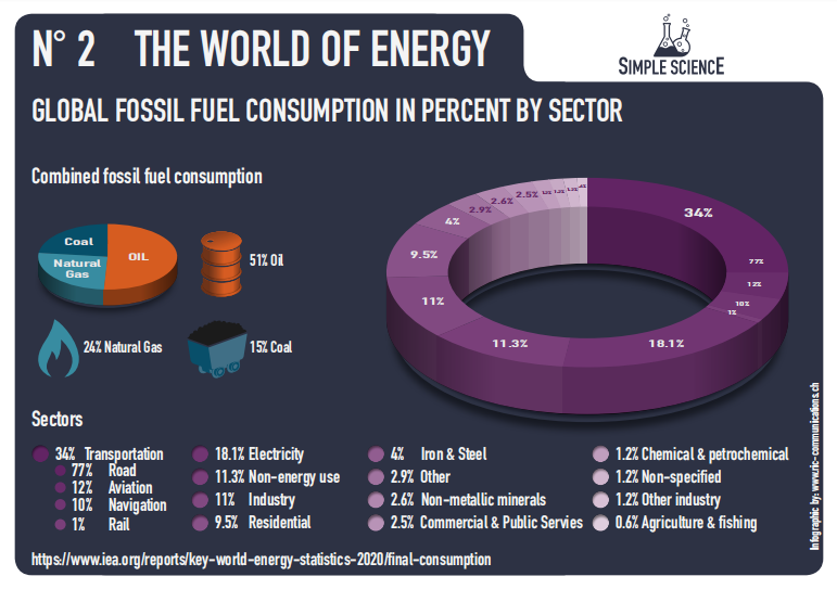
– N° 2 Global Fossil fuel consumption in percent by sector
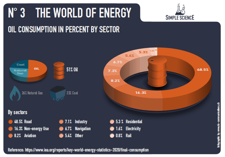
– N° 3 Oil consumption in percent by sector
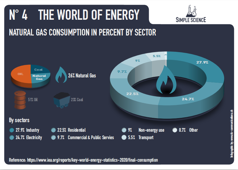
– N° 4 Natural Gas consumption in percent by sector
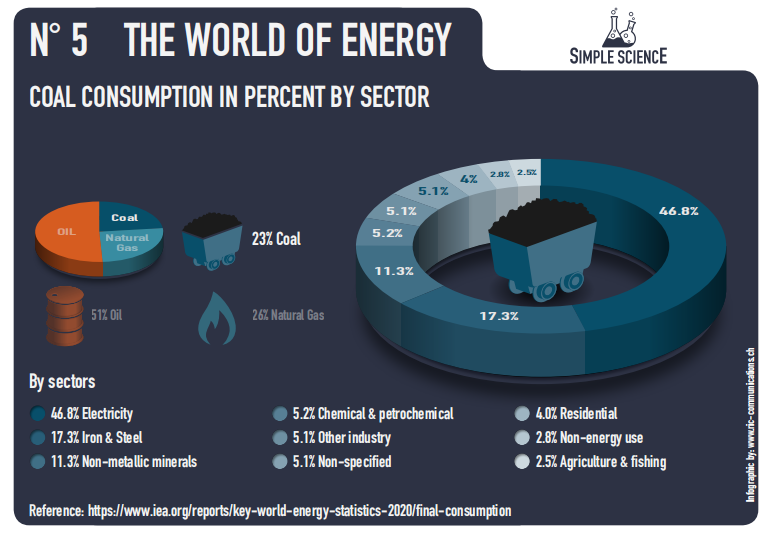
– N° 5 Coal consumption in percent by sector
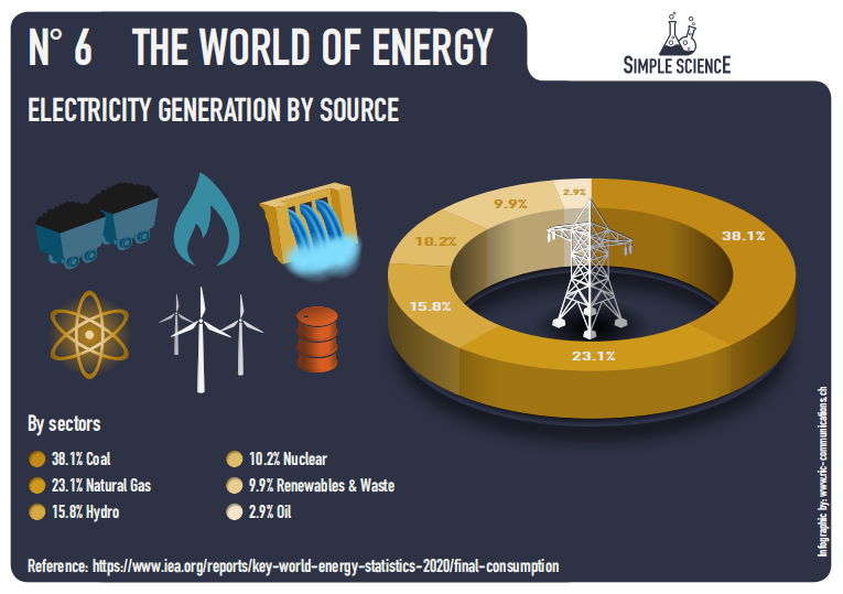
– N° 6 Electricity Generation by Source
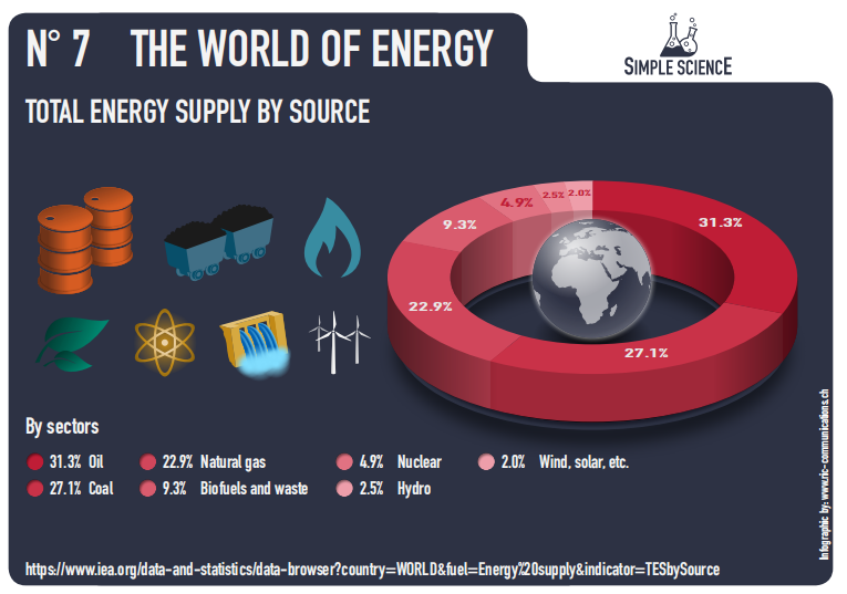
– N° 7 Total energy supply by source
Comment
Many observations are possible by studying these exhibits. For example, some activists insist that passenger air travel is dangerously warming the planet, and ordinary people should stay home, with flights restricted to essential trips by global elites. A glance at the transportation statistics on slide #2 shows Aviation is only 4% of fossil fuel consumption (12% of 34% FF used for transportation). And aviation includes cargo transport, so passenger travel is a fraction of that.
The bulk of FF transport consumption is Road, meaning cars and trucks, which is why some are demanding electric vehicles be the only means of mobility. Yet a look at slide #6 shows that presently only 10% of electricity comes from Wind, Solar and waste fuels. Furthermore, for all of the investment in wind and solar power, slide #7 shows that so called “green energy”` supplies only 2% of the world’s energy needs.

Ron,
Brilliant Graphs – thank you for the article
LikeLike
Hi Ron
Thank you for publishing my latest series on energy and I hope your readers will really enjoy it. Again, Ron, thank you for your help in finding the sources and for your watchful eye as I developed the project. Your expertise is much appreciated!
Raymond Inauen or Virtual Realtiy
LikeLiked by 1 person
Reblogged this on Climate Collections.
LikeLike