
Recently, Dr. John Robson of the Climate Discussion Nexus (CDN) interviewed CERES co-team leader, Dr. Ronan Connolly, on the role of the Sun in recent climate change. Excerpts from ICECAP in italics with my bolds, followed by a video and my transcript from the closed captions.
CDN have now published their 20 minute “explainer” video including extracts from this interview and discussion of some of CERES’ recent scientific research. Although the video covers quite a few technical points, they are explained in a very clear and accessible manner.
Topics covered include:
The significance of the debates between the two main rival satellite estimates of solar activity trends since 1978, i.e., PMOD and ACRIM.
How using either PMOD or ACRIM to calibrate the pre-satellite era solar data can give very different estimates of how much solar activity has changed since the 19th century and earlier.
How politics and the UN’s Intergovernmental Panel on Climate Change (IPCC) reports have downplayed the possible role of solar activity in recent climate change.
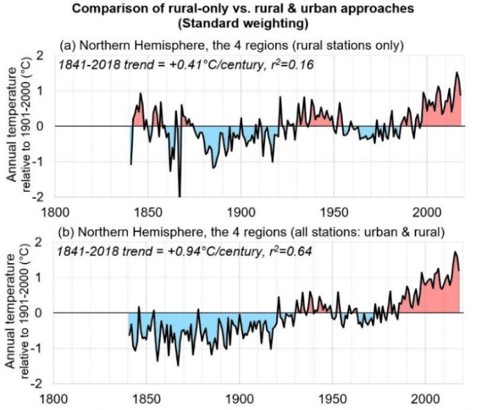
The urbanization bias problem of current thermometer-based estimates of global temperature trends since the 19th century.
They say you should not look directly at the sun but when it comes to climate a lot of people take that advice to ridiculous extremes. That bright yellow ball in the sky is basically earth’s only source of energy though a very small amount radiates from the planet’s hot core. The sun’s output has been measured to a high degree of precision by satellites in orbit since the late 1970s. and we now know that it varies over time.
Since it is our only source of energy, if it gets stronger it stands to reason
that it could warm the climate.
Indeed there was a time about 20 years ago when many scientists believed that the sun had gotten a bit brighter during the 1980s and 1990s. And they even argued it was enough to explain much of the warming that had taken place.
But now agencies like the UN IPCC ( intergovernmental panel on climate change), NASA and others insist the change in solar output never happened. They say the warming can only be explained by greenhouse gases, so do not look at the sun.
People, something pretty basic doesn’t add up here.
If satellites are measuring the sun’s energy precisely, how can there be disagreement about what it’s been doing? The answer unfortunately is that there’s a gap in the satellite record, a gap that came about after the 1986 space shuttle challenger disaster. And as happens too much in this field, the gap quickly went from being a scientific problem to a political one. And the way that gap was handled is a story that deserves a little sunlight.
I’m John Robson and this is a climate discussion nexus backgrounder on the ACRIM gap controversy
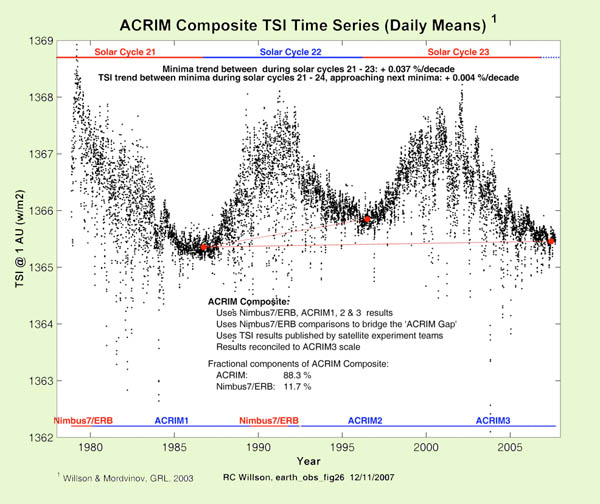
The name ACRIM comes from an instrument called the Active Cavity Radiometer Irradiance Monitor that satellites use to measure solar output. And the amount of solar energy that hits the earth’s atmosphere is called the total solar irradiance or TSI measured in watts per square meter.
On average the sun provides about 1367 watts of energy per square meter continuously on the upper atmosphere. For comparison, all the carbon dioxide ever released from using fossil fuels is estimated by the IPCC to have added about 2 watts per square meter of energy to the atmosphere. And so given the overwhelming role of solar output in the total it shouldn’t take much of a change in the sun’s output to have a global influence on the climate.
We also have data on solar output from the pre-satellite era. For centuries astronomers have been keeping track of the number of dark circles or sunspots that appear on the surface of the sun. Galileo even wrote a book about them. The sunspot count rises and falls on a roughly 11-year cycle which provides clues to the changing strength of solar energy in the past. Scientists can also use evidence from chemical signatures in the earth, called cosmogenic isotopes, to reconstruct solar activity. As usual when you go backward in time on climate it’s only proxy data, and it’s considerably less precise than modern measurements.

Source IPCC Assessment Report #1
But by comparing proxies to satellite data since 1979 we get some idea of how to interpret the clues. In the IPCC’s first report in 1990 they presented a graph that summarized the prevailing view of the sun’s history over the 19th and 20th centuries. It showed the familiar sunspot cycle and also suggested average solar output grew stronger in the second half of the century but they said the changes were not large enough to cause much warming unless there are positive feedback mechanisms that amplify those changes.
But that qualification is not trivial because in fact the notion that carbon dioxide is the driver of warming itself depends on a series of positive feedback mechanisms. Because on its own the warming effect of CO2 is quite small. So there have been various proposals for amplifying mechanisms to increase its impact, which we’ll look at in more detail on another day.
When it comes to the sun basically the argument is that the sun doesn’t just affect how bright it is outside, it also influences how cloudy it is. And since some kinds of clouds have a major role in reflecting heat back into space if more solar output not only adds a bit of heat but also suppresses that kind of cloud formation, it can translate into a lot of surface warming.
So key point here: By the time of the IPCC’s third assessment report in 2001, their views about the sun’s history were getting more uncertain not less uncertain. In AR3 in 2001, instead of having just one reconstruction of solar output, the IPCC now had multiple different ones to choose from. The reconstructions all agreed that solar output followed the sunspot cycle and they all agreed that solar output had increased over the 20th century.

Fig. 6.5 Reconstructions of total solar irradiance (TSI) by Lean et al. as well as Hoyt and Schatten 1993 updated.
But they disagreed over whether the increase was a lot or little and whether it had happened all at once early in the century or more gradually over the whole span. Since these differences arose from statistical estimates using proxy records, it didn’t look as though there would be an easy way to resolve the disagreements.
So attention turned to the modern satellite record with precise measurements of TSI available since 1978. It should have been possible to compare them with surface temperatures to see if there was any relationship. Unfortunately there was the problem we referred to at the outset: A big gap in the data. The satellites that carried the ACRIM system were first launched in 1978. From time to time satellites wear out and need to be replaced. A replacement satellite is supposed to be launched early enough so its ACRIM system overlaps with the existing one allowing the instruments to be calibrated to each other giving scientists a continuous record.

But as you can see, there’s a gap in the ACRIM record from June 1989 to October 1991. and that gap was a consequence of the space shuttle challenger disaster in January of 1986 that caused NASA’s satellite launch program to be suspended for several years.
By the time a new ACRIM system could be put into orbit in 1991 the old one had already been offline for two years. And the only data available to fill the gap was from a different monitor called the earth radiation budget system or ERB which flew on the Nimbus 7 satellite launched in 1978 as part of a separate series. That satellite didn’t have an acronym and unfortunately the ERB system was not meant to monitor solar output with much precision. Its sensors were pointed toward the earth so it could monitor the climate system and it only had a view of the sun during brief intervals of its orbit.. Also it generated two data series, called ERB and ERBS in the diagram, and they disagreed with each other regarding what the sun did during the ACRIM gap.
Still it was something to work with. In 1997 the lead scientist working on the ACRIM system RIchard Willson of Columbia University used the satellite data and all available information on the behavior of the onboard sensors in the various satellites to construct a composite ACRIM record. A comparison of the minimum points in the solar cycle suggested an increase in TSI from the early 1980s through to the end of the 1990s, after which solar output flattened out.
Since this broadly matched the progress of temperatures after 1980 it opened the door to the possibility that the sun might be responsible for some or all of recent climate changes. The alarmists didn’t like that result at all. In fact they reacted like that far side cartoon with the astronauts going blast the controls are jammed we’re headed right for Mr Sun.
So a few years later a different team led by Claus Fröhlich and Judith Lean published a new reconstruction of the same data that showed: Voila, no upward step, just the standard solar cycle steady downward trend after 1980. It’s called the PMOD reconstruction after the name of Fröhlich’s institute the Physical Meteorological Observatory in Davos. It had the convenient effect of ruling out the sun as a factor in climate change.
Now when I say convenient I do mean in the political sense. The authors made no secret of their motivation. In a recent article reviewing the whole episode scientist Ronan Connolly of the center for environmental research in earth science (CERES) massachusetts found some telling quotes from the authors and others working in the field. In a 2003 interview discussing the motivation for their research author Judith Lean stated the fact that some people could use Willson’s results as an excuse to do nothing about greenhouse gas emissions. It is one reason we felt we needed to look at the data ourselves. And in a later review published in 2014 Pia Zacharis of the international space science institute in switzerland conceded that the data adjustments are still a matter of active debate and have prevented the TSI community from coming up with a conclusive TSI composite so far.

But she went on to observe a conclusive TSI time series is not only desirable from the perspective of the scientific community but also when considering the rising interest of the public in questions related to climate change issues, “thus preventing climate skeptics from taking advantage of these discrepancies within the TSI community by for example putting forth a presumed solar effect as an excuse for inaction on anthropogenic warming.”
We spoke with scientist Ronan Connolly recently to discuss the ACRIM gap and how the IPCC handled the controversy. So the PMOD rival group took the ACRIM data and they’ve applied a series of adjustments which got rid of that rise in solar activity in the 80s and 90s, replacing it with a decline. The net effect shows a declining, effectively according to the PMOD, solar activity has been generally decreasing since at least 1970s.
If the ACRIM composite is correct then that would be consistent with a solar contribution because some of the warming in the 80s and 90s could be due to the solar activity. And then the reduction in warming, the pause or even a slight decline depending on the metric, that could be due to a reduction in solar activity. But if PMOD is correct then solar activity can’t really explain any of the global temperature trends during the satellite era.
Which gives us two things to think about. One is that if the sun’s output did get stronger over the 1980s and 1990s that means it bears some of the blame or gets some of the credit for warming the planet over that interval. Which is a valid argument for not blaming everything on greenhouse gases, especially since the sun’s subsequently quieting down coincides with two long pauses in any warming detected by satellites.
Second, the other thing is that we have scientists talking as if their motivation is not just finding the truth. It’s preventing so-called inaction on climate change and feeling no need to hide such a motive. On the contrary they seem to be broadcasting it. And if you’re going to come right out and tell us that your goal is to push a policy agenda whether it’s scientifically justified or not, don’t act surprised when we ell you we’re skeptical about your results.
One group that wasn’t skeptical was the IPCC in their fourth assessment report or AR4 in 2007 they showed both the Willson series here in violet and the Piedmont series which is green. But in their next report in 2013 while they still mentioned the Willson series they dropped it from their calculations and said from now on they would only use the PMOD series that told them what they wanted to hear.
Namely that with no increase in solar output there’s no way to blame the sun for global warming so it must be all your fault
Which is one way to do science but what kind of way? My own experience is that there’s a lot of scientists that feel a lot of pressure to conform their work to the IPCC. The IPCC has become a very dominant political body within the scientific community.
How did the PMOD team come up with a different answer than Willson’s group? By arguing that one of the sensors on the ERB system was defective and experienced an increase in its sensitivity during its time in orbit, adding an artificial upward trend to its readings. The PMOD team corrected this supposed defect by pushing the later part of their data downward, thus erasing the increase and getting the result they were looking for.
But did the ERB system actually suffer this malfunction? In 2008 Richard Willson and another of
his co-authors physicist Nicola Scafetta of the university of Naples tracked down Dr Douglas Hoyt, the scientist who’d been in charge of the ERB satellite mission at the time but had since retired. And they asked him and Hoyt emailed them back the following:
Dear Dr. Scafetta:
Concerning the supposed increase in Nimbus 7 sensitivity at the end of September 1989 and other matters as proposed by Fröhlich’s PMOD TSI composite:
1.there is no known physical change in the electrically calibrated nimbus 7 radiometer or its electronics that could have caused it to become more sensitive. At least neither Lee Kyle nor I could never imagine how such a thing could happen. And no one else has ever come up with a physical theory for the instrument that could cause it to become more sensitive.
2. The Nimbus-7 radiometer was calibrated electrically every 12 days. The calibrations before and after the September shutdown gave no indication of any change in the sensitivity of the radiometer. Thus, when Bob Lee of the ERBS team originally claimed there was a change in Nimbus 7 sensitivity, we examined the issue and concluded there was no internal evidence in the Nimbus 7 records to warrant the correction that he was proposing. Since the result was a null one, no publication was thought necessary.
3. Thus Fröhlich’s PMOD TSI composite is not consistent with the internal data or physics of the Nimbus 7 cavity radiometer.
4. The correction of the Nimbus 7 tsi values for 1979 through 1980 proposed by Fröhlich is also puzzling. The raw data was run through the same algorithm for these early years and the subsequent years and there is no justification for Freulich’s adjustment in my opinion.
Sincerely Douglas Hoyt
Yeah puzzling, though we can think of other words like suspicious. So let’s look again at the various reconstructions of solar output. In the 2007 IPCC report here’s the range they admitted was possible from the 1600s to the turn of the century. And typically the uncertainty increases as you go backwards, but there are ways to try to decrease it. In that review article I mentioned by Ronan Connolly and 22 co-authors, when they surveyed the various ways experts have used the satellite and proxy records, they found 16 possible reconstructions of solar activity since 1600: Eight yielding fairly low variability and eight fairly high variability.
Source: How much has the Sun influenced Northern Hemisphere temperature trends? An ongoing debate. Connolly et all June 2021
To illuminate solar influence on temperature these authors also took a close look at the other side of the equation, surface temperature data, and constructed a new climate record for the northern hemisphere using only rural weather stations and data collected over the sea surface to avoid contamination from urban heat islands. Then they coupled this with tree ring proxy data to assemble a temperature estimate covering the same interval as the solar series.
Putting the solar and temperature data together depending on which solar reconstruction you pick the sun turns out to explain either none of the observed warming or all of it or somewhere in between. So we can get a result from nothing to almost all of the temperature changes since 19th century in terms of solar activity depending on whether ACRIM is correct or PMOD is correct.
Now that result doesn’t mean we get to cherry pick the result we like and say, aha we’ve proven that the sun causes all climate change. But neither can the alarmists go, aha we’ve proven that the sun causes none of it. And the trouble is they do it when they put out reports confidently declaring that warming is all due to greenhouse gases.
They don’t tell you that their calculation is based on using one specific solar reconstruction and a lot of temperature data from cities which have grown bigger and hotter since the start of the 21st century.
I’m going to leave you here with one more quote from another scientist working in the solar measurement field. In a 2012 review paper physicist Michael Lockwood discussed all the difficulties in trying to reconstruct solar output and measure its current effects and lamented:
“The academic reputation of the field of sun climate relations is poor because many studies do not address all or even some of the limitations listed above. It is also a field that in recent years has been corrupted by unwelcome political and financial influence as climate change skeptics have seized upon putative solar effects as an excuse for inaction on anthropogenic warming.”
It’s strange when scientists insist that there’s political and financial corruption in their field but it only ever goes in one direction. And it’s not the direction the funders want because, don’t forget, climate research is funded overwhelmingly by governments who believe in a man-made global warming crisis. And it’s also weird when they say that people drawing logical conclusions about the policy implications of the sun having a significant impact on climate are “just making excuses.”
I don’t expect these scientists want any advice from me but I’m going to give it to them anyway.
When you keep telling us that your motivation is to promote a costly policy agenda whether it’s scientifically justified or not;
and you keep getting caught trying to conceal the fact that you’re not nearly as certain about your conclusions as the IPCC keeps claiming;
and you keep getting caught fiddling data series;
and when challenged you substitute abuse for argument;
It makes the general public more skeptical and not less.
So please look up, because for the climate discussion nexus, I’m John Robson and I am looking at the Sun.

Reblogged this on Climate Collections.
LikeLike
You and your readers might be interested in this. https://budbromley.blog/2022/05/11/the-co2-tempest-in-a-teapot-scandal/
LikeLike
Re Sunspots Professor Will Alexander had a long career in water resources and flood engineering in South Africa. I find his detailed double cycle sunspot data synchrosity with weather in Africa quite compelling.
LikeLike