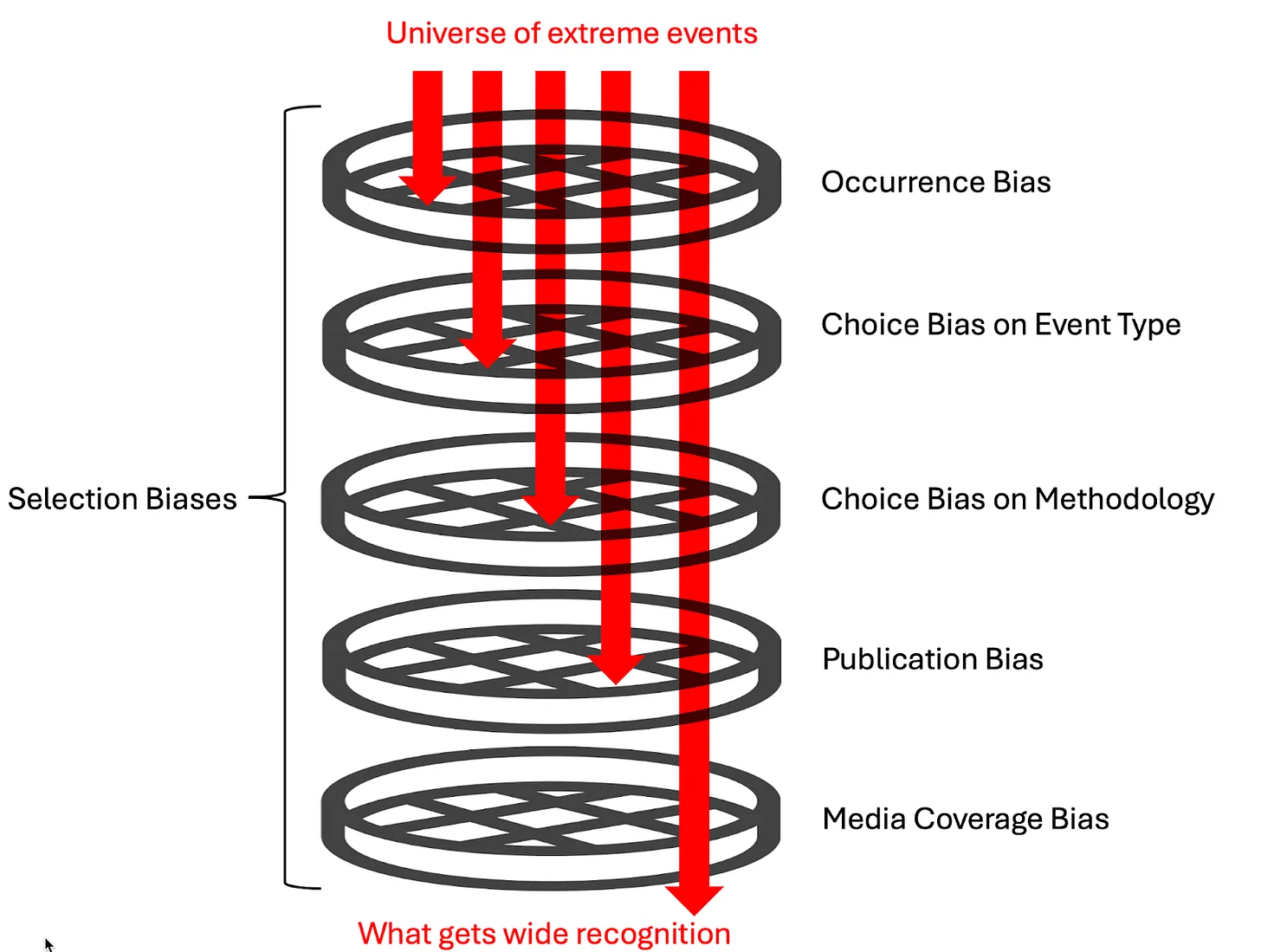
It’s Better to be Outside Paris Accord
 Chris Johnson writes at Real Clear Energy to explain Trump’s Withdrawal From the Paris Agreement Won’t Hurt the Climate. Excerpts in italics with my bolds and added images.
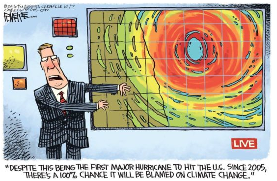
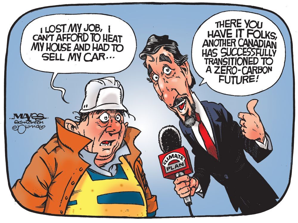
President Donald Trump withdrew from the Paris Agreement. Cue the leftwing meltdown. Though everyone knew the withdrawal was coming, the left and the “international community” are still decrying America’s alleged abdication of leadership on climate.
But toothless agreements window dressed with international
summits and photo ops are not the same as leadership.
summits and photo ops are not the same as leadership.
The truth is America has led the world in reducing emissions for years not because of the Paris Agreement, but because innovation and the free market facilitate the deployment of cheaper and cleaner energy. Let’s review the record.
In recent decades, America has achieved unprecedented — and unexpected — energy production thanks to fracking and horizontal drilling. Since the early 2000s when these twin technologies began to be deployed much more expansively, U.S. natural gas production has more than doubled. By 2016, hydraulically fractured gas wells accessed through horizontal drilling accounted for nearly 70% of all oil and natural gas wells.
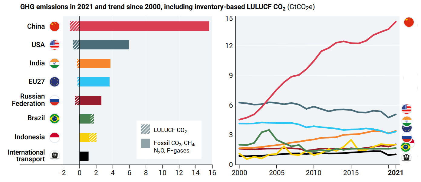
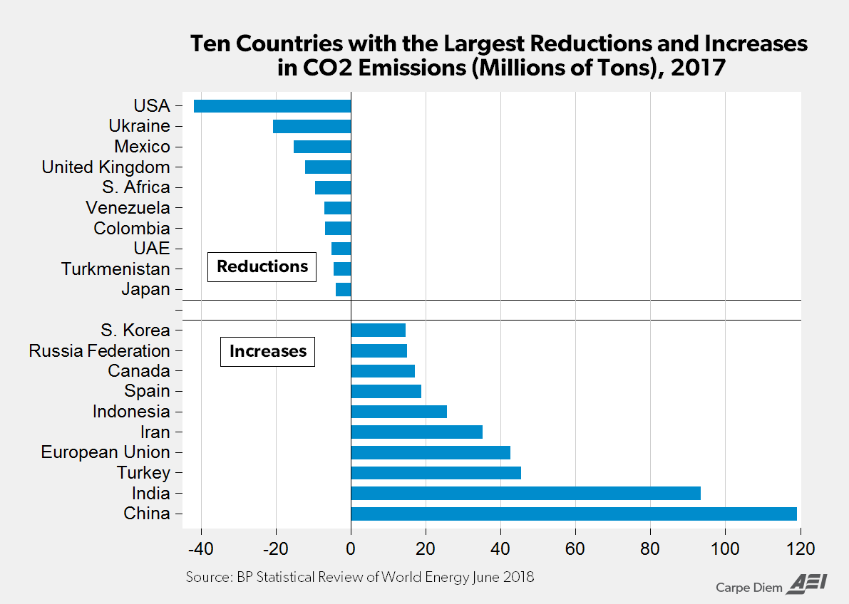
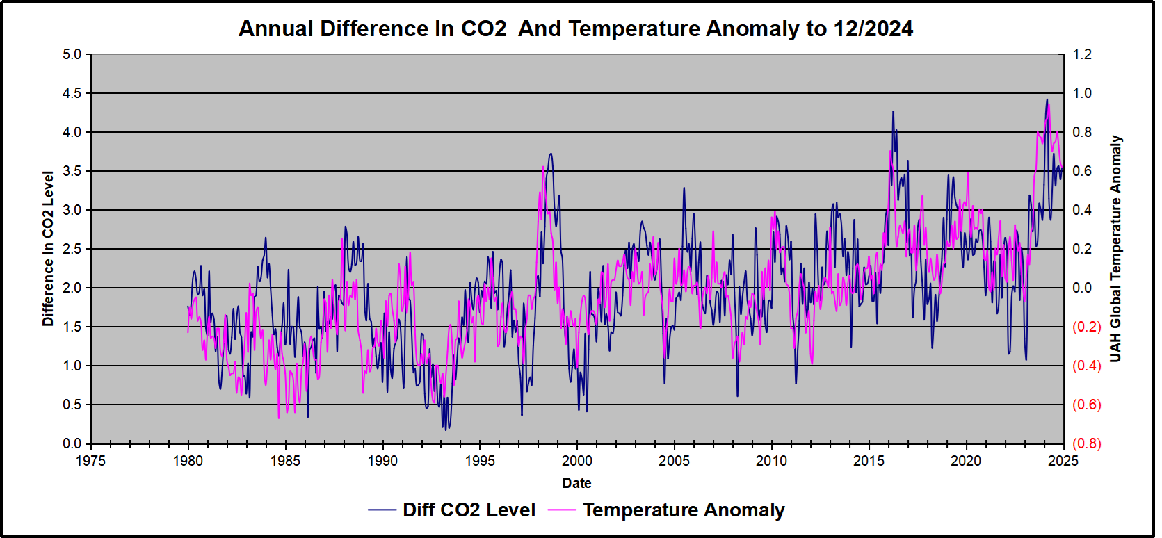
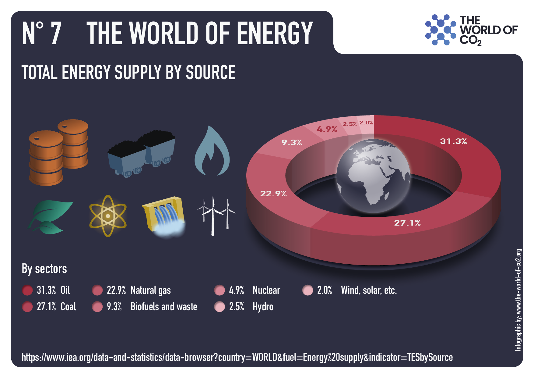
While the left may clutch its pearls at the increased production of a fossil fuel like natural gas, this clean energy source has been a main driver of U.S. emissions reductions. Over the past 15 years when America has massively increased natural gas output, the U.S. reduced carbon emissions more than any other country. We can see this year by year.

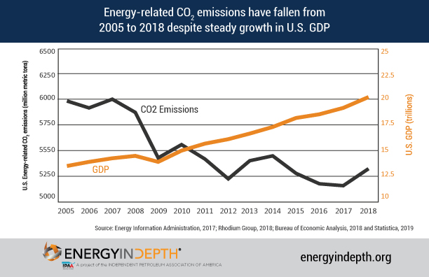
For example, from 2022 to 2023, America offset dirtier coal energy generation with natural gas. As coal declined by 121.9 terawatt hours of electric generation over that time, natural gas increased by 118.9 terawatt hours. At the same time, U.S. greenhouse gas emissions declined 1.9%. Notably, 80% of the U.S. carbon emissions reductions were driven by the electric power sector — precisely where natural gas has an outsized impact.
Notice what didn’t cause those emissions reductions? The Paris Agreement.
The American energy sector — powered by innovation and good-old-fashioned free market economics — has been driving down carbon emissions cheaply and effectively before the Paris Agreement was a twinkle in climate activists’ eyes. And it will continue to reduce carbon emissions long after President Trump’s decision to withdraw.
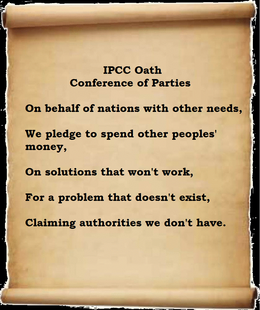
The Paris Agreement is far from the panacea some activists claim it is.
It isn’t even a particularly effective tool to
rally nations toward greater climate success.
It isn’t even a particularly effective tool to
rally nations toward greater climate success.
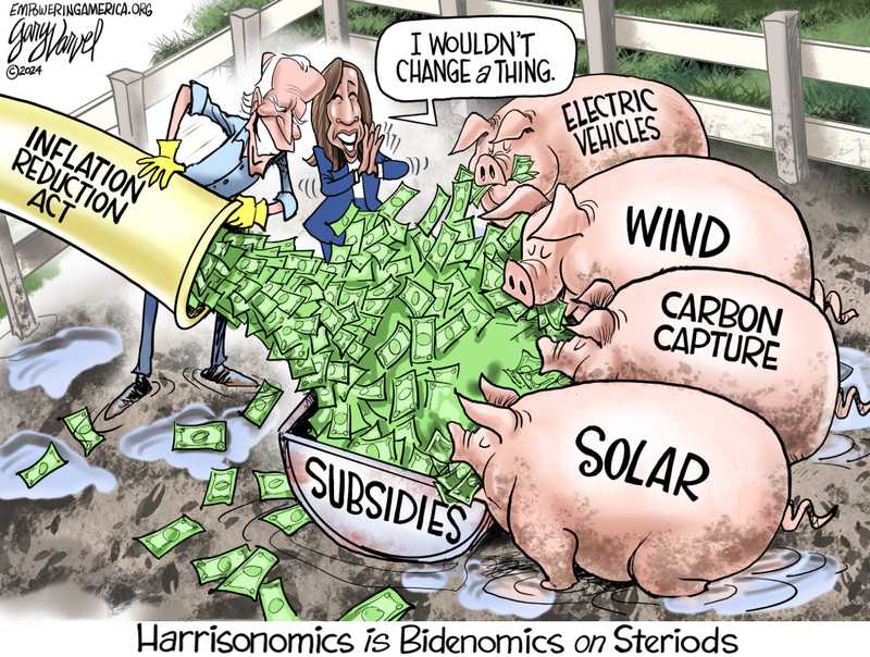
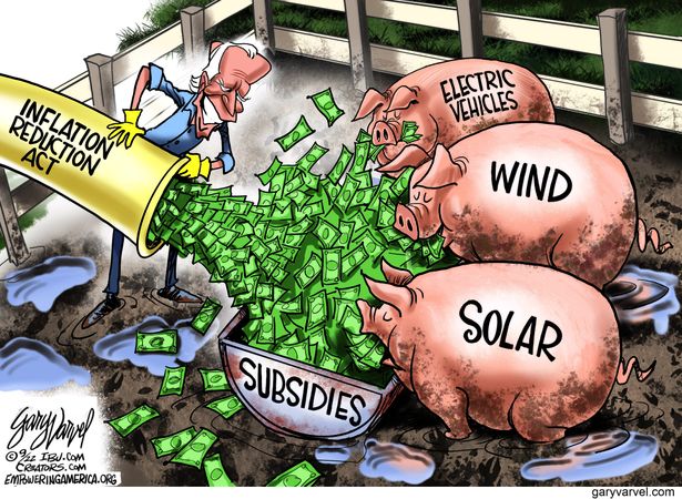
In the middle of the allegedly climate-conscious Biden administration, none of the world’s biggest emitters — America included — had reduced their emissions in accordance with the Paris goals. Apparently, the $1 trillion regulatory and subsidy regime erected by President Biden’s Inflation Reduction Act had little bang for the buck.
What Agreement supporters forget is that no number of high-profile international accords can make command-control tactics work — or instill other nations with the ambition to fulfill their empty promises.
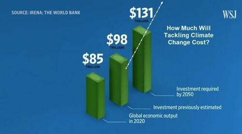
Yes, those are trillions of dollars they are projecting to spend.
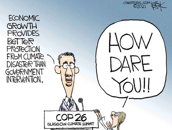
The Paris Agreement is the definition of bureaucratic failure, conflating meetings, busyness, and lofty goals as success. Its only achievement is to make climate ideologues and green jetsetters feel good about themselves as they fly to international conferences.
It’s no wonder President Trump withdrew. Talk is cheap. What matters is success. On that metric, the Trump administration is set to actually achieve what Paris Agreement signatories only write on paper.
Trump entered office promising to deregulate the fossil fuel industry, increase permitting for natural gas extraction, approve the construction of energy facilities like natural gas export terminals, and re-establish American energy dominance.
By leaning into America’s carbon advantage and exporting clean American energy abroad, he will boost the U.S. economy, supplant dirty energy from nations like Russia and Venezuela with a clean American alternative, and lower emissions both at home and abroad, all without the jaw-dropping price tag of the failed Biden-era green agenda. We should combine these steps with efforts to actually hold the biggest polluters accountable (which are being discussed by President Trump’s cabinet). This approach would be the antithesis of the Paris Accords’ America-last strategy.
Of course, some are urging President Trump to go further and not just withdraw from the Paris Agreement, but also back out of the UN Framework Convention on Climate Change (UNFCCC). This may seem like an easy choice, seeing as the UNFCCC, like so many UN bodies, acts contrary to American interests. But that’s exactly why America must remain in the UNFCCC.
Climate treaties will be formed whether or not the U.S. is involved, and the UNFCCC will continue to operate as a forum for those negotiations. Staying in the UNFCCC costs America nothing while allowing Trump and his appointees to keep a seat at the table, hold the UN accountable, and counter any deal that would put America at a disadvantage. While the UNFCCC can be harmful, it’s only the Paris Agreement that’s impotent.
The breathless alarm over the withdrawal from the Paris Agreement is overwrought. When President Trump withdrew from the Paris Climate Accord during his first administration, America went on to cut carbon emissions to the lowest level in 25 years. Re-embracing the power of natural gas in his second term, he’ll do it again.
So instead of the UN and international climate activists judging the U.S., we should remind everyone that if you want to put climate first, you should actually put America first.
Chris Johnson is a GOP strategist who organizes the next generation of conservative leaders. He also serves as a senior advisor to the National Federation of College Republicans, focusing on energy issues.


