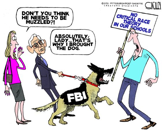
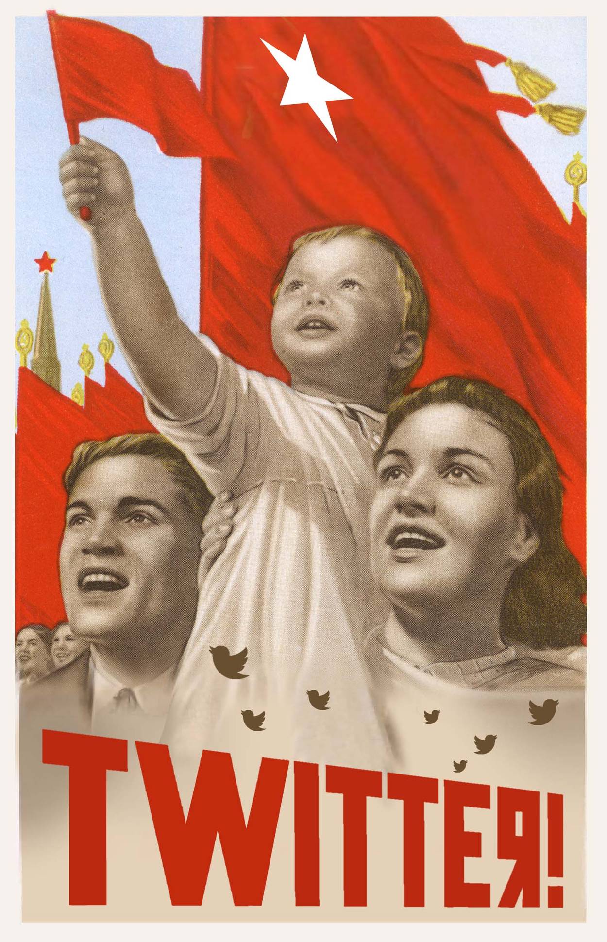
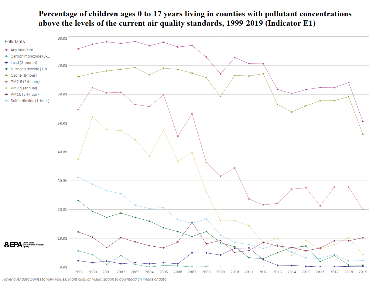
Lee Smith documents the hideous journey at his Tablet article How the FBI Hacked Twitter. Excerpts in italics with my bolds and added images.
After journalist Matt Taibbi published the first batch of internal Twitter documents known as the Twitter files, he tweeted that the company’s deputy general counsel, James Baker, was vetting them.
“The news that Baker was reviewing the ‘Twitter files’ surprised everyone involved,” Taibbi wrote. That apparently included even Twitter’s new boss, Elon Musk, who added that Baker may have deleted some of the files he was supposed to be reviewing.
Baker had been the top lawyer at the FBI when it interfered in the 2016 presidential election. News that he might have been burying evidence of the spy service’s use of a social media company to interfere with the 2020 election, is rightly setting off alarm bells.
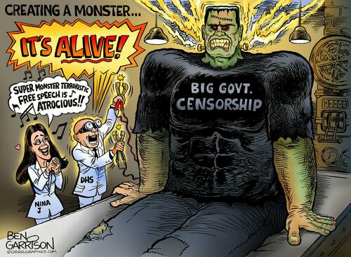
In fact, the FBI’s penetration of Twitter constituted just one part of a much larger intelligence operation—one in which the bureau offshored the machinery it used to interfere in the 2016 election and embedded it within the private sector. The resulting behemoth, still being built today, is a public-private consortium made up of U.S. intelligence agencies, Big Tech companies, civil society institutions, and major media organizations that has become the world’s most powerful spy service—one that was powerful enough to disappear the former president of the United States from public life, and that is now powerful enough to do the same or worse to anyone else it chooses.
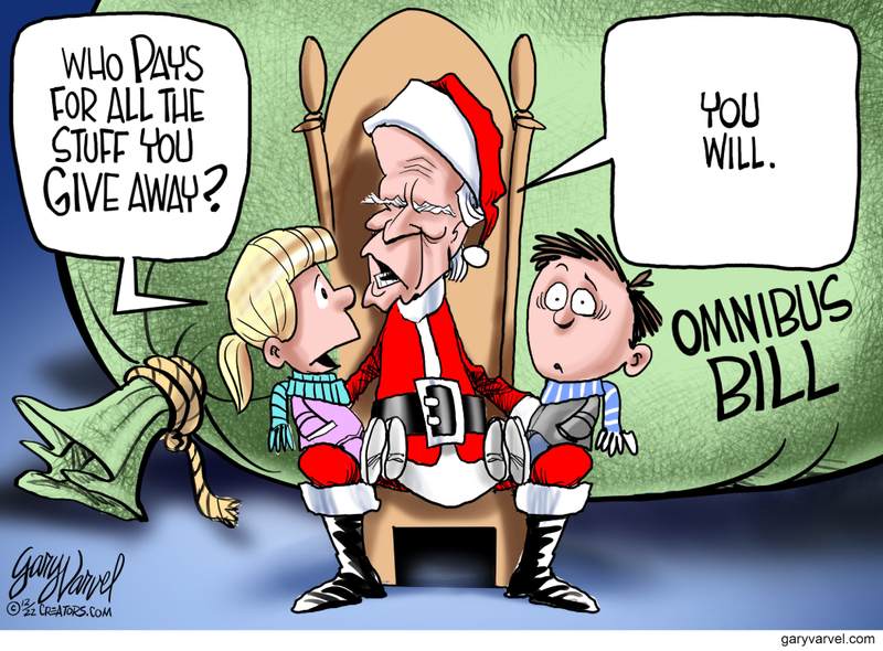
Records from the Twitter files show that the FBI paid Twitter nearly $3.5 million, apparently for actions in connection with the 2020 election and nominally a payout for the platform’s work censoring “dangerous” content that had been flagged as mis- or disinformation. That “dangerous” content notably included material that threatened Joe Biden and implicated U.S. officials who have been curating the Biden family’s foreign corruption for decades.
The Twitter files have to date focused on FBI and, to a lesser extent, CIA election interference. However a lesser-known U.S. government agency, the Cybersecurity and Infrastructure Security Agency (CISA) also played a significant role in shaping the 2020 vote. “CISA is a sub-agency at DHS that was set up to protect real physical infrastructure, like servers, malware and hacking threats,” said former State Department official Mike Benz, now the executive director of the Foundation for Freedom Online. “But they expanded ‘infrastructure’ to mean us, the U.S. electorate. So ‘disinformation’ threatened infrastructure and that’s how cybersecurity became cyber-censorship.
CISA’s mandate went from stopping threats of Russian malware to stopping tweets from accounts that questioned the integrity of mail-in voting.”
The censorship industry is based on a “whole of society model,” said Benz. “It unifies the government and the private sector, as well as civil society in the form of academia and NGOs and news organizations, including fact-checking organizations. All these projects with catchphrases like building resilience, media literacy, cognitive security, etc., are all part of a broad partnership to help censor opponents of the Biden administration.”
Notably, Baker was enlisted in one of the civil-society organizations at the same time he joined Twitter as deputy general counsel. According to Benz, the National Task Force on Election Crises is something like a sister organization to the Transition Integrity Project, the group founded by former Democratic Party officials and Never Trump publicists who war-gamed post-2020-election scenarios.
“The outfit Baker was part of,” said Benz, “effectively handled the public messaging
for an organization that threatened street violence and counseled
violating the constitution to thwart a Trump victory.”
Baker’s presence at Twitter, then, and his review of the Twitter files, was deeply disconcerting. “This is who is inside Twitter,” the journalist and filmmaker Mike Cernovich tweeted at Elon Musk this spring. “He facilitated fraud.”
Musk replied: “Sounds pretty bad.”
In fact, Musk has done more in two months to bring to light crimes committed by U.S. officials than William Barr and John Durham did during their three-year investigation of the FBI’s election interference activities during the 2016 election. Musk now owns what became a crucial component of the national security apparatus that, seen in this light, is worth many times more than the $44 billion he paid for it.
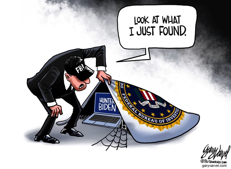
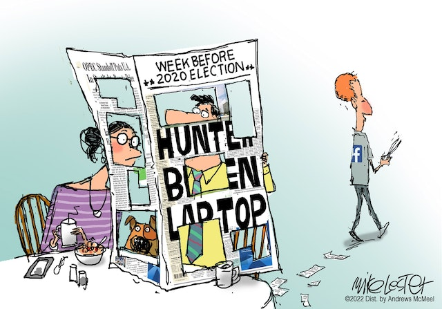
The FBI prepared America’s new public-private censorship regime for the 2020 election by falsely telling Twitter, as well as other social media platforms, press outlets, lawmakers, and staff members of the White House, that Russians were readying a hack and leak operation to dirty the Democratic candidate. Accordingly, when reports of a laptop owned by Hunter Biden and giving evidence of his family’s financial ties with foreign officials were published in October 2020, Twitter blocked them.
In the week before the election, the FBI field office in charge of investigating Hunter Biden sent multiple censorship requests to Twitter. The FBI has “some folks in the Baltimore field office and at [FBI headquarters] that are just doing keyword searches for violations,” a company lawyer wrote in a Nov. 3, 2020, email.
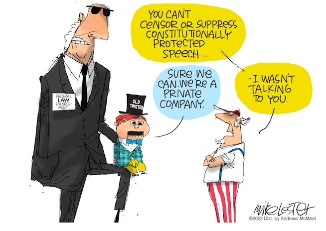
The documents also show that Twitter banished Trump after misrepresenting his posts as incitement to violence. With U.S. intelligence services reportedly using informants to provoke violence during the January 6th protest at the Capitol, the trap closed on Trump. Twitter and Facebook then moved to silence the outgoing president by denying him access to the global communications infrastructure.
Twitter was more than a one-way mirror: The FBI also seems to have embedded its own spy structure within the social media company to siphon off the personal data and behavior of users. Dozens of former intelligence officials were installed within Twitter after the election of Donald Trump. Some had active top secret security clearances. Twitter’s director of strategy was Dawn Burton, former FBI Director James Comey’s deputy chief of staff. Perhaps most significant was Baker himself, who appears to have led the FBI’s internal organization at the platform. Efforts to reach Baker for comment on this story were unsuccessful.

Under Baker, Twitter became more than just an instrument to censor
the opposition; it also spied on them.
Newly released court documents show that Twitter coordinated with the DOJ to intercept the communications of users potentially dangerous to the Biden campaign, like Tara Reade, the former Biden Senate staffer who alleged that Biden had sexually assaulted her decades earlier. The DOJ subpoenaed her Twitter account, likely with the purpose of giving the company cover for finding out which journalists had contacted her about her allegations.
Perkins Coie’s lead attorney for Twitter v. Holder was former DOJ cybersecurity expert Michael Sussmann. He and Baker were friends. The FBI lawyer thanked him in a September 2014 letter for a recent meeting that included Twitter’s top lawyer Vijaya Gadde and others, but affirmed that giving specific numbers would reveal “properly classified information.” Why that would endanger sources and methods, as the government claimed, Baker never explained. But no one at DOJ knew more than Baker about FISA, the most intrusive surveillance program that U.S. intelligence services have in their arsenal.
Given what we know now, it’s clear that special counsel John Durham’s case against Sussmann was even more troubled than it first seemed. His star witness, Baker, wasn’t a hero in the story but a co-conspirator, to whom Durham gave a pass so he could charge Sussmann with a process crime.
What few understood was that the issue wasn’t just the 2016 election but the 2020 vote, too. Baker had to tread carefully or else risk exposing the job for which Sussmann had helped plant him at Twitter. It was one of the spy service’s most sensitive operations—infiltrating social media platforms to fix a presidential race. So Sussmann was acquitted—and the FBI’s hack of Twitter continued.
The Obama administration also realized that it could lean hard on monopoly social media platforms in order to gain political advantages—and it could make companies that weren’t compliant pay a price. First strike got you a dressing down from the White House: Weeks after the 2016 vote, for instance, Obama pulled Mark Zuckerberg aside at a conference in Peru and read him out about not doing more to keep Russian disinformation off Facebook. The reality is that Russia spent around $135,000 on Facebook ads, a small percentage of what presidential campaigns typically spend on a single day before lunch. But Obama wasn’t worried about Russia—he struck deals with Vladimir Putin to advance his own idiosyncratic foreign policy goals, like the nuclear agreement with Russia’s ally Iran. Obama’s problem was Trump.
As he was leaving office, Obama stamped the U.S. government’s seal of approval on Russiagate, ordering his spy chiefs to draft an official assessment claiming Putin helped put Trump in the White House. Since then, in Deep State parlance, “Russia” equals Trump and stopping “Russian disinformation” means censoring Trump, his supporters, and anyone else opposed to the national security apparatus’s takeover of the public communications infrastructure. Since Zuckerberg didn’t keep Trump off Facebook in 2016, he had to put up $400 million to drive votes to Democrats in 2020—and even that wasn’t enough. In 2021, Democratic Party insiders working together with Zuckerberg’s Big Tech competitor, eBay founder Pierre Omidyar, sent a fake whistleblower after him to testify before congress that Facebook was bad for teenage girls.
The censorship regime would regulate out of existence anyone who resists it. To make the case for the hegemony of government censors, it found an eminent pitchman: Barack Obama.
In April, as Musk first said he wanted to buy Twitter and save free speech, Obama embarked on a “disinformation” tour, which took him to several college campuses to promote the un-American virtues of censorship. He first visited his hometown to speak at a University of Chicago conference, “Disinformation and the Erosion of Democracy.” Other guests included Anne Applebaum, an early advocate of the collusion conspiracy theory who pushed the spy-service fiction in dozens of her Washington Post columns. Also in attendance was former CISA head Chris Krebs, now famous for congressional testimony in which he claimed the 2020 election was the most secure ever.
The purpose of Obama’s speech was to present a choice to his audience: Either you impose a scorched-earth policy against the establishment’s opponents, or else you will face the kind of regulation that every company knows will be its death knell. Moreover, if they made the right choice, Obama showed, there was money in it for them.
“In effect, Obama announced that the funding channels are open for people who want to do disinformation work,” said Mike Benz, executive director of the Foundation for Freedom Online. “It’s like what happened with climate change. If you were an academic who wanted federal funding for anything, you made sure you made reference to climate to get grants. Same now with disinformation. Obama was saying, ‘here’s where the puck is moving, so skate here if you want federal funding.’”
In retrospect, the failure of the Russiagate conspiracy theory
accelerated the spy service’s takeover of social media.
Though no one is likely to be held accountable anytime soon, or ever, it was enough that the details of the operation were exposed by Patel and Nunes. In response, the spy agencies moved much of their operations out of the federal government and into the private sector, where even if congressional investigators found it, there wasn’t much they could do. Republicans could threaten to regulate social media, but their threats were empty. They might even find themselves—and their campaign ads—banned from Twitter.
The public-private sector merger worked only because, as a unifying myth for the U.S. elite, if not as a legal or political maneuver, Russiagate was a great success. If there were any fears of how news of the FBI’s spying operation on a presidential campaign might be received by the press, civil rights activists, and the left, the reception to Russiagate dispelled those concerns. The media offered itself up as a platform for information operations and published illegal leaks of classified information while the rest of the ruling class promoted a conspiracy theory and celebrated the assault on the constitutional rights of their fellow Americans as a success story.
Barr resigned from the administration a month after the election, outraged that Trump kept pushing him to investigate election fraud when, according to Barr, there was no evidence of it. And yet on his watch, law enforcement agencies under his authority ran the biggest election interference operation in U.S. history. William Barr did not respond to a request for comment.
It seems Barr’s contempt for the president he served blinded him—along with the class of people to which he belongs, Democrats and Republicans alike—to an essential fact: A whole-of-society industry designed to shape elections and censor, propagandize, and spy on Americans was never simply a weapon to harm Donald Trump. It was designed to replace the republic.
Footnote: Soviet Humor:
“Lubyanka (KGB headquarters) is the tallest building in Moscow. You can see Siberia from its basement.”


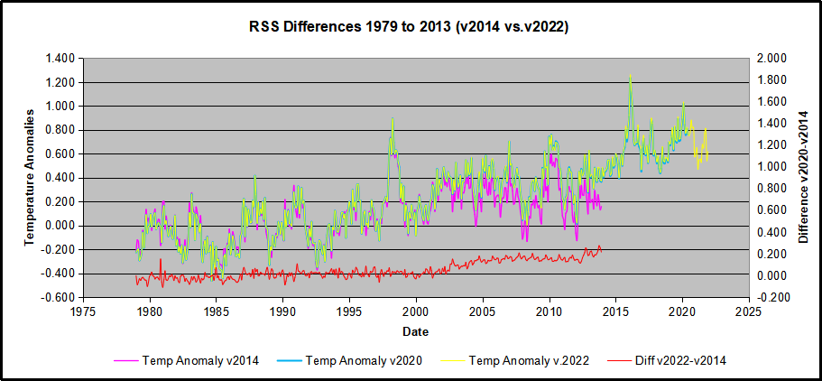
 The best context for understanding decadal temperature changes comes from the world’s sea surface temperatures (SST), for several reasons:


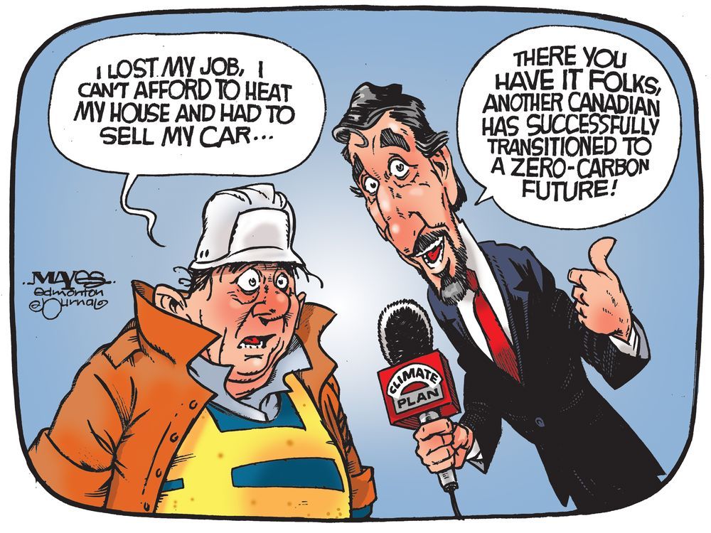
/img/iea/r1OrW3DQGn/evs-in-cold.jpg)