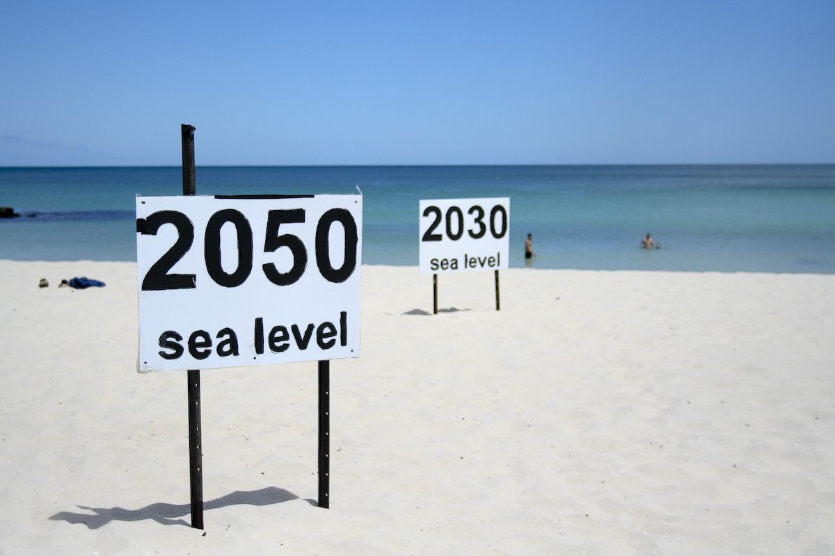
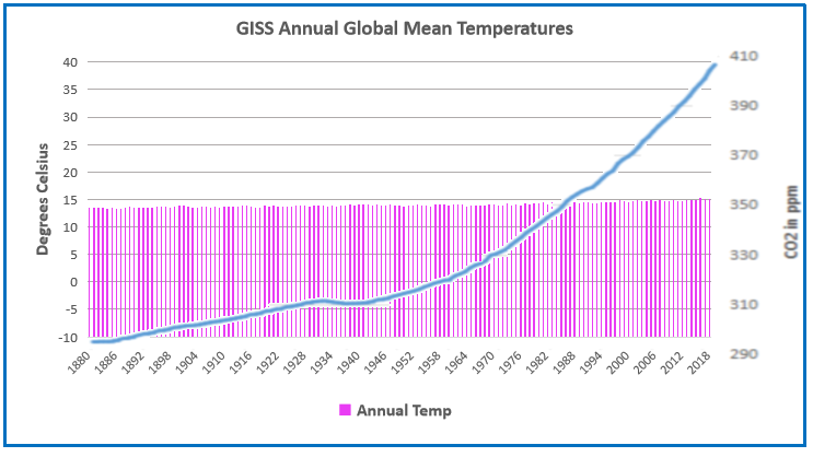
Bug Apocalypse Not!

Jon Entine writes again lamenting false alarms by scientists and journalists The Insect Apocalypse That Never Was.  Excerpts in italics with my bolds.

For the past four years, journalists and environmental bloggers have been churning out alarming stories that insects are vanishing, in the United States and globally. Limited available evidence lends credence to reasonable concerns, not least because insects are crucial components of many ecosystems. But the issue has often been framed in catastrophic terms, with predictions of a near-inevitable and imminent ecological collapse that would break ecosystems, destroy harvests, and trigger widespread starvation. Most of the proposed solutions would require a dramatic retooling of many aspects of modern life, from urbanization to agriculture.

Considering the disruptive economic and social trade-offs being demanded by some of those promoting the crisis hypothesis, it’s prudent to separate genuine threats from agenda-driven hyperbole. Are insect declines really threatening to precipitate a catastrophic ecological crisis? And, given the available data, what should a responsible society be doing?

The silver lining around the cloud of gloomy advocacy-focused studies and reporting is that entomologists are doing a deeper dive into the reasons behind the global declines. Goulson’s upcoming media blitz notwithstanding, the most thorough studies to date on insects in North America challenge the catastrophe narrative (although you may not have heard about them as they have been almost ignored by the media), and even offers some reassuring news.

The Moran study, published last August, specifically examined four to 36 years of data on arthropods (insects and other invertebrates) collected from US Long-Term Ecological Research sites located in ecoregions throughout the country. The authors found that: “There is no evidence of precipitous and widespread insect abundance declines in North America akin to those reported from some sites in Europe.”

The robustness of the Moran study data suggests the insect population story is much more complicated—and less dire—than many headlines suggest. If a thorough examination of the data on one continent can lead to such a dramatically different and more hopeful conclusion, broad trends in the vast, highly diverse, and relatively unstudied continents of Asia, Africa, Latin America, and Australia cannot be characterized through extrapolation with any assurance.

The overall paucity of data provides an opening for alarmists to speculate, and Goulson and others have taken advantage of that. But why are the data so fragmentary? Moran attributed the lack of corroborating studies supporting the consensus view that insect populations are mostly stable to what he calls “publication bias … more dramatic results are more publishable. Reviewers and journals are more likely to be interested in species that are disappearing than in species that show no change over time,” he wrote in the Washington Post.

It’s a reinforcing feedback loop, with journalists playing a key role in this misinformation cycle. Scientific publications are more likely to publish reports of declining species. Then, when researchers search for data, “declines are what they find.” The media often seize on incomplete or even biased conclusions to build a compelling narrative—an insect apocalypse or insectageddon or zombie-like resurrections of debunked reports of birdpocalypses and beepocalypses.

Background previous post:  Epic Media Science Fail: Fear Not Pollinator Collapse

Jon Entine returns to this topic writing at the Genetic Literacy Project: The world faces ‘pollinator collapse’? How and why the media get the science wrong time and again. Excerpts in italics with my bolds.

As I and others have detailed in the Genetic Literacy Project and as other news organizations such as the Washington Post and Slate have outlined, the pollinator-collapse narrative has been relentless and mostly wrong for more than seven years now.

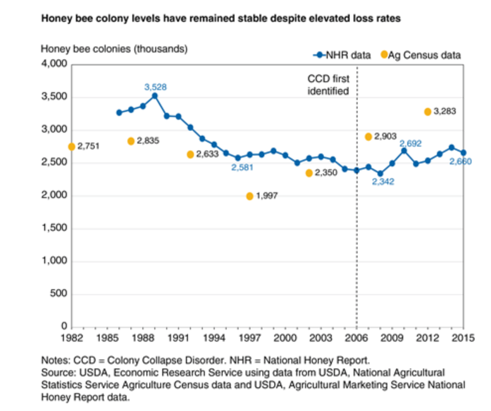
It germinated with Colony Collapse Disorder that began in 2006 and lasted for a few years—a freaky die off of bees that killed almost a quarter of the US honey bee population, but its cause remains unknown. Versions of CCD have been occurring periodically for hundreds of years, according to entomologists.

Today, almost all entomologists are convinced that the ongoing bee health crisis is primarily driven by the nasty Varroa destructor mite. Weakened honey bees, trucked around the country as livestock, face any number of health stressors along with Varroa, including the use of miticides used to control the invasive mite, changing weather and land and the use of some farm chemicals, which may lower the honeybee’s ability to fight off disease.

Still, the ‘bee crisis’ flew under the radar until 2012, when advocacy groups jumped in to provide an apocalyptic narrative after a severe winter led to a sharp, and as it turned out temporary, rise in overwinter bee deaths.

Colony loss numbers jumped in 2006 when CCD hit but have been steady and even improving since.

The alarm bells came with a spin, as advocacy groups blamed a class of pesticides known as neonicotinoids, which were introduced in the 1990s, well after the Varroa mite invasion infected hives and started the decline. The characterization was apocalyptic, with some activist claiming that neonics were driving honey bees to extinction.

In the lab evaluations, which are not considered state of the art—field evaluations replicate real-world conditions far better—honeybee mortality did increase. But that was also true of all the insecticides tested; after all, they are designed to kill harmful pests. Neonics are actually far safer than the pesticides they replaced, . . . particularly when their impact is observed under field-realistic conditions (i.e., the way farmers would actually apply the pesticide).

As the “science” supporting the bee-pocalypse came under scrutiny, the ‘world pollinator crisis’ narrative began to fray. Not only was it revealed that the initial experiments had severely overdosed the bees, but increasing numbers of high-quality field studies – which test how bees are actually affected under realistic conditions – found that bees can successfully forage on neonic-treated crops without noticeable harm.

Those determined to keep the crisis narrative alive were hardly deterred. Deprived of both facts and science to argue their case, many advocacy groups simply pounded the table by shifting their crisis argument dramatically. For example, in 2016, the Sierra Club (while requesting donations), hyped the honey bee crisis to no end.

But more recently, in 2018, the same organization posted a different message on its blog. Honeybees, the Sierra Club grudgingly acknowledged, were not threatened. Forget honeybees, the Sierra Club said, the problem is now wild bees, or more generally, all insect pollinators, which are facing extinction due to agricultural pesticides of all types (though neonics, they insisted, were especially bad).

So, once again, with neither the facts nor the science to back them up, advocacy groups have pulled a switcheroo and are again pounding the table. As they once claimed with honeybees, they now claim that the loss of wild bees and other insect pollinators imperils our food supply. A popular meme on this topic is the oft-cited statistic, which appears in the recent UN IPBES report on biodiversity, that “more than 75 per cent of global food crop types, including fruits and vegetables and some of the most important cash crops such as coffee, cocoa and almonds, rely on animal pollination.”

There’s a sleight of hand here. Most people (including most journalists) miss or gloss over the important point that this is 75 percent of crop types, or varieties, not 75 percent of all crop production. In fact, 60 percent of agricultural production comes from crops that do not rely on animal pollination, including cereals and root crops. As the GLP noted in its analysis, only about 7 percent of crop output is threatened by pollinator declines—not a welcomed percentage, but far from an apocalypse.

And the word “rely” seems almost purposefully misleading. More accurately, most of these crops receive some marginal boost in yield from pollination. Few actually “rely” on it. A UN IPBES report on pollinators published in 2018 actually breaks this down in a convenient pie graph.

Many of these facts are ignored by advocacy groups sharpening their axes, and they’re generally lost on the “if it bleeds it leads” media, which consistently play up catastrophe scenarios of crashing pollinator communities and food supplies. Unfortunately, many scientists willingly go along. Some are activists themselves; others hope to elevate the significance of their findings to garner media attention and supercharge grant proposals.

As John Adams is alleged to have said, ‘facts are stubborn things.’ We can’t be simultaneously in the midst of a pollinator crisis threatening our ability to grow food and see continually rising yield productivity among those crops most sensitive to pollination.

With these claims of an impending wild bee catastrophe, as in the case of the original honeybee-pocalypse claims, few of the journalists, activists, scientists or biodiversity experts who regularly sound this ecological alarm have reviewed the facts in context. Advocacy groups consistently extrapolate from the declines of a handful of wild bee species (out of the thousands that we know exist), to claim that we are in the midst of a worldwide crisis. But just as with the ‘honey bee-mageddon, we are not.

Those of us who actually care about science and fact, however, might note the irony here: It is precisely the pesticides which the catastrophists are urging us to ban that, along with the many other tools in the modern farmer’s kit, have enabled us grow more of these nutritious foods, at lower prices, than ever before in human history.

Footnote:  Activists have played both sides with their insect warnings Alarmists: Global Warming Destroys Good Bugs and Multiplies Bad Bugs

insect

Summary: These scares always sound plausible, but on closer inspection are simplistic and unrealistic. The above shows that each type of insect has a range of temperatures they can tolerate and allow them to develop. They are stressed and populations decrease when colder than the lower limit and also when hotter than the upper limit. Every species will adapt to changing conditions as they always have. Those at their upper limit will decline, not increase, and their place will be taken by others. Of course, if it gets colder, the opposite occurs. Don’t let them scare you that insects are taking over.

Inside the Sea Level Scare Machine

3047060508_737c7687bd_o.0.0

Such beach decorations exhibit the fervent belief of activists that sea levels are rising fast and will flood the coastlines if we don’t stop burning fossil fuels.  As we will see below there is a concerted effort to promote this notion empowered with slick imaging tools to frighten the gullible.  Of course there are frequent media releases sounding the alarms.  Recently for example:

From the Guardian Up to 410 million people at risk from sea level rises – study.  Excerpts in italics with my bolds.

The paper, published in Nature Communications, finds that currently 267 million people worldwide live on land less than 2 metres above sea level. Using a remote sensing method called Lidar, which pulsates laser light across coastal areas to measure elevation on the Earth’s surface, the researchers predicted that by 2100, with a 1 metre sea level rise and zero population growth, that number could increase to 410 million people.

The climate emergency has caused sea levels to rise and more frequent and severe storms to occur, both of which increase flood risks in coastal environments.

Last year, a survey published by Climate and Atmospheric Science, which aggregated the views of 106 specialists, suggested coastal cities should prepare for rising sea levels that could reach as high as 5 metres by 2300, which could engulf areas home to hundreds of millions of people.

The rest of this post provides a tour of seven US cities demonstrating how the sea level scare machine promotes fear among people living or invested in coastal properties.  In each case there are warnings published in legacy print and tv media, visual simulations powered by computers and desktop publishing, and a comparison of imaginary vs. observed sea level trends.

Prime US Cities on the “Endangered” List
Newport , R.I.

Examples of Media Warnings

Bangor Daily News:  In Maine’s ‘City of Ships,’ climate change’s coastal threat is already here

Bath, the 8,500-resident “City of Ships,” is among the places in Maine facing the greatest risks from increased coastal flooding because so much of it is low-lying. The rising sea level in Bath threatens businesses along Commercial and Washington streets and other parts of the downtown, according to an analysis by Climate Central, a nonprofit science and journalism organization.

Water levels reached their highest in the city during a record-breaking storm in 1978 at a little more than 4 feet over pre-2000 average high tides, and Climate Central’s sea level team found there’s a 1-in-4 chance of a 5-foot flood within 30 years. That level could submerge homes and three miles of road, cutting off communities that live on peninsulas, and inundate sites that manage wastewater and hazardous waste along with several museums.

UConn Today:  Should We Stay or Should We Go? Shoreline Homes and Rising Sea Levels in Connecticut

As global temperatures rise, so does the sea level. Experts predict it could rise as much as 20 inches by 2050, putting coastal communities, including those in Connecticut, in jeopardy.

One possible solution is a retreat from the shoreline, in which coastal homes are removed to take them out of imminent danger. This solution comes with many complications, including reductions in tax revenue for towns and potentially diminished real estate values for surrounding properties. Additionally, it can be difficult to get people to volunteer to relocate their homes.

Computer Simulations of the Future

Newport Obs Imaged

Imaginary vs. Observed Sea Level Trends (2020 Update)

Newport past & projected 2020

Boston, Mass.

Example of Media Warnings

From WBUR Radio Boston:  Rising Sea Levels Threaten MBTA’s Blue Line

Could it be the end of the Blue Line as we know it? The Blue Line, which features a mile-long tunnel that travels underwater, and connects the North Shore with Boston’s downtown, is at risk as sea levels rise along Boston’s coast. To understand the threat sea-level rise poses to the Blue Line, and what that means for the rest of the city, we’re joined by WBUR reporter Simón Ríos and Julie Wormser, Deputy Director at the Mystic River Watershed Association.

As sea levels continue to rise, the Blue Line and the whole MBTA system face an existential threat. The MBTA is also facing a serious financial crunch, still reeling from the pandemic, as we attempt to fully reopen the city and the region. Joining us to discuss is MBTA General Manager Steve Poftak.

Computer Simulations of the Future

Boston Obs Imaged2


Imaginary vs. Observed Sea Level Trends (2020 Update)

Boston Past and Projected 2020


New York City

Example of Media Warnings

From Quartz: Sea level rise will flood the neighborhood around the UN building with two degrees warming

Right now, of every US city, New York City has the highest population living inside a floodplain. By 2100, seas could rise around around the city by as much as six feet. Extreme rainfall is also predicted to rise, with roughly 1½ times more major precipitation events per year by the 2080s, according to a 2015 report by a group of scientists known as the New York City Panel on Climate Change.

But a two-degree warming scenario, which the world is on track to hit, could lock in dramatic sea level rise—possibly as much as 15 feet.

Computer Simulations of the Future

NYC Obs Imaged

Imaginary vs. Observed Sea Level Trends (2020 Update)

NYC past & projected 2020

Philadelphia, PA.

Example of Media Warnings

From NBCPhiladelphia:  Climate Change Studies Show Philly Underwater

NBC10 is looking at data and reading studies on climate change to showcase the impact. There are studies that show if the sea levels continue to rise at this rate, parts of Amtrak and Philadelphia International Airport could be underwater in 100 years.

Computer Simulations of the Future

Philly Obs Imaged

Imaginary vs. Observed Sea Level Trends (2020 Update)

Phil past & projected 2020

Miami, Florida

Examples of Media Warnings

From WLRN Miami: Miles Of Florida Roads Face ‘Major Problem’ From Sea Rise. Is State Moving Fast Enough?

One 2018 Department of Transportation study has already found that a two-foot rise, expected by mid-century, would imperil a little more than five percent — 250-plus miles — of the state’s most high-traffic highways. That may not sound like a lot, but protecting those highways alone could easily cost several billion dollars. A Cat 5 hurricane could be far worse, with a fifth of the system vulnerable to flooding. The impact to seaports, airports and railroads — likely to also be significant and expensive — is only now under analysis.

From Washington Post:  Before condo collapse, rising seas long pressured Miami coastal properties

Investigators are just beginning to try to unravel what caused the Champlain Towers South to collapse into a heap of rubble, leaving at least 159 people missing as of Friday. Experts on sea-level rise and climate change caution that it is too soon to speculate whether rising seas helped destabilize the oceanfront structure. The 40-year-old building was relatively new compared with others on its stretch of beach in the town of Surfside.

But it is already clear that South Florida has been on the front lines of sea-level rise and that the effects of climate change on the infrastructure of the region — from septic systems to aquifers to shoreline erosion — will be a management problem for years.

Computer Simulations of the Future

Florida Obs Imaged

Imaginary vs. Observed Sea Level Trends (2020 Update)

KW past & projected 2020

Houston, Texas

Example of Media Warnings

From Undark:  A $26-Billion Plan to Save the Houston Area From Rising Seas

As the sea rises, the land is also sinking: In the last century, the Texas coast sank about 2 feet into the sea, partly due to excessive groundwater pumping. Computer models now suggest that climate change will further lift sea levels somewhere between 1 and 6 feet over the next 50 years. Meanwhile, the Texas coastal population is projected to climb from 7 to 9 million people by 2050.

Protecting Galveston Bay is no simple task. The bay is sheltered from the open ocean by two low, sandy strips of land — Galveston Island and Bolivar Peninsula — separated by the narrow passage of Bolivar Roads. When a sufficiently big storm approaches, water begins to rush through that gap and over the island and peninsula, surging into the bay.

Computer Simulations of the Future

Galv Obs Imaged

Imaginary vs. Observed Sea Level Trends (2020 Update)

Galv past & projected 2020

San Francisco, Cal.

Example of Media Warnings

From San Francisco Chronicle:  Special Report: SF Bay Sea Level Rise–Hayward

Sea level rise is fueled by higher global temperatures that trigger two forces: Warmer water expands oceans while the increased temperatures hasten the melting of glaciers on Antarctica and Greenland and add yet more water to the oceans.

The California Ocean Protection Council, a branch of state government, forecasts a 1-in-7 chance that the average daily tides in the bay will rise 2 or more feet by 2070. This would cause portions of the marshes and bay trail in Hayward to be underwater during high tides. Add another 2 feet, on the higher end of the council’s projections for 2100 and they’d be permanently submerged. Highway 92 would flood during major storms. So would the streets leading into the power plant.

From San Francisco Chronicle Special Report: SF Bay Sea Level Rise–Mission Creek

Along San Francisco’s Mission Creek, sea level rise unsettles the waters.  Each section of this narrow channel must be tailored differently to meet an uncertain future. Do nothing, and the combination of heavy storms with less than a foot of sea level rise could send Mission Creek spilling over its banks in a half-dozen places, putting nearby housing in peril and closing the two bridges that cross the channel.

Whatever the response, we won’t know for decades if the city’s efforts can keep pace with the impact of global climatic forces that no local government can control.

Though Mission Creek is unique, the larger dilemma is one that affects all nine Bay Area counties.

Computer Simulations of the Future

SF Obs Imaged

Imaginary vs. Observed Sea Level Trends (2020 Update)

SF CA past & projected 2020

Summary: This is a relentless, high-tech communications machine to raise all kinds of scary future possibilities, based upon climate model projections, and the unfounded theory of CO2-driven global warming/climate change.  The graphs above are centered on the year 2000, so that the 21st century added sea level rise is projected from that year forward.  In addition, we now have observations at tidal gauges for the first 20 years, 1/5 of the total expected.  The gauges in each city are the ones with the longest continuous service record, and wherever possible the locations shown in the simulations are not far from the tidal gauge.  For example, NYC best gauge is at the Battery, and Fulton St. is also near the Manhattan southern tip.

Already the imaginary rises are diverging greatly from observations, yet the chorus of alarm goes on.  In fact, the added rise to 2100 from tidal gauges ranges from 6 to 9.5 inches, except for Galveston projecting 20.6 inches. Meanwhile models imagined rises from 69 to 108 inches. Clearly coastal settlements must adapt to evolving conditions, but also need reasonable rather than fearful forecasts for planning purposes.

Footnote:  The problem of urban flooding is discussed in some depth at a previous post Urban Flooding: The Philadelphia Story

Background on the current sea level campaign is at USCS Warnings of Coastal Floodings

And as always, an historical perspective is important:

post-glacial_sea_level

Typical Arctic Ice Extents in June


Arctic2021181

Previous posts reported that Arctic Sea Ice has persisted this year despite a wavy Polar Vortex this spring, bringing cold down to mid-latitudes, and warming air into Arctic regions.  Then in May and now again in June,  the sea ice extent matched or exceeded the 14-year average several times during the month, tracking alongside until month end.  Surprisingly  SII (Sea Ice Index) showed much more ice the first week, similar extents mid- June, and then SII lost ice more rapidly the final week.  Yesterday both SII and MASIE day 181 were close to the same day in 2007.

Note that on the 14-year average, June loses ~2M km2 of ice extent, which 2021 matched, as did 2007.  Both 2020 and 2019 finished lower than average, by 500k and 400k respectively.  

Why is this important?  All the claims of global climate emergency depend on dangerously higher temperatures, lower sea ice, and rising sea levels.  The lack of additional warming is documented in a post Adios, Global Warming

The lack of acceleration in sea levels along coastlines has been discussed also.  See USCS Warnings of Coastal Floodings

Also, a longer term perspective is informative:

post-glacial_sea_level
The table below shows the distribution of Sea Ice across the Arctic Regions, on average, this year and 2007.

Region 2021181 Day 181 Average 2021-Ave. 2007181 2021-2007
 (0) Northern_Hemisphere 9644967 9741628  -96661  9672969 -28002 
 (1) Beaufort_Sea 999085 905769  93316  939209 59876 
 (2) Chukchi_Sea 760235 715065  45170  670088 90146 
 (3) East_Siberian_Sea 924474 1010406  -85932  901963 22511 
 (4) Laptev_Sea 578894 703006  -124112  658742 -79848 
 (5) Kara_Sea 527080 545919  -18839  657478 -130398 
 (6) Barents_Sea 129619 123601  6018  130101 -482 
 (7) Greenland_Sea 461815 501479  -39664  548399 -86584 
 (8) Baffin_Bay_Gulf_of_St._Lawrence 497237 504688  -7451  450461 46777 
 (9) Canadian_Archipelago 761843 778224  -16381  773611 -11768 
 (10) Hudson_Bay 736119 728550  7569  718441 17678 
 (11) Central_Arctic 3239262 3205301  33960  3218999 20262 
 (12) Bering_Sea 15316 4566  10750  981 14336 
 (13) Baltic_Sea 0 3 -3  0
 (14) Sea_of_Okhotsk 12919 13765  -847  2983 9936 

The overall deficit to average happened yesterday, being an extent 1% lower, and one day earlier than average.  The largest deficits to average are in East Siberian and Laptev Seas, along with Greenland Sea.  These are partly offset by surpluses elsewhere, mostly in Beaufort, Chukchi, and Central Artic seas.


US Heat and Drought Advisory June

Climatists are raising alarms about the rising temperatures and water shortages as evidence of impending doom (it’s summer and that time of year again).  So some contextual information is suitable.

First, a comparison of recent US June forecasts for temperatures.

NOAA US temp 2019 2021

And then for the same years, precipitation forecasts.

NOAA US rain 2019 2021

Finally, a reminder of how unrelated CO2 is to all of this.

us-wet-dry-co2rev-1

giss-gmt-to-2018-w-co2

What Solstice Teaches Us About Climate Change

From Previous Post When Is It Warming?

On June 21, 2015 E.M. Smith made an intriguing comment on the occasion of Summer Solstice (NH) and Winter Solstice (SH):

“This is the time when the sun stops the apparent drift in the sky toward one pole, reverses, and heads toward the other. For about 2 more months, temperatures lag this change of trend. That is the total heat storage capacity of the planet. Heat is not stored beyond that point and there can not be any persistent warming as long as winter brings a return to cold.

I’d actually assert that there are only two measurements needed to show the existence or absence of global warming. Highs in the hottest month must get hotter and lows in the coldest month must get warmer. BOTH must happen, and no other months matter as they are just transitional.

I’m also pretty sure that the comparison of dates of peaks between locations could also be interesting. If one hemisphere is having a drift to, say, longer springs while the other is having longer falls, that’s more orbital mechanics than CO2 driven and ought to be reflected in different temperature trends / rates of drift.” Source: Summer Solstice is here at chiefio

Monthly Temps NH and SH

Notice that the global temperature tracks with the seasons of the NH. The reason for this is simple. The NH has twice as much land as the Southern Hemisphere (SH). Oceans do not change temperatures as much as land does. So every year when there is almost a 4 °C swing in the temperature of the Earth, it follows the seasons of the NH. This is especially interesting because the Earth gets the most energy from the sun in January presently. That is because of the orbit of the Earth. The perihelion is when the Earth is closest to the sun and that currently takes place in January.

sun-distances

Observations and Analysis:

At the time my curiosity was piqued by Chiefio’s comment, so I went looking for data to analyze to test his proposition. As it happens, Berkeley Earth provides data tables for monthly Tmax and Tmin by hemisphere (NH and SH), from land station records. Setting aside any concerns about adjustments or infilling I did the analysis taking the BEST data tables at face value. Since land surface temperatures are more variable than sea surface temps, it seems like a reasonable dataset to analyze for the mentioned patterns. In the analysis below, all years refers to data for the years 1877 through 2013.

Tmax Records

NH and SH long-term trends are the same 0.07C/decade, and in both there was cooling before 1979 and above average warming since. However, since 1950 NH warmed more strongly, and mostly prior to 1998, while SH has warmed strongly since 1998. (Trends below are in C/yr.)

 Tmax Trends NH Tmax SH Tmax
All years 0.007 0.007
1998-2013 0.018 0.030
1979-1998 0.029 0.017
1950-1979 -0.003 -0.003
1950-2013 0.020 0.014

Summer Comparisons:

NH summer months are June, July, August, (6-8) and SH summer is December, January, February (12-2). The trends for each of those months were computed and the annual trends subtracted to show if summer months were warming more than the rest of the year (Trends below are in C/yr.).

Month less Annual NH
Tmax
NH Tmax NH Tmax SH Tmax SH Tmax SH Tmax
Summer Trends

6

7 8 12 1

2

All years -0.002 -0.004 -0.004 0.000 0.003 0.002
1998-2013 0.026 0.002 0.006 0.022 0.004 -0.029
1979-1998 0.003 -0.004 -0.003 -0.014 -0.029 0.001
1950-1979 -0.002 -0.002 -0.005 0.004 0.005 -0.005
1950-2013 -0.002 -0.003 -0.002 -0.002 -0.002 -0.002

NH summer months are cooler than average overall and since 1950. Warming does appear since 1998 with a large anomaly in June and also warming in August.  SH shows no strong pattern of Tmax warming in summer months. A hot December trend since 1998 is offset by a cold February. Overall SH summers are just above average, and since 1950 have been slightly cooler.

Tmin Records

Both NH and SH show Tmin rising 0.12C/decade, much more strongly warming than Tmax. SH show that average warming persisting throughout the record, slightly higher prior to 1979. NH Tmin is more variable, showing a large jump 1979-1998, a rate of 0.25 C/decade (Trends below are in C/yr.).

 Trends NH Tmin SH Tmin
All years 0.012 0.012
1998-2013 0.010 0.010
1979-1998 0.025 0.011
1950-1979 0.006 0.014
1950-2013 0.022 0.014

Winter Comparisons:

SH winter months are June, July, August, (6-8) and NH winter is December, January, February (12-2). The trends for each of those months were computed and the annual trends subtracted to show if winter months were warming more than the rest of the year (Trends below are in C/yr.).

Month less Annual NH Tmin NH Tmin NH Tmin SH Tmin SH Tmin SH Tmin
Winter Trends

12

1 2 6 7

8

All years 0.007 0.008 0.007 0.005 0.003 0.004
1998-2013 -0.045 -0.035 -0.076 -0.043 -0.024 -0.019
1979-1998 -0.018 -0.005 0.024 0.034 0.008 -0.008
1950-1979 0.008 0.005 0.007 0.008 0.012 0.013
1950-2013 0.001 0.007 0.008 -0.001 -0.002 0.002

NH winter Tmin warming is stronger than SH Tmin trends, but shows quite strong cooling since 1998. An anomalously warm February is the exception in the period 1979-1998.  Both NH and SH show higher Tmin warming in winter months, with some irregularities. Most of the SH Tmin warming was before 1979, with strong cooling since 1998. June was anomalously warming in the period 1979 to 1998.

Summary

Tmin did trend higher in winter months but not consistently. Mostly winter Tmin warmed 1950 to 1979, and was much cooler than other months since 1998.

Tmax has not warmed in summer more than in other months, with the exception of two anomalous months since 1998: NH June and SH December.

Conclusion:

I find no convincing pattern of summer Tmax warming carrying over into winter Tmin warming. In other words, summers are not adding warming more than other seasons. There is no support for concerns over summer heat waves increasing as a pattern.

It is interesting to note that the plateau in temperatures since the 1998 El Nino is matched by winter months cooler than average during that period, leading to my discovering the real reason for lack of warming recently.

The Real Reason for the Pause in Global Warming?

These data suggest warming trends are coming from less cold overnight temperatures as measured at land weather stations. Since stations exposed to urban heat sources typically show higher minimums overnight and in winter months, this pattern is likely an artifact of human settlement activity rather than CO2 from fossil fuels.

uhi_profile-rev-big

Thus the Pause (more correctly the Plateau) in global warming is caused by end of the century completion of urbanization around most surface stations. With no additional warming from additional urban heat sources, temperatures have remained flat for more than 15 years.

Data is here:
http://berkeleyearth.lbl.gov/regions/northern-hemisphere
http://berkeleyearth.lbl.gov/regions/southern-hemisphere

Happy Summer Solstice

White Nights

White Nights Festival, St. Petersburg


Whiplash from Climate News

Studio Shot Of Masn In pain Wearing Neck Brace

Warning:  Reading media reports about global warming/climate change can cause serious whiplash, far beyond the danger in watching a professional tennis match.  Take today, for example (all excerpts in italics with my bolds)

‘May already be too late to reverse global warming’ at hthk.hk.

The tipping point for irreversible global warming may have already been triggered, the scientist who led the biggest-ever expedition to the Arctic warned on Tuesday.

“The disappearance of summer sea ice in the Arctic is one of the first landmines in this minefield, one of the tipping points that we set off first when we push warming too far,” said Markus Rex.

“And one can essentially ask if we haven’t already stepped on this mine and already set off the beginning of the explosion.”

Rex led the world’s biggest mission to the North Pole, an expedition involving 300 scientists from 20 countries.

Summarising their first findings, Rex said scientists found that the Arctic sea ice had retreated “faster in the spring of 2020 than since the beginning of records” and that “the spread of the sea ice in the summer was only half as large as decades ago”. [Really?]

Arctic ice Sept Ave 2020

“Only evaluation in the coming years will allow us to determine if we can still save the year-round Arctic sea ice through forceful climate protection or whether we have already passed this important tipping point in the climate system,” Rex added, urging rapid action to halt warming.

Stefanie Arndt, who specialises in sea ice physics, said it was “painful to know that we are possibly the last generation who can experience an Arctic which still has a sea ice cover in the summer”.

“This sea ice cover is gradually shrinking and it is an important living space for polar bears,” said Arndt, while recounting observations of seals and other animals in the polar habitat. [What about this?]

when-al-gore-was-born-there-were-7000-polar-bears

Comment:  I agree it’s high time to stop trying to cut emissions, and commit to adapting to whatever nature brings: whether warming, or the greater threat, cooling.

Climate change to blame for ‘catastrophic’ French frost: analysis at Daily Sabah

122221-1

As temperatures fall below zero degrees celsius during the night, anti-frost candles burn through sunrise in the Chablis vineyards near Chablis, Burgundy, France, April 7, 2021. (AFP Photo)

Scientists said Tuesday that climate change had sharply increased the odds of devastating events such as the frost that wiped out a third of French wine production at a cost of around 2 billion euros ($2.42 billion) in the space of a few nights in April. The frost blanketed the country’s most well-known and prestigious wine-producing regions in what minister Julien Denormandie called “probably the greatest agricultural catastrophe of the beginning of the 21st century.”

Scientists warned that climate change would raise the risk of such events even further in the future.

28239_cartoon_main

Greta Thunberg calls out hypocrisy of world leaders for eating steak and lobster at climate summit.  at VegNews

vegnews.gretathunbergborisjohnson

This week, vegan climate activist Greta Thunberg expressed her disappointment with world leaders making empty promises about climate action during the G7 (Group of Seven) summit at the luxury Carbis Bay Hotel in Cornwall, England. Led by United Kingdom Prime Minister Boris Johnson and attended by United States President Joe Biden, the purpose of the three-day event was for the group to meet prior to this year’s United Nations conferences to discuss a variety of global issues, including their collaborative effort to tackle the climate crisis.

Throughout the weekend, event attendees were treated to a variety of meals, including a five-course dinner which included turbot fish, a selection of Cornish cheeses, and dairy-based desserts on Friday; and a lavish beach barbecue on Saturday which included seafood appetizers made with scallops, mackerel, and crab claws, and a traditional surf-and-turf entrée that featured sirloin steak and lobsters. The meals were marketed as sustainable and “carbon neutral” because animals such as lamb and crab were sourced locally.

Greta sees

Wildfire Ashes Dumped on Pelosi’s Porch as Youth Climate Activists Descend on US Lawmakers’ CA Homes at Sputnik News.

Last month, the Sunrise Movement, a youth-led political movement against climate change, kicked off a series of ‘Generation on Fire’ marches in California and the Gulf Coast. Since then, members of the group have marched hundreds of miles and held a demonstration in Paradise, California, the site of a 2018 fire that displaced nearly 50,000 people.

The San Francisco, California, homes of House Speaker Nancy Pelosi (D-CA) and longtime Sen. Dianne Feinstein (D-CA) became the sites of protest as over 100 young activists of the Sunrise Movement ended a 266-mile march on Monday.

The climate change activists could be overheard chanting, among many things, “Whose future? Our future!” as they marched across the Golden Gate Bridge to get to Pelosi’s Normandie Terrace home and Feinstein’s mansion.

reality-check-30-yrs.-of-climate-policy

Big Four beancounter PwC to hire 100,000 employees world-wide as it expands consultancy services at This Is Money.

44264489-9689735-image-a-1_1623781755632

Big Four accountant PwC plans to hire 100,000 employees world-wide as it expands lucrative consultancy services in areas such as climate change.

The hiring spree over the next five years will take its global headcount to nearly 384,000.

It is part of a £8.5billion investment to take advantage of huge demand from businesses for advice on environmental, social and governance (ESG) issues.

PwC is investing in recruitment, training and technology to foster expertise on subjects ranging from how firms can cut carbon emissions, to ‘hybrid’ working practices after the pandemic and how to hire executives from a mix of backgrounds.

Florida skies to turn orange as dust storm travels over from Sahara at The Independent.

photojoiner_photo2028929

Florida’s skies are set to be turned orange this week by a giant Saharan dust storm that has traveled across the Atlantic.

The dust is part of 60 million tons of sand and mineral particles that are annually swept up off the African desert floor and pushed westwards across the ocean by winds.

Weather experts predict that the cloud of dust is due to arrive in the Gulf of Mexico this week and will likely hit Florida on Wednesday.

Should we pay a carbon tax to our own government or to someone else’s? at WA Today.

Despite Prime Minister Scott Morrison’s popular determination to tackle climate change with “technology not taxes”, the decision might not long remain in Australian hands if the G7 leaders’ statement from the weekend meeting in Cornwall is anything to go by.

Soon we might have to decide if we want to pay a carbon tax to our own government, or one to someone else’s.

151214paris-climate

June Arctic Ice Returns to Mean


Arctic2021159

A previous post reported that Arctic Sea Ice has persisted this year despite a wavy Polar Vortex this spring, bringing cold down to mid-latitudes, and warming air into Arctic regions.  Now in June, after tracking in deficit the sea ice extent is matching the 14-year average on day 159.  Note that SII (Sea Ice Index) since mid-May has been showing 200 to 400k km2 more ice than MASIE, and currently the two datasets have converged on a value of ~11.25 M km2.

Note that on the 14-year average, during this period ~1.7M km2 of ice extent is lost, which 2021 is matching, as did 2007.  Both 2020 and 2019 were much lower than average at this date, by ~600k and ~700k respectively.  

Why is this important?  All the claims of global climate emergency depend on dangerously higher temperatures, lower sea ice, and rising sea levels.  The lack of additional warming is documented in a post Adios, Global Warming

The lack of acceleration in sea levels along coastlines has been discussed also.  See USCS Warnings of Coastal Floodings

Also, a longer term perspective is informative:

post-glacial_sea_level
The table below shows the distribution of Sea Ice across the Arctic Regions, on average, this year and 2007.

Region 2021159 Day 159 Average 2021-Ave. 2007159 2021-2007
 (0) Northern_Hemisphere 11240999 11259536  -18538  11316498 -75500 
 (1) Beaufort_Sea 1019264 964689  54575  1000434 18830 
 (2) Chukchi_Sea 849650 820007  29642  828275 21375 
 (3) East_Siberian_Sea 1018939 1060847  -41907  1065467 -46528 
 (4) Laptev_Sea 719152 797804  -78652  750975 -31824 
 (5) Kara_Sea 786077 768820  17257  805583 -19506 
 (6) Barents_Sea 253238 260182  -6944  312729 -59491 
 (7) Greenland_Sea 664297 581528  82769  579724 84573 
 (8) Baffin_Bay_Gulf_of_St._Lawrence 755645 803058  -47412  811860 -56215 
 (9) Canadian_Archipelago 802846 802905  -60  783908 18938 
 (10) Hudson_Bay 1022997 1058859  -35862  1027039 -4042 
 (11) Central_Arctic 3233401 3215315  18085  3235047 -1646 
 (12) Bering_Sea 59415 70145  -10729  62751 -3336 
 (13) Baltic_Sea 0 8 -8  0
 (14) Sea_of_Okhotsk 54471 53989  482  51031 3440 

The main deficits are in Laptev and East Siberian Seas, Baffin and Hudson Bays, offset by surpluses in Beaufort, Chukchi and Greenland Seas.


Ordinary Arctic Ice Extents in May

Arctic2021151

A previous post reported that Arctic Sea Ice has persisted this year despite a wavy Polar Vortex this spring, bringing cold down to mid-latitudes, and warming air into Arctic regions.  Now in May, the sea ice extent matched the 14-year average on day 144, tracking alongside until month end.  Surprisingly  SII (Sea Ice Index) is showing ~400k km2 more ice, which is also ~70k km2 higher than the 14-year average for SII on day 151 (not shown in chart).

Note that on the 14-year average, May loses ~2M km2 of ice extent, which 2021 matched, as did 2007.  Both 2020 and 2019 finished lower than average, by 300k and 400k respectively.  In contrast SII shows a May loss of only 1.3M km2.

Why is this important?  All the claims of global climate emergency depend on dangerously higher temperatures, lower sea ice, and rising sea levels.  The lack of additional warming is documented in a post Adios, Global Warming

The lack of acceleration in sea levels along coastlines has been discussed also.  See USCS Warnings of Coastal Floodings

Also, a longer term perspective is informative:

post-glacial_sea_level
The table below shows the distribution of Sea Ice across the Arctic Regions, on average, this year and 2007.

Region 2021151 Day 151 Average 2021-Ave. 2007151 2021-2007
 (0) Northern_Hemisphere 11605537 11733260  -127723  11846659 -241122 
 (1) Beaufort_Sea 1034779 992955  41825  1059461 -24682 
 (2) Chukchi_Sea 900868 861978  38891  894617 6251 
 (3) East_Siberian_Sea 1051959 1065828  -13869  1069198 -17239 
 (4) Laptev_Sea 738294 831217  -92923  754651 -16357 
 (5) Kara_Sea 824068 831440  -7373  895678 -71610 
 (6) Barents_Sea 325745 322981  2765  323801 1944 
 (7) Greenland_Sea 615174 567365  47810  591919 23255 
 (8) Baffin_Bay_Gulf_of_St._Lawrence 812548 908759  -96211  934257 -121709 
 (9) Canadian_Archipelago 811040 811378  -338  818055 -7015 
 (10) Hudson_Bay 1084892 1098368  -13476  1077744 7148 
 (11) Central_Arctic 3232324 3219180  13144  3230109 2215 
 (12) Bering_Sea 89124 122512  -33388  112353 -23228 
 (13) Baltic_Sea 0 161 -161  0
 (14) Sea_of_Okhotsk 83572 97612  -14040  83076 495 

The overall deficit to average happened yesterday, being an extent 1% lower, and two days earlier than average.  The largest deficits to average are in Baffin Bay and Laptev Sea, along with Bering and Okhotsk.  These are partly offset by surpluses elsewhere, mostly in Beaufort, Chukchi, and Greenland Seas.


May 24, 2021 Arctic Ice Matches Average

Arctic2021144

A previous post reported that Arctic Sea Ice has persisted this year despite a wavy Polar Vortex this spring, bringing cold down to mid-latitudes, and warming air into Arctic regions.  Now in May, the sea ice extent matches the 14-year average.  In the chart above, MASIE has caught up to its average, while SII (Sea Ice Index) is showing 300k km2 more ice.  This is also 200k km2 higher than the 14-year average for SII on day 144 (not shown in chart).

Why is this important?  All the claims of global climate emergency depend on dangerously higher temperatures, lower sea ice, and rising sea levels.  The lack of additional warming is documented in a post Adios, Global Warming

The lack of acceleration in sea levels along coastlines has been discussed also.  See USCS Warnings of Coastal Floodings

Also, a longer term perspective is informative:

post-glacial_sea_level
The table below shows the distribution of Sea Ice across the Arctic Regions, on average, this year and 2007.

Region 2021144 Day 144 Average 2021-Ave. 2007144 2021-2007
 (0) Northern_Hemisphere 12146819 12145771  1048  12035185 111634 
 (1) Beaufort_Sea 1014946 1014623  323  1063324 -48378 
 (2) Chukchi_Sea 926443 884593  41850  925212 1232 
 (3) East_Siberian_Sea 1074468 1068410  6057  1061115 13353 
 (4) Laptev_Sea 847289 862328  -15040  797581 49708 
 (5) Kara_Sea 850992 857488  -6495  898743 -47750 
 (6) Barents_Sea 414971 371726  43245  302721 112250 
 (7) Greenland_Sea 621173 588159  33015  573583 47591 
 (8) Baffin_Bay_Gulf_of_St._Lawrence 861138 985037  -123899  962331 -101193 
 (9) Canadian_Archipelago 836025 824730  11295  828387 7638 
 (10) Hudson_Bay 1109942 1135136  -25194  1091181 18761 
 (11) Central_Arctic 3241735 3223613  18121  3231990 9744 
 (12) Bering_Sea 212840 196725  16115  190680 22160 
 (13) Baltic_Sea 0 1039 -1039  619 -619 
 (14) Sea_of_Okhotsk 133703 130236  3467  105796 27907 

The largest deficit to average is in Baffin Bay, with Laptev and Hudson Bay also starting to melt.  These are offset by surpluses elsewhere, mostly in Chukchi, Barents, and Greenland Sea.


Mid May 2021 Persistent Arctic Ice

ArcDay135 2007 to 2021


Typically in climate observations, averages are referenced without paying attention to the high degree of component variability from year to year, and over longer time periods.  Mid May is when the Spring melt is well underway, but with the Arctic core still frozen solid.  Yet the animation above shows on day 135 over the last 15 years, there are considerable differences as to how much ice is in which regions. 

On the bottom left is Bering Sea which had ice extents on this day ranging from a high of 682k km2 (2012) to a low of 38k km2 (2018).  The day 135 average for Bering is 293k km2, but with a standard deviation of 192k (65%).  Okhotsk center left is the next most variable, from 290k (2012) to 99k (2019), averaging 188k with std. deviation of 63K (33%).  Barents Sea center top has a large variability from 568k km2 (2009) to 223k (2012), averaging 422k km2 +/- 111 k km2.  Other Arctic regions vary little on this day from year to year.  For example, Hudson Bay is close to 1.2M km2 every year on day 135.

The effect on NH total ice extents is presented in the graph below for the period mid April to mid May, comparing the 14-year average with 2021 MASIE and SII, and some other years of interest.

Arctic2021135

Note on average this period shows an ice loss of 1.5M km2.  MASIE 2021 is about 200k km2 below average, 1.6% down, or having the same total extent 3 days ahead of average.  Interestingly, SII shows about 200k higher, matching the MASIE average for day 135.

The table below shows the distribution of sea ice across the Arctic regions.

Region 2021135 Day 135 Average 2021-Ave. 2007135 2021-2007
 (0) Northern_Hemisphere 12490666 12692542  -201876  12431928 58738 
 (1) Beaufort_Sea 1058904 1044067  14837  1057649 1255 
 (2) Chukchi_Sea 926504 921289  5215  953491 -26987 
 (3) East_Siberian_Sea 1083562 1081242  2320  1075314 8248 
 (4) Laptev_Sea 852338 881285  -28948  828738 23600 
 (5) Kara_Sea 858111 882730  -24619  876053 -17942 
 (6) Barents_Sea 396873 421592  -24719  351553 45320 
 (7) Greenland_Sea 669899 618664  51235  564865 105035 
 (8) Baffin_Bay_Gulf_of_St._Lawrence 892167 1093916  -201749  1018780 -126614 
 (9) Canadian_Archipelago 852422 838509  13913  830604 21818 
 (10) Hudson_Bay 1160950 1194448  -33497  1167310 -6360 
 (11) Central_Arctic 3242075 3223985  18089  3234305 7769 
 (12) Bering_Sea 271137 293222  -22085  298268 -27130 
 (13) Baltic_Sea 3752 7215 -3463  6368 -2617 
 (14) Sea_of_Okhotsk 220784 188072  32712  164833 55951 

Overall NH extent March 31 was below average by 200k km2,  equivalent to the deficit in Baffin Bay.  Elsewhere smaller deficits were offset with surpluses. The onset of spring melt is as usual in most regions.