This recent paper is very topical, since several US coastal states are suing oil companies for damages expected from rising sea levels. Some Alaskan teenagers are making similar claims in a separate lawsuit against the US federal government. The study is Why would sea-level rise for global warming and polar ice-melt? By Aftab Alam Khan published in Geoscience Frontiers. Excerpts below with my bolds. H/T to NoTricksZone
IPCC Alarms over Sea Level Rise
Sea Level Change in the Fifth Assessment Report includes detailed explanation of the changes in the global mean sea level, regional sea level, sea level extremes, and waves (Church et al., 2013). Anthropogenic greenhouse gas emissions are causing sea-level rise (SLR) (Church and White, 2006; Jevrejeva et al., 2009). It is also claimed that ocean thermal expansion and glacier melting have been the dominant contributors to 20th century global mean sea level rise. It is further opined that global warming is the main contributor to the rise in global sea level since the Industrial Revolution (Church and White, 2006). According to Cazenave and Llovel (2010) rising of air temperature can warm and expand ocean waters wherein thermal expansion was the main driver of global sea level rise for 75 to 100 years after the start of the Industrial Revolution.
However, the share of thermal expansion in global sea level rise has declined in recent decades as the shrinking of land ice has accelerated (Lombard et al 2005). Lombard et al. (2006) opined that recent investigations based on new ocean temperature data sets indicate that thermal expansion only explains part (about 0.4 mm/yr) of the 1.8 mm/yr observed sea level rise of the past few decades. However, observation claim of 1.8 mm/yr sea level rise is also limited in scope and accuracy.
Fundamentals of Sea Level Variability
Mean Sea Level (MSL) is defined as the zero elevation for a local area. The zero surface referenced by elevation is called a vertical datum. Since sea surface conforms to the earth’s gravitational field, MSL has also slight hills and valleys that are similar to the land surface but much smoother. The MSL surface is in a state of gravitational equilibrium. It can be regarded as extending under the continents and is a close approximation of geoid. By definition geoid describes the irregular shape of the earth and is the true zero surface for measuring elevations. Because geoid surface cannot directly be observed, heights above or below the geoid surface can’t be directly measured and are inferred by making gravity measurements and modeling the surface mathematically.
Previously, there was no way to accurately measure geoid so it was roughly approximated by MSL. Although for practical purposes geoid and MSL surfaces are assumed to be essentially the same, but in reality geoid differs from MSL by several meters. Geoid moves above MSL where mass is excess and moves below MSL where mass is deficient. Distribution of mass in the crust in terms of ‘excess’ and ‘deficient’ can cause volume expansion and contraction for relative sea-level change. Height of the ocean surface at any given location, or sea level, is measured either with respect to the surface of the solid Earth i.e., relative sea level (RSL) or a eustatic sea level (ESL) (Fig. 1A).
Relative sea level (RSL) change can differ significantly from global mean sea level (GMSL) because of spatial variability in changes of the sea surface and ocean floor height. RSL change over the ocean surface area gives the change in ocean water volume, which is directly related to the sea level change. Sea level changes can be driven either by variations in the masses or volume of the oceans, or by changes of the land with respect to the sea surface. In the first case, a sea level change is defined ‘eustatic’; otherwise, it is defined ‘relative’ (Rovere et al., 2016). According to Kemp et al. (2015) land uplift or subsidence can result in, respectively, a fall or rise in sea level that cannot be considered eustatic as the volume or mass of water does not change. Any sea level change that is observed with respect to a land-based reference frame is defined a relative sea level (RSL) change. Eustatic Sea Level (ESL) changes also occur when the volume of the ocean basins changes due to tectonic seafloor spreading or sedimentation.
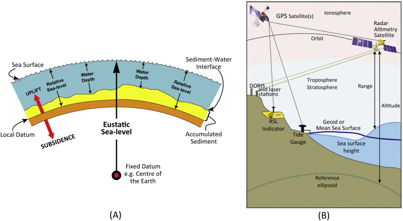
Figure 1. (A) Definition of sea level i.e., eustatic sea level and relative sea level (B) Different types of sea level observation techniques: satellite altimetry (based on NASA educational material), tide gauge and paleo sea level indicators (see text for details). Modern tide gauges are associated with a GPS station that records land movements.
Sea Level Observations
Changes in sea level can be observed at very different time scales and with different techniques (Fig. 1B). Regardless of the technique used, no observation allows to record purely eustatic sea level changes. At multi-decadal time scales, sea level reconstructions are based on satellite altimetry/gravimetry and landbased tide gauges (Cabanes et al., 2001). At longer time scales (few hundreds, thousands to millions of years), the measurement of sea level changes relies on a wide range of sea level indicators (Shennan and Horton, 2002; Vacchi et al., 2016; Rovere et al., 2016a). One of the most common methods to observe sea level changes at multi-decadal time scales is tide gauges.
Modern tide gauges are associated with a GPS station that records land movements (Fig. 1B). However, tide gauges have three main disadvantages: (i) they are unevenly distributed around the world (Julia Pfeffer and Allemand, 2015); (ii) the sea level signal they record is often characterized by missing data (Hay et al., 2015); and (iii) accounting for ocean dynamic changes and land movements might prove difficult in the absence of independent datasets (Rovere et al., 2016). Since 1992, tide gauge data are complemented by satellite altimetry datasets (Cazenave et al., 2002).
The altitude of the satellite is established with respect to an ellipsoid, which is an arbitrary and fixed surface that approximates the shape of the Earth. The difference between the altitude of the satellite and the range is defined as the sea surface height (SSH) (Fig. 1B). Subtracting from the measured SSH a reference mean sea surface (e.g. the geoid), one can obtain a ‘SSH anomaly’. The global average of all SSH anomalies can be plotted over time to define the global mean sea level change, which can be considered as the eustatic, globally averaged sea level change.
The shape of the geoid is crucial for deriving accurate measurements of seasonal sea level variations (Chambers, 2006). According to Rovere et al. (2016) measurements of paleo eustatic sea level (ESL) changes bear considerable uncertainty. Further, sea level changes on Earth cannot be treated as a rigid container although eustasy is defined in view of Earth as a rigid container. In reality, internal and external processes of the earth such as tectonics, dynamic topography, sediment compaction and melting ice all trigger variations of the container and these ultimately affect any sea level observation.
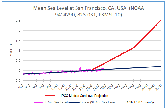
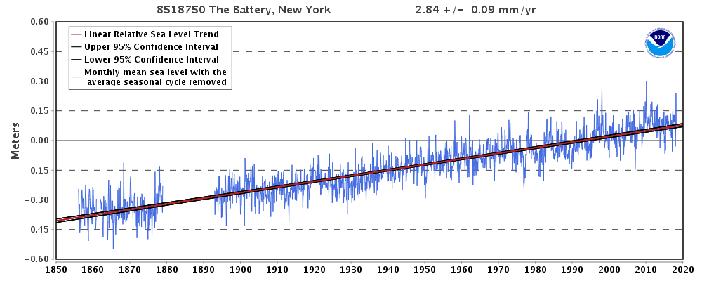
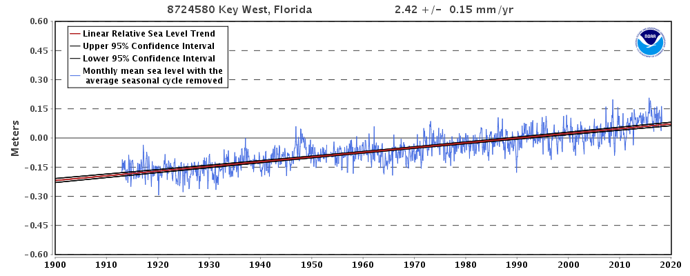
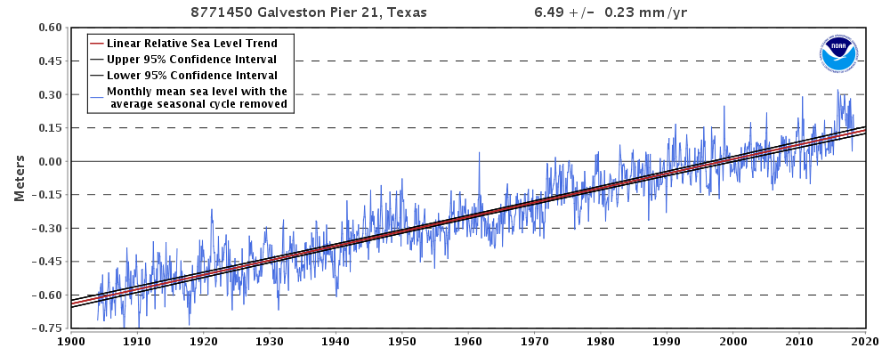
An estimated, observed, and possible future amounts of global sea level rise from 1800 to 2100, relative to the year 2000 has been proposed by Melillo et al. (2014) based on the works of Church and White (2011), Kemp et al. (2011) and Parris et al. (2012) (Fig. 2). The main concern of the predicted future global sea level rise shown in Melillo et al. (2014) is the forecast beyond 2012 up to 2100. Although sea level rise is shown by 0.89 ft in 209 years (between 1800 and 2009) at the rate of 0.0043 ft/yr, the prediction of 4–6 ft at the rate of 0.044 ft/yr and 0.066 ft/yr respectively in 91 years between 2009 and 2100) is highly questionable. An abrupt jump in the sea level rise after 2009 is definitely a conjecture.
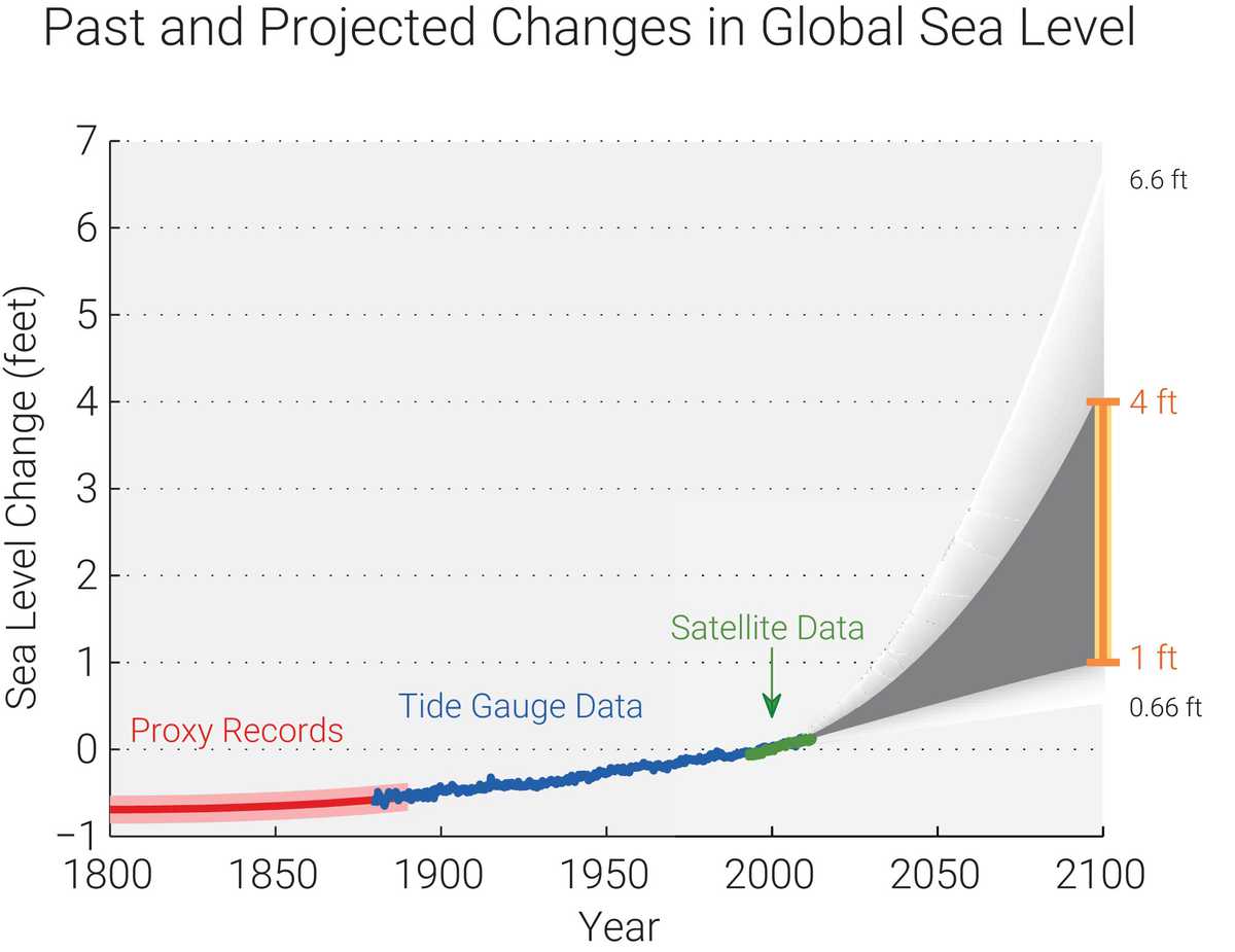
Figure 2. Estimated, observed, and predicted global sea level rise from 1800 to 2100. Estimates from proxy data are shown in red between 1800 and 1890, pink band shows uncertainty. Tide gauge data is shown in blue for 1880–2009. Satellite observations are shown in green from 1993 to 2012. The future scenarios range from 0.66 ft to 6.6 ft in 2100 (Redrawn from Melillo et al., 2014).
Sea Level Distribution is Determined by the Earth Surface
This study is based on the geophysical aspects of the earth wherein shape of the earth is the fundamental component of global sea level distribution. The physical surface of the earth adjusted to the mathematical surface of the earth is spheroidal. This spheroidal surface always coincides with the global mean sea level (Fig. 3). Having relationship between the shape of the earth and the global sea level, gravitational attraction of the earth plays a dominant role against sea level rise. Gravity is a force that causes earth to form the shape of a sphere by pulling the mass of the earth close to the center of gravity i.e., each mass-particle is attracted perpendicular towards the center of gravity of the earth (Fig. 4A).
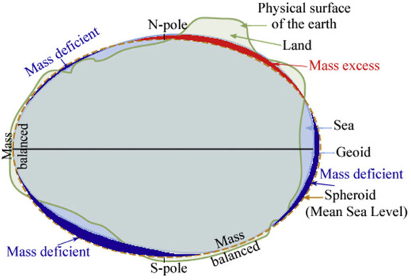
Figure 3. Physical surface (light green undulating line) of the earth adjusted to spheroidal surface (yellow broken line) by removing mass from continent above mean sea level and filling same mass in ocean below mean sea level. Geoid surface (light blue solid line), on the other hand, depends on the internal mass distribution i.e., geoid moves below spheroid where mass is deficient and it moves above spheroid where mass is excess. Where geoid surface and spheroidal surface coincides is accounted for mass balanced. By definition geoid describes the irregular shape of the earth and is the true zero surface for measuring elevations. Because geoid surface cannot be directly observed, heights above or below the geoid surface can’t be directly measured and are inferred by making gravity measurements and modeling the surface mathematically. MSL surfaces are assumed to be essentially the same, at some spots the geoid can actually differ from MSL by several meters.
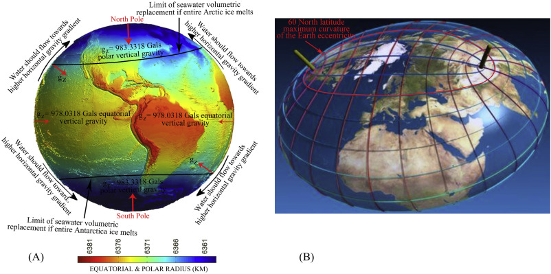
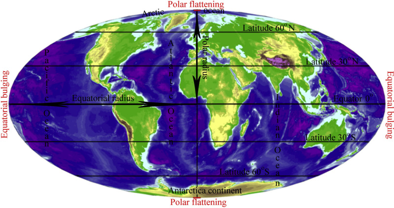
The sphere-like shape of the earth is distorted by (i) greater gravity attraction of the polar region causing polar flattening and lesser gravity attraction of the equatorial region causing equatorial bulging, and (ii) the centrifugal force of its rotation. This force causes the mass of the earth to move away from the center of gravity, which is located at the equator. Ocean-fluid surface takes a outward normal vector due to centrifugal force which is maximum at the equator and zero at the poles (Fig. 4B). Mathematical surface, an imaginary surface coinciding with the mean sea level of the Earth is a spheroidal surface due to its spin, and it is the centrifugal force due to the Earth’s spin caused polar flattening and equatorial bulge. The polar flattening ratio (eccentricity) of 1/298 implied that sea level at the equator is about 21 km further from the center of the Earth than it is at the poles. Water would find its hydrostatic level which is curvilinear, and this level is influenced by the gravity as well as centrifugal force. Centrifugal force acts as much on the oceans as it does on the solid Earth, which is maximum at the equator and minimum at the pole (Fig. 4B). Any addition of water to the oceans is supposed to flow uphill towards equator from the poles causing sea level rise everywhere, but it does not. Hence, although ocean water at the equator makes a level difference of 21 km higher than at the poles, it is the centrifugal force maximum at the equator and zero at the poles would prevent ocean water-column from moving down-hill toward poles effectively restricting sea level rise at the higher latitudes. On the other hand high gravity attraction and zero centrifugal force at the poles and low gravity attraction and maximum centrifugal force at the equator effectively balance sea-level and restrict sea-level rise. While, equatorial ocean-fluid surface always attains relatively higher altitude than that of polar ocean-fluid surface, ocean water column from polar region would not move towards equatorial region.
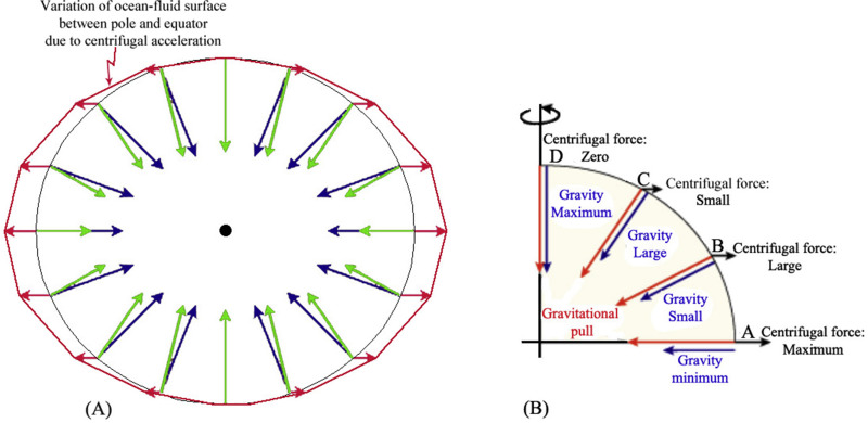
Figure 4. The shape of a sphere by pulling the mass of the earth close to the center of gravity. Blue arrows point from Earth’s surface toward its center. Their lengths represent local gravitational field strength. Gravity is strongest at the poles because they are closest to the center of mass. This difference is enhanced by the increasing density toward the center. Red arrows show the direction and magnitude of the centrifugal effect. On the equator, it is large and straight up. Near the poles, it is small and nearly horizontal. Vector addition of the blue and red arrows gives the net result of gravity plus centrifugal effect. This is shown by the green arrows. Rotation of the earth produces more centrifugal force at the equator, less as latitude increases, and zero at pole.
A mass of fluid under the rotation assumes a form such that its external form is an equipotential of its own attraction and the potential of the centripetal acceleration. Above analogy reveals that even if entire polar-ice melts due to the global warming, the melt-water will not flow towards equatorial region where surface has an upward gradient and gravity attraction is also significantly low in comparison to the polar region. However, conditions at both the poles are different. Arctic Ocean in the north is surrounded by the land mass thus can restrict the movement of the floating ice, while, Antarctic in the south is surrounded by open ocean thus floating ice can freely move to the north. But this movement is likely to be limited maximum up to 60°S latitude where spheroidal surface has the maximum curvature (Fig. 6B). As usual, water can not flow from higher gravity attraction to lower gravity attraction rather it is other way around wherein higher gravity attraction of the poles would attract water from moving towards equatorial region and water column would be static at every ‘gz’ direction. Further, greater horizontal gravity gradient toward poles would also help melt-water to remain attracted toward polar region.

Figure 6. (A) Surface of the earth is defined in terms of gravity values at all surface points known as the reference spheroid. It is related to the mean sea-level (MSL) surface with excess land masses removed and ocean deeps filled. Thus it is an equipotential surface, that is, the force of gravity (gz) (red arrows) is everywhere normal to this surface, or the plumb line is vertical at all points directed to the center of the earth having maximum at the poles and minimum at the equator. Two components work against sea level rise i.e., greater gravity attraction of the polar region and the equatorial bulge (B) Maximum curvature of the spheroidal surface of the Earth coincides with 60oN latitude. Floating ice from Antarctica surrounded by open ocean can freely move to the north likely to be limited maximum upto 60oS latitude where spheroidal surface has the maximum curvature.
A geoid surface thus prepared exhibits bulges and hollows of the order of hundreds of kilometers in diameter and up to hundred meter in elevation occurring in the zone mostly between 60°N and 60°S latitudes. Marked changes in the contour pattern of the geoid height in the zone between 60°N and 60°S suggests maximum curvature along 60°N and 60°S. Hence any change of the global sea level due to the predicted ice melt would not extend beyond 60°N and 60°S. However the reality is that no sea-level rise actually would occur due to ice melt as a result of same volumetric replacement between melt-water and floating ice.
Lindsay and Schweiger (2015) provide a longer-term view of ice thickness, compiling a variety of subsurface, aircraft, and satellite observations. They found that ice thickness over the central Arctic Ocean has declined from an average of 3.59 m (11.78 ft) to only 1.25 m (4.10 ft), a reduction of 65% over the period 1975 to 2012. Map shows sea ice thickness in meters in the Arctic Ocean from March 29, 2015 to April 25, 2015 (Fig. 9B). Total volume of ice-melt water of more than 2,500,000 km3 has been added to ocean water over an area more than 14,500,000 km2 of the central Arctic Ocean (Fig. 9B blue shaded area). By now this additional water should have caused sea level rise more than 178 mm which is much greater than what has been projected and predicted. However there is no record of such sea level rise.
Arctic sea-ice has already reduced its volume due to melting from 33,000 km3 in 1979 to 16,000 km3 in 2016 without showing any sea level rise. Although Arctic sea-ice has reduced its volume, Antarctic has gained (Zhang and Rothrock, 2003) (http://psc.apl.uw.edu). In contrast to the melting of the Arctic sea-ice, sea-ice around Antarctica was expanding as of 2013 (Bintanja et al., 2013). NASA study shows an increase in Antarctic snow accumulation that began 10,000 years ago is currently adding enough ice to the continent to outweigh the increased losses from its thinning glaciers.
From the above statement it is clearly understood that about 23,000 km3 sea-ice of Antarctica can freely float northward into the warmer water where it eventually melts every year without showing any sea level rise in the lower latitudes. Further, melting of such a huge volume of floating sea-ice of Antarctica not only can reoccupy volume of the displaced water but also can cool ocean-water in the lower latitudes of the southern oceans thus can prevent sea level rise due to thermal expansion of the ocean water. According to Zhang (2007) thermal expansion in the lower latitude is unlikely because of the reduced salt rejection and upper-ocean density and the enhanced thermohaline stratification tend to suppress convective overturning, leading to a decrease in the upward ocean heat transport and the ocean heat flux available to melt sea ice. The ice melting from ocean heat flux decreases faster than the ice growth does in the weakly stratified Southern Ocean, leading to an increase in the net ice production and hence an increase in ice mass.
Both the polar regions exhibit reduction in ice-load in the crust due to melting and removal of ice-cover from the continental blocks every year. Reduction of such weight in the continent thus can cause isostasy to come into play and land start to uplift due to elastic rebound to maintain its isostatic equilibrium which is load-dependent and would prevent sea level rise.
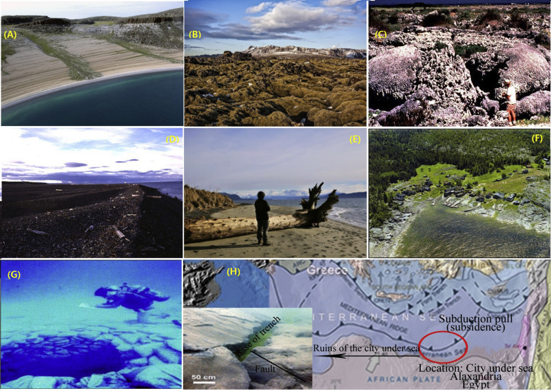
Figure 13. (A) Layered beach at Bathurst Inlet, Nunavut signifying post-glacial isostatic rebound (B) Some of the most dramatic uplift is found in Iceland. Evidence of isostatic rebound (C) Massive coral (Pavona clavus) exposed in 1954 by tectonic uplift in the Galapagos Islands, Ecuador (D) Beach ridges on the coast of Novaya Zemlya in arctic Russia, an example of Holocene glacio-isostatic rebound (E) A beach in Juneau, Alaska where sea level is not rising, but dropping due to glacial isostatic adjustment (F) Boat-houses in Scandinavia now considerably farther away from the water’s edge where they were built demonstrates land uplift (G) An 8000-year old-well off the coast of Israel now submerged, which is a land mark of crustal subsidence (H) The “City beneath the Sea”; Port Alexandria on the Nile delta and the drowned well off the coast of Israe (panel (G), both subsided due to subduction-pull of the downgoing African crustal slab as it enters trench.
Postglacial rebound continues today albeit very slowly wherein the land beneath the former ice sheets around Hudson Bay and central Scandinavia, is still rising by over a centimetre a year, while those regions which had bulged upwards around the ice sheet are subsiding such as the Baltic states and much of the eastern seaboard of North America. Snay et al. (2016) have found large residual vertical velocities, some with values exceeding 30 mm/yr, in southeastern Alaska. The uplift occurring here is due to present-day melting of glaciers and ice fields formed during the Little Ice Age glacial advance that occurred between 1550 A.D. and 1850 A.D.
When the land area shrinks globally, this corresponds to a global rise in sea level. From the curve it is certain that sea level has changed in geologic time scale due to geologic events. Hence, polar ice-melting would not contribute to sea-level rise rather sea-level would drop around the Arctic region as long as isostatic rebound will continue. Claim and prediction of 3 mm/yr rise of sea-level due to global warming and polar ice-melt is definitely a conjecture. Prediction of 4–6.6 ft sea level rise in the next 91 years between 2009 and 2100 is highly erroneous.
A negative sea level trend implied that Alaska is being uplifted continuously and corresponding sea level is dropping. However, permanent uplift and corresponding sea level drop of Alaska will occur through ultimate fault rupture between land and sea. Until that time it will continue to show the pattern of sea level as of Fig. 14A.
Conclusion
Geophysical shape of the earth is the fundamental component of the global sea level distribution. Global warming and ice-melt, although a reality, would not contribute to sea-level rise. Gravitational attraction of the earth plays a dominant role against sea level rise. As a result of low gravity attraction in the region of equatorial bulge and high gravity attraction in the region of polar flattening, melt-water would not move from polar region to equatorial region. Further, melt-water of the floating ice-sheets will reoccupy same volume of the displaced water by floating ice-sheets causing no sea-level rise. Arctic Ocean in the north is surrounded by the land mass thus can restrict the movement of the floating ice, while, Antarctic in the south is surrounded by open ocean thus floating ice can freely move to the north. Melting of huge volume of floating sea-ice around Antarctica not only can reoccupy volume of the displaced water but also can cool ocean-water in the region of equatorial bulge thus can prevent thermal expansion of the ocean water. Melting of land ice in both the polar region can substantially reduce load on the crust allowing crust to rebound elastically for isostatic balancing through uplift causing sea level to drop relatively. Palaeo-sea level rise and fall in macro-scale are related to marine transgression and regression in addition to other geologic events like converging and diverging plate tectonics, orogenic uplift of the collision margin, basin subsidence of the extensional crust, volcanic activities in the oceanic region, prograding delta buildup, ocean floor height change and sub-marine mass avalanche.
Summary
This research paper reads like a tutorial on sea level rise, and explains the geoscience behind fluctuations in observed sea levels over all time scales. It should be required reading for Judge Alsup, lawyers and litigants in these multiple lawsuits.
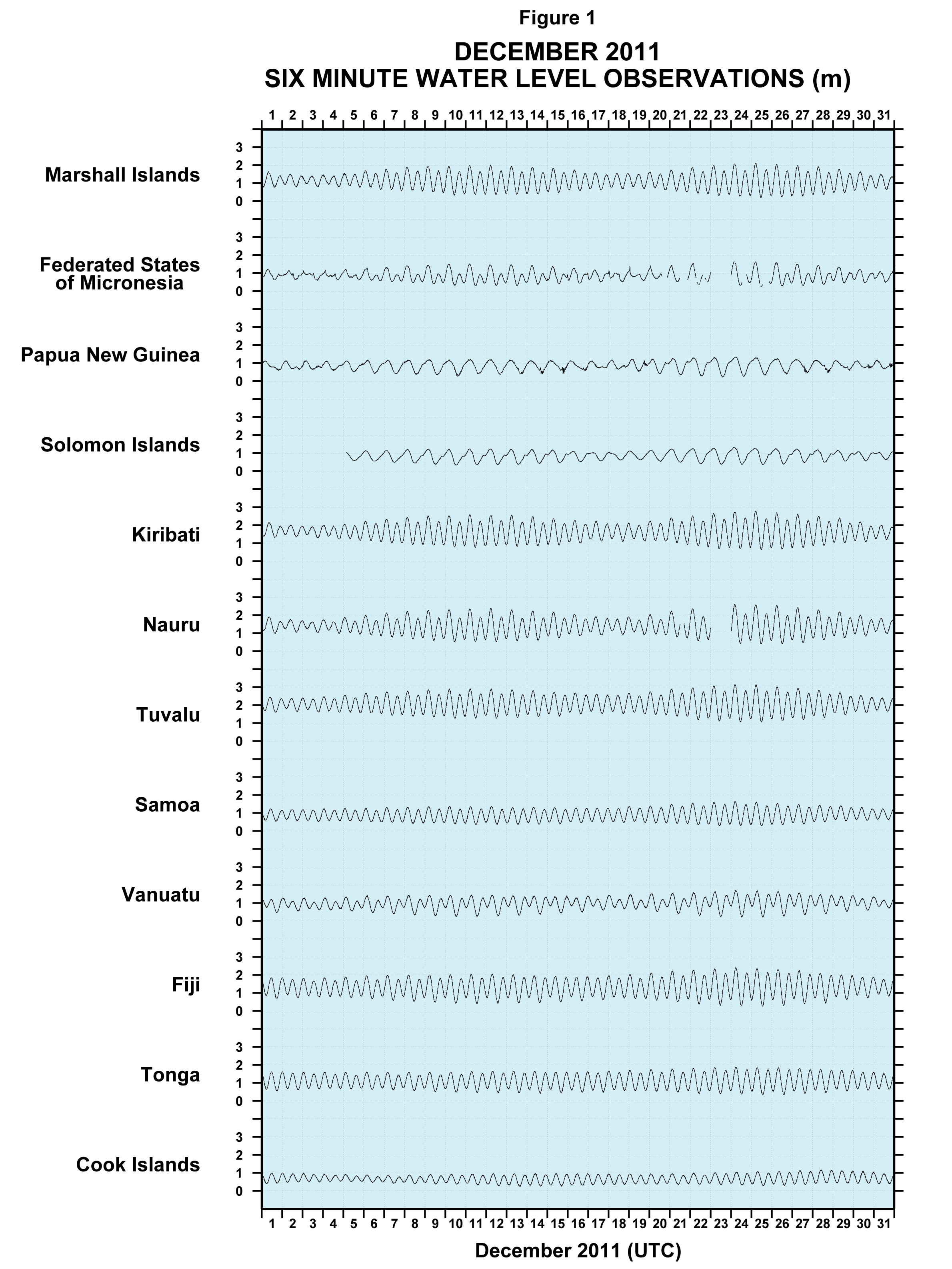
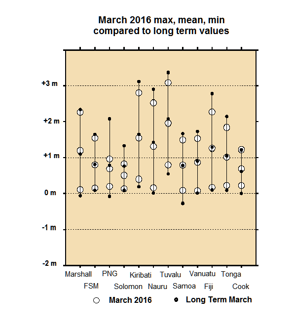
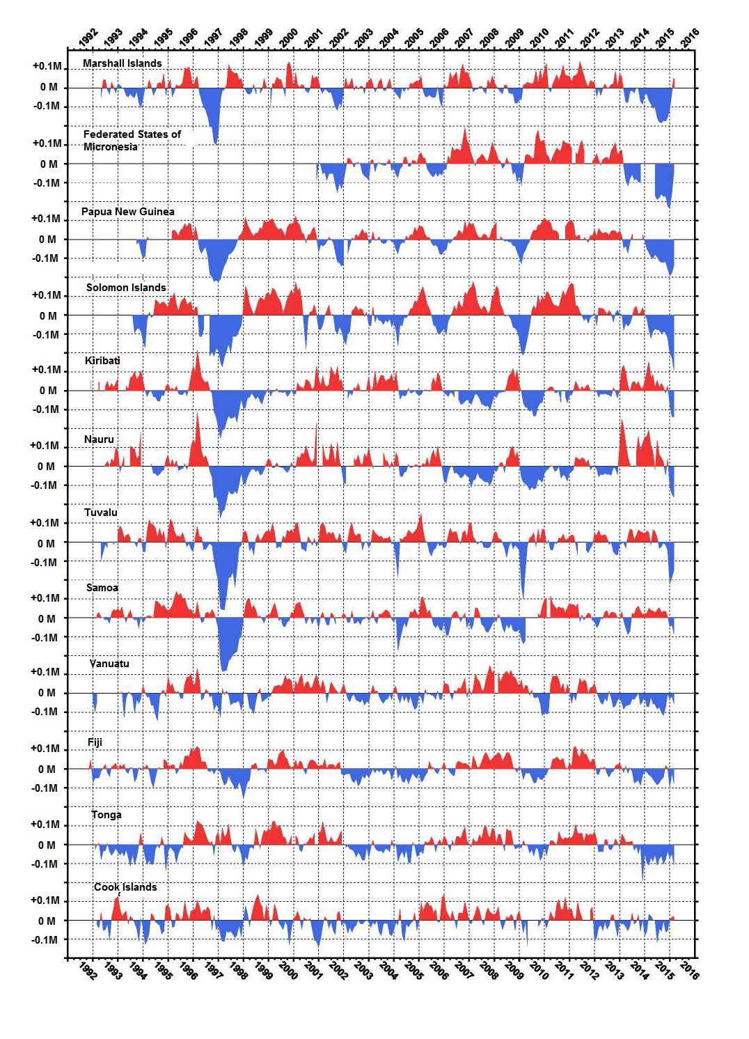
 This post is about the SEAFRAME network measuring sea levels in the Pacific, and about the difficulty to discern multi-decadal trends of rising or accelerating sea levels as evidence of climate change.
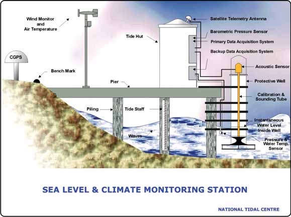
 Update July 9, 2018


 Gregory Whitestone has the story at CNS


 Looks like it’s time yet again to play Climate Whack-A-Mole. That means stepping back to get some perspective on the reports and the interpretations applied by those invested in alarmism.