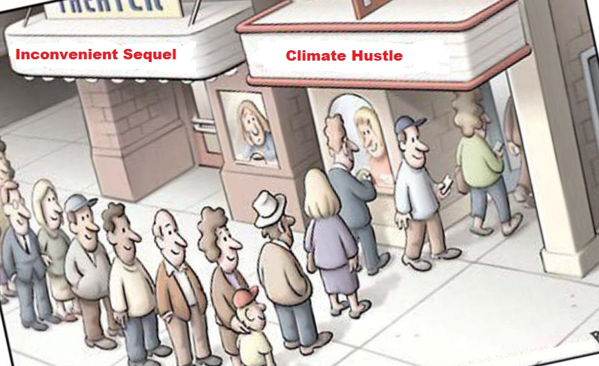
John Robson writes at Nation Post Why will global warming kill only the cute animals?
Excerpts in italics with my bolds
Only loathsome species will flourish, according to certain studies. Why? Because ‘rat explosion’ is more alarming than ‘two degrees’
Rats! It’s global warming again. Can’t we get a break?
No, literally. Not from the warming part. It’s actually quite chilly outside and there hasn’t been any measurable planetary warming since 1999. From the rats. Big ugly swarms of them spreading disease and biting your kids.
Monday’s Post headline actually said “Explosion of rats feared as climate warms.” So the good news is rats aren’t increasing any more than temperature. The bad news is a further increase in passive-voice predictions of doom.
Before the rats reach your face I’d like to note that this “news” story is remarkable for having the plumbing on the outside. It starts “Scientists have shown that the likely 2 degrees of global warming to come this century will be extremely dangerous, but, you know, ‘2 degrees’ is hardly a phrase from horror films. How about ‘rat explosion?’ ”
Exactly. It’s openly a story about hype not science. “The physics of climate change doesn’t have the same fear factor as the biology.” So cue the Fu Manchu-style mandibles, mould and plague because “it’s the creatures multiplying in outbreaks and infestations that generate horror.”

Beach invaded by red crabs.
It’s also old news. I’ve collected quite the file of creepy-crawly global-warming scare stories over the years including “super-sized, extra-itchy poison ivy” (Ottawa Citizen 2006), “tropical and potentially lethal fungus” (Globe and Mail 2007), venomous jellyfish the size of refrigerators (MSNBC 2009), mass starvation and the extinction of humanity (Globe and Mail 2009), bigger and more frequent kidney stones (Ottawa Citizen 2008), soggy pork chops (Globe and Mail 2009), asthma, allergies and runny noses (NBC 2015) and the conflict in Darfur (Ottawa Citizen 2007). Not to mention drought and flooding and the migration of France’s fabled wine industry to … um… Scotland (all Ottawa Citizen 2007), where they’ll be pairing a fine ruby Loch Ness with rat haggis I suppose. Och aye mon.
I could go on and on. But they already did. And don’t go reading these stories and thinking they offer evidence, or rather speculation, that warmth benefits life generally.
Far from it. Virtually none of these stories has anything cute or cuddly flourishing. Unless you count stray cats in Toronto (National Post 2007). Instead it’s a strangely un-PC combination of lookism and speciesism.

If you want to be a climate alarmist without all that tedious mucking about with facts, here’s how. Make a collage of many living things. Circle everything you’d like to see, up close or from a distance, like coral reefs or polar bears. Now predict their catastrophic decline if it gets two degrees warmer. (Don’t worry about them having somehow staggered through the Holocene Climatic Optimum. Pretend it never happened and hope it’s gone in the morning.)
Now circle all the really hideous stuff. Eyes on stalks, pointy noses, smelly, slimy. Predict a huge increase. Chocolate? Gone. (Globe and Mail 2012.) Diarrhea-inducing vibrio bacteria? Coming soon to an intestine near you. (MSNBC 2011.) Zika, or crabs swarming beaches? Oh yeah. (NBC 2016.) Insomnia, insanity and suicide? You bet. (Washington Post 2017, National Post 2018, Globe and Mail 2018.) Beer? Going going … (Guardian 2018.)
Friends, scientists, countrypersons, lend me your ears before some warmth-surfing pest chews them off. Even if a rapidly warming Earth were bad for man and beast, and our fault, the initial phases, with temperatures well within the range since the last glaciation ended 12,000 years back, can’t bring only bad consequences. No wind is that ill.
Nor is it plausible that every single new study says it’s worse than scientists thought. (Especially if “the science is settled”). If it were real science somebody would occasionally discover there’s a bit more time, climate somewhere will improve in the short run, some species that doesn’t have you fumbling for the Raid will flourish briefly. But no.
Even if climate change is going to have wiped out “sea spiders as large as a dinner plate” (Ottawa Citizen 2002) it’s the tragic loss of a unique species. But mostly it’s bumble bees (NBC 2015) or the coelacanth (Ottawa Citizen 2001), which cruised through the Permian-Triassic and Cretaceous-Paleogene mass extinctions but now dangles by a rhetorical thread. Oh, and the emperor penguin gets it too (NBC 2014). Plus plankton (Globe and Mail 2000). And walruses (NBC 2014).

As for the rats, one pregnant female will send 15,000 loathsome offspring a year straight to your suburb. None of their natural enemies will flourish. And “Rats are just the beginning … populations of dangerous crop-eating insects are likely to explode … Similar horrors lurk offshore … a population explosion of purple sea urchins — ‘cockroaches of the ocean’ — is choking out other denizens of Pacific kelp forests … we’re all sharing this warming planet, and at the very least surely we can unite against a future filled with rats.”
Or one filled with imaginary horrors? No? Rats.
See also:Alarmists: Global Warming Destroys Good Bugs and Multiplies Bad Bugs

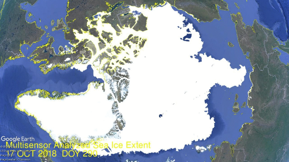
 Seventeen Days in Hudson Bay are shown in the above animation. In the lower center, Hudson Bay pushed its ice extent up to 1.24M km2, 98% of maximum. Just to the northeast, Hudson Strait and Ungava Bay are completely frozen over, with Baffin Bay reaching down. At the top left you can see Chukchi Sea growing ice toward Bering Strait.
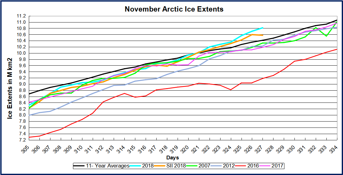
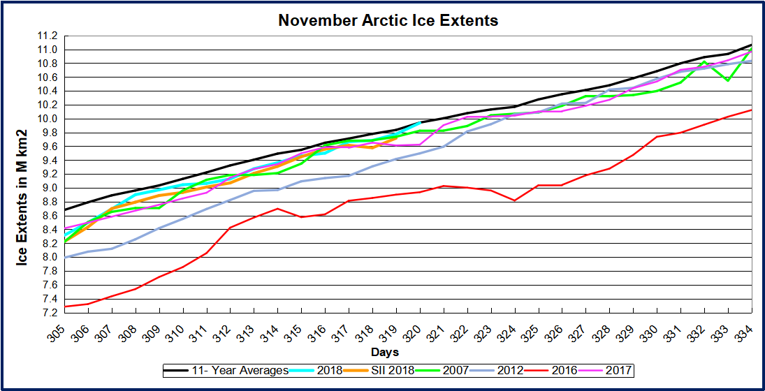
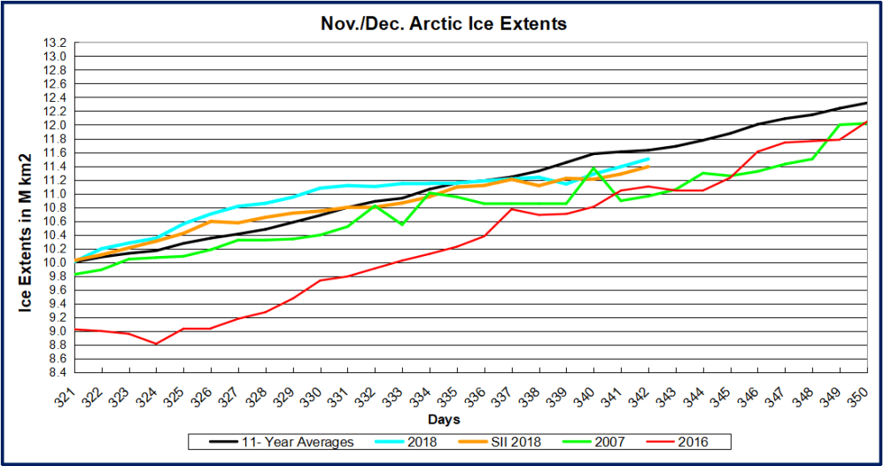 From days 330 to 339, 2018 extents were flat and went below average. Now freezing has resumed as shown in the animation above and nearing average again in the graph. At day 342 (Dec. 8) 2018 is 540k km2 greater than 2007 and 400k km2 more than 2016.
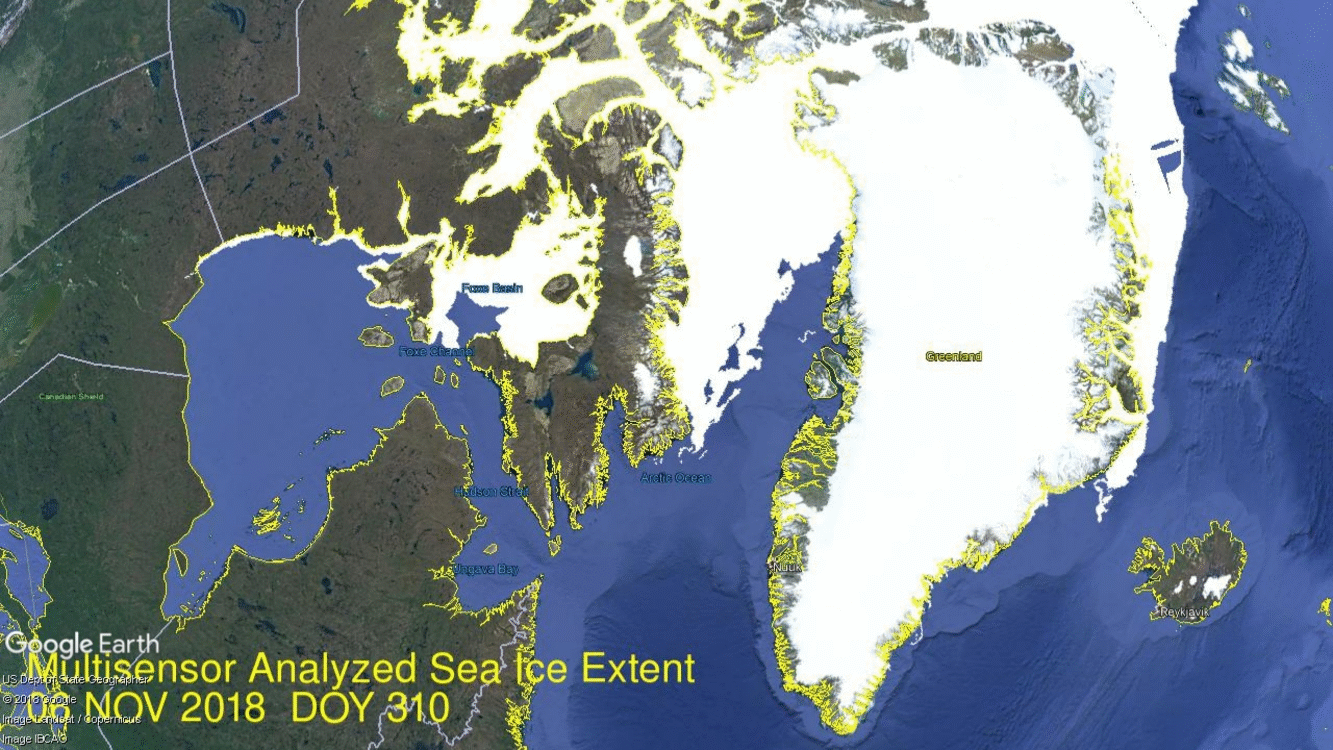
 Eighteen Days in Hudson Bay are shown in the above animation. In the lower center, Hudson Bay more than doubled its ice extent up to 1.07M km2, 85% of maximum. Just to the northeast, Hudson Strait and Ungava Bay are almost frozen over, with Baffin Bay reaching down. At the top right you can see Greenland Sea ice reaching out toward Iceland.

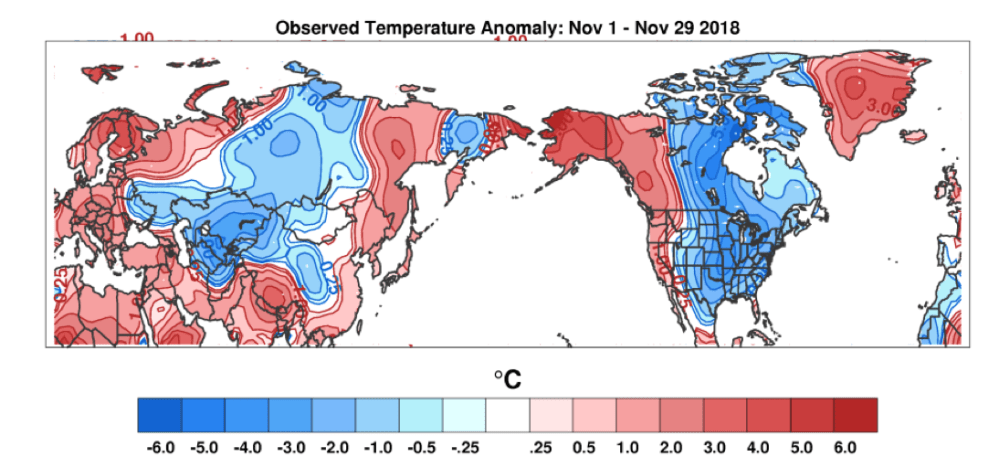


 Big Chill in last Two Weeks