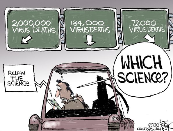
Fatal Flaw Discredits IPCC Science
 By way of John Ray comes this Spectator Australia article A basic flaw in IPCC science. Excerpts in italics with my bolds and added images.
Detailed research is underway that threatens to undermine the foundations of the climate science promoted by the IPCC since its First Assessment Report in 1992. The research is re-examining the rural and urban temperature records in the Northern Hemisphere that are the foundation for the IPCC’s estimates of global warming since 1850. The research team has been led by Dr Willie Soon (a Malaysian solar astrophysicist associated with the Smithsonian Institute for many years) and two highly qualified Irish academics – Dr Michael Connolly and his son Dr Ronan Connolly. They have formed a climate research group CERES-SCIENCE. Their detailed research will be a challenge for the IPCC 7th Assessment Report due to be released in 2029 as their research results challenge the very foundations of IPCC science.
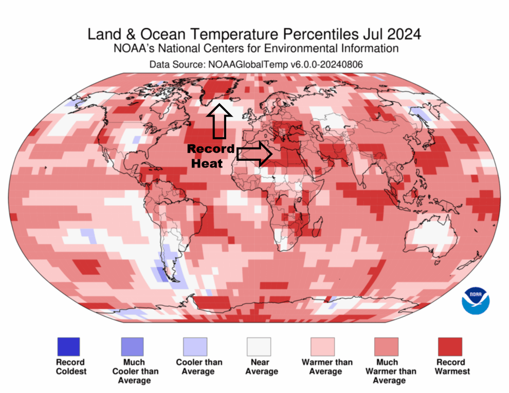
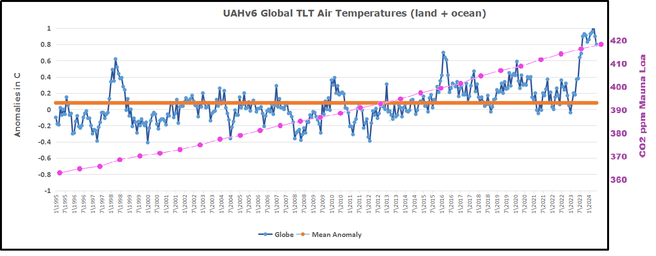
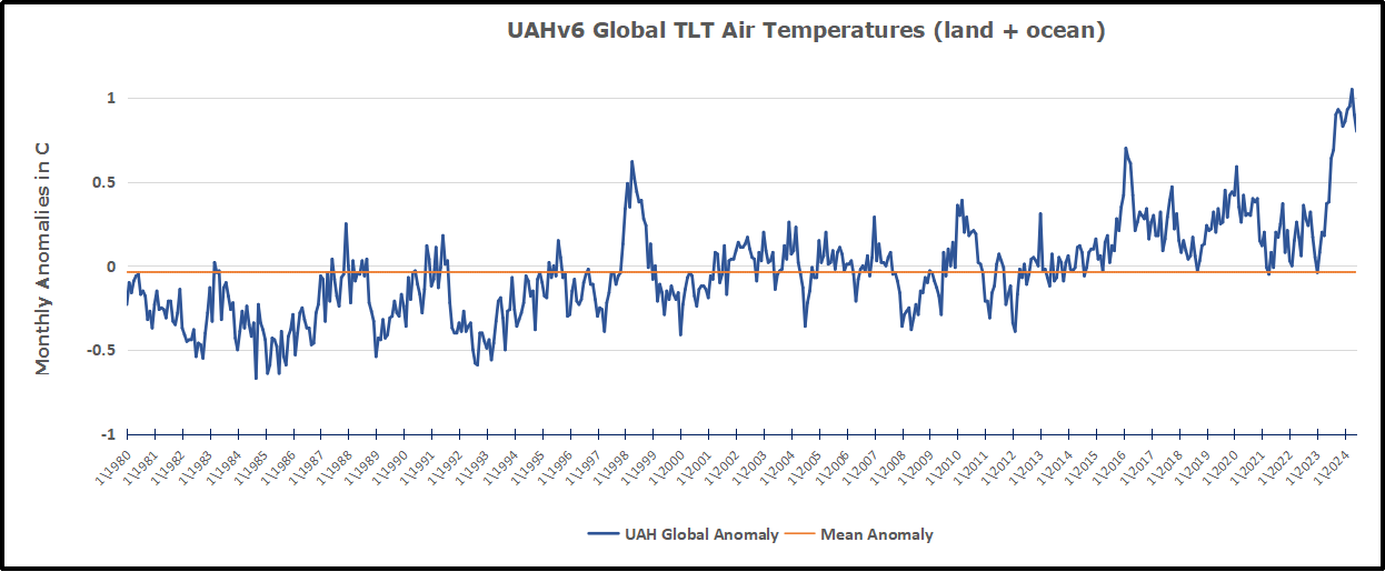
The climate warming trend published by the IPCC is a continually updated graph based on the temperature records of Northern Hemisphere land surface temperature stations dating from the mid 19th Century. The latest IPCC 2021 report uses data for the period 1850-2018. The IPCC’s selection of Northern Hemisphere land surface temperature records is not in question and is justifiable. The Northern Hemisphere records provide the best database for this period. The Southern Hemisphere land temperature records are not that extensive and are sparse for the 19th and early 20th Century. It is generally agreed that the urban temperature data is significantly warmer than the rural data in the same region because of an urban warming bias. This bias is due to night-time surface radiation of the daytime solar radiation absorbed by concrete and bitumen. Such radiation leads to higher urban night-time temperatures than say in the nearby countryside. The IPCC acknowledges such a warming bias but alleges the increased effect is only 10 per cent and therefore does not significantly distort its published global warming trend lines.

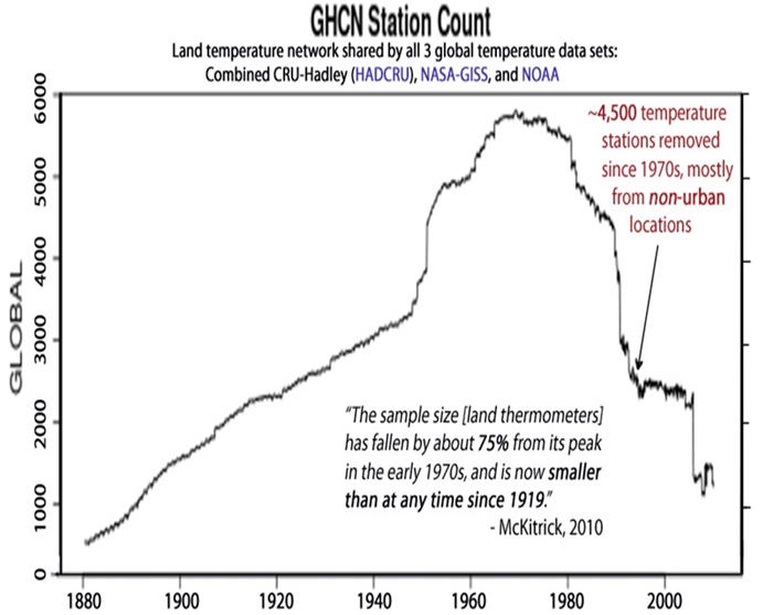
Since 2018, Dr Soon and his partners have analysed the data from rural and urban temperature recording stations in China, the USA, the Arctic, and Ireland. The number of stations with reliable temperature records in these areas increased from very few in the mid-19th Century to around 4,000 in the 1970s before decreasing to around 2,000 by the 1990s. The rural temperature recording stations with good records peaked at 400 and are presently around 200.
Their analysis of individual stations needs to account for any variation in their exposure to the Sun due to changes in their location, OR shadowing due to the construction of nearby buildings, OR nearby vegetation growth. The analysis of rural temperature stations is further complicated as over time many are encroached by nearby cities. Consequently, the data from such stations needs to be shifted at certain dates from the rural temperature database to either an intermediate database or to a full urban database. Consequently, an accurate analysis of the temperature records of each recording station is a time-consuming task.
This new analysis of 4,000 temperature recording stations in China, the USA, the Arctic, and Ireland shows a warming trend of 0.89ºC per century in the urban stations that is 1.61 times higher that a warming trend of 0.55ºC per century in the rural stations. This difference is far more significant than the 10 per cent divergence between urban and rural stations alleged in the IPCC reports; a divergence explained by a potential flaw in the IPCC’s methodology. The IPCC uses a technique called homogenisation that averages the rural and urban temperatures in a particular region. This method distorts the rural temperature records as over 75 per cent of the temperature records used in this homogenisation methodology are urban stations. So, a methodology that attempts to statistically identify and correct some biases that may be in the raw data, in effect, leads to an urban blending of the rural dataset. This result is biased as it downgrades the actual values of each rural temperature station. In contrast, Dr Soon and his coworkers avoided homogenisation so the temperature trends they identify for each rural region are accurate as the rural data are not distorted by the readings from nearby urban stations.
The rural temperature trend measured by this new research is 0.55ºC per century and it indicates the Earth has warmed 0.9ºC since 1850. In contrast, the urban temperature trend measured by this new research is 0.89ºC per century and indicates a much higher warming of 1.5ºC since 1850. Consequently, a distorted urban warming trend has been used by the IPCC to quantify the warming of the whole of the Earth since 1850. The exaggeration is significant as the urban temperature record database used by the IPCC only represents the temperatures on 3-4 per cent of the Earth’s land surface area; an area less than 2 per cent of the Earth’s total surface area. During the next few years, Dr Willie Soon and his research team are currently analysing the meta-history of 800 European temperature recording stations. When this is done their research will be based on very significant database of Northern Hemisphere rural and urban temperature records from China, the USA, the Arctic, Ireland, and Europe.

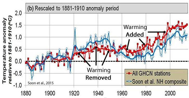
This new research has unveiled another flaw in the IPCC‘s temperature narrative as trend lines in its revised temperature datasets are different from those published by the IPCC. For example, the rural records now show a marked warming trend in the 1930s and 1940s while there is only a slight warming trend in the IPCC dataset. The most significant difference is the existence of a marked cooling period in the rural dataset for the 1960s and 1970s that is almost absent in the IPCC’s urban dataset. This later divergence upsets the common narrative that rising carbon dioxide levels control modern warming trends. For, if carbon dioxide levels are the driver of modern warming, how can a higher rate of increasing carbon dioxide levels exist within a cooling period in the 1960s and 1970s while a lower increasing rate of carbon dioxide levels coincides with an earlier warming interval in the 1930s and 1940s? Or, in other words, how can carbon dioxide levels increasing at 1.7 parts per million per decade cause a distinct warming period in the 1930s and 1940s while a larger increasing rate of 10.63 parts per million per decade is associated with a distinct cooling period in the 1960s and 1970s! Consequently, the research of Willie Soon and his coworkers is discrediting, not only the higher rate of global warming trends specified in IPCC Reports, but also the theory that rising carbon dioxide levels explain modern warming trends; a lynchpin of IPCC science for the last 25 years.
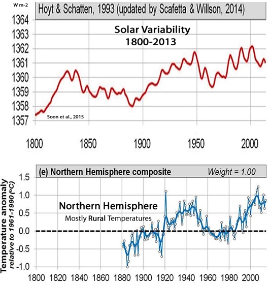
Willie Soon and his coworkers maintain that climate scientists need to consider other possible explanations for recent global warming. Willie Soon and his coworkers point to the Sun, but the IPCC maintains that variations in Total Solar Irradiance (TSI) are over eons and not over shorter periods such as the last few centuries. For that reason, the IPCC point to changes in greenhouse gases as the most obvious explanation for global warming since 1850. In contrast, Willie Soon and his coworkers maintain there can be short-term changes in solar activity and, for example, refer to a period of no sunspot activity that coincided with the Little Ice Age in the 17th Century. They also point out there is still no agreed average figure for Total Solar Irradiance (TSI) despite 30 years of measurements taken by various satellites. Consequently, they contend research in this area is not settled.
The CERES-SCIENCE research project pioneered by Dr Willie Soon and the father-son Connolly team has questioned the validity of the high global warming trends for the 1850-present period that have been published by the IPCC since its first report in 1992. The research also queries the IPCC narrative that rising greenhouse gas concentrations, particularly carbon dioxide, are the primary driver of global warming since 1850. That narrative has been the foundation of IPCC climate science for the last 40 years. It will be interesting to see how the IPCC’s 7th Assessment Report in 2029 treats this new research that questions the very basis of IPCC’s climate science.
Abstract
A statistical analysis was applied to Northern Hemisphere land surface temperatures (1850–2018) to try to identify the main drivers of the observed warming since the mid-19th century. Two different temperature estimates were considered—a rural and urban blend (that matches almost exactly with most current estimates) and a rural-only estimate. The rural and urban blend indicates a long-term warming of 0.89 °C/century since 1850, while the rural-only indicates 0.55 °C/century. This contradicts a common assumption that current thermometer-based global temperature indices are relatively unaffected by urban warming biases.
Three main climatic drivers were considered, following the approaches adopted by the Intergovernmental Panel on Climate Change (IPCC)’s recent 6th Assessment Report (AR6): two natural forcings (solar and volcanic) and the composite “all anthropogenic forcings combined” time series recommended by IPCC AR6. The volcanic time series was that recommended by IPCC AR6. Two alternative solar forcing datasets were contrasted. One was the Total Solar Irradiance (TSI) time series that was recommended by IPCC AR6. The other TSI time series was apparently overlooked by IPCC AR6. It was found that altering the temperature estimate and/or the choice of solar forcing dataset resulted in very different conclusions as to the primary drivers of the observed warming.
Our analysis focused on the Northern Hemispheric land component of global surface temperatures since this is the most data-rich component. It reveals that important challenges remain for the broader detection and attribution problem of global warming: (1) urbanization bias remains a substantial problem for the global land temperature data; (2) it is still unclear which (if any) of the many TSI time series in the literature are accurate estimates of past TSI; (3) the scientific community is not yet in a position to confidently establish whether the warming since 1850 is mostly human-caused, mostly natural, or some combination. Suggestions for how these scientific challenges might be resolved are offered.
 Kip Hansen gives the game away in his Climate Realism article