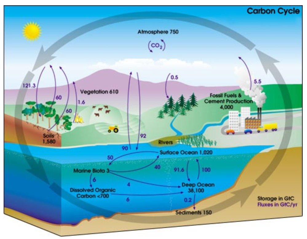
The Original Sin of GHG Theory

In reality, Water only spontaneously flows down a
pressure gradient (downhill).
Energy only spontaneously flows
down an energy density gradient (from high to low).

In the domain of theology, original sin refers to Adam and Eve choosing to trust the serpent’s lies rather than natural truth placed by God in the Garden of Eden.  In legal proceedings, a similar concept concerns evidence obtained under false pretences.  “The fruit of a poisonous tree” refers to analyses, interpretations or conclusions that must be excluded because they started with a falsehood.

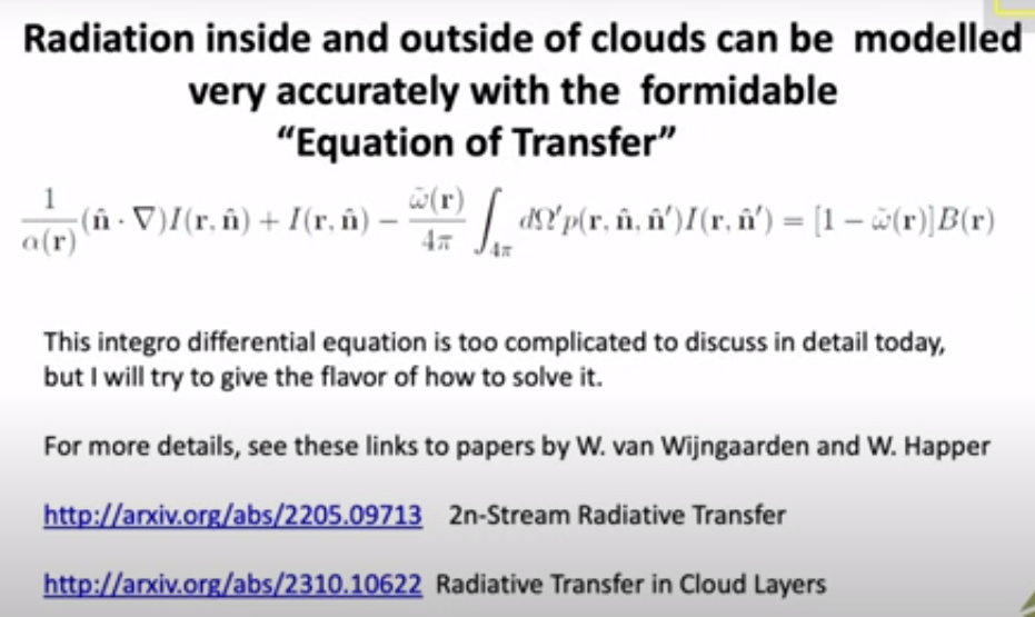
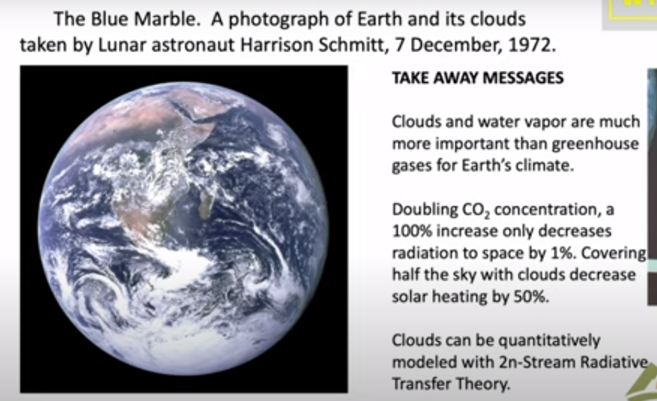
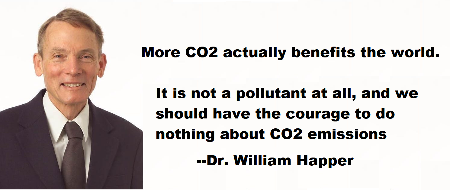
This post delves into a fraud at the root of consensus Climate Science™, illustrated by the image above showing how both water and energy flow down their respective gradients.  William Happer alluded to the problem in a recent presentation: (See Happer: Cloud Radiation Matters, CO2 Not So Much)

As we shall see below, mischief is a very polite term for a math and science error that has poisoned most all thinking and discussion about changes in climate and weather.  In a previous post, I summarized an important empirical experiment by Thomas Allmendinger proving that a parcel of pure CO2 and a parcel of ordinary air warm exactly the same when exposed to both SW and LW radiation.  (See Experimental Proof Nil Warming from GHGs).
So we know the notion is empirically wrong, now let’s discuss how GHG theory went off the rails from the beginning.  For that I provide below a synopsis of commentary by blogger Morpheus which he posted at Tallbloke’s Talkshop.  Excerpts in italics with my bolds and added images. (Title in red is link to blog)

CAGW (Catastrophic Anthropogenic Global Warming, due to CO2)
is nothing more than a complex mathematical scam.

The takeaways:

1) The climatologists have conflated their purported “greenhouse effect” with the Kelvin-Helmholtz Gravitational Auto-Compression Effect (aka the lapse rate).

2) The climatologists purport the causative agent for their purported “greenhouse effect” to be “backradiation”.

3) The Kelvin-Helmholtz Gravitational Auto-Compression Effect’s causative agent is, of course, gravity.

4) “Backradiation” is physically impossible because energy cannot spontaneously flow up an energy density gradient.

5) The climatologists misuse the Stefan-Boltzmann (S-B) equation, using the idealized blackbody form of the equation upon graybody objects, which manufactures out of thin air their purported “backradiation”. It is only a mathematical artifact due to that aforementioned misuse of the S-B equation. It does not and cannot actually exist. Its existence would imply rampant violations of the fundamental physical laws.
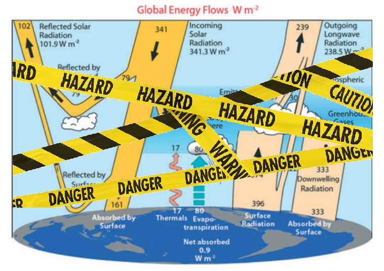
6) Polyatomic molecules are net atmospheric radiative coolants, not “global warming” gases. Far from the ‘global warming gas’ claimed by the climatologists, water acts as a literal refrigerant (in the strict ‘refrigeration cycle’ sense) below the tropopause. CO2 is the most prevalent atmospheric radiative coolant above the tropopause and the second-most prevalent (behind water vapor) below the tropopause. Peer reviewed studies corroborating this are referenced in the paper at the end of this post.

As you can see, there are two forms of the Stefan-Boltzmann (S-B) equation… one for idealized blackbody objects, one for graybody objects.

The idealized blackbody form of the S-B equation assumes emission to 0 K and ε = 1 by the very definition of idealized blackbody objects. ( ε is the term for emissivity from 0 to 1).

Idealized Blackbody Object (assumes emission to 0 K and ε = 1 by definition):
q_bb = ε σ (T_h^4 – T_c^4) A_h
1 σ (T_h^4 – 0 K) 1 m^2
=    σ  T^4

The graybody form of the S-B equation assumes emission to > 0 K and ε < 1.

Graybody Object (assumes emission to > 0 K and ε < 1):
q_gb = ε σ (T_h^4 – T_c^4) A_h

The ‘A_h’ term is merely a multiplier, used if one is calculating for an area larger than unity [for instance: >1 m^2], which converts the result from radiant exitance (W m-2, radiant flux per unit area) to radiant flux (W).

One can see from the immediately-above equation that the Stefan-Boltzmann (S-B) equation is all about subtracting the radiation energy density of the cooler object from the radiation energy density of the warmer object.

So radiant exitance at its most simplified (and thus the S-B equation at its most simplified) is just the emissivity of the warmer object (because emissivity only applies to objects which are emitting, and only the warmer object will be emitting… the colder object will be unable to emit in the direction of the warmer object because energy cannot spontaneously flow up an energy density gradient) multiplied by the speed of light in vacua, multiplied by the energy density differential, all divided by 4.

For graybody objects, it is the radiation energy density differential between warmer object and cooler object which determines warmer object radiant exitance. Warmer objects don’t absorb radiation from cooler objects (a violation of 2LoT in the Clausius Statement sense and Stefan’s Law); the lower radiation energy density gradient between warmer and cooler objects (as compared to between warmer object and 0 K) lowers radiant exitance of the warmer object (as compared to its radiant exitance if it were emitting to 0 K). The radiation energy density differential between objects manifests a radiation energy density gradient, each surface’s radiation energy density manifesting a proportional radiation pressure.

The climatologists use:   q = σ T^4on graybody objects, and sometimes slap ε<1 onto that,
when they should be using:  q = ε σ (T_h^4 – T_c^4)

This has the effect of artificially inflating radiant exitance of all calculated-upon objects.

Essentially, the climatologists are treating real-world graybody objects as though they are idealized blackbody objects… with emission to 0 K and emissivity of 1 (sometimes… other times they slap emissivity onto the idealized blackbody form of the S-B equation while still assuming emission to 0 K… which is still a misuse of the S-B equation, for graybody objects).

This essentially isolates each object into its own system so it cannot interact with other objects via the ambient EM field, which grossly inflates radiant exitance of all objects, necessitating that the climatologists carry these incorrect values through their calculation and cancel them on the back end (to get their equation to balance) by subtracting a wholly-fictive ‘cooler to warmer’ energy flow from the real (but far too high because it was calculated for emission to 0 K) ‘warmer to cooler’ energy flow.

That wholly-fictive ‘cooler to warmer’ energy flow is otherwise known as ‘backradiation’... it is nothing more than a mathematical artifact due to that aforementioned misuse of the S-B equation.

As I show here and in the below-linked paper, the correct usage of the S-B equation for graybody objects is via subtracting cooler object energy density from warmer object energy density to arrive at the energy density gradient, which determines radiant exitance of the warmer object.

So we’re talking about the same concept as water only spontaneously flowing down a pressure gradient (ie: downhill) when we talk of energy (of any form) only spontaneously flowing down an energy density gradient. Energy density is pressure, an energy density gradient is a pressure gradient… for energy.

It’s a bit more complicated for gases because they can convert that energy density to a change in volume (1 J m-3 = 1 Pa), for constant-pressure processes, which means the unconstrained volume of a gas will change such that its energy density (in J m-3) will tend toward being equal to pressure (in Pa). This is the underlying mechanism for convection. It should also have clued the climatologists in to the fact that it is solar insolation and atmospheric pressure which ‘sets’ temperature, not any ‘global warming’ gases.

Since a warmer object will have higher radiation energy density at all wavelengths than a cooler object (because remember, temperature is a measure of radiation energy density, equal to the fourth root of radiation energy density divided by Stefan’s Constant):

… ‘backradiation’ can do nothing to warm the surface because energy cannot spontaneously radiatively flow from lower to higher radiation energy density, and thus CAGW is nothing more than a complex mathematical scam perpetrated to obtain multiple billions of dollars in funding for trough-grubbing line-toeing ‘scientists’ and by perfidious politicians.

“But how does that make CAGW a scam?”, some may ask… well, because we’re being lied to, based upon an unscientific premise.

The climatologists have misused the Stefan-Boltzmann (S-B) equation (and the fundamental physical laws), and in the process, have practically flipped reality on its headpolyatomics (CO2, H2O, etc.) are not “global warming gases”, they are net atmospheric radiative coolants (radiative emission to space being the only way that Earth can shed energy); monoatomics (Ar) are not inert gases that have no effect upon climate, they are the actual “greenhouse gases” (because they cannot emit IR, and thus cannot shed energy to space… they dilute the radiative coolant gases); homonuclear diatomics (N2, O2) are somewhere in between… they can radiatively emit IR (and thus shed energy from the system known as ‘Earth’), but only under certain conditions (collisional perturbation of their net-zero electric dipole, which is why homonuclear diatomic vibrational mode quantum states are meta-stable and relatively long-lived. Collisions happen exponentially less frequently as altitude increases), and thus are “greenhouse gases” like the monoatomics, just not to the same extent.

We live, at the planet’s surface, in what can be analogized to the evaporator section of a world-sized AC unit, with polyatomics being net atmospheric radiative coolants (a higher concentration of them increases thermodynamic coupling between heat source (surface) and sink (space)), and with monoatomics and homonuclear diatomics playing the same role as non-condensable gases would play in an AC unit… diluting the polyatomic radiative gases which transit the majority of the energy, thus reducing the efficiency at which energy is transited from surface to upper atmosphere, then radiatively emitted to space.

Think about it this way… we all know the air warms up during the daytime as the planet’s surface absorbs energy from the sun. Conduction of that energy when air contacts the planet’s surface is the major reason air warms up.

How does that ~99% of the atmosphere (N2, O2, Ar) cool down? It cannot effectively radiatively emit.

Convection moves energy around in the atmosphere, but it cannot shed energy to space. Conduction depends upon thermal contact with other matter and since space is essentially a vacuum, conduction cannot shed energy to space… this leaves only radiative emission. The only way our planet can shed energy is via radiative emission to space. Fully ~76.2% of all surface energy is removed via convection, advection and evaporation. The surface only radiatively emits ~23.8% of all surface energy to space. That ~76.2% must be emitted to space by the atmosphere.
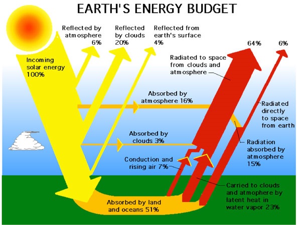
ERBE Earth Radiation Budget Experiment

Thus, common sense dictates that the thermal energy of the constituents of the atmosphere which cannot effectively radiatively emit (N2, O2, Ar) must be transferred to the so-called ‘greenhouse gases’ (CO2 being a lesser contributor below the tropopause and the largest contributor above the tropopause, water vapor being the main contributor below the tropopause) which can radiatively emit and thus shed that energy to space. Peer-reviewed studies corroborating this are referenced in the linked file below.

So, far from being ‘greenhouse gases’ which ‘trap heat’ in the atmosphere, those polyatomic radiative gases actually shed energy from the atmosphere to space. They are net atmospheric radiative coolants.

In short, in an atmosphere sufficiently dense such that collisional energy transfer can significantly occur, all polyatomic radiative molecules play the part of atmospheric radiative coolants at and above the temperature at which the combined translational mode energy of two colliding particles (atoms or molecules) exceeds the lowest excited vibrational mode quantum state energy of the radiative molecule. Below this temperature, they act to warm the atmosphere via thermalization (the mechanism the climate alarmists claim happens all the time), but if that occurs below the tropopause, the net result is an increase of Convective Available Potential Energy, which increases convection, which is a net cooling process. It is a gradation… as temperature increases, so too does the population of vibrationally excited polyatomics, and thus increases radiative emission. For CO2, that ‘transition temperature’ (the temperature at which the molecule transitions from being ‘net warmant’ to ‘net coolant’ and vice versa) is ~288 K.

The climatologists only told people half the story (thermalization by CO2 via vibrational mode to translation mode (v-t) collisional energy transfer processes). They didn’t tell anyone about the inverse (translational mode to vibrational mode (t-v) collisional energy transfer processes, (then that energy being radiatively emitted to space)), which is a cooling process. That didn’t fit their doomsaying narrative, so they left it out.

In other words, the climatologists only told people about the warming part (thermalization), not the cooling part. In order to hew to the fundamental physical laws, one must consider energy flow both to and from the CO2 molecule.

This doesn’t just apply to CO2, however. It applies to all atmospheric polyatomic molecules. In fact, far from the ‘global warming gas’ claimed by the climatologists, water acts as a literal refrigerant (in the strict ‘refrigeration cycle’ sense) below the tropopause:

That’s why, after all, the humid adiabatic lapse rate (~3.5 to ~6.5 K km-1) is lower than the dry adiabatic lapse rate (~9.81 K km-1).

You will note that the dry adiabatic lapse rate is due to the monoatomics and homonuclear diatomics... we’ve removed in this case the predominant polyatomic which reduces lapse rate.

Remember that an actual greenhouse works by hindering convection of energy out of the greenhouse.

In an atmosphere consisting of solely monoatomics and homonuclear diatomics (ie: no polyatomic radiative molecules), the atoms / molecules could pick up energy via conduction by contacting the surface, just as the polyatomics do; they could convect just as the polyatomics do… but once in the upper atmosphere, they could not as effectively radiatively emit that energy, the upper atmosphere would warm, lending less buoyancy to convecting air, thus hindering convection… and that’s how an actual greenhouse works, by hindering convection.

For homonuclear diatomics, there would be some collisional perturbation of their net-zero electric dipole and thus some emission in the atmosphere, but by and large the atmosphere could not effectively emit (especially at higher altitudes, because the probability of collision decreases exponentially with altitude).

Thus the surface would have to radiatively emit that energy (which is currently ~76.2% of all energy removed from the surface via radiation, convection and evaporation) instead… and a higher surface radiant exitance implies a higher surface temperature.

On the contrary, in our actual atmosphere, as temperature increases, (t-v) (translational mode -to- vibrational mode) collisional energy transfer processes increase and thus spectral emission increases only because CO2 is a net atmospheric radiative coolant (transferring translational mode energy to vibrational mode energy, then radiatively emitting it). So they are attempting to claim that CO2 is a “global warming gas” and simultaneously a net atmospheric radiative coolant, a contradiction… which is why their claims make no sense upon close examination.

In fact, removing CO2 would increase upper atmosphere temperature (due to fewer emitters in the upper atmosphere), which would set the starting point of the lapse rate higher, which translates down through the lapse rate to a warmer surface. That doesn’t occur with Ar, because it is a monoatomic, has no vibrational mode quantum states and thus cannot emit (nor absorb) IR in any case, and thus it only dilutes the radiative polyatomics, reducing the efficiency by which energy is transited from surface to space.

Because we don’t live in a ‘greenhouse’ as the climatologists claim… we live in what can be analogized to a world-sized AC unit… the surface is akin to the AC unit’s evaporator section (ie: the heat source); the atmosphere is akin to the AC unit’s working fluid; space is akin to the AC unit’s condenser section (ie: the heat sink); convection is akin to the AC unit’s compressor (ie: the motive force to move the working fluid).

These concepts used to be common knowledge. Somewhere along the way, the concepts got skewed to fit a particular narrative. Eventually, the concepts described herein will be common knowledge again, whereupon CAGW and its offshoots will be dumped on the midden heap of bad scientific ideas.
 

This Summer Celebrate Our Warm Climate

Legacy and social media keep up a constant drumbeat of warnings about a degree or two of planetary warming without any historical context for considering the significance of the alternative.  A poem of Robert Frost comes to mind as some applicable wisdom:

The diagram at the top shows how grateful we should be for living in today’s climate instead of a glacial icehouse. (H/T Raymond Inauen)  For most of its history Earth has been frozen rather than the mostly green place it is today.  And the reference is to the extent of the North American ice sheet during the Last Glacial Maximum (LGM).

For further context consider that geologists refer to our time as a “Severe Icehouse World”, among the various conditions in earth’s history, as diagramed by paleo climatologist Christopher Scotese. Referring to the Global Mean Temperatures, it appears after many decades, we are slowly rising to “Icehouse World”, which would seem to be a good thing.

Instead of fear mongering over a bit of warming, we should celebrate our good fortune, and do our best for humanity and the biosphere.  Matthew Ridley takes it from there in a previous post. Excerpts in italics with my bolds and added images.

Background from previous post The Goodness of Global Warming

LAI refers to Leaf Area Index.

As noted in other posts here, warming comes and goes and a cooling period may now be ensuing. See No Global Warming, Chilly January Land and Sea.  Matt Ridley provides a concise and clear argument to celebrate any warming that comes to our world in his Spiked article Why global warming is good for us.  Excerpts in italics with my bolds and added images.

Climate change is creating a greener, safer planet.

Global warming is real. It is also – so far – mostly beneficial. This startling fact is kept from the public by a determined effort on the part of alarmists and their media allies who are determined to use the language of crisis and emergency. The goal of Net Zero emissions in the UK by 2050 is controversial enough as a policy because of the pain it is causing. But what if that pain is all to prevent something that is not doing net harm?

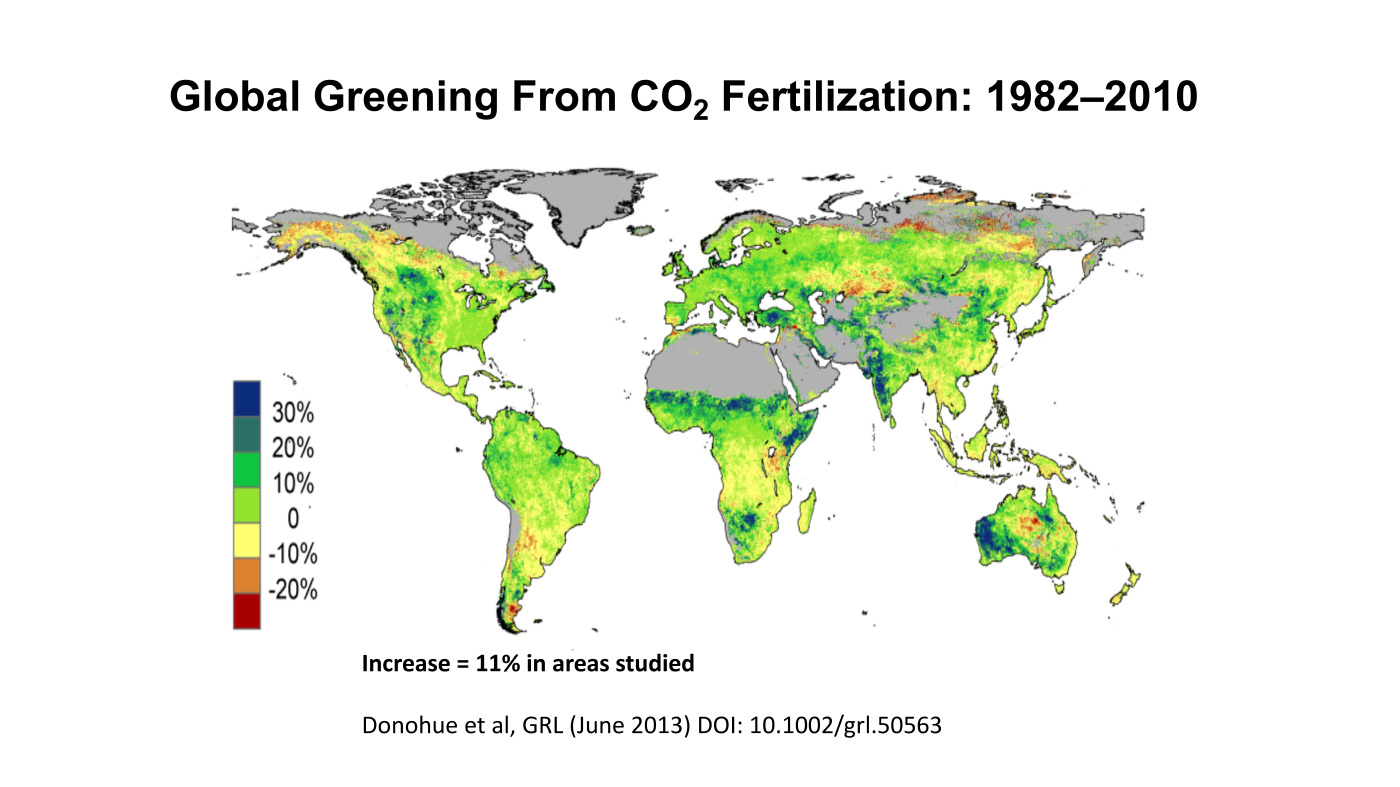
The biggest benefit of emissions is global greening, the increase year after year of green vegetation on the land surface of the planet. Forests grow more thickly, grasslands more richly and scrub more rapidly. This has been measured using satellites and on-the-ground recording of plant-growth rates. It is happening in all habitats, from tundra to rainforest. In the four decades since 1982, as Bjorn Lomborg points out, NASA data show that global greening has added 618,000 square kilometres of extra green leaves each year, equivalent to three Great Britains. You read that right: every year there’s more greenery on the planet to the extent of three Britains. I bet Greta Thunberg did not tell you that.

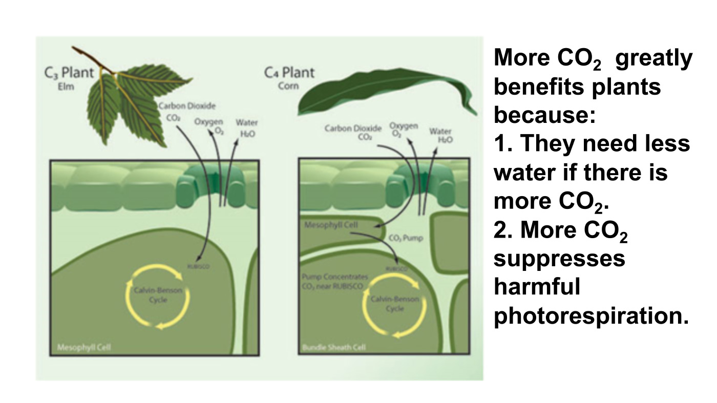
The cause of this greening? Although tree planting, natural reforestation, slightly longer growing seasons and a bit more rain all contribute, the big cause is something else. All studies agree that by far the largest contributor to global greening – responsible for roughly half the effect – is the extra carbon dioxide in the air. In 40 years, the proportion of the atmosphere that is CO2 has gone from 0.034 per cent to 0.041 per cent. That may seem a small change but, with more ‘food’ in the air, plants don’t need to lose as much water through their pores (‘stomata’) to acquire a given amount of carbon. So dry areas, like the Sahel region of Africa, are seeing some of the biggest improvements in greenery. Since this is one of the poorest places on the planet, it is good news that there is more food for people, goats and wildlife.

But because good news is no news, green pressure groups and environmental correspondents in the media prefer to ignore global greening. Astonishingly, it merited no mentions on the BBC’s recent Green Planet series, despite the name. Or, if it is mentioned, the media point to studies suggesting greening may soon cease. These studies are based on questionable models, not data (because data show the effect continuing at the same pace). On the very few occasions when the BBC has mentioned global greening it is always accompanied by a health warning in case any viewer might glimpse a silver lining to climate change – for example, ‘extra foliage helps slow climate change, but researchers warn this will be offset by rising temperatures’.

Another bit of good news is on deaths. We’re against them, right? A recent study shows that rising temperatures have resulted in half a million fewer deaths in Britain over the past two decades. That is because cold weather kills about ’20 times as many people as hot weather’, according to the study, which analyses ‘over 74million deaths in 384 locations across 13 countries’. This is especially true in a temperate place like Britain, where summer days are rarely hot enough to kill. So global warming and the unrelated phenomenon of urban warming relative to rural areas, caused by the retention of heat by buildings plus energy use, are both preventing premature deaths on a huge scale.

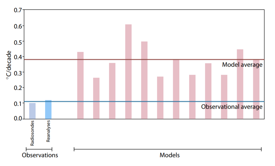
Figure 8: Warming in the tropical troposphere according to the CMIP6 models.
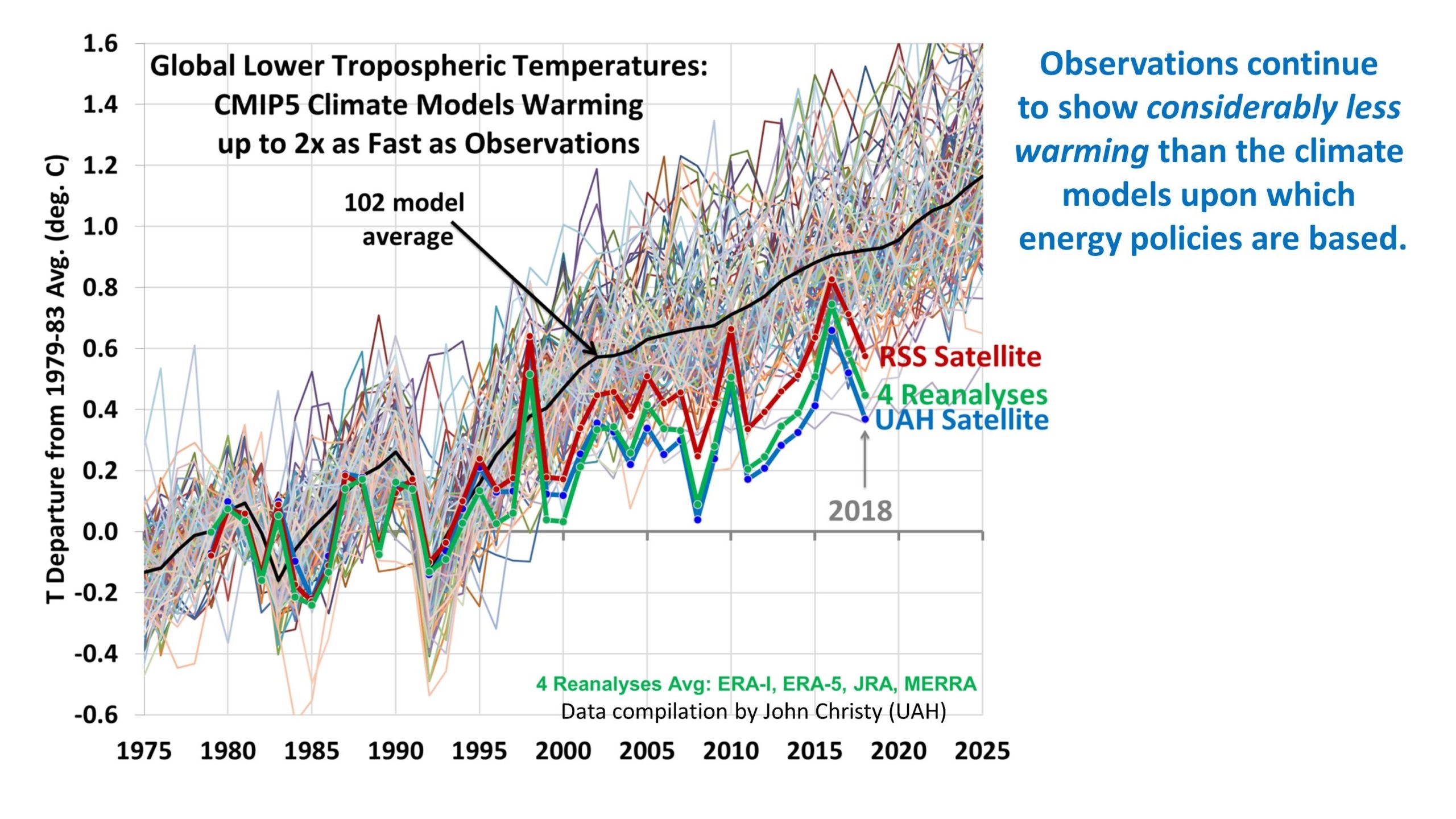
Trends 1979–2014 (except the rightmost model, which is to 2007), for 20°N–20°S, 300–200 hPa.  Source John Christy


Summer temperatures in the US are changing at half the rate of winter temperatures and daytimes are warming 20 per cent slower than nighttimes. A similar pattern is seen in most countries. Tropical nations are mostly experiencing very slow, almost undetectable daytime warming (outside cities), while Arctic nations are seeing quite rapid change, especially in winter and at night. Alarmists love to talk about polar amplification of average climate change, but they usually omit its inevitable flip side: that tropical temperatures (where most poor people live) are changing more slowly than the average.

My Mind is Made Up, Don’t Confuse Me with the Facts. H/T Bjorn Lomborg, WUWT

But are we not told to expect more volatile weather as a result of climate change? It is certainly assumed that we should. Yet there’s no evidence to suggest weather volatility is increasing and no good theory to suggest it will. The decreasing temperature differential between the tropics and the Arctic may actually diminish the volatility of weather a little.


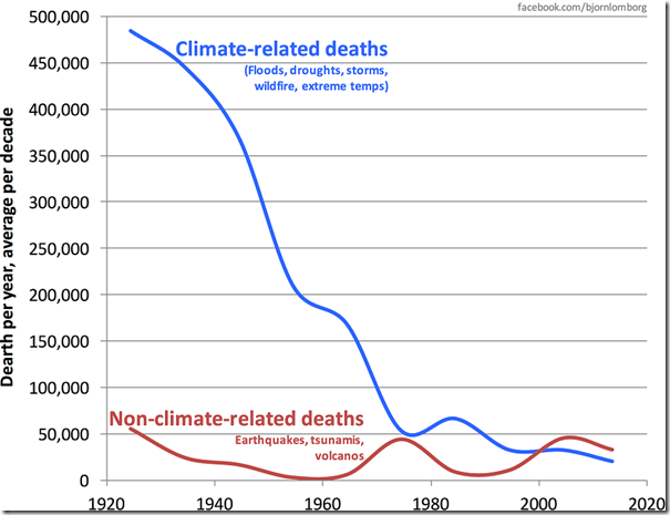
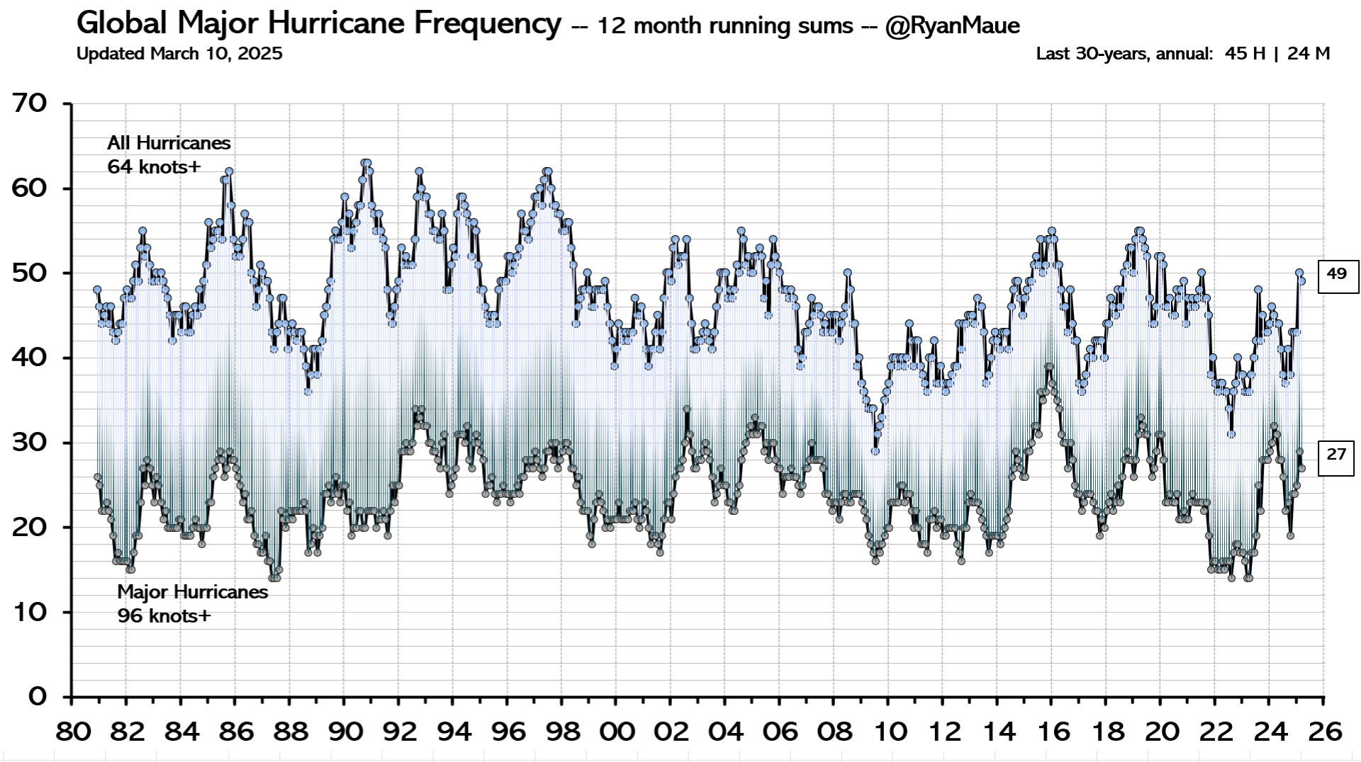
Indeed, as the Intergovernmental Panel on Climate Change (IPCC) repeatedly confirms, there is no clear pattern of storms growing in either frequency or ferocity, droughts are decreasing slightly and floods are getting worse only where land-use changes (like deforestation or building houses on flood plains) create a problem. Globally, deaths from droughts, floods and storms are down by about 98 per cent over the past 100 years – not because weather is less dangerous but because shelter, transport and communication (which are mostly the products of the fossil-fuel economy) have dramatically improved people’s ability to survive such natural disasters.

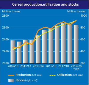
The effect of today’s warming (and greening) on farming is, on average, positive: crops can be grown farther north and for longer seasons and rainfall is slightly heavier in dry regions. We are feeding over seven billion people today much more easily than we fed three billion in the 1960s, and from a similar acreage of farmland. Global cereal production is on course to break its record this year, for the sixth time in 10 years.

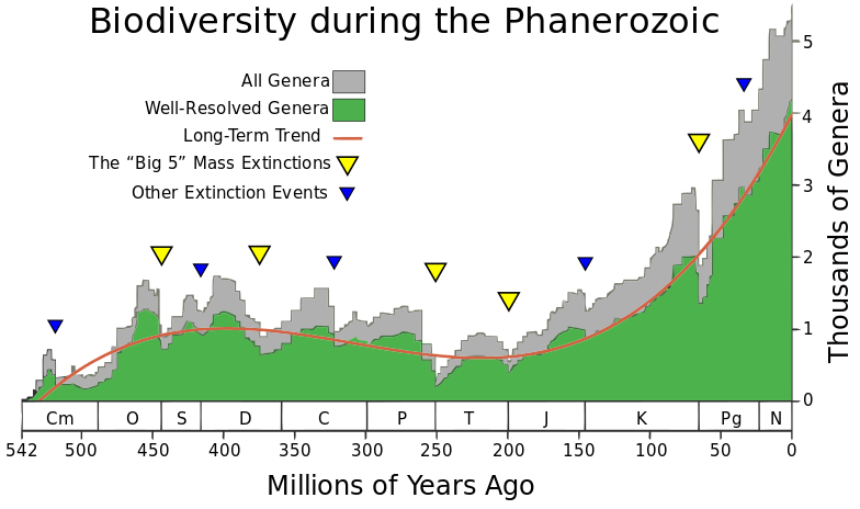
Nature, too, will do generally better in a warming world. There are more species in warmer climates, so more new birds and insects are arriving to breed in southern England than are disappearing from northern Scotland. Warmer means wetter, too: 9,000 years ago, when the climate was warmer than today, the Sahara was green. Alarmists like to imply that concern about climate change goes hand in hand with concern about nature generally. But this is belied by the evidence. Climate policies often harm wildlife: biofuels compete for land with agriculture, eroding the benefits of improved agricultural productivity and increasing pressure on wild land; wind farms kill birds and bats; and the reckless planting of alien sitka spruce trees turns diverse moorland into dark monoculture.

Meanwhile, real environmental issues are ignored or neglected because of the obsession with climate. With the help of local volunteers I have been fighting to protect the red squirrel in Northumberland for years. The government does literally nothing to help us, while it pours money into grants for studying the most far-fetched and minuscule possible climate-change impacts. Invasive alien species are the main cause of species extinction worldwide (like grey squirrels driving the red to the margins), whereas climate change has yet to be shown to have caused a single species to die out altogether anywhere.

Source: Phanerozoic_Biodiversity.png Author: SVG version by Albert Mestre

Of course, climate change does and will bring problems as well as benefits. Rapid sea-level rise could be catastrophic. But whereas the sea level shot up between 10,000 and 8,000 years ago, rising by about 60 metres in two millennia, or roughly three metres per century, today the change is nine times slower: three millimetres a year, or a foot per century, and with not much sign of acceleration. Countries like the Netherlands and Vietnam show that it is possible to gain land from the sea even in a world where sea levels are rising. The land area of the planet is actually increasing, not shrinking, thanks to siltation and reclamation.

Environmentalists don’t get donations or invitations to appear on the telly if they say moderate things. To stand up and pronounce that ‘climate change is real and needs to be tackled, but it’s not happening very fast and other environmental issues are more urgent’ would be about as popular as an MP in Oliver Cromwell’s parliament declaring, ‘The evidence for God is looking a bit weak, and I’m not so very sure that fornication really is a sin’. And I speak as someone who has made several speeches on climate in parliament.

No wonder we don’t hear about the good news on climate change.


Oceans Warming Uptick July 2024

The best context for understanding decadal temperature changes comes from the world’s sea surface temperatures (SST), for several reasons:

  • The ocean covers 71% of the globe and drives average temperatures;
  • SSTs have a constant water content, (unlike air temperatures), so give a better reading of heat content variations;
  • Major El Ninos have been the dominant climate feature in recent years.

HadSST is generally regarded as the best of the global SST data sets, and so the temperature story here comes from that source. Previously I used HadSST3 for these reports, but Hadley Centre has made HadSST4 the priority, and v.3 will no longer be updated.  HadSST4 is the same as v.3, except that the older data from ship water intake was re-estimated to be generally lower temperatures than shown in v.3.  The effect is that v.4 has lower average anomalies for the baseline period 1961-1990, thereby showing higher current anomalies than v.3. This analysis concerns more recent time periods and depends on very similar differentials as those from v.3 despite higher absolute anomaly values in v.4.  More on what distinguishes HadSST3 and 4 from other SST products at the end. The user guide for HadSST4 is here.

The Current Context

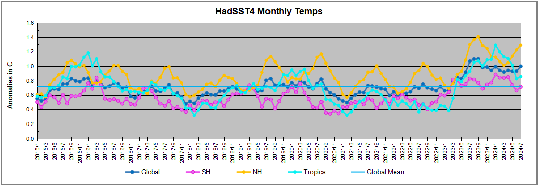
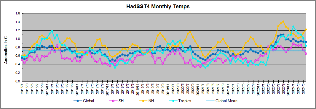
The chart below shows SST monthly anomalies as reported in HadSST4 starting in 2015 through July 2024.  A global cooling pattern is seen clearly in the Tropics since its peak in 2016, joined by NH and SH cycling downward since 2016, followed by rising temperatures in 2023 and 2024.

Note that in 2015-2016 the Tropics and SH peaked in between two summer NH spikes.  That pattern repeated in 2019-2020 with a lesser Tropics peak and SH bump, but with higher NH spikes. By end of 2020, cooler SSTs in all regions took the Global anomaly well below the mean for this period.  

Then in 2022, another strong NH summer spike peaked in August, but this time both the Tropic and SH were countervailing, resulting in only slight Global warming, later receding to the mean.   Oct./Nov. temps dropped  in NH and the Tropics took the Global anomaly below the average for this period. After an uptick in December, temps in January 2023 dropped everywhere, strongest in NH, with the Global anomaly further below the mean since 2015.

Then came El Nino as shown by the upward spike in the Tropics since January 2023, the anomaly nearly tripling from 0.38C to 1.09C.  In September 2023, all regions rose, especially NH up from 0.70C to 1.41C, pulling up the global anomaly to a new high for this period. By December, NH cooled to 1.1C and the Global anomaly down to 0.94C from its peak of 1.10C, despite slight warming in SH and Tropics.

In January 2024 both Tropics and SH rose, resulting in Global Anomaly going higher. Since then Tropics have cooled from a  peak of 1.29C down to 0.84C.  SH also dropped down from 0.89C to 0.65C. NH lost ~0.4C as of March 2024, but has risen 0.2C over April to June. Despite that upward NH bump, the Global SST anomaly cooled further.  Now in July there was a warming uptick in all regions, bringing the global anomaly up to match January 2024. The NH anomaly is now matching July 2023. The next months will reveal the strength of 2024 NH warming spike, which could rise to the 2023 level or recede.

Comment:

The climatists have seized on this unusual warming as proof their Zero Carbon agenda is needed, without addressing how impossible it would be for CO2 warming the air to raise ocean temperatures.  It is the ocean that warms the air, not the other way around.  Recently Steven Koonin had this to say about the phonomenon confirmed in the graph above:

El Nino is a phenomenon in the climate system that happens once every four or five years.  Heat builds up in the equatorial Pacific to the west of Indonesia and so on.  Then when enough of it builds up it surges across the Pacific and changes the currents and the winds.  As it surges toward South America it was discovered and named in the 19th century  It iswell understood at this point that the phenomenon has nothing to do with CO2.

Now people talk about changes in that phenomena as a result of CO2 but it’s there in the climate system already and when it happens it influences weather all over the world.   We feel it when it gets rainier in Southern California for example.  So for the last 3 years we have been in the opposite of an El Nino, a La Nina, part of the reason people think the West Coast has been in drought.

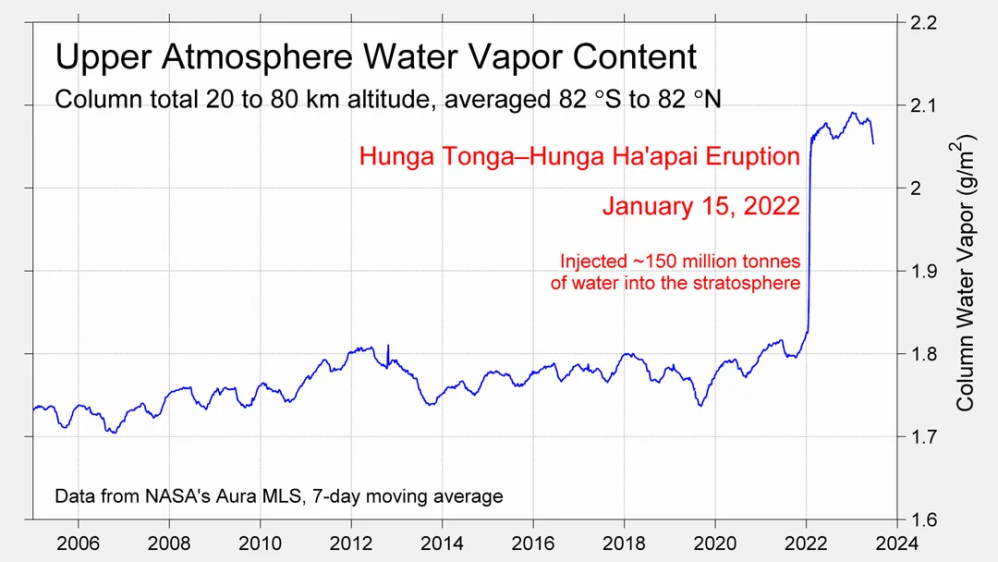
It has now shifted in the last months to an El Nino condition that warms the globe and is thought to contribute to this Spike we have seen. But there are other contributions as well.  One of the most surprising ones is that back in January of 2022 an enormous underwater volcano went off in Tonga and it put up a lot of water vapor into the upper atmosphere. It increased the upper atmosphere of water vapor by about 10 percent, and that’s a warming effect, and it may be that is contributing to why the spike is so high.

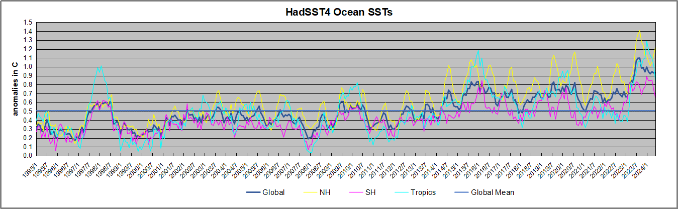
A longer view of SSTs

To enlarge, open image in new tab.

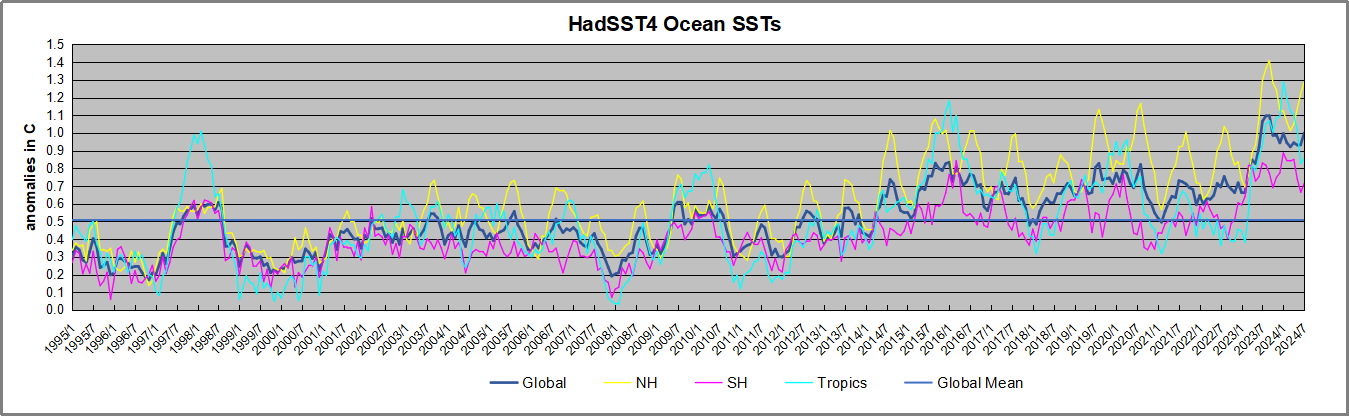
The graph above is noisy, but the density is needed to see the seasonal patterns in the oceanic fluctuations.  Previous posts focused on the rise and fall of the last El Nino starting in 2015.  This post adds a longer view, encompassing the significant 1998 El Nino and since.  The color schemes are retained for Global, Tropics, NH and SH anomalies.  Despite the longer time frame, I have kept the monthly data (rather than yearly averages) because of interesting shifts between January and July. 1995 is a reasonable (ENSO neutral) starting point prior to the first El Nino. 

The sharp Tropical rise peaking in 1998 is dominant in the record, starting Jan. ’97 to pull up SSTs uniformly before returning to the same level Jan. ’99. There were strong cool periods before and after the 1998 El Nino event. Then SSTs in all regions returned to the mean in 2001-2. 

SSTS fluctuate around the mean until 2007, when another, smaller ENSO event occurs. There is cooling 2007-8,  a lower peak warming in 2009-10, following by cooling in 2011-12.  Again SSTs are average 2013-14.

Now a different pattern appears.  The Tropics cooled sharply to Jan 11, then rise steadily for 4 years to Jan 15, at which point the most recent major El Nino takes off.  But this time in contrast to ’97-’99, the Northern Hemisphere produces peaks every summer pulling up the Global average.  In fact, these NH peaks appear every July starting in 2003, growing stronger to produce 3 massive highs in 2014, 15 and 16.  NH July 2017 was only slightly lower, and a fifth NH peak still lower in Sept. 2018.

The highest summer NH peaks came in 2019 and 2020, only this time the Tropics and SH were offsetting rather adding to the warming. (Note: these are high anomalies on top of the highest absolute temps in the NH.)  Since 2014 SH has played a moderating role, offsetting the NH warming pulses. After September 2020 temps dropped off down until February 2021.  In 2021-22 there were again summer NH spikes, but in 2022 moderated first by cooling Tropics and SH SSTs, then in October to January 2023 by deeper cooling in NH and Tropics.  

Then in 2023 the Tropics flipped from below to well above average, while NH produced a summer peak extending into September higher than any previous year.  Despite El Nino driving the Tropics January 2024 anomaly higher than 1998 and 2016 peaks, following months cooled in all regions, and the Tropics continued cooling in April, May and June along with SH dropping, suggesting that the peak might be reached, though now in July NH warming has again pulled the global anomaly higher.

What to make of all this? The patterns suggest that in addition to El Ninos in the Pacific driving the Tropic SSTs, something else is going on in the NH.  The obvious culprit is the North Atlantic, since I have seen this sort of pulsing before.  After reading some papers by David Dilley, I confirmed his observation of Atlantic pulses into the Arctic every 8 to 10 years.

Contemporary AMO Observations

Through January 2023 I depended on the Kaplan AMO Index (not smoothed, not detrended) for N. Atlantic observations. But it is no longer being updated, and NOAA says they don’t know its future.  So I find that ERSSTv5 AMO dataset has current data.  It differs from Kaplan, which reported average absolute temps measured in N. Atlantic.  “ERSST5 AMO  follows Trenberth and Shea (2006) proposal to use the NA region EQ-60°N, 0°-80°W and subtract the global rise of SST 60°S-60°N to obtain a measure of the internal variability, arguing that the effect of external forcing on the North Atlantic should be similar to the effect on the other oceans.”  So the values represent sst anomaly differences between the N. Atlantic and the Global ocean.

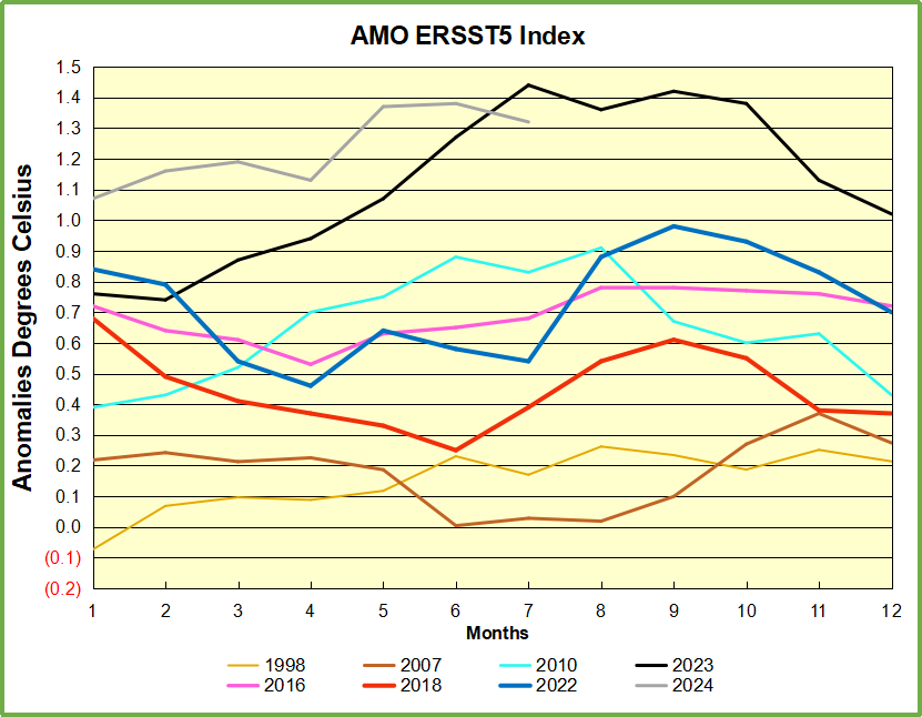
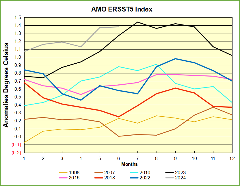
The chart above confirms what Kaplan also showed.  As August is the hottest month for the N. Atlantic, its variability, high and low, drives the annual results for this basin.  Note also the peaks in 2010, lows after 2014, and a rise in 2021. Now in 2023 the peak was holding at 1.4C before declining.  An annual chart below is informative:

Note the difference between blue/green years, beige/brown, and purple/red years.  2010, 2021, 2022 all peaked strongly in August or September.  1998 and 2007 were mildly warm.  2016 and 2018 were matching or cooler than the global average.  2023 started out slightly warm, then rose steadily to an  extraordinary peak in July.  August to October were only slightly lower, but by December cooled by ~0.4C.

Now in 2024 the AMO anomaly started higher than any previous year, then leveled off for two months declining slightly into April.  Remarkably, May shows an upward leap putting this on a higher track than 2023, and rising slightly higher in June.  In July 2024 the anomaly declined and is now lower than the peak reached in 2023.

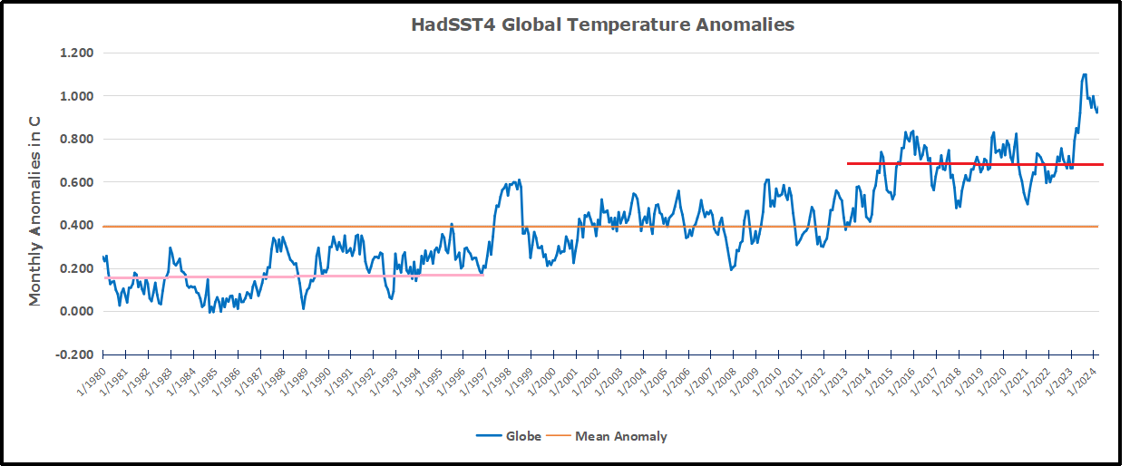
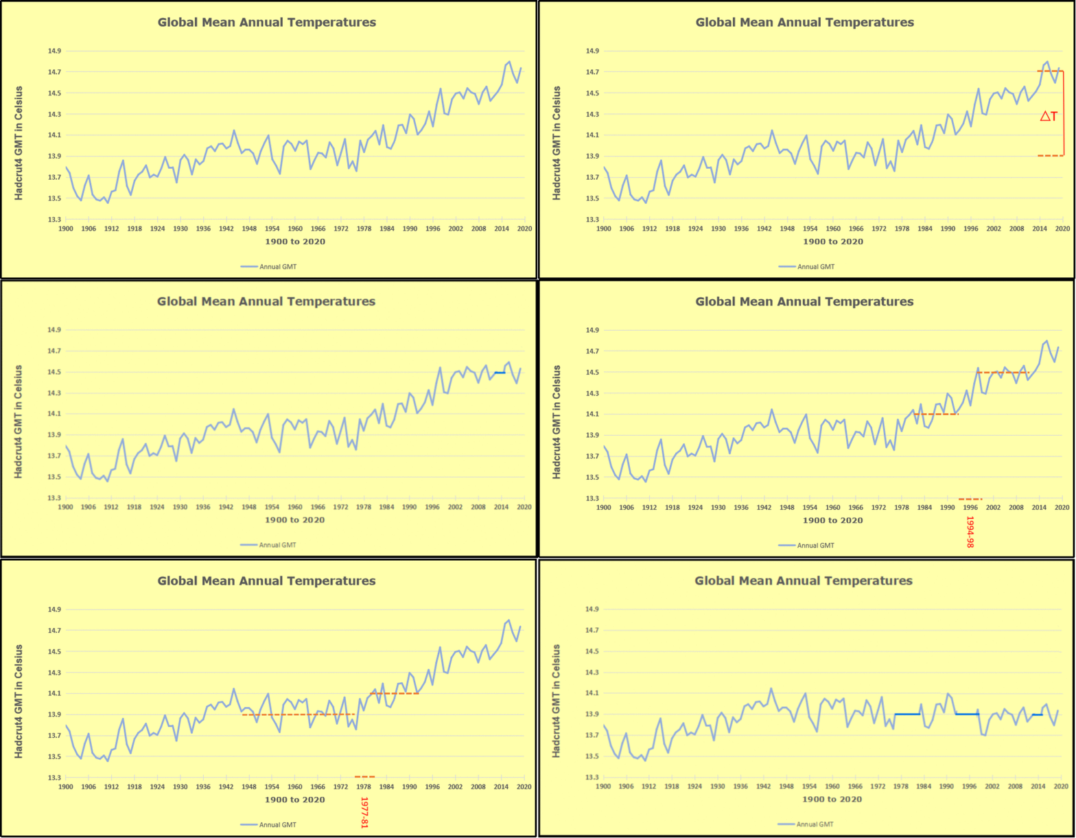
The pattern suggests the ocean may be demonstrating a stairstep pattern like that we have also seen in HadCRUT4. 

The purple line is the average anomaly 1980-1996 inclusive, value 0.18.  The orange line the average 1980-202404, value 0.39, also for the period 1997-2012. The red line is 2013-202404, value 0.66. As noted above, these rising stages are driven by the combined warming in the Tropics and NH, including both Pacific and Atlantic basins.

See Also:

2024 El Nino Collapsing

Curiosity:  Solar Coincidence?

The news about our current solar cycle 25 is that the solar activity is hitting peak numbers now and higher  than expected 1-2 years in the future.  As livescience put it:  Solar maximum could hit us harder and sooner than we thought. How dangerous will the sun’s chaotic peak be?  Some charts from spaceweatherlive look familar to these sea surface temperature charts.

Summary

The oceans are driving the warming this century.  SSTs took a step up with the 1998 El Nino and have stayed there with help from the North Atlantic, and more recently the Pacific northern “Blob.”  The ocean surfaces are releasing a lot of energy, warming the air, but eventually will have a cooling effect.  The decline after 1937 was rapid by comparison, so one wonders: How long can the oceans keep this up? And is the sun adding forcing to this process?

Space weather impacts the ionosphere in this animation. Credits: NASA/GSFC/CIL/Krystofer Kim

Footnote: Why Rely on HadSST4

HadSST is distinguished from other SST products because HadCRU (Hadley Climatic Research Unit) does not engage in SST interpolation, i.e. infilling estimated anomalies into grid cells lacking sufficient sampling in a given month. From reading the documentation and from queries to Met Office, this is their procedure.

HadSST4 imports data from gridcells containing ocean, excluding land cells. From past records, they have calculated daily and monthly average readings for each grid cell for the period 1961 to 1990. Those temperatures form the baseline from which anomalies are calculated.

In a given month, each gridcell with sufficient sampling is averaged for the month and then the baseline value for that cell and that month is subtracted, resulting in the monthly anomaly for that cell. All cells with monthly anomalies are averaged to produce global, hemispheric and tropical anomalies for the month, based on the cells in those locations. For example, Tropics averages include ocean grid cells lying between latitudes 20N and 20S.

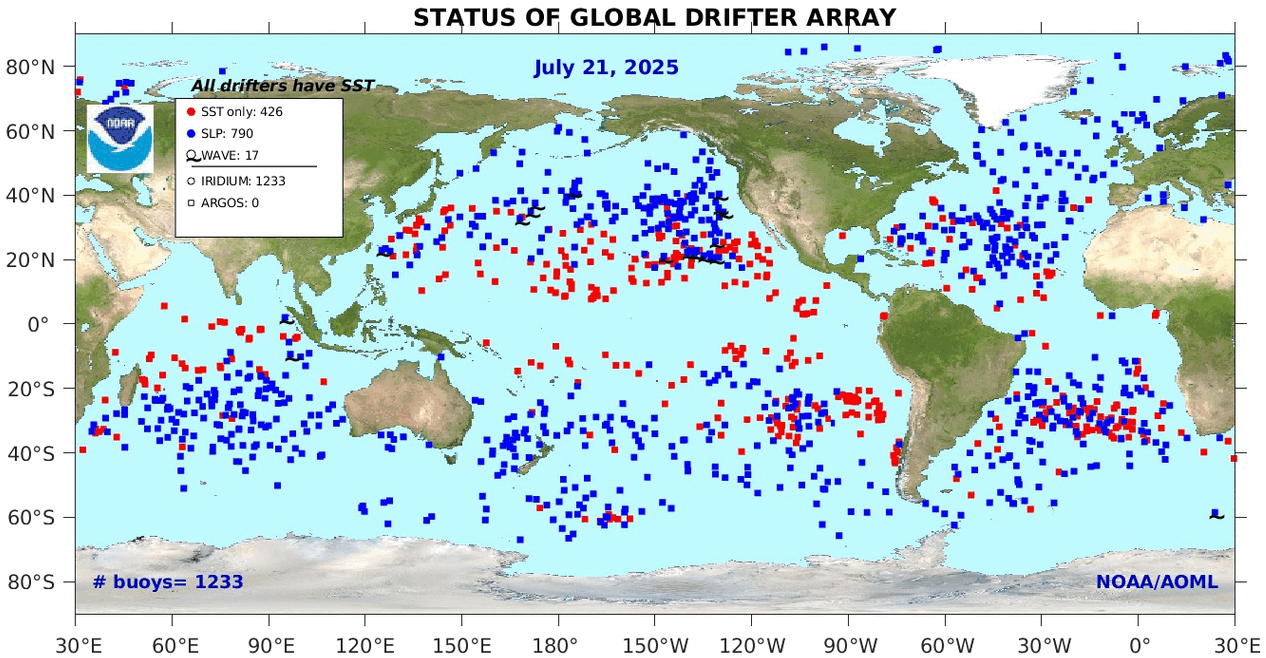
Gridcells lacking sufficient sampling that month are left out of the averaging, and the uncertainty from such missing data is estimated. IMO that is more reasonable than inventing data to infill. And it seems that the Global Drifter Array displayed in the top image is providing more uniform coverage of the oceans than in the past.

uss-pearl-harbor-deploys-global-drifter-buoys-in-pacific-ocean

USS Pearl Harbor deploys Global Drifter Buoys in Pacific Ocean


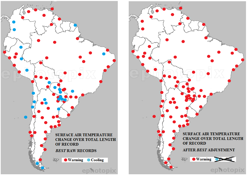
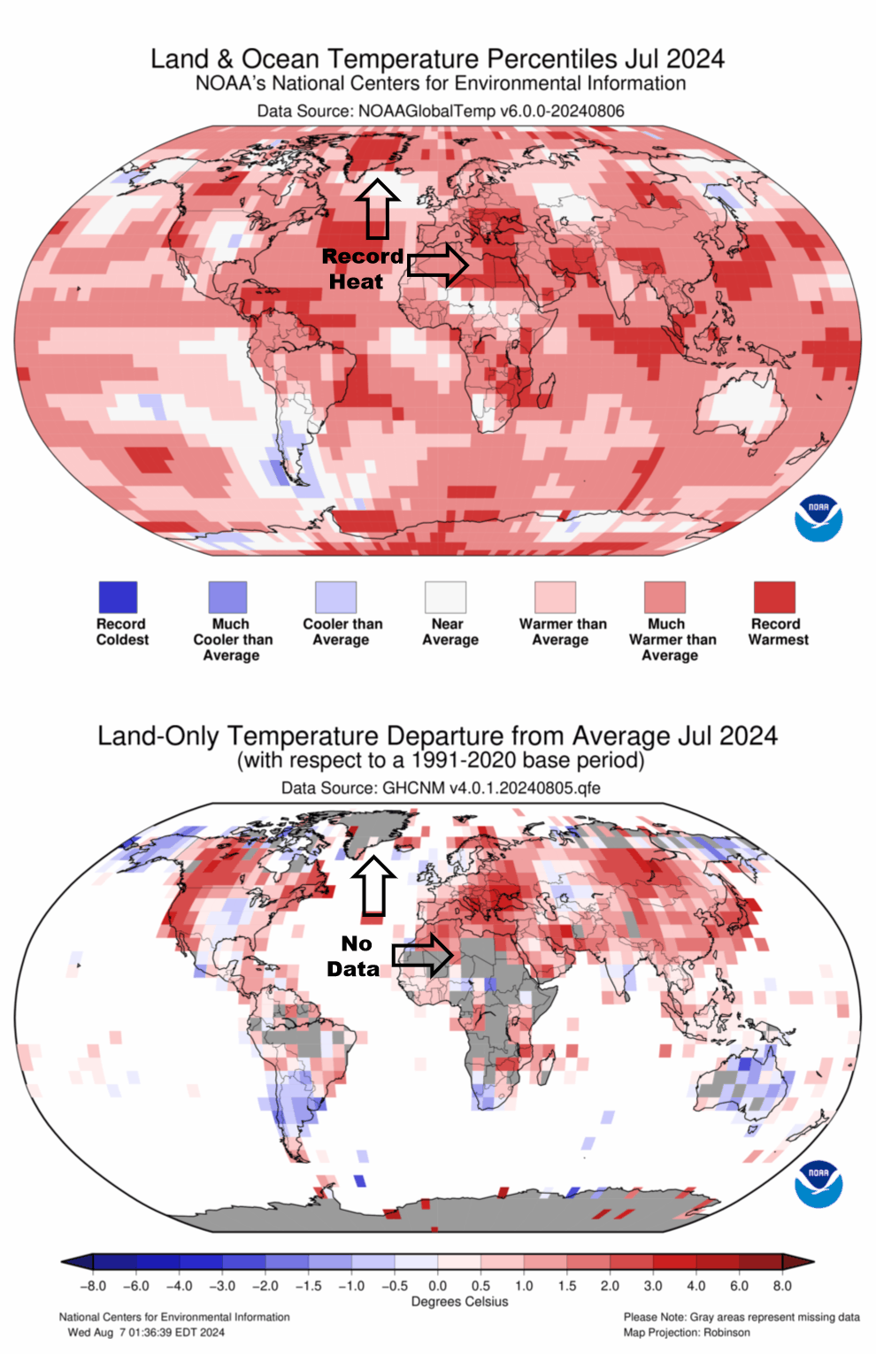
July 2024 the Hottest Ever? Not So Fast!

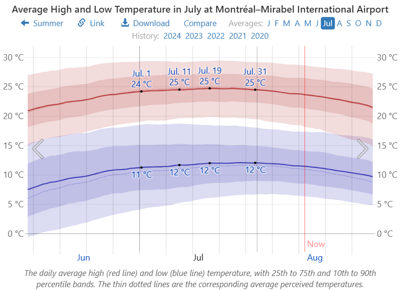
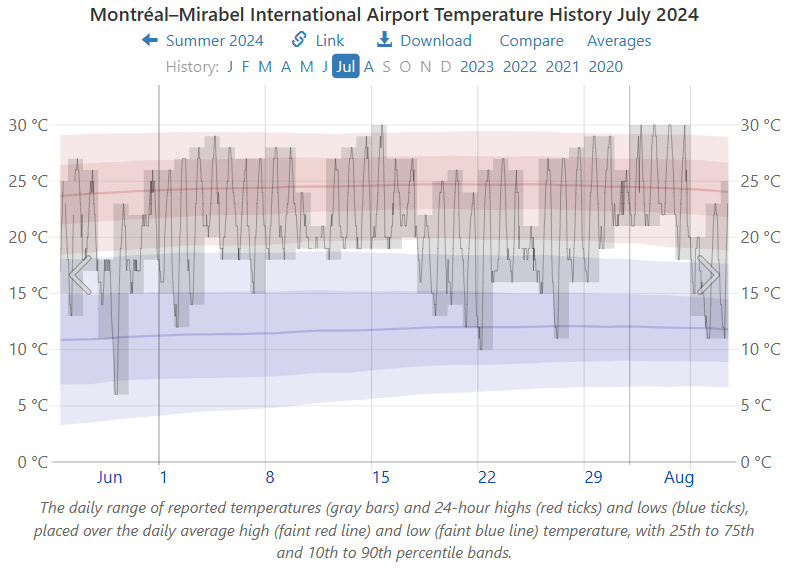
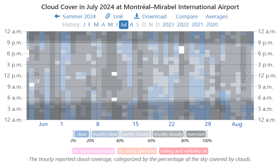
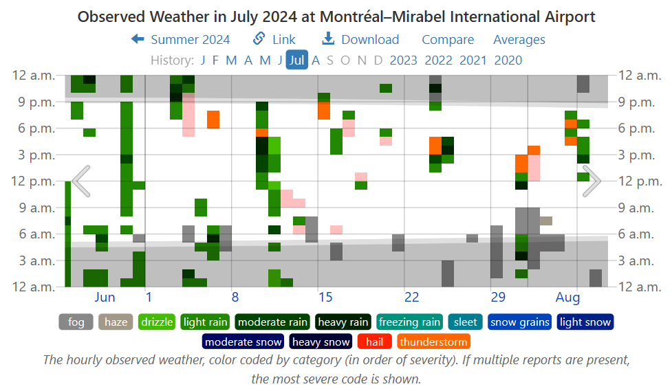
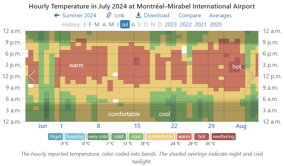
For sure you’ve seen the headlines declaring 2024 likely to be the Hottest year ever.  If you’re like me, your response is: That’s not the way it’s going down where I live.  Fortunately there is a website that allows anyone to check their personal experience with the weather station data nearby.  weatherspark.com provides data summaries for you to judge what’s going on in weather history where you live.  In my case a modern weather station is a few miles away July 2024 Weather History at Montréal–Mirabel International Airport  The story about July 2024 is evident below in charts and graphs from this site.  There’s a map that allows you to find your locale.

First, consider above the norms for July from the period 1980 to 2016.

Then, there’s July 2024 compared to the normal observations.

The graph shows July had some warm days, some cool days and overall was pretty normal.  But since climate is more than temperature, consider cloudiness.

Woah!  Most of the month was cloudy, which in summer means blocking the warming sun from hitting the surface.   And with all those clouds, let’s look at precipitation:

So, there were sixteen days when it rained, including five days of thunderstorms with heavy rainfall. Given what we know about the hydrology cycles, that means a lot of heat removed upward from the surface.

So the implications for July temperatures in my locale.

There you have it before your eyes. Mostly warm days for the
peak summer month, with exactly one brief hot afternoon.
Otherwise comfortable and cool, and a couple of hot
afternoons in first week of August.

Summary:

Claims of hottest this or that month or year are based on averages of averages of temperatures, which in principle is an intrinsic quality and distinctive to a locale.  The claim involves selecting some places and time periods where warming appears, while ignoring other places where it has been cooling.

Remember:  They want you to panic.  Before doing so, check out what the data says in your neck of the woods.  For example, NOAA declared that “July 2024 was the warmest ever recorded for the globe.”


Yes, IPCC, Our Climate Responds to Our Sun

John Gideon Hartnett writes at Spectator Australia The sun is in control of our oceans. Text is from John Ray at his blog, excerpts in italics with my bolds and added images.

In recent years, there has been observed an increase in ocean temperature. Those who adhere to the Climate Change version of events say that the oceans are getting warmer because of trapped carbon dioxide (CO2) in the atmosphere causing a massive greenhouse effect leading to boiling oceans.

Well, anyone who has a brain knows that the oceans are not boiling, but let’s assume that is just hyperbole. When actual research – when actual measurements were taken – reality turns out to be the exact opposite.

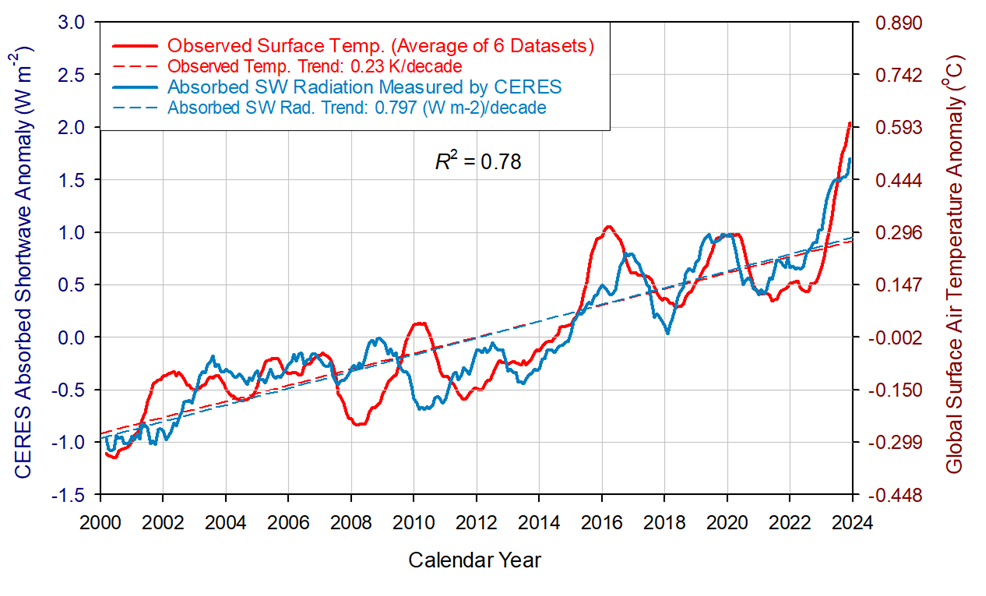
New research shows that the temperature of our oceans are controlled by incident radiation from the Sun. Who would have guessed?

And as a consequence of the oceans warming, dissolved carbon dioxide gas is released due to reduced is solubility in ocean water. This means the warming of the oceans would lead (or cause) an increase in CO2 concentration in the atmosphere.  One of the researchers in the study wrote on X.com:

A decrease in cloud cover and albedo means more short wavelength (SW) solar radiation reaches the oceans. Albedo is the reflectivity of the Earth. Lower albedo means more sunlight reaching the land and oceans and more warming by the Sun.

Figure 8. Comparison between observed global temperature anomalies and CERES-reported changes in the Earth’s absorbed solar flux. The two data series representing 13-month running means are highly correlated with the absorbed SW flux explaining 78% of the temperature variation (R2 = 0.78). The global temperature lags the absorbed solar radiation between 0 and 9 months, which indicates that climate change in the 21st Century was driven by solar forcing.

I mean to say that this is so obvious. The Sun heats Earth’s surface of which 71% is covered by the oceans! Basic physics!

The energy from the Sun powers all life on the planet and causes all Earth changes. Every second, the Earth receives the equivalent energy of 42 megatons of TNT in radiation from the Sun. That cannot be ignored. 

Climate Change, the ideological movement which I prefer to call a cult, views all evidence through the lens of their religious belief that the Earth is warmed by human activity. That activity releases carbon dioxide gas, which has been observed to be increasing. Their belief is that CO2 traps heat in a giant greenhouse effect. That is the dogma anyway. And I must add, we all are the carbon they want to eliminate.

But how much of that observed increase in CO2 is actually from natural causes and not from human activity? At least 94 per cent is. This new evidence now suggests it could be even more than that.

If the oceans emit CO2 gas following changes in the water temperature, which this research shows is due to the amount (flux) of solar radiation reaching the surface, then more CO2 comes from natural causes.

It is basic physics that as you heat water the dissolved gases are released due to a decrease in gas solubility. This means as the solar flux increases CO2 gas is released from the warmer ocean water.

Thus an ocean temperature increase leads to an increase in CO2 in the atmosphere, and not the other way around.

Space weather impacts the ionosphere in this animation. Credits: NASA/GSFC/CIL/Krystofer Kim

Experimental Proof Nil Warming from GHGs

Thomas Allmendinger is a Swiss physicist educated at Zurich ETH whose practical experience is in the fields of radiology and elemental particles physics.  His complete biography is here.

His independent research and experimental analyses of greenhouse gas (GHG) theory over the last decade led to several published studies, including the latest summation The Real Origin of Climate Change and the Feasibilities of Its Mitigation, 2023, at Atmospheric and Climate Sciences journal. The paper is a thorough and detailed discussion of which I provide here a synopsis of his methods, findings and conclusions. Excerpts are in italics with my bolds and added images.

Abstract

The actual treatise represents a synopsis of six important previous contributions of the author, concerning atmospheric physics and climate change. Since this issue is influenced by politics like no other, and since the greenhouse-doctrine with CO2 as the culprit in climate change is predominant, the respective theory has to be outlined, revealing its flaws and inconsistencies.

But beyond that, the author’s own contributions are focused and deeply discussed. The most eminent one concerns the discovery of the absorption of thermal radiation by gases, leading to warming-up, and implying a thermal radiation of gases which depends on their pressure. This delivers the final evidence that trace gases such as CO2 don’t have any influence on the behaviour of the atmosphere, and thus on climate.

But the most useful contribution concerns the method which enables to determine the solar absorption coefficient βs of coloured opaque plates. It delivers the foundations for modifying materials with respect to their capability of climate mitigation. Thereby, the main influence is due to the colouring, in particular of roofs which should be painted, preferably light-brown (not white, from aesthetic reasons).

It must be clear that such a drive for brightening-up the World would be the only chance of mitigating the climate, whereas the greenhouse doctrine, related to CO2, has to be abandoned. However, a global climate model with forecasts cannot be aspired to since this problem is too complex, and since several climate zones exist.

Background

The alleged proof for the correctness of this theory was delivered 25 years later by an article in the Scientific American of the year 1982 [4]. Therein, the measurements of C.D. Keeling were reported which had been made at two remote locations, namely at the South Pole and in Hawaii, and according to which a continuous rise of the atmospheric CO2-concentration from 316 to 336 ppm had been detected between the years 1958 and 1978 (cf. Figure 1), suggesting coherence between the CO2 concentration and the average global temperature.

But apart from the fact that these CO2-concentrations are quite minor (400 ppm = 0.04%), and that a constant proportion between the atmospheric CO2-concentration and the average global temperature could not be asserted over a longer period, it should be borne in mind that this conclusion was an analogous one, and not a causal one, since solely a temporal coincidence existed. Rather, other influences could have been effective which happened simultaneously, in particular the increasing urbanisation, influencing the structure and the coloration of large parts of Earth surface.

However, this contingency was, and still is, categorically excluded. Solely the two possibilities are considered as explanation of the climate change: either the anthropogenic influence due to CO2-production, or a natural one which cannot be influenced. A third influence, the one suggested here, namely the one of colours, is a priori excluded, even though nobody denies the influence of colouring on the surface temperature of Earth and the existence of urban heat islands, and although an increase of winds and storms cannot be explained by the greenhouse theory.

However, already well in advance institutions were founded which aimed at mitigating climate change through political measures. Thereby, climate change was equated with the industrial CO2 production, although physical evidence for such a relation was not given. It was just a matter of belief. In this regard, in 1992 the UNFCCC (United Nations Framework Convention on Climate Change) was founded, supported by the IPCC (Intergovernmental Panel on Climate Change). In advance, side by the side with the UNO, numerous so-called COPs (Conferences on the Parties) were hold: the first one in 1985 in Berlin, the most popular one in 1997 in Kyoto, and the most important one in 2015 in Paris, leading to a climate convention which was signed by representatives of 195 nations. Thereby, numerous documents were compiled, altogether more than 40,000. But actually these documents didn’t fulfil the standards of scientific publications since they were not peer reviewed.

Subsequently, intensive research activities emerged, accompanied by a flood of publications, and culminating in several text books. Several climate models were presented with different scenarios and diverging long-term forecasts. Thereby, the fact was disregarded that indeed no global climate exists but solely a plurality of climates, or rather of micro-climates and at best of climate-zones, and that the Latin word “clima” (as well as the English word “clime”) means “region”. Moreover, an average global temperature is not really defined and thus not measurable because the temperature-differences are immense, for instance with regard to the geographic latitude, the altitude, the distinct conditions over sea and over land, and not least between the seasons and between day and night. Moreover, the term “climate” implicates rain and snow as well as winds and storms which, in the long-term, are not foreseeable. In particular, it should be realized that atmospheric processes are energetically determined, whereto the temperature contributes only a part.

2. The Historical Inducement for the Greenhouse Theory and Their Flaws

The scientific literature about the greenhouse theory is so extensive that it is difficult to find a clearly outlined and consistent description. Nevertheless, the publications of James E. Hansen [5] and of V. Ramanathan et al. [6] may be considered as authoritative. Moreover, the textbooks [7] [8] and [9] are worth mentioning. Therein it is assumed that Earth surface, which is heated up by sun irradiation, emits thermal radiation into the atmosphere, warming it up due to heat absorption by “greenhouse gases” such as CO2 and CH4. Thereby, counter-radiation occurs which induces a so-called radiative transfer. This aspect involved the rise of numerous theories (e.g. [10] [11] [12]). But the co-existence of theories is in contrast to the scientific principle that for each phenomenon solely one explanation or theory is admissible.

Already simple thoughts may lead one to question this theory. For instance: Supposing the present CO2-concentration of approx. 400 ppm (parts per million) = 0.04%, one should wonder how the temperature of the atmosphere can depend on such an extremely low gas amount, and why this component can be the predominant or even the sole cause for the atmospheric temperature. This would actually mean that the temperature would be situated near the absolute zero of −273˚C if the air would contain no CO2 or other greenhouse gases.

Indeed, no special physical knowledge is needed in order to realize that this theory cannot be correct. However, the fact that it has settled in the public mind, becoming an important political issue, requires a more detailed investigation of the measuring methods and their results which delivered the foundations of this theory, and why misinterpretations arose. Thereto, the two subsequent points have to be particularly considered: The first point concerns the photometrical measurements on gases in the electromagnetic range of thermal radiation which initially Tyndall had carried out in the 1860s [13], and which had been expanded to IR-measurements evaluated by Plass nineteen years later [14]. The second point concerns the application of the Stefan/Boltzmann-law on the Earth-atmosphere system firstly made by Arrhenius in 1896 [2], and more or less adopted by modern atmospheric physics. Both approaches are deficient and would question the greenhouse theory without requiring the author’s own approaches.

2.1 The Photometric and IR-Measurement Methods for CO2

By variation of the wave length and measuring the respective absorption, the spectrum of a substance can be evaluated. This IR-spectroscopic method is widely used in order to characterize organic chemical substances and chemical bonds, usually in solution. But even there this method is not suited for quantitative measurements, i.e. the absorption of the IR-active substance is not proportional to its concentration as the Beer-Lambert law predicts. It probably will even less be the case in the gaseous phase and, all the more, at high pressures which were applied in order to imitate the large distances in the atmosphere in the range of several (up to 10) kilometres. Thereby it is disregarded that the pressure of the atmosphere depends on the altitude above sea level, which prohibits the assumption of a linear progress.

Moreover, it is disregarded that at IR-spectrographs the effective radiation intensity is not known, and that in the atmosphere a gas mixture exists where the CO2 amounts solely to a little extent, whereas for the spectroscopic measurements pure CO2 was used. Nevertheless, in the text books for atmospheric physics the Beer-Lambert law is frequently mentioned, however without delivering concrete numerical results about the absorbed radiation.

In both cases solely the absorption degree of the radiation was determined, i.e. the decrease of the radiation intensity due to its run through a gas, but never its heating-up, that means its temperature increase. Instead, it was assumed that a gas is necessarily warmed up when it absorbs thermal radiation. According to this assumption, pure air, or rather a 4:1 mixture of nitrogen and oxygen, is expected to be not warmed up when it is thermally irradiated since it is IR-spectroscopically inactive, in contrast to pure CO2.

However, no physical formula exists which would allow to calculate such an effect, and no respective empirical evidence was given so far. Rather, the measurements which were recently performed by the author delivered converse, surprising results.

2.2. The Impact of Solar Radiation onto the Earth Surface and Its Reflexion

Besides, a further error is implicated in the usual greenhouse theory. It results from the fact that the atmosphere is only partly warmed up by direct solar radiation. In addition, it is warmed up indirectly, namely via Earth surface which is warmed up due to solar irradiation, and which transmits the absorbed heat to the atmosphere either by thermal conduction or by thermal radiation. Moreover, air convection contributes a considerable part. This process is called Anthropogenic Heat Flux (AHF). It has recently been discussed by Lindgren [16]. However, herewith a more fundamental view is outlined.

The thermal radiation corresponds to the radiative emission of a so-called “black body”. Such a body is defined as a body which entirely absorbs electromagnetic radiation in the range from IR to UV light. Likewise, it emits electromagnetic radiation all the more as its temperature grows. Its radiative behaviour is formulated by the law of Stefan and Boltzmann. . . According to this law, the radiation wattage Φ of a black body is proportional to the fourth power of its absolute temperature. Usually, this wattage is related to the area, exhibiting the dimension W/m2.

This formula does not allow making a statement about the wave-length or the frequency of the emitted light. This is only possible by means of Max Planck’s formula which was published in 1900. According to that, the frequencies of the emitted light tend to be the higher the temperature is. At low temperatures, only heat is emitted, i.e. IR-radiation. At higher temperatures the body begins to glow: first of all in red, and later in white, a mixture of different colours. Finally, UV-radiation emerges. The emission spectrum of the sun is in quite good accordance with Planck’s emission spectrum for approx. 6000 K.

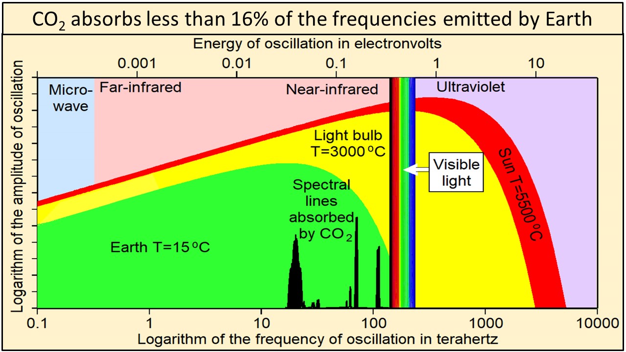
Black co2 absorption lines are not to scale.

This model can be applied on Earth surface considering it as a coloured opaque body: On one side, with respect to its thermal emission, it behaves like a black body fulfilling the Stefan/Boltzmann-law. On the other side, it adsorbs only a part βs of the incident solar light, converting it into heat, whereas the complementary part is reflected. However, the intensity of the incident solar light on Earth surface, Φsurface, is not identically equal with its extra-terrestrial intensity beyond the atmosphere, but depends on the sea level since the atmosphere absorbs a part of the sunlight. Remarkably, the atmosphere behaves like a black body, too, but solely with respect to the emission: On one side, it radiates inwards to the Earth surface, and on the other side, it radiates outwards in the direction of the rest of the atmosphere.

However, this method implies three considerable snags:
•  Firstly, TEarth means the constant limiting temperature of the Earth surface which is attained when the sun had constantly shone onto the same parcel and with the same intensity. But this is never the case, except at thin plates which are thermally insulated at the bottom and at the sides, since the position of the sun changes permanently.

•  Secondly, this formula does not allow making a statement about the rate of the warming up-process, which depends on the heat capacity of the involved plate, too. This is solely possible using the author’s approach (see Chapter 3). Nevertheless, it is often attempted (e.g. in [35]), not least within radiative transfer approaches.

•  Thirdly, it is principally impossible to determine the absolute values of the solar reflection coefficient αs with an Albedometer or a similar apparatus, because the intensity of the incident solar light is independent of the distance to the surface, whereas the intensity of the reflected light depends on it. Thus, the herewith obtained values depend on the distance from Earth surface where the apparatus is positioned. So they are not unambiguous but only relative.

In the modern approach of Hansen et al. [5] the Earth is apprehended as a coherent black body, disregarding its segmentation in a solid and a gaseous part, and thus disregarding the contact area between Earth surface and the atmosphere where the reflexion of the sunlight takes place. As a consequence, in Equation (4b) the expression with Tair disappears, whereas a total Earth temperature appears which is not definable and not determinable. This approach has been widely adopted in the textbooks, even though it is wrong (see also [15]).

Altogether, the matter of fact was neglected that the proportionality of the radiation intensity to the absolute temperature to the fourth is solely valid if a constant equilibrium is attained. In contrast, the subsequently described method enables the direct detection of the colour dependent solar absorption coefficient βs = 1 –αs using well-defined plates. Furthermore, the time/temperature-courses are mathematically modelled up to the limiting temperatures. Finally, relative field measurements are possible based on these results.

3. The Measurement of Solar Absorption-Coefficients with Coloured Plates

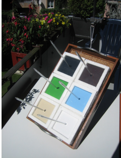
Within the here described and in [20] published lab-like method, not the reflected but the absorbed sun radiation was determined, namely by measuring the temperature courses of coloured quadratic plates (10 × 10 × 2 cm3) when sunlight of known intensity came vertically onto these plates. The temperatures of the plates were determined by mercury thermometers, while the intensity of the sunlight was measured by an electronic “Solarmeter” (KIMO SL 100). The plates were embedded in Styrofoam and covered with a thin transparent foil acting as an outer window in order to minimize erratic cooling by atmospheric turbulence (Figure 5). Their heat capacities were taken from literature values. The colours as well as the plate material were varied. Aluminium was used as a reference material, being favourable due to its high heat capacity which entails a low heating rate and a homogeneous heat distribution. For comparison, additional measurements were made by wooden plates, bricks and natural stones. For enabling a permanent optimal orientation towards the sun, six plate-modules were positioned on an adjustable panel (Figure 6).

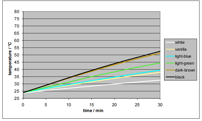
The evaluation of the curves of Figure 7 yielded the colour specific solar absorption-coefficients βs rendered in Figure 9. They were independent of the plate material. Remarkably, the value for green was relatively high.

Figure 7. Warming-up of aluminium plates at 1040 W/m2 [20].

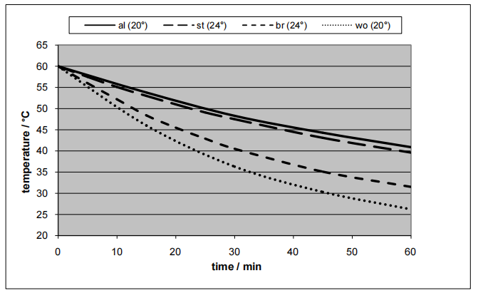
If the sunlight irradiation and thus the warming-up process would be continued, finally constant limiting temperatures are attained. However, when 20 mm thick aluminium plates are used, the hereto needed time would be too long, exceeding the constantly available sunshine period during a day. Instead, separate cooling-down experiments were made, allowing a mathematical modelling of the whole process including the determination of the limiting temperatures.

Figure 10. Cooling-down of different materials (in brackets: ambient temperature) [20]. al = aluminium 20 mm; st = stone 20.5 mm; br = brick 14.5 mm; wo = wood 17.5 mm.

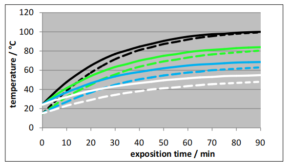
These limiting temperature values are in good accordance with the empirical values reported in [24] and with the Stefan/Boltzmann-values. As obvious from the respective diagrams in Figure 11 and Figure 12, the limiting temperatures are independent of the plate-materials, whereas the heating rates strongly depend on them.  In principal, it is also possible to model combined heating-up and cooling-down processes [20]. However, this presumes constant environmental conditions which normally do not exist.

4. Thermal Gas Absorption Measurements

If the warming-up behaviour of gases has to be determined by temperature measurements, interference by the walls of the gas vessel should be regarded since they exhibit a significantly higher heat capacity than the gas does, which implicates a slower warming-up rate. Since solid materials absorb thermal radiation stronger than gases do, the risk exists that the walls of the vessel are directly warmed up by the radiation, and that they subsequently transfer the heat to the gas. And finally, even the thin glass-walls of the thermometers may disturb the measurements by absorbing thermal radiation.
By these reasons, quadratic tubes with a relatively large profile (20 cm) were used which consisted of 3 cm thick plates from Styrofoam, and which were covered at the ends by thin plastic foils. In order to measure the temperature course along the tube, mercury-thermometers were mounted at three positions (beneath, in the middle, and atop) whose tips were covered with aluminium foils. The test gases were supplied from steel cylinders being equipped with reducing valves. They were introduced by a connecter during approx. one hour, because the tube was not gastight and not enough consistent for an evacuation. The filling process was monitored by means of a hygrometer since the air, which had to be replaced, was slightly humid. Afterwards, the tube was optimized by attaching adhesive foils and thin aluminium foils (see Figure 13). The equipment and the results are reported in [21].

Figure 13. Solar-tube, adjustable to the sun [21].

The initial measurements were made outdoor with twin-tubes in the presence of solar light. One tube was filled with air, and the other one with carbon-dioxide. Thereby, the temperature increased within a few minutes by approx. ten degrees till constant limiting temperatures were attained, namely simultaneously at all positions. Surprisingly, this was the case in both tubes, thus also in the tube which was filled with ambient air. Already this result delivered the proof that the greenhouse theory cannot be true. Moreover, it gave rise to investigate the phenomenon more thoroughly by means of artificial, better defined light.

Figure 14. Heat-radiation tube with IR-spot [21].

Accordingly, the subsequent experiments were made using IR-spots with wattages of 50 W, 100 W and 150W which are normally employed for terraria (Figure 14). Particularly the IR-spot with 150 W lead to a considerably higher temperature increase of the included gas than it was the case when sunlight was applied, since its ratio of thermal radiation was higher. Thereby, variable impacts such as the nature of the gas could be evaluated.

Due to the results with IR-spots at different gases (air, carbon-dioxide, the noble gases argon, neon and helium), essential knowledge could be gained. In each case, the irradiated gas warmed up until a stable limiting temperature was attained. Analogously to the case of irradiated coloured solid plates, the temperature increased until the equilibrium state was attained where the heat absorption rate was identically equal with the heat emission rate.

Figure 15. Time/temperature-curves for different gases [21] (150 W-spot, medium thermometer-position).

As evident from the diagram in Figure 15, the initial observation made with sunlight was approved that pure carbon-dioxide was warmed up almost to the same degree as air does (whereby ambient air only scarcely differed from a 4:1 mixture between nitrogen and oxygen). Moreover, noble gases absorb thermal radiation, too. As subsequently outlined, a theoretical explanation could be found thereto.

Interpretation of the Results

Comparison of the results obtained by the IR-spots, on the one hand, and those obtained with solar radiation, on the other hand, corroborated the conclusion that comparatively short-wave IR-radiation was involved (namely between 0.9 and 1.9 μm). However, subsequent measurements with a hotplate (<90˚C), placed at the bottom of the heat-radiation tube ([15], Figure 16), yielded that long-wave thermal radiation (which is expected at bodies with lower temperatures such as Earth surface) induces also temperature increase of air and of carbon-dioxide, cf. Figure 17.

Thus, the herewith discovered absorption effect at gases proceeds over a relatively wide wave-length range, in contrast to the IR-spectroscopic measurements where only narrow absorption bands appear. This effect is not exceptional, i.e. it occurs at all gases, also at noble gases, and leads to a significant temperature increase, even though it is spectroscopically not detectable. This temperature increase overlays an eventual temperature increase due to the specific IR-absorption since the intensity ratio of the latter one is very small.

This may be explained as follows: In any case, an oscillation of particles, induced by thermal radiation, acts a part. But whereas in the case of the specific IR-absorption the nuclei inside the molecules are oscillating along the chemical bond (which must be polar), in the relevant case here the electronic shell inside the atoms, or rather the electron orbit, is oscillating implicating oscillation energy. Obviously, this oscillation energy can be converted into kinetic translation energy of the entire atoms which correlates to the gas temperature, and vice versa.

5. The Altitude-Paradox of the Atmospheric Temperature

The statement that it’s colder in the mountains than in the lowlands is trivial. Not trivial is the attempt to explain this phenomenon since the reason is not readily evident. The usual explanation is given by the fact that rising air cools down since it expands due to the decreasing air-pressure. However, this cannot be true in the case of plateaus, far away from hillsides which engender ascending air streams. It appears virtually paradoxical in view of the fact that the intensity of the sun irradiation is much greater in the mountains than in the lowlands, in particular with respect to its UV-amount. Thereby, the intensity decrease is due to the scattering and the absorption of sunlight within the atmosphere, not only within the IR-range but also in the whole remaining spectral area. If such an absorption, named Raleigh-scattering, didn’t occur, the sky would not be blue but black.

However, the direct absorption of sunlight is not the only factor which determines the temperature of the atmosphere. Its warming-up via Earth surface,which is warmed up due to absorbed sun-irradiation, is even more important. Thereby, the heat transfer occurs partly by heat conduction and air convection, and partly by thermal radiation. But there is an additional factor which has to be regarded: namely the thermal radiation of the atmosphere. It runs on the one hand towards Earth (as counter-radiation), and on the other hand towards Space. Thus the situation becomes quite complicated, all the more the formal treatment based on the Stefan/Boltzmann-relation would require limiting equilibrated temperature conditions. But in particular, that relation does not reveal an influence of the atmospheric pressure which obviously acts a considerable part.

In order to study the dependency on the atmospheric pressure, it would be desirable solely varying the pressure, whereas the other terms remain constant by varying the altitude of the measuring station above sea level which implicates a variation of the intensity of the sunlight and of the ambient atmosphere temperature, too. The here reported measurements were made at two locations in Switzerland, namely at Glattbrugg (close to Zürich), 430 m above sea level, and at the top of the Furka pass, 2430 m above sea level. Using the barometric height formula, the respective atmospheric pressures were approx. 0.948 and 0.748 bar.  At any position, two measurements were made in the same space of time.

Figure 18. Comparison of the temperature courses during two measurements [24] (continuous lines: Glattbrugg; dotted lines: Furka).

Figure 18 renders the data of one measurement pair. Obviously, the limiting temperatures were not ideally attained within 90 minutes. Moreover, the evaluation of the data didn’t provide strictly invariant values for A. But this is reasonable in view of the fact that the sunlight intensity was not entirely constant during that period, and that its spectrum depends on the altitude over sea level. Nevertheless, for the atmospheric emission constant A an approximate value of 22W·m−2• bar−1• K−0.5 could be found.

These findings indeed confirm that in a way a greenhouse-effect occurs, since the atmosphere thermally radiates back to Earth surface. But this radiation has  nothing to do with trace gases such as CO2. It rather depends on the atmospheric pressure which diminishes at higher altitudes.

If the oxygen content of the air would be considerably reduced, a general reduction of the atmospheric pressure and, as a consequence, of the temperature would proceed. This may be an explanation for the appearance of glacial periods. However, other explanations are possible, in particular the temporary decrease of the sun activity.

Over all it can be stated that climate change cannot be explained by ominous greenhouse gases such as CO2, but mainly by artificial alterations of Earth surface, particularly in urban areas by darkening and by enlargement of the surface (so-called roughness). These urban alterations are not least due to the enormous global population growth, but also to the character of modern buildings tending to get higher and higher, and employing alternative materials such as concrete and glass. As a consequence, respective measures have to be focussed, firstly mentioning the previous work, and then applying the here presented method.

7. Conclusions

The herewith summarized work of the author concerns atmospheric physics with respect to climate change, comprising three specific and interrelated points based on several previous publications: The first one consists in a critical discussion and refutation of the customary greenhouse theory; the second one outlines the method for measuring the thermal-radiative behaviour of gases; and the third one describes a lab-like method for the characterization of the solar-reflective behaviour of solid opaque bodies, in particular for the determination of the colour-specific solar absorption coefficients.

As to the first point, three main flaws were revealed:

•  Firstly, the insufficiency of photometric methods in order to determine the heating-up of gases in the presence of thermal radiation;
•  Secondly, the lack of  causal relationship between the CO2-concentration in the atmosphere and the average global temperature, based on the reasoning that the empiric simultaneous increase of its concentration and of the global temperature would prove a causal relationship instead of an analogous one; and
•  Thirdly, the inadmissible application of the Stefan/Boltzmann-law to the entire Earth (including the atmosphere) versus Space, instead of the application onto the boundary between the Earth surface and the atmosphere.

As to the second point, the discovery has to be taken into account according to which every gas is warmed up when it is thermally irradiated, even noble gases, attaining a limiting temperature where the absorption of radiation is in equilibrium with the emitted radiation. In particular, pure CO2 behaves similarly to pure air. Applying kinetic gas theory, a dependency of the emission intensity on the pressure, on the root of the absolute temperature, and on the particle size could be found and theoretically explained by oscillation of the electron shell.

As to the third point not only a lab-like measuring method for the colour dependent solar absorption coefficient βs was developed, but also a mathematical modelling of the time/temperature-course where coloured opaque plates are irradiated by sunlight. Thereby, the (colour-dependent) warming-up and the (colour-independent) cooling-down are detected separately. Likewise, a limiting temperature occurs where the intensity of the absorbed solar light is identical equal with the intensity of the emitted thermal radiation. In the absence of wind-convection, the so-called heat transfer coefficient B is invariant. Its value was empirically evaluated, amounting to approx. 9 W·m−2•K−1.

Finally, the theoretically suggested dependency of the atmospheric thermal radiation intensity on the atmospheric pressure could be empirically verified by measurements at different altitudes, namely in Glattbrugg (430 m above sea level and on the top of the Furka-pass (2430 m above sea level), both in Switzerland, delivering a so-called atmospheric emission constant A ≈ 22 W·m−2•bar−1•K−0.5. It explained the altitude-paradox of the atmospheric temperature and delivered the definitive evidence that the atmospheric behavior, and thus the climate, does not depend on trace gases such as CO2. However, the atmosphere thermally reradiates indeed, leading to something similar to a Greenhouse effect. But this effect is solely due to the atmospheric pressure.

Therefore, and also considering the results of Seim and Olsen [23], the customary greenhouse doctrine assuming CO2 as the culprit in climate change has to be abandoned and instead replaced by the here recommended concept of improving the albedo by brightening parts of the Earth surface, particularly in cities, unless fatal consequences will be hazarded.

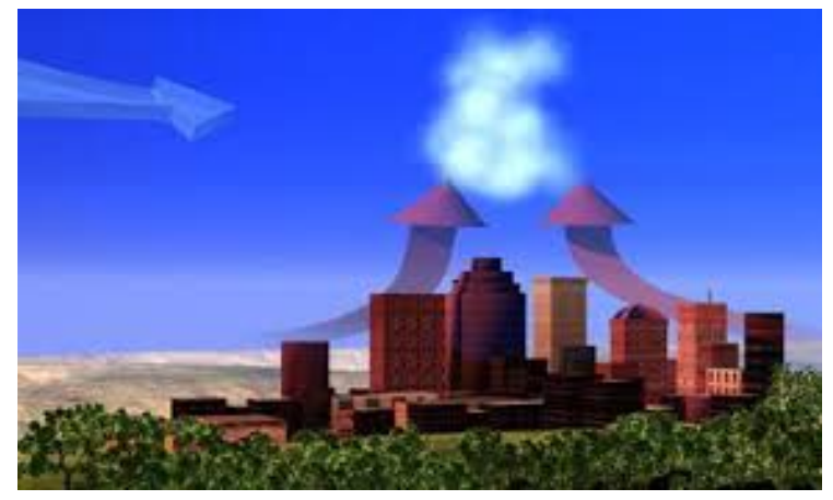
Figure 24. Up-winds induced by an urban heat island.

Happer: Cloud Radiation Matters, CO2 Not So Much

Earlier this month William Happer spoke on Radiation Transfer in Clouds at the EIKE conference, and the video is above.  For those preferring to read, below is a transcript from the closed captions along with some key exhibits.  I left out the most technical section in the latter part of the presentation. Text in italics with my bolds.

William Happer: Radiation Transfer in Clouds

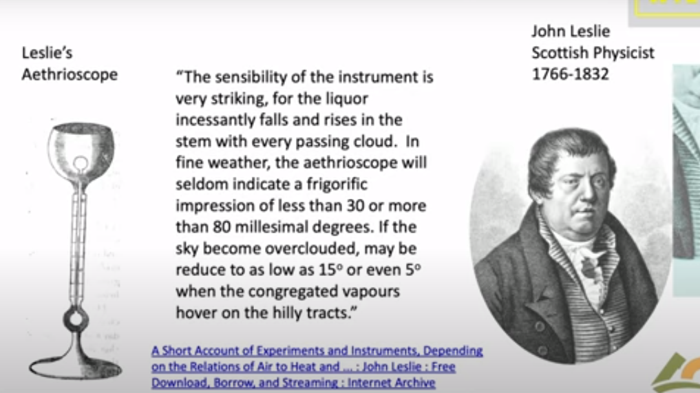
People have been looking at Clouds for a very long time in in a quantitive way. This is one of the first quantitative studies done about 1800. And this is John Leslie,  a Scottish physicist who built this gadget. He called it an Aethrioscope, but basically it was designed to figure out how effective the sky was in causing Frost. If you live in Scotland you worry about Frost. So it consisted of two glass bulbs with a very thin capillary attachment between them. And there was a little column of alcohol here.

The bulbs were full of air, and so if one bulb got a little bit warmer it would force the alcohol up through the capillary. If this one got colder it would suck the alcohol up. So he set this device out under the clear sky. And he described that the sensibility of the instrument is very striking. For the liquor incessantly falls and rises in the stem with every passing cloud. in fine weather the aethrioscope will seldom indicate a frigorific impression of less than 30 or more than 80 millesimal degrees. He’s talking about how high this column of alcohol would go up and down if the sky became overclouded. it may be reduced to as low as 15 refers to how much the sky cools or even five degrees when the congregated vapours hover over the hilly tracks. We don’t speak English that way anymore but I I love it.

The point was that even in 1800 Leslie and his colleagues knew very well that clouds have an enormous effect on the cooling of the earth. And of course anyone who has a garden knows that if you have a clear calm night you’re likely to get Frost and lose your crops. So this was a quantitative study of that.

Now it’s important to remember that if you go out today the atmosphere is full of two types of radiation. There’s sunlight which you can see and then there is the thermal radiation that’s generated by greenhouse gases, by clouds and by the surface of the Earth. You can’t see thermal radiation but you you can feel it if it’s intense enough by its warming effect. And these curves practically don’t overlap so we’re really dealing with two completely different types of radiation.

There’s sunlight which scatters very nicely and off of not only clouds but molecules; it’s the blue sky the Rayleigh scattering. Then there’s the thermal radiation which actually doesn’t scatter at all on molecules so greenhouse gases are very good at absorbing thermal radiation but they don’t scatter it. But clouds scatter thermal radiation and plotted here is the probability that you will find Photon of sunlight between you know log of its wavelength and the log of in this interval of the wavelength scale.

Since Leslie’s day two types of instruments have been developed to do what he did more precisely. One of them is called a pyranometer and this is designed to measure sunlight coming down onto the Earth on a day like this. So you put this instrument out there and it would read the flux of sunlight coming down. It’s designed to see sunlight coming in every direction so it doesn’t matter which angle the sun is shining; it’s uh calibrated to see them all.

Let me show you a measurement by a pyranometer. This is a actually a curve from a sales brochure of a company that will sell you one of these devices. It’s comparing two types of detectors and as you can see they’re very good you can hardly tell the difference. The point is that if you look on a clear day with no clouds you see sunlight beginning to increase at dawn it peaks at noon and it goes down to zero and there’s no sunlight at night. So half of the day over most of the Earth there’s no sunlight in the in the atmosphere.

Here’s a day with clouds, it’s just a few days later shown by days of the year going across. You can see every time a cloud goes by the intensity hitting the ground goes down. With a little clear sky it goes up, then down up and so on. On average at this particular day you get a lot less sunlight than you did on the clear day.

But you know nature is surprising. Einstein had this wonderful quote: God is subtle but he’s not malicious. He meant that nature does all of sorts of things you don’t expect, and so let me show you what happens on a partly cloudy day. Here so this is data taken near Munich. The blue curve is the measurement and the red curve is is the intensity on the ground if there were no clouds. This is a partly cloudy day and you can see there are brief periods when the sunlight is much brighter on the detector on a cloudy day than it is on the clear day. And that’s because coming through clouds you get focusing from the edges of the cloud pointing down toward your detector. That means somewhere else there’s less radiation reaching the ground. But this is rather surprising to most people. I was very surprised to learn about it but it just shows that the actual details of climate are a lot more subtle than you might think.

We knnow that visible light only happens during the daytime and stops at night. There’s a second type of important radiation which is the thermal radiation which is measured by a similar divice. You have a silicon window that passes infrared, which is below the band gap of silicon, so it passes through it as though transparent. Then there’s some interference filters here to give you further discrimination against sunlight. So sunlight practically doesn’t go through this at all, so they call it solar solar blind since it doesn’t see the Sun.

But it sees thermal radiation very clearly with a big difference between this device and the sunlight sensing device I showed you. Because actually most of the time this is radiating up not down. Out in the open air this detector normally gets colder than the body of the instrument. And so it’s carefully calibrated for you to compare the balance of down coming radiation with the upcoming radiation. Upcoming is normally greater than downcoming.

I’ll show you some measurements of the downwelling flux here; these are actually in Greenland in Thule and these are are watts per square meter on the vertical axis here. The first thing to notice is that the radiation continues day and night you can you if you look at the output of the pyrgeometer you can’t tell whether it’s day or night because the atmosphere is just as bright at night as it is during the day. However, the big difference is clouds: on a cloudy day you get a lot more downwelling radiation than you do on a clear day. Here’s a a near a full day of clear weather there’s another several days of clear weather. Then suddenly it gets cloudy. Radiation rises because the bottoms of the clouds are relatively warm at least compared to the clear sky. I think if you put the numbers In, this cloud bottom is around 5° Centigrade so it was fairly low Cloud. it was summertime in Greenland and this compares to about minus 5° for the clear sky.

So there’s a lot of data out there and there really is downwelling radiation there no no question about that you measure it routinely. And now you can do the same thing looking down from satellites so this is a picture that I downloaded a few weeks ago to get ready for this talk from Princeton and it was from Princeton at 6 PM so it was already dark in Europe. So this is a picture of the Earth from a geosynchronous satellite that’s parked over Ecuador. You are looking down on the Western Hemisphere and this is a filtered image of the Earth in Blue Light at 47 micrometers. So it’s a nice blue color not so different from the sky and it’s dark where the sun has set. There’s still a fair amount of sunlight over the United States and the further west.

Here is exactly the same time and from the same satellite the infrared radiation coming up at 10.3 which is right in the middle of the infrared window where there’s not much Greenhouse gas absorption; there’s a little bit from water vapor but very little, trivial from CO2.

As you can see, you can’t tell which side is night and which side is day. So even though the sun has set over here it is still glowing nice and bright. There’s sort of a pesky difference here because what you’re looking at here is reflected sunlight over the intertropical Convergence Zone. There are lots of high clouds that have been pushed up by the convection in the tropics and uh so this means more visible light here. You’re looking at emission of the cloud top so this is less thermal light so white here means less light, white there means more light so you have to calibrate your thinking. to

But the Striking thing about all of this: if you can see the Earth is covered with clouds, you have to look hard to find a a clear spot of the earth. Roughly half of the earth maybe is clear at any given time but most of it’s covered with clouds. So if anything governs the climate it is clouds and and so that’s one of the reasons I admire so much the work that Svensmark and Nir Shaviv have done. Because they’re focusing on the most important mechanism of the earth: it’s not Greenhouse Gases, it’s Clouds. You can see that here.

Now this is a single frequency let me show you what happens if you look down from a satellite and do look at the Spectrum. This is the spectrum of light coming up over the Sahara Desert measured from a satellite. And so here is the infrared window; there’s the 10.3 microns I mentioned in the previous slide it’s it’s a clear region. So radiation in this region can get up from the surface of the Sahara right up to outer space.

Notice that the units on these scales are very different; over the Sahara the top unit is 200, 150 over the Mediterranean and it’s only 60 over the South Pole. But at least the Mediterranean and the Sahara are roughly similar so the right side here these three curves on the right are observations from satellites and the three curves on the left are are calculations modeling that we’ve done. The point here is that you can hardly tell the difference between a model calculation and observed radiation.

So it’s really straightforward to calculate radiation transfer. If someone quotes you a number in watts per square centimeter you should take it seriously; that probably a good number. If they tell you a temperature you don’t know what to make about it. Because there’s a big step between going from watts per square centimeter to a temperature change. All the mischief in the whole climate business is going from watts per square centimeter to to Centigrade or Kelvin.

Now I will say just a few words about clear sky because that is the simplest. Then we’ll get on to clouds, the topic of this talk. This is a calculation with the same codes that I showed you in the previous slide which as you saw work very well. It’s worth spending a little time because this is the famous Planck curve that was the birth of quantum mechanics. There is Max Planck who figured out what the formula for that curve is and why it is that way. This is what the Earth would radiate at 15° Centigrade if there were no greenhouse gases. You would get this beautiful smooth curve the Planck curve. If you actually look at the Earth from the satellites you get a raggedy jaggedy black curve. We like to call that the Schwarzchild curve because Carl Schwarzchild was the person who showed how to do that calculation. Tragically he died during World War I, a Big Big loss to science.

There are two colored curves that I want to draw your attention. The green curve is is what Earth would radiate to space if you took away all the CO2 so it only differs from the black curve you know in the CO2 band here this is the bending band of CO2 which is the main greenhouse effect of CO2. There’s a little additional effect here which is the asymmetric stretch but it it doesn’t contribute very much. Then here is a red curve and that’s what happens if you double CO2.

So notice the huge asymmetry. If taking all 400 parts per million of CO2 away from the atmosphere causes this enormous change 30 watts per square meter, the difference between this green 307 and and the black 277, that’s 30 watts per square meter. But if you double CO2 you practically don’t make any change. This is the famous saturation of CO2. At the levels we have now doubling CO2, a 100% Increase of CO2 only changes the radiation to space by 3 watts per square meter. The difference between 274 for the red curve and 277 for the curve for today. So it’s a tiny amount: for 100% increase in CO2 a 1% decrease of radiation to space.

That allows you to estimate the feedback-free climate sensitivity in your head. I’ll talk you through the feedback-free climate free sensitivity. So doubling CO2 is a 1% decrease of radiation to space. If that happens then the Earth will start to warm up. But it will radiate as the fourth power of the temperature. So temperature starts to rise but if you’ve got a fourth power, the temperature only has to rise by one-quarter of a percent absolute temperature. So a 1% forcing in watts per square centimeter is a one-quarter percent of temperature in Kelvin. Since the ambient Kelvin temperature is about 300 Kelvin (actually a little less) a quarter of that is 75 Kelvin. So the feedback free equilibrium climate sensitivity is less than 1 Degree. It’s 0.75 Centigrade. It’s a number you can do in your head.

So when you hear about 3 centigrade instead of .75 C that’s a factor of four, all of which is positive feedback. So how is there really that much positive feedback? Because most feedbacks in nature are negative. The famous Le Chatelier principle which says that if you perturb a system it reacts in a way to to dampen the perturbation not increase it. There are a few positive feedback systems that were’re familiar with for example High explosives have positive feedback. So if the earth’s climate were like other positive feedback systems, all of them are highly explosive, it would have exploded a long time ago. But the climate has never done that, so the empirical observational evidence from geology is that the climate is like any other feedback system it’s probably negative Okay so I leave that thought with you and and let me stress again:

This is clear skies no clouds; if you add clouds all this does is
suppress the effects of changes of the greenhouse gas.

So now let’s talk about clouds and the theory of clouds, since we’ve already seen clouds are very important. Here is the formidable equation of transfer which has been around since Schwarzchild’s day. So some of the symbols here relate to the intensity, another represents scattering. If you have a thermal radiation on a greenhouse gas where it comes in and immediately is absorbed, there’s no scattering at all. If you hit a cloud particle it will scatter this way or that way, or some maybe even backwards.

So all of that’s described by this integral so you’ve got incoming light at One Direction and you’ve got outgoing light at a second Direction. And then at the same time you’ve got thermal radiation so the warm particles of the cloud are are emitting radiation creating photons which are coming out and and increasing the Earth glow the and this is represented by two parameters. Even a single cloud particle has an albedo, this is is the fraction of radiation that hits the cloud that is scattered as opposed to absorbed and being converted to heat. It’s a very important parameter for visible light and white clouds, typically 99% of the encounters are scattered. But for thermal radiation it’s much less. So water scatters thermal radiation only half as efficiently as shorter wavelengths.

The big problem is that in spite of all the billions of dollars that we have spent, these things which should be known and and would have been known if there hadn’t been this crazy fixation on carbon dioxide and greenhouse gases. And so we’ve neglected working on these areas that are really important as opposed to the trivial effects of greenhouse gases. Attenuation in a cloud is both scattering and absorption. Of course you have to solve these equations for every different frequency of the light because especially for molecules, there’s a strong frequency dependence.

In summary,  let me show you this photo which was taken by Harrison Schmitt who was a friend of mine on one of the first moonshots. It was taken in December and looking at this you can see that they were south of Madagascar when the photograph was taken. You can see it was Winter because here the Intertropical Convergence Zone is quite a bit south of the Equator; it’s moved Way South of India and Saudi Arabia. By good luck they had the sun behind them so they had the whole earth Irradiated.

There’s a lot of information there and and again let me draw your attention to how much of the Earth is covered with clouds. So only very small parts of the Earth can actually be directly affected by greenhouse gases, of the order of half. The takeaway message is that clouds and water vapor are much more important than greenhouse gases for earth’s climate. The second point is the reason they’re much more important: doubling CO2 as I indicated in the middle of the talk only causes a 1% difference of radiation to space. It is a very tiny effect because of saturation. You know people like to say that’s not so, but you can’t really argue that one, even the IPCC gets the same numbers that we do.

And you also know that covering half of the sky with clouds will decrease solar heating by 50%. So for clouds it’s one to one, for greenhouse gases it’s a 100 to one. If you really want to affect the climate, you want to do something to the clouds. You will have a very hard time making any difference with Net Zero with CO2 if you are alarmed about the warmings that have happened.

So one would hope that with all the money that we’ve spent trying to turn CO2 into a demon that some good science has come out of it. Fom my point of view this is a small part of it, this scattering theory that I think will be here a long time after the craze over greenhouse gases has gone away. I hope there will be other things too. You can point to the better instrumentation that we’ve got, satellite instrumentation as well as ground instrumentation. So that’s been a good investment of money. But the money we’ve spent on supercomputers and modeling has been completely wasted in my view.


Tropics, SH Lead Oceans Cooler June 2024

The best context for understanding decadal temperature changes comes from the world’s sea surface temperatures (SST), for several reasons:

  • The ocean covers 71% of the globe and drives average temperatures;
  • SSTs have a constant water content, (unlike air temperatures), so give a better reading of heat content variations;
  • Major El Ninos have been the dominant climate feature in recent years.

HadSST is generally regarded as the best of the global SST data sets, and so the temperature story here comes from that source. Previously I used HadSST3 for these reports, but Hadley Centre has made HadSST4 the priority, and v.3 will no longer be updated.  HadSST4 is the same as v.3, except that the older data from ship water intake was re-estimated to be generally lower temperatures than shown in v.3.  The effect is that v.4 has lower average anomalies for the baseline period 1961-1990, thereby showing higher current anomalies than v.3. This analysis concerns more recent time periods and depends on very similar differentials as those from v.3 despite higher absolute anomaly values in v.4.  More on what distinguishes HadSST3 and 4 from other SST products at the end. The user guide for HadSST4 is here.

The Current Context

The chart below shows SST monthly anomalies as reported in HadSST4 starting in 2015 through June 2024.  A global cooling pattern is seen clearly in the Tropics since its peak in 2016, joined by NH and SH cycling downward since 2016.


Note that in 2015-2016 the Tropics and SH peaked in between two summer NH spikes.  That pattern repeated in 2019-2020 with a lesser Tropics peak and SH bump, but with higher NH spikes. By end of 2020, cooler SSTs in all regions took the Global anomaly well below the mean for this period.  

Then in 2022, another strong NH summer spike peaked in August, but this time both the Tropic and SH were countervailing, resulting in only slight Global warming, later receding to the mean.   Oct./Nov. temps dropped  in NH and the Tropics took the Global anomaly below the average for this period. After an uptick in December, temps in January 2023 dropped everywhere, strongest in NH, with the Global anomaly further below the mean since 2015.

Then came El Nino as shown by the upward spike in the Tropics since January 2023, the anomaly nearly tripling from 0.38C to 1.09C.  In September 2023, all regions rose, especially NH up from 0.70C to 1.41C, pulling up the global anomaly to a new high for this period. By December, NH cooled to 1.1C and the Global anomaly down to 0.94C from its peak of 1.10C, despite slight warming in SH and Tropics.

In January 2024 both Tropics and SH rose, resulting in Global Anomaly going higher. Since then Tropics have cooled from a  peak of 1.29C down to 0.84C.  SH also dropped down from 0.89C to 0.65C. NH lost ~0.4C as of March 2024, but has risen 0.2C over the last 3 months Despite that upward NH bump, the Global SST anomaly cooled further.  The next months will reveal the strength of 2024 NH warming spike, which could resemble summer 2020, or could rise to the 2023 level.

Comment:

The climatists have seized on this unusual warming as proof their Zero Carbon agenda is needed, without addressing how impossible it would be for CO2 warming the air to raise ocean temperatures.  It is the ocean that warms the air, not the other way around.  Recently Steven Koonin had this to say about the phonomenon confirmed in the graph above:

El Nino is a phenomenon in the climate system that happens once every four or five years.  Heat builds up in the equatorial Pacific to the west of Indonesia and so on.  Then when enough of it builds up it surges across the Pacific and changes the currents and the winds.  As it surges toward South America it was discovered and named in the 19th century  It is well understood at this point that the phenomenon has nothing to do with CO2.

Now people talk about changes in that phenomena as a result of CO2 but it’s there in the climate system already and when it happens it influences weather all over the world.   We feel it when it gets rainier in Southern California for example.  So for the last 3 years we have been in the opposite of an El Nino, a La Nina, part of the reason people think the West Coast has been in drought.

It has now shifted in the last months to an El Nino condition that warms the globe and is thought to contribute to this Spike we have seen. But there are other contributions as well.  One of the most surprising ones is that back in January of 2022 an enormous underwater volcano went off in Tonga and it put up a lot of water vapor into the upper atmosphere. It increased the upper atmosphere of water vapor by about 10 percent, and that’s a warming effect, and it may be that is contributing to why the spike is so high.

A longer view of SSTs

To enlarge, open image in new tab.

The graph above is noisy, but the density is needed to see the seasonal patterns in the oceanic fluctuations.  Previous posts focused on the rise and fall of the last El Nino starting in 2015.  This post adds a longer view, encompassing the significant 1998 El Nino and since.  The color schemes are retained for Global, Tropics, NH and SH anomalies.  Despite the longer time frame, I have kept the monthly data (rather than yearly averages) because of interesting shifts between January and July. 1995 is a reasonable (ENSO neutral) starting point prior to the first El Nino. 

The sharp Tropical rise peaking in 1998 is dominant in the record, starting Jan. ’97 to pull up SSTs uniformly before returning to the same level Jan. ’99. There were strong cool periods before and after the 1998 El Nino event. Then SSTs in all regions returned to the mean in 2001-2. 

SSTS fluctuate around the mean until 2007, when another, smaller ENSO event occurs. There is cooling 2007-8,  a lower peak warming in 2009-10, following by cooling in 2011-12.  Again SSTs are average 2013-14.

Now a different pattern appears.  The Tropics cooled sharply to Jan 11, then rise steadily for 4 years to Jan 15, at which point the most recent major El Nino takes off.  But this time in contrast to ’97-’99, the Northern Hemisphere produces peaks every summer pulling up the Global average.  In fact, these NH peaks appear every July starting in 2003, growing stronger to produce 3 massive highs in 2014, 15 and 16.  NH July 2017 was only slightly lower, and a fifth NH peak still lower in Sept. 2018.

The highest summer NH peaks came in 2019 and 2020, only this time the Tropics and SH were offsetting rather adding to the warming. (Note: these are high anomalies on top of the highest absolute temps in the NH.)  Since 2014 SH has played a moderating role, offsetting the NH warming pulses. After September 2020 temps dropped off down until February 2021.  In 2021-22 there were again summer NH spikes, but in 2022 moderated first by cooling Tropics and SH SSTs, then in October to January 2023 by deeper cooling in NH and Tropics.  

Then in 2023 the Tropics flipped from below to well above average, while NH produced a summer peak extending into September higher than any previous year.  Despite El Nino driving the Tropics January 2024 anomaly higher than 1998 and 2016 peaks, following months cooled in all regions, and the Tropics continued cooling in April, May and June along with SH dropping, suggesting that the peak likely has been reached, though NH warming is the outlier.

What to make of all this? The patterns suggest that in addition to El Ninos in the Pacific driving the Tropic SSTs, something else is going on in the NH.  The obvious culprit is the North Atlantic, since I have seen this sort of pulsing before.  After reading some papers by David Dilley, I confirmed his observation of Atlantic pulses into the Arctic every 8 to 10 years.

Contemporary AMO Observations

Through January 2023 I depended on the Kaplan AMO Index (not smoothed, not detrended) for N. Atlantic observations. But it is no longer being updated, and NOAA says they don’t know its future.  So I find that ERSSTv5 AMO dataset has current data.  It differs from Kaplan, which reported average absolute temps measured in N. Atlantic.  “ERSST5 AMO  follows Trenberth and Shea (2006) proposal to use the NA region EQ-60°N, 0°-80°W and subtract the global rise of SST 60°S-60°N to obtain a measure of the internal variability, arguing that the effect of external forcing on the North Atlantic should be similar to the effect on the other oceans.”  So the values represent sst anomaly differences between the N. Atlantic and the Global ocean.

The chart above confirms what Kaplan also showed.  As August is the hottest month for the N. Atlantic, its variability, high and low, drives the annual results for this basin.  Note also the peaks in 2010, lows after 2014, and a rise in 2021. Now in 2023 the peak was holding at 1.4C before declining.  An annual chart below is informative:

Note the difference between blue/green years, beige/brown, and purple/red years.  2010, 2021, 2022 all peaked strongly in August or September.  1998 and 2007 were mildly warm.  2016 and 2018 were matching or cooler than the global average.  2023 started out slightly warm, then rose steadily to an  extraordinary peak in July.  August to October were only slightly lower, but by December cooled by ~0.4C.

Now in 2024 the AMO anomaly started higher than any previous year, then leveled off for two months declining slightly into April.  Remarkably, May shows an upward leap putting this on a higher track than 2023, and rising slightly higher in June.  The next months will show us if that warming strengthens or levels off.

The pattern suggests the ocean may be demonstrating a stairstep pattern like that we have also seen in HadCRUT4. 

The purple line is the average anomaly 1980-1996 inclusive, value 0.18.  The orange line the average 1980-202404, value 0.39, also for the period 1997-2012. The red line is 2013-202404, value 0.66. As noted above, these rising stages are driven by the combined warming in the Tropics and NH, including both Pacific and Atlantic basins.

See Also:

2024 El Nino Collapsing

Curiosity:  Solar Coincidence?

The news about our current solar cycle 25 is that the solar activity is hitting peak numbers now and higher  than expected 1-2 years in the future.  As livescience put it:  Solar maximum could hit us harder and sooner than we thought. How dangerous will the sun’s chaotic peak be?  Some charts from spaceweatherlive look familar to these sea surface temperature charts.

Summary

The oceans are driving the warming this century.  SSTs took a step up with the 1998 El Nino and have stayed there with help from the North Atlantic, and more recently the Pacific northern “Blob.”  The ocean surfaces are releasing a lot of energy, warming the air, but eventually will have a cooling effect.  The decline after 1937 was rapid by comparison, so one wonders: How long can the oceans keep this up? And is the sun adding forcing to this process?

Space weather impacts the ionosphere in this animation. Credits: NASA/GSFC/CIL/Krystofer Kim

Footnote: Why Rely on HadSST4

HadSST is distinguished from other SST products because HadCRU (Hadley Climatic Research Unit) does not engage in SST interpolation, i.e. infilling estimated anomalies into grid cells lacking sufficient sampling in a given month. From reading the documentation and from queries to Met Office, this is their procedure.

HadSST4 imports data from gridcells containing ocean, excluding land cells. From past records, they have calculated daily and monthly average readings for each grid cell for the period 1961 to 1990. Those temperatures form the baseline from which anomalies are calculated.

In a given month, each gridcell with sufficient sampling is averaged for the month and then the baseline value for that cell and that month is subtracted, resulting in the monthly anomaly for that cell. All cells with monthly anomalies are averaged to produce global, hemispheric and tropical anomalies for the month, based on the cells in those locations. For example, Tropics averages include ocean grid cells lying between latitudes 20N and 20S.

Gridcells lacking sufficient sampling that month are left out of the averaging, and the uncertainty from such missing data is estimated. IMO that is more reasonable than inventing data to infill. And it seems that the Global Drifter Array displayed in the top image is providing more uniform coverage of the oceans than in the past.

uss-pearl-harbor-deploys-global-drifter-buoys-in-pacific-ocean

USS Pearl Harbor deploys Global Drifter Buoys in Pacific Ocean


Intro to Climate Fallacies

First an example of how classical thought fallacies derail discussion from any search for meaning. H/T Jim Rose.

Then I took the liberty to change the discussion topic to climate change, by inserting typical claims heard in that context.

Below is a previous post taking a deeper dive into the fallacies that have plagued global warming/climate change for decades

Background Post Climatism is a Logic Fail

Two fallacies in particular ensure meaningless public discussion about climate “crisis” or “emergency.” H/T to Terry Oldberg for comments and writings prompting me to post on this topic.

One corruption is the numerous times climate claims include fallacies of Equivocation. For instance, “climate change” can mean all observed events in nature, but as defined by IPCC all are 100% caused by human activities.  Similarly, forecasts from climate models are proclaimed to be “predictions” of future disasters, but renamed “projections” in disclaimers against legal liability.  And so on.

A second error in the argument is the Fallacy of Misplaced Concreteness, AKA Reification. This involves mistaking an abstraction for something tangible and real in time and space. We often see this in both spoken and written communications. It can take several forms:

♦ Confusing a word with the thing to which it refers

♦ Confusing an image with the reality it represents

♦ Confusing an idea with something observed to be happening

Examples of Equivocation and Reification from the World of Climate Alarm

“Seeing the wildfires, floods and storms, Mother Nature is not happy with us failing to recognize the challenges facing us.” – Nancy Pelosi

Mother Nature’ is a philosophical construct and has no feelings about people.

“This was the moment when the rise of the oceans began to slow and our planet began to heal …”
– Barack Obama

The ocean and the planet do not respond to someone winning a political party nomination. Nor does a planet experience human sickness and healing.

“If something has never happened before, we are generally safe in assuming it is not going to happen in the future, but the exceptions can kill you, and climate change is one of those exceptions.” – Al Gore

The future is not knowable, and can only be a matter of speculation and opinion.

“The planet is warming because of the growing level of greenhouse gas emissions from human activity. If this trend continues, truly catastrophic consequences are likely to ensue. “– Malcolm Turnbull

Temperature is an intrinsic property of an object, so temperature of “the planet” cannot be measured. The likelihood of catastrophic consequences is unknowable. Humans are blamed as guilty by association.

“Anybody who doesn’t see the impact of climate change is really, and I would say, myopic. They don’t see the reality. It’s so evident that we are destroying Mother Earth. “– Juan Manuel Santos

“Climate change” is an abstraction anyone can fill with subjective content. Efforts to safeguard the environment are real, successful and ignored in the rush to alarm.

“Climate change, if unchecked, is an urgent threat to health, food supplies, biodiversity, and livelihoods across the globe.” – John F. Kerry

To the abstraction “Climate Change” is added abstract “threats” and abstract means of “checking Climate Change.”

Climate change is the most severe problem that we are facing today, more serious even than the threat of terrorism.” -David King

Instances of people killed and injured by terrorists are reported daily and are a matter of record, while problems from Climate Change are hypothetical


Corollary: Reality is also that which doesn’t happen, no matter how much we expect it to.

Climate Models Are Built on Fallacies


A previous post Chameleon Climate Models described the general issue of whether a model belongs on the bookshelf (theoretically useful) or whether it passes real world filters of relevance, thus qualifying as useful for policy considerations.

Following an interesting discussion on her blog, Dr. Judith Curry has written an important essay on the usefulness and limitations of climate models.

The paper was developed to respond to a request from a group of lawyers wondering how to regard claims based upon climate model outputs. The document is entitled Climate Models and is a great informative read for anyone. Some excerpts that struck me in italics with my bolds and added images.

Climate model development has followed a pathway mostly driven by scientific curiosity and computational limitations. GCMs were originally designed as a tool to help understand how the climate system works. GCMs are used by researchers to represent aspects of climate that are extremely difficult to observe, experiment with theories in a new way by enabling hitherto infeasible calculations, understand a complex system of equations that would otherwise be impenetrable, and explore the climate system to identify unexpected outcomes. As such, GCMs are an important element of climate research.

Climate models are useful tools for conducting scientific research to understand the climate system. However, the above points support the conclusion that current GCM climate models are not fit for the purpose of attributing the causes of 20th century warming or for predicting global or regional climate change on timescales of decades to centuries, with any high level of confidence. By extension, GCMs are not fit for the purpose of justifying political policies to fundamentally alter world social, economic and energy systems.

It is this application of climate model results that fuels the vociferousness
of the debate surrounding climate models.

Evolution of state-of-the-art Climate Models from the mid 70s to the mid 00s. From IPCC (2007)

Evolution of state-of-the-art Climate Models from the mid 70s to the mid 00s. From IPCC (2007)

The actual equations used in the GCM computer codes are only approximations of
the physical processes that occur in the climate system.

While some of these approximations are highly accurate, others are unavoidably crude. This is because the real processes they represent are either poorly understood or too complex to include in the model given the constraints of the computer system. Of the processes that are most important for climate change, parameterizations related to clouds and precipitation remain the most challenging, and are the greatest source of disagreement among different GCMs.

There are literally thousands of different choices made in the construction of a climate model (e.g. resolution, complexity of the submodels, parameterizations). Each different set of choices produces a different model having different sensitivities. Further, different modeling groups have different focal interests, e.g. long paleoclimate simulations, details of ocean circulations, nuances of the interactions between aerosol particles and clouds, the carbon cycle. These different interests focus their limited computational resources on a particular aspect of simulating the climate system, at the expense of others.


Overview of the structure of a state-of-the-art climate model. See Climate Models Explained by R.G. Brown

Human-caused warming depends not only on how much CO2 is added to the atmosphere, but also on how ‘sensitive’ the climate is to the increased CO2. Climate sensitivity is defined as the global surface warming that occurs when the concentration of carbon dioxide in the atmosphere doubles. If climate sensitivity is high, then we can expect substantial warming in the coming century as emissions continue to increase. If climate sensitivity is low, then future warming will be substantially lower.

In GCMs, the equilibrium climate sensitivity is an ‘emergent property’
that is not directly calibrated or tuned.

While there has been some narrowing of the range of modeled climate sensitivities over time, models still can be made to yield a wide range of sensitivities by altering model parameterizations. Model versions can be rejected or not, subject to the modelers’ own preconceptions, expectations and biases of the outcome of equilibrium climate sensitivity calculation.

Further, the discrepancy between observational and climate model-based estimates of climate sensitivity is substantial and of significant importance to policymakers. Equilibrium climate sensitivity, and the level of uncertainty in its value, is a key input into the economic models that drive cost-benefit analyses and estimates of the social cost of carbon.

Variations in climate can be caused by external forcing, such as solar variations, volcanic eruptions or changes in atmospheric composition such as an increase in CO2. Climate can also change owing to internal processes within the climate system (internal variability). The best known example of internal climate variability is El Nino/La Nina. Modes of decadal to centennial to millennial internal variability arise from the slow circulations in the oceans. As such, the ocean serves as a ‘fly wheel’ on the climate system, storing and releasing heat on long timescales and acting to stabilize the climate. As a result of the time lags and storage of heat in the ocean, the climate system is never in equilibrium.

The combination of uncertainty in the transient climate response (sensitivity) and the uncertainties in the magnitude and phasing of the major modes in natural internal variability preclude an unambiguous separation of externally forced climate variations from natural internal climate variability. If the climate sensitivity is on the low end of the range of estimates, and natural internal variability is on the strong side of the distribution of climate models, different conclusions are drawn about the relative importance of human causes to the 20th century warming.

Figure 5.1. Comparative dynamics of the World Fuel Consumption (WFC) and Global Surface Air Temperature Anomaly (ΔT), 1861-2000. The thin dashed line represents annual ΔT, the bold line—its 13-year smoothing, and the line constructed from rectangles—WFC (in millions of tons of nominal fuel) (Klyashtorin and Lyubushin, 2003). Source: Frolov et al. 2009

Anthropogenic (human-caused) climate change is a theory in which the basic mechanism is well understood, but whose potential magnitude is highly uncertain.

What does the preceding analysis imply for IPCC’s ‘extremely likely’ attribution of anthropogenically caused warming since 1950? Climate models infer that all of the warming since 1950 can be attributed to humans. However, there have been large magnitude variations in global/hemispheric climate on timescales of 30 years, which are the same duration as the late 20th century warming. The IPCC does not have convincing explanations for previous 30 year periods in the 20th century, notably the warming 1910-1945 and the grand hiatus 1945-1975. Further, there is a secular warming trend at least since 1800 (and possibly as long as 400 years) that cannot be explained by CO2, and is only partly explained by volcanic eruptions.

CO2 relation to Temperature is Inconsistent.

Summary

There is growing evidence that climate models are running too hot and that climate sensitivity to CO2 is on the lower end of the range provided by the IPCC. Nevertheless, these lower values of climate sensitivity are not accounted for in IPCC climate model projections of temperature at the end of the 21st century or in estimates of the impact on temperatures of reducing CO2 emissions.

The climate modeling community has been focused on the response of the climate to increased human caused emissions, and the policy community accepts (either explicitly or implicitly) the results of the 21st century GCM simulations as actual predictions. Hence we don’t have a good understanding of the relative climate impacts of the above (natural factors) or their potential impacts on the evolution of the 21st century climate.

Footnote:

There are a series of posts here which apply reality filters to attest climate models.  The first was Temperatures According to Climate Models where both hindcasting and forecasting were seen to be flawed.

Others in the Series are:

Sea Level Rise: Just the Facts

Data vs. Models #1: Arctic Warming

Data vs. Models #2: Droughts and Floods

Data vs. Models #3: Disasters

Data vs. Models #4: Climates Changing

Climate Medicine

Climates Don’t Start Wars, People Do

virtual-reality-1920x1200

Beware getting sucked into any model, climate or otherwise.


Mid 2024 More Proof Temp Changes Drive CO2 Changes

Previously I have demonstrated that changes in atmospheric CO2 levels follow changes in Global Mean Temperatures (GMT) as shown by satellite measurements from University of Alabama at Huntsville (UAH). That background post is reprinted later below.

My curiosity was piqued by the remarkable GMT spike starting in January 2023 and rising through April 2024, the monthly anomaly increasing from -0.04C to +1.05C that month. Now in May and June, temps have cooled, suggesting the warming peak is over. The chart above shows the two monthly datasets: CO2 levels in blue reported at Mauna Loa, and Global temperature anomalies in purple reported by UAH, both through June 2024. Would such a sharp increase in temperature be reflected in rising CO2 levels, according to the successful mathematical forecasting model? And would subsequent cooling lead to lower CO2 levels?

The answer is yes: that temperature spike results
in a corresponding CO2 rise and drop as expected.

Above are UAH temperature anomalies compared to CO2 monthly changes year over year.

Changes in monthly CO2 synchronize with temperature fluctuations, which for UAH are anomalies now referenced to the 1991-2020 period. CO2 differentials are calculated for the present month by subtracting the value for the same month in the previous year (for example June 2024 minus June 2023).   Temp anomalies are calculated by comparing the present month with the baseline month. Note the recent CO2 upward spike following the temperature spike and the drop afterward.

The final proof that CO2 follows temperature due to stimulation of natural CO2 reservoirs is demonstrated by the ability to calculate CO2 levels since 1979 with a simple mathematical formula:

For each subsequent year, the CO2 level for each month was generated

CO2  this month this year = a + b × Temp this month this year  + CO2 this month last year

The values for a and b are constants applied to all monthly temps, and are chosen to scale the forecasted CO2 level for comparison with the observed value. Here is the result of those calculations.

In the chart calculated CO2 levels correlate with observed CO2 levels at 0.9987 out of 1.0000.  This mathematical generation of CO2 atmospheric levels is only possible if they are driven by temperature-dependent natural sources, and not by human emissions which are small in comparison, rise steadily and monotonically.  For a more detailed look at the recent fluxes, here are the results since 2015, an ENSO neutral year.

For this recent period, the calculated CO2 values match the annual peaks, while some annual generated minimums of CO2 are slightly lower than those observed at that time of year, which tends to be Sept.-Nov. Still the correlation for this period is 0.9919.

Key Point

Changes in CO2 follow changes in global temperatures on all time scales, from last month’s observations to ice core datasets spanning millennia. Since CO2 is the lagging variable, it cannot logically be the cause of temperature, the leading variable. It is folly to imagine that by reducing human emissions of CO2, we can change global temperatures, which are obviously driven by other factors.

Background Post Temperature Changes Cause CO2 Changes, Not the Reverse

This post is about proving that CO2 changes in response to temperature changes, not the other way around, as is often claimed.  In order to do  that we need two datasets: one for measurements of changes in atmospheric CO2 concentrations over time and one for estimates of Global Mean Temperature changes over time.

Climate science is unsettling because past data are not fixed, but change later on.  I ran into this previously and now again in 2021 and 2022 when I set out to update an analysis done in 2014 by Jeremy Shiers (discussed in a previous post reprinted at the end).  Jeremy provided a spreadsheet in his essay Murray Salby Showed CO2 Follows Temperature Now You Can Too posted in January 2014. I downloaded his spreadsheet intending to bring the analysis up to the present to see if the results hold up.  The two sources of data were:

Temperature anomalies from RSS here:  http://www.remss.com/missions/amsu

CO2 monthly levels from NOAA (Mauna Loa): https://www.esrl.noaa.gov/gmd/ccgg/trends/data.html

Changes in CO2 (ΔCO2)

Uploading the CO2 dataset showed that many numbers had changed (why?).

The blue line shows annual observed differences in monthly values year over year, e.g. June 2020 minus June 2019 etc.  The first 12 months (1979) provide the observed starting values from which differentials are calculated.  The orange line shows those CO2 values changed slightly in the 2020 dataset vs. the 2014 dataset, on average +0.035 ppm.  But there is no pattern or trend added, and deviations vary randomly between + and -.  So last year I took the 2020 dataset to replace the older one for updating the analysis.

Now I find the NOAA dataset starting in 2021 has almost completely new values due to a method shift in February 2021, requiring a recalibration of all previous measurements.  The new picture of ΔCO2 is graphed below.

The method shift is reported at a NOAA Global Monitoring Laboratory webpage, Carbon Dioxide (CO2) WMO Scale, with a justification for the difference between X2007 results and the new results from X2019 now in force.  The orange line shows that the shift has resulted in higher values, especially early on and a general slightly increasing trend over time.  However, these are small variations at the decimal level on values 340 and above.  Further, the graph shows that yearly differentials month by month are virtually the same as before.  Thus I redid the analysis with the new values.

Global Temperature Anomalies (ΔTemp)

The other time series was the record of global temperature anomalies according to RSS. The current RSS dataset is not at all the same as the past.

Here we see some seriously unsettling science at work.  The purple line is RSS in 2014, and the blue is RSS as of 2020.  Some further increases appear in the gold 2022 rss dataset. The red line shows alterations from the old to the new.  There is a slight cooling of the data in the beginning years, then the three versions mostly match until 1997, when systematic warming enters the record.  From 1997/5 to 2003/12 the average anomaly increases by 0.04C.  After 2004/1 to 2012/8 the average increase is 0.15C.  At the end from 2012/9 to 2013/12, the average anomaly was higher by 0.21. The 2022 version added slight warming over 2020 values.

RSS continues that accelerated warming to the present, but it cannot be trusted.  And who knows what the numbers will be a few years down the line?  As Dr. Ole Humlum said some years ago (regarding Gistemp): “It should however be noted, that a temperature record which keeps on changing the past hardly can qualify as being correct.”

Given the above manipulations, I went instead to the other satellite dataset UAH version 6. UAH has also made a shift by changing its baseline from 1981-2010 to 1991-2020.  This resulted in systematically reducing the anomaly values, but did not alter the pattern of variation over time.  For comparison, here are the two records with measurements through December 2023.

Comparing UAH temperature anomalies to NOAA CO2 changes.

Here are UAH temperature anomalies compared to CO2 monthly changes year over year.

Changes in monthly CO2 synchronize with temperature fluctuations, which for UAH are anomalies now referenced to the 1991-2020 period.  As stated above, CO2 differentials are calculated for the present month by subtracting the value for the same month in the previous year (for example June 2022 minus June 2021).   Temp anomalies are calculated by comparing the present month with the baseline month.

The final proof that CO2 follows temperature due to stimulation of natural CO2 reservoirs is demonstrated by the ability to calculate CO2 levels since 1979 with a simple mathematical formula:

For each subsequent year, the co2 level for each month was generated

CO2  this month this year = a + b × Temp this month this year  + CO2 this month last year

Jeremy used Python to estimate a and b, but I used his spreadsheet to guess values that place for comparison the observed and calculated CO2 levels on top of each other.

In the chart calculated CO2 levels correlate with observed CO2 levels at 0.9986 out of 1.0000.  This mathematical generation of CO2 atmospheric levels is only possible if they are driven by temperature-dependent natural sources, and not by human emissions which are small in comparison, rise steadily and monotonically.

Comment:  UAH dataset reported a sharp warming spike starting mid year, with causes speculated but not proven.  In any case, that surprising peak has not yet driven CO2 higher, though it might,  but only if it persists despite the likely cooling already under way.

Previous Post:  What Causes Rising Atmospheric CO2?

nasa_carbon_cycle_2008-1

This post is prompted by a recent exchange with those reasserting the “consensus” view attributing all additional atmospheric CO2 to humans burning fossil fuels.

The IPCC doctrine which has long been promoted goes as follows. We have a number over here for monthly fossil fuel CO2 emissions, and a number over there for monthly atmospheric CO2. We don’t have good numbers for the rest of it-oceans, soils, biosphere–though rough estimates are orders of magnitude higher, dwarfing human CO2.  So we ignore nature and assume it is always a sink, explaining the difference between the two numbers we do have. Easy peasy, science settled.

What about the fact that nature continues to absorb about half of human emissions, even while FF CO2 increased by 60% over the last 2 decades? What about the fact that in 2020 FF CO2 declined significantly with no discernable impact on rising atmospheric CO2?

These and other issues are raised by Murray Salby and others who conclude that it is not that simple, and the science is not settled. And so these dissenters must be cancelled lest the narrative be weakened.

The non-IPCC paradigm is that atmospheric CO2 levels are a function of two very different fluxes. FF CO2 changes rapidly and increases steadily, while Natural CO2 changes slowly over time, and fluctuates up and down from temperature changes. The implications are that human CO2 is a simple addition, while natural CO2 comes from the integral of previous fluctuations.  Jeremy Shiers has a series of posts at his blog clarifying this paradigm. See Increasing CO2 Raises Global Temperature Or Does Increasing Temperature Raise CO2 Excerpts in italics with my bolds.

The following graph which shows the change in CO2 levels (rather than the levels directly) makes this much clearer.

Note the vertical scale refers to the first differential of the CO2 level not the level itself. The graph depicts that change rate in ppm per year.

There are big swings in the amount of CO2 emitted. Taking the mean as 1.6 ppmv/year (at a guess) there are +/- swings of around 1.2 nearly +/- 100%.

And, surprise surprise, the change in net emissions of CO2 is very strongly correlated with changes in global temperature.

This clearly indicates the net amount of CO2 emitted in any one year is directly linked to global mean temperature in that year.

For any given year the amount of CO2 in the atmosphere will be the sum of

  • all the net annual emissions of CO2
  • in all previous years.

For each year the net annual emission of CO2 is proportional to the annual global mean temperature.

This means the amount of CO2 in the atmosphere will be related to the sum of temperatures in previous years.

So CO2 levels are not directly related to the current temperature but the integral of temperature over previous years.

The following graph again shows observed levels of CO2 and global temperatures but also has calculated levels of CO2 based on sum of previous years temperatures (dotted blue line).

Summary:

The massive fluxes from natural sources dominate the flow of CO2 through the atmosphere.  Human CO2 from burning fossil fuels is around 4% of the annual addition from all sources. Even if rising CO2 could cause rising temperatures (no evidence, only claims), reducing our emissions would have little impact.

Atmospheric CO2 Math

Ins: 4% human, 96% natural
Outs: 0% human, 98% natural.
Atmospheric storage difference: +2%
(so that: Ins = Outs + Atmospheric storage difference)

Balance = Atmospheric storage difference: 2%, of which,
Humans: 2% X 4% = 0.08%
Nature: 2% X 96 % = 1.92%

Ratio Natural:Human =1.92% : 0.08% = 24 : 1

Resources
For a possible explanation of natural warming and CO2 emissions see Little Ice Age Warming Recovery May be Over
Resources:

CO2 Fluxes, Sources and Sinks

Who to Blame for Rising CO2?

Fearless Physics from Dr. Salby