Nino Recedes, NH Keeps Ocean Warm April 2024
The best context for understanding decadal temperature changes comes from the world’s sea surface temperatures (SST), for several reasons:

  • The ocean covers 71% of the globe and drives average temperatures;
  • SSTs have a constant water content, (unlike air temperatures), so give a better reading of heat content variations;
  • Major El Ninos have been the dominant climate feature in recent years.

HadSST is generally regarded as the best of the global SST data sets, and so the temperature story here comes from that source. Previously I used HadSST3 for these reports, but Hadley Centre has made HadSST4 the priority, and v.3 will no longer be updated.  HadSST4 is the same as v.3, except that the older data from ship water intake was re-estimated to be generally lower temperatures than shown in v.3.  The effect is that v.4 has lower average anomalies for the baseline period 1961-1990, thereby showing higher current anomalies than v.3. This analysis concerns more recent time periods and depends on very similar differentials as those from v.3 despite higher absolute anomaly values in v.4.  More on what distinguishes HadSST3 and 4 from other SST products at the end. The user guide for HadSST4 is here.

The Current Context

The chart below shows SST monthly anomalies as reported in HadSST4 starting in 2015 through April 2024.  A global cooling pattern is seen clearly in the Tropics since its peak in 2016, joined by NH and SH cycling downward since 2016.

Note that in 2015-2016 the Tropics and SH peaked in between two summer NH spikes.  That pattern repeated in 2019-2020 with a lesser Tropics peak and SH bump, but with higher NH spikes. By end of 2020, cooler SSTs in all regions took the Global anomaly well below the mean for this period.  

Then in 2022, another strong NH summer spike peaked in August, but this time both the Tropic and SH were countervailing, resulting in only slight Global warming, later receding to the mean.   Oct./Nov. temps dropped  in NH and the Tropics took the Global anomaly below the average for this period. After an uptick in December, temps in January 2023 dropped everywhere, strongest in NH, with the Global anomaly further below the mean since 2015.

Then came El Nino as shown by the upward spike in the Tropics since January 2023, the anomaly nearly tripling from 0.38C to 1.09C.  In September 2023, all regions rose, especially NH up from 0.70C to 1.41C, pulling up the global anomaly to a new high for this period. By December, NH cooled to 1.1C and the Global anomaly down to 0.94C from its peak of 1.10C, despite slight warming in SH and Tropics.

Then in January 2024 both Tropics and SH rose, resulting in Global Anomaly going higher. Tropics anomaly reached a new peak of 1.29C. and all ocean regions were higher than 01/2016, the previous peak. Then in February and March all regions cooled bringing the Global anomaly back down 0.18C from its September peak. In April Tropics cooled further, while NH rose slightly and SH remained unchanged. 

Comment:

The climatists have seized on this unusual warming as proof their Zero Carbon agenda is needed, without addressing how impossible it would be for CO2 warming the air to raise ocean temperatures.  It is the ocean that warms the air, not the other way around.  Recently Steven Koonin had this to say about the phonomenon confirmed in the graph above:

El Nino is a phenomenon in the climate system that happens once every four or five years.  Heat builds up in the equatorial Pacific to the west of Indonesia and so on.  Then when enough of it builds up it surges across the Pacific and changes the currents and the winds.  As it surges toward South America it was discovered and named in the 19th century  It is well understood at this point that the phenomenon has nothing to do with CO2.

Now people talk about changes in that phenomena as a result of CO2 but it’s there in the climate system already and when it happens it influences weather all over the world.   We feel it when it gets rainier in Southern California for example.  So for the last 3 years we have been in the opposite of an El Nino, a La Nina, part of the reason people think the West Coast has been in drought.

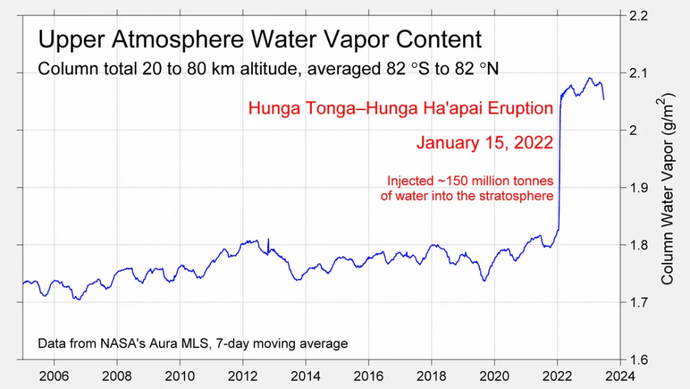
It has now shifted in the last months to an El Nino condition that warms the globe and is thought to contribute to this Spike we have seen. But there are other contributions as well.  One of the most surprising ones is that back in January of 2022 an enormous underwater volcano went off in Tonga and it put up a lot of water vapor into the upper atmosphere. It increased the upper atmosphere of water vapor by about 10 percent, and that’s a warming effect, and it may be that is contributing to why the spike is so high.
A longer view of SSTs
To enlarge, open image in new tab.

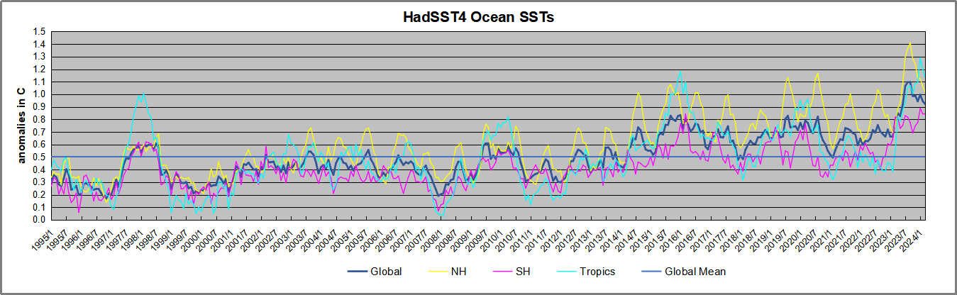
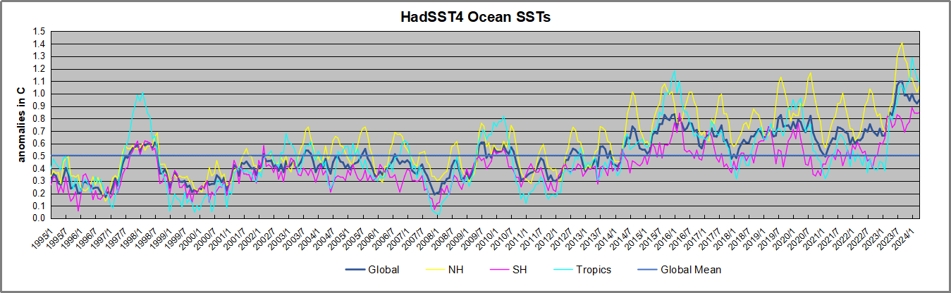
The graph above is noisy, but the density is needed to see the seasonal patterns in the oceanic fluctuations.  Previous posts focused on the rise and fall of the last El Nino starting in 2015.  This post adds a longer view, encompassing the significant 1998 El Nino and since.  The color schemes are retained for Global, Tropics, NH and SH anomalies.  Despite the longer time frame, I have kept the monthly data (rather than yearly averages) because of interesting shifts between January and July. 1995 is a reasonable (ENSO neutral) starting point prior to the first El Nino. 

The sharp Tropical rise peaking in 1998 is dominant in the record, starting Jan. ’97 to pull up SSTs uniformly before returning to the same level Jan. ’99. There were strong cool periods before and after the 1998 El Nino event. Then SSTs in all regions returned to the mean in 2001-2. 

SSTS fluctuate around the mean until 2007, when another, smaller ENSO event occurs. There is cooling 2007-8,  a lower peak warming in 2009-10, following by cooling in 2011-12.  Again SSTs are average 2013-14.

Now a different pattern appears.  The Tropics cooled sharply to Jan 11, then rise steadily for 4 years to Jan 15, at which point the most recent major El Nino takes off.  But this time in contrast to ’97-’99, the Northern Hemisphere produces peaks every summer pulling up the Global average.  In fact, these NH peaks appear every July starting in 2003, growing stronger to produce 3 massive highs in 2014, 15 and 16.  NH July 2017 was only slightly lower, and a fifth NH peak still lower in Sept. 2018.

The highest summer NH peaks came in 2019 and 2020, only this time the Tropics and SH were offsetting rather adding to the warming. (Note: these are high anomalies on top of the highest absolute temps in the NH.)  Since 2014 SH has played a moderating role, offsetting the NH warming pulses. After September 2020 temps dropped off down until February 2021.  In 2021-22 there were again summer NH spikes, but in 2022 moderated first by cooling Tropics and SH SSTs, then in October to January 2023 by deeper cooling in NH and Tropics.  

Then in 2023 the Tropics flipped from below to well above average, while NH produced a summer peak extending into September higher than any previous year.  Despite El Nino driving the Tropics January 2024 anomaly higher than 1998 and 2016 peaks, the last two months cooled in all regions, and the Tropics continued cooling in April, suggesting that the peak likely has been reached.

What to make of all this? The patterns suggest that in addition to El Ninos in the Pacific driving the Tropic SSTs, something else is going on in the NH.  The obvious culprit is the North Atlantic, since I have seen this sort of pulsing before.  After reading some papers by David Dilley, I confirmed his observation of Atlantic pulses into the Arctic every 8 to 10 years.

Contemporary AMO Observations

Through January 2023 I depended on the Kaplan AMO Index (not smoothed, not detrended) for N. Atlantic observations. But it is no longer being updated, and NOAA says they don’t know its future.  So I find that ERSSTv5 AMO dataset has data through October.  It differs from Kaplan, which reported average absolute temps measured in N. Atlantic.  “ERSST5 AMO  follows Trenberth and Shea (2006) proposal to use the NA region EQ-60°N, 0°-80°W and subtract the global rise of SST 60°S-60°N to obtain a measure of the internal variability, arguing that the effect of external forcing on the North Atlantic should be similar to the effect on the other oceans.”  So the values represent sst anomaly differences between the N. Atlantic and the Global ocean.

The chart above confirms what Kaplan also showed.  As August is the hottest month for the N. Atlantic, its varibility, high and low, drives the annual results for this basin.  Note also the peaks in 2010, lows after 2014, and a rise in 2021. Now in 2023 the peak was holding at 1.4C before declining.  An annual chart below is informative:

Note the difference between blue/green years, beige/brown, and purple/red years.  2010, 2021, 2022 all peaked strongly in August or September.  1998 and 2007 were mildly warm.  2016 and 2018 were matching or cooler than the global average.  2023 started out slightly warm, then rose steadily to an  extraordinary peak in July.  August to October were only slightly lower, but by December cooled by ~0.4C.

Now in 2024 the AMO anomaly is higher than any previous year, but is no longer rising the last two months into April.  Where it goes from here remains to be seen.

The pattern suggests the ocean may be demonstrating a stairstep pattern like that we have also seen in HadCRUT4. 
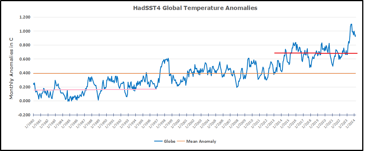
The purple line is the average anomaly 1980-1996 inclusive, value 0.18.  The orange line the average 1980-202404, value 0.39, also for the period 1997-2012. The red line is 2013-202404, value 0.66. As noted above, these rising stages are driven by the combined warming in the Tropics and NH, including both Pacific and Atlantic basins.

See Also:

2024 El Nino Collapsing

Curiosity:  Solar Coincidence?

The news about our current solar cycle 25 is that the solar activity is hitting peak numbers now and higher  than expected 1-2 years in the future.  As livescience put it:  Solar maximum could hit us harder and sooner than we thought. How dangerous will the sun’s chaotic peak be?  Some charts from spaceweatherlive look familar to these sea surface temperature charts.

Summary

The oceans are driving the warming this century.  SSTs took a step up with the 1998 El Nino and have stayed there with help from the North Atlantic, and more recently the Pacific northern “Blob.”  The ocean surfaces are releasing a lot of energy, warming the air, but eventually will have a cooling effect.  The decline after 1937 was rapid by comparison, so one wonders: How long can the oceans keep this up? And is the sun adding forcing to this process?

Space weather impacts the ionosphere in this animation. Credits: NASA/GSFC/CIL/Krystofer Kim

Footnote: Why Rely on HadSST4

HadSST is distinguished from other SST products because HadCRU (Hadley Climatic Research Unit) does not engage in SST interpolation, i.e. infilling estimated anomalies into grid cells lacking sufficient sampling in a given month. From reading the documentation and from queries to Met Office, this is their procedure.

HadSST4 imports data from gridcells containing ocean, excluding land cells. From past records, they have calculated daily and monthly average readings for each grid cell for the period 1961 to 1990. Those temperatures form the baseline from which anomalies are calculated.

In a given month, each gridcell with sufficient sampling is averaged for the month and then the baseline value for that cell and that month is subtracted, resulting in the monthly anomaly for that cell. All cells with monthly anomalies are averaged to produce global, hemispheric and tropical anomalies for the month, based on the cells in those locations. For example, Tropics averages include ocean grid cells lying between latitudes 20N and 20S.

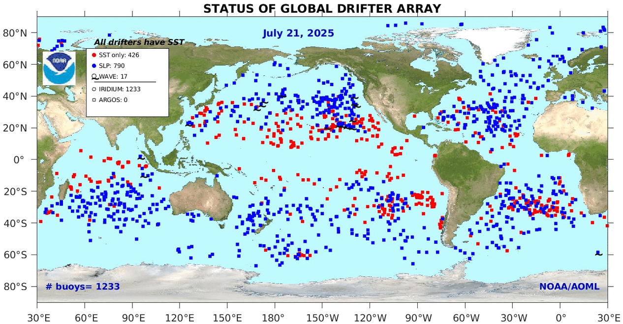
Gridcells lacking sufficient sampling that month are left out of the averaging, and the uncertainty from such missing data is estimated. IMO that is more reasonable than inventing data to infill. And it seems that the Global Drifter Array displayed in the top image is providing more uniform coverage of the oceans than in the past.

uss-pearl-harbor-deploys-global-drifter-buoys-in-pacific-ocean

USS Pearl Harbor deploys Global Drifter Buoys in Pacific Ocean


IPCC Uses Overblown Global Warming Potentials

H. Douglas Lightfoot and Gerald Ratzer published their paper Reliable Physics Demand Revision of the IPCC Global Warming Potentials in Environmental Science April 15, 2024.  Excerpts in italics with my bolds and added images.  H\T Patrick Moore.

Abstract

The Global Warming Potentials (GWP) of the Intergovernmental Panel on Climate Change (IPCC) in Table 2.14 of the Fourth Assessment Report (AR4) show the increase in warming by methane (CH4) and nitrous oxide (N2O) is 21 and 310 times respectively that of CO2. There has been wide acceptance of these values since publishing in 2007. Nevertheless, they are inaccurate.

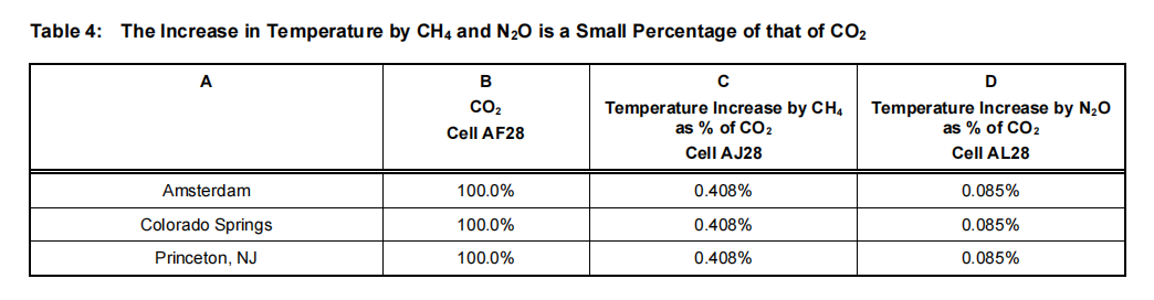
This study uses accurate methods to calculate the impacts of CO2, CH4, and N2O on the warming of the atmosphere. For example, this quantitative analysis from reliable physics shows the contribution of CO2 to warming at Amsterdam is 0.0083°C out of a difference of 26°C. The warming effect of CH4 on the Earth’s atmosphere is 0.408% of that of CO2, and the warming by N2O is 0.085% of that of CO2.

Thus, the warming effects of CO2, CH4, and N2O are too small to measure. The invalidity of the methane and nitrous oxide values indicates the GWPs of the remaining approximately sixty chemicals in the Table 2.14 list are also invalid. A recommendation is that the IPCC consider revising or retracting the GWP values in Table 2.14.

Introduction

The purpose of this paper is to examine the Global Warming Potentials (GWPs) in Table 2.14 of the Fourth Assessment Report [1] of the Intergovernmental Panel on Climate Change (IPCC), Figure 1.The Global Warming Potentials (GWP) of methane and nitrous oxide calculated by the IPCC in Table2.14 have profoundly affected the decisions made by elected officials worldwide.

Nitrogen fertilizers have been restricted or banned in several countries because they emit a small amount of nitrous oxide. Nitrogen fertilizers are essential for the growth of plants, and nitrogen is often the limiting nutrient [2]. Restricting their use affects food production adversely and can cause food shortages. The IPCC claims that nitrous oxide has up to 310 times the warming effect of CO2. This value is so significant that we must determine whether or not this value of 310 is valid.

A similar situation occurs with methane, which is claimed to have 21 times the warming effect of CO2. Natural gas is virtually all methane transported widely by pipelines and pumping stations. The claim is that methane leaks from natural gas pipeline systems and processing are warming the Earth. Periodically, a scientist will quote Table 2.14 and raise the alarm about methane and the possibility of significant methane releases from the Arctic Tundra caused by the warming of the Earth [3].

The methodology of this study answers the question: “Of the temperature difference between two weather stations, how many degrees Celsius do CO2, CH4, and N2O contribute?” Four weather stations—Pond Inlet, Amsterdam, Colorado Springs, and Princeton, NJ—were selected to provide the answers. The temperature and relative humidity are recorded within the same.

Calculations for Table 2 Column D

In Row 5, the grams of CO2 per kilogram (kg) of dry air is (0.00041806 x 44 x (1000/29) = 0.630, where 44 and 29 are the molecular weights of CO2 and air, respectively. In Row 9, the grams of CH4 per kg of dry air are (0.000001927 x 16 x (1000/29)) = 0.001063, where 16 is the molecular weight of methane. Similarly, in Row 12, Column E, the grams of N2O per kg of dry air are (0.00000033675 x 44 x (1000/29) = 0.000511, where 44 is the molecular weight of nitrous oxide.There are 0.630/0.00106 = 594 grams of CO2 per gram of methane. Thus, there are (594 x 44)/16) = 1634 molecules of CO2 per methane molecule. Thus, because the molecular weights of CO2 and N2O are the same at 44, there are (0.630/0.000511) = 1235 molecules of CO2 for each molecule of N2O in the Earth’s atmosphere. Thus, in September 2023, CO2 molecules outnumber CH4 molecules by 1634 and N2O molecules by 1235.

Measuring the Contribution of CO2, CH4 and N2O to Temperature in the Earth’s Atmosphere

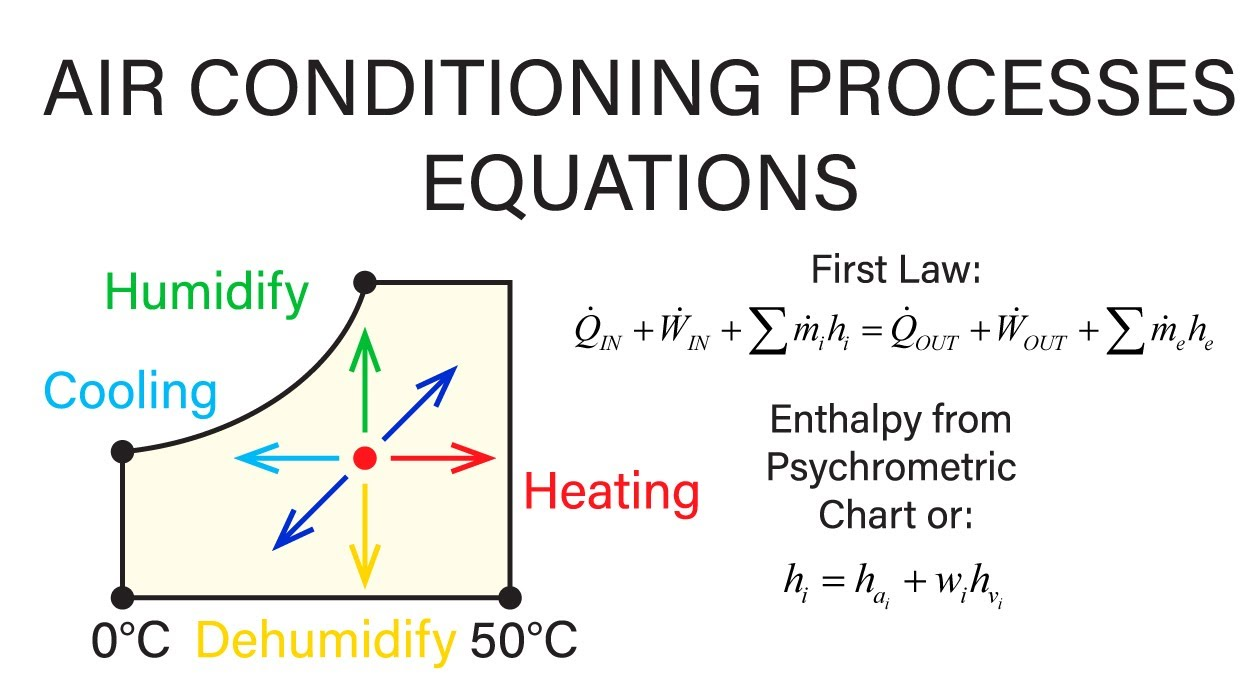
It is essential to understand that the measured and recorded temperature is the sum of all the factors affecting Earth’s temperature. These include warming caused by radiation from the Sun absorbed by CO2, CH4, N2O, feedback, and other warming or cooling effects. These factors also apply to temperature differences. The recorded temperature is input to the Humidair psychrometric program, which includes these factors in the heat content (enthalpy) and specific volume.

The following method quantifies the contribution of carbon dioxide, methane, and nitrous oxide to the difference in temperature between three weather stations and Pond Inlet.Table 3 is a summary of the Excel calculations. The file for the Excel calculations is: “Excel calculations for GWP Mar 102024.xlsx.” From the Excel spreadsheet, Column H, the temperatures measured at Pond Inlet, Amsterdam, Colorado Springs, and Princeton on December 30, 2023, were -18°C, 8°C, 3°C, and 4°C, respectively. We set the recorded level of CO2 at 418.06 at the location with the lowest of the four temperatures, i.e., at Pond Inlet. This is because the number of molecules of CO2 per cubic meter falls as the temperature rises.

The grams of CO2 per kg of dry air in the Pond Inlet row of Table 3 are the same as in Column D of Table 2. The temperature contributions of CO2, CH4, and N2O to the difference in temperature in °C between Pond Inlet and the weather stations in Column A are in Columns G, H, and I. The total is in Column J. The upper lines in the titles of the columns are the locations in the Excel spreadsheet calculations. Note that the average CO2 for Table 2 was 418.06 in August 2023, and the level of CO2 during the recording of the values for the Excel spreadsheet was 422.3 ppm. The difference of 4.24 ppm has no significant effect on the results of this study.

As shown in Table 4, the temperature increase caused by CH4 and N2O is a small percentage of the temperature rise caused by CO2.The warming effect of CO2 is too small to measure [9, 10].Thus, the warming effects of CH4 and N2O are also too small. The data in IPCC Table 2.14, showing that CH4 has 21 times the warming effect of CO2 and that N2O has 310 times the warming effect of CO2, are grossly incorrect.

Summary and Conclusions

This study provides evidence that the IPCC Global Warming Potentials are incorrect. It starts with the levels of carbon dioxide (CO2), methane (CH4), and nitrous oxide (N2O) measured as molecules per million molecules of dry air, which is the molar fraction. Then, quantitative results from reliable physics establish the enthalpy and specific volume at four weather stations. Chemistry determines the grams of each gas per kg of dry air. The increase in the temperature bycurrent levels of methane (CH4) and nitrous (N2O) in the Earth’s atmosphere isa small percentage of that of CO2.Conclusions 6.1, 6.2, and 6.3 answer, “Of the temperature difference between two weather stations, how many degrees Celsius do CO2, CH4, and N2O contribute?”

6.1.In this study, the difference in temperature between Pond Inlet and Amsterdam is 26°C. The contribution of CO2 to this difference is 0.0083°C, but this amount is too small to measure.

6.2.The contribution of CH4 to the 26°C difference between Pond Inlet and Amsterdam is 0.0000338°C.This current level of methane in the atmosphere increases the temperature by 0.408% of that of CO2. It does not have 21 times the warming of CO2 as claimed by the IPCC.

6.3.N2O’s contribution to the 26°C difference between Pond Inlet and Amsterdam is 0.00000705oC. This is 0.085% of that of CO2. It does not have 310 times the warming of CO2, as claimed by the IPCC

6.4.The total contribution of all three gases to the 26°C difference between Pond Inlet and Amsterdam is 0.00833oC. This is a typical result; this difference is too small to measure.

6.5.The warming of the Earth’s atmosphere by CH4 and N2O is 0.408% and 0.085% respectively of that of CO2.

6.6.The warming by CH4 and N2O is so tiny in the Earth’s atmosphere that the IPCC estimates of warming by GWP over several years are irrelevant.

6.7.It is reasonable for the IPCC to consider revising or withdrawing Table 2.14 in the Fourth Assessment Report

Footnote:  

If like me you are new to the term “psychrometrics”, it refers to an engineering method for assessing the thermodynamic properties of moist air.  From Understanding The Psychrometric Chart

The psychrometric chart is a tool commonly used in the field of engineering to understand and analyze the properties of air. This chart provides valuable information about the thermodynamic properties of moist air, which is crucial for various applications such as heating, ventilation, and air conditioning (HVAC) systems. By understanding the psychrometric chart, engineers can make more informed decisions and optimize their designs for enhanced efficiency and comfort.

In addition to temperature, the psychrometric chart also includes other properties such as humidity ratio, enthalpy, and specific volume. The humidity ratio represents the mass of moisture present in the air per unit mass of dry air, while enthalpy is the total heat content of the air including both sensible and latent heat. Specific volume, on the other hand, is the volume occupied by a unit mass of air. Together, these properties provide a comprehensive understanding of the thermodynamic behavior of moist air.

A Geophysicist Explains Geoclimate Change

John Bruyn writes at Quora answering the question: What does carbon dioxide have to do with climate change?  He is a retired geophysicist with a background in exploration geology, geophysics, seismology, and in remote sensing by satellite. Excerpts in italics with my bolds and added images.

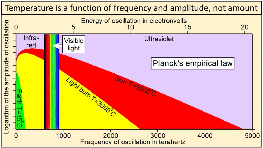
The surface of Mars shows that CO2 is transparent to radiation in the visible part of the electromagnetic spectrum until it becomes reflective as dry ice at temperatures below its -78.5 C (109.3 F) freezing point. A black body radiating at such temperatures does so at wavelengths close to 15 µm (microns), i.e., very low energy at the far end of the far infrared part of the electromagnetic spectrum.

Energy is a function of frequency and should therefore be plotted on the x-axis (top of this figure) and units of watts should not be included on the y-axis. The colored lines show the spectral radiance predicted by Planck’s law for black bodies with different absolute temperatures. The energy of radiation absorbed by carbon dioxide is near 0.08 electron volts while the UV-B energy that reaches Earth when the ozone layer is depleted is near 4 electron volts, 48 times larger.

Such radiation is inconsequential on Earth where the much higher global mean surface temperature of about 15 C (59 F) makes that impossible and irrelevant in that it would violate the 2nd law of thermodynamics. The exception would have to be mid-winter on central Antarctica where the temperatures can get as low as -90 C (-130 F) but where the roughly 0.042% (420 ppm) CO2 concentration leaves the partial pressure too low for dry ice to form. As that minimum temperature shows, any infrared radiation disappears quickly into space at close to the speed of light.

The extra carbon atom makes CO2 more massive than air and
at 0.042% that concentration is critically low for photosynthesis.

Any CO2 we can contribute only serves to improve on that. The reason for that very low concentration is the very much greater abundance of the lighter than air H2O molecules bonding with CO2 inversely proportional to temperature to suspend it temporarily. However, that is restricted to the troposphere with 99% of the Earth’s atmospheric H2O that relies on the bonding with enough CO2 molecules to be able to precipitate and fill water bodies on land and the ocean, currently taking up almost 71% of the global surface. Helping H2O precipitate makes CO2 a cooling agent, including by supporting photosynthesis and ozone formation in the stratosphere.

It follows that the atmospheric CO2 concentration is controlled by the amount of water vapour in the air and that its concentration rises and falls with the variations in insolation and from variations in the speed of the Earth’s rotation. Together they drive the evaporation of H2O from global surface, as well as the CO2 emissions from the ocean in the tropics. Cooling and the declining speed of the Earth’s rotation toward higher latitudes cause evaporation and the ocean’s CO2 emissions to decline with latitude and to reverse that process, as well as making the ocean the world’s primary carbon sink.

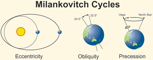
The Milankovic cycles have been concentrating insolation in the tropics with the declining obliquity of the Earth’s spin axis for the last 10 millennia. Perihelion has been adding to that by moving north since the mid-13th century. The declining eccentricity of the Earth’s orbits has been adding to that by increasing the already supersonic speed of the Earth’s rotation and will continue to do so for about another 30,000 years. The increasing the centrifugal force (inertia) has been causing the atmospheric CO2 concentration to increase. However, as sea levels continue to decline at the highest latitudes (see Post-glacial rebound – Wikipedia) and will cause the shallow seas in the tropics to start running dry in about 5 millennia from now, CO2 emissions will start to decline accordingly.

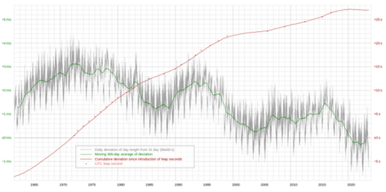
This plot shows the day length (LOD) variations from Wikipedia and how these have been shortening by milliseconds as a result of the increasing speed of the Earth’s rotation from the declining eccentricity of the Earth’s orbits.

The oscillations match the the variations in the sun’s barycentric motions caused by the gravity and orbits of the 4 outermost planets (JSUN) with 99.6% of the planetary mass that control the ~11-year solar cycle, as well as the sun’s ~22-year magnetic cycle due to the vertical motion of Jupiter and Saturn with respect to the plane of the solar equator caused by the inclinations of their orbits with respect to that plane and controlled by the orientation of the gravity of the Milky Way galaxy.

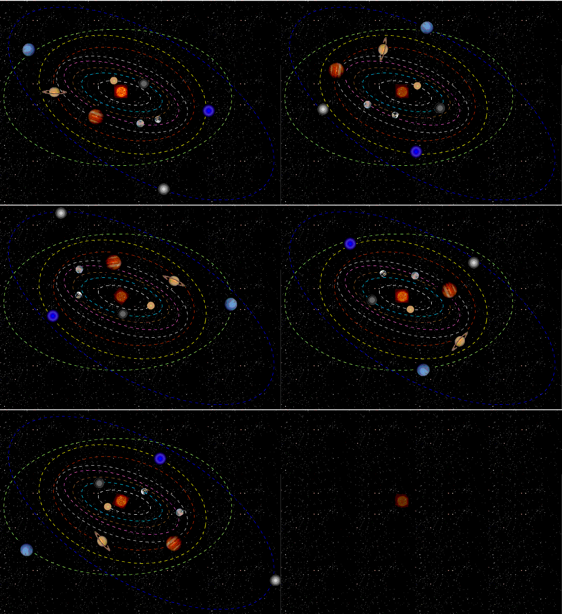
These are the solar orbits around the barycentre of the solar system from 1970–2022 as generated with the Solar Simulator 2 (can be downloaded free of charge, no strings attached). As can be seen from the prior LOD image, the SS2 shows that when the solar motion is small, day lengths increase and when the solar orbits are large, day lengths reduce. This makes it highly probable that the minute changes in the global mean temperatures by fractions of a degree that may be picked up with climate models are from the annual variations in day lengths instead of CO2 increases.

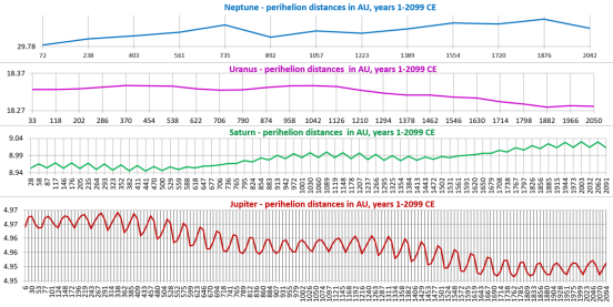
This graph (own work, based on NASA JPL Horizons ephemerides) shows that the changes in the Earth’s climate have been happening as a result of the changing shapes of the JSUN orbits for the last 2 millennia (and before that) and their always changing perihelion distances. They show the real reasons for climate change with a 973-year millennial cycle, as well as the roughly 60-year cycle of the phasing of the orbits and great conjunctions of Jupiter and Saturn according to the 5:2 ratio of their orbital periods of 12 years and 29.5 years respectively.

The ~60-year great conjunction cycle of Jupiter and Saturn has long been recognised by ancient astronomers and in the Chinese calendar. The cycle peaked in 2019 and the vertical motion of all 4 of the outermost planets, Jupiter (318 E-mass), Saturn (95 E-mass), Uranus 14.5 E-mass), and Neptune 17.1 E-mass) to a total of 99.6% of the planetary mass all converged well south of the plane of the solar equator in 2022, pulling the Earth with just 0.22% of the planetary mass a bit further south too and exposing more of the northern hemisphere to the sun. And that’s just one of the anthropogenic global warming (AGW)/climate change tricks, cherry picking the hemispheres and the poles at certain times.

This image (own work) of the vertical motion of the 4 outermost planets (JSUN) with 99.6% of the planetary mass shows that according to the NASA JPL Horizons ephemerides their orbits put all 4 of them well below the plane of the solar equator with the effect of forcing the Earth orbits a bit further south too and exposing the Arctic to more insolation.

At the temperatures of the troposphere are above the freezing point of CO2 it is transparent to electromagnetic radiation., but not when frozen as dry ice in the lower stratosphere with sub-100 C temperatures. In the troposphere, the up to 100 times higher concentration of the lighter than air H2O molecules suspend the CO2 molecules and prevent these from forming a dense high pressure high temperature surface layer as they do on Venus where 1 day takes longer than a year.

It follows that driving the best and the largest evaporative cooling and air-conditioning system on Earth is the centrifugal force (inertia) of the supersonic roughly 1,677 km/h (1,042 mph) equatorial speed of the Earth’s rotation and mountain ranges that spins CO2 out into the upper atmosphere. On the way back down, CO2 loses its energy in the lower stratosphere and freezing when reaching -78.5 C to become reflective as dry ice but that radiation, where and when it happens is too weak to have any effect on a much warmer troposphere where CO2 gets defrosted by bonding with H2O molecules and helping these condense, form clouds, and precipitate as slightly acid rain, pH of 5.6 or less but increasing inversely proportional to latitude. The reason for that upward pH gradient toward the poles is from H2O requiring fewer CO2 molecules to precipitate as temperatures decline and the centrifugal force (inertia) of the Earth’s 24-hour rotation period goes to zero. The Earth’s oblateness also causes gravity to increase to its maximum by bringing the surface at the poles closer to the Earth’s core.

So, the simple proposition is that in the tropics, where the intensity of solar radiation is the greatest, where humidity and cloud cover are the highest, and where the surface temperatures are high, water in the atmosphere does more reflecting while transporting solar energy to higher latitudes to precipitate and where opposite conditions make water in the atmosphere do more reflecting of surface energy as infrared radiation. However, as we well know, water does not reflect all of the surface energy but lets a lot of that through to still leave a substantial cooling effect, as can be noticed from snow and ice accumulation. It means that what shade cloth is to solar radiation in warmer climates, moisture in the air is to surface radiation in colder climates. And, deserts show that where moisture is low, the temperatures plummet overnight.

Simply put, we cannot have any control over Earth’s global mean temperatures without significantly increasing the supply of solar energy or changing the distribution of insolation, to melt some of the snow and ice in the Arctic or on Antarctica and raising sea levels. Doing so artificially would reduce the impacts of the impending ice age to some extent (not to be advised from an evolution point of view) by maintaining higher sea levels and keeping the continental shelves covered by water instead of drying out as they are known to have done during the last few ice ages and on the last occasion permitted our early-ancestors to leave Africa and migrate to other continents.

It follows, that as a ‘greenhouse gas’ CO2 is irrelevant by doing the opposite of what is claimed in support of the climate change hoax and Ponzi scheme, aimed at making us change over to alternatives energy sources to fossil fuels to prevent these from running out during the further cooling of this millennium, as well as making some people a hell of a lot of money. Not the least in that are Elon Musk and the oil, gas, and coal companies that love the higher energy prices from Saudi Arabia cutting back oil production but most tragically also fuelling past and present oil wars including the current wars in Ukraine and Gaza.

And in the Longer Term, Geoclimatic forces will continue to operate:

So Remember This . . .


R.I.P. Rex Murphy, Climatism Whistleblower

Rex Murphy was never taken in by climatists’ claims.  He was an early lucid and frequent detractor of CO2 hysteria and exposed its promoters as charlatans. In remembrance of his passing yesterday, here is his take on the climategate exposure of the scam.  It was broadcast on CBC 14 years ago, when reasonable people could still dissent from the party line.  Transcript from closed captions in italics with my bolds and added images. H/T blackfarms

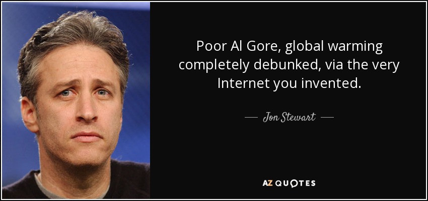
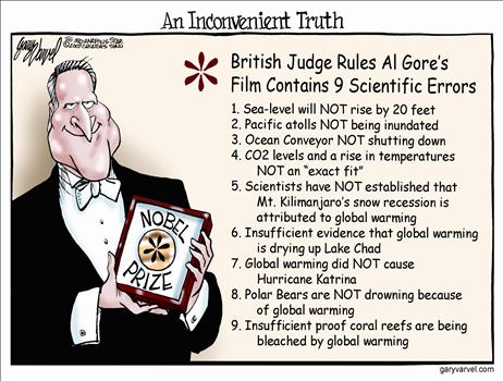
When John Stewart the Bantam rooster of conventional wisdom makes jokes about it, you know climategate has reached critical mass. Said Stewart: Poor Al Gore, Global warming completely debunked via the very internet he invented. Stewart was half joking but climate gate is no joke at all.

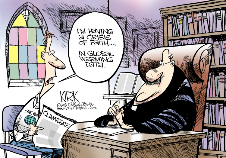
The massive emails from the Climate Research Unit of East Anglia University, let loose by a hacker or a whistleblower, pulls back the curtain on a scene of pettiness, turf protection, manipulation, defiance of Freedom of Information, lost or destroyed data and attempts to blacklist critics and skeptics of the global warming cause.

Now the CRU is not the only climate science advisory body but it is one of the most influential and feeds directly into the UN Panel on Climate Change. So let’s hear no more talk of the “Science is Settled.” 

When it turns out:

  • Some of the principal scientists behave as if they own the very question of global warming;
  • They seek to bar opposing research from peer-reviewed journals, to embargo journals they can’t control;
  • They urge each other to delete damaging emails before Freedom of Information takes hold;
  • They talk of hiding the decline; when they actually speak of destroying the primary data.

And when now we do learn that the primary data has been lost or destroyed, they’ve lost the raw data on which all the models, all the computer generated forecasts, the graphs and projections are based. You wouldn’t accept that at a grade school science fair. Now CRU is not the universe of climate research but it is the star. These emails demonstrate one thing beyond all else that climate science and global warming advocacy have become so entwined, so meshed into a mutant creature, that separating alarmism from investigation, ideology from science, agenda from empirical study, is well nigh impossible.

Climategate is evidence that the science has gone to bed with advocacy and both have had a very good time. The neutrality, openness and absolute disinterest that is the Hallmark of all honest scientific Endeavor has been abandoned to an atmosphere and a dynamic not superior to the partisan caterwalls of a sub-average question period. Climate science has been shown to be in part a sub-branch of climate politics. It is a situation intolerable even to serious minds who are on side with global warming, such as Clive Crook who wrote an Atlantic magazine about this Scandal, as follows:

The stink of intellectual corruption is overpowering. Climate science needs its own reset button and climategate should be seen not primarily as a setback but as an opportunity to cleanse scientific method, to take science away from politics, good causes and alarmists, and vest climate science in bodies of guaranteed neutrality, openness, real and vigorous debate. And away from the lobbyists the NGOs, the advocates, the Gores and professional environmentalists of all kinds.

Too many of the current leadership on global warming are more players than observers, gatekeepers not investigators, angry partisans of some global re-engineering rather than the humble servants of The Facts of the case. Read the emails you’ll never think of climate science quite the same way again.

Footnote from Background Post

9 . Climategate. Climategate was a notorious event initiated by leaked emails in 2009 (with a second batch released in 2011) allegedly revealing the deceit and deception practiced by a prominent group of British (Climatic Research Unit or CRU) and American climate researchers (including Michael Mann of Penn State) who promote the theory of CAGW and supply much of the climate and temperature data and reports to the IPCC. The latter gives this group tremendous influence regarding the UN’s climate change agenda.

“There are three threads in particular in the leaked documents which have sent a shock wave through informed observers across the world. Perhaps the most obvious, as lucidly put together by Willis Eschenbach (see McIntyre’s blog Climate Audit and Anthony Watt’s blog Watts Up With That ), is the highly disturbing series of emails which show how Dr Jones and his colleagues have for years been discussing the devious tactics whereby they could avoid releasing their data to outsiders under freedom of information laws.

“But the question which inevitably arises from this systematic refusal to release their data is – what is it that these scientists seem so anxious to hide? The second and most shocking revelation of the leaked documents is how they show the scientists trying to manipulate data through their tortuous computer programmes, always to point in only the one desired direction – to lower past temperatures and to ‘adjust’ recent temperatures upwards, in order to convey the impression of an accelerated warming. This is what Mr McIntyre caught Dr Hansen doing with his GISS temperature record last year (after which Hansen was forced to revise his record), and two further shocking examples have now come to light from Australia and New Zealand.

“The third shocking revelation of these documents is the ruthless way in which these academics have been determined to silence any expert questioning of the findings they have arrived at by such dubious methods – not just by refusing to disclose their basic data but by discrediting and freezing out any scientific journal which dares to publish their critics’ work. It seems they are prepared to stop at nothing to stifle scientific debate in this way, not least by ensuring that no dissenting research should find its way into the pages of IPCC reports.”

Q&A Why So Many Climate Skeptics

US Poll: Climatism Concern Dropping

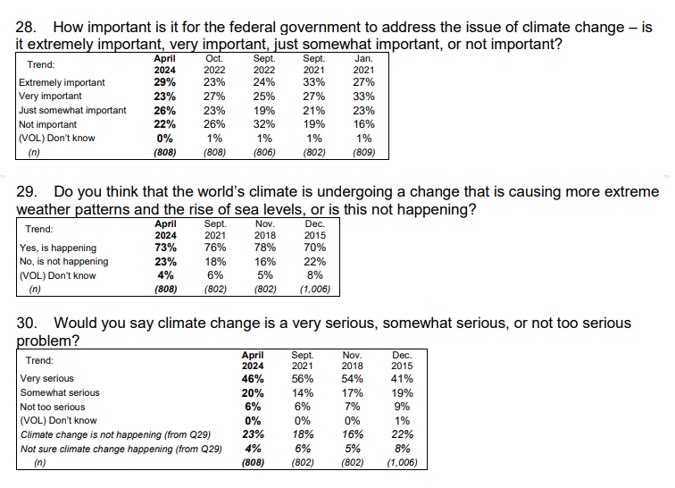
As the Biden administration moves forward with expensive and economically devastating regulations on vehicles, dishwashers, stoves and other major appliances under the guise of fighting “climate change,” Americans are questioning the efficiency, validity and cost of the agenda.

New polling from Monmouth University shows a significant drop in “serious concern” over the issue of “climate change,” particularly among young people.

National Climate Concerns Dip

Younger adults express less urgency than in prior polls

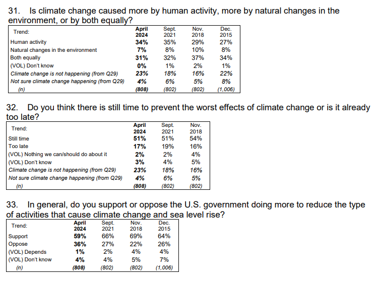
West Long Branch, NJ – Most Americans continue to acknowledge the existence of climate change, according to the latest Monmouth (“Mon-muth”) University Poll, but the number who see this as a very serious problem has fallen below half. Support for government action to reduce activities that impact the climate has dipped below 6 in 10 for the first time since Monmouth began polling this topic nearly a decade ago. The poll finds that the drop in the importance and urgency of climate change has been most pronounced among younger adults.

“Most Americans continue to believe climate change is real. The difference in these latest poll results is a decline in a sense of urgency around this issue,” said Patrick Murray, director of the independent Monmouth University Polling Institute.

METHODOLOGY
The Monmouth University Poll was sponsored and conducted by the Monmouth University Polling Institute from April 18 to 22, 2024 with a probability-based national random sample of 808 adults age 18 and older. Interviews were conducted in English, and included 163 live landline telephone interviews, 349 live cell phone interviews, and 296 online surveys via a cell phone text invitation. Telephone numbers were selected through a mix of random digit dialing and list-based sampling. Landline respondents were selected with a modified Troldahl-Carter youngest adult household screen. Interviewing services were provided by Braun Research, with sample obtained from Dynata (RDD, n=484), Aristotle (list, n=168) and a panel of prior Monmouth poll participants (n=156). Monmouth is responsible for all aspects of the survey design, data weighting and analysis. The full sample is weighted for region, age, education, gender and race based on US Census information (ACS 2021 one-year survey). 

Demographics (weighted)
Party (self-reported): 25% Republican, 44% Independent, 31% Democrat
Sex: 49% male, 50% female, 1% other
Age: 30% 18-34, 32% 35-54, 38% 55+
Race: 61% White, 12% Black, 17% Hispanic, 9% Asian/other
Education: 38% high school or less, 29% some college, 17% 4 year degree, 16% graduate degree

A Monmouth poll released last month found only 15% of voters view climate change as a determinative issue in how they will vote in the 2024 presidential election, ranking far lower than inflation, immigration, and abortion.   Compared to three years ago, climate change concern has declined by 8 percentage points among both Democrats (77% very serious, down from 85% in 2021) and Republicans (13%, from 21%) and by 13 points among independents (43%, from 56%).


My Comment:

The survey seems competent and credible.  It is obvious that global warming/climate change serves as a political wedge issue favored by Democrats and disfavored by Republicans.  Interestingly, with the decline of urgency in all groups, independents have flipped from slight majority favorable to unfavorable.

Note that climate change is undefined except as causing extreme weather and rising sea levels. I also think that the sequence of questions shows a bias for climate change to warrant governmental action.  Putting that question first sets a context for expressing belief and concern over the climate, and then sets up the final question of support or opposition. The question of human vs. natural causation includes a “Both Equally” response, which typically masks unwillingness to say “Don’t Know.”  However, even a 50-50 split between human and natural weakens the case for reducing human activity.  Then the next question about preventing climate change presumes humans are causing it and can stop it. Yet the urgency is diluted by 17% “Too Late”,  51% “Still Time” and 23% “Not Happening.”

In spite of the above attempts to bias, the body politic does not give majority support for government climate action.


See Also:

The Art of Rigging Climate Polls

Britain’s Royal Society Defies the Green Blob

News comes from Financial Times that the prestigious scientific Royal Society is honoring it’s motto:  “Take Nobody’s Word For It” (translation of Latin phrase above.) Of course, a great many UK academics were outraged at the refusal to take for granted their claim that “Climate Science is Settled.” The article by Kenza Bryan is Royal Society and academics clash over influence of oil and gas industry.  Excerpts in italics with my bolds and added images.

Three-centuries-old institution rebuffs call to
declare fossil fuel companies culpable for global warming

A clash between Britain’s 363-year-old Royal Society and more than 2,000 UK academics has escalated over the national academy of scientists’ refusal to attribute the role of oil and gas companies in climate change.

The academics had expressed their concerns about the influence of fossil fuel companies on scientific research in a letter last year to the Royal Society, founded in 1660 as a fellowship that included the likes of Isaac Newton.

But the Royal Society has now rebuffed their request to issue an “unambiguous statement about the culpability of the fossil fuel industry in driving the climate crisis”.

Treasurer Jonathan Keating wrote in reply last week that it would “not be appropriate” to do so, as there was a need for “multiple actors” to engage with the complexity of the climate crisis.

The academics’ concerns about the influence of oil and gas companies extend to separate allegations that ties to BP were not disclosed by a Cambridge professor in a Royal Society policy briefing document produced by a working group that he chaired in 2022.

Professor Andy Woods held the title of head of the BP Institute, a research arm that it funds, which was renamed the Institute for Energy and Environmental Flows by Cambridge last year. He also has the formal title of BP professor, a position endowed by the oil and gas company. These affiliations were not included in the reference in the document.

The Royal Society briefing document called for an “enormous and continued investment” into geological carbon capture and storage, a technology promoted by the fossil fuel industry as a way to keep expanding while storing the emissions.

A CO₂ storage adviser to BP and a director for CO₂ storage at the Norwegian Petroleum Directorate also contributed to the report. Woods’s expertise in geophysical fluid flows and the BP affiliation are listed elsewhere by the Royal Society in its fellowship directory. BP and Woods did not respond to a request for comment. The Royal Society said the document gave “clear affiliations” for contributors and that it publishes a wide range of research.

The tensions reflect the discord in academia about funding or
participation in research by oil and gas companies, as well as
rising activism on campuses among the student body and staff.

The Royal Society’s decision not to call out the industry was described as “moral cowardice” by James Dyke, earth system science professor at Exeter university.

Another signatory to the original letter, Bill McGuire, professor of geophysical and climate hazards at University College London, said it was “mind-boggling” that a respected scientific organisation would not attribute the role of fossil fuel groups in climate change.

Student campaigners at Oxford university have also targeted the author of a set of green principles used by the university to help guide decisions on whether to invest in or receive grants from oil and gas companies.

Under freedom of information provisions, the student campaigners identified Myles Allen, the university’s head of atmospheric, oceanic and planetary physics, as having had 18 meetings where a representative was present from one of the major oil and gas groups, including either BP, Shell, Exxon or Equinor.

Those meetings in 2021 and 2022 included five occasions organised by Shell, three of which focused on the oil and gas group’s strategy and climate scenarios, according to the freedom of information response.

Allen, who was head of the Oxford Net Zero research initiative until earlier this year, told the Financial Times he had used the meetings to highlight the need for fossil fuel companies to pay for carbon capture and storage technologies.

It is a solution to the reduction of future carbon dioxide emissions that he has long advocated. “We all have a duty to help the fossil fuel industry not make the problem worse but to fix it,” he said.

Oxford said its “partnerships and collaborations with industry” allow for research on pressing global issues, including climate-related ones.

The campaigners called on Oxford to conduct an independent assessment about its approach to fossil fuel sector donations and investment. Cambridge university in March temporarily stopped accepting grants and donations from the sector in response to similar concerns.


Newsflash: Science Not Settled on How Water Freezes

Here’s a great short video for those who like to think science is settled on global warming/climate change, as only one example of hubris despite our limited understanding of natural phenomena.  Further on is a discussion of the climate system we see as chaotic, another way of saying its behavior surpasses our understanding.

Readers here will know that I report frequently on the changes in Arctic ice extents during the year. So I was impressed to learn about fundamental mysteries underlying even this ordinary process. We do know a lot about the phase change of liquid water into ice.  And we have a theoretical law that is predictable, but only when water is absolutely pure, i.e. only H2O with no gases or impurities dissolved in the sample.  As the researcher explains, almost all of the water in nature has impurities and thus parts of the process are still beyond our scientific knowledge.

Our Chaotic Climate System

h/t tom0mason for inspiring this post, including his comment below

Foucault’s pendulum in the Panthéon, Paris

The Pendulum is Settled Science

I attended North Phoenix High School (Go Mustangs!) where students took their required physics class from a wild and crazy guy. Decades later alumni who don’t remember his name still reminisce about “the crazy science teacher with the bowling ball.”

To demonstrate the law of conservation of energy, he required each and every student to stand on a ladder in one corner of the classroom. Attached to a hook in the center of the rather high ceiling was a rope with a bowling ball on the other end. The student held the ball to his/her nose and then released it, being careful to hold still afterwards.

The 16 pound ball traveled majestically diagonally across the room and equally impressively returned along the same path. The proof of concept was established when the ball stopped before hitting your nose (though not by much).  In those days we learned to trust science and didn’t need to go out marching to signal some abstract virtue.

The equations for pendulums are centuries old and can predict the position of the ball at any point in time based on the mass of the object, length of the rope and starting position.

Pictured above is the currently operating Foucault pendulum that exactly follows these equations. While it had long been known that the Earth rotates, the introduction of the Foucault pendulum in 1851 was the first simple proof of planetary rotation in an easy-to-see experiment. Today, Foucault pendulums are popular displays in science museums and universities.

What About the Double Pendulum?

Trajectories of a double pendulum

A comment by tom0mason at alerted me to the science demonstrated by the double compound pendulum, that is, a second pendulum attached to the ball of the first one. It consists entirely of two simple objects functioning as pendulums, only now each is influenced by the behavior of the other.

Lo and behold, you observe that a double pendulum in motion produces chaotic behavior. In a remarkable achievement, complex equations have been developed that can and do predict the positions of the two balls over time, so in fact the movements are not truly chaotic, but with considerable effort can be determined. The equations and descriptions are at Wikipedia Double Pendulum

Long exposure of double pendulum exhibiting chaotic motion (tracked with an LED)

But here is the kicker, as described in tomomason’s comment:

If you arrive to observe the double pendulum at an arbitrary time after the motion has started from an unknown condition (unknown height, initial force, etc) you will be very taxed mathematically to predict where in space the pendulum will move to next, on a second to second basis. Indeed it would take considerable time and many iterative calculations (preferably on a super-computer) to be able to perform this feat. And all this on a very basic system of known elementary mechanics.

And What about the Climate?

This is a simple example of chaotic motion and its unpredictability. How predictable is our climate with so many variables and feedbacks, some known some unknown? Consider that this planet’s weather/climate system is chaotic in nature with many thousands (millions?) of loosely coupled variables and dependencies, and many of these variables have very complex feedback features within them.

Hurricane Gladys, photographed from orbit by Apollo 7 in 1968 (Photo: NASA)

Summary

To quote the IPCC:

The climate system is a coupled non-linear chaotic system, and therefore the long-term prediction of future climate states is not possible. Rather the focus must be upon the prediction of the probability distribution of the system’s future possible states by the generation of ensembles of model solutions.

A recent National Review article draws the implications:
The range of predicted future warming is enormous — apocalyptism is unwarranted.

But as the IPCC emphasizes, the range for future projections remains enormous. The central question is “climate sensitivity” — the amount of warming that accompanies a doubling of carbon dioxide in the atmosphere. As of its Fifth Assessment Report in 2013, the IPCC could estimate only that this sensitivity is somewhere between 1.5 and 4.5°C. Nor is science narrowing that range. The 2013 assessment actually widened it on the low end, from a 2.0–4.5°C range in the prior assessment. And remember, for any specific level of warming, forecasts vary widely on the subsequent environmental and economic implications.

For now, though, navigating the climate debate will require translating the phrase “climate denier” to mean “anyone unsympathetic to the most aggressive activists’ claims.” This apparently includes anyone who acknowledges meaningful uncertainty in climate models, adopts a less-than-catastrophic outlook about the consequences of future warming, or opposes any facet of the activist policy agenda. The activists will be identifiable as the small group continuing to shout “Denier!” The “deniers” will be identifiable as everyone else.

Climate System Summation

Esteemed climate scientist Richard Lindzen ends a very fine recent presentation (here) with this description of the climate system:

I haven’t spent much time on the details of the science, but there is one thing that should spark skepticism in any intelligent reader. The system we are looking at consists in two turbulent fluids interacting with each other. They are on a rotating planet that is differentially heated by the sun. A vital constituent of the atmospheric component is water in the liquid, solid and vapor phases, and the changes in phase have vast energetic ramifications. The energy budget of this system involves the absorption and reemission of about 200 watts per square meter. Doubling CO2 involves a 2% perturbation to this budget. So do minor changes in clouds and other features, and such changes are common. In this complex multifactor system, what is the likelihood of the climate (which, itself, consists in many variables and not just globally averaged temperature anomaly) is controlled by this 2% perturbation in a single variable? Believing this is pretty close to believing in magic. Instead, you are told that it is believing in ‘science.’ Such a claim should be a tip-off that something is amiss. After all, science is a mode of inquiry rather than a belief structure.

Flow Diagram for Climate Modeling, Showing Feedback Loops

Ocean Cooling Continues March 2024

The best context for understanding decadal temperature changes comes from the world’s sea surface temperatures (SST), for several reasons:

  • The ocean covers 71% of the globe and drives average temperatures;
  • SSTs have a constant water content, (unlike air temperatures), so give a better reading of heat content variations;
  • Major El Ninos have been the dominant climate feature in recent years.

HadSST is generally regarded as the best of the global SST data sets, and so the temperature story here comes from that source. Previously I used HadSST3 for these reports, but Hadley Centre has made HadSST4 the priority, and v.3 will no longer be updated.  HadSST4 is the same as v.3, except that the older data from ship water intake was re-estimated to be generally lower temperatures than shown in v.3.  The effect is that v.4 has lower average anomalies for the baseline period 1961-1990, thereby showing higher current anomalies than v.3. This analysis concerns more recent time periods and depends on very similar differentials as those from v.3 despite higher absolute anomaly values in v.4.  More on what distinguishes HadSST3 and 4 from other SST products at the end. The user guide for HadSST4 is here.

The Current Context

The chart below shows SST monthly anomalies as reported in HadSST4 starting in 2015 through March 2024.  A global cooling pattern is seen clearly in the Tropics since its peak in 2016, joined by NH and SH cycling downward since 2016.

Note that in 2015-2016 the Tropics and SH peaked in between two summer NH spikes.  That pattern repeated in 2019-2020 with a lesser Tropics peak and SH bump, but with higher NH spikes. By end of 2020, cooler SSTs in all regions took the Global anomaly well below the mean for this period.  

Then in 2022, another strong NH summer spike peaked in August, but this time both the Tropic and SH were countervailing, resulting in only slight Global warming, later receding to the mean.   Oct./Nov. temps dropped  in NH and the Tropics took the Global anomaly below the average for this period. After an uptick in December, temps in January 2023 dropped everywhere, strongest in NH, with the Global anomaly further below the mean since 2015.

Then came El Nino as shown by the upward spike in the Tropics since January, the anomaly nearly tripling from 0.38C to 1.09C.  In September 2023, all regions rose, especially NH up from 0.70C to 1.41C, pulling up the global anomaly to a new high for this period. By December, NH cooled to 1.1C and the Global anomaly down to 0.94C from its peak of 1.10C, despite slight warming in SH and Tropics.

Then in January both Tropics and SH rose, resulting Global Anomaly going higher. Tropics anomaly reached a new peak of 1.29C. and all ocean regions were higher than 01/2016, the previous peak. Now in February and March all regions have cooled bringing the Global anomaly back down 0.18C from its September peak.

Comment:

The climatists have seized on this unusual warming as proof their Zero Carbon agenda is needed, without addressing how impossible it would be for CO2 warming the air to raise ocean temperatures.  It is the ocean that warms the air, not the other way around.  Recently Steven Koonin had this to say about the phonomenon confirmed in the graph above:

El Nino is a phenomenon in the climate system that happens once every four or five years.  Heat builds up in the equatorial Pacific to the west of Indonesia and so on.  Then when enough of it builds up it surges across the Pacific and changes the currents and the winds.  As it surges toward South America it was discovered and named in the 19th century  It is well understood at this point that the phenomenon has nothing to do with CO2.

Now people talk about changes in that phenomena as a result of CO2 but it’s there in the climate system already and when it happens it influences weather all over the world.   We feel it when it gets rainier in Southern California for example.  So for the last 3 years we have been in the opposite of an El Nino, a La Nina, part of the reason people think the West Coast has been in drought.

It has now shifted in the last months to an El Nino condition that warms the globe and is thought to contribute to this Spike we have seen. But there are other contributions as well.  One of the most surprising ones is that back in January of 2022 an enormous underwater volcano went off in Tonga and it put up a lot of water vapor into the upper atmosphere. It increased the upper atmosphere of water vapor by about 10 percent, and that’s a warming effect, and it may be that is contributing to why the spike is so high.

A longer view of SSTs

The graph above is noisy, but the density is needed to see the seasonal patterns in the oceanic fluctuations.  Previous posts focused on the rise and fall of the last El Nino starting in 2015.  This post adds a longer view, encompassing the significant 1998 El Nino and since.  The color schemes are retained for Global, Tropics, NH and SH anomalies.  Despite the longer time frame, I have kept the monthly data (rather than yearly averages) because of interesting shifts between January and July. 1995 is a reasonable (ENSO neutral) starting point prior to the first El Nino. 

The sharp Tropical rise peaking in 1998 is dominant in the record, starting Jan. ’97 to pull up SSTs uniformly before returning to the same level Jan. ’99. There were strong cool periods before and after the 1998 El Nino event. Then SSTs in all regions returned to the mean in 2001-2. 

SSTS fluctuate around the mean until 2007, when another, smaller ENSO event occurs. There is cooling 2007-8,  a lower peak warming in 2009-10, following by cooling in 2011-12.  Again SSTs are average 2013-14.

Now a different pattern appears.  The Tropics cooled sharply to Jan 11, then rise steadily for 4 years to Jan 15, at which point the most recent major El Nino takes off.  But this time in contrast to ’97-’99, the Northern Hemisphere produces peaks every summer pulling up the Global average.  In fact, these NH peaks appear every July starting in 2003, growing stronger to produce 3 massive highs in 2014, 15 and 16.  NH July 2017 was only slightly lower, and a fifth NH peak still lower in Sept. 2018.

The highest summer NH peaks came in 2019 and 2020, only this time the Tropics and SH were offsetting rather adding to the warming. (Note: these are high anomalies on top of the highest absolute temps in the NH.)  Since 2014 SH has played a moderating role, offsetting the NH warming pulses. After September 2020 temps dropped off down until February 2021.  In 2021-22 there were again summer NH spikes, but in 2022 moderated first by cooling Tropics and SH SSTs, then in October to January 2023 by deeper cooling in NH and Tropics.  

Then in 2023 the Tropics flipped from below to well above average, while NH produced a summer peak extending into September higher than any previous year.  Despite El Nino driving the Tropics January 2024 anomaly higher than 1998 and 2016 peaks, the last two months cooled in all regions, especially the Tropics, suggesting that the peak likely has been reached.

What to make of all this? The patterns suggest that in addition to El Ninos in the Pacific driving the Tropic SSTs, something else is going on in the NH.  The obvious culprit is the North Atlantic, since I have seen this sort of pulsing before.  After reading some papers by David Dilley, I confirmed his observation of Atlantic pulses into the Arctic every 8 to 10 years.

Contemporary AMO Observations

Through January 2023 I depended on the Kaplan AMO Index (not smoothed, not detrended) for N. Atlantic observations. But it is no longer being updated, and NOAA says they don’t know its future.  So I find that ERSSTv5 AMO dataset has data through October.  It differs from Kaplan, which reported average absolute temps measured in N. Atlantic.  “ERSST5 AMO  follows Trenberth and Shea (2006) proposal to use the NA region EQ-60°N, 0°-80°W and subtract the global rise of SST 60°S-60°N to obtain a measure of the internal variability, arguing that the effect of external forcing on the North Atlantic should be similar to the effect on the other oceans.”  So the values represent sst anomaly differences between the N. Atlantic and the Global ocean.


The chart above confirms what Kaplan also showed.  As August is the hottest month for the N. Atlantic, its varibility, high and low, drives the annual results for this basin.  Note also the peaks in 2010, lows after 2014, and a rise in 2021. Now in 2023 the peak was holding at 1.4C before declining.  An annual chart below is informative:

Note the difference between blue/green years, beige/brown, and purple/red years.  2010, 2021, 2022 all peaked strongly in August or September.  1998 and 2007 were mildly warm.  2016 and 2018 were matching or cooler than the global average.  2023 started out slightly warm, then rose steadily to an  extraordinary peak in July.  August to October were only slightly lower, but by December cooled by ~0.4C. January 2024 was unchanged from the previous month, but February anomaly rose 0.1C and March a little more to reach 1.2C anomaly.

The pattern suggests the ocean may be demonstrating a stairstep pattern like that we have also seen in HadCRUT4. 

The purple line is the average anomaly 1980-1996 inclusive, value 0.18.  The orange line the average 1980-202306, value 0.38, also for the period 1997-2012. The red line is 2013-202306, value 0.64. As noted above, these rising stages are driven by the combined warming in the Tropics and NH, including both Pacific and Atlantic basins.

See Also:

2024 El Nino Collapsing

Curiosity:  Solar Coincidence?

The news about our current solar cycle 25 is that the solar activity is hitting peak numbers now and higher  than expected 1-2 years in the future.  As livescience put it:  Solar maximum could hit us harder and sooner than we thought. How dangerous will the sun’s chaotic peak be?  Some charts from spaceweatherlive look familar to these sea surface temperature charts.

Summary

The oceans are driving the warming this century.  SSTs took a step up with the 1998 El Nino and have stayed there with help from the North Atlantic, and more recently the Pacific northern “Blob.”  The ocean surfaces are releasing a lot of energy, warming the air, but eventually will have a cooling effect.  The decline after 1937 was rapid by comparison, so one wonders: How long can the oceans keep this up? And is the sun adding forcing to this process?

Space weather impacts the ionosphere in this animation. Credits: NASA/GSFC/CIL/Krystofer Kim

Footnote: Why Rely on HadSST4

HadSST is distinguished from other SST products because HadCRU (Hadley Climatic Research Unit) does not engage in SST interpolation, i.e. infilling estimated anomalies into grid cells lacking sufficient sampling in a given month. From reading the documentation and from queries to Met Office, this is their procedure.

HadSST4 imports data from gridcells containing ocean, excluding land cells. From past records, they have calculated daily and monthly average readings for each grid cell for the period 1961 to 1990. Those temperatures form the baseline from which anomalies are calculated.

In a given month, each gridcell with sufficient sampling is averaged for the month and then the baseline value for that cell and that month is subtracted, resulting in the monthly anomaly for that cell. All cells with monthly anomalies are averaged to produce global, hemispheric and tropical anomalies for the month, based on the cells in those locations. For example, Tropics averages include ocean grid cells lying between latitudes 20N and 20S.

Gridcells lacking sufficient sampling that month are left out of the averaging, and the uncertainty from such missing data is estimated. IMO that is more reasonable than inventing data to infill. And it seems that the Global Drifter Array displayed in the top image is providing more uniform coverage of the oceans than in the past.

uss-pearl-harbor-deploys-global-drifter-buoys-in-pacific-ocean

USS Pearl Harbor deploys Global Drifter Buoys in Pacific Ocean


2024 To Be the Hottest Ever? Hold On!

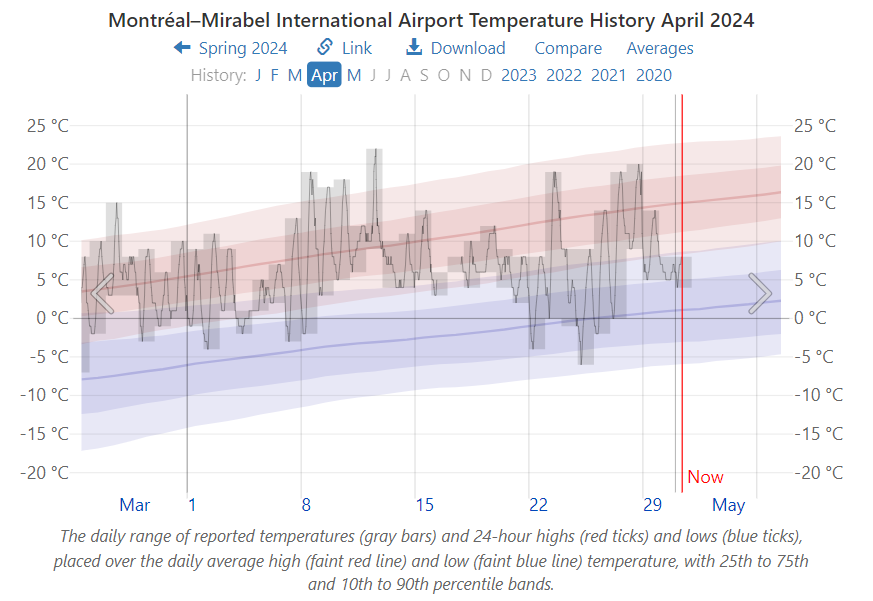
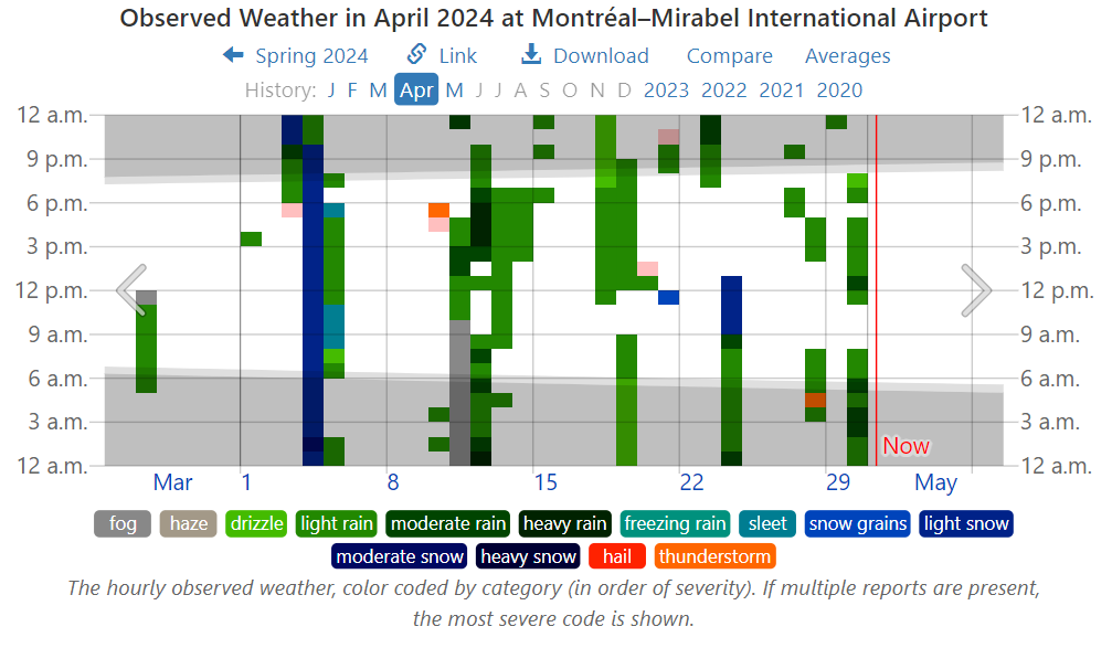
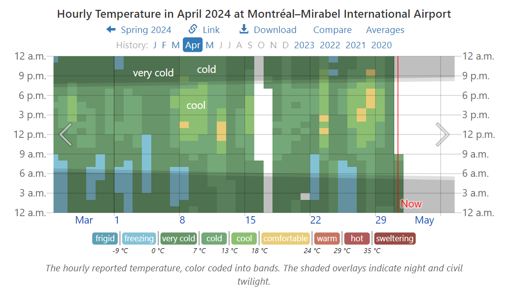
For sure you’ve seen the headlines declaring 2024 likely to be the Hottest year ever.  If you’re like me, your response is: That’s not the way it’s going down where I live.  Fortunately there is a website that allows anyone to check their personal experience with the weather station data nearby.  weatherspark.com provides data summaries for you to judge what’s going on in weather history where you live.  In my case a modern weather station is a few miles away  April 2024 Weather History at Montréal–Mirabel International Airport.  The story about April 2024 is evident below in charts and graphs from this site.  There’s a map that allows you to find your locale.

First, consider above the norms for April from the period 1980 to 2016.

Then, there’s April 2024 compared to the normal observations.

The graph shows April had some warm days, some cool days and overall was pretty normal.  But since climate is more than temperature, consider cloudiness.

Woah!  Most of the month was cloudy, which in spring means blocking the warming sun from hitting the surface.   And with all those clouds, let’s look at precipitation:

So, a major snowstorm April 3-4, 12 days when it rained, including heavy rain, and a couple of thunderstorms.  Given what we know about the hydrology cycles, that means a lot of heat removed upward from the surface.

So the implications for April temperatures in my locale.

There you have it before your eyes. Mostly Cool, Cold and
Very Cold, with freezing on numerous mornings.
Only five days with a few hours of comfortable temperatures.

Summary:

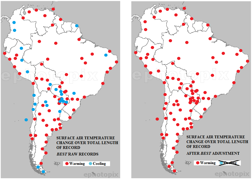
Claims of hottest this or that month or year are based on averages of averages of temperatures, which in principle is an intrinsic quality and distinctive to a locale.  The claim involves selecting some places and time periods where warming appears, while ignoring other places where it has been cooling.

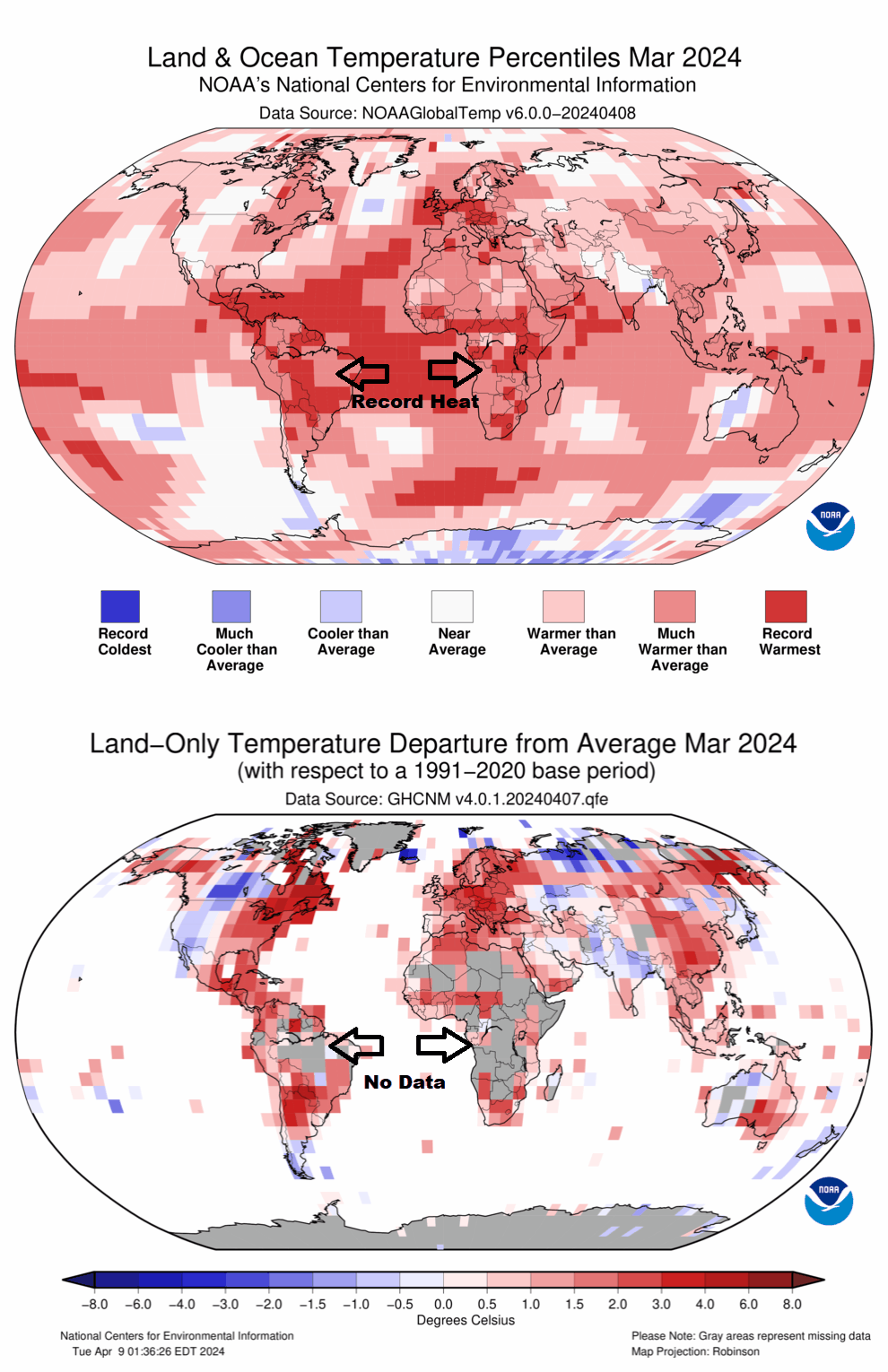
Remember:  They want you to panic.  Before doing so, check out what the data says in your neck of the woods.  For example, NOAA declared that March 2024 was “Earth’s Warmest March on Record.”


The Herd Shuns Climate Lunatics

Charles MacKay: “Men, it has been well said, think in herds; it will be seen that they go mad in herds, while they only recover their senses slowly, and one by one.”

Conrad Black writes at National Post Washing away the climate lunatics.  Excerpts in italics with my bolds and added images.

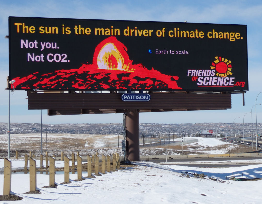
I have written here and elsewhere countless times before of the dangers of responding prematurely to alarmist concerns about climate change. Dr. Benny Peiser of the British Global Warming Policy Foundation spoke to the Friends of Science Society in Calgary earlier this month, warning that Europe’s extremist net zero carbon emission policies may get to Canada even though they are now running into extreme problems in Europe. The North American media has not much reported on the widespread and often violent farmer protests in Europe, which has caused every government that has been put to the test to scale back their aggressive climate change policies.

Tractors stand on a street during a protest by Belgian farmers over price pressures, taxes and green regulation, on the day of an EU agriculture ministers’ meeting in Brussels, Belgium March 26, 2024. REUTERS/Yves Herman/File Photo

For a long time, it was a political free lunch: everybody loves the environment, and the climate change issue was very skillfully transformed by the left into an assault on the capitalist system from a new angle in the name of saving the planet. As long as the heavy costs of displacing fossil fuels by so-called renewable energy were carefully disguised and diffused, everybody could wallow in collective self-praise for doing the healthy and environmentally responsible thing.

The burden of subsidized wind and solar farms didn’t appear on peoples’ energy bills, though eventually they were placed on the back of the taxpayer. Now, however, net zero policies are directly eating into the earnings and savings of the public and in most of Europe, the taxpayer rebellion is exploding, and the advantages of democracy are being reaffirmed as elected governments scamper to the rear, explaining that there has been a misunderstanding. When the German government tried to compel the people of that country to change their gas boilers for heat pumps at a cost of thousands of dollars per home, what critics called “boilergeddon,” it produced a so-called green-lash.

Another political disaster has befallen the western European governments that had rolled over like poodles in front of the climate change alarmists: once they had fully committed themselves to the boondoggle of electric vehicles (EV’s), and forced the powerful automobile industries of Germany, France, and Italy into conversion of gas powered vehicles to EV’s, sales of EV’s plummeted after the customary faddish start, just as much cheaper Chinese EV’s flooded into Europe. Germany and Italy forced the European Union into delaying its ill-considered ban on internal combustion engine vehicles past 2035. Those who jubilantly imagined that Europe would commit industrial suicide by destroying its own automobile industry, will have to revise their plans. There are now thousands of cheap Chinese EV’s parked at the main ports of Europe with no buyers in sight. As Dr. Peiser pointed out in Calgary, “If this was really about climate change, wouldn’t you want the cheapest EV’s, the cheapest wind, and solar, all from China?”


China’s Abandoned EV Graveyard: Thousands Of Cars Rot In Huge Fields

It is now clear in Europe, as it long has been in the private sector of the United States, that with whole industries and millions of jobs at stake, implementation of net zero policies in the West would make China the dominant economic and industrial power of the world. Even our most naïve and insipid global warming crusaders are unenthused by that bone-chilling prospect. Although Germany has finally acted to protect its auto industry, it is not yet doing the same for the public. It is still officially planning to ban weekend driving to meet climate targets. If the federal German government proceeds with such an insane plan, it will sink without a ripple at the next election.

There have even been some murmurings of emulation of this course in Canada; on Sept. 14, 2021, Journal Metro of Quebec proposed pre-emptively moving against a climate crisis by lockdown measures, an emulation of the Covid lockdown then ending, but including rations and limitations on personal travel. This proposal comes from the same sort of thinking that seeks to eliminate meat by a war on bovine flatulence.

Placid and docile toward virtue-posturing though Canadians are,
insane measures like these to mitigate climate change would surely
prove to be the funeral pyre of the coercive climate change terrorists.

For notorious historic reasons, Europe is always vulnerable to the madnesses and outrages of the left. The senior human rights court in Europe ruled three weeks ago in a lawsuit brought by 2000 elderly Swiss women against the Swiss government that it had violated the human rights of the plaintiffs by insufficiently mitigating climate change. Switzerland is a very small country but is responsible for between two and three per cent of global carbon dioxide emissions, while Canada, a huge country with a much larger population, emits only 1.5 per cent of global emissions, compared to 27 percent for China. The European Court of Human Rights crossed the jurisdictional Rubicon by overruling the voters of a democratic country.

The rationale for hurling millions of auto workers into unemployment and
shutting down Europe’s greatest industry in order to profit the Chinese
is a case that even the most ardent climate-zealots will find challenging.

At the same time that the climate fanatics are encountering irresistible political headwinds, the intellectual arguments of the climate skeptics are becoming steadily more unanswerable. A brief filed with the court of appeals in The Hague in November by three eminent, American climate-related academics, Richard Lindzen of MIT, William Happer of Princeton, and Steven Koonin of New York University, the Hoover Institute, and former climate adviser to President Obama, challenged the finding of a lower court and held that scientific analysis, as opposed to an aggregation of “government opinion, consensus, peer review, and cherry-picked or falsified data,” shows that “Fossil fuels and CO2 will not cause dangerous climate change, there will be disastrous consequences for people worldwide if fossil fuels in CO2 emissions are reduced to net zero, including mass starvation.” They assert that the poor, future generations, and the entire West will suffer profoundly from any such policy. which “will undermine human rights and cripple the realization of the first three UN sustainable development goals-no poverty, zero hunger, and good health and well-being.”

The three experts warn against equating “the state of climate science with the reports of the Intergovernmental Panel on Climate Change,” which “have no value as science, because the IPCC is government-controlled and represents only government opinions, not science.” It also denounced the lower court verdict that “dangerous climate change and extreme weather are caused by CO2 emissions from fossil fuels… We demonstrate that these conclusions are contradicted by the scientific method, and only supported by the unscientific methods mentioned. Hundreds of research papers confirm the highly beneficial effects of the increased concentration of atmospheric CO2, especially in dry farming areas.”

They go on to represent the CO2 as essential to food, and thus to life on earth, and that the more there is of CO2, the more food there will be, especially in drought-stricken areas. They also make the case that greenhouse gases prevent us from freezing to death, that there are “enormous social benefits to fossil fuels and that net zero will expand human starvation by eliminating nitrogen fertilizer.”

This highly recondite and meticulously documented paper states that “600 million years of carbon dioxide in temperature data contradict the theory of catastrophic global warming being caused by high levels of CO2, and that the atmospheric CO2 is now heavily saturated, which means that more will have little warming effect.” Up until recently, the zealots pretended that such opinions are held only by the uninformed, or the paid lobbyists of the oil industry, but they are not going to be able to get away with this much longer The ranks of the critics are swelling every week with aggrieved members of the voting public distressed by completely unnecessary skyrocketing costs generated by the fear-mongering climate zealots.

With any luck, the tide of logical evidence will wash away the
climate lunatics of this country before the damage becomes irreparable.

Addendum:  Contents of Brief Filed at the Hague

Shell v. Milieudefensie et al. – Expert Opinion

I. THERE WILL BE DISASTROUS CONSEQUENCES FOR THE POOR, PEOPLE
WORLDWIDE, FUTURE GENERATIONS AND THE WEST IF FOSSIL FUELS AND
CO2 EMISSIONS ARE REDUCED TO “NET ZERO”

A. CO2 is Essential to Our Food, and Thus to Life on Earth
B. More CO2, Including CO2 from Fossil Fuels, Produces More Food.
C. More CO2 Increases Food in Drought-Stricken Areas.
D. Greenhouse Gases Prevent Us from Freezing to Death
E. Enormous Social Benefits of Fossil Fuels
F. “Net Zeroing” Fossil Fuels Will Cause Massive Human Starvation by
Eliminating Nitrogen Fertilizer

II. THE IPCC IS GOVERNMENT CONTROLLED AND THUS ONLY ISSUES
GOVERNMENT OPINIONS, NOT SCIENCE, THUS PROVIDES NO SCIENTIFIC
BASIS FOR THE COURT’S OPINION

III. SCIENCE DEMONSTRATES FOSSIL FUELS AND CO2 WILL NOT CAUSE
DANGEROUS CLIMATE CHANGE AND EXTREME WEATHER

A. Reliable Science is Based on Validating Theoretical Predictions With Observations,
Not Consensus, Peer Review, Government Opinion or Cherry-Picked or Falsified
Data
B. The Models Predicting Catastrophic Warming and Extreme Weather Fail the Key
Scientific Test: They Do Not Work, and Would Never Be Used in Science.
C. 600 Million Years of CO2 and Temperature Data Contradict the Theory That High
Levels of CO2 Will Cause Catastrophic Global Warming.
D. Atmospheric CO2 Is Now “Heavily Saturated,” Which in Physics Means More CO2
Will Have Little Warming Effect.
E. The Theory Extreme Weather is Caused by Fossil Fuels and CO2 is Contradicted by
the Scientific Method and Thus is Scientifically Invalid