Little Ice Age Warming Recovery May be Over 2023
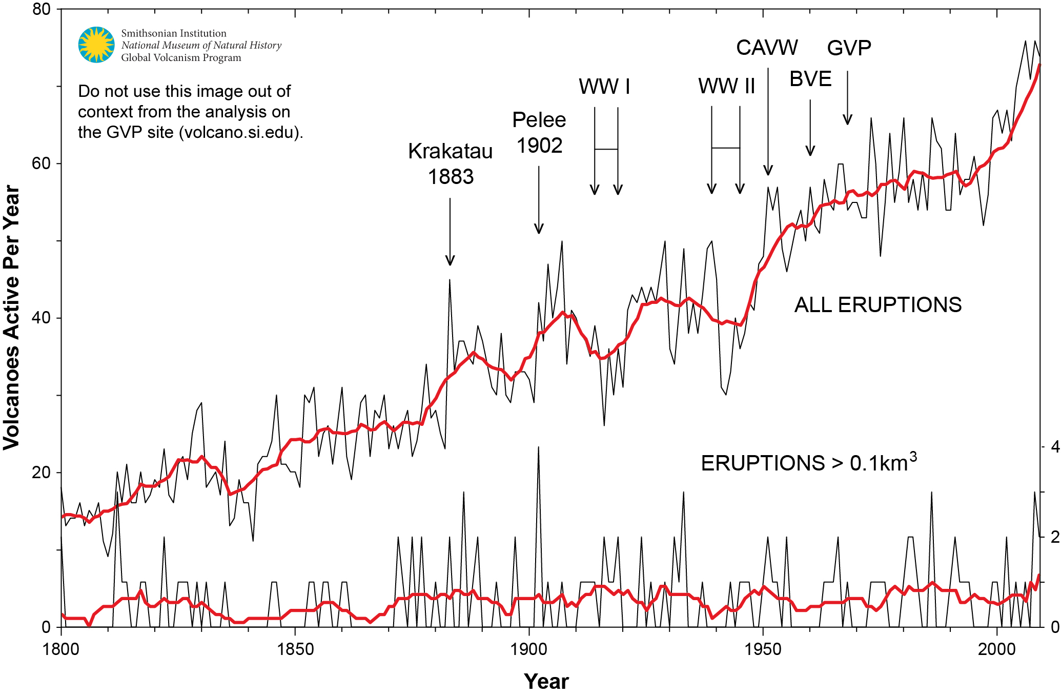
Figure 1. Graph showing the number of volcanoes reported to have been active each year since 1800 CE. Total number of volcanoes with reported eruptions per year (thin upper black line) and 10-year running mean of same data (thick upper red line). Lower lines show only the annual number of volcanoes producing large eruptions (>= 0.1 km3 of tephra or magma) and scale is enlarged on the right axis; thick red lower line again shows 10-year running mean. Global Volcanism Project Discussion

Update April 28, 2023

I am prompted by a discussion at WUWT regarding the role of SO2 in causing climate variabiity.  There are some voices claiming that reduced SO2 from smaller vocanic activity in the Middle Ages caused warming, leading to droughts, crop failures, etc.  And that we could be causing global warming by removing SO2 from the air in modern times.  As the research cited below explains, there is a likely role for volcanic SO2 to cause global cooling, which resulted in the crop failures and the “dark ages”.

Little Ice Age Warming Recovery May be Over

Recently I published an analysis showing how warming over the last four decades has driven a steady rise in atmospheric CO2 concentrations.  See Temps Cause CO2 Changes, Not the Reverse. 2022 Update

In discussion with Kip Hansen, it occurred to me that the process and equation could be explained by the steady recovery from the LIA (Little Ice Age).  That reminded me of this relevant discussion about the causes of the LIA, what ended it, and why the warming recovery from it may now be over.

Volcanoes and the Little Ice Age

University of Bern confirms in a recent announcement that volcanoes triggered the depths of the LIA (Little Ice Age).  Their article is Volcanoes shaped the climate before humankind. H/T GWPF.  However, they spin the story in support of climate alarm (emergency, whatever), rather than making the more obvious point that recent warming was  recovering to roughly Medieval Warming levels after the abnormal cooling disruption from volcanoes. Excerpt in italics with my bolds.

“The new Bern study not only explains the global early 19th century climate, but it is also relevant for the present. “Given the large climatic changes seen in the early 19th century, it is difficult to define a pre-industrial climate,” explains lead author Stefan Brönnimann, “a notion to which all our climate targets refer.” And this has consequences for the climate targets set by policymakers, who want to limit global temperature increases to between 1.5 and 2 degrees Celsius at the most. Depending on the reference period, the climate has already warmed up much more significantly than assumed in climate discussions. The reason: Today’s climate is usually compared with a 1850-1900 reference period to quantify current warming. Seen in this light, the average global temperature has increased by 1 degree. “1850 to 1900 is certainly a good choice but compared to the first half of the 19th century, when it was significantly cooler due to frequent volcanic eruptions, the temperature increase is already around 1.2 degrees,” Stefan Brönnimann points out.”

Bern seems preoccupied with targets and accounting, while others are concerned to understand the role of volcanoes in natural climate change.  A previous post gives a more detailed explanation, thanks to a suggestion I received.

The LIA Warming Rebound Is Over

Thanks to Dr. Francis Manns for drawing my attention to the role of Volcanoes as a climate factor, particularly related to the onset of the Little Ice Age (LIA), 1400 to 1900 AD. I was aware that the temperature record since about 1850 can be explained by a steady rise of 0.5C per century rebound overlaid with a quasi-60 year cycle, most likely oceanic driven. See below Dr. Syun Akasofu 2009 diagram from his paper Two Natural Components of Recent Warming.
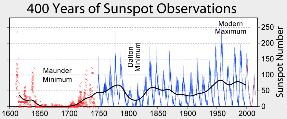
When I presented this diagram to my warmist friends, they would respond, “But you don’t know what caused the LIA or what ended it!” To which I would say, “True, but we know it wasn’t due to burning fossil fuels.” Now I find there is a body of evidence suggesting what caused the LIA and why the temperature rebound may be over. Part of it is a familiar observation that the LIA coincided with a period when the sun was lacking sunspots, the Maunder Minimum, and later the Dalton.
Not to be overlooked is the climatic role of volcano activity inducing deep cooling patterns such as the LIA.  Jihong Cole-Dai explains in a paper published 2010 entitled Volcanoes and climate. Excerpt in italics with my bolds.

There has been strong interest in the role of volcanism during the climatic episodes of Medieval Warm Period (MWP,800–1200 AD) and Little Ice Age (LIA, 1400–1900AD), when direct human influence on the climate was negligible. Several studies attempted to determine the influence of solar forcing and volcanic forcing and came to different conclusions: Crowley and colleagues suggested that increased frequency of stratospheric eruptions in the seventeenth century and again in the early nineteenth century was responsible in large part for LIA. Shindell et al. concluded that LIA is the result of reduced solar irradiance, as seen in the Maunder Minimum of sunspots, during the time period. Ice core records show that the number of large volcanic eruptions between 800 and 1100 AD is possibly small (Figure 1), when compared with the eruption frequency during LIA. Several researchers have proposed that more frequent large eruptions during the thirteenth century(Figure 1) contributed to the climatic transition from MWP to LIA, perhaps as a part of the global shift from a warmer to a colder climate regime. This suggests that the volcanic impact may be particularly significant during periods of climatic transitions.
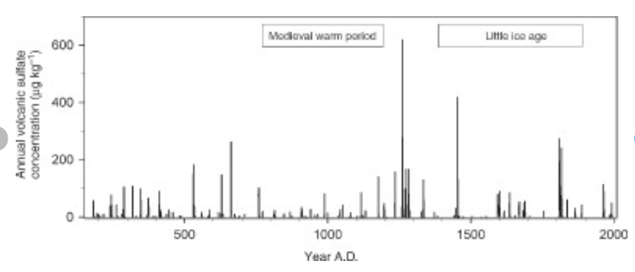
Weighted annual average concentration of volcanic sulfate for the period of 176–2005 AD in a South Pole, Antarctica ice core (Cole-Dai, manuscript in preparation).

How volcanoes impact on the atmosphere and climate

Alan Robock explains Climatic Impacts of Volcanic Eruptions in Chapter 53 of the Encyclopedia of Volcanoes.  Excerpts in italics with my bolds.

The major component of volcanic eruptions is the matter that emerges as solid, lithic material or solidifies into large particles, which are referred to as ash or tephra. These particles fall out of the atmosphere very rapidly, on timescales of minutes to a few days, and thus have no climatic impacts but are of great interest to volcanologists, as seen in the rest of this encyclopedia. When an eruption column still laden with these hot particles descends down the slopes of a volcano, this pyroclastic flow can be deadly to those unlucky enough to be at the base of the volcano. The destruction of Pompeii and Herculaneum after the AD 79 Vesuvius eruption is the most famous example.

Volcanic eruptions typically also emit gases, with H2O, N2, and CO2 being the most abundant. Over the lifetime of the Earth, these gases have been the main source of the Earth’s atmosphere and ocean after the primitive atmosphere of hydrogen and helium was lost to space. The water has condensed into the oceans, the CO2 has been changed by plants into O2 or formed carbonates, which sink to the ocean bottom, and some of the C has turned into fossil fuels. Of course, we eat plants and animals, which eat the plants, we drink the water, and we breathe the oxygen, so each of us is made of volcanic emissions. The atmosphere is now mainly composed of N2 (78%) and O2 (21%), both of which had sources in volcanic emissions.

Of these abundant gases, both H2O and CO2 are important greenhouse gases, but their atmospheric concentrations are so large (even for CO2 at only 400 ppm in 2013) that individual eruptions have a negligible effect on their concentrations and do not directly impact the greenhouse effect. Global annually averaged emissions of CO2 from volcanic eruptions since 1750 have been at least 100 times smaller than those from human activities. Rather the most important climatic effect of explosive volcanic eruptions is through their emission of sulfur species to the stratosphere, mainly in the form of SO2, but possibly sometimes as H2S. These sulfur species react with H2O to form H2SO4 on a timescale of weeks, and the resulting sulfate aerosols produce the dominant radiative effect from volcanic eruptions.
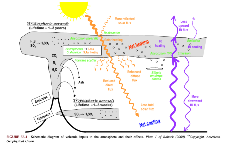
The major effect of a volcanic eruption on the climate system is the effect of the stratospheric cloud on solar radiation (Figure 53.1). Some of the radiation is scattered back to space, increasing the planetary albedo and cooling the Earth’s atmosphere system. The sulfate aerosol particles (typical effective radius of 0.5 mm, about the same size as the wavelength of visible light) also forward scatter much of the solar radiation, reducing the direct solar beam but increasing the brightness of the sky. After the 1991 Pinatubo eruption, the sky around the sun appeared more white than blue because of this. After the El Chicho´n eruption of 1982 and the Pinatubo eruption of 1991, the direct radiation was significantly reduced, but the diffuse radiation was enhanced by almost as much. Nevertheless, the volcanic aerosol clouds reduced the total radiation received at the surface.

Crowley et al 2008 go into the details in their paper Volcanism and the Little Ice Age. Excerpts in italics with my bolds.

Although solar variability has often been considered the primary agent for LIA cooling, the most comprehensive test of this explanation (Hegerl et al., 2003) points instead to volcanism being substantially more important, explaining as much as 40% of the decadal-scale variance during the LIA. Yet, one problem that has continually plagued climate researchers is that the paleo-volcanic record, reconstructed from Antarctic and Greenland ice cores, cannot be well calibrated against the instrumental record. This is because the primary instrumental volcano reconstruction used by the climate community is that of Sato et al. (1993), which is relatively poorly constrained by observations prior to 1960 (especially in the southern hemisphere).

Here, we report on a new study that has successfully calibrated the Antarctic sulfate record of volcanism from the 1991 eruptions of Pinatubo (Philippines) and Hudson (Chile) against satellite aerosol optical depth (AOD) data (AOD is a measure of stratospheric transparency to incoming solar radiation). A total of 22 cores yield an area-weighted sulfate accumulation rate of 10.5 kg/km2 , which translates into a conversion rate for AOD of 0.011 AOD/ kg/km2 sulfate. We validated our time series by comparing a canonical growth and decay curve for eruptions for Krakatau (1883), the 1902 Caribbean eruptions (primarily Santa Maria), and the 1912 eruption of Novarupta/Katmai (Alaska)

We therefore applied the methodology to part of the LIA record that had some of the largest temperature changes over the last millennium.
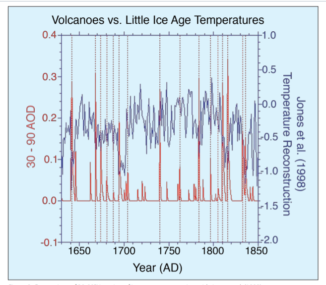
Figure 2: Comparison of 30-90°N version of ice core reconstruction with Jones et al. (1998) temperature reconstruction over the interval 1630-1850. Vertical dashed lines denote levels of coincidence between eruptions and reconstructed cooling. AOD = Aerosol Optical Depth.

The ice core chronology of volcanoes is completely independent of the (primarily) tree ring based temperature reconstruction. The volcano reconstruction is deemed accurate to within 0 ± 1 years over this interval. There is a striking agreement between 16 eruptions and cooling events over the interval 1630-1850. Of particular note is the very large cooling in 1641-1642, due to the concatenation of sulfate plumes from two eruptions (one in Japan and one in the Philippines), and a string of eruptions starting in 1667 and culminating in a large tropical eruption in 1694 (tentatively attributed to Long Island, off New Guinea). This large tropical eruption (inferred from ice core sulfate peaks in both hemispheres) occurred almost exactly at the beginning of the coldest phase of the LIA in Europe and represents a strong argument against the implicit link of Late Maunder Minimum (1640-1710) cooling to solar irradiance changes.

Figure 1: Comparison of new ice core reconstruction with various instrumental-based reconstructions of stratospheric aerosol forcing. The asterisks refer to some modification to the instrumental data; for Sato et al. (1993) and the Lunar AOD, the asterisk refers to the background AOD being removed for the last 40 years. For Stothers (1996), it refers to the fact that instrumental observations for Krakatau (1883) and the 1902 Caribbean eruptions were only for the northern hemisphere. To obtain a global AOD for these estimates we used Stothers (1996) data for the northern hemisphere and our data for the southern hemisphere. The reconstruction for Agung eruption (1963) employed Stothers (1996) results from 90°N-30°S and the Antarctic ice core data for 30-90°S.

During the 18th century lull in eruptions, temperatures recovered somewhat but then cooled early in the 19th century. The sequence begins with a newly postulated unknown tropical eruption in midlate 1804, which deposited sulfate in both Greenland and Antarctica. Then, there are four well-documented eruptions—an unknown tropical eruption in 1809, Tambora (1815) and a second doublet tentatively attributed in part to Babuyan (Philippines) in 1831 and Cosiguina (Nicaragua) in 1835. These closely spaced eruptions are not only large but have a temporally extended effect on climate, due to the fact that they reoccur within the 10-year recovery timescale of the ocean mixed layer.

The ocean has not recovered from the first eruption so the second eruption drives the temperatures to an even lower state.

Implications for Contemporary Climate Science

In this context Dr. Francis Manns went looking for a volcanic signature in recent temperature records. His paper is Volcano and Enso Punctuation of North American Temperature: Regression Toward the Mean  Excerpts in italics with my bolds.

Abstract: Contrary to popular media and urban mythology the global warming we have experienced since the Little Ice Age is likely finished. A review of 10 temperature time series from US cities ranging from the hottest in Death Valley, CA, to possible the most isolated and remote at Key West, FL, show rebound from the Little Ice Age (which ended in the Alps by 1840) by 1870. The United States reached temperatures like modern temperatures (1950 – 2000) by about 1870, then declined precipitously principally caused by Krakatoa, and a series of other violent eruptions. Nine of these time series started when instrumental measurement was in its infancy and the world was cooled by volcanic dust and sulphate spewed into the atmosphere and distributed by the jet streams. These ten cities represent a sample of the millions of temperature measurements used in climate models. The average annual temperatures are useful because they account for seasonal fluctuations. In addition, time series from these cities are punctuated by El Nino Southern Oscillation (ENSO).

As should be expected, temperature at each city reacted differently to differing events. Several cities measured the effects of Krakatoa in 1883 while only Death Valley, CA and Berkeley CA sensed the minor new volcano Paricutin in Michoacán, Mexico. The Key West time series shows rapid rebound from the Little Ice Age as do Albany, NY, Harrisburg, PA, and Chicago. IL long before the petroleum-industrial revolution got into full swing. Recording at most sites started during a volcanic induced temperature minimum thus giving an impression of global warming to which industrial carbon dioxide is persuasively held responsible. Carbon dioxide, however, cannot be proven responsible for these temperatures. These and likely subsequent temperatures could be the result of regression to the normal equilibrium temperatures of the earth (for now). If one were to remove the volcanic punctuation and El Nino Southern Oscillation (ENSO) input many would display very little alarming warming from 1815 to 2000. This review illustrates the weakness of linear regression as a measure of change. If there is a systemic reason for the global warming hypothesis, it is an anthropogenic error in both origin and termination. ENSO compliments and confirms the validity of NOAA temperature data. Temperatures since 2000 during the current hiatus are not available because NOAA has closed the public website.
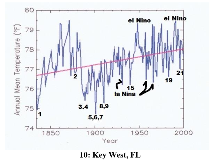
Example of time series from Manns. Numbers refer to major named volcano eruptions listed in his paper.  For instance, #3 was Krakatoa

The cooling effect is said to have lasted for 5 years after Krakatoa erupted – from 1883 to 1888. Examination of these charts, However, shows that, e.g., Krakatoa did not add to the cooling effect from earlier eruptions of Cosaguina in 1835 and Askja in 1875. The temperature charts all show rapid rebound to equilibrium temperature for the region affected in a year or two at most.

Manns Map

Fourteen major volcanic eruptions, however, were recorded between 1883 and 1918 (Robock, 2000, and this essay). Some erupted for days or weeks and some were cataclysmic and shorter. The sum of all these eruptions from Krakatoa onward effected temperatures early in the instrumental age. Judging from wasting glaciers in the Alps, abrupt retreat began about 1860).

Manns Conclusions:
1) Four of these time series (Albany, Harrisburg, Chicago and Key West) show recovery to the range of today’s temperatures by 1870 before the eruption of Askja in 1875. The temperature rebounded very quickly after the Little Ice Age in the northern hemisphere.
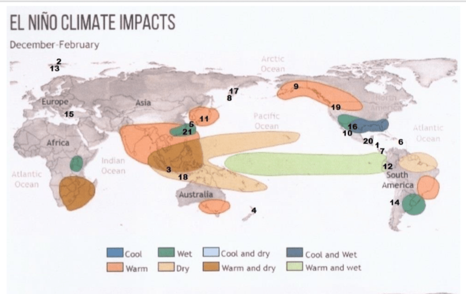
Manns ENSO Map

2) Volcanic eruptions and unrelated huge swings shown from ENSO largely rule global temperature. Volcanic history and the El Nino Southern Oscillation (ENSO) trump all other increments of temperature that may be hidden in the lists.

3) The sum of the eruptions from Krakatoa (1883) to Katla (1918) and Cerro Azul (1932) was a cold start for climate models.

4) It is beyond doubt that academic and bureau climate models use data that was gathered when volcanic activity had depressed global temperature. The cluster from Krakatoa to Katla (1883 -1918) were global.

5) Modern events, Mount Saint Helens and Pinatubo, moreover, were a fraction of the event intensity of the late 19th and early 20th centuries eruptions.

6) The demise of frequent violent volcanos has allowed the planet to regress toward a norm (for now).

The forecast above did not mention the January 15, 2022 major eruption of  Hunga Ha’apai volcano in Tonga.

Summary

These findings describe a natural process by which a series of volcanoes along with a period of quiet solar cycles ended the Medieval Warm Period (MWP), chilling the land and inducing deep oceanic cooling resulting in the Little Ice Age. With much less violent volcanic activity in the 20th century, coincidental with typically active solar cycles, a Modern Warm Period ensued with temperatures rebounding back to approximately the same as before the LIA.

This suggests that humans and the biosphere were enhanced by a warming process that has ended. The solar cycles are again going quiet and are forecast to continue that way. Presently, volcanic activity has been routine, showing no increase over the last 100 years. No one knows how long will last the current warm period, a benefit to us from the ocean recovering after the LIA. But future periods are as likely to be cooler than to be warmer compared to the present.

Climate Sense and Nonsense (Lindzen 2023-04-20)

Introduction: 

BizNews interviewed veteran climate expert Dr Richard Lindzen, the pioneering atmospheric physicist and former emeritus professor of meteorology at MIT. He recounted events that occurred in the 1980s, which gave birth to the all-consuming climate change narrative that prevails today. Having begun his research on climate change in the mid-70s, motivated by a sincere interest in understanding the Earth’s climate regimes, Lindzen offers a remarkably sensible assessment of the various elements parading as scientific evidence of an impending climate catastrophe. Particularly revealing from his recollection of events is how complicit the media and politicians have been in forcing the disastrous climate change narrative upon an unsuspecting and trusting public from the very beginning.

This recent interview by Richard Lindzen provides a brief and compelling overview sorting out facts and fictions regarding global warming/climate change.  For those who prefer reading, below is a lightly edited transcript from the closed captions in italics with my bolds and added images.  BN is Biz News and RL is Richard Lindzen.

BN: Joining me is one of the world’s leading voices on climate change, atmospheric physicist Dr Richard Lindzen. Dr lindsden I really appreciate your time; you’ve been an expert on climate change for over four decades now having started your research in the mid 70s. Briefly walk me through your career and what it was about climate change that captured your attention.

RL: It’s a peculiar question. I mean, do you think things only become interesting once they’re political? With the general circulation of the atmosphere, you want to know why you have the current climate. You have dozens of regimes throughout the Earth, so when you speak about the climate of the earth what the hell are you talking about?

South Africa is a very different climate from New England. The Pacific has many climate regimes, and you have the monsoon regimes in India. So there are a lot of things to understand. And it had nothing to do with the environmentalism; it was to understand how nature is on carbon dioxide and the greenhouse effect.

BN: You’ve claimed that believing that increased carbon dioxide is the largest driver of climate change is akin to believing in magic. What evidence supports this argument and what are the actual effects of increased carbon dioxide in the atmosphere?

RL: Well, you’re asking a complex question. Carbon dioxide is a relatively minor greenhouse gas. But the question arises when you speak about what controls climate, and you’re speaking about dozens of different climate regimes.

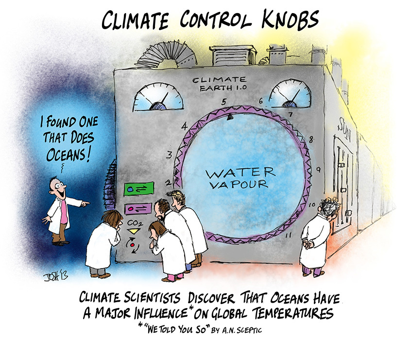
Saying there is one knob that controls the whole works makes no sense,
and that is belief in magic.

But you know greenhouse effect is useful for one climatic index namely: Why is the Earth different from Venus or Mars or Mercury? Those are huge differences. They depend on basically the mean radiative picture; which includes the greenhouse, the distance from the Sun, the amount of radiation you get and so on. So within a given planet, in particular the Earth our primary concern, we refer to the differences in climate that like the Ice Ages and the very warm period 50 million years ago. These are really pretty tiny compared to the differences between the planets. And those “tiny” differences that we obsess on for good reason are not due to the greenhouse effect.

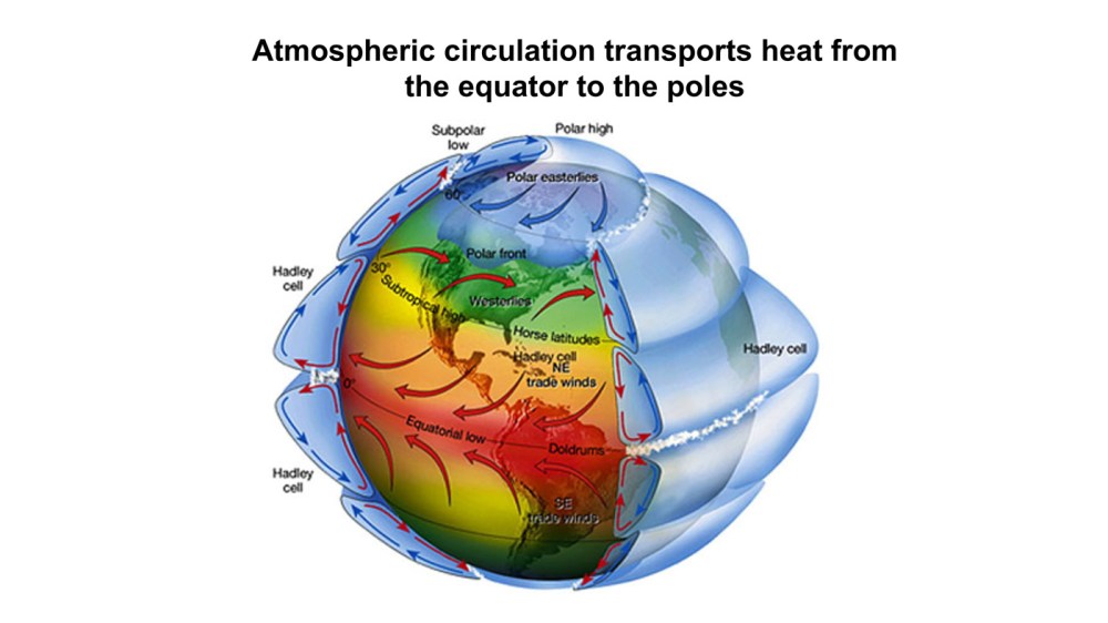
They’re due to the transport of heat between the tropics and the high latitudes.
And they are part of the Dynamics of the system
which depends on a number of factors

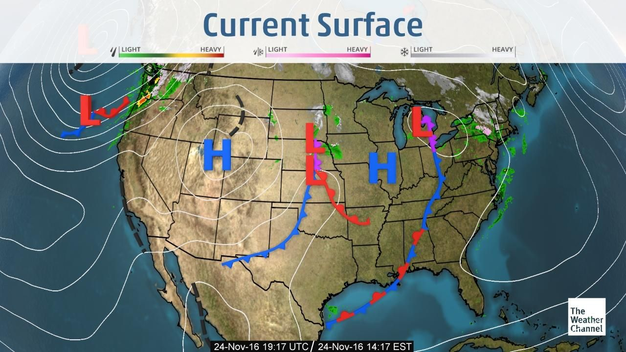
So primarily, what what does carry the heat? Well the ocean carries some heat but in many respects the most important thing is the so-called highs and lows. If you look at a weather map, it’s a little bit different in the southern hemisphere, but here you have the highs and lows going from west to east carrying weather. When you have the wind blowing from the north it’s cold, from South it’s warm. And this oscillates and gives work to your weathermen. In any event those same things carry heat to the pole. And many things determine them, but mainly it’s the differential heating between the tropics and the pole.

ERBE measurements of radiative imbalance.

So you have a system which has these features, and all of a sudden you obsess on the greenhouse effect. You end up having people saying really stupid things. So we’ve increased the temperature one degree or 1.1 in the last 100 years 120 years 150 years. And it’s been accompanied by the greatest improvement in human welfare in the history of the Earth, while some claim one-half degree more will be curtains. Only a politician could come up with something quite that absurd. But on the other hand when you get to the U.N and other things. it’s politicians that run it. And they’ve enabled this hysteria, frightening children their lives are going to be finished in short order. The UN IPCC has a working group that deals with science (Working Group 1). Even there in a thousand pages they don’t speak about an existential threat.

So you have other reports from the U.N that are not scientific that say: Oh yes it’s coming to the end of the world. And politicians say, well this is what we have to go by. I don’t know what you do, but it’s an evil movement, and it’s causing immense damage. It is trying to condemn people in Africa in the developing world to perpetual poverty. And yet I have to ask: Why would this be a goal? I don’t know.

BN: One of the cornerstones of this, let’s call it an agenda, is the constant bombardment to the public of reports on the rise of extreme weather events is this are these reports patently false or are they due to climate change?

RL: Well, you’re pointing to something very important. Even if it were occurring how do you relate it to this one number? But it’s not even true. Again going back to the IPCC, in the UN report they say there is virtually no evidence of a relationship between extreme events and climate change. Now they say that, but that doesn’t fit the politics, so they say something else. If you know of the American comic of years ago, Groucho Marx; he said, “I have my principles. If you don’t like them I have others.”

BN: That’s actually a good description on the politicization of climate change and the significant human progress enabled by the fossil fuel industry. Under this politicization, what do you think the end goal could possibly be for the manipulation of data given by the IPCC and the dismissal of data that contradicts it?

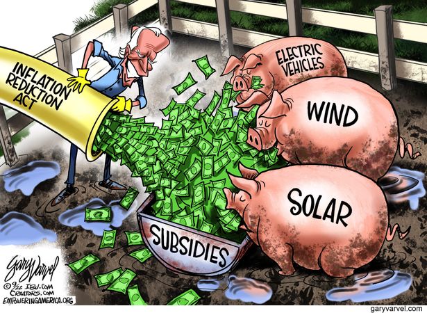
RL: Well, the energy sector is vital, it is the harnessing of fossil fuels that has led to the massive development of the western world. You know the progress since the invention of the steam engine has been the major feature in world history. On the other hand, because it’s such a large sector there are opportunities to make fortunes, even if your only activity is destroying the system. So for example in the U.S our current budget is showing trillions of dollars for climate change. Whether or not you think it makes sense doesn’t matter; somebody’s going to get those trillions of dollars and they have a real interest.

BN: I presume that the predominant funding would go to Renewables; pretty much anything that’s not nuclear or fossil fuel.

RL: What about the tools that extract energy from this, they’re not renewable. |They involve slave labor and that sounds pretty good doesn’t it. Now you have material usage, you have destruction of Landscapes. It’s almost as though the environmental movement has decided to commit suicide and go all in for things that destroy the environment. What you’re doing with the solar pedals and windmills and so on, you’re killing birds you’re destroying the environment. These have lifetimes of 10, 20 years, and you don’t know how to dispose of them. So this has nothing to do with the environment, it’s a power play.

BN: I had an interview with Professor William Harper and he said that the climate change activism movement is a joke and comparable to a coalition or organized crime unit of religious fanatics. And you’ve expressed the same sentiment. To what extent do you think that this is a result of people having pure intentions, but not being properly informed, not just trying to spin the situation far away from what the actual reality is.

RL: It’s hard to assess motivations.   You’re certainly taking the public and making them feel that getting rid of carbon dioxide, they’re doing something virtuous. As I’ve occasionally pointed out let’s imagine somebody came up with a good device that could get rid of about 60, 70 percent of the carbon dioxide in the atmosphere. What would be the result? The result would be: we’d all be dead. That’s a very peculiar pollutant. One that we can’t live without.

Though I think it’s based a lot on ignorance. You have economists talking about tipping points, and the geologists know that through most of the Earth’s history we’ve had far greater amounts of CO2. There’s never been any evidence of a Tipping Point. This is a very implausible thing but it sounds scary. It’s pretty clear going back on the history of the issue, when it got started in the early 80s, that it was already a governmental aim. You had these meetings at Villach, Austria and Bellagio, and there would be people interested in climate attending these, usually about a hundred. Those from the government were all in favor of this, while the others were scratching their heads and asking what’s this about. Somewhere along the way, somebody must have decided this is the way to go and they started pushing for it. Global cooling wasn’t panning out.

I think from the beginning of Earth Day, it was obvious you wanted to control the energy sector. At first it was sort of amateurish, you know acid rain, global cooling. Then someone realized, no matter how clean you made energy it would still produce CO2. So let’s go after that–you’ll never get rid of CO2 without getting rid of fossil fuels. There’s no evidence whatever that this is well-intentioned.

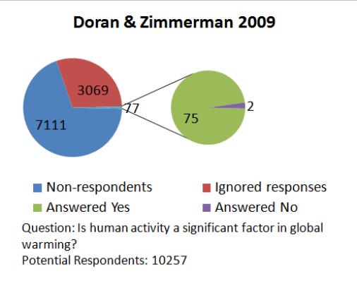
BN: But we still have a measured consensus of between 90 and 100 per cent of climate scientists that agree that it’s anthropogenic climate change. How is this the standing reality?

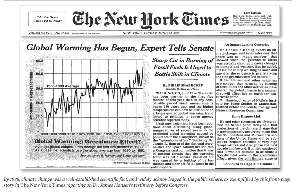
RL: Look, in 1988 when Jim Hansen first testified before the U.S Senate, Newsweek ran a cover issue showing the Earth on fire with the claim underneath, all scientists agree. No scientists were asked.  This is the way you convince the public, which is pretty illiterate when it comes to science. I don’t think the public feels comfortable about that, which is often ignored. So you immediately assure them: the scientists all agree, you don’t have to worry about it. And they knew that whether the scientists agree or not.

BN: Dr John Christie said that it’s actually a completely falsified number.

RL: Oh yeah as the record shows, there was a reduction from 1988 saying all scientists
Agree. Now it was only 97%. It’s a fake number, it’s just designed to tell people they don’t have to understand the science, just go along

BN: But then my question is if it is in fact such a small percentage of scientists that don’t agree . . .

RL: But we have to ask what they agreed to. You can frame the issue so that it was a hundred percent, for instance if you asked whether increasing CO2 increases or decreases temperature. Well I should say it probably increases it slightly. And then that’s listed as agreeing that the end of the world is coming if we increase CO2. They’re two different questions.

BN: So why do you think more climate scientists haven’t actually been vocal about the complete inaccuracy of these consensus figures?

RL: it’s a good question. One of the things that has changed is perfectly obvious. This was a small area in the 1980s. When you had a meeting, if you got a hundred people that was pretty substantial. And very few of them thought there was anything significant going on that would be called existential.  So what happened? If you look at funding in the U.S for climate science between 1989 and 1996 when Clinton/Gore Administration came in, funding increased by about a factor of 15. You literally created a whole new field, and you knew that the people who were brought in, knew that the reason for the funding was this issue. Indeed if you didn’t go along with it you lost your funding, So you know my funding ended as soon as I went public with my position.

BN: One of the common criticisms against you, your credibility and your views on climate science, is that you have ties to the fossil fuel industry. Is this true?

RL: No. Remember that everyone in this following that 15-fold increase came in it for the money. They assume anyone opposed must have gotten money from someone else. At MIT ExxonMobil does support some work, only on the part of people who support the alarm. The funniest was when they attacked me for writing an article in 1991 for Cato’s regulation magazine. And their argument was 10 years prior to that, Cato had received 10% of its funding from ExxonMobil. Now for this article I was paid 200 dollars, so presumably two dollars of that was from ExxonMobil 10 years prior to convince me to change my view.

BN: I just try to balance the scales, to get two sides of the story. I had an interview with Professor Guy McPherson, and he says with a very deep conviction that we are in the midst of abrupt climate change and that the methane released predominantly by the Arctic ocean will be the end of humanity by 2026. What’s your take on this?

RL: Well, he’s entitled to any science fiction he wishes to produce, but there’s no scientific evidence of that.

I think once people realize that the public is amenable
to scare stories, they get carried away

BN: What in your view is the political, economic and environmental implications of this move towards net zero and an abandonment of the fossil fuel industry?

RL: Pure malice. . . Plus profits for a few. Quite obviously you have people like Gore and Kerry and so on making hundreds of millions of dollars flying around the world ignoring all the things that they would prohibit Ordinary People. I suppose for these people it’s a return to feudalism where where us peasants should know our place and they should have their privilege.

BN: In 2001 you proposed the iris hypothesis on climate change. What was the premise of this?

RL: Well that was a question in some respects I think less important now. But since they were making a big fuss over changes of one degree, two degrees, so the question is why CO2 doesn’t do much. And it turns out that they had assumed assumed feedbacks that instead of trying to preserve a situation would act to make whatever we do worse. And there were plenty of problems with these feedbacks they they were improperly implemented.

So with the cooperation of NASA at the time, we looked if there were any obvious things occurring that were negative feedbacks. And it did look as though essentially upper level clouds in the tropics were acting in such a manner as to oppose the greenhouse effect. That seemed like an important feedback and it’s one which I think still likely plays a very important role in an important phenomenon that was called the early faint Sun paradox.

I don’t know if you’ve ever heard about this, but the sun’s output is increasing with time. If you go back two and a half billion years, the solar output was appreciably less than it is today. Yet the evidence is the earth did not freeze over; the Earth maintained a temperature that was very similar to today. The question is: How could it do that with a 20, 30 percent reduction in radiation. And it turns out that this Iris feedback is entirely capable of balancing that change. And so I think that remains a fairly substantial argument for the system being stable.

BN: What are the epistemological issues around climate change research

RL: OK. You have to remember a couple of things: One this was a small field. Two it was concerned with the problem: Why do you have different climate regimes; things that dealt with the Here and Now. So when you increase the funding by a factor of 15 the talent wasn’t available. So new topics were introduced, and one of them was climate impacts. Now this had nothing to do with understanding the physics of climate. If you were working on cockroaches, and you said my grant is to study the role of climate on cockroaches you got funded.

So you have all these impacts: climate and obesity, climate and diabetes, and so on. They wanted a piece of the action and they all became “climate scientists.” It’s worth remembering for instance, in 1990 my department at MIT no one called themselves a climate scientist. There were good reasons for that: climate was a very comprehensive thing. I was working on Dynamic meteorology, colleagues were working on oceanography, there were Marine geochemists. None of us pretended to comprehensive knowledge of everything about climate.

But all of a sudden you have people who know nothing about the physics
who are climate scientists because they got a grant
to find out whether diabetes was related to climate.

BN: You say that climate variability is actually the thing that we should be looking at to understand what is changing our climate and not human activity. Can you summarize the difference between anthropogenic climate change and climate variability, and why it is that you believe it’s climate variability that we should be looking at and not human activity

RL: Oh I’m not saying you shouldn’t look at things. People should be free to look at what they want.  But we do know that long before there were even people, climate was changing markedly. Even before the Industrial Revolution there was a little ice age. It had all sorts of documents, for instance villages in the Alps saying the ice is overtaking our village. You had the ice ages every hundred thousand years in which you had massive glaciation.

And you know this had nothing to do with people,
so you would need to understand those differences.

There was progress with the ice ages. A man called Milankovitch noticed that ice ages bore a relationship to orbital variations. It took a while but there were there was a climate program trying to find out how this worked. And we have a pretty good idea at this point of why that worked and Milankovitch was pretty much right. He said it would depend very much on the solar radiation in summer at high latitudes. And that was a well-known feature of glaciology: whether a glacier grows or not doesn’t depend so much on winter which are always cold in the northern hemisphere. But in summer if the snow that accumulated in Winter melts, you don’t build a glacier.

If the summer is cool and the glacier snow doesn’t fully melt,
then you build up each year.
You have thousands of years to build up your glacier.

Well you know it turns out for instance that CO2 follows temperature in the ice ages and it changes enough to change the flux about a watt per square meter. On the other hand when you look at the Milankovitch parameter, the incoming solar radiation over the course of this Ice Age cycle varies on the order of a hundred watts per square meter. That’s much more significant.

But then you have people say: “Well yeah I know that since CO2 is following that you can’t say CO2 caused it. But it must be CO2 amplification that was important.” But I mean it makes no sense: one watt versus a hundred.

BN: When I spoke to Dr Judith Curry, her story was just a very unfortunate reflection of what happened to dissenting voices. And she said that she’s essentially unhirable and so she had to leave for the private sector. What have you had to face as a result of going against the grain and the consensus for so many decades?

RL: Well you know Judith at first was a strong supporter of global warming and attacking anyone who questioned it. It’s interesting that she changed. I don’t know what to say. There are a couple of things that happened. First of all I’m older, so I had a senior position. I was doing research in a lot of areas and the National Science Foundation was funding my research in fluid mechanics. That continued a while so I sort of did climb on the side. The department of energy at first tried to fund people on all sides subjectively, but by the 90s they were told to quit that. And so the research manager there did me a favor. I had not fully expended my funding and she let me keep it past the due date without adding anything to it so that allowed things to continue a bit longer.

With publication again I was well known in the field and so I published some papers in the American Meteorological society’s monthly Bulletin and they got through. They were reviewed but the editors were all fired immediately after publication. And the paper was never rejected but I immediately invited people to criticize it. When the criticisms were published, we were not permitted to answer for six months, which was very unusual.

BN: That’s the manipulation of the justice system. How the situation is rigged to support the narrative and the complicity of politicians and scientists.

RL: Yes the situation was rigged, it was very much a March through the institutions. And that’s a problem for professional societies. Whether you are a member of the American physical Society or American Meteorological Society, or for that matter the American musicological society, you’re a member of a group of people who have a professional interest. And they elect a president and an executive manager to take care of the public relations so on

I think the people pushing this issue realized all you had to do is turn an official, the executive manager or something, and he ends up speaking for the whole group, never having actually sampled the people. And so you take over the American Meteorological Society, the National Academy, the American Academy, all of them are top-down organizations with managers. And they’ve done a terrific job of that

So you have some naive hypothesis that something as complex as climate is controlled by a single control knob of a minor gas that controls a couple of watts per meter squared out of hundreds. You can only promote this if you have a public, including political officials, who are totally illiterate or enumerate versus science.

You mentioned to all these people who are getting support. You find that scientists only have to say something like they think CO2 increasing will give some warming and they leave it to the politicians to say this means the end of the world is coming. And their backup position is: I never said that.

BN: Are there any anthropogenic elements that humans could increase or continue with, like fossil fuel consumption, that will possibly have catastrophic consequences?

RL: You know a nuclear war could do that but driving your SUV? I guess it appeals to certain people’s vanity that we are all powerful.

BN: Just to close off: What would you recommend as a way out of this situation that feels a little bit like a trap?

RL: It’s a very serious question. When you co-opt the institutional structure, then you have people like the world economic Forum, the EU full of bureaucrats who are just infatuated with the power they might have. It’s got to be very difficult to break out, either there are political parties that are opposed to this. One hopes maybe they’ll gain power and just trash this. Time will of course play a role but I hope we don’t have to wait to see the destruction of modern society and realize it had nothing to do with climate. I’d like to think we can get out of this before then.

BN: As it stands are we at risk or in any way getting close to a climate catastrophe?

RL: I suppose it depends on how you define it. If you define a catastrophe as having three inches of extra rain one year, then we’re all in their catastrophe. If you really mean an existential threat, the answer is: No, we’re nowhere near that. It just makes no sense. These are scare stories you especially want to give to kindergarten kids because they have no defense mechanism.

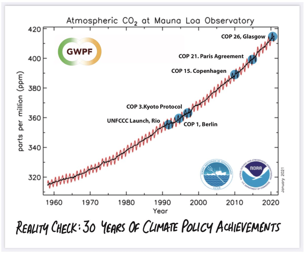
You know there may be some hope that the developing world, I mean clearly China, India, Russia are ignoring this. They know it’s nonsense so they’re sitting by and watching the West self-destruct while wondering about what divine good luck they have. You know they’re not going to do anything about it. If you’re really worried about CO2 you know we’ve spent trillions of dollars trying to reduce it and get to Net Zero. And you look at CO2 versus time and it continues to increase.without any change So we’ve had no impact upon that. So you’d ask yourself:

If we have no impact, and we’re worried about it,
why aren’t we building resilience?
Do we want to make ourselves more vulnerable
so we’ll be properly punished? That’s nuts.

BN: It does sound like you’re reading the message between the lines of the environmentalists.

RL: Yeah, it seems as though they hate Humanity, they want Power and they don’t give a damn about the environment. And they certainly give no attention to feeding starving people, when that is in fact a real problem. 

Addendum:

In a previous publication Lindzen sets the record straight about the “March through Institutions” with names and maneuvers which have crippled efforts to answer questions about the functioning of earth’s climate system.

When an issue becomes a vital part of a political agenda, as is the case with climate, then the politically desired position becomes a goal rather than a consequence of scientific research. This paper deals with the origin of the cultural changes and with specific examples of the operation and interaction of these factors. In particular, we will show how political bodies act to control scientific institutions, how scientists adjust both data and even theory to accommodate politically correct positions, and how opposition to these positions is disposed of.

By taking a few minutes to read his text (link in red above), you can learn from Lindzen some important truths:

♦  How science was perverted from a successful mode of enquiry into a source of authority;
♦  What are the consequences when fear is perceived to be the basis for scientific support rather than from gratitude and the trust associated with it;
♦  How incentives are skewed in favor of perpetuating problems rather than solving them;
♦  Why simulation and large programs replaced theory and observation as the basis of scientific investigation;
♦  How specific institutions and scientific societies were infiltrated and overtaken by political activists;
♦  Specific examples where data and analyses have been manipulated to achieve desired conclusions;
♦  Specific cases of concealing such truths as may call into question global warming alarmism;
♦  Examples of the remarkable process of “discreditation” by which attack papers are quickly solicited and published against an undesirable finding;
♦  Cases of Global Warming Revisionism, by which skeptical positions of prominent people are altered after they are dead;
♦  Dangers to societies and populations from governments, NGOs and corporations exploiting climate change.

Summary: Thanks to Richard Lindzen and others for putting on the record how broken is the field of climate science. It is dangerous in itself, and it also extends into other domains, threatening the scientific basis of modern civilization. Fixing such scientific perversions will be difficult and lengthy, but it can only start with acknowledging how bad it is. It truly is worse than we thought.

Ocean Warming Spike March 2023

The best context for understanding decadal temperature changes comes from the world’s sea surface temperatures (SST), for several reasons:

  • The ocean covers 71% of the globe and drives average temperatures;
  • SSTs have a constant water content, (unlike air temperatures), so give a better reading of heat content variations;
  • A major El Nino was the dominant climate feature in recent years.

HadSST is generally regarded as the best of the global SST data sets, and so the temperature story here comes from that source. Previously I used HadSST3 for these reports, but Hadley Centre has made HadSST4 the priority, and v.3 will no longer be updated.  HadSST4 is the same as v.3, except that the older data from ship water intake was re-estimated to be generally lower temperatures than shown in v.3.  The effect is that v.4 has lower average anomalies for the baseline period 1961-1990, thereby showing higher current anomalies than v.3. This analysis concerns more recent time periods and depends on very similar differentials as those from v.3 despite higher absolute anomaly values in v.4.  More on what distinguishes HadSST3 and 4 from other SST products at the end. The user guide for HadSST4 is here.

The Current Context

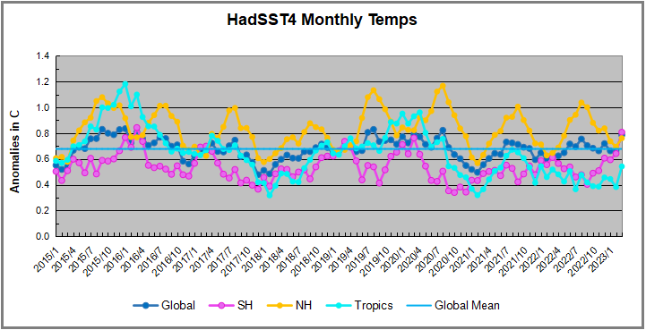
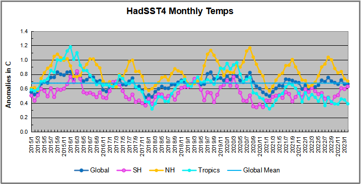
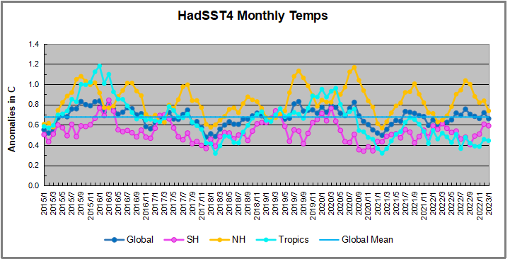
The chart below shows SST monthly anomalies as reported in HadSST4 starting in 2015 through March 2023.  A global cooling pattern is seen clearly in the Tropics since its peak in 2016, joined by NH and SH cycling downward since 2016. 

Note that in 2015-2016 the Tropics and SH peaked in between two summer NH spikes.  That pattern repeated in 2019-2020 with a lesser Tropics peak and SH bump, but with higher NH spikes. By end of 2020, cooler SSTs in all regions took the Global anomaly well below the mean for this period.  In 2021 the summer NH summer spike was joined by warming in the Tropics but offset by a drop in SH SSTs, which raised the Global anomaly slightly over the mean.

Then in 2022, another strong NH summer spike peaked in August, but this time both the Tropic and SH were countervailing, resulting in only slight Global warming, later receding to the mean.   Oct./Nov. temps dropped  in NH and the Tropics took the Global anomaly below the average for this period. After an uptick in December, temps in January 2023 dropped everywhere, strongest in NH, with the Global anomaly further below the mean since 2015.

In February Global SSTs stayed cool, but in March temps everywhere spiked upward.  SH and the Tropics both showed anomalies 0.16C higher than February, pulling the Global anomaly up 0.12C. Both SH and NH are now close to the Global anomaly of 0.78C

A longer view of SSTs

To enlarge image open in new tab.

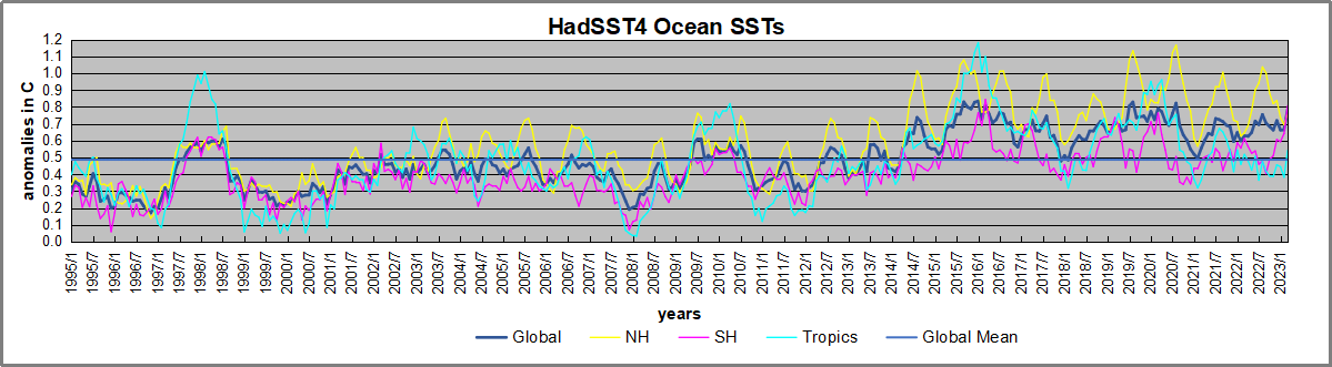
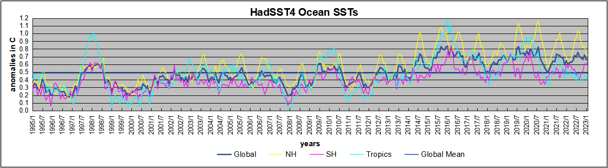
The graph above is noisy, but the density is needed to see the seasonal patterns in the oceanic fluctuations.  Previous posts focused on the rise and fall of the last El Nino starting in 2015.  This post adds a longer view, encompassing the significant 1998 El Nino and since.  The color schemes are retained for Global, Tropics, NH and SH anomalies.  Despite the longer time frame, I have kept the monthly data (rather than yearly averages) because of interesting shifts between January and July.1995 is a reasonable (ENSO neutral) starting point prior to the first El Nino. 

The sharp Tropical rise peaking in 1998 is dominant in the record, starting Jan. ’97 to pull up SSTs uniformly before returning to the same level Jan. ’99. There were strong cool periods before and after the 1998 El Nino event. Then SSTs in all regions returned to the mean in 2001-2. 

SSTS fluctuate around the mean until 2007, when another, smaller ENSO event occurs. There is cooling 2007-8,  a lower peak warming in 2009-10, following by cooling in 2011-12.  Again SSTs are average 2013-14.

Now a different pattern appears.  The Tropics cooled sharply to Jan 11, then rise steadily for 4 years to Jan 15, at which point the most recent major El Nino takes off.  But this time in contrast to ’97-’99, the Northern Hemisphere produces peaks every summer pulling up the Global average.  In fact, these NH peaks appear every July starting in 2003, growing stronger to produce 3 massive highs in 2014, 15 and 16.  NH July 2017 was only slightly lower, and a fifth NH peak still lower in Sept. 2018.

The highest summer NH peaks came in 2019 and 2020, only this time the Tropics and SH were offsetting rather adding to the warming. (Note: these are high anomalies on top of the highest absolute temps in the NH.)  Since 2014 SH has played a moderating role, offsetting the NH warming pulses. After September 2020 temps dropped off down until February 2021.  Now in 2021-22 there are again summer NH spikes, but in 2022 moderated first by cooling Tropics and SH SSTs, then in October to January 2023 by deeper cooling in NH and Tropics.  The graph shows the warming spikes since 2015, including one last month,  lifted the Global anomaly by about 0.2C above the mean since 1995 (an ENSO neutral year).

What to make of all this? The patterns suggest that in addition to El Ninos in the Pacific driving the Tropic SSTs, something else is going on in the NH.  The obvious culprit is the North Atlantic, since I have seen this sort of pulsing before.  After reading some papers by David Dilley, I confirmed his observation of Atlantic pulses into the Arctic every 8 to 10 years.

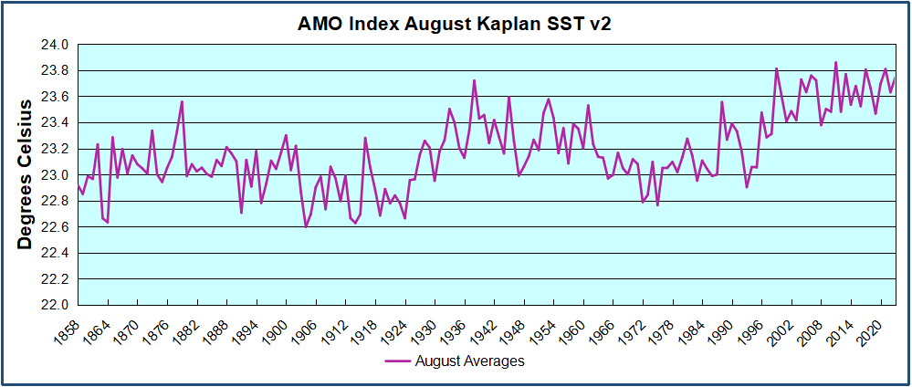
But the peaks coming nearly every summer in HadSST require a different picture.  Let’s look at August, the hottest month in the North Atlantic from the Kaplan dataset.

The AMO Index is from from Kaplan SST v2, the unaltered and not detrended dataset. By definition, the data are monthly average SSTs interpolated to a 5×5 grid over the North Atlantic basically 0 to 70N. The graph shows August warming began after 1992 up to 1998, with a series of matching years since, including 2020, dropping down in 2021.  Because the N. Atlantic has partnered with the Pacific ENSO recently, let’s take a closer look at some AMO years in the last 2 decades.

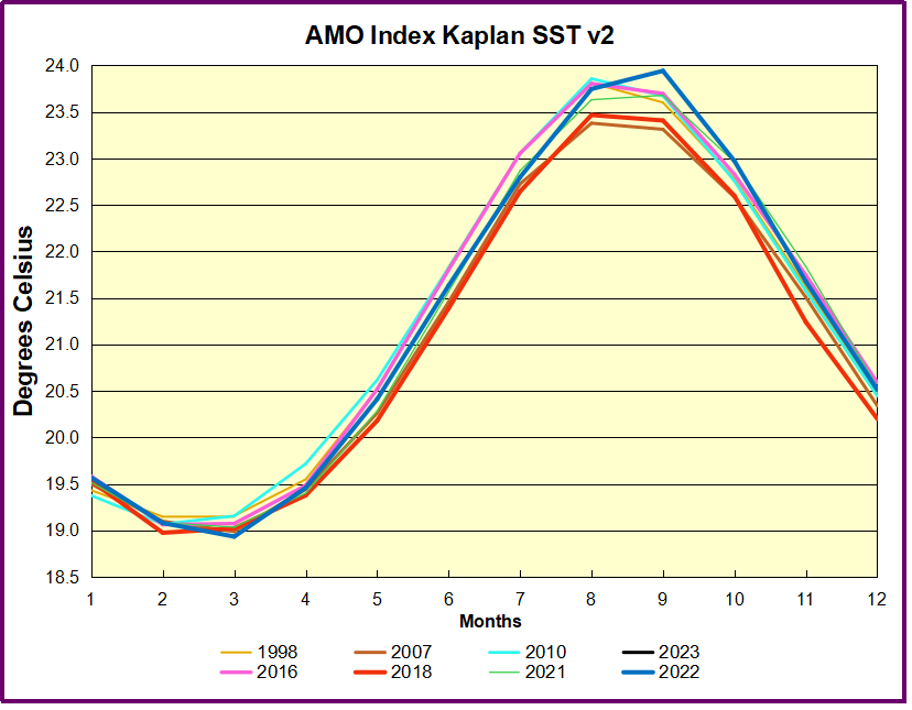
This graph shows monthly AMO temps for some important years. The Peak years were 1998, 2010 and 2016, with the latter emphasized as the most recent. The other years show lesser warming, with 2007 emphasized as the coolest in the last 20 years. Note the red 2018 line is at the bottom of all these tracks. The heavy blue line shows that 2022 started warm, dropped to the bottom and stayed near the lower tracks.  Note the strength of that summer’s warming pulse, in September peaking to nearly 24 Celsius, a new record for this dataset. January 2023 starts similar to 2022. (Note:  No data updates for February or March so far.)

Summary

The oceans are driving the warming this century.  SSTs took a step up with the 1998 El Nino and have stayed there with help from the North Atlantic, and more recently the Pacific northern “Blob.”  The ocean surfaces are releasing a lot of energy, warming the air, but eventually will have a cooling effect.  The decline after 1937 was rapid by comparison, so one wonders: How long can the oceans keep this up? 

Footnote: Why Rely on HadSST4

HadSST is distinguished from other SST products because HadCRU (Hadley Climatic Research Unit) does not engage in SST interpolation, i.e. infilling estimated anomalies into grid cells lacking sufficient sampling in a given month. From reading the documentation and from queries to Met Office, this is their procedure.

HadSST4 imports data from gridcells containing ocean, excluding land cells. From past records, they have calculated daily and monthly average readings for each grid cell for the period 1961 to 1990. Those temperatures form the baseline from which anomalies are calculated.

In a given month, each gridcell with sufficient sampling is averaged for the month and then the baseline value for that cell and that month is subtracted, resulting in the monthly anomaly for that cell. All cells with monthly anomalies are averaged to produce global, hemispheric and tropical anomalies for the month, based on the cells in those locations. For example, Tropics averages include ocean grid cells lying between latitudes 20N and 20S.

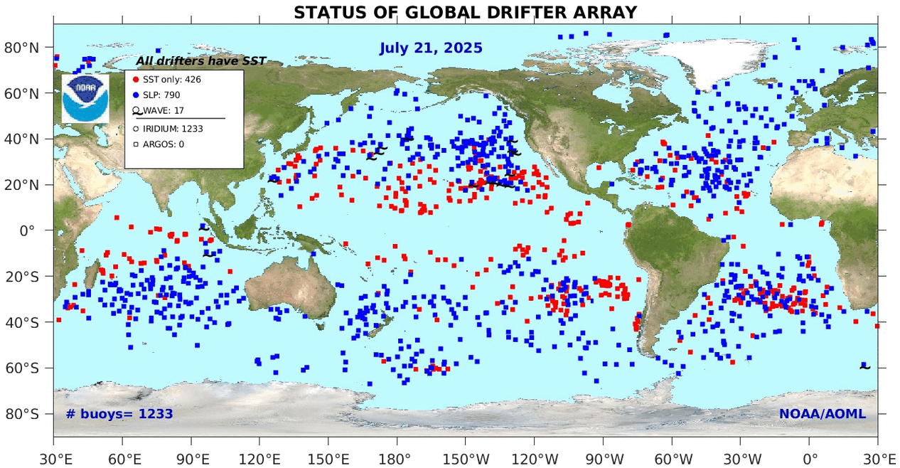
Gridcells lacking sufficient sampling that month are left out of the averaging, and the uncertainty from such missing data is estimated. IMO that is more reasonable than inventing data to infill. And it seems that the Global Drifter Array displayed in the top image is providing more uniform coverage of the oceans than in the past.

uss-pearl-harbor-deploys-global-drifter-buoys-in-pacific-ocean

USS Pearl Harbor deploys Global Drifter Buoys in Pacific Ocean


The Less It Warms, the Louder Is Zero Carbon Push

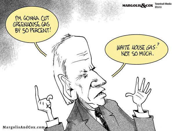
The post below updates the UAH record of air temperatures over land and ocean. Each month and year exposes again the growing disconnect between the real world and the Zero Carbon zealots.  It is as though the anti-hydrocarbon band wagon hopes to drown out the data contradicting their justification for the Great Energy Transition.  

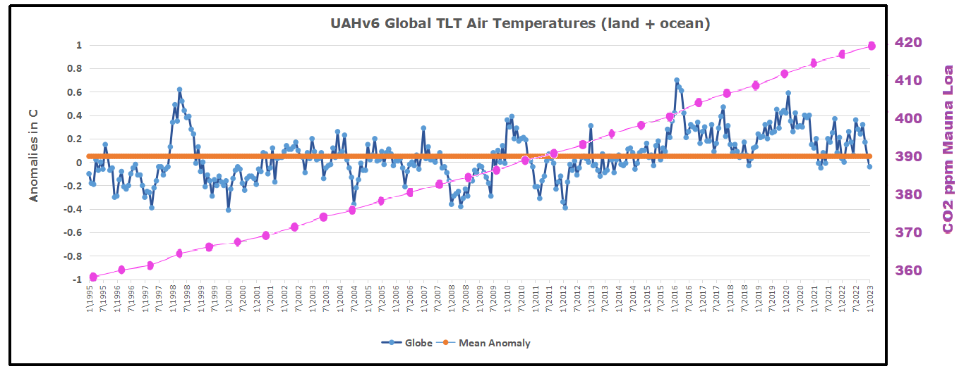
As an overview consider how recent rapid cooling  completely overcame the warming from the last 3 El Ninos (1998, 2010 and 2016).  The UAH record shows that the effects of the last one were gone as of April 2021, again in November 2021, and in February and June 2022  Now at year end 2022 and continuing into 2023 global temp anomaly is matching or lower than average since 1995, an ENSO neutral year. (UAH baseline is now 1991-2020).

For reference I added an overlay of CO2 annual concentrations as measured at Mauna Loa.  While temperatures fluctuated up and down ending flat, CO2 went up steadily by ~60 ppm, a 15% increase.

Furthermore, going back to previous warmings prior to the satellite record shows that the entire rise of 0.8C since 1947 is due to oceanic, not human activity.

gmt-warming-events

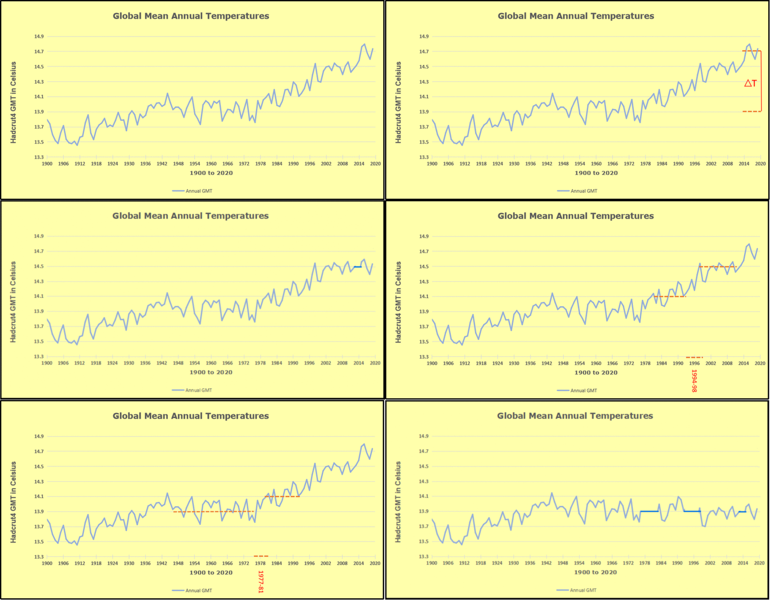
The animation is an update of a previous analysis from Dr. Murry Salby.  These graphs use Hadcrut4 and include the 2016 El Nino warming event.  The exhibit shows since 1947 GMT warmed by 0.8 C, from 13.9 to 14.7, as estimated by Hadcrut4.  This resulted from three natural warming events involving ocean cycles. The most recent rise 2013-16 lifted temperatures by 0.2C.  Previously the 1997-98 El Nino produced a plateau increase of 0.4C.  Before that, a rise from 1977-81 added 0.2C to start the warming since 1947.

Importantly, the theory of human-caused global warming asserts that increasing CO2 in the atmosphere changes the baseline and causes systemic warming in our climate.  On the contrary, all of the warming since 1947 was episodic, coming from three brief events associated with oceanic cycles. 

Update August 3, 2021

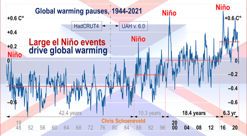
Chris Schoeneveld has produced a similar graph to the animation above, with a temperature series combining HadCRUT4 and UAH6. H/T WUWT

image-8


mc_wh_gas_web20210423124932

See Also Worst Threat: Greenhouse Gas or Quiet Sun?

March 2023 Update  Land and Sea Temps Little Changed

banner-blog

With apologies to Paul Revere, this post is on the lookout for cooler weather with an eye on both the Land and the Sea.  While you will hear a lot about 2020-21 temperatures matching 2016 as the highest ever, that spin ignores how fast the cooling set in.  The UAH data analyzed below shows that warming from the last El Nino was fully dissipated with chilly temperatures in all regions. After a warming blip in 2022, land and ocean temps dropped again with 2023 starting below the mean since 1995.

UAH has updated their tlt (temperatures in lower troposphere) dataset for March 2023. Posts on their reading of ocean air temps this month came ahead of updated records from HadSST4.  I have previously posted on SSTs using HadSST4  Oceans Stay Cool February 2023. This month also has a separate graph of land air temps because the comparisons and contrasts are interesting as we contemplate possible cooling in coming months and years. Sometimes air temps over land diverge from ocean air changes.  For example in February, Tropical ocean temps alone moved upward, while temps in all land regions rebounded after hitting bottom..

Note:  UAH has shifted their baseline from 1981-2010 to 1991-2020 beginning with January 2021.  In the charts below, the trends and fluctuations remain the same but the anomaly values change with the baseline reference shift.

Presently sea surface temperatures (SST) are the best available indicator of heat content gained or lost from earth’s climate system.  Enthalpy is the thermodynamic term for total heat content in a system, and humidity differences in air parcels affect enthalpy.  Measuring water temperature directly avoids distorted impressions from air measurements.  In addition, ocean covers 71% of the planet surface and thus dominates surface temperature estimates.  Eventually we will likely have reliable means of recording water temperatures at depth.

Recently, Dr. Ole Humlum reported from his research that air temperatures lag 2-3 months behind changes in SST.  Thus the cooling oceans now portend cooling land air temperatures to follow.  He also observed that changes in CO2 atmospheric concentrations lag behind SST by 11-12 months.  This latter point is addressed in a previous post Who to Blame for Rising CO2?

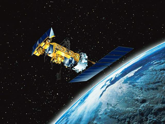
After a change in priorities, updates are now exclusive to HadSST4.  For comparison we can also look at lower troposphere temperatures (TLT) from UAHv6 which are now posted for March.  The temperature record is derived from microwave sounding units (MSU) on board satellites like the one pictured above. Recently there was a change in UAH processing of satellite drift corrections, including dropping one platform which can no longer be corrected. The graphs below are taken from the revised and current dataset.

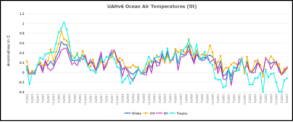
The UAH dataset includes temperature results for air above the oceans, and thus should be most comparable to the SSTs. There is the additional feature that ocean air temps avoid Urban Heat Islands (UHI).  The graph below shows monthly anomalies for ocean air temps since January 2015.

Note 2020 was warmed mainly by a spike in February in all regions, and secondarily by an October spike in NH alone. In 2021, SH and the Tropics both pulled the Global anomaly down to a new low in April. Then SH and Tropics upward spikes, along with NH warming brought Global temps to a peak in October.  That warmth was gone as November 2021 ocean temps plummeted everywhere. After an upward bump 01/2022 temps reversed and plunged downward in June.  After an upward spike in July, ocean air everywhere cooled in August and also in September.   After sharp cooling everywhere in January 2023, all regions were into negative territory. Now in February and March, an uptick in the Tropics led to a small rise globally slightly above zero.

Land Air Temperatures Tracking Downward in Seesaw Pattern

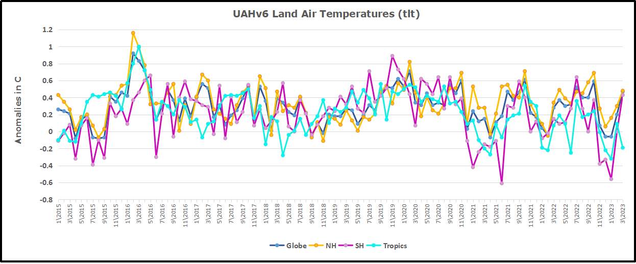
We sometimes overlook that in climate temperature records, while the oceans are measured directly with SSTs, land temps are measured only indirectly.  The land temperature records at surface stations sample air temps at 2 meters above ground.  UAH gives tlt anomalies for air over land separately from ocean air temps.  The graph updated for March is below.

Here we have fresh evidence of the greater volatility of the Land temperatures, along with extraordinary departures by SH land.  Land temps are dominated by NH with a 2021 spike in January,  then dropping before rising in the summer to peak in October 2021. As with the ocean air temps, all that was erased in November with a sharp cooling everywhere.  After a summer 2022 NH spike, land temps dropped everywhere, and in January, further cooling in SH and Tropics offset by an uptick in NH.  Now in February and March both SH and Tropics along with NH pulled up the Global land anomaly.

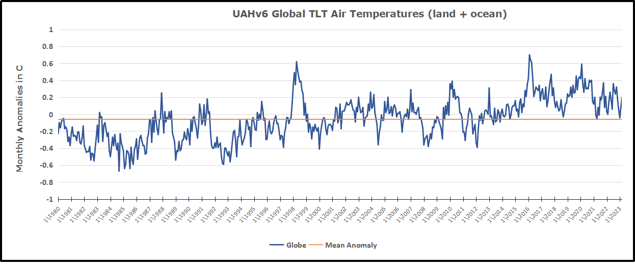
The Bigger Picture UAH Global Since 1980

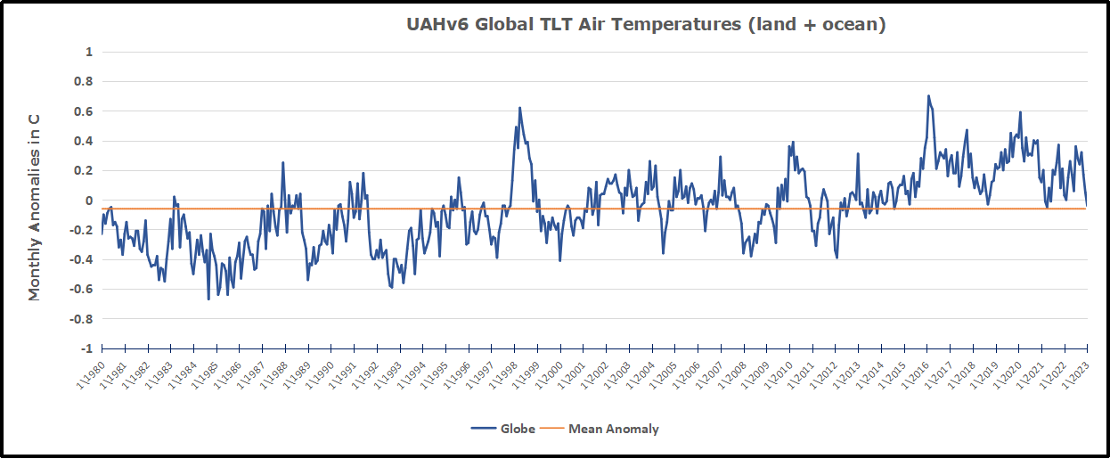
The chart shows monthly Global anomalies starting 01/1980 to present.  The average monthly anomaly is -0.06, for this period of more than four decades.  The graph shows the 1998 El Nino after which the mean resumed, and again after the smaller 2010 event. The 2016 El Nino matched 1998 peak and in addition NH after effects lasted longer, followed by the NH warming 2019-20.   An upward bump in 2021 was reversed with temps having returned close to the mean as of 2/2022.  March and April brought warmer Global temps, later reversed, and with the sharp drops in Nov., Dec. and January 2023 temps, there was no increase over 1980. Now in February and March there is a slight rebound over zero.

TLTs include mixing above the oceans and probably some influence from nearby more volatile land temps.  Clearly NH and Global land temps have been dropping in a seesaw pattern, nearly 1C lower than the 2016 peak.  Since the ocean has 1000 times the heat capacity as the atmosphere, that cooling is a significant driving force.  TLT measures started the recent cooling later than SSTs from HadSST3, but are now showing the same pattern.  It seems obvious that despite the three El Ninos, their warming has not persisted, and without them it would probably have cooled since 1995.  Of course, the future has not yet been written.


Oceans Stay Cool February 2023

The best context for understanding decadal temperature changes comes from the world’s sea surface temperatures (SST), for several reasons:

  • The ocean covers 71% of the globe and drives average temperatures;
  • SSTs have a constant water content, (unlike air temperatures), so give a better reading of heat content variations;
  • A major El Nino was the dominant climate feature in recent years.

HadSST is generally regarded as the best of the global SST data sets, and so the temperature story here comes from that source. Previously I used HadSST3 for these reports, but Hadley Centre has made HadSST4 the priority, and v.3 will no longer be updated.  HadSST4 is the same as v.3, except that the older data from ship water intake was re-estimated to be generally lower temperatures than shown in v.3.  The effect is that v.4 has lower average anomalies for the baseline period 1961-1990, thereby showing higher current anomalies than v.3. This analysis concerns more recent time periods and depends on very similar differentials as those from v.3 despite higher absolute anomaly values in v.4.  More on what distinguishes HadSST3 and 4 from other SST products at the end. The user guide for HadSST4 is here.

The Current Context

The chart below shows SST monthly anomalies as reported in HadSST4 starting in 2015 through February 2023.  A global cooling pattern is seen clearly in the Tropics since its peak in 2016, joined by NH and SH cycling downward since 2016. 

Note that in 2015-2016 the Tropics and SH peaked in between two summer NH spikes.  That pattern repeated in 2019-2020 with a lesser Tropics peak and SH bump, but with higher NH spikes. By end of 2020, cooler SSTs in all regions took the Global anomaly well below the mean for this period.  In 2021 the summer NH summer spike was joined by warming in the Tropics but offset by a drop in SH SSTs, which raised the Global anomaly slightly over the mean.

Then in 2022, another strong NH summer spike peaked in August, but this time both the Tropic and SH were countervailing, resulting in only slight Global warming, later receding to the mean.   Oct./Nov. temps dropped  in NH and the Tropics took the Global anomaly below the average for this period. After an uptick in December, temps in January 2023 dropped everywhere, strongest in NH, with the Global anomaly further below the mean since 2015. In February Global SSTs stayed the same, with slight warming in SH offset by further cooling in NH and Tropics

A longer view of SSTs

To enlarge image open in new tab.

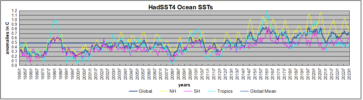
The graph above is noisy, but the density is needed to see the seasonal patterns in the oceanic fluctuations.  Previous posts focused on the rise and fall of the last El Nino starting in 2015.  This post adds a longer view, encompassing the significant 1998 El Nino and since.  The color schemes are retained for Global, Tropics, NH and SH anomalies.  Despite the longer time frame, I have kept the monthly data (rather than yearly averages) because of interesting shifts between January and July.1995 is a reasonable (ENSO neutral) starting point prior to the first El Nino. 

The sharp Tropical rise peaking in 1998 is dominant in the record, starting Jan. ’97 to pull up SSTs uniformly before returning to the same level Jan. ’99. There were strong cool periods before and after the 1998 El Nino event. Then SSTs in all regions returned to the mean in 2001-2. 

SSTS fluctuate around the mean until 2007, when another, smaller ENSO event occurs. There is cooling 2007-8,  a lower peak warming in 2009-10, following by cooling in 2011-12.  Again SSTs are average 2013-14.

Now a different pattern appears.  The Tropics cooled sharply to Jan 11, then rise steadily for 4 years to Jan 15, at which point the most recent major El Nino takes off.  But this time in contrast to ’97-’99, the Northern Hemisphere produces peaks every summer pulling up the Global average.  In fact, these NH peaks appear every July starting in 2003, growing stronger to produce 3 massive highs in 2014, 15 and 16.  NH July 2017 was only slightly lower, and a fifth NH peak still lower in Sept. 2018.

The highest summer NH peaks came in 2019 and 2020, only this time the Tropics and SH were offsetting rather adding to the warming. (Note: these are high anomalies on top of the highest absolute temps in the NH.)  Since 2014 SH has played a moderating role, offsetting the NH warming pulses. After September 2020 temps dropped off down until February 2021.  Now in 2021-22 there are again summer NH spikes, but in 2022 moderated first by cooling Tropics and SH SSTs, then in October to January 2023 by deeper cooling in NH and Tropics.  The graph shows the warming spikes since 2015 lifted the Global anomaly by about 0.2C above the mean since 1995.

What to make of all this? The patterns suggest that in addition to El Ninos in the Pacific driving the Tropic SSTs, something else is going on in the NH.  The obvious culprit is the North Atlantic, since I have seen this sort of pulsing before.  After reading some papers by David Dilley, I confirmed his observation of Atlantic pulses into the Arctic every 8 to 10 years.

But the peaks coming nearly every summer in HadSST require a different picture.  Let’s look at August, the hottest month in the North Atlantic from the Kaplan dataset.

The AMO Index is from from Kaplan SST v2, the unaltered and not detrended dataset. By definition, the data are monthly average SSTs interpolated to a 5×5 grid over the North Atlantic basically 0 to 70N. The graph shows August warming began after 1992 up to 1998, with a series of matching years since, including 2020, dropping down in 2021.  Because the N. Atlantic has partnered with the Pacific ENSO recently, let’s take a closer look at some AMO years in the last 2 decades.

This graph shows monthly AMO temps for some important years. The Peak years were 1998, 2010 and 2016, with the latter emphasized as the most recent. The other years show lesser warming, with 2007 emphasized as the coolest in the last 20 years. Note the red 2018 line is at the bottom of all these tracks. The heavy blue line shows that 2022 started warm, dropped to the bottom and stayed near the lower tracks.  Note the strength of that summer’s warming pulse, in September peaking to nearly 24 Celsius, a new record for this dataset. January 2023 starts similar to 2022.

Summary

The oceans are driving the warming this century.  SSTs took a step up with the 1998 El Nino and have stayed there with help from the North Atlantic, and more recently the Pacific northern “Blob.”  The ocean surfaces are releasing a lot of energy, warming the air, but eventually will have a cooling effect.  The decline after 1937 was rapid by comparison, so one wonders: How long can the oceans keep this up? If the pattern of recent years continues, NH SST anomalies will likely decline in coming months, along with ENSO also weakening will probably determine a cooler outcome.

Footnote: Why Rely on HadSST4

HadSST is distinguished from other SST products because HadCRU (Hadley Climatic Research Unit) does not engage in SST interpolation, i.e. infilling estimated anomalies into grid cells lacking sufficient sampling in a given month. From reading the documentation and from queries to Met Office, this is their procedure.

HadSST4 imports data from gridcells containing ocean, excluding land cells. From past records, they have calculated daily and monthly average readings for each grid cell for the period 1961 to 1990. Those temperatures form the baseline from which anomalies are calculated.

In a given month, each gridcell with sufficient sampling is averaged for the month and then the baseline value for that cell and that month is subtracted, resulting in the monthly anomaly for that cell. All cells with monthly anomalies are averaged to produce global, hemispheric and tropical anomalies for the month, based on the cells in those locations. For example, Tropics averages include ocean grid cells lying between latitudes 20N and 20S.

Gridcells lacking sufficient sampling that month are left out of the averaging, and the uncertainty from such missing data is estimated. IMO that is more reasonable than inventing data to infill. And it seems that the Global Drifter Array displayed in the top image is providing more uniform coverage of the oceans than in the past.

uss-pearl-harbor-deploys-global-drifter-buoys-in-pacific-ocean

USS Pearl Harbor deploys Global Drifter Buoys in Pacific Ocean

Footnote Rare Triple Dip La Nina Likely This Winter

Here’s Where a Rare “Triple Dip La Niña” Might Drop the Most Snow This Winter Ski Mag

The unusual weather phenomenon might result in the snowiest season in years for some parts of the country.

The long-range winter forecast could be good news for skiers living in the certain parts of the U.S. and Canada. The National Oceanic and Atmospheric Administration (NOAA) estimates that the chance of a La Niña occurring this fall and early winter is 86 percent, and the main beneficiary is expected to be mountains in the Northwest and Northern Rockies.

If NOAA’s predictions pan out, this will be the third La Niña in a row—a rare phenomenon called a “Triple Dip La Niña.” Between now and 1950, only two Triple Dips have occurred.

Smith also notes that winters on the East Coast are similarly tricky to predict during La Niña years. “In the West, you’re simply looking for above-average precipitation, which typically translates to above-average snowfall, but in the East, you have temperature to worry about as well … that adds another complication.” In other words, increased precip could lead to more rain if the temperatures aren’t cooperative.

The presence of a La Niña doesn’t always translate to higher snowfall in the North, either, as evidenced by last ski season, which saw few powder days.

However, in consecutive La Niña triplets, one winter usually involves above-average snowfall. While this historical pattern isn’t tied to any documented meteorological function, it could mean that the odds of a snowy 2022’-’23 season are higher, given the previous two La Niñas didn’t deliver the goods.


Satellite Temps Hit Bottom: February 2023

The post below updates the UAH record of air temperatures over land and ocean.  But as an overview consider how recent rapid cooling  completely overcame the warming from the last 3 El Ninos (1998, 2010 and 2016).  The UAH record shows that the effects of the last one were gone as of April 2021, again in November 2021, and in February and June 2022  Now at year end 2022 and continuing into January 2023 we have again global temp anomaly lower than average since 1995. (UAH baseline is now 1991-2020).

For reference I added an overlay of CO2 annual concentrations as measured at Mauna Loa.  While temperatures fluctuated up and down ending flat, CO2 went up steadily by ~60 ppm, a 15% increase.

Furthermore, going back to previous warmings prior to the satellite record shows that the entire rise of 0.8C since 1947 is due to oceanic, not human activity.

gmt-warming-events

The animation is an update of a previous analysis from Dr. Murry Salby.  These graphs use Hadcrut4 and include the 2016 El Nino warming event.  The exhibit shows since 1947 GMT warmed by 0.8 C, from 13.9 to 14.7, as estimated by Hadcrut4.  This resulted from three natural warming events involving ocean cycles. The most recent rise 2013-16 lifted temperatures by 0.2C.  Previously the 1997-98 El Nino produced a plateau increase of 0.4C.  Before that, a rise from 1977-81 added 0.2C to start the warming since 1947.

Importantly, the theory of human-caused global warming asserts that increasing CO2 in the atmosphere changes the baseline and causes systemic warming in our climate.  On the contrary, all of the warming since 1947 was episodic, coming from three brief events associated with oceanic cycles. 

Update August 3, 2021

Chris Schoeneveld has produced a similar graph to the animation above, with a temperature series combining HadCRUT4 and UAH6. H/T WUWT

image-8


mc_wh_gas_web20210423124932

See Also Worst Threat: Greenhouse Gas or Quiet Sun?

February Update  Land and Sea Temps Bottom Out

banner-blog

With apologies to Paul Revere, this post is on the lookout for cooler weather with an eye on both the Land and the Sea.  While you will hear a lot about 2020-21 temperatures matching 2016 as the highest ever, that spin ignores how fast the cooling set in.  The UAH data analyzed below shows that warming from the last El Nino was fully dissipated with chilly temperatures in all regions. After a warming blip in 2022, land and ocean temps dropped again with 2023 starting below the mean since 1995.

UAH has updated their tlt (temperatures in lower troposphere) dataset for February 2023. Posts on their reading of ocean air temps this month came ahead of updated records from HadSST4.  I have previously posted on SSTs using HadSST4  Ahoy! Cooler Ocean Ahead, January 2023  This month also has a separate graph of land air temps because the comparisons and contrasts are interesting as we contemplate possible cooling in coming months and years. Sometimes air temps over land diverge from ocean air changes.  For example in February, Tropical ocean temps alone moved upward, while temps in all land regions rebounded after hitting bottom..

Note:  UAH has shifted their baseline from 1981-2010 to 1991-2020 beginning with January 2021.  In the charts below, the trends and fluctuations remain the same but the anomaly values change with the baseline reference shift.

Presently sea surface temperatures (SST) are the best available indicator of heat content gained or lost from earth’s climate system.  Enthalpy is the thermodynamic term for total heat content in a system, and humidity differences in air parcels affect enthalpy.  Measuring water temperature directly avoids distorted impressions from air measurements.  In addition, ocean covers 71% of the planet surface and thus dominates surface temperature estimates.  Eventually we will likely have reliable means of recording water temperatures at depth.

Recently, Dr. Ole Humlum reported from his research that air temperatures lag 2-3 months behind changes in SST.  Thus the cooling oceans now portend cooling land air temperatures to follow.  He also observed that changes in CO2 atmospheric concentrations lag behind SST by 11-12 months.  This latter point is addressed in a previous post Who to Blame for Rising CO2?

After a change in priorities, updates are now exclusive to HadSST4.  For comparison we can also look at lower troposphere temperatures (TLT) from UAHv6 which are now posted for February.  The temperature record is derived from microwave sounding units (MSU) on board satellites like the one pictured above. Recently there was a change in UAH processing of satellite drift corrections, including dropping one platform which can no longer be corrected. The graphs below are taken from the revised and current dataset.

The UAH dataset includes temperature results for air above the oceans, and thus should be most comparable to the SSTs. There is the additional feature that ocean air temps avoid Urban Heat Islands (UHI).  The graph below shows monthly anomalies for ocean air temps since January 2015.

Note 2020 was warmed mainly by a spike in February in all regions, and secondarily by an October spike in NH alone. In 2021, SH and the Tropics both pulled the Global anomaly down to a new low in April. Then SH and Tropics upward spikes, along with NH warming brought Global temps to a peak in October.  That warmth was gone as November 2021 ocean temps plummeted everywhere. After an upward bump 01/2022 temps reversed and plunged downward in June.  After an upward spike in July, ocean air everywhere cooled in August and also in September.   After sharp cooling everywhere in January 2023, all regions were into negative territory. Now in February, an uptick in the Tropics led a small rise globally slightly above zero.

Land Air Temperatures Tracking Downward in Seesaw Pattern

We sometimes overlook that in climate temperature records, while the oceans are measured directly with SSTs, land temps are measured only indirectly.  The land temperature records at surface stations sample air temps at 2 meters above ground.  UAH gives tlt anomalies for air over land separately from ocean air temps.  The graph updated for February is below.

Here we have fresh evidence of the greater volatility of the Land temperatures, along with extraordinary departures by SH land.  Land temps are dominated by NH with a 2021 spike in January,  then dropping before rising in the summer to peak in October 2021. As with the ocean air temps, all that was erased in November with a sharp cooling everywhere.  After a summer 2022 NH spike, land temps dropped everywhere, and in January, further cooling in SH and Tropics offset by an uptick in NH.  Now in February both SH and Tropics along with NH pulled up the Global land anomaly.

The Bigger Picture UAH Global Since 1980

The chart shows monthly Global anomalies starting 01/1980 to present.  The average monthly anomaly is -0.06, for this period of more than four decades.  The graph shows the 1998 El Nino after which the mean resumed, and again after the smaller 2010 event. The 2016 El Nino matched 1998 peak and in addition NH after effects lasted longer, followed by the NH warming 2019-20.   An upward bump in 2021 was reversed with temps having returned close to the mean as of 2/2022.  March and April brought warmer Global temps, later reversed, and with the sharp drops in Nov., Dec. and January temps, there was no increase over 1980. Now in February there is a slight rebound over zero.

TLTs include mixing above the oceans and probably some influence from nearby more volatile land temps.  Clearly NH and Global land temps have been dropping in a seesaw pattern, nearly 1C lower than the 2016 peak.  Since the ocean has 1000 times the heat capacity as the atmosphere, that cooling is a significant driving force.  TLT measures started the recent cooling later than SSTs from HadSST3, but are now showing the same pattern.  It seems obvious that despite the three El Ninos, their warming has not persisted, and without them it would probably have cooled since 1995.  Of course, the future has not yet been written.


Ahoy! Cooler Ocean Ahead, January 2023

The best context for understanding decadal temperature changes comes from the world’s sea surface temperatures (SST), for several reasons:

  • The ocean covers 71% of the globe and drives average temperatures;
  • SSTs have a constant water content, (unlike air temperatures), so give a better reading of heat content variations;
  • A major El Nino was the dominant climate feature in recent years.

HadSST is generally regarded as the best of the global SST data sets, and so the temperature story here comes from that source. Previously I used HadSST3 for these reports, but Hadley Centre has made HadSST4 the priority, and v.3 will no longer be updated.  HadSST4 is the same as v.3, except that the older data from ship water intake was re-estimated to be generally lower temperatures than shown in v.3.  The effect is that v.4 has lower average anomalies for the baseline period 1961-1990, thereby showing higher current anomalies than v.3. This analysis concerns more recent time periods and depends on very similar differentials as those from v.3 despite higher absolute anomaly values in v.4.  More on what distinguishes HadSST3 and 4 from other SST products at the end. The user guide for HadSST4 is here.

The Current Context

The chart below shows SST monthly anomalies as reported in HadSST4 starting in 2015 through January 2023.  A global cooling pattern is seen clearly in the Tropics since its peak in 2016, joined by NH and SH cycling downward since 2016. 

Note that in 2015-2016 the Tropics and SH peaked in between two summer NH spikes.  That pattern repeated in 2019-2020 with a lesser Tropics peak and SH bump, but with higher NH spikes. By end of 2020, cooler SSTs in all regions took the Global anomaly well below the mean for this period.  In 2021 the summer NH summer spike was joined by warming in the Tropics but offset by a drop in SH SSTs, which raised the Global anomaly slightly over the mean.

Then in 2022, another strong NH summer spike peaked in August, but this time both the Tropic and SH were countervailing, resulting in only slight Global warming, later receding to the mean.   Oct./Nov. temps dropped  in NH and the Tropics took the Global anomaly below the average for this period. After an uptick in December, temps in January 2023 dropped everywhere, strongest in NH, with the Global anomaly further below the mean since 2015.

A longer view of SSTs

To enlarge image open in new tab.

The graph above is noisy, but the density is needed to see the seasonal patterns in the oceanic fluctuations.  Previous posts focused on the rise and fall of the last El Nino starting in 2015.  This post adds a longer view, encompassing the significant 1998 El Nino and since.  The color schemes are retained for Global, Tropics, NH and SH anomalies.  Despite the longer time frame, I have kept the monthly data (rather than yearly averages) because of interesting shifts between January and July.1995 is a reasonable (ENSO neutral) starting point prior to the first El Nino. 

The sharp Tropical rise peaking in 1998 is dominant in the record, starting Jan. ’97 to pull up SSTs uniformly before returning to the same level Jan. ’99. There were strong cool periods before and after the 1998 El Nino event. Then SSTs in all regions returned to the mean in 2001-2. 

SSTS fluctuate around the mean until 2007, when another, smaller ENSO event occurs. There is cooling 2007-8,  a lower peak warming in 2009-10, following by cooling in 2011-12.  Again SSTs are average 2013-14.

Now a different pattern appears.  The Tropics cooled sharply to Jan 11, then rise steadily for 4 years to Jan 15, at which point the most recent major El Nino takes off.  But this time in contrast to ’97-’99, the Northern Hemisphere produces peaks every summer pulling up the Global average.  In fact, these NH peaks appear every July starting in 2003, growing stronger to produce 3 massive highs in 2014, 15 and 16.  NH July 2017 was only slightly lower, and a fifth NH peak still lower in Sept. 2018.

The highest summer NH peaks came in 2019 and 2020, only this time the Tropics and SH were offsetting rather adding to the warming. (Note: these are high anomalies on top of the highest absolute temps in the NH.)  Since 2014 SH has played a moderating role, offsetting the NH warming pulses. After September 2020 temps dropped off down until February 2021.  Now in 2021-22 there are again summer NH spikes, but in 2022 moderated first by cooling Tropics and SH SSTs, then in October to January 2023 by deeper cooling in NH and Tropics.  The graph shows the warming spikes since 2015 lifted the Global anomaly by about 0.2C above the mean since 1995.

What to make of all this? The patterns suggest that in addition to El Ninos in the Pacific driving the Tropic SSTs, something else is going on in the NH.  The obvious culprit is the North Atlantic, since I have seen this sort of pulsing before.  After reading some papers by David Dilley, I confirmed his observation of Atlantic pulses into the Arctic every 8 to 10 years.

But the peaks coming nearly every summer in HadSST require a different picture.  Let’s look at August, the hottest month in the North Atlantic from the Kaplan dataset.

The AMO Index is from from Kaplan SST v2, the unaltered and not detrended dataset. By definition, the data are monthly average SSTs interpolated to a 5×5 grid over the North Atlantic basically 0 to 70N. The graph shows August warming began after 1992 up to 1998, with a series of matching years since, including 2020, dropping down in 2021.  Because the N. Atlantic has partnered with the Pacific ENSO recently, let’s take a closer look at some AMO years in the last 2 decades.

This graph shows monthly AMO temps for some important years. The Peak years were 1998, 2010 and 2016, with the latter emphasized as the most recent. The other years show lesser warming, with 2007 emphasized as the coolest in the last 20 years. Note the red 2018 line is at the bottom of all these tracks. The heavy blue line shows that 2022 started warm, dropped to the bottom and stayed near the lower tracks.  Note the strength of that summer’s warming pulse, in September peaking to nearly 24 Celsius, a new record for this dataset. January 2023 starts similar to 2022.

Summary

The oceans are driving the warming this century.  SSTs took a step up with the 1998 El Nino and have stayed there with help from the North Atlantic, and more recently the Pacific northern “Blob.”  The ocean surfaces are releasing a lot of energy, warming the air, but eventually will have a cooling effect.  The decline after 1937 was rapid by comparison, so one wonders: How long can the oceans keep this up? If the pattern of recent years continues, NH SST anomalies will likely decline in coming months, along with ENSO also weakening will probably determine a cooler outcome.

Footnote: Why Rely on HadSST4

HadSST is distinguished from other SST products because HadCRU (Hadley Climatic Research Unit) does not engage in SST interpolation, i.e. infilling estimated anomalies into grid cells lacking sufficient sampling in a given month. From reading the documentation and from queries to Met Office, this is their procedure.

HadSST4 imports data from gridcells containing ocean, excluding land cells. From past records, they have calculated daily and monthly average readings for each grid cell for the period 1961 to 1990. Those temperatures form the baseline from which anomalies are calculated.

In a given month, each gridcell with sufficient sampling is averaged for the month and then the baseline value for that cell and that month is subtracted, resulting in the monthly anomaly for that cell. All cells with monthly anomalies are averaged to produce global, hemispheric and tropical anomalies for the month, based on the cells in those locations. For example, Tropics averages include ocean grid cells lying between latitudes 20N and 20S.

Gridcells lacking sufficient sampling that month are left out of the averaging, and the uncertainty from such missing data is estimated. IMO that is more reasonable than inventing data to infill. And it seems that the Global Drifter Array displayed in the top image is providing more uniform coverage of the oceans than in the past.

uss-pearl-harbor-deploys-global-drifter-buoys-in-pacific-ocean

USS Pearl Harbor deploys Global Drifter Buoys in Pacific Ocean

Footnote Rare Triple Dip La Nina Likely This Winter

Here’s Where a Rare “Triple Dip La Niña” Might Drop the Most Snow This Winter Ski Mag

The unusual weather phenomenon might result in the snowiest season in years for some parts of the country.

The long-range winter forecast could be good news for skiers living in the certain parts of the U.S. and Canada. The National Oceanic and Atmospheric Administration (NOAA) estimates that the chance of a La Niña occurring this fall and early winter is 86 percent, and the main beneficiary is expected to be mountains in the Northwest and Northern Rockies.

If NOAA’s predictions pan out, this will be the third La Niña in a row—a rare phenomenon called a “Triple Dip La Niña.” Between now and 1950, only two Triple Dips have occurred.

Smith also notes that winters on the East Coast are similarly tricky to predict during La Niña years. “In the West, you’re simply looking for above-average precipitation, which typically translates to above-average snowfall, but in the East, you have temperature to worry about as well … that adds another complication.” In other words, increased precip could lead to more rain if the temperatures aren’t cooperative.

The presence of a La Niña doesn’t always translate to higher snowfall in the North, either, as evidenced by last ski season, which saw few powder days.

However, in consecutive La Niña triplets, one winter usually involves above-average snowfall. While this historical pattern isn’t tied to any documented meteorological function, it could mean that the odds of a snowy 2022’-’23 season are higher, given the previous two La Niñas didn’t deliver the goods.


Intellect Applied to Climate Change

Rex Murphy writes at  National Post  If CBC cared about diversity, it would host Jordan Peterson global warming talk Excerpts in italics with my bolds and added images.

There is no other issue over the past 20 and probably 30 years that has more obtained the attention of the world’s press than global warming.

I know there have been others. But none has had such a continuous and insistent presence.

No other issue has had the sweet, soft, giddy support of the big networks, the great corporations, the trendy school boards, every mad virtue-signalling politician (the chieftain of which is Prime Minister Justin Trudeau), and the whole wide and multitudinous, amoeba-replicative (and dreadful) NGOS — think of the various foundations, of which I nominate the Suzuki Foundation as the Canadian prince of these dull harrying grouplets — as global warming.

I am aware I am using the old and opportunistically discarded
brand-name here: global warming.

Global warming was the term du jour when the thesis was we were heading into thermal crisis, the snow caps were to disappear, glaciers would go all water in the next 30 years or so, skiers would stare down snow-clean slopes, the seas would swamp New York and Tokyo, and children would weep at bared un-snowed hill-slides.

Alas. Snow kept falling. Seas refused to swell to city-destroying levels. Some winters remained … cold. Ski slopes had snow. And children still in all their sweet joy sledded down the still snow-blanketed hills.

Imagine — the planet’s weather refused to follow Greenpeace’s furious warnings.

Elizabeth May’s hothouse weepings, the latest bulletins from various second-tier folk singers, and people who slept on multimillion-dollar yachts on the French Riviera who deplored those who drove pickup trucks in Northern Alberta.

It was for naught. The Earth has its own ideas. And may probably continue to have them. Presuming the cosmos itself doesn’t go woke.

So it was obvious that “global warming,” the doomster’s environmental tagline required what the communication shops call a “re-branding.” And there being no set more adjusted to the miracles of communications management than the herd of apocalyptic global warming warriors, they — perhaps with much polling, and certainly with much cuteness — changed the brand to “climate change.”

Climate change. There’s a conceptual “get out of jail” brand.

A useful digression: I come from dear, sweet Newfoundland. And I know this will not mean much for you who are not from my province — but I grew up in Placentia Bay.

In Placentia Bay the climate changes every six minutes. And on rough days, every four. Climate change is a beautiful redundancy. It always changes. And if it didn’t … well, it wouldn’t be climate.

So the new brand of “climate change” had this going for it — it gave a blanket rationale for every twitch and tingle or every “weather event” of any kind, wet or cold, hot or dry, a justification under its pure and infinitely elastic designation.

And every TV station, every “weather specialist” was on board with pointing
to “climate change” as the universal cause.

CBC and TV Ontario kept up the silly surmise, having aired Al Gore’s ridiculous, abysmally ignorant An Inconvenient Truth as if it was a script from Sinai, not on stone tablets of course, but “verified” by the “scientists” at the Academy Awards.

Climate change as a brand and a switch-name has gone unchallenged by the main media. Most of them have endorsed a silence on respectable, authoritative, independent and resolute minds who offer more than a different view, but a neutral, rational, and science-based contesting opinion on what has become more of a doxology than matter for exchange, debate, and informed challenge.

Consider Dr. Richard Lindzen. His qualifications on atmospheric science are superb. He is not a “culture warrior.” He is not “political.” He is a great thinking mind — that last term is a very high compliment.

He recently gave a long — nearly two hours — interview with Jordan Peterson, on “climate change,” all conducted with great calm and a backand-forth that followed no script. It was, to my view, one of the cleanest discussions of this issue I have seen.

Dr. Lindzen has the authority of real knowledge on this topic, and therefore his reasonings are worth full and wide attention.

The interview is a model of intellectual exchange, something long lost on our big networks with their fixed views and hollow coverage.

Dr. Lindzen is a font of clear thought, non-agenda-driven deliberation, and direct statement.

It would be a wild wish to see Peterson’s interview with Dr. Lindzen on CBC or TVO. It would break the hearts of their morning agenda meeting attendees. And would threaten their “diversity” and climate change mandates, which are, apparently, whatever the Suzuki foundation and Steven Guilbeault think are correct must be correct.

Watch this interview, even if you are committed to “global warming” theorizations.

And, to Ms. Catherine Tait, CBC president currently wandering the great Canadian landscape arguing CBC’S relevance and point. Here’s a thought: diversity is a quality of mind and intellect. It is not a submission to current faddishness.

Try airing the interview with Dr. Lindzen as an experiment with diversity of thought.

It may be a strange thing to say, but a broadcaster, subsidized and leaning on past glories, should earn its present-day respect by looking around and giving a glimpse at opinions and perspectives outside the glass case of its own treasured ever-so-correct eidolons of virtue-speak.

Zero Warming: January 2023 Starts Cold

The post below updates the UAH record of air temperatures over land and ocean.  But as an overview consider how recent rapid cooling  completely overcame the warming from the last 3 El Ninos (1998, 2010 and 2016).  The UAH record shows that the effects of the last one were gone as of April 2021, again in November 2021, and in February and June 2022  Now at year end 2022 and continuing into January 2023 we have again global temp anomaly lower than average since 1995. (UAH baseline is now 1991-2020).

For reference I added an overlay of CO2 annual concentrations as measured at Mauna Loa.  While temperatures fluctuated up and down ending flat, CO2 went up steadily by ~60 ppm, a 15% increase.

Furthermore, going back to previous warmings prior to the satellite record shows that the entire rise of 0.8C since 1947 is due to oceanic, not human activity.

gmt-warming-events

The animation is an update of a previous analysis from Dr. Murry Salby.  These graphs use Hadcrut4 and include the 2016 El Nino warming event.  The exhibit shows since 1947 GMT warmed by 0.8 C, from 13.9 to 14.7, as estimated by Hadcrut4.  This resulted from three natural warming events involving ocean cycles. The most recent rise 2013-16 lifted temperatures by 0.2C.  Previously the 1997-98 El Nino produced a plateau increase of 0.4C.  Before that, a rise from 1977-81 added 0.2C to start the warming since 1947.

Importantly, the theory of human-caused global warming asserts that increasing CO2 in the atmosphere changes the baseline and causes systemic warming in our climate.  On the contrary, all of the warming since 1947 was episodic, coming from three brief events associated with oceanic cycles. 

Update August 3, 2021

Chris Schoeneveld has produced a similar graph to the animation above, with a temperature series combining HadCRUT4 and UAH6. H/T WUWT

image-8


mc_wh_gas_web20210423124932

See Also Worst Threat: Greenhouse Gas or Quiet Sun?

January Update  Cooler Land and Sea 

banner-blog

With apologies to Paul Revere, this post is on the lookout for cooler weather with an eye on both the Land and the Sea.  While you will hear a lot about 2020-21 temperatures matching 2016 as the highest ever, that spin ignores how fast the cooling set in.  The UAH data analyzed below shows that warming from the last El Nino was fully dissipated with chilly temperatures in all regions. After a warming blip in 2022, land and ocean temps dropped again with 2023 starting below the mean since 1995.

UAH has updated their tlt (temperatures in lower troposphere) dataset for January 2023. Posts on their reading of ocean air temps this month came ahead of updated records from HadSST4.  I have previously posted on SSTs using HadSST4 Ocean Temps Dropping November 2022 This month also has aO separate graph of land air temps because the comparisons and contrasts are interesting as we contemplate possible cooling in coming months and years. Sometimes air temps over land diverge from ocean air changes.  However, in January temps in all land and ocean regions dropped sharply.

Note:  UAH has shifted their baseline from 1981-2010 to 1991-2020 beginning with January 2021.  In the charts below, the trends and fluctuations remain the same but the anomaly values change with the baseline reference shift.

Presently sea surface temperatures (SST) are the best available indicator of heat content gained or lost from earth’s climate system.  Enthalpy is the thermodynamic term for total heat content in a system, and humidity differences in air parcels affect enthalpy.  Measuring water temperature directly avoids distorted impressions from air measurements.  In addition, ocean covers 71% of the planet surface and thus dominates surface temperature estimates.  Eventually we will likely have reliable means of recording water temperatures at depth.

Recently, Dr. Ole Humlum reported from his research that air temperatures lag 2-3 months behind changes in SST.  Thus the cooling oceans now portend cooling land air temperatures to follow.  He also observed that changes in CO2 atmospheric concentrations lag behind SST by 11-12 months.  This latter point is addressed in a previous post Who to Blame for Rising CO2?

After a change in priorities, updates are now exclusive to HadSST4.  For comparison we can also look at lower troposphere temperatures (TLT) from UAHv6 which are now posted for January.  The temperature record is derived from microwave sounding units (MSU) on board satellites like the one pictured above. Recently there was a change in UAH processing of satellite drift corrections, including dropping one platform which can no longer be corrected. The graphs below are taken from the revised and current dataset.

The UAH dataset includes temperature results for air above the oceans, and thus should be most comparable to the SSTs. There is the additional feature that ocean air temps avoid Urban Heat Islands (UHI).  The graph below shows monthly anomalies for ocean air temps since January 2015.

Note 2020 was warmed mainly by a spike in February in all regions, and secondarily by an October spike in NH alone. In 2021, SH and the Tropics both pulled the Global anomaly down to a new low in April. Then SH and Tropics upward spikes, along with NH warming brought Global temps to a peak in October.  That warmth was gone as November 2021 ocean temps plummeted everywhere. After an upward bump 01/2022 temps reversed and plunged downward in June.  After an upward spike in July, ocean air everywhere cooled in August and also in September.   Now in January 2023, sharp cooling everywhere brought all regions into negative territory. 

Land Air Temperatures Tracking Downward in Seesaw Pattern

We sometimes overlook that in climate temperature records, while the oceans are measured directly with SSTs, land temps are measured only indirectly.  The land temperature records at surface stations sample air temps at 2 meters above ground.  UAH gives tlt anomalies for air over land separately from ocean air temps.  The graph updated for January is below.

Here we have fresh evidence of the greater volatility of the Land temperatures, along with extraordinary departures by SH land.  Land temps are dominated by NH with a 2021 spike in January,  then dropping before rising in the summer to peak in October 2021. As with the ocean air temps, all that was erased in November with a sharp cooling everywhere.  After a summer 2022 NH spike, land temps dropped everywhere, and in January, a NH upward bump offset further cooling in SH and Tropics to leave Global land anomaly unchanged. 

The Bigger Picture UAH Global Since 1980

The chart shows monthly Global anomalies starting 01/1980 to present.  The average monthly anomaly is -0.06, for this period of more than four decades.  The graph shows the 1998 El Nino after which the mean resumed, and again after the smaller 2010 event. The 2016 El Nino matched 1998 peak and in addition NH after effects lasted longer, followed by the NH warming 2019-20.   An upward bump in 2021 was reversed with temps having returned close to the mean as of 2/2022.  March and April brought warmer Global temps, later reversed, and with the sharp drops in Nov., Dec. and now January temps, there is no increase over 1980.
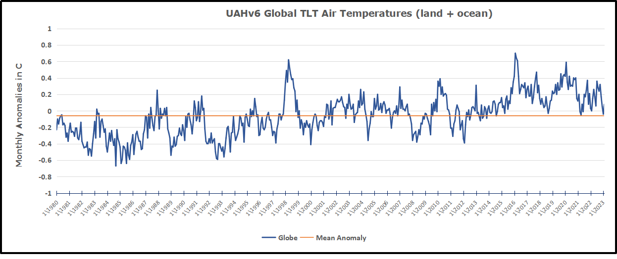

TLTs include mixing above the oceans and probably some influence from nearby more volatile land temps.  Clearly NH and Global land temps have been dropping in a seesaw pattern, nearly 1C lower than the 2016 peak.  Since the ocean has 1000 times the heat capacity as the atmosphere, that cooling is a significant driving force.  TLT measures started the recent cooling later than SSTs from HadSST3, but are now showing the same pattern.  It seems obvious that despite the three El Ninos, their warming has not persisted, and without them it would probably have cooled since 1995.  Of course, the future has not yet been written.


Climate Critical Intelligence Q & A


H/T David Wojick and CFACT

Doctors for Disaster Preparedness are concerned to be ready for real disasters and not be distracted by irrational fears like global warming/climate change. They have provided a useful resource for people to test and deepen their knowledge of an issue distorted for many people by loads of misinformation and exaggerations.

From David Wojick:

A new lesson set called the Climate Change IQ (CCIQ) provides a good skeptical critique of ten top alarmist claims. The format is succinct and non-technical. Each alarmist claim is posed as a question, followed by a short skeptical answer, which is highlighted with a single telling graphic.

Then there is a link to a somewhat longer answer, which in turn includes links to a few online sources of more information. Each lesson is also available in a printable PDF version, suitable for classroom use. This compact format is potentially very useful.

CCIQ comes from a long-standing skeptical group called the Doctors for Disaster Preparedness (DDP). Despite the name, DDP gives attention to pointing out scares that are not disasters waiting to happen. Not surprisingly climate alarmism gets a lot of this attention.

The ten topic questions are wide ranging, including the following. Each speaks to a popular pro-alarmist news hook.

Is climate change the most urgent global health threat?

Are government-sponsored climate scientists the only credible sources of information relating to climate-change policy?

Is the increase in atmospheric CO2 making wildfires worse?

Why can’t all States emulate California’s proposed “clean” energy standards?

What would happen if atmospheric CO2 concentration dropped by half, say to less than 200 ppm?

Are human CO2 emissions acidifying the oceans and endangering shell-making animals?

Will Manhattan and Florida soon be under water if humans do not curtail use of “fossil fuels”?

Do 97% of climate scientists agree that catastrophic climate change will result if humans do not curtail use of “fossil fuels”? (This one includes the dynamite John Christy graph showing the rapidly growing divergence of climate model global temperature forecasts with real world observations.)

Is Arctic ice disappearing?

And the number 1 CCIQ question: Would lowering atmospheric CO2 prevent or mitigate hurricanes?

Note:  Each question title links to a pdf with a longer answer and references. Question 1 link is in red above as an example.  See the CCIQ questionnaire for links to all 10 pdfs

Check it out. Inquiring minds want to know.

Footnote:

“The reason some of us are skeptical about man-made global warming, or climate change, isn’t that we’re in “denial” or the pay of Big Oil. It’s the alarmists’ long run of lurid failed predictions. The models “run hot.” Arctic ice hasn’t vanished. The coral hasn’t died. We haven’t been overrun by rats and super-itchy poison ivy.”  John Robson National Post Canada