El Nino Ocean Warming Abates May 2023

The best context for understanding decadal temperature changes comes from the world’s sea surface temperatures (SST), for several reasons:

  • The ocean covers 71% of the globe and drives average temperatures;
  • SSTs have a constant water content, (unlike air temperatures), so give a better reading of heat content variations;
  • A major El Nino was the dominant climate feature in recent years.

HadSST is generally regarded as the best of the global SST data sets, and so the temperature story here comes from that source. Previously I used HadSST3 for these reports, but Hadley Centre has made HadSST4 the priority, and v.3 will no longer be updated.  HadSST4 is the same as v.3, except that the older data from ship water intake was re-estimated to be generally lower temperatures than shown in v.3.  The effect is that v.4 has lower average anomalies for the baseline period 1961-1990, thereby showing higher current anomalies than v.3. This analysis concerns more recent time periods and depends on very similar differentials as those from v.3 despite higher absolute anomaly values in v.4.  More on what distinguishes HadSST3 and 4 from other SST products at the end. The user guide for HadSST4 is here.

The Current Context

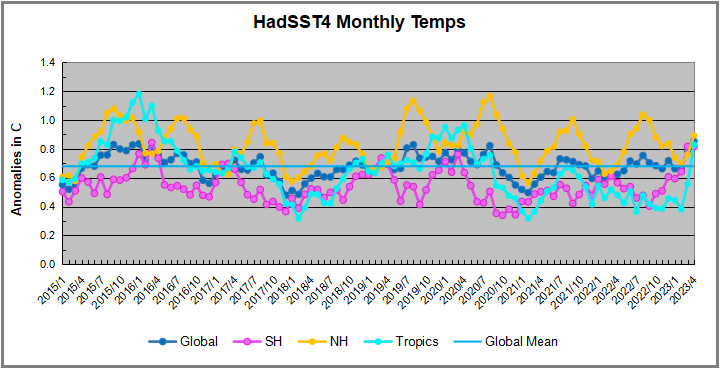
The chart below shows SST monthly anomalies as reported in HadSST4 starting in 2015 through May 2023.  A global cooling pattern is seen clearly in the Tropics since its peak in 2016, joined by NH and SH cycling downward since 2016. 

Note that in 2015-2016 the Tropics and SH peaked in between two summer NH spikes.  That pattern repeated in 2019-2020 with a lesser Tropics peak and SH bump, but with higher NH spikes. By end of 2020, cooler SSTs in all regions took the Global anomaly well below the mean for this period.  In 2021 the summer NH summer spike was joined by warming in the Tropics but offset by a drop in SH SSTs, which raised the Global anomaly slightly over the mean.

Then in 2022, another strong NH summer spike peaked in August, but this time both the Tropic and SH were countervailing, resulting in only slight Global warming, later receding to the mean.   Oct./Nov. temps dropped  in NH and the Tropics took the Global anomaly below the average for this period. After an uptick in December, temps in January 2023 dropped everywhere, strongest in NH, with the Global anomaly further below the mean since 2015.

Now comes El Nino as shown by the upward spike in the Tropics since January, the anomaly nearly doubling from 0.45C to 0.83C.  SH stayed the same as March, but NH also increased 0.13, resulting in a Global anomaly of 0.85C.  However, in May 2023, both the Tropics and SH temps dropped down, reducing the Global anomaly to 0.82C dispite an upward bump in NH.

A longer view of SSTs

To enlarge, open in new tab.

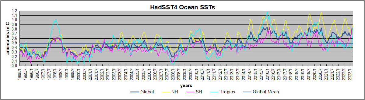
The graph above is noisy, but the density is needed to see the seasonal patterns in the oceanic fluctuations.  Previous posts focused on the rise and fall of the last El Nino starting in 2015.  This post adds a longer view, encompassing the significant 1998 El Nino and since.  The color schemes are retained for Global, Tropics, NH and SH anomalies.  Despite the longer time frame, I have kept the monthly data (rather than yearly averages) because of interesting shifts between January and July.1995 is a reasonable (ENSO neutral) starting point prior to the first El Nino. 

The sharp Tropical rise peaking in 1998 is dominant in the record, starting Jan. ’97 to pull up SSTs uniformly before returning to the same level Jan. ’99. There were strong cool periods before and after the 1998 El Nino event. Then SSTs in all regions returned to the mean in 2001-2. 

SSTS fluctuate around the mean until 2007, when another, smaller ENSO event occurs. There is cooling 2007-8,  a lower peak warming in 2009-10, following by cooling in 2011-12.  Again SSTs are average 2013-14.

Now a different pattern appears.  The Tropics cooled sharply to Jan 11, then rise steadily for 4 years to Jan 15, at which point the most recent major El Nino takes off.  But this time in contrast to ’97-’99, the Northern Hemisphere produces peaks every summer pulling up the Global average.  In fact, these NH peaks appear every July starting in 2003, growing stronger to produce 3 massive highs in 2014, 15 and 16.  NH July 2017 was only slightly lower, and a fifth NH peak still lower in Sept. 2018.

The highest summer NH peaks came in 2019 and 2020, only this time the Tropics and SH were offsetting rather adding to the warming. (Note: these are high anomalies on top of the highest absolute temps in the NH.)  Since 2014 SH has played a moderating role, offsetting the NH warming pulses. After September 2020 temps dropped off down until February 2021.  In 2021-22 there were again summer NH spikes, but in 2022 moderated first by cooling Tropics and SH SSTs, then in October to January 2023 by deeper cooling in NH and Tropics.  

Now in 2023 the Tropics flip from below to above average, and NH starts building up for a summer peak comparable to previous years. In May warming in the Tropics and SH abated, while NH showed a typical upward bump.

What to make of all this? The patterns suggest that in addition to El Ninos in the Pacific driving the Tropic SSTs, something else is going on in the NH.  The obvious culprit is the North Atlantic, since I have seen this sort of pulsing before.  After reading some papers by David Dilley, I confirmed his observation of Atlantic pulses into the Arctic every 8 to 10 years.

Contemporary AMO Observations

Through January 2023 I depended on the Kaplan AMO Index (not smoothed, not detrended) for N. Atlantic observations. But it is no longer being updated, and NOAA says they don’t know its future.  So I find only the Hadsst AMO dataset has data through April.  It differs from Kaplan, which reported average absolute temps measured in N. Atlantic.  “Hadsst AMO  follows Trenberth and Shea (2006) proposal to use the NA region EQ-60°N, 0°-80°W and subtract the global rise of SST 60°S-60°N to obtain a measure of the internal variability, arguing that the effect of external forcing on the North Atlantic should be similar to the effect on the other oceans.”  So the values represent differences between the N. Atlantic and the Global ocean.

The chart above confirms what Kaplan also showed.  As August is the hottest month for the N. Atlantic, its varibility, high and low, drives the annual results for this basin.  Note also the peaks in 2010, lows after 2014, and a rise in 2021. An annual chart below is informative:

Note the difference between blue/green years, beige/brown, and purple/red years.  2010, 2021, 2022 all peaked strongly in August or September.  1998 and 2007 were mildly warm.  2016 and 2018 were matching or cooler than the global average.  2023 is starting out slightly warm.

Summary

The oceans are driving the warming this century.  SSTs took a step up with the 1998 El Nino and have stayed there with help from the North Atlantic, and more recently the Pacific northern “Blob.”  The ocean surfaces are releasing a lot of energy, warming the air, but eventually will have a cooling effect.  The decline after 1937 was rapid by comparison, so one wonders: How long can the oceans keep this up? 

Footnote: Why Rely on HadSST4

HadSST is distinguished from other SST products because HadCRU (Hadley Climatic Research Unit) does not engage in SST interpolation, i.e. infilling estimated anomalies into grid cells lacking sufficient sampling in a given month. From reading the documentation and from queries to Met Office, this is their procedure.

HadSST4 imports data from gridcells containing ocean, excluding land cells. From past records, they have calculated daily and monthly average readings for each grid cell for the period 1961 to 1990. Those temperatures form the baseline from which anomalies are calculated.

In a given month, each gridcell with sufficient sampling is averaged for the month and then the baseline value for that cell and that month is subtracted, resulting in the monthly anomaly for that cell. All cells with monthly anomalies are averaged to produce global, hemispheric and tropical anomalies for the month, based on the cells in those locations. For example, Tropics averages include ocean grid cells lying between latitudes 20N and 20S.

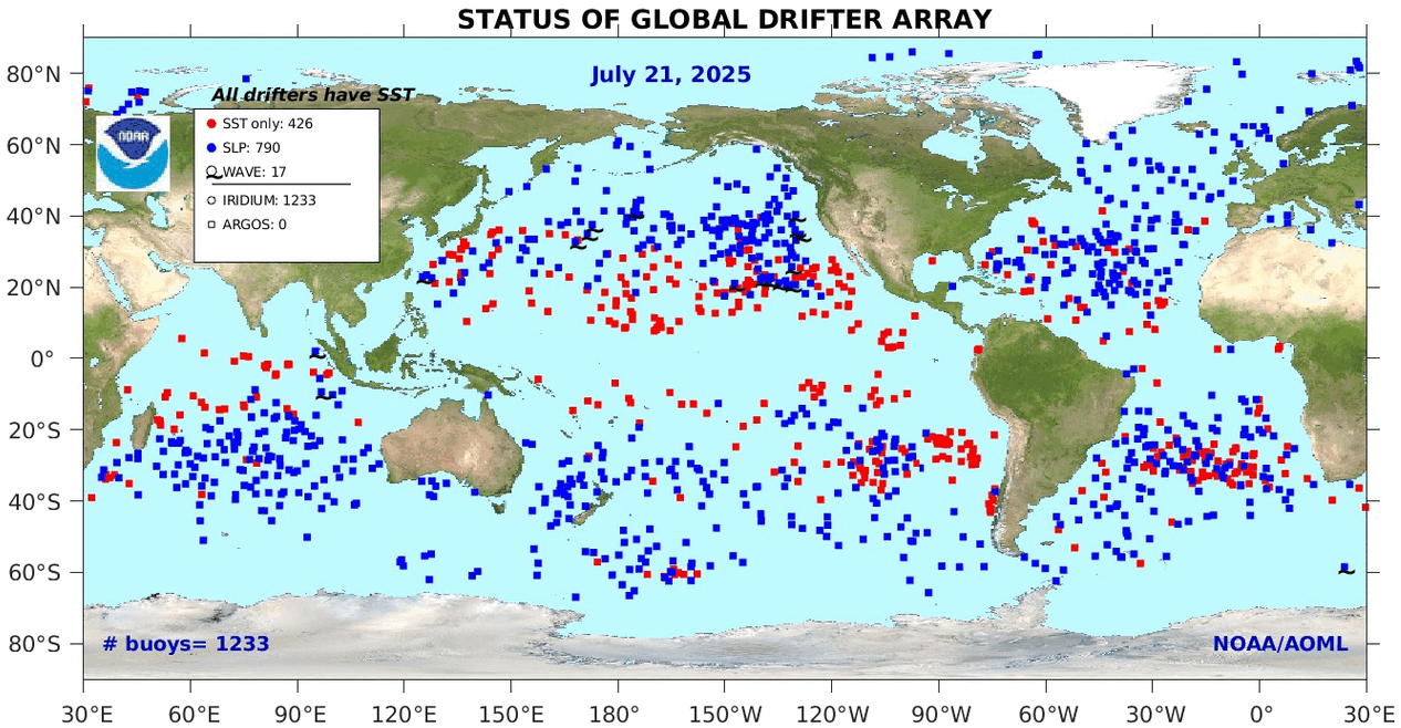
Gridcells lacking sufficient sampling that month are left out of the averaging, and the uncertainty from such missing data is estimated. IMO that is more reasonable than inventing data to infill. And it seems that the Global Drifter Array displayed in the top image is providing more uniform coverage of the oceans than in the past.

uss-pearl-harbor-deploys-global-drifter-buoys-in-pacific-ocean

USS Pearl Harbor deploys Global Drifter Buoys in Pacific Ocean


Climate Primer for Misguided Kids Suing Montana

Jack Hellner explains the basics in his American Thinker article This is some of the garbage we can expect with indoctrinated kids and greedy lawyers.  Excerpts in italics with my bolds and added images.

These children say that their lives have been destroyed because of coal and oil so they are suing Montana.

A group of Montana youth who say their lives are already being affected by climate change and that state government is failing to protect them are the first of dozens of such efforts to get their lawsuit to trial Monday. They will try to persuade a judge that the state’s allegiance to fossil fuel development endangers their health and livelihoods and those of future generations.

Lawsuits and policies should be based on the truth and scientific facts, not on easily manipulated computer models and made up predictions which have consistently been wrong, like this lawsuit and the radical green policies which are being forced on the American people. 

Maybe the state should take the kids to underdeveloped countries that haven’t developed and used their natural resources to see how lucky they are. Then the state should send them a bill for greatly improving their quality and length of life. 

The line of defense against this nuisance lawsuit is long because it is based on factual scientific data.  They can have it presented in the simplest form since they have been taught not to ask questions or do research. 

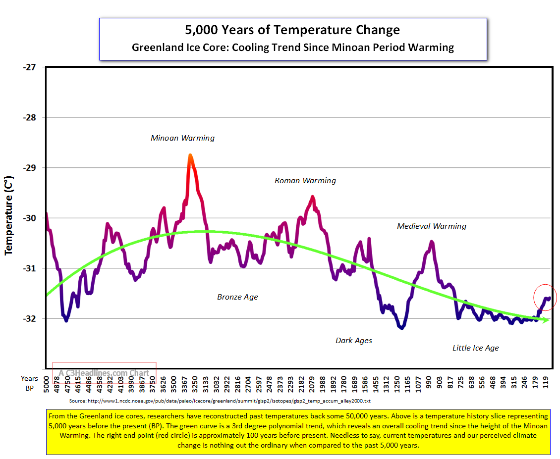
They should be told that the Earth was just as warm 1,000 years ago as it is today. 

Then they should have the scientific fact pointed out to them that a Little Ice Age occurred from around 1300 to 1860 where the Earth cooled a little. 

Dr. Syun Akasofu 2009 diagram from his paper Two Natural Components of Recent Warming.

Then they should be shown that the Earth has only warmed a little in the last 160 years since the Little Ice Age ended, and they should be able to comprehend that the Earth always warms a little after an ice age ends. 

They should be told that although there has been one or two degrees of warming the last 160 years, we also had a 35-year period of cooling from 1940-1975 where the public was warned that a catastrophic ice age was coming. 

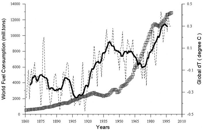
It should be possible for the youth to understand, even as journalists, politicians, and bureaucrats can’t seem to, that if temperatures sometimes rise and sometimes fall while crude oil use and coal use are constantly rising rapidly, that there is no correlation between our use of natural resources and temperatures, nor climate change. 

Figure 5.1. Comparative dynamics of the World Fuel Consumption (WFC) and Global Surface Air Temperature Anomaly (ΔT), 1861-2000. The thin dashed line represents annual ΔT, the bold line—its 13-year smoothing, and the line constructed from rectangles—WFC (in millions of tons of nominal fuel) (Klyashtorin and Lyubushin, 2003). Source: Frolov et al. 2009

They should be able to understand the simple scientific concept that if there is no correlation, there can be no causation. 

They should also be taught that CO2 is a clear, innocuous, non-pollutant gas that makes plants thrive and allows the World to be fed. There is also no correlation between the rise to a small 420-parts-per-million in the atmosphere and temperatures or sea levels. 

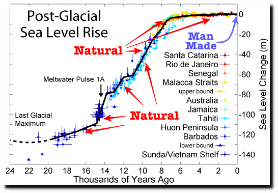
Oceans, which average over 12,000 feet deep, have risen a miniscule 9 inches in 140 years, which is essentially immeasurable, let alone be attributed to CO2, oil, humans or anything else. There are thousands of natural variables.

It would help if children were shown the truth as to how life expectancy has almost doubled since we started using coal and oil and people in countries that don’t use oil and coal live shorter lives. 

Maybe it would help to inform them of all the products that are derived from crude oil and ask them if their lives would be better off without them. 

A Partial list of the over 6,000 products made from one barrel of oil (after creating 19 gallons of gasoline) 

Maybe the children should be shown how all of the previous dire predictions have been wrong including one from over 100 years ago that predicted the ice would soon be gone, that oceans were dying, and coastal cities would soon disappear. 

“The Arctic Ocean is warming up, icebergs are growing scarcer, and in some places the seals are finding the water too hot. Reports from fishermen, seal hunters, and explorers all point to a radical change in climate conditions and hitherto unheard‐of temperatures in the Arctic zone. Exploration expeditions report that scarcely any ice has been met as far north as 81 degrees 29 minutes. Within a few years it is predicted that due to the ice melt the sea will rise and make most coastal cities uninhabitable.” — from an Associated Press report published in The Washington Post on November 2, 1922

It is a true shame that most of the media along with educators spend their time scaring children that we are destroying the Earth and that we don’t have much time left instead of doing their job to educate and inform them and to teach them to ask questions and do research. It is no wonder so many young people are suicidal and don’t want children. 

We get extremely destructive government policies when people
are indoctrinated instead of told the truth.

We should count our blessings that the Earth has such an abundance of natural resources and that humans were given a brain that allowed them to develop them.


Our Chaotic Climate System


Foucault’s pendulum in the Panthéon, Paris

h/t tom0mason for inspiring this post, including his comment below

The Pendulum is Settled Science

I attended North Phoenix High School (Go Mustangs!) where students took their required physics class from a wild and crazy guy. Decades later alumni who don’t remember his name still reminisce about “the crazy science teacher with the bowling ball.”

To demonstrate the law of conservation of energy, he required each and every student to stand on a ladder in one corner of the classroom. Attached to a hook in the center of the rather high ceiling was a rope with a bowling ball on the other end. The student held the ball to his/her nose and then released it, being careful to hold still afterwards.

The 16 pound ball traveled majestically diagonally across the room and equally impressively returned along the same path. The proof of concept was established when the ball stopped before hitting your nose (though not by much).  In those days we learned to trust science and didn’t need to go out marching to signal some abstract virtue.

The equations for pendulums are centuries old and can predict the position of the ball at any point in time based on the mass of the object, length of the rope and starting position.

Pictured above is the currently operating Foucault pendulum that exactly follows these equations. While it had long been known that the Earth rotates, the introduction of the Foucault pendulum in 1851 was the first simple proof of the rotation in an easy-to-see experiment. Today, Foucault pendulums are popular displays in science museums and universities.

What About the Double Pendulum?

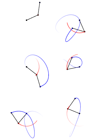
Trajectories of a double pendulum

A comment by tom0mason at alerted me to the science demonstrated by the double compound pendulum, that is, a second pendulum attached to the ball of the first one. It consists entirely of two simple objects functioning as pendulums, only now each is influenced by the behavior of the other.

Lo and behold, you observe that a double pendulum in motion produces chaotic behavior. In a remarkable achievement, complex equations have been developed that can and do predict the positions of the two balls over time, so in fact the movements are not truly chaotic, but with considerable effort can be determined. The equations and descriptions are at Wikipedia Double Pendulum

Long exposure of double pendulum exhibiting chaotic motion (tracked with an LED)

But here is the kicker, as described in tomomason’s comment:

If you arrive to observe the double pendulum at an arbitrary time after the motion has started from an unknown condition (unknown height, initial force, etc) you will be very taxed mathematically to predict where in space the pendulum will move to next, on a second to second basis. Indeed it would take considerable time and many iterative calculations (preferably on a super-computer) to be able to perform this feat. And all this on a very basic system of known elementary mechanics.

And What about the Climate?

This is a simple example of chaotic motion and its unpredictability. How predictable is our climate with so many variables and feedbacks, some known some unknown? Consider that this planet’s weather/climate system is chaotic in nature with many thousands (millions?) of loosely coupled variables and dependencies, and many of these variables have very complex feedback features within them.

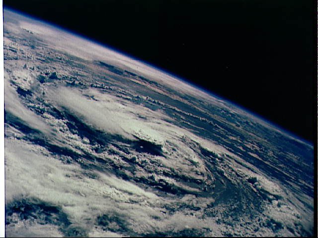
Hurricane Gladys, photographed from orbit by Apollo 7 in 1968 (Photo: NASA)

Summary

To quote the IPCC:

The climate system is a coupled non-linear chaotic system, and therefore the long-term prediction of future climate states is not possible. Rather the focus must be upon the prediction of the probability distribution of the system’s future possible states by the generation of ensembles of model solutions.

A recent National Review article draws the implications:
The range of predicted future warming is enormous — apocalyptism is unwarranted.

But as the IPCC emphasizes, the range for future projections remains enormous. The central question is “climate sensitivity” — the amount of warming that accompanies a doubling of carbon dioxide in the atmosphere. As of its Fifth Assessment Report in 2013, the IPCC could estimate only that this sensitivity is somewhere between 1.5 and 4.5°C. Nor is science narrowing that range. The 2013 assessment actually widened it on the low end, from a 2.0–4.5°C range in the prior assessment. And remember, for any specific level of warming, forecasts vary widely on the subsequent environmental and economic implications.

For now, though, navigating the climate debate will require translating the phrase “climate denier” to mean “anyone unsympathetic to the most aggressive activists’ claims.” This apparently includes anyone who acknowledges meaningful uncertainty in climate models, adopts a less-than-catastrophic outlook about the consequences of future warming, or opposes any facet of the activist policy agenda. The activists will be identifiable as the small group continuing to shout “Denier!” The “deniers” will be identifiable as everyone else.

Climate System Summation

Esteemed climate scientist Richard Lindzen ends a very fine recent presentation (here) with this description of the climate system:

I haven’t spent much time on the details of the science, but there is one thing that should spark skepticism in any intelligent reader. The system we are looking at consists in two turbulent fluids interacting with each other. They are on a rotating planet that is differentially heated by the sun. A vital constituent of the atmospheric component is water in the liquid, solid and vapor phases, and the changes in phase have vast energetic ramifications. The energy budget of this system involves the absorption and reemission of about 200 watts per square meter. Doubling CO2 involves a 2% perturbation to this budget. So do minor changes in clouds and other features, and such changes are common. In this complex multifactor system, what is the likelihood of the climate (which, itself, consists in many variables and not just globally averaged temperature anomaly) is controlled by this 2% perturbation in a single variable? Believing this is pretty close to believing in magic. Instead, you are told that it is believing in ‘science.’ Such a claim should be a tip-off that something is amiss. After all, science is a mode of inquiry rather than a belief structure.

Flow Diagram for Climate Modeling, Showing Feedback Loops

El Nino Warms UAH Air Temps in May 2023

The post below updates the UAH record of air temperatures over land and ocean. Each month and year exposes again the growing disconnect between the real world and the Zero Carbon zealots.  It is as though the anti-hydrocarbon band wagon hopes to drown out the data contradicting their justification for the Great Energy Transition.  Yes there is warming from an El Nino buildup but no basis to blame it on CO2.  

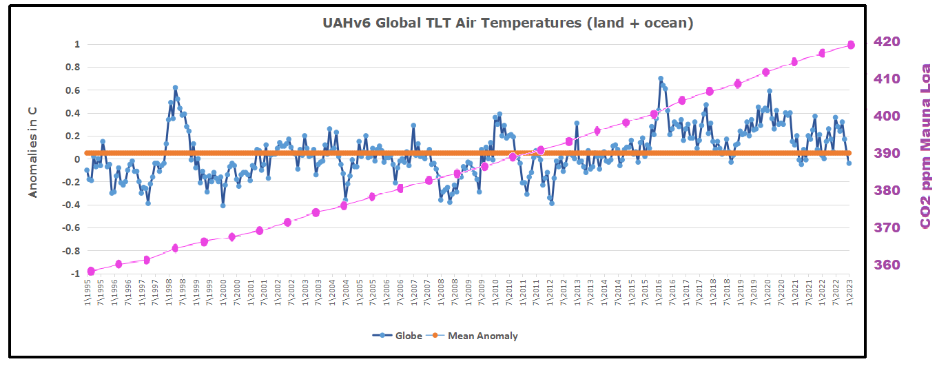
As an overview consider how recent rapid cooling  completely overcame the warming from the last 3 El Ninos (1998, 2010 and 2016).  The UAH record shows that the effects of the last one were gone as of April 2021, again in November 2021, and in February and June 2022  Now at year end 2022 and continuing into 2023 global temp anomaly is matching or lower than average since 1995, an ENSO neutral year. (UAH baseline is now 1991-2020).

For reference I added an overlay of CO2 annual concentrations as measured at Mauna Loa.  While temperatures fluctuated up and down ending flat, CO2 went up steadily by ~60 ppm, a 15% increase.

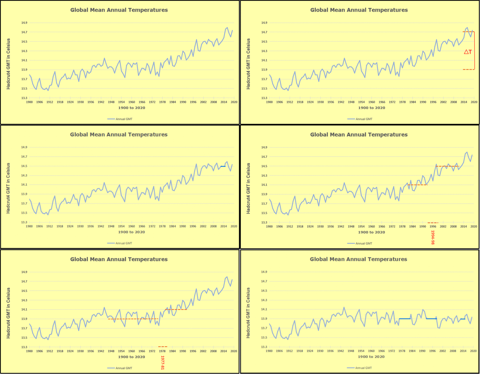
Furthermore, going back to previous warmings prior to the satellite record shows that the entire rise of 0.8C since 1947 is due to oceanic, not human activity.

gmt-warming-events

The animation is an update of a previous analysis from Dr. Murry Salby.  These graphs use Hadcrut4 and include the 2016 El Nino warming event.  The exhibit shows since 1947 GMT warmed by 0.8 C, from 13.9 to 14.7, as estimated by Hadcrut4.  This resulted from three natural warming events involving ocean cycles. The most recent rise 2013-16 lifted temperatures by 0.2C.  Previously the 1997-98 El Nino produced a plateau increase of 0.4C.  Before that, a rise from 1977-81 added 0.2C to start the warming since 1947.

Importantly, the theory of human-caused global warming asserts that increasing CO2 in the atmosphere changes the baseline and causes systemic warming in our climate.  On the contrary, all of the warming since 1947 was episodic, coming from three brief events associated with oceanic cycles. 

Update August 3, 2021

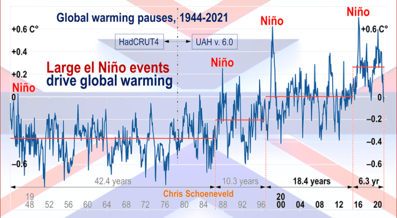
Chris Schoeneveld has produced a similar graph to the animation above, with a temperature series combining HadCRUT4 and UAH6. H/T WUWT

image-8


mc_wh_gas_web20210423124932

See Also Worst Threat: Greenhouse Gas or Quiet Sun?

May 2023 Update  El Nino Shows Up In Warming Spike

banner-blog

With apologies to Paul Revere, this post is on the lookout for cooler weather with an eye on both the Land and the Sea.  While you will hear a lot about 2020-21 temperatures matching 2016 as the highest ever, that spin ignores how fast the cooling set in.  The UAH data analyzed below shows that warming from the last El Nino Had fully dissipated with chilly temperatures in all regions. After a warming blip in 2022, land and ocean temps dropped again with 2023 starting below the mean since 1995.  Now in March to May EL Nino appears in a Tropical ocean Spike.

UAH has updated their tlt (temperatures in lower troposphere) dataset for May 2023. Posts on their reading of ocean air temps this month preceded updated records from HadSST4.  I last posted on SSTs using HadSST4 El Nino Comes to Save Global Warming April 2023 This month also has a separate graph of land air temps because the comparisons and contrasts are interesting as we contemplate possible cooling in coming months and years. Sometimes air temps over land diverge from ocean air changes.  For example in February, Tropical ocean temps alone moved upward, while temps in all land regions rebounded after hitting bottom. In May, as shown later on, ocean air everywhere warmed, led by a Tropics spike, while land air temps also rose sharply, despite cooling in SH.  Thus a Global uptick in UAH temperature record.

Note:  UAH has shifted their baseline from 1981-2010 to 1991-2020 beginning with January 2021.  In the charts below, the trends and fluctuations remain the same but the anomaly values change with the baseline reference shift.

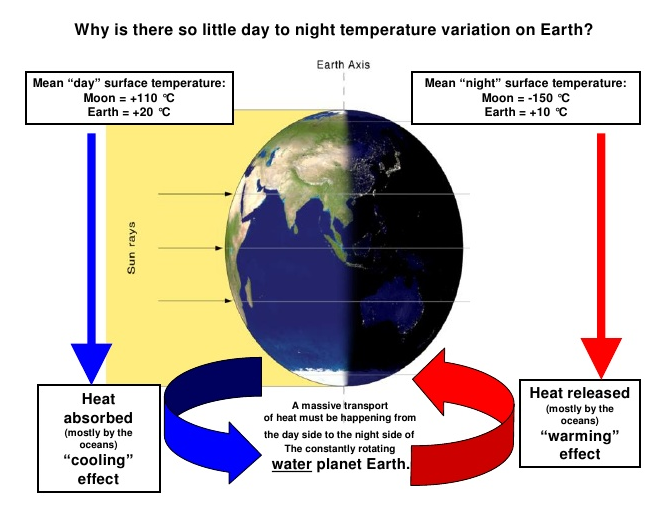
Presently sea surface temperatures (SST) are the best available indicator of heat content gained or lost from earth’s climate system.  Enthalpy is the thermodynamic term for total heat content in a system, and humidity differences in air parcels affect enthalpy.  Measuring water temperature directly avoids distorted impressions from air measurements.  In addition, ocean covers 71% of the planet surface and thus dominates surface temperature estimates.  Eventually we will likely have reliable means of recording water temperatures at depth.

Recently, Dr. Ole Humlum reported from his research that air temperatures lag 2-3 months behind changes in SST.  Thus the cooling oceans now portend cooling land air temperatures to follow.  He also observed that changes in CO2 atmospheric concentrations lag behind SST by 11-12 months.  This latter point is addressed in a previous post Who to Blame for Rising CO2?

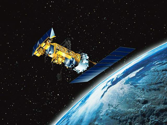
After a change in priorities, updates are now exclusive to HadSST4.  For comparison we can also look at lower troposphere temperatures (TLT) from UAHv6 which are now posted for May.  The temperature record is derived from microwave sounding units (MSU) on board satellites like the one pictured above. Recently there was a change in UAH processing of satellite drift corrections, including dropping one platform which can no longer be corrected. The graphs below are taken from the revised and current dataset.

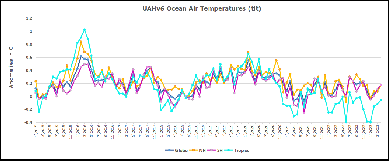
The UAH dataset includes temperature results for air above the oceans, and thus should be most comparable to the SSTs. There is the additional feature that ocean air temps avoid Urban Heat Islands (UHI).  The graph below shows monthly anomalies for ocean air temps since January 2015.

Note 2020 was warmed mainly by a spike in February in all regions, and secondarily by an October spike in NH alone. In 2021, SH and the Tropics both pulled the Global anomaly down to a new low in April. Then SH and Tropics upward spikes, along with NH warming brought Global temps to a peak in October.  That warmth was gone as November 2021 ocean temps plummeted everywhere. After an upward bump 01/2022 temps reversed and plunged downward in June.  After an upward spike in July, ocean air everywhere cooled in August and also in September.   

After sharp cooling everywhere in January 2023, all regions were into negative territory. Note the Tropics matched the lowest, followed since by spiking upward +0.7C, with the largest increase in May 2023.  Warming in both NH and SH added to a higher Global temp.  The SSTs are comparable to May 2015 and May 2017, with another peak like 2016 possible.  

Land Air Temperatures Tracking Downward in Seesaw Pattern

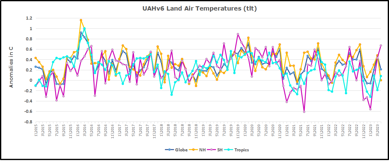
We sometimes overlook that in climate temperature records, while the oceans are measured directly with SSTs, land temps are measured only indirectly.  The land temperature records at surface stations sample air temps at 2 meters above ground.  UAH gives tlt anomalies for air over land separately from ocean air temps.  The graph updated for May is below.

Here we have fresh evidence of the greater volatility of the Land temperatures, along with extraordinary departures by SH land.  Land temps are dominated by NH with a 2021 spike in January,  then dropping before rising in the summer to peak in October 2021. As with the ocean air temps, all that was erased in November with a sharp cooling everywhere.  After a summer 2022 NH spike, land temps dropped everywhere, and in January, further cooling in SH and Tropics offset by an uptick in NH. 

Remarkably, in 2023, SH land air anomaly shot up 1.2C, from  -0.56C in January to +0.67 in April. Now in May, rising Tropical and NH Land air temps rose, pulling up the Global land anomaly, despite a drop in SH land temps.

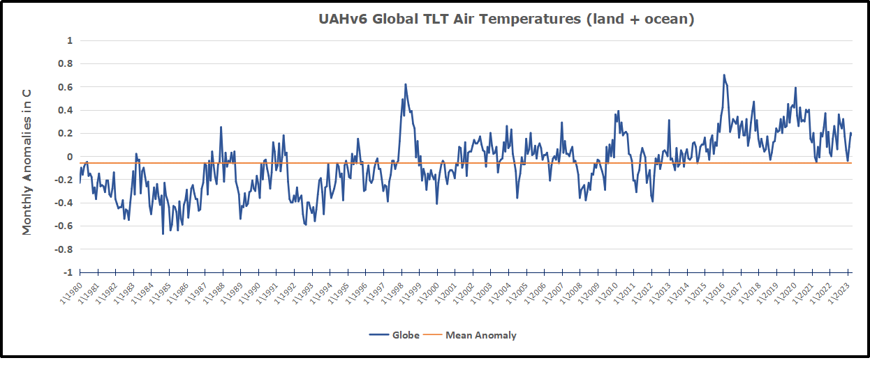
The Bigger Picture UAH Global Since 1980

The chart shows monthly Global anomalies starting 01/1980 to present.  The average monthly anomaly is -0.06, for this period of more than four decades.  The graph shows the 1998 El Nino after which the mean resumed, and again after the smaller 2010 event. The 2016 El Nino matched 1998 peak and in addition NH after effects lasted longer, followed by the NH warming 2019-20.   An upward bump in 2021 was reversed with temps having returned close to the mean as of 2/2022.  March and April brought warmer Global temps, later reversed, and with the sharp drops in Nov., Dec. and January 2023 temps, there was no increase over 1980. Now in 2023 the May peak matches the two previous Julys.  Where it goes from here, up or down, remains to be seen.

TLTs include mixing above the oceans and probably some influence from nearby more volatile land temps.  Clearly NH and Global land temps have been dropping in a seesaw pattern, nearly 1C lower than the 2016 peak.  Since the ocean has 1000 times the heat capacity as the atmosphere, that cooling is a significant driving force.  TLT measures started the recent cooling later than SSTs from HadSST3, but are now showing the same pattern.  It seems obvious that despite the three El Ninos, their warming has not persisted, and without them it would probably have cooled since 1995.  Of course, the future has not yet been written.


What If Climate is Self-Regulating?

Andy Kessler writes at WSJ Can the Climate Heal Itself?  Excerpts in italics with my bolds and added images.

Dissenters from the catastrophe consensus on warming are worth listening to.

Stop with all the existential-crisis talk. President Biden said, “Climate change is literally an existential threat to our nation and to the world.” Defense Secretary Lloyd Austin also talks about the “existential threat” of climate change. National security adviser Jake Sullivan identifies an “accelerating climate crisis” as one reason for a “new consensus” for government picking winners and losers in the economy. Be wary of those touting consensus.

But what if the entire premise is wrong? What if the Earth is self-healing? Before you hurl the “climate denier” invective at me, let’s think this through. Earth has been around for 4.5 billion years— living organisms for 3.7 billion. Surely, an enlightened engineer might think, the planet’s creator built in a mechanism to regulate heat, or we wouldn’t still be here to worry about it.

The theory of climate change is that excess carbon dioxide and methane trap the sun’s radiation in the atmosphere, and these man-made greenhouse gases reflect more of that heat back to Earth, warming the planet. Pretty simple. Eventually, we reach a tipping point when positive feedback loops form—less ice to reflect sunlight, warm oceans that can no longer absorb carbon dioxide—and then we fry, existentially. So lose those gas stoves and carbon spewing Suburbans.

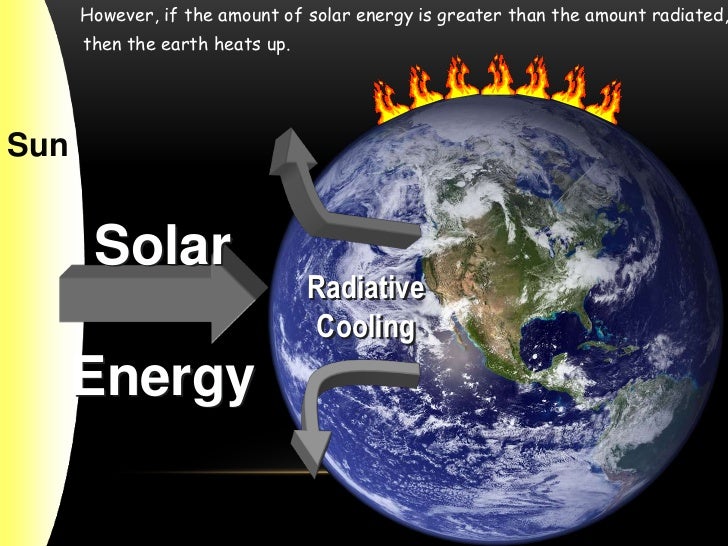
Note nearly half incoming solar energy is not absorbed by Earth’s surface.

But nothing is simple. What about negative feedback loops? Examples: human sweat and its cooling condensation or our irises dilating or constricting based on the amount of light coming in. Clouds, which can block the sun or trap its radiation, are rarely mentioned in climate talk.

Why? Because clouds are notoriously difficult to model in climate simulations. Steven Koonin, a New York University professor and author of “Unsettled,” tells me that today’s computing power can typically model the Earth’s atmosphere in grids 60 miles on a side. Pretty coarse. So, Mr. Koonin says, “the properties of clouds in climate models are often adjusted or ‘tuned’ to match observations.” Tuned!

Last month the coddling modelers at the United Nations’ World Meteorological Organization stated that “warming El Niño” and “human-induced climate change” mean there is a “66% likelihood that annual average global temperatures will exceed the threshold of 1.5 degrees Celsius above preindustrial levels by 2027.” Notice that El Niño is mentioned first.

To enlarge open image in new tab.

Richard Lindzen, a professor at the Massachusetts Institute of Technology and lead author of an early Intergovernmental Panel on Climate Change report, told me, “Temperatures in the tropics remain relatively constant compared with changes in the tropics-to-pole temperatures. The tropics-polar difference is about 40 degrees Celsius today but was 20 degrees during the warm Eocene Epoch and 60 degrees during Ice Ages.” This difference has more to do with changes in the Earth’s rotation, like wobbling, than anything else. According to Mr. Lindzen, this effect is some 70 times as great as human-made greenhouse gases.

OK, back to clouds. Cumulus clouds, the puffy ones often called thunderclouds, are an important convection element, carrying heat from the Earth’s surface to the upper atmosphere. Above them are high-altitude cirrus clouds, which can reflect heat back toward the surface. A 2001 Lindzen paper, however, suggests that high-level cirrus clouds in the tropics dissipate as temperatures rise. These thinning cirrus clouds allow more heat to escape. It’s called the Iris Effect, like a temperature-controlled vent opener for an actual greenhouse so you don’t (existentially) fry your plants. Yes, Earth has a safety valve.

Mr. Lindzen says, “This more than offsets the effect of greenhouse gases.” As you can imagine, theories debunking the climate consensus are met with rebuttals and more papers. Often, Mr. Lindzen points out, critics, “to maintain the warming narrative, adjust their models, especially coverage and reflection or albedo of clouds in the tropics.” More tuning.

A 2021 paper co-authored by Mr. Lindzen shows strong support for an Iris Effect.  Maybe Earth really was built by an engineer. Proof? None other than astronomer Carl Sagan described the Faint Young Sun Paradox that, 2.5 billion years ago, the sun’s energy was 30% less, but Earth’s climate was basically the same as today. Cirrus clouds likely formed to trap heat—a closed Iris and a negative feedback loop at work.

Figure 2: At higher temperatures there are more thunderstorms over the ocean and the area without high level clouds (dry and clear) expands further and thus allows more heat to radiate off into space (strong OLR) than when temperatures are lower, i.e. when the iris is smaller. Source: Figure 1 from MS15.

In a 2015 Nature Geoscience paper, Thorsten Mauritsen and Bjorn Stephen at the Max Planck Institute for Meteorology reran climate models using the Iris Effect and found them better at modeling historic observations. No need for tuning. Wouldn’t it be nice if the U.N. used realistic cloud and climate models?

Earth has warmed, but I’m convinced negative feedback loops will save us. Dismissing the Iris Effect or detuning it isn’t science. Sadly, climate science has morphed into climate rhetoric. And note, Treasury Secretary Janet Yellen explained in April that green spending “is, at its core, about turning the climate crisis into an economic opportunity.” Hmmm. “Catastrophic,” “existential” and “crisis” are cloudy thinking. Negative feedback is welcome. Dissenters from the catastrophe consensus on warming are worth listening to.

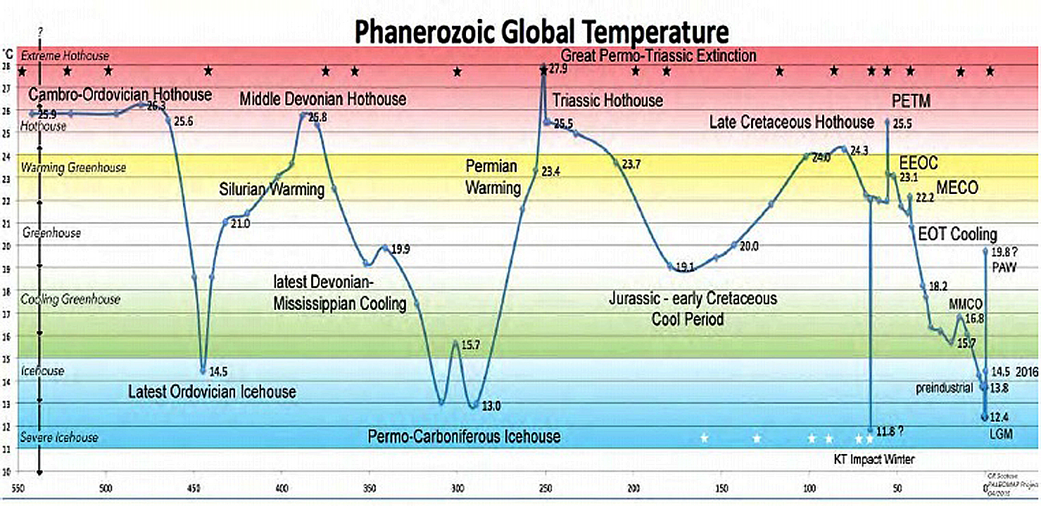
Footnote–Phanerozoic Temperatures

Maurice Lavigne commented that the best evidence of our self-regulating climate is found in the Phanerozoic temperature record.  I had to find out what he meant, which led me to discover this:

The PhanSST global database of Phanerozoic sea surface temperature proxy data

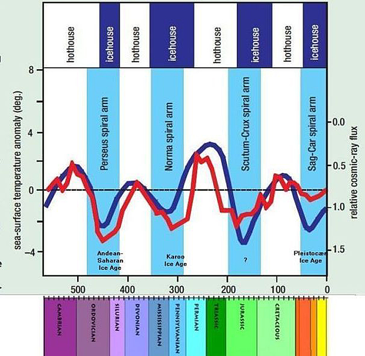
And this graph from Nir Shaviv and Jan Veizer:

Cosmic radiation and temperature through Phanerozoic according to Nir Shaviv and Jan Veizer. The vertical axis on the left represents the temperature as deviations from present temperature. The vertical axis on the right shows the cosmic radiation as multiples of radiation today – today’s radiation is set to 1. Note that the right scale is inverted so that strong radiation can be compared to low temperature. The red curve represents the temperature and the blue radiation. Temperature and cosmic radiation appear to have a very good correlation. The horizontal axis represents time through Phanerozoic’s more than 500 million years. Note that the Carboniferous is divided into “Missisipian” and “Pennsylvanian”, that is an American custom, referring to different types of coal from the coal mines.

The image above comes from Christopher Scotese PaleoMAP project, showing the dramatic temperature and climate shifts, hothouse to icehouse and everything in between.  Finally, a graph showing these temperature cycles unrelated to CO2 concentrations.

See Also More Evidence of Nature’s Sunscreen

Greenhouse with adjustable sun screens to control warming.


Climate Prime Example of Broken Science

Net Zero has published a wonderful essay by William Briggs On Broken Science.  It is a joy to read with great clarity, depth and plain talk while being delightful.  The excerpt here is the segment describing how climate science is the epitome of the wider phenomenon of broken science.

We all agree that the planet needs saving. Everybody says so. From global cooling.

When climatology was becoming a new field, they really did say a new ice age was coming.
Newsweek in 1975 reported:
There are ominous signs that the earth’s weather patterns have begun to change dramatically and that these changes may portend a drastic decline in food production.

Time in 1974 said:
Climatologist Kenneth Hare, a former president of the Royal Meteorological Society, believes that the continuing drought…gave the world a grim premonition of what might happen. Warns Hare: ‘I don’t believe the world’s present population is sustainable if [trends continue]’.

There are scores upon scores of these, the scientists and groups such as the UN warning of mass deaths by starvation and so on. Well, climatological science grew, and the temperature warmed, and then we got global warming. Caused, incidentally, by the same thing said to cause global cooling: oil.

Global warming in time became ‘climate change’: a brilliant name, because the earth’s climate changes unceasingly. Thus any change, which is inevitable, can be said to be because of ‘climate change.’ Correlation becomes causation with ease here.

‘Climate change’ was quickly married to scientism, where it came to be synonymous with ‘solutions’ to ‘climate change’. Because of this error, doubt expressed about the so-called solutions caused one to be called a ‘climate change denier’ – an asinine name, because no working scientist, not one, denies the earth’s climate changes or is unaffected by man.

US Secretary of the Treasury Janet Yellen recently said that ‘Climate change is an existential threat’ and that the ‘world will become uninhabitable’ if – you know the rest – if we don’t act. Uninhabitable is a mighty word. Rode and Fischbeck in 2021 examined environmental apocalyptic predictions and discovered that the average time until The End, for those saying we ‘Must act now’, as Yellen did, is about nine years.

Predictions of ‘only nine years left’ started gradually, in the 1970s. They now happen regularly. Funny thing about these forecasts is that failure never counts against theory. Which is another strike against falsification.

That is a story unto itself. Let’s instead peek at the science of ‘climate change.’ Not at the thermodynamics or fluid physics, which is too much for us here, but at the things which are claimed will go bad because of ‘climate change.’

Which is everything. There is no ill that will not be exacerbated by ‘climate change’, and there is no good thing that will escape degradation. ‘Climate change’ will simultaneously cause every beast and bug and weed which is a menace to flourish, and it will corrupt or kill every furry, delicious, and photogenic animal.

There is a fellow in the UK who collects these things. His ‘warm list‘ total right now is about 900 science papers, an undercount. Academics have proved, to their satisfaction, that ‘climate change’ will cause or exacerbate (just reading the first few): AIDS, Afghan poppies destroyed, African holocaust, aged deaths, poppies more potent, Africa devastated, Africa in conflict, African aid threatened, aggressive weeds, Air France crash, air pockets, air pressure changes, airport farewells virtual, airport malaria, Agulhas current, Alaskan towns slowly destroyed, Al Qaeda and Taliban Being Helped, allergy increase, allergy season longer, [and my favourite] alligators in the Thames! And we haven’t even come close to getting out of the As.

There is not one study, that I know of, that remarks on how a slight increase in globally average temperature will lead to more warm, pleasant summer afternoons. That a small change in the earth’s climate, whether caused by man or not, can only be seen as wholly and entirely bad, and can in no way be good, is sufficient proof, I think, that science has gone horribly wrong. It’s not logically impossible, of course, but it cannot be believed.

Yet this doesn’t say how these beliefs are generated. They happen by some of the reasons we’ve already mentioned, but also by forgetting the multiplication of uncertainties.

Given knowledge of coins, the chance of a head on a flip is one half. Two heads in a row is one quarter: the uncertainties are multiplied. Three in a row is one eighth; four is one in sixteen. If the event of interest is that string of four heads, we must announce the small probability of about 6%. It would be an obvious error, and a silly mathematical blunder, to say the probability is ‘one half’ because the chance of the last head is one half. And it would be outrageous if a headline were to blare ‘Earth will see a Head on last throw.’ Agreed?

But that’s exactly how ‘climate change’ scare stories are produced. We first have a model of climate change, and how man might affect the climate. There is only a chance this model is correct. It is not certain. We next have a weather model, which rides on top of the climate model, which says how the weather will change when the climate does. This model is not certain, either. We then have a third model, about how some item of importance – the welfare of some animal or the size of coffee production or whatever – is affected by the weather. This third model is not certain. We finally, or eventually, have a fourth model, which shows how a solution will stop this bad thing from happening. This model is also uncertain.

In the end, it will be announced ‘We must do X to stop Y’. This is equivalent to ‘Earth will see a Head.’ Causal language. Which we agreed was an error. The chain of uncertainties must be multiplied. The greater the chain, the more uncertain the whole must be. This is never remembered, but must be, especially when the number of claims grows almost without bound.

The Deadly Sin Of Reification: Mistaking models for Reality

We are in rugged territory here, for the closer we get to the true nature of causation, which requires a clear understanding of metaphysics, the subtler the mistakes that are made, and the more difficult they are to describe. Plus, I have detained you long enough.

It would, I hope you agree, be an obvious fallacy to say that Y was not or cannot be observed, when Y was in fact observed, because some theory X says Y is not possible. Yes?

This error abounds. X is some cherished model or theory, and Y an observation which is scoffed at, dismissed, or ‘explained’ away, because it does not accord with theory.

This happens in the least sciences, like dowsing or astrology, where practitioners reflexively explain away their mistakes. But it also happens with great and persistent frequency in the greatest sciences, like physics.

It also leads to the current mini-panic over ‘AI’, or ‘artificial intelligence.’ Which it isn’t: intelligence, that is. All models only say what they are told to say – a philosophic truth that when forgotten leads to scientism – and AI is only a model. AI is nothing more than an abacus, which does its calculations at the direction of real intelligence in wooden beads, with the beads replaced with electric potential differences.

But because the allure and love of theory is too strong, it is believed that computer intelligence will somehow ‘emerge’ into real intelligence, just like the behaviour of large objects is said to ‘emerge’ from quantum interactions.

I will upset many when I say this is always a bluff, a great grand bluff. There is no causal proof of ‘emergence’: if there was, it would be given. Talk of emergence is always wishful thinking, reflecting a desire not to question the philosophy of what philosopher Robert Koons and others call ‘microphysicalism’, the ancient Democritian idea that everything is just particles bumping into things.

There are alternatives to this philosophy, such as the revival of Aristotelian metaphysics, which would do wonders for quantum mechanics if it were better known. Unfortunately, we haven’t the time to cover any of them.

The Deadly Sin Of Reification, the mistaking of models for Reality, is much worse than I have made it sound. It leads to strange and untestable creations, such as the multiverse and ‘many worlds’ in physics, and gender theory, and all that they have wrought.

See Also Chameleon Climate Models


UAH Air Temps Warming Little in April 2023

The post below updates the UAH record of air temperatures over land and ocean. Each month and year exposes again the growing disconnect between the real world and the Zero Carbon zealots.  It is as though the anti-hydrocarbon band wagon hopes to drown out the data contradicting their justification for the Great Energy Transition.  

As an overview consider how recent rapid cooling  completely overcame the warming from the last 3 El Ninos (1998, 2010 and 2016).  The UAH record shows that the effects of the last one were gone as of April 2021, again in November 2021, and in February and June 2022  Now at year end 2022 and continuing into 2023 global temp anomaly is matching or lower than average since 1995, an ENSO neutral year. (UAH baseline is now 1991-2020).

For reference I added an overlay of CO2 annual concentrations as measured at Mauna Loa.  While temperatures fluctuated up and down ending flat, CO2 went up steadily by ~60 ppm, a 15% increase.

Furthermore, going back to previous warmings prior to the satellite record shows that the entire rise of 0.8C since 1947 is due to oceanic, not human activity.

gmt-warming-events

The animation is an update of a previous analysis from Dr. Murry Salby.  These graphs use Hadcrut4 and include the 2016 El Nino warming event.  The exhibit shows since 1947 GMT warmed by 0.8 C, from 13.9 to 14.7, as estimated by Hadcrut4.  This resulted from three natural warming events involving ocean cycles. The most recent rise 2013-16 lifted temperatures by 0.2C.  Previously the 1997-98 El Nino produced a plateau increase of 0.4C.  Before that, a rise from 1977-81 added 0.2C to start the warming since 1947.

Importantly, the theory of human-caused global warming asserts that increasing CO2 in the atmosphere changes the baseline and causes systemic warming in our climate.  On the contrary, all of the warming since 1947 was episodic, coming from three brief events associated with oceanic cycles. 

Update August 3, 2021

Chris Schoeneveld has produced a similar graph to the animation above, with a temperature series combining HadCRUT4 and UAH6. H/T WUWT

image-8


mc_wh_gas_web20210423124932

See Also Worst Threat: Greenhouse Gas or Quiet Sun?

April 2023 Update  Land and Sea Temps Little Changed

banner-blog

With apologies to Paul Revere, this post is on the lookout for cooler weather with an eye on both the Land and the Sea.  While you will hear a lot about 2020-21 temperatures matching 2016 as the highest ever, that spin ignores how fast the cooling set in.  The UAH data analyzed below shows that warming from the last El Nino was fully dissipated with chilly temperatures in all regions. After a warming blip in 2022, land and ocean temps dropped again with 2023 starting below the mean since 1995.

UAH has updated their tlt (temperatures in lower troposphere) dataset for April 2023. Posts on their reading of ocean air temps this month came later the same day as updated records from HadSST4.  I just posted on SSTs using HadSST4 El Nino Comes to Save Global Warming April 2023 This month also has a separate graph of land air temps because the comparisons and contrasts are interesting as we contemplate possible cooling in coming months and years. Sometimes air temps over land diverge from ocean air changes.  For example in February, Tropical ocean temps alone moved upward, while temps in all land regions rebounded after hitting bottom. In April, as shown later on, ocean air warmed slightly, while NH land air cooled sharply, leaving the overall Global anomally little changed.

Note:  UAH has shifted their baseline from 1981-2010 to 1991-2020 beginning with January 2021.  In the charts below, the trends and fluctuations remain the same but the anomaly values change with the baseline reference shift.

Presently sea surface temperatures (SST) are the best available indicator of heat content gained or lost from earth’s climate system.  Enthalpy is the thermodynamic term for total heat content in a system, and humidity differences in air parcels affect enthalpy.  Measuring water temperature directly avoids distorted impressions from air measurements.  In addition, ocean covers 71% of the planet surface and thus dominates surface temperature estimates.  Eventually we will likely have reliable means of recording water temperatures at depth.

Recently, Dr. Ole Humlum reported from his research that air temperatures lag 2-3 months behind changes in SST.  Thus the cooling oceans now portend cooling land air temperatures to follow.  He also observed that changes in CO2 atmospheric concentrations lag behind SST by 11-12 months.  This latter point is addressed in a previous post Who to Blame for Rising CO2?

After a change in priorities, updates are now exclusive to HadSST4.  For comparison we can also look at lower troposphere temperatures (TLT) from UAHv6 which are now posted for March.  The temperature record is derived from microwave sounding units (MSU) on board satellites like the one pictured above. Recently there was a change in UAH processing of satellite drift corrections, including dropping one platform which can no longer be corrected. The graphs below are taken from the revised and current dataset.

The UAH dataset includes temperature results for air above the oceans, and thus should be most comparable to the SSTs. There is the additional feature that ocean air temps avoid Urban Heat Islands (UHI).  The graph below shows monthly anomalies for ocean air temps since January 2015.

Note 2020 was warmed mainly by a spike in February in all regions, and secondarily by an October spike in NH alone. In 2021, SH and the Tropics both pulled the Global anomaly down to a new low in April. Then SH and Tropics upward spikes, along with NH warming brought Global temps to a peak in October.  That warmth was gone as November 2021 ocean temps plummeted everywhere. After an upward bump 01/2022 temps reversed and plunged downward in June.  After an upward spike in July, ocean air everywhere cooled in August and also in September.   After sharp cooling everywhere in January 2023, all regions were into negative territory. Now in February, March and April, a sharp rise in the Tropics with upticks elsewhere led to a rise globally slightly above zero. Unusually April SH, NH and Global anomalies were all the same 0.17C.

Land Air Temperatures Tracking Downward in Seesaw Pattern

We sometimes overlook that in climate temperature records, while the oceans are measured directly with SSTs, land temps are measured only indirectly.  The land temperature records at surface stations sample air temps at 2 meters above ground.  UAH gives tlt anomalies for air over land separately from ocean air temps.  The graph updated for April is below.

Here we have fresh evidence of the greater volatility of the Land temperatures, along with extraordinary departures by SH land.  Land temps are dominated by NH with a 2021 spike in January,  then dropping before rising in the summer to peak in October 2021. As with the ocean air temps, all that was erased in November with a sharp cooling everywhere.  After a summer 2022 NH spike, land temps dropped everywhere, and in January, further cooling in SH and Tropics offset by an uptick in NH. 

Remarkably, in 2023, SH land air anomaly shot up 1.2C, from  -0.56C in January to +0.67 in April. Land air in the Tropics also rose, but NH land air dropped from +0.48C down to 0C.  Due to NH having twice the land surface as SH, the Global land anomaly was pulled down.

The Bigger Picture UAH Global Since 1980

The chart shows monthly Global anomalies starting 01/1980 to present.  The average monthly anomaly is -0.06, for this period of more than four decades.  The graph shows the 1998 El Nino after which the mean resumed, and again after the smaller 2010 event. The 2016 El Nino matched 1998 peak and in addition NH after effects lasted longer, followed by the NH warming 2019-20.   An upward bump in 2021 was reversed with temps having returned close to the mean as of 2/2022.  March and April brought warmer Global temps, later reversed, and with the sharp drops in Nov., Dec. and January 2023 temps, there was no increase over 1980. Now in 2023 February-April there is a slight rebound over zero.

TLTs include mixing above the oceans and probably some influence from nearby more volatile land temps.  Clearly NH and Global land temps have been dropping in a seesaw pattern, nearly 1C lower than the 2016 peak.  Since the ocean has 1000 times the heat capacity as the atmosphere, that cooling is a significant driving force.  TLT measures started the recent cooling later than SSTs from HadSST3, but are now showing the same pattern.  It seems obvious that despite the three El Ninos, their warming has not persisted, and without them it would probably have cooled since 1995.  Of course, the future has not yet been written.


El Nino Comes to Save Global Warming April 2023

The best context for understanding decadal temperature changes comes from the world’s sea surface temperatures (SST), for several reasons:

  • The ocean covers 71% of the globe and drives average temperatures;
  • SSTs have a constant water content, (unlike air temperatures), so give a better reading of heat content variations;
  • A major El Nino was the dominant climate feature in recent years.

HadSST is generally regarded as the best of the global SST data sets, and so the temperature story here comes from that source. Previously I used HadSST3 for these reports, but Hadley Centre has made HadSST4 the priority, and v.3 will no longer be updated.  HadSST4 is the same as v.3, except that the older data from ship water intake was re-estimated to be generally lower temperatures than shown in v.3.  The effect is that v.4 has lower average anomalies for the baseline period 1961-1990, thereby showing higher current anomalies than v.3. This analysis concerns more recent time periods and depends on very similar differentials as those from v.3 despite higher absolute anomaly values in v.4.  More on what distinguishes HadSST3 and 4 from other SST products at the end. The user guide for HadSST4 is here.

The Current Context

The chart below shows SST monthly anomalies as reported in HadSST4 starting in 2015 through April 2023.  A global cooling pattern is seen clearly in the Tropics since its peak in 2016, joined by NH and SH cycling downward since 2016. 

Note that in 2015-2016 the Tropics and SH peaked in between two summer NH spikes.  That pattern repeated in 2019-2020 with a lesser Tropics peak and SH bump, but with higher NH spikes. By end of 2020, cooler SSTs in all regions took the Global anomaly well below the mean for this period.  In 2021 the summer NH summer spike was joined by warming in the Tropics but offset by a drop in SH SSTs, which raised the Global anomaly slightly over the mean.

Then in 2022, another strong NH summer spike peaked in August, but this time both the Tropic and SH were countervailing, resulting in only slight Global warming, later receding to the mean.   Oct./Nov. temps dropped  in NH and the Tropics took the Global anomaly below the average for this period. After an uptick in December, temps in January 2023 dropped everywhere, strongest in NH, with the Global anomaly further below the mean since 2015.

Now comes El Nino as shown by the upward spike in the Tropics since January, the anomaly nearly doubling from 0.45C to 0.83C.  SH stayed the same as March, but NH also increased 0.13, resulting in a Global anomaly of 0.85C.  That’s above the average for this period by 0.17C, while Global January was slightly below the mean for this period.

A longer view of SSTs

To enlarge image open in new tab.

The graph above is noisy, but the density is needed to see the seasonal patterns in the oceanic fluctuations.  Previous posts focused on the rise and fall of the last El Nino starting in 2015.  This post adds a longer view, encompassing the significant 1998 El Nino and since.  The color schemes are retained for Global, Tropics, NH and SH anomalies.  Despite the longer time frame, I have kept the monthly data (rather than yearly averages) because of interesting shifts between January and July.1995 is a reasonable (ENSO neutral) starting point prior to the first El Nino. 

The sharp Tropical rise peaking in 1998 is dominant in the record, starting Jan. ’97 to pull up SSTs uniformly before returning to the same level Jan. ’99. There were strong cool periods before and after the 1998 El Nino event. Then SSTs in all regions returned to the mean in 2001-2. 

SSTS fluctuate around the mean until 2007, when another, smaller ENSO event occurs. There is cooling 2007-8,  a lower peak warming in 2009-10, following by cooling in 2011-12.  Again SSTs are average 2013-14.

Now a different pattern appears.  The Tropics cooled sharply to Jan 11, then rise steadily for 4 years to Jan 15, at which point the most recent major El Nino takes off.  But this time in contrast to ’97-’99, the Northern Hemisphere produces peaks every summer pulling up the Global average.  In fact, these NH peaks appear every July starting in 2003, growing stronger to produce 3 massive highs in 2014, 15 and 16.  NH July 2017 was only slightly lower, and a fifth NH peak still lower in Sept. 2018.

The highest summer NH peaks came in 2019 and 2020, only this time the Tropics and SH were offsetting rather adding to the warming. (Note: these are high anomalies on top of the highest absolute temps in the NH.)  Since 2014 SH has played a moderating role, offsetting the NH warming pulses. After September 2020 temps dropped off down until February 2021.  In 2021-22 there were again summer NH spikes, but in 2022 moderated first by cooling Tropics and SH SSTs, then in October to January 2023 by deeper cooling in NH and Tropics.  

Now in 2023 the Tropics flip from below to above average, and NH starts building up for a summer peak comparable to previous years.

What to make of all this? The patterns suggest that in addition to El Ninos in the Pacific driving the Tropic SSTs, something else is going on in the NH.  The obvious culprit is the North Atlantic, since I have seen this sort of pulsing before.  After reading some papers by David Dilley, I confirmed his observation of Atlantic pulses into the Arctic every 8 to 10 years.

Contemporary AMO Observations

Through January 2023 I depended on the Kaplan AMO Index (not smoothed, not detrended) for N. Atlantic observations. But it is no longer being updated, and NOAA says they don’t know its future.  So I find only the Hadsst AMO dataset has Feb. and March data.  It differs from Kaplan, which reported average absolute temps measured in N. Atlantic.  “Hadsst AMO  follows Trenberth and Shea (2006) proposal to use the NA region EQ-60°N, 0°-80°W and subtract the global rise of SST 60°S-60°N to obtain a measure of the internal variability, arguing that the effect of external forcing on the North Atlantic should be similar to the effect on the other oceans.”  So the values represent differences between the N. Atlantic and the Global ocean.

The chart above confirms what Kaplan also showed.  As August is the hottest month for the N. Atlantic, its varibility, high and low, drives the annual results for this basin.  Note also the peaks in 2010, lows after 2014, and a rise in 2021. An annual chart below is informative:

Note the difference between blue/green years, beige/brown, and purple/red years.  2010, 2021, 2022 all peaked strongly in August or September.  1998 and 2007 were mildly warm.  2016 and 2018 were matching or cooler than the global average.  2023 is starting out slightly warm.

Summary

The oceans are driving the warming this century.  SSTs took a step up with the 1998 El Nino and have stayed there with help from the North Atlantic, and more recently the Pacific northern “Blob.”  The ocean surfaces are releasing a lot of energy, warming the air, but eventually will have a cooling effect.  The decline after 1937 was rapid by comparison, so one wonders: How long can the oceans keep this up? 

Footnote: Why Rely on HadSST4

HadSST is distinguished from other SST products because HadCRU (Hadley Climatic Research Unit) does not engage in SST interpolation, i.e. infilling estimated anomalies into grid cells lacking sufficient sampling in a given month. From reading the documentation and from queries to Met Office, this is their procedure.

HadSST4 imports data from gridcells containing ocean, excluding land cells. From past records, they have calculated daily and monthly average readings for each grid cell for the period 1961 to 1990. Those temperatures form the baseline from which anomalies are calculated.

In a given month, each gridcell with sufficient sampling is averaged for the month and then the baseline value for that cell and that month is subtracted, resulting in the monthly anomaly for that cell. All cells with monthly anomalies are averaged to produce global, hemispheric and tropical anomalies for the month, based on the cells in those locations. For example, Tropics averages include ocean grid cells lying between latitudes 20N and 20S.

Gridcells lacking sufficient sampling that month are left out of the averaging, and the uncertainty from such missing data is estimated. IMO that is more reasonable than inventing data to infill. And it seems that the Global Drifter Array displayed in the top image is providing more uniform coverage of the oceans than in the past.

uss-pearl-harbor-deploys-global-drifter-buoys-in-pacific-ocean

USS Pearl Harbor deploys Global Drifter Buoys in Pacific Ocean


Does More CO2 Warm or Cool the Planet?

There are various answers to the title question.  IPCC doctrine asserts that not only does more CO2 induce warming, it also triggers a water vapor positive feedback that triples the warming.  Many other scientists, including some skeptical of any climate “emergency,” agree some CO2 warming is likely, but doubt the positive feedback, with the possibility the sign is wrong. Still others point out that increases of CO2 lag temperature increases on all time scales, from ice core data to last month’s observations.  CO2 can hardly be claimed to cause warming, when CO2 changes do not precede the effect.  [See Temps Cause CO2 Changes, Not the Reverse. ]

Below is a post describing how CO2 warming is not only lacking, but more CO2 actually increases planetary cooling.  The mathematical analysis reveals a fundamental error in the past and only now subjected to correction.

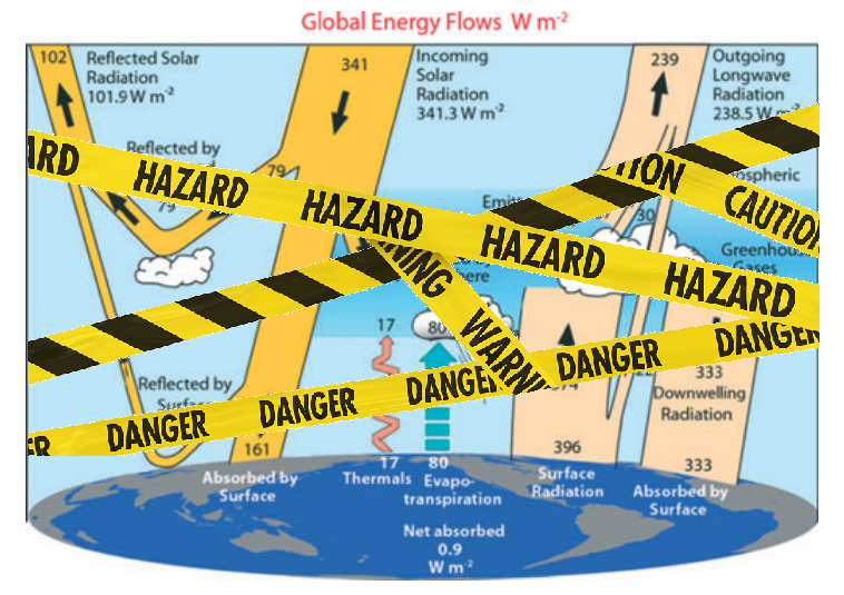
Fatal Flaw in Earth Energy Balance Diagrams

Prof. Warren Stannard of Western Australia University provides the math analysis to correct the above mistaken energy balance cartoon published in 1997.  His paper in Natural Science (2018) is The Greenhouse Effect: An Evaluation of Arrhenius’ Thesis and a New Energy Equilibrium Model.  Excerpts in italics with my bolds and exhibits.

Abstract

In 1896, Svante Arrhenius proposed a model predicting that increased concentration of carbon dioxide and water vapour in the atmosphere would result in a warming of the planet. In his model, the warming effects of atmospheric carbon dioxide and water vapour in preventing heat flow from the Earth’ s surface (now known as the “Greenhouse Effect”) are counteracted by a cooling effect where the same gasses are responsible for the radiation of heat to space from the atmosphere. His analysis found that there was a net warming effect and his model has remained the foundation of the Enhanced Greenhouse Effect—Global Warming hypothesis.

This paper attempts to quantify the parameters in his equations but on evaluation his model cannot produce thermodynamic equilibrium. A modified model is proposed which reveals that increased atmospheric emissivity enhances the ability of the atmosphere to radiate heat to space overcoming the cooling effect resulting in a net cooling of the planet. In consideration of this result, there is a need for greenhouse effect—global warming models to be revised.

1. Introduction

In 1896 Arrhenius proposed that changes in the levels of “carbonic acid” (carbon dioxide) in the atmosphere could substantially alter the surface temperature of the Earth. This has come to be known as the greenhouse effect. Arrhenius’ paper, “On the Influence of Carbonic Acid in the Air upon the Temperature of the Ground”, was published in Philosophical Magazine.  Arrhenius concludes:

“If the quantity of carbonic acid in the air should sink to one-half its present percentage, the temperature would fall by about 4˚; a diminution to one-quarter would reduce the temperature by 8˚. On the other hand, any doubling of the percentage of carbon dioxide in the air would raise the temperature of the earth’s surface by 4˚; and if the carbon dioxide were increased fourfold, the temperature would rise by 8˚ ” [ 2 ].

It is interesting to note that Arrhenius considered this greenhouse effect a positive thing if we were to avoid the ice ages of the past. Nevertheless, Arrhenius’ theory has become the foundation of the enhanced greenhouse effect―global warming hypothesis in the 21st century. His model remains the basis for most modern energy equilibrium models.

2. Arrhenius’ Energy Equilibrium Model

Arrhenius’ proposed a two-part energy equilibrium model in which the atmosphere radiates the same amount of heat to space as it receives and, likewise, the ground transfers the same amount of heat to the atmosphere and to space as it receives. The model contains the following assumptions:

Heat conducted from the center of the Earth is neglected.

Heat flow by convection between the surface and the atmosphere and throughout the atmosphere remains constant.

Cloud cover remains constant. This is questionable but allows the model to be quantified.

Part 1: Equilibrium of the Air

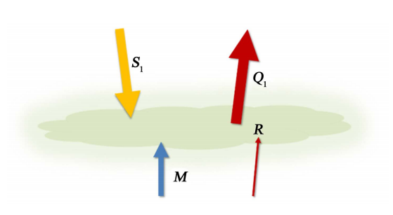
The balance of heat flow to and from the air (or atmosphere) has four components as shown in Figure 1. The arrow labelled S1 indicates the solar energy absorbed by the atmosphere. R indicates the infra-red radiation from the surface of the Earth to the atmosphere, M is the quantity of heat “conveyed” to the atmosphere by convection and Q1 represents heat loss from the atmosphere to space by radiation. All quantities are measured in terms of energy per unit area per unit time (W/m2).

Figure 1. Model of the energy balance of the atmosphere. The heat received by the atmosphere ( R+M+S1 ) equals the heat lost to space (Q1). In this single layer atmospheric model, the absorbing and emitting layers are one and the same.

Part 2: Thermal Equilibrium of the Ground

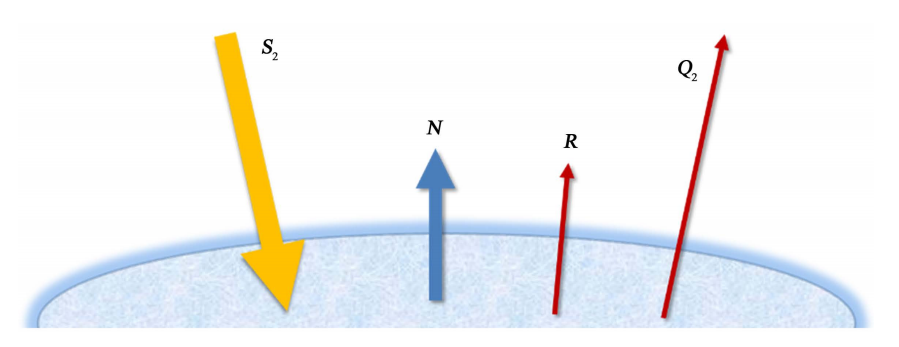
In the second part of his model, Arrhenius describes the heat flow equilibrium at the “ground” or surface of the Earth. There are four contributions to the surface heat flow as shown in Figure 2. S2 is the solar energy absorbed by the surface, R is the infra-red radiation emitted from the surface and transferred to the atmosphere, N is the heat conveyed to the atmosphere by convection and Q2 is the heat radiated to space from the surface. Note: Here Arrhenius uses the term N for the convective heat flow. It is equivalent to the term M used in the air equilibrium model.

Figure 2. The energy balance at the surface of the Earth. The energy received by the ground is equal to the energy lost.

3. Finding the Temperature of the Earth

Arrhenius combined these equations and, by eliminating the temperature of the atmosphere which according to Arrhenius “has no considerable interest”, he arrived at the following relationship:

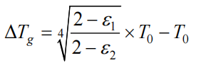
ΔTg  is the expected change in the temperature of the Earth for a change in atmospheric emissivity from ε1 to ε2. Arrhenius determined that the current transparency of the atmosphere was 0.31 and, therefore the emissivity/absorptivity ε1 = 0.69. The current mean temperature for the surface of the Earth can be assumed to be To = 288 K.

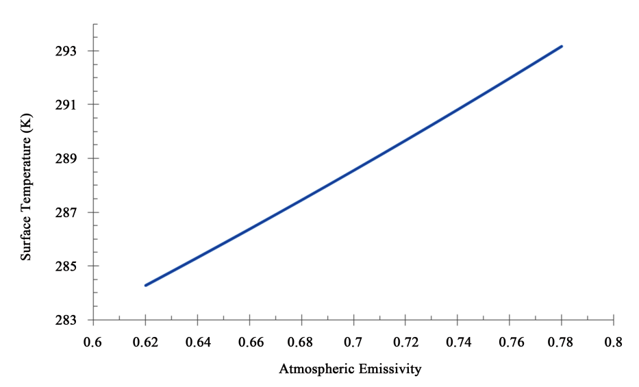
Figure 3. Arrhenius’ model is used to determine the mean surface temperature of the Earth as a function of atmospheric emissivity ε. For initial conditions, ε = 0.69 and the surface temperature is 288 K. An increase in atmospheric emissivity produces an increase in the surface temperature of the Earth.

Arrhenius estimated that a doubling of carbon dioxide concentration in the atmosphere would produce a change in emissivity from 0.69 to 0.78 raising the temperature of the surface by approximately 6 K. This value would be considered high by modern climate researchers; however, Arrhenius’ model has become the foundation of the greenhouse-global warming theory today. Arrhenius made no attempt to quantify the specific heat flow values in his model. At the time of his paper there was little quantitative data available relating to heat flow for the Earth.

4. Evaluation of Arrhenius’ Model under Present Conditions

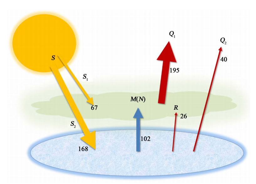
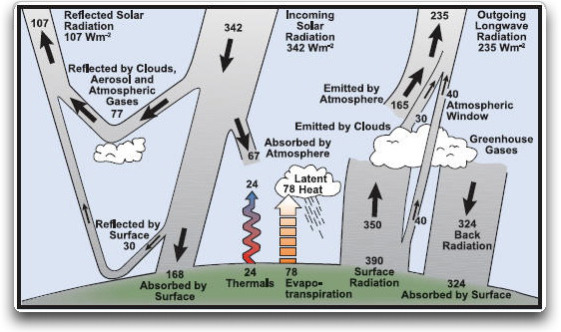
More recently, Kiehl and Trenberth (K & T) [ 3 ] and others have quantified the heat flow values used in Arrhenius’ model. K & T’s data are summarised in Figure 4.

The reflected solar radiation, which plays no part in the energy balance described in this model, is ignored. R is the net radiative transfer from the ground to the atmosphere derived from K & T’s diagram. The majority of the heat radiated to space originates from the atmosphere (Q1 > Q2). And the majority of the heat lost from the ground is by means of convection to the atmosphere (M > R + Q2).

Figure 4. Model of the mean energy budget of the earth as determined by Kiehl and Trenberth.

Equation (5)    Q2=(1−ε)σνT4e(5)

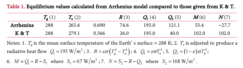
Substituting ε = 0.567, ν = 1.0 and Tg = 288 K we get:  Q2=149.2 W/m2

Using Arrhenius value of 0.69 for the atmospheric emissivity Q2 = 120.9 W/m2.

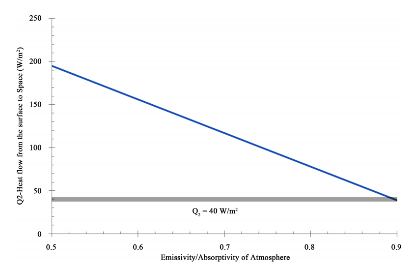
Both values are significantly more than the 40 W/m2 determined by K & T.
The equation will not balance, something is clearly wrong.

Figure 5 illustrates the problem.

Equation (5) is based on the Stefan-Boltzmann law which is an empirical relationship which describes the amount of radiation from a hot surface passing through a vacuum to a region of space at a temperature of absolute zero. This is clearly not the case for radiation passing through the Earth’s atmosphere and as a result the amount of heat lost by radiation has been grossly overestimated.

No amount of adjusting parameters will allow this relationship to produce
sensible quantities and the required net heat flow of 40 W/m2.

This error affects the equilibrium heat flow values in Arrhenius’ model and the model is not able to produce a reasonable approximation of present day conditions as shown in Table 1. In particular, the convective heat flow takes on very different values from the two parts of the model. The values M and N in the table should be equivalent.

5. A New Energy Equilibrium Model

A modified model is proposed which will determine the change in surface temperature of the Earth caused by a change in the emissivity of the atmosphere (as would occur when greenhouse gas concentrations change). The model incorporates the following ideas:

1) The total heat radiated from the Earth ( Q1+Q2Q1+Q2 ) will remain constant and equal to the total solar radiation absorbed by the Earth ( S1+S2S1+S2 ).

2) Convective heat flow M remains constant. Convective heat flow between two regions is dependent on their temperature difference, as expressed by Newton’s Law of cooling1. The temperature difference between the atmosphere and the ground is maintained at 8.9 K (see Equation 7(a)). M = 102 W/m2 (K & T).

3) A surface temperature of 288 K and an atmospheric emissivity of 0.567 (Equation (7b)) is assumed for initial or present conditions.

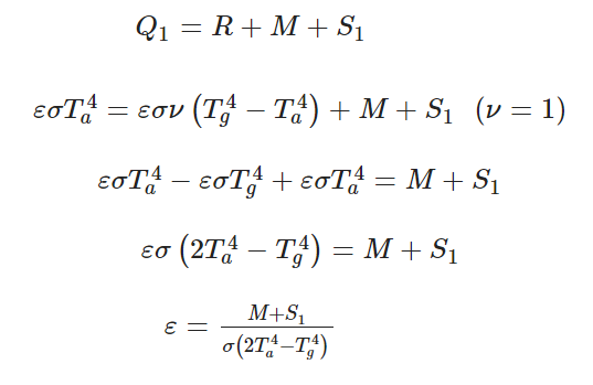
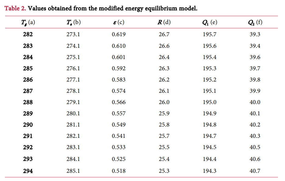
Equation (9) represents the new model relating the emissivity of the atmosphere ε to the surface temperature Tg. Results from this model are shown in Table 2. The table shows the individual heat flow quantities and the temperature of the surface of the Earth that is required to maintain equilibrium:

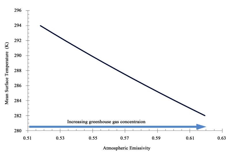
The table shows that as the value of the atmospheric emissivity ε is increased less heat flows from the Earth’s surface to space, Q2 decreases. This is what would be expected. As well, more heat is radiated to space from the atmosphere; Q1 increases. This is also expected. The total energy radiated to space Q1+Q2=235 W/m2 . A plot of the resultant surface temperature Tg versus the atmospheric emissivity ε is shown below Figure 6.

Figure 6. Plot of the Earth’s mean surface temperature as a function of the atmospheric emissivity. This model predicts that the temperature of the Earth will decrease as the emissivity of the atmosphere increases.

6. Conclusion

Arrhenius identified the fact that the emissivity/absorptivity of the atmosphere increased with increasing greenhouse gas concentrations and this would affect the temperature of the Earth. He understood that infra-red active gases in the atmosphere contribute both to the absorption of radiation from the Earth’s surface and to the emission of radiation to space from the atmosphere. These were competing processes; one trapped heat, warming the Earth; the other released heat, cooling the Earth. He derived a relationship between the surface temperature and the emissivity of the atmosphere and deduced that an increase in emissivity led to an increase in the surface temperature of the Earth.

However, his model is unable to produce sensible results for the heat flow quantities as determined by K & T and others. In particular, his model and all similar recent models, grossly exaggerate the quantity of radiative heat flow from the Earth’s surface to space. A new energy equilibrium model has been proposed which is consistent with the measured heat flow quantities and maintains thermal equilibrium. This model predicts the changes in the heat flow quantities in response to changes in atmospheric emissivity and reveals that Arrhenius’ prediction is reversed. Increasing atmospheric emissivity due to increased greenhouse gas concentrations will have a net cooling effect.

It is therefore proposed by the author that any attempt to curtail emissions of CO2
will have no effect in curbing global warming.

Summary:

If Stannard is right, then the unthinkable, inconvenient truth is:  More CO2 cools, rather than warms the planet.  As noted before, we have enjoyed a modern warming period with the recovery of temperatures ending the Little Ice Age.  But cold is the greater threat to human life and prosperity, and as well to the biosphere.  Society’s priorities should be to ensure reliable affordable energy, and robust infrastructure to meet the demands of future cooling, which will eventually bring down CO2 concentrations in its wake.

Footnote: 

A comment below refers to the cartoon image at the top which was an older version of K & T.  The more recent version was used by the author and has slightly different numbers.  Below is the actual model he analyzed:

I agree that these energy budgets oversimplify the real world, and the author’s intention is not to correct the details, but to show that the models fail when taken at face value. He is focusing on the imbalance arising from applying Stefan-Boltzmann law to an atmospheric planet.  As noted below there are other challenging issues such as using the average frequency of visual light for calculating W/m^2, which is not realistic for earth’s LW radiation.

2023 Observing N. Atlantic Oscillations

A continuing theme of this blog is Oceans Make Climate, coined by Dr. Arnd Bernaerts.  He further explained: ” Climate is the continuation of ocean by other means.”  The focus of this post is the North Atlantic which directly impacts weather and climate experienced by the populated continents of Europe and North America.

North Atlantic is a Climate Driver

The importance of this basin is described by Börgel et al. (2020) The Atlantic Multidecadal Oscillation controls the impact of the North Atlantic Oscillation on North European climate.  Excerpts in italics with my bolds.

Abstract

European climate is heavily influenced by the North Atlantic Oscillation (NAO). However, the spatial structure of the NAO is varying with time, affecting its regional importance. By analyzing an 850-year global climate model simulation of the last millennium it is shown that the variations in the spatial structure of the NAO can be linked to the Atlantic Multidecadal Oscillation (AMO). The AMO changes the zonal position of the NAO centers of action, moving them closer to Europe or North America. During AMO+ states, the Icelandic Low moves further towards North America while the Azores High moves further towards Europe and vice versa for AMO- states. The results of a regional downscaling for the East Atlantic/European domain show that AMO-induced changes in the spatial structure of the NAO reduce or enhance its influence on regional climate variables of the Baltic Sea such as sea surface temperature, ice extent, or river runoff.
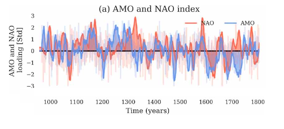
Natural Factors Operating in N. Atlantic

The main mechanisms operating in this basin are defined as follows:

AMO (Atlantic Multidecadal Oscillation) refers to the phase changes of N. Atlantic SSTs (Sea Surface Temperatures).  There is also the AMOC (Atlantic Multidecadal Overturning Oscillation) referring to the oceanic “conveyer belt” transporting water between the warm tropics and the cold poles. The NAO (North Atlantic Oscillation) is the air pressure dipole alternating highs and lows between the Azores and Iceland.

The current state of scientific understanding is indicated by a recent paper Seip and Wang (2022) The North Atlantic Oscillations: Lead–Lag Relations for the NAO, the AMO, and the AMOC—A High-Resolution Lead–lag Analysis.  Excerpts in italics with my bolds.

Abstract

Several studies examine cycle periods and the interactions between the three major climate modes over the North Atlantic, namely the Atlantic meridional overturning circulation (AMOC), the Atlantic multidecadal oscillation (AMO), and the North Atlantic oscillation (NAO). Here, we use a relatively novel high-resolution lead–lag (LL) method to identify short time windows with persistent LL relations in the three series during the period from 1947 to 2020. We find that there are roughly 20-year time windows where LL relations change direction at both interannual, high-frequency and multidecadal, low-frequency timescales. However, with varying LL strength, the AMO leads AMOC for the full period at the interannual timescale. During the period from 1980 to 2000, we had the sequence NAO→AMO→AMOC→NAO at the interannual timescale. For the full period in the decadal time scale, we obtain NAO→AMO→AMOC. The Ekman variability closely follows the NAO variability. Both single time series and the LL relation between pairs of series show pseudo-oscillating patterns with cycle periods of about 20 years. We list possible mechanisms that contribute to the cyclic behavior, but no conclusive evidence has yet been found.
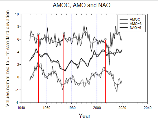
Figure 2.AMOC, AMO and NAO. (a) Time series raw and LOESS(0.3)-smoothed. The detrendedand LOESS(0.3)-smoothed versions of AMOC shifts sign from starting with (+) in 1947, then 1969,1997, 2010. AMO starting from (+) in 1947, 1996, 1999. NAO starting from (+) in 1947, 1952, 1972,1997, 2014, 2020.

Contemporary AMO Observations

Through January 2023 I depended on the Kaplan AMO Index (not smoothed, not detrended) for N. Atlantic observations. But it is no longer being updated, and NOAA says they don’t know its future.  So I find only the Hadsst AMO dataset has Feb. and March data.  It differs from Kaplan, which reported average absolute temps measured in N. Atlantic.  “Hadsst AMO  follows Trenberth and Shea (2006) proposal to use the NA region EQ-60°N, 0°-80°W and subtract the global rise of SST 60°S-60°N to obtain a measure of the internal variability, arguing that the effect of external forcing on the North Atlantic should be similar to the effect on the other oceans.”  So the values represent differences between the N. Atlantic and the Global ocean.
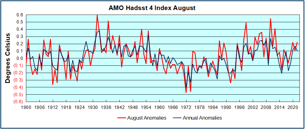
The AMO index as defined as the SST averaged over 0°-60°N, 0°-80°W minus SST averaged over 60°S-60°N.

The chart above confirms what Kaplan also showed.  As August is the hottest month for the N. Atlantic, its varibility, high and low, drives the annual results for this basin.  Note also the peaks in 2010, lows after 2014, and a rise in 2021. An annual chart below is informative:
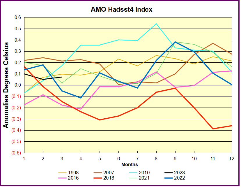
Note the difference between blue/green years, beige/brown, and purple/red years.  2010, 2021, 2022 all peaked strongly in August or September.  1998 and 2007 were mildly warm.  2016 and 2018 were matching or cooler than the global average.  2023 is starting out slightly warm.

The background post below provides more detail on AMO and AMOC measuring systems, but there is a growing concern that funding for oceanic data is being reduced or cut off.  For example this report from Srokosz et al. (2020):

Despite the tremendous progress in AMOC-related research as articulated in the Special Issue manuscripts, there are many remaining challenges that should be addressed to further our understanding. From the observational side, such challenges include gaps in the observing system (e.g., shelf regions and deep oceans), disparate observational strategies, and reductions in funding that jeopardize sustained observations (Frajka-Williams et al., 2019; McCarthy et al., 2020). Earth system models continue to show persistent biases, particularly in the North Atlantic, and AMOC variability mechanisms and their characteristics vary significantly across models (e.g., Danabasoglu et al., 2019; Zhang et al., 2019).

Although the US AMOC Program formally “sunsets” in 2021, research on the AMOC in the United States will continue. The original motivation for AMOC observations, the possibility of AMOC decline or rapid collapse under anthropogenically induced climate change, remains. The latest IPCC special report on the ocean and cryosphere (Pörtner et al., 2019) states that “Observations, both in situ (2004–2017) and based on sea surface temperature reconstructions, indicate that the AMOC has weakened relative to 1850–1900 (medium confidence),” and that “The AMOC is projected to weaken in the 21st century under all RCPs (very likely), although a collapse is very unlikely (medium confidence).” These conclusions and the above challenges present new opportunities and motivations for the community. Specifically, collaborative research that includes a hierarchy of models, theory, high-resolution paleo records, and sustained and processed-based observations promises to advance our understanding, potentially leading to improved models and prediction skills, among others, of AMOC variability and its associated climate impacts.

Comment:  It seems that data showing errors in the climate models, or failing to support climate alarm, will disappear when funding is withdrawn.

Background: AMOC Update: Oceans Moderate Climate Threat

Update Feb.1, 2019 New Publication from M.S. Lozier et al. 
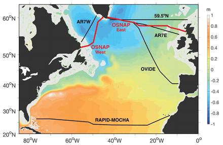
f1.medium

The article is A sea change in our view of overturning in the subpolar North Atlantic which is reporting on the first 21 months of observations from the newly installed OSNAP array described in a previous post from a year ago (reprinted below).  The article is paywalled, but the main findings are provided at a Science Daily article European waters drive ocean overturning, key for regulating climate.  Excerpts in italics with my bolds.

Summary:
An international study reveals the Atlantic meridional overturning circulation, which helps regulate Earth’s climate, is highly variable and primarily driven by the conversion of warm, salty, shallow waters into colder, fresher, deep waters moving south through the Irminger and Iceland basins. This upends prevailing ideas and may help scientists better predict Arctic ice melt and future changes in the ocean’s ability to mitigate climate change by storing excess atmospheric carbon.
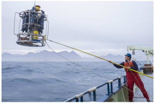
190131143344_1_540x360

New research shows the Atlantic meridional overturning circulation, which regulates climate, is primarily driven by waters west of Europe.
Credit: Carolina Nobre, WHOI Media

In a departure from the prevailing scientific view, the study shows that most of the overturning and variability is occurring not in the Labrador Sea off Canada, as past modeling studies have suggested, but in regions between Greenland and Scotland. There, warm, salty, shallow waters carried northward from the tropics by currents and wind, sink and convert into colder, fresher, deep waters moving southward through the Irminger and Iceland basins.

Overturning variability in this eastern section of the ocean was seven times greater than in the Labrador Sea, and it accounted for 88 percent of the total variance documented across the entire North Atlantic over the 21-month study period.

“Overturning carries vast amounts of anthropogenic carbon deep into the ocean, helping to slow global warming,” said co-author Penny Holliday of the National Oceanography Center in Southampton, U.K. “The largest reservoir of this anthropogenic carbon is in the North Atlantic.”

“Overturning also transports tropical heat northward,” Holliday said, “meaning any changes to it could have an impact on glaciers and Arctic sea ice. Understanding what is happening, and what may happen in the years to come, is vital.”

MIT’s Carl Wunsch and other outside experts said the study was helpful, but pointed out that 21 months of study is not enough to know if this different location is temporary or permanent.

[Note: The comment about oceans taking up CO2 could be misleading.  The ocean contains dissolved CO2 amounting to 50 times atmospheric CO2.  Each year about 20% of all CO2 in the air goes into the ocean, replaced by outgassing CO2.  The tiny fraction of atmospheric CO2 from humans is exchanged proportionately.  Henry’s law applies to the water/air interface, so that a warmer ocean absorbs slightly less, and a colder ocean absorbs slightly more CO2.  The exchange equilibrium is hardly disturbed by the little bit of human produced CO2.  Thus the ocean serves as a massive buffer against human emissions.]

Previous Post: AMOC 2018:  Not Showing Climate Threat
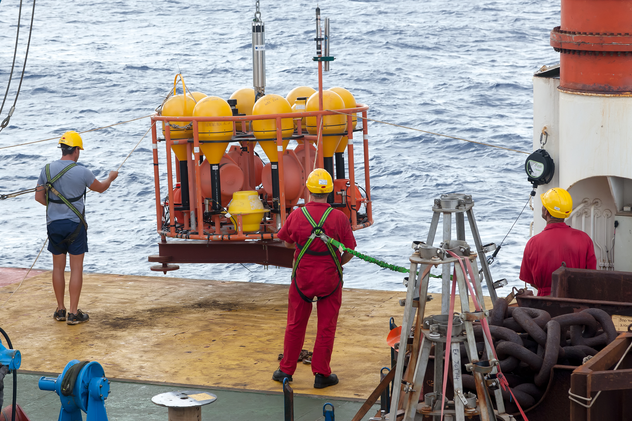
myrtle_jc174_small

The RAPID moorings being deployed. Credit: National Oceanography Centre.

The AMOC is back in the news following a recent Ocean Sciences meeting.  This update adds to the theme Oceans Make Climate. Background links are at the end, including one where chief alarmist M. Mann claims fossil fuel use will stop the ocean conveyor belt and bring a new ice age.  Actual scientists are working away methodically on this part of the climate system, and are more level-headed.  H/T GWPF for noticing the recent article in Science Ocean array alters view of Atlantic ‘conveyor belt’  By Katherine Kornei Feb. 17, 2018 . Excerpts with my bolds.

The powerful currents in the Atlantic, formally known as the Atlantic meridional overturning circulation (AMOC), are a major engine in Earth’s climate. The AMOC’s shallower limbs—which include the Gulf Stream—transport warm water from the tropics northward, warming Western Europe. In the north, the waters cool and sink, forming deeper limbs that transport the cold water back south—and sequester anthropogenic carbon in the process. This overturning is why the AMOC is sometimes called the Atlantic conveyor belt.
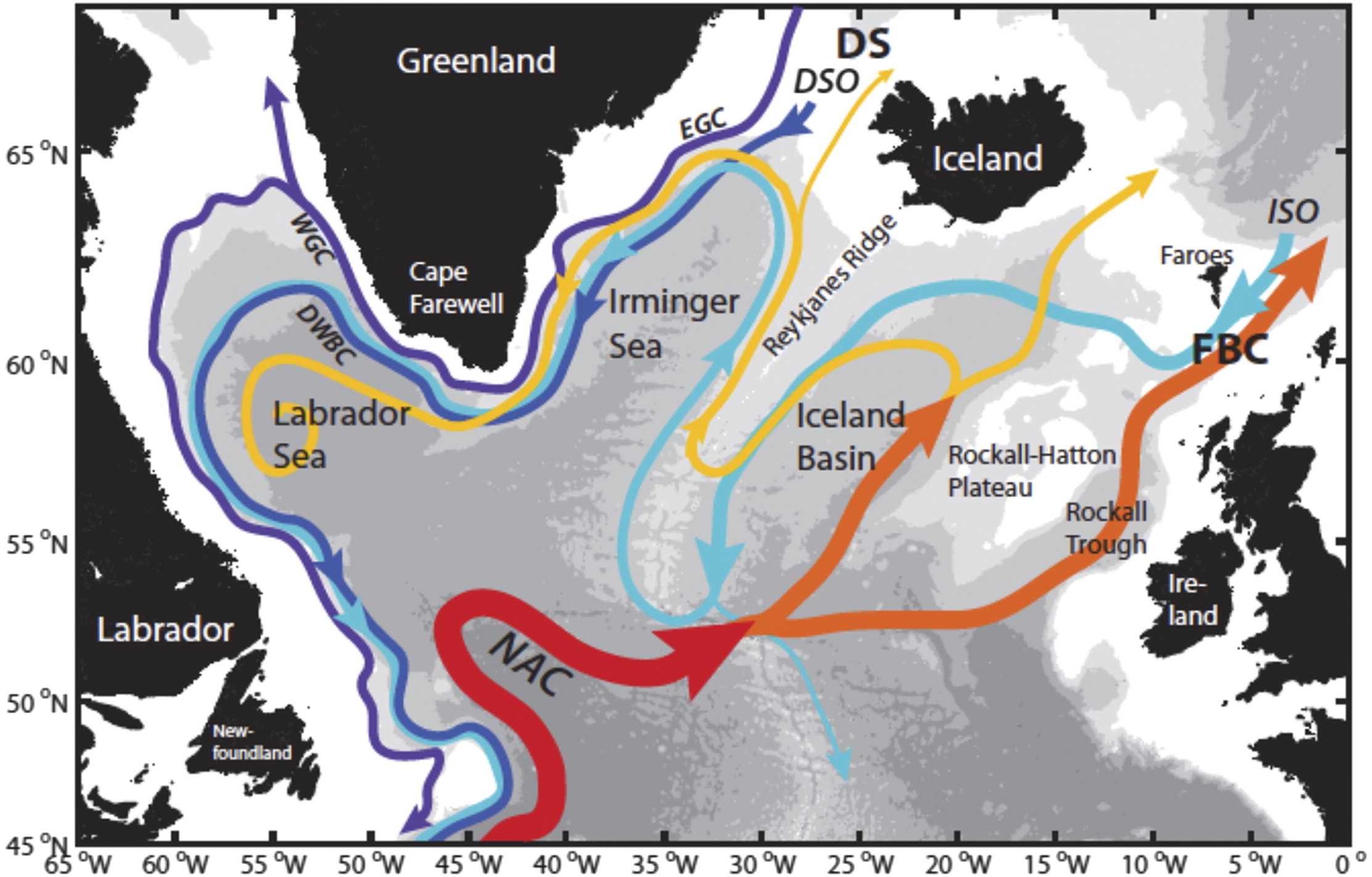
bams-d-16-0057.1-f1

Fig. 1. Schematic of the major warm (red to yellow) and cold (blue to purple) water pathways in the NASPG (North Atlantic subpolar gyre ) credit: H. Furey, Woods Hole Oceanographic Institution): Denmark Strait (DS), Faroe Bank Channel (FBC), East and West Greenland Currents (EGC and WGC, respectively), NAC, DSO, and ISO.

Last week, at the American Geophysical Union’s (AGU’s) Ocean Sciences meeting here, scientists presented the first data from an array of instruments moored in the subpolar North Atlantic. The observations reveal unexpected eddies and strong variability in the AMOC currents. They also show that the currents east of Greenland contribute the most to the total AMOC flow. Climate models, on the other hand, have emphasized the currents west of Greenland in the Labrador Sea. “We’re showing the shortcomings of climate models,” says Susan Lozier, a physical oceanographer at Duke University in Durham, North Carolina, who leads the $35-million, seven-nation project known as the Overturning in the Subpolar North Atlantic Program (OSNAP).
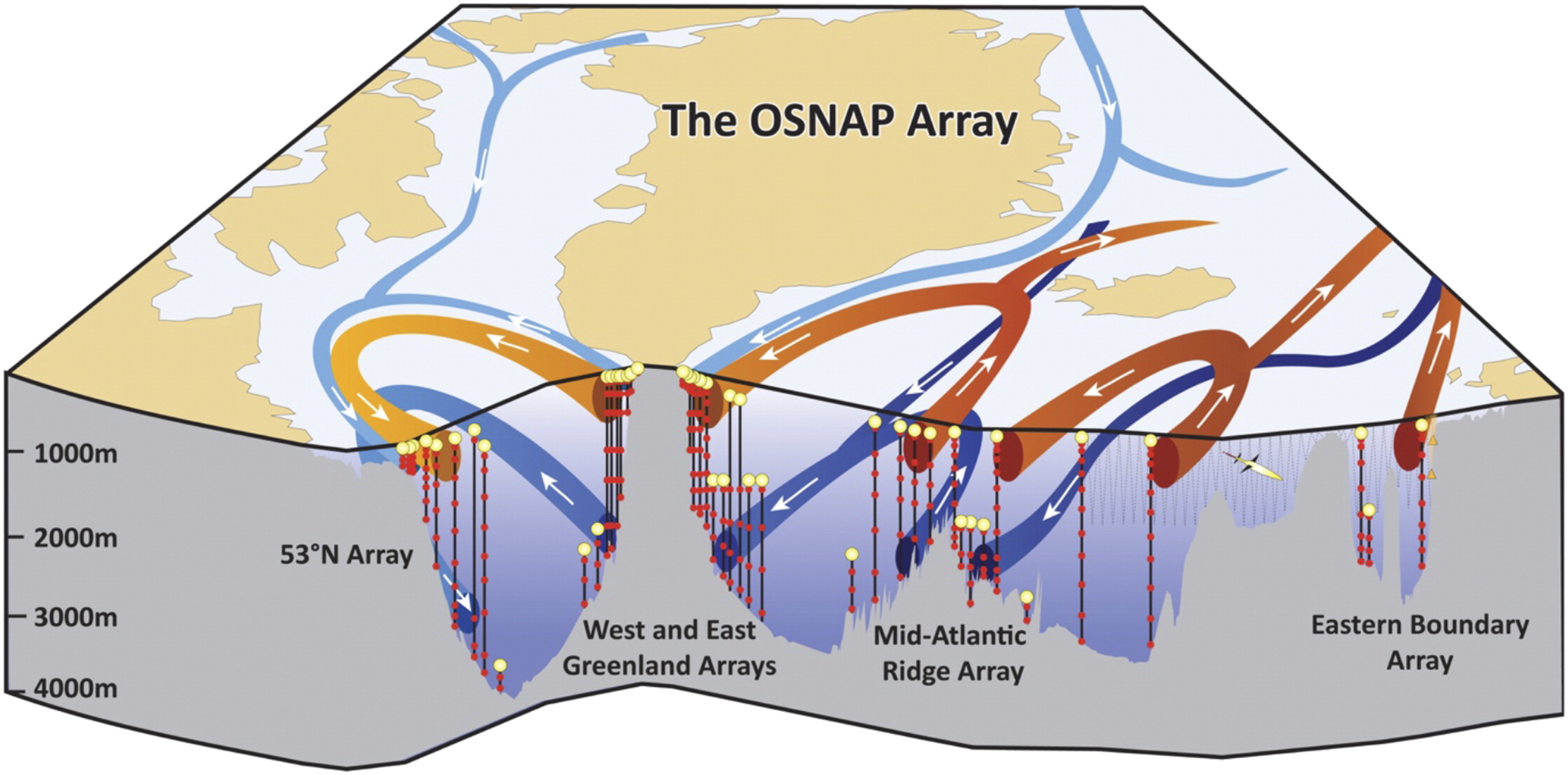
bams-d-16-0057.1-f2

Fig. 2. Schematic of the OSNAP array. The vertical black lines denote the OSNAP moorings with the red dots denoting instrumentation at depth. The thin gray lines indicate the glider survey. The red arrows show pathways for the warm and salty waters of subtropical origin; the light blue arrows show the pathways for the fresh and cold surface waters of polar origin; and the dark blue arrows show the pathways at depth for waters that originate in the high-latitude North Atlantic and Arctic.

The research and analysis is presented by Dr. Lozier et al. in this publication Overturning in the Subpolar North Atlantic Program: A New International Ocean Observing System Images above and text excerpted below with my bolds.

For decades oceanographers have assumed the AMOC to be highly susceptible to changes in the production of deep waters at high latitudes in the North Atlantic. A new ocean observing system is now in place that will test that assumption. Early results from the OSNAP observational program reveal the complexity of the velocity field across the section and the dramatic increase in convective activity during the 2014/15 winter. Early results from the gliders that survey the eastern portion of the OSNAP line have illustrated the importance of these measurements for estimating meridional heat fluxes and for studying the evolution of Subpolar Mode Waters. Finally, numerical modeling data have been used to demonstrate the efficacy of a proxy AMOC measure based on a broader set of observational data, and an adjoint modeling approach has shown that measurements in the OSNAP region will aid our mechanistic understanding of the low-frequency variability of the AMOC in the subtropical North Atlantic.

Fig. 7. (a) Winter [Dec–Mar (DJFM)] mean NAO index. Time series of temperature from the (b) K1 and (c) K9 moorings.

Finally, we note that while a primary motivation for studying AMOC variability comes from its potential impact on the climate system, as mentioned above, additional motivation for the measure of the heat, mass, and freshwater fluxes in the subpolar North Atlantic arises from their potential impact on marine biogeochemistry and the cryosphere. Thus, we hope that this observing system can serve the interests of the broader climate community.

Fig. 10. Linear sensitivity of the AMOC at (d),(e) 25°N and (b),(c) 50°N in Jan to surface heat flux anomalies per unit area. Positive sensitivity indicates that ocean cooling leads to an increased AMOC—e.g., in the upper panels, a unit increase in heat flux out of the ocean at a given location will change the AMOC at (d) 25°N or (e) 50°N 3 yr later by the amount shown in the color bar. The contour intervals are logarithmic. (a) The time series show linear sensitivity of the AMOC at 25°N (blue) and 50°N (green) to heat fluxes integrated over the subpolar gyre (black box with surface area of ∼6.7 × 10 m2) as a function of forcing lead time. The reader is referred to Pillar et al. (2016) for model details and to Heimbach et al. (2011) and Pillar et al. (2016) for a full description of the methodology and discussion relating to the dynamical interpretation of the sensitivity distributions.

In summary, while modeling studies have suggested a linkage between deep-water mass formation and AMOC variability, observations to date have been spatially or temporally compromised and therefore insufficient either to support or to rule out this connection.

Current observational efforts to assess AMOC variability in the North Atlantic.

The U.K.–U.S. Rapid Climate Change–Meridional Overturning Circulation and Heatflux Array (RAPID–MOCHA) program at 26°N successfully measures the AMOC in the subtropical North Atlantic via a transbasin observing system (Cunningham et al. 2007; Kanzow et al. 2007; McCarthy et al. 2015). While this array has fundamentally altered the community’s view of the AMOC, modeling studies over the past few years have suggested that AMOC fluctuations on interannual time scales are coherent only over limited meridional distances. In particular, a break point in coherence may occur at the subpolar–subtropical gyre boundary in the North Atlantic (Bingham et al. 2007; Baehr et al. 2009). Furthermore, a recent modeling study has suggested that the low-frequency variability of the RAPID–MOCHA appears to be an integrated response to buoyancy forcing over the subpolar gyre (Pillar et al. 2016). Thus, a measure of the overturning in the subpolar basin contemporaneous with a measure of the buoyancy forcing in that basin likely offers the best possibility of understanding the mechanisms that underpin AMOC variability. Finally, though it might be expected that the plethora of measurements from the North Atlantic would be sufficient to constrain a measure of the AMOC within the context of an ocean general circulation model, recent studies (Cunningham and Marsh 2010; Karspeck et al. 2015) reveal that there is currently no consensus on the strength or variability of the AMOC in assimilation/reanalysis products.
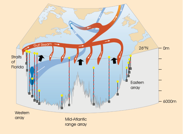
Atlantic Meridional Overturning Circulation (AMOC). Red colours indicate warm, shallow currents and blue colours indicate cold, deep return flows. Modified from Church, 2007, A change in circulation? Science, 317(5840), 908–909. doi:10.1126/science.1147796

In addition we have a recent report from the United Kingdom Marine Climate Change Impacts Partnership (MCCIP) lead author G.D. McCarthy Atlantic Meridional Overturning Circulation (AMOC) 2017.
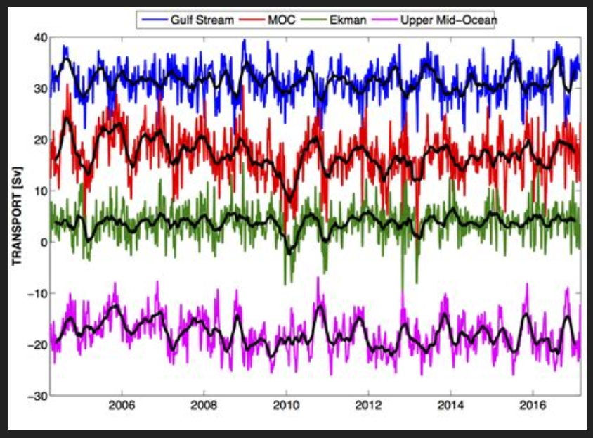
Figure 1: Ten-day (colours) and three month (black) low-pass filtered timeseries of Florida Straits transport (blue), Ekman transport (green), upper mid-ocean transport (magenta), and overturning transport (red) for the period 2nd April 2004 to end- February 2017. Florida Straits transport is based on electromagnetic cable measurements; Ekman transport is based on ERA winds. The upper mid-ocean transport, based on the RAPID mooring data, is the vertical integral of the transport per unit depth down to the deepest northward velocity (~1100 m) on each day. Overturning transport is then the sum of the Florida Straits, Ekman, and upper mid-ocean transports and represents the maximum northward transport of upper-layer waters on each day. Positive transports correspond to northward flow.

The RAPID/MOCHA/WBTS array (hereinafter referred to as the RAPID array) has revolutionized basin scale oceanography by supplying continuous estimates of the meridional overturning transport (McCarthy et al., 2015), and the associated basin-wide transports of heat (Johns et al., 2011) and freshwater (McDonagh et al., 2015) at 10-day temporal resolution. These estimates have been used in a wide variety of studies characterizing temporal variability of the North Atlantic Ocean, for instance establishing a decline in the AMOC between 2004 and 2013.

Summary from RAPID data analysis

MCCIP reported in 2006 that:

  • a 30% decline in the AMOC has been observed since the early 1990s based on a limited number of observations. There is a lack of certainty and consensus concerning the trend;
  • most climate models anticipate some reduction in strength of the AMOC over the 21st century due to increased freshwater influence in high latitudes. The IPCC project a slowdown in the overturning circulation rather than a dramatic collapse.
  • And in 2017 that:
  • a substantial increase in the observations available to estimate the strength of the AMOC indicate, with greater certainty, a decline since the mid 2000s;
  • the AMOC is still expected to decline throughout the 21st century in response to a changing climate. If and when a collapse in the AMOC is possible is still open to debate, but it is not thought likely to happen this century.

And also that:

  • a high level of variability in the AMOC strength has been observed, and short term fluctuations have had unexpected impacts, including severe winters and abrupt sea-level rise;
  • recent changes in the AMOC may be driving the cooling of Atlantic ocean surface waters which could lead to drier summers in the UK.
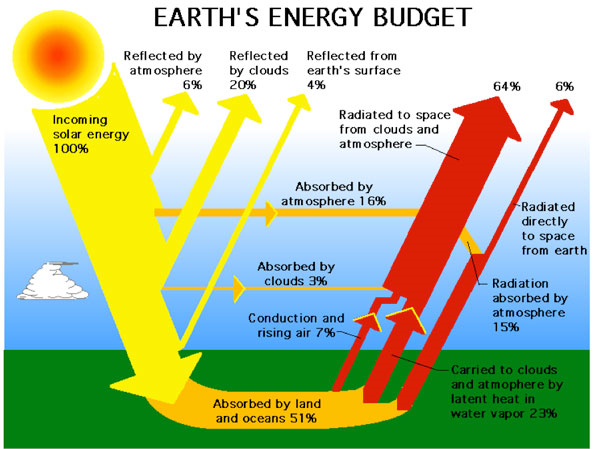
Conclusions

  • The AMOC is key to maintaining the mild climate of the UK and Europe.
  • The AMOC is predicted to decline in the 21st century in response to a changing climate.
  • Past abrupt changes in the AMOC have had dramatic climate consequences.
  • There is growing evidence that the AMOC has been declining for at least a decade, pushing the Atlantic Multidecadal Variability into a cool phase.
  • Short term fluctuations in the AMOC have proved to have unexpected impacts, including being linked
    with severe winters and abrupt sea-level rise.

Background:

Climate Pacemaker: The AMOC

Evidence is Mounting: Oceans Make Climate

Mann-made Global Cooling