No Global Warming, Chilly January Land and Sea

a62edf0f39de560a219b7262163b0d45

The post below updates the UAH record of air temperatures over land and ocean.  But as an overview consider how recent rapid cooling has now completely overcome the warming from the last 3 El Ninos (1998, 2010 and 2016).  The UAH record shows that the effects of the last one were gone as of April 2021, again in November, 2021 and now in January 2022. (UAH baseline is now 1991-2020).

For reference I added an overlay of CO2 annual concentrations as measured at Mauna Loa.  While temperatures fluctuated up and down ending flat, CO2 went up steadily by ~55 ppm, a 15% increase.

Furthermore, going back to previous warmings prior to the satellite record shows that the entire rise of 0.8C since 1947 is due to oceanic, not human activity.

gmt-warming-events

The animation is an update of a previous analysis from Dr. Murry Salby.  These graphs use Hadcrut4 and include the 2016 El Nino warming event.  The exhibit shows since 1947 GMT warmed by 0.8 C, from 13.9 to 14.7, as estimated by Hadcrut4.  This resulted from three natural warming events involving ocean cycles. The most recent rise 2013-16 lifted temperatures by 0.2C.  Previously the 1997-98 El Nino produced a plateau increase of 0.4C.  Before that, a rise from 1977-81 added 0.2C to start the warming since 1947.

Importantly, the theory of human-caused global warming asserts that increasing CO2 in the atmosphere changes the baseline and causes systemic warming in our climate.  On the contrary, all of the warming since 1947 was episodic, coming from three brief events associated with oceanic cycles. 

Update August 3, 2021

Chris Schoeneveld has produced a similar graph to the animation above, with a temperature series combining HadCRUT4 and UAH6. H/T WUWT

image-8


mc_wh_gas_web20210423124932

See Also Worst Threat: Greenhouse Gas or Quiet Sun?

January Update Chilly Ocean and Land Air Temps 

banner-blog

With apologies to Paul Revere, this post is on the lookout for cooler weather with an eye on both the Land and the Sea.  While you will hear a lot about 2020-21 temperatures matching 2016 as the highest ever, that spin ignores how fast is the cooling setting in.  The UAH data analyzed below shows that warming from the last El Nino is now fully dissipated with chilly temperatures setting in all regions.  Last month both land and ocean cooled further.

UAH has updated their tlt (temperatures in lower troposphere) dataset for January 2022.  Previously I have done posts on their reading of ocean air temps as a prelude to updated records from HadSST3 (still not updated from October). So I have separately posted on SSTs using HadSST4 2021 Ends with Cooler Ocean Temps  This month also has a separate graph of land air temps because the comparisons and contrasts are interesting as we contemplate possible cooling in coming months and years. Sometimes air temps over land diverge from ocean air changes, and last month showed air over land dropping slightly while ocean air rose.

Note:  UAH has shifted their baseline from 1981-2010 to 1991-2020 beginning with January 2021.  In the charts below, the trends and fluctuations remain the same but the anomaly values change with the baseline reference shift.

Presently sea surface temperatures (SST) are the best available indicator of heat content gained or lost from earth’s climate system.  Enthalpy is the thermodynamic term for total heat content in a system, and humidity differences in air parcels affect enthalpy.  Measuring water temperature directly avoids distorted impressions from air measurements.  In addition, ocean covers 71% of the planet surface and thus dominates surface temperature estimates.  Eventually we will likely have reliable means of recording water temperatures at depth.

Recently, Dr. Ole Humlum reported from his research that air temperatures lag 2-3 months behind changes in SST.  Thus the cooling oceans now portend cooling land air temperatures to follow.  He also observed that changes in CO2 atmospheric concentrations lag behind SST by 11-12 months.  This latter point is addressed in a previous post Who to Blame for Rising CO2?

After a change in priorities, updates to HadSST4 now appear more promptly.  For comparison we can also look at lower troposphere temperatures (TLT) from UAHv6 which are now posted for January.  The temperature record is derived from microwave sounding units (MSU) on board satellites like the one pictured above. Recently there was a change in UAH processing of satellite drift corrections, including dropping one platform which can no longer be corrected. The graphs below are taken from the new and current dataset.

The UAH dataset includes temperature results for air above the oceans, and thus should be most comparable to the SSTs. There is the additional feature that ocean air temps avoid Urban Heat Islands (UHI).  The graph below shows monthly anomalies for ocean temps since January 2015.

Note 2020 was warmed mainly by a spike in February in all regions, and secondarily by an October spike in NH alone. In 2021, SH and the Tropics both pulled the Global anomaly down to a new low in April. Then SH and Tropics upward spikes, along with NH warming brought Global temps to a peak in October.  That warmth was gone as November 2021 ocean temps plummeted everywhere. Note the sharp drop in the Tropics the last 3 months, and NH erasing its upward bump in December. 01/2022 closely resembles 01/2015.

Land Air Temperatures Tracking Downward in Seesaw Pattern

We sometimes overlook that in climate temperature records, while the oceans are measured directly with SSTs, land temps are measured only indirectly.  The land temperature records at surface stations sample air temps at 2 meters above ground.  UAH gives tlt anomalies for air over land separately from ocean air temps.  The graph updated for January is below.

Here we have fresh evidence of the greater volatility of the Land temperatures, along with extraordinary departures by SH land.  Land temps are dominated by NH with a 2020 spike in February, followed by cooling down to July and a second spike in November.  Note the mid-year spikes in SH winter months.  In December 2020 all of that was wiped out. Then 2021 followed a similar pattern with NH spiking in January, then dropping before rising in the summer to peak in October 2021. As with the ocean air temps, all that was erased in November with a sharp cooling everywhere. Land temps dropped sharply the last three months, even more than did the Oceans.  Note 01/2022 Global and NH land are much cooler than 01/2015.

The Bigger Picture UAH Global Since 1995

The chart shows monthly anomalies starting 01/1995 to present.  The average anomaly is 0.04, since this period is the same as the new baseline, lacking only the first 4 years. 1995 was chosen as an ENSO neutral year.  The graph shows the 1998 El Nino after which the mean resumed, and again after the smaller 2010 event. The 2016 El Nino matched 1998 peak and in addition NH after effects lasted longer, followed by the NH warming 2019-20.   A small upward bump in 2021 has been reversed with temps now returning again to the mean.

TLTs include mixing above the oceans and probably some influence from nearby more volatile land temps.  Clearly NH and Global land temps have been dropping in a seesaw pattern, nearly 1C lower than the 2016 peak.  Since the ocean has 1000 times the heat capacity as the atmosphere, that cooling is a significant driving force.  TLT measures started the recent cooling later than SSTs from HadSST3, but are now showing the same pattern.  It seems obvious that despite the three El Ninos, their warming has not persisted, and without them it would probably have cooled since 1995.  Of course, the future has not yet been written.


UAH Confirms Global Warming Gone End of 2021

a62edf0f39de560a219b7262163b0d45

The post below updates the UAH record of air temperatures over land and ocean.  But as an overview consider how recent rapid cooling has now completely overcome the warming from the last 3 El Ninos (1998, 2010 and 2016).  The UAH record shows that the effects of the last one were gone as of April and then again in November, 2021 (UAH baseline is now 1991-2020).

For reference I added an overlay of CO2 annual concentrations as measured at Mauna Loa.  While temperatures fluctuated up and down ending flat, CO2 went up steadily by ~55 ppm, a 15% increase.

Furthermore, going back to previous warmings prior to the satellite record shows that the entire rise of 0.8C since 1947 is due to oceanic, not human activity.

gmt-warming-events

The animation is an update of a previous analysis from Dr. Murry Salby.  These graphs use Hadcrut4 and include the 2016 El Nino warming event.  The exhibit shows since 1947 GMT warmed by 0.8 C, from 13.9 to 14.7, as estimated by Hadcrut4.  This resulted from three natural warming events involving ocean cycles. The most recent rise 2013-16 lifted temperatures by 0.2C.  Previously the 1997-98 El Nino produced a plateau increase of 0.4C.  Before that, a rise from 1977-81 added 0.2C to start the warming since 1947.

Importantly, the theory of human-caused global warming asserts that increasing CO2 in the atmosphere changes the baseline and causes systemic warming in our climate.  On the contrary, all of the warming since 1947 was episodic, coming from three brief events associated with oceanic cycles. 

Update August 3, 2021

Chris Schoeneveld has produced a similar graph to the animation above, with a temperature series combining HadCRUT4 and UAH6. H/T WUWT

image-8


mc_wh_gas_web20210423124932

See Also Worst Threat: Greenhouse Gas or Quiet Sun?

November Update Ocean and Land Air Temps Plunge

banner-blog

With apologies to Paul Revere, this post is on the lookout for cooler weather with an eye on both the Land and the Sea.  While you will hear a lot about 2020-21 temperatures matching 2016 as the highest ever, that spin ignores how fast is the cooling setting in.  The UAH data analyzed below shows that warming from the last El Nino is now fully dissipated with chilly temperatures setting in all regions.  Last month both land and ocean remained cool.

UAH has updated their tlt (temperatures in lower troposphere) dataset for December.  Previously I have done posts on their reading of ocean air temps as a prelude to updated records from HadSST3 (still not updated from October). So I have separately posted on SSTs using HadSST4 2021 Ends with Cooler Ocean Temps  This month also has a separate graph of land air temps because the comparisons and contrasts are interesting as we contemplate possible cooling in coming months and years. Sometimes air temps over land diverge from ocean air changes, and last month showed air over land dropping slightly while ocean air rose.

Note:  UAH has shifted their baseline from 1981-2010 to 1991-2020 beginning with January 2021.  In the charts below, the trends and fluctuations remain the same but the anomaly values change with the baseline reference shift.

Presently sea surface temperatures (SST) are the best available indicator of heat content gained or lost from earth’s climate system.  Enthalpy is the thermodynamic term for total heat content in a system, and humidity differences in air parcels affect enthalpy.  Measuring water temperature directly avoids distorted impressions from air measurements.  In addition, ocean covers 71% of the planet surface and thus dominates surface temperature estimates.  Eventually we will likely have reliable means of recording water temperatures at depth.

Recently, Dr. Ole Humlum reported from his research that air temperatures lag 2-3 months behind changes in SST.  Thus the cooling oceans now portend cooling land air temperatures to follow.  He also observed that changes in CO2 atmospheric concentrations lag behind SST by 11-12 months.  This latter point is addressed in a previous post Who to Blame for Rising CO2?

After a change in priorities, updates to HadSST4 now appear more promptly.  For comparison we can also look at lower troposphere temperatures (TLT) from UAHv6 which are now posted for December.  The temperature record is derived from microwave sounding units (MSU) on board satellites like the one pictured above. Recently there was a change in UAH processing of satellite drift corrections, including dropping one platform which can no longer be corrected. The graphs below are taken from the new and current dataset.

The UAH dataset includes temperature results for air above the oceans, and thus should be most comparable to the SSTs. There is the additional feature that ocean air temps avoid Urban Heat Islands (UHI).  The graph below shows monthly anomalies for ocean temps since January 2015.

Note 2020 was warmed mainly by a spike in February in all regions, and secondarily by an October spike in NH alone. In 2021, SH and the Tropics both pulled the Global anomaly down to a new low in April. Then SH and Tropics upward spikes, along with NH warming brought Global temps to a peak in October.  That warmth was gone as November 2021 ocean temps plummeted everywhere. With an upward bump in December, global ocean air at 0.2C matches 1/2015 and is 0.5C cooler than its peak in 02/2016.

Land Air Temperatures Tracking Downward in Seesaw Pattern

We sometimes overlook that in climate temperature records, while the oceans are measured directly with SSTs, land temps are measured only indirectly.  The land temperature records at surface stations sample air temps at 2 meters above ground.  UAH gives tlt anomalies for air over land separately from ocean air temps.  The graph updated for December is below.

Here we have fresh evidence of the greater volatility of the Land temperatures, along with extraordinary departures by SH land.  Land temps are dominated by NH with a 2020 spike in February, followed by cooling down to July and a second spike in November.  Note the mid-year spikes in SH winter months.  In December 2020 all of that was wiped out. Then 2021 followed a similar pattern with NH spiking in January, then dropping before rising in the summer to peak in October 2021. As with the ocean air temps, all that was erased in November with a sharp cooling everywhere. Last month there was further global land air cooling below 0.2C, a drop of 0.7C from the peak of 0.9C 02/2016.

The Bigger Picture UAH Global Since 1995

The chart shows monthly anomalies starting 01/1995 to present.  The average anomaly is 0.04, since this period is the same as the new baseline, lacking only the first 4 years. 1995 was chosen as an ENSO neutral year.  The graph shows the 1998 El Nino after which the mean resumed, and again after the smaller 2010 event. The 2016 El Nino matched 1998 peak and in addition NH after effects lasted longer, followed by the NH warming 2019-20.   A small upward bump in 2021 has been reversed with temps now returning again to the mean.

TLTs include mixing above the oceans and probably some influence from nearby more volatile land temps.  Clearly NH and Global land temps have been dropping in a seesaw pattern, nearly 1C lower than the 2016 peak.  Since the ocean has 1000 times the heat capacity as the atmosphere, that cooling is a significant driving force.  TLT measures started the recent cooling later than SSTs from HadSST3, but are now showing the same pattern.  It seems obvious that despite the three El Ninos, their warming has not persisted, and without them it would probably have cooled since 1995.  Of course, the future has not yet been written.


2021 Ends with Cooler Ocean Temps


The best context for understanding decadal temperature changes comes from the world’s sea surface temperatures (SST), for several reasons:

  • The ocean covers 71% of the globe and drives average temperatures;
  • SSTs have a constant water content, (unlike air temperatures), so give a better reading of heat content variations;
  • A major El Nino was the dominant climate feature in recent years.

HadSST is generally regarded as the best of the global SST data sets, and so the temperature story here comes from that source. Previously I used HadSST3 for these reports, but Hadley Centre has made HadSST4 the priority, and v.3 updates are slow to appear.  HadSST4 is the same as v.3, except that the older data from ship water intake was re-estimated to be generally lower temperatures than shown in v.3.  The effect is that v.4 has lower average anomalies for the baseline period 1961-1990, thereby showing higher current anomalies than v.3. This analysis concerns more recent time periods and depends on very similar differentials as those from v.3 despite higher absolute anomaly values in v.4.  More on what distinguishes HadSST3 and 4 from other SST products at the end. The user guide for HadSST4 is here.

The Current Context

The 2020 year end report below showed rapid cooling in all regions.  The anomalies then continued in 2021 to remain well below the mean since 2015.  This Global Cooling was also evident in the UAH Land and Ocean air temperatures ( See Adios, Global Warming)

The chart below shows SST monthly anomalies as reported in HadSST4 starting in 2015 through December 2021. After three straight Spring 2020 months of cooling led by the tropics and SH, NH spiked in the summer, along with smaller bumps elsewhere.  Then temps everywhere dropped for six months, hitting bottom in February 2021.  All regions were well below the Global Mean since 2015, matching the cold of 2018, and lower than January 2015. Then the spring and summer brought more temperate waters and a July return to the mean anomaly since 2015.  After an upward bump in August, the 2021 yearend Global temp anomaly dropped below the mean, driven by sharp declines in the Tropics and NH.

A global cooling pattern is seen clearly in the Tropics since its peak in 2016, joined by NH and SH cycling downward since 2016.  

Note that higher temps in 2015 and 2016 were first of all due to a sharp rise in Tropical SST, beginning in March 2015, peaking in January 2016, and steadily declining back below its beginning level. Secondly, the Northern Hemisphere added three bumps on the shoulders of Tropical warming, with peaks in August of each year.  A fourth NH bump was lower and peaked in September 2018.  As noted above, a fifth peak in August 2019 and a sixth August 2020 exceeded the four previous upward bumps in NH.

This has now been reversed in 2021 with all regions pulling the Global anomaly downward sharply, tempered by warming this year in spring and summer.  Note in September the Global anomaly return to mean was driven by cooling in SH and Tropics, overcoming a final upward bump in NH. At yearend warming effects from the 2016 El Nino gone from all regions.

To enlarge image double-click or open in new tab.

A longer view of SSTs

The graph above is noisy, but the density is needed to see the seasonal patterns in the oceanic fluctuations.  Previous posts focused on the rise and fall of the last El Nino starting in 2015.  This post adds a longer view, encompassing the significant 1998 El Nino and since.  The color schemes are retained for Global, Tropics, NH and SH anomalies.  Despite the longer time frame, I have kept the monthly data (rather than yearly averages) because of interesting shifts between January and July.1995 is a reasonable (ENSO neutral) starting point prior to the first El Nino.  The sharp Tropical rise peaking in 1998 is dominant in the record, starting Jan. ’97 to pull up SSTs uniformly before returning to the same level Jan. ’99.  For the next 2 years, the Tropics stayed down, and the world’s oceans held steady around 0.5C above 1961 to 1990 average.

Then comes a steady rise over two years to a lesser peak Jan. 2003, but again uniformly pulling all oceans up around 0.5C.  Something changes at this point, with more hemispheric divergence than before. Over the 4 years until Jan 2007, the Tropics go through ups and downs, NH a series of ups and SH mostly downs.  As a result the Global average fluctuates around that same 0.5C, which also turns out to be the average for the entire record since 1995.

2007 stands out with a sharp drop in temperatures so that Jan.08 matches the low in Jan. ’99, but starting from a lower high. The oceans all decline as well, until temps build peaking in 2010.

Now again a different pattern appears.  The Tropics cool sharply to Jan 11, then rise steadily for 4 years to Jan 15, at which point the most recent major El Nino takes off.  But this time in contrast to ’97-’99, the Northern Hemisphere produces peaks every summer pulling up the Global average.  In fact, these NH peaks appear every July starting in 2003, growing stronger to produce 3 massive highs in 2014, 15 and 16.  NH July 2017 was only slightly lower, and a fifth NH peak still lower in Sept. 2018.

The highest summer NH peaks came in 2019 and 2020, only this time the Tropics and SH are offsetting rather adding to the warming. (Note: these are high anomalies on top of the highest absolute temps in the NH.)  Since 2014 SH has played a moderating role, offsetting the NH warming pulses. After September 2020 temps dropped off down until February 2021, then all regions rose to bring the global anomaly above the mean since 1995  June 2021 backed down before warming again slightly in July and August 2021, then cooling slightly in September.  The present level compares with 2014.

What to make of all this? The patterns suggest that in addition to El Ninos in the Pacific driving the Tropic SSTs, something else is going on in the NH.  The obvious culprit is the North Atlantic, since I have seen this sort of pulsing before.  After reading some papers by David Dilley, I confirmed his observation of Atlantic pulses into the Arctic every 8 to 10 years.

But the peaks coming nearly every summer in HadSST require a different picture.  Let’s look at August, the hottest month in the North Atlantic from the Kaplan dataset.

The AMO Index is from from Kaplan SST v2, the unaltered and not detrended dataset. By definition, the data are monthly average SSTs interpolated to a 5×5 grid over the North Atlantic basically 0 to 70N. The graph shows August warming began after 1992 up to 1998, with a series of matching years since, including 2020, dropping down in 2021.  Because the N. Atlantic has partnered with the Pacific ENSO recently, let’s take a closer look at some AMO years in the last 2 decades.

This graph shows monthly AMO temps for some important years. The Peak years were 1998, 2010 and 2016, with the latter emphasized as the most recent. The other years show lesser warming, with 2007 emphasized as the coolest in the last 20 years. Note the red 2018 line is at the bottom of all these tracks. The heavy green line shows that 2021 has been tracking close to the cooler years, but  in September 2021, an upward bump matched the highest year, 2016. That warming persists in Oct./Nov.

Summary

The oceans are driving the warming this century.  SSTs took a step up with the 1998 El Nino and have stayed there with help from the North Atlantic, and more recently the Pacific northern “Blob.”  The ocean surfaces are releasing a lot of energy, warming the air, but eventually will have a cooling effect.  The decline after 1937 was rapid by comparison, so one wonders: How long can the oceans keep this up? If the pattern of recent years continues, NH SST anomalies may rise slightly in coming months, but once again, ENSO which has weakened will probably determine the outcome.

Footnote: Why Rely on HadSST4

HadSST is distinguished from other SST products because HadCRU (Hadley Climatic Research Unit) does not engage in SST interpolation, i.e. infilling estimated anomalies into grid cells lacking sufficient sampling in a given month. From reading the documentation and from queries to Met Office, this is their procedure.

HadSST4 imports data from gridcells containing ocean, excluding land cells. From past records, they have calculated daily and monthly average readings for each grid cell for the period 1961 to 1990. Those temperatures form the baseline from which anomalies are calculated.

In a given month, each gridcell with sufficient sampling is averaged for the month and then the baseline value for that cell and that month is subtracted, resulting in the monthly anomaly for that cell. All cells with monthly anomalies are averaged to produce global, hemispheric and tropical anomalies for the month, based on the cells in those locations. For example, Tropics averages include ocean grid cells lying between latitudes 20N and 20S.

Gridcells lacking sufficient sampling that month are left out of the averaging, and the uncertainty from such missing data is estimated. IMO that is more reasonable than inventing data to infill. And it seems that the Global Drifter Array displayed in the top image is providing more uniform coverage of the oceans than in the past.

uss-pearl-harbor-deploys-global-drifter-buoys-in-pacific-ocean

USS Pearl Harbor deploys Global Drifter Buoys in Pacific Ocean


Global Warming Theory and the Tests It Fails 2021

The updating of this previous post is timely following on Dr. William Happer’s additional test of Global Warming Theory, the notion that rising CO2 causes dangerous warming of earth’s climate. A synopsis of that presentation is at Climate Change and CO2 Not a Problem.  For the purpose of this discussion I will add at the end Happer’s finding that additional CO2 (from any and all sources) shows negligible effect in the radiative profile of the atmosphere.

Overview

Many people commenting both for and against reducing emissions from burning fossil fuels assume it has been proven that rising GHGs including CO2 cause higher atmospheric temperatures.  That premise has been tested and found wanting, as this post will describe.  First below is a summary of Global Warming Theory as presented in the scientific literature.  Then follows discussion of several unsuccessful attempts to find evidence of the hypothetical effects from GHGs in the relevant datasets.  Concluding is the alternative theory of climate change deriving from solar and oceanic fluctuations.

Scientific Theory of  Global Warming

The theory is well described in an article by Kristian (okulaer) prefacing his analysis of  “AGW warming” fingerprints in the CERES satellite data.  How the CERES EBAF Ed4 data disconfirms “AGW” in 3 different ways  by okulaer November 11, 2018. Excerpts below with my bolds.  Kristian provides more detailed discussion at his blog (title in red is link).

Background: The AGW Hypothesis

For those of you who aren’t entirely up to date with the hypothetical idea of an “(anthropogenically) enhanced GHE” (the “AGW”) and its supposed mechanism for (CO2-driven) global warming, the general principle is fairly neatly summed up here.

I’ve modified this diagram below somewhat, so as to clarify even further the concept of “the raised ERL (Effective Radiating Level)” – referred to as Ze in the schematic – and how it is meant to ‘drive’ warming within the Earth system; to simply bring the message of this fundamental premise of “AGW” thinking more clearly across.
Then we have the “doubled CO2” (t1) scenario, where the ERL has been pushed higher up into cooler air layers closer to the tropopause:

So when the atmosphere’s IR opacity increases with the excess input of CO2, the ERL is pushed up, and, with that, the temperature at ALL ALTITUDE-SPECIFIC LEVELS of the Earth system, from the surface (Ts) up through the troposphere (Ttropo) to the tropopause, directly connected via the so-called environmental lapse rate, i.e. the negative temperature profile rising up through the tropospheric column, is forced to do the same.

The Expected GHG Fingerprints

How, then, is this mechanism supposed to manifest itself?

Well, as the ERL, basically the “effective atmospheric layer of OUTWARD (upward) radiation”, the one conceptually/mathematically responsible for the All-Sky OLR flux at the ToA, and from now on, in this post, dubbed rather the EALOR, is lifted higher, into cooler layers of air, the diametrically opposite level, the “effective atmospheric layer of INWARD (downward) radiation” (EALIR), the one conceptually and mathematically responsible for the All-Sky DWLWIR ‘flux’ (or “the atmospheric back radiation”) to the surface, is simultaneously – and for the same physical reason, only inversely so – pulled down, into warmer layers of air closer to the surface. This latter concept was explained already in 1938 by G.S. Callendar. Feldman et al., 2015, (as an example) confirm that this is still how “Mainstream Climate Science (MCS)” views this ‘phenomenon’:

The gist being that, when we make the atmosphere more opaque to IR by putting more CO2 into it, “the atmospheric back radiation” (all-sky DWLWIR at sfc) will naturally increase as a result, reducing the radiative heat loss (net LW) from the surface up. And do note, it will increase regardless of (and thus, on top of) any atmospheric rise in temperature, which would itself cause an increase. Which is to say that it will always distinctly increase also RELATIVE TO tropospheric temps (which are, by definition, altitude-specific (fixed at one particular level, like ‘the lower troposphere’ (LT))). That is, even when tropospheric temps do go up, the DWLWIR should be observed to increase systematically and significantly MORE than what we would expect from the temperature rise alone. Because the EALIR moves further down.

Conversely, at the other end, at the ToA, the EALOR moves the opposite way, up into colder layers of air, which means the all-sky OLR (the outward emission flux) should rather be observed to systematically and significantly decrease over time relative to tropospheric temps. If tropospheric temps were to go up, while the DWLWIR at the surface should be observed to go significantly more up, the OLR at the ToA should instead be observed to go significantly less up, because the warming of the troposphere would simply serve to offset the ‘cooling’ of the effective emission to space due to the rise of the EALOR into colder strata of air.

What we’re looking for, then, if indeed there is an “enhancement” of some “radiative GHE” going on in the Earth system, causing global warming, is ideally the following:

OLR stays flat, while TLT increases significantly and systematically over time;
TLT increases systematically over time, but DWLWIR increases significantly even more.
Effectively summed up in this simplified diagram.

Figure 4. Note, this schematic disregards – for the sake of simplicity – any solar warming at work.

However, we also expect to observe one more “greenhouse” signature.

If we expect the OLR at the ToA to stay relatively flat, but the DWLWIR at the sfc to increase significantly over time, even relative to tropospheric temps, then, if we were to compare the two (OLR and DWLWIR) directly, we’d, after all, naturally expect to see a fairly remarkable systematic rise in the latter over the former (refer to Fig.4 above).

Which means we now have our three ways to test the reality of an hypothesized “enhanced GHE” as a ‘driver’ (cause) of global warming.


Three Tests for GHG Warming in the Sky

The null hypothesis in this case would claim or predict that, if there is NO strengthening “greenhouse mechanism” at work in the Earth system, we would observe:

1. The general evolution (beyond short-term, non-thermal noise (like ENSO-related humidity and cloud anomalies or volcanic aerosol anomalies))* of the All-Sky OLR flux at the ToA to track that of Ttropo (e.g. TLT) over time;
2. The general evolution of the All-Sky DWLWIR at the surface to track that of Ttropo (Ts + Ttropo, really) over time;
3. The general evolution of the All-Sky OLR at the ToA and the All-Sky DWLWIR at the surface to track each other over time, barring short-term, non-thermal noise.

* (We see how the curve of the all-sky OLR flux at the ToA differs quite noticeably from the TLT and DWLWIR curves, especially during some of the larger thermal fluctuations (up or down), normally associated with particularly strong ENSO events. This is because there are factors other than pure mean tropospheric temperatures that affect Earth’s final emission flux to space, like the concentration and distribution (equator→poles, surface→tropopause/stratosphere) of clouds, water vapour and aerosols. These may (and do) all vary strongly in the short term, significantly disrupting the normal temperature↔flux (Stefan-Boltzmann) connection, but in the longer term, they display a remarkable tendency to even out, leaving the tropospheric temperature signal as the only real factor to consider when comparing the OLR with Ttropo (TLT). Or not. The “AGW” idea specifically contends, resting on the premise, that these other factors (and crucially also including CO2, of course) do NOT even out over time, but rather accrue in a positive (‘warming’) direction.)

Missing Fingerprint #1

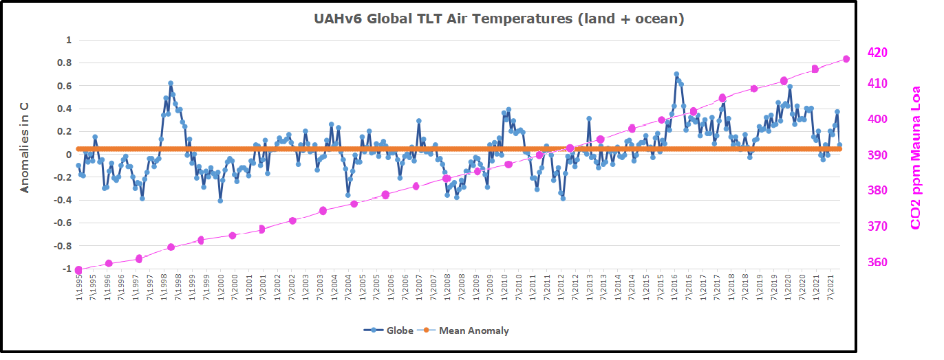
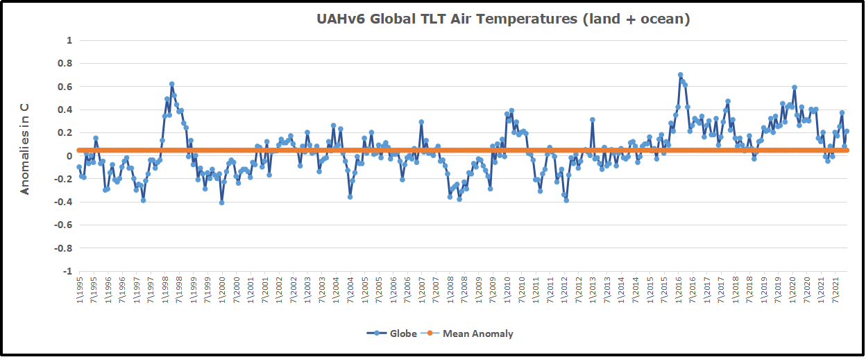
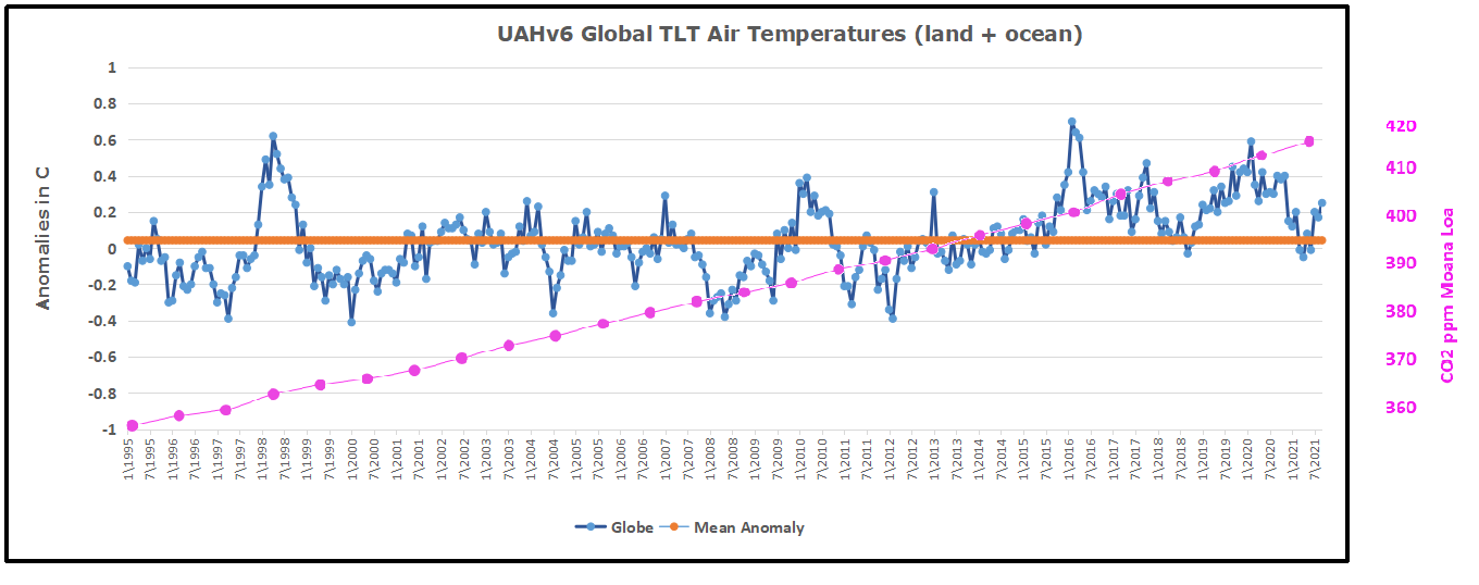
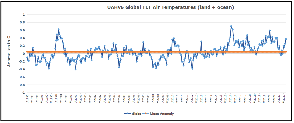
The first point above we have already covered extensively. The combined ERBS+CERES OLR record is seen to track the general progression of the UAHv6 TLT series tightly, both in the tropics and near-globally, all the way from 1985 till today (the last ~33 years), as discussed at length both here and here.

Since, however, in this post we’re specifically considering the CERES era alone, this is how the global OLR matches against the global TLT since 2000:
Figure 5.

This is simply the monthly CERES OLR flux data properly scaled (x0.266), enabling us to compare it more directly to temperatures (W/m2→K), and superimposed on the UAH TLT data. Watch how closely the two curves track each other, beyond the obvious noise. To highlight this striking state of relative congruity, we remove the main sources of visual bias in Fig.5 above. Notice, then, how the red OLR curve, after the 4-year period of fairly large ENSO-events (La Niña-El Niño-La Niña) between 2007/2008 and 2011/2012, when the cyan TLT curve goes both much lower (during the flanking La Niñas) and much higher (during the central El Niño), quickly reestablishes itself right back on top of the TLT curve, just where it used to be prior to that intermediate stretch of strong ENSO influence. And as a result, there is NO gradual divergence whatsoever to be spotted between the mean levels of these two curves, from the beginning of 2000 to the end of 2015.

Missing Fingerprint #2

The second point above is just as relevant as the first one, if we want to confirm (or disconfirm) the reality of an “enhanced GHE” at work in the Earth system. We compare the tropospheric temperatures with the DWLWIRsfc ‘flux’, that is, the apparent atmospheric thermal emission to the surface:

Figure 9. Note how the scaling of the flux (W/m2) values is different close to the surface than at the ToA. Here at the DWLWIR level, down low, we divide by 5 (x0.2), while at the OLR level, up high, we divide by 3.76 (x0.266).

We once again observe a rather close match overall. At the very least, we can safely say that there is no evidence whatsoever of any gradual, systematic rise in DWLWIR over the TLT, going from 2000 to 2018. If we plot the difference between the two curves in Fig.9 to obtain the “DWLWIR residual”, this fact becomes all the more evident:

Figure 10.

Remember now how the idea of an “enhanced GHE” requires the DWLWIR to rise significantly more than Ttropo (TLT) over time, and that its “null hypothesis” therefore postulates that such a rise should NOT be seen. Well, do we see such a rise in the plot above? Nope. Not at all. Which fits in perfectly with the impression we got at the ToA, where the TLT-curve was supposed to rise systematically up and away from the OLR-curve over time, but didn’t – no observed evidence there either of any “enhanced GHE” at work.

Missing Fingerprint #3

Finally, the third point above is also pretty interesting. It is simply to verify whether or not the CERES EBAF Ed4 ‘radiation flux’ data products are indeed suggesting a strengthening of some radiatively defined “greenhouse mechanism”. We sort of know the answer to this already, though, from going through points 1 and 2 above. Since neither the OLR at the ToA nor the DWLWIR at the surface deviated meaningfully from the UAHv6 TLT series (the same one used to compare with both, after all), we expect rather by necessity that the two CERES ‘flux products’ also shouldn’t themselves deviate meaningfully overall from one another. And, unsurprisingly, they don’t:

Figure 14.  Difference plot (“DWLWIR residual”)

Again, it is so easy here to allow oneself to be fooled by the visual impact of that late – obviously ENSO-related – peak, and, in this case, also a definite ENSO-based trough right at the start (you’ll plainly recognise it in Fig.14); another perfect example of how one’s perception and interpretation of a plot is directly affected by “the end-point bias”. Don’t be fooled:

If we expect the OLR at the ToA to stay relatively flat, but the DWLWIR at the sfc to increase significantly over time, even relative to tropospheric temps, then, if we were to compare the two (OLR and DWLWIR) directly, we’d […] naturally expect to see a fairly remarkable systematic rise in the latter over the former (refer to Fig.4 above).

Looking at Fig.14, and taking into account the various ENSO states along the way, does such a “remarkable systematic rise” in DWLWIR over OLR manifest itself during the CERES era?

I’m afraid not …

Five Lines of Evidence Against GHG Warming Hypothesis

The lack of GHG warming in the CERES data is added to four previous atmospheric heat radiation studies.


  1.  In 2004 Ferenc MIskolczi studied the radiosonde datasets and found that the optical density at the top of the troposphere does not change with increasing CO2, since reducing H2O maintains optimal radiating efficiency.  His publication was suppressed by NASA, and he resigned from his job there. He has elaborated on his findings in publications as recently as 2014. See:  The Curious Case of Dr. Miskolczi

2.  Ronan and Michael Connolly  studied radiosonde data and concluded in 2014:

“It can be seen from the infra-red cooling model of Figure 19 that the greenhouse effect theory predicts a strong influence from the greenhouse gases on the barometric temperature profile. Moreover, the modeled net effect of the greenhouse gases on infra-red cooling varies substantially over the entire atmospheric profile.

However, when we analysed the barometric temperature profiles of the radiosondes in this paper, we were unable to detect any influence from greenhouse gases. Instead, the profiles were very well described by the thermodynamic properties of the main atmospheric gases, i.e., N 2 and O 2 , in a gravitational field.”

While water vapour is a greenhouse gas, the effects of water vapour on the temperature profile did not appear to be related to its radiative properties, but rather its different molecular structure and the latent heat released/gained by water in its gas/liquid/solid phase changes.

For this reason, our results suggest that the magnitude of the greenhouse effect is very small, perhaps negligible. At any rate, its magnitude appears to be too small to be detected from the archived radiosonde data.” Pg. 18 of referenced research paper

See:  The Physics Of The Earth’s Atmosphere I. Phase Change Associated With Tropopause

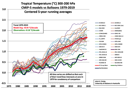
3.  An important proof against the CO2 global warming claim was included in John Christy’s testimony 29 March 2017 at the House Committee on Science, Space and Technology. The text and diagram below are from that document which can be accessed here.

IPCC Assessment Reports show that the IPCC climate models performed best versus observations when they did not include extra GHGs and this result can be demonstrated with a statistical model as well.

Figure 5. Simplification of IPCC AR5 shown above in Fig. 4. The colored lines represent the range of results for the models and observations. The trends here represent trends at different levels of the tropical atmosphere from the surface up to 50,000 ft. The gray lines are the bounds for the range of observations, the blue for the range of IPCC model results without extra GHGs and the red for IPCC model results with extra GHGs.The key point displayed is the lack of overlap between the GHG model results (red) and the observations (gray). The nonGHG model runs (blue) overlap the observations almost completely.

4. Update 2021 Finding from William Happer

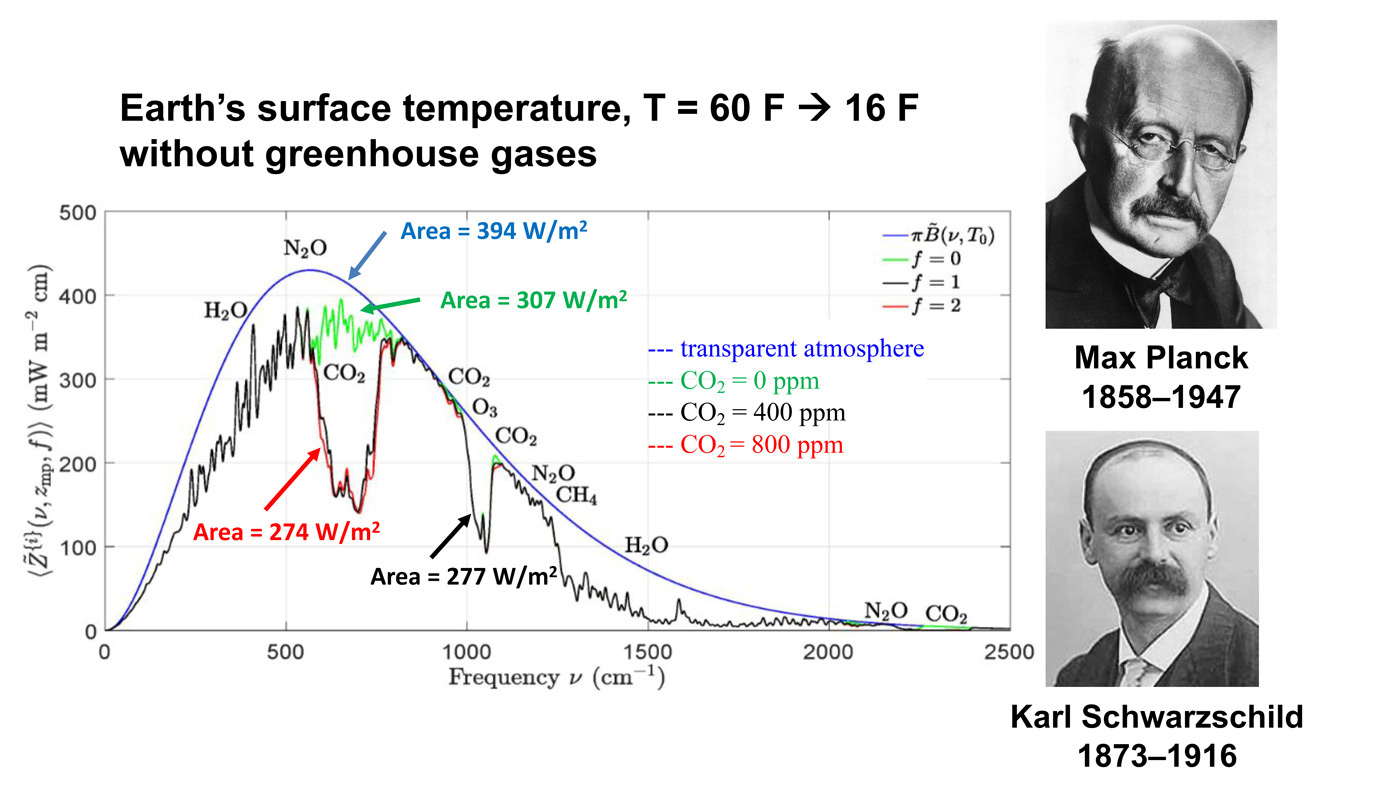
The full discussion of this slide is in the linked synopsis at the top.  In summary here, Happer points to the black line of CO2 infrared absorption at 400 ppm, compared to CO2 IR absorption at 800 ppm.

The important point here is the red line. This is what Earth would radiate to space if you were to double the CO2 concentration from today’s value. Right in the middle of these curves, you can see a gap in spectrum. The gap is caused by CO2 absorbing radiation that would otherwise cool the Earth. If you double the amount of CO2, you don’t double the size of that gap. You just go from the black curve to the red curve, and you can barely see the difference. The gap hardly changes.

The message I want you to understand, which practically no one really understands, is that doubling CO2 makes almost no difference.

An Alternative Theory of Natural Climate Change

Dan Pangburn is a professional engineer who has synthesized the solar and oceanic factors into a mathematical model that correlates with Average Global Temperature (AGT). On his blog is posted a monograph Cause of Global Climate Change explaining clearly his thinking and the maths.  I provided a post with some excerpts and graphs as a synopsis of his analysis, in hopes others will also access and appreciate his work on this issue.  See  Quantifying Natural Climate Change

Footnote on the status of an hypothetical effect too small to be measured:  Bertrand Russell’s teapot

Open image in new tab to enlarge.

Postscript:  For an explanation why CO2 has negligible effect on thermal properties of the atmosphere, and why all W/m2 are not created equal, see: Light Bulbs Disprove Global Warming

Zero Global Warming This Century

a62edf0f39de560a219b7262163b0d45

The post below updates the UAH record of air temperatures over land and ocean.  But as an overview consider how recent rapid cooling has now completely overcome the warming from the last 3 El Ninos (1998, 2010 and 2016).  The UAH record shows that the effects of the last one were gone as of April and now again in November, 2021 (UAH baseline is now 1991-2020).


For reference I added an overlay of CO2 annual concentrations as measured at Mauna Loa.  While temperatures fluctuated up and down ending flat, CO2 went up steadily by ~55 ppm, a 15% increase.

Furthermore, going back to previous warmings prior to the satellite record shows that the entire rise of 0.8C since 1947 is due to oceanic, not human activity.

gmt-warming-events

The animation is an update of a previous analysis from Dr. Murry Salby.  These graphs use Hadcrut4 and include the 2016 El Nino warming event.  The exhibit shows since 1947 GMT warmed by 0.8 C, from 13.9 to 14.7, as estimated by Hadcrut4.  This resulted from three natural warming events involving ocean cycles. The most recent rise 2013-16 lifted temperatures by 0.2C.  Previously the 1997-98 El Nino produced a plateau increase of 0.4C.  Before that, a rise from 1977-81 added 0.2C to start the warming since 1947.

Importantly, the theory of human-caused global warming asserts that increasing CO2 in the atmosphere changes the baseline and causes systemic warming in our climate.  On the contrary, all of the warming since 1947 was episodic, coming from three brief events associated with oceanic cycles. 

Update August 3, 2021

Chris Schoeneveld has produced a similar graph to the animation above, with a temperature series combining HadCRUT4 and UAH6. H/T WUWT

image-8


mc_wh_gas_web20210423124932

See Also Worst Threat: Greenhouse Gas or Quiet Sun?

November Update Ocean and Land Air Temps Plunge

banner-blog

With apologies to Paul Revere, this post is on the lookout for cooler weather with an eye on both the Land and the Sea.  While you will hear a lot about 2020-21 temperatures matching 2016 as the highest ever, that spin ignores how fast is the cooling setting in.  The UAH data analyzed below shows that warming from the last El Nino is now fully dissipated with chilly temperatures setting in all regions.  Last month both land and ocean cooled off dramatically.

UAH has updated their tlt (temperatures in lower troposphere) dataset for November.  Previously I have done posts on their reading of ocean air temps as a prelude to updated records from HADSST3 (still not updated from September). This month also has a separate graph of land air temps because the comparisons and contrasts are interesting as we contemplate possible cooling in coming months and years. Sometimes air temps over land diverge from ocean air changes, but last month showed air over land and oceans both plummeted down everywhere.

Note:  UAH has shifted their baseline from 1981-2010 to 1991-2020 beginning with January 2021.  In the charts below, the trends and fluctuations remain the same but the anomaly values change with the baseline reference shift.

Presently sea surface temperatures (SST) are the best available indicator of heat content gained or lost from earth’s climate system.  Enthalpy is the thermodynamic term for total heat content in a system, and humidity differences in air parcels affect enthalpy.  Measuring water temperature directly avoids distorted impressions from air measurements.  In addition, ocean covers 71% of the planet surface and thus dominates surface temperature estimates.  Eventually we will likely have reliable means of recording water temperatures at depth.

Recently, Dr. Ole Humlum reported from his research that air temperatures lag 2-3 months behind changes in SST.  Thus the cooling oceans now portend cooling land air temperatures to follow.  He also observed that changes in CO2 atmospheric concentrations lag behind SST by 11-12 months.  This latter point is addressed in a previous post Who to Blame for Rising CO2?

After a technical enhancement to HadSST3 delayed updates Spring 2020, May resumed a pattern of HadSST updates toward the following month end (Sept. last update).  For comparison we can look at lower troposphere temperatures (TLT) from UAHv6 which are now posted for November.  The temperature record is derived from microwave sounding units (MSU) on board satellites like the one pictured above. Recently there was a change in UAH processing of satellite drift corrections, including dropping one platform which can no longer be corrected. The graphs below are taken from the new and current dataset.

The UAH dataset includes temperature results for air above the oceans, and thus should be most comparable to the SSTs. There is the additional feature that ocean air temps avoid Urban Heat Islands (UHI).  The graph below shows monthly anomalies for ocean temps since January 2015.

Note 2020 was warmed mainly by a spike in February in all regions, and secondarily by an October spike in NH alone. In 2021, SH and the Tropics both pulled the Global anomaly down to a new low in April. Then SH and Tropics upward spikes, along with NH warming brought Global temps to a peak in October.  That warmth is now gone as November 2021 ocean temps plummeted everywhere.

Land Air Temperatures Tracking Downward in Seesaw Pattern

We sometimes overlook that in climate temperature records, while the oceans are measured directly with SSTs, land temps are measured only indirectly.  The land temperature records at surface stations sample air temps at 2 meters above ground.  UAH gives tlt anomalies for air over land separately from ocean air temps.  The graph updated for November is below.

Here we have fresh evidence of the greater volatility of the Land temperatures, along with extraordinary departures by SH land.  Land temps are dominated by NH with a 2020 spike in February, followed by cooling down to July,and a second spike in November.  Note the mid-year spikes in SH winter months.  In December all of that was wiped out. Then 2021 follows a similar pattern with NH spiking in January, then dropping before rising in the summer to peak in October 2021. As with the ocean air temps, all that was erased in November with a sharp cooling everywhere.

The Bigger Picture UAH Global Since 1995

The chart shows monthly anomalies starting 01/1995 to present.  The average anomaly is 0.04, since this period is the same as the new baseline, lacking only the first 4 years. 1995 was chosen as an ENSO neutral year.  The graph shows the 1998 El Nino after which the mean resumed, and again after the smaller 2010 event. The 2016 El Nino matched 1998 peak and in addition NH after effects lasted longer, followed by the NH warming 2019-20.   A small upward bump in 2021 has been reversed with temps now returning again to the mean.

TLTs include mixing above the oceans and probably some influence from nearby more volatile land temps.  Clearly NH and Global land temps have been dropping in a seesaw pattern, more than 1C lower than the 2016 peak.  Since the ocean has 1000 times the heat capacity as the atmosphere, that cooling is a significant driving force.  TLT measures started the recent cooling later than SSTs from HadSST3, but are now showing the same pattern.  It seems obvious that despite the three El Ninos, their warming has not persisted, and without them it would probably have cooled since 1995.  Of course, the future has not yet been written.


2021 Update: Climate Reductionism

19170447-global_warming_1.530x298In the aftermath of Glasgow COP, many have noticed how incredible were the pronouncements and claims from UK hosts as well as other speakers intending to inflame public opinion in support of the UN agenda.  No one in the media applies any kind of critical intelligence examining the veracity of facts and conclusions trumpeted before, during and after the conference.  In the interest of presenting an alternate, unalarming paradigm of earth’s climate, I am reposting a previous discussion of how wrongheaded is the IPCC “consensus science.”

Background

With all the fuss about the “Green New Deal” and attempts to blame recent cold waves on rising CO2, it is wise to remember the logic of the alarmist argument.  It boils down to two suppositions:

Rising atmospheric CO2 makes the planet warmer.

Rising emissions from humans burning fossil fuels makes atmospheric CO2 higher.

The second assertion is challenged in a post: Who to Blame for Rising CO2?

This post addresses the first claim.  Remember also that all of the so-called “lines of evidence” for global warming do not distinguish between human and natural causes.  Typically the evidence cited falls into these categories:

Global temperature rise
Warming oceans
Shrinking ice sheets
Glacial retreat
Decreased snow cover
Sea level rise
Declining Arctic sea ice
Extreme events

However, all of these are equivocal, involving signal and noise issues. Note also that all of them are alleged impacts from the first one.  And in any case, the fact of any changes does not in itself prove human causation.  That attribution rests solely on unvalidated climate models.  Below is a discussion of the reductionist mental process by which climate complexity and natural forces are systematically excluded to reach the pre-determined conclusion.

Original Post:  Climate Reductionism


Reductionists are those who take one theory or phenomenon to be reducible to some other theory or phenomenon. For example, a reductionist regarding mathematics might take any given mathematical theory to be reducible to logic or set theory. Or, a reductionist about biological entities like cells might take such entities to be reducible to collections of physico-chemical entities like atoms and molecules.
Definition from The Internet Encyclopedia of Philosophy

Some of you may have seen this recent article: Divided Colorado: A Sister And Brother Disagree On Climate Change

The reporter describes a familiar story to many of us.  A single skeptic (the brother) is holding out against his sister and rest of the family who accept global warming/climate change. And of course, after putting some of their interchanges into the text, the reporter then sides against the brother by taking the word of a climate expert. From the article:

“CO2 absorbs infrared heat in certain wavelengths and those measurements were made first time — published — when Abraham Lincoln was president of the United States,” says Scott Denning, a professor of atmospheric science at Colorado State University. “Since that time, those measurements have been repeated by better and better instruments around the world.”

CO2, or carbon dioxide, has increased over time, scientists say, because of human activity. It’s a greenhouse gas that’s contributing to global warming.

“We know precisely how the molecule wiggles and waggles, and what the quantum interactions between the electrons are that cause everyone one of these little absorption lines,” he says. “And there’s just no wiggle room around it — CO2 absorbs heat, heat warms things up, so adding CO2 to the atmosphere will warm the climate.”

Denning says that most of the CO2 we see added to the atmosphere comes from humans — mostly through burning coal, oil and gas, which, as he puts it, is “indirectly caused by us.”

When looking at the scientific community, Denning says it’s united, as far as he knows.

earth-science-climatic-change-Climate-System-3-114-g001

A Case Study of Climate Reductionism

Denning’s comments, supported by several presentations at his website demonstrate how some scientists (all those known to Denning) engage in a classic form of reductionism.

The full complexity of earth’s climate includes many processes, some poorly understood, but known to have effects orders of magnitude greater than the potential of CO2 warming. The case for global warming alarm rests on simplifying away everything but the predetermined notion that humans are warming the planet. It goes like this:

Our Complex Climate

Earth’s climate is probably the most complicated natural phenomenon ever studied. Not only are there many processes, but they also interact and influence each other over various timescales, causing lagged effects and multiple cycling. This diagram illustrates some of the climate elements and interactions between them.

Flows and Feedbacks for Climate Models

The Many Climate Dimensions

Further, measuring changes in the climate goes far beyond temperature as a metric. Global climate indices, like the European dataset include 12 climate dimensions with 74 tracking measures. The set of climate dimensions include:

  • Sunshine
  • Pressure
  • Humidity
  • Cloudiness
  • Wind
  • Rain
  • Snow
  • Drought
  • Temperature
  • Heat
  • Cold

And in addition there are compound measures combining temperature and precipitation. While temperature is important, climate is much more than that.  With this reduction, all other dimensions are swept aside, and climate change is simplified down to global warming as seen in temperature measurements.

Climate Thermodynamics: Weather is the Climate System at work.

Another distortion is the notion that weather is bad or good, depending on humans finding it favorable. In fact, all that we call weather are the ocean and atmosphere acting to resolve differences in temperatures, humidities and pressures. It is the natural result of a rotating, irregular planetary surface mostly covered with water and illuminated mostly at its equator.

The sun warms the surface, but the heat escapes very quickly by convection so the build-up of heat near the surface is limited. In an incompressible atmosphere, it would *all* escape, and you’d get no surface warming. But because air is compressible, and because gases warm up when they’re compressed and cool down when allowed to expand, air circulating vertically by convection will warm and cool at a certain rate due to the changing atmospheric pressure.

Climate science has been obsessed with only a part of the system, namely the atmosphere and radiation, in order to focus attention on the non-condensing IR active gases. The climate is framed as a 3D atmosphere above a 2D surface. That narrow scope leaves out the powerful non-radiative heat transfer mechanisms that dominate the lower troposphere, and the vast reservoir of thermal energy deep in the oceans.

As Dr. Robert E Stevenson writes, it could have been different:

“As an oceanographer, I’d been around the world, once or twice, and I was rather convinced that I knew the factors that influenced the Earth’s climate. The oceans, by virtue of their enormous density and heat-storage capacity, are the dominant influence on our climate. It is the heat budget and the energy that flows into and out of the oceans that basically determines the mean temperature of the global atmosphere. These interactions, plus evaporation, are quite capable of canceling the slight effect of man-produced CO2.”

The troposphere is dominated by powerful heat transfer mechanisms: conduction, convection and evaporation, as well as physical kinetic movements.  All this is ignored in order to focus on radiative heat transfer, a bit player except at the top of the atmosphere.

There’s More than the Atmosphere

Once the world of climate is greatly reduced down to radiation of infrared frequencies, yet another set of blinders is applied. The most important source of radiation is of course the sun. Solar radiation in the short wave (SW) range is what we see and what heats up the earth’s surface, particularly the oceans. In addition solar radiation includes infrared, some absorbed in the atmosphere and some at the surface. The ocean is also a major source of heat into the atmosphere since its thermal capacity is 1000 times what the air can hold. The heat transfer from ocean to air is both by way of evaporation (latent heat) and also by direct contact at the sea surface (conduction).

Yet conventional climate science dismisses the sun as a climate factor saying that its climate input is unvarying. That ignores significant fluctuations in parts of the light range, for example ultraviolet, and also solar effects such as magnetic fields and cosmic rays. Also disregarded is solar energy varying due to cloud fluctuations. The ocean is also dismissed as a source of climate change despite obvious ocean warming and cooling cycles ranging from weeks to centuries. The problem is such oscillations are not well understood or predictable, so can not be easily modeled.

With the sun and the earth’s surface and ocean dismissed, the only consideration left is the atmosphere.

The Gorilla Greenhouse Gas

Thus climate has been reduced down to heat radiation passing through the atmosphere comprised of gases. One of the biggest reductions then comes from focusing on CO2 rather than H20. Of all the gases that are IR-active, water is the most prevalent and covers more of the spectrum.

The diagram below gives you the sense of proportion.

GHG blocks

The Role of CO2

We come now to the role of CO2 in “trapping heat” and making the world warmer. The theory is that CO2 acts like a blanket by absorbing and re-radiating heat that would otherwise escape into space. By delaying the cooling while solar energy comes in constantly, CO2 is presumed to cause a buildup of heat resulting in warmer temperatures.

How the Atmosphere Processes Heat

There are 3 ways that heat (Infrared or IR radiation) passes from the surface to space.

1) A small amount of the radiation leaves directly, because all gases in our air are transparent to IR of 10-14 microns (sometimes called the “atmospheric window.” This pathway moves at the speed of light, so no delay of cooling occurs.

2) Some radiation is absorbed and re-emitted by IR active gases up to the tropopause. Calculations of the free mean path for CO2 show that energy passes from surface to tropopause in less than 5 milliseconds. This is almost speed of light, so delay is negligible. H2O is so variable across the globe that its total effects are not measurable. In arid places, like deserts, we see that CO2 by itself does not prevent the loss of the day’s heat after sundown.

3) The bulk gases of the atmosphere, O2 and N2, are warmed by conduction and convection from the surface. They also gain energy by collisions with IR active gases, some of that IR coming from the surface, and some absorbed directly from the sun. Latent heat from water is also added to the bulk gases. O2 and N2 are slow to shed this heat, and indeed must pass it back to IR active gases at the top of the troposphere for radiation into space.

In a parcel of air each molecule of CO2 is surrounded by 2500 other molecules, mostly O2 and N2. In the lower atmosphere, the air is dense and CO2 molecules energized by IR lose it to surrounding gases, slightly warming the entire parcel. Higher in the atmosphere, the air is thinner, and CO2 molecules can emit IR into space. Surrounding gases resupply CO2 with the energy it lost, which leads to further heat loss into space.

This third pathway has a significant delay of cooling, and is the reason for our mild surface temperature, averaging about 15C. Yes, earth’s atmosphere produces a buildup of heat at the surface. The bulk gases, O2 and N2, trap heat near the surface, while IR active gases, mainly H20 and CO2, provide the radiative cooling at the top of the atmosphere. Near the top of the atmosphere you will find the -18C temperature.

Sources of CO2

Note the size of the human emissions next to the red arrow.

A final reduction comes down to how much of the CO2 in the atmosphere is there because of us. Alarmists/activists say any increase in CO2 is 100% man-made, and would be more were it not for natural CO2 sinks, namely the ocean and biosphere. The claim overlooks the fact that those sinks are also sources of CO2 and the flux from the land and sea is an order of magnitude higher than estimates of human emissions. In fact, our few Gigatons of carbon are lost within the error range of estimating natural emissions. Insects produce far more CO2 than humans do by all our activity, including domestic animals.

Why Climate Reductionism is Dangerous

Reducing the climate in this fashion reaches its logical conclusion in the Activist notion of the “450 Scenario.”  Since Cancun, IPCC is asserting that global warming is capped at 2C by keeping CO2 concentration below 450 ppm. From Summary for Policymakers (SPM) AR5

Emissions scenarios leading to CO2-equivalent concentrations in 2100 of about 450 ppm or lower are likely to maintain warming below 2°C over the 21st century relative to pre-industrial levels. These scenarios are characterized by 40 to 70% global anthropogenic GHG emissions reductions by 2050 compared to 2010, and emissions levels near zero or below in 2100.

Thus is born the “450 Scenario” by which governments can be focused upon reducing human emissions without any reference to temperature measurements, which are troublesome and inconvenient. Almost everything in the climate world has been erased, and “Fighting Climate Change” is now code to mean accounting for fossil fuel emissions.

Conclusion

All propagandists begin with a kernel of truth, in this case the fact everything acting in the world has an effect on everything else. Edward Lorenz brought this insight to bear on the climate system in a ground breaking paper he presented in 1972 entitled: “Predictability: Does the Flap of a Butterfly’s Wings in Brazil Set Off a Tornado in Texas?”  Everything does matter and has an effect. Obviously humans impact on the climate in places where we build cities and dams, clear forests and operate farms. And obviously we add some CO2 when we burn fossil fuels.

But it is wrong to ignore the major dominant climate realities in order to exaggerate a small peripheral factor for the sake of an agenda. It is wrong to claim that IR active gases somehow “trap” heat in the air when they immediately emit any energy absorbed, if not already lost colliding with another molecule. No, it is the bulk gases, N2 and O2, making up the mass of the atmosphere, together with the ocean delaying the cooling and giving us the mild and remarkably stable temperatures that we enjoy. And CO2 does its job by radiating the heat into space.

Since we do little to cause it, we can’t fix it by changing what we do. The climate will not stop changing because we put a price on carbon. And the sun will rise despite the cock going on strike to protest global warming.

Footnote: For a deeper understanding of the atmospheric physics relating to CO2 and climate, I have done a guide and synopsis of Murry Salby’s latest textbook on the subject:  Fearless Physics from Dr. Salby

IPCC Data: Rising CO2 is 75% Natural

A previous post reprinted later below raised the question Who to Blame for Rising CO?  It provided synopses of three studies challenging the IPCC orthodox explanation that humans are the cause by burning fossil fuels.  This post brings the research up to date with a 2021  publication by Edwin Berry.

The graph above summarizes Dr. Berry’s findings.  The lines represent CO2 added into the atmosphere since the 1750 level of 280 ppm.  Based on IPCC data regarding CO2 natural sources and sinks, the black dots show the CO2 data. The small blue dots show the sum of all human CO2 emissions since they became measurable, irrespective of transfers of that CO2 from the atmosphere to land or to ocean.

Notice the CO2 data is greater than the sum of all human CO2 until 1960. That means nature caused the CO2 level to increase prior to 1960, with no reason to stop adding CO2 since.  In fact, the analysis shows that in the year 2020, the human contribution to atmospheric CO2 level is 33 ppm, which means that from a 2020 total of 413 ppm, 280 is pre-industrial and 100 is added from land andl ocean during the industrial era.

A new carbon cycle model shows human emissions cause 25% and nature 75% of the CO2 increase is the title (and link) for Dr. Edwin Berry’s paper accepted in the journal Atmosphere August 12, 2021.  The pre-print version is available at Ed Berry’s website providing all the details and opportunity to ask questions.  Respecting his request not to post content from the paper, I provide some of his comments on threads at his blog in order to indicate the thrust of his analysis and findings.  Excerpts are in italics with my bolds.

Here is IPCC’s and climate alarmism’s core theory. It has 3 connected parts. Notice the separation of “natural carbon emissions” and “human carbon emissions”:

  • Natural carbon emissions remained constant after 1750.
  • These constant natural emissions support a CO2 level of 280 ppm.
  • Human carbon emissions caused all the CO2 increase above 280 ppm.
Data proves IPCC’s core theory is wrong.

In the figure above, the black dots show the CO2 data. The small blue dots show the sum of all human CO2 emissions. Notice the CO2 data is greater than the sum of all human CO2 until 1960. That means nature caused the CO2 level to increase. Therefore, IPCC’s core theory is wrong.

Don’t worry that the sum of human CO2 becomes greater after 1960 because the sum is not a valid argument anyway. It omits the flow of human CO2 out of the atmosphere.

The solid blue line shows the true effect of human CO2. In 2020, the human-caused increase in CO2 is 25 percent and the natural-caused increase in CO2 is 75 percent of the total increase.

The key point is the data have proven IPCC’s core theory is wrong.

The logic of my paper is simple. It has four steps:

1. It uses IPCC’s natural carbon cycle data.
2. It computes deductively the resulting true human carbon cycle.
3. This true human carbon cycle disagrees with IPCC’s human carbon cycle
4. Therefore, IPCC’s human carbon cycle is wrong.

IPCC’s human carbon cycle — the basis of all IPCC’s climate claims and climate models — contradicts IPCC’s natural carbon cycle data.  My proof of IPCC’s error is independent of outside data and is deductive. My model asserts two things about the CO2 cycle.

1. Human carbon derived from carbon fuels adds new carbon to the fast carbon cycle. (More precisely, it moves carbon from the slow carbon cycle to the fast carbon cycle.) My model keeps track of this added carbon. As of 2020, human carbon has added about one percent to the carbon in the fast carbon cycle.

2.Once this new carbon is added to the fast carbon cycle, it behaves physically and chemically exactly like all the other carbon in the fast carbon cycle.

The purpose of my model is to use IPCC’s black numbers for its natural carbon cycle to calculate the turnover times for the six nodes. Then, using these turnover times, my model calculates how human carbon, introduced annually into the atmosphere according to data, flows to the land, surface ocean, and deep ocean.

We don’t expect my calculations for human carbon to agree with IPCC’s numbers for its human carbon cycle because IPCC numbers assume the core theory is true, and my numbers assume IPCC’s natural carbon cycle is true.

My model does what the IPCC should have done but didn’t. My model calculates how the level changes with time using the same physics found in IPCC’s natural carbon cycle. These calculations show human carbon flows so fast from the atmosphere that only 33 ppm is still in the atmosphere in 2020.

This is the most accurate calculation anyone has made for the effect of human carbon on atmospheric CO2. Given this result, nature had to add 100 ppm to the atmosphere as of 2020.

Background from previous post Who to Blame for Rising CO2?

Blaming global warming on humans comes down to two assertions:

Rising CO2 in the atmosphere causes earth’s surface temperature to rise.

Humans burning fossil fuels cause rising atmospheric CO2.

For this post I will not address the first premise, instead refer the reader to a previous article referencing Fred Singer. He noted that greenhouse gas theory presumes surface warming arises because heat is forced to escape at a higher, colder altitude. In fact, temperatures in the tropopause do not change with altitude (“pause”), and in the stratosphere temperatures increase with altitude. That post also includes the “meat” of the brief submitted to Judge Alsup’s court by Happer, Koonin and Lindzen, which questions CO2 driving global warming in the face of other more powerful factors. See Courtroom Climate Science

The focus in this piece is the claim that fossil fuel emissions drive observed rising CO2 concentrations. IPCC consensus scientists and supporters note that human emissions are about twice the measured rise and presume that natural sinks absorb half, leaving the other half to accumulate in the atmosphere. Thus they conclude all of the increase in atmospheric CO2 is from fossil fuels.

This simple-minded conclusion takes the only two things we measure in the carbon cycle: CO2 in the atmosphere, and fossil fuel emissions. And then asserts that one causes the other. But several elephants are in the room, namely the several carbon reservoirs that dwarf human activity in their size and activity, and can not be measured because of their complexity.

The consensus notion is based on a familiar environmental paradigm: The Garden of Eden. This is the modern belief that nature, and indeed the climate is in balance, except for humans disrupting it by their activities. In the current carbon cycle context, it is the supposition that all natural sources and sinks are in balance, thus any additional CO2 is because of humans.

Now, a curious person might wonder: How is it that for decades as the rate of fossil fuel emissions increased, the absorption by natural sinks has also increased at exactly the same rate, so that 50% is always removed and 50% remains? It can only be that nature is also dynamic and its flows change over time!

That alternative paradigm is elaborated in several papers that are currently under vigorous attack from climatists. As one antagonist put it: Any paper concluding that humans don’t cause rising CO2 is obviously wrong. One objectionable study was published by Hermann Harde, another by Ole Humlum, and a third by Ed Berry is delayed in pre-publication review.

The methods and analyses are different, but the three skeptical papers argue that the levels and flows of various carbon reservoirs fluctuate over time with temperature itself as a causal variable. Some sinks are stimulated by higher temperatures to release more CO2 while others respond by capturing more CO2. And these reactions occur on a range of timescales. Once these dynamics are factored in, the human contribution to rising atmospheric CO2 is neglible, much to the ire of alarmists.

Ed Berry finds IPCC carbon cycle metrics illogical.

Dr. Ed Berry provides a preprint of his submitted paper at a blog post entitled Why human CO2 does not change climate. He welcomes comments and uses the discussion to revise and improve the text. Excerpts with my bolds.

The United Nations Intergovernmental Panel on Climate Change (IPCC) claims human emissions raised the carbon dioxide level from 280 ppm to 410 ppm, or 130 ppm. Physics proves this claim is impossible.

The IPCC agrees today’s annual human carbon dioxide emissions are 4.5 ppm per year and nature’s carbon dioxide emissions are 98 ppm per year. Yet, the IPCC claims human emissions have caused all the increase in carbon dioxide since 1750, which is 30 percent of today’s total.

How can human carbon dioxide, which is only 5 percent of natural carbon dioxide, add 30 percent to the level of atmospheric carbon dioxide? It can’t.

inflowresultipcc-2

This paper derives a Model that shows how human and natural carbon dioxide emissions independently change the equilibrium level of atmospheric carbon dioxide. This Model should replace the IPCC’s invalid Bern model.

The Model shows the ratio of human to natural carbon dioxide in the atmosphere equals the ratio of their inflows, independent of residence time.

fig5.carbonflows

Fig. 5. The sum of nature’s inflow is 20 times larger than the sum of human emissions. Nature balances inflow with or without human emissions.

The model shows, contrary to IPCC claims, that human emissions do not continually add carbon dioxide to the atmosphere, but rather cause a flow of carbon dioxide through the atmosphere. The flow adds a constant equilibrium level, not a continuing increasing level, of carbon dioxide.

systembalanceb-665x255-1

Fig. 2. Balance proceeds as follows: (1) Inflow sets the balance level. (2) Level sets the outflow. (3) Level moves toward balance level until outflow equals inflow.

Ole Humlum proves that CO2 follows temperature also for interannual/decadal periods.

Humlum et al. looks the modern record of fluctuating temperatures and atmospheric CO2 and concludes that CO2 changes follow temperature changes over these timescales. The paper is The phase relation between atmospheric carbon dioxide and global temperature OleHumlum, KjellStordahl, Jan-ErikSolheim.  Excerpts with my bolds.

From the Abstract:
Using data series on atmospheric carbon dioxide and global temperatures we investigate the phase relation (leads/lags) between these for the period January 1980 to December 2011. Ice cores show atmospheric CO2 variations to lag behind atmospheric temperature changes on a century to millennium scale, but modern temperature is expected to lag changes in atmospheric CO2, as the atmospheric temperature increase since about 1975 generally is assumed to be caused by the modern increase in CO2.

In our analysis we used eight well-known datasets. . . We find a high degree of co-variation between all data series except 7) and 8), but with changes in CO2 always lagging changes in temperature.


Highlights

► Changes in global atmospheric CO2 are lagging 11–12 months behind changes in global sea surface temperature. ► Changes in global atmospheric CO2 are lagging 9.5–10 months behind changes in global air surface temperature. ► Changes in global atmospheric CO2 are lagging about 9 months behind changes in global lower troposphere temperature. ► Changes in ocean temperatures explain a substantial part of the observed changes in atmospheric CO2 since January 1980. ► Changes in atmospheric CO2 are not tracking changes in human emissions.

Summary

Summing up, monthly data since January 1980 on atmospheric CO2 and sea and air temperatures unambiguously demonstrate the overall global temperature change sequence of events to be 1) ocean surface, 2) surface air, 3) lower troposphere, and with changes in atmospheric CO2 always lagging behind changes in any of these different temperature records.9

A main control on atmospheric CO2 appears to be the ocean surface temperature, and it remains a possibility that a significant part of the overall increase of atmospheric CO2 since at least 1958 (start of Mauna Loa observations) simply reflects the gradual warming of the oceans, as a result of the prolonged period of high solar activity since 1920 (Solanki et al., 2004).

Based on the GISP2 ice core proxy record from Greenland it has previously been pointed out that the present period of warming since 1850 to a high degree may be explained by a natural c. 1100 yr periodic temperature variation (Humlum et al., 2011).

Hermann Harde sets realistic proportions for the carbon cycle.

Hermann Harde applies a comparable perspective to consider the carbon cycle dynamics. His paper is Scrutinizing the carbon cycle and CO2 residence time in the atmosphere. Excerpts with my bolds.

From the Abstract:

Climate scientists presume that the carbon cycle has come out of balance due to the increasing anthropogenic emissions from fossil fuel combustion and land use change. This is made responsible for the rapidly increasing atmospheric CO2 concentrations over recent years, and it is estimated that the removal of the additional emissions from the atmosphere will take a few hundred thousand years. Since this goes along with an increasing greenhouse effect and a further global warming, a better understanding of the carbon cycle is of great importance for all future climate change predictions. We have critically scrutinized this cycle and present an alternative concept, for which the uptake of CO2 by natural sinks scales proportional with the CO2 concentration. In addition, we consider temperature dependent natural emission and absorption rates, by which the paleoclimatic CO2 variations and the actual CO2 growth rate can well be explained. The anthropogenic contribution to the actual CO2 concentration is found to be 4.3%, its fraction to the CO2 increase over the Industrial Era is 15% and the average residence time 4 years.

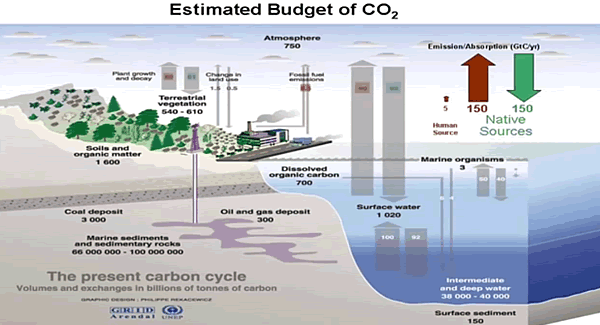
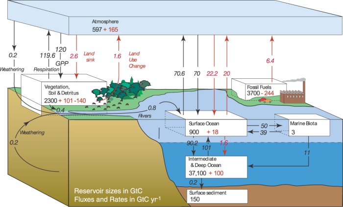
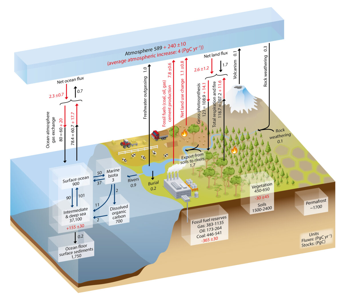
Fig. 1. Simplified schematic of the global carbon cycle. Black numbers and arrows indicate reservoir mass in PgC and exchange fluxes in PgC/yr before the Industrial Era. Red arrows and numbers show annual  anthropogenic’ flux changes averaged over the 2000–2009 time period. Graphic from AR5-Chap.6-Fig.6.1. 

Conclusions

Climate scientists assume that a disturbed carbon cycle, which has come out of balance by the increasing anthropogenic emissions from fossil fuel combustion and land use change, is responsible for the rapidly increasing atmospheric CO2 concentrations over recent years. While over the whole Holocene up to the entrance of the Industrial Era (1750) natural emissions by heterotrophic processes and fire were supposed to be in equilibrium with the uptake by photosynthesis and the net ocean-atmosphere gas exchange, with the onset of the Industrial Era the IPCC estimates that about 15–40% of the additional emissions cannot further be absorbed by the natural sinks and are accumulating in the atmosphere. The IPCC further argues that CO2 emitted until 2100 will remain in the atmosphere longer than 1000 years, and in the same context it is even mentioned that the removal of human-emitted CO2 from the atmosphere by natural processes will take a few hundred thousand years (high confidence) (see AR5-Chap.6ExecutiveSummary). Since the rising CO2 concentrations go along with an increasing greenhouse effect and, thus, a further global warming, a better understanding of the carbon cycle is a necessary prerequisite for all future climate change predictions.

In their accounting schemes and models of the carbon cycle the IPCC uses many new and detailed data which are primarily focussing on fossil fuel emission, cement fabrication or net land use change (see AR5-WG1- Chap.6.3.2), but it largely neglects any changes of the natural emissions, which contribute to more than 95 % to the total emissions and by far cannot be assumed to be constant over longer periods (see, e.g.: variations over the last 800,000 years (Jouzel et al., 2007); the last glacial termination (Monnin et al., 2001); or the younger Holocene (Monnin et al., 2004; Wagner et al., 2004)).

Since our own estimates of the average CO2 residence time in the atmosphere differ by several orders of magnitude from the announced IPCC values, and on the other hand actual investigations of Humlum et al. (2013) or Salby (2013, 2016) show a strong relation between the natural CO2 emission rate and the surface temperature, this was motivation enough to scrutinize the IPCC accounting scheme in more detail and to contrast this to our own calculations.

Different to the IPCC we start with a rate equation for the emission and absorption processes, where the uptake is not assumed to be saturated but scales proportional with the actual CO2 concentration in the atmosphere (see also Essenhigh, 2009; Salby, 2016). This is justified by the observation of an exponential decay of 14C. A fractional saturation, as assumed by the IPCC, can directly be expressed by a larger residence time of CO2 in the atmosphere and makes a distinction between a turnover time and adjustment time needless.

Based on this approach and as solution of the rate equation we derive a concentration at steady state, which is only determined by the product of the total emission rate and the residence time. Under present conditions the natural emissions contribute 373 ppm and anthropogenic emissions 17 ppm to the total concentration of 390 ppm (2012). For the average residence time we only find 4 years.

The stronger increase of the concentration over the Industrial Era up to present times can be explained by introducing a temperature dependent natural emission rate as well as a temperature affected residence time. With this approach not only the exponential increase with the onset of the Industrial Era but also the concentrations at glacial and cooler interglacial times can well be reproduced in full agreement with all observations.

So, different to the IPCC’s interpretation the steep increase of the concentration since 1850 finds its natural explanation in the self accelerating processes on the one hand by stronger degassing of the oceans as well as a faster plant growth and decomposition, on the other hand by an increasing residence time at reduced solubility of CO2 in oceans. Together this results in a dominating temperature controlled natural gain, which contributes about 85% to the 110 ppm CO2 increase over the Industrial Era, whereas the actual anthropogenic emissions of 4.3% only donate 15%. These results indicate that almost all of the observed change of CO2 during the Industrial Era followed, not from anthropogenic emission, but from changes of natural emission. The results are consistent with the observed lag of CO2 changes behind temperature changes (Humlum et al., 2013; Salby, 2013), a signature of cause and effect. Our analysis of the carbon cycle, which exclusively uses data for the CO2 concentrations and fluxes as published in AR5, shows that also a completely different interpretation of these data is possible, this in complete conformity with all observations and natural causalities.

Background

CO2 Fluxes, Sources and Sinks

Obsessed with Human CO2

Not Worried About CO2


Mild Land and Ocean Air Temps October 2021

The post below updates the UAH (U. of Alabama in Huntsville) record of air temperatures over land and ocean.  But as an overview consider how rapid cooling  recently completely overcame the warming from the last 3 El Ninos (1998, 2010 and 2016).  The UAH record shows that the effects of the last one were gone as of March 2021. (UAH baseline is now 1991-2020). For reference I added an overlay of CO2 annual concentrations as measured at Mauna Loa. While temperatures fluctuated up and down ending flat, CO2 went up steadily by ~55 ppm by 2020, a 15% increase.

Furthermore, going back to previous warmings prior to the satellite record shows that the entire rise of 0.8C since 1947 is due to oceanic, not human activity.

gmt-warming-events

The animation is an update of a previous analysis from Dr. Murry Salby.  These graphs use Hadcrut4 and include the 2016 El Nino warming event.  The exhibit shows since 1947 GMT warmed by 0.8 C, from 13.9 to 14.7, as estimated by Hadcrut4.  This resulted from three natural warming events involving ocean cycles. The most recent rise 2013-16 lifted temperatures by 0.2C.  Previously the 1997-98 El Nino produced a plateau increase of 0.4C.  Before that, a rise from 1977-81 added 0.2C to start the warming since 1947.

Importantly, the theory of human-caused global warming asserts that increasing CO2 in the atmosphere changes the baseline and causes systemic warming in our climate.  On the contrary, all of the warming since 1947 was episodic, coming from three brief events associated with oceanic cycles. 

October Update Mild Ocean and Land Air Temps 

banner-blog

With apologies to Paul Revere, this post is on the lookout for cooler weather with an eye on both the Land and the Sea.  While you will hear a lot about 2020 temperatures matching 2016 as the highest ever, that spin ignores how fast has the cooling set in.  The UAH data analyzed below shows that warming from the last El Nino was fully dissipated with chilly temperatures setting in all regions.  The peak NH summer month of July saw some warming most pronounced in the SH, then reversed by cooling in August and September. Now in October there is an upward tick with milder temperatures.

UAH has updated their tlt (temperatures in lower troposphere) dataset for October.  Previously I have done posts on their reading of ocean air temps as a prelude to updated records from HADSST3. This month also has a separate graph of land air temps because the comparisons and contrasts are interesting as we contemplate possible cooling in coming months and years. 

Note:  UAH has shifted their baseline from 1981-2010 to 1991-2020 beginning with January 2021.  In the charts below, the trends and fluctuations remain the same but the anomaly values change with the baseline reference shift. Data for lower troposphere is here .

Presently sea surface temperatures (SST) are the best available indicator of heat content gained or lost from earth’s climate system.  Enthalpy is the thermodynamic term for total heat content in a system, and humidity differences in air parcels affect enthalpy.  Measuring water temperature directly avoids distorted impressions from air measurements.  In addition, ocean covers 71% of the planet surface and thus dominates surface temperature estimates.  Eventually we will likely have reliable means of recording water temperatures at depth.

Recently, Dr. Ole Humlum reported from his research that air temperatures lag 2-3 months behind changes in SST.  Thus the cooling oceans now portend cooling land air temperatures to follow.  He also observed that changes in CO2 atmospheric concentrations lag behind SST by 11-12 months.  This latter point is addressed in a previous post Who to Blame for Rising CO2?

After a technical enhancement to HadSST3 delayed updates Spring 2020, May resumed a pattern of HadSST updates toward the following month end.  For comparison we can look at lower troposphere temperatures (TLT) from UAHv6 which are now posted for October.  The temperature record is derived from microwave sounding units (MSU) on board satellites like the one pictured above. Recently there was a change in UAH processing of satellite drift corrections, including dropping one platform which can no longer be corrected. The graphs below are taken from the new and current dataset.

The UAH dataset includes temperature results for air above the oceans, and thus should be most comparable to the SSTs. There is the additional feature that ocean air temps avoid Urban Heat Islands (UHI).  The graph below shows monthly anomalies for ocean temps since January 2015.

In Jan-March 2021 SH dropped sharply, pulling the Global anomaly down with SH matching the coldest in this period. March drops in the Tropics and NH made those regions at their coldest since 01/2015.  In June 2021 despite an uptick in NH, the Global anomaly dropped back down due to a record low in SH along with a Tropical cooling.  The summer warm pulse in NH was mild this year, with NH peaking in July, pulling up Global anomaly slightly with an assist from the Tropics.  Now in October the Global anomaly is up due to both the Tropics and NH, though the latter is 0.3C lower than October a year ago.

Land Air Temperatures Tracking Downward in Seesaw Pattern

We sometimes overlook that in climate temperature records, while the oceans are measured directly with SSTs, land temps are measured only indirectly.  The land temperature records at surface stations sample air temps at 2 meters above ground.  UAH gives tlt anomalies for air over land separately from ocean air temps.  The graph updated for October is below.

Here we have fresh evidence of the greater volatility of the Land temperatures, along with extraordinary departures by SH land.  Land temps are dominated by NH with a 2021 spike in February, followed by cooling down to April.  Then NH land warmed with a second NH spike peaking in July. Note how cold have been SH land temperatures in 2021, with two lows in Jan. and again in July.  Then SH  and the Tropics spiked upward, raising the Global land anomaly.  And now NH has ticked upward matching its peak last October.

The Bigger Picture UAH Global Since 1995

The chart shows monthly anomalies starting 01/1995 to present.  The average anomaly is 0.04, since this period is the same as the new baseline, lacking only the first 4 years.  1995 was chosen as an ENSO neutral year.  The graph shows the 1998 El Nino after which the mean resumed, and again after the smaller 2010 event. The 2016 El Nino matched 1998 peak and in addition NH after effects lasted longer, followed by the NH warming 2019-20, with temps having returned again to the mean March-June, with an uptick in July-October.

TLTs include mixing above the oceans and probably some influence from nearby more volatile land temps.  Clearly NH and Global land temps have been dropping in a seesaw pattern, more than 1C lower than the 2016 peak.  Since the ocean has 1000 times the heat capacity as the atmosphere, that cooling is a significant driving force.  TLT measures started the recent cooling later than SSTs from HadSST3, but are now showing the same pattern.  It seems obvious that despite the three El Ninos, their warming has not persisted, and without them it would probably have cooled since 1995.  Of course, the future has not yet been written.


The Imaginary Leap to “Climate Crisis”

Nowadays human imagination is serving slavery and division, rather than the freedom and peace John Lennon envisioned.  At the very moment when we should be celebrating so much progress over human suffering, instead elites and celebrities are mobilizing to destroy individual rights and freedoms.  Michael Hart in his book preface describes the flight of imagination bringing the world to this moment of climate fear and division.  Excerpts in italics with my bolds.

Imagine a movement so bent on achieving its political objectives that it is willing to corrupt science to meet them. Imagine governments around the globe, first adopting and then promoting this official science for more than two generations. Imagine that they are willing to use their regulatory power to implement a massive program of social engineering in order to “save” the planet. Imagine the United Nations leading this movement and insisting that a global effort is required.

Imagine the movement’s leaders believing that people around the globe must change their eating, heating, cooling, lighting, toilet, transportation, manufacturing, entertainment, even housing habits and reject values that are critical to their prosperity, happiness, and welfare, confident that humans can adapt and revert to simpler, more primitive, more local life-styles, have fewer children, and embrace lives presumed to be more in harmony with nature.

Imagine thousands of scientists engaged at public expense in developing a convincing rationale for this unprecedented project. Imagine that these scientists are willing to compromise their integrity in pursuit of the role of a single factor that they insist controls the most complex and chaotic earth system, a molecule–carbon dioxide–that is literally the building block of all of life. Imagine that they believe that by reducing its miniscule–.04 percent–presence in the atmosphere, the planet will cool and climate will stabilize at an optimum level, a level seen only in microseconds of geological time.

Imagine scientists who dismiss the work of hundreds of their colleagues and believe that their work must be suppressed. Imagine a scientific movement dominated by greedy grant farmers and cheered on by the media, insisting that there is no further need to study the science and that governments need to start implementing its preferred policy of worldwide social engineering.

Imagine that many leaders of this movement believe that the world’s population needs to be thinned down to a billion people within a generation or two. Imagine that some of the movement’s most revered leaders, even as they advocate that ordinary people must curb their consumption and live simpler lives, pursue lifestyles that consume more energy and other commodities in a year than an ordinary family of four would need over its lifetime.

Imagine a movement whose leaders habitually dissemble and mislead and justify this on the claimed greater good they are pursuing. Imagine politicians, civil servants, scientists,activists, and the media flying from one exotic location to another as they plan what must be done to coerce changes in our lifestyles, even to the point of sacrificing human freedom and democracy.

Most thoughtful people would conclude that only Hollywood could come up with such a bizarre plot. A little more thinking, however, and they might connect the dots. There is such a movement, and it has demanded our attention for more than thirty years. It has devoured hundreds of billions of dollars in public money and has inserted its menacing tentacles into every aspect of modern life. The UN and all its organs are the leading force behind it, but most governments of the world support it in one way or another. Elites, the media, and even religious leaders, have embraced it, even though they seem poorly informed and ignore its demands while urging others to adopt sharply reduced lifestyles.

The public face of this science, climate science, is part of a worrying new trend: the emergence of “official” or consensus science. In this perversion of real science, policy becomes the goal of scientific enquiry rather than its result. Over the last thirty years and more, public policy has focused increasingly on dealing with risks to health, safety, and the environment. Much of that policy ostensibly relies on scientific findings. In their decision making, governments increasingly look to scientists and have resorted to funding science that meets their political need for certainty.

Consensus on controversial issues is critical to governments. Ever since Rachel Carson published Silent Spring in 1962, activists have stood ready to convince governments of all manner of risks to humanity and nature, and scientists have obliged by reporting findings that satisfy activist political needs. Once governments acquiesce, it is critical that scientists not undermine their decisions with awkward new findings. Public policy is not easily reversed. The result is a potential monster spewing out more and more regulations, presumably making us safer and healthier and safeguarding the environment, but also substituting social for personal responsibility, reducing freedom and choice, and creating an ever larger, more costly, and intrusive public footprint.

For many years it seemed that the public agreed that there was a need to take action to control the globe’s climate, but that support has steadily eroded as people have begun to realize the enormity of what is being demanded, the flimsy ground on which this demand is based, and the impact of what would need to be imposed. Public support has declined further as sceptical scientists have pointed out more and more problems with the underlying scientific hypothesis, as engineers have indicated the extent to which purported energy substitutes are not up to the job, and as economists have calculated the enormous costs and minimal benefits. Only general scientific illiteracy has kept the project afloat.

While the primary movement is withering on the vine, its effects linger for generations. Governments may never meet the primary objectives of the global warming movement, but they have succeeded in embedding many of its tentacles into public regulatory policies and programs. Multiple interests have become dependent on these policies and will fight to maintain them, including thousands of officials whose careers are wedded to them. As so often happens in public policy, the unintended and harmful consequences become accepted practice, despite their costs and annoyance.

The world will be a better place:
♦ when governments agree to tame this monster and refocus their energies on issues within their competence;

♦ when religious leaders and other elites accept that they have fallen prey to a movement whose motives are much darker and more damaging than they realize;

♦ and when the media adopt a more balanced approach and provide the public with the critical assessment that is often missing from their reporting.

It is time for all three to accept that the UN is pursuing a path that can only result in a less prosperous and more divided world.

Background from previous post:  On the Hubris of Climatism

Canadian Michael Hart speaks out on climatism in his new book, Hubris: The Troubling Science, Economics, and Politics of Climate Change (link to interview with Hart at Tallbloke’s Talkshop)

The wide-ranging interview contains many insights, including this one that IMO gets at a deep, underlying motive:

Alarm over a changing climate leading to malign results is in many ways the product of the hunger for stability and direction in a post-Christian world. Humans have a deep, innate need for a transcendent authority. Having rejected the precepts of Christianity, people in the advanced economies of the West are turning to other forms of authority. Putting aside those who cynically exploit the issue for their own gain – from scientists and politicians to UN leaders and green businesses – most activists are deeply committed to a secular, statist, anti-human, earth-centric set of beliefs which drives their claims of a planet in imminent danger from human activity.

To them, a planet with fewer people is the ultimate goal, achievable only through centralized direction and control. As philosopher of science Jeffrey Foss points out, “Environmental science conceives and expresses humankind’s relationship to nature in a manner that is – as a matter of observable fact – religious.” It “prophesies an environmental apocalypse. It tells us that the reason we confront apocalypse is our own environmental sinfulness. Our sin is one of impurity. We have fouled a pure, ‘pristine’ nature with our dirty household and industrial wastes. The apocalypse will take the form of an environmental backlash, a payback for our sins. … environmental scientists tell people what they must do to be blameless before nature.”

Hart says that unfortunately society has gone a long way down the wrong road, but the outcome can be changed.

I remain cautiously optimistic. Popular support for climate change action peaked a few years ago. In Europe, which has gone furthest in implementing climate change policies, politicians are beginning to look for ways to moderate earlier initiatives. In North America, rhetoric has far outstripped actions while the Obama administration has relied on stealth to implement its climate change agenda. At the same time, climate change has added to the momentum of the broader secularization of society and the pursuit of anti-human policies and programs. We are, sadly, farther down that road than we have ever been before.

Again, it will take a determined effort by people of faith and conscience to convince our political leaders that they have been gulled by a political movement exploiting fear of climate change to push a utopian, humanist agenda that most people would find abhorrent. As it now stands, politicians are throwing money that they do not have at a problem that does not exist in order to finance solutions that make no difference. The time has come to call a halt to this nonsense and focus on real issues that pose real dangers. In a world beset by war, terrorism, and continuing third-world poverty, there are far more important things on which political leaders need to focus.

Read the first chapter here:

https://www.academia.edu/29923495/_Hubris_The_Troubling_Science_Economics_and_Politics_of_Climate_Change_by_Michael_Hart_Chapter_One_here_interview_by_Margaret_Wente_of_Globe_and_Mail_my_comment


Nobel Prize for World’s Worst Climate Model

Patrick J. Michaels reports at Real Clear Policy Nobel Prize Awarded for the Worst Climate Model. Excerpts in italics with my bolds and added images.

Given the persistent headlines about climate change over the years, it’s surprising how long it took the Nobel Committee to award the Physics prize to a climate modeler, which finally occurred earlier this month.

Indeed, Syukuro Manabe has been a pioneer in the development of so-called general circulation climate models (GCMs) and more comprehensive Earth System Models (ESMs). According to the Committee, Manabe was awarded the prize “For the physical modelling of the earth’s climate, quantifying variability, and reliably predicting global warming.”

What Manabe did was to modify early global weather forecasting models, adapting them to long-term increases in human emissions of carbon dioxide that alter the atmosphere’s internal energy balance, resulting in a general warming of surface temperatures, along with a much larger warming of temperatures above the surface over the earth’s vast tropics.

Unlike some climate modelers, like NASA’s James Hansen — who lit the bonfire of the greenhouse vanities in 1988, Manabe is hardly a publicity hound. And while politics clearly influences it (see Al Gore’s 2007 Prize), the Nobel Committee also respects primacy, as Manabe’s model was the first comprehensive GCM. He produced it at the National Oceanic and Atmospheric Administration’s Geophysical Fluid Dynamics Laboratory (GFDL) in Princeton NJ. The seminal papers were published in 1975 and 1980.

And, after many modifications and renditions, it is also the most incorrect of all the world’s GCMs at altitude over the vast tropics of the planet.

Getting the tropical temperatures right is critical. The vast majority of life-giving moisture that falls over the worlds productive midlatitude agrosystems originates as evaporation from the tropical oceans.

The major determinant of how much moisture is wafted into our region is the vertical distribution of tropical temperature. When the contrast is great, with cold temperatures aloft compared to the normally hot surface, that surface air is buoyant and ascends, ultimately transferring moisture to the temperate zones. When the contrast is less, the opposite occurs, and less moisture enters the atmosphere.

Every GCM or ESM predicts that several miles above the tropical surface should be a “hot spot,” where there is much more warming caused by carbon dioxide emissions than at the surface. If this is improperly forecast, then subsequent forecasts of rainfall over the world’s major agricultural regions will be unreliable.

That in turn will affect forecasts of surface temperature. Everyone knows a wet surface heats up (and cools down) slower than a dry one (see: deserts), so getting the moisture input right is critical.

Following Manabe, vast numbers of modelling centers popped up, mushrooms fertilized by public — and only public — money.

Every six years or so, the U.S. Department of Energy collects all of these models, aggregating them into what they call Coupled Model Intercomparison Projects (CMIPs). These serve as the bases for the various “scientific assessments” of climate change produced by the U.N.’s Intergovernmental Panel on Climate Change (IPCC) or the U.S. “National Assessments” of climate.

Figure 8: Warming in the tropical troposphere according to the CMIP6 models. Trends 1979–2014 (except the rightmost model, which is to 2007), for 20°N–20°S, 300–200 hPa. John Christy (2019)

In 2017, University of Alabama’s John Christy, along with Richard McNider, published a paper that, among other things, examined the 25 applicable families of CMIP-5 models, comparing their performance to what’s been observed in the three-dimensional global tropics. Take a close look at Figure 3 from the paper, in the Asia-Pacific Journal of Atmospheric Sciences, and you’ll see that the model GFDL-CM3 is so bad that it is literally off the scale of the graph. [See Climate Models: Good, Bad and Ugly]

At its worst, the GFDL model is predicting approximately five times as much warming as has been observed since the upper-atmospheric data became comprehensive in 1979. This is the most evolved version of the model that won Manabe the Nobel.

In the CMIP-5 model suite, there is one, and only one, that works. It is the model INM-CM4 from the Russian Institute for Numerical Modelling, and the lead author is Evgeny Volodin. It seems that Volodin would be much more deserving of the Nobel for, in the words of the committee “reliably predicting global warming.”

Might this have something to do with the fact that INM-CM4 and its successor models have less predicted warming than all of the other models?

Patrick J. Michaels is a senior fellow working on energy and environment issues at the Competitive Enterprise Institute and author of “Scientocracy: The Tangled Web of Public Science and Public Policy.”