What Causes Rising Atmospheric CO2?

nasa_carbon_cycle_2008

This post is prompted by a recent exchange with those reasserting the “consensus” view attributing all additional atmospheric CO2 to humans burning fossil fuels.

The IPCC doctrine which has long been promoted goes as follows. We have a number over here for monthly fossil fuel CO2 emissions, and a number over there for monthly atmospheric CO2. We don’t have good numbers for the rest of it-oceans, soils, biosphere–though rough estimates are orders of magnitude higher, dwarfing human CO2.  So we ignore nature and assume it is always a sink, explaining the difference between the two numbers we do have. Easy peasy, science settled.

What about the fact that nature continues to absorb about half of human emissions, even while FF CO2 increased by 60% over the last 2 decades? What about the fact that so far in 2020 FF CO2 has declined significantly with no discernable impact on rising atmospheric CO2?

These and other issues are raised by Murray Salby and others who conclude that it is not that simple, and the science is not settled. And so these dissenters must be cancelled lest the narrative be weakened.

The non-IPCC paradigm is that atmospheric CO2 levels are a function of two very different fluxes. FF CO2 changes rapidly and increases steadily, while Natural CO2 changes slowly over time, and fluctuates up and down from temperature changes. The implications are that human CO2 is a simple addition, while natural CO2 comes from the integral of previous fluctuations.  Jeremy Shiers has a series of posts at his blog clarifying this paradigm. See Increasing CO2 Raises Global Temperature Or Does Increasing Temperature Raise CO2 Excerpts in italics with my bolds.

The following graph which shows the change in CO2 levels (rather than the levels directly) makes this much clearer.

Note the vertical scale refers to the first differential of the CO2 level not the level itself. The graph depicts that change rate in ppm per year.

There are big swings in the amount of CO2 emitted. Taking the mean as 1.6 ppmv/year (at a guess) there are +/- swings of around 1.2 nearly +/- 100%.

And, surprise surprise, the change in net emissions of CO2 is very strongly correlated with changes in global temperature.

This clearly indicates the net amount of CO2 emitted in any one year is directly linked to global mean temperature in that year.

For any given year the amount of CO2 in the atmosphere will be the sum of

  • all the net annual emissions of CO2
  • in all previous years.

For each year the net annual emission of CO2 is proportional to the annual global mean temperature.

This means the amount of CO2 in the atmosphere will be related to the sum of temperatures in previous years.

So CO2 levels are not directly related to the current temperature but the integral of temperature over previous years.

The following graph again shows observed levels of CO2 and global temperatures but also has calculated levels of CO2 based on sum of previous years temperatures (dotted blue line).

Summary:

The massive fluxes from natural sources dominate the flow of CO2 through the atmosphere.  Human CO2 from burning fossil fuels is around 4% of the annual addition from all sources. Even if rising CO2 could cause rising temperatures (no evidence, only claims), reducing our emissions would have little impact.

Resources:

CO2 Fluxes, Sources and Sinks

Who to Blame for Rising CO2?

Fearless Physics from Dr. Salby

In this video presentation, Dr. Salby provides the evidence, math and charts supporting the non-IPCC paradigm.

About 18 minutes from the start Dr. Salby demonstrates that all the warming since 1945 came from two short term events.

If these two events 1977-1981 and 1994-1998 are removed, the entire 0.6C increase disappears.  Global Warming theory asserts that adding CO2 causes a systemic change resulting in a higher temperature baseline.  Two temperature spikes, each lasting four years, are clearly episodic, not systemic.  A further proof that warming over the last 70 years arose from natural variations, not CO2 forcing.

Best Climate Model: Mild Warming Forecasted

Links are provided at the end to previous posts describing climate models 4 and 5 from the Institute of Numerical Mathematics in Moscow, Russia.  Now we have forecasts for the 21st Century published for INM-CM5 at Izvestiya, Atmospheric and Oceanic Physics volume 56, pages218–228(July 7, 2020). The article is Simulation of Possible Future Climate Changes in the 21st Century in the INM-CM5 Climate Model by E. M. Volodin & A. S. Gritsun.  Excerpts are in italics with my bolds, along with a contextual comment.

Abstract

Climate changes in 2015–2100 have been simulated with the use of the INM-CM5 climate model following four scenarios: SSP1-2.6, SSP2-4.5, and SSP5-8.5 (single model runs) and SSP3-7.0 (an ensemble of five model runs). Changes in the global mean temperature and spatial distribution of temperature and precipitation are analyzed. The global warming predicted by the INM-CM5 model in the scenarios considered is smaller than that in other CMIP6 models. It is shown that the temperature in the hottest summer month can rise more quickly than the seasonal mean temperature in Russia. An analysis of a change in Arctic sea ice shows no complete Arctic summer ice melting in the 21st century under any model scenario. Changes in the meridional stream function in atmosphere and ocean are studied.

Overview

The climate is understood as the totality of statistical characteristics of the instantaneous states of the atmosphere, ocean, and other climate system components averaged over a long time period.

Therefore, we restrict ourselves to an analysis of some of the most important climate parameters, such as average temperature and precipitation. A more detailed analysis of individual aspects of climate change, such as changes in extreme weather and climate situations, will be the subject of another work. This study is not aimed at a full comparison with the results of other climate models, where calculations follow the same scenarios, since the results of other models have not yet been published in peer reviewed journals by the time of this writing.

The INM-CM5 climate model [1, 2] is used for the numerical experiments. It differs from the previous version, INMCM4, which was also used for experiments on reproducing climate change in the 21st century [3], in the following:

  • an aerosol block has been added to the model, which allows inputting anthropogenic emissions of aerosols and their precursors;
  • the concentrations and optical properties of aerosols are calculated, but not specified, like in the previous version;
  • the parametrizations of cloud formation and condensation are changed in the atmospheric block;
  • the upper boundary in the atmospheric block is raised from 30 to 60 km;
  • the horizontal resolution in the ocean block is doubled along each coordinate; and,
  • the software related to adaptation to massively parallel computers is improved, which allows the effective use a larger number of compute cores.

The model resolution in the atmospheric and aerosol blocks is 2° × 1.5° in longitude and latitude and 73 levels and, in the ocean, 0.5° × 0.25° and 40 levels. The calculations were performed at supercomputers of the Joint Supercomputer Center, Russian Academy of Sciences, and Moscow State University, with the use of 360 to 720 cores. The model calculated 6–10 years per 24 h in the above configuration.

Four scenarios were used to model the future climate: SSP1-2.6, SSP2-4.5, SSP3-7.0, and SSP5-5.8. The scenarios are described in [4]. The figure after the abbreviation SSP (Shared Socioeconomic Pathway) is the number of the mankind development path (see the values in [4]). The number after the dash means the radiation forcing (W m–2) in 2100 compared to the preindustrial level. Thus, the SSP1-2.6 scenario is the most moderate and assumes rapid actions which sharply limit and then almost completely stop anthropogenic emissions. Within this scenario, greenhouse gas concentrations are maximal in the middle of the 21st century and then slightly decrease by the end of the century. The SSP5-8.5 scenario is the warmest and implies the fastest climate change. The scenarios are recommended for use in the project on comparing CMIP6 (Coupled Model Intercomparison Project, Phase 6, [5]) climate models.  Each scenario includes the time series of:

  • carbon dioxide, methane, nitrous oxide, and ozone concentrations;
  • emissions of anthropogenic aerosols and their precursors;
  • the concentration of volcanic sulfate aerosol; and
  • the solar constant. 

One model experiment was carried out for each of the above scenarios. It began at the beginning of 2015 and ended at the end of 2100. The initial state was taken from the so-called historical experiment with the same model, where climate changes were simulated for 1850–2014, and all impacts on the climate system were set according to observations. The results of the ensemble of historical experiments with the model under consideration are given in [6, 7]. For the SSP3-7.0 scenario, five model runs was performed differing in the initial data taken from different historical experiments. The ensemble of numerical experiments is required to increase the statistical confidence of conclusions about climate changes.

[My Contextual Comment inserted Prior to Consideration of Results]

Firstly, the INM-CM5 historical experiment can be read in detail by following a linked post below, but this graphic summarizes the model hindcasting of past temperatures (GMT) compared to HadCrutv4.

Figure 1. The 5-year mean GMST (K) anomaly with respect to 1850–1899 for HadCRUTv4 (thick solid black); model mean (thick solid red). Dashed thin lines represent data from individual model runs: 1 – purple, 2 – dark blue, 3 – blue, 4 – green, 5 – yellow, 6 – orange, 7 – magenta. In this and the next figures numbers on the time axis indicate the first year of the 5-year mean.

Secondly, the scenarios are important to understand since they stipulate data inputs the model must accept as conditions for producing forecasts according to a particular scenario (set of assumptions).  The document with complete details referenced as [4] is The Scenario Model Intercomparison Project (ScenarioMIP) for CMIP6.

All the details are written there but one diagram suggests the implications for the results described below.

Figure 5. CO2 emissions (a) and concentrations (b), anthropogenic radiative forcing (c), and global mean temperature change (d) for the three long-term extensions. As in Fig. 3, concentration, forcing, and temperature outcomes are calculated with a simple climate model (MAGICC version 6.8.01 BETA; Meinshausen et al., 2011a, b). Outcomes for the CMIP5 versions of the long-term extensions of RCP2.6 and RCP8.5 (Meinshausen et al., 2011c), as calculated with the same model, are shown for comparison.

As shown, the SSP1-26 is virtually the same scenario as the former RCP2.6, while SSP5-85 is virtually the same as RCP8.5, the wildly improbable scenario (impossible according to some analysts).  Note that FF CO2 emissions are assumed to quadruple in the next 80 years, with atmospheric CO2 rising from 400 to 1000 ppm ( +150%).  Bear these suppositions in mind when considering the INMCM5 forecasts below.

Results [Continuing From Volodin and Gritsun]

Fig. 1. Changes in the global average surface temperature (K) with respect to the pre-industrial level in experiments according to the SSP1-2.6 (triangles), SSP2-4.5 (squares), SSP3-7.0 (crosses), and SSP5-8.5 (circles) scenarios.

Let us describe some simulation results of climate change in the 21st century. Figure 1 shows the change in the globally averaged surface air temperature with respect to the data of the corresponding historical experiment for 1850–1899. In the warmest SSP5-8.5 scenario, the temperature rises by more than 4° by the end of the 21st century. In the SSP3-7.0 scenario, different members of the ensemble show warming by 3.4°–3.6°. In the SSP2-4.5 scenario, the temperature increases by about 2.4°. According to the SSP1-2.6 scenario, the maximal warming by ~1.7° occurs in the middle of the 21st century, and the temperature exceeds the preindustrial temperature by 1.4° by the end of the century.

[My comment: Note that the vertical scale starts with +1.0C as was seen in the historical experiment. Thus an anomaly of 1.4C by 2100 is an increase of only 0.4C, while the SSP2-4.5 result adds 1.4C to the present].

The results for other CMIP6 models have not yet been published in peer-reviewed journals. However, according to the preliminary analysis (see, e.g.  https://cmip6workshop19.sciencesconf.org/ data/Session1_PosterSlides.pdf, p.29), the INM-CM5 model shows the lowest temperature increase among the CMIP6 models considered for all the scenarios due to the minimal equilibrium sensitivity to the CO2 concentration doubling, which is ~2.1° for the current model version, like for the previous version, despite new condensation and cloud formation blocks. [For more on CMIP6 comparisons see post Climate Models: Good, Bad and Ugly]

Fig. 2. Differences between the annual average surface air temperatures (K) in 2071–2100 and 1981–2010 for the (a) SSP5-8.5 and (b) SSP1-2.6 scenarios.

The changes in the surface air temperature are similar for all scenarios; therefore, we analyze the difference between temperatures in 2071–2100 and 1981–2010 under the SSP5-8.5 and SSP1-2.6 scenarios (Fig. 2). The warming is maximal in the Arctic; it reaches 10° and 3°, respectively. Other features mainly correspond to CMIP5 data [8], including the INMCM4 model, which participates in the comparison. The warming on the continents of the Northern Hemisphere is about 2 times higher than the mean, and the warming in the Southern Hemisphere is noticeably less than in the Northern Hemisphere. The land surface is getting warmer than the ocean surface in all the scenarios except SSP1-2.6, because the greenhouse effect is expected to weaken in the second half of the 21st century in this scenario, and the higher heat capacity of the ocean prevents it from cooling as quickly as the land.

The changes in precipitation in December–February and June–August for the SSP3-7.0 scenario averaged over five members of the ensemble are shown in Fig. 4. All members of the ensemble show an increase in precipitation in the winter in a significant part of middle and high latitudes. In summer, the border between the increase and decrease in precipitation in Eurasia passes mainly around or to the north of 60°. In southern and central Europe, all members of the ensemble show a decrease in precipitation. Precipitation also increases in the region of the summer Asian monsoon, over the equatorial Pacific, due to a decrease in the upwelling and an increase in ocean surface temperature (OST). The distribution of changes in precipitation mainly corresponds to that given in [6, Fig. 12.22] for all CMIP5 models.

The change in the Arctic sea ice area in September, when the ocean ice cover is minimal over the year, is of interest. Figure 5 shows the sea ice area in September 2015–2019 to be 4–6 million km2 in all experiments, which corresponds to the estimate from observations in [11]. The Arctic sea ice does not completely melt in any of the experiments and under any scenario. However, according to [8, Figs. 12.28 and 12.31], many models participating in CMIP6, where the Arctic ice area is similar to that observed at the beginning of the 21st century, show the complete absence of ice by the end of the 21st century, especially under the RCP8.5 scenario, which is similar to SSP5-8.5.

The reason for these differences is the lower equilibrium sensitivity of the INM-CM5 model.

Note that the scatter of data between experiments under different scenarios in the first half of the 21st century is approximately the same as between different members of the ensemble under the SSP3-7.0 scenario and becomes larger only after 2070. The sea ice area values are sorted in accordance with the radiative forcing of the scenarios only after 2090. This indicates the large contribution of natural climate variability into the Arctic ice area. In the SSP1-2.6 experiment, the Arctic ice area at the end of the 21st century approximately corresponds to its area at the beginning of the experiment.

Climate changes can be also traced in the ocean circulation. Figure 6 shows the change in the 5-year averaged intensity of the Atlantic meridional circulation, defined as the maximum of the meridional streamfunction at 32° N. All experiments show a decrease in the intensity of meridional circulation in the 21st century and natural fluctuations against this decrease. The decrease is about 4.5–5 Sv for the SSP5-8.5 scenario, which is close to values obtained in the CMIP5 models [8, Fig. 12.35] under the RCP8.5 scenario. Under milder scenarios, the weakening of the meridional circulation is less pronounced. The reason for this weakening of the meridional circulation in the Atlantic, as far as we know, is not yet fully understood.

Conclusion

Numerical experiments have been carried out to reproduce climate changes in the 21st century according to four scenarios of the CMIP6 program [4, 5], including an ensemble of five experiments under the SSP3-7.0 scenario. The changes in the global mean surface temperature are analyzed. It is shown that the global warming predicted by the INM-CM5 model is the lowest among the currently published CMIP6 model data. The geographical distribution of changes in the temperature and precipitation is considered. According to the model, the temperature in the warmest summer month will increase faster than the summer average temperature in Russia.

None of the experiments show the complete melting of the Arctic ice cover by the end of the 21st century. Some changes in the ocean dynamics, including the flow velocity and the meridional stream function, are analyzed. The changes in the Hadley and Ferrel circulation in the atmosphere are considered.

Resources:

Climate Models: Good, Bad and Ugly

2018 Update: Best Climate Model INMCM5

Temperatures According to Climate Models

Ocean Temps Dropping June 2020

The best context for understanding decadal temperature changes comes from the world’s sea surface temperatures (SST), for several reasons:

  • The ocean covers 71% of the globe and drives average temperatures;
  • SSTs have a constant water content, (unlike air temperatures), so give a better reading of heat content variations;
  • A major El Nino was the dominant climate feature in recent years.

HadSST is generally regarded as the best of the global SST data sets, and so the temperature story here comes from that source, the latest version being HadSST3.  More on what distinguishes HadSST3 from other SST products at the end.

The Current Context

The cool 2020 Spring was not just your local experience, it’s the result of Earth’s ocean cooling off after last summer’s warming in the Northern Hemisphere.  The chart below shows SST monthly anomalies as reported in HadSST3 starting in 2015 through June 2020.
A global cooling pattern is seen clearly in the Tropics since its peak in 2016, joined by NH and SH cycling downward since 2016.  In 2019 all regions had been converging to reach nearly the same value in April.

Then  NH rose exceptionally by almost 0.5C over the four summer months, in August exceeding previous summer peaks in NH since 2015.  In the 4 succeeding months, that warm NH pulse reversed sharply.  Now NH temps are warming to a lower 2020 summer peak, while the SH and Tropics are cooling sharply.  Thus the Global anomaly has steadily decreased since March, presently matching last Autumn

Note that higher temps in 2015 and 2016 were first of all due to a sharp rise in Tropical SST, beginning in March 2015, peaking in January 2016, and steadily declining back below its beginning level. Secondly, the Northern Hemisphere added three bumps on the shoulders of Tropical warming, with peaks in August of each year.  A fourth NH bump was lower and peaked in September 2018.  As noted above, a fifth peak in August 2019 exceeded the four previous upward bumps in NH.

And as before, note that the global release of heat was not dramatic, due to the Southern Hemisphere offsetting the Northern one.  The major difference between now and 2015-2016 is the absence of Tropical warming driving the SSTs, along with SH anomalies nearly the lowest in this period.

A longer view of SSTs

The graph below  is noisy, but the density is needed to see the seasonal patterns in the oceanic fluctuations.  Previous posts focused on the rise and fall of the last El Nino starting in 2015.  This post adds a longer view, encompassing the significant 1998 El Nino and since.  The color schemes are retained for Global, Tropics, NH and SH anomalies.  Despite the longer time frame, I have kept the monthly data (rather than yearly averages) because of interesting shifts between January and July.

To enlarge, open image in new tab,

1995 is a reasonable (ENSO neutral) starting point prior to the first El Nino.  The sharp Tropical rise peaking in 1998 is dominant in the record, starting Jan. ’97 to pull up SSTs uniformly before returning to the same level Jan. ’99.  For the next 2 years, the Tropics stayed down, and the world’s oceans held steady around 0.2C above 1961 to 1990 average.

Then comes a steady rise over two years to a lesser peak Jan. 2003, but again uniformly pulling all oceans up around 0.4C.  Something changes at this point, with more hemispheric divergence than before. Over the 4 years until Jan 2007, the Tropics go through ups and downs, NH a series of ups and SH mostly downs.  As a result the Global average fluctuates around that same 0.4C, which also turns out to be the average for the entire record since 1995.

2007 stands out with a sharp drop in temperatures so that Jan.08 matches the low in Jan. ’99, but starting from a lower high. The oceans all decline as well, until temps build peaking in 2010.

Now again a different pattern appears.  The Tropics cool sharply to Jan 11, then rise steadily for 4 years to Jan 15, at which point the most recent major El Nino takes off.  But this time in contrast to ’97-’99, the Northern Hemisphere produces peaks every summer pulling up the Global average.  In fact, these NH peaks appear every July starting in 2003, growing stronger to produce 3 massive highs in 2014, 15 and 16.  NH July 2017 was only slightly lower, and a fifth NH peak still lower in Sept. 2018.

The highest summer NH peak came in 2019, only this time the Tropics and SH are offsetting rather adding to the warming. Since 2014 SH has played a moderating role, offsetting the NH warming pulses. Now in June 2020 last summer’s unusually high NH SSTs have been erased. (Note: these are high anomalies on top of the highest absolute temps in the NH.)

What to make of all this? The patterns suggest that in addition to El Ninos in the Pacific driving the Tropic SSTs, something else is going on in the NH.  The obvious culprit is the North Atlantic, since I have seen this sort of pulsing before.  After reading some papers by David Dilley, I confirmed his observation of Atlantic pulses into the Arctic every 8 to 10 years.

But the peaks coming nearly every summer in HadSST require a different picture.  Let’s look at August, the hottest month in the North Atlantic from the Kaplan dataset.
The AMO Index is from from Kaplan SST v2, the unaltered and not detrended dataset. By definition, the data are monthly average SSTs interpolated to a 5×5 grid over the North Atlantic basically 0 to 70N. The graph shows warming began after 1992 up to 1998, with a series of matching years since. Because the N. Atlantic has partnered with the Pacific ENSO recently, let’s take a closer look at some AMO years in the last 2 decades.
This graph shows monthly AMO temps for some important years. The Peak years were 1998, 2010 and 2016, with the latter emphasized as the most recent. The other years show lesser warming, with 2007 emphasized as the coolest in the last 20 years. Note the red 2018 line is at the bottom of all these tracks. The black line shows that 2020 began slightly warm, then set records for 3 months before dropping below 2016 and 2017.

Summary

The oceans are driving the warming this century.  SSTs took a step up with the 1998 El Nino and have stayed there with help from the North Atlantic, and more recently the Pacific northern “Blob.”  The ocean surfaces are releasing a lot of energy, warming the air, but eventually will have a cooling effect.  The decline after 1937 was rapid by comparison, so one wonders: How long can the oceans keep this up? If the pattern of recent years continues, NH SST anomalies may rise slightly in coming months, but once again, ENSO which has weakened will probably determine the outcome.

Footnote: Why Rely on HadSST3

HadSST3 is distinguished from other SST products because HadCRU (Hadley Climatic Research Unit) does not engage in SST interpolation, i.e. infilling estimated anomalies into grid cells lacking sufficient sampling in a given month. From reading the documentation and from queries to Met Office, this is their procedure.

HadSST3 imports data from gridcells containing ocean, excluding land cells. From past records, they have calculated daily and monthly average readings for each grid cell for the period 1961 to 1990. Those temperatures form the baseline from which anomalies are calculated.

In a given month, each gridcell with sufficient sampling is averaged for the month and then the baseline value for that cell and that month is subtracted, resulting in the monthly anomaly for that cell. All cells with monthly anomalies are averaged to produce global, hemispheric and tropical anomalies for the month, based on the cells in those locations. For example, Tropics averages include ocean grid cells lying between latitudes 20N and 20S.

Gridcells lacking sufficient sampling that month are left out of the averaging, and the uncertainty from such missing data is estimated. IMO that is more reasonable than inventing data to infill. And it seems that the Global Drifter Array displayed in the top image is providing more uniform coverage of the oceans than in the past.

uss-pearl-harbor-deploys-global-drifter-buoys-in-pacific-ocean

USS Pearl Harbor deploys Global Drifter Buoys in Pacific Ocean

2020 SNAP-DRAGON Funded: Enhanced Monitoring of North Atlantic


f1.medium

SNAP-DRAGON Funded: 2020 Update on Monitoring North Atlantic Circulation

The news comes from the UK National Oceanography Centre article SNAP-DRAGON project funded to study the changing subpolar North Atlantic Ocean. Excerpts in italics with my bolds.

Funding has been announced for a major project aimed at improving understanding of an ocean region important for climate predictability.

The SNAP-DRAGON project will see NOC scientists work alongside colleagues from Oxford, Southampton, Reading, Liverpool, Oban, and the US, to study the subpolar North Atlantic Ocean, which stretches between the UK, Greenland and Canada. The project is funded by the Natural Environment Research Council (NERC) and National Science Foundation (NSF).

Heat released from the subpolar North Atlantic influences the storm track that determines weather in Europe. Furthermore, the sinking of ocean water in this region carries heat and carbon down into the ocean interior, away from the atmosphere.

The SNAP-DRAGON project will provide new knowledge of the subpolar North Atlantic, which will help to improve predictions of ocean and climate variability.

SNAP-DRAGON will build on the results of the Overturning in the Subpolar North Atlantic Programme (OSNAP), which has recently made the first ever sustained observations of the large-scale subpolar North Atlantic circulation. SNAP-DRAGON scientists will use these observations, together with numerical models of the ocean, to understand what causes the large variability observed in the circulation of this region. The researchers will also establish what the variations in temperature and circulation tell us about future ocean and climate conditions. By figuring out how the subpolar North Atlantic circulation works and which physical processes are important, SNAP-DRAGON scientists will be able to assess the performance of climate models and suggest improvements.

Associate Professor Helen Johnson from Oxford Earth Sciences, who is leading the project, said “This is a really exciting project which should help us to properly get to grips with how the circulation in the subpolar North Atlantic works, and the role it plays in the climate system.”

Scientists at the NOC will lead the analysis of the OSNAP and other observations. A team at Oxford University will take the lead on using state-of-the art numerical models to probe the ocean physics responsible for variability and change. The SNAP-DRAGON team includes scientists at several US institutions and partners from a range of European institutions. It will bring observations and models together in a range of innovative ways to produce a step change in our understanding of the causes of subpolar ocean variability, their implications for ocean and climate predictability in this region, and the degree to which we can trust their representation in climate models.

[Note: While this announcement recognizes the unsettled science, it concerns me to hear about innovative use of models applied to observations.  In the past, that has meant twisting the data to fit the modelers’ presuppositions in service of alarmism.  Let’s trust these scientists, but verify they really want the truth and not just pushing an agenda.  I am somewhat reassured that Gerald McCarthy, (head of the RAPID project referenced later on) spoke truth to the climatists in the past, though they protested against him for his honesty.]

Background from Previous Post Feb.1, 2019 New Publication from M.S. Lozier et al. 

A Feb.1, 2019 publication from M.S. Lozier et al. is A sea change in our view of overturning in the subpolar North Atlantic which is reporting on the first 21 months of observations from the newly installed OSNAP array described in a previous post from a year ago (reprinted below).  The article is paywalled, but the main findings are provided at a Science Daily article European waters drive ocean overturning, key for regulating climate.  Excerpts in italics with my bolds.

Summary:
An international study reveals the Atlantic meridional overturning circulation, which helps regulate Earth’s climate, is highly variable and primarily driven by the conversion of warm, salty, shallow waters into colder, fresher, deep waters moving south through the Irminger and Iceland basins. This upends prevailing ideas and may help scientists better predict Arctic ice melt and future changes in the ocean’s ability to mitigate climate change by storing excess atmospheric carbon.

190131143344_1_540x360

New research shows the Atlantic meridional overturning circulation, which regulates climate, is primarily driven by waters west of Europe.
Credit: Carolina Nobre, WHOI Media

In a departure from the prevailing scientific view, the study shows that most of the overturning and variability is occurring not in the Labrador Sea off Canada, as past modeling studies have suggested, but in regions between Greenland and Scotland. There, warm, salty, shallow waters carried northward from the tropics by currents and wind, sink and convert into colder, fresher, deep waters moving southward through the Irminger and Iceland basins.

Overturning variability in this eastern section of the ocean was seven times greater than in the Labrador Sea, and it accounted for 88 percent of the total variance documented across the entire North Atlantic over the 21-month study period.

“Overturning carries vast amounts of anthropogenic carbon deep into the ocean, helping to slow global warming,” said co-author Penny Holliday of the National Oceanography Center in Southampton, U.K. “The largest reservoir of this anthropogenic carbon is in the North Atlantic.”

“Overturning also transports tropical heat northward,” Holliday said, “meaning any changes to it could have an impact on glaciers and Arctic sea ice. Understanding what is happening, and what may happen in the years to come, is vital.”

MIT’s Carl Wunsch and other outside experts said the study was helpful, but pointed out that 21 months of study is not enough to know if this different location is temporary or permanent.

[Note: The comment about oceans taking up CO2 could be misleading.  The ocean contains dissolved CO2 amounting to 50 times atmospheric CO2.  Each year about 20% of all CO2 in the air goes into the ocean, replaced by outgassing CO2.  The tiny fraction of atmospheric CO2 from humans is exchanged proportionately.  Henry’s law applies to the water/air interface, so that a warmer ocean absorbs slightly less, and a colder ocean absorbs slightly more CO2.  The exchange equilibrium is hardly disturbed by the little bit of human produced CO2.  Thus the ocean serves as a massive buffer against human emissions.]

Previous Post: AMOC 2018:  Not Showing Climate Threat

myrtle_jc174_small

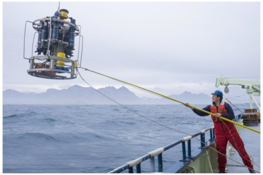
The RAPID moorings being deployed. Credit: National Oceanography Centre.

The AMOC is back in the news following a recent Ocean Sciences meeting.  This update adds to the theme Oceans Make Climate. Background links are at the end, including one where chief alarmist M. Mann claims fossil fuel use will stop the ocean conveyor belt and bring a new ice age.  Actual scientists are working away methodically on this part of the climate system, and are more level-headed.  H/T GWPF for noticing the recent article in Science Ocean array alters view of Atlantic ‘conveyor belt’  By Katherine Kornei Feb. 17, 2018 . Excerpts with my bolds.

The powerful currents in the Atlantic, formally known as the Atlantic meridional overturning circulation (AMOC), are a major engine in Earth’s climate. The AMOC’s shallower limbs—which include the Gulf Stream—transport warm water from the tropics northward, warming Western Europe. In the north, the waters cool and sink, forming deeper limbs that transport the cold water back south—and sequester anthropogenic carbon in the process. This overturning is why the AMOC is sometimes called the Atlantic conveyor belt.

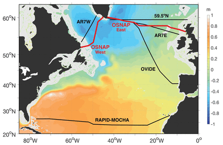
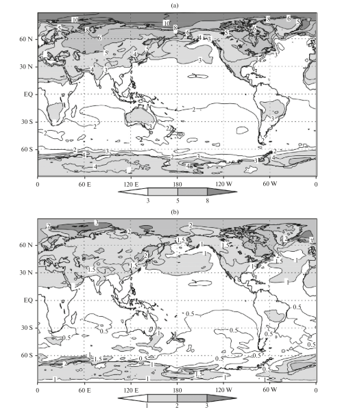
Fig. 1. Schematic of the major warm (red to yellow) and cold (blue to purple) water pathways in the NASPG (North Atlantic subpolar gyre ) credit: H. Furey, Woods Hole Oceanographic Institution): Denmark Strait (DS), Faroe Bank Channel (FBC), East and West Greenland Currents (EGC and WGC, respectively), NAC, DSO, and ISO.

Last week, at the American Geophysical Union’s (AGU’s) Ocean Sciences meeting here, scientists presented the first data from an array of instruments moored in the subpolar North Atlantic. The observations reveal unexpected eddies and strong variability in the AMOC currents. They also show that the currents east of Greenland contribute the most to the total AMOC flow. Climate models, on the other hand, have emphasized the currents west of Greenland in the Labrador Sea. “We’re showing the shortcomings of climate models,” says Susan Lozier, a physical oceanographer at Duke University in Durham, North Carolina, who leads the $35-million, seven-nation project known as the Overturning in the Subpolar North Atlantic Program (OSNAP).

Fig. 2. Schematic of the OSNAP array. The vertical black lines denote the OSNAP moorings with the red dots denoting instrumentation at depth. The thin gray lines indicate the glider survey. The red arrows show pathways for the warm and salty waters of subtropical origin; the light blue arrows show the pathways for the fresh and cold surface waters of polar origin; and the dark blue arrows show the pathways at depth for waters that originate in the high-latitude North Atlantic and Arctic.

The research and analysis is presented by Dr. Lozier et al. in this publication Overturning in the Subpolar North Atlantic Program: A New International Ocean Observing System Images above and text excerpted below with my bolds.

For decades oceanographers have assumed the AMOC to be highly susceptible to changes in the production of deep waters at high latitudes in the North Atlantic. A new ocean observing system is now in place that will test that assumption. Early results from the OSNAP observational program reveal the complexity of the velocity field across the section and the dramatic increase in convective activity during the 2014/15 winter. Early results from the gliders that survey the eastern portion of the OSNAP line have illustrated the importance of these measurements for estimating meridional heat fluxes and for studying the evolution of Subpolar Mode Waters. Finally, numerical modeling data have been used to demonstrate the efficacy of a proxy AMOC measure based on a broader set of observational data, and an adjoint modeling approach has shown that measurements in the OSNAP region will aid our mechanistic understanding of the low-frequency variability of the AMOC in the subtropical North Atlantic.

Fig. 7. (a) Winter [Dec–Mar (DJFM)] mean NAO index. Time series of temperature from the (b) K1 and (c) K9 moorings.

Finally, we note that while a primary motivation for studying AMOC variability comes from its potential impact on the climate system, as mentioned above, additional motivation for the measure of the heat, mass, and freshwater fluxes in the subpolar North Atlantic arises from their potential impact on marine biogeochemistry and the cryosphere. Thus, we hope that this observing system can serve the interests of the broader climate community.

Fig. 10. Linear sensitivity of the AMOC at (d),(e) 25°N and (b),(c) 50°N in Jan to surface heat flux anomalies per unit area. Positive sensitivity indicates that ocean cooling leads to an increased AMOC—e.g., in the upper panels, a unit increase in heat flux out of the ocean at a given location will change the AMOC at (d) 25°N or (e) 50°N 3 yr later by the amount shown in the color bar. The contour intervals are logarithmic. (a) The time series show linear sensitivity of the AMOC at 25°N (blue) and 50°N (green) to heat fluxes integrated over the subpolar gyre (black box with surface area of ∼6.7 × 10 m2) as a function of forcing lead time. The reader is referred to Pillar et al. (2016) for model details and to Heimbach et al. (2011) and Pillar et al. (2016) for a full description of the methodology and discussion relating to the dynamical interpretation of the sensitivity distributions.

In summary, while modeling studies have suggested a linkage between deep-water mass formation and AMOC variability, observations to date have been spatially or temporally compromised and therefore insufficient either to support or to rule out this connection.

Current observational efforts to assess AMOC variability in the North Atlantic.

The U.K.–U.S. Rapid Climate Change–Meridional Overturning Circulation and Heatflux Array (RAPID–MOCHA) program at 26°N successfully measures the AMOC in the subtropical North Atlantic via a transbasin observing system (Cunningham et al. 2007; Kanzow et al. 2007; McCarthy et al. 2015). While this array has fundamentally altered the community’s view of the AMOC, modeling studies over the past few years have suggested that AMOC fluctuations on interannual time scales are coherent only over limited meridional distances. In particular, a break point in coherence may occur at the subpolar–subtropical gyre boundary in the North Atlantic (Bingham et al. 2007; Baehr et al. 2009). Furthermore, a recent modeling study has suggested that the low-frequency variability of the RAPID–MOCHA appears to be an integrated response to buoyancy forcing over the subpolar gyre (Pillar et al. 2016). Thus, a measure of the overturning in the subpolar basin contemporaneous with a measure of the buoyancy forcing in that basin likely offers the best possibility of understanding the mechanisms that underpin AMOC variability. Finally, though it might be expected that the plethora of measurements from the North Atlantic would be sufficient to constrain a measure of the AMOC within the context of an ocean general circulation model, recent studies (Cunningham and Marsh 2010; Karspeck et al. 2015) reveal that there is currently no consensus on the strength or variability of the AMOC in assimilation/reanalysis products.

Atlantic Meridional Overturning Circulation (AMOC). Red colours indicate warm, shallow currents and blue colours indicate cold, deep return flows. Modified from Church, 2007, A change in circulation? Science, 317(5840), 908–909. doi:10.1126/science.1147796

In addition we have a recent report from the United Kingdom Marine Climate Change Impacts Partnership (MCCIP) lead author G.D. McCarthy Atlantic Meridional Overturning Circulation (AMOC) 2017.

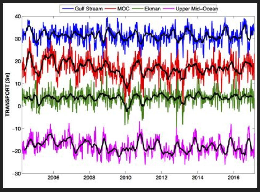
Figure 1: Ten-day (colours) and three month (black) low-pass filtered timeseries of Florida Straits transport (blue), Ekman transport (green), upper mid-ocean transport (magenta), and overturning transport (red) for the period 2nd April 2004 to end- February 2017. Florida Straits transport is based on electromagnetic cable measurements; Ekman transport is based on ERA winds. The upper mid-ocean transport, based on the RAPID mooring data, is the vertical integral of the transport per unit depth down to the deepest northward velocity (~1100 m) on each day. Overturning transport is then the sum of the Florida Straits, Ekman, and upper mid-ocean transports and represents the maximum northward transport of upper-layer waters on each day. Positive transports correspond to northward flow.

The RAPID/MOCHA/WBTS array (hereinafter referred to as the RAPID array) has revolutionized basin scale oceanography by supplying continuous estimates of the meridional overturning transport (McCarthy et al., 2015), and the associated basin-wide transports of heat (Johns et al., 2011) and freshwater (McDonagh et al., 2015) at 10-day temporal resolution. These estimates have been used in a wide variety of studies characterizing temporal variability of the North Atlantic Ocean, for instance establishing a decline in the AMOC between 2004 and 2013.

Schematic of main AMOC pathways at high resolution with vigorous Sub-Polar Gyre (SPG top left), low resolution and weak SPG (top middle) as well as “classic” conveyor‐type pathway as expected in, for example, box models (top right) Colors (red to blue) indicate the gradual cooling and density increase of water masses along the AMOC path. AMOC in depth (second row) and potential density referenced to 2,000‐dbar (third row) coordinates for two high‐resolution (VIKING005, ACCESS‐OM2‐01) and low‐resolution (ORCA2, ACCESS‐OM2‐1) simulations. Bottom row: maximum values of ψ (z ) (blue) and ψ (σ 2) (black).

Summary from RAPID data analysis

MCCIP reported in 2006 that:

  • a 30% decline in the AMOC has been observed since the early 1990s based on a limited number of observations. There is a lack of certainty and consensus concerning the trend;
  • most climate models anticipate some reduction in strength of the AMOC over the 21st century due to increased freshwater influence in high latitudes. The IPCC project a slowdown in the overturning circulation rather than a dramatic collapse.


  • And in 2017 that:
  • a substantial increase in the observations available to estimate the strength of the AMOC indicate, with greater certainty, a decline since the mid 2000s;
  • the AMOC is still expected to decline throughout the 21st century in response to a changing climate. If and when a collapse in the AMOC is possible is still open to debate, but it is not thought likely to happen this century.

And also that:

  • a high level of variability in the AMOC strength has been observed, and short term fluctuations have had unexpected impacts, including severe winters and abrupt sea-level rise;
  • recent changes in the AMOC may be driving the cooling of Atlantic ocean surface waters which could lead to drier summers in the UK.

Conclusions

  • The AMOC is key to maintaining the mild climate of the UK and Europe.
  • The AMOC is predicted to decline in the 21st century in response to a changing climate.
  • Past abrupt changes in the AMOC have had dramatic climate consequences.
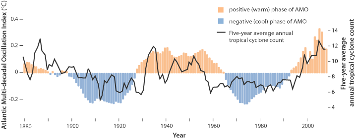
  • There is growing evidence that the AMOC has been declining for at least a decade, pushing the Atlantic Multidecadal Variability into a cool phase.
  • Short term fluctuations in the AMOC have proved to have unexpected impacts, including being linked
    with severe winters and abrupt sea-level rise.

Background:

Climate Pacemaker: The AMOC

Evidence is Mounting: Oceans Make Climate

Mann-made Global Cooling


Cooling June for Land and Ocean Air Temps

banner-blog

With apologies to Paul Revere, this post is on the lookout for cooler weather with an eye on both the Land and the Sea.  UAH has updated their tlt (temperatures in lower troposphere) dataset for June 2020.  Previously I have done posts on their reading of ocean air temps as a prelude to updated records from HADSST3. This month also has a separate graph of land air temps because the comparisons and contrasts are interesting as we contemplate possible cooling in coming months and years.

Presently sea surface temperatures (SST) are the best available indicator of heat content gained or lost from earth’s climate system.  Enthalpy is the thermodynamic term for total heat content in a system, and humidity differences in air parcels affect enthalpy.  Measuring water temperature directly avoids distorted impressions from air measurements.  In addition, ocean covers 71% of the planet surface and thus dominates surface temperature estimates.  Eventually we will likely have reliable means of recording water temperatures at depth.

Recently, Dr. Ole Humlum reported from his research that air temperatures lag 2-3 months behind changes in SST.  He also observed that changes in CO2 atmospheric concentrations lag behind SST by 11-12 months.  This latter point is addressed in a previous post Who to Blame for Rising CO2?

HadSST3 results were delayed with February and March updates only appearing together end of April.  For comparison we can look at lower troposphere temperatures (TLT) from UAHv6 which are now posted for June. The temperature record is derived from microwave sounding units (MSU) on board satellites like the one pictured above.

The UAH dataset includes temperature results for air above the oceans, and thus should be most comparable to the SSTs. There is the additional feature that ocean air temps avoid Urban Heat Islands (UHI). In 2015 there was a change in UAH processing of satellite drift corrections, including dropping one platform which can no longer be corrected. The graphs below are taken from the latest and current dataset, Version 6.0.

The graph above shows monthly anomalies for ocean temps since January 2015. After all regions peaked with the El Nino in early 2016, the ocean air temps dropped back down with all regions showing the same low anomaly August 2018.  Then a warming phase ensued with NH and Tropics spikes in February and May 2020. As was the case in 2015-16, the warming was driven by the Tropics and NH, with SH lagging behind. After the up and down fluxes, oceans temps in June are back to a neutral point, close to the 0.4C average for the period.

Land Air Temperatures Showing a Seesaw Pattern

We sometimes overlook that in climate temperature records, while the oceans are measured directly with SSTs, land temps are measured only indirectly.  The land temperature records at surface stations sample air temps at 2 meters above ground.  UAH gives tlt anomalies for air over land separately from ocean air temps.  The graph updated for June 2020 is below.

Here we see evidence of the greater volatility of the Land temperatures, along with extraordinary departures, first by NH land with SH often offsetting.   The overall pattern is similar to the ocean air temps, but obviously driven by NH with its greater amount of land surface. The Tropics synchronized with NH for the 2016 event, but otherwise follow a contrary rhythm.  SH seems to vary wildly, especially in recent months.  Note the extremely high anomaly last November, cold in March 2020, and then again a spike in April. Now in June 2020, all land regions have converged, erasing the earlier spikes in NH and SH, and showing anomalies comparable to the 0.4C anomaly prior to the 2015-16 El Nino.

The longer term picture from UAH is a return to the mean for the period starting with 1995.  2019 average rose but currently lacks any El Nino to sustain it.

These charts demonstrate that underneath the averages, warming and cooling is diverse and constantly changing, contrary to the notion of a global climate that can be fixed at some favorable temperature.

TLTs include mixing above the oceans and probably some influence from nearby more volatile land temps.  Clearly NH and Global land temps have been dropping in a seesaw pattern, more than 1C lower than the 2016 peak, prior to these last several months. TLT measures started the recent cooling later than SSTs from HadSST3, but are now showing the same pattern.  It seems obvious that despite the three El Ninos, their warming has not persisted, and without them it would probably have cooled since 1995.  Of course, the future has not yet been written.

2020 Update: Fossil Fuels ≠ Global Warming

gas in hands

Previous posts addressed the claim that fossil fuels are driving global warming. This post updates that analysis with the latest (2019) numbers from BP Statistics and compares World Fossil Fuel Consumption (WFFC) with three estimates of Global Mean Temperature (GMT). More on both these variables below.

WFFC

2019 statistics are now available from BP for international consumption of Primary Energy sources. 2019 Statistical Review of World Energy. 

The reporting categories are:
Oil
Natural Gas
Coal
Nuclear
Hydro
Renewables (other than hydro)

Note:  British Petroleum (BP) for the first time uses Exajoules to replace MToe (Million Tonnes of oil equivalents.) It is logical to use an energy metric which is independent of the fuel source. OTOH renewable advocates have no doubt pressured BP to stop using oil as the baseline since their dream is a world without fossil fuel energy.

From BP conversion table 1 exajoule (EJ) = 1 quintillion joules (1 x 10^18). Oil products vary from 41.6 to 49.4 tonnes per gigajoule (10^9 joules).  Comparing this annual report with previous years shows that global Primary Energy (PE) in MToe is roughly 24 times the same amount in Exajoules.  The conversion factor at the macro level varies from year to year depending on the fuel mix. The graphs below use the new metric.

This analysis combines the first three, Oil, Gas, and Coal for total fossil fuel consumption world wide. The chart below shows the patterns for WFFC compared to world consumption of Primary Energy from 1965 through 2019.

To enlarge, open image in new tabl

The graph shows that global Primary Energy consumption from all sources has grown continuously over 5 decades. Since 1965  oil, gas and coal (FF, sometimes termed “Thermal”) averaged 89% of PE consumed, ranging from 94% in 1965 to 84% in 2019.

Global Mean Temperatures

Everyone acknowledges that GMT is a fiction since temperature is an intrinsic property of objects, and varies dramatically over time and over the surface of the earth. No place on earth determines “average” temperature for the globe. Yet for the purpose of detecting change in temperature, major climate data sets estimate GMT and report anomalies from it.

UAH record consists of satellite era global temperature estimates for the lower troposphere, a layer of air from 0 to 4km above the surface. HadSST estimates sea surface temperatures from oceans covering 71% of the planet. HADCRUT combines HadSST estimates with records from land stations whose elevations range up to 6km above sea level.

Both GISS LOTI (land and ocean) and HADCRUT4 (land and ocean) use 14.0 Celsius as the climate normal, so I will add that number back into the anomalies. This is done not claiming any validity other than to achieve a reasonable measure of magnitude regarding the observed fluctuations.

No doubt global sea surface temperatures are typically higher than 14C, more like 17 or 18C, and of course warmer in the tropics and colder at higher latitudes. Likewise, the lapse rate in the atmosphere means that air temperatures both from satellites and elevated land stations will range colder than 14C. Still, that climate normal is a generally accepted indicator of GMT.

Correlations of GMT and WFFC

The next graph compares WFFC to GMT estimates over the five decades from 1965 to 2019 from HADCRUT4, which includes HadSST3.

Since 1965 the increase in fossil fuel consumption is dramatic and monotonic, steadily increasing by 237% from 146 to 492 exajoules.  Meanwhile the GMT record from Hadcrut shows multiple ups and downs with an accumulated rise of 0.9C over 54 years, 6% of the starting value.

The graph below compares WFFC to GMT estimates from UAH6, and HadSST3 for the satellite era from 1979 to 2019, a period of 40 years.

In the satellite era WFFC has increased at a compounded rate of nearly 2% per year, for a total increase of 87% since 1979. At the same time, SST warming amounted to 0.52C, or 3.7% of the starting value.  UAH warming was 0.58C, or 4.7% up from 1979.  The temperature compounded rate of change is 0.1% per year, an order of magnitude less than WFFC.  Even more obvious is the 1998 El Nino peak and flat GMT since.

Summary

The climate alarmist/activist claim is straight forward: Burning fossil fuels makes measured temperatures warmer. The Paris Accord further asserts that by reducing human use of fossil fuels, further warming can be prevented.  Those claims do not bear up under scrutiny.

It is enough for simple minds to see that two time series are both rising and to think that one must be causing the other. But both scientific and legal methods assert causation only when the two variables are both strongly and consistently aligned. The above shows a weak and inconsistent linkage between WFFC and GMT.

Going further back in history shows even weaker correlation between fossil fuels consumption and global temperature estimates:

wfc-vs-sat

Figure 5.1. Comparative dynamics of the World Fuel Consumption (WFC) and Global Surface Air Temperature Anomaly (ΔT), 1861-2000. The thin dashed line represents annual ΔT, the bold line—its 13-year smoothing, and the line constructed from rectangles—WFC (in millions of tons of nominal fuel) (Klyashtorin and Lyubushin, 2003). Source: Frolov et al. 2009

In legal terms, as long as there is another equally or more likely explanation for the set of facts, the claimed causation is unproven. The more likely explanation is that global temperatures vary due to oceanic and solar cycles. The proof is clearly and thoroughly set forward in the post Quantifying Natural Climate Change.

Background context for today’s post is at Claim: Fossil Fuels Cause Global Warming.

Disunity Over Going Green

Joel Kotkin writes at Real Clear Energy The Green Civil War. Excerpts in italics with my bolds and images.

Like many contemporary social movements—#metoo, Black Lives Matter, the Women’s March—the environmental lobby has tended to create an atmosphere of unanimity. In its struggle to win public and elite opinion, it has frequently evoked “science” as something settled and immutable, warning that those who dissent are either self-serving or seriously deranged.

Yet in recent months, there has been growing criticism about the current green orthodoxy, including from people long associated with environmental causes. This has been most widely seen in the strange case of the Michael Moore–produced Planet of Humans, which exposes the rapacious profit-seeking and gratuitous environmental damage caused by the renewable energy industry.

Critics have attempted to get Moore’s film de-platformed, and the green establishment has pressured distributors not to take the film. Such censorious behavior is increasingly common among the greens. Some veteran climate scientists—such as Roger Pielke and Judith Curry, Greenpeace founder Patrick Moore, and former members of the UN International Panel on Climate Change—have been demonized and marginalized for deviating from what Curry has described as an overly “monolithic” approach to the issue of climate change. Some political leaders even seem ready to take dissenters to court in an effort to ban their ideas by legal means. Not only energy companies but think tanks and dissident scientists have been targeted for criminal prosecution. These tactics are all too reminiscent of the medieval Inquisition.

The Green War on the Working Class

Moore’s apostasy may be better known but lacks the breadth of Michael Shellenberger’s new book, Apocalypse Never. A green zealot from his high school years, the Berkeley-based Shellenberger has worked on protecting habitats for endangered species and has battled climate change. His book, like Moore’s movie, exposes the hypocrisy of the green elite but, importantly, offers a more hopeful approach than Moore’s Malthusian worldview.

Like Moore, Shellenberger has become utterly disillusioned with the self-serving and often counterproductive policies pushed by the green lobby. He demonstrates how green policies backed by oligarch-funded nonprofits have often worked against the economic interests of people in Africa, Southeast Asia, and South America, often leaving them with little recourse but to pillage their own natural environments.

Shellenberger blasts green nonprofits for blocking new energy development—dams, gas plants, pipelines—in these countries. Such actions may seem noble enough to the rich of the West, but it slows the manufacturing growth that could allow these countries to become rich enough to accommodate such things as habitat preservation. People working in textile or garment plants need not rely on the jungle for their survival, reducing the need to consume its bounty.

“Rainforests in the Amazon and elsewhere in the world can only be saved if the need for economic development is accepted, respected, and embraced,” Shellenberger states. “By opposing many forms of economic development in the Amazon, particularly the most productive forms, many environmental NGOs, European governments, and philanthropies have made the situation worse.”

Green plans to raise energy prices, eliminate cars, and ban fossil fuel development also have stirred fierce opposition from the working class, whether in pro-Trump middle America, or among France’s gilets jaune. But it’s not just the proverbial angry white men. In California, some 200 local civil rights leaders have filed lawsuits against the state’s regulators, arguing that the state’s climate policies are essentially discriminatory toward poor people and minorities.

Challenging Religious Orthodoxy

Even before Black Lives Matter, mainstream American journalism was being transformed into an extended-stay resort for the woke. Shellenberger calls out “stealth environmental activists working as journalists” who report the most drastic environmental projections while ignoring any contrary perspectives. “Much of what people are being told about the environment, including the climate, is wrong, and we desperately need to get it right,” he insists, suggesting that he is “fed up with the exaggeration, alarmism, and extremism that are the enemy of a positive, humanistic, and rational environmentalism.”

Shellenberger places his hopes on “competition from outside traditional news media institutions,” having seen the gullibility of most reporters. For decades, they have embraced notions, first seen in Paul Ehrlich’s 1968 book, The Population Bomb, that humanity would “breed ourselves to extinction” if birthrates were not severely curtailed. Reporters also widely hailed the Club of Rome report in 1972, which took a similar apocalyptic approach, predicting massive shortages of natural resources unless there was a shift to lower birthrates, slower economic growth, less material consumption, and, ultimately, less social mobility.

Many of these apocalyptic predictions, like those in the Middle Ages, proved exaggerated or even plain wrong. Contrary to environmentalist dogma from the 1970s, natural resources, including energy and food, did not run out but became more available than anyone expected. So why the constant hyping and hysteria? Because what Shellenberger calls “the apocalyptic environmental tradition” demands it.

In a way that perhaps only someone bitten by the green bug could understand, Shellenberger labels environmentalism as “the dominant secular religion of the educated, upper-middle-class elite in most developed and many developing nations.” This applies, he reports, not only to seemingly deranged cults like Britain’s Extinction Rebellion but also to august environmental groups like the Sierra Club or Friends of the Earth. Christianity offered guidance for how one should live and conduct one’s personal affairs in a manner pleasing to God, but the green movement seeks to steer people toward a life in better harmony with nature.

Like medieval Catholicism, the green faith foresees impending doom caused by human activity; human sin was the primary reason for the world’s problems in medieval times, and has been rediscovered by environmentalists. “Apocalyptic environmentalism gives people a purpose: to save the world from climate change, or some other environmental disaster,” Shellenberger writes. “It provides people with a story that casts them as heroes“.”

Needed: A New Human-Centered Approach to the Environment

Perhaps what is most revolutionary about Shellenberger’s book is his call for a new, more human-centered, environmentalism. In contrast to the green movement’s jihad against material progress, he suggests that only by making people more affluent will they be able to afford the environmental redress that the planet, in fact, needs.

Rather than battle industrialism, greens need to appreciate what technological progress has done for the environment. The development of plastics helped reduce demand for ivory, hawksbill turtles, whale oil, and the despoiling of old forests. Dealing pragmatically, as opposed to religiously, with environmental concerns, means accepting the reality that some forms of efficient energy production, such as natural gas or nuclear, need to be part of a cleaner future. “It is only by embracing the artificial that we can save what’s natural,” he states.

The key to environmental success lies in affluence. “Richer countries are more resilient,” he says, quoting MIT climate scientist Kerry Emanuel, “so let us focus on making people richer and more resilient.” Countries like the United States, the United Kingdom, and particularly Scandinavia become cleaner, in large part, because they can afford to do so and also must respond to popular pressures. Poor autocratic and officially socialist states, like those of the former Soviet bloc and China, did not face the same pressures for a cleaner environment.

In the future, to succeed, environmental policy has to consider human concerns, particularly those of the working and middle classes. It needs not only to “protect the natural environment but also to achieve the goal of universal prosperity.” Thus Shellenberger speaks of “a positive, humanistic, and rational environmentalism.” Like any movement in a still-democratic society, he suggests, environmentalists can win over the population not by terrorizing them but by showing that we can protect nature without stomping out all natural human aspirations.

Solar Cyles in Earth Atmosphere

H/T to Ireneusz Palmowski for pointing me to this presentation of a paper Regional and temporal variability of solar activity and galactic cosmic ray effects on the lower atmosphere circulation by S. Veretenenko and M. Ogurtsov  Advances in Space Research · February 2012.

Background

A previous post Quantifying Natural Climate Change presented a study by Dan Pangburn demonstrating that earth temperature fluctuations can be explained by oceanic and solar variations.  The oceanic factors are elaborated in numerous posts here under the category Oceans Make Climate.  The solar mechanisms are more mysterious, making it more difficult to show how solar activity influences cooler or warmer eras.  Cosmoclimatology is a theory advanced by Svensmark that draws a connection between GCRs (Galactic Cosmic Rays) and cloudiness.

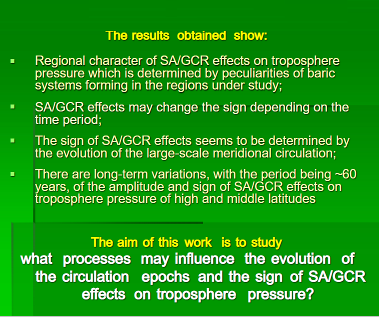
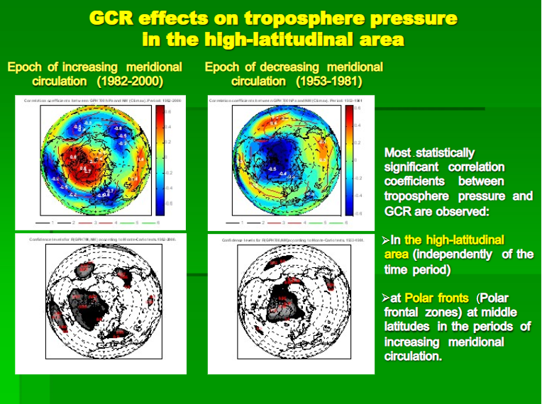
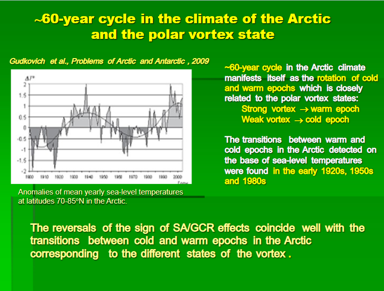
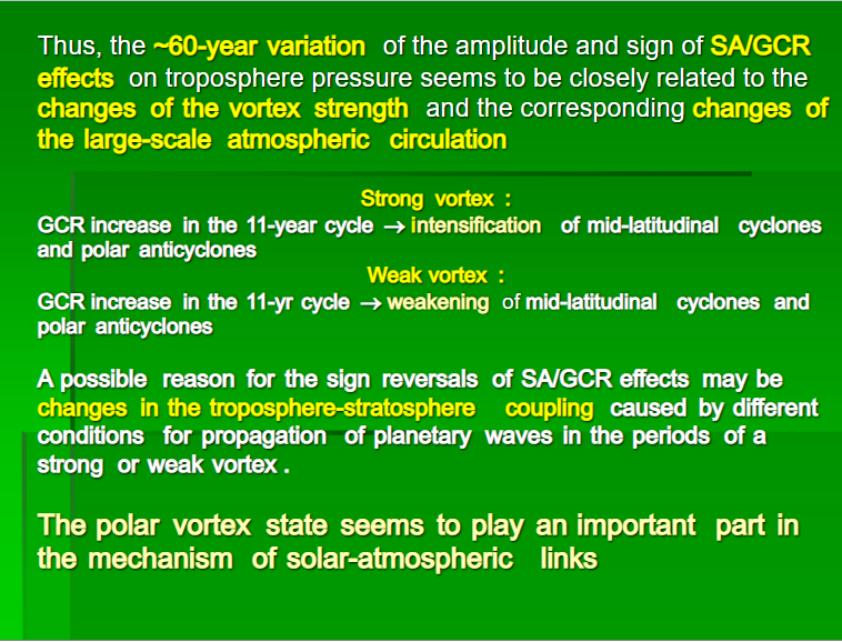
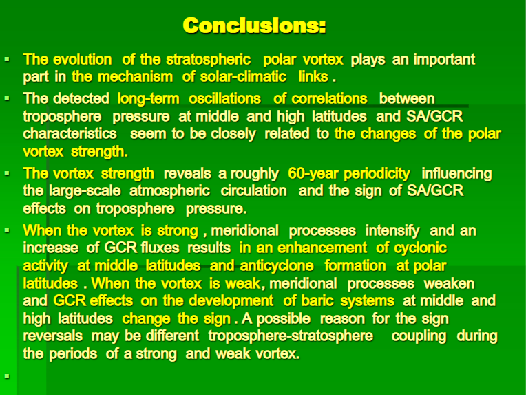
This post presents evidence from Russian scientists describing how those same Cosmic Rays (GCR) have a dramatic top-down effect on atmospheric circulation by interacting with ozone in the stratosphere.  The basic idea is that the climate effects from increasing cosmic rays vary according to Arctic polar vortex shifts from fast and strong, to weak and wavy, resulting in alternating climate epochs.

The published paper can be accessed by the linked title at the top.  The slide presentation is here.

Conclusions: In the paper three important findings are described. Text in italics with my bolds.

1. Disturbances of the lower atmosphere circulation associated with solar activity and galactic cosmic ray variations take place over the entire globe, with the processes developing in different latitudinal belts and regions being closely interconnected. The SA/GCR effects on pressure variations reveal a distinct latitudinal and regional character depending on the circulation peculiarities in the regions under study. The spatial structure of pressure variations correlated with SA/GCR variations is closely related to their influence on the main elements of the large-scale atmospheric circulation, namely on the polar vortex, planetary frontal zones and extratropical cyclones and anticyclones.

2. The temporal structure of the SA/GCR effects on pressure variations at high and middle latitudes of the Northern hemisphere is characterized by a pronounced ~60-year periodicity which is apparently related to the epochs of the large-scale atmospheric circulation. The reversals of the correlation sign between pressure and sunspot numbers were detected in the 1890s, 1920s, 1950s and in the early 1980s. The sign of the SA/GCR effects seems to depend on the evolution of meridional processes in the atmosphere which, in turn, is determined by the state of the polar vortex.

3. A mechanism of SA/GCR influences on the troposphere circulation is likely to involve changes in the evolution of the polar vortex in the stratosphere of high latitudes. Intensification of the polar vortex associated with solar activity and cosmic ray variations may contribute to the increase of temperature contrasts in planetary frontal zones and, then, to the intensification of extratropical cyclogenesis.


Comment and Further Discussion

It takes some effort to grasp the import of this research.  If I understand correctly, they looked at the impact of increasing GCRs during periods of quiet SA, and found the effects on earth atmosphere differed depending on another factor: strength or weakness of the polar vortex, which is an internal feature of the Arctic region.  At one point, the paper says:

Vangengeim–Girs classification defines three main forms of circulation: the westerly (zonal) form W, the easterly form E and the meridional form C. A distinguishing feature of the form W is the development of zonal circulation when the pressure field is characterized by small amplitude waves rapidly moving from west to east. The forms C and E are characterized by the development of meridional processes in the  atmosphere when slowly moving or stationary large-amplitude waves are observed in the pressure field.

Fig. 9. Top panel: annual frequencies of occurrence (number of days during a year) of the main forms of the large-scale circulation (20-year running averages) (a); Bottom panel: correlation coefficient R(SLP,Rz) between mean yearly values of pressure in the region of the polar vortex center and sunspot numbers for sliding 17-year periods (b) and the Fourier spectrum of the annual frequency of occurrence of the meridional circulation C (c). The vertical dotted lines indicate the moments of the correlation sign reversals.

The data in Fig. 9a show the evolution of annual frequency of occurrence (expressed as a number of days during a year) of these circulation forms. The time variation of the correlation R(SLP,Rz) in the region of the Arctic polar vortex is presented in Fig. 9b. Comparing these data, we can see that the latest reversal of the correlation sign in the early 1980s was preceded by noticeable changes in the evolution of all the circulation forms. Since the late 1970s the frequency of occurrence of the zonal form W has been increasing. The frequency of the meridional form C started increasing too, with a simultaneous decrease of the frequency of the form E.

The results presented in Fig. 9 show that the time behavior of the correlation between pressure at high and middle latitudes and SA/GCR variability depends on the evolution of meridional processes in the atmosphere. In the epochs of increasing frequency of the meridional circulation C (~1920–1950 and since the 1980s) we can see that an increase of GCR fluxes in the 11-year solar cycle is accompanied by an intensification of polar anticyclones (an increase of the troposphere pressure at polar latitudes), an intensification of extratropical cyclogenesis (a decrease of pressure at polar fronts at middle latitudes) and a weakening of the equatorial trough (an increase of pressure at low latitudes). The long-term GCR effects on extratropical cyclogenesis during these epochs are in good agreement with the GCR effects on the development of baric systems detected on the time scale of a few days.  These epochs coincide with the periods of a strong polar vortex. 

In the epochs of decreasing meridional circulation C (~1890–1920 and ~1950–1980), corresponding to a weak polar vortex, we observe the spatial distribution of the correlations between the troposphere pressure and GCR intensity with the opposite sign: an increase of GCR isaccompanied by a weakening of polar anticyclones, a weakening of extratropical cyclogenesis and an intensification of the equatorial trough.

A possible reason for these correlation reversals may be significant changes in a dynamic coupling between the troposphere and the stratosphere during the periods of a weak and strong polar vortex. According to the data of Perlwitz and Graf (2001), the stratosphere may influence the troposphere only when the polar vortex is strong. When the vortex is weak, only the troposphere influences the stratosphere. So, if GCR (or some other factor of solar activity) produce any effect in the stratosphere in the period of a strong vortex (i.e., in the period of increasing meridional circulation), this effect may be transferred to the troposphere and we can see a pronounced correlation of extratropical cyclogenesis with GCR intensity. As the strength of the vortex reveals ~60-year variations (Gudkovich et al., 2009; Frolov et al., 2009), which influence the circulation state, this can explain the detected temporal variability of the SA/GCR effects.

And thus we can appreciate the summary slide shown at the top.  It would appear that we have been in a period of weak and wavy polar vortices as well as strong GCRs (minimal solar activity),  a continuation of the epoch since 1982 (on the left). It also suggests that the ~60 year vortex cycle is due for a shift to the epoch on the right.

Oceans Cooling May 2020

The best context for understanding decadal temperature changes comes from the world’s sea surface temperatures (SST), for several reasons:

  • The ocean covers 71% of the globe and drives average temperatures;
  • SSTs have a constant water content, (unlike air temperatures), so give a better reading of heat content variations;
  • A major El Nino was the dominant climate feature in recent years.

HadSST is generally regarded as the best of the global SST data sets, and so the temperature story here comes from that source, the latest version being HadSST3.  More on what distinguishes HadSST3 from other SST products at the end.

The Current Context

The cool 2020 Spring is not just your local experience, it’s the result of Earth’s ocean cooling off after last summer’s warming in the Northern Hemisphere.  The chart below shows SST monthly anomalies as reported in HadSST3 starting in 2015 through May 2020.
A global cooling pattern is seen clearly in the Tropics since its peak in 2016, joined by NH and SH cycling downward since 2016.  In 2019 all regions had been converging to reach nearly the same value in April.

Then  NH rose exceptionally by almost 0.5C over the four summer months, in August exceeding previous summer peaks in NH since 2015.  In the 4 succeeding months, that warm NH pulse has reversed sharply.  May NH anomaly is up a little from March but matching last November.  SH and Tropics SSTs bumped upward in March, but dropped sharply since. In May the Global anomaly is the same as December 2019.

Note that higher temps in 2015 and 2016 were first of all due to a sharp rise in Tropical SST, beginning in March 2015, peaking in January 2016, and steadily declining back below its beginning level. Secondly, the Northern Hemisphere added three bumps on the shoulders of Tropical warming, with peaks in August of each year.  A fourth NH bump was lower and peaked in September 2018.  As noted above, a fifth peak in August 2019 exceeded the four previous upward bumps in NH.

And as before, note that the global release of heat was not dramatic, due to the Southern Hemisphere offsetting the Northern one.  The major difference between now and 2015-2016 is the absence of Tropical warming driving the SSTs.

A longer view of SSTs

The graph below  is noisy, but the density is needed to see the seasonal patterns in the oceanic fluctuations.  Previous posts focused on the rise and fall of the last El Nino starting in 2015.  This post adds a longer view, encompassing the significant 1998 El Nino and since.  The color schemes are retained for Global, Tropics, NH and SH anomalies.  Despite the longer time frame, I have kept the monthly data (rather than yearly averages) because of interesting shifts between January and July.

To enlarge open image in new tab.

1995 is a reasonable (ENSO neutral) starting point prior to the first El Nino.  The sharp Tropical rise peaking in 1998 is dominant in the record, starting Jan. ’97 to pull up SSTs uniformly before returning to the same level Jan. ’99.  For the next 2 years, the Tropics stayed down, and the world’s oceans held steady around 0.2C above 1961 to 1990 average.

Then comes a steady rise over two years to a lesser peak Jan. 2003, but again uniformly pulling all oceans up around 0.4C.  Something changes at this point, with more hemispheric divergence than before. Over the 4 years until Jan 2007, the Tropics go through ups and downs, NH a series of ups and SH mostly downs.  As a result the Global average fluctuates around that same 0.4C, which also turns out to be the average for the entire record since 1995.

2007 stands out with a sharp drop in temperatures so that Jan.08 matches the low in Jan. ’99, but starting from a lower high. The oceans all decline as well, until temps build peaking in 2010.

Now again a different pattern appears.  The Tropics cool sharply to Jan 11, then rise steadily for 4 years to Jan 15, at which point the most recent major El Nino takes off.  But this time in contrast to ’97-’99, the Northern Hemisphere produces peaks every summer pulling up the Global average.  In fact, these NH peaks appear every July starting in 2003, growing stronger to produce 3 massive highs in 2014, 15 and 16.  NH July 2017 was only slightly lower, and a fifth NH peak still lower in Sept. 2018.

The highest summer NH peak came in 2019, only this time the Tropics and SH are offsetting rather adding to the warming. Since 2014 SH has played a moderating role, offsetting the NH warming pulses. Now in January 2020 last summer’s unusually high NH SSTs have been erased. (Note: these are high anomalies on top of the highest absolute temps in the NH.)

What to make of all this? The patterns suggest that in addition to El Ninos in the Pacific driving the Tropic SSTs, something else is going on in the NH.  The obvious culprit is the North Atlantic, since I have seen this sort of pulsing before.  After reading some papers by David Dilley, I confirmed his observation of Atlantic pulses into the Arctic every 8 to 10 years.

But the peaks coming nearly every summer in HadSST require a different picture.  Let’s look at August, the hottest month in the North Atlantic from the Kaplan dataset.
The AMO Index is from from Kaplan SST v2, the unaltered and not detrended dataset. By definition, the data are monthly average SSTs interpolated to a 5×5 grid over the North Atlantic basically 0 to 70N. The graph shows warming began after 1992 up to 1998, with a series of matching years since. Because the N. Atlantic has partnered with the Pacific ENSO recently, let’s take a closer look at some AMO years in the last 2 decades.
This graph shows monthly AMO temps for some important years. The Peak years were 1998, 2010 and 2016, with the latter emphasized as the most recent. The other years show lesser warming, with 2007 emphasized as the coolest in the last 20 years. Note the red 2018 line is at the bottom of all these tracks. The black line shows that 2020 began slightly warm, then set records for 3 months before dropping below 2016 and 2017.

Summary

The oceans are driving the warming this century.  SSTs took a step up with the 1998 El Nino and have stayed there with help from the North Atlantic, and more recently the Pacific northern “Blob.”  The ocean surfaces are releasing a lot of energy, warming the air, but eventually will have a cooling effect.  The decline after 1937 was rapid by comparison, so one wonders: How long can the oceans keep this up? If the pattern of recent years continues, NH SST anomalies may rise slightly in coming months, but once again, ENSO which has weakened will probably determine the outcome.

Footnote: Why Rely on HadSST3

HadSST3 is distinguished from other SST products because HadCRU (Hadley Climatic Research Unit) does not engage in SST interpolation, i.e. infilling estimated anomalies into grid cells lacking sufficient sampling in a given month. From reading the documentation and from queries to Met Office, this is their procedure.

HadSST3 imports data from gridcells containing ocean, excluding land cells. From past records, they have calculated daily and monthly average readings for each grid cell for the period 1961 to 1990. Those temperatures form the baseline from which anomalies are calculated.

In a given month, each gridcell with sufficient sampling is averaged for the month and then the baseline value for that cell and that month is subtracted, resulting in the monthly anomaly for that cell. All cells with monthly anomalies are averaged to produce global, hemispheric and tropical anomalies for the month, based on the cells in those locations. For example, Tropics averages include ocean grid cells lying between latitudes 20N and 20S.

Gridcells lacking sufficient sampling that month are left out of the averaging, and the uncertainty from such missing data is estimated. IMO that is more reasonable than inventing data to infill. And it seems that the Global Drifter Array displayed in the top image is providing more uniform coverage of the oceans than in the past.

uss-pearl-harbor-deploys-global-drifter-buoys-in-pacific-ocean

USS Pearl Harbor deploys Global Drifter Buoys in Pacific Ocean

N. Atlantic May 2020

RAPID Array measuring North Atlantic SSTs.

For the last few years, observers have been speculating about when the North Atlantic will start the next phase shift from warm to cold. The way 2018 went and 2019 followed suggested this may be the onset.  However, 2020 started out against that trend, now backing off a bit.  First some background.

. Source: Energy and Education Canada

An example is this report in May 2015 The Atlantic is entering a cool phase that will change the world’s weather by Gerald McCarthy and Evan Haigh of the RAPID Atlantic monitoring project. Excerpts in italics with my bolds.

This is known as the Atlantic Multidecadal Oscillation (AMO), and the transition between its positive and negative phases can be very rapid. For example, Atlantic temperatures declined by 0.1ºC per decade from the 1940s to the 1970s. By comparison, global surface warming is estimated at 0.5ºC per century – a rate twice as slow.

In many parts of the world, the AMO has been linked with decade-long temperature and rainfall trends. Certainly – and perhaps obviously – the mean temperature of islands downwind of the Atlantic such as Britain and Ireland show almost exactly the same temperature fluctuations as the AMO.

Atlantic oscillations are associated with the frequency of hurricanes and droughts. When the AMO is in the warm phase, there are more hurricanes in the Atlantic and droughts in the US Midwest tend to be more frequent and prolonged. In the Pacific Northwest, a positive AMO leads to more rainfall.

A negative AMO (cooler ocean) is associated with reduced rainfall in the vulnerable Sahel region of Africa. The prolonged negative AMO was associated with the infamous Ethiopian famine in the mid-1980s. In the UK it tends to mean reduced summer rainfall – the mythical “barbeque summer”.Our results show that ocean circulation responds to the first mode of Atlantic atmospheric forcing, the North Atlantic Oscillation, through circulation changes between the subtropical and subpolar gyres – the intergyre region. This a major influence on the wind patterns and the heat transferred between the atmosphere and ocean.

The observations that we do have of the Atlantic overturning circulation over the past ten years show that it is declining. As a result, we expect the AMO is moving to a negative (colder surface waters) phase. This is consistent with observations of temperature in the North Atlantic.

Cold “blobs” in North Atlantic have been reported, but they are usually winter phenomena. For example in April 2016, the sst anomalies looked like this

But by September, the picture changed to this

And we know from Kaplan AMO dataset, that 2016 summer SSTs were right up there with 1998 and 2010 as the highest recorded.

As the graph above suggests, this body of water is also important for tropical cyclones, since warmer water provides more energy.  But those are annual averages, and I am interested in the summer pulses of warm water into the Arctic. As I have noted in my monthly HadSST3 reports, most summers since 2003 there have been warm pulses in the north atlantic, and 2019 was one of them.

The AMO Index is from from Kaplan SST v2, the unaltered and not detrended dataset. By definition, the data are monthly average SSTs interpolated to a 5×5 grid over the North Atlantic basically 0 to 70N.  The graph shows the warmest month August beginning to rise after 1993 up to 1998, with a series of matching years since.  December 2017 set a record at 20.6C, but note the plunge down to 20.2C for December 2018, matching 2011 as the coldest years since 2000. December 2019 shows an uptick but still lower than 2016-2017.

December 2019 confirmed the summer pulse weakening, along with 2018 well below other recent peak years since 1998. Then came a surprise in 2020.  Because McCarthy refers to hints of cooling to come in the N. Atlantic, let’s take a closer look at some AMO years in the last 2 decades.

The 2020 North Atlantic Surprise

This graph shows monthly AMO temps for some important years. The Peak years were 1998, 2010 and 2016, with the latter emphasized as the most recent. The other years show lesser warming, with 2007 emphasized as the coolest in the last 20 years. Note the red 2018 line was at the bottom of all these tracks.  2019 began slightly cooler than January 2018, then tracked closely before rising in the summer months.  Through December 2019 tracked warmer than 2018 but cooler than other recent years in the North Atlantic.

In 2020 following a warm January, N. Atlantic temps in February, March and April were the highest in the record. Now May 2020 temps are still warm but lower than May 2016 and 2017.  That is a concern for the upcoming hurricane season, along with the lack of a Pacific El Nino providing wind shear against developing tropical storms.

More recently, temps in higher Atlantic latitudes (45N to 65N) have cooled, as shown in this graph and map from Tropical Tidbits (Levi Cowan)

Footnote:  Levi Cowan’s Tropical Tidbits is an excellent source of information regarding tropical storm activity, even before disturbances are assigned names, as well as ones like tropical storm Christobal now raining over states in the midwest.