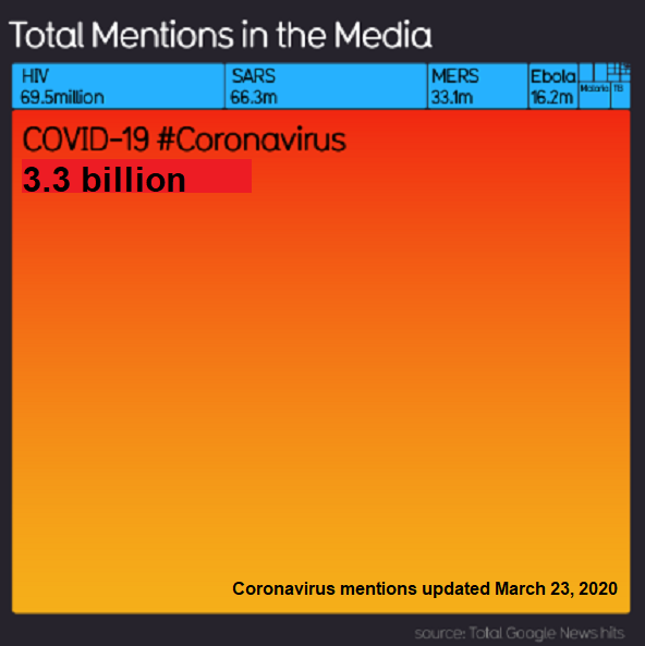
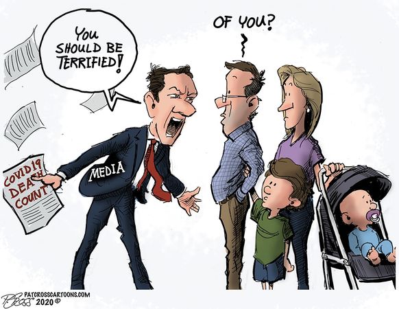
Media Blowing on Embers of Covid Fear

Alex Berenson explains in a twitter thread (here). Text in italics with my bolds

1/ This panic is likely to prove even more embarrassing than previous panics. Here’s why: the media is both confused and conflating several different data points in an effort to stir hysteria. (Stop me if you’ve heard this before.)

What do I mean?
2/ So: you’ve heard positive tests are up in several states. True. The media refers to these as “cases,” as if positive tests have clinical significance by themselves. They do not. The vast majority of people with positive tests do not become ill enough to need hospitalization

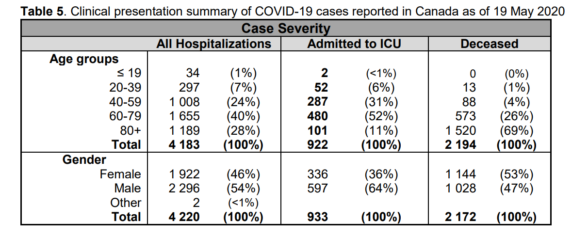
3/ Much less intensive care or ventilator support. For people under 50, this is true in the extreme. But the daily age distribution of positive tests is rarely if ever supported…

4/ Second: you’ve heard overall hospitalizations are up in some states. This is also true. THIS IS A FEATURE, NOT A BUG. Overall hospitalizations are rising because people are returning to hospitals for elective (and in some cases very necessary) surgeries that were postponed

5/ Now, in some of these states COVID-related hospitalizations have also risen (though they make up a tiny fraction of overall hospitalizations). Scary, right?

No. When people go to the hospital for elective surgeries they are now routinely tested for COVID...

6/ Whether or not they are symptomatic. Hospitals have financial and legal as well as medical incentives to do this. IF THEY ARE POSITIVE, hospitals will report them as COVID patients (since, technically, they are), EVEN IF THEY HAVE NO COVID SYMPTOMS.

7/ This fact accounts for the bizarre disconnect between the fact the number of people going to emergency rooms with influenza-like or COVID-like symptoms is NOT rising (and remains in the low single digits) even in states reporting more hospitalizations…

8/ As well as the fact that fewer hospitalized cases are now progressing to ventilators (I can’t swear to this in every state, but it appears to be a trend)…

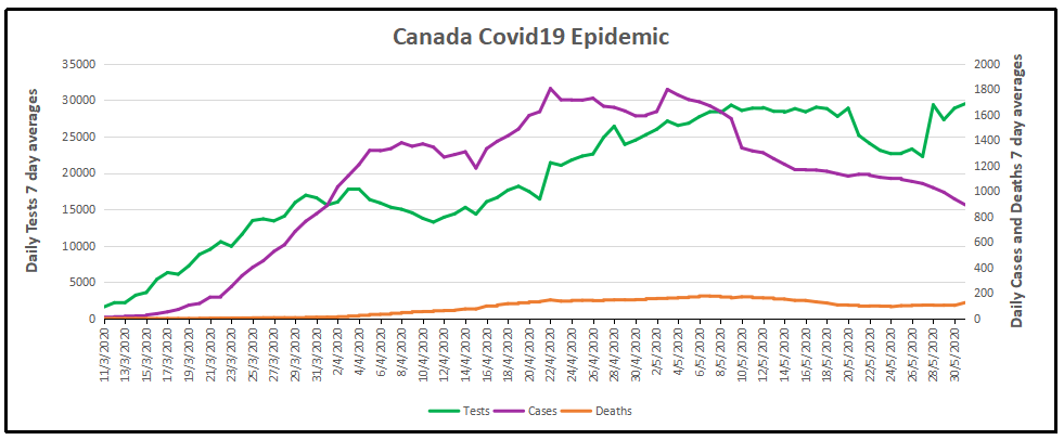
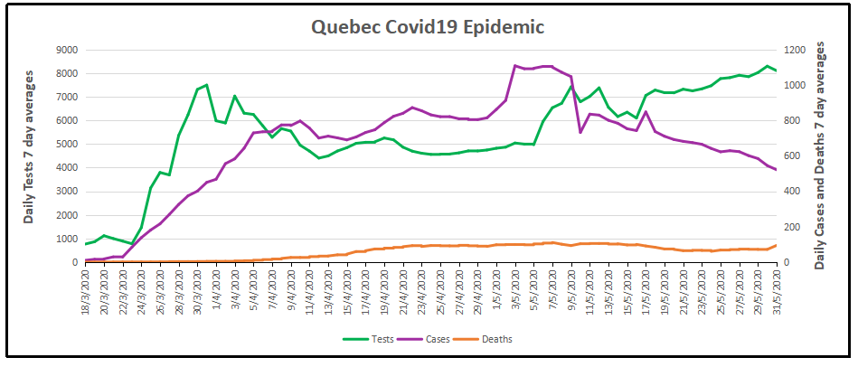
9/ And the fact that deaths no longer seem to have any relationship to case counts in many states (true even accounting for the fact that deaths lag).

The question you should be asking yourself: why aren’t Europe and Asia seeing post-lockdown spikes if this trend is real?

10/ And don’t say masks. Masks are not routine in Europe. So either COVID is somehow different post-lockdown in Europe (and different in different states, too)… or this is just one last gasp of panic porn.

And if you want confirmation from epidemiologists, here Facts about Covid-19 from Swiss Policy Research.

Fully referenced facts about Covid-19, provided by experts in the field, to help our readers make a realistic risk assessment. (Regular updates below)

“The only means to fight the plague is honesty.” (Albert Camus, 1947)

Overview

1.According to the latest immunological and serological studies, the overall lethality of Covid-19 (IFR) is about 0.1% and thus in the range of a strong seasonal influenza (flu).

2. Even in global “hotspots”, the risk of death for the general population of school and working age is typically in the range of a daily car ride to work. The risk was initially overestimated because many people with only mild or no symptoms were not taken into account.

3. Up to 80% of all test-positive persons remain symptom-free. Even among 70-79 year olds, about 60% remain symptom-free. Over 95% of all persons develop at most moderate symptoms.

4. Up to 60% of all persons may already have a certain cellular background immunity to Covid19 due to contact with previous coronaviruses (i.e. common cold viruses).

5. The median or average age of the deceased in most countries (including Italy) is over 80 years and only about 4% of the deceased had no serious preconditions. The age and risk profile of deaths thus essentially corresponds to normal mortality.

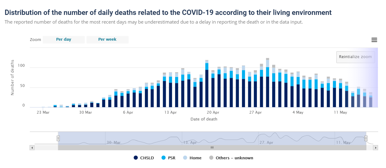
6. In many countries, up to two thirds of all extra deaths occurred in nursing homes, which do not benefit from a general lockdown. Moreover, in many cases it is not clear whether these people really died from Covid19 or from weeks of extreme stress and isolation.

7. Up to 30% of all additional deaths may have been caused not by Covid19, but by the effects of the lockdown, panic and fear. For example, the treatment of heart attacks and strokes decreased by up to 60% because many patients no longer dared to go to hospital.

8. Even in so-called “Covid19 deaths” it is often not clear whether they died from or with coronavirus (i.e. from underlying diseases) or if they were counted as “presumed cases” and not tested at all. However, official figures usually do not reflect this distinction.

9. Many media reports of young and healthy people dying from Covid19 turned out to be false: many of these young people either did not die from Covid19, they had already been seriously ill (e.g. from undiagnosed leukaemia), or they were in fact 109 instead of 9 years old. The claimed increase in Kawasaki disease in children also turned out to be false.

10. The normal overall mortality per day is about 8000 people in the US, about 2600 in Germany and about 1800 in Italy. Influenza mortality per season is up to 80,000 in the US and up to 25,000 in Germany and Italy. In several countries Covid19 deaths remained below strong flu seasons.

11. Regional increases in mortality can occur if there is a collapse in the care of the elderly and sick as a result of infection or panic, or if there are additional risk factors such as severe air pollution. Special regulations for dealing with the deceased sometimes led to additional bottlenecks in funeral or cremation services.

12. In countries such as Italy and Spain, and to some extent the UK and the US, hospital overloads due to strong flu waves are not unusual. In addition, up to 15% of doctors and health workers are now being put into quarantine, even if they develop no symptoms.

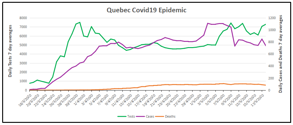
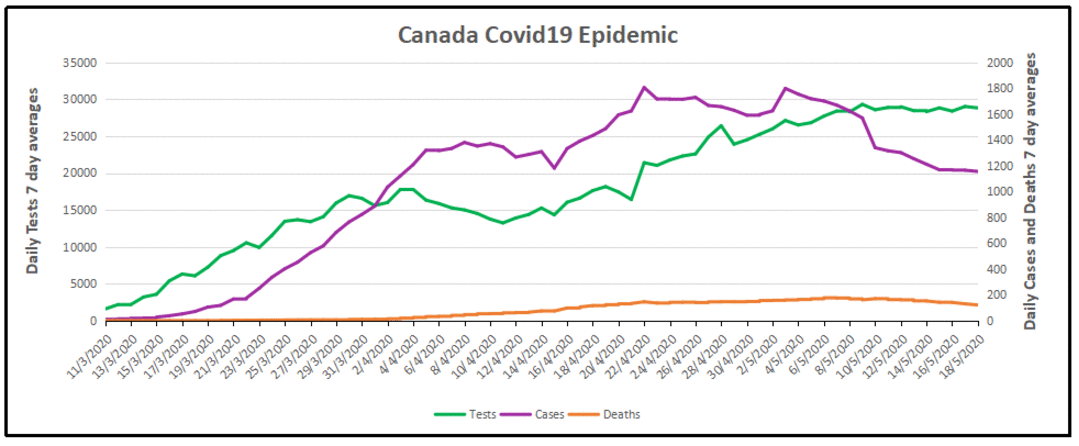
13. The often shown exponential curves of “corona cases” are misleading, as the number of tests also increased exponentially. In most countries, the ratio of positive tests to tests overall (i.e. the positive rate) remained constant at 5% to 25% or increased only slightly. In many countries, the peak of the spread was already reached well before the lockdown.

14. Countries without curfews and contact bans, such as Japan, South Korea or Sweden, have not experienced a more negative course of events than other countries. Sweden was even praised by the WHO and now benefits from higher immunity compared to lockdown countries.

15. The fear of a shortage of ventilators was unjustified. According to lung specialists, the invasive ventilation (intubation) of Covid19 patients, which is partly done out of fear of spreading the virus, is in fact often counterproductive and damaging to the lungs.

16. Contrary to original assumptions, various studies have shown that there is no evidence of the virus spreading through aerosols (i.e. tiny particles floating in the air) or through smear infections (e.g. on door handles or smartphones). The main modes of transmission are direct contact and droplets produced when coughing or sneezing.

17. There is also no scientific evidence for the effectiveness of face masks in healthy or asymptomatic individuals. On the contrary, experts warn that such masks interfere with normal breathing and may become “germ carriers”. Leading doctors called them a “media hype” and “ridiculous”.

18. Many clinics in Europe and the US remained strongly underutilized or almost empty during the Covid19 peak and in some cases had to send staff home. Numerous operations and therapies were cancelled, including many cancer screenings and organ transplants.

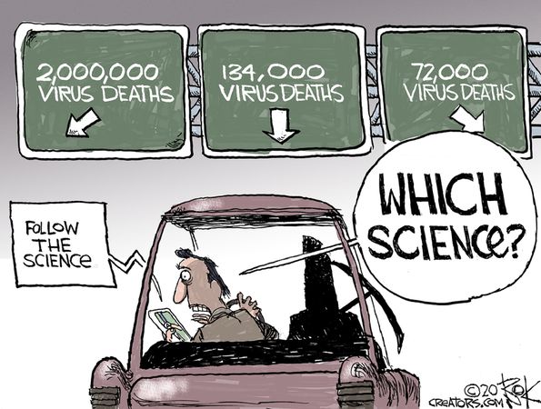
19. Several media were caught trying to dramatize the situation in hospitals, sometimes even with manipulative images and videos. In general, the unprofessional reporting of many media maximized fear and panic in the population.

20. The virus test kits used internationally are prone to errors and can produce false positive and false negative results. Moreover, the official virus test was not clinically validated due to time pressure and may sometimes react positive to other coronaviruses.

21. Numerous internationally renowned experts in the fields of virology, immunology and epidemiology consider the measures taken to be counterproductive and recommend rapid natural immunisation of the general population and protection of risk groups.

22. At no time was there a medical reason for the closure of schools, as children hardly ever transmit the virus or fall ill with it themselves. There is also no medical reason for small classes, masks or ‘social distancing’ rules in schools.

23. The claim that only severe Covid-19 but not influenza may cause venous thrombosis and pulmonary (lung) embolism is not true, as it has been known for 50 years that severe influenza greatly increases the risk of thrombosis and embolism, too.

24. Several medical experts described vaccines against coronaviruses as unnecessary or even dangerous. Indeed, the vaccine against the so-called swine flu of 2009, for example, led to sometimes severe neurological damage and lawsuits in the millions.

25. The number of people suffering from unemployment, depressions and domestic violence as a result of the measures has reached historic record values. Several experts predict that the measures will claim more lives than the virus itself. According to the UN millions of people around the world may fall into absolute poverty and famine.

26. NSA whistleblower Edward Snowden warned that the “corona crisis” will be used for the massive and permanent expansion of global surveillance. The renowned virologist Pablo Goldschmidt spoke of a “global media terror” and “totalitarian measures”. Leading British virologist professor John Oxford spoke of a “media epidemic”.

27. More than 500 scientists have warned of an “unprecedented surveillance of society” through problematic apps for “contact tracing”. In some countries, such “contact tracing” is already carried out directly by the secret service. In several parts of the world, the population is already being monitored by drones and facing serious police overreach.

28. A 2019 WHO study on public health measures against pandemic influenza found that from a medical perspective, “contact tracing” is “not recommended in any circumstances.

See also: Pandemonia Funnies Madebyjimbob

Covid Decline in Canada and World June 8

Reported at Just The News Doctors around world say COVID-19 may be losing its potency, becoming less deadly

Doctors in Italy, Israel and U.S. say the coronavirus may be losing its potency and becoming less deadly even as it spreads.

Doctors across the world are offering preliminary but encouraging reports that the coronavirus may be losing steam and becoming less deadly: a behavior observed in at least one respiratory pandemic before, and a welcome sign for a world weary of nonstop COVID-19 fears.

But numerous prominent doctors and scientists in the last few weeks and months have begun to question that narrative, pointing to evidence that suggests the coronavirus may, unexpectedly, be dying out on its own.

Virus appears to behave the same regardless of lockdown measures

Yitzhak Ben Israel, a professor at Tel Aviv University, offered early speculation to that effect when in April he said, based on the observed behavior of the virus across the globe, that the virus appears to function more or less the same no matter what a country does to mitigate it. He said the virus appears to follow a fixed pattern in which there is “a decline in the number of infections even [in countries] without closures” that is “similar to the countries with closures.”  See post on Ben Israel Good Virus News from the Promised Land

Those observations may indicate that the virus is not an unstoppable juggernaut: If it works more or less the same with or without mitigation efforts, then it is likely less of a danger than was initially imagined, insofar as the disease is less hampered by lockdowns than experts thought but also less deadly without them than was initially feared.

Yet apart from the epidemiological path the pandemic might or might not take, there are also signs that the virus itself is weakening, growing less potent, more diffuse and less deadly, meaning that even if a region experiences a significant amount of infections, it may amount to fewer hospitalizations and deaths than medical experts have predicted over the past few months.

That’s the contention of two top Italian doctors, who argued this week that the disease appears to be rapidly declining in potency. The coronavirus “clinically no longer exists in Italy,” San Raffaele Hospital Director Alberto Zangrillo told Reuters, claiming that recent swabs of infected patients have shown “a viral load in quantitative terms that was absolutely infinitesimal compared to the ones carried out a month or two months ago.”

Matteo Bassetti, meanwhile—the head of the infectious diseases clinic at the San Martino hospital in Genoa—said that “the strength the virus had two months ago is not the same strength it has today” and that “it is clear that today the COVID-19 disease is different.”

The Italian government is still cautioning its citizens to continue to treat the virus as highly dangerous.

Covid Decline Evident in Canada

The media and governmental reports focus on total accumulated numbers which are big enough to scare people to do as they are told.  In the absence of contextual comparisons, citizens have difficulty answering the main (perhaps only) question on their minds:  What are my chances of catching Covid19 and dying from it?  The map shows a lot of cases, and the chart looks like an hockey stick, going upward on a straight line. So why do I say canadians are safer than it looks like from such images?

First let’s look at daily numbers to see where we are in this process.  All the statistics come from Canada Public Health Coronavirus disease (COVID-19): Outbreak update.

By showing daily tests, new cases and reported deaths, we can see how the outbreak has built up, peaked and declined over the last 3 months.  The green line shows how testing grew to a sustained daily rate of 29,000, then dropped, before rising to a new level. (all numbers are smoothed with 7 day averages ending with the stated date.) Note that the curve is now descending after peaking at 1800 on April 22, now down to 679 new cases per day.  This lower rate of infections is despite the highest rate of testing since the outbreak began. Deaths have also peaked at 177 on May 6, down to 72 June 7. The rate of people testing positive is down to 2.2%, and deaths are 0.22% of the tests administered.

But it matters greatly where in Canada you live. Quebec has been the province leading the nation in both cases and deaths.  Quebec has always celebrated being a distinct society, but not in this way. Below is the same chart for the Quebec epidemic from the same dataset. The province has about 23% of the national population and does about 26% of the tests.  But Quebec contributes 56% of the cases and 64% of the deaths, as of yesterday.  Here how the outbreak has gone in La Belle Province.

The Quebec graph is more lumpy showing cases peaking May 1-9, including several days inflated by data catchups. Cases have dropped off recently, from 1100 May 7 down to 256 yesterday.  Deaths are also dropped, declining from 110 on May 7 to 48 June 7 (7-day average). The animation below shows the epidemic in Canada with and without Quebec statistics.

But clearly everywhere else in Canada, people are much safer than those living in Quebec.  So what is going on?

To enlarge image, open in new tab.

The graph shows that people in Quebec are dying in group homes, the majority in CHSLD (long term medical care facilities) and also in PSR (private seniors’ residences).  The huge majority of Quebecers in other, more typical living arrangements have very little chance of dying from this disease. Not even prisoners are much at risk.


Doctors Against Borders (Lockdowns)


A person holds a sign during a Reopen New Jersey protest in Point Pleasant, N.J., on May 25, 2020. (Michael Loccisano/Getty Images)

Benjamin Turner, MD, MA, FRCSC, is a general surgeon who writes at Epoch Times  Another Doctor Argues Against Lockdown: It’s Time We Ended This Disastrous Policy.  Excerpts in italics with my bolds.

Add my name to the list of physicians who cannot stay silent any longer. The lockdowns must end. They must end immediately and in earnest, not a slow sinking into a morass of rules so complex, illogical, and destructive of privacy as to make lockdown look enjoyable.

In March, the argument for lockdowns was simple: SARS-CoV-2 is far more deadly and infectious than seasonal influenza. A drastic and legally enforced decrease in socialization will prevent the overwhelming of hospitals. The cost of these measures is not to be compared to the loss of even a single life. We now hear a supplementary argument: The death toll was less than projected, but it would have been catastrophic without lockdowns.

Every one of these claims is either questionable or outright false. But if even one point fails, so does the case for lockdowns.

1. SARS-CoV-2 does not have a higher mortality rate than seasonal influenza

Dr. Tedros Adhanom Ghebreyesus, director-general of the World Health Organization, said 3.4 percent of COVID-19 patients die, and far less than 1 percent of influenza patients. Dr. Anthony Fauci, leading member of the White House Coronavirus Task Force, estimated 1 percent fatality, “ten times more lethal than the seasonal flu.” But both had severely underestimated mild cases.

Early in any epidemic, mortality is estimated as the ratio of deaths to confirmed cases; this is the case fatality ratio (CFR). Later, we can compare deaths to all cases, including those who did not seek medical attention; this is the infection fatality ratio (IFR). Tedros’s 3.4 percent refers to the CFR. The flu’s 0.1 to 0.2 percent is an IFR. The two must not be confused.

Antibody studies invariably show prevalence more than 10 times the early estimates, and IFR lower by the same.

In a systematic review by Dr. John Ioannidis, professor of medicine and co-director of the Meta-Research Innovation Center at Stanford, 9 out of 12 studies gave an IFR of 0.16 percent or less. The highest was only 0.4 percent.

2. SARS-CoV-2 is more contagious than the flu in some countries, but not by much

Prof. Neil Ferguson, director of the MRC Centre for Global Infectious Disease Analysis at Imperial College London, and member of the UK’s Scientific Advisory Group for Emergencies, predicted up to 81 percent transmission of SARS-CoV-2. This has happened nowhere, regardless of lockdown.

The highest prevalence in Ioannidis’s review was 25.9 percent. For perspective, 15 percent of the U.S. population contracted influenza in 2017/18.

3. So far, COVID-19 mortality is similar to that of seasonal influenza

Though this could change, the comparison to influenza is presently valid. COVID-19 has killed many thousands, and severely strained some hospitals. But influenza does the same. Only two years ago, influenza forced hospitals in the United States, England, and Italy to cancel elective surgery and use surge capacity, including in tents.

As of May 29, Italy counted 33,229 COVID-19 deaths, 33 percent above 2016/17 flu deaths (24,981), but still below that year’s deaths from influenza-like illnesses in general (43,336).

At 83,142 (CDC provisional count), the United States is even with the 2017/18 flu season, estimated contemporaneously at 80,000. The UK reports 38,489 deaths, similar to the 2014/15 flu (34,300). Globally, COVID-19 is estimated at 372,000 deaths, and the flu at 291,000 to 646,000 annually.

In worse years, influenza wins, hands down. Both the 1957 and the 1968 flu killed between 1 million and 4 million. The 1968 flu killed 100,000 Americans in a population two thirds the present size, and younger; a modern equivalent would exceed 150,000.

4. Deaths may be badly overestimated

There’s good reason to doubt even the numbers above. Early in the pandemic, Prof. Dr. Sucharit Bhakdi, professor emeritus and former head of the Institute for Medical Microbiology and Hygiene at the Johannes Gutenberg University of Mainz in Germany, pointed out that governments were failing to distinguish between deaths “of” and merely “with” SARS-CoV-2.

Prof. Walter Ricciardi, scientific adviser to the Italian minister of health, reports that only 12 percent of Italian “COVID-19” deaths were directly caused by COVID-19. The CDC encourages logging COVID-19 only on suspicion, without lab evidence. On the day New York started this practice, they added 3,700 deaths, about 50 percent of the previous total. Some of these surely died of COVID-19, but since the clinical picture overlaps with COPD, heart failure, and non-pulmonary sepsis, surely many of them did not.

5. The models triggering lockdown were grossly flawed

Around the world, Prof. Ferguson’s model was the most influential. It forecast as many as 2,200,000 dead in the United States and 510,000 in the UK. It was released without its supporting code, which should have disqualified it immediately. It assumed an IFR of 0.9 percent, more than twice the highest estimate discussed above. The highly modified code was released a month late, and severely criticized by numerous programmers, including a team from the University of Edinburgh.

Pro-lockdown scientists from the Uppsala University ran a Swedish model based on Ferguson’s, and predicted 80,000 to 90,000 deaths by mid-May under the present rules, and 20,000 to 30,000 under lockdown. Without any lockdown, Sweden had 3,800 deaths by mid-May, 20 times fewer than predicted. We didn’t avert Ferguson’s forecast; it was just worthless.

6. There is no evidence that lockdowns saved lives

Even if mortality increases well past a bad flu year, that still won’t make lockdowns the right solution. Oxford University’s Blavatnik School of Government maintains a graph of lockdown stringency and prevalence of COVID-19 in different countries, and there’s no correlation between the two.

Dr. Carl Heneghan, director of the Centre for Evidence-Based Medicine, and researchers at both Switzerland’s ETH Zurich and Germany’s Robert Koch Institute have all separately argued that the transmission rate was already decreasing before lockdowns.

Nobel laureate and Stanford professor of structural biology Dr. Michael Levitt has shown that transmission decays at similar rates regardless of lockdown. No wonder, then, that Sweden reached peak infection at the same speed as other countries, and, as of May 31, has a lower overall death rate per million (435) than the UK (567), France (441), Spain (580), Italy (553), and Belgium (817).

If lockdowns make no difference, much less will the half-lockdowns we’re now told to call “normal.”

7. Lockdowns have probably killed people, but the recession will kill more

The UK reports about 20,000 excess deaths outside hospital, not associated with COVID-19. Emergency treatment for heart attacks is down 40 percent in England, implying that enormous numbers of people are not being treated. But widespread poverty may prove more important yet.

Suicide, drug use, and violence all increase with unemployment. Heart disease is directly related to poverty. One shudders to think of the developing world, where the U.N. World Food Program estimates that 130 million more people will be pushed to the brink of starvation. That’s 300 times the number of COVID-19 deaths worldwide.

It’s time we ended this disastrous policy, so aptly described by Prof. Dr. Bhakdi as “collective suicide.” I beg my colleagues who agree with me to break your own silence. We are already late to do our duty.

Benjamin Turner, MD, MA, FRCSC, is a general surgeon working in Alberta, British Columbia, and the Yukon, Canada.

Canadians Much Safer June 1

Update at May 31, 2020
It took a lot of work, but I was able to produce something akin to the Dutch advice to their citizens.

The media and governmental reports focus on total accumulated numbers which are big enough to scare people to do as they are told.  In the absence of contextual comparisons, citizens have difficulty answering the main (perhaps only) question on their minds:  What are my chances of catching Covid19 and dying from it?  The map shows a lot of cases, and the chart looks like an hockey stick, going upward on a straight line. So why do I say canadians are safer than it looks like from such images?

First let’s look at daily numbers to see where we are in this process.  All the statistics come from Canada Public Health Coronavirus disease (COVID-19): Outbreak update.

By showing daily tests, new cases and reported deaths, we can see how the outbreak has built up, peaked and declined over the last 2.5 months.  The green line shows how testing grew to a sustained daily rate of 29,000, with a recent drop and recovery (all numbers are smoothed with 7 day averages ending with the stated date.) Note that the curve is now descending after peaking at 1800 on April 22, now down to 893 new cases per day.  This lower rate of infections is despite the highest rate of testing since the outbreak began. Deaths have also peaked at 177 on May 6, down to 104 May 30. (Reported deaths bumped upward yesterday due to a data transmission catchup in Quebec, explained below).  The percentage of people testing positive is down to 3%, and deaths are 0.42% of the tests administered.

But it matters greatly where in Canada you live.  In the map at the top, Quebec is the dark blue province leading the nation in both cases and deaths.  Quebec has always celebrated being a distinct society, but not in this way. Below is the same chart for the Quebec epidemic from the same dataset. The province has about 23% of the national population and does about 26% of the tests.  But Quebec contributes 56% of the cases and 64% of the deaths, as of yesterday.  Here how the outbreak has gone in La Belle Province.

The Quebec graph is more lumpy showing cases peaking May 1-9, including several days inflated by data catchups. Cases have dropped off recently, from 1100 May 7 down to 521 yesterday.  Deaths are also slowing, declining from 110 on May 7 to 71 May 30. Yesterday the reported deaths in Quebec jumped to 202 due to 165 previously unrecorded data, while the actual new deaths were 37 . The animation below shows the epidemic in Canada with and without Quebec statistics.

But clearly everywhere else in Canada, people are much safer than those living in Quebec.  So what is going on?

To enlarge image, open in new tab.

The graph shows that people in Quebec are dying in group homes, the majority in CHSLD (long term medical care facilities) and also in PSR (private seniors’ residences).  The huge majority of Quebecers in other, more typical living arrangements have very little chance of dying from this disease. Not even prisoners are much at risk.

Of course the other dimension is years of age, since this disease has punished mostly people suffering from end-of-life frailties.  A previous post reported that the Netherlands parliament was provided with the type of guidance everyone wants to see.

For canadians, the most similar analysis is this one from the Daily Epidemiology Update: :

The table presents only those cases with a full clinical documentation, which included some 2194 deaths compared to the 5842 total reported.  The numbers show that under 60 years old, few adults and almost no children have anything to fear.

Update May 20, 2020

It is really quite difficult to find cases and deaths broken down by age groups.  For Canadian national statistics, I resorted to a report from Ontario to get the age distributions, since that province provides 69% of the cases outside of Quebec and 87% of the deaths.  Applying those proportions across Canada results in this table. For Canada as a whole nation:

Age  Risk of Test +  Risk of Death Population
per 1 CV death
<20 0.05% None NA
20-39 0.20% 0.000% 431817
40-59 0.25% 0.002% 42273
60-79 0.20% 0.020% 4984
80+ 0.76% 0.251% 398

In the worst case, if you are a Canadian aged more than 80 years, you have a 1 in 400 chance of dying from Covid19.  If you are 60 to 80 years old, your odds are 1 in 5000.  Younger than that, it’s only slightly higher than winning (or in this case, losing the lottery).

As noted above Quebec provides the bulk of cases and deaths in Canada, and also reports age distribution more precisely,  The numbers in the table below show risks for Quebecers.

Age  Risk of Test +  Risk of Death Population
per 1 CV death
0-9 yrs 0.13% 0 NA
10-19 yrs 0.21% 0 NA
20-29 yrs 0.50% 0.000% 289,647
30-39 0.51% 0.001% 152,009
40-49 years 0.63% 0.001% 73,342
50-59 years 0.53% 0.005% 21,087
60-69 years 0.37% 0.021% 4,778
70-79 years 0.52% 0.094% 1,069
80-89 1.78% 0.469% 213
90  + 5.19% 1.608% 62

While some of the risk factors are higher in the viral hotspot of Quebec, it is still the case that under 80 years of age, your chances of dying from Covid 19 are better than 1 in 1000, and much better the younger you are.

Mr. Trudeau, Take Down This Wall !

Epidemiology Journal: Use HCQ+AZ

Prestigious medical journal urges outpatient use of hydroxychloroquine regimen for COVID-19
Reported at Just The News.  Excerpts in italics with my bolds.

‘These medications need to be widely available and promoted immediately for physicians to prescribe,’ the American Journal of Epidemiology says.

A prestigious medical journal is criticizing news media coverage of hydroxychlorioquine in the battle against coronavirus, saying there is evidence the anti-malarial drug combined with the antibiotic azithromycin helps in the early stages of outpatient treatment.

“These medications need to be widely available and promoted immediately for physicians to prescribe,” the American Journal of Epidemiology reported in an article published this week that pushed back against claims the regimen has been dangerous or ineffective in all cases.

“Hydroxychloroquine plus azithromycin has been widely misrepresented in both clinical reports and public media, and outpatient trials results are not expected until September,” the journal noted, urging medical professionals and the public to recognize there are different stages of the disease that may require different treatments.

The article said the two candidate medications which have been widely reported – remdesivir and hydroxychloroquine plus azithromycin — need to be looked at differently.

“Remdesivir has shown mild effectiveness in hospitalized inpatients, but no trials have been registered in outpatients,” it said.

Meanwhile, the regimen with hydroxychloroquine has been the subject of five studies, including two controlled clinical trials, that “have demonstrated significant major outpatient treatment efficacy.”

The article noted that while there have been some instances of the drug regimen creating heart arrhythmias, the reactions are relatively small compared to those dying from COVID-19.

“Hydroxychloroquine+azithromycin has been used as standard-of-care in more than 300,000 older adults with multicomorbidities, with estimated proportion diagnosed with cardiac arrhythmias attributable to the medications 47/100,000 users, of which estimated mortality is <20%, 9/100,000 users, compared to the 10,000 Americans now dying each week.” the journal said.

The most compelling argument, the journal said, is how hydroxycholoroquine plus azithromycin reduces the rate of mortality.

Below are the percentages of doctors prescribing the hydroxychloroquine plus azithromycin regimen to COVID-19 patients across the globe:

72% in Spain;
49% in Italy;
41% in Brazil;
39% in Mexico;
28% in France;
23% in the US;
17% in Germany;
16% in Canada;
13% in the UK;

And at four New York hospitals, a recent study found that adding zinc sulfate with hydroxychloroquine and azithromycin significantly cuts both the need for intubation and mortality risks by half, researchers said.

Covid Inflation

The story of inflated coronavirus death statistics reminds of decades of climate science manipulations.  When the models produce big scary numbers, and reality fails to rise to predictions, data must be managed to keep scientists’ credibility.  With so much economic damage from shutdowns, many experts are vulnerable to be proven wrong and their advice unfounded.

How this is playing in the pandemic is reported by Timothy Allen & John Lott at Real Clear Politics U.S. COVID-19 Death Toll Is Inflated.  Excerpts in italics with my bolds.

The latest Centers for Disease Control data show that the COVID-19 fatality rate is 0.26% — four times higher than the worst rate for the seasonal flu over the past decade. That is dramatically lower than the World Health Organization’s estimate of 3.4% and Dr. Anthony Fauci’s initial guess of about 2%.

When the CDC projected 1.7 million deaths back in March, it used an estimated death rate of 0.8%. Imperial College’s estimate of 2.2 million deaths assumed a rate of 0.9%. The fear generated by the projections drives the public policy debate. The Washington Post headline, “As deaths mount, Trump tries to convince Americans it’s safe to inch back to normal,” were part of a steady diet of such fare. When Georgia opened up over a month ago, the Post warned: “Georgia leads the race to become America’s No. 1 Death Destination.”

The CDC currently puts the number of confirmed deaths at about 100,000. But even the “best estimate” 0.26% fatality rate is a significant overestimate because of how the CDC is counting deaths. The actual rate is fairly close to a recent bad year for the seasonal flu. And though public health officials have been transparent about how they are counting coronavirus deaths, the implications for calculating the infection fatality rate are not appreciated.

“The case definition is very simplistic,” Dr. Ngozi Ezike, director of Illinois Department of Public Health, explains. “It means, at the time of death, it was a COVID positive diagnosis. That means, that if you were in hospice and had already been given a few weeks to live, and then you also were found to have COVID, that would be counted as a COVID death. It means, technically even if you died of [a] clear alternative cause, but you had COVID at the same time, it’s still listed as a COVID death.”

Medical examiners from Colorado to Michigan use the same definition. In Macomb and Oakland counties in Michigan, where most of the deaths in that state occurred, medical examiners classify any death as a coronavirus death when the postmortem test is positive. Even people who died in suicides and automobile accidents meet that definition.

Such expansive definitions are not due to rogue public health officials. The rules direct them to do this. “If someone dies with COVID-19, we are counting that as a COVID-19 death,” White House coronavirus response coordinator Dr. Deborah Birx recently noted.

Beyond including people with the virus who clearly didn’t die from it, the numbers are inflated by counting people who don’t even have the virus. New York has classified many cases as coronavirus deaths even when postmortem tests have been negative. The diagnosis can be based on symptoms, even though the symptoms are often similar to those of the seasonal flu.

The Centers for Disease Control guidance explicitly acknowledges the uncertainty that doctors can face when identifying the cause of death. When coronavirus cases are “suspected,” the agency counsels doctors that “it is acceptable to report COVID-19 on a death certificate.” This advice has produced a predictable inflation in the numbers. When New York City’s death toll rose above 10,000 on April 21, the New York Times reported that the city included “3,700 additional people who were presumed to have died of the coronavirus but had never tested positive” – more than a 50% increase in the number of cases.

Nor can this be explained by false-negative results in the tests. For the five most commonly used tests, the least reliable test still scored a 96% accuracy rate in laboratory settings. Some doctors report feeling pressure from hospitals to list deaths as being due to the coronavirus, even when the doctors don’t believe that is the case “to make it look a little bit worse than it is.” That is pressure they say they never previously faced in reporting deaths from the seasonal flu.

There are financial incentives that might make a difference for hospitals and doctors. The CARES Act adds a 20% premium for COVID-19 Medicare patients. Birx and others are also concerned that the CDC’s “antiquated” accounting system is double-counting cases and inflating mortality and case counts “by as much as 25%.” When all these anomalies are added up, it becomes apparent that we simply don’t have an accurate death toll from this new coronavirus. But it seems clear that the correct rate is just a little worse than the rate for the 2017-2018 flu.

Meanwhile, the Washington Post, New York Times, and others claim that we are undercounting the true number of deaths. They reach that conclusion by showing that the total number of deaths from all causes is about 30% greater than we would typically expect from March through early May. They then conclude that the excess is due to deaths not being accurately labeled as due to the coronavirus.

But these are not normal times. Many people with heart problems aren’t going to the hospital for fear of the virus. Delaying cancer surgeries and other serious medical treatments for months has real impacts on life expectancies. The stress of the situation is almost certainly increasing suicides and other illnesses. Which is not to minimize the threat: Even if the true death toll is now closer to 50,000 than 100,000, this pandemic is a big deal. But we need some perspective. During the 2017-18 flu season, 61,000 Americans died from the flu.

Public health officials need to face a lot of serious questions about how they counted Coronavirus deaths. We don’t have all the answers yet, but it’s clear the inflated numbers have helped mislead people into a state of alarmism.

Timothy Allen is a governor of the College of American Pathologists and chairs the Department of Pathology at the University of Mississippi Medical Center.

John Lott is the president of the Crime Prevention Research Center.

See also Man Made Warming from Adjusting Data

Cartoon by Josh at cartoonsbyjosh.com

Confusing Urgent with Important

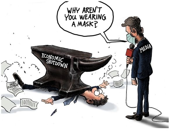
One of the things we learned in organizational science was that managers are prone to focus attention and resources on urgent situations at the expense of more serious threats to viability.  Thus the aphorism:  “When you are up to your ass in alligators it’s difficult to remember that your initial objective was to drain the swamp”.  Many times we consultants saw clients working hard to put out fires (complaints, delays, etc.) while oblivious to strategic weaknesses eroding their ability to compete with rivals.  One memorable client responded to our product profitabilty analysis showing why they were losing money, “I can’t drop that product, it’s our best seller!”

All this by way of introduction to an article at Real Clear Politics Miscalculating Risk: Confusing Scary With Dangerous  In this case the subject is evaluating risks, but the mistake can also be made regarding opportunities. Excerpts in italics with my bolds.

The coronavirus kills, everyone knows it. But this isn’t the first deadly virus the world has seen, so what happened? Why did we react the way we did? One answer is that this is the first social media pandemic. News and narratives travel in real-time right into our hands.

This spreads fear in a way we have never experienced. Drastic and historically unprecedented lockdowns of the economy happened and seemed to be accepted with little question.

We think the world is confusing “scary” with “dangerous.” They are not the same thing. It seems many have accepted as fact that coronavirus is one of the scariest things the human race has ever dealt with. But is it the most dangerous? Or even close?

There are four ways to categorize any given reality. It can be scary but not dangerous, scary and dangerous, dangerous but not scary, or not dangerous and not scary.

Clearly, COVID-19 ranks high on the scary scale. A Google news search on the virus brings up over 1.5 billion news results. To date, the virus has tragically killed nearly 100,000 people in the United States, and more lives will be lost. But on a scale of harmless to extremely dangerous, it would still fall into the category of slightly to mildly dangerous for most people, excluding the elderly and those with preexisting medical conditions.

In comparison, many have no idea that heart disease is the leading cause of death in the United States, killing around 650,000 people every year, 54,000 per month, or approximately 200,000 people between February and mid-May of this year. This qualifies as extremely dangerous. But most people are not very frightened of it. A Google news search for heart disease brings up around 100 million results, under one-fifteenth the results of the COVID-19 search.

It’s critical to be able to distinguish between fear and danger. Fear is an emotion, it’s the risk that we perceive. As an emotion, it is often blind to the facts. For example, the chances of dying from a shark attack are minuscule, but the thought still crosses most people’s minds when they play in the ocean. Danger is measurable, and in the case of sharks, the danger is low, even if fear is sometimes high.

Imagine if an insurance actuary was so scared of something that she graded it 1,000 times riskier than the data showed. This might be a career-ending mistake. This is exactly what people have done regarding COVID-19: making decisions on fear and not data.

According to CDC data, 81% of deaths from COVID-19 in the United States are people over 65 years old, most with preexisting conditions. If you add in 55-64-year-olds that number jumps to 93%. For those below age 55, preexisting conditions play a significant role, but the death rate is currently around 0.0022%, or one death per 45,000 people in this age range. Below 25 years old the fatality rate of COVID-19 is 0.00008%, or roughly one in 1.25 million, and yet we have shut down all schools and day-care centers, some never to open again! This makes it harder for mothers and fathers to remain employed.

All life is precious. No death should be ignored, but we have allowed our fear to move resources away from areas that are more dangerous, but less scary, to areas that are scary, but less dangerous. And herein lies the biggest problem.

Hospitals and doctors’ offices have had to be much more selective in the people they are seeing, leaving beds open for COVID-19 patients and cutting out elective surgeries. According to Komodo, in the weeks following the first shelter-in-place orders, cervical cancer screenings were down 68%, cholesterol panels were down 67%, and the blood sugar tests to detect diabetes were off 65% nationally.

It doesn’t stop there. The U.N. estimates that infant mortality rates could rise by hundreds of thousands in 2020 because of the global recession and diverted health care resources. Add in opioid addiction, alcoholism, domestic violence and other detrimental reactions from job loss and despair. It’s tragic.

The benefits gained through this fear-based shutdown (if there really are any) have massively increased dangers in the both the short term and the long term. Every day that businesses are shuttered, and people remain unemployed or underemployed, the economic wounds grow more deadly. The loss of wealth is immense, and this will undermine the ability of nations around the world to deal with true dangers for decades to come, maybe forever. We have altered the course of economic growth.

Shutting down the private sector (which is where all wealth is created) is truly dangerous even though many of our leaders suggest we shouldn’t be scared of it. Another round of stimulus is not what we need. Like a Band-Aid on a massive laceration, it may stop a tiny bit of the bleeding, but the wound continues to worsen, feeding greater and more elaborate intervention. Moreover, we are putting huge financial burdens on future generations because we are scared about something that the data reveal as far less dangerous than many other things in life.

A shutdown may slow the spread of a virus, but it can’t stop it. A vaccine may cure us. But in the meantime, we have entered a new era, one in which fear trumps danger and near-term risk creates long-term problems. It appears many people have come to this realization as the data builds. Hopefully, this will go down in history as a mistake that we will never repeat.


Georgians Dine Out, Pundits Eat Crow

Matthew Walther writes at the Week We should be grateful for good news in Georgia.  Excerpts in italics with my bolds.

I hate to be the bearer of bad news, but Atlanta is not burning. Bodies are not piled up in the streets. Hospitals in Georgia are not being overwhelmed; in fact, they are virtually empty. There is no mad rush for ventilators (remember those?). Instead, men, women, and children in the Peach State are returning to some semblance of normal life: working outside their homes, going to restaurants and bars, getting haircuts, exercising, and most important, spending time with their friends and families and worshipping God. The opening that began more than three weeks ago is continuing apace.

Oh, my apologies, you were waiting for bad news? Sorry, I forgot, we were actually not supposed to be rooting for the virus. Despite the apparent relish behind headlines like “Georgia’s Experiment in Human Sacrifice,” one assumes that most Americans, even the ones most committed to omnidirectional prophecies of doom, were actually hoping this would happen. While it really is a shame that we do not get to gloat about the cravenness and stupidity of yet another GOP politician, I think on balance most of us will be glad to hear that Gov. Brian Kemp was not badly wrong here.

What is happening instead of the widely predicted bloodbath? Confirmed cases of the virus are obviously increasing (though the actual rolling weekly average of new ones have been headed down for nearly a month) while deaths remain more or less flat. This is in fact what happens when you test more people for a disease that is not fatal or even particularly serious for the vast majority of those who contract it, for which the median age of death is higher than the American life expectancy.

How was this possible? One answer is that the lockdown did not in fact do what it was supposed to do, which is to say, meaningfully impede transmission of the virus.

In fact, data both from states like Georgia and from abroad suggests that the lifting of lockdowns is positively correlated with a decrease in rates of infection. This could be because lockdowns are inherently ineffective at slowing down a disease whose spread appears to be largely intrafamilial and nosocomial.

It could also be the weather. That’s right: another thing that we were told months ago not even to suggest aloud because it would be irresponsible to make assumptions of any kind about the virus, even sensible ones, like the idea that wearing masks just might help slow it down. This is not science. COVID-19 arrived from China, not from outer space. Unsurprisingly, it appears to behave very much like other respiratory viruses, including influenza. It hates sunlight and the outdoors generally and prefers cramped stuffy conditions, like those found in public transit systems and dense housing complexes with poor ventilation.

It is worth pointing out here that journalists and Democratic politicians (most notably Stacey Abrams, the former Georgia state representative who labors under the bizarre illusion that she won a statewide election there two years ago and would now like to be vice president) were not the only critics of Gov. Kemp. After a series of spasmodic muscular contractions that seemed to have resulted in tweets calling upon unnamed persons to “liberate” various states, President Trump changed his mind and insisted on more than one occasion that he “strongly disagreed” with the decision to open Georgia. Expecting anything resembling consistency from this president is a fool’s errand, but one hopes that at least some of his supporters remember that he was wrong here.

None of what I have written above should be taken to suggest that Kemp’s handling of the pandemic is above reproach, or that he should receive a medal for clear-sightedness here. (I might give one instead to Gov. Ron DeSantis of Florida, where amid shrill moaning about the non-existent dangers of people standing on beaches, thousands of lives may have been saved by a swift executive order banning the re-introduction of coronavirus patients to elder care facilities). Nor am I suggesting that things in the Peach State cannot possibly take a turn for the worse, especially if appropriate measures are not taken in nursing homes.

Two much narrower claims are being made. The first is that those who insisted that Georgia would be transformed into a post-apocalyptic wasteland within days or even weeks of reopening were wrong, and predictably so.

The second is that this is something about which we should be happy.

Update: Canadians Are Safer Than They Think

Update at End May 20, 2020
It took a lot of work, but I was able to produce something akin to the Dutch advice to their citizens.

Original Post:

The media and governmental reports focus on total accumulated numbers which are big enough to scare people to do as they are told.  In the absence of contextual comparisons, citizens have difficulty answering the main (perhaps only) question on their minds:  What are my chances of catching Covid19 and dying from it?  The map shows a lot of cases, and the chart looks like an hockey stick, going upward on a straight line. So why do I say canadians are safer than it looks like from such images?

First let’s look at daily numbers to see where we are in this process.  All the statistics come from Canada Public Health Coronavirus disease (COVID-19): Outbreak update.

By showing daily tests, new cases and reported deaths, we can see how the outbreak has built up over the last 2 months or so.  The green line shows how testing has grown to a sustained daily rate of 30,000 (all numbers are smoothed with 7 day averages ending with the stated date.) Note that the curve is now descending after peaking at 1800 on May 3, now down to 1156 new cases per day.  This lower rate of infections is despite the highest rate of testing since the outbreak began. Deaths have also peaked at 177 on May 6, down to 121 yesterday.  The percentage of people testing positive is down to 4%, and deaths are 0.42% of the tests administered.

But it matters greatly where in Canada you live.  In the map at the top, Quebec is the dark blue province leading the nation in both cases and deaths.  Quebec has always celebrated being a distinct society, but not in this way. Below is the same chart for the Quebec epidemic from the same dataset. The province has about 23% of the national population and does about 25% of the tests.  But Quebec contributes 56% of the cases and 62% of the deaths, as of yesterday.  Here how the outbreak has gone in La Belle Province.

Cases have dropped off recently, from 1100 May 9 down to 737 yesterday.  Deaths are also slowing, declining from 110 on May 7 to 83 yesterday. The animation below shows the epidemic in Canada with and without Quebec statistics.

But clearly everywhere else in Canada, people are much safer than those living in Quebec.  So what is going on?

To enlarge image, open in new tab.

The graph shows that people in Quebec are dying in group homes, the majority in CHSLD (long term medical care facilities) and also in PSR (private seniors’ residences).  The huge majority of Quebecers in other, more typical living arrangements have very little chance of dying from this disease. Not even prisoners are much at risk.

Of course the other dimension is years of age, since this disease has punished mostly people suffering from end-of-life frailties.  A previous post reported that the Netherlands parliament was provided with the type of guidance everyone wants to see.

For canadians, the most similar analysis is this one from the Daily Epidemiology Update: :

The table presents only those cases with a full clinical documentation, which included some 2194 deaths compared to the 5842 total reported.  The numbers show that under 60 years old, few adults and almost no children have anything to fear.

Update May 20, 2020

It is really quite difficult to find cases and deaths broken down by age groups.  For Canadian national statistics, I resorted to a report from Ontario to get the age distributions, since that province provides 69% of the cases outside of Quebec and 87% of the deaths.  Applying those proportions across Canada results in this table. For Canada as a whole nation:

Age  Risk of Test +  Risk of Death Population
per 1 CV death
<20 0.05% None NA
20-39 0.20% 0.000% 431817
40-59 0.25% 0.002% 42273
60-79 0.20% 0.020% 4984
80+ 0.76% 0.251% 398

In the worst case, if you are a Canadian aged more than 80 years, you have a 1 in 400 chance of dying from Covid19.  If you are 60 to 80 years old, your odds are 1 in 5000.  Younger than that, it’s only slightly higher than winning (or in this case, losing the lottery).

As noted above Quebec provides the bulk of cases and deaths in Canada, and also reports age distribution more precisely,  The numbers in the table below show risks for Quebecers.

Age  Risk of Test +  Risk of Death Population
per 1 CV death
0-9 yrs 0.13% 0 NA
10-19 yrs 0.21% 0 NA
20-29 yrs 0.50% 0.000% 289,647
30-39 0.51% 0.001% 152,009
40-49 years 0.63% 0.001% 73,342
50-59 years 0.53% 0.005% 21,087
60-69 years 0.37% 0.021% 4,778
70-79 years 0.52% 0.094% 1,069
80-89 1.78% 0.469% 213
90  + 5.19% 1.608% 62

While some of the risk factors are higher in the viral hotspot of Quebec, it is still the case that under 80 years of age, your chances of dying from Covid 19 are better than 1 in 1000, and much better the younger you are.

Mr. Trudeau, Take Down This Wall !

Canadians Are Safer Than They Think

The media and governmental reports focus on total accumulated numbers which are big enough to scare people to do as they are told.  In the absence of contextual comparisons, citizens have difficulty answering the main (perhaps only) question on their minds:  What are my chances of catching Covid19 and dying from it?  The map shows a lot of cases, and the chart looks like an hockey stick, going upward on a straight line. So why do I say canadians are safer than it looks like from such images?

First let’s look at daily numbers to see where we are in this process.  All the statistics come from Canada Public Health Coronavirus disease (COVID-19): Outbreak update.

By showing daily tests, new cases and reported deaths, we can see how the outbreak has built up over the last 2 months or so.  The green line shows how testing has grown to a sustained daily rate of 30,000 (all numbers are smoothed with 7 day averages ending with the stated date.) Note that the curve is now descending after peaking at 1800 on May 3, now down to 1156 new cases per day.  This lower rate of infections is despite the highest rate of testing since the outbreak began. Deaths have also peaked at 177 on May 6, down to 121 yesterday.  The percentage of people testing positive is down to 4%, and deaths are 0.42% of the tests administered.

But it matters greatly where in Canada you live.  In the map at the top, Quebec is the dark blue province leading the nation in both cases and deaths.  Quebec has always celebrated being a distinct society, but not in this way. Below is the same chart for the Quebec epidemic from the same dataset. The province has about 23% of the national population and does about 25% of the tests.  But Quebec contributes 56% of the cases and 62% of the deaths, as of yesterday.  Here how the outbreak has gone in La Belle Province.

Cases have dropped off recently, from 1100 May 9 down to 737 yesterday.  Deaths are also slowing, declining from 110 on May 7 to 83 yesterday.

But clearly everywhere else in Canada, people are much safer than those living in Quebec.  So what is going on?

To enlarge image, open in new tab.

The graph shows that people are dying in group homes, the majority in CHSLD (long term medical care facilities) and also in PSR (private seniors’ residences).  The huge majority of Quebecers in other, more typical living arrangements have very little chance of dying from this disease. Not even prisoners are much at risk.

Of course the other dimension is years of age, since this disease has punished mostly people suffering from end-of-life frailties.  A previous post reported that the Netherlands parliament was provided with the type of guidance everyone wants to see.

For canadians, the most similar analysis is this one from the Daily Epidemiology Update: :

The table presents only those cases with a full clinical documentation, which included some 2194 deaths compared to the 5842 total reported.  The numbers show that under 60 years old, few adults and almost no children have anything to fear.