Bill Ponton reminds us that in addition to being fickle, renewables are also costly, in his American Thinker article What are the merits of renewables? Excerpts in italics with my bolds and added images.
The Spanish blackout made us all aware of how unstable the grid can get when renewables are in the driver’s seat, but one should also not forget that they don’t come cheaply. The idea of getting free energy from wind and solar is inaccurate. Man must build machines to extract energy from nature and those machines, windmills and solar panels, are expensive.
Usually, proponents of renewables point to the fact that once the windmills and solar panels are installed, there is no added cost for fuel. That’s true, but there is more to the story. The capital cost of capacity for onshore wind, solar, and natural gas is $1.7 /MW, $1.3/MW, and $1.2/MW, respectively, a difference, but maybe not what one would call significant.
However, there is a gross disparity between capacity factors for each with 31% for wind, 20% for solar, and 60% for natural gas, as evidenced by the figures from Texas grid operator, ERCOT, in 2023. The capacity factor is a measure of how effectively a power plant or energy-producing system is operating compared to its maximum potential output over a specific period (Capacity Factor = Actual Output / Maximum Possible Output).
It should be said that a capacity factor of 60% for natural gas is what one would expect if the operator were only dependent upon natural gas. The current situation where natural gas generation is used to backup solar and wind generation drives the capacity factor for natural gas generation down to 36%.
With these lower capacity factors, one gets a cost multiple
of over 1.5 times greater to operate a mixed energy system
versus a system with just natural gas.
My calculations are herefor all to examine. Another way to look at it is that the price of natural gas would have to go up by a factor of five (x5) to make the combined system with wind, solar, and natural gas cost competitive against a system with natural gas alone. Although Texas has a lot to brag about, its use of multiple energy sources to power its grid is not one of them. Why would one expect any other result from a scheme that requires massive subsidies, mandates, and tax breaks to even exist?
So, if renewables are unreliable and expensive, who finds them appealing? The answer is folks that are so guilt-ridden about their role in a supposed climate catastrophe that they will grab on to any scheme that offers them absolution, whether it has merit or not.
Dr. Kevin E. Trenberth, a distinguished scholar at the National Center for Atmospheric Research, commented on this movie: “I don’t recall a lot except that the whole science was incredibly wrong,”, “one does not get an ice age out of global warming.”
Likely you’ve heard the recent and previous warnings from Mann and friends about the ocean conveyor belt (including the Gulf Stream) slowing down and freezing us all. With the COP gathering next month, something scary must be proclaimed, and Global Freezing is it, replacing Global Boiling earlier this year. The declaration signed by Mann and 43 other scientists was Open Letter by Climate Scientists to the Nordic Council of Ministers, Reykjavik, October 2024. Preface:
“We, the undersigned, are scientists working in the field of climate research and feel it is urgent to draw the attention of the Nordic Council of Ministers to the serious risk of a major ocean circulation change in the Atlantic. A string of scientific studies in the past few years suggests that this risk has so far been greatly underestimated. Such an ocean circulation change would have devastating and irreversible impacts especially for Nordic countries, but also for other parts of the world.”
“Given the increasing evidence for a higher risk of an AMOC collapse, we believe it is of critical importance that Arctic tipping point risks, in particular the AMOC risk, are taken seriously in governance and policy. Even with a medium likelihood of occurrence, given that the outcome would be catastrophic and impacting the entire world for centuries to come, we believe more needs to be done to minimize this risk.”
The Warning is based on Fear, not Facts
1. The AMOC has been stable for the last four decades.
The potential weakeningof the Atlantic Meridional Overturning Circulation (AMOC) in response to anthropogenic forcing, suggested by climate models, is at the forefront of scientific debate. A key AMOC component, the Florida Current (FC), has been measured using submarine cables between Florida and the Bahamas at 27°N nearly continuously since 1982. A decrease in the FC strength could be indicative of the AMOC weakening. Here, we reassess motion-induced voltages measured on a submarine cable and reevaluate the overall trend in the inferred FC transport. We find that the cable record beginning in 2000 requires a correction for the secular change in the geomagnetic field. This correction removes a spurious trend in the record, revealing that the FC has remained remarkably stable. The recomputed AMOC estimates at ~26.5°N result in a significantly weaker negative trend than that which is apparent in the AMOC time series obtained with the uncorrected FC transports.
Fig. 1: The Western Boundary Time Series observing network in the Straits of Florida.
The network consists of the submarine telecommunications cable between West Palm Beach and Grand Bahama Island (cyan curve), ship sections across the Florida Current (FC) at 27°N with in situ measurements at nine stations (white circles), two bottom pressure gauges on both sides of the FC at 27°N (yellow stars), and along-track satellite altimetry measurements (magenta dotted line). CTD Conductivity-Temperature-Depth, LADCP Lowered Acoustic Doppler Current Profiler, XBT expendable bathythermograph.
Fig. 6: Florida Current (FC) volume transports corrected for the secular change in the Earth’s Magnetic Field (EMF).
a The time series of the daily FC volume transport: (blue) not corrected for the secular change in the EMF, (red) corrected for the secular change in the EMF. The linear trends of the FC transport not corrected and corrected for the EMF are shown by the blue and red lines, respectively. b The differences between the cable and ship section transport for the cable data (blue squares) not corrected for the EMF and (red circles) corrected for the EMF. The linear trends of the differences (ΔT) not corrected and corrected for the EMF are shown by the blue and red lines, respectively.
Fig. 2: The Florida Current volume transport.
Daily transport estimates from the cable record (black; prior to corrections applied in this study); estimates from the Pegasus (orange diamonds) and Pegasus in dropsonde mode (Pegasus-DM; light blue circles) sections; estimates from the dropsonde sections (blue circles); and estimates from the Lowered Acoustic Doppler Current Profiler (LADCP) sections (red circles). The linear trends for 1982–2023, 1982–1998, and 2000–2023 periods are shown by the orange, cyan, and magenta lines, respectively.
2. Paleo records show past AMOC changes due to seafloor shifts not climate change.
The global meridional overturning circulation (GMOC) is important for redistributing heat and, thus, determining global climate, but what determines its strength over Earth’s history remains unclear. On the basis of two sets of climate simulations for the Paleozoic characterized by a stable GMOC direction, our research reveals that GMOC strength primarily depends on continental configuration while climate variations have a minor impact. In the mid- to high latitudes, the volume of continents largely dictates the speed of westerly winds, which in turn controls upwelling and the strength of the GMOC. At low latitudes, open seaways also play an important role in the strength of the GMOC. An open seaway in one hemisphere allows stronger westward ocean currents, which support higher sea surface heights (SSH) in this hemisphere than that in the other. The meridional SSH gradient drives a stronger cross-equatorial flow in the upper ocean, resulting in a stronger GMOC. This latter finding enriches the current theory for GMOC.
On the basis of a series of simulations for the Paleozoic, we find that the GMOC is primarily controlled by:
freshwater input into ocean;
wind-driven Ekman pumping in the midlatitudes, and
SH anomaly in low latitudes.
The latter two factors are especially important for the strength of the GMOC and are highly related to continental configuration. Our major conclusions find validation through Paleozoic climate simulations using the HadCM3 model by Valdes et al. (53, 67) and a non-IPCC class model, FOAM, by Pohl et al. (52) (figs. S17 and S18). This last study by Pohl et al. (52) also pointed out the unfortunate absence of proxy data for validating the direction and magnitude of the Paleozoic GMOC.
Controlling factors for the global
meridional overturning circulation
Fig. 5. Schematic of controlling factors for the GMOC during the Paleozoic. The schematic is based on the situation for 400 Ma. Three main factors are shown, the less net precipitation in the south SH; the strong westerlies, ocean surface current, and Ekman upwelling in the midlatitude region in NH; the SSH anomaly and associated pressure anomaly in the low-latitude region.
Although there has been tremendous interest in understanding the mechanisms that govern the MOC, surface topography in the westerlies region and the presence of an open seaway in the low-latitude region were previously largely overlooked. Our study thus draws attention to how the evolution of continents in these two regions affects the strength of MOC. Our study indicates that the traditional theory for MOC misses an important element, that is, the influence of a low-latitude seaway. Previous studies either did not have such a seaway (1, 34, 43) or had a partial seaway that connected the present-day Atlantic Ocean and Pacific Ocean only (32–34). Their focus was mostly on the strength of the AMOC and mechanism invoked generally involved freshwater and salinity only (32, 33, 68), while as demonstrated above, a fully open low-latitude seaway affects the MOC in a fundamentally different way.
3. AMOC alarm presupposes Arctic “Amplification” of Global Warming
Activist scientists claim the Arctic is warming up to five times faster than lower latitudes. This is based on models projecting scarce temperature records great distances over the Arctic ocean drift sea ice. There are three flaws in the arctic warming claim (from Arctic “Amplification” Not What You Think)
a. Arctic Amplification is an artifact of Temperature Anomalies
Clive Best provides this animation of recent monthly temperature anomalies which demonstrates how most variability in anomalies occur over northern continents.
b. Arctic Surface Stations Records Show Ordinary Warming
Locations of 118 arctic stations examined in this study and compared to observations at 50 European stations whose records averaged 200 years and in a few cases extend to the early 1700s.
c. Arctic Warmth Comes from Meridional Heat Transport, not CO2
4. Hypothesis that rising CO2 will collapse the AMOC is flawed.
The “AMOC is collapsing” narrative goes like this:
Ocean circulation is driven by density differences, which depend on the salinity and the temperature of the water. Cold, salty water is heavier than warm, fresh water. When flowing water reaches Greenland, it becomes very cold and salty, causing it to sink and flow south, where the water warms and rises closer to the surface again. Some compare the process to a conveyor belt going around and around.
This graphic shows a highly simplified schematic of the Atlantic Meridional Overturning Circulation (AMOC) against a backdrop of the sea surface temperature trend since 1993 from the Copernicus Climate Change Service (https://climate.copernicus.eu/). Image credit: Ruijian Gou. > High res figure.
Changing the salinity of the water messes up the way the water flows. That’s why the melting of the Greenland ice sheets is a big problem: It’s injecting a ton of freshwater into the ocean far north, where the water is usually very salty. The more freshwater, the weaker the circulation—not to mention that atmospheric temperatures are also increasing, which also makes water lighter. The new study shows that if the density dynamics change enough, the conveyor belt will eventually stop moving, aka “collapse.” That means it won’t transport any water, saline, or heat across the globe.
So the scenario is that supposed amplified Arctic warming will cause iceberg calving and glacial melting, and the freshwater will slow and eventually stop the AMOC. Firstly, the above study shows seafloor configuration has greater impact than salinity changing. Secondly, the spread of freshwater is not so simple.
Anthropogenic warming is projected to enhance Arctic freshwater exportation into the Labrador Sea. This extra freshwater may weaken deep convection and contribute to the Atlantic Meridional Overturning Circulation (AMOC) decline. Here, by analyzing an unprecedented high-resolution climate model simulation for the 21st century, we show that the Labrador Current strongly restricts the lateral spread of freshwater from the Arctic Ocean into the open ocean such that the freshwater input has a limited role in weakening the overturning circulation. In contrast, in the absence of a strong Labrador Current in a climate model with lower resolution, the extra freshwater is allowed to spread into the interior region and eventually shut down deep convection in the Labrador Sea. Given that the Labrador Sea overturning makes a significant contribution to the AMOC in many climate models, our results suggest that the AMOC decline during the 21st century could be overestimated in these models due to the poorly resolved Labrador Current.
One way to warn of forthcoming critical transitions in Earth system components is using observations to detect declining system stability. It has also been suggested to extrapolate such stability changes into the future and predict tipping times. Here, we argue that the involved uncertainties are too high to robustly predict tipping times. We raise concerns regarding
(i) the modeling assumptions underlying any extrapolation of historical results into the future,
(ii) the representativeness of individual Earth system component time series, and
(iii) the impact of uncertainties and preprocessing of used observational datasets, with focus on nonstationary observational coverage and gap filling.
We explore these uncertainties in general and specifically for the example of the Atlantic Meridional Overturning Circulation. We argue that even under the assumption that a given Earth system component has an approaching tipping point, the uncertainties are too large to reliably estimate tipping times by extrapolating historical information.
“The conclusions of this study are certainly in line with my understanding of the current state of the art,” says Gavin Schmidt, a climate scientist and professor at Columbia University and the director of NASA’s Goddard Institute for Space Studies (GISS). Schmidt was not involved in the new work, but has extensively researched climate variability and systems like AMOC.
“I have not been impressed by previous or recent efforts to predict upcoming tipping points in either AMOC or ice sheets — there is more going on than just patterns in time series and we still don’t have sufficiently complex and calibrated models to have a robust idea of what will happen,” says Gavin Schmidt, director of NASA’s GISS.
Footnote
In researching for this post I discovered an informative website Ocean to Climate Science news & articles on topics related to ocean and climate by oceanographer Sang-Ki Lee. Some additional examples of studies for further reading on this issue are below.
Meteorologist Cliff Mass explains at his blog El Nino’s Collapse Has Begun. Excerpts in italics with my bolds, added images and ending comment.
The entire character of this winter has been characterized by a strong El Nino.
El Nino impacts have included low snowpack over Washington State, huge snowpack and heavy precipitation over California, and warm temperatures over the Upper Plains states.
However, El Nino’s days are numbered and
its decline is proceeding rapidly right now.
First, consider the critical measure of El Nino: the sea surface temperatures in the central tropical Pacific (see graph above showing the Nino 3.4 area). The warmth of this El Nino peaked in late November (about 2.1°C above normal) and is now declining fairly rapidly (currently at roughly 1.3°C above normal).
But the cooling is really more dramatic than that:
a LOT of cooling has been happening beneath the surface!
To demonstrate this, take a look at subsurface temperatures (the difference from normal) for the lowest 300 m under the surface for a vertical cross-section across the Pacific (below).
On 8 January, there was a substantial warm layer extending about 100 m beneath the surface.
But look at the same cross-section on 27 February.
Wow–what a difference! The warm water has dramatically cooled, with only a thin veneer of warmth evident for much of the Pacific. Rapidly cooling has occurred beneath the surface and this cool water is about to spread to the surface.
If you really want to appreciate the profound cooling take a look at the amount of heat in the upper ocean for the western tropical Pacific (below, the difference from normal is being shown).
A very, very dramatic change has occurred. The heat content of the upper ocean peaked in late November and then plummeted. Declined so much that the water below the surface is now COOLER than normal.
El Nino fans will be further dismayed to learn that models are going for a continuous decline….so much so that they predict a La Nina next year!
My Comment: Why this shift from El Nino to La Nina matters
Global temperatures typically increase during an El Niño episode, and fall during La Niña. El Niño means warmer water spreads further, and stays closer to the surface. This releases more heat into the atmosphere, creating wetter and warmer air.
Air temperatures typically peak a few months after El Niño hits maximum strength, as heat escapes from the sea surface to the atmosphere.
In 2021, the UN’s climate scientists, the IPCC, said the ENSO events which have occurred since 1950 are stronger than those observed between 1850 and 1950. But it also said that tree rings and other historical evidence show there have been variations in the frequency and strength of these episodes since the 1400s.
The IPCC concluded there is no clear evidence that Climate Change™ has affected these events.
Last night I watched an extraordinary netflix documentary which took us on a journey discovering the rich variety of reef life, including microscopic creatures not shown in videos before. It was highly educational and thoroughly delightful . . . until suddenly it wasn’t. Spoiler Alert: Puff returns as an adult to the reef where he was born after leaving it to mature in a mangrove marsh. Alas, he finds the coral dead and blackened, and the narrator warns us: Warming oceans kiiled the reef and we must change the way we live for the sake of Puff and the other reef creatures. There may have been more to the fire and brimstone ending, but I was so turned off that I turned it off.
Coral at the Great Barrier Reef (GBR) faces another year of exile from the climate scare headlines with news that the record levels reported in 2021-22 have been sustained in the latest annual period to May 2023. A small drop in the three main areas of the reef was well within margin of error territory, with the Australian Institute of Marine Science (AIMS) reporting that regional average hard coral cover in 2022-2023 was similar to last year at 35.7%. Most reefs underwent little change during the year.
Coral at the reef has been bouncing back sharply for a number of years, with a record 36-year high reported in 2022. But the news of this spectacular recovery has been largely ignored in most media since it had previously been a go-to poster scare story for collectivist Net Zero promoters. But connecting the fate of tropical corals to global warming was always a difficult ask since they grow in waters between 24-32°C. Short boosts in local temperatures can cause temporary bleaching, but it is scientifically impossible to pin it on human-caused climate change, although pseudoscientific ‘attribution’ computer models try very hard.
In the latest year, there was a short local temperature rise,
but little bleaching was reported during the 2023 summer.
No cyclones hit the reef and crown-of thorns starfish attacks were limited. Nevertheless, natural stresses will always affect the eco-system and AIMS states that these paused the growth of hard coral on some of the reefs.
Like most state-funded scientific bodies, The Australian Institute of Marine Science (AIMS) is fully signed up to climate extremism and delivering politically correct messages to promote the Net Zero solution. Despite reporting what is now a substantial multi-year recovery, it notes that the future is predicted to bring more frequent, intense and enduring marine heatwaves, alongside the persistent threat of crown-of thorns starfish outbreaks and tropical cyclones. More frequent mass coral bleaching is a sign that the GBR is experiencing the consequences of climate change, it claims. However, in a different part of its latest report, AIMS accepts that the recent substantial recovery occurred despite two mass coral bleaching events in 2020 and 2022.
There is an acceptance that this underlines that “widespread coral bleaching
does not necessarily lead to extensive coral mortality”.
But pockets of extremist catastrophism remain in the mainstream media, notably in the Guardian, fighting to keep the coral destruction story going. A year ago, the newspaper reported that the GBR still had “some capacity” for recovery, but the window was closing fast as the climate continued to warm. Of course the Guardian has form as long as your arm on this score. Back in 1999, George Monbiot told its readers that the “imminent total destruction of the world’s coral reefs is not a scare story but a fact”.
Coral reefs have been around in one form or another for hundreds of millions of years. Current global temperatures are towards the lower end of the paleoclimatic record. One might wonder how corals manage to survive temperatures up to 10°C higher in the past?
Back in the real world, we can see how the recent solid recovery
was sustained across the three main areas of the GBR.
The recovery in the northern GBR actually started around 2017. Last year the coral declined slightly from 36.5% to 35.7%, and was easily within the margin of error calculated by the AIMS. Typhoon Tiffany passed through at the end of the previous reporting season, and could have been responsible for some loss.
In the centre of the reef, the strong recovery of hard coral cover to 32.6% last year eased slightly, but again, as the AIMS noted, it was within the margin of error.
The southern end of the GBR has generally had higher coral cover than elsewhere, but has shown greater variability over the observed record. Last year’s cover was 33.8%, compared with 33.9% the year before. Somecoral was reported to have been lost due to starfish predations.
The GBR is the largest reef system on Earth and runs for
over 1,400 miles down the eastern side of Australia.
It is also the most surveyed reef in the world and the results of scientific endeavour are widely distributed. While this work is often politicised, it is clear that recent evidence shows that temporary spikes in temperature, which occur naturally in the oceans, can cause bleaching. However, this bleaching process can rapidly go into reverse when local conditions stabilise. These findings have been confirmed elsewhere, notably in the remote Palmyra Atoll, 1,200 kms south of Hawaii. A 10-year survey recently observed sudden changes in temperature up to 3°C on two occasions, leading to substantial damage to the coral. A 2015-16 spike led to 90% of the coral bleaching, but the researchers found that within a year only 10% of the coral had died. Within two years, the corals had returned to pre-bleached levels.
The researchers concluded that the coral structures
“show evidence of long-term stability”
– but don’t expect to see that on the front page.
A continuing theme at this blog has been our planetary fact that Oceans Make Climate. The initial inspiration came from Dr. Arnd Bernaerts’ insightful phrase: “Climate is the continuation of ocean by other means.”
6m (20ft) flywheel, weighs 15 tonnes. Used at Gepps Cross, Adelaide, South Australia Meatworks
The image at the top is the cover of a fresh presentation of the ocean flywheel paradigm written by William Kininmonth, and posted at GWPF Rethinking the Greenhouse Effect.
A rather different challenge to the CO2 global warming hypothesis from the challenges discussed in my previous posts postulates that human emissions of CO2 into the atmosphere have only a minimal impact on the earth’s temperature. Instead, it is proposed that current global warming comes from a slowdown in ocean currents.
The daring challenge has been made in a recent paper by retired Australian meteorologist William Kininmonth, who was head of his country’s National Climate Centre from 1986 to 1998. Kininmonth rejects the claim of the IPCC (Intergovernmental Panel on Climate Change) that greenhouse gases have caused the bulk of modern global warming. The IPCC’s claim is based on the hypothesis that the intensity of cooling longwave radiation to space has been considerably reduced by the increased atmospheric concentration of gases such as CO2.
But, he says, the IPCC glosses over the fact that the earth is spherical,
so what happens near the equator is very different from what happens at the poles.
Most absorption of incoming shortwave solar radiation occurs over the tropics, where the incident radiation is nearly perpendicular to the surface. Yet the emission of outgoing longwave radiation takes place mostly at higher latitudes. Nowhere is there local radiation balance.
ERBE measurements of radiative imbalance.
In an effort by the climate system to achieve balance, atmospheric winds and ocean currents constantly transport heat from the tropics toward the poles. Kininmonth argues, however, that radiation balance can’t exist globally, simply because the earth’s average surface temperature is not constant, with an annual range exceeding 2.5 degrees Celsius (4.5 degrees Fahrenheit). This shows that the global emission of longwave radiation to space varies seasonally, so radiation to space can’t define Earth’s temperature, either locally or globally.
In warm tropical oceans, the temperature is governed by absorption of solar shortwave radiation, together with absorption of longwave radiation radiated downward by greenhouse gases; heat carried away by ocean currents; and heat (including latent heat) lost to the atmosphere. Over the last 40 years, the tropical ocean surface has warmed by about 0.4 degrees Celsius (0.7 degrees Fahrenheit).
But the warming can’t be explained by rising CO2 that went up from 341 ppm in 1982 to 417 ppm in 2022. This rise boosts the absorption of longwave radiation at the tropical surface by only 0.3 watts per square meter, according to the University of Chicago’s MODTRAN model, which simulates the emission and absorption of infrared radiation in the atmosphere. The calculation assumes clear sky conditions and tropical atmosphere profiles of temperature and relative humidity.
The 0.3 watts per square meter is too little to account for the increase in ocean surface temperature of 0.4 degrees Celsius (0.7 degrees Fahrenheit), which in turn increases the loss of latent and “sensible” (conductive) heat from the surface by about 3.5 watts per square meter, as estimated by Kininmonth.
So twelve times as much heat escapes from the tropical ocean to the atmosphere as the amount of heat entering the ocean due to the increase in CO2 level. The absorption of additional radiation energy due to extra CO2 is not enough to compensate for the loss of latent and sensible heat from the increase in ocean temperature.
The minimal contribution of CO2 is evident from the following table, which shows how the amount of longwave radiation from greenhouse gases absorbed at the tropical surface goes up only marginally as the CO2 concentration increases. The dominant greenhouse gas is water vapor, which produces 361.4 watts per square meter of radiation at the surface in the absence of CO2; its value in the table (surface radiation) is the average global tropical value.
You can see that the increase in greenhouse gas absorption from preindustrial times to the present, corresponding roughly to the CO2 increase from 300 ppm to 400 ppm, is 0.62 watts per square meter. According to the MODTRAN model, this is almost the same as the increase of 0.63 watts per square meter that occurred as the CO2 level rose from 200 ppm to 280 ppm at the end of the last ice age – but which resulted in tropical warming of about 6 degrees Celsius (11 degrees Fahrenheit), compared with warming of only 0.4 degrees Celsius (0.7 degrees Fahrenheit) during the past 40 years.
Therefore, says Kininmonth, the only plausible explanation left for warming of the tropical ocean is a slowdown in ocean currents, those unseen arteries carrying the earth’s lifeblood of warmth away from the tropics. His suggested slowing mechanism is natural oscillations of the oceans, which he describes as the inertial and thermal flywheels of the climate system.
Kininmonth observes that the overturning time of the deep-ocean thermohaline circulation is about 1,000 years. Oscillations of the thermohaline circulation would cause a periodic variation in the upwelling of cold seawater to the tropical surface layer warmed by solar absorption; reduced upwelling would lead to further heating of the tropical ocean, while enhanced upwelling would result in cooling.
Such a pattern is consistent with the approximately 1,000-year interval between the Roman and Medieval Warm Periods, and again to current global warming.
Climatists are manifesting cognitive dissonance, or maybe factional conflict. They simultaneously claim the ocean current warming the North Atlantic is slowing down bringing colder weather, while also claiming the increasing ocean heat content is warming the ocean faster than ever. The cooling alarm was noted and rebutted in a recent No Tricks Zone article 3 New Studies Show Atlantic Tipping Point Unrealistic…”Muted Response”…”Changes To Be Viewed With Caution”.
Turning Attention from the Freezing to the Overheating Ocean
The Ocean Heat scare was included in the recent UN Climate report, alongside four other claims I rebutted in the post UN False Alarms from Key Climate Indicators.The Ocean Heat Content is more complex, requiring this post of its own. The key message was this:
Ocean heat was record high. The upper 2000m depth of the ocean continued to warm in 2021 and it is expected that it will continue to warm in the future – a change which is irreversible on centennial to millennial time scales. All data sets agree that ocean warming rates show a particularly strong increase in the past two decades. The warmth is penetrating to ever deeper levels. Much of the ocean experienced at least one ‘strong’ marine heatwave at some point in 2021.
Figure 4. 1960–2021 ensemble mean time series and ensemble standard deviation (2 standard deviations, shaded) of global OHC anomalies relative to the 2005–2017 average for the 0–300 m (grey), 0–700 m (blue), 0–2 000 m (yellow) and 700–2 000 m (green) depth layers. The ensemble mean is an update of the outcome of a concerted international data and analysis effort.
Context and Background Information
Media alarms are rampant relying mostly on a publication Record-Setting Ocean Warmth Continued in 2019 in Advances in Atmospheric Sciences
Authors: Lijing Cheng, John Abraham, Jiang Zhu, Kevin E. Trenberth, John Fasullo, Tim Boyer, Ricardo Locarnini, Bin Zhang, Fujiang Yu, Liying Wan, Xingrong Chen, Xiangzhou Song, Yulong Liu, Michael E. Mann.
Reasons for doubting the paper and its claims go well beyond the listing of so many names, including several of the usual suspects. No, this publication is tarnished by its implausible provenance. It rests upon and repeats analytical mistakes that have been pointed out, but true believers carry on without batting an eye.
It started with Resplandy et al in 2018 who became an overnight sensation with their paper Quantification of ocean heat uptake from changes in atmospheric O2 and CO2 composition in Nature October 2018, leading to media reports of extreme ocean heating. Nic Lewis published a series of articles at his own site and at Climate Etc. in November 2018, leading to the paper being withdrawn and eventually retracted. Those authors acknowledged the errors and did the honorable thing at the time, resulting the paper’s retraction 25 September 2019.
Then a revised version of the paper was published 27 December 2019 with the same title and stands today. The 2019 abstract is exactly the same as the 2018 abstract (retracted), except for one sentence.
♦ 2018: We show that the ocean gained 1.33 ± 0.20 × 10^22 joules of heat per year between 1991 and 2016, equivalent to a planetary energy imbalance of 0.83 ± 0.11 watts per square metre of Earth’s surface.
♦ 2019: We show that the ocean gained 1.29 ± 0.79 × 10^22 Joules of heat per year between 1991 and 2016, equivalent to a planetary energy imbalance of 0.80 ± 0.49 W watts per square metre of Earth’s surface.
Figure 1. Argo float operation. There are about 3,500 floats in the ocean, and a total of ~10,000 floats have been used over the period of operation.
In the discussion and graphs, readers should note that 1 Zettajoule (ZJ) = 1 x 10^21 joules, and that these are energy units, not temperatures. Willis Eschenbach did a fine analysis of this OHC issue, since it depends mostly upon ARGO float measurements. From that essay:
The first thing that I wanted to do was to look at the data using more familiar units. I mean, nobody knows what 10^22 joules means in the top two kilometres of the ocean. So I converted the data from joules to degrees C. The conversion is that it takes 4 joules to heat a gram of seawater by 1°C (or 4 megajoules per tonne per degree). The other information needed is that there are 0.65 billion cubic kilometres of ocean above 2,000 metres of depth, and that seawater weighs about 1.033 tonnes per cubic metre.
The first thing is to note that 3500 floats are sampling 0.65 billion cubic km of the ocean, and the record began in 2005. The next thing is to appreciate the impact of increasing energy upon the ocean temperature.
Yes, those are ocean warming increments of a few 1/100ths of a degree kelvin. Applying the math to Resplandy et al., we should also note the ranges of uncertainty in these estimates (ocean temps to 1/100 of a degree, really?)
Resplandy 2018: Claim 103 to 153 ZJ/decade, or warming between 0.03 to 0.05 C/decade.
Resplandy 2019: Claim 50 to 208 ZJ/decade, or warming between 0.02 to 0.07 c/decade
Your report (SROCC, p. 5-14) concludes that ” The rate of heat uptake in the upper ocean (0-700m) is very likely higher in the 1993-2017 (or .2005-2017) period compared with the 1969-1993 period (see Table 5.1).”
We would like to point out that this conclusion is based to a significant degree on a paper by Cheng et al. (2019) which itself relies on a flawed estimate by Resplandy et al. (2018). An authors’ correction to this paper and its ocean heat uptake (OHU) estimate was under review for nearly a year, but in the end Nature requested that the paper be retracted (Retraction Note, 2019).
That was not the only objection. Nic Lewis examined Cheng et al. 2019 and found it wanting. That discussion is also at Climate Etc. Is ocean warming accelerating faster than thought? The authors replied to Lewis’ critique but did not refute or correct the identified errors.
Now in 2022 the same people have processed another year of data in the same manner and then proclaim the same result. The only differences are the addition of several high profile alarmists and the subtraction of Resplandy et al. from the References. It looks like the group is emulating MIchael Mann’s blueprint: The Show Must Go On. The Noble cause justifies any and all means.
Show no weaknesses, admit no mistakes, correct nothing, sue if you have to.
Footnote: Q: Is the Ocean Warming or Cooling? A: Nobody Knows.
With the lack of global warming and the steep decline of surface temperatures the last 6 to 8 months, climatists are pivoting to the notion invented by the infamous M. Mann, AKA Mr. Hockey Stick (aiming to erase the Medieval warming period). The reasoning is convoluted, as you might expect given the intent to blame cold weather on global warming. The claim is that burning fossil fuels causes the North Atlantic Current to slow down and bring cold temperatures to the Northern Hemisphere. The video below is an excellent PR piece promoting this science fiction as though it were fact.
The link below allows you to view it in its natural habitat (USA Today)
There is debate about slowing of the Atlantic Meridional Overturning Circulation (AMOC), a key component of the global climate system. Some focus is on the sea surface temperature (SST) slightly cooling in parts of the subpolar North Atlantic despite widespread ocean warming. Atlantic SST is influenced by the AMOC, especially on decadal timescales and beyond. The local cooling could thus reflect AMOC slowing and diminishing heat transport, consistent with climate model responses to rising atmospheric greenhouse gas concentrations.
Here we show from Atlantic SST the prevalence of natural AMOC variability since 1900. This is consistent with historical climate model simulations for 1900–2014 predicting on average AMOC slowing of about 1 Sv at 30° N after 1980, which is within the range of internal multidecadal variability derived from the models’ preindustrial control runs. These results highlight the importance of systematic and sustained in-situ monitoring systems that can detect and attribute with high confidence an anthropogenic AMOC signal.
Main
Global surface warming (global warming hereafter) since the beginning of the twentieth century is unequivocal, and humans are the main cause through the emission of vast amounts of greenhouse gases (GHGs), especially carbon dioxide (CO2)1,2,3. The oceans have stored more than 90% of the heat trapped in the climate system caused by the accumulation of GHGs in the atmosphere, thereby contributing to sea-level rise and leading to more frequent and longer lasting marine heat waves4. Moreover, the oceans have taken up about one third of the total anthropogenic CO2 emissions since the start of industrialization, causing ocean acidification5. Both ocean warming and acidification already have adverse consequences for marine ecosystems6. Some of the global warming impacts, however, unfold slowly in the ocean due to its large thermal and dynamical inertia. Examples are sea-level rise and the response of the Atlantic Meridional Overturning Circulation (AMOC), a three-dimensional system of currents in the Atlantic Ocean with global climatic relevance7,8,9,10.
[Comment: The paragraph above is the obligatory statement of fidelity to the Climatist Creed. All the foundational claims are affirmed with references to prove the authors above reproach, and not to be dismissed as denialists. As further evidence of their embrace of IPCC consensus science, consider the diagrams below.
a, The NAWH SST index (°C), defined as the annual SST anomalies averaged over the region 46° N–62° N and 46° W–20° W. Observations for 1900–2019 from ERSSTv.5 (orange) and Kaplan SST v.2 (yellow), and ensemble-mean SST for 1900–2014 (dark blue line) from the historical simulations with the CMIP6 models and the individual historical simulations (thin grey lines) are shown. b, Same as a but for the NA-SST index (°C), defined as the annual SST anomalies averaged over the region 40° N–60° N and 80° W–0° E. c, Same as a but for the AMO/V (°C) index, defined as the 11-year running mean of the annual SST anomalies averaged over the region 0° N–65° N and 80° W–0° E. The SST indices in a–c are calculated as area-weighted means. d, NAO index (dimensionless) for 1900–2019 (red), defined as the difference in the normalized winter (December–March) sea-level pressure between Lisbon (Portugal) and Stykkisholmur/Reykjavik (Iceland). The blue curve indicates the equivalent CO2 radiative forcing (W m−2) for 1900–2019, which is taken from the Representative Concentration Pathway (RCP) SSP5-8.5 after 2014.
Chart d shows the NAO fluxes compared to a CO2 forcing curve based upon the much criticized RCP 8.5 scenario, which is not “business-as-usual” but rather “business-impossible.” Using it shows the authors bending over backwards to give every chance for confirming the alarming slowdown narrative. The next paragraph gives the entire game away]
Climate models predict substantial AMOC slowing if atmospheric GHG concentrations continue to rise unabatedly1,11,12,13,14. Substantial AMOC slowing would drive major climatic impacts such as shifting rainfall patterns on land15, accelerating regional sea-level rise16,17 and reducing oceanic CO2 uptake. However, it is still unclear as to whether sustained AMOC slowing is underway18,19,20,21,22. Direct ocean-circulation observation in the North Atlantic (NA) is limited9,23,24,25,26,27. Inferences drawn about the AMOC’s history from proxy data28 or indices derived from other variables, which may provide information about the circulation’s variability (for example, sea surface temperature (SST)21,29,30, salinity31 or Labrador Sea convection32), are subject to large uncertainties.
Discussion
Observed SSTs and a large ensemble of historical simulations with state-of-the-art climate models suggest the prevalence of internal AMOC variability since the beginning of the twentieth century. Observations and individual model runs show comparable SST variability in the NAWH region. However, the models’ ensemble-mean signal is much smaller, indicative of the prevalence of internal variability. Further, most of the SST cooling in the subpolar NA, which has been attributed to anthropogenic AMOC slowing21, occurred during 1930–1970, when the radiative forcing did not exhibit a major upward trend. We conclude that the anthropogenic signal in the AMOC cannot be reliably estimated from observed SST. A linear and direct relationship between radiative forcing and AMOC may not exist. Further, the relevant physical processes could be shared across EOF modes, or a mode could represent more than one process.
A relatively stable AMOC and associated northward heat transport during the past decades is also supported by ocean syntheses combining ocean general circulation models and data76,77, hindcasts with ocean general circulation models forced by observed atmospheric boundary conditions78 and instrumental measurements of key AMOC components9,22,79,80,81.
Neither of these datasets suggest major AMOC slowing since 1980, and neither of the AMOC indices from Rahmstorf et al.20 or Caesar et al.21 show an overall AMOC decline since 1980.
In the February, 2022, edition of the journal Nature Geoscience, researchers at the University of Maryland Center for Environmental Science urged more detailed study of the notoriously complex Atlantic Meridional Overturning Circulation (AMOC). Now, oceanographer Mojib Latif and his team from the GEOMAR Helmholtz Centre for Ocean Research in Kiel, Germany are repeating that call in a paper just published in the journal Nature Climate Change.
The latest study describes the AMOC as a “three-dimensional system of current in the Atlantic Ocean with global climatic relevance.”
The February study responded to an August 2021 warning from the Potsdam Institute
that the AMOC has become wildly unstable and dangerously weak
due to global warming caused by human activity.
The authors of the latest study affirm that the Earth’s oceans have taken up more than 90% of the accumulated heat and roughly a third of all CO2 emissions since the dawn of the industrial age, leading to clearly measurable and devastating impacts like marine heat waves, sea level rise, and ocean acidification.
But it isn’t easy to confirm that the Atlantic circulation is actually slowing, partly because the ocean possesses such “large thermal and dynamical inertia.”
It is also extremely difficult to directly observe ocean circulation patterns in the North Atlantic, and proxies like sea surface temperature are “subject to large uncertainties,” the scientists say. Based on the available data, the GEOMAR study attributes localized sea surface cooling in the North Atlantic since 1900 to natural AMOC variability—not, as had been hypothesized, to a global heating-induced breakdown in the AMOC’s capacity to transfer heat.
Water (H2O) has magical properties that make our planet suitable for us. The video explains why most of the ocean water is about 4 degrees Celsius. A transcript from another presentation draws the implications. Excerpts in italics with my bolds.
At the surface, ocean water can vary wildly in temperature – the water at the equator is around 30 degrees Celsius and the water at the poles is, well, freezing. But surface waters are only a small fraction of the total water in the ocean. Dive a little deeper, and you’ll find that a whopping 75 percent of the ocean’s water is all at the same temperature…and we’re not talking averages or anything – the vast majority of ocean water is 4 degrees Celsius. And that’s not just a coincidence – it’s because water is weird.
As a liquid cools, its molecules slow down and the liquid generally gets denser and denser. That’s how molten metals, wax, nacho cheese, and basically everything else behaves – except water. Water does become denser as it cools though, but only up to a point. Then it reverses course and actually gets less dense.
This happens because once water molecules slow down enough, intermolecular forces due to the water molecule’s unique shape start pushing the molecules apart until – at zero degrees and below – they form a lattice-like structure. That’s why ice is less dense than water.
But the magic temperature where water is actually densest is 4 degrees Celsius. This weird maximum density is what causes the vast majority of the ocean to be stuck at the same temperature.
By about 1000 meters down, water has cooled to around four degrees. Any water here, or below, that happens to warm up – say, via heat from a hydrothermal vent or underwater volcano – will get a little less dense and float upwards, as less-dense things tend to do – out of this 4-degree zone. Strangely, water cooler than 4 degrees will behave the same way; any water that loses a little bit of heat will also become a little less dense and balloon upwards.
As a result, all the ocean water below 1000 meters or so is about 4 degrees. Well, almost all the water.
The very deepest parts of the ocean can get just a tiny bit colder, because of salt. When salt ions are stuck to water molecules, they weigh them down, making saltier water a little denser than less salty water. So when polar ice forms, salt gets pushed into the surrounding water, making it super-salty. This super-salty water is most dense slightly below 4 degrees, in addition to being a little denser than less salty water, so, it has the tendency to plummet straight to the seafloor.
This heavier, colder water makes the deepest depths of the ocean slightly colder and denser than the water above. Expeditions to the deepest parts of the ocean, like the Challenger Deep of Mariana’s Trench have recorded temperatures of 1 degree. However, the same rules apply down there as they do in the rest of the water column – any water that warms or cools, even a bit, will become less dense and float away into the higher, less dense layers above.
If these weird water density rules didn’t apply – if water behaved like, say, nacho cheese – ocean water would just solidify from the bottom up as it’s cooled, and we wouldn’t have liquid oceans at all.
A recent paper employed expert statistical analysis to prove that currently climate models fail to reproduce fluctuations of sea surface temperatures in the North Atlantic, a key region affecting global weather and climate. H/T to David Whitehouse at GWPF for posting a revew of the paper. I agree with him that the analysis looks solid and the findings robust. However, as I will show below, neither Whitehouse nor the paper explicitly drew the most important implication.
A new paper by Timothy DelSole of George Mason University and Michael Tippett of Columbia University looks into this by attempting to quantify the consistency between climate models and observations using a novel statistical approach. It involves using a multivariate statistical framework whose usefulness has been demonstrated in other fields such as economics and statistics. Technically, they are asking if two time series such as observations and climate model output come from the same statistical source.
To do this they looked at the surface temperature of the North Atlantic which is variable over decadal timescales. The reason for this variability is disputed, it could be related to human-induced climate change or natural variability. If it is internal variability but falsely accredited to human influences then it could lead over estimates of climate sensitivity. There is also the view that the variability is due to anthropogenic aerosols with internal variability playing a weak role but it has been found that models that use external forcing produce inconsistencies in such things as the pattern of temperature and ocean salinity. These things considered it’s important to investigate if climate models are doing well in accounting for variability in the region as the North Atlantic is often used as a test of a climate model’s capability.
The researchers found that when compared to observations, almost every CMIP5 model fails, no matter whether the multidecadal variability is assumed to be forced or internal. They also found institutional bias in that output from the same model, or from models from the same institution, tended to be clustered together, and in many cases differ significantly from other clusters produced by other institutions. Overall only a few climate models out of three dozen considered were found to be consistent with the observations.
We now apply our test tocompare North Atlantic sea surface temperature (NASST) variability between models and observations. In particular, we focus on comparing multi-year internal variability. The question arises as to how to extract internal variability from observations. There is considerable debate about the magnitude of forced variability in this region, particularly the contribution due to anthropogenic aerosols (Booth et al., 2012; Zhang et al., 2013). Accordingly, we consider two possibilities: that the forced response is well represented by (1) a second-order polynomial or (2) a ninth-order polynomial over 1854-2018. These two assumptions will be justified shortly.
If NASST were represented on a typical 1◦ × 1◦ grid, then the number of grid cells would far exceed the available sample size. Accordingly, some form of dimension reduction is necessary. Given our focus on multi-year predictability, we consider only large-scale patterns. Accordingly, we project annual-mean NASST onto the leading eigenvectors of the Laplacian over the Atlantic between 0 0 60◦N. These eigenvectors form an orthogonal set of patterns that can be ordered by a measure of length scale from largest to smallest.
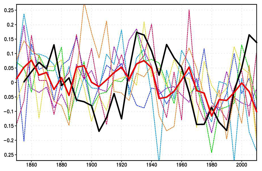
Figure 1. Laplacian eigenvectors 1,2,3,4,5,6 over the North Atlantic between the equator and 60◦N, where dark red and dark blue indicate extreme positive and negative values, respectively
The first six Laplacian eigenvectors are shown in fig. 1 (these were computed by the method of DelSole and Tippett, 2015). The first eigenvector is spatially uniform. Projecting data onto the first Laplacian eigenvector is equivalent to taking the area-weighted average in the basin. In the case of SST, the time series for the first Laplacian eigenvector is merely an AMV index (AMV stands for “Atlantic Multidecadal Variability”). The second and third eigenvectors are dipoles that measure the large-scale gradient across the basin. Subsequent eigenvectors capture smaller scale patterns. For model data, we use pre-industrial control simulations of SST from phase 5 of the Coupled Model Intercomparison Project (CMIP5 Taylor et al., 2012). Control simulations use forcings that repeat year after year. As a result, interannual variability in control simulations come from internal dynamical mechanisms, not from external forcing.
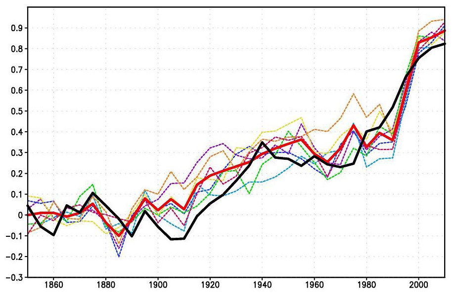
Figure 2. AMV index from ERSSTv5 (thin grey), and polynomial fits to a second-order (thick black) and ninth-order (red) polynomial.
For observational data, we use version 5 of the Extended Reconstructed SST dataset (ERSSTv5 Huang et al., 2017). We consider only the 165-year period 1854-2018. We first focus on time series for the first Laplacian eigenvector, which we call the AMV index. The corresponding least squares fit to second- and ninth-order polynomials in time are shown in fig. 2. The second-order polynomial captures the secular trend toward warmer temperatures but otherwise has weak multidecadal variability. In contrast, the ninth-order polynomial captures both the secular trend and multidecadal variability. There is no consensus as to whether this multidecadal variability is internal or forced.
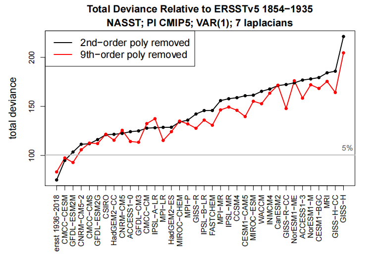
Figure 4. Deviance between ERSSTv5 1854-1935 and 82-year segments from 36 CMIP5 pre-industrial control simulations. Also shown is the deviance between ERSSTv5 1854-1935 and ERSSTv5 1937-2018 (first item on x-axis). The black and red curves show, respectively, results after removing a second- and ninth-order polynomial in time over 1854-2018 before evaluating the deviance. The models have been ordered on the x-axis from smallest to largest deviance after removing a second-order polynomial in time.
Conclusion:
The test was illustrated by using it to compare annual mean North Atlantic SST variability in models and observations. When compared to observations, almost every CMIP5 model differs significantly from ERSST. This conclusion holds regardless of whether a second- or ninth-order polynomial in time is regressed out. Thus, our conclusion does not depend on whether multidecadal NASST variability is assumed to be forced or internal. By applying a hierarchical clustering technique, we showed that time series from the same model, or from models from the same institution, tend to be clustered together, and in many cases differ significantly from other clusters. Our results are consistent with previous claims (Pennell and Reichler, 2011; Knutti et al., 2013) that the effective number of independent models is smaller than the actual number of models in a multi-model ensemble.
The Elephant in the Room
Now let’s consider the interpretation reached by model builders after failing to match observations of Atlantic Multidecadal Variability. As an example consider INMCM4, whose results deviated greatly from the ERSST5 dataset. In 2018, Evgeny Volodin and Andrey Gritsun published Simulation of observed climate changes in 1850–2014 with climate model INM-CM5. Included in those simulations is a report of their attempts to replicate North Atlantic SSTs. Excerpts in italics with my bolds.
Figure 4 The 5-year mean AMO index (K) for ERSSTv4 data (thick solid black); model mean (thick solid red). Dashed thin lines represent data from individual model runs. Colors correspond to individual runs as in Fig. 1.
Keeping in mind the argument that the GMST slowdown in the beginning of the 21st century could be due to the internal variability of the climate system, let us look at the behavior of the AMO and PDO climate indices. Here we calculated the AMO index in the usual way, as the SST anomaly in the Atlantic at latitudinal band 0–60∘ N minus the anomaly of the GMST. The model and observed 5-year mean AMO index time series are presented in Fig. 4. The well-known oscillation with a period of 60–70 years can be clearly seen in the observations. Among the model runs, only one (dashed purple line) shows oscillation with a period of about 70 years, but without significant maximum near year 2000. In other model runs there is no distinct oscillation with a period of 60–70 years but a period of 20–40 years prevails. As a result none of the seven model trajectories reproduces the behavior of the observed AMO index after year 1950 (including its warm phase at the turn of the 20th and 21st centuries).
One can conclude that anthropogenic forcing is unable to produce any significant impact on the AMO dynamics as its index averaged over seven realization stays around zero within one sigma interval (0.08). Consequently, the AMO dynamics are controlled by the internal variability of the climate system and cannot be predicted in historic experiments. On the other hand, the model can correctly predict GMST changes in 1980–2014 having the wrong phase of the AMO (blue, yellow, orange lines in Figs. 1 and 4).
Figure 1 The 5-year mean GMST (K) anomaly with respect to 1850–1899 for HadCRUTv4 (thick solid black); model mean (thick solid red). Dashed thin lines represent data from individual model runs: 1 – purple, 2 – dark blue, 3 – blue, 4 – green, 5 – yellow, 6 – orange, 7 – magenta. In this and the next figures numbers on the time axis indicate the first year of the 5-year mean.
The Bottom Line
Since the models incorporate AGW in the form of CO2 sensitivity, they are unable to replicate Atlantic Multidecadal Variability. Thus, the logical conclusion is that variability of North Atlantic SSTs is an internal, natural climate factor.
The hydrological cycle. Estimates of the observed main water reservoirs (black numbers in 10^3 km3 ) and the flow of moisture through the system (red numbers, in 10^3 km3 yr À1 ). Adjusted from Trenberth et al. [2007a] for the period 2002-2008 as in Trenberth et al. [2011].
Global warming issues have caused intensive research work in related areas, from land use, to urban environment to data science use in order to understand its effects better [25], [26], [27]. In this paper we focus on water related effects on global warming. Although water is recognised as the main cause of the greenhouse effect warming the Earth 33 oC above its black body temperature, water vapour is usually given a secondary role in global models, as a positive feedback from warming by all other causes. Despite its dominant effect in generating the weather, changes related to water are not seen as having a primary role in climate change, the focus being primarily on CO2. With positive feedback from primary warming, the effect of increasing CO2 is trebled [15] by water vapour increase. This conclusion is based on the perception that there are no significant trends in the hydrological cycle that could cause climate forcing. But this overlooks the effect of more than 3500 km3 of extra surface and ground water used annually in irrigation [17] to grow food for the human population. This quantity of extra water increases steadily year by year, well correlated with increasing atmospheric CO2, growing about 60% of world food requirements. Even so, the amount used in irrigation probably only adds about 3% to the annual hydrological cycle [9] of 113,000 km3. Is this sufficient to exert a significant extra greenhouse effect? Here we advance the hypothesis that it does and should be included in climate models.
A critical assumption of the IPCC consensus of global warming is that an increasing concentration of CO2 causes more retention of radiant heat near the top of the atmosphere, largely as a result of reduced emission of its spectral wavelengths centred on 15 microns. The radiative-convective model assumes that the lowered emissions at reduced pressure, number density and higher, colder altitudes from this GHG now provides an independent and sustained forcing exceeding 1-2 W per m2. It is assumed that once this reduction in OLR in the air column from increasing CO2 has occurred it must be compensated by increased OLR at different wavelengths elsewhere, maintaining balance with incoming radiation.
This critical assumption still lacks empirical confirmation.
Water Drives Atmospheric Warming
The importance of water in helping to keep the Earth’s atmosphere warm in the short term is beyond dispute. Table 1 summarises previously estimated rates for thermal energy flows into and out of the atmosphere [23]. As shown in the table, more than 80% of the power by which the temperature of air is maintained above the Earth’s black body temperature of -18 C is facilitated by water. Most significant of these air warming inputs from water is the greenhouse effect by which water vapour absorbs longwave radiation emitted from the surface, retaining more energy in air. However, warming from absorption of specific quanta by water vapour of incoming short wave solar radiation (ISR) and the latent heat of condensation of water vapour, exceeding the cooling effect of vertical convection, also contribute to warming of air.
Thus, the greenhouse gas (GHG) content of the atmosphere effectively provides resistance to heat flow to space increasing the transient storage of solar energy, with a warming effect analogous to resistances in an electrical circuit. By comparison to water, other polyatomic greenhouse gases like CO2 play a minor role in this process, totalling less than 20% of warming. Furthermore, the fact that the minor GHGs are relatively well-mixed by the turbulence in the troposphere, unlike water, means that we cannot expect to observe spatial variations in their effects. Furthermore, the heat capacity of non-greenhouse gases provides some 99% of the thermal inertia of the troposphere, although only greenhouse gases capable of longwave radiation by vibrational and rotational quanta can contribute to cooling by radiation through the top of the atmosphere as OLR. Figure 1 contrasts schematically the typical variation of outgoing longwave radiation (OLR) over marine and terrestrial environments.
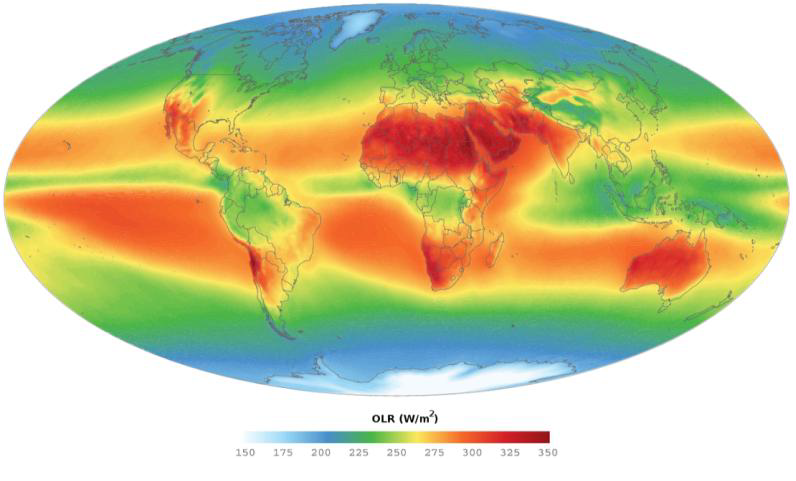
On well-watered land such as southern China much less direct emission of OLR to space occurs, in contrast to Quetta, Pakistan, on the same latitude with similar incoming shortwave radiation (ISR). In contrast to humid atmospheres on land and tropical seas, relatively arid regions such as the Sahara, the Middle East and Australia provide heat vents effectively cooling the Earth, solely as a result of the radiant emissions from GHGs as OLR. The varying global emissions of OLR estimated for typical marine and terrestrial regions shown in Figure 2 mirror this scheme.
Clearly, water vapour is the most critical factor in the mechanism by which the air column of the lower troposphere is charged with heat energy. It is of interest from this figure and in Table 1 that the exact sum of the effects of all greenhouse gases in directly warming air, including conduction from the surface, charges the lower atmosphere with sufficient heat to generate the downwelling radiation from greenhouse gases directed towards the surface [12]. Water is the main source of this back radiation [18], well understood to be responsible for keeping the surface air warmer in humid atmospheres, thus raising the minimum temperature.
None of the variation in OLR in Figure 1 can be attributed to the well-mixed GHGs such as CO2.
Furthermore, unlike the greenhouse effect of CO2, which is regarded as increasing only in in a logarithmic manner as its concentration rises, the greenhouse effect of water on retaining heat in the atmosphere should vary more linearly, even in the case of absorption of surface radiation, as its vapour spreads into dryer atmospheres; this potential is illustrated in Fig.1 in the descending zones of Hadley cells at sub-tropical latitudes.
Fig. 1 Global values of mean OLR from 2003-2011 (downloaded August 2, 2017, AIRS OLR 2003-2011 average htpp://mirador.gsfc.nasa.gov/ estimated by Giorgio, G.P., June 24, 2014). The russet areas show regions of greater OLR, with outgoing radiation above the average of ca. 240 W per m2, thus tending to cool the Earth. Note how the upper troposphere above arid continental regions provides a vent for the greatest rate of cooling.
Thermal Effects from Water are Direct and Linear
An approximately linear response in increasing air temperature to changes in atmospheric water content is reasonable. Unlike the well-mixed CO2, there are marked spatial and temporal variations in atmospheric water content, with much of the Earth’s surface in significant deficit, particularly in the sub-tropical zone subject to Hadley cell recycling, emphasised over semi-arid land. To the extent that additional water vapour spills over into these dryer regions on land the greater the area of the Earth that is subject to the greenhouse effect. This response can be contrasted to the effect of increasing CO2, which has a logarithmic relationship between climate forcing and concentration in the atmosphere [14], [15], each doubling causing a similar increase in temperature. Because there is no obvious regional effect of CO2 on the weather or regional climate, the effect of any increases in its concentration can only be theoretically inferred. If additional heat is retained in the atmosphere by increasing greenhouse effects from CO2 or water, the air temperature near the surface is expected to increase to keep global values of ISR and OLR in balance. A critical assumption of the IPCC consensus for climate change is that increasing CO2 causes more retention of heat in air near the top of the troposphere, largely as reduced emission from the edges of its spectral peak centred on 15 microns. This edge effect is predicted to be visible from space as a cooling of its spectrum, providing a negative forcing of 1-2 W per m2. It is assumed that this forcing must be compensated by increased OLR at different wavelengths as a result of the increased temperature.
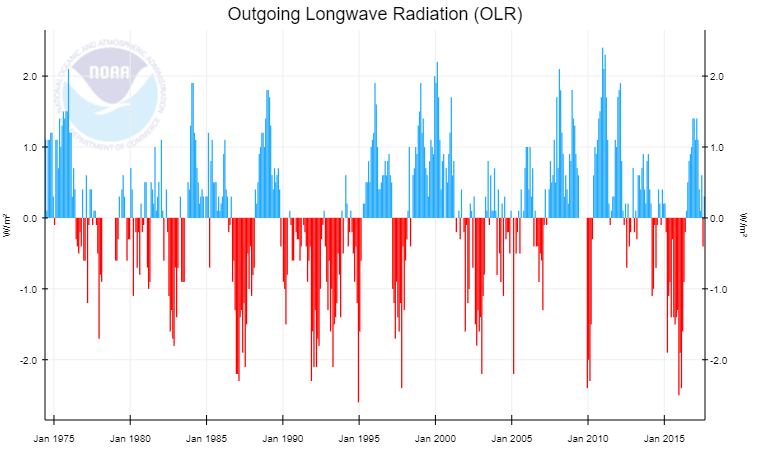
Fig. 3 Satellite measurements of global-zonal OLR (http://www.cpc.ncep.noaa.gov/data/indices/olr NOAA website, downloaded August 20, 2017). The 1998-2000 El Nino peaked at about 1.03 C above the minimum temperature in the preceding La Nina, with zonal OLR varying approximately 4 W/m2; see also (8)
This is regarded as a result of convective elevation of the maritime atmosphere, reducing the outgoing longwave radiation (OLR) about 100 W/m2 locally and 4 W/m2 globally from an increase in global water vapour of about 4%. This suggests a linear response from greenhouse warming to increased water vapour content of the atmosphere. Note that the extra heat in the atmosphere during an El Nino is controlled by all these sources of warming, as shown in Figure 2. Whatever the source of extra heat in the ocean, by moving extra water into the atmosphere as vapour it warms the atmosphere by the resultant greenhouse effect, reducing OLR, as well as direct warming by sunlight in the air column. In Table 4, another estimate of the possible effect of irrigation on global warming by comparison with the El Nino-La Nina cycle [22] is made. Consistent with the irrigation water hypothesis the El Nino has been long known to significantly reduce the OLR over the Pacific Ocean up to 25% [3], recognised as a result of elevation of emission of the OLR from water being elevated and therefore a colder altitude. Assuming 60% of irrigation water becomes vapour in the troposphere and a longer rain-out time of 15 days in dry regions compared to less than a week over the oceans with a global average of 8.5 days [19], a steady state of about 100 km3 of extra water vapour results from irrigation.
This estimate also suggests an increase in temperature near 0.2C from 0.84 W/m2 of forcing based on the data given in Figure 3. This is consistent with the total effect of water vapour on global warming exceeding 25 C.
It should be noted that this dynamic effect of water on warming air includes heat pumping by evapotranspiration as well as significant warming by direct absorption of short wave solar radiation (see Fig. 2), also contributing to a more linear effect by water on warming. Since this increase estimates a primary forcing effect of new water, a positive feedback is also anticipated from increased evaporation of the ocean, suggesting that the total increase from irrigation could be of the order of 0.5 oC in the 20th century.
These global results may have more accuracy than the results obtained from the numerous grid points in global circulation models, given the additivity of errors.
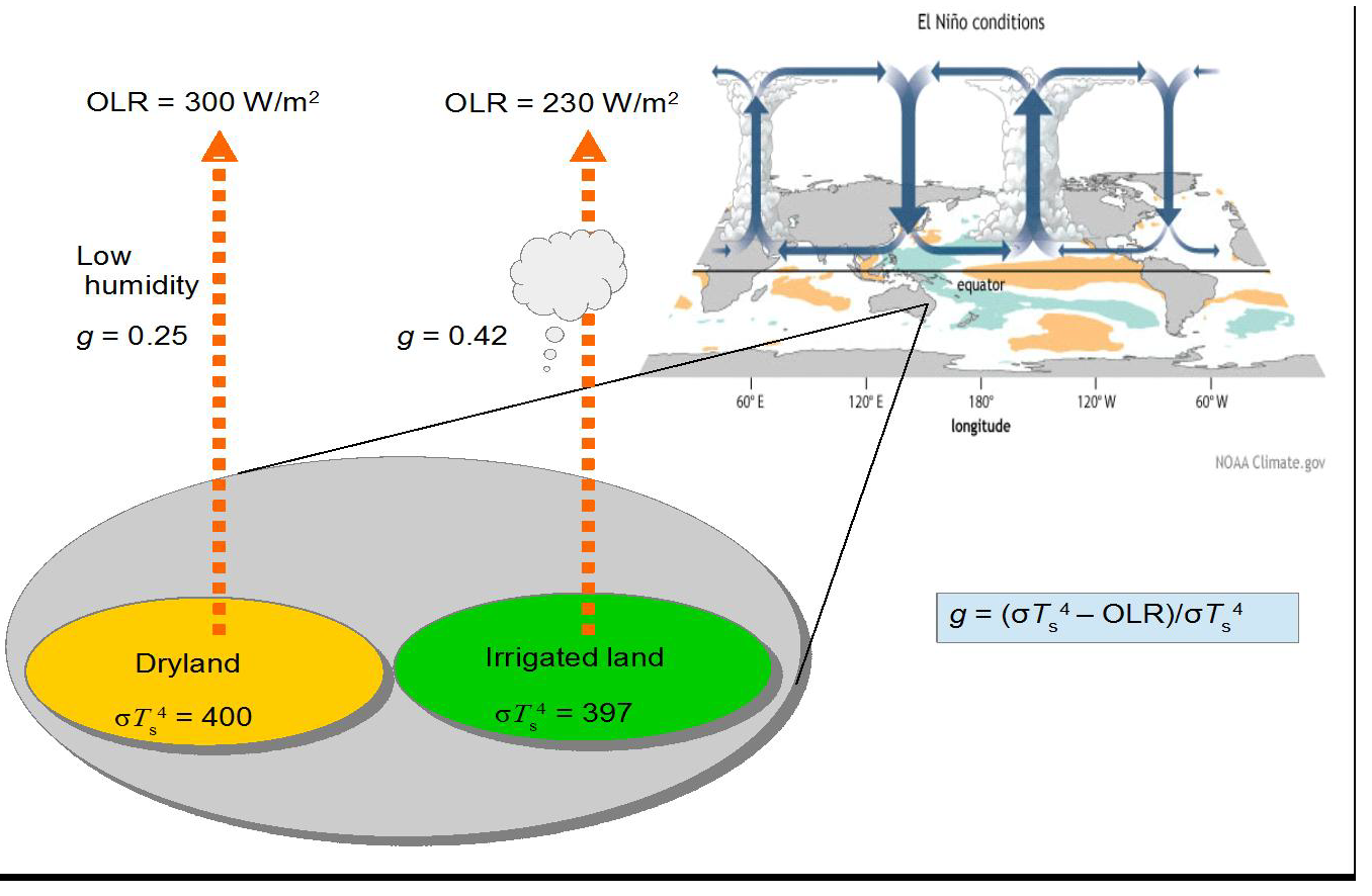
Empirical Proof Comparing Dry and Irrigated Land
In Figure 4, using the same modelling as in Figure 2, the predicted steady state greenhouse effect of adding irrigation water in a comparison between dryland and irrigated land. In fact the effect of water on heat transfer to the atmospheric column is not only a result of the greenhouse effect given in the equation in the figure but also from direct absorption by water of short wave ISR and evapotranspiration, similar in total magnitude. These latter effects will be a linear function of the water vapour involved. The evaporative effect cools the surface but must transfer a similar amount of heat to the atmosphere as infrared radiation (ca. 6 microns) associated with condensation of water vapour into droplets under convective cooling as in [21]. Paradoxically, the modelling paper in [6] failed to account for any of these effects, specifically dismissing significant transfer of water vapour into the atmosphere from growth of irrigated crop growth as noted above. This provides a clue to the possible flaw in their models. Except for environments already very humid where evapotranspiration is limited, this cannot be true.
Fig. 4 Comparison of dryland and irrigated land for effect of water on heat retention in the atmosphere as an enhanced greenhouse effect. The El Nino condition of enhanced evaporation from the ocean known to strongly reduce OLR In [3] is shown as an analogue.
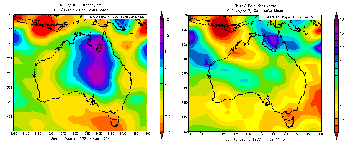
NCEP/ NCAR Reanalyses Coincident with the Periodic Flooding of Lake Eyre
Fig. 5 Variation in OLR from flooding of lake Eyre using NCEP-NCAR reanalysis datasets. a.Difference in OLR values between 1978 and 1974, dry and wet years. b. Difference in OLR values between 1978 and 1973, two dry years.
Rarely, during the La Nina phase of the climate cycle, the dry interior of northern Australia overlying the Great Artesian Basin may flood. Lacking riverine exits to the ocean, the massive runoff caused flows southwards, mainly accumulating in the depression below sea level in central South Australia known as Lake Eyre. In late January and February in the early months of 1974 Lake Eyre filled to a depth of six metres, its surface only returning to its hot, dry state three years later in 1977-78. This was the greatest flood ever recorded. The hypothesis in [4] suggests that this flooding should also lead to persistent elevated water vapour content of the atmosphere, predominantly downwind from the Lake Eyre basin. Using the NCEP-NCAR reanalysis datasets, which are informed by Nimbus and other satellite observations since 1970, the OLR emissions to space and the variation in humidity from this region comparing 12 months of 1974 with the same period in 1978 by subtraction of one year from the other. A significant elevation of OLR when the lake was dry by more than 10 W/m2 was observed for the 12-month period (Figure 5). This result is accompanied by increases in specific humidity consistent with an elevated greenhouse effect such as would be experienced in semi-arid areas when irrigated. The area affected downwind also showing elevated humidity is estimated as 35 times the flooded area, showing that the magnitude of this regional greenhouse effect was indeed significant.
Conclusion: Thankfully, A Wet World is a Warm World
The neglect of the possible effect of irrigation as a significant source of anthropogenic climate change may have been a result of reluctance to consider the relatively small amount of irrigation in the hydrological cycle. Because water has been considered as providing positive feedback to warming primarily from CO2 its possible forcing effect has been overlooked. But as shown here by several different means, the more potent effect of applying water previously in the ocean or deep in the ground to dry surfaces with air in strong water deficit can be sufficient to affect global temperature. Clearly, the water vapour content of the troposphere is the major cause of the natural greenhouse effect, contributing up to two-thirds of the 33 oC warming.
Spatial and temporal variations in soil moisture and relative humidity of the atmosphere are the main factors controlling the regional outgoing longwave radiation (OLR), in contrast to the more even effects from well-mixed greenhouse gases such as CO2.
This is well illustrated in the 4-6 year El Nino cycles, resulting in a global mean temperature variation approaching 1 oC compared with La Nina years. Longer term, the proposed Milankovitch glaciations of paleoclimates result in declines of atmospheric temperature around 10 oC, consistent with the major reduction in tropospheric water vapour approaching 50%. Weather conditions and climate as illustrated in the greenhouse effect are clearly demonstrated in the distribution of water, particularly on land. The apparently linear relationship between the water content of the atmosphere is direct verification of the greenhouse warming effect of this greenhouse gas. By contrast, other than by correlation, there is no such direct verification possible for the greenhouse effect of CO2. We rely on the forcing equation of 5.3ln[(CO2)t /(CO2)o] to estimate the climate sensitivity with respect to varying concentration (ppmv) of this greenhouse gas. Early hopes that a clear spectral signal was available showing significantly reduced OLR from increasing CO2, proving the hypothesis of climate forcing by permanent GHGs, have not been realised [5]. A focus using new satellites on the longer wavelength OLR associated with rotations of water might help resolve this question. Up till now, OLR is estimated for this region based on shorter wavelengths. The natural experiment provided by the flooding of Lake Eyre of the greenhouse effect by significantly reducing the OLR provides confirmation that irrigation water typically applied to dry land will have a measurable greenhouse effect.
One year time lapse of precipitable water (amount of water in the atmosphere) from Jan 1, 2016 to Dec 31, 2016, as modeled by the GFS. The Pacific ocean rotates into view just as the tropical cyclone season picks up steam.
 Bill Ponton reminds us that in addition to being fickle, renewables are also costly, in his American Thinker article What are the merits of renewables? Excerpts in italics with my bolds and added images.

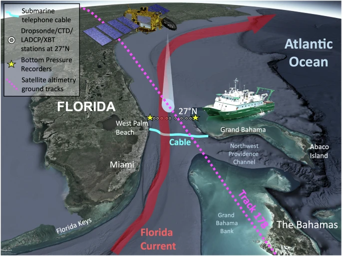
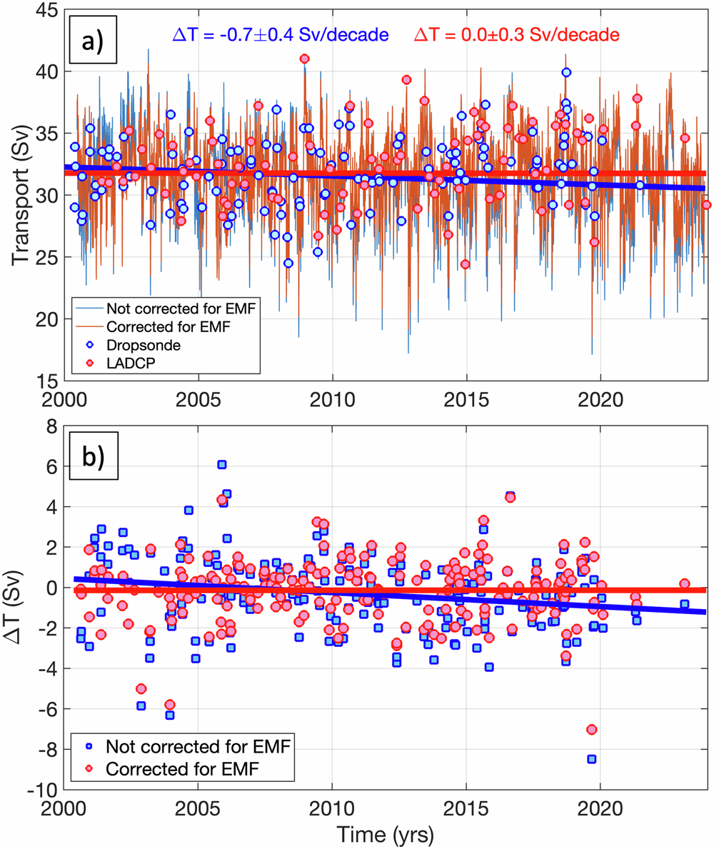
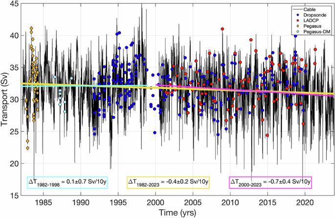


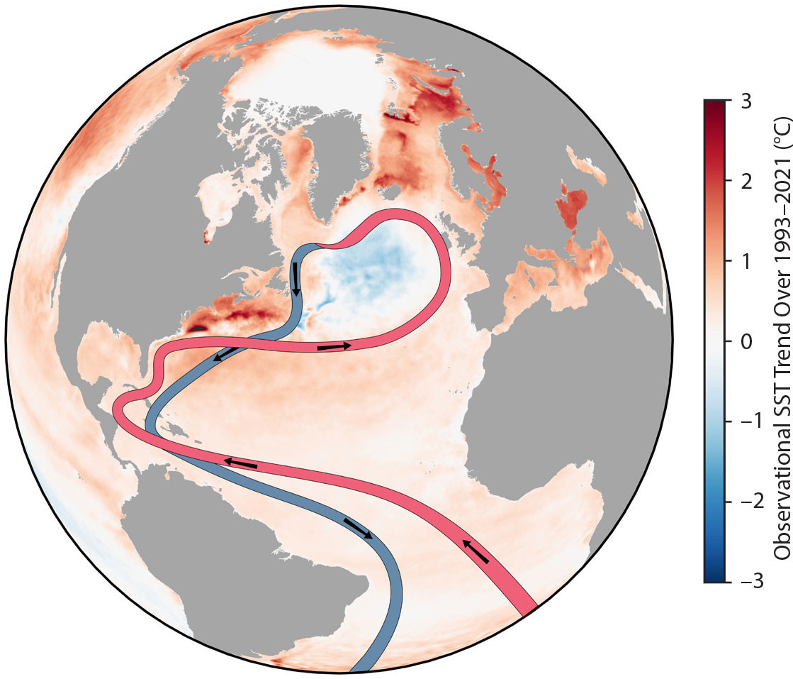

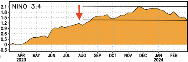


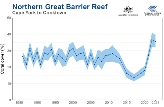
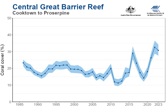
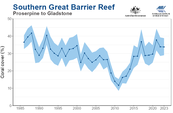


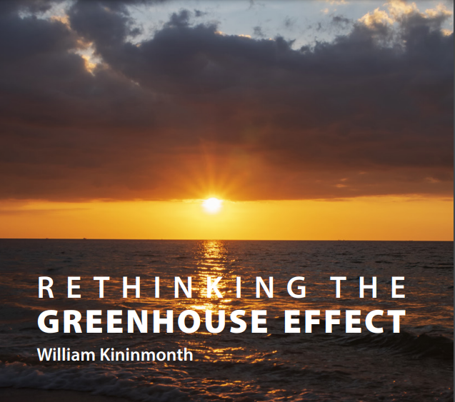


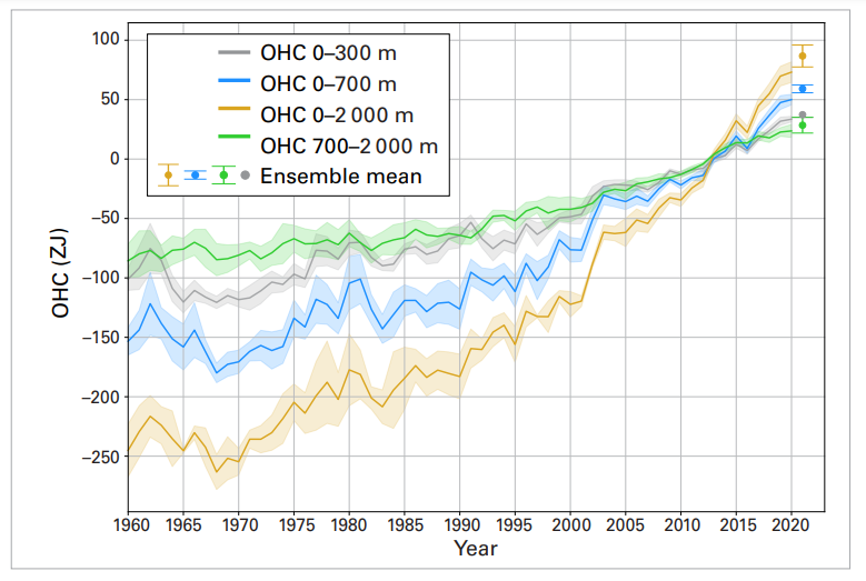

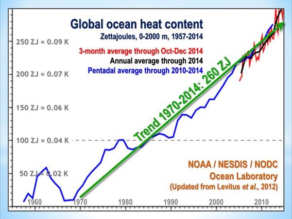


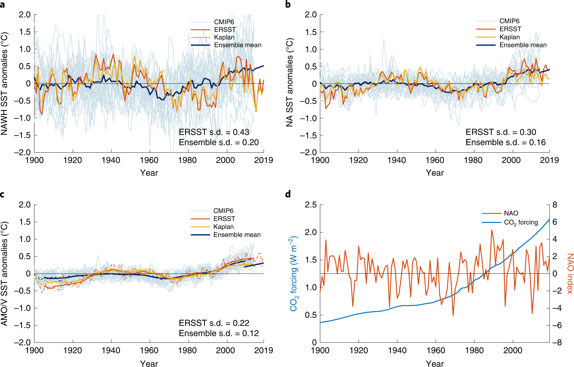
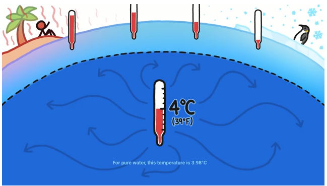


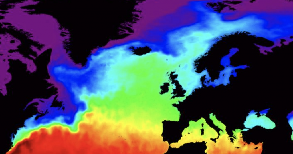
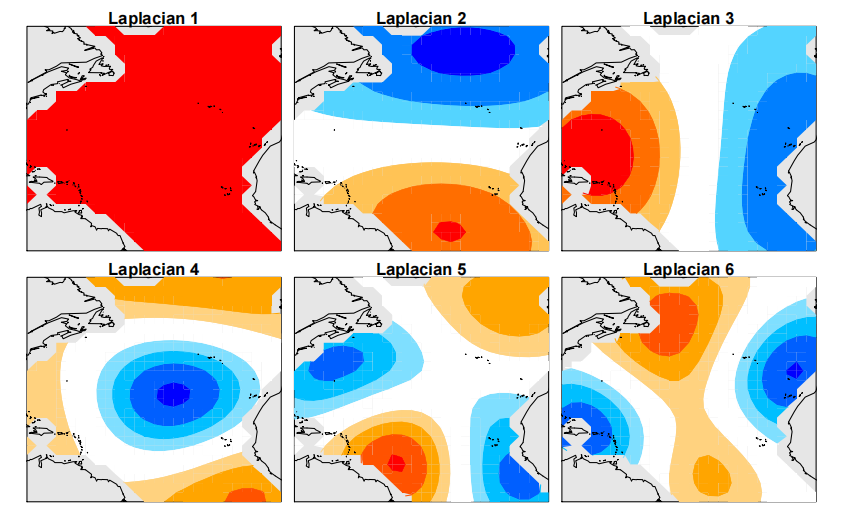
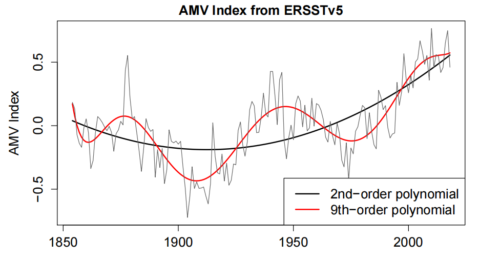 Figure 2. AMV index from ERSSTv5 (thin grey), and polynomial fits to a second-order (thick black) and ninth-order (red) polynomial.