June Mixes up Both Land and Sea Temps

banner-blog

With apologies to Paul Revere, this post is on the lookout for cooler weather with an eye on both the Land and the Sea.  UAH has updated their tlt (temperatures in lower troposphere) dataset for June.   Previously I have done posts on their reading of ocean air temps as a prelude to updated records from HADSST3. This month also has a separate graph of land air temps because the comparisons and contrasts are interesting as we contemplate possible cooling in coming months and years.

Presently sea surface temperatures (SST) are the best available indicator of heat content gained or lost from earth’s climate system.  Enthalpy is the thermodynamic term for total heat content in a system, and humidity differences in air parcels affect enthalpy.  Measuring water temperature directly avoids distorted impressions from air measurements.  In addition, ocean covers 71% of the planet surface and thus dominates surface temperature estimates.  Eventually we will likely have reliable means of recording water temperatures at depth.

Recently, Dr. Ole Humlum reported from his research that air temperatures lag 2-3 months behind changes in SST.  He also observed that changes in CO2 atmospheric concentrations lag behind SST by 11-12 months.  This latter point is addressed in a previous post Who to Blame for Rising CO2?

After a technical enhancement to HadSST3 delayed March and April updates, May was posted early in June, hopefully a signal the future months will also appear more promptly.  For comparison we can look at lower troposphere temperatures (TLT) from UAHv6 which are now posted for June. The temperature record is derived from microwave sounding units (MSU) on board satellites like the one pictured above. Recently there was a change in UAH processing of satellite drift corrections, including dropping one platform which can no longer be corrected. The graphs below are taken from the new and current dataset.

The UAH dataset includes temperature results for air above the oceans, and thus should be most comparable to the SSTs. There is the additional feature that ocean air temps avoid Urban Heat Islands (UHI).  The graph below shows monthly anomalies for ocean temps since January 2015.

June ocean air temps rose in all regions after May’s drop, resulting in the Global average back up matching June 2017.  NH warming in June was slight while warming in SH and the Tropics was stronger.  The temps this June are warmer than 2018, similar to 06/2017, and of course lower than 2016.

Land Air Temperatures Tracking Downward in Seesaw Pattern

We sometimes overlook that in climate temperature records, while the oceans are measured directly with SSTs, land temps are measured only indirectly.  The land temperature records at surface stations record air temps at 2 meters above ground.  UAH gives tlt anomalies for air over land separately from ocean air temps.  The graph updated for June is below.

The greater volatility of the Land temperatures was evident earlier, calmed down recently, and now diverging again.  SH declined slightly, NH recovered a bit from recent drops, and the Tropics land jumped up.  The result is an upward bump, since NH dominates, having twice as much land area as SH.  Note how global peaks mirror NH peaks.  The present situation is close to 06/2017 except for SH being somewhat warmer now.

The longer term picture from UAH is a return to the mean for the period starting with 1995:

TLTs include mixing above the oceans and probably some influence from nearby more volatile land temps.  Clearly NH and Global land temps have been dropping in a seesaw pattern, now more than 1C lower than the peak in 2016.  TLT measures started the recent cooling later than SSTs from HadSST3, but are now showing the same pattern.  It seems obvious that despite the three El Ninos, their warming has not persisted, and without them it would probably have cooled since 1995.  Of course, the future has not yet been written.

The LIA Warming Rebound Is Over

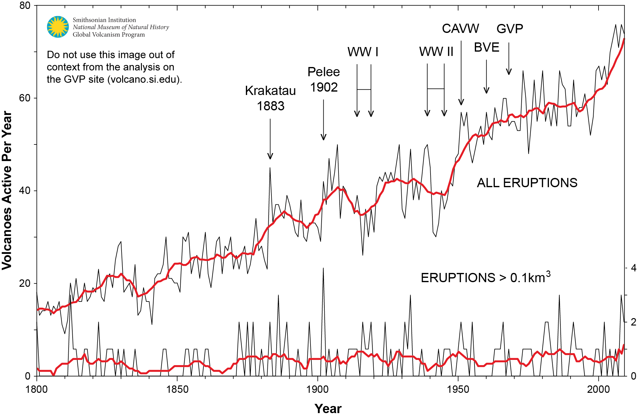
Figure 1. Graph showing the number of volcanoes reported to have been active each year since 1800 CE. Total number of volcanoes with reported eruptions per year (thin upper black line) and 10-year running mean of same data (thick upper red line). Lower lines show only the annual number of volcanoes producing large eruptions (>= 0.1 km3 of tephra or magma) and scale is enlarged on the right axis; thick red lower line again shows 10-year running mean. Global Volcanism Project Discussion

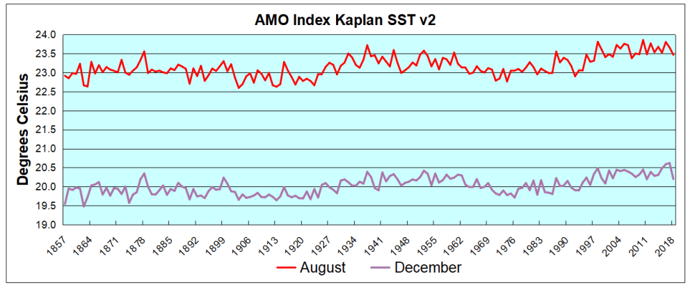
Thanks to Dr. Francis Manns for drawing my attention to the role of Volcanoes as a climate factor, particularly related to the onset of the Little Ice Age (LIA), 1400 to 1900 AD. I was aware that the temperature record since about 1850 can be explained by a steady rise of 0.5C per century rebound overlaid with a quasi-60 year cycle, most likely oceanic driven. See below Dr. Syun Akasofu 2009 diagram from his paper Two Natural Components of Recent Warming.
When I presented this diagram to my warmist friends, they would respond, “But you don’t know what caused the LIA or what ended it!” To which I would say, “True, but we know it wasn’t due to burning fossil fuels.” Now I find there is a body of evidence suggesting what caused the LIA and why the temperature rebound may be over. Part of it is a familiar observation that the LIA coincided with a period when the sun was lacking sunspots, the Maunder Minimum.

Not to be overlooked is the climatic role of volcano activity inducing deep cooling patterns such as the LIA.  Jihong Cole-Dai explains in a paper published 2010 entitled Volcanoes and climate. Excerpt in italics with my bolds.

There has been strong interest in the role of volcanism during the climatic episodes of Medieval Warm Period (MWP,800–1200 AD) and Little Ice Age (LIA, 1400–1900AD), when direct human influence on the climate was negligible. Several studies attempted to determine the influence of solar forcing and volcanic forcing and came to different conclusions: Crowley and colleagues suggested that increased frequency of stratospheric eruptions in the seventeenth century and again in the early nineteenth century was responsible in large part for LIA. Shindell et al. concluded that LIA is the result of reduced solar irradiance, as seen in the Maunder Minimum of sunspots, during the time period. Ice core records show that the number of large volcanic eruptions between 800 and 1100 AD is possibly small (Figure 1), when compared with the eruption frequency during LIA. Several researchers have proposed that more frequent large eruptions during the thirteenth century(Figure 1) contributed to the climatic transition from MWP to LIA, perhaps as a part of the global shift from a warmer to a colder climate regime. This suggests that the volcanic impact may be particularly significant during periods of climatic transitions.

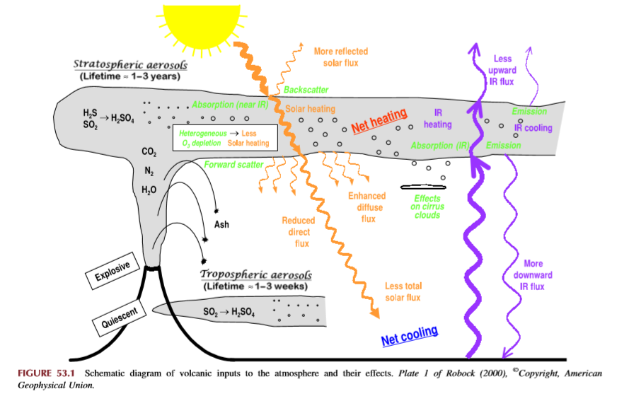
How volcanoes impact on the atmosphere and climate

Alan Robock explains Climatic Impacts of Volcanic Eruptions in Chapter 53 of the Encyclopedia of Volcanoes.  Excerpts in italics with my bolds.

The major component of volcanic eruptions is the matter that emerges as solid, lithic material or solidifies into large particles, which are referred to as ash or tephra. These particles fall out of the atmosphere very rapidly, on timescales of minutes to a few days, and thus have no climatic impacts but are of great interest to volcanologists, as seen in the rest of this encyclopedia. When an eruption column still laden with these hot particles descends down the slopes of a volcano, this pyroclastic flow can be deadly to those unlucky enough to be at the base of the volcano. The destruction of Pompeii and Herculaneum after the AD 79 Vesuvius eruption is the most famous example.

Volcanic eruptions typically also emit gases, with H2O, N2, and CO2 being the most abundant. Over the lifetime of the Earth, these gases have been the main source of the Earth’s atmosphere and ocean after the primitive atmosphere of hydrogen and helium was lost to space. The water has condensed into the oceans, the CO2 has been changed by plants into O2 or formed carbonates, which sink to the ocean bottom, and some of the C has turned into fossil fuels. Of course, we eat plants and animals, which eat the plants, we drink the water, and we breathe the oxygen, so each of us is made of volcanic emissions. The atmosphere is now mainly composed of N2 (78%) and O2 (21%), both of which had sources in volcanic emissions.

Of these abundant gases, both H2O and CO2 are important greenhouse gases, but their atmospheric concentrations are so large (even for CO2 at only 400 ppm in 2013) that individual eruptions have a negligible effect on their concentrations and do not directly impact the greenhouse effect. Global annually averaged emissions of CO2 from volcanic eruptions since 1750 have been at least 100 times smaller than those from human activities. Rather the most important climatic effect of explosive volcanic eruptions is through their emission of sulfur species to the stratosphere, mainly in the form of SO2, but possibly sometimes as H2S. These sulfur species react with H2O to form H2SO4 on a timescale of weeks, and the resulting sulfate aerosols produce the dominant radiative effect from volcanic eruptions.

The major effect of a volcanic eruption on the climate system is the effect of the stratospheric cloud on solar radiation (Figure 53.1). Some of the radiation is scattered back to space, increasing the planetary albedo and cooling the Earth’s atmosphere system. The sulfate aerosol particles (typical effective radius of 0.5 mm, about the same size as the wavelength of visible light) also forward scatter much of the solar radiation, reducing the direct solar beam but increasing the brightness of the sky. After the 1991 Pinatubo eruption, the sky around the sun appeared more white than blue because of this. After the El Chicho´n eruption of 1982 and the Pinatubo eruption of 1991, the direct radiation was significantly reduced, but the diffuse radiation was enhanced by almost as much. Nevertheless, the volcanic aerosol clouds reduced the total radiation received at the surface.

Crowley et al 2008 go into the details in their paper Volcanism and the Little Ice Age. Excerpts in italics with my bolds.

Although solar variability has often been considered the primary agent for LIA cooling, the most comprehensive test of this explanation (Hegerl et al., 2003) points instead to volcanism being substantially more important, explaining as much as 40% of the decadal-scale variance during the LIA. Yet, one problem that has continually plagued climate researchers is that the paleo-volcanic record, reconstructed from Antarctic and Greenland ice cores, cannot be well calibrated against the instrumental record. This is because the primary instrumental volcano reconstruction used by the climate community is that of Sato et al. (1993), which is relatively poorly constrained by observations prior to 1960 (especially in the southern hemisphere).

Here, we report on a new study that has successfully calibrated the Antarctic sulfate record of volcanism from the 1991 eruptions of Pinatubo (Philippines) and Hudson (Chile) against satellite aerosol optical depth (AOD) data (AOD is a measure of stratospheric transparency to incoming solar radiation). A total of 22 cores yield an area-weighted sulfate accumulation rate of 10.5 kg/km2 , which translates into a conversion rate for AOD of 0.011 AOD/ kg/km2 sulfate. We validated our time series by comparing a canonical growth and decay curve for eruptions for Krakatau (1883), the 1902 Caribbean eruptions (primarily Santa Maria), and the 1912 eruption of Novarupta/Katmai (Alaska)

We therefore applied the methodology to part of the LIA record that had some of the largest temperature changes over the last millennium.

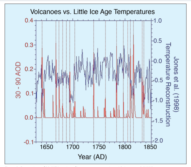
Figure 2: Comparison of 30-90°N version of ice core reconstruction with Jones et al. (1998) temperature reconstruction over the interval 1630-1850. Vertical dashed lines denote levels of coincidence between eruptions and reconstructed cooling. AOD = Aerosol Optical Depth.

The ice core chronology of volcanoes is completely independent of the (primarily) tree ring based temperature reconstruction. The volcano reconstruction is deemed accurate to within 0 ± 1 years over this interval. There is a striking agreement between 16 eruptions and cooling events over the interval 1630-1850. Of particular note is the very large cooling in 1641-1642, due to the concatenation of sulfate plumes from two eruptions (one in Japan and one in the Philippines), and a string of eruptions starting in 1667 and culminating in a large tropical eruption in 1694 (tentatively attributed to Long Island, off New Guinea). This large tropical eruption (inferred from ice core sulfate peaks in both hemispheres) occurred almost exactly at the beginning of the coldest phase of the LIA in Europe and represents a strong argument against the implicit link of Late Maunder Minimum (1640-1710) cooling to solar irradiance changes.

Figure 1: Comparison of new ice core reconstruction with various instrumental-based reconstructions of stratospheric aerosol forcing. The asterisks refer to some modification to the instrumental data; for Sato et al. (1993) and the Lunar AOD, the asterisk refers to the background AOD being removed for the last 40 years. For Stothers (1996), it refers to the fact that instrumental observations for Krakatau (1883) and the 1902 Caribbean eruptions were only for the northern hemisphere. To obtain a global AOD for these estimates we used Stothers (1996) data for the northern hemisphere and our data for the southern hemisphere. The reconstruction for Agung eruption (1963) employed Stothers (1996) results from 90°N-30°S and the Antarctic ice core data for 30-90°S.

During the 18th century lull in eruptions, temperatures recovered somewhat but then cooled early in the 19th century. The sequence begins with a newly postulated unknown tropical eruption in midlate 1804, which deposited sulfate in both Greenland and Antarctica. Then, there are four well-documented eruptions—an unknown tropical eruption in 1809, Tambora (1815) and a second doublet tentatively attributed in part to Babuyan (Philippines) in 1831 and Cosiguina (Nicaragua) in 1835. These closely spaced eruptions are not only large but have a temporally extended effect on climate, due to the fact that they reoccur within the 10-year recovery timescale of the ocean mixed layer.

The ocean has not recovered from the first eruption so the second eruption drives the temperatures to an even lower state.

Implications for Contemporary Climate Science

In this context Dr. Francis Manns went looking for a volcanic signature in recent temperature records. His paper is Volcano and Enso Punctuation of North American Temperature: Regression Toward the Mean  Excerpts in italics with my bolds.

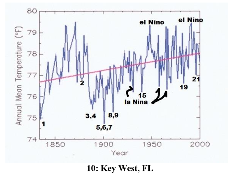
Abstract: Contrary to popular media and urban mythology the global warming we have experienced since the Little Ice Age is likely finished. A review of 10 temperature time series from US cities ranging from the hottest in Death Valley, CA, to possible the most isolated and remote at Key West, FL, show rebound from the Little Ice Age (which ended in the Alps by 1840) by 1870. The United States reached temperatures like modern temperatures (1950 – 2000) by about 1870, then declined precipitously principally caused by Krakatoa, and a series of other violent eruptions. Nine of these time series started when instrumental measurement was in its infancy and the world was cooled by volcanic dust and sulphate spewed into the atmosphere and distributed by the jet streams. These ten cities represent a sample of the millions of temperature measurements used in climate models. The average annual temperatures are useful because they account for seasonal fluctuations. In addition, time series from these cities are punctuated by El Nino Southern Oscillation (ENSO).

As should be expected, temperature at each city reacted differently to differing events. Several cities measured the effects of Krakatoa in 1883 while only Death Valley, CA and Berkeley CA sensed the minor new volcano Paricutin in Michoacán, Mexico. The Key West time series shows rapid rebound from the Little Ice Age as do Albany, NY, Harrisburg, PA, and Chicago. IL long before the petroleum-industrial revolution got into full swing. Recording at most sites started during a volcanic induced temperature minimum thus giving an impression of global warming to which industrial carbon dioxide is persuasively held responsible. Carbon dioxide, however, cannot be proven responsible for these temperatures. These and likely subsequent temperatures could be the result of regression to the normal equilibrium temperatures of the earth (for now). If one were to remove the volcanic punctuation and El Nino Southern Oscillation (ENSO) input many would display very little alarming warming from 1815 to 2000. This review illustrates the weakness of linear regression as a measure of change. If there is a systemic reason for the global warming hypothesis, it is an anthropogenic error in both origin and termination. ENSO compliments and confirms the validity of NOAA temperature data. Temperatures since 2000 during the current hiatus are not available because NOAA has closed the public website.

Example of time series from Manns. Numbers refer to major named volcano eruptions listed in his paper.  For instance, #3 was Krakatoa

The cooling effect is said to have lasted for 5 years after Krakatoa erupted – from 1883 to 1888. Examination of these charts, However, shows that, e.g., Krakatoa did not add to the cooling effect from earlier eruptions of Cosaguina in 1835 and Askja in 1875. The temperature charts all show rapid rebound to equilibrium temperature for the region affected in a year or two at most.

Manns Map

Fourteen major volcanic eruptions, however, were recorded between 1883 and 1918 (Robock, 2000, and this essay). Some erupted for days or weeks and some were cataclysmic and shorter. The sum of all these eruptions from Krakatoa onward effected temperatures early in the instrumental age. Judging from wasting glaciers in the Alps, abrupt retreat began about 1860).

Manns Conclusions:
1)Four of these time series (Albany, Harrisburg, Chicago and Key West) show recovery to the range of today’s temperatures by 1870 before the eruption of Askja in 1875. The temperature rebounded very quickly after the Little Ice Age in the northern hemisphere.

Manns ENSO Map

2)Volcanic eruptions and unrelated huge swings shown from ENSO largely rule global temperature. Volcanic history and the El Nino Southern Oscillation (ENSO) trump all other increments of temperature that may be hidden in the lists.

3)The sum of the eruptions from Krakatoa (1883) to Katla (1918) and Cerro Azul (1932) was a cold start for climate models.

4)It is beyond doubt that academic and bureau climate models use data that was gathered when volcanic activity had depressed global temperature. The cluster from Krakatoa to Katla (1883 -1918) were global.

5)Modern events, Mount Saint Helens and Pinatubo, moreover, were a fraction of the event intensity of the late 19th and early 20th centuries eruptions.

6) The demise of frequent violent volcanos has allowed the planet to regress toward a norm (for now).

Summary

These findings describe a natural process by which a series of volcanoes along with a period of quiet solar cycles ended the Medieval Warm Period (MWP), chilling the land and inducing deep oceanic cooling resulting in the Little Ice Age. With much less violent volcanic activity in the 20th century, coincidental with typically active solar cycles, a Modern Warm Period ensued with temperatures rebounding back to approximately the same as before the LIA.

This suggests that humans and the biosphere were enhanced by a warming process that has ended. The solar cycles are again going quiet and are forecast to continue that way. Presently, volcanic activity has been routine, showing no increase over the last 100 years. No one knows how long will last the current warm period, a benefit to us from the ocean recovering after the LIA. But future periods are as likely to be cooler than to be warmer compared to the present.

Update on Warming Hiatus

Figure 1. Comparison of HadCRUT3 and the latest HadCRUT4.6 Notice how all trends pivot around the 1998 El Nino peak.

Clive Best has a new post exploring the question: Whatever happened to the Global Warming Hiatus ? Excerpts in italics with my bolds and comment at end.

The last IPCC assessment in 2013 showed a clear pause in global warming lasting 16 years from 1998 to 2012 – the notorious hiatus. As a direct consequence of this AR5 estimates of climate sensitivity were reduced and CMIP5 models appeared to clearly overestimate trends. Following the first release of HadCRUT4 in 2014 the ‘headline’ then was that 2005 and 2010 were marginally warmer than 1998. This was the first dent in removing the hiatus. Since then each new version of H4 has showed further incremental warming trends, such that by 2019 the hiatus has now completely vanished. Anyone mentioning it today is likely to be ridiculed by the climate science community. So how did this reversal happen within just 5 years? I decided to find out exactly why the post 1998 temperature record changed so dramatically in such a short period of time.

In what follows I always use the same algorithm as CRU for the station data and then blend that with the Hadley SST data. I have checked that I can reproduce exactly the latest HadCRUT4.6 results based on the current 7820 stations from CRU merged with HadSST3. Back in 2012 I downloaded the original station data from CRU – CRUTEM3. I have also downloaded the latest CRUTEM4 station data.

Figure 1 above compares the latest HadCRUT4.6 results with the last version of HadCRUT3.

I had assumed that the reason for the apparent trend change was because CRUTEM4 had added many new weather stations in the Arctic (removing some in S.America as well), while additionally the SST data had also been updated (HadSST2 moved to HADSST3). However, as I show below, my assumption simply isn’t true.

To investigate I recalculated a ‘modern’ version of HadCRUT3 by using only the original 4100 stations (used by CRUTEM3) from CRUTEM4 station data.  The list of these stations are defined here. I then merged these with  both the older HadSST2 and HADSST3 to derive annual global temperature anomalies. Figure 2 shows the result. I get almost exactly the same values as the full 7820 stations in HadCRUT4. It certainly does not reproduce HadCRUT3 !

Figure 2. The black curve is based on “modern” CRUTEM3 stations combined with HADSST3 and the Yellow curve is “modern” CRUTEM3 stations with HADSST2

This result provides two conclusions.

  1. Modern CRUTEM3 stations give a different result to the original CRUTEM3 stations.
  2. SST data is not responsible for the difference between HadCRUT4 and HadCRUT3

    To confirm point 1) I used exactly the same code to regenerate HadCRUT3 temperature series using the original CRUTEM3 station data as opposed to the ‘modern’ values based on CRUTEM4.
Figure 3: Comparison of HadCRUT3 with my calculation using the original CRUTEM3 station data.

The original CRUTEM3 station data I had previously downloaded in 2012. These are combined with HADSST2 data. Now we see that the agreement with the H3 annual temperatures is very good, and indeed reproduces the hiatus.

So the conclusion is very simple. The monthly temperature values in over 4000 CRUTEM3 stations have all been continuously changed, and it is these changes alone that have resulted in transforming the 16 year long hiatus in global warming into a rising temperature trend. Furthermore all these updates have only affected temperatures AFTER 1998! Temperatures before 1998 have hardly changed at all, which is the second requirement needed to eliminate the hiatus.

P.S. I am sure there are excellent arguments as to why pair-wise ‘homogenisation’ is wonderful but why then does it only affect data after 1998 ?

Comment:

Meanwhile, UAH is showing a return to the mean annual anomaly since 1995.

May Makes Both Land and Sea Cooler

banner-blog

With apologies to Paul Revere, this post is on the lookout for cooler weather with an eye on both the Land and the Sea.  UAH has updated their tlt (temperatures in lower troposphere) dataset for May.   Previously I have done posts on their reading of ocean air temps as a prelude to updated records from HADSST3. This month also has a separate graph of land air temps because the comparisons and contrasts are interesting as we contemplate possible cooling in coming months and years.

Presently sea surface temperatures (SST) are the best available indicator of heat content gained or lost from earth’s climate system.  Enthalpy is the thermodynamic term for total heat content in a system, and humidity differences in air parcels affect enthalpy.  Measuring water temperature directly avoids distorted impressions from air measurements.  In addition, ocean covers 71% of the planet surface and thus dominates surface temperature estimates.  Eventually we will likely have reliable means of recording water temperatures at depth.

Recently, Dr. Ole Humlum reported from his research that air temperatures lag 2-3 months behind changes in SST.  He also observed that changes in CO2 atmospheric concentrations lag behind SST by 11-12 months.  This latter point is addressed in a previous post Who to Blame for Rising CO2?

After a technical enhancement to HadSST3 delayed March and April updates, May has just been posted, hopefully a signal the future months will also appear more promptly.  For comparison we can look at lower troposphere temperatures (TLT) from UAHv6 which are now posted for May. The temperature record is derived from microwave sounding units (MSU) on board satellites like the one pictured above. Last month also involved a change in UAH processing of satellite drift corrections, including dropping one platform which can no longer be corrected. The graphs below are taken from the new and current dataset.

The UAH dataset includes temperature results for air above the oceans, and thus should be most comparable to the SSTs. There is the additional feature that ocean air temps avoid Urban Heat Islands (UHI).  The graph below shows monthly anomalies for ocean temps since January 2015.

May ocean air temps dropped in all regions after April’s rise, resulting in the Global average back down below January 2019.  NH warming in February has been reversed, and April warming in SH and the Tropics is also gone.  The temps this May are warmer than 2018, but lower than 05/2017, and of course lower than 2016.

Land Air Temperatures Tracking Downward in Seesaw Pattern

We sometimes overlook that in climate temperature records, while the oceans are measured directly with SSTs, land temps are measured only indirectly.  The land temperature records at surface stations record air temps at 2 meters above ground.  UAH gives tlt anomalies for air over land separately from ocean air temps.  The graph updated for May is below.

The greater volatility of the Land temperatures was evident earlier, but has calmed down recently. Also the  NH dominates, having twice as much land area as SH.  Note how global peaks mirror NH peaks.  In January 2019 all Land air temps were close but have now diverged.  In May both SH and the Tropics dropped sharply (comparable to ocean temps), and the much larger NH land surface also cooled, pulling the Global anomaly down nearly 0.2C.  The Tropical land air temps could not be more different from 05/2018, yet the Global, NH and SH are much cooler.

TLTs include mixing above the oceans and probably some influence from nearby more volatile land temps.  Clearly NH and Global land temps have been dropping in a seesaw pattern, now more than 1C lower than the peak in 2016.  TLT measures started the recent cooling later than SSTs from HadSST3, but are now showing the same pattern.  It seems obvious that despite the three El Ninos, their warming has not persisted, and without them it would probably have cooled since 1995.  Of course, the future has not yet been written.


Climate Changes Both Ways

The title comes from a news event last week when President Trump reminded Prince Charles of a natural truism:  Climate change goes both ways.  A media freak out ensued, as shown by this example from Newsweek.  Excerpt in italics with my bolds.

President Donald Trump said Wednesday he believes there has been a change in the weather due to climate change, but that “it changes both ways.”

The president then explained his views on the climate. “Don’t forget, it used to be called global warming, that wasn’t working, then it was called climate change, now it’s actually called extreme weather because with extreme weather you can’t miss,” the president said.

Environmental watchdog groups now advocate calling the phenomenon “climate catastrophe.”

It seemed to me that Trump is learning from his briefings with William Happer, and is finding the weak spots in the alarmist house of cards.  It also reminded me of a previous post describing the complexity of tracking climate change.  That essay is reprinted below because it reminds us that not only does climate change both ways, but also the warming and cooling can happen concurrently in some times and places.

Concurrent Climate Warming and Cooling

This post highlights recent interesting findings regarding past climate change in NH, Scotland in particular. The purpose of the research was to better understand how glaciers could be retreating during the Younger Dryas Stadia (YDS), one of the coldest periods in our Holocene epoch.

The lead researcher is Gordon Bromley, and the field work was done on site of the last ice fields on the highlands of Scotland. 14C dating was used to estimate time of glacial events such as vegetation colonizing these places. Bromely explains in article Shells found in Scotland rewrite our understanding of climate change at siliconrepublic. Excerpts in italics with my bolds.

By analysing ancient shells found in Scotland, the team’s data challenges the idea that the period was an abrupt return to an ice age climate in the North Atlantic, by showing that the last glaciers there were actually decaying rapidly during that period.

The shells were found in glacial deposits, and one in particular was dated as being the first organic matter to colonise the newly ice-free landscape, helping to provide a minimum age for the glacial advance. While all of these shell species are still in existence in the North Atlantic, many are extinct in Scotland, where ocean temperatures are too warm.

This means that although winters in Britain and Ireland were extremely cold, summers were a lot warmer than previously thought, more in line with the seasonal climates of central Europe.

“There’s a lot of geologic evidence of these former glaciers, including deposits of rubble bulldozed up by the ice, but their age has not been well established,” said Dr Gordon Bromley, lead author of the study, from NUI Galway’s School of Geography and Archaeology.

“It has largely been assumed that these glaciers existed during the cold Younger Dryas period, since other climate records give the impression that it was a cold time.”

He continued: “This finding is controversial and, if we are correct, it helps rewrite our understanding of how abrupt climate change impacts our maritime region, both in the past and potentially into the future.”

The recent report is Interstadial Rise and Younger Dryas Demise of Scotland’s Last Ice Fields G. Bromley A. Putnam H. Borns Jr T. Lowell T. Sandford D. Barrell  First published: 26 April 2018.(my bolds)

Abstract

Establishing the atmospheric expression of abrupt climate change during the last glacial termination is key to understanding driving mechanisms. In this paper, we present a new 14C chronology of glacier behavior during late‐glacial time from the Scottish Highlands, located close to the overturning region of the North Atlantic Ocean. Our results indicate that the last pulse of glaciation culminated between ~12.8 and ~12.6 ka, during the earliest part of the Younger Dryas stadial and as much as a millennium earlier than several recent estimates. Comparison of our results with existing minimum‐limiting 14C data also suggests that the subsequent deglaciation of Scotland was rapid and occurred during full stadial conditions in the North Atlantic. We attribute this pattern of ice recession to enhanced summertime melting, despite severely cool winters, and propose that relatively warm summers are a fundamental characteristic of North Atlantic stadials.

Plain Language Summary

Geologic data reveal that Earth is capable of abrupt, high‐magnitude changes in both temperature and precipitation that can occur well within a human lifespan. Exactly what causes these potentially catastrophic climate‐change events, however, and their likelihood in the near future, remains frustratingly unclear due to uncertainty about how they are manifested on land and in the oceans. Our study sheds new light on the terrestrial impact of so‐called “stadial” events in the North Atlantic region, a key area in abrupt climate change. We reconstructed the behavior of Scotland’s last glaciers, which served as natural thermometers, to explore past changes in summertime temperature. Stadials have long been associated with extreme cooling of the North Atlantic and adjacent Europe and the most recent, the Younger Dryas stadial, is commonly invoked as an example of what might happen due to anthropogenic global warming. In contrast, our new glacial chronology suggests that the Younger Dryas was instead characterized by glacier retreat, which is indicative of climate warming. This finding is important because, rather than being defined by severe year‐round cooling, it indicates that abrupt climate change is instead characterized by extreme seasonality in the North Atlantic region, with cold winters yet anomalously warm summers.

The complete report is behind a paywall, but a 2014 paper by Bromley discusses the evidence and analysis in reaching these conclusions. Younger Dryas deglaciation of Scotland driven by warming summers  Excerpts with my bolds.

Significance: As a principal component of global heat transport, the North Atlantic Ocean also is susceptible to rapid disruptions of meridional overturning circulation and thus widely invoked as a cause of abrupt climate variability in the Northern Hemisphere. We assess the impact of one such North Atlantic cold event—the Younger Dryas Stadial—on an adjacent ice mass and show that, rather than instigating a return to glacial conditions, this abrupt climate event was characterized by deglaciation. We suggest this pattern indicates summertime warming during the Younger Dryas, potentially as a function of enhanced seasonality in the North Atlantic.

Surface temperatures range from -30C to +30C

Fig. 1. Surface temperature and heat transport in the North Atlantic Ocean.  The relatively mild European climate is sustained by warm sea-surface temperatures and prevailing southwesterly airflow in the North Atlantic Ocean (NAO), with this ameliorating effect being strongest in maritime regions such as Scotland. Mean annual temperature (1979 to present) at 2 m above surface (image obtained using University of Maine Climate Reanalyzer, http://www.cci-reanalyzer.org). Locations of Rannoch Moor and the GISP2 ice core are indicated (yellow and red dots).

Thus the Scottish glacial record is ideal for reconstructing late glacial variability in North Atlantic temperature (Fig. 1). The last glacier resurgence in Scotland—the “Loch Lomond Advance” (LLA)—culminated in a ∼9,500-km2 ice cap centered over Rannoch Moor (Fig. 2A) and surrounded by smaller ice fields and cirque glaciers.

Fig. 2. Extent of the LLA ice cap in Scotland and glacial geomorphology of western Rannoch Moor. (A) Maximum extent of the ∼9,500 km2 LLA ice cap and larger satellite ice masses, indicating the central location of Rannoch Moor. Nunataks are not shown. (B) Glacial-geomorphic map of western Rannoch Moor. Distinct moraine ridges mark the northward active retreat of the glacier margin (indicated by arrow) across this sector of the moor, whereas chaotic moraines near Lochan Meall a’ Phuill (LMP) mark final stagnation of ice. Core sites are shown, including those (K1–K3) of previous investigations (14, 15).

When did the LLA itself occur? We consider two possible resolutions to the paradox of deglaciation during the YDS. First, declining precipitation over Scotland due to gradually increasing North Atlantic sea-ice extent has been invoked to explain the reported shrinkage of glaciers in the latter half of the YDS (18). However, this course of events conflicts with recent data depicting rapid, widespread imposition of winter sea-ice cover at the onset of the YDS (9), rather than progressive expansion throughout the stadial.

Loch Lomond

Furthermore, considering the gradual active retreat of LLA glaciers indicated by the geomorphic record, our chronology suggests that deglaciation began considerably earlier than the mid-YDS, when precipitation reportedly began to decline (18). Finally, our cores contain lacustrine sediments deposited throughout the latter part of the YDS, indicating that the water table was not substantially different from that of today. Indeed, some reconstructions suggest enhanced YDS precipitation in Scotland (24, 25), which is inconsistent with the explanation that precipitation starvation drove deglaciation (26).

We prefer an alternative scenario in which glacier recession was driven by summertime warming and snowline rise. We suggest that amplified seasonality, driven by greatly expanded winter sea ice, resulted in a relatively continental YDS climate for western Europe, both in winter and in summer. Although sea-ice formation prevented ocean–atmosphere heat transfer during the winter months (10), summertime melting of sea ice would have imposed an extensive freshwater cap on the ocean surface (27), resulting in a buoyancy-stratified North Atlantic. In the absence of deep vertical mixing, summertime heating would be concentrated at the ocean surface, thereby increasing both North Atlantic summer sea-surface temperatures (SSTs) and downwind air temperatures. Such a scenario is analogous to modern conditions in the Sea of Okhotsk (28) and the North Pacific Ocean (29), where buoyancy stratification maintains considerable seasonal contrasts in SSTs. Indeed, Haug et al. (30) reported higher summer SSTs in the North Pacific following the onset of stratification than previously under destratified conditions, despite the growing presence of northern ice sheets and an overall reduction in annual SST. A similar pattern is evident in a new SST record from the northeastern North Atlantic, which shows higher summer temperatures during stadial periods (e.g., Heinrich stadials 1 and 2) than during interstadials on account of amplified seasonality (30).

Our interpretation of the Rannoch Moor data, involving the summer (winter) heating (cooling) effects of a shallow North Atlantic mixed layer, reconciles full stadial conditions in the North Atlantic with YDS deglaciation in Scotland. This scenario might also account for the absence of YDS-age moraines at several higher-latitude locations (12, 36–38) and for evidence of mild summer temperatures in southern Greenland (11). Crucially, our chronology challenges the traditional view of renewed glaciation in the Northern Hemisphere during the YDS, particularly in the circum-North Atlantic, and highlights our as yet incomplete understanding of abrupt climate change.

Summary

Several things are illuminated by this study. For one thing, glaciers grow or recede because of multiple factors, not just air temperature. The study noted that glaciers require precipitation (snow) in order to grow, but also melt under warmer conditions. For background on the complexities of glacier dynamics see Glaciermania

Also, paleoclimatology relies on temperature proxies who respond to changes over multicentennial scales at best. C14 brings higher resolution to the table.

Finally, it is interesting to consider climate changing with respect to seasonality.  Bromley et al. observe that during Younger Dryas, Scotland shifted from a moderate maritime climate to one with more seasonal extremes like that of inland continental regions. In that light, what should we expect from cooler SSTs in the North Atlantic?

Note also that our modern warming period has been marked by the opposite pattern. Many NH temperature records show slight summer cooling along with somewhat stronger warming in winter, the net being the modest (fearful?) warming in estimates of global annual temperatures.

I’m with Trump on this one:  Climate shifts are not a matter of one-way warming, as we have been told.


N. Atlantic Keeps Its Cool

RAPID Array measuring North Atlantic SSTs.

For the last few years, observers have been speculating about when the North Atlantic will start the next phase shift from warm to cold. Given the way 2018 went and 2019 is following, this may be the onset.  First some background.

. Source: Energy and Education Canada

An example is this report in May 2015 The Atlantic is entering a cool phase that will change the world’s weather by Gerald McCarthy and Evan Haigh of the RAPID Atlantic monitoring project. Excerpts in italics with my bolds.

This is known as the Atlantic Multidecadal Oscillation (AMO), and the transition between its positive and negative phases can be very rapid. For example, Atlantic temperatures declined by 0.1ºC per decade from the 1940s to the 1970s. By comparison, global surface warming is estimated at 0.5ºC per century – a rate twice as slow.

In many parts of the world, the AMO has been linked with decade-long temperature and rainfall trends. Certainly – and perhaps obviously – the mean temperature of islands downwind of the Atlantic such as Britain and Ireland show almost exactly the same temperature fluctuations as the AMO.

Atlantic oscillations are associated with the frequency of hurricanes and droughts. When the AMO is in the warm phase, there are more hurricanes in the Atlantic and droughts in the US Midwest tend to be more frequent and prolonged. In the Pacific Northwest, a positive AMO leads to more rainfall.

A negative AMO (cooler ocean) is associated with reduced rainfall in the vulnerable Sahel region of Africa. The prolonged negative AMO was associated with the infamous Ethiopian famine in the mid-1980s. In the UK it tends to mean reduced summer rainfall – the mythical “barbeque summer”.Our results show that ocean circulation responds to the first mode of Atlantic atmospheric forcing, the North Atlantic Oscillation, through circulation changes between the subtropical and subpolar gyres – the intergyre region. This a major influence on the wind patterns and the heat transferred between the atmosphere and ocean.

The observations that we do have of the Atlantic overturning circulation over the past ten years show that it is declining. As a result, we expect the AMO is moving to a negative (colder surface waters) phase. This is consistent with observations of temperature in the North Atlantic.

Cold “blobs” in North Atlantic have been reported, but they are usually winter phenomena. For example in April 2016, the sst anomalies looked like this

But by September, the picture changed to this

And we know from Kaplan AMO dataset, that 2016 summer SSTs were right up there with 1998 and 2010 as the highest recorded.

As the graph above suggests, this body of water is also important for tropical cyclones, since warmer water provides more energy.  But those are annual averages, and I am interested in the summer pulses of warm water into the Arctic. As I have noted in my monthly HadSST3 reports, most summers since 2003 there have been warm pulses in the north atlantic.
amo december 2018
The AMO Index is from from Kaplan SST v2, the unaltered and not detrended dataset. By definition, the data are monthly average SSTs interpolated to a 5×5 grid over the North Atlantic basically 0 to 70N.  The graph shows the warmest month August beginning to rise after 1993 up to 1998, with a series of matching years since.  December 2016 set a record at 20.6C, but note the plunge down to 20.2C for  December 2018, matching 2011 as the coldest years  since 2000.  Because McCarthy refers to hints of cooling to come in the N. Atlantic, let’s take a closer look at some AMO years in the last 2 decades.

May is a transitional month, and does serve to show the pattern of North Atlantic pulse related to the ENSO events. In the last two decades, there were four El Nino events peaking in 1998, 2005, 2010 and 2016.  All those years appear in the May AMO record as over 20.4C, a level not previously reached in the North Atlantic. Note the dropoff to 20.2C the last two years.

This graph shows monthly AMO temps for some important years. The Peak years were 1998, 2010 and 2016, with the latter emphasized as the most recent. The other years show lesser warming, with 2007 emphasized as the coolest in the last 20 years. Note the red 2018 line is at the bottom of all these tracks.  The short black line shows that 2019 began slightly cooler than January 2018, and tracking closely since.

With all the talk of AMOC slowing down and a phase shift in the North Atlantic, it seems the annual average for 2018 confirms that cooling has set in.  Through December the momentum is certainly heading downward, despite the band of warming ocean  that gave rise to European heat waves last summer.

amo annual122018


Land and Sea Temps: April Southern Exposure

banner-blog

With apologies to Paul Revere, this post is on the lookout for cooler weather with an eye on both the Land and the Sea.  UAH has updated their tlt (temperatures in lower troposphere) dataset for April.   Previously I have done posts on their reading of ocean air temps as a prelude to updated records from HADSST3. This month also has a separate graph of land air temps because the comparisons and contrasts are interesting as we contemplate possible cooling in coming months and years.

Presently sea surface temperatures (SST) are the best available indicator of heat content gained or lost from earth’s climate system.  Enthalpy is the thermodynamic term for total heat content in a system, and humidity differences in air parcels affect enthalpy.  Measuring water temperature directly avoids distorted impressions from air measurements.  In addition, ocean covers 71% of the planet surface and thus dominates surface temperature estimates.  Eventually we will likely have reliable means of recording water temperatures at depth.

Recently, Dr. Ole Humlum reported from his research that air temperatures lag 2-3 months behind changes in SST.  He also observed that changes in CO2 atmospheric concentrations lag behind SST by 11-12 months.  This latter point is addressed in a previous post Who to Blame for Rising CO2?

The April update to HadSST3 will hopefully appear later this month (March is yet to be posted).  In the meantime we can look at lower troposphere temperatures (TLT) from UAHv6 which are already posted for April. The temperature record is derived from microwave sounding units (MSU) on board satellites like the one pictured above. This month also involved a change in UAH processing of satellite drift corrections, including dropping one platform which can no longer be corrected. The graphs below are taken from the new and current dataset.

The UAH dataset includes temperature results for air above the oceans, and thus should be most comparable to the SSTs. There is the additional feature that ocean air temps avoid Urban Heat Islands (UHI).  The graph below shows monthly anomalies for ocean temps since January 2015.

Click on image to enlarge.

April ocean air temps rose in all regions, putting them back comparable with January 2019.  NH warming was slight, while stronger warming in SH and the Tropics pulled up the Global average.  The temps this April are warmer than 2018, nearly matching 2017, and of course much lower than 2016.

Land Air Temperatures Tracking Downward in Seesaw Pattern

We sometimes overlook that in climate temperature records, while the oceans are measured directly with SSTs, land temps are measured only indirectly.  The land temperature records at surface stations record air temps at 2 meters above ground.  UAH gives tlt anomalies for air over land separately from ocean air temps.  The graph updated for April is below.

The greater volatility of the Land temperatures was evident earlier, but has calmed down recently. Also the  NH dominates, having twice as much land area as SH.  Note how global peaks mirror NH peaks.  In January 2019 all Land air temps were close but have now diverged.  In April both SH and the Tropics warmed (comparable to ocean temps), but the much larger NH land surface cooled, pulling the Global anomaly down.  The Tropical land air temps could not be more different from a year ago, yet the Global is about the same.

TLTs include mixing above the oceans and probably some influence from nearby more volatile land temps.  Clearly NH and Global land temps have been dropping in a seesaw pattern, now more than 1C lower than the peak in 2016.  TLT measures started the recent cooling later than SSTs from HadSST3, but are now showing the same pattern.  It seems obvious that despite the three El Ninos, their warming has not persisted, and without them it would probably have cooled since 1995.  Of course, the future has not yet been written.


Climate Extrasensory Perception

A recent post Climate Hearsay featured an article by Ross McKitrick noting how climatists rely on charts and graphs to alarm people about temperature changes too small for them to notice otherwise.  For example, NOAA each month presents temperature measurements globally and broken down in various ways.  To illustrate McKitrick’s point, let’s look at the results for Quarter 1 of 2019, January through March.  Source: Global Climate Report

So the chart informs us that for this 3 month period, the whole world had its third warmest year out of the last 140 years!  2016 was a full 0.27℃ hotter on average over those 90 days.  Well, maybe not, because the error range is given as +/- 0.15℃.  So the difference this year from the record year 2016 might have been only a few 0.01℃, and no way you could have noticed that.  In fact where I live in Montreal, it didn’t seem like a warm year at all.

McKitrick also makes the point that claiming a country like Canada warmed more than twice the global average proves nothing.  In a cooling period, any place on land will cool faster than the global surface which is 71% ocean.  Same thing goes for warming: land temps change faster. For example, consider NOAA’s first quarter report on the major continents.

Surprise, surprise: North American temperatures ranked 38th out of 110 years, more than 2℃ cooler than 2016.  That’s more like what I experienced, though many days were much colder.  And browse the list of other land places: it was not that warm anywhere except for Oceania, with the land mass mostly in Australia.

Summary

Global warming/climate change is one of those everywhere, elsewhere phenomena.  Taking masses of temperatures and averaging them into a GMT (Global Mean Temperature Anomaly) is an abstraction, not anyone’s reality.  And in addition, minute changes in that abstraction are too small for anyone to sense.  Yet, modern civilization is presumed to be in crisis over 1.5℃ of additional warming, which we apparently already got in Canada and we are much better for it.

Some people worry Global Warming is changing how fast the Earth spins. Have you noticed?

Footnote:

Mike Hulme is a leading voice striking a rational balance between concern about the planet and careful deliberation over policy choices.  I have posted several of his articles, for example on extreme weather attribution and on attempts to link armed conflicts with climate change.  Pertinent to this post, Hulme has spoken out on the obsession with global temperature anomalies: See Obsessing Over Global Temperatures

Global temperature does not cause anything to happen. It has no material agency. It is an abstract proxy for the aggregated accumulation of heat in the surface boundary layer of the planet. It is far removed from revealing the physical realities of meteorological hazards occurring in particular places. And forecasts of global temperature threshold exceedance are even further removed from actionable early warning information upon which disaster risk management systems can work.

Global temperature offers the ultimate view of the planet—and of meteorological hazard—from nowhere.

And he has warned about the emergency rhetoric now on full display in the streets of major cities.  See Against Emergency Countdown

But as we argued a few years ago, declaring a climate emergency invokes a state of exception that carries many inherent risks: the suspension of normal governance, the use of coercive rhetoric, calls for ‘desperate measures’, shallow thinking and deliberation, and even militarization. To declare an emergency becomes an act of high moral and political significance, as it replaces the framework of ordinary politics with one of extraordinary politics.

In contrast, a little less rhetorical heat will allow for more cool-headed policy development. What is needed is clear-headed pragmatism, but without the Sword of Damocles hanging over these heads. Climate Pragmatism calls for accelerating technology innovation, including nuclear energy, for tightening local air quality standards, for sector-, regional- and local-level interventions to alter development trajectories and for major investments in improving female literacy. Not desperate measures called forth by the unstable politics of a state of emergency, but right and sensible things to do. And it is never too late to do the right thing.


Warmists Epic History Fail

epic fail

Geologist Gregory Whitestone provides a climate history lesson for warmists who skipped history classes protesting against global warming.  His article at Town Hall is Ocasio-Cortez’s Climatology Lacks Historical Context. Excerpts in italics with my bolds. H/T Climate Depot.

When Sam Cooke sang “Don’t know much about history” in 1960 he could not have had U.S. Rep. Alexandria Ocasio-Cortez in mind, but only because she lives a half century later.

Whatever Ocasio-Cortez got from history classes during her time at Boston University, it wasn’t an appreciation of historical context because it is sorely lacking in her assertions about climate and its effect on humankind. She and others promoting the Green New Deal have the facts exactly backwards when they claim that warming temperatures are an existential threat to humanity.

Ocasio-Cortez recently warned in a House Oversight Committee hearing that the United States would have “blood on our hands” if legislation to tackle climate change was not passed. In questioning former Secretary of Defense Chuck Hagel, she alleged that “denial or even delaying in that action could cost us American life.”

Is that the case? Has increasing temperature been associated with negative impacts on the human condition? Common sense would seem to dictate that higher temperatures would lead to more drought and then to famine and ultimately to loss of life.

However, the story is different upon checking several thousands of years of extensive documentation covering the most recent warming trends to see how humans fared with temperatures like those predicted to occur by 2050 or 2100.

As it turns out, there is a great correlation between the rise and fall of temperature and the rise and fall of civilization, and the human experience is not the apocalypse you are being told to expect. Very consistently, throughout the last 3,500 years, humanity has prospered and thrived during warming periods, while the intervening colder periods witnessed crop failure, famine and mass depopulation. In fact, before climate science became politicized in the late 20th century, the warm eras were known as “Climate Optima” because both people and the Earth’s ecosystems benefited.

The last three warming trends corresponded with large advances in culture, science and technology. The Minoan (Bronze Age), Roman (Iron Age) and Medieval (High Middle Ages) periods were all much warmer than our current temperature and all benefited greatly from the rising temperature. Likely the most significant factor that allowed advances in civilization was a plentiful supply of food. Crops flourished and allowed time for the citizens of each culture to think, to dream and to invent.

Lucas van Valckenborch painted a cold winter landscape set near Antwerp, Belgium, in 1575, when Europe was in the midst of the Little Ice Age. Städel/Wikimedia Commons

Contrary to what we are being told by modern prophets of climate doom, it was the intervening cold that was devastating and led to the fall of empires and the collapse of civilizations. With names like the Greek Dark Ages, the Dark Ages and the Little Ice Age, these cold periods’ accompanying crop failure, famine, and mass depopulation were horrific for people.

The most recent and best documented cold period was the Little Ice Age (1250 – 1850 AD) which brought severe hardship, primarily in the northern latitudes. The combination of bitterly cold winters and cool, wet summers led to poor harvests, hunger and widespread death. Half the population of Iceland perished, and as much as one-third of humankind was decimated.

The worst cold of the Little Ice Age occurred in the late 17th century during a time known as the Maunder Minimum, which is linked to inactivity of the Sun. Based on the Central England Temperature record (the longest thermometer-based record) the depths of the cold were reached in the year 1695. For the next 40 years temperatures rose quickly and at several times the rate of warming measured in the 20th century.

The warming that began in the late 17th century continued for the next 300-plus years, ushering in an era of advancement unseen during any other period in humanity’s existence. It is what author W. Cleon Skousen called the “5,000 Year Leap” — five millennia of advances in communication, transportation, energy and exploration, and a doubling of the average length of human life, all condensed into less than 200 years. A myriad of factors were responsible, but it is certainly not clear that this progress would have occurred had Earth still been mired in the frigid temperatures of the Little Ice Age.

Last year, while Scott Pruitt was still the administrator of the EPA, he posed the question of how anyone could know what the ideal temperature of the Earth should be. Well known climate scientist Dr. Michael Mann of Penn State responded to Pruitt’s question by stating that the ideal temperature would be that which pre-dated the burning of fossil fuels. That temperature would put us squarely in the middle of the Little Ice Age’s devastating cold and history tells us that it turned out quite poorly.

History tells us that warming is very, very good, while cold is very, very bad.

Perhaps both Ocasio-Cortez and Mann should be labeled as “history deniers” for ignoring the true relationship between temperature and the human condition.

Footnote:  The obsession with a slight rise in average temperatures in the last 100 years is all the more remarkable for taking that warming totally out of context.
Any warming is good, even this small amount seen in the context of a year in the life of a typical American.  Moreover, the details of the statistics reveal that the rise is the result of cold months being warmer, while hotter months have cooled very slightly.  False Alarm.

Postscript (old soviet joke):  During soviet Russia era a professor addressed his history class, “I have good news and bad news about your final exam.  The good news is that all the questions are the same as last year.  The bad news:  Some of the answers are different.”

March Cools Seas More Than Land Warms

banner-blog

With apologies to Paul Revere, this post is on the lookout for cooler weather with an eye on both the Land and the Sea.  UAH has updated their tlt (temperatures in lower troposphere) dataset for March.   Previously I have done posts on their reading of ocean air temps as a prelude to updated records from HADSST3. This month also has a separate graph of land air temps because the comparisons and contrasts are interesting as we contemplate possible cooling in coming months and years.

Presently sea surface temperatures (SST) are the best available indicator of heat content gained or lost from earth’s climate system.  Enthalpy is the thermodynamic term for total heat content in a system, and humidity differences in air parcels affect enthalpy.  Measuring water temperature directly avoids distorted impressions from air measurements.  In addition, ocean covers 71% of the planet surface and thus dominates surface temperature estimates.  Eventually we will likely have reliable means of recording water temperatures at depth.

Recently, Dr. Ole Humlum reported from his research that air temperatures lag 2-3 months behind changes in SST.  He also observed that changes in CO2 atmospheric concentrations lag behind SST by 11-12 months.  This latter point is addressed in a previous post Who to Blame for Rising CO2?

The March update to HadSST3 will appear later this month, but in the meantime we can look at lower troposphere temperatures (TLT) from UAHv6 which are already posted for March. The temperature record is derived from microwave sounding units (MSU) on board satellites like the one pictured above. This month also involved a change in UAH processing of satellite drift corrections, including dropping one platform which can no longer be corrected. The graphs below are taken from the new and current dataset.

The UAH dataset includes temperature results for air above the oceans, and thus should be most comparable to the SSTs. There is the additional feature that ocean air temps avoid Urban Heat Islands (UHI).  The graph below shows monthly anomalies for ocean temps since January 2015.

Open image in new tab to enlarge.

The anomalies over the entire ocean dropped to the same value, 0.11C  in August.  Warming in previous months was erased, and September added very little warming back. In October and November NH and the Tropics rose, joined by SH.  In December 2018 all regions cooled resulting in a global drop of nearly 0.1C. The upward bump in January in SH was reversed in February.  Despite some February warming in both NH and the Tropics, the Global anomaly cooled. Now in March the cooling appears in all regions resulting in a global decline in SST anomaly of 01C since 01/2019. Except for the Tropics, the ocean SSTs match those of 2015.

Land Air Temperatures Tracking Downward in Seesaw Pattern

We sometimes overlook that in climate temperature records, while the oceans are measured directly with SSTs, land temps are measured only indirectly.  The land temperature records at surface stations record air temps at 2 meters above ground.  UAH gives tlt anomalies for air over land separately from ocean air temps.  The graph updated for March is below.

The greater volatility of the Land temperatures was evident earlier, but has calmed down recently. Also the  NH dominates, having twice as much land area as SH.  Note how global peaks mirror NH peaks.  In November air over NH land Global and surfaces bottomed.despite the Tropics.  By January  all regions had almost the same anomaly. Now in March an upward bump in NH has pulled the Global anomaly up, and both are comparable to early 2015.  SH and the Tropics air over land are currently matching other regions, in contrast to starting 2015 much cooler.

TLTs include mixing above the oceans and probably some influence from nearby more volatile land temps.  Clearly NH and Global land temps have been dropping in a seesaw pattern, now more than 1C lower than the peak in 2016.  TLT measures started the recent cooling later than SSTs from HadSST3, but are now showing the same pattern.  It seems obvious that despite the three El Ninos, their warming has not persisted, and without them it would probably have cooled since 1995.  Of course, the future has not yet been written.