Ocean Surface Temps–How Low Will They Go?

Ocean temperature measurements come from a global array of 3,500 Argo floats and other ocean sensors. Credits: Argo Program, Germany/Ifremer
We have seen lots of claims about the temperature records for 2016 and 2015 proving dangerous man made warming. At least one senator stated that in a confirmation hearing. Now that HadSST3 data is complete through February 2017, let’s see how obvious is the ocean’s governing of global average temperatures.
The best context for understanding these last two years comes from the world’s sea surface temperatures (SST), for several reasons:
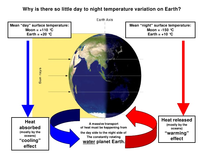
- The ocean covers 71% of the globe and drives average temperatures;
- SSTs have a constant water content, (unlike air temperatures), so give a better reading of heat content variations;
- A major El Nino was the dominant climate feature the last two years.
HadSST is generally regarded as the best of the global SST data sets, and so the temperature story here comes from that source, the latest version being HadSST3.
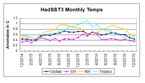
The chart below shows the last two years of SST monthly anomalies as reported in HadSST3, along with the first two months of 2017.
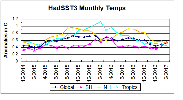
Note that higher temps in 2015 and 2016 are first of all due to a sharp rise in Tropical SST, beginning in March 2015, peaking in February 2016, and steadily declining back to its beginning level. Secondly, the Northern Hemisphere added two bumps on the shoulders of Tropical warming, with peaks in August of each year. Also, note that the global release of heat was not dramatic, due to the Southern Hemisphere offsetting the Northern one.
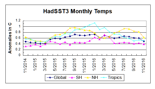
Finally, the oceans are starting 2017 only slightly lower than a year ago, but this year with much cooler Tropics. Notice that both the Tropics and also the Northern Hemisphere continue to cool. The Global average warmed slightly, pulled upward by the Southern Hemisphere which reaches its summer peak at this time.
March may repeat 2016 when NH bottomed and SH peaked, or maybe both will rise or both will drop. In the latter case, perhaps we will see the long-awaited La Nina.
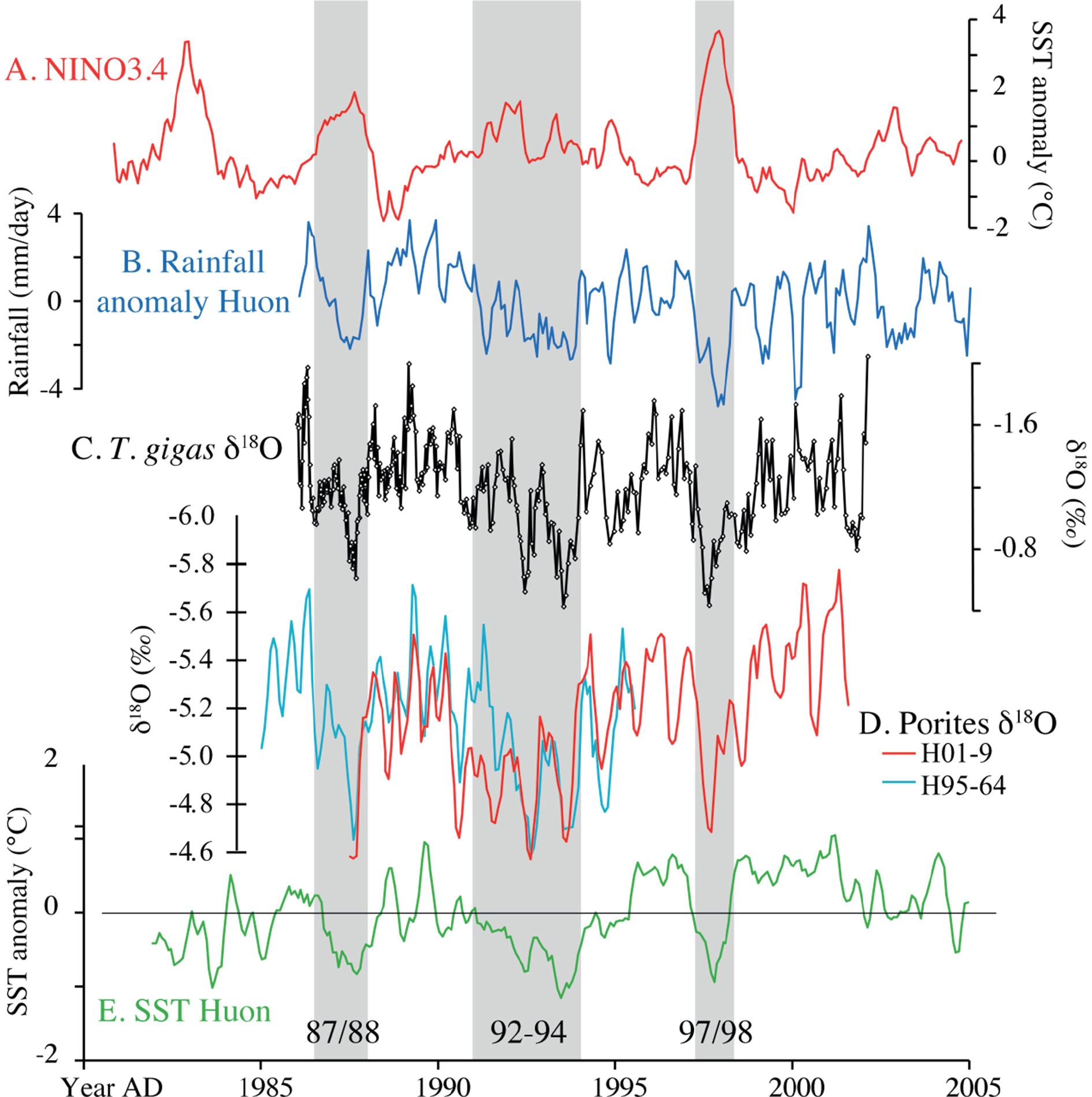
H/T to Global Warming Policy Forum for adding this informative graphic:
|
Much ado has been made of this warming, including claims of human causation, despite the obvious oceanic origin. However, it is unreasonable to claim CO2 functions as a global warming agent, yet the two hemispheres respond so differently. Moreover, CO2 warming theory expects greater warming in the higher latitudes, while this event was driven by heating in the Tropics, contradicting alarmist warming theory.

Solar energy accumulates massively in the ocean and is variably released during circulation events.