It’s not Hotter, it’s Milder.

Again this week I got an email from a friend linking to an alarmist website claiming (among other things) 2015 the Hottest Year Ever, August 2016 the Hottest Month Ever, 16 Hottest Months in a row, The Earth is Burning!
My reply:
Calm down and breathe through your nose. Be not afraid.
You have been misinformed, and I will tell you how and why.
1. “Hotter” does not describe a long period when daily highs are falling, not rising. That’s right, generally the temperature records are showing a decline over time in the maximums recorded at the weather stations.
For example look at results from USHCN (US Historical Climate Network) for the trend of daily maximums since 1930.
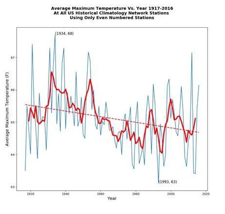
Source: Tony Heller, Real Climate Science
It is clear that measurements of actual afternoon highs are trending down in most places, and lower much more strongly than the few increases. Below the same results displayed geographically.
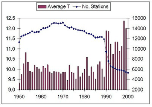
2. Temperature averages over decades show great climate stability, not change. The calculated trends are in fractions of a degree Celsius, well within the error range of the instruments.
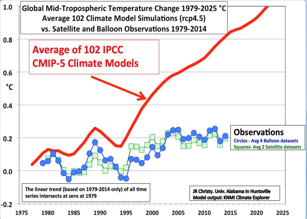
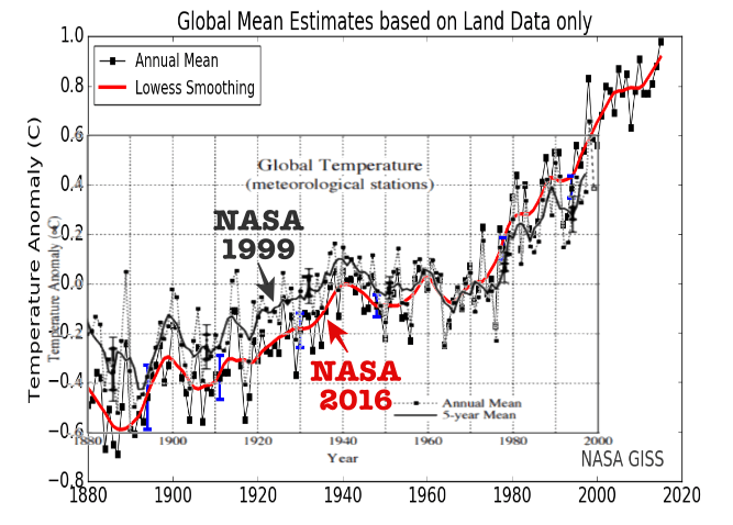
Alarmists favor the dataset from GISS, a part of NASA. They fabricate estimates of an hypothetical Global Mean Temperature not from satellites, but by taking weather station records and performing various statistical manipulations, including adjusting, deleting, infilling, gridding, weighting, homogenizing, and averaging.
Out of all that processing they produce estimates of annual GMTs, which can not be attributed to any actual observation. More importantly, the dataset is unstable–past history, for example the 1930s, appears in GISS graphs with different values this year than last, and different again from 5 and 10 years ago. As Dr. Ole Humlum commented: A temperature record which keeps on changing the past hardly can qualify as being correct.
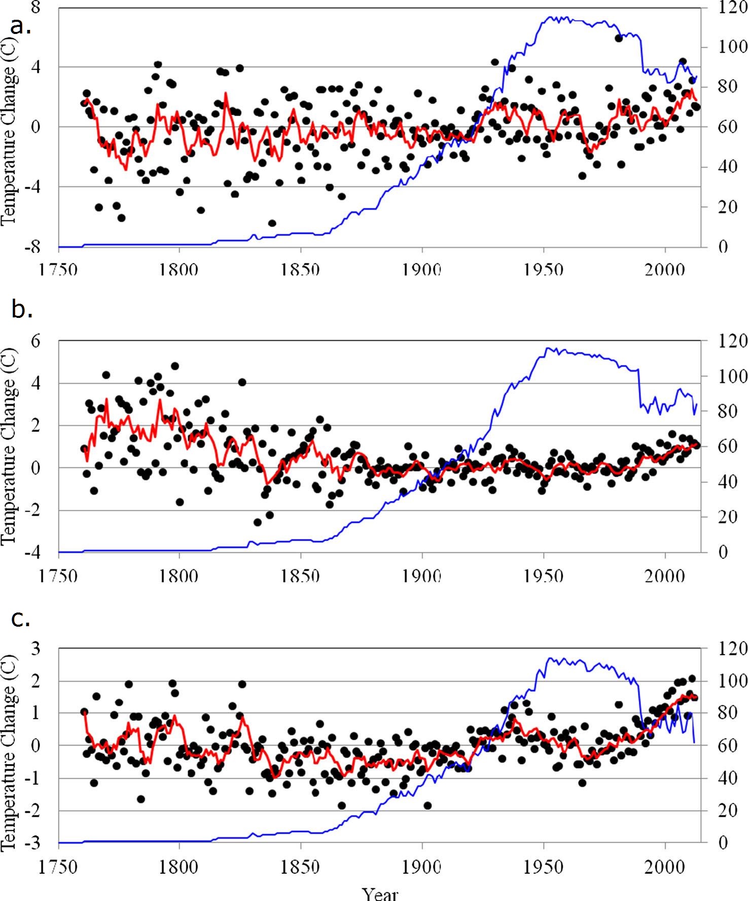
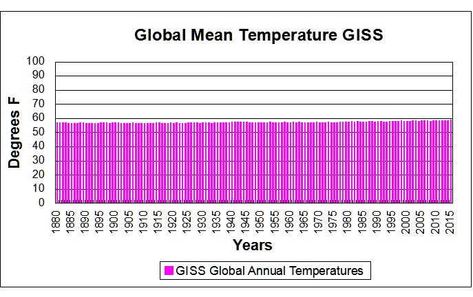
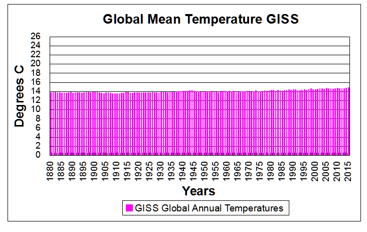
Below is shown GISS estimates in the context of human experience of daily and seasonal temperature variability.

3. The planet has a vast array of climates, each of which has it’s own experience of changing weather and longer term patterns. That is evident in the first chart above. It is also the case that generally as daily highs have been falling, daily lows (minimums) have been rising more strongly, resulting in slightly increasing daily averages. That is the basis for claiming hottest years and months.
This phenomenon is widespread around the world, as demonstrated by studies reported here at this blog under the category Temperature Trend Analysis. For example, Analyzing Temperature Change using World Class Stations.
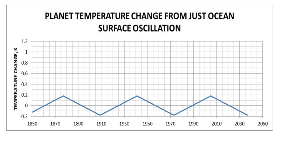
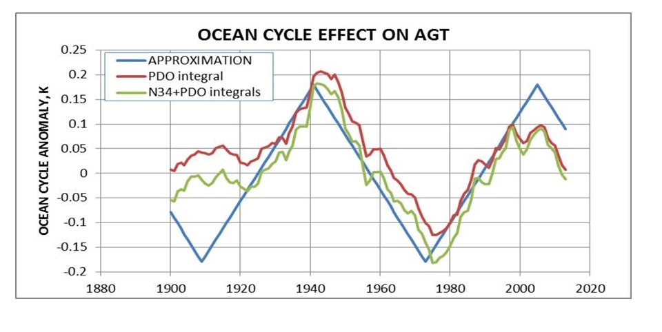
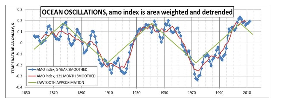
In addition, 70% of the GISS surface temperatures are from SSTs (sea surface temperatures), meaning that ocean cycles like El Nino dominate the results. Short-term variations recently derive from changes in the Pacific basin, the largest of the world’s oceans.
Because climates are local and plural, any general statement about warming or cooling does not necessarily apply to the place where you live.
Summary
The next time you read or are told the world is getting hotter, you should respond along these lines.
“You have been misinformed. It is not getting hotter, it has become milder. The temperature records show fewer extremes of highs and lows, milder Winters, earlier Springs and later Autumns. The longer growing seasons are producing bumper crops almost every year.
Instead of complaining about hotter weather, we should enjoy the bounty of harvests Nature is providing to us.”

The 2016 harvest is shaping up to be a whopper, according to Western Canada’s largest elevator companies.
Footnote:
Another post Arctic Warming Unalarming reports on in depth analysis of 118 weather stations around the Arctic Circle, where so-called “Arctic amplification” should be evident. The conclusions:
The Arctic has warmed at the same rate as Europe over the past two centuries. . . The warming has not occurred at a steady rate. . .During the 1900s, all four (Arctic) regions experienced increasing temperatures until about 1940. Temperatures then decreased by about 1 °C over the next 50 years until rising in the 1990s.
For the period 1820–2014, the trends for the January, July and annual temperatures are 1.0, 0.0 and 0.7 °C per century, respectively. . . Much of the warming trends found during 1820 to 2014 occurred in the late 1990s, and the data show temperatures leveled off after 2000. (my bold).
So, consistent with statements above: No increase in July temperatures, some warming overall due mostly to January.


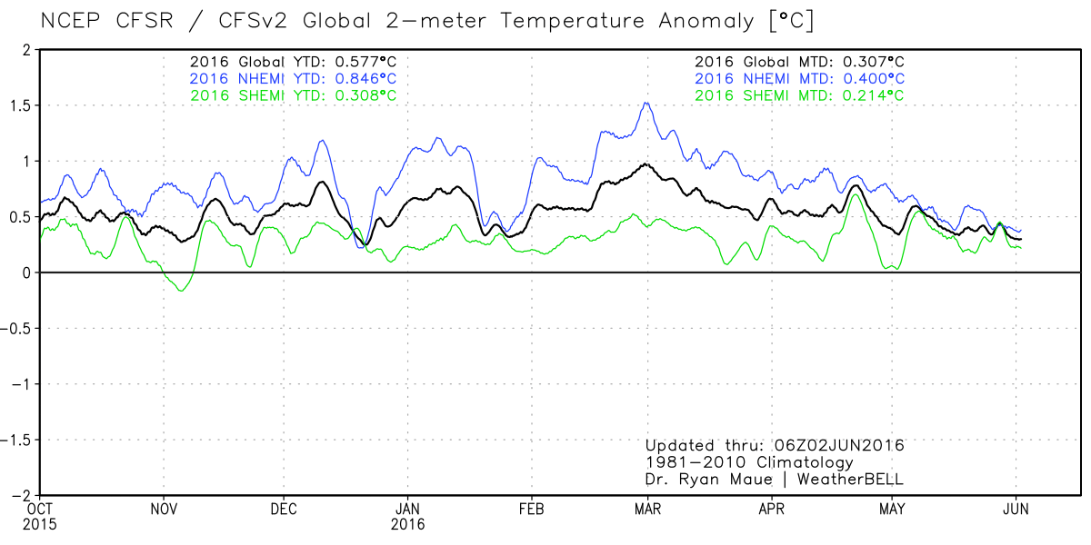


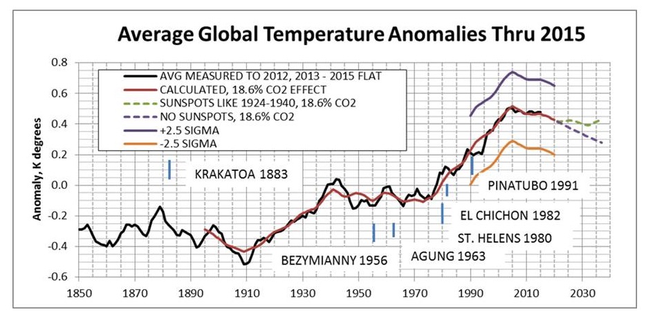

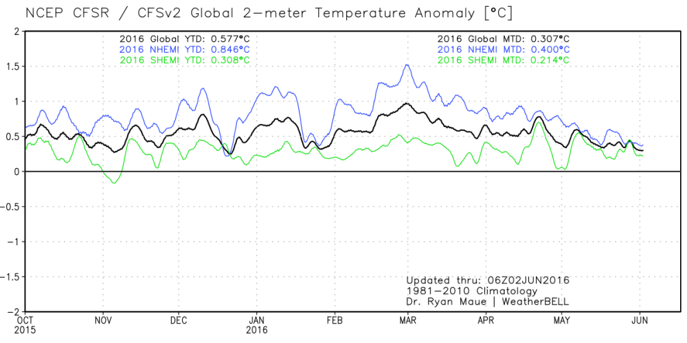 Here is a great view of how the 2015-16 El Nino caused higher surface temperatures last year and this, displayed in 2-meter temp anomalies (weather station height). The satellites’ data show the uptick began in earnest October 2015 and returned to neutral in May 2016. SSTs are now firmly in neutral.