2024 Oceanic Climate Warming At Work

David Wojick describes how ocean cycles create warming blips in global temperature records in his concise, plain language CFACT article Big temperature spike may lead to small temperature rise. Excerpts in italics with my bolds and added images.
The recent big temperature spike has the climate alarmists all excited, pulling out all the hyperbolic stops as it were. The warming is huge they say. Their favorite descriptor — unprecedented — appears frequently.
Which makes it all very funny, since we had exactly this same situation not that long ago. What is most interesting is what happened next back then, because in my view it is likely to happen again. Let me explain.

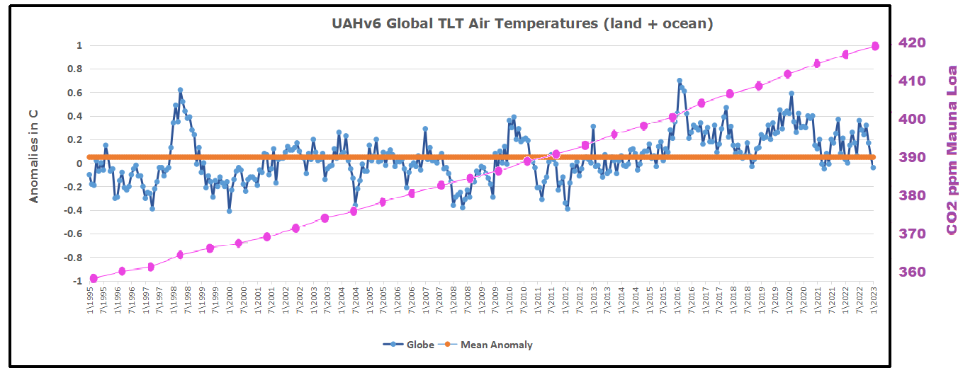
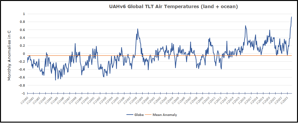
For what follows you need to be looking at the UAH temperature record, which is here:
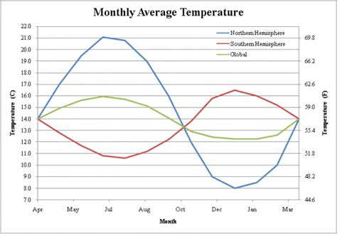
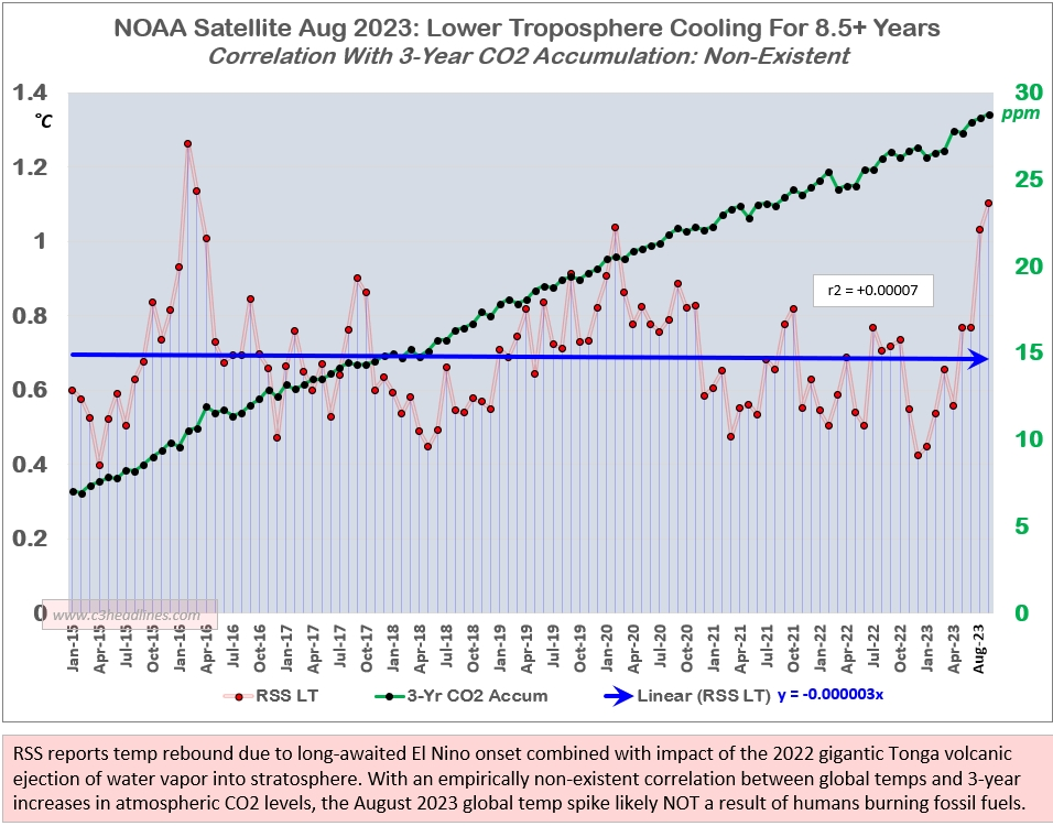
First of all compare the ongoing spike now with the 1998 spike. They are virtually identical as far as the short term temperature increase is concerned, roughly 1.0 degrees C. So as spikes go there is nothing unprecedented.
Yes the tip of the now spike is at a higher temperature that the 1998 spike and this is where is gets very interesting. The base of the now spike is warmer than the base was in 1998. This is because there has been a little bit of warming since then.
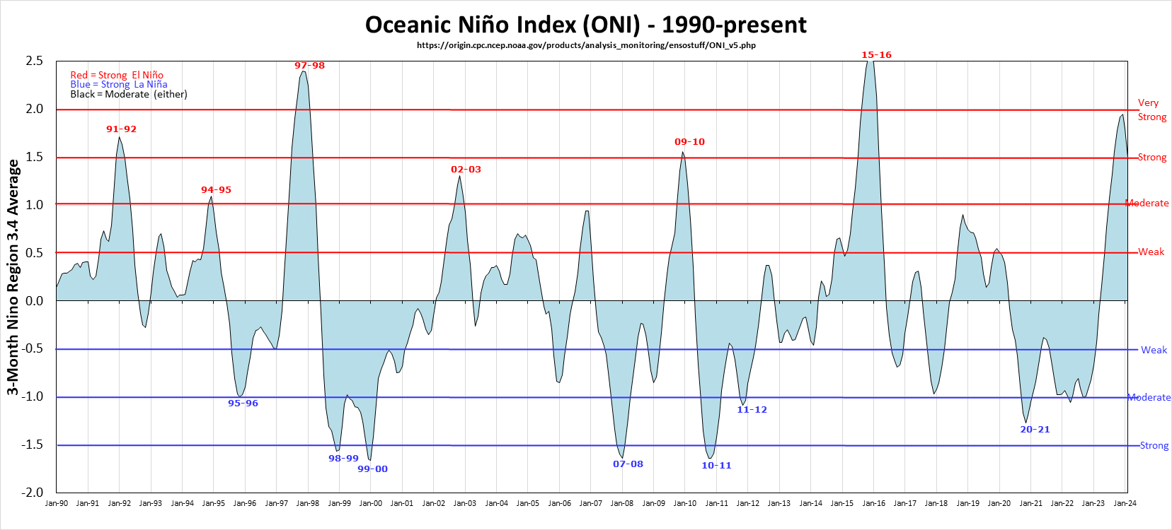
But all of that warming has occurred in two specific steps up, each following a super El Niño. After the 1998 spike the temperature oscillated around a constant value that was warmer than before the spike but there was no additional warming until the 2016 super El Niño spike came along. Then after that spike it was again warmer but with no warming.
All the warming in the entire record occurs in just two steps with no warming in between. For the record I first pointed out this step pattern six years ago, when there was just one clear step, the 1998. See No CO2 warming for the last 40 years
At the time we were wondering if this step pattern would repeat with the 2016 super El Niño and by golly it did.
So now the question is will we get another little step up in average temperature from the ongoing spike? My bet is it will so, Of course I am prepared to be wrong but it is still very likely. But the basic point from six years ago remains.
There is no evidence of any warming due to the ongoing steady CO2
increase in this entire 45 year record. None whatsoever as it is
all clearly to do with the periodic occurrence of super El Niños.
The likely explanation also seems pretty simple. There is residual energy in the atmosphere left over from each spike. So the total energy goes up with each step.
Note that the energy in the spike does not come from the El Niño. An El Niño is simply a lack of cold water upwelling. Without that cold water the ocean surface layer gets a lot warmer from the incoming solar energy. Some of that energy goes into the atmosphere creating the big spike. That some of it would then hang around does not seem surprising. There is no reason why the La Niña that follows each super El Niño should remove all recently added energy.
Here is my conclusion from six years ago: “But in no case is there any evidence of CO2 induced warming here, nor of any human-caused warming for that matter. These causes would produce a relatively steady warming over time, not the single episodic warming that we clearly see here. In particular, to my knowledge there is no known way that the gradual CO2 increase could have caused this giant El Nino-La Nina cycle.

Thus the little warming that there is in the last 40 years appears to be more or less entirely natural. In any normal science this result would be sufficient to invalidate the hypothesis that the increasing CO2 concentration is causing global warming.”
Nothing has changed. The hypothesis of anthropogenic global warming
is falsified by simple observation. Science is like that, or should be.
Addendum:
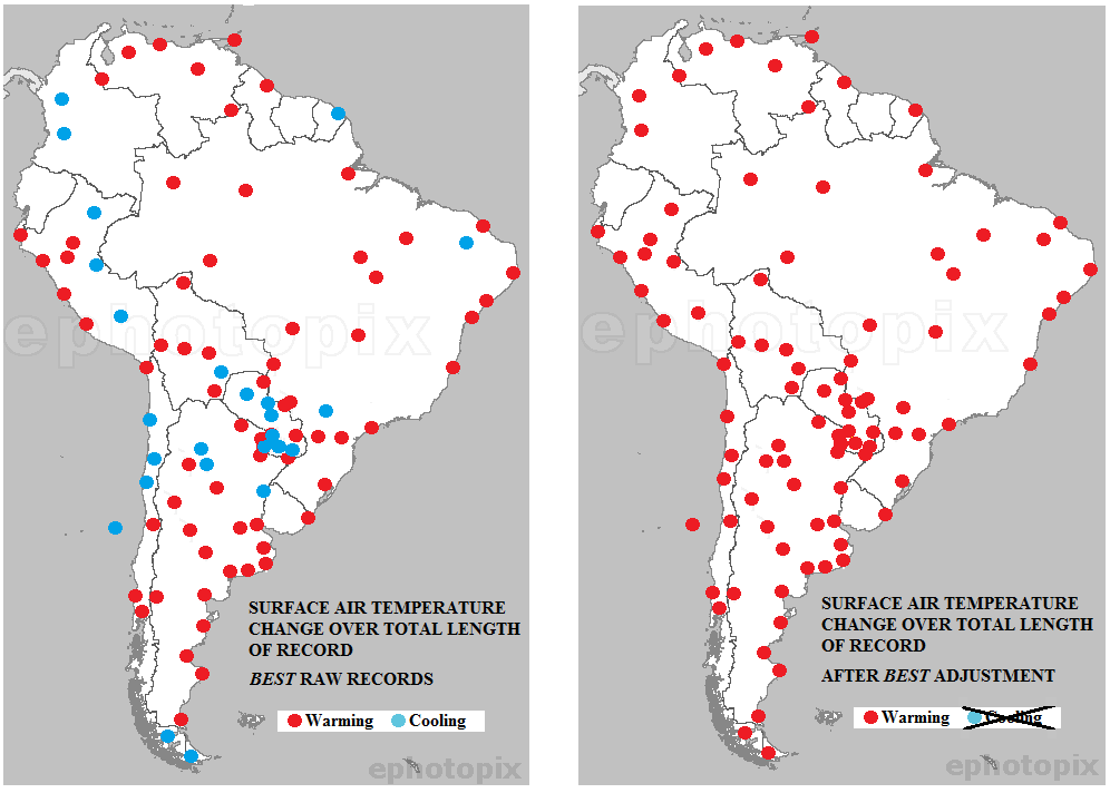
The stairstep warming also appears in HadSST4 global ocean temperature dataset, with the suggestion that a new plateau may be in place.

Since Hadcrut4 (ocean + land) goes back early in the 20th century, we can see the same pattern from an earlier analysis updated to today. Going back to previous warmings prior to the satellite record shows that the entire rise of 0.8C since 1947 is due to oceanic, not human activity.
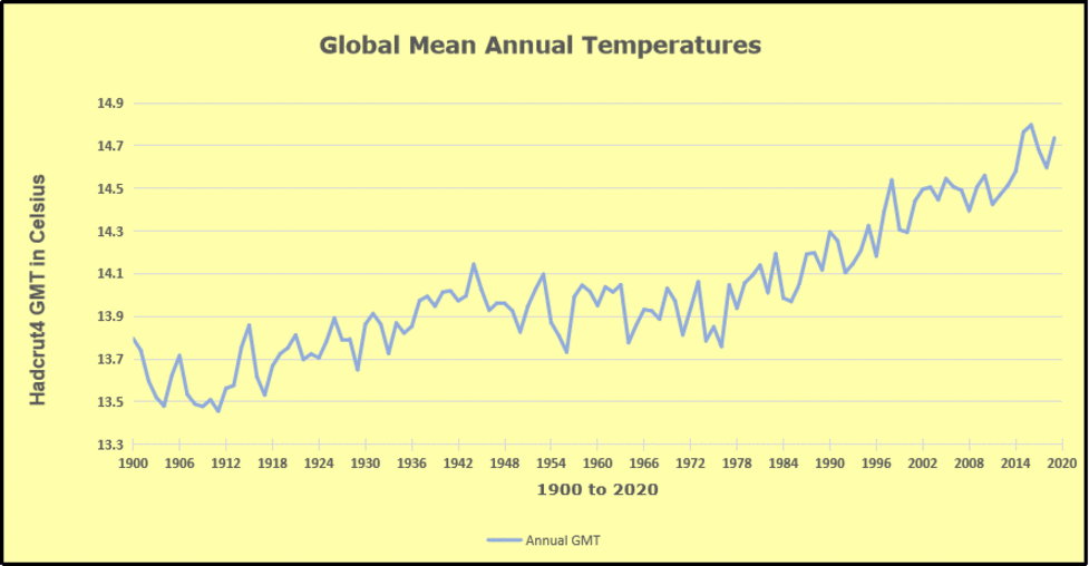
The animation is an update of a previous analysis from Dr. Murry Salby. These graphs use Hadcrut4 and include the 2016 El Nino warming event. The exhibit shows since 1947 GMT warmed by 0.8 C, from 13.9 to 14.7, as estimated by Hadcrut4. This resulted from three natural warming events involving ocean cycles. The most recent rise 2013-16 lifted temperatures by 0.2C. Previously the 1997-98 El Nino produced a plateau increase of 0.4C. Before that, a rise from 1977-81 added 0.2C to start the warming since 1947.
Importantly, the theory of human-caused global warming asserts that increasing CO2 in the atmosphere changes the baseline and causes systemic warming in our climate. On the contrary, all of the warming since 1947 was episodic, coming from three brief events associated with oceanic cycles. And now in 2023 we are seeing an amazing episode with a temperature spike driven by ocean air warming in all regions.
Footnote:
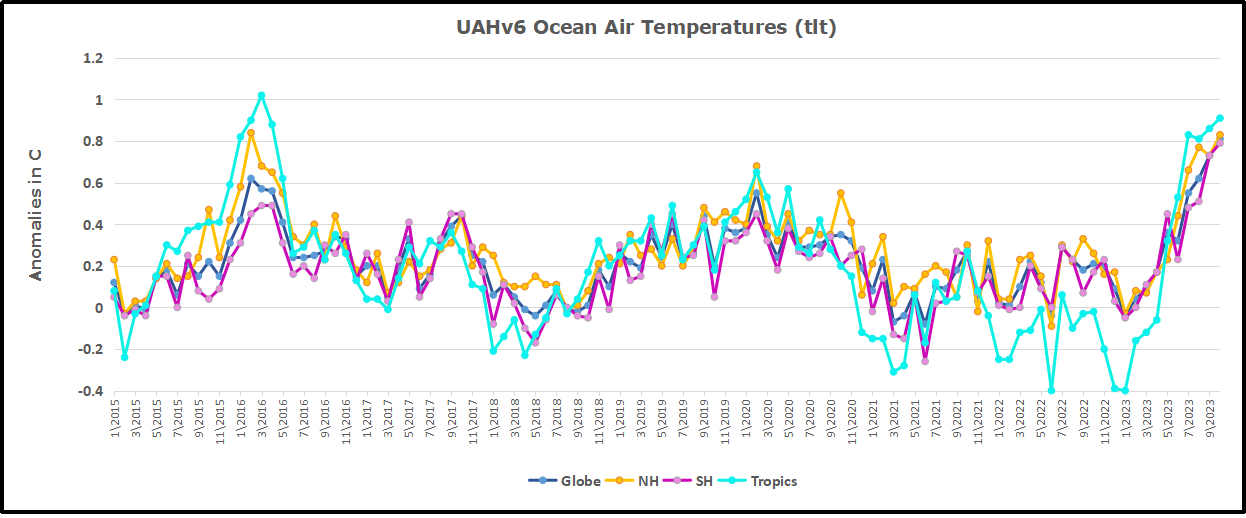
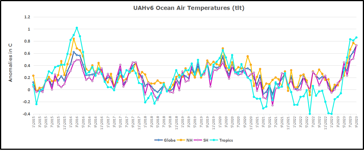
As David stated and diagramed so well, ENSO (El Nino Southern Oscillation) ocean cycle has driven this contemporary warming of atmospheric temperatures. But we should also note how the Northern Atlantic has contributed to this effect, both in 2016 and currently.

To enlarge open image in new tab.
Note that in 2015-2016 the Tropics and SH peaked in between two summer NH spikes. That pattern repeated in 2019-2020 with a lesser Tropics peak and SH bump, but with higher NH spikes. By end of 2020, cooler SSTs in all regions took the Global anomaly well below the mean for this period. Then in 2023 we see the Tropical peaking from El Nino at the same time as the remarkable NH spike, raising the Global ocean anomaly to a new high.
Additional evidence for North Atlantic warming comes from the AMO index (Atlantic Multi-decadal Oscillation). ERSSTv5 AMO dataset uses the NA region EQ-60°N, 0°-80°W and subtracts the global rise of SST 60°S-60°N to obtain a measure of the internal variability of NA. So the values represent SST anomaly differences between the N. Atlantic and the Global ocean.
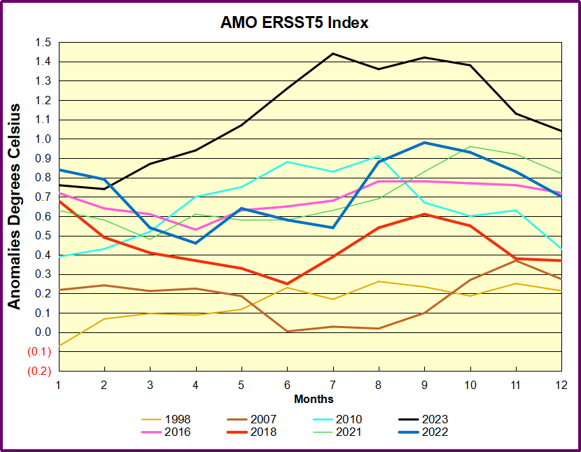
The chart shows the outlier 2023 spike peaking in the North Atlantic in July, persisting through October, before dropping November and December. Note how much higher are these anomalies compared to 2016 in purple. Note also that August typically has the highest NA ocean temperatures, so these anomalies are on top of the highest actual temperatures recorded.
It remains to be seen how long this warming will persist, and what will be the longer term effect, but as David explained, it all has nothing to do with CO2.