Arctic “Amplification” Not What You Think

HT to Dr. David Whitehouse writing at GWPF regarding a recent study claiming Arctic Amplification is causing a wavey polar vortex, resulting in winter warming and cooling extremes.  His critique is Extreme cold snaps and global warming: A speculative explanation.

This post is challenging the notion of Arctic Amplification itself.  The term is bandied about with the connotation that man-made global warming is multiplied in the Arctic and responsible for weather extremes.

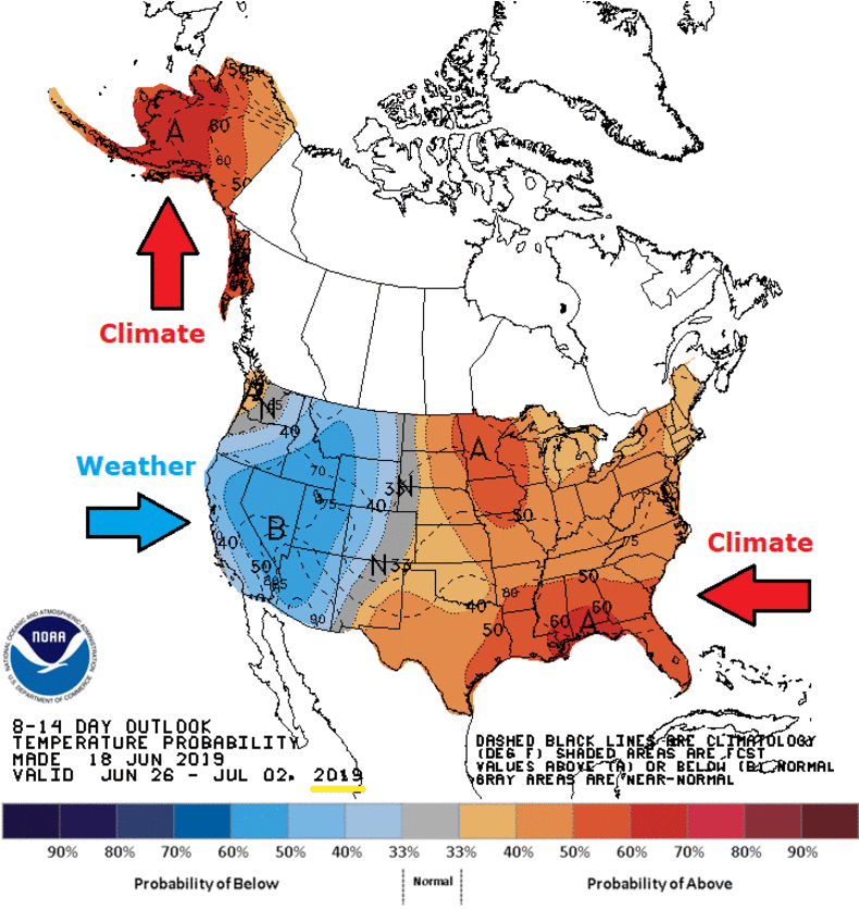
As the animation above shows, there have been in recent years alternating patterns of unusually cold or warm weather in the Northern Hemisphere.  There are several problems in the attempt to link these events to global warming/climate change, i.e. claiming causation from a slow increase in baseline global average temperatures.

  1. Arctic Amplification is an artifact of Temperature Anomalies
  2. Arctic Surface Stations Records Show Ordinary Warming
  3. Arctic Warmth Comes from Meridional Heat Transport, not CO2

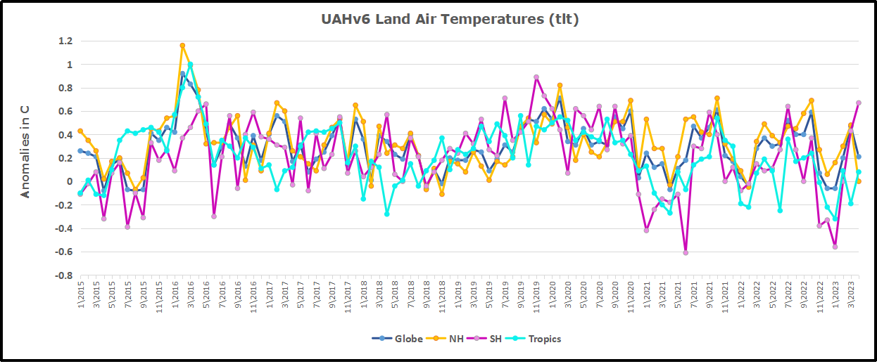
Clive Best provides this animation of recent monthly temperature anomalies which demonstrates how most variability in anomalies occur over northern continents.

1. Arctic Amplification is an artifact of Temperature Anomalies

Beyond the issues with the measurements and the questionable adjustments, there is a more fundamental misconception about air temperatures in relation to “climate change.” Clive Best does a fine job explaining why Global Mean Temperature anomalies do not mean what people think. Below is my synopsis of his recent essay entitled Do Global Temperatures make sense? (link)

Background: Earth’s Heat Imbalance

ERBE measurements of radiative imbalance.

The earth’s temperature at any location is never in equilibrium. It changes daily, seasonally and annually. Incoming solar radiation varies enormously especially near the poles which receive more energy per day in summer than the equator.

The earth cools primarily by moving heat from hot tropical regions towards high latitudes where net IR radiation loss cools the planet, thus maintaining a certain temperature profile.

Key Point: GMT Anomalies Are Dominated by the Highest Latitudes

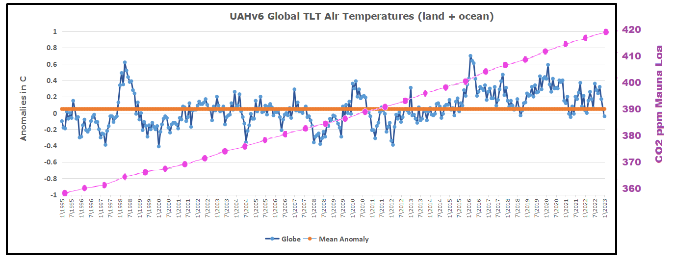
The main problem with all the existing observational datasets is that they don’t actually measure the global temperature at all. Instead they measure the global average temperature ‘anomaly’. . .The use of anomalies introduces a new bias because they are now dominated by the larger ‘anomalies’ occurring at cold places in high latitudes. The reason for this is obvious, because all extreme seasonal variations in temperature occur in northern continents, with the exception of Antarctica. Increases in anomalies are mainly due to an increase in the minimum winter temperatures, especially near the arctic circle. 

To take an extreme example here is the monthly temperature data and calculated anomalies for Verkoyhansk in Siberia. Annual temperatures vary from -50C in winter to +20C in summer. That is a seasonal range of 70C each year, and a year to year anomaly variation of ~8C is normal. The only global warming effect evident is a slight increase in the minimum winter temperatures since 1900. That is not due to any localised enhanced greenhouse effect but rather to an enhanced meridional heat transport. Temperatures in equatorial regions meanwhile have only ~4C seasonal variations, and show essentially no warming trend.

2. Arctic Surface Stations Records Show Ordinary Warming

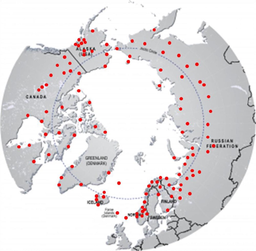
Locations of 118 arctic stations examined in this study and compared to observations at 50 European stations whose records averaged 200 years and in a few cases extend to the early 1700s

A recent extensive analysis of Northern surface temperature records gives no support for Arctic “amplification” fears.

The Arctic has warmed at the same rate as Europe over the past two centuries. Heretofore, it has been supposed that any global warming would be amplified in the Arctic. This may still be true if urban heat island effects are responsible for part of the observed temperature increase at European stations. However, European and Arctic temperatures have remained closely synchronized for over 200 years during the rapid growth of urban centres.

And the warming pattern in Europe and the Arctic is familiar and unalarming.

Arctic temperatures have increased during the period 1820– 2014. The warming has been larger in January than in July. Siberia, Alaska and Western Canada appear to have warmed slightly more than Eastern Canada, Greenland, Iceland and Northern Europe. The warming has not occurred at a steady rate. Much of the warming trends found during 1820 to 2014 occurred in the late 1990s, and the data show temperatures levelled off after 2000. The July temperature trend is even slightly negative for the period 1820–1990. The time series exhibit multidecadal temperature fluctuations which have also been found by other temperature reconstructions.

The paper is: Arctic temperature trends from the early nineteenth century to the present W. A. van Wijngaarden, Theoretical & Applied Climatology (2015).  My synopsis: Arctic Warming Unalarming

3. Arctic Warmth Comes from Meridional Heat Transport, not CO2

Key Point: Heat Distribution Changes, not Global Temperatures

Rising CO2 levels modify that radiation imbalance profile slightly. Surface temperatures in the tropics are not really warming at all. Any excess heat induces more clouds and more convection while surface temperatures remain constant. What really happens is that the meridional radiation profile changes. Slightly more heat is transported polewards so that hot places are shifting more heat to cold places which are doing the warming. If CO2 levels stop rising then a new temperature and radiation profile would rather quickly be reached. This is then called ‘climate change’ but any such changes are concentrated in colder regions of the world. The global ‘temperature’ itself is not changing, but instead the global distribution of temperature is changing.

Key Point: More Atmospheric Heat means Warming in the Coldest Places

Temperatures at the poles during 6 months of darkness would fall well below -150C if there was no atmosphere, similar to the moon. Instead heat is constantly being transported from lower latitudes by the atmosphere and ocean and so that temperatures never fall much below -43C. If more heat is transported northwards than previously, then minimum temperatures must rise, and this is what we observe in individual measurements.

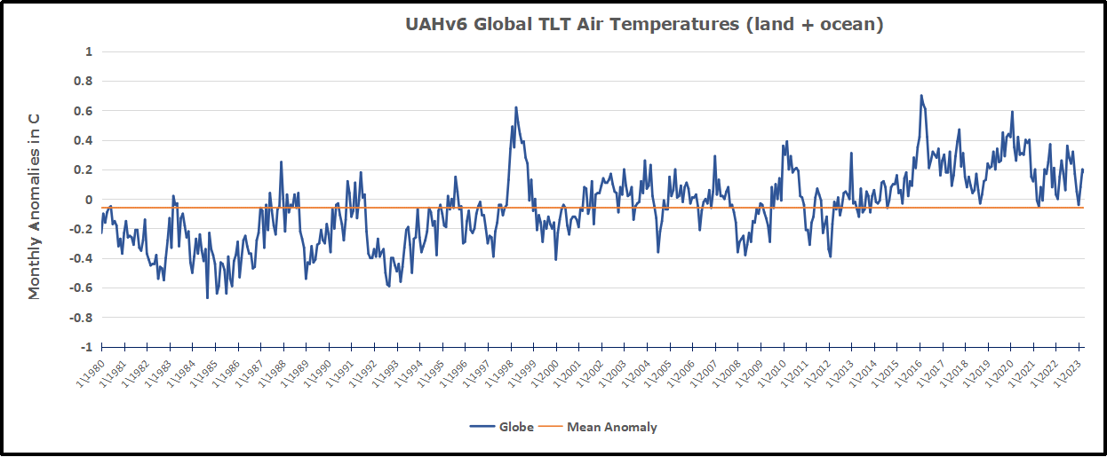
Long term changes in temperature anomalies occur mainly in northern continents in winter months. This is not because the earth as a whole is warming up but rather that meridional heat transport from the equator to the poles has increased and the largest effect on ‘anomalies occurs in winter. The average absolute temperature of the earth’s surface is unknown. Basing the evidence for climate change on the 150 year trend in global averaged temperature anomalies still biases the result towards higher latitudes where most of the stations are located.

Summary

When heat is released into the atmosphere from the oceans, it is transported toward the poles to dissipate into space. Places in higher latitudes are warmed, not by radiative effects of greenhouse gases in those locales, but by the incursion of warmer air from the equator.

What happens if more CO2 is added into the atmosphere? No one knows, but there are many opinions, a popular one being that more heat is retained in the atmosphere. But in that case, that additional heat will be shed by the planet in exactly the same manner: transport to the poles with slightly less extremely cold air at the higher latitudes.

Why in the world would we pay anything to prevent a little bit of warming in the world’s coldest places?

Clive Best takes the analysis further and relates to work by Christopher Scotese in a later post Fact: Future Climate Will Be Flatter, not Hotter
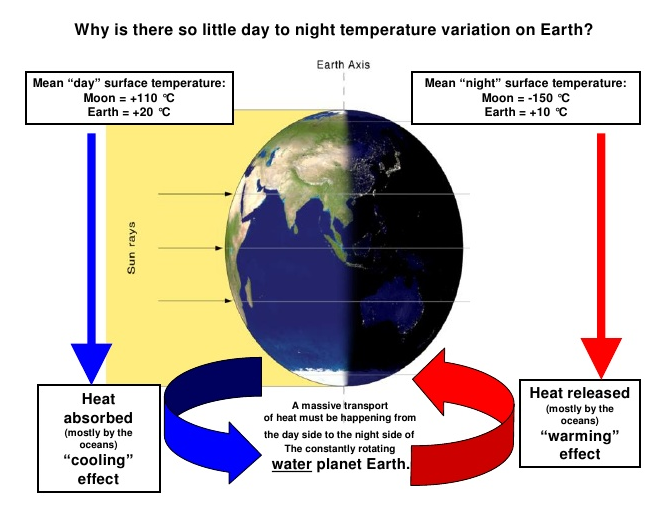
More explanation at The Climate Water Wheel

Resources:  Bill Gray: H20 is Climate Control Knob, not CO2

No, CO2 Doesn’t Drive the Polar Vortex (Updated)

Quantifying Natural Climate Change

Update September 24, 2022 Richard Lindzen Weighs In

H/T Not A Lot of People Know That

London, 23 September – A prominent climate scientist has warned that the picture of climate change presented in the IPCC’s narrative is simplistic, ill-conceived, and undermined by observational evidence.
In a new 
discussion paper, Professor Richard Lindzen of the Massachusetts Institute of Technology (MIT) points out that the official picture, focusing narrowly on carbon dioxide as a warming agent, becomes implausible when applied to the details of the climate system.  According to Lindzen,

“If you are going to blame everything on carbon dioxide, you have to explain why, on all timescales, temperatures in the tropics are extremely stable while those in high latitudes are much more variable. The IPCC’s story is that small amounts of greenhouse warming near the equator are ‘amplified’ at high latitudes. But neither theory nor data support the idea of amplification.”

Instead, says Lindzen, this pattern – of stable tropical temperatures and fluctuating ones in high latitudes – is mostly a function of natural processes in the atmosphere and oceans; in other words, changes in oceanic and atmospheric currents that transport heat poleward while drawing varying amounts of heat out of the tropics.  These changes in transport affect the tropics, but they are not determined by the tropics.

“The changes in the earth’s so-called temperature are mainly due to changes in the temperature difference between the tropics and the poles – at least for major changes.  The changes in tropical temperature, which are influenced by greenhouse processes, are a minor contribution.”

Richard Lindzen: An assessment of the conventional global warming narrative (pdf)


UAH: El Nino Rescues Global Warming July 2023

The post below updates the UAH record of air temperatures over land and ocean. Each month and year exposed again the growing disconnect between the real world and the Zero Carbon zealots.  It is as though the anti-hydrocarbon band wagon hopes to drown out the data contradicting their justification for the Great Energy Transition.  Yes, there is warming from an El Nino buildup coincidental with North Atlantic warming, but no basis to blame it on CO2.  

As an overview consider how recent rapid cooling  completely overcame the warming from the last 3 El Ninos (1998, 2010 and 2016).  The UAH record shows that the effects of the last one were gone as of April 2021, again in November 2021, and in February and June 2022  At year end 2022 and continuing into 2023 global temp anomaly matched or went lower than average since 1995, an ENSO neutral year. (UAH baseline is now 1991-2020).

For reference I added an overlay of CO2 annual concentrations as measured at Mauna Loa.  While temperatures fluctuated up and down ending flat, CO2 went up steadily by ~60 ppm, a 15% increase.

Furthermore, going back to previous warmings prior to the satellite record shows that the entire rise of 0.8C since 1947 is due to oceanic, not human activity.

gmt-warming-events

The animation is an update of a previous analysis from Dr. Murry Salby.  These graphs use Hadcrut4 and include the 2016 El Nino warming event.  The exhibit shows since 1947 GMT warmed by 0.8 C, from 13.9 to 14.7, as estimated by Hadcrut4.  This resulted from three natural warming events involving ocean cycles. The most recent rise 2013-16 lifted temperatures by 0.2C.  Previously the 1997-98 El Nino produced a plateau increase of 0.4C.  Before that, a rise from 1977-81 added 0.2C to start the warming since 1947.

Importantly, the theory of human-caused global warming asserts that increasing CO2 in the atmosphere changes the baseline and causes systemic warming in our climate.  On the contrary, all of the warming since 1947 was episodic, coming from three brief events associated with oceanic cycles. 

Update August 3, 2021

Chris Schoeneveld has produced a similar graph to the animation above, with a temperature series combining HadCRUT4 and UAH6. H/T WUWT

image-8


mc_wh_gas_web20210423124932

See Also Worst Threat: Greenhouse Gas or Quiet Sun?

July 2023 Update El Nino plus North Atlantic Spikes Hit Summer Highs

banner-blog

With apologies to Paul Revere, this post is on the lookout for cooler weather with an eye on both the Land and the Sea.  While you will hear a lot about 2020-21 temperatures matching 2016 as the highest ever, that spin ignores how fast the cooling set in.  The UAH data analyzed below shows that warming from the last El Nino had fully dissipated with chilly temperatures in all regions. After a warming blip in 2022, land and ocean temps dropped again with 2023 starting below the mean since 1995.  Now in July EL Nino appears in a major Tropical ocean air spike in concert with North Atlantic high temps.

UAH has updated their tlt (temperatures in lower troposphere) dataset for July 2023. Posts on their reading of ocean air temps this month preceded updated records from HadSST4.  I last posted on SSTs using HadSST4 North Atlantic Warming June 2023. This month also has a separate graph of land air temps because the comparisons and contrasts are interesting as we contemplate possible cooling in coming months and years. Sometimes air temps over land diverge from ocean air changes.  For example in May 2023, ocean temps in all regions moved upward, while Tropical and NH land air temps dropped sharply. 

In July, as shown later on, Global ocean air jumpted upward led by rising temps in all regions, led by Tropics and NH.  Land air temps augmented this warming also with spikes in all regions.  Thus the land + ocean Global UAH temperature is now nearly matching the 2016 peak.

Note:  UAH has shifted their baseline from 1981-2010 to 1991-2020 beginning with January 2021.  In the charts below, the trends and fluctuations remain the same but the anomaly values change with the baseline reference shift.

Presently sea surface temperatures (SST) are the best available indicator of heat content gained or lost from earth’s climate system.  Enthalpy is the thermodynamic term for total heat content in a system, and humidity differences in air parcels affect enthalpy.  Measuring water temperature directly avoids distorted impressions from air measurements.  In addition, ocean covers 71% of the planet surface and thus dominates surface temperature estimates.  Eventually we will likely have reliable means of recording water temperatures at depth.

Recently, Dr. Ole Humlum reported from his research that air temperatures lag 2-3 months behind changes in SST.  Thus the cooling oceans now portend cooling land air temperatures to follow.  He also observed that changes in CO2 atmospheric concentrations lag behind SST by 11-12 months.  This latter point is addressed in a previous post Who to Blame for Rising CO2?

After a change in priorities, updates are now exclusive to HadSST4.  For comparison we can also look at lower troposphere temperatures (TLT) from UAHv6 which are now posted for July.  The temperature record is derived from microwave sounding units (MSU) on board satellites like the one pictured above. Recently there was a change in UAH processing of satellite drift corrections, including dropping one platform which can no longer be corrected. The graphs below are taken from the revised and current dataset.

The UAH dataset includes temperature results for air above the oceans, and thus should be most comparable to the SSTs. There is the additional feature that ocean air temps avoid Urban Heat Islands (UHI).  The graph below shows monthly anomalies for ocean air temps since January 2015.

Note 2020 was warmed mainly by a spike in February in all regions, and secondarily by an October spike in NH alone. In 2021, SH and the Tropics both pulled the Global anomaly down to a new low in April. Then SH and Tropics upward spikes, along with NH warming brought Global temps to a peak in October.  That warmth was gone as November 2021 ocean temps plummeted everywhere. After an upward bump 01/2022 temps reversed and plunged downward in June.  After an upward spike in July, ocean air everywhere cooled in August and also in September.   

After sharp cooling everywhere in January 2023, all regions were into negative territory. Note the Tropics matched the lowest, but since  have spiked sharply upward +1.25C, with the largest increases in May, June and July 2023.  NH also warmed 0.6C in the last 3 months, while SH ocean air rose 0.5C since February. Global Ocean air July 2023 is second only to 2016, which had Feb./March peaks followed by cooling.  The strength of the El Nino will determine the latter half of this year.

Land Air Temperatures Tracking Downward in Seesaw Pattern

We sometimes overlook that in climate temperature records, while the oceans are measured directly with SSTs, land temps are measured only indirectly.  The land temperature records at surface stations sample air temps at 2 meters above ground.  UAH gives tlt anomalies for air over land separately from ocean air temps.  The graph updated for June is below.

Here we have fresh evidence of the greater volatility of the Land temperatures, along with extraordinary departures by SH land.  Land temps are dominated by NH with a 2021 spike in January,  then dropping before rising in the summer to peak in October 2021. As with the ocean air temps, all that was erased in November with a sharp cooling everywhere.  After a summer 2022 NH spike, land temps dropped everywhere, and in January, further cooling in SH and Tropics offset by an uptick in NH. 

Remarkably, in 2023, SH land air anomaly shot up 1.5C, from  -0.56C in January to +0.93 in July.  Tropical land temps are up 1.25 since January and NH Land air temps rose 0.7.   The consolidated rise resembles the upward spikes starting in September 2015.

The Bigger Picture UAH Global Since 1980

The chart shows monthly Global anomalies starting 01/1980 to present.  The average monthly anomaly is -0.06, for this period of more than four decades.  The graph shows the 1998 El Nino after which the mean resumed, and again after the smaller 2010 event. The 2016 El Nino matched 1998 peak and in addition NH after effects lasted longer, followed by the NH warming 2019-20.   An upward bump in 2021 was reversed with temps having returned close to the mean as of 2/2022.  March and April brought warmer Global temps, later reversed.

With the sharp drops in Nov., Dec. and January 2023 temps, there was no increase over 1980. Now in 2023 the buildup to the July peak resembles closely the sharp July peak of the El Nino 1998 event. It is second only to the March peak in 2016.  Where it goes from here, up or down, remains to be seen.

TLTs include mixing above the oceans and probably some influence from nearby more volatile land temps.  Clearly NH and Global land temps have been dropping in a seesaw pattern, nearly 1C lower than the 2016 peak.  Since the ocean has 1000 times the heat capacity as the atmosphere, that cooling is a significant driving force.  TLT measures started the recent cooling later than SSTs from HadSST3, but are now showing the same pattern. Despite the three El Ninos, their warming has not persisted prior to 2023, and without them it would probably have cooled since 1995.  Of course, the future has not yet been written.


Heatless in Seattle Summer 2023

With all the media noise about “Global Boiling”, they must think we are all frogs in a pot on the stove (electric, no gas permitted).  And yet, what a difference a year makes in the US Northwest, as Cliff Mass reminds at his blog A Summer Without Extreme Heat in the Northwest.  Excerpts in italics with  added images.

With all the talk of heat waves in the media these days, it is fascinating to note that the Pacific Northwest has NOT had extreme heat this summer.  

No major heatwaves.   A lack of warm temperature records.

A really moderate, benign summer regarding high temperatures.  And the temperate weather is not over.

And more surprises…there is really little evidence over the past decades of increases in extreme July heat in our region.

Let me show you some data, to prove the above to you.

Just a reminder….the end of July is climatologically the warmest time of the year (see the climatology of SeaTac Airport, below).   By the end of August, solar radiation has declined so much that the temperatures inevitably decline.


A July Without Extreme Heat

Below you will find plots of the highest temperature in July over many decades for five local stations:  Olympia and Bellingham in western Washington, Wenatchee and Kennewick in eastern Washington, and Portland, Oregon.  I have plotted the July highs for the entire period of record and plotted a linear trend line for your reference.

Really interesting.   The high temperatures in July at these stations have been very average and FAR below record levels.  

Most of you have not needed AC this month.

Perhaps Shocking to Some
Now look at the trend of the extreme July temperatures above (brown lines) and you will notice something that is perhaps surprising:  there are no large increases in record July temperatures over many decades.
About a 1°F increase at Bellingham and Olympia, roughly .5 °F at Portland and Wenatchee, and a DECLINE of roughly 2 F at Kennewick over many decades.
The background global warming of mean temperatures is about 2F.  Our regional extremes are going up LESS than that.  
There is no local amplification of extreme temperatures as the planet slowly warms.
To bring home the message of the lack of extreme temperatures this July, below are the temperatures at Olympia and Wenatchee (blue bars showing observed highs and lows), with record daily highs shown by the red colors.
No daily high-temperature records were broken.  None. Nada. Zippo.

Finally, the moderate temperatures are not over.  

To illustrate, the latest 7-day forecast from the European Center ensemble (shown below) indicates cooler than normal conditions (blue colors) over and west of the Cascade crest (this is for the daily average temperature, NOT the high temperatures).
As noted in my previous blogs, the lack of extreme high temperatures is associated with a persistent atmospheric circulation pattern.  It also helps explain the lack of wildfires over the region.


Hottest Year Misdirection June Report

Activists and their media allies are Hell-bent to spoil our summertime joy by stirring up climate fear to further their zero carbon agenda.

The calendar turning to June and the official start to summer triggers the usual alarms that this year will surely be the hottest ever.  Headlines recently:

♦  Is 2023 going to be the hottest year on record?  World Economic Forum

♦  Why 2023 is shaping up to be the hottest year on record New Scientist

♦  Global temperatures in 2023 set to be among hottest on record  The Guardian

♦  2023 will be ‘one of the hottest on record’ says Met Office BBC

And of course you can count on NYT to totally jump the shark:

♦  The Last 8 Years Were the Hottest on Record – The New York Times

In the past few years, the earth cooled after warming from the 2015-2016 El Nino, and with higher North Atlantic summer anomalies repeating in 2020.  The cooling was significant as shown in the chart below (from the UAH satellite temperature dataset.)

The Global anomaly dropped from +0.7C January 2016 to <0.0C January 2023.  And of course the media ignored that cooling since they are addicted to the global warming narrative: temperatures can only go up, since CO2 keeps rising.  On the contrary, the chart shows CO2 did rise steadily, while temps fluctuated up and down, ending this period of 27 years flat.

Curiously, a lot of us have so far seen unseasonably cool temperatures this year, and wonder where this hottest year could be?  I mean, 60 cm of snow one June day in Jasper Park Alberta?   Suspecting that we have again a weather/climate perception that exists everywhere elsewhere, I turned to NOAA’s Climate at a Glance website to see what their data shows.

Climate reporting is confusing because the scope of temperature averaging gives very different impressions, and at the mega scale rarely corresponds to anyone’s particular experience.  So generalizations are claimed extrapolating from statistics, contradicted by many persons’ direct experience.

NOAA State of the Climate is another site advocating for the IPCC agenda and illustrates how this works.  First the Global Climate Report:

So there is the #1 hottest month out of 174 years–warmest Land, Ocean and combined Global.  Now let’s look at the year to date (YTD):

Whoops, that’s not as scary; the first half of 2023 is not #1.   Rather, the ocean is #2, Land #5, and the Global start to the year is #3.  And the table shows that 2016 was the hottest, consistent with the UAH graph above.  We start to see how media reports are speculating and hoping for this to be the hottest year, despite the first half of the year.

And to understand why most people will be put off by hottest year claims, we go to the Regional Analysis in order to see what the year has been like in various continents (land by definition).

It becomes obvious that no matter where I live, don’t tell me this is the hottest year ever. OK some Africans and Europeans may agree, but those in Oceania (mostly Australians) will boo you out of the room.

Note:  NOAA climatology data

The Extended Reconstructed Sea Surface Temperature (ERSST) dataset is a global monthly analysis of SST data derived from the International Comprehensive Ocean–Atmosphere Dataset (ICOADS). The dataset can be used for long-term global and basin-wide studies and incorporates smoothed local and short-term variations.

The Global Historical Climatology Network monthly (GHCNm) dataset provides monthly climate summaries from thousands of weather stations around the world. The initial version was developed in the early 1990s, and subsequent iterations were released in 1997, 2011, and most recently in 2018. The period of record for each summary varies by station, with the earliest observations dating to the 18th century. Some station records are purely historical and are no longer updated, but many others are still operational and provide short time delay updates that are useful for climate monitoring. The current version (GHCNm v4) consists of mean monthly temperature data, as well as a beta release of monthly precipitation data. [Reported station data are subject to adjustments by way of a procedure, known as the Pairwise Homogenization Algorithm (PHA)]

In addition, a previous post gives directions and links for anyone to get the unbiased climate history where they live, including the example of my locale.  See June 2023 the Hottest Ever? Not So Fast!

Footnote: Everyone has an agenda and packages data in support of their POV.  Those who joined the anti-hydrocarbon crusade are bound to find and amplify any bit of global warming they can find.  My agenda is for people to consider the full amount of relevant data and facts, and to reason accordingly rather than go along with the crowd or their feelings.  My approach is best expressed in this essay:

I Want You Not to Panic

Little Warming in June 2023 UAH Air Temps

The post below updates the UAH record of air temperatures over land and ocean. Each month and year exposes again the growing disconnect between the real world and the Zero Carbon zealots.  It is as though the anti-hydrocarbon band wagon hopes to drown out the data contradicting their justification for the Great Energy Transition.  Yes there is warming from an El Nino buildup but no basis to blame it on CO2.  

As an overview consider how recent rapid cooling  completely overcame the warming from the last 3 El Ninos (1998, 2010 and 2016).  The UAH record shows that the effects of the last one were gone as of April 2021, again in November 2021, and in February and June 2022  Now at year end 2022 and continuing into 2023 global temp anomaly is matching or lower than average since 1995, an ENSO neutral year. (UAH baseline is now 1991-2020).

For reference I added an overlay of CO2 annual concentrations as measured at Mauna Loa.  While temperatures fluctuated up and down ending flat, CO2 went up steadily by ~60 ppm, a 15% increase.

Furthermore, going back to previous warmings prior to the satellite record shows that the entire rise of 0.8C since 1947 is due to oceanic, not human activity.

gmt-warming-events

The animation is an update of a previous analysis from Dr. Murry Salby.  These graphs use Hadcrut4 and include the 2016 El Nino warming event.  The exhibit shows since 1947 GMT warmed by 0.8 C, from 13.9 to 14.7, as estimated by Hadcrut4.  This resulted from three natural warming events involving ocean cycles. The most recent rise 2013-16 lifted temperatures by 0.2C.  Previously the 1997-98 El Nino produced a plateau increase of 0.4C.  Before that, a rise from 1977-81 added 0.2C to start the warming since 1947.

Importantly, the theory of human-caused global warming asserts that increasing CO2 in the atmosphere changes the baseline and causes systemic warming in our climate.  On the contrary, all of the warming since 1947 was episodic, coming from three brief events associated with oceanic cycles. 

Update August 3, 2021

Chris Schoeneveld has produced a similar graph to the animation above, with a temperature series combining HadCRUT4 and UAH6. H/T WUWT

image-8


mc_wh_gas_web20210423124932

See Also Worst Threat: Greenhouse Gas or Quiet Sun?

June 2023 Update Little Warming Added After May El Nino Spike

banner-blog

With apologies to Paul Revere, this post is on the lookout for cooler weather with an eye on both the Land and the Sea.  While you will hear a lot about 2020-21 temperatures matching 2016 as the highest ever, that spin ignores how fast the cooling set in.  The UAH data analyzed below shows that warming from the last El Nino Had fully dissipated with chilly temperatures in all regions. After a warming blip in 2022, land and ocean temps dropped again with 2023 starting below the mean since 1995.  Now in March to May EL Nino appears in a Tropical ocean Spike.

UAH has updated their tlt (temperatures in lower troposphere) dataset for June 2023. Posts on their reading of ocean air temps this month preceded updated records from HadSST4.  I last posted on SSTs using HadSST4 El Nino Ocean Warming Abates May 2023. This month also has a separate graph of land air temps because the comparisons and contrasts are interesting as we contemplate possible cooling in coming months and years. Sometimes air temps over land diverge from ocean air changes.  For example in February, Tropical ocean temps alone moved upward, while temps in all land regions rebounded after hitting bottom.

In June, as shown later on, Global ocean air cooled led by dropping SH temps, despite continued warming in the Tropics and NH.  OTOH Global land air temps rose in both NH and SH with Tropical land little changed.  Thus the land + ocean Global UAH temperature record remained the same.

Note:  UAH has shifted their baseline from 1981-2010 to 1991-2020 beginning with January 2021.  In the charts below, the trends and fluctuations remain the same but the anomaly values change with the baseline reference shift.

Presently sea surface temperatures (SST) are the best available indicator of heat content gained or lost from earth’s climate system.  Enthalpy is the thermodynamic term for total heat content in a system, and humidity differences in air parcels affect enthalpy.  Measuring water temperature directly avoids distorted impressions from air measurements.  In addition, ocean covers 71% of the planet surface and thus dominates surface temperature estimates.  Eventually we will likely have reliable means of recording water temperatures at depth.

Recently, Dr. Ole Humlum reported from his research that air temperatures lag 2-3 months behind changes in SST.  Thus the cooling oceans now portend cooling land air temperatures to follow.  He also observed that changes in CO2 atmospheric concentrations lag behind SST by 11-12 months.  This latter point is addressed in a previous post Who to Blame for Rising CO2?

After a change in priorities, updates are now exclusive to HadSST4.  For comparison we can also look at lower troposphere temperatures (TLT) from UAHv6 which are now posted for June.  The temperature record is derived from microwave sounding units (MSU) on board satellites like the one pictured above. Recently there was a change in UAH processing of satellite drift corrections, including dropping one platform which can no longer be corrected. The graphs below are taken from the revised and current dataset.

The UAH dataset includes temperature results for air above the oceans, and thus should be most comparable to the SSTs. There is the additional feature that ocean air temps avoid Urban Heat Islands (UHI).  The graph below shows monthly anomalies for ocean air temps since January 2015.


Note 2020 was warmed mainly by a spike in February in all regions, and secondarily by an October spike in NH alone. In 2021, SH and the Tropics both pulled the Global anomaly down to a new low in April. Then SH and Tropics upward spikes, along with NH warming brought Global temps to a peak in October.  That warmth was gone as November 2021 ocean temps plummeted everywhere. After an upward bump 01/2022 temps reversed and plunged downward in June.  After an upward spike in July, ocean air everywhere cooled in August and also in September.   

After sharp cooling everywhere in January 2023, all regions were into negative territory. Note the Tropics matched the lowest, but since  have spiked sharply upward +0.9C, with the largest increase in May and June 2023.  NH also warmed, but SH ocean air was cooler by 0.23C, resulting in Global Ocean air cooling slightly. Mid-year 2023 looks similar to both 2021 and 2022, which also had summer peaks followed by cooling.  The strength of the El Nino will determine the latter half of this year.

Land Air Temperatures Tracking Downward in Seesaw Pattern

We sometimes overlook that in climate temperature records, while the oceans are measured directly with SSTs, land temps are measured only indirectly.  The land temperature records at surface stations sample air temps at 2 meters above ground.  UAH gives tlt anomalies for air over land separately from ocean air temps.  The graph updated for June is below.


Here we have fresh evidence of the greater volatility of the Land temperatures, along with extraordinary departures by SH land.  Land temps are dominated by NH with a 2021 spike in January,  then dropping before rising in the summer to peak in October 2021. As with the ocean air temps, all that was erased in November with a sharp cooling everywhere.  After a summer 2022 NH spike, land temps dropped everywhere, and in January, further cooling in SH and Tropics offset by an uptick in NH. 

Remarkably, in 2023, SH land air anomaly shot up 1.2C, from  -0.56C in January to +0.67 in April. Now in June, rising SH and NH Land air temps rose, pulling up the Global land anomaly by 0.13C.

The Bigger Picture UAH Global Since 1980


The chart shows monthly Global anomalies starting 01/1980 to present.  The average monthly anomaly is -0.06, for this period of more than four decades.  The graph shows the 1998 El Nino after which the mean resumed, and again after the smaller 2010 event. The 2016 El Nino matched 1998 peak and in addition NH after effects lasted longer, followed by the NH warming 2019-20.   An upward bump in 2021 was reversed with temps having returned close to the mean as of 2/2022.  March and April brought warmer Global temps, later reversed, and with the sharp drops in Nov., Dec. and January 2023 temps, there was no increase over 1980. Now in 2023 the May and June peak matches the two previous Julys.  Where it goes from here, up or down, remains to be seen.

TLTs include mixing above the oceans and probably some influence from nearby more volatile land temps.  Clearly NH and Global land temps have been dropping in a seesaw pattern, nearly 1C lower than the 2016 peak.  Since the ocean has 1000 times the heat capacity as the atmosphere, that cooling is a significant driving force.  TLT measures started the recent cooling later than SSTs from HadSST3, but are now showing the same pattern.  It seems obvious that despite the three El Ninos, their warming has not persisted, and without them it would probably have cooled since 1995.  Of course, the future has not yet been written.


2023 Update: Fossil Fuels ≠ Global Warming

gas in hands

Previous posts addressed the claim that fossil fuels are driving global warming. This post updates that analysis with the latest (2022) numbers from Energy Institute and compares World Fossil Fuel Consumption (WFFC) with three estimates of Global Mean Temperature (GMT). More on both these variables below. Note: Previously these same statistics were hosted by BP.

WFFC

2022 statistics are now available from Energy Institute for international consumption of Primary Energy sources. Statistical Review of World Energy. 

The reporting categories are:
Oil
Natural Gas
Coal
Nuclear
Hydro
Renewables (other than hydro)

Note:  Energy Institute began last year to use Exajoules to replace MToe (Million Tonnes of oil equivalents.) It is logical to use an energy metric which is independent of the fuel source. OTOH renewable advocates have no doubt pressured EI to stop using oil as the baseline since their dream is a world without fossil fuel energy.

From BP conversion table 1 exajoule (EJ) = 1 quintillion joules (1 x 10^18). Oil products vary from 41.6 to 49.4 tonnes per gigajoule (10^9 joules).  Comparing this annual report with previous years shows that global Primary Energy (PE) in MToe is roughly 24 times the same amount in Exajoules.  The conversion factor at the macro level varies from year to year depending on the fuel mix. The graphs below use the new metric.

This analysis combines the first three, Oil, Gas, and Coal for total fossil fuel consumption world wide (WFFC).  The chart below shows the patterns for WFFC compared to world consumption of Primary Energy from 1965 through 2022.

The graph shows that global Primary Energy (PE) consumption from all sources has grown continuously over nearly 6 decades. Since 1965  oil, gas and coal (FF, sometimes termed “Thermal”) averaged 88% of PE consumed, ranging from 93% in 1965 to 82% in 2022.  Note that in 2020, PE dropped 21 EJ (4%) below 2019 consumption, then increased 31 EJ in 2021.  WFFC for 2020 dropped 24 EJ (5%), then in 2021 gained back 26 EJ to slightly exceed 2019 WFFC consumption. For the 58 year period, the net changes were:

Oil 194%
Gas 525%
Coal 178%
WFFC 239%
PE 287%
Global Mean Temperatures

Everyone acknowledges that GMT is a fiction since temperature is an intrinsic property of objects, and varies dramatically over time and over the surface of the earth. No place on earth determines “average” temperature for the globe. Yet for the purpose of detecting change in temperature, major climate data sets estimate GMT and report anomalies from it.

UAH record consists of satellite era global temperature estimates for the lower troposphere, a layer of air from 0 to 4km above the surface. HadSST estimates sea surface temperatures from oceans covering 71% of the planet. HadCRUT combines HadSST estimates with records from land stations whose elevations range up to 6km above sea level.

Both GISS LOTI (land and ocean) and HadCRUT4 (land and ocean) use 14.0 Celsius as the climate normal, so I will add that number back into the anomalies. This is done not claiming any validity other than to achieve a reasonable measure of magnitude regarding the observed fluctuations.[Note: HadCRUT4 was discontinued after 2021 in favor of HadCRUT5.]

No doubt global sea surface temperatures are typically higher than 14C, more like 17 or 18C, and of course warmer in the tropics and colder at higher latitudes. Likewise, the lapse rate in the atmosphere means that air temperatures both from satellites and elevated land stations will range colder than 14C. Still, that climate normal is a generally accepted indicator of GMT.

Correlations of GMT and WFFC

The next graph compares WFFC to GMT estimates over the decades from 1965 to 2022 from HadCRUT4, which includes HadSST4.

Since 1965 the increase in fossil fuel consumption is dramatic and monotonic, steadily increasing by 239% from 146 to 494 exajoules.  Meanwhile the GMT record from Hadcrut shows multiple ups and downs with an accumulated rise of 0.8C over 56 years, 6% of the starting value.

The graph below compares WFFC to GMT estimates from UAH6, and HadSST4 for the satellite era from 1980 to 2022, a period of 43 years.

In the satellite era WFFC has increased at a compounded rate of nearly 2% per year, for a total increase of 92% since 1979. At the same time, SST warming amounted to 0.53C, or 3.7% of the starting value.  UAH warming was 0.52C, or 3.8% up from 1979.  The temperature compounded rate of change is 0.1% per year, an order of magnitude less than WFFC.  Even more obvious is the 1998 El Nino peak and flat GMT since.

Summary

The climate alarmist/activist claim is straight forward: Burning fossil fuels makes measured temperatures warmer. The Paris Accord further asserts that by reducing human use of fossil fuels, further warming can be prevented.  Those claims do not bear up under scrutiny.

It is enough for simple minds to see that two time series are both rising and to think that one must be causing the other. But both scientific and legal methods assert causation only when the two variables are both strongly and consistently aligned. The above shows a weak and inconsistent linkage between WFFC and GMT.

Going further back in history shows even weaker correlation between fossil fuels consumption and global temperature estimates:

wfc-vs-sat

Figure 5.1. Comparative dynamics of the World Fuel Consumption (WFC) and Global Surface Air Temperature Anomaly (ΔT), 1861-2000. The thin dashed line represents annual ΔT, the bold line—its 13-year smoothing, and the line constructed from rectangles—WFC (in millions of tons of nominal fuel) (Klyashtorin and Lyubushin, 2003). Source: Frolov et al. 2009

In legal terms, as long as there is another equally or more likely explanation for the set of facts, the claimed causation is unproven. The more likely explanation is that global temperatures vary due to oceanic and solar cycles. The proof is clearly and thoroughly set forward in the post Quantifying Natural Climate Change.

Footnote: CO2 Concentrations Compared to WFFC

Contrary to claims that rising atmospheric CO2 consists of fossil fuel emissions, consider the Mauna Loa CO2 observations in recent years.

Despite the drop in 2020 WFFC, atmospheric CO2 continued to rise steadily, demonstrating that natural sources and sinks drive the amount of CO2 in the air.

See also: Nature Erases Pulses of Human CO2 Emissions

Temps Cause CO2 Changes, Not the Reverse

Hottest Year Coming Everywhere Elsewhere

In the past few years, the earth cooled after warming from the 2015-2016 El Nino, and with higher North Atlantic summer anomalies repeating in 2020.  The cooling was significant as shown in the chart below (from the UAH satellite temperature dataset.)

The Global anomaly dropped from +0.7C January 2016 to <0.0C January 2023.  And of course the media ignored that cooling since they are addicted to the global warming narrative: temperatures can only go up, since CO2 keeps rising.  On the contrary, the chart shows CO2 did rise steadily, while temps fluctuated up and down, ending this period of 27 years flat.

The calendar turning to June and the official start to summer triggers the usual alarms that this year will surely be the hottest ever.  Headlines recently:

♦  Is 2023 going to be the hottest year on record?  World Economic Forum

♦  Why 2023 is shaping up to be the hottest year on record New Scientist

♦  Global temperatures in 2023 set to be among hottest on record  The Guardian

♦  2023 will be ‘one of the hottest on record’ says Met Office BBC

And of course you can count on NYT to totally jump the shark:

♦  The Last 8 Years Were the Hottest on Record – The New York Times

Curiously, a lot of us have so far seen unseasonably cool temperatures this year, and wonder where this hottest year could be?  I mean, 60 cm of snow yesterday in Jasper Park Alberta?   Suspecting that we have again a weather/climate perception that exists everywhere elsewhere, I turned to NOAA’s Climate at a Glance website to see what their data shows.

Climate reporting is confusing because the scope of temperature averaging gives very different impressions, and at the mega scale rarely corresponds to anyone’s particular experience.  So generalizations are claimed extrapolating from statistics, contradicted by many persons’ direct experience.

NOAA State of the Climate is another site advocating for the IPCC agenda and illustrates how this works.  First the Global Climate Report:

So there is the #1 warmest Ocean, but we now can see the Land was 8th and combined Global is 3rd, not 1st.  Now let’s look at the year to date (YTD):

Oh oh, that’s not as scary; the first 5/12ths of 2023 are not #1, but the ocean is #3, Land #6, and the Global start to the year is #4.  And the table shows that 2016 was the hottest, consistent with the UAH graph above.

And to understand why most people will be put off by hottest year claims, we go to the Regional Analysis in order to see what the year has been like in various continents (land by definition).

It becomes obvious that no matter where I live, don’t tell me this is the hottest year ever. OK some Africans and Europeans may agree, but those in Oceania (mostly Australians) will boo you out of the room.

Footnote: Everyone has an agenda and packages data in support of their POV.  Those who joined the anti-hydrocarbon crusade are bound to find and amplify any bit of global warming they can find.  My agenda is for people to consider the full amount of relevant data and facts, and to reason accordingly rather than go along with the crowd or their feelings.  My approach is best expressed in this essay:

I Want You Not to Panic

El Nino Warms UAH Air Temps in May 2023

The post below updates the UAH record of air temperatures over land and ocean. Each month and year exposes again the growing disconnect between the real world and the Zero Carbon zealots.  It is as though the anti-hydrocarbon band wagon hopes to drown out the data contradicting their justification for the Great Energy Transition.  Yes there is warming from an El Nino buildup but no basis to blame it on CO2.  

As an overview consider how recent rapid cooling  completely overcame the warming from the last 3 El Ninos (1998, 2010 and 2016).  The UAH record shows that the effects of the last one were gone as of April 2021, again in November 2021, and in February and June 2022  Now at year end 2022 and continuing into 2023 global temp anomaly is matching or lower than average since 1995, an ENSO neutral year. (UAH baseline is now 1991-2020).

For reference I added an overlay of CO2 annual concentrations as measured at Mauna Loa.  While temperatures fluctuated up and down ending flat, CO2 went up steadily by ~60 ppm, a 15% increase.

Furthermore, going back to previous warmings prior to the satellite record shows that the entire rise of 0.8C since 1947 is due to oceanic, not human activity.

gmt-warming-events

The animation is an update of a previous analysis from Dr. Murry Salby.  These graphs use Hadcrut4 and include the 2016 El Nino warming event.  The exhibit shows since 1947 GMT warmed by 0.8 C, from 13.9 to 14.7, as estimated by Hadcrut4.  This resulted from three natural warming events involving ocean cycles. The most recent rise 2013-16 lifted temperatures by 0.2C.  Previously the 1997-98 El Nino produced a plateau increase of 0.4C.  Before that, a rise from 1977-81 added 0.2C to start the warming since 1947.

Importantly, the theory of human-caused global warming asserts that increasing CO2 in the atmosphere changes the baseline and causes systemic warming in our climate.  On the contrary, all of the warming since 1947 was episodic, coming from three brief events associated with oceanic cycles. 

Update August 3, 2021

Chris Schoeneveld has produced a similar graph to the animation above, with a temperature series combining HadCRUT4 and UAH6. H/T WUWT

image-8


mc_wh_gas_web20210423124932

See Also Worst Threat: Greenhouse Gas or Quiet Sun?

May 2023 Update  El Nino Shows Up In Warming Spike

banner-blog

With apologies to Paul Revere, this post is on the lookout for cooler weather with an eye on both the Land and the Sea.  While you will hear a lot about 2020-21 temperatures matching 2016 as the highest ever, that spin ignores how fast the cooling set in.  The UAH data analyzed below shows that warming from the last El Nino Had fully dissipated with chilly temperatures in all regions. After a warming blip in 2022, land and ocean temps dropped again with 2023 starting below the mean since 1995.  Now in March to May EL Nino appears in a Tropical ocean Spike.

UAH has updated their tlt (temperatures in lower troposphere) dataset for May 2023. Posts on their reading of ocean air temps this month preceded updated records from HadSST4.  I last posted on SSTs using HadSST4 El Nino Comes to Save Global Warming April 2023 This month also has a separate graph of land air temps because the comparisons and contrasts are interesting as we contemplate possible cooling in coming months and years. Sometimes air temps over land diverge from ocean air changes.  For example in February, Tropical ocean temps alone moved upward, while temps in all land regions rebounded after hitting bottom. In May, as shown later on, ocean air everywhere warmed, led by a Tropics spike, while land air temps also rose sharply, despite cooling in SH.  Thus a Global uptick in UAH temperature record.

Note:  UAH has shifted their baseline from 1981-2010 to 1991-2020 beginning with January 2021.  In the charts below, the trends and fluctuations remain the same but the anomaly values change with the baseline reference shift.

Presently sea surface temperatures (SST) are the best available indicator of heat content gained or lost from earth’s climate system.  Enthalpy is the thermodynamic term for total heat content in a system, and humidity differences in air parcels affect enthalpy.  Measuring water temperature directly avoids distorted impressions from air measurements.  In addition, ocean covers 71% of the planet surface and thus dominates surface temperature estimates.  Eventually we will likely have reliable means of recording water temperatures at depth.

Recently, Dr. Ole Humlum reported from his research that air temperatures lag 2-3 months behind changes in SST.  Thus the cooling oceans now portend cooling land air temperatures to follow.  He also observed that changes in CO2 atmospheric concentrations lag behind SST by 11-12 months.  This latter point is addressed in a previous post Who to Blame for Rising CO2?

After a change in priorities, updates are now exclusive to HadSST4.  For comparison we can also look at lower troposphere temperatures (TLT) from UAHv6 which are now posted for May.  The temperature record is derived from microwave sounding units (MSU) on board satellites like the one pictured above. Recently there was a change in UAH processing of satellite drift corrections, including dropping one platform which can no longer be corrected. The graphs below are taken from the revised and current dataset.

The UAH dataset includes temperature results for air above the oceans, and thus should be most comparable to the SSTs. There is the additional feature that ocean air temps avoid Urban Heat Islands (UHI).  The graph below shows monthly anomalies for ocean air temps since January 2015.

Note 2020 was warmed mainly by a spike in February in all regions, and secondarily by an October spike in NH alone. In 2021, SH and the Tropics both pulled the Global anomaly down to a new low in April. Then SH and Tropics upward spikes, along with NH warming brought Global temps to a peak in October.  That warmth was gone as November 2021 ocean temps plummeted everywhere. After an upward bump 01/2022 temps reversed and plunged downward in June.  After an upward spike in July, ocean air everywhere cooled in August and also in September.   

After sharp cooling everywhere in January 2023, all regions were into negative territory. Note the Tropics matched the lowest, followed since by spiking upward +0.7C, with the largest increase in May 2023.  Warming in both NH and SH added to a higher Global temp.  The SSTs are comparable to May 2015 and May 2017, with another peak like 2016 possible.  

Land Air Temperatures Tracking Downward in Seesaw Pattern

We sometimes overlook that in climate temperature records, while the oceans are measured directly with SSTs, land temps are measured only indirectly.  The land temperature records at surface stations sample air temps at 2 meters above ground.  UAH gives tlt anomalies for air over land separately from ocean air temps.  The graph updated for May is below.

Here we have fresh evidence of the greater volatility of the Land temperatures, along with extraordinary departures by SH land.  Land temps are dominated by NH with a 2021 spike in January,  then dropping before rising in the summer to peak in October 2021. As with the ocean air temps, all that was erased in November with a sharp cooling everywhere.  After a summer 2022 NH spike, land temps dropped everywhere, and in January, further cooling in SH and Tropics offset by an uptick in NH. 

Remarkably, in 2023, SH land air anomaly shot up 1.2C, from  -0.56C in January to +0.67 in April. Now in May, rising Tropical and NH Land air temps rose, pulling up the Global land anomaly, despite a drop in SH land temps.

The Bigger Picture UAH Global Since 1980

The chart shows monthly Global anomalies starting 01/1980 to present.  The average monthly anomaly is -0.06, for this period of more than four decades.  The graph shows the 1998 El Nino after which the mean resumed, and again after the smaller 2010 event. The 2016 El Nino matched 1998 peak and in addition NH after effects lasted longer, followed by the NH warming 2019-20.   An upward bump in 2021 was reversed with temps having returned close to the mean as of 2/2022.  March and April brought warmer Global temps, later reversed, and with the sharp drops in Nov., Dec. and January 2023 temps, there was no increase over 1980. Now in 2023 the May peak matches the two previous Julys.  Where it goes from here, up or down, remains to be seen.

TLTs include mixing above the oceans and probably some influence from nearby more volatile land temps.  Clearly NH and Global land temps have been dropping in a seesaw pattern, nearly 1C lower than the 2016 peak.  Since the ocean has 1000 times the heat capacity as the atmosphere, that cooling is a significant driving force.  TLT measures started the recent cooling later than SSTs from HadSST3, but are now showing the same pattern.  It seems obvious that despite the three El Ninos, their warming has not persisted, and without them it would probably have cooled since 1995.  Of course, the future has not yet been written.


UAH Air Temps Warming Little in April 2023

The post below updates the UAH record of air temperatures over land and ocean. Each month and year exposes again the growing disconnect between the real world and the Zero Carbon zealots.  It is as though the anti-hydrocarbon band wagon hopes to drown out the data contradicting their justification for the Great Energy Transition.  

As an overview consider how recent rapid cooling  completely overcame the warming from the last 3 El Ninos (1998, 2010 and 2016).  The UAH record shows that the effects of the last one were gone as of April 2021, again in November 2021, and in February and June 2022  Now at year end 2022 and continuing into 2023 global temp anomaly is matching or lower than average since 1995, an ENSO neutral year. (UAH baseline is now 1991-2020).

For reference I added an overlay of CO2 annual concentrations as measured at Mauna Loa.  While temperatures fluctuated up and down ending flat, CO2 went up steadily by ~60 ppm, a 15% increase.

Furthermore, going back to previous warmings prior to the satellite record shows that the entire rise of 0.8C since 1947 is due to oceanic, not human activity.

gmt-warming-events

The animation is an update of a previous analysis from Dr. Murry Salby.  These graphs use Hadcrut4 and include the 2016 El Nino warming event.  The exhibit shows since 1947 GMT warmed by 0.8 C, from 13.9 to 14.7, as estimated by Hadcrut4.  This resulted from three natural warming events involving ocean cycles. The most recent rise 2013-16 lifted temperatures by 0.2C.  Previously the 1997-98 El Nino produced a plateau increase of 0.4C.  Before that, a rise from 1977-81 added 0.2C to start the warming since 1947.

Importantly, the theory of human-caused global warming asserts that increasing CO2 in the atmosphere changes the baseline and causes systemic warming in our climate.  On the contrary, all of the warming since 1947 was episodic, coming from three brief events associated with oceanic cycles. 

Update August 3, 2021

Chris Schoeneveld has produced a similar graph to the animation above, with a temperature series combining HadCRUT4 and UAH6. H/T WUWT

image-8


mc_wh_gas_web20210423124932

See Also Worst Threat: Greenhouse Gas or Quiet Sun?

April 2023 Update  Land and Sea Temps Little Changed

banner-blog

With apologies to Paul Revere, this post is on the lookout for cooler weather with an eye on both the Land and the Sea.  While you will hear a lot about 2020-21 temperatures matching 2016 as the highest ever, that spin ignores how fast the cooling set in.  The UAH data analyzed below shows that warming from the last El Nino was fully dissipated with chilly temperatures in all regions. After a warming blip in 2022, land and ocean temps dropped again with 2023 starting below the mean since 1995.

UAH has updated their tlt (temperatures in lower troposphere) dataset for April 2023. Posts on their reading of ocean air temps this month came later the same day as updated records from HadSST4.  I just posted on SSTs using HadSST4 El Nino Comes to Save Global Warming April 2023 This month also has a separate graph of land air temps because the comparisons and contrasts are interesting as we contemplate possible cooling in coming months and years. Sometimes air temps over land diverge from ocean air changes.  For example in February, Tropical ocean temps alone moved upward, while temps in all land regions rebounded after hitting bottom. In April, as shown later on, ocean air warmed slightly, while NH land air cooled sharply, leaving the overall Global anomally little changed.

Note:  UAH has shifted their baseline from 1981-2010 to 1991-2020 beginning with January 2021.  In the charts below, the trends and fluctuations remain the same but the anomaly values change with the baseline reference shift.

Presently sea surface temperatures (SST) are the best available indicator of heat content gained or lost from earth’s climate system.  Enthalpy is the thermodynamic term for total heat content in a system, and humidity differences in air parcels affect enthalpy.  Measuring water temperature directly avoids distorted impressions from air measurements.  In addition, ocean covers 71% of the planet surface and thus dominates surface temperature estimates.  Eventually we will likely have reliable means of recording water temperatures at depth.

Recently, Dr. Ole Humlum reported from his research that air temperatures lag 2-3 months behind changes in SST.  Thus the cooling oceans now portend cooling land air temperatures to follow.  He also observed that changes in CO2 atmospheric concentrations lag behind SST by 11-12 months.  This latter point is addressed in a previous post Who to Blame for Rising CO2?

After a change in priorities, updates are now exclusive to HadSST4.  For comparison we can also look at lower troposphere temperatures (TLT) from UAHv6 which are now posted for March.  The temperature record is derived from microwave sounding units (MSU) on board satellites like the one pictured above. Recently there was a change in UAH processing of satellite drift corrections, including dropping one platform which can no longer be corrected. The graphs below are taken from the revised and current dataset.

The UAH dataset includes temperature results for air above the oceans, and thus should be most comparable to the SSTs. There is the additional feature that ocean air temps avoid Urban Heat Islands (UHI).  The graph below shows monthly anomalies for ocean air temps since January 2015.

Note 2020 was warmed mainly by a spike in February in all regions, and secondarily by an October spike in NH alone. In 2021, SH and the Tropics both pulled the Global anomaly down to a new low in April. Then SH and Tropics upward spikes, along with NH warming brought Global temps to a peak in October.  That warmth was gone as November 2021 ocean temps plummeted everywhere. After an upward bump 01/2022 temps reversed and plunged downward in June.  After an upward spike in July, ocean air everywhere cooled in August and also in September.   After sharp cooling everywhere in January 2023, all regions were into negative territory. Now in February, March and April, a sharp rise in the Tropics with upticks elsewhere led to a rise globally slightly above zero. Unusually April SH, NH and Global anomalies were all the same 0.17C.

Land Air Temperatures Tracking Downward in Seesaw Pattern

We sometimes overlook that in climate temperature records, while the oceans are measured directly with SSTs, land temps are measured only indirectly.  The land temperature records at surface stations sample air temps at 2 meters above ground.  UAH gives tlt anomalies for air over land separately from ocean air temps.  The graph updated for April is below.

Here we have fresh evidence of the greater volatility of the Land temperatures, along with extraordinary departures by SH land.  Land temps are dominated by NH with a 2021 spike in January,  then dropping before rising in the summer to peak in October 2021. As with the ocean air temps, all that was erased in November with a sharp cooling everywhere.  After a summer 2022 NH spike, land temps dropped everywhere, and in January, further cooling in SH and Tropics offset by an uptick in NH. 

Remarkably, in 2023, SH land air anomaly shot up 1.2C, from  -0.56C in January to +0.67 in April. Land air in the Tropics also rose, but NH land air dropped from +0.48C down to 0C.  Due to NH having twice the land surface as SH, the Global land anomaly was pulled down.

The Bigger Picture UAH Global Since 1980

The chart shows monthly Global anomalies starting 01/1980 to present.  The average monthly anomaly is -0.06, for this period of more than four decades.  The graph shows the 1998 El Nino after which the mean resumed, and again after the smaller 2010 event. The 2016 El Nino matched 1998 peak and in addition NH after effects lasted longer, followed by the NH warming 2019-20.   An upward bump in 2021 was reversed with temps having returned close to the mean as of 2/2022.  March and April brought warmer Global temps, later reversed, and with the sharp drops in Nov., Dec. and January 2023 temps, there was no increase over 1980. Now in 2023 February-April there is a slight rebound over zero.

TLTs include mixing above the oceans and probably some influence from nearby more volatile land temps.  Clearly NH and Global land temps have been dropping in a seesaw pattern, nearly 1C lower than the 2016 peak.  Since the ocean has 1000 times the heat capacity as the atmosphere, that cooling is a significant driving force.  TLT measures started the recent cooling later than SSTs from HadSST3, but are now showing the same pattern.  It seems obvious that despite the three El Ninos, their warming has not persisted, and without them it would probably have cooled since 1995.  Of course, the future has not yet been written.


1875 was coldest in 10,000 years, Warming A Good Thing

Jørgen Peder Steffensen, of Denmark’s Niels Bohr Institute, is one of the most experienced experts in ice core analysis, in both Greenland and Antarctica. In this video he explains a coincidence that has misled those alarmed about the warming recovery since the Little Ice Age.  And if you skip to 2:25, you will see the huge error we have made and the assumptions and extrapolations based on that error.  Transcript below is from closed captions with my bolds and added images. H/T Raymond

What do ice cores tell us about the history of climate change and the present trend? 

This ice is from the Viking age around the year one thousand, also called the medieval warm period. We believe that in Greenland the Medieval Warm Period was about one and a half degrees warmer on average than today

NorthGRIP the Greenland ice core project is being reopened to drill the last few meters through the ice sheet to the rock beneath the research station. The ice core over three kilometers in length has been hauled up to the surface piece by piece, and contains important data on the history of the climate of the earth. It bears the fingerprints of climatic conditions over more than 120 thousand years.

When we remove a drilled ice core we leave a hole, and we insert a thermometer in the hole. We are able to map out the temperature through the three kilometer ice sheet. Now that temperature, if we do it precisely enough with a thousandth of a degree accuracy, then the ice has not forgotten how cold or warm it was on the surface at the time the snow fell.

So using those temperatures we have been able to reconstruct the temperatures of the last ten thousand years. Here we have our picture of the temperature reconstructions that we have from Greenland in the graphical form. And if we go back along this axis it’s going back in time. This is the last 8 000 years we have plotted here. On this axis we have the temperatures at the site in Greenland, and we can see that if we go back from now about 4000 years ago, we would have temperatures up here for about 4 000 years in the past that on average were two and a half degrees warmer than today.

Reconstructed temperatures for Greenland ice cores Dye3 and GRIP. (A) The temperature from 8000 BP to present; (B) the temperature from AD 0-2000 (after Dahl-Jensen et al., 1998). The observed difference in amplitude between the two cores is a result of their different geographic location in relation to the variability in atmospheric circulation. Source: Reconstructed-temperatures-for-Greenland-ice-cores-Dye3-and-GRIP-A

Now as we go forward to approach our time, we can see that in the period after four thousand years ago and up to the two thousand years ago (which is actually the Roman Age) the temperatures have been decreasing in Greenland by two and a half degrees. Then temperatures increased gradually up to a maximum point around a thousand years ago, we call it the Medieval Warm Period. And then temperatures declined and go down to minimum around 1650 a.d., before coming back up a little in the 18th century.

And then around 1875 we have right here the lowest point in the last 10,000 years.
And that matches exactly the time when meteorological observations started
.

Other core samples from elsewhere in Greenland confirmed that the little ice age ended about 140 years ago at the coldest point in the last 10,000 years. The natural pronounced alteration of warm and cold periods back in time has also been confirmed elsewhere in the northern hemisphere. Carbon 14 dating of organic matter from peat bogs and tree rings confirms the pattern. Also the data from stalactite caves in China and measurements from North Africa.

The problem is that we can all agree completely that we have had a global temperature increase in the 20th century. Yes, but an increase from what? It was probably an increase from the lowest point we’ve had for the last 10,000 years. And this means it will be very hard indeed to prove whether the increase of temperature in the 20th century was man-made or it’s a natural variation. That would be very hard because we made ourselves an extremely poor experiment when we started to observe meteorology at the coldest time in the last ten thousand years.

Dr. Syun Akasofu 2009 diagram from his paper Two Natural Components of Recent Warming.