“Those who cannot remember the past are condemned to repeat it.”–George Santayana 1905
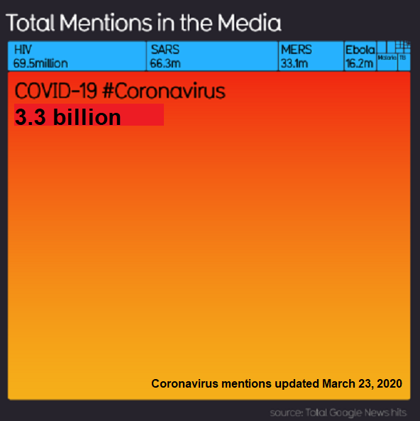
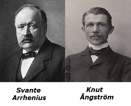
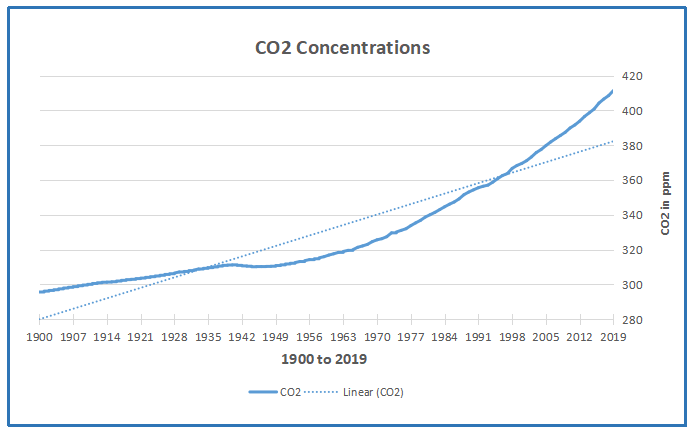
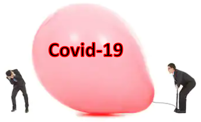
Interesting that Svante Arrhenius was elevated as the founder of AGW belief system. He was ignored for many decades after Knut Ångström and his assistant Herr Koch showed that reducing CO2 concentrations did not affect the amount of IR absorbed by the air. That’s almost as interesting as discovering that shutting down the global economy over fear of Covid19 has little effect on atmospheric CO2 concentrations.
As a fellow Scandinavian, Ångström agreed with Arrhenius that his projected warming would be a good thing, even in the lower estimates Svante made later on. Still, Ångström had two objections to Arrhenius’ conjecture about global warming from increasing CO2. In 1900, Herr J. Koch, laboratory assistant to Knut Ångström, did not observe any appreciable change in the absorption of infrared radiation by decreasing the concentration of CO2 up to a third of the initial amount. This result, in addition to the observation made a couple of years before that the superposition of the water vapour absorption bands, more abundant in the atmosphere, over those of CO2, convinced most geologists that calculations by Svante Arrhenius for CO2 warming were wrong.
Ångström’s 1900 paper (english translation) was About the importance of water vapor and carbon dioxide during the absorption of the Earth’s atmosphere Title is link to pdf. Conclusion:
Under no circumstances should carbon dioxide absorb more than 16 percent of terrestrial radiation, and the size of this absorption varies quantitatively very little, as long as there is not less than 20 percent of the existing value. The main alteration caused by a decrease in atmospheric carbon dioxide content, is that the absorption exerted by the carbon dioxide (about 16 percent of the radiation) is only completed by a thicker atmospheric layer, so that the heat is a little more dispersed in the atmosphere.
Many decades passed without reference to Arrhenius until the AGW movement took off in the 1980s and advocates wanted an ancient founder for their ideas. Obviously, Ångström’s position had to be destroyed by articles at RealClimate and Wikipedia (the same team after all.) So it is now declared that Arrhenius was right and Ångström wrong, based on some claims about “line-broadening” and the famous raised Effective Radiating Level (ERL). Ångström’s experimental results were not overturned but were deemed the” Saturation Fallacy”. Meanwhile,today’s climate realists acknowledge that the IR absorption by CO2 is logarithmic with diminishing returns. Attempts to find the raised ERL in modern satellite and balloon datasets have also failed, but alarmists are undaunted. (See reprinted post below)
Background from previous post Global Warming Theory and the Tests It Fails

Many people commenting both for and against reducing emissions from burning fossil fuels assume it has been proven that rising GHGs including CO2 cause higher atmospheric temperatures. That premise has been tested and found wanting, as this post will describe. First below is a summary of Global Warming Theory as presented in the scientific literature. Then follows discussion of several unsuccessful attempts to find evidence of the hypothetical effects from GHGs in the relevant datasets. Concluding is the alternative theory of climate change deriving from solar and oceanic fluctuations.
Scientific Theory of Global Warming
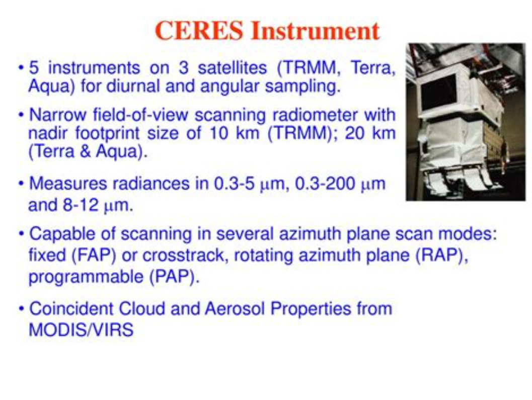
The theory is well described in an article by Kristian (okulaer) prefacing his analysis of “AGW warming” fingerprints in the CERES satellite data. How the CERES EBAF Ed4 data disconfirms “AGW” in 3 different ways by okulaer November 11, 2018. Excerpts below with my bolds. Kristian provides more detailed discussion at his blog (title in red is link).
Background: The AGW Hypothesis
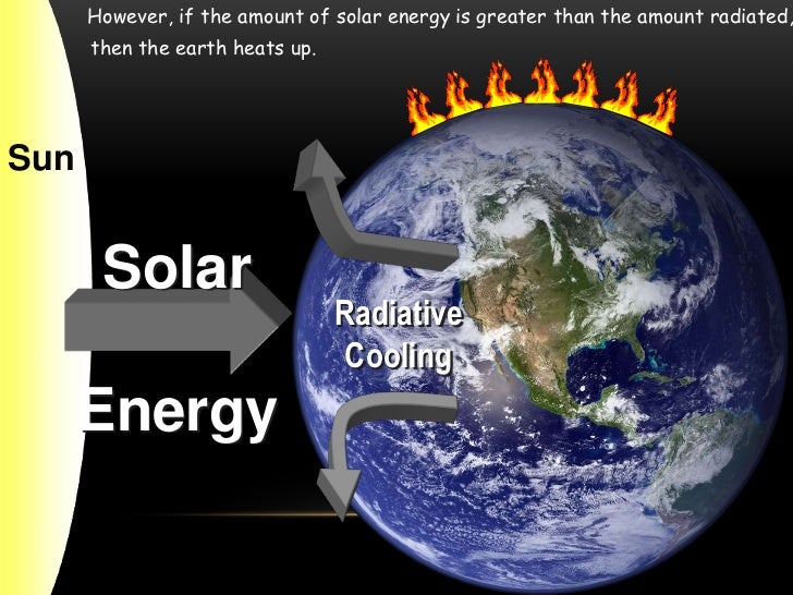
For those of you who aren’t entirely up to date with the hypothetical idea of an “(anthropogenically) enhanced GHE” (the “AGW”) and its supposed mechanism for (CO2-driven) global warming, the general principle is fairly neatly summed up here.
I’ve modified this diagram below somewhat, so as to clarify even further the concept of “the raised ERL (Effective Radiating Level)” – referred to as Ze in the schematic – and how it is meant to ‘drive’ warming within the Earth system; to simply bring the message of this fundamental premise of “AGW” thinking more clearly across.
 Then we have the “doubled CO2” (t1) scenario, where the ERL has been pushed higher up into cooler air layers closer to the tropopause:
So when the atmosphere’s IR opacity increases with the excess input of CO2, the ERL is pushed up, and, with that, the temperature at ALL ALTITUDE-SPECIFIC LEVELS of the Earth system, from the surface (Ts) up through the troposphere (Ttropo) to the tropopause, directly connected via the so-called environmental lapse rate, i.e. the negative temperature profile rising up through the tropospheric column, is forced to do the same.
The Expected GHG Fingerprints
How, then, is this mechanism supposed to manifest itself?
Well, as the ERL, basically the “effective atmospheric layer of OUTWARD (upward) radiation”, the one conceptually/mathematically responsible for the All-Sky OLR flux at the ToA, and from now on, in this post, dubbed rather the EALOR, is lifted higher, into cooler layers of air, the diametrically opposite level, the “effective atmospheric layer of INWARD (downward) radiation” (EALIR), the one conceptually and mathematically responsible for the All-Sky DWLWIR ‘flux’ (or “the atmospheric back radiation”) to the surface, is simultaneously – and for the same physical reason, only inversely so – pulled down, into warmer layers of air closer to the surface. This latter concept was explained already in 1938 by G.S. Callendar. Feldman et al., 2015, (as an example) confirm that this is still how “Mainstream Climate Science (MCS)” views this ‘phenomenon’:
The gist being that, when we make the atmosphere more opaque to IR by putting more CO2 into it, “the atmospheric back radiation” (all-sky DWLWIR at sfc) will naturally increase as a result, reducing the radiative heat loss (net LW) from the surface up. And do note, it will increase regardless of (and thus, on top of) any atmospheric rise in temperature, which would itself cause an increase. Which is to say that it will always distinctly increase also RELATIVE TO tropospheric temps (which are, by definition, altitude-specific (fixed at one particular level, like ‘the lower troposphere’ (LT))). That is, even when tropospheric temps do go up, the DWLWIR should be observed to increase systematically and significantly MORE than what we would expect from the temperature rise alone. Because the EALIR moves further down.
Conversely, at the other end, at the ToA, the EALOR moves the opposite way, up into colder layers of air, which means the all-sky OLR (the outward emission flux) should rather be observed to systematically and significantly decrease over time relative to tropospheric temps. If tropospheric temps were to go up, while the DWLWIR at the surface should be observed to go significantly more up, the OLR at the ToA should instead be observed to go significantly less up, because the warming of the troposphere would simply serve to offset the ‘cooling’ of the effective emission to space due to the rise of the EALOR into colder strata of air.
What we’re looking for, then, if indeed there is an “enhancement” of some “radiative GHE” going on in the Earth system, causing global warming, is ideally the following:
OLR stays flat, while TLT increases significantly and systematically over time;
TLT increases systematically over time, but DWLWIR increases significantly even more.
Effectively summed up in this simplified diagram.

Figure 4. Note, this schematic disregards – for the sake of simplicity – any solar warming at work.
However, we also expect to observe one more “greenhouse” signature.
If we expect the OLR at the ToA to stay relatively flat, but the DWLWIR at the sfc to increase significantly over time, even relative to tropospheric temps, then, if we were to compare the two (OLR and DWLWIR) directly, we’d, after all, naturally expect to see a fairly remarkable systematic rise in the latter over the former (refer to Fig.4 above).
Which means we now have our three ways to test the reality of an hypothesized “enhanced GHE” as a ‘driver’ (cause) of global warming.
Three Tests for GHG Warming in the Sky
The null hypothesis in this case would claim or predict that, if there is NO strengthening “greenhouse mechanism” at work in the Earth system, we would observe:
1. The general evolution (beyond short-term, non-thermal noise (like ENSO-related humidity and cloud anomalies or volcanic aerosol anomalies))* of the All-Sky OLR flux at the ToA to track that of Ttropo (e.g. TLT) over time;
2. The general evolution of the All-Sky DWLWIR at the surface to track that of Ttropo (Ts + Ttropo, really) over time;
3. The general evolution of the All-Sky OLR at the ToA and the All-Sky DWLWIR at the surface to track each other over time, barring short-term, non-thermal noise.
* (We see how the curve of the all-sky OLR flux at the ToA differs quite noticeably from the TLT and DWLWIR curves, especially during some of the larger thermal fluctuations (up or down), normally associated with particularly strong ENSO events. This is because there are factors other than pure mean tropospheric temperatures that affect Earth’s final emission flux to space, like the concentration and distribution (equator→poles, surface→tropopause/stratosphere) of clouds, water vapour and aerosols. These may (and do) all vary strongly in the short term, significantly disrupting the normal temperature↔flux (Stefan-Boltzmann) connection, but in the longer term, they display a remarkable tendency to even out, leaving the tropospheric temperature signal as the only real factor to consider when comparing the OLR with Ttropo (TLT). Or not. The “AGW” idea specifically contends, resting on the premise, that these other factors (and crucially also including CO2, of course) do NOT even out over time, but rather accrue in a positive (‘warming’) direction.)
Missing Fingerprint #1
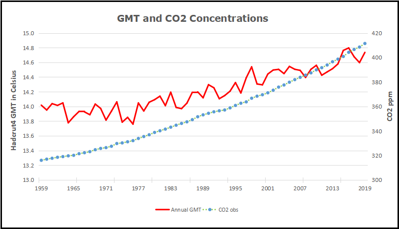
The first point above we have already covered extensively. The combined ERBS+CERES OLR record is seen to track the general progression of the UAHv6 TLT series tightly, both in the tropics and near-globally, all the way from 1985 till today (the last ~33 years), as discussed at length both here and here.
Since, however, in this post we’re specifically considering the CERES era alone, this is how the global OLR matches against the global TLT since 2000:
 Figure 5.
This is simply the monthly CERES OLR flux data properly scaled (x0.266), enabling us to compare it more directly to temperatures (W/m2→K), and superimposed on the UAH TLT data. Watch how closely the two curves track each other, beyond the obvious noise. To highlight this striking state of relative congruity, we remove the main sources of visual bias in Fig.5 above. Notice, then, how the red OLR curve, after the 4-year period of fairly large ENSO-events (La Niña-El Niño-La Niña) between 2007/2008 and 2011/2012, when the cyan TLT curve goes both much lower (during the flanking La Niñas) and much higher (during the central El Niño), quickly reestablishes itself right back on top of the TLT curve, just where it used to be prior to that intermediate stretch of strong ENSO influence. And as a result, there is NO gradual divergence whatsoever to be spotted between the mean levels of these two curves, from the beginning of 2000 to the end of 2015.
Missing Fingerprint #2
The second point above is just as relevant as the first one, if we want to confirm (or disconfirm) the reality of an “enhanced GHE” at work in the Earth system. We compare the tropospheric temperatures with the DWLWIRsfc ‘flux’, that is, the apparent atmospheric thermal emission to the surface:

Figure 9. Note how the scaling of the flux (W/m2) values is different close to the surface than at the ToA. Here at the DWLWIR level, down low, we divide by 5 (x0.2), while at the OLR level, up high, we divide by 3.76 (x0.266).
We once again observe a rather close match overall. At the very least, we can safely say that there is no evidence whatsoever of any gradual, systematic rise in DWLWIR over the TLT, going from 2000 to 2018. If we plot the difference between the two curves in Fig.9 to obtain the “DWLWIR residual”, this fact becomes all the more evident:
 Figure 10.
Remember now how the idea of an “enhanced GHE” requires the DWLWIR to rise significantly more than Ttropo (TLT) over time, and that its “null hypothesis” therefore postulates that such a rise should NOT be seen. Well, do we see such a rise in the plot above? Nope. Not at all. Which fits in perfectly with the impression we got at the ToA, where the TLT-curve was supposed to rise systematically up and away from the OLR-curve over time, but didn’t – no observed evidence there either of any “enhanced GHE” at work.
Missing Fingerprint #3
Finally, the third point above is also pretty interesting. It is simply to verify whether or not the CERES EBAF Ed4 ‘radiation flux’ data products are indeed suggesting a strengthening of some radiatively defined “greenhouse mechanism”. We sort of know the answer to this already, though, from going through points 1 and 2 above. Since neither the OLR at the ToA nor the DWLWIR at the surface deviated meaningfully from the UAHv6 TLT series (the same one used to compare with both, after all), we expect rather by necessity that the two CERES ‘flux products’ also shouldn’t themselves deviate meaningfully overall from one another. And, unsurprisingly, they don’t:

Figure 14. Difference plot (“DWLWIR residual”)
Again, it is so easy here to allow oneself to be fooled by the visual impact of that late – obviously ENSO-related – peak, and, in this case, also a definite ENSO-based trough right at the start (you’ll plainly recognise it in Fig.14); another perfect example of how one’s perception and interpretation of a plot is directly affected by “the end-point bias”. Don’t be fooled:
If we expect the OLR at the ToA to stay relatively flat, but the DWLWIR at the sfc to increase significantly over time, even relative to tropospheric temps, then, if we were to compare the two (OLR and DWLWIR) directly, we’d […] naturally expect to see a fairly remarkable systematic rise in the latter over the former (refer to Fig.4 above).
Looking at Fig.14, and taking into account the various ENSO states along the way, does such a “remarkable systematic rise” in DWLWIR over OLR manifest itself during the CERES era?
I’m afraid not …
Four Lines of Evidence Against GHG Warming Hypothesis
The lack of GHG warming in the CERES data is added to three previous atmospheric heat radiation studies.

- In 2004 Ferenc MIskolczi studied the radiosonde datasets and found that the optical density at the top of the troposphere does not change with increasing CO2, since reducing H2O maintains optimal radiating efficiency. His publication was suppressed by NASA, and he resigned from his job there. He has elaborated on his findings in publications as recently as 2014. See: The Curious Case of Dr. Miskolczi
2. Ronan and Michael Connolly studied radiosonde data and concluded in 2014:
“It can be seen from the infra-red cooling model of Figure 19 that the greenhouse effect theory predicts a strong influence from the greenhouse gases on the barometric temperature profile. Moreover, the modeled net effect of the greenhouse gases on infra-red cooling varies substantially over the entire atmospheric profile.
However, when we analysed the barometric temperature profiles of the radiosondes in this paper, we were unable to detect any influence from greenhouse gases. Instead, the profiles were very well described by the thermodynamic properties of the main atmospheric gases, i.e., N 2 and O 2 , in a gravitational field.”
While water vapour is a greenhouse gas, the effects of water vapour on the temperature profile did not appear to be related to its radiative properties, but rather its different molecular structure and the latent heat released/gained by water in its gas/liquid/solid phase changes.
For this reason, our results suggest that the magnitude of the greenhouse effect is very small, perhaps negligible. At any rate, its magnitude appears to be too small to be detected from the archived radiosonde data.” Pg. 18 of referenced research paper
See: The Physics Of The Earth’s Atmosphere I. Phase Change Associated With Tropopause
3. An important proof against the CO2 global warming claim was included in John Christy’s testimony 29 March 2017 at the House Committee on Science, Space and Technology. The text and diagram below are from that document which can be accessed here.
IPCC Assessment Reports show that the IPCC climate models performed best versus observations when they did not include extra GHGs and this result can be demonstrated with a statistical model as well.

Figure 5. Simplification of IPCC AR5 shown above in Fig. 4. The colored lines represent the range of results for the models and observations. The trends here represent trends at different levels of the tropical atmosphere from the surface up to 50,000 ft. The gray lines are the bounds for the range of observations, the blue for the range of IPCC model results without extra GHGs and the red for IPCC model results with extra GHGs.The key point displayed is the lack of overlap between the GHG model results (red) and the observations (gray). The nonGHG model runs (blue) overlap the observations almost completely.
An Alternative Theory of Natural Climate Change
Dan Pangburn is a professional engineer who has synthesized the solar and oceanic factors into a mathematical model that correlates with Average Global Temperature (AGT). On his blog is posted a monograph Cause of Global Climate Change explaining clearly his thinking and the maths. I provided a post with some excerpts and graphs as a synopsis of his analysis, in hopes others will also access and appreciate his work on this issue. See Quantifying Natural Climate Change
Footnote on the status of an hypothetical effect too small to be measured: Bertrand Russell’s teapot

Open image in new tab to enlarge.
Postscript:
A further reference comes from the brief submiitted by Professors Happer, Koonin and Lindzen to the Climate Tutorial for Judge Alsup. The pertinent citation is as follows:
“On average, the absorption rate of solar radiation by the Earth’s surface and atmosphere is equal to emission rate of thermal infrared radiation to space. Much of the radiation to space does not come from the surface but from greenhouse gases and clouds in the lower atmosphere, where the temperature is usually colder than the surface temperature, as shown in the figure on the previous page. The thermal radiation originates from an “escape altitude” where there is so little absorption from the overlying atmosphere that most (say half) of the radiation can escape to space with no further absorption or scattering. Adding greenhouse gases can warm the Earth’s surface by increasing the escape altitude. To maintain the same cooling rate to space, the temperature of the entire troposphere, and the surface, would have to increase to make the effective temperature at the new escape altitude the same as at the original escape altitude. For greenhouse warming to occur, a temperature profile that cools with increasing altitude is required.
Over most of the CO2 absorption band (between about 580 cm-1 and 750 cm-1 ) the escape altitude is the nearly isothermal lower stratosphere shown in the first figure. The narrow spike of radiation at about 667 cm-1 in the center of the CO2 band escapes from an altitude of around 40 km (upper stratosphere), where it is considerably warmer than the lower stratosphere due heating by solar ultraviolet light which is absorbed by ozone, O3. Only at the edges of the CO2 band (near 580 cm-1 and 750 cm-1 ) is the escape altitude in the troposphere where it could have some effect on the surface temperature. Water vapor, H2O, has emission altitudes in the troposphere over most of its absorption bands. This is mainly because water vapor, unlike CO2, is not well mixed but mostly confined to the troposphere.”
A synopsis of that submission was posted as Cal Climate Tutorial: The Meat


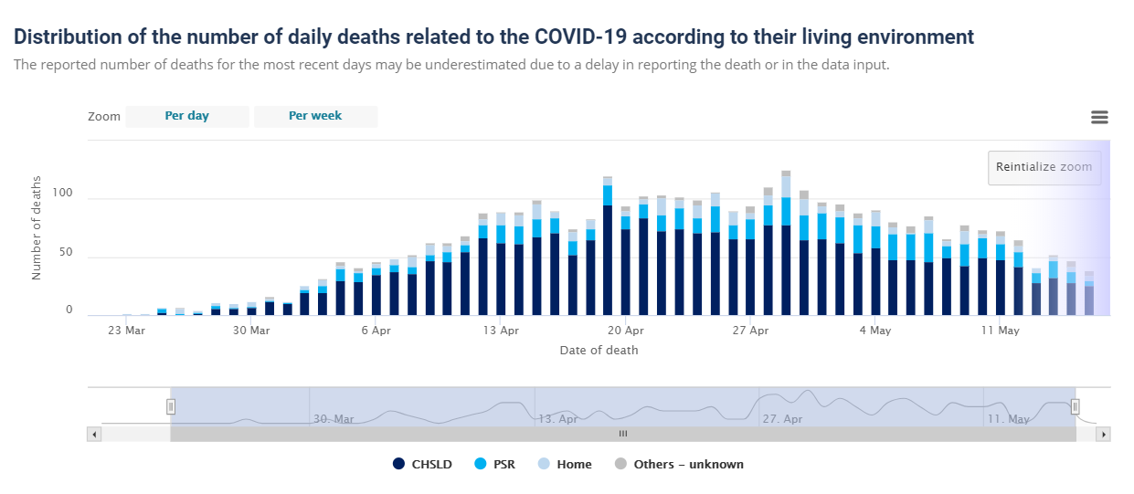

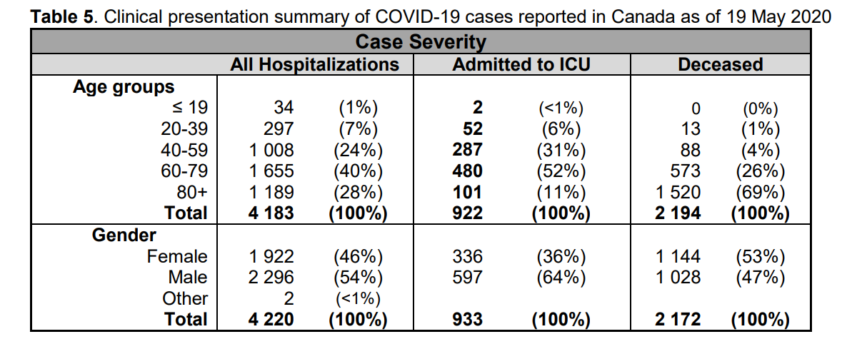


 Beyond including people with the virus who clearly didn’t die from it, the numbers are inflated by counting people who don’t even have the virus. New York has classified many cases as coronavirus deaths even when postmortem tests have been negative. The diagnosis can be based on symptoms, even though the symptoms are often similar to those of the seasonal flu.


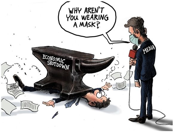
 One of the things we learned in organizational science was that managers are prone to focus attention and resources on urgent situations at the expense of more serious threats to viability. Thus the aphorism: “When you are up to your ass in alligators it’s difficult to remember that your initial objective was to drain the swamp”. Many times we consultants saw clients working hard to put out fires (complaints, delays, etc.) while oblivious to strategic weaknesses eroding their ability to compete with rivals. One memorable client responded to our product profitabilty analysis showing why they were losing money, “I can’t drop that product, it’s our best seller!”