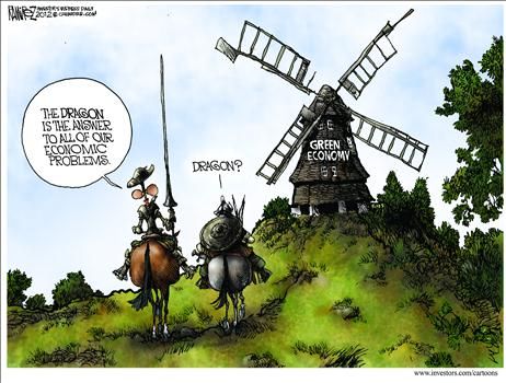
Alarmists Attack IPCC Not Linking Disasters to CO2


Chris Morrison reports on the flap over Climate Crisis™ media tactics in his Daily Sceptic article Climate Activists Frustrated by IPCC’s Refusal to Link Extreme Weather With Carbon Emissions.  Excerpts in italics with my bolds and added images.

Last June, the state-reliant BBC reported that human-caused climate change had made U.S. and Mexico heatwaves “35 times more likely”. Nothing out of the ordinary here in mainstream media with everyone from climate comedy turn ‘Jim’ Dale to UN chief Antonio ‘Boiling’ Guterres making these types of bizarre attributions. But for those who closely follow climate science and the assessments of the Intergovernmental Panel on Climate Change (IPCC), “such headlines can be difficult to make sense of”, observes the distinguished science writer Roger Pielke. In a hard-hitting attack on the pseudo-scientific industry of weather attribution, he states:

“neither the IPCC nor the underlying scientific literature comes anywhere close to making such strong and“ certain claims of attribution”.

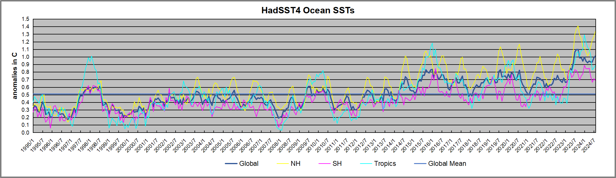
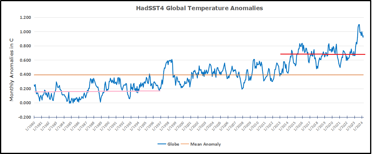
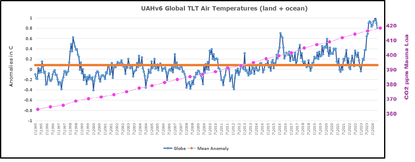
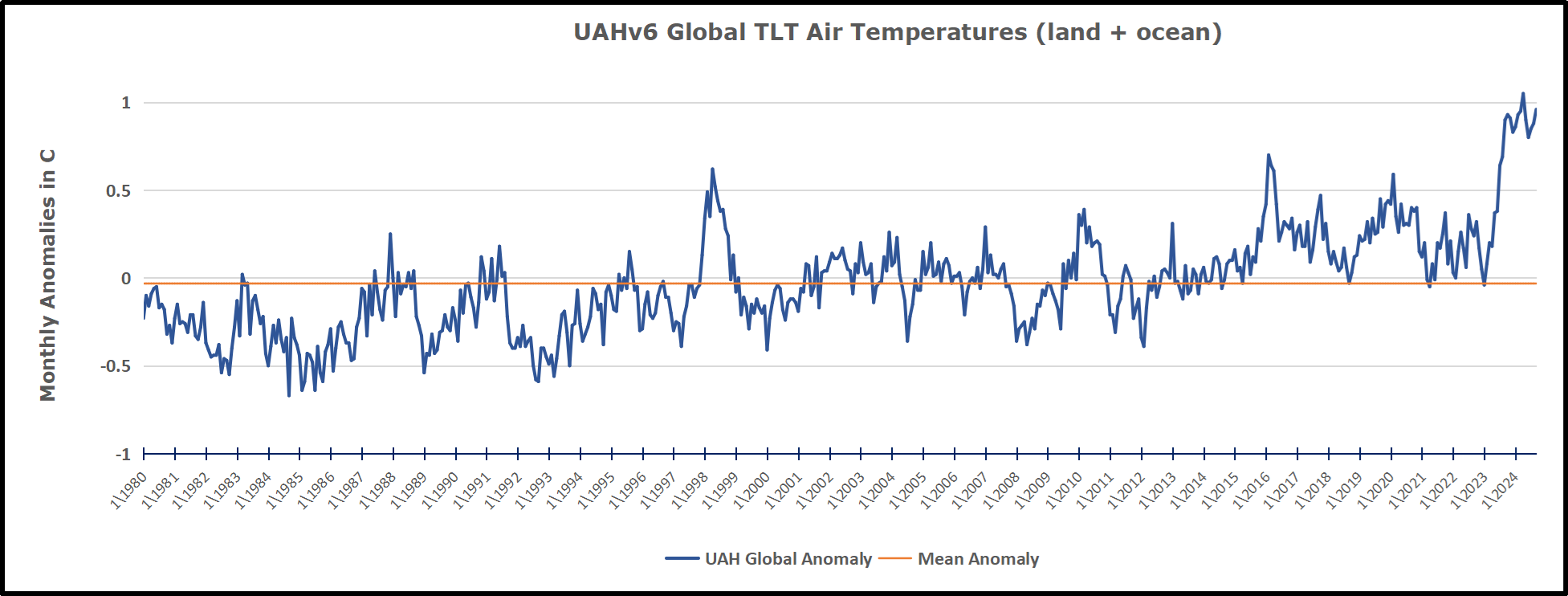
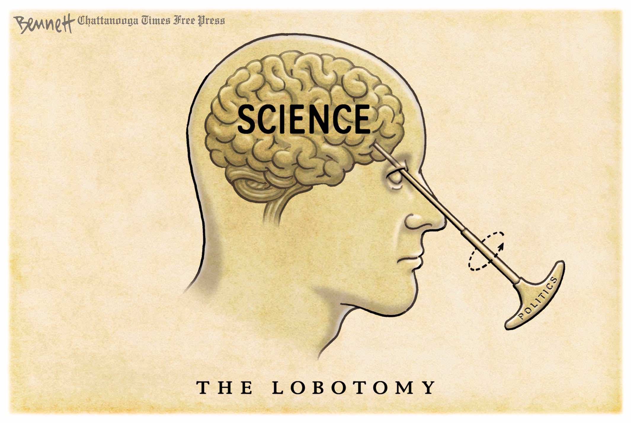
Pielke argues that the extreme position of attributing individual bad weather events is “roughly aligned” with the far Left. “Climate science is not, or at least should not serve as a proxy for political tribes,” he cautions. But of course it is. The Net Zero fantasy is a collectivist national and supra-national agenda that increasingly relies on demonising bad weather. With global temperatures rising at most only 0.1°C a decade, laughter can only be general and side-splitting when IPCC boss Jim Skea claims that British summers will be 6°C hotter in less than 50 years. Two extended temperature pauses since 2000 have not helped the cause of global boiling. In addition there are increasing doubts about the reliability of temperature recordings by many meteorological organisations that seem unable to properly account for massive urban heat corruptions.

The big problem for ‘far Left’ climate extremists is that event attribution is a form, in Pielke’s words, of “tactical science”. Such science serves legal and political ends and is not always subject to peer review. As the BBC and other media outlets can attest, the work is “generally promoted via press release”. It has been developed in response to the failure of the IPCC to detect and attribute most types of extreme weather including drought, flooding, storms and wildfires to human involvement, notes Pielke. Worse, the IPCC can find little sign of human involvement going forward to 2100.

Scientists cannot answer directly whether particular events are
caused by climate change since extremes occur naturally.

Meanwhile the IPCC is somewhat dismissive about weather attribution, or as Pielke terms it, “weather attribution alchemy”. It notes: “The usefulness or applicability of available extreme event attribution methods for assessing climate-related risks remains subject to debate.” The IPCC is a biased body full of climate alarmists, but its inability to attribute single events to humans is obviously highly irritating and somewhat inconvenient for activists and their media counterparts.

Dr. Friederike Otto speaking with reporter at Oxford.

Dr. Friederike Otto runs World Weather Attribution (WWA) out of Imperial College London and is a frequent presence on the BBC. WWA is behind many of the immediate attributions of bad weather to human causes and its motives are clear. As Dr. Otto has noted: “Unlike every other branch of climate science or science in general, event attribution was actually originally suggested with the courts in mind.” Otto is clear that the main function of such studies, part-funded by Net Zero-supporting billionaires and heavily pushed by aligned mainstream media, is to support lawsuits against fossil fuel companies. She explains this strategy in detail in the interview, ‘From Extreme Event Attribution to Climate Litigation‘.

The inability of the IPCC to attribute bad weather to humans has been viewed by climate advocates as “politically problematic”, continues Pielke. He notes the work of climate activists Elizabeth Lloyd and Naomi Oreskes who are worried that the lack of attribution “conveys the impression that we just do not know, which feeds into uncertainty, doubt or incompleteness, and the general tendency of humans to discount threats that are not imminent”.

Perish the thought that there should be uncertainty, doubt
or incompleteness in the settled world of climate science.

It is of course different from all other branches of science in that all its opinions are right and consequently there is no need for the unhelpful process of constant inquiry and experiment. It need hardly be added that no doubt exists at the BBC, where former Radio 4 Today Editor Sarah Sands wrote the foreword to a WWA guide for journalists. Recalling when the late Nigel Lawson suggested there had been no increase in extreme weather, Sands noted: “I wish we had this guide for journalists to help us mount a more effective challenge to his claim.” These days, Sands enthused, attribution studies have given us “significant insight into the horsemen of the climate apocalypse”.

For her part, Otto is keen to crack down on the heretics. She was at the forefront of the recent notorious retraction of a paper in a Springer Nature journal that stated there was no evidence that the climate was breaking down. Written by four Italian scientists and led by Professor Gianluca Alimonti, they argued that a climate emergency was not supported by the data. Otto, who had previously worked in the Oxford School of Geography for 10 years, claimed the scientists were not writing in good faith. “If the journal cares about science they should withdraw it loudly and publicly saying it should never have been published,” she demanded.

A recent scientific study has confirmed that natural and climate-related disasters are declining during the 21st century. Getty Images/iStcokphoto

Declining Weather Disasters Prove Doomsters Wrong (Alimonti et al.)

Benny Peiser makes the case in his NY Post article Despite climate-change hysterics, weather disasters have decreased.  Excerpts in italics with my bolds and added images.

A recent scientific study has confirmed what climate realists have been highlighting for some time: Natural and climate-related disasters have been declining rather than increasing during the 21st century.

In a paper published this year in one of the world’s leading journals on environmental hazards, Italian scientists Gianluca Alimonti and Luigi Mariani analyzed the number and temporal trends of natural disasters reported since 1900.

A 2015 study by 22 scientists from around the world found that cold kills over 17 times more people than heat. Thus the planet’s recent modest warming has been saving millions of lives.

Based on the best available data, the two scientists concluded the 21st century has seen “a decreasing trend [of natural disasters] to 2022” which is “characterized by a significant decline in number of events.”

The researchers emphasized that their conclusion “sits in marked contradiction to earlier analyses by UN bodies which predict an increasing number of natural disasters and impacts in concert with global warming.”

“Our analyses strongly refute this assertion,” they wrote.

For years, international agencies such as the UN Office for Disaster Risk Reduction, the Food and Agriculture Organization of the United Nations, the World Meteorological Organization and the International Red Cross have claimed that climate-related disasters are escalating.

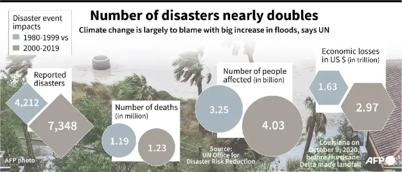
Floods lead a near doubling of disaster events from 1980 to 1999 compared to 2000 to 2019, according to a report by the UN Office for Disaster Risk Reduction.

“Weather disasters are striking the world four to five times more often and causing seven times more damage than in the 1970s,” the WMO reported in 2021.

Disaster and weather officials affiliated with the UN claim this dramatic rise is due to global warming: The changing climate, they say, is making weather disasters stronger and more frequent.

Fourth National Climate Assessment, Volume II: Impacts, Risks, and Adaptation in the United States.

The increased frequency of heat waves, droughts, flooding, winter storms, hurricanes, wildfires and other extreme weather events prove the negative impact of a warming world, according to various UN agencies and nongovernmental organizations.

Yet, as the actual data used by these organizations reveals, the last 20 years have in fact seen a significant decline in such events.

It turns out that climate alarmists have based their claims on a highly misleading comparison of disaster data of the late 20th and the early 21st centuries.

By their tally, the period from 1980 to 2000 saw about 4,200 natural disasters —with the number increasing sharply, to more than 8,000, during the first 20 years of this century.

This conclusion, however, is fatally flawed: It fails to take into account the huge increase in the global reporting of disasters engendered by the invention and rapid global dissemination of new communication technologies since the 1980s.

The arrival of the internet and other new communication tools has undoubtedly accelerated the reporting of disasters from all corners of the world — events that were significantly underreported in earlier decades.

As well, the number of people killed by natural and climate-related disasters has fallen steadily over the past 120 years — from 500,000 deaths per decade in the early 20th century down to less than 50,000 per decade in the last ten years.

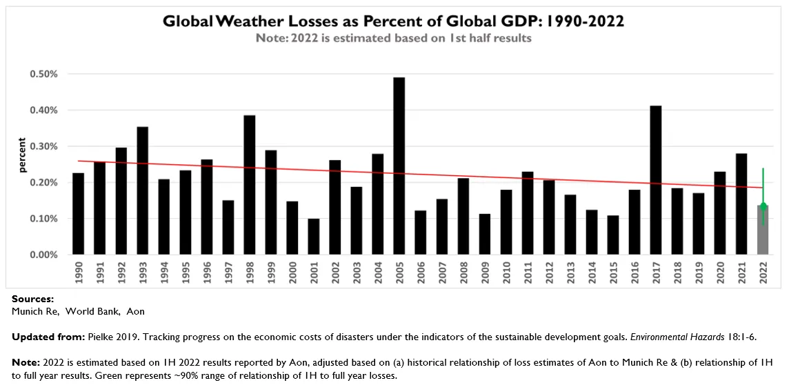
And, contrary to claims by NGOs and government officials, climate-related disaster losses have also declined as a percentage of global GDP during the last 30 years — from about 0.25% of GDP in 1990 to less than 0.20% in 2023.

The study by Alimonti and Mariani vindicates what we at the Global Warming Policy Foundation have been pointing out for a long time: Climate-related disasters are not on the rise, despite warming temperatures.

International agencies and the news media have hyped climate disasters for far too long, while ignoring the factual downward trend.

”First they ignore you, then they laugh at you, then they fight you, then you win,” as the saying goes.  UN agencies and NGOs have been misleading the public for years. It’s past time for the truth to win out.

Benny Peiser is the director of the London-based Global Warming Policy Foundation.

See also

Our Weather Extremes Are Customary in History

Figure27: Annual count of EF3 and above tornadoes in the US, 1950–2021. Source: Source: NOAA/NCEI.106, 107


UAH September 2024: NH Land Up, SH Land Down

The post below updates the UAH record of air temperatures over land and ocean. Each month and year exposes again the growing disconnect between the real world and the Zero Carbon zealots.  It is as though the anti-hydrocarbon band wagon hopes to drown out the data contradicting their justification for the Great Energy Transition.  Yes, there has been warming from an El Nino buildup coincidental with North Atlantic warming, but no basis to blame it on CO2.  

As an overview consider how recent rapid cooling  completely overcame the warming from the last 3 El Ninos (1998, 2010 and 2016).  The UAH record shows that the effects of the last one were gone as of April 2021, again in November 2021, and in February and June 2022  At year end 2022 and continuing into 2023 global temp anomaly matched or went lower than average since 1995, an ENSO neutral year. (UAH baseline is now 1991-2020). Now we have an usual El Nino warming spike of uncertain cause, unrelated to steadily rising CO2 and now moderating.

For reference I added an overlay of CO2 annual concentrations as measured at Mauna Loa.  While temperatures fluctuated up and down ending flat, CO2 went up steadily by ~60 ppm, a 15% increase.

Furthermore, going back to previous warmings prior to the satellite record shows that the entire rise of 0.8C since 1947 is due to oceanic, not human activity.

gmt-warming-events

The animation is an update of a previous analysis from Dr. Murry Salby.  These graphs use Hadcrut4 and include the 2016 El Nino warming event.  The exhibit shows since 1947 GMT warmed by 0.8 C, from 13.9 to 14.7, as estimated by Hadcrut4.  This resulted from three natural warming events involving ocean cycles. The most recent rise 2013-16 lifted temperatures by 0.2C.  Previously the 1997-98 El Nino produced a plateau increase of 0.4C.  Before that, a rise from 1977-81 added 0.2C to start the warming since 1947.

Importantly, the theory of human-caused global warming asserts that increasing CO2 in the atmosphere changes the baseline and causes systemic warming in our climate.  On the contrary, all of the warming since 1947 was episodic, coming from three brief events associated with oceanic cycles. And now in 2024 we have seen an amazing episode with a temperature spike driven by ocean air warming in all regions, along with rising NH land temperatures, now oscillating near its peak.

Chris Schoeneveld has produced a similar graph to the animation above, with a temperature series combining HadCRUT4 and UAH6. H/T WUWT

image-8


mc_wh_gas_web20210423124932

See Also Worst Threat: Greenhouse Gas or Quiet Sun?

September 2024 NH Land Spike Warms More than SH Land Drops

 banner-blog

With apologies to Paul Revere, this post is on the lookout for cooler weather with an eye on both the Land and the Sea.  While you heard a lot about 2020-21 temperatures matching 2016 as the highest ever, that spin ignores how fast the cooling set in.  The UAH data analyzed below shows that warming from the last El Nino had fully dissipated with chilly temperatures in all regions. After a warming blip in 2022, land and ocean temps dropped again with 2023 starting below the mean since 1995.  Spring and Summer 2023 saw a series of warmings, continuing into October, followed by cooling. 

UAH has updated their tlt (temperatures in lower troposphere) dataset for September 2024. Posts on their reading of ocean air temps this month are ahead of the update from HadSST4.  I posted last month on SSTs using NH Pulls Oceans Warmer August 2024.  These posts have a separate graph of land air temps because the comparisons and contrasts are interesting as we contemplate possible cooling in coming months and years.

Sometimes air temps over land diverge from ocean air changes. In July 2024 all oceans were unchanged except for Tropical warming, while all land regions rose slightly. Then in August we saw a warming leap in SH land, slight Land cooling elsewhere, a dip in Tropical Ocean temp and slightly elsewhere. Now in September a dramatic drop in SH land, overcome by a greater NH land increase. End result is an upward bump in Global anomaly.

Note:  UAH has shifted their baseline from 1981-2010 to 1991-2020 beginning with January 2021.  In the charts below, the trends and fluctuations remain the same but the anomaly values changed with the baseline reference shift.

Presently sea surface temperatures (SST) are the best available indicator of heat content gained or lost from earth’s climate system.  Enthalpy is the thermodynamic term for total heat content in a system, and humidity differences in air parcels affect enthalpy.  Measuring water temperature directly avoids distorted impressions from air measurements.  In addition, ocean covers 71% of the planet surface and thus dominates surface temperature estimates.  Eventually we will likely have reliable means of recording water temperatures at depth.

Recently, Dr. Ole Humlum reported from his research that air temperatures lag 2-3 months behind changes in SST.  Thus cooling oceans portend cooling land air temperatures to follow.  He also observed that changes in CO2 atmospheric concentrations lag behind SST by 11-12 months.  This latter point is addressed in a previous post Who to Blame for Rising CO2?

After a change in priorities, updates are now exclusive to HadSST4.  For comparison we can also look at lower troposphere temperatures (TLT) from UAHv6 which are now posted for September.  The temperature record is derived from microwave sounding units (MSU) on board satellites like the one pictured above. Recently there was a change in UAH processing of satellite drift corrections, including dropping one platform which can no longer be corrected. The graphs below are taken from the revised and current dataset.

The UAH dataset includes temperature results for air above the oceans, and thus should be most comparable to the SSTs. There is the additional feature that ocean air temps avoid Urban Heat Islands (UHI).  The graph below shows monthly anomalies for ocean air temps since January 2015.

Note 2020 was warmed mainly by a spike in February in all regions, and secondarily by an October spike in NH alone. In 2021, SH and the Tropics both pulled the Global anomaly down to a new low in April. Then SH and Tropics upward spikes, along with NH warming brought Global temps to a peak in October.  That warmth was gone as November 2021 ocean temps plummeted everywhere. After an upward bump 01/2022 temps reversed and plunged downward in June.  After an upward spike in July, ocean air everywhere cooled in August and also in September.   

After sharp cooling everywhere in January 2023, all regions were into negative territory. Then there is a remarkable spiking of Tropical ocean temps from -0.4 up to + 1.3 in January 2024.  The rise was matched by other regions in 2024 January through May, before dropping lower. Now in September comes an upward bump in NH and Tropics pulling up Global anomaly.

Land Air Temperatures Tracking in Seesaw Pattern

We sometimes overlook that in climate temperature records, while the oceans are measured directly with SSTs, land temps are measured only indirectly.  The land temperature records at surface stations sample air temps at 2 meters above ground.  UAH gives tlt anomalies for air over land separately from ocean air temps.  The graph updated for September is below.

Here we have fresh evidence of the greater volatility of the Land temperatures, along with extraordinary departures by SH land.  Land temps are dominated by NH with a 2021 spike in January,  then dropping before rising in the summer to peak in October 2021. As with the ocean air temps, all that was erased in November with a sharp cooling everywhere.  After a summer 2022 NH spike, land temps dropped everywhere, and in January, further cooling in SH and Tropics offset by an uptick in NH. 

Remarkably, in 2023, SH land air anomaly shot up 2.1C, from  -0.6C in January to +1.5 in September, then dropped sharply to 0.6 in January 2024, matching the SH peak in 2016. Then through May 2024 NH and Tropical land temps spiked to new highs, before dropping down.  Now in August SH land spiked up, then reversed down in September.  NH and Tropics bumped upward, and Global land anomaly rose slightly

The Bigger Picture UAH Global Since 1980

The chart shows monthly Global anomalies starting 01/1980 to present.  The average monthly anomaly is -0.04, for this period of more than four decades.  The graph shows the 1998 El Nino after which the mean resumed, and again after the smaller 2010 event. The 2016 El Nino matched 1998 peak and in addition NH after effects lasted longer, followed by the NH warming 2019-20.   An upward bump in 2021 was reversed with temps having returned close to the mean as of 2/2022.  March and April brought warmer Global temps, later reversed

With the sharp drops in Nov., Dec. and January 2023 temps, there was no increase over 1980. Then in 2023 the buildup to the October/November peak exceeded the sharp April peak of the El Nino 1998 event. It also surpassed the February peak in 2016. In 2024 March and April took the Global anomaly to a new peak of 1.05C.  The cool down started with May dropping to 0.90C, and in June a further decline to 0.80C.  The warming level rose again and has persisted through September.

The graph reminds of another chart showing the abrupt ejection of humid air from Hunga Tonga eruption.

TLTs include mixing above the oceans and probably some influence from nearby more volatile land temps.  Clearly NH and Global land temps have been dropping in a seesaw pattern, nearly 1C lower than the 2016 peak.  Since the ocean has 1000 times the heat capacity as the atmosphere, that cooling is a significant driving force.  TLT measures started the recent cooling later than SSTs from HadSST4, but are now showing the same pattern. Despite the three El Ninos, their warming had not persisted prior to 2023, and without them it would probably have cooled since 1995.  Of course, the future has not yet been written.


Arctic Shipping Ends Early Due to Growing Ice

Ice-strengthened supramax Kumpula (Arc 4) on the NSR being escorted by nuclear icebreaker Vaygach. (Source: Courtesy of ESL Shipping)

The report comes from Malte Humpert at gCaptain  Early Winter Ice Halts Arctic Shipping Traffic Weeks Ahead of Schedule.  Excerpts in italics with my bolds.

The summer shipping window on Russia’s Northern Sea Route is coming to a rapid close weeks ahead of schedule. A number of vessels and convoys are rushing to complete their transits before the route shuts down in the next three weeks.

Source: Northern Sea Route Information Office

Unlike the last couple of summers when Russia’s Arctic coastal waterways were fully clear of sea ice, residual winter ice persisted in the eastern section this year. This has resulted in the early onset of ice formation especially in the Laptev, East Siberian, and Chukchi Seas.

NSRIO: Ice is still present in the eastern sector of the NSR preventing free passage of ships without ice class. The nuclear icebreaker Sibir has been operating in the East Siberian and Chukchi Seas since the end of June together with the nuclear icebreaker Vaygach, which has been in the area since mid-July. In several areas of the Chukchi and East Siberian Seas heavy ice conditions are still observed, which directly affects the admission of low ice class vessels to these areas. The western part of the NSR is mostly ice-free. Above is a map of ice conditions as of August 7, 2024.

Russia’s Northern Sea Route Administration announced that vessels with no ice class will have to vacate the waterway by October 15, around 2-3 weeks ahead of schedule. For vessels with light and medium ice classifications the navigation season will end on October 20 and October 31 respectively.

The last permitted start of convoys heading east will be October 10, leaving just one more week for vessels to begin their Arctic transit.

This year’s early shutdown comes three years after narrowly avoiding a major incident three years ago. In October 2021 Russian authorities reacted too late to begin closing down the NSR as winter sea ice drifted into the main shipping channel and trapped two dozen vessels for more than a month. A 30 centimeter or one foot thick ice layer had formed by the end of October across hundreds of miles of Arctic Ocean.
 
Several icebreakers, including the powerful nuclear vessel Yamal, rushed to the scene from Murmansk over 3,000 nautical miles away to help free the stranded vessels. Over the course of more than 6 weeks several icebreakers worked to break the vessels free and escort them to safety out of the eastern section of the Northern Sea Route. The situation did not fully resolve until the end of December when the last vessels were freed.

Vessels stuck in thick winter sea ice in November 2021 awaiting rescue. (Source: Rosatomflot)

Currently a number of container ships, oil tankers, bulk carriers
and LNG tankers are passing through the route.

In the Far East two LNG carriers and two oil tankers, including the Suezmax tanker Sai Baba, are currently passing through the waters adjacent to the Bering Strait. They are staying clear of multi-year ice around Wrangel Island which has persisted and troubled shipping all summer. A nuclear icebreaker had remained on standby for much of the summer keeping the shipping lane open.

Select container ships, crude oil tankers, and bulk and LNG carriers currently on the NSR. (Source: Shipatlas)

Further west along the route, the first-ever conventional Panamax container ship in the Arctic is about halfway through its transit. The vessel had originally intended to also conduct its return voyage via the Arctic, but will now likely have to return to Asia via the Suez Canal or South Africa route.

A massive Capesize bulk carrier without any ice class, Dodo, is also rushing to complete its eastbound voyage to Caofeidian, China.

Here’s ice activity in last week in the NSR from Chukchi Sea in the east (left side), and threatening in Laptev Sea (right).

Dearth of Green Jobs in UK

Chris Morrison provides the analysis in his Daily Sceptic article ONS Reveals the Pitiful Number of New Green Jobs Being Created in the U.K. Economy.  Excerpts in italics with my bolds and added images.

The problem with the green U.K. economy, and its associated destruction of the hydrocarbon environment, is that there are very few jobs being created. The few remaining ‘workers’ in the ruling Labour party are starting to rumble all the luxury boondoggles that are set to further decimate well-paid jobs in their communities. The figures compiled by the Office for National Statistics (ONS), trying to estimate the actual number of green jobs, are always a highly creative hoot, and the latest batch are no exception. Many jobs identified are simply displacement activity, with one repair or maintenance occupation taking over from another. Around 6% of the total are to be found in ‘environmental charities’, an interesting way to describe elite billionaire political funding to push the Net Zero fantasy. Such is the seeming desperation to rustle up a green job, the ONS even includes repairing home appliances, controlling forest fires and separating hydrogen by carbon dioxide-producing electrolysis.

The latest ‘estimates’ from the ONS cover 2021 and 2022, and they are said to show an increase in both years. But as the graph below reveals, the rises are pitiful over a decade, and the 2022 estimate of 639,000 is less than 2% of jobs in the economy as a whole.

As can be seen, environmental charities employ 40,000 people, almost as many as the 47,000 that work in renewable energy. But the charities figure does not include all those make-work jobs in environmental consultancy and education or what is described as in-house environmental activities. If all the displacement, invented or re-badged jobs in repair, electric vehicles, waste disposal, water treatment, energy efficiency, Net Zero promotion, teaching and the ubiquitous bureaucracy are rightly ignored, it is unlikely that more than 150,000 new jobs have been created.

Fairly small pickings, it might be thought, from all the cash sprayed at subsidy-hunting chancers over at least two decades. Even worse, any new jobs are easily offset by the occupations being destroyed in steel making, refining hydrocarbons, coal mining and oil and gas exploration. Fracking for gas would transform a number of deprived areas in the U.K. at little environmental cost, as it has done in the U.S. Energy security would likely be achieved, and the tax take would be considerable. But fracking is anathema to the major political parties in the U.K., except the emerging Reform party.Last week saw some real push back on the madness of Net Zero and the so-called green economy. The boss of GMB, the third largest trade union in the country, told the annual Labour party conference that its plans to decarbonise the energy network by 2030 will cost up to one million jobs, decimate working communities and push up bills for the poorest. According to Smith, Government’s plans for Net Zero were “bonkers” and “fundamentally dishonest”. In a week when it was revealed that British consumers, both industrial and private, had some of the highest electricity prices in the developed world, he charged that current energy policy amounted to virtue signalling by politicians. He accused them of exporting jobs and importing virtue because the jobs were being created abroad rather than in the U.K.

Meanwhile, a recent paper published in Science came to a damning conclusion that will not surprise sceptics, namely that 96% of climate policies over the last 25 years, ultimately designed to reduce carbon dioxide emissions, have been a waste of money. “That’s where green spin has got us,” writes George Monbiot, although these days the Guardian’s extremist-in-chief seems to have given up on all life enhancing processes that run the risk of disturbing anything on the planet. “Finally, 15 years and a trillion dollars too late, George Monbiot says what sceptics have been saying all along,” observes the sceptical journalist Jo Nova. “Nearly every single carbon reduction scheme is a useless make-work machination that creates the illusion that the government is doing something,” she says.

As we can see, the ONS survey is full of these make-work schemes providing jobs that can only exist by rigging free markets and providing eye-watering subsidies from consumers and taxpayers. As the more concerned trade unionists can see, much of the cost of these fantasy ventures falls on the poorest members of society forced to pay higher prices for many of the basic essentials of life. In addition, as we have observed, most green schemes make mugs of the wider investing public, with the RENIXX, a stock capitalisation global index of the 30 largest renewable industrial companies, showing near zero growth since it was started in 2006. None of this matters, of course, to the Mad Miliband and his weird wonks at the U.K. Department of Energy, who are ramping up ideological plans to hose cash at daft ideas like carbon capture, battery energy storage and hydrogen production.

Not only is CO2 Capture and Storage wildly impractical, its aim is to deprive the biosphere of plant food.

But all is not lost on the jobs front – opportunities must be taken when they occur. Earlier this year, Gary Smith was able to point to some new employment clearing away the animal casualties of wind farm blades. “It’s usually a man in a rowing boat, sweeping up the dead birds,” he observed.

Footnote Q & A:

Q:  What is the difference between Golf and Government?

A:  In Government you can always improve your lie.

–Anonymous Source

Resources

Climate Policies Fail in Fact and in Theory

Investors Beware Green Equipment Companies

Green Deal Cuts EU Emissions, Doubles Them Elsewhere

Climatists’ War on Meat updated

Tyler Durden reports at Zerohedge Meat Substitutes Still A Tiny Sliver Of US Meat Market.  Excerpts in italics with my bolds and added images.

Over the past few years, plant-based meat substitutes have come closer and closer to mimicking the real thing, with brands like Beyond Meat having even sussed out how to create fake meat that “bleeds”.

But, as Statista’s Anna Fleck details below, after an initial boom, the company has rapidly come down from its peaks.

There are several reasons for the hype having died down, one of which being that many consumers decided to move away from buying the often more expensive items amid the cost of living crisis.

Another reason cited is that plant-based meats have become a part of the U.S.’s culture war, labeled as a symbol of left-wing politics and a binary to “real” meat.

According to data from Statista’s Market Insights, plant-based meat substitutes accounted for a mere sliver of the U.S. meat market last year.

Not counting insect-based meat alternatives or cultured, i.e. lab-grown meat, meat substitute sales amounted to $1.4 billion in 2023, while sales of fresh and processed meat added up to almost $124 billion.

Outlook

  • Revenue in the Meat market amounts to US$131.60bn in 2024. The market is expected to grow annually by 4.22% (CAGR 2024-2029).
  • In global comparison, most revenue is generated in China (US$273bn in 2024).
  • In relation to total population figures, per person revenues of US$385.00 are generated in 2024.
  • In the Meat market, volume is expected to amount to 12.10bn kg by 2029. The Meat market is expected to show a volume growth of 1.9% in 2025.
  • The average volume per person in the Meat market is expected to amount to 32.4kg in 2024.

What’s Next?

Background Post: Coming Soon: Menu Climate Warnings

Baylen Linnekin writes at Reason Public Health Researchers Float Idea of Climate-Change Warnings on Menu Items.  Excerpts in italics with my bolds and added images.

Warning diners that red meat is bad for the environment is yet another attempt
to socially engineer food choices.

A study released last week suggests that fast-food menus that feature labels urging diners not to order red meat off those same menus due to the “climate impact” of those food items can help convince customers to swap out red meat for what the researchers argue are more climate-friendly foods—from fruits and vegetables to poultry and seafood. The study, published in Jama Network Open and led by researchers from Johns Hopkins University, concludes that “climate impact menu labels may be an effective strategy to promote more sustainable restaurant food choices and that labels highlighting high-climate impact items may be most effective.”

The study’s data comes from more than 5,000 Americans who took part in a nationwide online survey last year. Study participants were instructed to “imagine they were in a restaurant and about to order dinner” from an accurately priced sample menu containing a variety of choices, including hamburgers, chicken sandwiches, plant-based burgers, and salads.

The study asked participants to “order” different foods after viewing one of three types of sample menus online. Outside of a control group, the study presented web users with choices that either disparaged the sustainability of red-meat dishes or touted the sustainability of dishes not containing red meat. Based on the results, which showed people who were more likely to avoid red meat if it had a red warning label and more likely to order other menu items if they featured a green health halo, the authors conclude that “climate impact menu labels [a]re effective” and “that labeling red meat items with negatively framed, red high-climate impact labels was more effective at increasing sustainable selections than labeling non-red meat items with positively framed, green low-climate impact labels.”

The study has spurred some news outlets to suggest governments around the world
may—or should—operationalize its findings.

“Policymakers have been debating how to get people to make less carbon-heavy food choices,” the Guardian recounted in a recent report on the study, “In April, the Intergovernmental Panel on Climate Change (IPCC) report urged world leaders, especially those in developed countries, to support a transition to sustainable, healthy, low-emissions diets.”

“Unfortunately, consumers have been resistant to change and many wish to continue eating meat,” a Phys.org report on the study laments.

Worse still, though the study itself does not suggest that it should be used to form the basis of any government policies, its lead author, Prof. Julia Wolfson of the Johns Hopkins Bloomberg School of Public Health, told CNN last week that “legislation or regulation may be necessary” to force restaurants to add climate warnings to their menus.

Let’s pump the brakes—for a couple of reasons.

Data from the study itself and, more generally, on the effectiveness of government-mandated menu labeling suggests the authors may wish to dial down their perception of the effectiveness of the labels they tested. For example, after completing their respective orders, the survey asked participants if they “notice[d] any labels” on the menu. As the study data reveal, only around 4 out of every 10 participants even noticed any climate-related labeling. While that’s a low percentage, in the real world—in an actual fast-food restaurant setting rather than in an online survey—the percentage would likely be far lower. That’s because, as I’ve explained time and again, study after study has shown that few people pay attention to mandated menu labels (except to choose which food or foods to order), and even fewer use that information.

The premise of the study itself also may rest on shaky ground.

Some critics have pushed back against the notion that some chicken or seafood is more sustainable than all red meat. As the Guardian report on the study notes, “intensively produced chicken has been found to be damaging for the environment, as has some farmed and trawled fish.” Others disagree with the very notion that red meat is an inherently unsustainable food. While it’s become popular in recent years to argue that eating less red meat is better for the environment, that argument has received a good amount of pushback, with critics charging that swapping out meat for plants could be inefficient and ineffective, harm human health, and have unintended consequences for the developing world.

Even if I were to accept arguments that eating less meat is better for the environment, the choice to eat meat (or not) ultimately is and should be an individual’s to make. So it’s not “unfortunate” that consumers “wish to continue eating meat,” as Phys.org posits. And that wish isn’t a cry for government intervention, as Wolfson, the study’s lead author, argues. Rather, it’s a cry for freedom of choice.

If some restaurants competing in the marketplace care to attempt to skew their customers’ choices away from meat and towards vegetarian and/or vegan foods, by all means, they should do so. But the jury is out on whether that would improve the sustainability of those restaurants. What’s more, any restaurant that wants to make such a change should do so on its own accord, without the government’s prompting, backing, or mandate.

Elites’ Energy Fantasies Abound

Stephen Barrett reports on ruminations from technically challenged overlords in his Spectator Australia article by way of John Ray’s blog The chattering climate class and their war on coal. Excerpts in italics with my bolds and added images.

The Climate Chattering Class is now telling each other:
No Such Thing as Baseload Electrical Power.

Electricity is slippery stuff, in that it can be difficult to properly grasp what it is or how to quantify it.  We can blame the school system. Teachers who were taught social politics at University must somehow teach mathematics and physics.

There is a reason for everything in the world and that reason usually comes down to physics until politics gets mixed in. This is a problem. In politics, the same big lie can be repeated many times, as loudly as possible, until people accept it as truth or give up trying to argue the toss.


Readers will be familiar with the nameplate rating on wind farms and solar plants. It lists the rated output under ideal circumstances, measured in watts. If a heater has 1,000W we all understand it is telling us the output at one instant in time. Consumption is a different thing and is measured in watts/hour. Reversing this, we can understand we are seeing a generator’s nameplate watts as the size of the generator and watt hours as how much it provides.

An interesting idea making its way around the energy conversation
at present is that there is no such thing as baseload energy.

The lie is perpetrated by the political system which is, at present, intending to destroy the concept (and existence) of baseload energy. Baseload is created by heavy generators that operate all day, every day, and are typically cheap. The disadvantage of this structure is that baseload plants usually take time to reach full production. Then, they need to run for extended periods of time to be economically viable. Coal and nuclear are the only two types feasible for most of the Australian market.

Gas and diesel plants can provide electricity but they are expensive when operated in this way. Peaking power is where gas comes to the fore. It can be fired up quickly and make electricity rapidly. This is ideal for peaks when people come home from their day and want heating or cooling and to cook. Gas can cover this surge very happily. Diesel is lovely stuff and great in remote locations where there is no access to the grid or if the grid fails. It might not be pretty, but it delivers when needed.

In the whole clean grid argument, those words should be enshrined…
‘When it is needed.’

Coal, nuclear, gas, and diesel will deliver when needed. Reliability has been ignored by the chattering classes who have created the current disaster of high prices and brownouts that continue to destroy various industries.

Perhaps that is the whole point of ‘renewable’ energy.  I put that in quotes because the best figures I can find are that they only return seven-tenths of the power used to build them.

Every wind tower is a hallmark to coal-fired power being able to carry inefficient freeloaders. Freeloaders because renewable technologies can never produce energy when it is needed, only when it wishes.Solar and wind dump themselves on the energy market, making it impossible for reliable supplies to remain economic. If they had to obey the same bidding rules, they would never survive.

Let’s compare the costs of wind, solar, and nuclear. To do this we can look at the Shepherds Flat Wind Farm, Topaz Solar Farm, and Barakah Nuclear Power Plant.

We can skittle the first anti-nuclear claim about taking too long to build. Barakah was completed within eight years. The global average for modern nuclear plant construction (globally) is between seven and eight years. Sadly in Australia we have a less than helpful public service that thrives on inefficiency that might drag out this timeline.

The nameplate ratings on these plants were 845MW for Shepherds Flat, 550MW for Topaz and 5,600MW for Barakah. Nuclear can appear expensive if you compare build cost against the nameplate rating but not markedly. Shepherds Flat cost $2 billion, Topaz $2.5 billion, and Barakah $24.4 billion. Comparing build cost to nameplate rating, Shepherds Flat Wind cost 42 cents/MW, Topaz Solar 22 cents/MW, and Barakah Nuclear 23 cents/MW.

Looking at the size per dollar, nuclear is almost as good as solar and better than wind. The issue already demonstrated is not size as much as provision. That nameplate value is giving you one second of use. One second later, you are going to need that much again. This means the Watt/Hrs is crucial.

This is where wind and solar fail massively. The watts produced are not as important as the Watt Hours provided to the market. Assuming a generous 25-year life span for Shepherds Flat, 30 years for Topaz, and a mean-spirited 60 years for Barakah (when it is likely to still be running 100 years after it started), I calculated the GWh per annum compared to the Build Price over the life of the project. That is Build Price divided by annual GWh times lifespan.

Shepherds Flat was $40,000, Topaz $75,000 and Barakah $9,300.

On this measure, nuclear is significantly cheaper, but the price of firming wind and solar is not added to their totals. So that you can have power on those hot still days of summer when the wind doesn’t blow or the cold nights of winter when the sun is not shining you will need either nuclear or coal to provide you with the electricity you need.

We can discuss batteries some other time, but the new super battery has been coming about as long as perpetual motion and flying cars. Lithium ion batteries are old tech that has been developed to a point of maturity where there is little left to squeeze out of them and without mountains we are not going to get enough pumped hydro no matter how economically bad that model is.

If I magically had the power I would build more coal-fired stations, only because nuclear will need time to be made legal and that cannot be predicted. Nuclear however beats wind and solar to bits as far as costs and output and reliability are concerned.

18 yr. Plateau September Arctic Ice 2024

September daily extents are now fully reported and the 2024 September monthly results can be compared with those of the previous 17 years.  MASIE showed 2024 at 4.6M km2  and SII was slightly lower, reaching 4.4M for the month.  Analysis below shows that the 2024 annual Minimum month was 75k km2 lower than the 18 year average, and was 256 km2 greater than 2007.  The 18 yr. trendlines are virtually flat and matching the averages of 4.6M km2 for the period since 2007.

In August, 4.27M km2 was the median estimate (range 4.11 to 4.54) for the September monthly average extent from the SIPN (Sea Ice Prediction Network) who use the reports from SII (Sea Ice Index), the NASA team satellite product from passive microwave sensors. The SII actual ice extent average was ~100k km2 higher than estimated.

The graph below shows September comparisons through day 274 (Sept. 30).

The graph has some unusual things to note. The typical September is shown by the black line, which reaches the daily minimum on day 260 and ends the month ~100k km2 higher than the beginning. 2024 was unusual by matching average the first half, appearing on day 255 to hit minimum, then going above average on day 260.  Surprisingly, the last two weeks MASIE showed a steady loss of ice extent down to a minimum on day 272, and recovering the last two days.  Instead of a slight gain, MASIE showed September 2024 losing ~400k km2 by month end.

2007 also started matching average, but went down steeply losing more than half a wadham below average on day 261, then recovering slightly but ending ~800k km2 below average on day 274.

The orange line shows SII starting much lower than MASIE, then the dataset is missing six days mid month. Finally, ice extents rise above MASIE by the end, reaching ~200k km2 above the SII month beginning. I calculated the monthly average for SII from the data provided, though the official number may differ once it is reported.

The table shows ice extents in the regions for 2024, 18 year averages and 2007 for day 274. Averages refer to 2006 through 2023 inclusive.

Region 2024274 Day 274 Ave 2024-Ave. 2007274 2024-2007
 (0) Northern_Hemisphere 4446117 5013499 -567382 4196873 249243
 (1) Beaufort_Sea 280737 564271 -283534 503548 -222811
 (2) Chukchi_Sea 350261 214302 135958 1065 349196
 (3) East_Siberian_Sea 320409 307838 12571 311 320098
 (4) Laptev_Sea 207220 169745 37475 237446 -30226
 (5) Kara_Sea 339 39310 -38971 15857 -15518
 (6) Barents_Sea 0 15734 -15734 4851 -4851
 (7) Greenland_Sea 163963 250200 -86237 353210 -189247
 (8) Baffin_Bay_Gulf_of_St._Lawrence 38141 57714 -19573 51770 -13629
 (9) Canadian_Archipelago 112998 388756 -275757 302221 -189223
 (10) Hudson_Bay 0 3062 -3062 1936 -1936
 (11) Central_Arctic 2968286 3001441 -33155 2723382.15 244904

The major deficits are in Beaufort, Greenland sea and Canadian Archipelago. Only Chukchi shows an offsetting surplus.  Overall, the NH ice extent is 567k km2 or 11% below average.

Summary

Earlier observations showed that Arctic ice extents were low in the 1940s, grew thereafter up to a peak in 1977, before declining.  That decline was gentle until 1996 which started a decade of multi-year ice loss through the Fram Strait.  There was also a major earthquake under the north pole in that period.  In any case, the effects and the decline ceased in 2007, 30 years after the previous peak.  Now we have a plateau in ice extents, which could be the precursor of a growing phase of the quasi-60 year Arctic ice oscillation.

Background 

A commenter previously asked, where do they get their data? The answer is primarily from NIC’s Interactive Multisensor Snow and Ice Mapping System (IMS). From the documentation, the multiple sources feeding IMS are:

Platform(s) AQUA, DMSP, DMSP 5D-3/F17, GOES-10, GOES-11, GOES-13, GOES-9, METEOSAT, MSG, MTSAT-1R, MTSAT-2, NOAA-14, NOAA-15, NOAA-16, NOAA-17, NOAA-18, NOAA-N, RADARSAT-2, SUOMI-NPP, TERRA

Sensor(s): AMSU-A, ATMS, AVHRR, GOES I-M IMAGER, MODIS, MTSAT 1R Imager, MTSAT 2 Imager, MVIRI, SAR, SEVIRI, SSM/I, SSMIS, VIIRS

Summary: IMS Daily Northern Hemisphere Snow and Ice Analysis

The National Oceanic and Atmospheric Administration / National Environmental Satellite, Data, and Information Service (NOAA/NESDIS) has an extensive history of monitoring snow and ice coverage.Accurate monitoring of global snow/ice cover is a key component in the study of climate and global change as well as daily weather forecasting.

The Polar and Geostationary Operational Environmental Satellite programs (POES/GOES) operated by NESDIS provide invaluable visible and infrared spectral data in support of these efforts. Clear-sky imagery from both the POES and the GOES sensors show snow/ice boundaries very well; however, the visible and infrared techniques may suffer from persistent cloud cover near the snowline, making observations difficult (Ramsay, 1995). The microwave products (DMSP and AMSR-E) are unobstructed by clouds and thus can be used as another observational platform in most regions. Synthetic Aperture Radar (SAR) imagery also provides all-weather, near daily capacities to discriminate sea and lake ice. With several other derived snow/ice products of varying accuracy, such as those from NCEP and the NWS NOHRSC, it is highly desirable for analysts to be able to interactively compare and contrast the products so that a more accurate composite map can be produced.

The Satellite Analysis Branch (SAB) of NESDIS first began generating Northern Hemisphere Weekly Snow and Ice Cover analysis charts derived from the visible satellite imagery in November, 1966. The spatial and temporal resolutions of the analysis (190 km and 7 days, respectively) remained unchanged for the product’s 33-year lifespan.

As a result of increasing customer needs and expectations, it was decided that an efficient, interactive workstation application should be constructed which would enable SAB to produce snow/ice analyses at a higher resolution and on a daily basis (~25 km / 1024 x 1024 grid and once per day) using a consolidated array of new as well as existing satellite and surface imagery products. The Daily Northern Hemisphere Snow and Ice Cover chart has been produced since February, 1997 by SAB meteorologists on the IMS.

Another large resolution improvement began in early 2004, when improved technology allowed the SAB to begin creation of a daily ~4 km (6144×6144) grid. At this time, both the ~4 km and ~24 km products are available from NSIDC with a slight delay. Near real-time gridded data is available in ASCII format by request.

In March 2008, the product was migrated from SAB to the National Ice Center (NIC) of NESDIS. The production system and methodology was preserved during the migration. Improved access to DMSP, SAR, and modeled data sources is expected as a short-term from the migration, with longer term plans of twice daily production, GRIB2 output format, a Southern Hemisphere analysis, and an expanded suite of integrated snow and ice variable on horizon.

http://www.natice.noaa.gov/ims/ims_1.html

Footnote

Some people unhappy with the higher amounts of ice extent shown by MASIE continue to claim that Sea Ice Index is the only dataset that can be used. This is false in fact and in logic. Why should anyone accept that the highest quality picture of ice day to day has no shelf life, that one year’s charts can not be compared with another year?

MASIE is rigorous, reliable, serves as calibration for satellite products, and continues the long and honorable tradition of naval ice charting using modern technologies. More on this at my post Support MASIE Arctic Ice Dataset


Investors Beware Green Equipment Companies

Steve Goreham explains in his Heartland article Why Are Renewable Equipment Companies Such Poor Investments? Excerpts in italics with my bolds and added images.

Headlines promote renewable energy equipment companies as part of efforts to transition to Net Zero carbon dioxide emissions by 2050. Wind and solar system providers, electric vehicle manufacturers, green hydrogen producers, and other green equipment firms form a growing share of world industry. But renewable equipment firms suffer poor market returns, so investors should beware.

The Renewable Energy Industrial Index (RENIXX) is a global stock index of the 30 largest renewable energy industrial companies in the world by stock market capitalization. Current RENIXX companies include Enphase Energy, First Solar, Orsted, Plug Power, Tesla, and Vestas.

IWR of Germany established the RENIXX on May 1, 2006, with an initial value of 1,000 points. This month, the RENIXX stood at 1,013 points, essentially zero value growth over the last 18 years. In comparison, the S&P 500 Index more than quadrupled over the same period. The RENIXX is down three years in a row from 2021, losing about half its value.

Wind turbine manufacturers faced serious financial challenges over the last three years, even with rising sales. Rising costs, high interest rates, and project delays continue to impact the profitability of wind projects and equipment suppliers. The stock of Denmark-based Vestas Wind Systems, the world’s largest supplier, rose only 7% over the last 16 years, and its stock price has fallen 58% from a high in 2021. Vestas struggled to make a profit in 2022 and 2023 and suspended dividends to shareholders.

Other major wind suppliers have also been poor investments for shareholders. The stock of Siemens Gamesa, the number two turbine maker, is down 65% since a peak in 2021. Gamesa reported a loss of €4.4 billion in 2023 and received a €7.5 billion bailout from the German government that same year. Other top wind suppliers suffered major stock price declines since 2021, including Goldwind of China (down 77%) and Nordex of Germany (-36%).

Some 80% of the world’s solar panels are manufactured in China and the top six suppliers reside in China. The solar panel industry is beset by overcapacity and severe competition. Stock prices of the top seven suppliers have all declined by more than 50% since 2021. The stock of U.S. firm First Solar has risen since 2021 but remains below its all-time high price reached in 2008.

Tesla, which was founded in 2003, remained the only pure-play, publicly traded EV stock until 2018. By the end of 2021, Tesla’s value had soared to over $1 Trillion, boasting a market value more than Toyota, Volkswagen, Mercedes-Benz, General Motors, Ford, BMW, and Honda combined. But Tesla is the exception.

But in most cases, electric vehicle (EV) companies have been very poor investments. Between 2020 and 2024, 31 EV companies went public on U.S. stock exchanges. Only one of these 31 companies, the Chinese firm Li Auto, saw its price rise since the initial public offering (IPO). Thirty EV firms saw their stock prices fall, most precipitously.

EV company price declines from the IPO price include Fisker (-99%), Nikola (-94%), NIO (-50%), Lucid Group (-75%), and Rivian (-88%). Six others of the 31 companies went bankrupt. Tesla and Chinese firms BYD and Li Auto are the only EV firms profitable today.

ChargePoint is the world’s largest dedicated EV charger company (behind EV manufacturer Tesla), with over 25,000 charging stations in the U.S. and Canada. ChargePoint went public in 2021 by merging with Switchback Energy Acquisition Corporation, valued at $2.4 billion. The firm’s value today is about $585 million, down 76% since 2021.  For fiscal year 2024, ChargePoint lost $458 million on revenue of $507 million.

It’s not clear that any charging company can make money. High-speed, 50-kilowatt EV chargers cost about five times as much as traditional gasoline pumps. Around 80% of EV charging is done at home, reducing the demand for public charging. ChargePoint, EVgo, Wallbox, Allego, and Blink Charging are all valued today at small fractions of their original IPO price. No EV charger firm is profitable, even after continuing to receive large government subsidies.

Plug Power is a leading supplier of hydrogen energy systems, including battery-cells for hydrogen vehicles and electrolyzers to produce green hydrogen fuel. Founded in 1997, the company went public in October 1999 at a split-adjusted price of about $160 per share.

But during its 27-year history, Plug Power has never turned a profit. According to financial reports, the firm lost $1.45 billion in 2024, up from a loss of $43.8 million in 2018. Its current stock price is under two dollars per share.

Traditional established firms are finding that renewable equipment can be poor business. In 2023, Ford lost $4.7 billion on sales of 116,000 electric vehicles, or over $40,000 per vehicle. General Electric’s wind turbine business lost $1.1 billion in 2023.

The U.S. federal government provided subsidies to renewable equipment companies of between $7 billion and $16 billion per year between 2010 and 2022. But the Cato Institute estimates that because of the passage of the Inflation Reduction Act in 2022, subsidies will skyrocket to about $80 billion in fiscal year 2025.

EIA

Without the fear of human-caused climate change and
a rising level of government subsidies and mandates,
many of these green companies would not exist.

It’s doubtful that carbon dioxide pipelines, heavy electric trucks, offshore wind systems, green hydrogen fuel equipment, and EV charging stations would be viable businesses in unsubsidized capital markets.

During this last year, leading financial firms pulled back on their climate change pledges. Bank of America, JP Morgan, State Street, and Pimco withdrew from Climate Action 100+, which seeks to force companies and investment funds to address climate issues and adopt environmental, social, and governance (ESG) policies.

But it’s difficult to invest in renewable equipment companies
when they are losing money.


Wind Power Pollution and Hypocrisy in New England

Emmett Hare reports in City Journal Wind Power Debacle in New England.  Excerpts in italics with my bolds and added images.

A fractured turbine’s blade in Nantucket is causing
ongoing problems and frustrating local residents.

In mid-July, a blade from an offshore wind turbine operating 15 miles southwest of Nantucket fractured. A large amount of fiberglass, foam, and plastic debris fell into the ocean and began washing up on the island’s shores. The incident led to the closure of several beaches and a suspension of operations and construction for the massive Vineyard Wind project, a joint venture of Avangrid and foreign-owned Copenhagen Infrastructure Partners that has installed and operated ten of 62 planned turbines in the country’s largest wind farm.

At local meetings, Nantucket residents expressed concerns about officials’ handling of the turbine breakage and the environmental hazards of enormous fiberglass blades tumbling into the sea. In the past, they have also cited the project’s impact on marine wildlife and its visual impact on the town’s scenic beaches. A CNN report describing this “unusual and rare” event noted that the Coast Guard had retrieved a 300-foot piece of the shattered blade from local waters. The outlet reported that a spokesperson for GE Vernova, the wind-blade manufacturer, “couldn’t provide officials with the precise number of times something similar has happened at other wind farms around the world.”

Environmental groups, realizing the potential political implications of the fractured blade, downplayed the episode. The National Wildlife Federation (NWF), which avidly supports offshore wind farms, insisted that the damage was minor. “Compared to other energy disasters in the ocean like oil spills, this incident is fairly contained and easily cleaned up to prioritize the safety of marine life,” said Amber Hewett, senior director of offshore wind energy for the NWF. The Sierra Club emphasized that “the failure of a single turbine blade does not adversely impact the emergence of offshore wind as a critical solution for reducing dependence on fossil fuels and addressing the climate crisis.”

Whether the incident is “contained” remains in question. Debris from the broken turbine has been reported beyond Nantucket—in Martha’s Vineyard, Cape Cod, Rhode Island, and off the coast of Montauk, Long Island. The debris is breaking up into smaller pieces resembling shattered glass, with yet-unknown effects on Nantucket’s marine habitat. Vineyard Wind cautioned that “[m]embers of the public should avoid handling debris” and promised to “bag, track, and transport all debris to proper storage as soon as possible.” It remains to be seen whether simple avoidance will suffice, especially given the possibility of debris entering the human food chain through area fish.

The Massachusetts Clean Energy Center (MassCEC) Wind Technology Testing Center in Boston has taken delivery of a 107-meter wind turbine blade designed for GE Renewable Energy’s Haliade-X offshore wind turbine.

While this event may be “unusual and rare” in an absolute sense, many wind farms have seen broken turbines, fires, and sea-floor damage. And Nantucket’s situation is particularly dire, given that Vineyard Wind’s turbines are by far the largest ever constructed in the United States: the blade that fragmented on July 13 was over 350 feet long and weighed 57 tons.

Even when functioning as intended, wind farms can negatively affect the surrounding environment. Wildlife advocates have claimed that sonic and subsonic vibrations from the construction and operation of turbines disrupt the navigational senses of marine mammals like whales and dolphins and can cause beachings. Turbines are also responsible for the deaths of countless birds. Clammers and fishermen are wary of working in areas close to wind farms, out of concern for equipment snags on buried power lines and risks to their vessels of navigating between the turbines in bad weather.

French Fishermen Join U.S. Fishermen in Fighting Offshore Wind – IER

The Nantucket residents questioning the safety of wind turbines generally support alternative energy. Indeed, in an FAQ post on the town government’s webpage, officials made the point that allowing wind projects to avoid scrutiny might allow traditional fossil fuel producers to evade similar oversight: “If [the Bureau of Ocean Energy Management] guts the provisions of these longstanding federal laws protecting culturally and environmentally significant places to facilitate expedient green energy projects, fossil fuel developers will exploit the bad precedent to undercut regulation of harmful projects for decades to come.”

Nonetheless, the Nantucket residents have seen themselves branded as tools of the fossil-fuel industry by well-financed lobbyists and promoters of richly subsidized wind power. They have also been subject to physical attacks. At a city council meeting in Newport, Rhode Island, a field director for Climate Jobs Rhode Island, David Booth, was charged with simple assault and disorderly conduct after accosting a speaker and seizing a bag of turbine fragments that she had brought for her testimony. Booth allegedly appeared prominently in a photo on the campaign website of Rhode Island senator Sheldon Whitehouse, which was subsequently removed without comment.

Debris in the water from Vineyard turbine blade

The wind-power industry has seen some of its planned projects cancelled in recent years due to swelling production costs and local opposition to the environmental and aesthetic impact of the colossal windmills. A report published by Brown University’s Climate and Development Lab in early 2024 suggested that much of the opposition to offshore wind was rooted in “misinformation,” “[c]onspiracy theories,” and cherry-picked information supplied by “right-wing think tanks.” It might prove beyond the powers of an academic paper to convince the residents of New England and coastal states that the fiberglass and foam washing up on their beaches is nothing more than a conservative talking point.

See Also:

The Short Lives of Wind Turbines

NH Pulls Oceans Warmer August 2024

The best context for understanding decadal temperature changes comes from the world’s sea surface temperatures (SST), for several reasons:

  • The ocean covers 71% of the globe and drives average temperatures;
  • SSTs have a constant water content, (unlike air temperatures), so give a better reading of heat content variations;
  • Major El Ninos have been the dominant climate feature in recent years.

HadSST is generally regarded as the best of the global SST data sets, and so the temperature story here comes from that source. Previously I used HadSST3 for these reports, but Hadley Centre has made HadSST4 the priority, and v.3 will no longer be updated.  HadSST4 is the same as v.3, except that the older data from ship water intake was re-estimated to be generally lower temperatures than shown in v.3.  The effect is that v.4 has lower average anomalies for the baseline period 1961-1990, thereby showing higher current anomalies than v.3. This analysis concerns more recent time periods and depends on very similar differentials as those from v.3 despite higher absolute anomaly values in v.4.  More on what distinguishes HadSST3 and 4 from other SST products at the end. The user guide for HadSST4 is here.

The Current Context

The chart below shows SST monthly anomalies as reported in HadSST4 starting in 2015 through August 2024.  A global cooling pattern is seen clearly in the Tropics since its peak in 2016, joined by NH and SH cycling downward since 2016, followed by rising temperatures in 2023 and 2024.

Note that in 2015-2016 the Tropics and SH peaked in between two summer NH spikes.  That pattern repeated in 2019-2020 with a lesser Tropics peak and SH bump, but with higher NH spikes. By end of 2020, cooler SSTs in all regions took the Global anomaly well below the mean for this period.  

Then in 2022, another strong NH summer spike peaked in August, but this time both the Tropic and SH were countervailing, resulting in only slight Global warming, later receding to the mean.   Oct./Nov. temps dropped  in NH and the Tropics took the Global anomaly below the average for this period. After an uptick in December, temps in January 2023 dropped everywhere, strongest in NH, with the Global anomaly further below the mean since 2015.

Then came El Nino as shown by the upward spike in the Tropics since January 2023, the anomaly nearly tripling from 0.38C to 1.09C.  In September 2023, all regions rose, especially NH up from 0.70C to 1.41C, pulling up the global anomaly to a new high for this period. By December, NH cooled to 1.1C and the Global anomaly down to 0.94C from its peak of 1.10C, despite slight warming in SH and Tropics.

In January 2024 both Tropics and SH rose, resulting in Global Anomaly going higher. Since then Tropics have cooled from a  peak of 1.29C down to 0.84C.  SH also dropped down from 0.89C to 0.65C. NH lost ~0.4C as of March 2024, but has risen 0.2C over April to June. Despite that upward NH bump, the Global SST anomaly cooled further. 

In July there was a warming uptick in all regions, and now in August a new high in NH, along with the Tropics, bringing the global anomaly up to almost match August 2023. We have now three distinct warmings: the El Nino driven peak in 2025-16, the lesser peak in 2019-20 and now a stronger warming event in 2023-24.

Comment:

The climatists have seized on this unusual warming as proof their Zero Carbon agenda is needed, without addressing how impossible it would be for CO2 warming the air to raise ocean temperatures.  It is the ocean that warms the air, not the other way around.  Recently Steven Koonin had this to say about the phonomenon confirmed in the graph above:

El Nino is a phenomenon in the climate system that happens once every four or five years.  Heat builds up in the equatorial Pacific to the west of Indonesia and so on.  Then when enough of it builds up it surges across the Pacific and changes the currents and the winds.  As it surges toward South America it was discovered and named in the 19th century  It iswell understood at this point that the phenomenon has nothing to do with CO2.

Now people talk about changes in that phenomena as a result of CO2 but it’s there in the climate system already and when it happens it influences weather all over the world.   We feel it when it gets rainier in Southern California for example.  So for the last 3 years we have been in the opposite of an El Nino, a La Nina, part of the reason people think the West Coast has been in drought.

It has now shifted in the last months to an El Nino condition that warms the globe and is thought to contribute to this Spike we have seen. But there are other contributions as well.  One of the most surprising ones is that back in January of 2022 an enormous underwater volcano went off in Tonga and it put up a lot of water vapor into the upper atmosphere. It increased the upper atmosphere of water vapor by about 10 percent, and that’s a warming effect, and it may be that is contributing to why the spike is so high.

A longer view of SSTs

The graph above is noisy, but the density is needed to see the seasonal patterns in the oceanic fluctuations.  Previous posts focused on the rise and fall of the last El Nino starting in 2015.  This post adds a longer view, encompassing the significant 1998 El Nino and since.  The color schemes are retained for Global, Tropics, NH and SH anomalies.  Despite the longer time frame, I have kept the monthly data (rather than yearly averages) because of interesting shifts between January and July. 1995 is a reasonable (ENSO neutral) starting point prior to the first El Nino. 

The sharp Tropical rise peaking in 1998 is dominant in the record, starting Jan. ’97 to pull up SSTs uniformly before returning to the same level Jan. ’99. There were strong cool periods before and after the 1998 El Nino event. Then SSTs in all regions returned to the mean in 2001-2. 

SSTS fluctuate around the mean until 2007, when another, smaller ENSO event occurs. There is cooling 2007-8,  a lower peak warming in 2009-10, following by cooling in 2011-12.  Again SSTs are average 2013-14.

Now a different pattern appears.  The Tropics cooled sharply to Jan 11, then rise steadily for 4 years to Jan 15, at which point the most recent major El Nino takes off.  But this time in contrast to ’97-’99, the Northern Hemisphere produces peaks every summer pulling up the Global average.  In fact, these NH peaks appear every July starting in 2003, growing stronger to produce 3 massive highs in 2014, 15 and 16.  NH July 2017 was only slightly lower, and a fifth NH peak still lower in Sept. 2018.

The highest summer NH peaks came in 2019 and 2020, only this time the Tropics and SH were offsetting rather adding to the warming. (Note: these are high anomalies on top of the highest absolute temps in the NH.)  Since 2014 SH has played a moderating role, offsetting the NH warming pulses. After September 2020 temps dropped off down until February 2021.  In 2021-22 there were again summer NH spikes, but in 2022 moderated first by cooling Tropics and SH SSTs, then in October to January 2023 by deeper cooling in NH and Tropics.  

Then in 2023 the Tropics flipped from below to well above average, while NH produced a summer peak extending into September higher than any previous year.  Despite El Nino driving the Tropics January 2024 anomaly higher than 1998 and 2016 peaks, following months cooled in all regions, and the Tropics continued cooling in April, May and June along with SH dropping, suggesting that the peak might be reached, though now in July and August NH warming has again pulled the global anomaly higher.

What to make of all this? The patterns suggest that in addition to El Ninos in the Pacific driving the Tropic SSTs, something else is going on in the NH.  The obvious culprit is the North Atlantic, since I have seen this sort of pulsing before.  After reading some papers by David Dilley, I confirmed his observation of Atlantic pulses into the Arctic every 8 to 10 years.

Contemporary AMO Observations

Through January 2023 I depended on the Kaplan AMO Index (not smoothed, not detrended) for N. Atlantic observations. But it is no longer being updated, and NOAA says they don’t know its future.  So I find that ERSSTv5 AMO dataset has current data.  It differs from Kaplan, which reported average absolute temps measured in N. Atlantic.  “ERSST5 AMO  follows Trenberth and Shea (2006) proposal to use the NA region EQ-60°N, 0°-80°W and subtract the global rise of SST 60°S-60°N to obtain a measure of the internal variability, arguing that the effect of external forcing on the North Atlantic should be similar to the effect on the other oceans.”  So the values represent sst anomaly differences between the N. Atlantic and the Global ocean.

The chart above confirms what Kaplan also showed.  As August is the hottest month for the N. Atlantic, its variability, high and low, drives the annual results for this basin.  Note also the peaks in 2010, lows after 2014, and a rise in 2021. Then in 2023 the peak was holding at 1.4C before declining.  An annual chart below is informative:

Note the difference between blue/green years, beige/brown, and purple/red years.  2010, 2021, 2022 all peaked strongly in August or September.  1998 and 2007 were mildly warm.  2016 and 2018 were matching or cooler than the global average.  2023 started out slightly warm, then rose steadily to an  extraordinary peak in July.  August to October were only slightly lower, but by December cooled by ~0.4C.

Now in 2024 the AMO anomaly started higher than any previous year, then leveled off for two months declining slightly into April.  Remarkably, May shows an upward leap putting this on a higher track than 2023, and rising slightly higher in June.  In July and August 2024 the anomaly declined and is now lower than the peak reached in 2023.

The pattern suggests the ocean may be demonstrating a stairstep pattern like that we have also seen in HadCRUT4. 

The purple line is the average anomaly 1980-1996 inclusive, value 0.18.  The orange line the average 1980-202404, value 0.39, also for the period 1997-2012. The red line is 2013-202404, value 0.66. As noted above, these rising stages are driven by the combined warming in the Tropics and NH, including both Pacific and Atlantic basins.

See Also:

2024 El Nino Collapsing

Curiosity:  Solar Coincidence?

The news about our current solar cycle 25 is that the solar activity is hitting peak numbers now and higher  than expected 1-2 years in the future.  As livescience put it:  Solar maximum could hit us harder and sooner than we thought. How dangerous will the sun’s chaotic peak be?  Some charts from spaceweatherlive look familar to these sea surface temperature charts.

Summary

The oceans are driving the warming this century.  SSTs took a step up with the 1998 El Nino and have stayed there with help from the North Atlantic, and more recently the Pacific northern “Blob.”  The ocean surfaces are releasing a lot of energy, warming the air, but eventually will have a cooling effect.  The decline after 1937 was rapid by comparison, so one wonders: How long can the oceans keep this up? And is the sun adding forcing to this process?

Space weather impacts the ionosphere in this animation. Credits: NASA/GSFC/CIL/Krystofer Kim

Footnote: Why Rely on HadSST4

HadSST is distinguished from other SST products because HadCRU (Hadley Climatic Research Unit) does not engage in SST interpolation, i.e. infilling estimated anomalies into grid cells lacking sufficient sampling in a given month. From reading the documentation and from queries to Met Office, this is their procedure.

HadSST4 imports data from gridcells containing ocean, excluding land cells. From past records, they have calculated daily and monthly average readings for each grid cell for the period 1961 to 1990. Those temperatures form the baseline from which anomalies are calculated.

In a given month, each gridcell with sufficient sampling is averaged for the month and then the baseline value for that cell and that month is subtracted, resulting in the monthly anomaly for that cell. All cells with monthly anomalies are averaged to produce global, hemispheric and tropical anomalies for the month, based on the cells in those locations. For example, Tropics averages include ocean grid cells lying between latitudes 20N and 20S.

Gridcells lacking sufficient sampling that month are left out of the averaging, and the uncertainty from such missing data is estimated. IMO that is more reasonable than inventing data to infill. And it seems that the Global Drifter Array displayed in the top image is providing more uniform coverage of the oceans than in the past.

uss-pearl-harbor-deploys-global-drifter-buoys-in-pacific-ocean

USS Pearl Harbor deploys Global Drifter Buoys in Pacific Ocean