link to video: Prof. William Happer – Climate Scare Is Based on Lies
Transcript in italics with my bolds and added images (HS is interviewer Hannes Sarv, WH is William Happer)
HS: If you read about climate in the newspapers or some talk about climate on television, it will be very, very far from the truth. We’re told that climate change is a direct consequence of human activity, particularly the burning of fossil fuels. Year after year, you are seeing the dramatic reality of a boiling planet.
And for scientists, it is unequivocal. Humans are to blame, we’re led to believe the climate is boiling. And the accumulated amount is now trapping as much extra heat as would be released by 600,000 Hiroshima-class atomic bombs exploding. That’s what’s boiling the oceans. Which will have disastrous effects.
But is there really a scientific consensus on man-made climate change? Over a thousand scientists dispute the so-called climate crisis. Many of them are high-ranking experts in their fields. Among them, Dr. William Happer, a respected physicist with decades of groundbreaking research, an emeritus professor at Princeton University, and a leading expert in atomic and molecular physics. He has deep expertise in the greenhouse effect and the role of CO2 in climate change. Dr. Happer argues that the role of human activity and CO2 in global warming is based on flawed science and misinterpretations.
“You know, it’s dangerous to make policy on the basis of lies.”
In this interview, we’ll explore the evidence he believes has been overlooked and why it could transform our understanding of climate change.
HS: As we can see, Professor, you are still working daily in your university office. So what is it? Are you consulting younger colleagues or still involved in some research projects?
WH: Well, yes, I try to stay busy and I’m working now with a former student from Canada who’s a professor there now, William van Wijngaarden. And we’re working now on how water vapor and clouds affect the Earth’s climate, the radiation transfer details of those.
HS:So still very much involved in climate science.
WH: Well, you know, climate is very important. It’s always been important to humanity. It’s not going to change. I think it’s been having hard times the last 50 years because of this manic focus on demonization of greenhouse gases, which have some effect on climate but not very much.
HS: We’re going to absolutely get to that. But I wanted to start from actually, I was listening to one of your speeches and presentations you held back in 2023 at the Institute of Public Affairs. And what really I think resonated with me was that you started from the notion that freedom is important. And every generation has their own struggle for freedom and freedom is not free. So I actually wanted to start by asking you what is the state, the current state of freedom in your opinion in the world today?
WH: I think it’s really true that every generation has to struggle to maintain freedom, you know, because every generation has lots of people who don’t like freedom, you know. They would like to be little dictators, you know, and that’s always been true if you read history. And it’s not going to change.
And so I think it’s important that we educate our children to recognize that humans are imperfect and there will always be attempts to get dictatorial control over society. And, you know, our founding fathers in America represented recognize that. They just assumed that their fellow Americans would be not very perfect people, you know, with lots of flawed people, and they tried to design a system of government that would work even with flawed people. Some German philosopher put it right, you know, out of the crooked timber of mankind, no straight thing was ever made. So that’s the problem that we will always face.
HS: What about academic freedom in today’s world? I’m not only speaking about climate science, but in general.
WH: Well, you know, I think academia has always had a problem with groupthink, you know, because you’re typically all together in one small community, and your children and wives interact with each other. And so the temptations, the pressures to all think the same are very great. You know, if you don’t think the same, your kids suffer, your wife suffers, and that’s nothing new. It’s always been like that. You know, there’s a famous… American play, Who’s Afraid of Virginia Woolf? But it’s about this topic and it goes back many, many decades, you know, long before the current woke problems that we’re having in America.
HS: So as we all know currently, there is a new administration in the United States. So what will happen now? Will the situation, in your opinion, improve or is it just, you know, the challenges are going to remain?
WH: Well, you know, we’ve just elected a new president, and he’s very vigorous and has lots of ideas, and I think that’s a good thing. We’ll see how successful he is. But, you know, our society and our government is designed to be cumbersome and unwieldy. That’s to prevent crazy things from happening too quickly. And so the president will have to deal with that. And if the Americans support him, if the Congress supports him, he’ll be successful.

HS: Let’s move to climate science. Is there any honest discussion left? It has become so political, in my opinion, that it is really hard to have an open, a normal discussion about it.
WH: Well, I think if you go to a seminar, for example, at Princeton on climate, It’s often pretty good science. It’s not alarmist. But this is professors and students talking to each other. The further you get away from the actual research, the more alarmist and crazy it becomes.

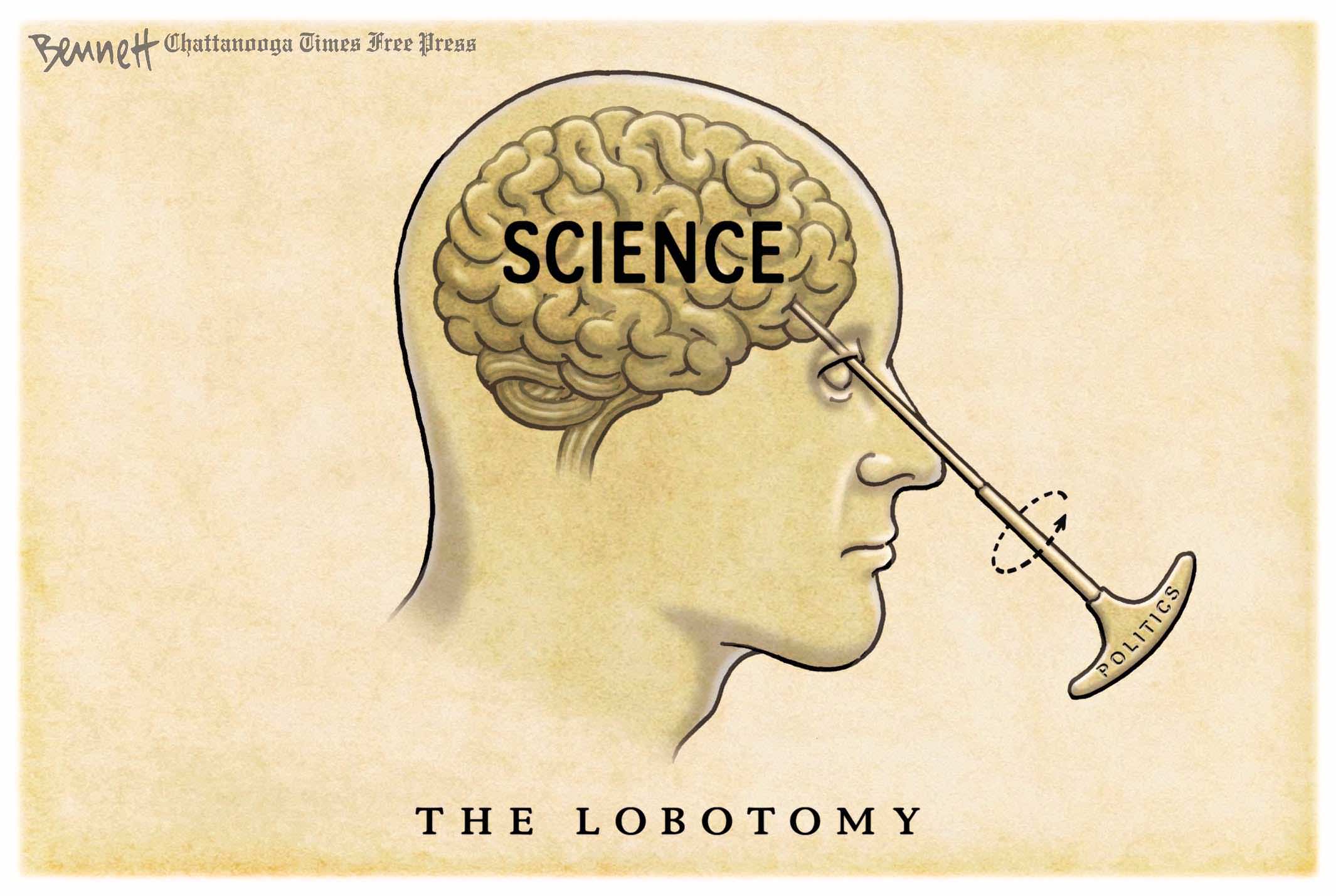
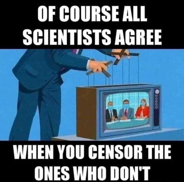
So if you read about climate in the newspapers or listen to some talk about climate on television, it will be very, very far from the truth. And it won’t be the same thing that the professors at universities normally are talking about. But that said, you know, I think there’s been a lot of corruption because of all of the money available. You know, there are huge funds if you do research that supports the idea that there is a climate emergency which requires lots of government intervention. And if you don’t do that, you’re less likely to be funded, you know, you can’t pay your graduate students. So it’s a bad situation. It’s been very corrupting to this branch of science.
HS: Exactly how long has it been going on, this kind of situation?
WH: Well, I think it really got started in the early 90s. I was in Washington at the time as a government bureaucrat, and I could see it getting started. It was being pushed by Senator Al Gore and his allies. There were, at that time, still lots of honest scientists in academia who didn’t go along with all of the alarmism, but they’ve gradually died off and they’ve been replaced by younger people who’ve never known anything except, you know, pleasing your government sponsor with the politically correct research results that they expect.

HS: So basically they are not in a position, if they want to achieve anything in academia or make a career for themselves, they are kind of unable to stay honest even?
WH: They try to be honest, but it’s very difficult because you have to plan to educate your children. You have to maintain your family, and so that means you need money. And the only way to get money is to agree to this alarmist meme that has dominated climate scientists now for several decades.
HS: Of course it affects climate research. So what is the current state, let’s say, the current state of climate research? What’s the quality of it in your opinion?
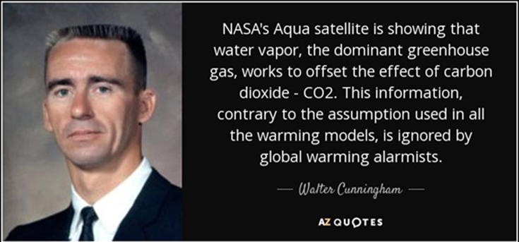
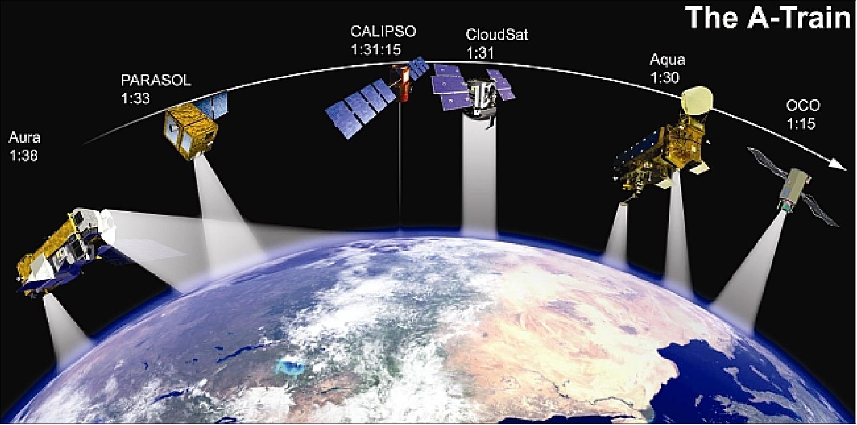
WH: Well, I think many of the observational programs in climate science are very good. For example, satellite measurements of Earth’s properties, radiation, cloudiness, temperatures, and ground-based observations. They’re often very high-quality work, very useful, and we’re lucky to have them. There are good programs in both Europe and the United States and Japan, and China is becoming quite important nowadays, too.
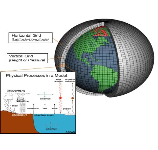
I think where there’s still huge problems is in computer modeling. I don’t think most computer models mean anything. It’s a complete waste of money, but that’s what’s driving the public perception. So the public is unable to look at model results, which are not alarming at all. But instead what they see is graphic displays from computer computations which are not tied into observations. So I think the money that’s been spent on computers, and lots of it has been spent, has been mostly wasted.

HS: Let me just understand it correctly because I’ve come to understand that these computer models are something that our current debate or the climate alarm is all based on: That there’s going to be a warming of how many degrees and then the earth is going to be uninhabitable. And you’re saying that those models are not things that something like that should be based on.

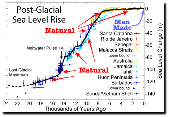
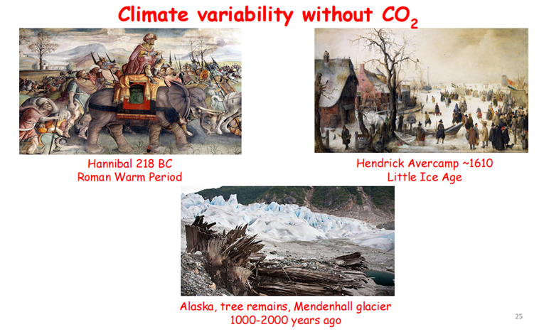
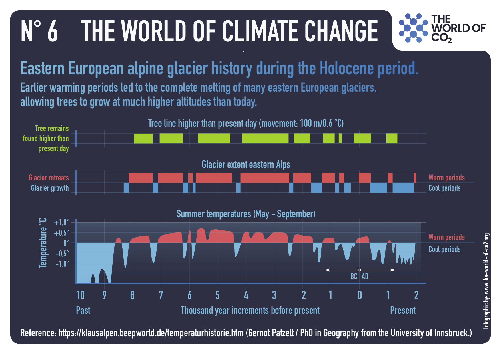
WH: The Earth is always either warming or cooling. It’s a rare time when it’s got stable temperature. We’re in a warming phase now. But most of the warming is probably a natural recovery from the Little Ice Age when it was much, much colder all over the world. And it began to warm up in the early 1800s.
And it continued to warm, not very fast. No one knows how long this will last. If you look over the last 10,000 years, since the end of the last glacial period, there have been many warmings and coolings similar to the one that we’re in now.
And I think understanding that is quite important, but that understanding has been put back by many, many years because of the sort of crazed focus on greenhouse gases. It’s pretty clear that greenhouse gases don’t have very much to do with these warmings. Nobody was burning fossil fuels in the year 1200-1300 when the poor Greenlanders were frozen out.
They did some pretty good farming in the southern parts of Greenland in the year 1000, the year 1100. Before long, it became just too cold to continue to do that. The same thing happened in parts of my ancestral country of Scotland. You know, you used to be able to farm the uplands of Scotland, which you can’t farm now, it’s too cold. But they’re warming up at some point, maybe you can farm them again. So anyway, the climate is just famous for being unstable.
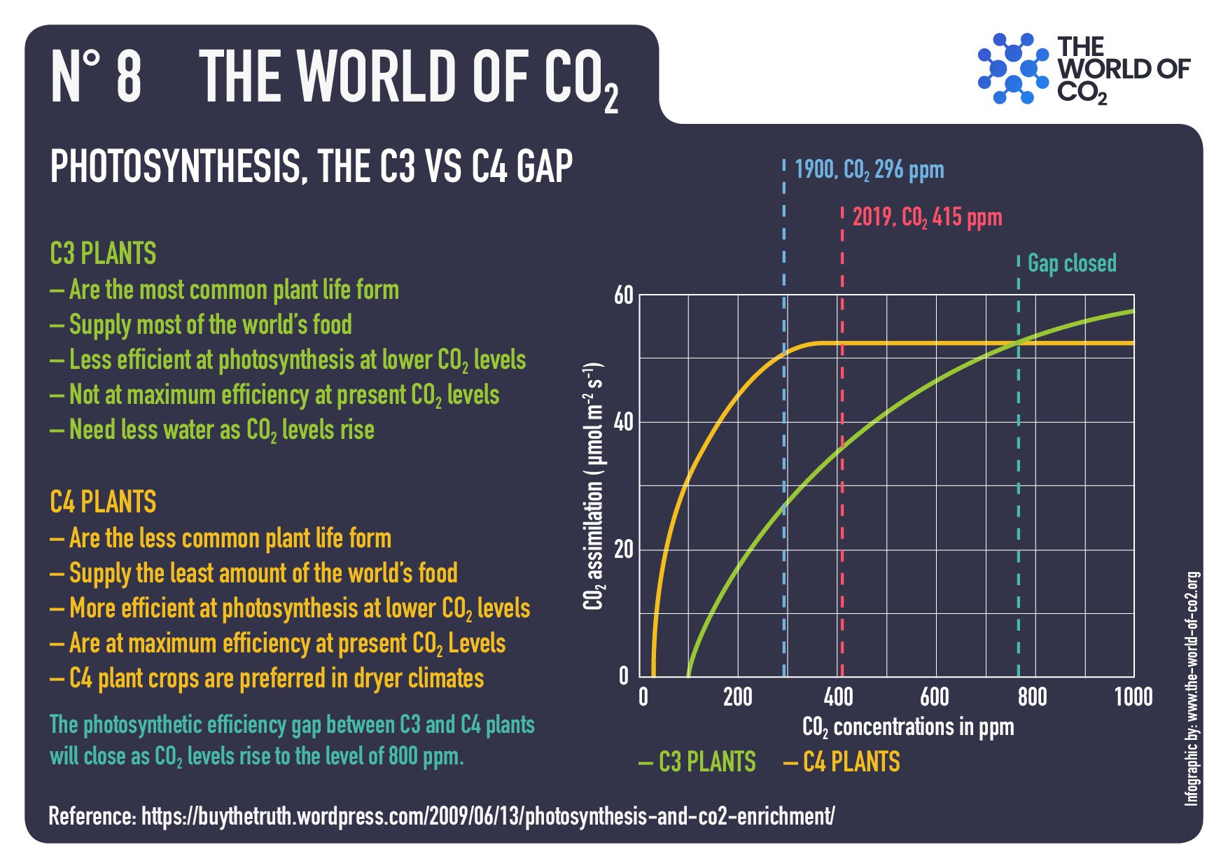
HS: Let’s talk about those greenhouse gases. Mainly climate change today in mainstream media or by those alarmist politicians, for example, is attributed to carbon dioxide. If someone has not looked into it, this gas might seem to have something even poisonous. What is carbon dioxide? Do we need it?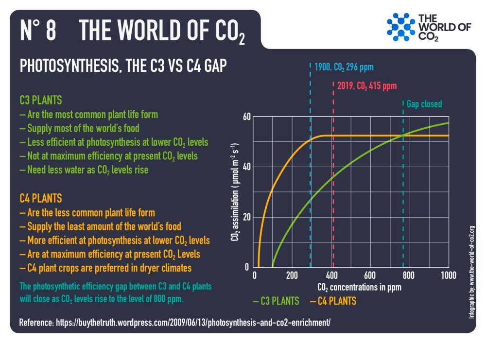
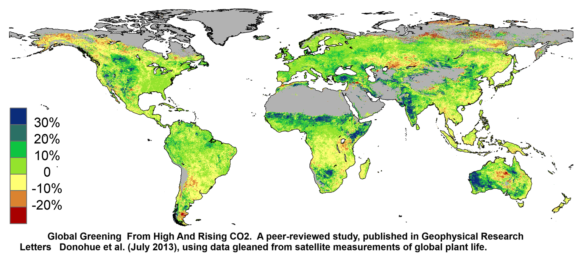
WH: Well, first of all, carbon dioxide is at the basis of life on Earth. We live because plants are able to chemically transform carbon dioxide and water into sugar. And a byproduct is the oxygen that we breathe. And so we should all be very grateful that we have carbon dioxide in the atmosphere. You know, life would die without carbon dioxide. If you look over the history of… Life on Earth, carbon dioxide has never been very stable in the atmosphere. There have been times in the past when it’s been much, much higher than today. Life flourished with five times more carbon dioxide than we have today.
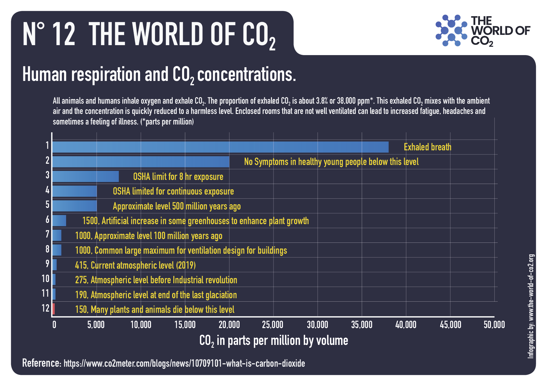
And there have been times when it’s been much lower, one-half, one-third, and those were actually quite unpleasant times for life. They were the depths of the last ice ages when carbon dioxide levels dropped to below 200 parts per million, quite low compared to today. We’re at around 400. So at the depth of the last ice age, it was about half what it is today. In some of the more verdant periods of geological history, it’s been four times, five times what it is today. So the climate is not terribly sensitive to carbon dioxide. It has some sensitivity to it.

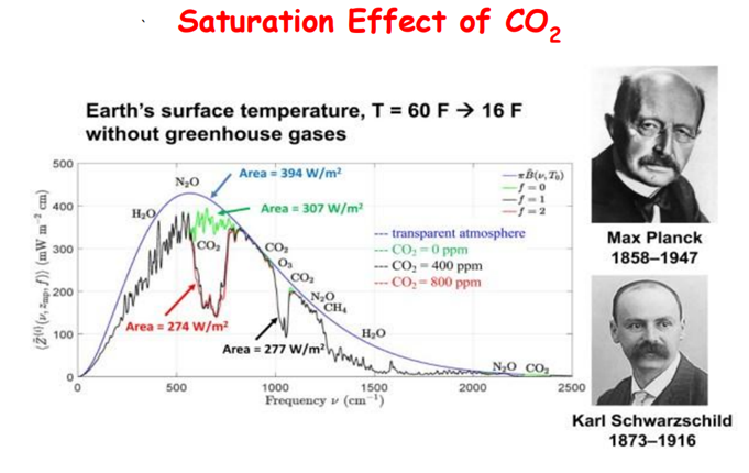
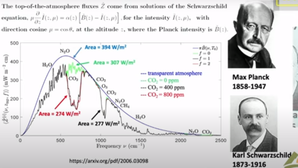
More carbon dioxide will make it a little bit warmer. But carbon dioxide is heavily saturated, to use a technical term. You know, there’s so much in the atmosphere today that if you, for example, could double carbon dioxide, that’s 100% increase, you would only decrease the cooling radiation to space by 1%. So 100% change in carbon dioxide only makes a 1% change in flux. And that’s because of the saturation that I mentioned. And there’s not much you can debate about that. It’s very, very basic physics. It’s the same physics that produces the dark lines of the sun and the stars. So it’s quite well understood.

And so the question is, what temperature change will a 1% change of radiation to space cause? You know, that’s radiation flux, not temperature. And the answer is it will cause an even smaller percentage change of temperature. There’s really no threat from increasing carbon dioxide or any of the other more minor greenhouse gases like methane or nitrous oxide or artificial gases like anesthetic gases. It’s all a made-up scare story.

HS: Where did this scare story come from? Why this fixation on greenhouse gases? If you explain it this way, it seems a bit even absurd to be fixated on these gases all the time.
WH: Well, you know, I’m really good with instruments and differential equations, but I’m not so good at people’s motives. And so I don’t really understand myself exactly how this has happened. I think… There are various motives, some of them fundamentally good. For example, one of the motives has been it’s hard to keep people from fighting with each other, so if we could have a common enemy like a danger to the climate, we could all join forces and defeat climate change, and then we wouldn’t be killing each other off.
So there’s nothing wrong with a motive like that, except that you have to lie.
And so, you know, it’s dangerous to make policy on the basis of lies.
So I don’t know what drives it. It’s a perfect storm of different motives. Lust for power, good motives, lust for peace. All for that. Lust for money. But I’m much more comfortable talking about, as I say, the physics of greenhouse gases and the physics of climate than what drives people.
HS: Yeah, yeah. Well, you have said that this climate change or climate alarmism today is, what was it, you prefer scam, but you are willing to settle with a hoax, is it correct?
WH: Well, this is not too serious, but you know, when someone says hoax, I think of hoax as, to some extent, a practical joke. There’s a certain amount of humor in it. For example, the Piltdown Man was a famous hoax where some brilliant Englishman doctored up a I think it was a chimpanzee skull to make it look like a human skull. And this was not too serious, but lots of learned professors wrote papers about it, you know, and it was all nonsense. But this had no aim to make a lot of money, you know, or to gain power.
It was simply, you know, a great practical joke. That’s a hoax. A scam is different. A scam is where you are deceiving people to enrich yourself, to gain power, you know, and so I think that’s a better description of what’s happening with climate than a hoax. But it’s a small detail, I don’t mind calling it a hoax.
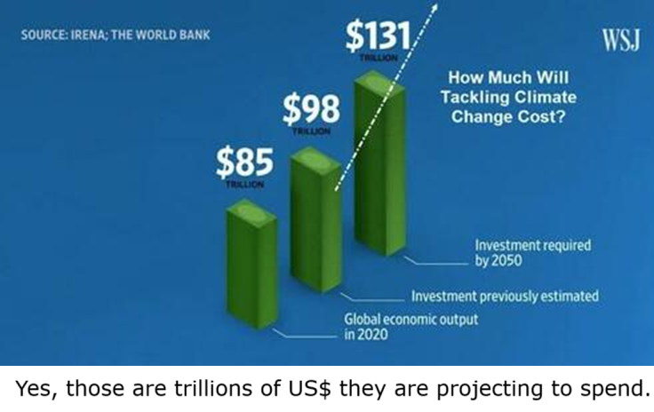
HS: Basically, Professor, there is a lot of money involved in climate change or climate alarmism. Would it be that money is driving this as well or what is your take on that?
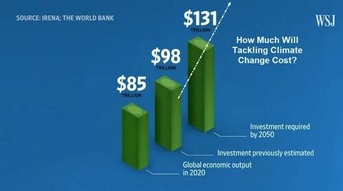
Yes, those are trillions of dollars they are projecting.
WH: Well, I think it’s really true that the love of money has been the root of evil as long as humanity has existed. And here we’re talking about trillions of dollars. If you really went to net zero, the economic implications would just be enormous. People would have to lower their standard of living greatly. It would cause enormous damage to the environment. You cover the world with windmills and solar panels. So… And it’s driven by money. Lots of people are making lots of money. So it’s driven by money. It’s driven by power.

And then it’s driven by poor people who fundamentally believe, you know, and that they really have been misled into thinking that there is an emergency. And you have to be sympathetic to them, you know, who wouldn’t want to save the world if the world was in danger? It is not really in danger, but many people are convinced that it’s in danger. But, you know, there’s this old saying, the road to hell is paved with good intentions, and we’re on the road to hell with net zero.

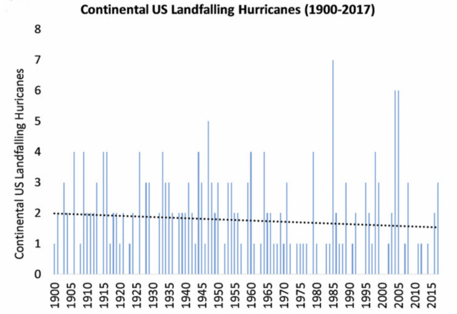
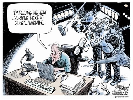
HS: Yes. Well, like you already mentioned, this crisis is often said to be linked with, for example, extreme weather events. But I don’t know, is it even clear today that we have more extreme weather events because of the warming that is happening? Or is it so?
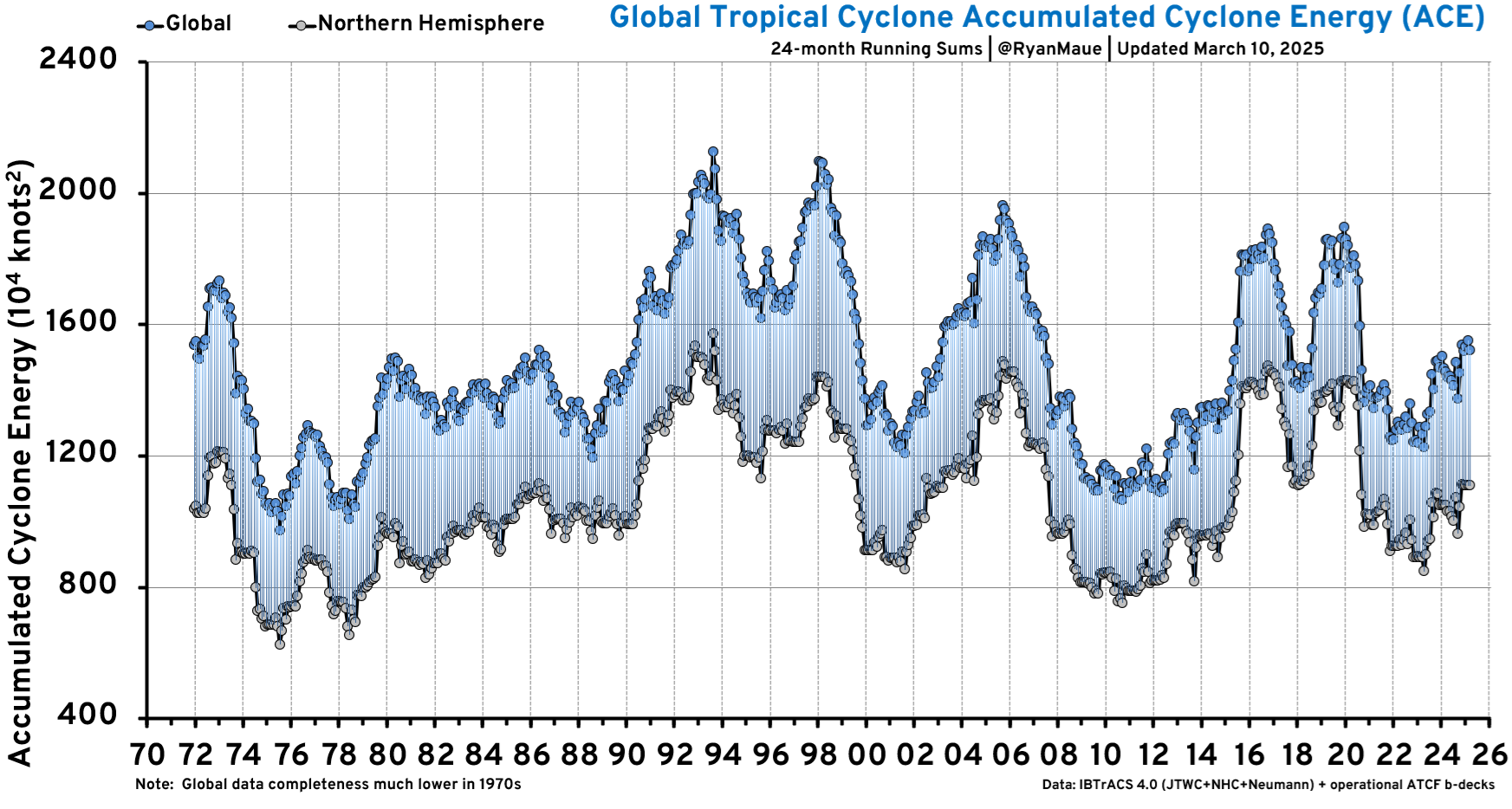
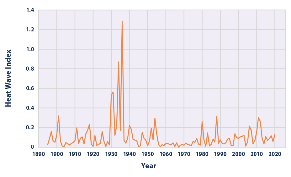
WH: Well, if you look at the data, there’s not the slightest evidence that there’s more extreme weather today than there was 50 years ago. Even the IPCC, you know, the UN body does not claim that there is an increase in extreme weather. They say there’s really no hard evidence for that. And in fact, the evidence is that it’s about the same as the weather has always been. In my country, for example, the worst weather we had was back in the 1930s when we had the Dust Bowl and, you know… people migrating from Oklahoma to California, you know, it was a terrible time. We’ve not had anything like that since.
HS: Of course, always to talk about floods, always to talk about hurricanes. And as I understand as well, the IPCC is not actually in their scientific reports. They are not actually saying that there are more. But they are saying something, right? So the question here is, what do you think? You have probably looked into them a bit more than I am. So is it solid science what’s in there? Or is it also motivated the IPCC scientific reports, politically motivated, for example?
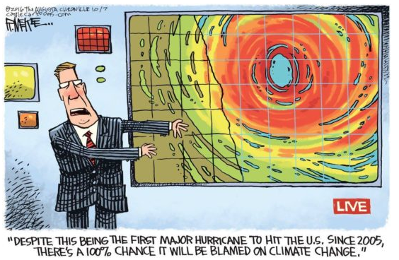
WH: You know, there’s this saying in the communications business, if it bleeds, it leads. So if you’ve got a newspaper or a television business, you have to look for disasters because that’s what people pay attention to. And so part of the problem has been the mass media, which has to have emergencies, has to have extreme events. And the fact is usually hidden that there’s nothing unusual about an event. They try to deceive you into thinking that this has never happened.
For example, just yesterday they had four or five inches of snow in Corpus Christi, Texas. That’s a lot of snow for Corpus Christi. But, you know, if you look at the records of Corpus Christi, it’s not unusual every 20, 30 years as it happens. It’s been happening for thousands of years. But most people, you know, they’re not even 20 or 30 years of age, and so they’ve never seen this before. So it seems like the world is changing rapidly in front of their eyes, but it’s not changing really at all.
HS: Yes, they can look at it on the television, then it must be true when they are saying that it’s because of climate change, right? So this is the thing. One particular graph that is always talked about when climate is the issue is the famous Michael Mann hockey stick.

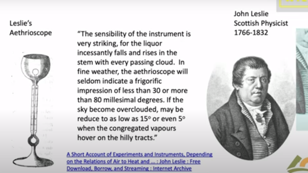
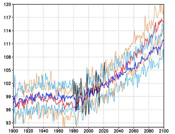
The first graph appeared in the IPCC 1990 First Assessment Report (FAR) credited to H.H.Lamb, first director of CRU-UEA. The second graph was featured in 2001 IPCC Third Assessment Report (TAR) the famous hockey stick credited to M. Mann.
WH: The graph is phony, and that’s been demonstrated by many, many people. It’s even different from the first IPCC graphs. It’s a graph of temperature versus time since about the year 2000. you know, about the year zero, you know, from the time of Christ to today. And what it shows is absolutely no change of temperature until the 20th century when it shoots up like the blade of a hockey stick. So that’s why it’s called the hockey stick curve. So the long, flat… Part of the hockey stick is the unchanging temperature. But that was not in the first IPCC report.

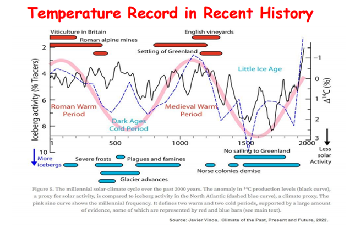
Climate reconstructions of the ‘Medieval Warm Period’ 1000-1200 AD. Legend: MWP was warm (red), cold (blue), dry (yellow), wet
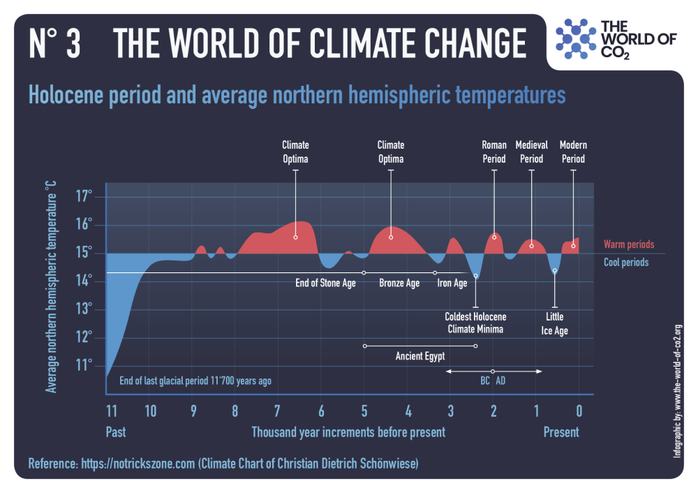
The first IPCC report showed that it was much warmer in Northern Europe and United States, North America, in the year 1000 than it is today. There really was a medieval warm period, which was what allowed the Norse to settle in Greenland. and have a century or two of successful agriculture there. It’s never gotten that warm again since. It may happen, but the hockey stick curve basically erased that, so it was… It’s like these Orwellian novels. 1984, there was this… They continued to rewrite history, you know, so what was history yesterday was not history today, you know. So it was rewriting the past. There clearly was a warm period.There is evidence from all around the globe that it was much warmer in the year 1000 than today. We still have not gotten as warm as it was then.

HS: Yes, yes, and the warm period, as I understand, was followed by the Little Ice Age. So 19th century, the warming that started then is actually, it started at the end of this Little Ice Age.

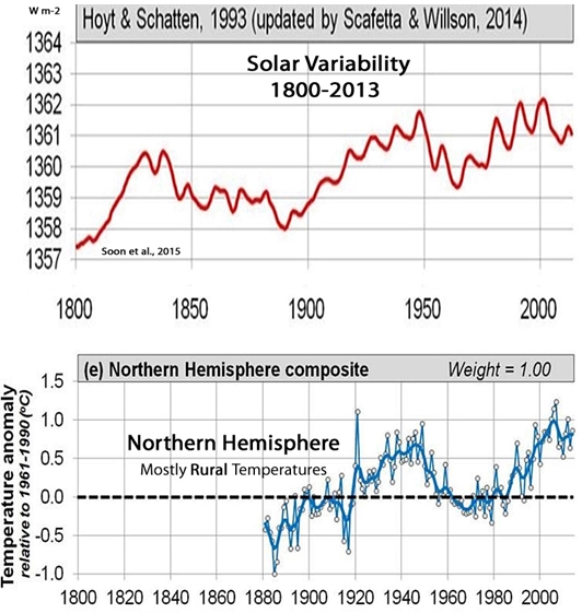
Earth is still recovering from the Little Ice Age, which was the coldest period of the past 10,000 years, that ended about 150 years ago.
WH: That’s right, that’s right. For example, that’s very clear if you come to Alaska, And look at the Alaska glaciers. In particular, there’s a famous glacier bay in Alaska which was filled with glaciers in the year 1790 when it was first mapped by the British captain Vancouver. the ice came right out to the Pacific.
And already by 1800, it had receded up into the bay. Some of it was melting by 1800. And by 1850, most of the ice was gone. I’m talking about the 1800s, not the 1900s, not the present time. So it’s pretty clear from Glacier Bay that the warming began around the year 1800. And it’s just been steadily warming since then.
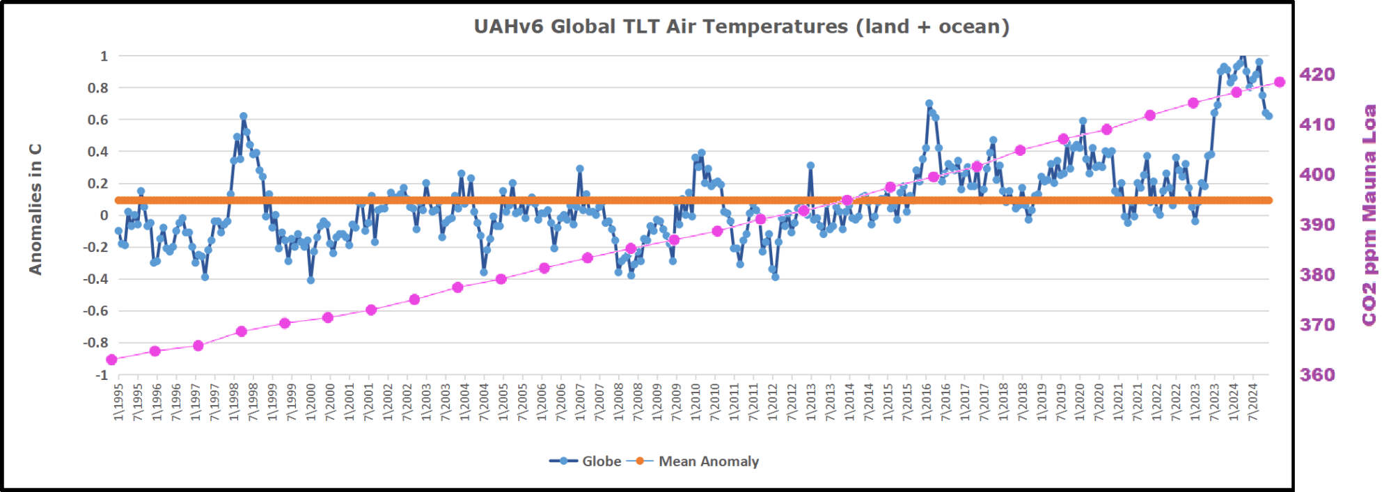
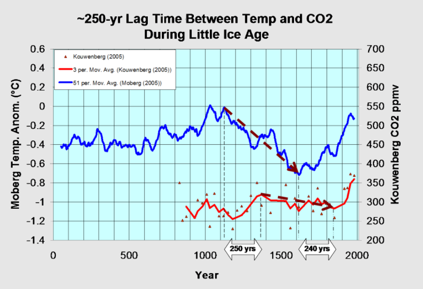
HS: I have been shown another graph many times which shows a correlation between the increase of carbon dioxide in the atmosphere and the temperature rise during the last, let’s say, 150-200 years. Yeah, it’s a correlation, of course, but is there any causation as well? Because you pointed it out as well that there is a warming effect. Carbon dioxide has a warming effect in the atmosphere, but it’s not leading as I understand.
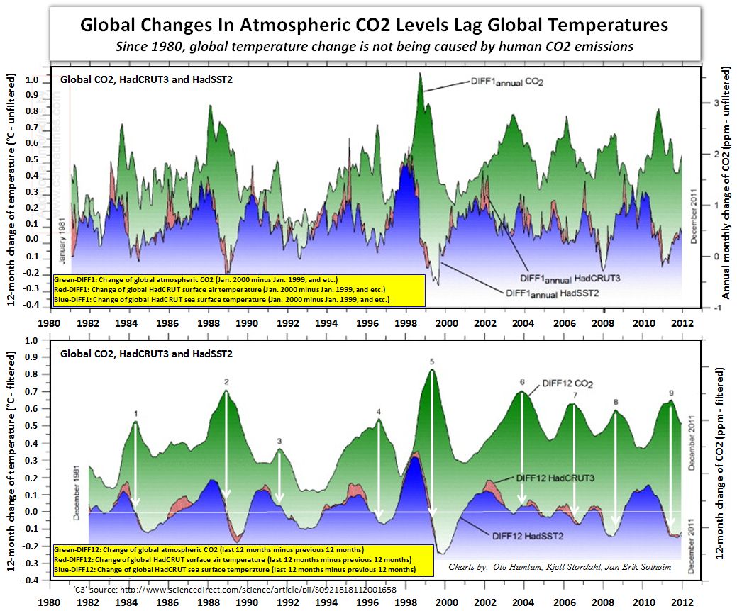
► Changes in global atmospheric CO2 are lagging 11–12 months behind changes in global sea surface temperature. ► Changes in global atmospheric CO2 are lagging 9.5–10 months behind changes in global air surface temperature. ► Changes in global atmospheric CO2 are lagging about 9 months behind changes in global lower troposphere temperature. ► Changes in ocean temperatures explain a substantial part of the observed changes in atmospheric CO2 since January 1980. ► Changes in atmospheric CO2 are not tracking changes in human emissions.
WH: Yeah, that’s correct. You know, you can estimate past CO2 levels by looking at bubbles in ice cores from Antarctica or from Greenland. And you can also estimate past temperatures by looking at the ratios of oxygen isotopes in the ice and the other proxies. So there are these proxy estimates of past CO2 levels and past temperature.
And they are indeed tightly correlated. When their temperature is high, CO2 levels are high, and temperature is low, CO2 levels are low. But if you look at the time dependence, in every case, first the temperature changes and then the CO2 changes. Temperature goes up, a little bit later CO2 goes up.
Temperature goes down, a little bit later CO2 goes down. So they are indeed correlated, but the cause is not CO2, the cause is temperature. So something makes the temperature change and the CO2 is forced to follow. That’s easy to understand. It’s mostly due to CO2 dissolving in the ocean. The solubility of CO2 is very temperature dependent.
So if the world ocean’s cool, they suck more CO2 out of the atmosphere. And if they warm, more CO2 can come back into the atmosphere. So there’s nothing surprising about that. The only surprise is nobody really knows why the temperature changes, but it’s certainly not CO2 causing it to change because the CO2 follows the change.
HS: It doesn’t precede it. Causes have to precede their effects. from the same 2023 presentation that I already mentioned, that I listened. And as a member of Jason in 1982, you were one of the authors of a scientific paper that aimed to measure the effects of CO2 to global warming. The first number you got was too small. Then you just arbitrarily increased it.
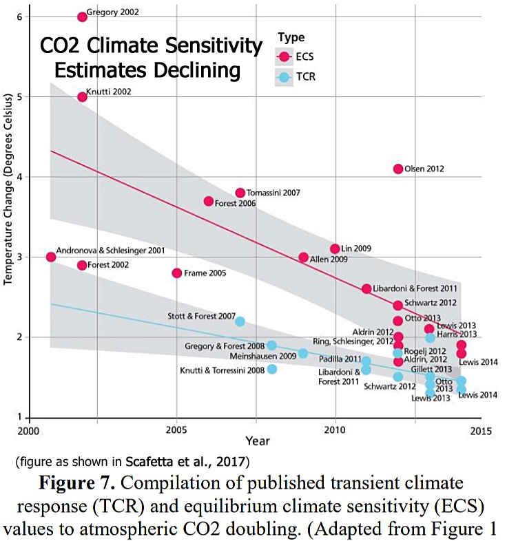
WH: You’re asking, the key question is how much warming would be caused if you double carbon dioxide. That’s sometimes called the climate sensitivity or the doubling sensitivity. And the first person to seriously try to calculate that theoretically was your neighbor across the Baltic, Svante Arrhenius. He was a Swede and a very good chemist, and he was interested in this problem. He was the first one to really work on it, and his first paper was written in 1896. So the first climate warming paper was 1896 by Arrhenius, and he estimated that doubling CO2 at that time would warm the earth by around six degrees.
It was a big number. He didn’t know very much, so it was not a bad number given what he knew at the time. As he learned more, he kept bringing that number down, so the last number he published was about four degrees, and it was still going down. So the number that we published was three degrees, this little Jason study. So it was only a little bit smaller than Arrhenius’ number. But that was because neither he nor we really knew enough about how the climate works to get a reliable answer.
And I think the only way to really get a reliable answer is from good observations over long periods of time. And we simply don’t have good enough empirical data right now to know what that is. But I’m pretty sure that doubling CO2 by itself is unlikely to cause warming of more than about one degree Celsius. You know, if you do the simplest calculation, you find that answer, it’s a bit less than one degree for doubling CO2.
And so three degrees, four degrees, the only way to get that is with enormous positive feedbacks. And so that’s what these computer models do that we’ve been talking about. They inject feedbacks in a very obscure way so you can’t figure out what they’ve done. But it’s a supercomputer, so how could it be wrong? It must be right, it’s a computer after all. But nevertheless, it’s giving these absurd positive feedbacks. And most feedbacks in nature are not positive, they’re negative.
There’s even a law called Le Chatelier’s Principle, which is that if you perturb some chemical system or physical system, it has feedbacks. And they try to reduce the perturbation. They don’t try to make it bigger. They try to make it smaller. So climate has turned that completely on its head. It says all feedbacks in climate are positive, and if it’s negative, forget about it. You won’t get your research grant renewed next year if you put that in your proposal. So it’s a mess, and it’s going to take a long time to clean this up.
Of course, if someone is not on the right side of this net zero debate, people are starting calling him names. He’s a climate denier or climate skeptic and so on. But those ad hominem arguments are what are used in the media to shut down the arguments of even scientists. One of them is that if you’re not a climate scientist, you’re not allowed to talk about climate. Well, of course, that’s nonsense. Climate is really all physics and chemistry. And so anyone with a good grounding in physics and chemistry can know as much about climate as a climate scientist.
In general, climate scientists are not well educated. When I look at American universities, maybe it’s better in Estonia, but you go to a class and your education consists on how do you organize a petition to your local legislator. So that’s your knowledge as a climate scientist. You don’t have to learn physics, you don’t have to learn chemistry, you don’t have to learn electromagnetics and radiation transfer. You have to learn how to work the political process. So it’s true that most physicists aren’t very good at that. You know, they’re quite good at physics, but they’re not very good at talking to the Congress or to the president.
HS: Yeah, yeah. So basically, climate science has become something more like a social science in that sense.
WH: Yeah, that’s right. It’s been very heavily politicized. There was something very similar to this in the Soviet Union in the field of biology. There was this Ukrainian agronomist, Lysenko, who… got the ear of the Communist Party and was supported for many decades with just crazy theories about biology, you know, you could grow peaches on the Arctic Circle if you just listen to him. All sorts of nutty things and that there was no such thing as genes, but he had a lot of political support and so he essentially destroyed biology for a generation in the Soviet Union. You know if you taught your class about genes, you know, Mendel’s wrinkled peas and smooth peas, you were lucky if you were only fired, you know, you could have been sent to a concentration camp and several people were condemned to death for teaching about genes. And so I think climate science is a lot more like Lysenkoism than it is normal science.
HS: Yes, well, yes, this is something that we should be able to learn from because this was the Stalin era, this was the craziest time period, absolutely. In Eastern Europe we also know a lot about that and it does seem to me as well that Löschenkism is something that is like gaslighting the public and ostracizing renowned scientists, for example, like yourself. This is something that has been done related to climate science. Or how do you feel that? Do you feel that you have been targeted by those activists, activist politicians or not?
WH: I don’t feel any pain. I don’t pay much attention to them because I have very little respect for them. The people that I respect, most of them agree with me. I’ve personally not suffered from it, perhaps just because I don’t pay attention to it. I’m older, I’m retired, so I’m not dependent on government grants. Younger people could not do this. So people in the middle of their career have a very serious problem because they’ll lose their research funding and they won’t be able to continue their career if they don’t sign up to the alarmist Dogma.

HS: And one of the things how they shut down criticism is simply by stating that 97% of climate scientists are saying that our climate change or global warming, it is anthropogenic and you cannot argue with 97%, can you? What do you think? Is science democracy?
WH: There are some small anthropogenic effects on climate. Any big city, for example, is quite a bit warmer than the countryside. If you go 30 kilometers outside of New York City, it’s cooler. Or any other big city. So those are called urban heat island effects. So it’s clearly caused by people.

But if you look at undisturbed areas far from urban centers, there the climate is doing what it has always done. It’s warmed, it’s cooled, it’s done that many, many times over history. And there’s not the slightest sign of anything different resulting from our generation burning fossil fuels.
My own guess is that fossil fuels may have caused about close to a degree, maybe three-quarters of a degree of warming, but that’s not very much. When I got up this morning, it was minus 10 Celsius. Here in my office, it’s quite a bit warmer. One degree, you can hardly feel it. My air conditioner doesn’t trip on and off at one degree, so it’s not a dangerous increase in temperature. Saving the planet from one and a half degree of warming is just crazy. Who cares about one and a half degree of warming? It won’t be that much anyway. But if it were, it wouldn’t matter.
HS: If the planet warms a bit, is it actually bad to us?
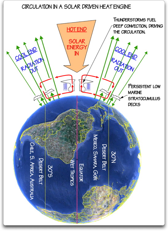
WH: No, of course it’s not bad. For example, I have a backyard garden, and I would welcome another week or two of frost-free growing season in the fall and in the spring. I could have a better garden, and that’s true over much of the world. And if you look at the warming, most of the warming is in high latitudes where it’s cold. It’s where you live in Estonia, where I live in New Jersey. It doesn’t warm in India. It doesn’t warm in the Congo or in the Amazon. Even, you know, the climate models don’t predict that. They predict the warming, when it comes, will be mostly at high latitudes near the poles. And that’s where actually the warming will be good, not bad.
HS: One more question about climate science. It is being told to us that there is a consensus on anthropogenic climate change. And my question actually here is that in science, can there be a consensus? What is a consensus in science even?
WH: Well, I think you know very well that science has nothing to do with consensus. Michael Crichton was very eloquent about this. And if you don’t know about his work, you should read it. But he says when someone uses the word consensus, they’re really talking about politics, not science.
Science is determined by how well your understanding agrees with observations. If you have a theory and it agrees with observations, then the theory is probably right. But it’s right not because everybody, all your friends agree with it, it’s because it agrees with observation. You make a prediction and you do an experiment to see whether the prediction is right. If the experiment confirms it, then the theory is probably okay. It’s not okay because everybody agrees with you that your theory is right. And so that’s what the climate scientists are trying to claim, that science is made by consensus. It’s not made by consensus. There really is a science that is independent of people. There is a reality that could care less what the consensus is. It’s just the way the world works. And that’s real science.
HS: What are your views on energy transition? Should we, you know, stop burning fossil fuels? And why, if so?

WH: Well, of course, we shouldn’t stop burning fossil fuels. We can’t stop, you know. It’s suicide. It’s economic suicide. And more than economic, it’s real suicide. People will die. You know, they tried something like that in Sri Lanka, you know, 15, 20 years ago when the extremist government came in and stopped the use of chemical fertilizer, you know, because it was unnatural. So everyone was supposed to go back to organic farming and the result was that, you know, the rice crop failed, the tea crop failed, you know, the price of food went up, people were starving in the streets. The same thing will happen if we go to net zero.

You can’t run the world without fossil fuels. We’re completely dependent on them, especially for agriculture, but transportation and many other things. There’s nothing bad about them. If you burn them in a responsible way, they cause no harm. They release beneficial carbon dioxide. Carbon dioxide really benefits the world. It’s not a pollutant at all.
HS: There is the question of how much longer will fossil fuels last. There is a finite number and for years people have wondered when will they run out and what will we do when we run out of fossil fuels. And so that’s an interesting question that’s worth talking about.
WH: It’s not an immediate problem, but sooner or later it will be a problem. My own guess, we’re talking about a century or two, not decades. But I think our descendants will have to replace fossil fuels, and my guess is that they will make synthetic hydrocarbon fuels. No one has ever discovered a better fuel than a hydrocarbon, you know. We ourselves, you know, store energy as hydrocarbons. You know, the fat on our belly, you know, that’s a hydrocarbon. You know, so it’s really good, you know. So we can make hydrocarbons ourselves from limestone and water if you have enough energy.
There are ways to do that chemically. And so my guess is that in 200 years, that’s the way energy will be… handled. We’ll make it from inorganic carbon, limestone probably, and we’ll burn it the same way we do today. You know, we’ll make synthetic diesel, we’ll make synthetic gasoline, and continue to use internal combustion engines. No one’s invented a better engine than an internal combustion engine.
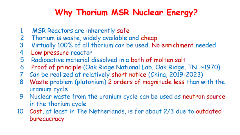
HS: But what about nuclear energy? What are your thoughts on that?

WH: Well, nuclear energy clearly works. It makes electricity, so you can’t run your automobile on nuclear energy unless you’re stupid enough to buy an electric car. So nuclear has had some of the same problems as fossil fuels. There are these ideological foes of nuclear energy And they have two main arguments. The first argument, and one that does worry me, is that it’s not that difficult to change a nuclear commercial enterprise into a weapon. And nuclear weapons really are very, very dangerous.
So that’s one of the oppositions. But the other is completely phony, is that we can’t handle the waste. That’s not a difficult problem, actually. It’s technically quite easy to handle the waste. For example, at a typical nuclear plant in the United States, there’s a dry cask storage yard, which is not as big as the parking lot. And it’s got a century worth of fuel. It’s perfectly safe. And you could leave it there for several centuries and nothing would happen to it. So there’s no need to process it. You can let it sit there and, you know, in a hundred years, maybe people will regard it as a useful mine for various materials. So nuclear is fine, and I think it will play an important role for a long time in human affairs.
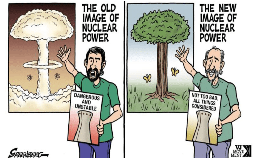
You know, the big dream has always been fusion, nuclear fusion energy, where you combine deuterium and tritium, you know, and make power. That’s turned out to be much, much harder than we ever thought it would be. But my guess is it’s a problem that will eventually be solved.
Someone will have a really good new idea about how to do it. If we keep smart people working on it, someone will figure out how to do it. So I’m optimistic about the future for energy. I think humanity is going to do fine if they don’t self-destruct.
HS: Well, Professor, to kind of sum up, I would like to ask you about what is, in your opinion, what are the real problems? As I understand, and I tend to agree with you, climate change currently at least is not a real problem for humanity. But probably there are some. And what is your feeling? What are they?
Well, the problem has always been living together. How do you keep humanity from self-destructing? And that’s why I have some sympathy for the climate alarmists. They thought that having climate as a common enemy would be one way to prevent this. So you have to admit that that’s not such a bad motive.
I don’t think it’s true. I don’t think it will work. I think it’s worse than nothing. But I guess the question is how do we keep people in a civilized society indefinitely? And As I said, I’m a lot better with differential equations and instruments than I am with this sort of a question. But just speaking personally, I think everybody should have a feeling that they’re doing something significant with their lives. So I think anything we can do in society is to let young people feel like they’re significant and they’re doing something worthwhile and useful it would be good for the whole world.