N. Atlantic SST Plunging

RAPID Array measuring North Atlantic SSTs.
For the last few years, observers have been speculating about when the North Atlantic will start the next phase shift from warm to cold.
Source: Energy and Education Canada
An example is this report in May 2015 The Atlantic is entering a cool phase that will change the world’s weather by Gerald McCarthy and Evan Haigh of the RAPID Atlantic monitoring project. Excerpts in italics with my bolds.
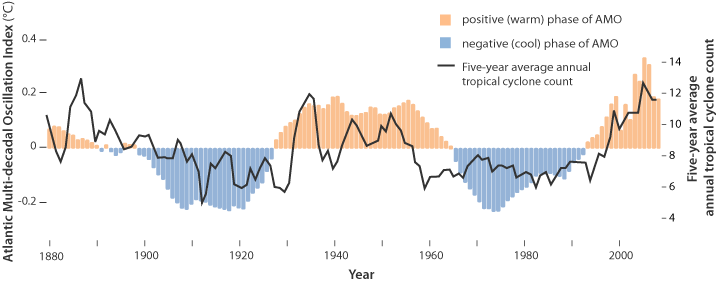
This is known as the Atlantic Multidecadal Oscillation (AMO), and the transition between its positive and negative phases can be very rapid. For example, Atlantic temperatures declined by 0.1ºC per decade from the 1940s to the 1970s. By comparison, global surface warming is estimated at 0.5ºC per century – a rate twice as slow.
In many parts of the world, the AMO has been linked with decade-long temperature and rainfall trends. Certainly – and perhaps obviously – the mean temperature of islands downwind of the Atlantic such as Britain and Ireland show almost exactly the same temperature fluctuations as the AMO.
Atlantic oscillations are associated with the frequency of hurricanes and droughts. When the AMO is in the warm phase, there are more hurricanes in the Atlantic and droughts in the US Midwest tend to be more frequent and prolonged. In the Pacific Northwest, a positive AMO leads to more rainfall.
A negative AMO (cooler ocean) is associated with reduced rainfall in the vulnerable Sahel region of Africa. The prolonged negative AMO was associated with the infamous Ethiopian famine in the mid-1980s. In the UK it tends to mean reduced summer rainfall – the mythical “barbeque summer”.Our results show that ocean circulation responds to the first mode of Atlantic atmospheric forcing, the North Atlantic Oscillation, through circulation changes between the subtropical and subpolar gyres – the intergyre region. This a major influence on the wind patterns and the heat transferred between the atmosphere and ocean.
The observations that we do have of the Atlantic overturning circulation over the past ten years show that it is declining. As a result, we expect the AMO is moving to a negative (colder surface waters) phase. This is consistent with observations of temperature in the North Atlantic.
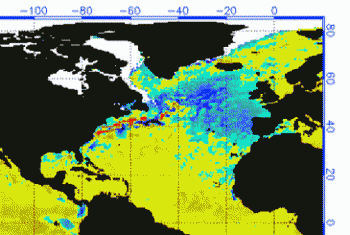
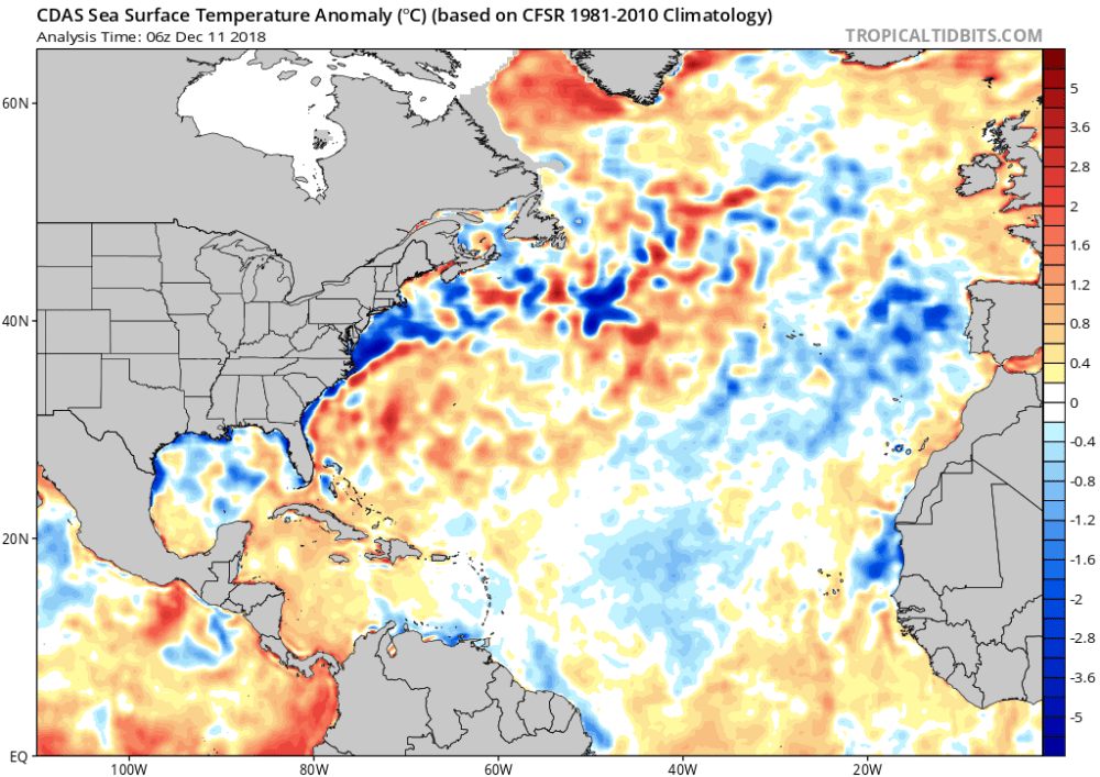
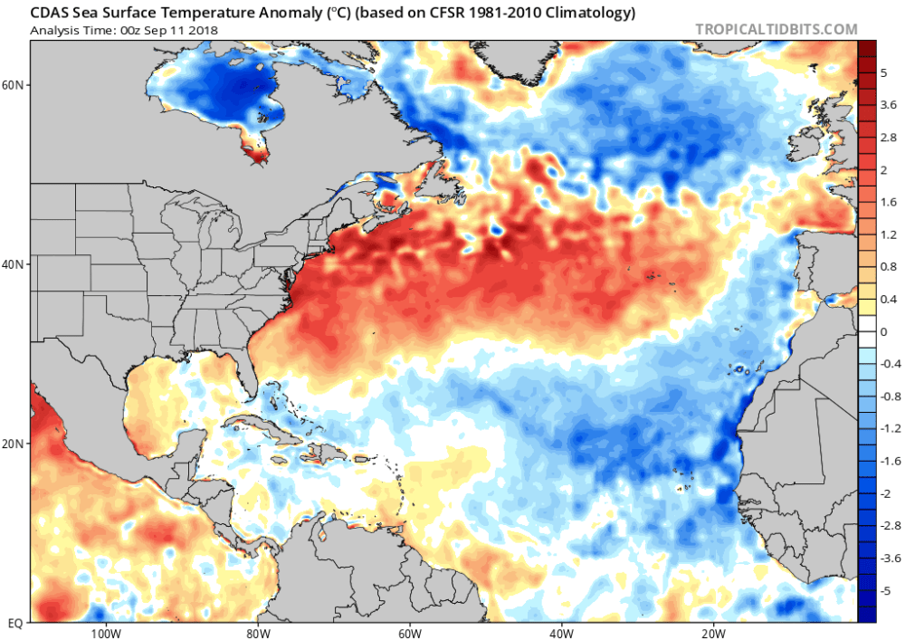
Cold “blobs” in North Atlantic have been reported, but they are usually a winter phenomena. For example in April 2016, the sst anomalies looked like this
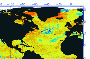
But by September, the picture changed to this
And we know from Kaplan AMO dataset, that 2016 summer SSTs were right up there with 1998 and 2010 as the highest recorded.
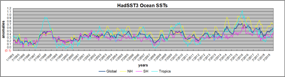
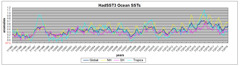
As the graph above suggests, this body of water is also important for tropical cyclones, since warmer water provides more energy. But those are annual averages, and I am interested in the summer pulses of warm water into the Arctic. As I have noted in my monthly HadSST3 reports, most summers since 2003 there have been warm pulses in the north atlantic.
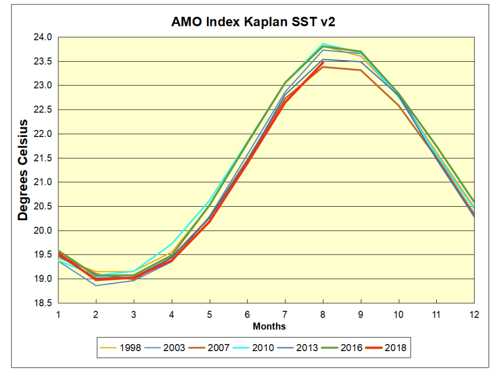
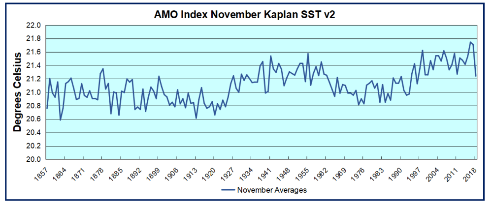 The AMO Index is from from Kaplan SST v2, the unaltered and not detrended dataset. By definition, the data are monthly average SSTs interpolated to a 5×5 grid over the North Atlantic basically 0 to 70N. The graph shows warming began after 1993 up to 1998, with a series of matching years since. November 2016 set a record at 21.75C, but note the plunge down to 21.24C for November 2018, the coldest since 1996. Because McCarthy refers to hints of cooling to come in the N. Atlantic, let’s take a closer look at some AMO years in the last 2 decades.
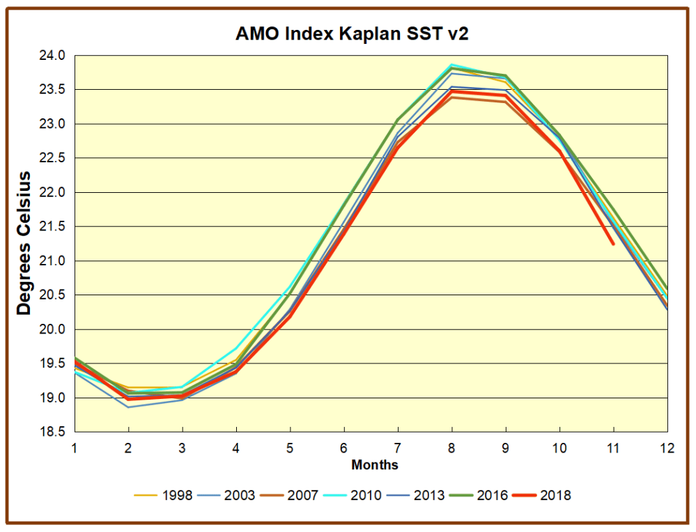
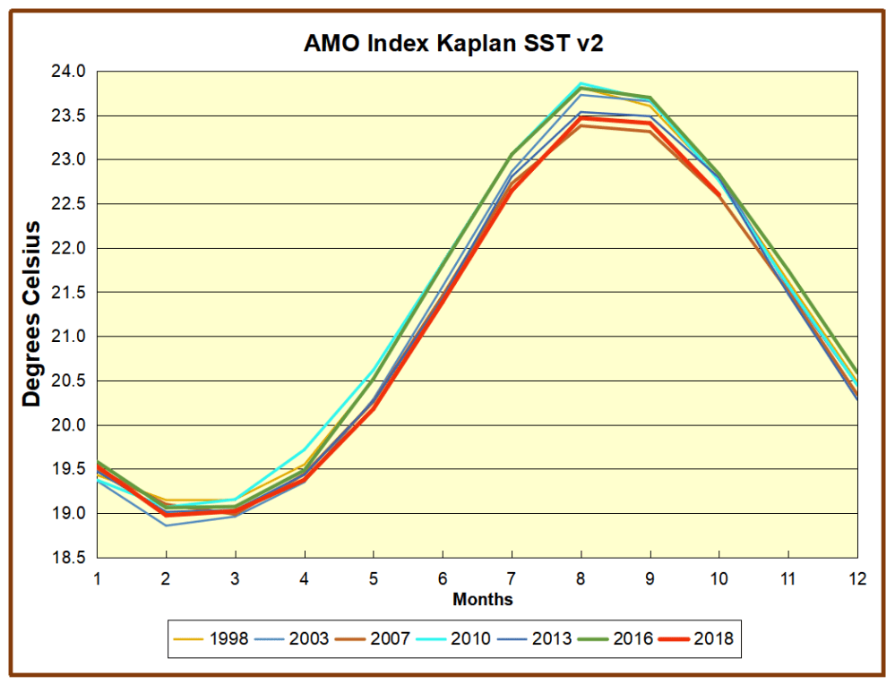
This graph shows monthly AMO temps for some important years. The Peak years were 1998, 2010 and 2016, with the latter emphasized as the most recent. The other years show lesser warming, with 2007 emphasized as the coolest in the last 20 years. Note the red 2018 line is at the bottom of all these tracks. Most recently November 2018 is 0.5C lower than November 2017, and is the coolest November since 1996.
With all the talk of AMOC slowing down and a phase shift in the North Atlantic, we expect that the annual average for 2018 will confirm that cooling has set in. Through November the momentum is certainly heading downward, despite the band of warming ocean that gave rise to European heat waves last summer.
 The best context for understanding decadal temperature changes comes from the world’s sea surface temperatures (SST), for several reasons:
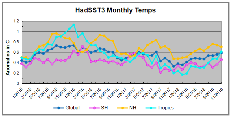

 The best context for understanding decadal temperature changes comes from the world’s sea surface temperatures (SST), for several reasons:
 The AMO Index is from from Kaplan SST v2, the unaltered and untrended dataset. By definition, the data are monthly average SSTs interpolated to a 5×5 grid over the North Atlantic basically 0 to 70N. The graph shows warming began after 1993 up to 1998, with a series of matching years since. October is the fourth hottest month in the dataset, and note the considerable drop from 2017 to October 2018. Because McCarthy refers to hints of cooling to come in the N. Atlantic, let’s take a closer look at some AMO years in the last 2 decades.
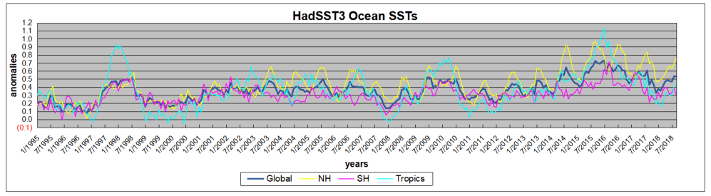
 The best context for understanding decadal temperature changes comes from the world’s sea surface temperatures (SST), for several reasons:
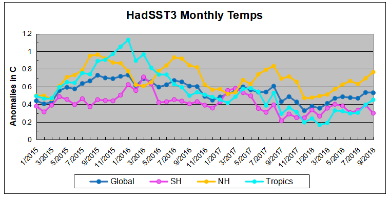
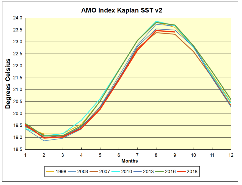
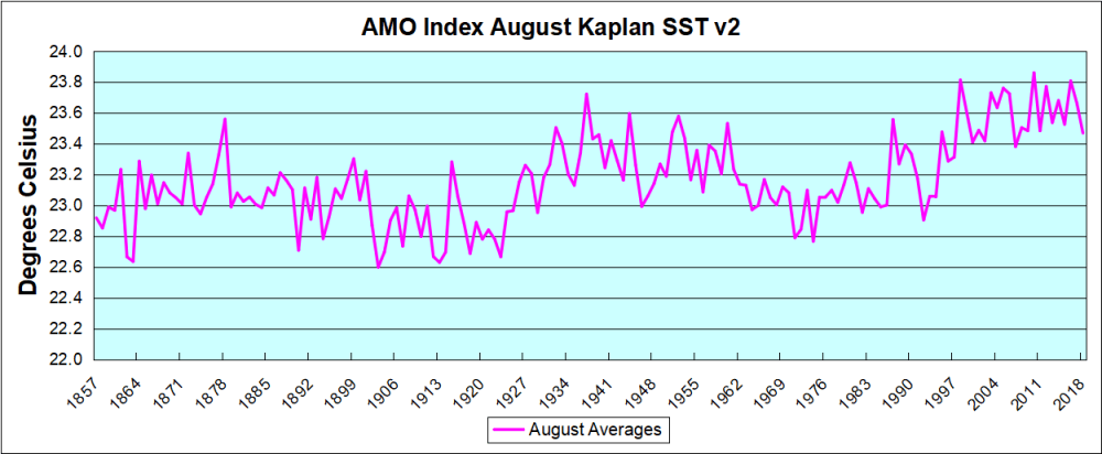
 The AMO Index is from from Kaplan SST v2, the unaltered and untrended dataset. By definition, the data are monthly average SSTs interpolated to a 5×5 grid over the North Atlantic basically 0 to 70N. The graph shows warming began after 1992 up to 1998, with a series of matching years since. September is the second hottest month in the dataset, and note the considerable drop from 2017 to August 2018. Because McCarthy refers to hints of cooling to come in the N. Atlantic, let’s take a closer look at some AMO years in the last 2 decades.


 The best context for understanding decadal temperature changes comes from the world’s sea surface temperatures (SST), for several reasons:
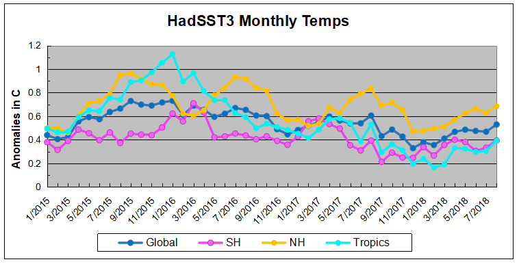
 The best context for understanding decadal temperature changes comes from the world’s sea surface temperatures (SST), for several reasons:


