Australia was literally on fire in December. Record heat made headlines in global media. So did the extreme rainfall in east Africa.
You and everybody else on earth can guess what climate alarmists blamed for both: man-made global warming, a.k.a. climate change.
But record cold in northern India at the same time didn’t make headlines in any major media in the United States or the United Kingdom.
Why? Because it didn’t fit expectations.
It’s a perfect example of climate alarmists’ obvious bias that’s seldom brought to light.
In December, east Africa received extremely heavy rainfall, causing widespread floods in Kenya and Djibouti. The floods impacted more than one million people and killed scores already challenged by extreme poverty.
During the same month, Australia recorded all-time highs. Widespread, devastating wildfires made the situation worse.
Climate alarmists predictably claimed these weather events for their propaganda. Almost all news article about the Australian heat and wildfires ultimately blamed man-made climate change. But more than four-fifths of Australia’s wildfires were caused by arson, not climate change.
And what caused the extreme hot weather was not global warming but a phenomenon called Positive Indian Ocean Dipole (PIOD).
PIOD is a seasonal weather phenomenon that can affect climate in east Africa, south Asia, and Australia all at once.
The same PIOD that caused Australia’s heat (but not its wildfires) caused the year-end floods in east Africa. It also caused extreme cold in northern India in the same month. Largely underreported in global media, the cold continued right through to the end of December.
Delhi, India’s capital, recorded its second-coldest December in 118 years. Intermittent cold waves gripped Punjab, Jammu and Kashmir, Ladakh, Himachal Pradesh, Uttarakhand, and Delhi.
On December 28, the heart of Delhi recorded a minimum of 1.7˚C (35˚F). The temperature likely reached freezing outside the city’s urban heat island effect. The cold wave impacted everyday life for 29 million people in Delhi.
But neither CNN nor BBC headlines ever mentionedit. It runs contrary to their narrative. Winters are supposed to become warmer. Though the mainstream media do link the PIOD to the Australian heat and the east African floods, they never shy away from blaming man-made climate change and find ways to link both.
Now their new theory is that the PIOD itself has become more intense because of climate change. In other words, weather events are non-existent in their dictionary. Each and every extreme weather event is blamed on man-made climate change.
This is what happens when people read every weather event through the preconceived lenses of climate alarmism.
Closer inspection reveals no change in very hot days in Australia since World War I. So hot weather (short term) and hot climate (long term) have nothing to do with the wildfire outbreak.
December’s extremes — heat in Australia, flooding in east Africa, cold in India — all were caused by a strong PIOD, not climate change.
These weather events neither prove nor disprove man-made climate change. But they do expose the bias of climate alarmists who blame them on man-made global warming.
Vijay Jayaraj (M.Sc., Environmental Science, University of East Anglia, England) is a research contributor for the Cornwall Alliance for the Stewardship of Creation.
Footnote:
The real tragedy is that Australian officials keep obsessing over their bogus climate models instead taking seriously real world weather warnings. It is not like they had no advance notice; this was published May 16, 2019, which should have triggered major efforts to reduce the fuel load long before summer.
NEW YORK—Emphasizing that the phenomenon is barely perceptible on a daily basis yet significant when observed on the whole, the nation’s top qualitative experts released a report Monday confirming that everything in every significant area of life is, in fact, slightly worse than it was yesterday. “While there are by no means any drastic changes for the worse in any given 24-hour period, we have observed a measurable and steady decline in each passing day,” the report read in part, specifically noting gradual but perceptible declines in personal wealth, food quality, the overall love shared by humanity, and the warmth of sunlight. “The outlook certainly looks bleak for the things that bring you joy, be it conversation with friends or the sound of children’s laughter, as they slowly become less and less fulfilling. Your favorite song will eventually become grating, the touch of your lover harsh and abrasive, and your own thoughts bitter and abhorrent as your mind itself sours.”
The report also noted that you should have noticed by now but your very awareness of things has diminished and grown hazy.
OK, but they forgot to mention that it is worst for children, women and minorities, and that cutting fossil fuels would solve this.
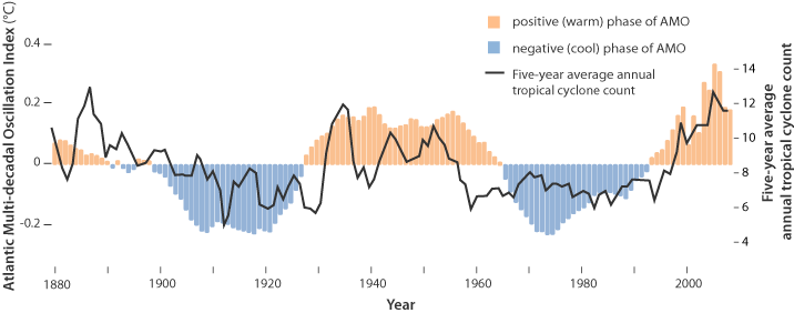
For the last few years, observers have been speculating about when the North Atlantic will start the next phase shift from warm to cold. Given the way 2018 went and 2019 followed, this may be the onset. First some background.
This is known as the Atlantic Multidecadal Oscillation (AMO), and the transition between its positive and negative phases can be very rapid. For example, Atlantic temperatures declined by 0.1ºC per decade from the 1940s to the 1970s. By comparison, global surface warming is estimated at 0.5ºC per century – a rate twice as slow.
In many parts of the world, the AMO has been linked with decade-long temperature and rainfall trends. Certainly – and perhaps obviously – the mean temperature of islands downwind of the Atlantic such as Britain and Ireland show almost exactly the same temperature fluctuations as the AMO.
Atlantic oscillations are associated with the frequency of hurricanes and droughts. When the AMO is in the warm phase, there are more hurricanes in the Atlantic and droughts in the US Midwest tend to be more frequent and prolonged. In the Pacific Northwest, a positive AMO leads to more rainfall.
A negative AMO (cooler ocean) is associated with reduced rainfall in the vulnerable Sahel region of Africa. The prolonged negative AMO was associated with the infamous Ethiopian famine in the mid-1980s. In the UK it tends to mean reduced summer rainfall – the mythical “barbeque summer”.Our results show that ocean circulation responds to the first mode of Atlantic atmospheric forcing, the North Atlantic Oscillation, through circulation changes between the subtropical and subpolar gyres – the intergyre region. This a major influence on the wind patterns and the heat transferred between the atmosphere and ocean.
The observations that we do have of the Atlantic overturning circulation over the past ten years show that it is declining. As a result, we expect the AMO is moving to a negative (colder surface waters) phase. This is consistent with observations of temperature in the North Atlantic.
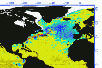
Cold “blobs” in North Atlantic have been reported, but they are usually winter phenomena. For example in April 2016, the sst anomalies looked like this
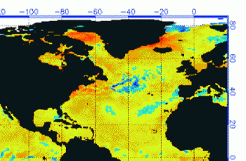
But by September, the picture changed to this
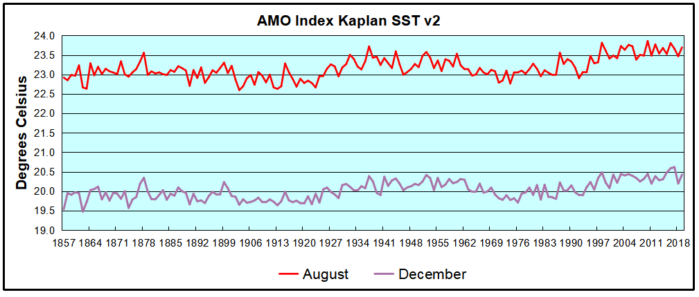
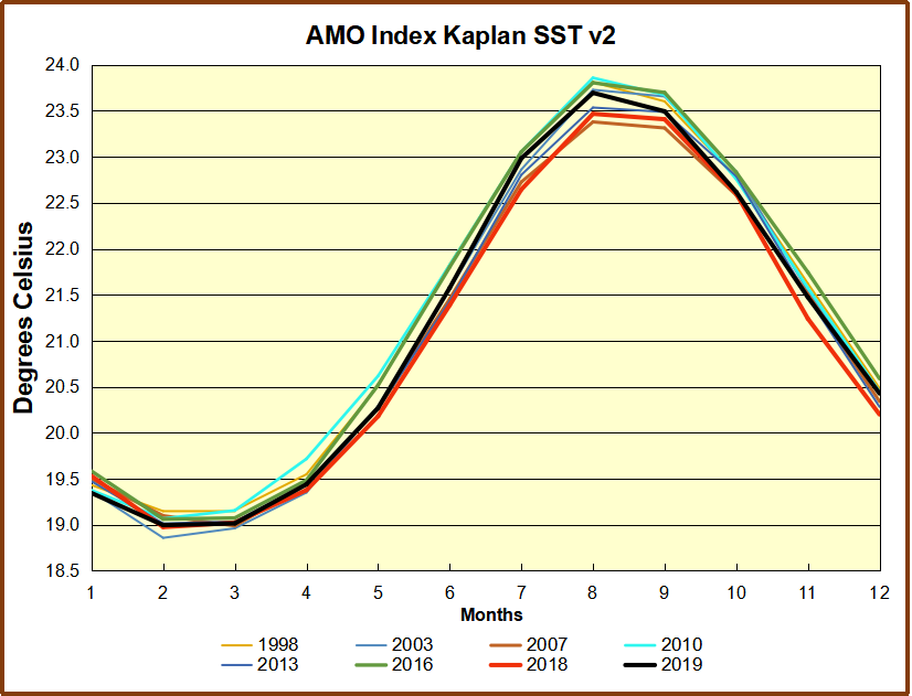
And we know from Kaplan AMO dataset, that 2016 summer SSTs were right up there with 1998 and 2010 as the highest recorded.
As the graph above suggests, this body of water is also important for tropical cyclones, since warmer water provides more energy. But those are annual averages, and I am interested in the summer pulses of warm water into the Arctic. As I have noted in my monthly HadSST3 reports, most summers since 2003 there have been warm pulses in the north atlantic.
The AMO Index is from from Kaplan SST v2, the unaltered and not detrended dataset. By definition, the data are monthly average SSTs interpolated to a 5×5 grid over the North Atlantic basically 0 to 70N. The graph shows the warmest month August beginning to rise after 1993 up to 1998, with a series of matching years since. December 2017 set a record at 20.6C, but note the plunge down to 20.2C for December 2018, matching 2011 as the coldest years since 2000. December 2019 shows an uptick but still lower than 2016-2017.
December 2019 confirms the summer pulse weakening, along with 2018 well below other recent peak years since 1998. Because McCarthy refers to hints of cooling to come in the N. Atlantic, let’s take a closer look at some AMO years in the last 2 decades.
This graph shows monthly AMO temps for some important years. The Peak years were 1998, 2010 and 2016, with the latter emphasized as the most recent. The other years show lesser warming, with 2007 emphasized as the coolest in the last 20 years. Note the red 2018 line was at the bottom of all these tracks. The black line shows that 2019 began slightly cooler than January 2018, then tracked closely before rising in the summer months, though still lower than the peak years. Through December 2019 is again tracking warmer than 2018 but cooler than other recent years in the North Atlantic. For the 12 month annual average, 2019 is 0.1C higher than 2018, but cooler by more than 0.1C lower than the El Nino years of 2016 and 2017.
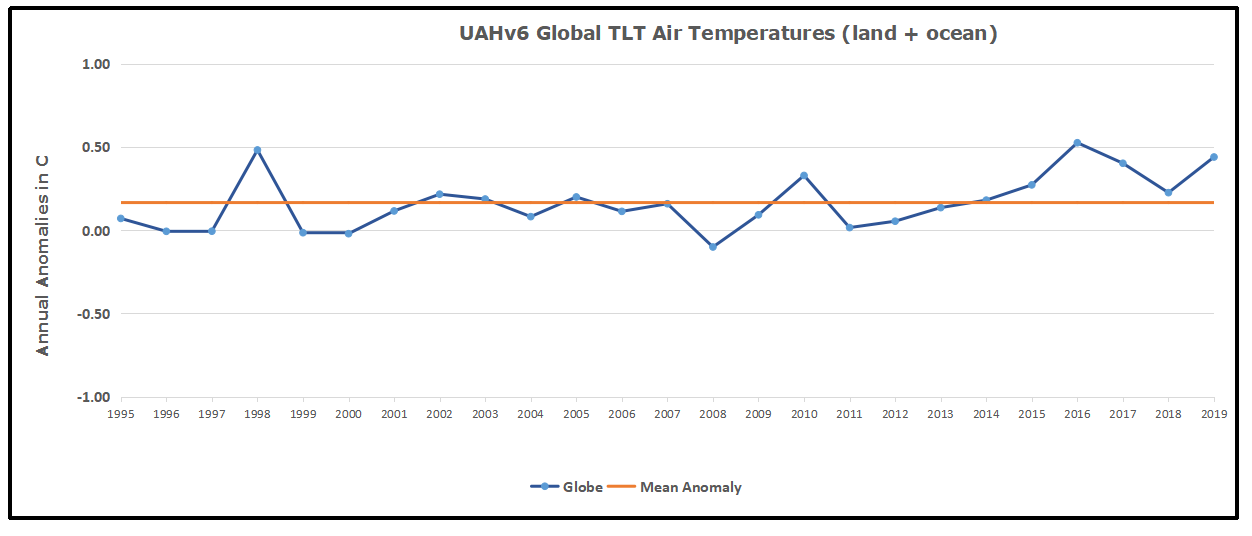
With apologies to Paul Revere, this post is on the lookout for cooler weather with an eye on both the Land and the Sea. UAH has updated their tlt (temperatures in lower troposphere) dataset for December. Previously I have done posts on their reading of ocean air temps as a prelude to updated records from HADSST3. This month also has a separate graph of land air temps because the comparisons and contrasts are interesting as we contemplate possible cooling in coming months and years.
Presently sea surface temperatures (SST) are the best available indicator of heat content gained or lost from earth’s climate system. Enthalpy is the thermodynamic term for total heat content in a system, and humidity differences in air parcels affect enthalpy. Measuring water temperature directly avoids distorted impressions from air measurements. In addition, ocean covers 71% of the planet surface and thus dominates surface temperature estimates. Eventually we will likely have reliable means of recording water temperatures at depth.
Recently, Dr. Ole Humlum reported from his research that air temperatures lag 2-3 months behind changes in SST. He also observed that changes in CO2 atmospheric concentrations lag behind SST by 11-12 months. This latter point is addressed in a previous post Who to Blame for Rising CO2?
After a technical enhancement to HadSST3 delayed March and April updates, May resumed a pattern of HadSST updates mid month. For comparison we can look at lower troposphere temperatures (TLT) from UAHv6 which are now posted for December. The temperature record is derived from microwave sounding units (MSU) on board satellites like the one pictured above. Recently there was a change in UAH processing of satellite drift corrections, including dropping one platform which can no longer be corrected. The graphs below are taken from the new and current dataset.
The UAH dataset includes temperature results for air above the oceans, and thus should be most comparable to the SSTs. There is the additional feature that ocean air temps avoid Urban Heat Islands (UHI). The graph below shows monthly anomalies for ocean temps since January 2015.
After a June rise in ocean air temps, all regions dropped back down to May levels in July and August. A spike occured in September, followed by plummenting October ocean air temps in the Tropics and SH. In November that drop partly warmed back, now leveling slightly downword with continued cooling in NH.
Land Air Temperatures Tracking in Seesaw Pattern
We sometimes overlook that in climate temperature records, while the oceans are measured directly with SSTs, land temps are measured only indirectly. The land temperature records at surface stations sample air temps at 2 meters above ground. UAH gives tlt anomalies for air over land separately from ocean air temps. The graph updated for October is below. Here we have freash evidence of the greater volatility of the Land temperatures, along with an extraordinary departure by SH land. Despite the small amount of SH land, it spiked in July, then dropped in August so sharply along with the Tropics that it pulled the global average downward against slight warming in NH. In November SH jumped up beyond any month in this period. Despite this spike along with a rise in the Tropics, NH land temps dropped sharply. The larger NH land area pulled the Global average downward. December reversed the situation with the SH dropping as sharply as it rose, while NH rose to the same anomaly, pulling the Global up slightly. The behavior of SH land temps is puzzling, to say the least. it is also a reminder that global averages can conceal important underlying volatility.
The longer term picture from UAH is a return to the mean for the period starting with 1995. 2019 average rose but currently lacks any El Nino to sustain it.
TLTs include mixing above the oceans and probably some influence from nearby more volatile land temps. Clearly NH and Global land temps have been dropping in a seesaw pattern, more than 1C lower than the 2016 peak, prior to these last several months. TLT measures started the recent cooling later than SSTs from HadSST3, but are now showing the same pattern. It seems obvious that despite the three El Ninos, their warming has not persisted, and without them it would probably have cooled since 1995. Of course, the future has not yet been written.
The hydrological cycle. Estimates of the observed main water reservoirs (black numbers in 10^3 km3 ) and the flow of moisture through the system (red numbers, in 10^3 km3 yr À1 ). Adjusted from Trenberth et al. [2007a] for the period 2002-2008 as in Trenberth et al. [2011].
Global warming issues have caused intensive research work in related areas, from land use, to urban environment to data science use in order to understand its effects better [25], [26], [27]. In this paper we focus on water related effects on global warming. Although water is recognised as the main cause of the greenhouse effect warming the Earth 33 oC above its black body temperature, water vapour is usually given a secondary role in global models, as a positive feedback from warming by all other causes. Despite its dominant effect in generating the weather, changes related to water are not seen as having a primary role in climate change, the focus being primarily on CO2. With positive feedback from primary warming, the effect of increasing CO2 is trebled [15] by water vapour increase. This conclusion is based on the perception that there are no significant trends in the hydrological cycle that could cause climate forcing. But this overlooks the effect of more than 3500 km3 of extra surface and ground water used annually in irrigation [17] to grow food for the human population. This quantity of extra water increases steadily year by year, well correlated with increasing atmospheric CO2, growing about 60% of world food requirements. Even so, the amount used in irrigation probably only adds about 3% to the annual hydrological cycle [9] of 113,000 km3. Is this sufficient to exert a significant extra greenhouse effect? Here we advance the hypothesis that it does and should be included in climate models.
A critical assumption of the IPCC consensus of global warming is that an increasing concentration of CO2 causes more retention of radiant heat near the top of the atmosphere, largely as a result of reduced emission of its spectral wavelengths centred on 15 microns. The radiative-convective model assumes that the lowered emissions at reduced pressure, number density and higher, colder altitudes from this GHG now provides an independent and sustained forcing exceeding 1-2 W per m2. It is assumed that once this reduction in OLR in the air column from increasing CO2 has occurred it must be compensated by increased OLR at different wavelengths elsewhere, maintaining balance with incoming radiation.
This critical assumption still lacks empirical confirmation.
Water Drives Atmospheric Warming
The importance of water in helping to keep the Earth’s atmosphere warm in the short term is beyond dispute. Table 1 summarises previously estimated rates for thermal energy flows into and out of the atmosphere [23]. As shown in the table, more than 80% of the power by which the temperature of air is maintained above the Earth’s black body temperature of -18 C is facilitated by water. Most significant of these air warming inputs from water is the greenhouse effect by which water vapour absorbs longwave radiation emitted from the surface, retaining more energy in air. However, warming from absorption of specific quanta by water vapour of incoming short wave solar radiation (ISR) and the latent heat of condensation of water vapour, exceeding the cooling effect of vertical convection, also contribute to warming of air.
Thus, the greenhouse gas (GHG) content of the atmosphere effectively provides resistance to heat flow to space increasing the transient storage of solar energy, with a warming effect analogous to resistances in an electrical circuit. By comparison to water, other polyatomic greenhouse gases like CO2 play a minor role in this process, totalling less than 20% of warming. Furthermore, the fact that the minor GHGs are relatively well-mixed by the turbulence in the troposphere, unlike water, means that we cannot expect to observe spatial variations in their effects. Furthermore, the heat capacity of non-greenhouse gases provides some 99% of the thermal inertia of the troposphere, although only greenhouse gases capable of longwave radiation by vibrational and rotational quanta can contribute to cooling by radiation through the top of the atmosphere as OLR. Figure 1 contrasts schematically the typical variation of outgoing longwave radiation (OLR) over marine and terrestrial environments.
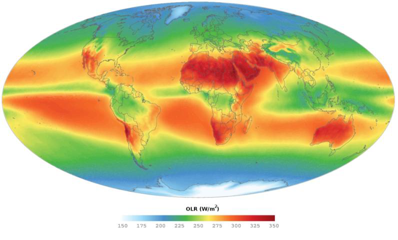
On well-watered land such as southern China much less direct emission of OLR to space occurs, in contrast to Quetta, Pakistan, on the same latitude with similar incoming shortwave radiation (ISR). In contrast to humid atmospheres on land and tropical seas, relatively arid regions such as the Sahara, the Middle East and Australia provide heat vents effectively cooling the Earth, solely as a result of the radiant emissions from GHGs as OLR. The varying global emissions of OLR estimated for typical marine and terrestrial regions shown in Figure 2 mirror this scheme.
Clearly, water vapour is the most critical factor in the mechanism by which the air column of the lower troposphere is charged with heat energy. It is of interest from this figure and in Table 1 that the exact sum of the effects of all greenhouse gases in directly warming air, including conduction from the surface, charges the lower atmosphere with sufficient heat to generate the downwelling radiation from greenhouse gases directed towards the surface [12]. Water is the main source of this back radiation [18], well understood to be responsible for keeping the surface air warmer in humid atmospheres, thus raising the minimum temperature.
None of the variation in OLR in Figure 1 can be attributed to the well-mixed GHGs such as CO2.
Furthermore, unlike the greenhouse effect of CO2, which is regarded as increasing only in in a logarithmic manner as its concentration rises, the greenhouse effect of water on retaining heat in the atmosphere should vary more linearly, even in the case of absorption of surface radiation, as its vapour spreads into dryer atmospheres; this potential is illustrated in Fig.1 in the descending zones of Hadley cells at sub-tropical latitudes.
Fig. 1 Global values of mean OLR from 2003-2011 (downloaded August 2, 2017, AIRS OLR 2003-2011 average htpp://mirador.gsfc.nasa.gov/ estimated by Giorgio, G.P., June 24, 2014). The russet areas show regions of greater OLR, with outgoing radiation above the average of ca. 240 W per m2, thus tending to cool the Earth. Note how the upper troposphere above arid continental regions provides a vent for the greatest rate of cooling.
Thermal Effects from Water are Direct and Linear
An approximately linear response in increasing air temperature to changes in atmospheric water content is reasonable. Unlike the well-mixed CO2, there are marked spatial and temporal variations in atmospheric water content, with much of the Earth’s surface in significant deficit, particularly in the sub-tropical zone subject to Hadley cell recycling, emphasised over semi-arid land. To the extent that additional water vapour spills over into these dryer regions on land the greater the area of the Earth that is subject to the greenhouse effect. This response can be contrasted to the effect of increasing CO2, which has a logarithmic relationship between climate forcing and concentration in the atmosphere [14], [15], each doubling causing a similar increase in temperature. Because there is no obvious regional effect of CO2 on the weather or regional climate, the effect of any increases in its concentration can only be theoretically inferred. If additional heat is retained in the atmosphere by increasing greenhouse effects from CO2 or water, the air temperature near the surface is expected to increase to keep global values of ISR and OLR in balance. A critical assumption of the IPCC consensus for climate change is that increasing CO2 causes more retention of heat in air near the top of the troposphere, largely as reduced emission from the edges of its spectral peak centred on 15 microns. This edge effect is predicted to be visible from space as a cooling of its spectrum, providing a negative forcing of 1-2 W per m2. It is assumed that this forcing must be compensated by increased OLR at different wavelengths as a result of the increased temperature.
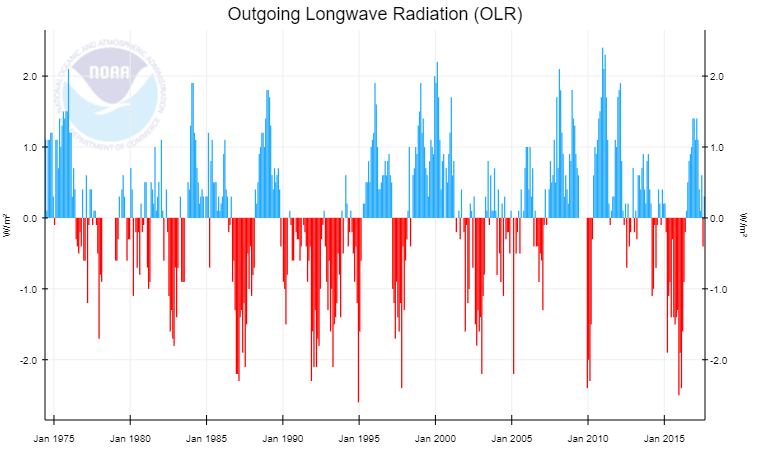
Fig. 3 Satellite measurements of global-zonal OLR (http://www.cpc.ncep.noaa.gov/data/indices/olr NOAA website, downloaded August 20, 2017). The 1998-2000 El Nino peaked at about 1.03 C above the minimum temperature in the preceding La Nina, with zonal OLR varying approximately 4 W/m2; see also (8)
This is regarded as a result of convective elevation of the maritime atmosphere, reducing the outgoing longwave radiation (OLR) about 100 W/m2 locally and 4 W/m2 globally from an increase in global water vapour of about 4%. This suggests a linear response from greenhouse warming to increased water vapour content of the atmosphere. Note that the extra heat in the atmosphere during an El Nino is controlled by all these sources of warming, as shown in Figure 2. Whatever the source of extra heat in the ocean, by moving extra water into the atmosphere as vapour it warms the atmosphere by the resultant greenhouse effect, reducing OLR, as well as direct warming by sunlight in the air column. In Table 4, another estimate of the possible effect of irrigation on global warming by comparison with the El Nino-La Nina cycle [22] is made. Consistent with the irrigation water hypothesis the El Nino has been long known to significantly reduce the OLR over the Pacific Ocean up to 25% [3], recognised as a result of elevation of emission of the OLR from water being elevated and therefore a colder altitude. Assuming 60% of irrigation water becomes vapour in the troposphere and a longer rain-out time of 15 days in dry regions compared to less than a week over the oceans with a global average of 8.5 days [19], a steady state of about 100 km3 of extra water vapour results from irrigation.
This estimate also suggests an increase in temperature near 0.2C from 0.84 W/m2 of forcing based on the data given in Figure 3. This is consistent with the total effect of water vapour on global warming exceeding 25 C.
It should be noted that this dynamic effect of water on warming air includes heat pumping by evapotranspiration as well as significant warming by direct absorption of short wave solar radiation (see Fig. 2), also contributing to a more linear effect by water on warming. Since this increase estimates a primary forcing effect of new water, a positive feedback is also anticipated from increased evaporation of the ocean, suggesting that the total increase from irrigation could be of the order of 0.5 oC in the 20th century.
These global results may have more accuracy than the results obtained from the numerous grid points in global circulation models, given the additivity of errors.
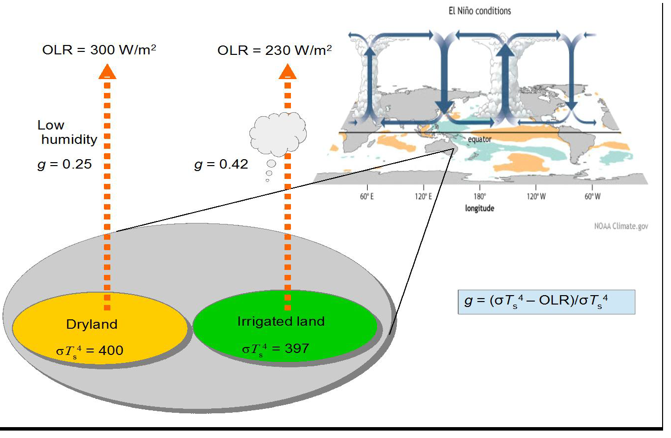
Empirical Proof Comparing Dry and Irrigated Land
In Figure 4, using the same modelling as in Figure 2, the predicted steady state greenhouse effect of adding irrigation water in a comparison between dryland and irrigated land. In fact the effect of water on heat transfer to the atmospheric column is not only a result of the greenhouse effect given in the equation in the figure but also from direct absorption by water of short wave ISR and evapotranspiration, similar in total magnitude. These latter effects will be a linear function of the water vapour involved. The evaporative effect cools the surface but must transfer a similar amount of heat to the atmosphere as infrared radiation (ca. 6 microns) associated with condensation of water vapour into droplets under convective cooling as in [21]. Paradoxically, the modelling paper in [6] failed to account for any of these effects, specifically dismissing significant transfer of water vapour into the atmosphere from growth of irrigated crop growth as noted above. This provides a clue to the possible flaw in their models. Except for environments already very humid where evapotranspiration is limited, this cannot be true.
Fig. 4 Comparison of dryland and irrigated land for effect of water on heat retention in the atmosphere as an enhanced greenhouse effect. The El Nino condition of enhanced evaporation from the ocean known to strongly reduce OLR In [3] is shown as an analogue.
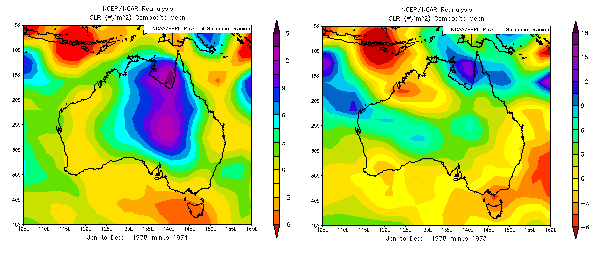
NCEP/ NCAR Reanalyses Coincident with the Periodic Flooding of Lake Eyre
Fig. 5 Variation in OLR from flooding of lake Eyre using NCEP-NCAR reanalysis datasets. a.Difference in OLR values between 1978 and 1974, dry and wet years. b. Difference in OLR values between 1978 and 1973, two dry years.
Rarely, during the La Nina phase of the climate cycle, the dry interior of northern Australia overlying the Great Artesian Basin may flood. Lacking riverine exits to the ocean, the massive runoff caused flows southwards, mainly accumulating in the depression below sea level in central South Australia known as Lake Eyre. In late January and February in the early months of 1974 Lake Eyre filled to a depth of six metres, its surface only returning to its hot, dry state three years later in 1977-78. This was the greatest flood ever recorded. The hypothesis in [4] suggests that this flooding should also lead to persistent elevated water vapour content of the atmosphere, predominantly downwind from the Lake Eyre basin. Using the NCEP-NCAR reanalysis datasets, which are informed by Nimbus and other satellite observations since 1970, the OLR emissions to space and the variation in humidity from this region comparing 12 months of 1974 with the same period in 1978 by subtraction of one year from the other. A significant elevation of OLR when the lake was dry by more than 10 W/m2 was observed for the 12-month period (Figure 5). This result is accompanied by increases in specific humidity consistent with an elevated greenhouse effect such as would be experienced in semi-arid areas when irrigated. The area affected downwind also showing elevated humidity is estimated as 35 times the flooded area, showing that the magnitude of this regional greenhouse effect was indeed significant.
Conclusion: Thankfully, A Wet World is a Warm World
The neglect of the possible effect of irrigation as a significant source of anthropogenic climate change may have been a result of reluctance to consider the relatively small amount of irrigation in the hydrological cycle. Because water has been considered as providing positive feedback to warming primarily from CO2 its possible forcing effect has been overlooked. But as shown here by several different means, the more potent effect of applying water previously in the ocean or deep in the ground to dry surfaces with air in strong water deficit can be sufficient to affect global temperature. Clearly, the water vapour content of the troposphere is the major cause of the natural greenhouse effect, contributing up to two-thirds of the 33 oC warming.
Spatial and temporal variations in soil moisture and relative humidity of the atmosphere are the main factors controlling the regional outgoing longwave radiation (OLR), in contrast to the more even effects from well-mixed greenhouse gases such as CO2.
This is well illustrated in the 4-6 year El Nino cycles, resulting in a global mean temperature variation approaching 1 oC compared with La Nina years. Longer term, the proposed Milankovitch glaciations of paleoclimates result in declines of atmospheric temperature around 10 oC, consistent with the major reduction in tropospheric water vapour approaching 50%. Weather conditions and climate as illustrated in the greenhouse effect are clearly demonstrated in the distribution of water, particularly on land. The apparently linear relationship between the water content of the atmosphere is direct verification of the greenhouse warming effect of this greenhouse gas. By contrast, other than by correlation, there is no such direct verification possible for the greenhouse effect of CO2. We rely on the forcing equation of 5.3ln[(CO2)t /(CO2)o] to estimate the climate sensitivity with respect to varying concentration (ppmv) of this greenhouse gas. Early hopes that a clear spectral signal was available showing significantly reduced OLR from increasing CO2, proving the hypothesis of climate forcing by permanent GHGs, have not been realised [5]. A focus using new satellites on the longer wavelength OLR associated with rotations of water might help resolve this question. Up till now, OLR is estimated for this region based on shorter wavelengths. The natural experiment provided by the flooding of Lake Eyre of the greenhouse effect by significantly reducing the OLR provides confirmation that irrigation water typically applied to dry land will have a measurable greenhouse effect.
One year time lapse of precipitable water (amount of water in the atmosphere) from Jan 1, 2016 to Dec 31, 2016, as modeled by the GFS. The Pacific ocean rotates into view just as the tropical cyclone season picks up steam.
From the Daily Caller (they watched the show, while I skipped it expecting only the usual social justice charade)
Absolutely amazing. Absolutely amazing on every single level. The entire opening monologue is a great example of why Gervais is the man.
Most award shows suck. They’re absolutely awful, and it’s usually millionaires lecturing middle Americans about why they’re the problem.
Gervais just dropped about a dozen verbal missiles on the whole crowd tonight before they even realized what happened.
Thank you, Gervais! Thank you so much. It’s about time somebody just spoke the honest truth to celebrities.
Of course my highest appreciation goes for this zinger:
“If you do win an award tonight, don’t use it as a platform to make a political speech. You’re in no position to lecture the public about anything. You know nothing about the real world. Most of you spent less time in school than Greta Thunberg. So, if you win, come up, accept your little award, thank your agent and your God and f**k off.”
Here’s the full transcript of the opening monologue:
“Hello and welcome to the 77th annual Golden Globe Awards, live from the Beverly Hilton Hotel here in Los Angeles. I’m Ricky Gervais, thank you.
You’ll be pleased to know this is the last time I’m hosting these awards, so I don’t care anymore. I’m joking. I never did. I’m joking, I never did. NBC clearly don’t care either — fifth time. I mean, Kevin Heart was fired from the Oscars for some offensive tweets — hello?
Lucky for me, the Hollywood Foreign Press can barely speak English and they’ve no idea what Twitter is, so I got offered this gig by fax. Let’s go out with a bang, let’s have a laugh at your expense. Remember, they’re just jokes. We’re all gonna die soon and there’s no sequel, so remember that.
But you all look lovely all dolled up. You came here in your limos. I came here in a limo tonight and the license plate was made by Felicity Huffman. No, shush. It’s her daughter I feel sorry for. OK? That must be the most embarrassing thing that’s ever happened to her. And her dad was in Wild Hogs.
Lots of big celebrities here tonight. Legends. Icons. This table alone — Al Pacino, Robert DeNiro … Baby Yoda. Oh, that’s Joe Pesci, sorry. I love you man. Don’t have me whacked. But tonight isn’t just about the people in front of the camera. In this room are some of the most important TV and film executives in the world. People from every background. They all have one thing in common: They’re all terrified of Ronan Farrow. He’s coming for ya. Talking of all you perverts, it was a big year for pedophile movies. Surviving R. Kelly, Leaving Neverland, Two Popes. Shut up. Shut up. I don’t care. I don’t care.
Many talented people of color were snubbed in major categories. Unfortunately, there’s nothing we can do about that. Hollywood Foreign press are all very racist. Fifth time. So. We were going to do an In-Memoriam this year, but when I saw the list of people who died, it wasn’t diverse enough. No, it was mostly white people and I thought, nah, not on my watch. Maybe next year. Let’s see what happens.
No one cares about movies anymore. No one goes to cinema, no one really watches network TV. Everyone is watching Netflix. This show should just be me coming out, going, “Well done Netflix. You win everything. Good night.” But no, we got to drag it out for three hours. You could binge-watch the entire first season of Afterlife instead of watching this show. That’s a show about a man who wants to kill himself cause his wife dies of cancer and it’s still more fun than this. Spoiler alert, season two is on the way so in the end he obviously didn’t kill himself. Just like Jeffrey Epstein. Shut up. I know he’s your friend but I don’t care.
Seriously, most films are awful. Lazy. Remakes, sequels. I’ve heard a rumor there might be a sequel to Sophie’s Choice. I mean, that would just be Meryl just going, “Well, it’s gotta be this one then.” All the best actors have jumped to Netflix, HBO. And the actors who just do Hollywood movies now do fantasy-adventure nonsense. They wear masks and capes and really tight costumes. Their job isn’t acting anymore. It’s going to the gym twice a day and taking steroids, really. Have we got an award for most ripped junky? No point, we’d know who’d win that.
Martin Scorsese made the news for his controversial comments about the Marvel franchise. He said they’re not real cinema and they remind him about theme parks. I agree. Although I don’t know what he’s doing hanging around theme parks. He’s not big enough to go on the rides. He’s tiny. The Irishman was amazing. It was amazing. It was great. Long, but amazing. It wasn’t the only epic movie. Once Upon a Time in Hollywood, nearly three hours long. Leonardo DiCaprio attended the premiere and by the end his date was too old for him. Even Prince Andrew was like, “Come on, Leo, mate.You’re nearly 50-something.”
The world got to see James Corden as a fat pussy. He was also in the movie Cats. No one saw that movie. And the reviews, shocking. I saw one that said, “This is the worst thing to happen to cats since dogs.” But Dame Judi Dench defended the film saying it was the film she was born to play because she loves nothing better than plunking herself down on the carpet, lifting her leg and licking her ass. (Coughs) Hairball. She’s old-school.
It’s the last time, who cares? Apple roared into the TV game with The Morning Show, a superb drama about the importance of dignity and doing the right thing, made by a company that runs sweatshops in China. Well, you say you’re woke but the companies you work for in China — unbelievable. Apple, Amazon, Disney. If ISIS started a streaming service you’d call your agent, wouldn’t you?
So if you do win an award tonight, don’t use it as a platform to make a political speech. You’re in no position to lecture the public about anything. You know nothing about the real world. Most of you spent less time in school than Greta Thunberg.
So if you win, come up, accept your little award, thank your agent, and your God and fuck off, OK? It’s already three hours long. Right, let’s do the first award.”
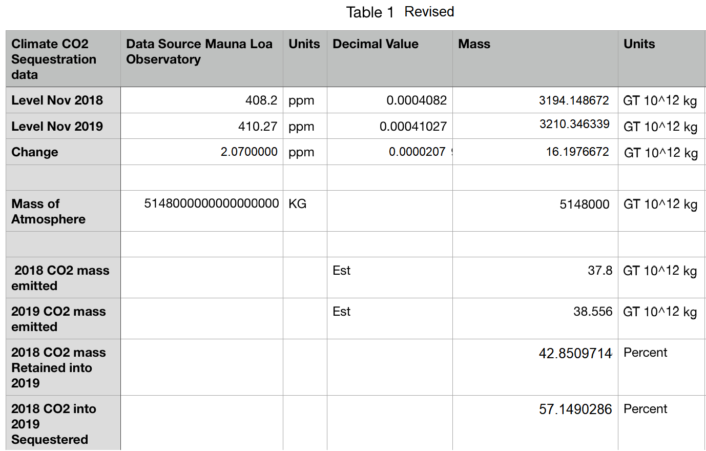
This is an update correcting a previous post Fear Not CO2! I discovered math errors that invalidated the main conclusion. I apologize for not seeing the problem before posting.
NO it is not even an issue you need to worry about.
Look closely. The biological adaptation is eating up the CO2 almost as fast as it is being emitted and the adaptation is getting faster every year.
Out of the over 38 GT output in 2019 only 0.02 GT will not be sequestered naturally and by next year that will be gone. The plants are eating up the CO2 just a few days after the release. They are happily eating it up just fine. You don’t even need to plant trees. Nothing against trees here. I like them.
This is the TRUMP CARD on the game. With this known, it is impossible to imagine the problems proposed are happening regardless of all other issues.
Correction Update
I reblogged an answer from Quora with an analysis and conclusions new to me. I thought it interesting if it held up to scrutiny.. Afterward I became uncomfortable when double checking the math, and so I am retracting my support. One smaller issue was noted in my post regarding CO2 having a larger weight (44) than the average air molecule (29). Thus calculating CO2 mass in the atmosphere should apply a ratio of 1.52. That does not in itself materially affect the finding.
The Table produced by Paul Noel is shown above..
The more substantial issue is having equivalent units of mass for comparing atmospheric CO2 and human emissions of CO2. The proper unit is Gigatons since that is how emissions are reported. One GT is defined as 1 billion (10^9) metric tons and 1 metric ton is 1000 (10^3) kilograms. So one GT is 10^12 kg.
The mass of the atmosphere is calculated using air pressure and area, with a little variation in the results obtained by researchers. A typical standard is 5.148 x 10^18 kg. That converts to 5148000 x 10^12 kg or 5148000 GT. Once that value is plugged into the table, the results are very different. I had recognized that 10^15 was not GT, but thought it was only mislabeling. Later I found that the comparison was distorted in the process.
My revised Table 1 applies a weighted calculation for CO2 compared to average air molecules and derives masses and percentages using GT consistently.
It is clear that the claim of 99% sequestration of emissions is an artifact of faulty math. A better approximation is 57% for emissions reduced by natural fluxes.
This does not mean we should fear CO2. For one thing the greening of the planet and record annual crop yields are a great benefit from both warming and higher atmospheric CO2. It is also the case that estimates of human emissions (fraught with uncertainty) are small compared to natural fluxes, which are estimated with error ranges exceeding emission amounts. Further, the sensitivity of temperature to rising CO2 is assumed to lie in a wide range.
There I have said the unsayable but don’t hold your breath, you will not hear that on the MSM biased broadcasters like Sky or BBC.
Of course, this is only my opinion but it is an opinion held by millions and deserves to be heard surely?
I hoped after the media bias over the Brexit debate and the General election that the MSM broadcasters would stop emoting and get back to reporting but alas my optimism was misplaced.
It appears to me that because the BBC and Sky News lost the Remainer narrative and the trash Boris agenda and the British public that they have now switched their attention and propaganda machine to promote climate change danger and the agenda of Greta.
The BBC seem determined and desperate to blame the horrific fires in Australia on their global warming agenda and seem very reluctant to mention that over a hundred people have already been arrested for setting fires.
Arson has always been a feature of these annual bush fires and of course the fires themselves are not a new phenomenon either.
I’m not denying that the extremely hot temperatures and dry weather haven’t contributed to the scale of the disaster but isn’t it a reporter’s job to give all sides of a story?
Like many people I don’t doubt that Global warming is happening but I am not convinced that is man-made and that opinion should be reflected in reports.
This is not a game, people have died and many are missing and hundreds of people have or are going to lose their homes.
This is not a time for sixth form, pig tailed, Greta style politicising and propaganda tricks to push the green agenda.
Which of course always ends at the same destination. With working class people losing their manufacturing jobs and being taxed to the hilt when they start ‘Burger flipping’. Meanwhile preaching pop stars and Royals still fly around the globe in private jets whilst paying to offset their carbon ‘Birkenstock’ footprint.
It is, if you pardon the image, all smoke and mirrors and broadcasters should be ashamed of themselves particularly the State one that we pay for via a compulsory poll tax.
Last night the BBCreported/emoted on the fires and then followed it with a report about the last decade being the second hottest on record. The implication was clear and was almost the media manipulation of a five-year-old.
Do they really think that we are that thick? Unfortunately, I believe that they do. It would appear that to use a football chant, ‘two referendums and one election’ has taught them absolutely nothing.
Aussie PM, Scott Morrison, on a visit to Cobargo a town that has almost been destroyed by the fires, got a real hard time from angry and distraught residents yesterday and rightly so.
He was a complete idiot to go to Hawaii whilst his country burned. However, the visit and the refusal by one firefighter to shake his hand was interpreted by the biased broadcasters as if these people were green activists rather than people who had lost their homes and were bloody angry with the establishment class for ignoring them.
These people telling him he was a “Fu*kwit and to pi** off didn’t strike me as green activists or members of Extinction rebellion, no these were normal people who felt let down and forgotten by the political class. Is that attitude ringing any bells with you?
Have you seen the video of the Australian who has a completely different narrative of what has caused these fires? Although his language is extremely fruity, to say the least, his point is that it is actually green activists that have led to the scale of these fires because they have forced farmers to stop burning their scrubland in the winter months which used to create natural fire breaks. This is a tradition that goes back centuries and was actually practiced by the original indigenous Australian Aboriginal population. This possible cause is echoed all over social media today in many tweets from the affected area today.
But that didn’t stop Caroline Lucas the Green Party’s only MP in the UK from entering the fray with a tweet with a link to an article in (you guessed it) the Guardian saying, ‘This is what Climate Emergency looks like – completely terrifying. Honestly, what further devastation needs to happen before world leaders finally put in place urgent climate action at the scale and speed the science demands?’
However, she has had her fingers burnt with angry exchanges on Twitter from people who actually live in New South Wales.
One British ex-pat, Terry Stone, angrily answered her tweet with the following, ‘You have no clue what is happening here. Green lobby stupid restrictions on controlled burns & removal of dead wood is primary reason these fires cannot be controlled. Listen to multiple generations of land owners and keep your mouth shut, you might learn something.’
Another tweeted, ‘I’m a rural Victoria resident. In addition to less burning off than used to happen, we’re restricted collecting dead wood in forests for our wood burners at home (principal heating) in case we inadvertently squish rare lizard or such. And then millions of animals die instead. Ugh’
Have you heard these views on Sky or the BBC? No of course not because Sky are too busy rabidly pushing the ‘woke’ agenda and today they had the leading climate change purveyor of doom and gloom, George Monbiot from (yes, you’ve guessed it) the Guardian on their programme.
Monbiot condemned, and was unchallenged, the Aussie Pm and stated that the Bush fires were a prime example of climate breakdown and that we need political leaders who are going to leave fossil fuels in the ground. Again, this ludicrous statement went unchallenged. In fact, the person Sky chose to conduct this debate and I use the term really loosely was some sort of PR guy who was on to suggest how Morrison could rebuild his reputation after the disaster. Putting aside the fact that Morrison has just won another election why was a PR man on. Why not use someone like James Delingpole or any other climate change sceptic to challenge Monbiot’s views? Well we all know the answer to that one, don’t we!
Sky News backed up Monbiot’s simplistic ludicrous blame game by reminding viewers and their internet readers that “Rewind a few years and he (Morrison) was brandishing a lump of coal in parliament, taunting those he described as having a “pathological fear of coal” and lauding the fossil fuel he said was powering Australia’s economy and underpinning jobs.” Is this what Sky call impartial and balanced reporting?
But unfortunately for George, Sly News and the climate change fanatics Morrison was correct as Australia is the biggest net exporter of coal and is the world’s fourth-largest producer. Over 175,000 people are either directly or indirectly employed in the industry.
In the real world a leader has to balance these real factors before looking to be loved by the MSM broadcasters and avoid the death stare of Greta!
The BBC and Sky’s simplistic and biased telling of this story is almost turning them into the Greta Broadcasting Corporation where they tell us the problem but only half of the solution.
So, called man made global warming is not the primary villain in this story.
The people who are responsible for: the 17 deaths so far, the hundreds of houses destroyed and lives ruined, the burning alive of half a billion animals and the torching of over 5 Billion hectares of land and forest and thousands of Aussies being evacuated from beaches are not those who dig coal but those who despise those who dig coal or work the land.
A new progressive administration and Democratic legislative super-duper majorities put California on a collision course with reality.
Basically, the Brown era signaled the last years of traditional liberal governance. The new governor, former San Francisco Mayor Gavin Newsom, comes out of the party’s progressive wing. Democrats have long controlled the Capitol, but an anti-Trump backlash hastened the state GOP’s long-coming meltdown. A couple of GOP lawmakers even recently jumped ship. That means no check on Democrats, which makes this shift even more noteworthy.
Looking back at 2019, we get a vision of the future — and there’s reason for concern.
Newsom was stuck dealing with raging wildfires and a bankrupt public utility that began shutting down parts of the electrical grid to prevent even more fires. This brought back shades of Gray Davis, who in 2003 was recalled by voters (and replaced by nominally Republican Gov. Arnold Schwarzenegger) in the midst of rolling blackouts caused by a failed electricity deregulation plan. That’s not just because of the obvious electricity parallels, but because Newsom’s tepid response was reminiscent of the deer-in-the-headlights Davis.
The wildfire/electricity mess is related to liability rules, an overly bureaucratic regulatory climate, and an environmental approach to forest lands that limited brush clearance. None of these matters could quickly be fixed by any governor — even one who had a clue what to do about it. But the real trouble signs in 2019 have come from the governor’s decision to sign measures that likely would have sent his predecessor reaching for the veto pen.
I’ve covered the worst new law for The American Spectator. This was Assembly Bill 5, which banned many companies from using contractors as their workforce. It epitomizes the new, more aggressive strain of progressivism that isn’t content creating new programs and raising taxes — but is willing to destroy large segments of the private economy. The goal seems to be punishing “evil” businesses. If people’s lives are destroyed in the process, so be it.
The targets of the law were Uber, Lyft, DoorDash, and other ride-sharing and delivery companies whose business model is based on using independent contractors as drivers. The union-backed legislation is designed to force these companies (lawmakers exempted most other businesses from its rules, including attorneys, physicians, real-estate agents, and insurance sales people) to hire their drivers as permanent employees and pay them benefits.
Instead, we’re seeing predictable results. Freelance writers, photographers, and artists were not exempted from the measure — and the layoff notices have been coming to these workers as the year’s end approaches. The newly unemployed shouldn’t worry, though. The law’s sponsor, Assemblywoman Lorena Gonzalez, D-San Diego, said in a tweet (as quoted by Reason): “These were never good jobs. No one has ever suggested that, even freelancers.”
That’s progressivism reduced to one short tweet. These folks know what’s best for us and can determine what jobs are good and which ones shouldn’t exist.
When it comes to drivers, hundreds of thousands of jobs could be at risk, according to a recent economic study. Companies that hire drivers have filed suit and are gathering signatures for an initiative that would exempt these workers, but it’s anybody’s guess how this madness might shake out.
Newsom also signed a bill imposing statewide rent control, even though it’s an unquestionable fact that rent control depresses housing supply. Even California officials are starting to realize that the state’s sky-high housing prices are the result of regulations that squelch housing construction. Yet there’s been no legislative progress in addressing those state-imposed restrictions, only a push for more subsidized housing and passage of the one sure-fire way to quickly make the situation worse.
The governor also signed a package of laws that will slowly strangle the charter-school industry (even though both sides depicted it as a compromise), which is the state’s main educational bright spot. The new Legislature is targeting the gig economy, the housing industry, and the schools. Quite obviously, the next target for their destruction is healthcare. Look out for coming plans for single payer.
As Californians, we’re used to the ridiculous spending plans and the state’s refusal to deal with problems (homelessness, soaring pension liabilities, tax rates that are driving businesses out of state) that are of its own making. That’s been standard fare, and certainly was true during the Brown administration. But we’re heading into a brave new world. I predicted we’d be pining for the days of Jerry Brown.
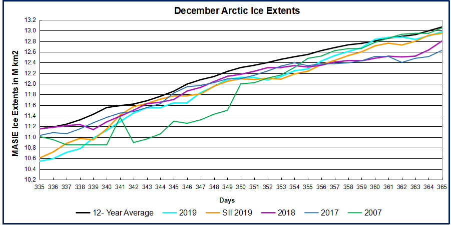
The image above shows recovery of Arctic sea ice extent over the month of December 2019. As supported by the table later, the pace of refreezing allowed 2019 to match and exceed for a few days the 12 year average (2007 to 2018 inclusive).
The month began with seas on the Eurasian side (left) already ice-covered, so no additional extent came from there. OTOH Hudson Bay (right) filled in completely, gaining from 445k km2 to 1255k km2, virtually to its max. Most of the action now is on the Pacific side (bottom) where Chukchi iced over, and Bering (center) and Okhotsk (left) have started to freeze in ernest.
The graph below shows the ice extent growing during December compared to some other years and the 12 year average (2007 to 2018 inclusive).
Note that the NH ice extent 12 year average increases almost 2M km2 during December, up to 13.1M km2. MASIE 2019 shows a faster icing rate, starting 600k km2 lower than average before reaching and surpassing the average, ending December in a virtual tie with average. Both 2018 and 2017 were lower at this point, while MASIE and SII are tracking closely together.
Region
2019365
Day 365 Average
2019-Ave.
2017365
2019-2007
(0) Northern_Hemisphere
12980000
13070435
-90436
12628187
351813
(1) Beaufort_Sea
1070655
1070266
389
1070445
210
(2) Chukchi_Sea
965972
964161
1811
943883
22090
(3) East_Siberian_Sea
1087137
1087134
3
1087120
18
(4) Laptev_Sea
897845
897842
3
897845
0
(5) Kara_Sea
929682
880747
48935
892689
36993
(6) Barents_Sea
479642
424886
54756
331819
147823
(7) Greenland_Sea
590098
568883
21215
555757
34341
(8) Baffin_Bay_Gulf_of_St._Lawrence
851131
1016132
-165001
978074
-126943
(9) Canadian_Archipelago
854282
853098
1185
853109
1174
(10) Hudson_Bay
1254576
1231781
22795
1260838
-6262
(11) Central_Arctic
3228672
3206086
22586
3191526
37147
(12) Bering_Sea
362317
439846
-77529
194350
167967
(13) Baltic_Sea
8738
32177
-23439
13345
-4607
(14) Sea_of_Okhotsk
390113
376320
13793
336595
53518
The table shows where the ice is distributed compared to average. Bering Sea and Baffin Bay have the only deficits to average, while other regions are at or above average; Kara and Barents Seas are in surplus.
Footnote: Interesting comments recently by Dr. Judah Cohen at his blogregarding the Arctic fluctuations. Excerpts with my bolds.
I have said many times the first thing that you learn as a seasonal forecaster is humility and these are one of those times. What is humbling me at the moment is that I have expected a weakening of the stratospheric polar vortex (PV) based on fall Arctic predictors – extensive Siberian snow cover, more limited Arctic sea ice extent and a relatively warm Arctic. Following the PV weakening or disruption, severe winter weather would be more frequent at least regionally across the mid-latitudes of the Northern Hemisphere (NH). But to be honest it is hard to see from today’s viewpoint how this verifies. And as I have shared on Twitter the new operational GFS, the FV3, has been especially bullish on a strong PV.
The biggest challenge that I see right now is the center of low mid-tropospheric heights currently just north of Alaska and is expected to expand in breadth over the next two weeks enough so to fill the entire Arctic basin. This a fairly class pattern of low heights in the Arctic and high heights in the mid-latitudes resulting in a cold Arctic/warm continents pattern, all consistent with a positive AO. It seems a bit ironic (at least to me) that with the record low sea ice in the Chukchi-Bering seas this fall, the incredibly warm year Alaska just experienced both in part due to persistent ridging in the region, this same region is predicted to now experience an extended period of low heights and below normal temperatures. As an aside, this is something that I had a hard time anticipating even just a few weeks ago.
So, for now I remain steadfast in the winter forecast that based on high fall snow cover/low Arctic sea ice that they will in tandem perturb the PV. Given the westerly quasi-biennial oscillation (QBO) I expect a scenario somewhere between winter 2016/17 and winter 2017/18. Both of those winters were westerly QBO winters and the most significant disruption of the stratospheric PV took place in February.
Illustration by Eleanor Lutz shows Earth’s seasonal climate changes. If played in full screen, the four corners present views from top, bottom and sides. It is a visual representation of scientific datasets measuring Arctic ice extents.
 Vijay Jayaraj explains how weather is created around the Indian Ocean in this article Record Heat and Cold Expose Climate Alarmists’ Bias. Excerpts in italics with my bolds and images.