Covid Recedes in Canada August

The map shows that in Canada 8979 deaths have been attributed to Covid19, meaning people who died having tested positive for SARS CV2 virus.  This number accumulated over a period of 204 days starting January 31. The daily death rate reached a peak of 177 on May 6, 2020, and is down to 5 as of yesterday.  More details on this below, but first the summary picture. (Note: 2019 is the latest demographic report)

Canada Pop Ann Deaths Daily Deaths Risk per
Person
2019 37589262 330786 906 0.8800%
Covid 2020 37589262 8979 44 0.0239%

Over the epidemic months, the average Covid daily death rate amounted to 5% of the All Causes death rate. During this time a Canadian had an average risk of 1 in 5000 of dying with SARS CV2 versus a 1 in 114 chance of dying regardless of that infection. As shown later below the risk varied greatly with age, much lower for younger, healthier people.

Background Updated from Previous Post

In reporting on Covid19 pandemic, governments have provided information intended to frighten the public into compliance with orders constraining freedom of movement and activity. For example, the above map of the Canadian experience is all cumulative, and the curve will continue upward as long as cases can be found and deaths attributed.  As shown below, we can work around this myopia by calculating the daily differentials, and then averaging newly reported cases and deaths by seven days to smooth out lumps in the data processing by institutions.

A second major deficiency is lack of reporting of recoveries, including people infected and not requiring hospitalization or, in many cases, without professional diagnosis or treatment. The only recoveries presently to be found are limited statistics on patients released from hospital. The only way to get at the scale of recoveries is to subtract deaths from cases, considering survivors to be in recovery or cured. Comparing such numbers involves the delay between infection, symptoms and death. Herein lies another issue of terminology: a positive test for the SARS CV2 virus is reported as a case of the disease COVID19. In fact, an unknown number of people have been infected without symptoms, and many with very mild discomfort.

August 7 in the UK it was reported (here) that around 10% of coronavirus deaths recorded in England – almost 4,200 – could be wiped from official records due to an error in counting.  Last month, Health Secretary Matt Hancock ordered a review into the way the daily death count was calculated in England citing a possible ‘statistical flaw’.  Academics found that Public Health England’s statistics included everyone who had died after testing positive – even if the death occurred naturally or in a freak accident, and after the person had recovered from the virus.  Numbers will now be reconfigured, counting deaths if a person died within 28 days of testing positive much like Scotland and Northern Ireland…

Professor Heneghan, director of the Centre for Evidence-Based Medicine at Oxford University, who first noticed the error, told the Sun: ‘It is a sensible decision. There is no point attributing deaths to Covid-19 28 days after infection…

For this discussion let’s assume that anyone reported as dying from COVD19 tested positive for the virus at some point prior. From the reasoning above let us assume that 28 days after testing positive for the virus, survivors can be considered recoveries.

Recoveries are calculated as cases minus deaths with a lag of 28 days. Daily cases and deaths are averages of the seven days ending on the stated date. Recoveries are # of cases from 28 days earlier minus # of daily deaths on the stated date. Since both testing and reports of Covid deaths were sketchy in the beginning, this graph begins with daily deaths as of April 24, 2020 compared to cases reported on March 27, 2020.

The line shows the Positivity metric for Canada starting at nearly 8% for new cases April 24, 2020. That is, for the 7 day period ending April 24, there were a daily average of 21,772 tests and 1715 new cases reported. Since then the rate of new cases has dropped down, now holding steady at ~1% since mid-June. Yesterday, the daily average number of tests was 43,612 with 375 new cases. So despite double the testing, the positivity rate is not climbing.  Another view of the data is shown below.

The scale of testing has increased and has now reached nearly 50,000 a day, while positive tests (cases) are hovering at 1% positivity.  The shape of the recovery curve resembles the case curve lagged by 28 days, since death rates are a small portion of cases.  The recovery rate has grown from 83% to 98% steady over the last 2 weeks.  This approximation surely understates the number of those infected with SAR CV2 who are healthy afterwards, since antibody studies show infection rates multiples higher than confirmed positive tests (8 times higher in Canada).  In absolute terms, cases are now down to 375 a day and deaths 5 a day, while estimates of recoveries are 285 a day.

Summary of Canada Covid Epidemic

It took a lot of work, but I was able to produce something akin to the Dutch advice to their citizens.

The media and governmental reports focus on total accumulated numbers which are big enough to scare people to do as they are told.  In the absence of contextual comparisons, citizens have difficulty answering the main (perhaps only) question on their minds:  What are my chances of catching Covid19 and dying from it?

A previous post reported that the Netherlands parliament was provided with the type of guidance everyone wants to see.

For canadians, the most similar analysis is this one from the Daily Epidemiology Update: :

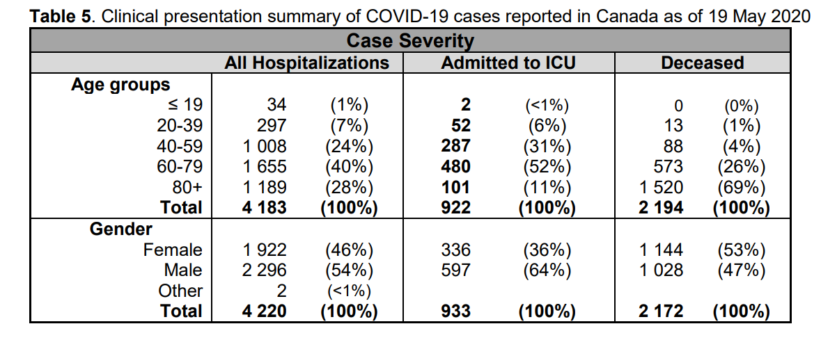
The table presents only those cases with a full clinical documentation, which included some 2194 deaths compared to the 5842 total reported.  The numbers show that under 60 years old, few adults and almost no children have anything to fear.

Update May 20, 2020

It is really quite difficult to find cases and deaths broken down by age groups.  For Canadian national statistics, I resorted to a report from Ontario to get the age distributions, since that province provides 69% of the cases outside of Quebec and 87% of the deaths.  Applying those proportions across Canada results in this table. For Canada as a whole nation:

Age  Risk of Test +  Risk of Death Population
per 1 CV death
<20 0.05% None NA
20-39 0.20% 0.000% 431817
40-59 0.25% 0.002% 42273
60-79 0.20% 0.020% 4984
80+ 0.76% 0.251% 398

In the worst case, if you are a Canadian aged more than 80 years, you have a 1 in 400 chance of dying from Covid19.  If you are 60 to 80 years old, your odds are 1 in 5000.  Younger than that, it’s only slightly higher than winning (or in this case, losing the lottery).

As noted above Quebec provides the bulk of cases and deaths in Canada, and also reports age distribution more precisely,  The numbers in the table below show risks for Quebecers.

Age  Risk of Test +  Risk of Death Population
per 1 CV death
0-9 yrs 0.13% 0 NA
10-19 yrs 0.21% 0 NA
20-29 yrs 0.50% 0.000% 289,647
30-39 0.51% 0.001% 152,009
40-49 years 0.63% 0.001% 73,342
50-59 years 0.53% 0.005% 21,087
60-69 years 0.37% 0.021% 4,778
70-79 years 0.52% 0.094% 1,069
80-89 1.78% 0.469% 213
90  + 5.19% 1.608% 62

While some of the risk factors are higher in the viral hotspot of Quebec, it is still the case that under 80 years of age, your chances of dying from Covid 19 are better than 1 in 1000, and much better the younger you are.

Heisenberg Uncertainty Appears in Socio-Political Research

Background:  Heisenberg Uncertainty

In the sub-atomic domain of quantum mechanics, Werner Heisenberg, a German physicist, determined that our observations have an effect on the behavior of quanta (quantum particles).

The Heisenberg uncertainty principle states that it is impossible to know simultaneously the exact position and momentum of a particle. That is, the more exactly the position is determined, the less known the momentum, and vice versa. This principle is not a statement about the limits of technology, but a fundamental limit on what can be known about a particle at any given moment. This uncertainty arises because the act of measuring affects the object being measured. The only way to measure the position of something is using light, but, on the sub-atomic scale, the interaction of the light with the object inevitably changes the object’s position and its direction of travel.

Now skip to the world of governance and the effects of regulation. A similar finding shows that the act of regulating produces reactive behavior and unintended consequences contrary to the desired outcomes. More on that later on from a previous post.

This article looks at political and social research attempts to describe the electorate’s preoccupations and preferences ahead of 2020 US Presidential voting in November.

John McLaughlin explains in his article Biased Polls Suppress Vote  Excerpts in italics with my bolds.

McLaughlin noted among the 220 million eligible voters in the U.S., only around 139 million voted in 2016, which is considered the most all-time.

“Even if it goes up to 140-150 million, the polls of adults are going to be skewed against Republicans,” McLaughlin told Monday’s “Greg Kelly Reports,” especially “since President Trump gets over 90% support from Republicans.”

McLaughlin noted CNN’s poll among adults featured just 25% registered Republicans, where as around one-third of the electorate that voted in 2016 were Republicans.

He added to host Greg Kelly, it costs more to run focused polls of likely voters from actual voter registration lists.

“It’s cheaper for them to do,” in addition to being advantageous to the Democratic candidate, McLaughlin told Kelly. “They don’t have to buy a sample of voters, that campaign pollsters – whether Republican or Democrat – are going to have to do.”

Also, per McLaughlin, reporting a blowout lead ultimately can cause voter suppression, a frequent rally cry of Democrats against Republicans in election.

Politico notes that there is nothing nefarious going on to skew these polls toward Biden. But they do have the same issue the 2016 polls had: They’re not reaching all of the Trump supporters.

At the center of the issue are white voters without college degrees; in 2016, Trump earned 67% of this demographic’s support, while Democrat Hillary Clinton got just 28%. Current polls, according to Politico, are not capturing enough of this voting bloc, which unintentionally skews the results toward Biden.

My Comment:  This post was inspired by a Flynnville Train song that captures the sentiment of working class Americans alienated from the political process.  Disrespected as “deplorables” they turned out for Trump and made the difference in 2016.  Now with arbitrary pandemic restrictions and random urban rioting, these folks are even more incensed about the political elite.  Lest anyone think them inconsequential, remember that many of them get up and go to watch the most popular US spectator sport.  I refer to stock car racing, not the kneeling football or basketball athletes.

Lyrics:

IF YOU’RE HANDS ARE HURTIN’ FROM A WEEK OF WORKIN’
AND HOLDING YOUR WOMAN IS THE ONLY THING THEY’RE GOOD FOR
YOU’RE PREACHING TO THE CHOIR
IF THE PRICE OF GAS IS BREAKIN’ YOUR BACK
AND THAT DRIVE TO WORK IS KILLIN’ YOUR PAYCHECK
YOU’RE PREACHING TO THE CHOIR
IF YOU’RE WORRIED ‘BOUT WHERE THIS COUNTRY’S HEADED
AND YOU DON’T BELIEVE ONE POLITICIAN GETS IT

CHORUS
YOURE PREACHIN’ TO THE CHOIR
A FELLOW WORKIN’ MAN
THERE’S A WHOLE LOT OF STUFF MESSED UP
CAN I GETTA AMEN
SOMETHING’S GOTTA GIVE
CAUSE WE’RE ALL GETTING TIRED
SO GO ON BITCH AND MOAN
YOU’RE PREACHING TO THE CHOIR

IF THE GOOD BOOK SITS BESIDE YOUR BED
AND UNDER YOUR ROOF WE’RE STILL ONE NATION UNDER GOD
YOU’RE PREACHING TO THE CHOIR
IF YOU LIKE THE CHANCE TO WRAP YOUR HANDS
ROUND THAT S.O.B. THAT HURT THAT KID ON THE EVENIN’ NEWS
YOU’RE PREACHING TO THE CHOIR
IF YOU KNOW THERE AIN’T NO HERO LIKE A SOLDIER
BUT YOU HATE TO EVER HAVE TO SEND ‘EM OVER

CHORUS

IF THE GOLDEN RULE STILL MEANS SOMETHING TO YA
WELL HALLELUJAH

CHORUS

PREACHING TO THE CHOIR

Previous Post: Regulatory Backfire

An article at Financial Times explains about Energy Regulations Unintended Consequences  Excerpts below with my bolds.

Goodhart’s Law holds that “any observed statistical regularity will tend to collapse once pressure is placed upon it for control purposes”. Originally coined by the economist Charles Goodhart as a critique of the use of money supply measures to guide monetary policy, it has been adopted as a useful concept in many other fields. The general principle is that when any measure is used as a target for policy, it becomes unreliable. It is an observable phenomenon in healthcare, in financial regulation and, it seems, in energy efficiency standards.

When governments set efficiency regulations such as the US Corporate Average Fuel Economy standards for vehicles, they are often what is called “attribute-based”, meaning that the rules take other characteristics into consideration when determining compliance. The Cafe standards, for example, vary according to the “footprint” of the vehicle: the area enclosed by its wheels. In Japan, fuel economy standards are weight-based. Like all regulations, fuel economy standards create incentives to game the system, and where attributes are important, that can mean finding ways to exploit the variations in requirements. There have long been suspicions that the footprint-based Cafe standards would encourage manufacturers to make larger cars for the US market, but a paper this week from Koichiro Ito of the University of Chicago and James Sallee of the University of California Berkeley provided the strongest evidence yet that those fears are likely to be justified.

Mr Ito and Mr Sallee looked at Japan’s experience with weight-based fuel economy standards, which changed in 2009, and concluded that “the Japanese car market has experienced a notable increase in weight in response to attribute-based regulation”. In the US, the Cafe standards create a similar pressure, but expressed in terms of size rather than weight. Mr Ito suggested that in Ford’s decision to end almost all car production in North America to focus on SUVs and trucks, “policy plays a substantial role”. It is not just that manufacturers are focusing on larger models; specific models are also getting bigger. Ford’s move, Mr Ito wrote, should be seen as an “alarm bell” warning of the flaws in the Cafe system. He suggests an alternative framework with a uniform standard and tradeable credits, as a more effective and lower-cost option. With the Trump administration now reviewing fuel economy and emissions standards, and facing challenges from California and many other states, the vehicle manufacturers appear to be in a state of confusion. An elegant idea for preserving plans for improving fuel economy while reducing the cost of compliance could be very welcome.

The paper is The Economics of Attribute-Based Regulation: Theory and Evidence from Fuel-Economy Standards Koichiro Ito, James M. Sallee NBER Working Paper No. 20500.  The authors explain:

An attribute-based regulation is a regulation that aims to change one characteristic of a product related to the externality (the “targeted characteristic”), but which takes some other characteristic (the “secondary attribute”) into consideration when determining compliance. For example, Corporate Average Fuel Economy (CAFE) standards in the United States recently adopted attribute-basing. Figure 1 shows that the new policy mandates a fuel-economy target that is a downward-sloping function of vehicle “footprint”—the square area trapped by a rectangle drawn to connect the vehicle’s tires.  Under this schedule, firms that make larger vehicles are allowed to have lower fuel economy. This has the potential benefit of harmonizing marginal costs of regulatory compliance across firms, but it also creates a distortionary incentive for automakers to manipulate vehicle footprint.

Attribute-basing is used in a variety of important economic policies. Fuel-economy regulations are attribute-based in China, Europe, Japan and the United States, which are the world’s four largest car markets. Energy efficiency standards for appliances, which allow larger products to consume more energy, are attribute-based all over the world. Regulations such as the Clean Air Act, the Family Medical Leave Act, and the Affordable Care Act are attribute-based because they exempt some firms based on size. In all of these examples, attribute-basing is designed to provide a weaker regulation for products or firms that will find compliance more difficult.

Summary from Heritage Foundation study Fuel Economy Standards Are a Costly Mistake Excerpt with my bolds.

The CAFE standards are not only an extremely inefficient way to reduce carbon dioxide emission but will also have a variety of unintended consequences.

For example, the post-2010 standards apply lower mileage requirements to vehicles with larger footprints. Thus, Whitefoot and Skerlos argued that there is an incentive to increase the size of vehicles.

Data from the first few years under the new standard confirm that the average footprint, weight, and horsepower of cars and trucks have indeed all increased since 2008, even as carbon emissions fell, reflecting the distorted incentives.

Manufacturers have found work-arounds to thwart the intent of the regulations. For example, the standards raised the price of large cars, such as station wagons, relative to light trucks. As a result, automakers created a new type of light truck—the sport utility vehicle (SUV)—which was covered by the lower standard and had low gas mileage but met consumers’ needs. Other automakers have simply chosen to miss the thresholds and pay fines on a sliding scale.

Another well-known flaw in CAFE standards is the “rebound effect.” When consumers are forced to buy more fuel-efficient vehicles, the cost per mile falls (since their cars use less gas) and they drive more. This offsets part of the fuel economy gain and adds congestion and road repair costs. Similarly, the rising price of new vehicles causes consumers to delay upgrades, leaving older vehicles on the road longer.

In addition, the higher purchase price of cars under a stricter CAFE standard is likely to force millions of households out of the new-car market altogether. Many households face credit constraints when borrowing money to purchase a car. David Wagner, Paulina Nusinovich, and Esteban Plaza-Jennings used Bureau of Labor Statistics data and typical finance industry debt-service-to-income ratios and estimated that 3.1 million to 14.9 million households would not have enough credit to purchase a new car under the 2025 CAFE standards.[34] This impact would fall disproportionately on poorer households and force the use of older cars with higher maintenance costs and with fuel economy that is generally lower than that of new cars.

CAFE standards may also have redistributed corporate profits to foreign automakers and away from Ford, General Motors (GM), and Chrysler (the Big Three), because foreign-headquartered firms tend to specialize in vehicles that are favored under the new standards.[35] 

Conclusion

CAFE standards are costly, inefficient, and ineffective regulations. They severely limit consumers’ ability to make their own choices concerning safety, comfort, affordability, and efficiency. Originally based on the belief that consumers undervalued fuel economy, the standards have morphed into climate control mandates. Under any justification, regulation gives the desires of government regulators precedence over those of the Americans who actually pay for the cars. Since the regulators undervalue the well-being of American consumers, the policy outcomes are predictably harmful.


Cool July for Land and Ocean Air Temps

banner-blog
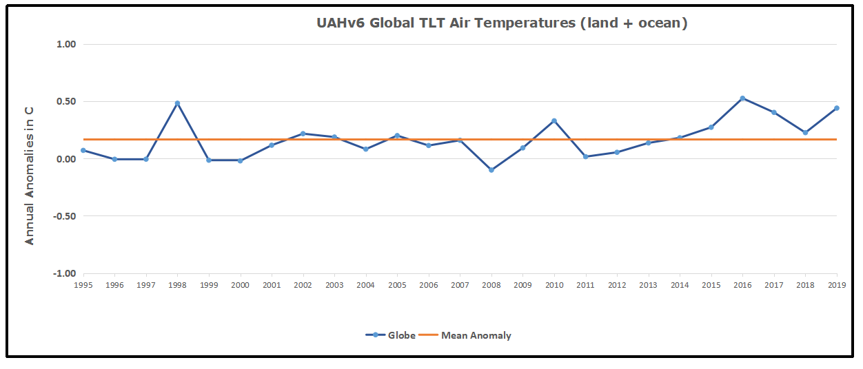
With apologies to Paul Revere, this post is on the lookout for cooler weather with an eye on both the Land and the Sea.  UAH has updated their tlt (temperatures in lower troposphere) dataset for July 2020.  Previously I have done posts on their reading of ocean air temps as a prelude to updated records from HADSST3. This month also has a separate graph of land air temps because the comparisons and contrasts are interesting as we contemplate possible cooling in coming months and years.


Presently sea surface temperatures (SST) are the best available indicator of heat content gained or lost from earth’s climate system.  Enthalpy is the thermodynamic term for total heat content in a system, and humidity differences in air parcels affect enthalpy.  Measuring water temperature directly avoids distorted impressions from air measurements.  In addition, ocean covers 71% of the planet surface and thus dominates surface temperature estimates.  Eventually we will likely have reliable means of recording water temperatures at depth.

Recently, Dr. Ole Humlum reported from his research that air temperatures lag 2-3 months behind changes in SST.  He also observed that changes in CO2 atmospheric concentrations lag behind SST by 11-12 months.  This latter point is addressed in a previous post Who to Blame for Rising CO2?

HadSST3 results were delayed with February and March updates only appearing together end of April.  For comparison we can look at lower troposphere temperatures (TLT) from UAHv6 which are now posted for July. The temperature record is derived from microwave sounding units (MSU) on board satellites like the one pictured above.

The UAH dataset includes temperature results for air above the oceans, and thus should be most comparable to the SSTs. There is the additional feature that ocean air temps avoid Urban Heat Islands (UHI). In 2015 there was a change in UAH processing of satellite drift corrections, including dropping one platform which can no longer be corrected. The graphs below are taken from the latest and current dataset, Version 6.0.

The graph above shows monthly anomalies for ocean temps since January 2015. After all regions peaked with the El Nino in early 2016, the ocean air temps dropped back down with all regions showing the same low anomaly August 2018.  Then a warming phase ensued with NH and Tropics spikes in February and May 2020. As was the case in 2015-16, the warming was driven by the Tropics and NH, with SH lagging behind. After the up and down fluxes, oceans temps in June returned to a neutral point, close to the 0.4C average for the period. NH rose only slightly in July and was offset by a drop in SH, reducing the chance of another NH or Tropics warming bump this summer.

Land Air Temperatures Showing a Seesaw Pattern

We sometimes overlook that in climate temperature records, while the oceans are measured directly with SSTs, land temps are measured only indirectly.  The land temperature records at surface stations sample air temps at 2 meters above ground.  UAH gives tlt anomalies for air over land separately from ocean air temps.  The graph updated for July 2020 is below.

Here we see evidence of the greater volatility of the Land temperatures, along with extraordinary departures, first by NH land with SH often offsetting.   The overall pattern is similar to the ocean air temps, but obviously driven by NH with its greater amount of land surface. The Tropics synchronized with NH for the 2016 event, but otherwise follow a contrary rhythm.  SH seems to vary wildly, especially in recent months.  Note the extremely high anomaly last November, cold in March 2020, and then again a spike in April. In June 2020, all land regions converged, erasing the earlier spikes in NH and SH, and showing anomalies comparable to the 0.5C average land anomaly this period.

In July land air temps were the reverse of ocean air temps.  SH land temps bumped up, while NH and Tropics declined, giving the same flat result from the prior month.

The longer term picture from UAH is a return to the mean for the period starting with 1995.  2019 average rose but currently lacks any El Nino or NH warm blob to sustain it.

These charts demonstrate that underneath the averages, warming and cooling is diverse and constantly changing, contrary to the notion of a global climate that can be fixed at some favorable temperature.

TLTs include mixing above the oceans and probably some influence from nearby more volatile land temps.  Clearly NH and Global land temps have been dropping in a seesaw pattern, NH in July more than 1C lower than the 2016 peak.  TLT measures started the recent cooling later than SSTs from HadSST3, but are now showing the same pattern.  It seems obvious that despite the three El Ninos, their warming has not persisted, and without them it would probably have cooled since 1995.  Of course, the future has not yet been written.

Data Update Shows Orwellian Climate Science

Climate science is unsettling because past data are not fixed, but change later on.  I ran into this when I set out to update an analysis done in 2014 by Jeremy Shiers, which I discussed in a previous post reprinted at the end.  Jeremy provided a spreadsheet in his essay Murray Salby Showed CO2 Follows Temperature Now You Can Too posted in January 2014. I downloaded his spreadsheet intending to bring the analysis up to the present to see if the results hold up.  The two sources of data were:

Temperature anomalies from RSS here:  http://www.remss.com/missions/amsu

CO2 monthly levels from NOAA (Mauna Loa): https://www.esrl.noaa.gov/gmd/ccgg/trends/data.html

Uploading the CO2 dataset showed that many numbers had changed (why?).

The blue line shows annual observed differences in monthly values year over year, e.g. June 2020 minus June 2019 etc.  The first 12 months (1979) provide the observed starting values from which differentials are calculated.  The orange line shows those differentials changed slightly in the 2020 dataset vs. the 2014 dataset, on average +0.035 ppm.  But there is no pattern or trend added, and deviations vary randomly between + and -.  So I took the current dataset to replace the older one for updating the analysis.

The other time series is the record of global temperature anomalies according to RSS. The current RSS dataset is not at all the same as the past.

To enlarge open image in new tab.

Here we see some seriously unsettling science at work.  The gold line is 2020 RSS and the purple is RSS as of 2014.  The red line shows alterations from the old to the new.  There is a slight cooling of the data in the beginning years, then the two versions pretty much match until 1997, when systematic warming enters the record.  From 1997/5 to 2003/12 the average anomaly increases by 0.04C.  After 2004/1 to 2012/8 the average increase is 0.15C.  At the end from 2012/9 to 2013/12, the average anomaly was higher by 0.21.

RSS continues that accelerated warming to the present, but it cannot be trusted.  And who knows what the numbers will be a few years down the line?  As Dr. Ole Humlum said some years ago (regarding Gistemp): “It should however be noted, that a temperature record which keeps on changing the past hardly can qualify as being correct.”

Given the above manipulations, I went instead to the other satellite dataset UAH version 6. Here are UAH temperature anomalies compared to CO2 changes.

The changes in monthly CO2 synchronize with temperature fluctuations, which for UAH are anomalies referenced to the 1981-2010 period.  The final proof that CO2 follows temperature due to stimulation of natural CO2 reservoirs is demonstrated by the ability to calculate CO2 levels since 1979 with a simple mathematical formula:

For each subsequent year, the co2 level for each month was generated

CO2  this month this year = a + b × Temp this month this year  + CO2 this month last year

Jeremy used Python to estimate a and b, but I used his spreadsheet to guess values that place for comparison the observed and calculated CO2 levels on top of each other.

In the chart calculated CO2 levels correlate with observed CO2 levels at 0.9988 out of 1.0000.  This mathematical generation of CO2 atmospheric levels is only possible if they are driven by temperature-dependent natural sources, and not by human emissions which are small in comparison, rise steadily and monotonically.

Previous Post:  What Causes Rising Atmospheric CO2?

nasa_carbon_cycle_2008-1

This post is prompted by a recent exchange with those reasserting the “consensus” view attributing all additional atmospheric CO2 to humans burning fossil fuels.

The IPCC doctrine which has long been promoted goes as follows. We have a number over here for monthly fossil fuel CO2 emissions, and a number over there for monthly atmospheric CO2. We don’t have good numbers for the rest of it-oceans, soils, biosphere–though rough estimates are orders of magnitude higher, dwarfing human CO2.  So we ignore nature and assume it is always a sink, explaining the difference between the two numbers we do have. Easy peasy, science settled.

What about the fact that nature continues to absorb about half of human emissions, even while FF CO2 increased by 60% over the last 2 decades? What about the fact that so far in 2020 FF CO2 has declined significantly with no discernable impact on rising atmospheric CO2?

These and other issues are raised by Murray Salby and others who conclude that it is not that simple, and the science is not settled. And so these dissenters must be cancelled lest the narrative be weakened.

The non-IPCC paradigm is that atmospheric CO2 levels are a function of two very different fluxes. FF CO2 changes rapidly and increases steadily, while Natural CO2 changes slowly over time, and fluctuates up and down from temperature changes. The implications are that human CO2 is a simple addition, while natural CO2 comes from the integral of previous fluctuations.  Jeremy Shiers has a series of posts at his blog clarifying this paradigm. See Increasing CO2 Raises Global Temperature Or Does Increasing Temperature Raise CO2 Excerpts in italics with my bolds.

The following graph which shows the change in CO2 levels (rather than the levels directly) makes this much clearer.

Note the vertical scale refers to the first differential of the CO2 level not the level itself. The graph depicts that change rate in ppm per year.

There are big swings in the amount of CO2 emitted. Taking the mean as 1.6 ppmv/year (at a guess) there are +/- swings of around 1.2 nearly +/- 100%.

And, surprise surprise, the change in net emissions of CO2 is very strongly correlated with changes in global temperature.

This clearly indicates the net amount of CO2 emitted in any one year is directly linked to global mean temperature in that year.

For any given year the amount of CO2 in the atmosphere will be the sum of

  • all the net annual emissions of CO2
  • in all previous years.

For each year the net annual emission of CO2 is proportional to the annual global mean temperature.

This means the amount of CO2 in the atmosphere will be related to the sum of temperatures in previous years.

So CO2 levels are not directly related to the current temperature but the integral of temperature over previous years.

The following graph again shows observed levels of CO2 and global temperatures but also has calculated levels of CO2 based on sum of previous years temperatures (dotted blue line).

Summary:

The massive fluxes from natural sources dominate the flow of CO2 through the atmosphere.  Human CO2 from burning fossil fuels is around 4% of the annual addition from all sources. Even if rising CO2 could cause rising temperatures (no evidence, only claims), reducing our emissions would have little impact.

Resources:

CO2 Fluxes, Sources and Sinks

Who to Blame for Rising CO2?

Fearless Physics from Dr. Salby

In this video presentation, Dr. Salby provides the evidence, math and charts supporting the non-IPCC paradigm.

About 18 minutes from the start Dr. Salby demonstrates that all the warming since 1945 came from two short term events.

If these two events 1977-1981 and 1994-1998 are removed, the entire 0.6C increase disappears.  Global Warming theory asserts that adding CO2 causes a systemic change resulting in a higher temperature baseline.  Two temperature spikes, each lasting four years, are clearly episodic, not systemic.  A further proof that warming over the last 70 years arose from natural variations, not CO2 forcing.

The Real HCQ Story: What We Now Know

Steven Hatfill explains what happened to HCQ treatments against coronavirus in his Real Politics article An Effective COVID Treatment the Media Continues to Besmirch.  Excerpts in italics with my bolds.

After examples of the media disinformation campaign, Steven provides a brief recounting of what has transpired over the last half year pandemic.

So what is the real story on hydroxychloroquine? Here, briefly, is what we know:

When the COVID-19 pandemic began, a search was made for suitable antiviral therapies to use as treatment until a vaccine could be produced. One drug, hydroxychloroquine, was found to be the most effective and safe for use against the virus. Federal funds were used for clinical trials of it, but there was no guidance from Dr. Anthony Fauci or the NIH Treatment Guidelines Panel on what role the drug would play in the national pandemic response. Fauci seemed to be unaware that there actually was a national pandemic plan for respiratory viruses.

Following a careful regimen developed by doctors in France, some knowledgeable practicing U.S. physicians began prescribing hydroxychloroquine to patients still in the early phase of COVID infection. Its effects seemed dramatic. Patients still became sick, but for the most part they avoided hospitalization. In contrast — and in error — the NIH-funded studies somehow became focused on giving hydroxychloroquine to late-presenting hospitalized patients. This was in spite of the fact that unlike the drug’s early use in ambulatory patients, there was no real data to support the drug’s use in more severe hospitalized patients.

By April, it was clear that roughly seven days from the time of the first onset of symptoms, a COVID-19 infection could sometimes progress into a more radical late phase of severe disease with inflammation of the blood vessels in the body and immune system over-reactions. Many patients developed blood clots in their lungs and needed mechanical ventilation. Some needed kidney dialysis. In light of this pathological carnage, no antiviral drug could be expected to show much of an effect during this severe second stage of COVID.

On April 6, 2020, an international team of medical experts published an extensive study of hydroxychloroquine in more than 130,000 patients with connective tissue disorders. They reaffirmed that hydroxychloroquine was a safe drug with no serious side effects. The drug could safely be given to pregnant women and breast-feeding mothers. Consequently, countries such as China, Turkey, South Korea, India, Morocco, Algeria, and others began to use hydroxychloroquine widely and early in their national pandemic response. Doctors overseas were safely prescribing the drug based on clinical signs and symptoms because widespread testing was not available.

However, the NIH promoted a much different strategy for the United States. The “Fauci Strategy” was to keep early infected patients quarantined at home without treatment until they developed a shortness of breath and had to be admitted to a hospital. Then they would they be given hydroxychloroquine. The Food and Drug Administration cluelessly agreed to this doctrine and it stated in its hydroxychloroquine Emergency Use Authorization (EUA) that “hospitalized patients were likely to have a greater prospect of benefit (compared to ambulatory patients with mild illness).”

In reality just the opposite was true. This was a tragic mistake by Fauci and FDA Commissioner Dr. Stephen Hahn and it was a mistake that would cost the lives of thousands of Americans in the days to come.

At the same time, accumulating data showed remarkable results if hydroxychloroquine were given to patients early, during a seven-day window from the time of first symptom onset. If given during this window, most infections did not progress into the severe, lethal second stage of the disease. Patients still got sick, but they avoided hospitalization or the later transfer to an intensive care unit. In mid-April a high-level memo was sent to the FDA alerting them to the fact that the best use for hydroxychloroquine was for its early use in still ambulatory COVID patients. These patients were quarantined at home but were not short of breath and did not yet require supplemental oxygen and hospitalization.

Failing to understand that COVID-19 could be a two-stage disease process, the FDA ignored the memo and, as previously mentioned, it withdrew its EUA for hydroxychloroquine based on flawed studies and clinical trials that were applicable only to late-stage COVID patients.

By now, however, some countries had already implemented early, aggressive, outpatient community treatment with hydroxychloroquine and within weeks were able to minimize their COVID deaths and bring their national pandemic under some degree of control.

In countries such as Great Britain and the United States, where the “Fauci-Hahn Strategy” was followed, there was a much higher death rate and an ever-increasing number of cases. COVID patients in the U.S. would continue to be quarantined at home and left untreated until they developed shortness of breath. Then they would be admitted to the hospital and given hydroxychloroquine outside the narrow window for the drug’s maximum effectiveness.

In further contrast, countries that started out with the “Fauci-Hahn Doctrine” and then later shifted their policy towards aggressive outpatient hydroxychloroquine use, after a brief lag period also saw a stunning rapid reduction in COVID mortality and hospital admissions.

Finally, several nations that had started using an aggressive early-use outpatient policy for hydroxychloroquine, including France and Switzerland, stopped this practice when the WHO temporarily withdrew its support for the drug. Five days after the publication of the fake Lancet study and the resulting media onslaught, Swiss politicians banned hydroxychloroquine use in the country from May 27 until June 11, when it was quickly reinstated.

The consequences of suddenly stopping hydroxychloroquine can be seen by examining a graph of the Case Fatality Ratio Index (nrCFR) for Switzerland. This is derived by dividing the number of daily new COVID fatalities by the new cases resolved over a period with a seven-day moving average. Looking at the evolution curve of the CFR it can be seen that during the weeks preceding the ban on hydroxychloroquine, the nrCFR index fluctuated between 3% and 5%.

Following a lag of 13 days after stopping outpatient hydroxychloroquine use, the country’s COVID-19 deaths increased four-fold and the nrCFR index stayed elevated at the highest level it had been since early in the COVID pandemic, oscillating at over 10%-15%. Early outpatient hydroxychloroquine was restarted June 11 but the four-fold “wave of excess lethality” lasted until June 22, after which the nrCFR rapidly returned to its background value.

Here in our country, Fauci continued to ignore the ever accumulating and remarkable early-use data on hydroxychloroquine and he became focused on a new antiviral compound named remdesivir. This was an experimental drug that had to be given intravenously every day for five days. It was never suitable for major widespread outpatient or at-home use as part of a national pandemic plan. We now know now that remdesivir has no effect on overall COVID patient mortality and it costs thousands of dollars per patient.

Hydroxychloroquine, by contrast, costs 60 cents a tablet, it can be taken at home, it fits in with the national pandemic plan for respiratory viruses, and a course of therapy simply requires swallowing three tablets in the first 24 hours followed by one tablet every 12 hours for five days.

There are now 53 studies that show positive results of hydroxychloroquine in COVID infections. There are 14 global studies that show neutral or negative results — and 10 of them were of patients in very late stages of COVID-19, where no antiviral drug can be expected to have much effect. Of the remaining four studies, two come from the same University of Minnesota author. The other two are from the faulty Brazil paper, which should be retracted, and the fake Lancet paper, which was.

Millions of people are taking or have taken hydroxychloroquine in nations that have managed to get their national pandemic under some degree of control. Two recent, large, early-use clinical trials have been conducted by the Henry Ford Health System and at Mount Sinai showing a 51% and 47% lower mortality, respectively, in hospitalized patients given hydroxychloroquine. A recent study from Spain published on July 29, two days before Margaret Sullivan’s strafing of “fringe doctors,” shows a 66% reduction in COVID mortality in patients taking hydroxychloroquine. No serious side effects were reported in these studies and no epidemic of heartbeat abnormalities.

This is ground-shaking news. Why is it not being widely reported? Why is the American media trying to run the U.S. pandemic response with its own misinformation?

Steven Hatfill is a veteran virologist who helped establish the Rapid Hemorrhagic Fever Response Teams for the National Medical Disaster Unit in Kenya, Africa. He is an adjunct assistant professor in two departments at the George Washington University Medical Center where he teaches mass casualty medicine. He is principle author of the prophetic book “Three Seconds Until Midnight — Preparing for the Next Pandemic,” published by Amazon in 2019.

.

Resisting the PC “Karens”

In the social media it has become common to refer to someone who scolds or punishes you for your behavior as “Karen being Karen.” It started with a stereotype of arrogant entitled white women who put down others lacking their privileged refinement. Since the return of the BLM movement many are using the label for a racist tone dismissive of white people generally.

Leaving aside the racist connotation, I am focusing on the Karen role of enforcing politically correct behavior. For example, consider the recent Central Park incident in which a woman called Amy Cooper called the cops on a black man called Christian Cooper (no relation) and claimed that he was harassing her when in truth he was reprimanding her for letting her dog off its leash in a part of the park where you’re not meant to do that. Amy behaved badly in this incident. But as Robert A George argued in the New York Daily News: ‘[Christian] is the “Karen” in this encounter, deciding to enforce park rules unilaterally and to punish “intransigence” ruthlessly.’ Amy Cooper’s life has been shattered by this Karen-shaming incident: she lost her job and her dog.

Regardless of racial or gender identity, the “Karenness Quality” is this self-righteous public shaming of others for not behaving according to Karen’s Rules. For example, note the flip-flop of the mayor of Olympia, Washington. She was fine with the Black Lives Matter protests that followed George Floyd’s death in police custody. But that was until vandals damaged her home, according to reports. Changing her mind about the BLM protests when she was damaged personally, Mayor Cheryl Selby of Olympia now refers to the protests as “domestic terrorism,” according to The Olympian. “I’m really trying to process this,” Selby told the newspaper Saturday, after the rioters’ Friday night spree left her front door and porch covered with spray-painted messages. “It’s like domestic terrorism. It’s unfair.”

Karenism has this moral purity abstracted from personal experience with the hardships involved. Karen exemplar Marie Antoinette famously responded to the plight of breadless peasants with her “Let them eat cake.”

Karens are having a field day with The Wu Flu pandemania, such that I am in violation just for referring to the Chinese origin of this contagion. The media weaponizing the virus fear factor triggers the inner Karens to confront, denounce and denigrate others as threats to personal health and well being. You can see it when in a store, another customer scolds you for not wearing your mask properly, or going the wrong direction in the aisle. Or when Governor Karen Cuomo of NY denounces Florida or Georgia for their policies, while his state sets records for Wu Flu deaths per million.

There are various ways of responding to the Karens of this world. Comedian Steve Martin was famous for his reply to PC critics.

When the scolding is related to trivial procedural details, it’s appropriate to respond with: “Whatever.”

Then there’s Jimbob’s approach which involves switching the context to expose the absurdity of Karen’s challenge.

What Causes Rising Atmospheric CO2?

nasa_carbon_cycle_2008

This post is prompted by a recent exchange with those reasserting the “consensus” view attributing all additional atmospheric CO2 to humans burning fossil fuels.

The IPCC doctrine which has long been promoted goes as follows. We have a number over here for monthly fossil fuel CO2 emissions, and a number over there for monthly atmospheric CO2. We don’t have good numbers for the rest of it-oceans, soils, biosphere–though rough estimates are orders of magnitude higher, dwarfing human CO2.  So we ignore nature and assume it is always a sink, explaining the difference between the two numbers we do have. Easy peasy, science settled.

What about the fact that nature continues to absorb about half of human emissions, even while FF CO2 increased by 60% over the last 2 decades? What about the fact that so far in 2020 FF CO2 has declined significantly with no discernable impact on rising atmospheric CO2?

These and other issues are raised by Murray Salby and others who conclude that it is not that simple, and the science is not settled. And so these dissenters must be cancelled lest the narrative be weakened.

The non-IPCC paradigm is that atmospheric CO2 levels are a function of two very different fluxes. FF CO2 changes rapidly and increases steadily, while Natural CO2 changes slowly over time, and fluctuates up and down from temperature changes. The implications are that human CO2 is a simple addition, while natural CO2 comes from the integral of previous fluctuations.  Jeremy Shiers has a series of posts at his blog clarifying this paradigm. See Increasing CO2 Raises Global Temperature Or Does Increasing Temperature Raise CO2 Excerpts in italics with my bolds.

The following graph which shows the change in CO2 levels (rather than the levels directly) makes this much clearer.

Note the vertical scale refers to the first differential of the CO2 level not the level itself. The graph depicts that change rate in ppm per year.

There are big swings in the amount of CO2 emitted. Taking the mean as 1.6 ppmv/year (at a guess) there are +/- swings of around 1.2 nearly +/- 100%.

And, surprise surprise, the change in net emissions of CO2 is very strongly correlated with changes in global temperature.

This clearly indicates the net amount of CO2 emitted in any one year is directly linked to global mean temperature in that year.

For any given year the amount of CO2 in the atmosphere will be the sum of

  • all the net annual emissions of CO2
  • in all previous years.

For each year the net annual emission of CO2 is proportional to the annual global mean temperature.

This means the amount of CO2 in the atmosphere will be related to the sum of temperatures in previous years.

So CO2 levels are not directly related to the current temperature but the integral of temperature over previous years.

The following graph again shows observed levels of CO2 and global temperatures but also has calculated levels of CO2 based on sum of previous years temperatures (dotted blue line).

Summary:

The massive fluxes from natural sources dominate the flow of CO2 through the atmosphere.  Human CO2 from burning fossil fuels is around 4% of the annual addition from all sources. Even if rising CO2 could cause rising temperatures (no evidence, only claims), reducing our emissions would have little impact.

Resources:

CO2 Fluxes, Sources and Sinks

Who to Blame for Rising CO2?

Fearless Physics from Dr. Salby

In this video presentation, Dr. Salby provides the evidence, math and charts supporting the non-IPCC paradigm.

About 18 minutes from the start Dr. Salby demonstrates that all the warming since 1945 came from two short term events.

If these two events 1977-1981 and 1994-1998 are removed, the entire 0.6C increase disappears.  Global Warming theory asserts that adding CO2 causes a systemic change resulting in a higher temperature baseline.  Two temperature spikes, each lasting four years, are clearly episodic, not systemic.  A further proof that warming over the last 70 years arose from natural variations, not CO2 forcing.