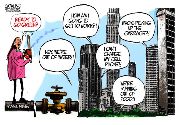
Desire for Power Hiding Behind Health and Climate Concerns

Theodore Dalrymple writes at Epoch Times The Desire for Power Hiding Behind Health and Climate Concerns. Excerpts in italics with my bolds.
There is a threat of creeping totalitarianism in western societies that comes from health and climate activists. Who (except unfeeling monsters) could possibly be against the saving of human life or the preservation of the planet from future catastrophe? Often the two strands of redemptive enthusiasm go together: after all, environmental degradation is hardly good for health.
Since almost all human activities have health or environmental consequences, especially bad ones, it follows that those who want to preserve either human health or the environment, or both, have an almost infinitely expansible justification for interfering in our lives, indeed they have it to the nth degree.
These days, much medical research that is published in the general medical journals such as the Lancet or the New England Journal of Medicine is epidemiological rather than experimental.
It finds associations between factor a (shall we say, the consumption of bananas) and illness x (shall we say, Alzheimer’s disease).
Once an association is found that is unlikely to have arisen by chance (unlikely, that is, but not impossible), an hypothesis is put forward as to why the eating of bananas should conduce to the development of Alzheimer’s disease. Before long, the statistical association and its alleged explanation leaks out into the press or social media, and people start to be afraid of bananas. The more enthusiastic and less sceptical of the epidemiologists begin to call for banana controls: anti-banana propaganda, extra taxes on bananas, no bananas on sale within a hundred yards of anywhere there might be a child, and so on.
And of course, a reduction in the demand for bananas will assist those tropical countries large parts of which are given over to environmentally-degrading banana monoculture. Banana republics are not called bananas republics for nothing.
Often in the medical literature, the statistical associations are weak: someone who consumes a is, say, 1.2 times more likely to develop disease x than someone who does not. This is described as being a statistically significant increase in risk, but it is not significant in any other humanly important way, especially where the initial risk of contracting the disease is very low in any case. These caveats are often, even usually, missing from not only the scientific literature itself, but from the reports of it that filter into the general public’s awareness.
Not infrequently, sweeping policy changes are proposed on the basis of weak evidence which not only is likely to be superseded in time by new research (though dietary recommendations for the most part they are not very different from those recommended by physicians such as Dr. George Cheyne in the first half of the eighteenth century), but which fail to take into account that health, while an important consideration, is not an all-important consideration, and sometimes must be balanced against others.
For example, it would be easy to reduce the fatal road accident rate to zero by forbidding everyone to leave his house, but this might not be a wise prohibition. Sport is one of the most frequent causes of injury in the western world, yet sport is encouraged because of its other (alleged) benefits.
Good Intentions a Smokescreen
Supposed good intentions are often a smokescreen for an almost sadistic desire to exercise power, or at least influence. A writer of editorials for the influential British newspaper, the Observer, Sonia Sodha, has suggested, for example, that meat should be rationed. She suggests such a measure not because there is a shortage of meat, but because the environmental cost of producing it is too great.
She opposes a tax on it to lower consumption because raising the price would affect the poor more than the rich. The only other solution is to ration it, so that everyone has access to an equal, but small, quantity.
The author is honest enough to admit that she is a hypocrite in the sense that, while she strongly believes meat consumption should decrease in order to save the planet, she will continue to eat it in her accustomed quantities so long as it is available to her. She needs a dictator to get her to do the right thing.
The really striking thing in her article is that she does not consider the kind of apparatus that would be necessary to ration a commodity such as meat. Someone would have to set the ration and many people would have to enforce it.
Evidently, she has never heard of or experienced black markets; nor does she seem to be aware that, where a bureaucracy allocates or distributes goods and services, especially when they are in short supply, privilege flourishes rather than withers.
Nor does she acknowledge that meat is far from the only commodity with a high environmental cost, and that the argument for the rationing of meat could be used for the rationing of many, if not most or even all, commodities.
What the author is proposing, then, implicitly or explicitly, is a kind of communism, in which an administrative class under the direction of an even smaller class of enlightened and informed individuals doles out to the populace what it thinks it ought to have—for its own ultimate good, of course.
The author is certainly intelligent enough to realize that this is the implication or corollary of what she writes (and, to do her justice, she writes very clearly), so one must conclude that a society in which a great deal, if not everything, is rationed first in the name of protecting the environment and second in the name of social justice is one that would be pleasing to her—at least to contemplate in the abstract, if not actually to live in.
That this drastic and very far-reaching scheme is based upon evidence that is itself far from rock-solid or indisputable would probably not worry her very much, because the end result (the theoretical end result, that is, not the end result in practice) is one which she desires a priori: in other words, first the policy, and then the evidence to justify it.
As it happens, more and more young people in western countries are turning to vegetarianism by means of persuasion. I have no objection to this; I think on balance that it is probably a good thing. But no giant state apparatus was necessary to bring this about. It is a change that has welled up from below, not imposed from the top down, and requires no corrupting means of coercion to enforce.
Theodore Dalrymple is a retired doctor. He is contributing editor of the City Journal of New York and the author of 30 books, including “Life at the Bottom.” His latest book is “Embargo and Other Stories.”