Raymond of RiC-Communications studio created infographics on CO2 for improving public awareness. He produced 13 interesting slides which are presented in the post World of CO2 Infographics A second project was created on a related theme The World of Climate Change comprising six charts, including one regarding Alpine glacier studies by two prominent geologists. In addition, Raymond was able to consult the work of these two experts in their native German language.
This project is The World of Climate Change
Infographics can be helpful, in making things simple to understand. Climate change is a complex topic with a lot of information and statistics. These simple step by step charts are to better understand what is occurring naturally and what could be caused by humans. What is cause for alarm and what isn’t cause for alarmism if at all. Only through learning is it possible to get the big picture so as to make the right decisions for the future.
Images are available at these links:
The+World+of+Climate+Change Charts
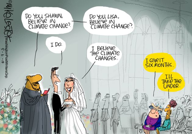
– N° 1 600 million years of global temperature change
– N° 2 Earth‘s temperature record for the last 400,000 years
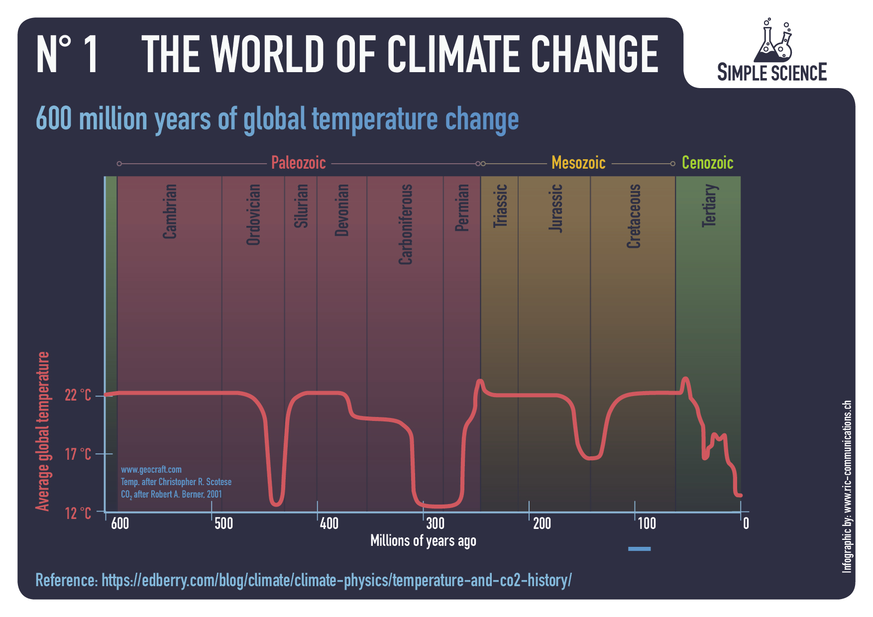
– N° 3 Holocene period and average northern hemispheric temperatures
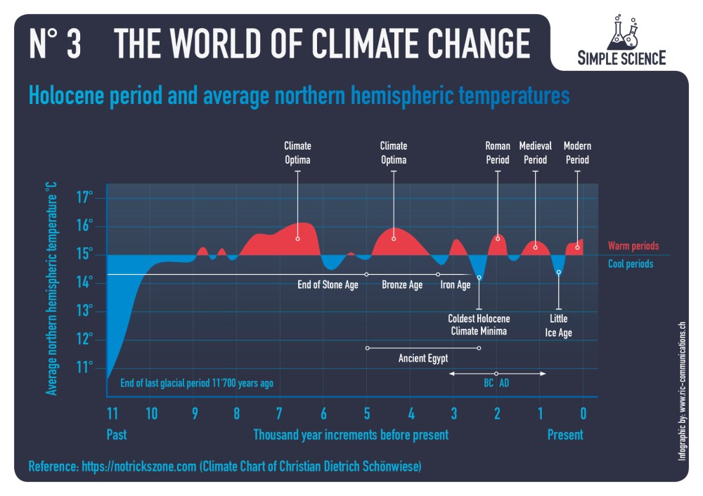
– N° 4 140 years of global mean temperature
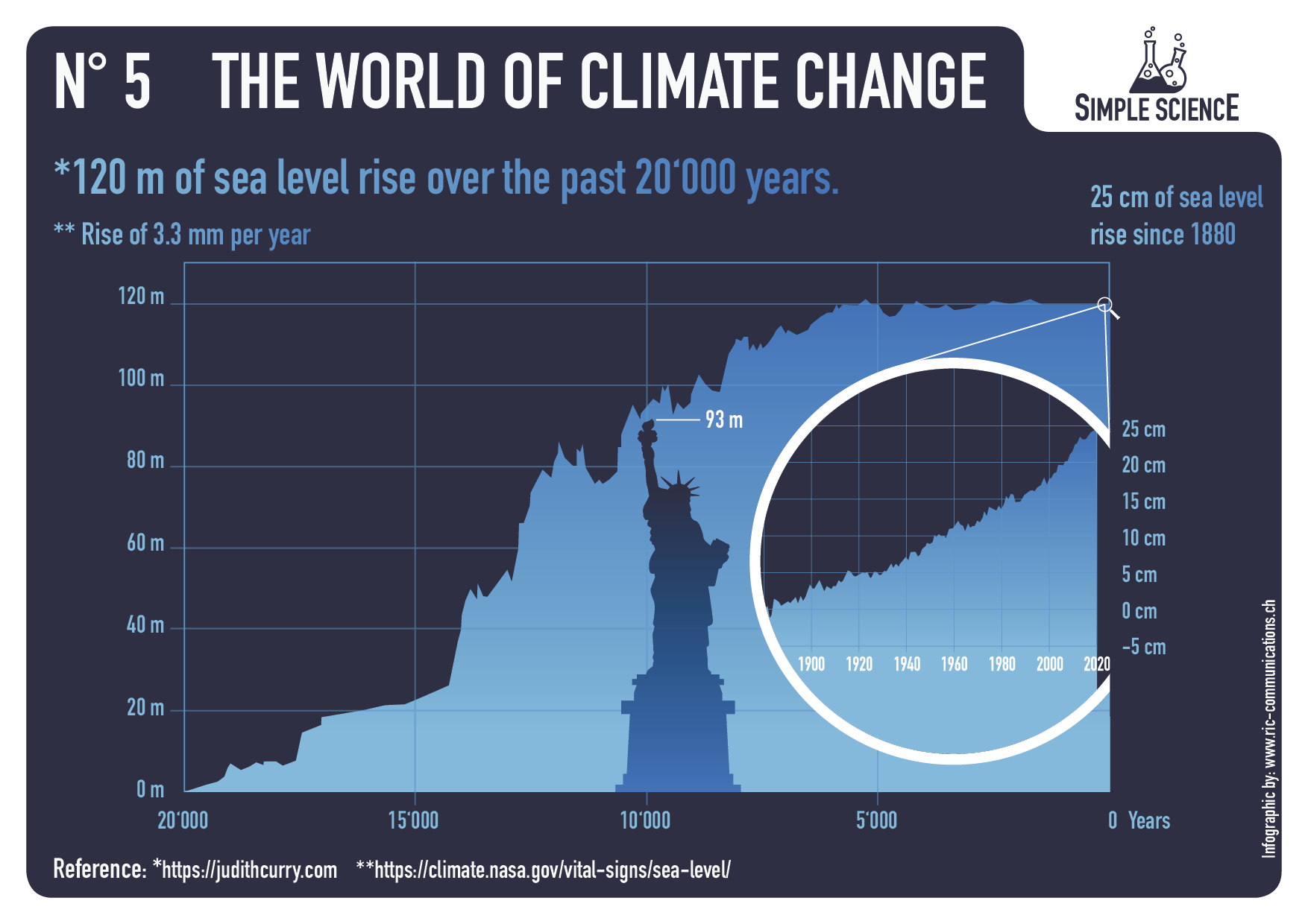
– N° 5 120 m of sea level rise over the past 20‘000 years
– N° 6 Eastern European alpine glacier history during the Holocene period.


Summer Temperatures (May – September) A rise in temperature during a warming period will result in a glacier losing more surface area or completely vanishing. This can happen very rapidly in only a few years or over a longer period of time. If temperatures drop during a cooling period and summer temperatures are too low, glaciers will begin to grow and advance with each season. This can happen very rapidly or over a longer period in time. Special thanks to Prof. em. Christian Schlüchter / (Quartärgeologie, Umweltgeologie) Universität Bern Institut für Geologie His work is on the Western Alps and was so kind to help Raymond make this graphic as correct as possible.
Comment:
This project explored information concerning how aspects of the world climate system have changed in the past up to the present time. Understanding the range of historical variation and the factors involved is essential for anticipating how future climate parameters might fluctuate.
For example:
The Climate Story (Illustrated) looks at the temperature record.
H20 the Gorilla Climate Molecule looks at precipitation patterns.
Data vs. Models #2: Droughts and Floods looks at precipitation extremes.
Data vs. Models #3: Disasters looks at extreme weather events.
Data vs. Models #4: Climates Changing looks at boundaries of defined climate zones.
And in addition, since Chart #5 features the Statue of Liberty, here are the tidal gauge observations there compared to climate model projections:


How about a table of the costs for a kWh of energy from PG&E, for a customer who has had PV installed for 15 years-
Affect of changes to rate design,
net metering retained, tiers collapsed-
rate Year cents/kwh
True Up
e-7 2009 3.94
e-7 2011 5.04
e-7 2014 4.86
e-7 2015 7.45
mix 2016 12.5
e-6 2017 19.04
e-6 2018 18.38 planned black outs
e-6 2019 18.65 planned black outs
e-6 2021 23.53 planned black outs
3.0? 2022 tbd (26.00+)
Wonder what year NRG’s residential solar business exited CA
LikeLike
Interesting thought kakatoa. We could do series called “World of Hurt from Climate Policies.”
LikeLike
Maybe the climate policy series could start with this one:
CO2 and COPs
LikeLike
Hi Ron
I found this website from the Swiss Policy Research (SPR), founded in 2016, is an independent, nonpartisan and nonprofit research group investigating geopolitical propaganda.
https://swprs.org/covid19-facts/
I had completely forgotten about the website and after cleaning up my web browser backlog of links I Stumbled on the website again. They keep an up to date fact checking list with links on the Covid-19. It’s in multiple languages including English. You might want to check it out if you haven’t already found it. And there are plenty of charts too!!!!!
LikeLike
Thanks for the heads up. Good to see they are updating regularly. My favorite from SPR was this one https://rclutz.com/2020/10/12/covid-the-big-picture-in-7-charts/
LikeLiked by 1 person
My favorite was “6) Epidemiological models vs. reality”
LikeLike
Reblogged this on Climate Collections.
LikeLike