Firstly, Ben provides evidence for a reasonable person to conclude the weather and climate is doing nothing out of the ordinary. Drawing on this year’s UK State of the Climate report:
But how significant are these changes really? Take, for example, the claim that the UK’s temperatures have increased. Leaving aside the possibility that land-use change thanks to the UK’s economic development might influence temperatures, the report offers this chart depicting 140 years of anomalies in UK and global annual temperatures:
Though the chart clearly shows that UK temperatures have risen, there is substantial year-to-year variability – far greater in the UK than for the world as a whole – that might make us wonder how impactful this extra warmth really is.
The point is shown more clearly by the report’s chart which shows temperature anomalies in each season:
Over the past 370 years, winters appear to have become substantially warmer. Really what this means is that they have become substantially less cold, rather than actually warm. Autumn and spring also seem to have become milder, whereas the summer has warmed the least.
What’s more, each season shows remarkable changes over the decades and even centuries – showing large-scale change was occurring long before manmade climate change became an issue. The temperature changes of the 1990s are not unprecedented in their degree or speed.
Pile goes on to discuss the absence of facts for other claims regarding precipitation, storms, heatwaves. etc. Then comes the meat of his argument.
Climate is Not the Problem: It’s the so-called “solutions”
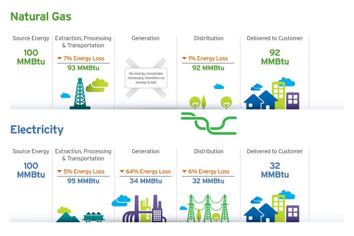
But the climate, again, is not the real issue here. An even more uncomfortable truth for environmentalists is that cheap, abundant and easy-to-use energy – ie, gas – has done and could continue to do far more to keep older and infirm people alive in the winter than milder weather ever could. In other words, fossil fuels save lives.
It is climate policy not climate change that wants to deny people the right to heat or cool their homes cheaply and efficiently. Just look at the exorbitant costs to households of Boris’s planned boiler ban. The weather itself does not play any significant role in daily life in historically wealthy, industrialised and liberal societies.
This fact is seen even more clearly in that other preoccupation of climate doomsayers: floods. The environmentalist argument is that warmer air carries more water, and so rainfall events have become more intense, leading to more flash flooding in particular. ‘The higher global warming, the more rainfall’, climate academic Friederike Otto told the Independent, in an article which tried to pin blame for the recent floods in Germany on climate change.
Floods certainly are disruptive. Unsurprisingly, this captures the news media’s attention. But proving a link to climate change is much harder than the media have made out. The most recent IPCC report, for instance, has ‘low confidence’ in the claim ‘that anthropogenic climate change has affected the frequency and the magnitude of floods’. Meanwhile, it has ‘high confidence’ that ‘streamflow trends since 1950 are not statistically significant in most of the world’s largest rivers’. Similarly, other research suggests that there is little evidence of flash floods getting worse in the UK.
What causes floods, then? In the recent case of the tragic floods in Germany, flood warnings were ignored by civil planners and politicians.
Floods in Britain are rarely fatal. But when horrendous flooding does occur, it should be seen as a result not of an altered climate, but of engineering, planning and policy failures. As the nearly three-centuries-long record in the Met Office’s possession clearly shows, various parts of the UK, from time to time, suffer periods of intense rainfall, causing floods. Any urban or infrastructure design that fails to take account of the likelihood of flooding makes flooding inevitable.
In other words, flooding is a manmade event – but not one caused by climate change. There is no such thing as a ‘natural disaster’ in a country as wealthy as the UK. Even if adverse weather events are made ‘more likely’ or even ‘more intense’ by CO2 emissions in the future, as the Met Office report argues, we already know what kind of policies and infrastructure we need to deal with this. There is no excuse for not building this infrastructure: warmer, wetter, colder and drier conditions all existed in the past, and so will likely appear again in the future. What’s past is prologue.
Ironically, it is environmentalism that makes the climate actually dangerous.
Green austerity will deny people the resources and technology they need and deserve to keep warm in winter and cool in summer. And it is environmentalism, with its promise to make the weather ‘safe’ and unchanging if we follow its agenda, that is selling us false hope. That is a much greater threat than climate change or extreme weather could ever be.
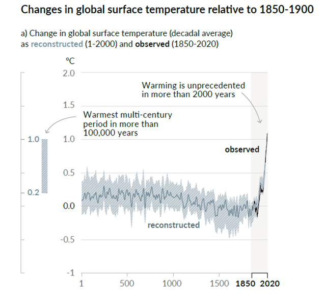
Stephen McIntyre has an interesting post today at his blog Climate Audit The IPCC AR6 Hockeystick Excerpts in italics with my bolds.
Although climate scientists keep telling us that defects in their “hockey stick” proxy reconstructions don’t matter – that it doesn’t matter whether they use data upside down, that it doesn’t matter if they cherry pick individual series depending on whether they go up in the 20th century, that it doesn’t matter if they discard series that don’t go the “right” way (“hide the decline”), that it doesn’t matter if they used contaminated data or stripbark bristlecones, that such errors don’t matter because the hockey stick itself doesn’t matter – the IPCC remains addicted to hockey sticks: lo and behold, Figure 1a of its newly minted Summary for Policy-makers contains what else – a hockey stick diagram. If you thought Michael Mann’s hockey stick was bad, imagine a woke hockey stick by woke climate scientists. As the climate scientists say, it’s even worse that we thought.
Curiously, this leading diagram of the Summary of Policy-Makers does not appear in the Report itself. (At least, I was unable to locate it in Chapter 2.) However, it is clearly the progeny of PAGES2K Consortium (Nature 2019) and Kaufman et al (2020), both of which I commented on briefly on Twitter (see here).
It’s hard to know where to begin.
The idea/definition of a temperature “proxy” is that it has some sort of linear or near-linear relationship to temperature with errors being white noise or low-order red noise. In other words, if you look at a panel of actual temperature “proxies”, you would expect to see series that look pretty similar and consistent.
But that’s not what you see with the data used by the IPCC. You’d never know this from the IPCC report or even from the cited articles, since authors of these one- and two-millennium temperature reconstructions scrupulously avoid plotting any of the underlying data. It’s hard for readers unfamiliar with the topic to fully appreciate the extreme inconsistency of underlying “proxy” data, given the faux precision of the IPCC diagram.
Many of the series discussed in this post, including nearly all of any HS-shaped series, have been previously discussed in Climate Audit blog posts (tag/pages2k) from 2, 5, 10 or even 15 years ago or in tweets from 2019 and 2020 (see here).
This post will be a work in progress for a few days, as I have some sections on special issues that I will try to add as I have time.CPS (to my knowledge) in all prior reconstructions by non-woke authors is an average of scaled data that has been oriented ex ante by known properties of the proxy. I.e. it won’t flip over an alkenone temperature estimate simply because it goes the wrong way. But this salutary property is not maintained in Neukom’s bastardized implementation of CPS – a bastardization that ought to have been resisted by reviewers somewhere along the line. PAGES2K produced temperature reconstructions by seven different methods, all of which yielded somewhat similar results to CPS – strongly suggesting that these other methods also flip series like Cape Ghir.
It’s not as though PAGES2K made a composite from 257 series that are two millennia long, all or a majority having a HS shape. One series in this sample does look a lot like the IPCC stick and will be discussed at length below, but the others look very different.
Four of the series in the sample are very short – three of them are actually shorter than the instrumental record. These are all coral Sr or coral d18O series, which make up 25% of the PAGES2019 data set. The extremely short records illustrated above are typical, indeed almost universal, in this class of proxy. They do have a pronounced trend in the instrumental period. This contrasts with the lack of trend that one sees in the two long proxies in the middle column above – a tree ring series from Mt Read, Tasmania (also used in MBH98) and a 1983 ice core series by Fisher from Devon Ice Cap on Baffin Island (also available to 1990s vintage multiproxy studies).
The short coral series do not contribute information to the medieval and earlier periods which one is trying to compare to the modern period. So what is their function? Do they contribute anything other than painting a moustache on the non-descript longer series?
The tree ring series in this sample are rather short; the screening procedures have somewhat concentrated series with slight upticks. (The stripbark bristlecone chronologies that were so prominent in the Mann et al Hockey Stick continue to be used in PAGES2019 – as discussed below.) I discussed the series in the left column with large uptick (Asi_MUSPIG aka paki033) in a 2019 tweet thread here. I located the underlying ring width measurements at NOAA and re-calculated the tree ring “chronology” using standard methodology – see below. The high-frequency details match, showing that the underlying measurement data is apples-to-apples. No chronology from original authors is archived at NOAA: so how did PAGES2K manage to get such a hockey stick? I have no idea.
The most “interesting” series in this sample batch is the borehole temperature reconstruction that has such an uncanny resemblance to the eventual IPCC reconstruction. By coincidence (or not), I wrote about this borehole temperature reconstruction (from WAIS Divide, Antarctica) in February 2019, a few months before publication of PAGES 2019 – see here – scroll down – for a more thorough analysis.
I’ve written multiple posts on the mathematics of borehole inversion calculations, which purport to estimate temperatures for thousands of years into the past from modern day temperatures measured downhole. These calculations require the inversion of a multicollinear matrix (with determinant close to 0). As far as I’m concerned, nearly all the details that specialists pontificate about are a sort of Chladni pattern artifact.
But that’s another story. Here the problem was much stranger. A few years earlier, I had (circuitously) managed to obtain a copy of the code used to calculate this borehole inversion (which is not archived anywhere.) The code showed that they had deleted the top 15 meters of the core from their calculation.
I’ve had a LOT of trouble getting the underlying borehole temperatures for some famous series. (The 2006 NAS panel cited one such result, but the original author (a US government employee) refused to make the data available, and, to my knowledge, it remains unavailable.) However, in this case, the underlying downhole temperatures had been archived, including the values had been deleted. Needless to say, they went down. An inversion using all the data would not have resulted in the impressive Hockey Stick in the PAGES2019 dataset, but a substantial recent decline.
Note that the blade on the hockey stick in this IPCC series is entirely dependent on the choice of 15 meters as a cutoff point for the borehole inversion. A choice of 20 meters would have probably eliminated the blade altogether.
The fact that the top portion of the core has to be excluded because of seasonal effects also creates a strange irony: the layers at 15 meters at WAIS date back to the 1960s. So IPCC has ended up relying on a series that purports to reconstruct temperature up to 2007, but without using any of the ice core dating from ~1965 to 2007. The calculation is entirely done from ice core layers dated prior to the 1960s. Does this seem reliable to any of you? Doesn’t to me.
Furthermore, the WAIS Divide borehole temperature reconstruction yields a totally different result than the widely replicated and well understood d18O isotope series.
Given the questions and defects surrounding the WAIS borehole inversion series, it is absurd that this series (a singleton, to boot) should be used in a policy-relevant document. That the final IPCC diagram is so similar to this garbage series also makes one wonder about what is happening under the hood of the multivariate calculations.
A Third Batch: PAGES2019 North American Tree Rings
North American tree rings (including some Arctic series) make up ~25% of PAGES2019 proxies. Here’s a random sample.The majority are short and rather non-descript – nothing like the final IPCC diagram.
There are one series with an enormous hockey stick: Mackenzie Delta (Porter 2013); and two series (“GB [Great Basin]” and nv512) with noticeable closing upticks. Sharp-eyed readers may have already figured out some of this story.
I discussed the Mackenzie Delta super-stick of Porter et al (2013), a new entry to hockey stick fabrication technology, in July 2019 here on Twitter. It comes from Yukon, Canada, an area that, in a 2004 study by d’Arrigo et al, had been a type location for the classic “divergence problem” – ring widths going down, while temperatures went up. So how did Porter et al manage to get a super-stick that had eluded Jacoby and d’Arrigo, long-time searchers for hockey sticks in tree ring data and not shy about picking cherries in order to make cherry pie?
They took “hide the decline” to extremes that had never been contemplated by prior practitioners of this dark art. Rather than hiding the decline in the final product, they did so for individual trees: as explained in the underlying article, they excluded the “divergent portions” of individual trees that had temerity to have decreasing growth in recent years. Even Briffa would never have contemplated such woke radical measures.
Stripbark Bristlecone Chronologies
As noted above, sharp-eyed readers may recall the identifier nv512. It is one of the classic Graybill stripbark bristlecone chronologies (Pearl Peak), which we had observed to dominate both the MBH98 PC1 and the final MBH98 reconstruction. It (and other key stripbark sites) was listed in McIntyre and McKitrick (2005 GRL) Table 1:
Readers will also recall that the 2006 NAS Panel recommended that “stripbark” chronologies be “avoided” in temperature reconstructions. Although the climate community has professed to implement the recommendations of the NAS Panel, they are addicted to stripbark chronologies, the properties of which are well known. Five different PAGES2019 series use stripbark bristlecones (three from original Graybill versions): nv512 (Pearl Peak); nv513 (Mount Washington); ca529 (Timber Gap Upper); SFP (an update of San Francisco Peaks, incorporating az510) and GB (a composite of Pearl Peak, Mount Washington and Sheep Mountain, using both Graybill and updated information).
In 2018, I looked at how North American tree ring networks had changed since MBH98. The one constant was the addiction of paleoclimatologists to stripbark chronologies– a phenomenon that I had commented on long before Climategate (citing Clapton et al and Paeffgen et al), much to the annoyance of dendros, but the comment remains as true now as it was then.
Conclusion
I discussed many of these problems in July 2019, within a couple of days of publication of the underlying article (see here). While I don’t necessarily expect IPCC reviewers to be paying rapt attention to my twitter feed, one surely presumes that IPCC climate scientists, who are employed full time on these topics, to be competent enough to notice things that I was able to observe in my first day or so of looking at PAGES2019. But their obtuseness never ceases to amaze.
The parasite leucochloridium paradoxum, shown here infecting a snail, is a flatworm that takes over the brains of gastropods and forces them into self-destructive behaviors. As this essay demonstrates, woke social teaching has been known to do the same with academic departments.
Woke grievance is eating expert inquiry from the inside out.
A large gathering of scientists and engineers was brought together by the National Science Foundation (NSF). We were there to compete for a very large sum of money.
At stake was funding for a “research center,” something akin to national laboratories like Brookhaven Labs or Livermore Labs. Research centers are built around a strategic theme, like nuclear physics, and are intended to provide a venue for scientists nationwide to come together to explore that theme. Research centers are high-stakes competitions, involving tens of millions of dollars doled out over a term of ten years or so. The prizes are big, and the prestige immense. They are intended to go to the best of the best.
If a team is awarded a planning grant, the next step is a “planning meeting,” where the NSF gathers the successful teams together to provide detailed guidance on what might make for a successful proposal. I was on one of those teams, and that is how I came to be in that hotel ballroom.
At the opening session, we were told that proposals would be judged on four “foundational components,” or “pillars,” as they were styled in the PowerPoints. A successful proposal would be strong on all four: weakness in one would cast the proposal into the abyss, we were told, no matter how strong the other pillars might be. At the planning meeting, each pillar was to have a dedicated panel discussion, just to make clear to us what the NSF’s expectations were. Three of the four pillars were conventionally scientific and academic: innovation, training, etc. The remaining pillar was “Diversity and Culture of Inclusion” (DCI).
That was where things took a bizarre turn.
The DCI panel consisted of bureaucrats from the NSF’s Office of Diversity and Inclusion (ODI). Naturally, there were many questions from the floor about what the criteria for a strong DCI pillar would be. We are talking about engineers, remember, whose culture is: “give us ‘the specs’ and we will solve any problem.” The assembled engineers were looking for “the specs” they needed to build that DCI pillar.
I remember the scene. Each team was seated at its own round table on the ballroom floor. The DCI panel was seated on a raised platform, looking down on us, as from thrones on high.
One engineer at a neighboring table kept trying to pin the DCI panel down on those DCI specs. They kept deflecting the question. We’ll know it when we see it, was the blithe answer, issued with the monotonous imperiousness of the entitled ruler indulging inconvenient questioning from the proles. Engineering is too white and too male, was one panelist’s message to us, and that needed to be corrected. Irony alert: the engineer pressing the point was not white, but an Indian immigrant.
It became clearer with every question that the specs not only would not be laid out: they would in any event change according to inscrutable whim of the ODI bureaucrats. Foolish engineers, one might imagine Jabba chortling, the “specs” are not to help you solve a problem: they are there to keep you off-balance, uncertain, and in my power. It is enough for you to know you depend upon my mercy for funding.
How the Parasite Takes Over
All are familiar with the Left’s “long march” through the institutions. What might not be so well known is just how thorough the conquest has been. Evidence of this sometimes pops up into prominent public view, as in the recent exposure of “critical race theory” training in federal agencies (including places like Sandia National Labs, where one would expect such hokum to be laughed out the door). Such incidents, though quite frequent, are only the tips of a very large iceberg.
In the academic sciences, where I have spent my career, “diversity, inclusion, and equity” (DIE) has become as pervasive as one might expect it to be in any grievance studies department.
How did this happen? More to the point, how could it happen to the supposedly sensible people that scientists are generally thought to be?
The concept of “zombie parasites” provides an apt metaphor for how things got to this point. These are parasites that colonize the brains and nervous systems of their hosts, taking the controls, so to speak, over the host’s behavior. One striking example of a zombie parasite is a worm that infects the brains of snails, which normally crawl around stealthily at night. A snail infected with the parasite crawls out onto a grass stalk during the day, where it is now visible to birds that gobble them up. The parasite then breeds in the bird’s digestive tract and deposits its eggs in the bird’s feces. When uninfected snails eat the feces, the parasite’s life cycle is completed.
DIE has spread into the academic sciences as a kind of zombie parasite. It is not a real worm at work, of course, but a metaphorical “brainworm”—three of them, in fact, that together spread a kind of altered cognitive reality through any institution that is infected by them.
The route of infection usually starts with a “study” that identifies a “problem” that no one knew existed: the overwhelming whiteness of, say, fishery science. Once an unwitting host takes the bait, the next phase of the infection kicks in: all are invited to contemplate with horror the dark future that awaits should fishery scientists not take immediate steps to correct the “problem.” In the final stage of the infection, the brainworm plants its “diversity is our strength” meme in the host’s nervous system. The infected now babble about solving the impending crisis through a crash outreach program to “under-represented” or “marginalized” groups, who, by virtue of their class membership, think differently about fisheries, and so can save the field from stultifying white maleness.
As in those parasitized snails, the DIE brainworm induces a cognitive disconnect in the infected. None of the assertions planted by the DIE zombie parasite have a sound basis in fact or reason. The accusation of too much whiteness usually is based upon a simple observation that the ethnic, gender, and sexual orientation mix in, say, fishery science, departs from the statistical distributions found in the general population. Why this should be, where it is considered at all, is usually buried under a panoply of repetitive charts and diagrams of dubious critical value.
What makes the DIE brainworm a zombie parasite is how it hijacks the host’s behavior to facilitate its spread, to the host’s ultimate detriment.Universities, where future scientists are trained, are a common target. Incubating a future scientist has traditionally involved a very close relationship between a professor and a student (“mentor” and “mentee,” in today’s clumsy parlance).
Fishery scientists, to trot them out again, become fishery scientists because, well, they love fish. They want to devote their lives to getting to know fish better. The same may be said of nearly every scientific endeavor in academia: at the vital core is a love that can verge into obsession. The genius of the academy is that it provides a place where that love can give value to the society that supports it. Disrupt that elemental drive, and you degrade the real social value of the sciences.
This almost primitive love provides a kind of immunity to the DIE brainworm, which makes it a particular target. To spread, the parasite must plant the idea that the familial network of relationships cloaks a hostile and dangerous climate, propped up by cronyism, privilege, racism, sexism, and hostility to the non-binary. The only way to make science “safe” for the marginalized, or excluded, or under-represented, is to disrupt the traditional mentoring family. Students and new faculty who are members of “under-represented” or “marginalized” groups are drawn from their intellectual families into self-referential bubbles of grievance: support groups, safe spaces, counseling services, etc., where the normal stresses of academic life can be transformed into evidence of the hostile climate without.
At some point, earnest administrators, who know nothing about science and understand even less how it works, are brought in to “listen” to the newly aggrieved. At that point, discontent is turned into actionable grievance: committees and study groups are appointed, action plans formulated. Excluded from all this, of course, are the keepers of the academic traditions which, inconveniently for them, have already been condemned in absentia as the problem.
Pressure is brought on these erstwhile traditionalists to conform, to “listen” to other voices, to “check your privilege,” to be “open” to different “perspectives.” If the brainworm has spread far enough to implant a DIE bureaucracy on campus, penalties for non-conformity will be quietly placed in a corner of the room, a visible reminder of the consequences of resistance to the brainworm. Once that happens, the path is open for the entire academic institution to become infected, triggering the next, and most dangerous, stage of the infection.
Follow the Money
Parasites do not simply invade a host: they require fertile ground and food. For the DIE brainworm, the mother’s milk is money. And it is the academic sciences, not the humanities, where the ground is lushest. Compare two sources of federal funds that are often tied to woke ideology on campuses: the National Endowment for the Arts (NEA) and the National Endowment for the Humanities (NEH). These are NSF-style agencies that fund academic work in the arts and humanities, and in similar ways. Artists and scholars submit proposals, these are scrutinized by peers, and funds are doled out to the successful proposals.
How much money? The NEA presently enjoys an annual appropriation of about $150 million. For the NEH, it is about $160 million. In contrast, the federal money directed to academic science in 2017 stood at around $40 billion: 250 times more. Over the course of the 50 years of its existence, the NEH has funded a cumulative total of roughly $4.7 billion dollars in grants. The cumulative tally of federal support of academic research over the same time span has been nearly $900 billion: about 200 times more.
It is to the sciences, then, that the DIE brainworm has gone to feed, and there it has spread as if it were an epidemic. Evidence for this can be ferreted out from the NSF’s searchable databases of its grant awards, by searching for keywords such as “under-represented,” “minority,” or “marginalized” in the grant documents. Prior to 2010, no award carried these keywords. The first to do so was in 2010, when the NSF awarded a large research center grant to MIT, which contained within it a significant program of outreach to marginalized groups.
Since that year, NSF expenditures on research grants containing the “woke” keywords have risen exponentially, doubling at a rate of about 50% each year, just as a novel virus would when spreading through a new population. In 2018, the last year for which a complete picture can be discerned, the NSF funded nearly a thousand research grants devoted in whole or part to DIE aims, to the tune of more than $1.3 billion. From 2010 to 2018, a total of more than $4 billion have been awarded to more than 2,200 DIE-oriented grants.
Which is how we get to that scene in the Arlington hotel ballroom, where DIE now holds the trump card in deciding what science is worthy of funding. No matter how stellar the science, the message is clear: gobble up the DIE brainworm, or your funding will dry up, and your career along with it.
Footnote: The DIE acronym reminded me of this poem by e.e. cummings
i had an uncle named Sol who was a born failure and nearly everybody said he should have gone into vaudeville perhaps because my Uncle Sol could sing McCann He Was A Diver on Xmas Eve like Hell Itself which may or may not account for the fact that my Uncle
Sol indulged in that possibly most inexcusable of all to use a highfalootin phrase luxuries that is or to wit farming and be it needlessly added
my Uncle Sol’s farm failed because the chickens ate the vegetables so my Uncle Sol had a chicken farm till the skunks ate the chickens when
my Uncle Sol had a skunk farm but the skunks caught cold and died and so my Uncle Sol imitated the skunks in a subtle manner
or by drowning himself in the watertank but somebody who’d given my Uncle Sol a Victor Victrola and records while he lived presented to him upon the auspicious occasion of his decease a scruptious not to mention splendiferous funeral with tall boys in black gloves and flowers and everything and i remember we all cried like the Missouri when my Uncle Sol’s coffin lurched because somebody pressed a button (and down went my Uncle Sol
To all the silent good people watching our society tear itself in two, this essay is for you.
Those in charge have long since signalled that they have no intention of returning to a liberal democracy founded on the recognition of inalienable individual rights and freedoms. If data were the ingredient required to confront them, they would have folded long ago. They are impervious to data. This isn’t about a virus. This is a psychological game and it’s all about power and control.
In this Brave New World, the regime will grant temporary conditional privileges tied to virus seasonality, good behaviour, or whatever other conditions they choose to set to achieve the social engineering agenda of the day. Once they opened Pandora’s Box to a society based on conditional rights, there is no limit to where their imaginations will take them.
How do we stop this neo-feudal re-imagining of society? How do we play chicken with a regime that appears to hold all the cards? At this point it is clear that regaining our freedom depends entirely on the government losing the support of the crowd. To use the words of Hans Christian Andersen’s timeless folktale from 1837, we need to shake our frightened fellow citizens out of their stupor by getting them to see that “the emperor has no clothes” but, more importantly, we need everyone who sees it to be willing to say it out loud.
So, in this essay, I am going to dissect the psychology of dissent.
Winning Hearts and Minds – How to Open the Mind to Doubts
Data plays an important role in changing hearts and minds, but only as a secondary ingredient.
We are fighting a psychological battle, not an intellectual one.
Data will help those who start to ask questions, but first they need to ask their first question. First there needs to be a seed of doubt. Data will not plant that seed of doubt. Data does not have the power to break the spell.
A frightened mind seeks certainty because certainty feels safe, which is why a frightened mind rejects anything that undermines the feeling of certainty. Uncertainty is scary. This desire for certainty makes people savagely hostile to conflicting data and capable of entertaining the wildest of logical fallacies. The facts simply do not matter to their feelings. People only begin to seek out data after the spell begins to break. Something else must first plant that initial seed of doubt.
Uncertainty is uncomfortable so if it cannot be pushed aside, then and only then will the mind enlist rational thought processes to work through the dilemma in order to regain a sense of certainty. That is the psychological game we need to play. We need to create the sense of uncertainty that forces our frightened peers to enlist their rational minds. Once doubt sets in, the data will take them the rest of the way.
Thus, the willingness to look at data is merely the second step along each individual person’s journey to recognizing that the emperor has no clothes. Much of our effort in this battle for our freedom has been focused on that second step. More data. But the first step along that path requires planting the initial seed of doubt. How do you seed doubt without data?
The simple reality is that this first step is fought with symbolism, with herd psychology, and with the courage to bear the cost of speaking out when others will not. Navigating this first step is the focus of this essay because that is where we are falling short.
To plant a seed of doubt, to help people take that first step, it is not what you say that matters so much as being seen to say it, out loud, in public, in a way that allows you to be identified and counted, and being willing to face the music when the world can see what you really think. And saying it over and over again, relentlessly, until enough voices join in, until the counter chorus can no longer be dismissed as fringe.
Doubt is created by breaking the illusion of consensus.
This first seed of doubt happens on a deeply subconscious emotional level. There are three different ways that it can happen:
Many only start to ask questions after getting their first COVID vaccination. As they begin to feel safe, they regain their ability to think, which gives rise to questions and doubts. It is why the regime is creating a hyperventilating drumbeat about “variants” and stoking hysteria about the unvaccinated. The regime is trying to keep the vaccinated in fear in order to prevent them from regaining their ability to see clearly and think independently.
Doubt can also be created when someone’s personal experience doesn’t match the propaganda that they’ve been fed. The regime is fighting that part of the battle for us. When someone is injured by a vaccine, sees a loved one trapped in isolation in a nursing home, or is at risk of losing their business to lockdowns, doubt in the narrative begins to creep in. There is only so much pain that anyone can bear before their certainty in the regime begins to waiver.
And doubt can be created simply by depriving someone of the illusion of consensus. Remember Hans Christian Andersen’s folk tale. It was a child that broke the illusion because it was unafraid to say out loud that the emperor’s fine gown didn’t exist, that he was wearing nothing at all. Data didn’t break the illusion. All it took was a pointed finger, a well-timed laugh, and the courage to speak out.
Doubt creates conflicting emotions that can only be resolved by enlisting the rational mind. Doubt leads the mind to seek out data, not the other way around. The regime is doing everything it can to prevent the fearful from thinking. This is a psychological war.
This is a war about the role of government. It is about your freedom to think, to speak, and to ask questions, and about whether your individual autonomy is downgraded to a conditional privilege or whether it remains a right. It is a war about whether you are to remain a citizen or become a subject. It is about who owns you, you or the state.
The question at the forefront of this psychological battle, accelerated by the lens of COVID, is about whether we will remain a society based on legal equality and inalienable rights or whether, in the name of safety, equity, and political correctness, we will allow ourselves to be reduced to a society of masters and servants, as was the norm throughout much of human history, with the masters granting or withdrawing conditional privileges to pursue whatever they perceive as the greater good.
To have a psychological impact, you have to voice your dissent in person, out there in the real world where the risk of repercussions is real. Where you can make eye contact while you are doing it. At work, at home, at school, at church, at the gym, at the mall, and out on the street. You have to say it where those who disagree with you can see you saying it. You have to be the little boy who stood in front of the crowd and pointed at the emperor’s lack of clothes. That is how democracy works in its rawest form when the institutions of liberal democracy cease to function.
Words are not violence. Words are 100% peaceful, no matter how much you disagree with them or how much you are offended by them. But censorship in any form is a form of implied violence because, without your voice, you are held hostage by your censor and have no peaceful means of self-defence.
A liberal democracy cannot function in an atmosphere of censorship. Brute force begins with censorship. Allowing yourself or others to be silenced ushers in a world where the only means of self defense is through brute force. That is what is currently being normalized under the guise of saving the world from COVID.
History shows that once the norms of a liberal democracy give way to brute force politics, even if the regime does change hands, those that emerge on top are themselves rarely champions of freedom and tolerance. The only way to prevent brute force politics from becoming normalized is if the good people refuse to shut up. So, this is not just a war against bad people with bad ideas, it is equally a war to defend the only system ever invented that gives citizens autonomy over their own bodies, minds, and voices, along with the mechanism to defend that autonomy through peaceful means.
Our opponents are well aware of the power of conformity and are using it to their advantage. Do not mistake their feigned ignorance about basic medical facts as stupidity. Do not mistake the media’s blockade of dissenting views as ignorance. They all know the game they are playing. Why do you think they are so careful to avoid any debate about the data?
The desire for conformity is one of the most powerful emotions in the human species. It is our natural herd instinct – our hive mind – asserting itself. We are a social creature. Safety lies in numbers. Our herd instinct is so strong that when the dominoes line up just right, it can lead us into blind groupthink, cults, and mass hysterias in defiance of all rational logic. The rational mind is a thin crust perched precariously on a much larger, highly emotional, subconscious neurological tool kit. Conformity is the subconscious search for safety. We are wired to seek safety at the center of the herd even when that conformity is leading us straight over a cliff.
If you have never seen the videos of the Asch Conformity Experiments, take the time to watch this brief clip before reading further. It is one of the keys to fighting the psychological battle to regain our freedoms.
Currently the regime is manufacturing an illusion of consensus to use herd instinct as a means of control. But the moment we deprive the herd of the comfort of consensus, we will be in the driver’s seat. Breaking the illusion of consensus is what will give us the power to force the herd to think for itself. That is why it is so important that the silent good people speak out.
We don’t need to agree with one another to challenge the regime. We don’t need to speak with one voice. To break the illusion, we simply need enough people to speak out in disagreement of the “consensus”.
The Ash Conformity Experiments taught us that even a single person standing up in a room will give others with doubts the courage to speak out. Breaking the illusion begins with a single voice. But for a phenomenon as global as the current mass hysteria, it will take more than a few voices to create a loud enough counter-chorus to break the spell.
As the counter-chorus becomes more visible, the regime has no choice but to ramp up or lose the illusion of consensus it has manufactured. This traps the regime in a catch-22 in which doing nothing allows the counter-chorus to reach that 10% tipping point but doing something increases the pain so quickly that it erodes its support base. Visibility puts us in the driver’s seat because it traps the regime in that untenable catch-22.
A slow consolidation of power allows the regime to strip our freedoms slowly enough that the crowd becomes accustomed to its own subjugation. That is why they keep letting off a little pressure after a period of control. They are teaching us to accept the bridle of our serfdom.
The actions taken by our government made it clear, “if you want to practice medicine or pursue an academic career in Canada, toe the line by self-censoring or we will destroy your reputation and come after your career.” If this is allowed to go unchallenged, it will mark the end of academic freedom and professional discretion in Canada. The regime is watching, waiting to gauge the response.
Publishing more data won’t fix this. The regime doesn’t care about data. And frightened members of the crowd will never look at it. In this game, more data is the equivalent of silence. More data is the nod of consent.
The only way to confront this is for the silent good doctors, medical professionals, and academic professionals to publicly stand up and speak out, on principle, to break the illusion of consensus that has been cultivated by our public health authorities and media. The silent good doctors must speak out to signal that the censorship of Dr. Christian was wrong, that they will not be cowed by the regime’s treatment of Dr. Christian, that scientific questions should be settled through debate and not through sanctions, and that they have lost faith in our public health authority’s ability to function as an evidence-based policymaking institution.
I hear rumors that up to 50% of medical professionals are not okay with the public health response. I also hear rumors that outspoken doctors who faced a deluge of ridicule and chastisement from peers in the early days of the pandemic are now rapidly seeing that criticism fade away. I have no way of gauging if those rumors are correct, but it suggests that the tide is turning in the medical community and that the numbers have long since crossed the 10% threshold needed to break the illusion. If only they were all willing to step out from behind a veil of anonymity and say it out loud.
The Soft Underbelly of the Regime Is Exposed
In Quebec, the healthcare system is already on the brink of collapse (see my Twitter thread) because of a mass exodus of staff quitting the system during COVID. Some hospitals have already lost over 50% of their staff.
Anecdotal reports from other provinces show they are not far behind. There has never been a time when medical professionals have had more leverage to force a revival of scientific debate and evidence-based policymaking. And there has never been a better time speak out in defense of Dr. Christian.
Public health officials cannot afford to alienate more doctors and nurses. They cannot afford alienating or firing a horde of outspoken disgruntled medical professionals. The soft underbelly of the regime is exposed.
In short, as long as enough medical professionals speak out, now is the time that they have the upper hand in this game of brinksmanship. Now is the time that they can throw off both bridle and saddle and take back their professional and academic freedoms. The window of opportunity to rescue the system from itself is now. But only if enough of silent good doctors break their silence.
[Note Reuchel is focused on the Covid tyranny, but there are three cudgels beating on free enterprise democracies: Covid, Climate and Racism. See also: Climate Reductionism]
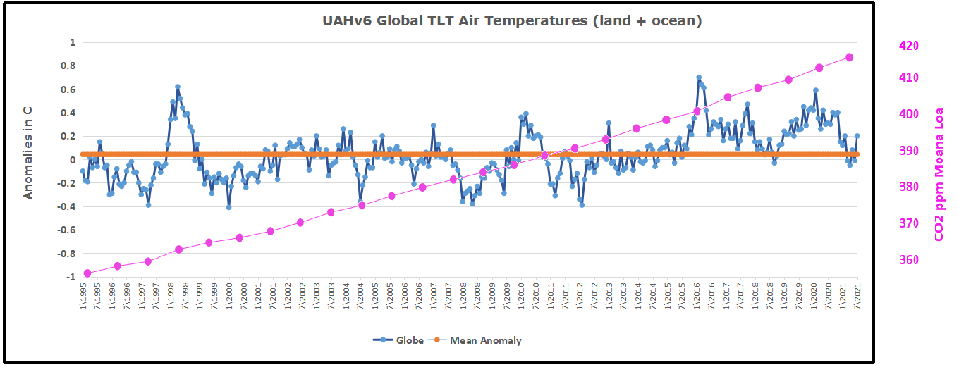
The post below updates the UAH record of air temperatures over land and ocean. But as an overview consider how recent rapid cooling completely overcame the warming from the last 3 El Ninos (1998, 2010 and 2016). The UAH record shows that the effects of the last one were gone as of April 2021. (UAH baseline is now 1991-2020). Now in July there is an uptick mainly due to SH land and ocean warming.
For reference I added an overlay of CO2 annual concentrations as measured at Mauna Loa. While temperatures fluctuated up and down ending flat, CO2 went up steadily by ~55 ppm by 2020, a 15% increase.
Furthermore, going back to previous warmings prior to the satellite record shows that the entire rise of 0.8C since 1947 is due to oceanic, not human activity.
The animation is an update of a previous analysis from Dr. Murry Salby. These graphs use Hadcrut4 and include the 2016 El Nino warming event. The exhibit shows since 1947 GMT warmed by 0.8 C, from 13.9 to 14.7, as estimated by Hadcrut4. This resulted from three natural warming events involving ocean cycles. The most recent rise 2013-16 lifted temperatures by 0.2C. Previously the 1997-98 El Nino produced a plateau increase of 0.4C. Before that, a rise from 1977-81 added 0.2C to start the warming since 1947.
Importantly, the theory of human-caused global warming asserts that increasing CO2 in the atmosphere changes the baseline and causes systemic warming in our climate. On the contrary, all of the warming since 1947 was episodic, coming from three brief events associated with oceanic cycles.
July Update Ocean and Land Air Temps Continue Down
With apologies to Paul Revere, this post is on the lookout for cooler weather with an eye on both the Land and the Sea. While you will hear a lot about 2020 temperatures matching 2016 as the highest ever, that spin ignores how fast has the cooling set in. The UAH data analyzed below shows that warming from the last El Nino is now fully dissipated with chilly temperatures setting in all regions. The peak NH summer month of July saw some warming in all regions, most pronounced in the SH.
UAH has updated their tlt (temperatures in lower troposphere) dataset for July. Previously I have done posts on their reading of ocean air temps as a prelude to updated records from HADSST3. This month also has a separate graph of land air temps because the comparisons and contrasts are interesting as we contemplate possible cooling in coming months and years. Again last month showed air temps over land moved up sharply, while oceans warmed mildly.
Note: UAH has shifted their baseline from 1981-2010 to 1991-2020 beginning with January 2021. In the charts below, the trends and fluctuations remain the same but the anomaly values change with the baseline reference shift.
Presently sea surface temperatures (SST) are the best available indicator of heat content gained or lost from earth’s climate system. Enthalpy is the thermodynamic term for total heat content in a system, and humidity differences in air parcels affect enthalpy. Measuring water temperature directly avoids distorted impressions from air measurements. In addition, ocean covers 71% of the planet surface and thus dominates surface temperature estimates. Eventually we will likely have reliable means of recording water temperatures at depth.
Recently, Dr. Ole Humlum reported from his research that air temperatures lag 2-3 months behind changes in SST. Thus the cooling oceans now portend cooling land air temperatures to follow. He also observed that changes in CO2 atmospheric concentrations lag behind SST by 11-12 months. This latter point is addressed in a previous post Who to Blame for Rising CO2?
After a technical enhancement to HadSST3 delayed updates Spring 2020, May resumed a pattern of HadSST updates toward the following month end. For comparison we can look at lower troposphere temperatures (TLT) from UAHv6 which are now posted for July. The temperature record is derived from microwave sounding units (MSU) on board satellites like the one pictured above. Recently there was a change in UAH processing of satellite drift corrections, including dropping one platform which can no longer be corrected. The graphs below are taken from the new and current dataset.
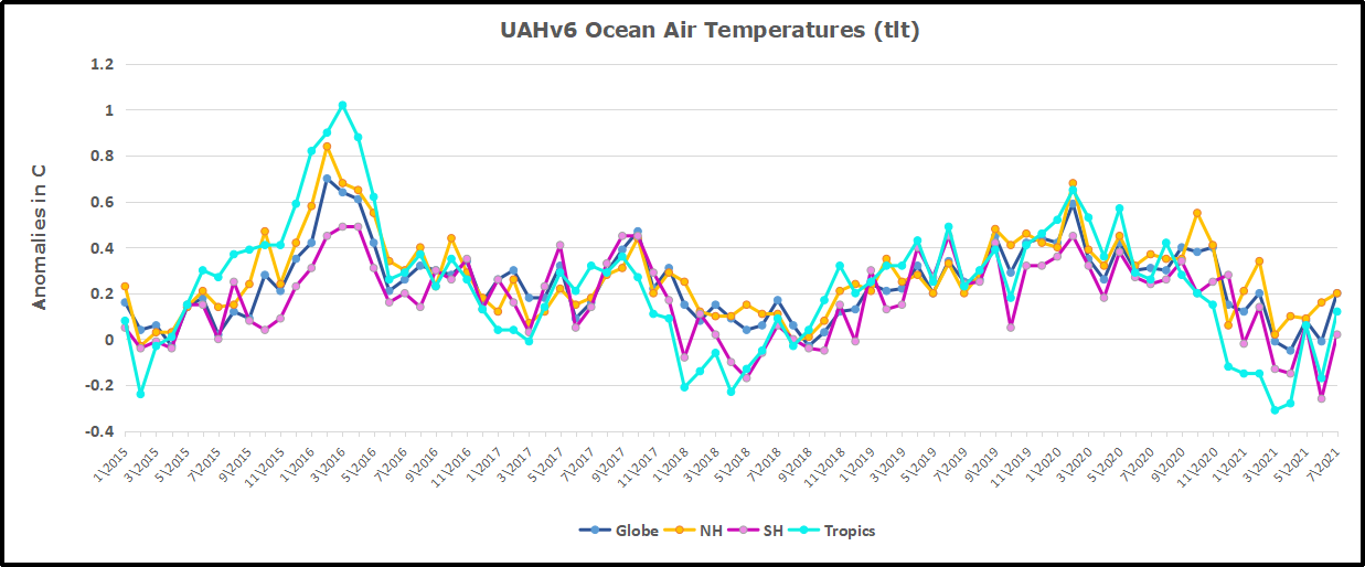
The UAH dataset includes temperature results for air above the oceans, and thus should be most comparable to the SSTs. There is the additional feature that ocean air temps avoid Urban Heat Islands (UHI). The graph below shows monthly anomalies for ocean temps since January 2015.
Note 2020 was warmed mainly by a spike in February in all regions, and secondarily by an October spike in NH alone. End of 2020 November and December ocean temps plummeted in NH and the Tropics. In January SH dropped sharply, pulling the Global anomaly down despite an upward bump in NH. An additional drop in March had SH matching the coldest in this period. March drops in the Tropics and NH made those regions at their coldest since 01/2015. In June 2021 despite an uptick in NH, the Global anomaly dropped back down due to a record low in SH along with a Tropical cooling. Now in July SH and the Tropics have gone up sharply, pulling up the Global anomaly. The NH spikes in previous summers appears less likely in 2021.
Land Air Temperatures Tracking Downward in Seesaw Pattern
We sometimes overlook that in climate temperature records, while the oceans are measured directly with SSTs, land temps are measured only indirectly. The land temperature records at surface stations sample air temps at 2 meters above ground. UAH gives tlt anomalies for air over land separately from ocean air temps. The graph updated for July is below. Here we have fresh evidence of the greater volatility of the Land temperatures, along with extraordinary departures by SH land. Land temps are dominated by NH with a 2020 spike in February, followed by cooling down to July. Then NH land warmed with a second spike in November. Note the mid-year spikes in SH winter months. In December all of that was wiped out.
Then January 2021 showed a sharp drop in SH, but a rise in NH more than offset, pulling the Global anomaly upward. In February NH and the Tropics cooled further, pulling down the Global anomaly, despite slight SH land warming. March continued to show all regions roughly comparable to early 2015, prior to the 2016 El Nino. Then in April NH land dropped sharply along with the Tropics, bringing Global Land anomaly down by nearly 0.2C. Now a remarkable divergence with NH rising in May and June, while SH drops sharply to a new low, along with Tropical cooling. With NH having most of the land mass, the Global land anomaly ticked upward.
Now in July SH jumped up nearly 1C from -o.6 to +0.3, causing a spike in Global land anomaly despite little change in NH.
The Bigger Picture UAH Global Since 1995 The chart shows monthly anomalies starting 01/1995 to present. The average anomaly is 0.04, since this period is the same as the new baseline, lacking only the first 4 years. 1995 was chosen as an ENSO neutral year. The graph shows the 1998 El Nino after which the mean resumed, and again after the smaller 2010 event. The 2016 El Nino matched 1998 peak and in addition NH after effects lasted longer, followed by the NH warming 2019-20, with temps now returning again to the mean with an uptick in July.
TLTs include mixing above the oceans and probably some influence from nearby more volatile land temps. Clearly NH and Global land temps have been dropping in a seesaw pattern, more than 1C lower than the 2016 peak. Since the ocean has 1000 times the heat capacity as the atmosphere, that cooling is a significant driving force. TLT measures started the recent cooling later than SSTs from HadSST3, but are now showing the same pattern. It seems obvious that despite the three El Ninos, their warming has not persisted, and without them it would probably have cooled since 1995. Of course, the future has not yet been written.
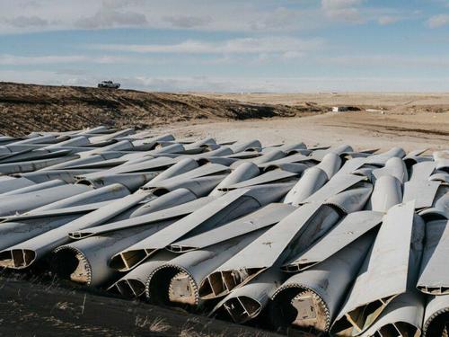
This is a fourth post toward infographics exposing the damaging effects of Climate Policies upon the lives of ordinary people. (See World of Hurt Part 1 , Part 2, and Part 3 ) And all of the pain is for naught in fighting against global warming/climate change, as shown clearly in the image above. This post presents graphics to illustrate the fourth of four themes:
Zero Carbon Means Killing Real Jobs with Promises of Green Jobs
Reducing Carbon Emissions Means High Cost Energy Imports and Social Degradation
100% Renewable Energy Means Sourcing Rare Metals Off-Planet
Leave it in the Ground Means Perpetual Poverty
The War Against Carbon Emissions Diminishes Efforts to Lift People Out of Poverty
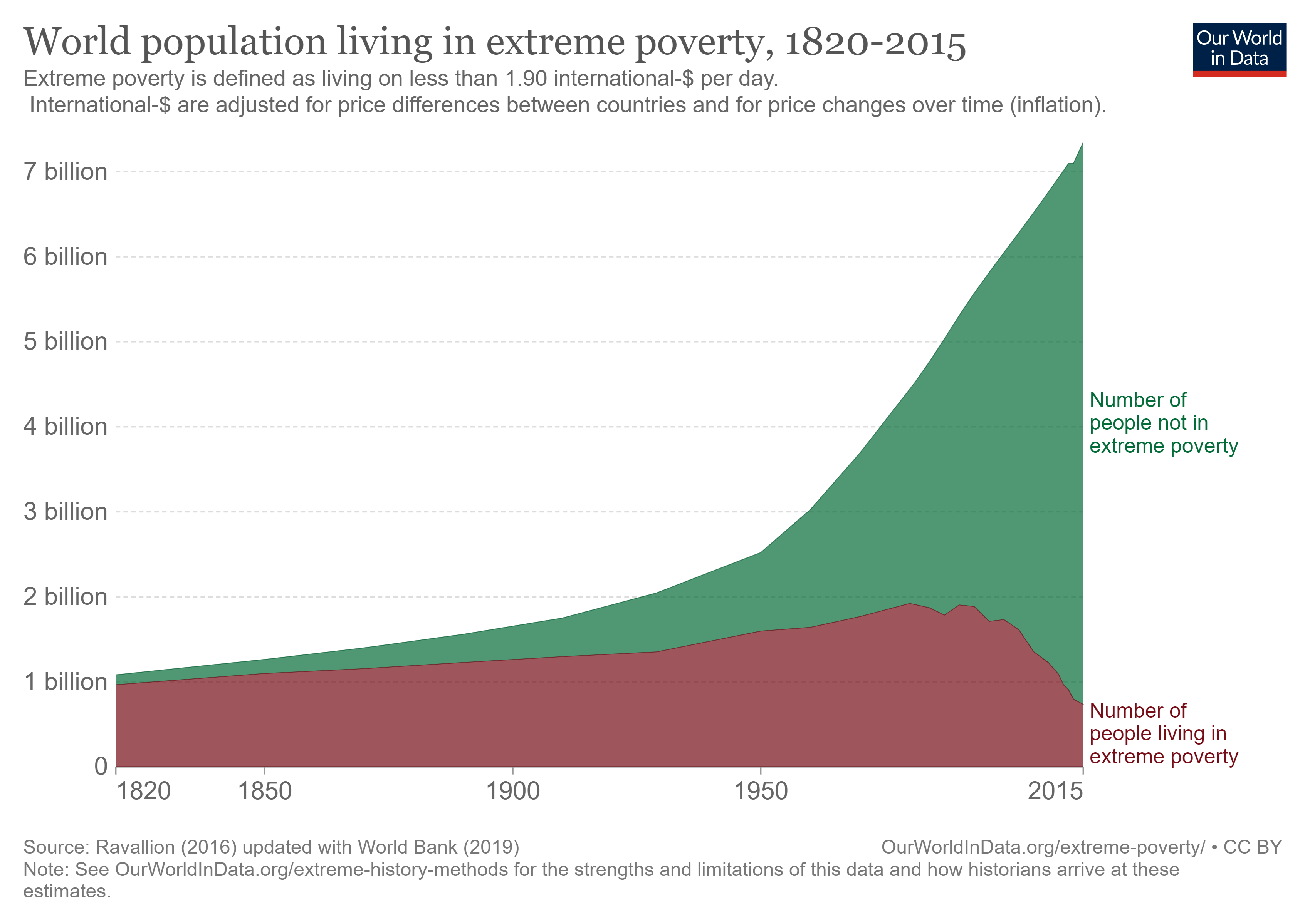
The OurWorldinData graph shows how half a billion people have risen out of extreme poverty in recent decades. While much needs to be done, it is clear that the world knows the poverty factors to be overcome.
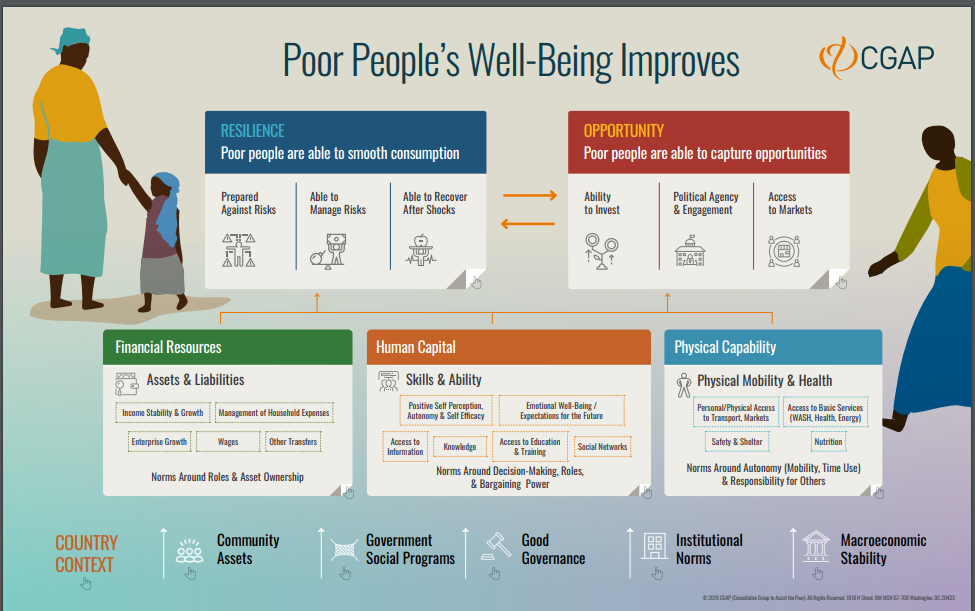
That comprehensive diagram from CGAP shows numerous elements that contribute to rising health and prosperity, but there is one resource underlying and enabling everything: Access to affordable, reliable energy. From Global Energy Assessment:
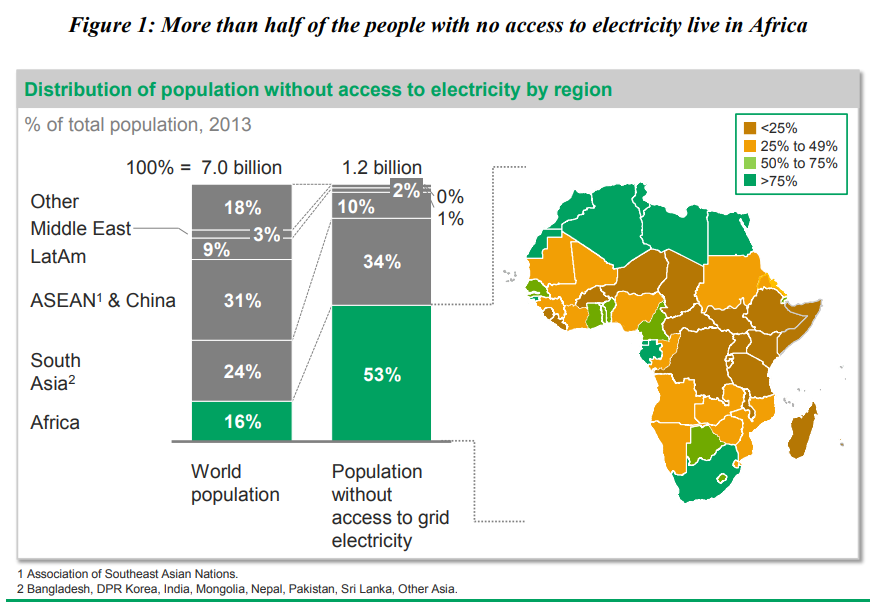
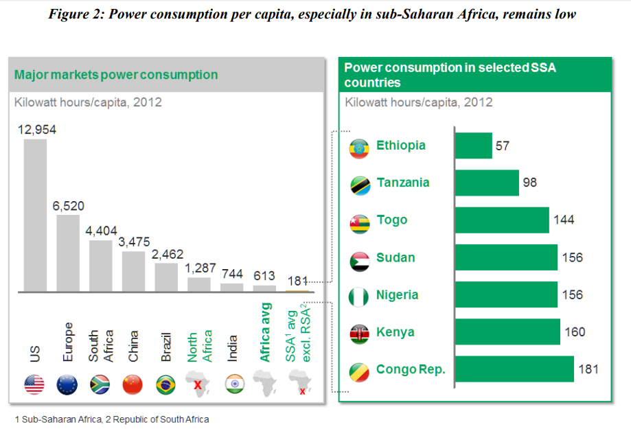
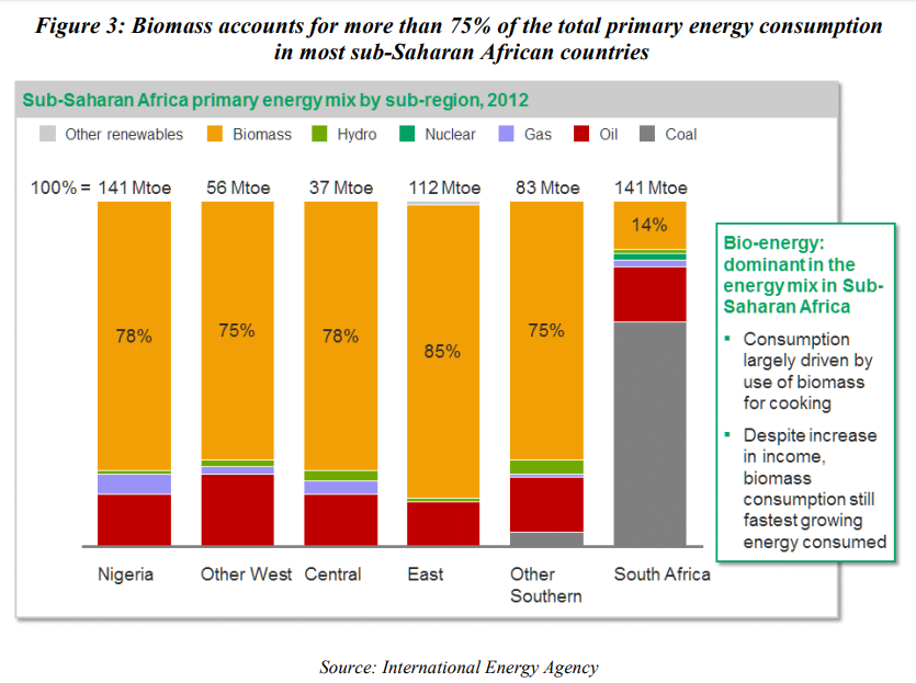
“Access to cleaner and affordable energy options is essential for improving the livelihoods of the poor in developing countries. The link between energy and poverty is demonstrated by the fact that the poor in developing countries constitute the bulk of an estimated 2.7 billion people relying on traditional biomass for cooking and the overwhelming majority of the 1.4 billion without access to grid electricity. Most of the people still reliant on traditional biomass live in Africa and South Asia.
The relationship is, in many respects, a vicious cycle in which people who lack access to cleaner and affordable energy are often trapped in a re-enforcing cycle of deprivation, lower incomes and the means to improve their living conditions while at the same time using significant amounts of their very limited income on expensive and unhealthy forms of energy that provide poor and/or unsafe services.”
The moral of this is very clear. Where energy is scarce and expensive, people’s labor is cheap and they live in poverty. Where energy is reliable and cheap, people are paid well to work and they have a better life.
How Climate Policies Keep People Poor
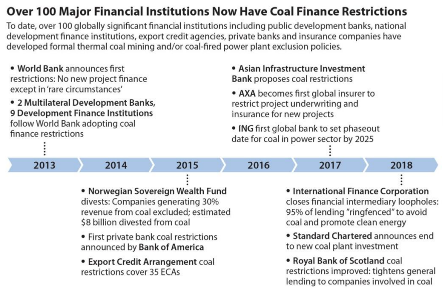
Note that the vision for 100% access to electric power was put forward by the African Development Bank in 2016. (Above slides come from The Bank Group’s Strategy for The New Deal on Energy for Africa 2016 – 2025). Instead of making finances available for such a plan, an International Cabal organized to deny any support for coal, the most available and inexpensive way to electrify Africa. This is an organized campaign to deny coal-fired power anywhere in the world, despite coal being the starting point in the development pathway for every modern society, and currently the success model for Asia, and China in particular. [Note in Figure 3 above that South Africa, the most advanced of African nations gets the majority of its power from coal.] The chart above comes from IEEFA 2019 report Over 100 Global Financial Institutions Are Exiting Coal, With More to Come. Their pride in virtue-signaling is expressed in the subtitle: Every Two Weeks a Bank, Insurer or Lender Announces New Restrictions on Coal.
How Climate Policies Waste Resources that could Improve Peoples’ Lives
The Climate Crisis Industry costs over 2 Trillion US dollars every year, and is estimated to redirect 30% of all foreign aid meant for developing countries into climate projects like carbon offsets and off-grid wind and solar.
A much better plan is put forward by the Copenhagen Consensus Center. A panel of social and economic development experts did cost/benefit analyses of all the Millenium Goals listed by the UN working groups, including climate mitigation and adaption goals along with all the other objectives deemed desirable. They addressed the question:
What are the best ways of advancing global welfare, and particularly the welfare of developing countries, illustrated by supposing that an additional $75 billion of resources were at their disposal over a 4‐year initial period?
These challenges were examined:
Armed Conflict
Biodiversity
Chronic Disease
Climate Change
Education
Hunger and Malnutrition
Infectious Disease
Natural Disasters
Population Growth
Water and Sanitation
Imagine how much good could be done by diverting some of the trillions wasted trying to bend the curve at the top of the page?
100% Renewable Energy Means Sourcing Rare Metals Off-Planet
This is a third post toward infographics exposing the damaging effects of Climate Policies upon the lives of ordinary people. (See World of Hurt Part 1 and Part 2) And all of the pain is for naught in fighting against global warming/climate change, as shown clearly in the image above. This post presents graphics to illustrate the third of four themes:
Zero Carbon Means Killing Real Jobs with Promises of Green Jobs
Reducing Carbon Emissions Means High Cost Energy Imports and Social Degradation
100% Renewable Energy Means Sourcing Rare Metals Off-Planet
Leave it in the Ground Means Perpetual Poverty
Part 3: Wind and Solar Infrastructure Consumes Rare Metals Far Beyond World Supplies
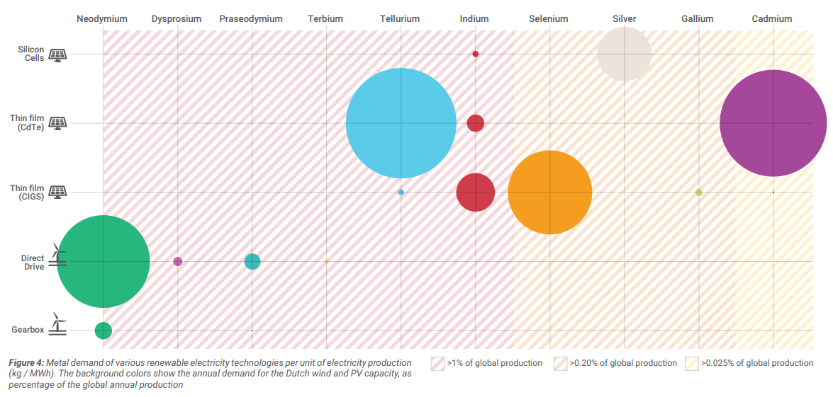
Metal demand per technology
There are various technologies available for the production of electricity through wind and solar. Each technology requires different amounts of critical metals. This figure shows the metal demand for the five most common technologies.
Conclusions • Newer technologies are often more efficient and cheaper, however, they rely on the properties of critical metals to achieve this. • Thin film cadmium-tellurium solar PV cells have the best performance in terms of CO2 -emissions and energy payback times. They do however require large quantities of tellurium and cadmium, and tellurium is one of the rarest metalloids. • Direct-drive wind turbines use neodymium-dysprosium based permanent magnets. They are more expensive to produce, but cheaper in their exploitation phase. Gearbox turbines require less critical metals, but are generally understood to have higher maintenance costs because they have more moving parts. Gearbox turbines also have a shorter energy payback time.
Method The average metal demand per unit of electricity is calculated based on load hours in the Netherlands.7–9 The entire lifespan of the specific technologies has been taken into account.Metal demand for Dutch renewable electricity production
This chart shows the average annual metal demand (for 22 metals) required for the installation of new solar panels and wind turbines. This assumes a linear installation of capacity.
The annual metal demand is compared to the annual global production of these specific metals, resulting in an indicator for the share of Dutch demands for renewables in global production.
Conclusions • For five of the metals, the required demand for renewable electricity production capacity is significant: neodymium, terbium, indium, dysprosium, and praseodymium. • If the rest of the world would develop renewable electricity capacity at a comparable pace with the Netherlands, a considerable shortage will arise. • When other applications (such as electric vehicles) are also taken into consideration, the required amount of certain metals would further increase.
Method The renewable electricity targets for 2030 serve as the starting point for the calculations. Based on these targets, the annual installed capacity is calculated. The metals required for this capacity are shown as a percentage of the annual global production. Origin of critical metals
This diagram shows the origin of the metals required for meeting the 2030 goals. The left side of the diagram shows the origin, based on today’s global production of metals. The right side shows the cumulative metal demand for wind and solar technologies until 2030.
Conclusions • The Netherlands is entirely dependenton countries outside of Europe – and mainly on China – for its critical metals. • Not only is the main share of current production located in China, the country also hosts refinery facilities for many metals. • Australia and Turkey are also important countries for the extraction of specific metals, particularly neodymium (Australia) and boron (Turkey).
Method The renewable electricity capacity required is calculated from the goals in the Climate Agreement outlines. This capacity is then translated to a metal demand. The ratio of world production is based on the annual production statistics of 2017. Global critical metal demand for wind and PV
When considering a global perspective, the critical metal demand for our future renewable electricity production is significant. This graph shows the annual metal demand for the six most critical metals, compared to the annual production. The dotted line represents present-day annual production.
Conclusions • Future annual critical metal demands of the energy transition surpass the total annual critical metal production. • An exponential growth in renewable energy production capacity is not possible with present-day technologies and annual metal production. As an illustration: in 2050, the annual need for Indium (only for solar panel application) will exceed the present-day annual global production twelvefold. • To be able to realize a renewable energy system, there is a need to both dematerialize renewable electricity production technologies and increase global annual production.
Reducing Carbon Emissions Means High Cost Energy Imports and Social Degradation
This is a second post toward infographics exposing the damaging effects of Climate Policies upon the lives of ordinary people. (See World of Hurt Part 1) And all of the pain is for naught in fighting against global warming/climate change, as shown clearly in the image above. This post presents graphics to illustrate the second of four themes:
Zero Carbon Means Killing Real Jobs with Promises of Green Jobs
Reducing Carbon Emissions Means High Cost Energy Imports and Social Degradation
100% Renewable Energy Means Sourcing Rare Metals Off-Planet
Leave it in the Ground Means Perpetual Poverty
Part 2: California Exemplifies Ruination from Self-imposed Climate PoliciesFor the past 25 years the amount of oil supplied to California’s refineries has essentially held steady at around 660 million barrels per year, but the source of the supply has changed drastically. In 1995, nearly all of that oil came from within California’s borders and Alaska. Today, the majority of the oil comes from foreign imports as data from the state’s Energy Commission shows.By blocking domestic production through permit denials, California is playing a shell game with emissions. Overall use of petroleum products has held steady but shifted from energy produced within the state – where the industry is subject to U.S. environmental regulations and supports local workers and companies – to overseas.
California isn’t reducing its dependence on oil; it’s just adding a higher carbon footprint to get it.Californians pay one of the highest electricity rates in the United States. In 2015, the average resident spent 2.7 percent of their salary on electricity and paid approximately $1,700 annually to keep their lights on. This percentage has been increasing since 2008 Prices have climbed 30 percent over the last decade as successive governors have mandated that an increasing share of electricity is sourced from renewables.Despite natural gas rates being at their lowest levels since 1999, several municipalities across California have proposed or implemented bans on the use of the resource in homes and businesses.
As individuals leave the gas grid, the poor will face higher prices on the grid and higher electricity prices when they switch. They will be threatened with a higher cost of living that could force them from their homes. Lower income individuals are priced out of neighborhoods where they could build equity because of higher electric costs. Middle class and wealthy individuals pay four times more for electricity, diminishing disposable income, while still paying for a gas grid they are unable to connect to through municipal law.
The result of California’s efforts? A reduction of global emissions by less than half of one percent.Sources: EnergyInDepth: California
This is a beginning post toward infographics exposing the damaging effects of Climate Policies upon the lives of ordinary people. And all of the pain is for naught in fighting against global warming/climate change, as shown clearly in the image above. This post presents graphics to illustrate the first of four themes:
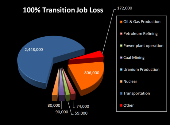
Zero Carbon Means Killing Real Jobs with Promises of Green Jobs
“While many experts dispute the feasibility of Jacobson’s plan for a renewables-only energy grid, the severe job losses are far more difficult to dispute, given that they come directly from Jacobson’s research. Those job losses would undoubtedly be devastating for millions of American families.”
And about Those Promised Green Jobs to replace the lost ones:
In February 2009, the last time Democrats controlled the White House and both chambers of Congress, President Barack Obama and Vice President Joe Biden flew to Colorado to sign their $787 billion stimulus package into law.
The plan was to invest $150 billion over 10 years that would advance a “clean energy” economy built around biofuels, hybrid cars, low-emission coal plants, and renewable sources such as solar and wind. Obama and Biden promised to create five million green jobs that would specifically benefit low-income earners, claiming that the stimulus package included “help for those hit hardest by our economic crisis.”
A decade later, we now know that the 2009 green jobs program was a complete failure. The Department of Labor (DoL) and the Bureau of Labor Statistics (BLS) issued several reports on the green jobs program. Each report was an indictment on the program, as job placement met only 10 percent of the targeted level, and many of those who were hired remained employed for less than six months.
Even the new, redefined green jobs did not reach the five million promised in February 2009. According to a study by the Brookings Institution, the Obama–Biden administration identified nearly 2.7 million green jobs, but most were bus drivers, sewage workers, and other types of work that do not match the “green jobs of the future” that the administration promised. Most of them were preexisting jobs, which were simply re-characterized by the government, apparently in an effort to boost the numbers. Source: If at First You Don’t Succeed, Try ‘Green Jobs’ Again
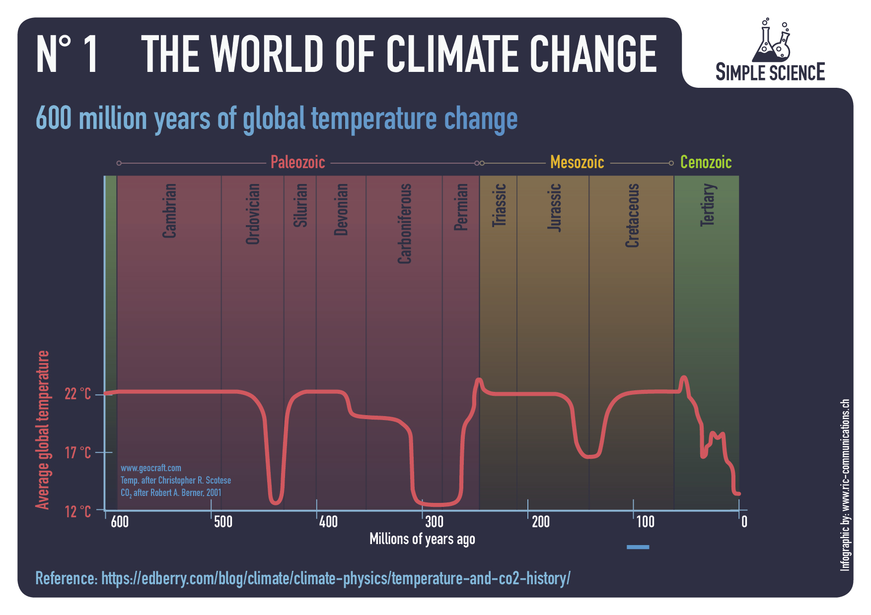
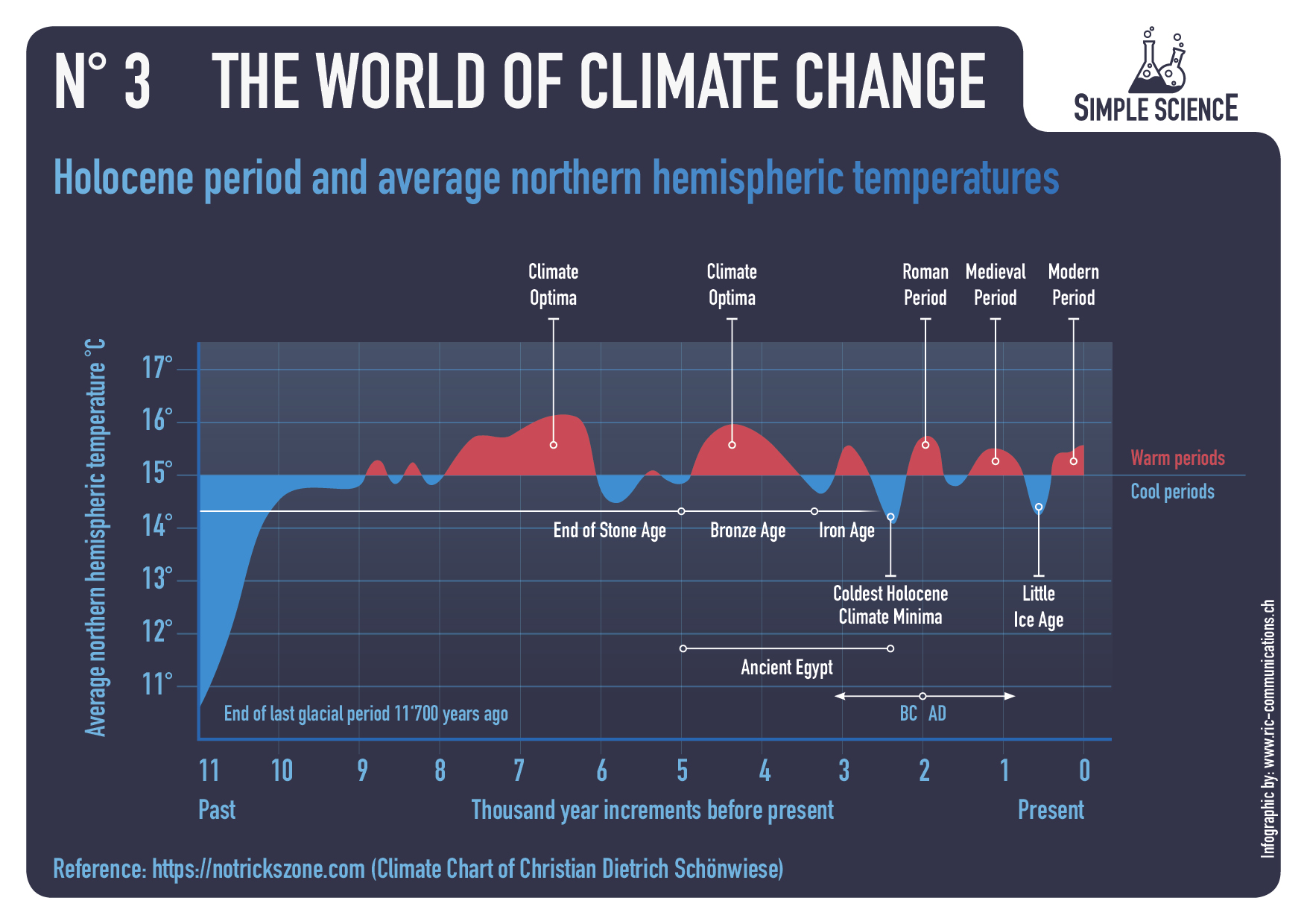
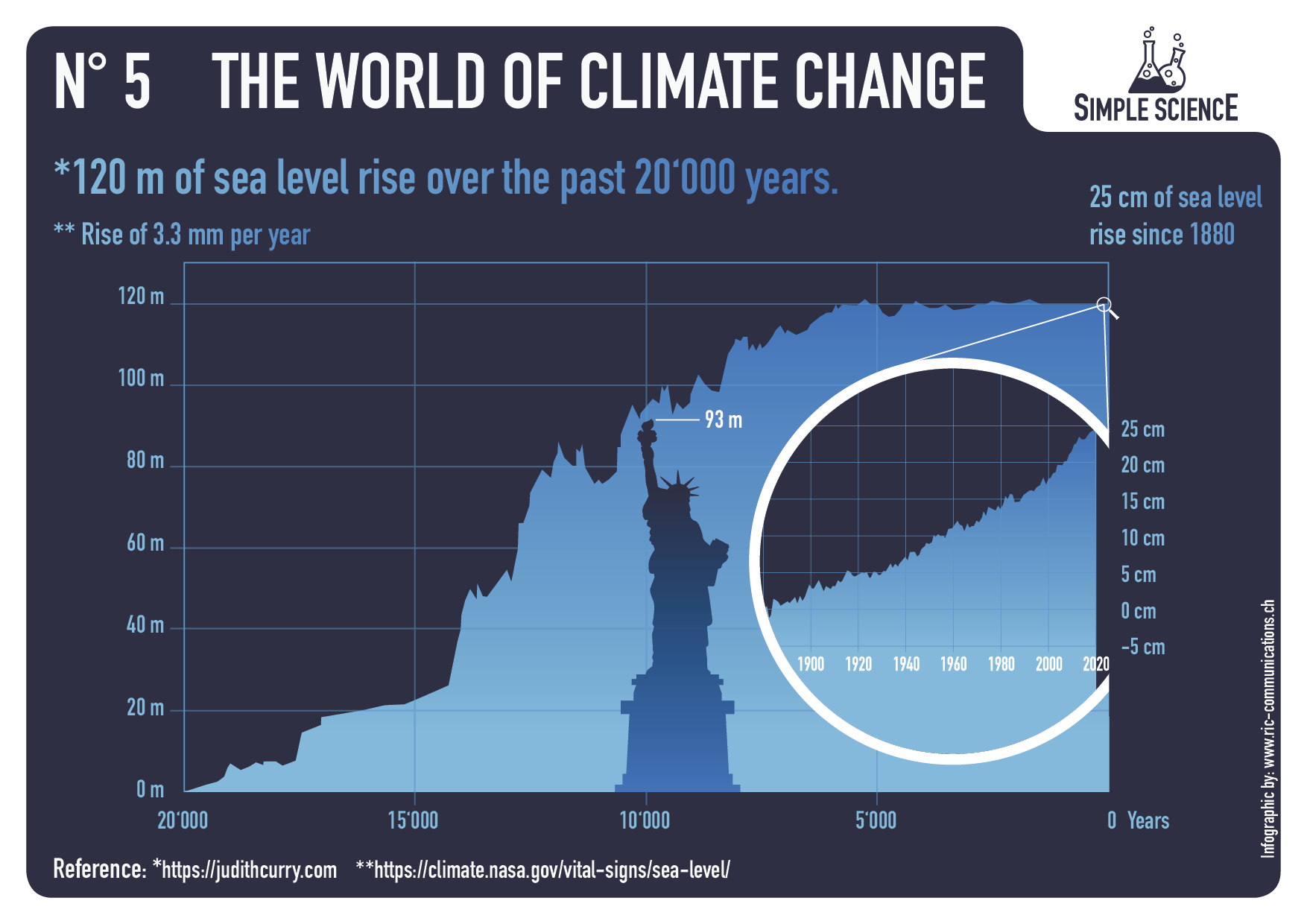
Raymond of RiC-Communications studio created infographics on CO2 for improving public awareness. He produced 13 interesting slides which are presented in the post World of CO2 Infographics A second project was created on a related theme The World of Climate Change comprising six charts, including one regarding Alpine glacier studies by two prominent geologists. In addition, Raymond was able to consult the work of these two experts in their native German language.
Infographics can be helpful, in making things simple to understand. Climate change is a complex topic with a lot of information and statistics. These simple step by step charts are to better understand what is occurring naturally and what could be caused by humans. What is cause for alarm and what isn’t cause for alarmism if at all. Only through learning is it possible to get the big picture so as to make the right decisions for the future.
– N° 1 600 million years of global temperature change – N° 2 Earth‘s temperature record for the last 400,000 years – N° 3 Holocene period and average northern hemispheric temperatures – N° 4 140 years of global mean temperature – N° 5 120 m of sea level rise over the past 20‘000 years – N° 6 Eastern European alpine glacier history during the Holocene period.
Summer Temperatures (May – September) A rise in temperature during a warming period will result in a glacier losing more surface area or completely vanishing. This can happen very rapidly in only a few years or over a longer period of time. If temperatures drop during a cooling period and summer temperatures are too low, glaciers will begin to grow and advance with each season. This can happen very rapidly or over a longer period in time. Special thanks to Prof. em. Christian Schlüchter / (Quartärgeologie, Umweltgeologie) Universität Bern Institut für Geologie His work is on the Western Alps and was so kind to help Raymond make this graphic as correct as possible.
Comment:
This project explored information concerning how aspects of the world climate system have changed in the past up to the present time. Understanding the range of historical variation and the factors involved is essential for anticipating how future climate parameters might fluctuate.


 Note 2020 was warmed mainly by a spike in February in all regions, and secondarily by an October spike in NH alone. End of 2020 November and December ocean temps plummeted in NH and the Tropics. In January SH dropped sharply, pulling the Global anomaly down despite an upward bump in NH. An additional drop in March had SH matching the coldest in this period. March drops in the Tropics and NH made those regions at their coldest since 01/2015. In June 2021 despite an uptick in NH, the Global anomaly dropped back down due to a record low in SH along with a Tropical cooling. Now in July SH and the Tropics have gone up sharply, pulling up the Global anomaly. The NH spikes in previous summers appears less likely in 2021.
 Here we have fresh evidence of the greater volatility of the Land temperatures, along with extraordinary departures by SH land. Land temps are dominated by NH with a 2020 spike in February, followed by cooling down to July. Then NH land warmed with a second spike in November. Note the mid-year spikes in SH winter months. In December all of that was wiped out.
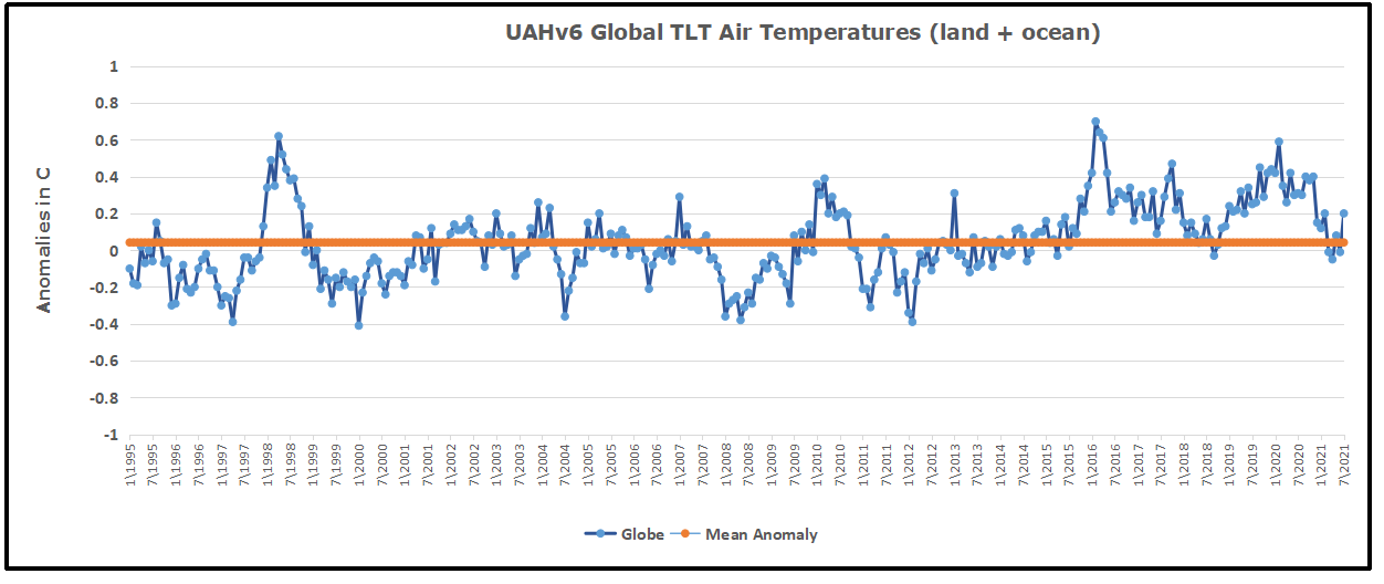 The chart shows monthly anomalies starting 01/1995 to present. The average anomaly is 0.04, since this period is the same as the new baseline, lacking only the first 4 years. 1995 was chosen as an ENSO neutral year. The graph shows the 1998 El Nino after which the mean resumed, and again after the smaller 2010 event. The 2016 El Nino matched 1998 peak and in addition NH after effects lasted longer, followed by the NH warming 2019-20, with temps now returning again to the mean with an uptick in July.
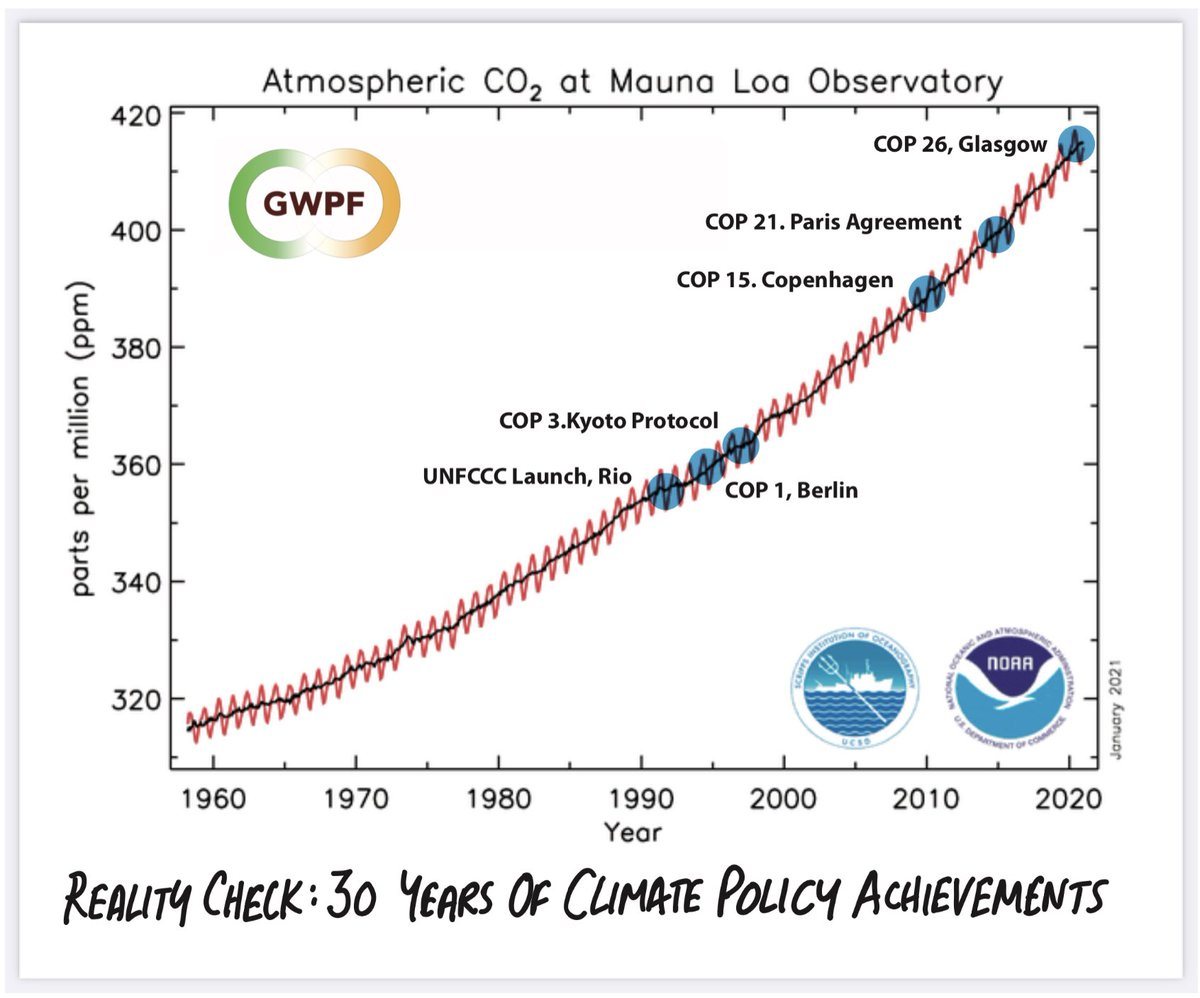

 This is an organized campaign to deny coal-fired power anywhere in the world, despite coal being the starting point in the development pathway for every modern society, and currently the success model for Asia, and China in particular. [Note in Figure 3 above that South Africa, the most advanced of African nations gets the majority of its power from coal.] The chart above comes from IEEFA 2019 report
 Metal demand per technology
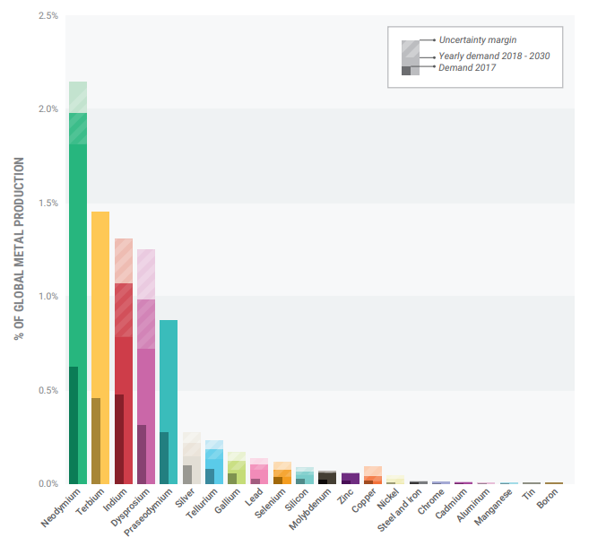 Metal demand for Dutch renewable electricity production
 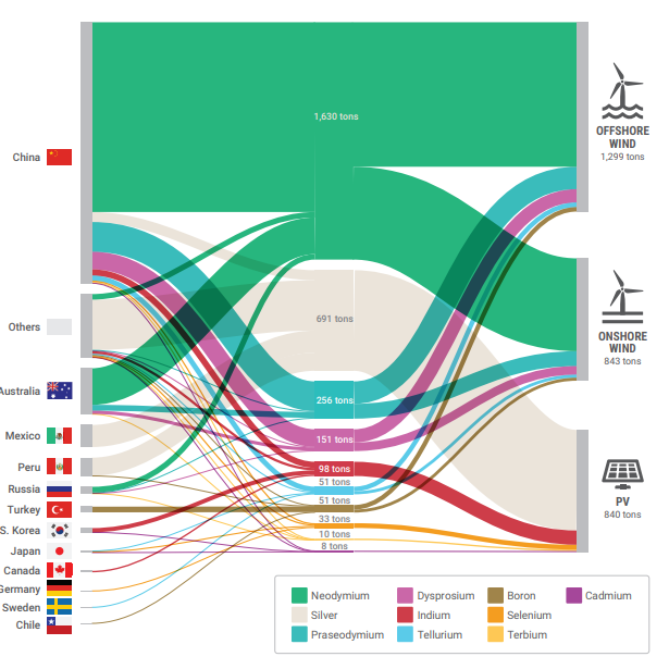 Origin of critical metals
 The gray area would be required for a wind farm large enough to power London UK. The yellow area would be required for solar panels.
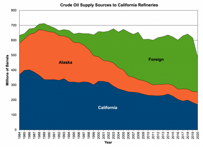 For the past 25 years the amount of oil supplied to California’s refineries has essentially held steady at around 660 million barrels per year, but the source of the supply has changed drastically. In 1995, nearly all of that oil came from within California’s borders and Alaska. Today, the majority of the oil comes from foreign imports as data from the state’s Energy Commission shows.
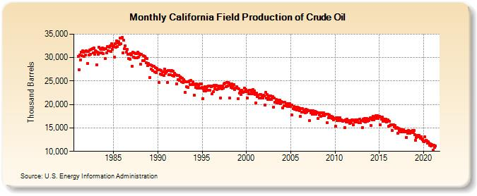
 By blocking domestic production through permit denials, California is playing a shell game with emissions. Overall use of petroleum products has held steady but shifted from energy produced within the state – where the industry is subject to U.S. environmental regulations and supports local workers and companies – to overseas.
 Californians pay one of the highest electricity rates in the United States. In 2015, the average resident spent 2.7 percent of their salary on electricity and paid approximately $1,700 annually to keep their lights on. This percentage has been increasing since 2008 Prices have climbed 30 percent over the last decade as successive governors have mandated that an increasing share of electricity is sourced from renewables.
 Despite natural gas rates being at their lowest levels since 1999, several municipalities across California have proposed or implemented bans on the use of the resource in homes and businesses.
  Sources: