Our Childish Leaders

Donald J. Boudreaux writes at AIER Beware the Allure of Simple ‘Solutions’.  H/T Brownstone Institute.  Excerpts in italics with my bolds and added images.

The attitudes and opinions of today’s so-called “elite” – those public-opinion formers who Deirdre McCloskey calls “the clerisy” – are childish. Most journalists and writers working for most premier media and entertainment companies, along with most professors and public intellectuals, think, talk, and write about society with the insight of kindergartners.

This sad truth is masked by the one feature that does distinguish the clerisy from young children: verbal virtuosity. Yet beneath the fine words, beautiful phrases, arresting metaphors, and affected allusions lies a notable immaturity of thought.

Every social and economic problem is believed to have a solution,
and that solution is almost always superficial.

Unlike children, adults understand that living life well begins with accepting the inescapability of trade-offs. Contrary to what you might have heard, you cannot “have it all.” You cannot have more of this thing unless you’re willing to have less of that other thing. And what’s true for you as an individual is true for any group of individuals. We Americans cannot have our government artificially raise the cost of producing and using carbon fuels unless we are willing to pay higher prices at the pump and, thus, have less income to spend on acquiring other goods and services. We cannot use money creation to ease the pain today of COVID lockdowns without enduring the greater pain tomorrow of inflation.

While children stomp their little feet in protest when confronted with the need to make trade-offs, the necessity of trade-offs is accepted as a matter of course by adults.

No less importantly, adults, unlike children, are not beguiled by the superficial.

Pay close attention to how the clerisy (who are mostly, although not exclusively, Progressives) propose to ‘solve’ almost any problem, real or imaginary. You’ll discover that the proposed ‘solution’ is superficial; it’s rooted in the naïve assumption that social reality beyond what is immediately observable either doesn’t exist or is unaffected by attempts to rearrange surface phenomena. In the clerisy’s view, the only reality that matters is the reality that is easily seen and seemingly easily manipulated with coercion.

The clerisy’s proposed ‘solutions,’ therefore, involve simply rearranging,
or attempting to rearrange, surface phenomena.

♦  Do some people use guns to murder other people? Yes, sadly. The clerisy’s superficial ‘solution’ to this real problem is to outlaw guns.

♦  Do some people have substantially higher net financial worths than other people? Yes. The clerisy’s juvenile ‘solution’ to this fake problem is to heavily tax the rich and transfer the proceeds to the less rich.

♦  Are some workers paid wages that are too low to support a family in modern America? Yes. The clerisy’s simplistic ‘solution’ to this fake problem – “fake” because most workers earning such low wages are not heads of households – is to have government prohibit the payment of wages below some stipulated minimum.

♦  Do some people suffer substantial property damage, or even loss of life, because of hurricanes, droughts, and other bouts of severe weather? Yes. The clerisy’s lazy ‘solution’ to this real problem focuses on changing the weather by reducing the emissions of an element, carbon, that is now (too simplistically) believed to heavily determine the weather.

♦  Do prices of many ‘essential’ goods and services rise significantly in the immediate aftermath of natural disasters? Yes. The clerisy’s counterproductive ‘solution’ to this fake problem, “counterproductive” and “fake” because these high prices accurately reflect and signal underlying economic realities, is to prohibit the charging and payment of these high prices.

♦  When inflationary pressures build up because of excessive monetary growth, are these pressures vented in the form of rising prices? Yes indeed. The clerisy’s infantile ‘solution’ to the very real problem of inflation is to blame it on greed while raising taxes on profits.

♦  Is the SARS-CoV-2 virus contagious and potentially dangerous to humans? Yes. The clerisy’s simple-minded ‘solution’ to this real problem is to forcibly prevent people from mingling with each other.

♦  Do many Americans still not receive K-12 schooling of minimum acceptable quality? Yes. The clerisy’s lazy ‘solution’ to this real problem is to give pay raises to teachers and spend more money on school administrators.

♦  Do some American workers lose jobs when American consumers buy more imports? Yes. The clerisy’s ‘solution’ is to obstruct consumers’ ability to buy imports.

♦  Are some people bigoted and beset with irrational dislike or fear of blacks, gays, lesbians, and bisexuals? Yes. The clerisy’s ‘solution’ to this real problem is to outlaw “hate” and to compel bigoted persons to behave as if they aren’t bigoted.

♦  Do many persons who are eligible to vote in political elections refrain from voting? Yes. The ‘solution’ favored by at least some of the clerisy to this fake problem – “fake” because in a free society each person has a right to refrain from participating in politics – is to make voting mandatory.

The above list of simplistic and superficial ‘solutions’ to problems real and imaginary
can easily be expanded.

The clerisy, mistaking words for realities, assumes that success at verbally describing realities more to their liking proves that these imagined realities can be made real by merely rearranging the relevant surface phenomena. Members of the clerisy ignore unintended consequences. And they overlook the fact that many of the social and economic realities that they abhor are the result, not of villainy or of correctible imperfections, but of complex trade-offs made by countless individuals.

Social engineering appears doable only to those persons who, seeing only a relatively few surface phenomena, are blind to the astonishing complexity that is ever-churning beneath the surface to create those surface phenomena. To such persons, social reality appears as it does to a child: simple and easily manipulated to achieve whatever are the desires that motivate the manipulators.

The clerisy’s ranks are filled overwhelmingly with simple-minded people who mistake their felicity with words and their good intentions for serious thinking. They convey to each other, and to the unsuspecting public, the appearance of being deep thinkers while seldom thinking with more sophistication and nuance than is on display daily in every classroom of kindergartners.

Progressive Means Experts Rule

Ryan McMaken explains at Mises Why Progressives Love Government “Experts”.  Excerpts in italics with my bolds and added images H/T zerohedge

In twenty-first-century America, ordinary people are at the mercy of well-paid, unelected government experts who wield vast power.

That is, we live in the age of the technocrats: people who claim to have special wisdom that entitles them to control, manipulate, and manage society’s institutions using the coercive power of the state.

We’re told these people are “nonpolitical” and will use their impressive scientific knowledge to plan the economy, public health, public safety, or whatever goal the regime has decided the technocrats will be tasked with bringing about.

These people include central bankers, Supreme Court justices, “public health” bureaucrats, and Pentagon generals.

The narrative is that these people are not there to represent the public or bow to political pressure. They’re just there to do “the right thing” as dictated by economic theory, biological sciences, legal theory, or the study of military tactics.  We’re also told that in order to allow these people to act as the purely well-meaning apolitical geniuses they are, we must give them their independence and not question their methods or conclusions.

We were exposed to this routine yet again last week as President Joe Biden announced he will “respect the Fed’s independence” and allow the central bankers to set monetary policy without any bothersome interference from the representatives of the taxpayers who pay all the bills and who primarily pay the price when central bankers make things worse. (Biden, of course, didn’t mention that central bankers have been spectacularly wrong about the inflation threat in recent years, with inflation rates hitting forty-year highs, economic growth going negative, and consumer credit piling up as families struggle to cope with the cost of living.)

Conveniently, Biden’s deferral to the Fed allows him to blame it later when economic conditions get even worse. Nonetheless, his placing the economy in the hands of alleged experts will no doubt appear laudable to many. This is because the public has long been taught by public schools and media outlets that government experts should have the leeway to exercise vast power in the name of “fixing” whatever problems society faces.

The Expert Class as a Tool for State Building

The success of this idea represents a great victory for progressive ideology. Progressives have long been committed to creating a special expert class as a means of building state power. In the United States, for example, the cult of expertise really began to take hold in the late nineteenth and early twentieth centuries, and it led directly to support for more government intervention in the private sector. As Maureen Flanagan notes in “Progressives and Progressivism in an Era of Reform,”

Social science expertise gave political Progressives a theoretical foundation for cautious proposals to create a more activist state…. Professional social scientists composed a tight circle of men who created a space between academia and government from which to advocate for reform. They addressed each other, trained their students to follow their ideas, and rarely spoke to the larger public.

These men founded new organizations—such as the American Economics Association—to promote this new class of experts and their plans for a more centrally planned society. Ultimately, the nature of the expert class was revolutionary. The new social scientists thought they knew better than the patricians, religious leaders, local representatives, and market actors who had long shaped local institutions. Instead,

Progressives were modernizers with a structural-instrumentalist agenda. They rejected reliance on older values and cultural norms to order society and sought to create a modern reordered society with political and economic institutions run by men qualified to apply fiscal expertise, businesslike efficiency, and modern scientific expertise to solve problems and save democracy. The emerging academic disciplines in the social sciences of economics, political economy and political science, and pragmatic education supplied the theoretical bases for this middle-class expert Progressivism.

In the Progressive view, business leaders and machine politicians lacked a rational and broad view of the needs of society. In contrast, the government experts would approach society’s problems as scientists. Johnson felt this model already somewhat existed in the Department of War, where Johnson imagined the secretary of war was “quite free from political pressure and [relied] on the counsel of the engineers.” Johnson imagined that these science-minded bureaucrats could bring a “really economic and scientific application” of policy.

“Disinterested” Central Planners

Johnson was part of a wave of experts and intellectuals attempting to develop “a new realm of state expertise” that favored apolitical technocrats who would plan the nation’s infrastructure and industry. Many historians have recognized that these efforts were fundamentally “state-building activities … [and that] their emergence marked and symbolized a watershed in which an often-undemocratic new politics of administration and interest groups displaced the nineteenth century’s partisan, locally oriented public life”. 

In short, these efforts sowed the seeds for the idealized technocracy we have today: unresponsive to the public and imbued with vast coercive power that continually displaces private discretion and private prerogatives.

Indeed, the Progressive devotion to expertise followed “the core pattern of Progressive politics,” which is “the redirection of decision making upward within bureaucracies.” Thus, in contrast to the populist political institutions of an earlier time, decision-making in the Progressive Era became more white-collar, more middle class—as opposed to the working-class party workers—and more hierarchical within bureaucracies directly controlled by the state’s executive agencies.

Who Should Rule?

In many ways, then, this aspect of Progressive ideology turned the political agenda of laissez-faire classical liberalism on its head. Liberals of the Jeffersonian and Jacksonian variety had sought to increase outside political influence in the policy-making process through elections and the appointment of party activists loyal to elected representatives. This was because liberals feared that an insulated class of government experts would function more in its own interests than those of the taxpayers.

The Progressives, however, imagined they could create a disinterested nonpolitical class of experts devoted only to objective science.

The fundamental question, then, became who should rule: insulated experts or nonexpert representatives with closer ties to the taxpayers.  We can see today that the Progressives largely succeeded in granting far greater power to today’s technocratic class of experts. The technocrats are praised for their allegedly scientific focus, and we are told to respect their independence.

If the goal was ever to protect public checks on state power, however, this was always an unworkable ideal. By creating a special class of expert bureaucrats with decades-long careers within the regime itself, we are simply creating a new class of officials able to wield state power with little accountability. Anyone with a sufficiently critical view of state power could see the danger in this. Interestingly, it was anarcho-communist Mikhail Bakunin who recognized the impossibility of solving the problem of state power by putting scientific experts in charge. Such a move only represented a transfer of power from one group to another. Bakunin warned:

The State has always been the patrimony of some privileged class or other; a priestly class, an aristocratic class, a bourgeois class, and finally a bureaucratic class.

It is not necessary, of course, to have full-blown socialism to create this “new class.” The modern state with its mixed economy in most cases already has all the bureaucratic infrastructure necessary to make this a reality. As long as we defer to this ruling class of “scientists and scholars,” the Progressives have won.

Background Why Technocrats Deliver Catastrophes

Finland’s Self-imposed Climate Lockdown

You’d think that politicians had learned to forego climate virtue-signaling after seeing the lawfare tactics that they will suffer.  And yet, Finland bravely goes where smarter angels fear to tread.  As the Helsinki Times reports New Climate Change Act into force in July.  Excerpts in italics with my bolds.

The Climate Change Act lays the foundation for national work on climate change in Finland. The reformed Act sets emission reductions targets for 2030, 2040 and 2050. Now the target of a carbon-neutral Finland by 2035 has for the first time been laid down by law.

The Government submitted the bill for approval on 9 June. The President of the Republic is to approve the Act on 10 June and it will enter into force on 1 July 2022.

“The new Climate Change Act is vital for Finland. The Climate Change Act ensures that ambitious climate work will continue across government terms. The Act shows the world how we can built a carbon-neutral welfare state by 2035. It is also a strong signal for companies that in Finland clean solutions are well worth investing in,” says Minister of the Environment and Climate Change Maria Ohisalo.

Minister of the Environment and Climate Change Maria Ohisalo at a press event in Helsinki. LEHTIKUVA

The Act lays down provisions on the climate change policy plans. The scope of the Act will be extended to also cover emissions from the land use sector, i.e. land use, forestry and agriculture, and it will for the first time include the objective to strengthen carbon sinks.

“Including land use in the Climate Change Act is a significant improvement. We have a lot of opportunities to reduce emissions and strengthen carbon sinks in the land use sector – in forests, construction and agriculture,” Minister Ohisalo says.

The previous Climate Change Act entered into force in 2015, and it set an emission reduction target only for 2050. The new Climate Change Act will include emission reduction targets for 2030 and 2040 that are based on the recommendations of the Finnish Climate Change Panel, and the target for 2050 will be updated.

The emission reduction targets are -60% by 2030, -80% by 2040 and at least -90% but aiming at -95% by 2050, compared to the levels in 1990.

Finns have lost any room to maneuver, or to walk back ill-advised policies should the future be cooler rather than the warming of which they are so certain.  The lawyers will be all over them to prevent any escape.  To use another metaphor, they are lobsters who put themselves into the pots; there will be no getting out or going free.


See Also Dutch Judges Dictate Energy Policy

See Also Climate Tyranny By Way of Criminal Law


FDA Interfered With Ivermectin, Doctors Suing

A Washington law firm has filed a federal lawsuit against the Food and Drug Administration (FDA) for interfering with the use of ivermectin as a treatment for COVID-19. H/T Epoch Times

The lawsuit was filed by Boyden Gray & Associates on behalf of three doctors who were disciplined for prescribing human-grade ivermectin to patients. The firm’s founder, attorney Boyden Gray, is a former legal adviser to the Reagan and Bush administrations.

Gray told The Epoch Times that the FDA had violated well-established law that allows doctors to prescribe an FDA-approved drug as an off-label treatment. Ivermectin was no different, he said. It was approved by the FDA in 1966. “Congress recognized the importance of letting doctors be doctors and expressly prohibited the FDA from interfering with the practice of medicine,” Gray said.

“That is exactly what the FDA has done time and time again throughout this pandemic, assuming authority it doesn’t have and trying to insert itself in the medical decisions of Americans everywhere.” The three plaintiffs in the case are k Marik is a founder of the Front Line COVID-19 Critical Care 21 Alliance (FLCCC), a national nonprofit that promotes alternative COVID-19 treatments to the government-touted vaccine.

“The FDA has made public statements on ivermectin that have been misleading and have raised unwarranted concern over a critical drug in preventing and treating COVID-19,” Marik told The Epoch Times.

“To do this is to ignore both statutory limits on the FDA’s authority and the significant body of scientific evidence from peer-reviewed research.”

According to Marik, more than 80 medical trials conducted since the outbreak of COVID-19 show that ivermectin is a safe and effective treatment for the virus. Gray said the FDA has engaged in unlawful interference with the use of ivermectin and should be held accountable for that. The lawsuit included several statements made by the FDA that Gray said show that the administration interfered with the use of ivermectin.

They include an Aug. 21, 2021, Twitter post by the agency: “You are not a horse. You are not a cow. Seriously, y’all. Stop it.”

Marik, a critical care specialist, was suspended by Sentara Norfolk General Hospital for prescribing ivermectin as a COVID-19 treatment. Bowden, an ear, nose, and throat specialist, was suspended from the Houston Medical Hospital. Apter was under investigation by both the Washington Medical Commission and Arizona Medical Board for prescribing ivermectin. Marik was recently informed that he was under investigation by the medical licensing board in Virginia.

Gray filed the lawsuit in U.S. District Court in Texas. The doctors are seeking a permanent injunction that would prohibit the FDA from interfering with the use of ivermectin for the treatment of COVID-19.

Background from previous post Why Ivermectin Was Disappeared

Henry F. Smith Jr., MD explains at American Thinker Why Ivermectin was Disappeared.  Excerpts in italics with my bolds.

Case #1

It’s a common occurrence in winter. A patient calls a primary physician to report a nonproductive cough, slight hoarseness, muscle aches, and a low-grade fever. The physician, and likely the patient, realize that this is almost certainly a viral upper respiratory infection. If the patient were in the office, the physician may test for a streptococcal bacterial infection, but it will likely be negative.

This is probably an infection with a rhinovirus, adenovirus, or endemic coronavirus. Despite this, the afflicted patient will happily proceed to the pharmacy to pick up their prescription for an antibiotic. The patient will feel as though the physician was proactive, something the doctor certainly understands.

This prescription, however, will be of no value to the patient and may actually cause issues. Yet pharmacies in the U.S. see this type of prescription thousands of times a day.

It occurs despite the fact that physicians are constantly reminded that gratuitous antibiotic prescriptions come with side effects and can lead to antibiotic resistance. Beyond that, there is no tangible resistance to this practice from the medical establishment or healthcare authorities.

Case #2

Now let’s imagine another patient calls in. This patient also has a dry cough scratchy throat, muscle aches, and a low-grade fever. Only this patient had a COVID test kit at home and tested positive. The physician wants to prescribe a medication with no risk of bacterial resistance and a very benign side-effect profile. He’s read lots of literature to suggest it will be helpful. There are a significant number of double-blind studies showing it to be effective in the treatment of SARS Co-V2. It has been used in multiple countries with excellent results. Except, in this case, the physician will find it impossible to prescribe that medication. It will be impossible because that medication is Ivermectin. And somehow it has been removed from the market.

Not only has this FDA-approved, Nobel prize-winning drug been made unavailable, if a physician were to prescribe it, or advocate it as therapy, they are threatened with the potential loss of their medical license, their hospital affiliations, and their board certification.

Case #3

It gets even more ironic. I’ve noticed that some physicians are prescribing a very common antibiotic called azithromycin for their COVID patients. It is well understood that for COVID-19 when taken alone, it is of no value. There is absolutely no data to show efficacy in COVID-19. It has the same potential problems, as when it is prescribed for other viral infections. Yet the practice goes on, again unimpeded.

Let’s go one step further. Levofloxacin is another antibiotic, introduced in 1996. It was unusual in that it can treat a broad variety of infections, even those that are severe but can be given orally. Because of this, it was overutilized, threatening to create drug resistance.

In 2016, the FDA issued a black box warning because of several severe side effects including tendon rupture, peripheral nerve damage, for them and psychosis. Since then its usage has waned.

The drug was proposed as a treatment for COVID early in the pandemic but proved to have limited antiviral activity.

Case #4

So I posed this hypothetical to several pharmacist friends: If a physician called in a prescription for azithromycin, or even levofloxacin, and gave the diagnosis of COVID-19, would they fill the prescription? The answer was yes, as there would be nothing to prevent it.  So, in other words, a physician is permitted to prescribe useless antibiotics, even those with serious adverse reactions according to the FDA for COVID-19 infection.

If, as apparently the FDA believes, ivermectin is similarly useless but benign, why is it alone being blocked?

Doing the Math

Let’s do some mathematics. As of this writing, there are roughly 890,000 deaths recorded in the United States related to COVID-19. I think most people understand that a lot of these deaths are not due to the virus but from other comorbid conditions. The CDC has long stated that the number of deaths from COVID where there was no comorbid condition (In other words, healthy people who died from COVID) is roughly 7% of the total (65,000). In several meta-analyses, Ivermectin was shown to be roughly 65% effective at preventing serious disease and/or death. So, in the best-case scenario for them, our public health organizations, by suppressing Ivermectin, may be responsible for roughly 40,000 deaths.

In fact, the vast majority of people who actually died from COVID had multiple comorbid conditions, so that number could be much higher.

I need to acknowledge that prescribing antibiotics for viral infections is something that the primary caregivers struggle with. Patients expect them to do something when they’re sick. They don’t appreciate being told to go home and take acetaminophen. Some may never come back and seek care elsewhere.

Yet patients have accepted that exact recipe for dealing with COVID-19, a disease they perceive may actually kill them.

So what’s the difference between prescriptions written for an anti-bacterial, versus Ivermectin, which is an anti-parasitic agent, for a viral infection? Both primarily target infectious agents other than viruses. If anything, even it was futile therapy, Ivermectin is safer than the antibiotics discussed. Yet it is the only medication that has been effectively banned

Given all this, I think it’s easy to suspect that the FDA, the NIH, and the CDC actually understand the potential benefits of Ivermectin and other repurposed drugs. But they also realize that these medications threaten the profits of the pharmaceutical industry with which they are financially entwined.

Case #5

What makes this even more infuriating is the government’s warm embrace of two new antiviral medications, Pfizer’s Paxlovid, and Merck’s Molnupivinir. These drugs have exactly one company-sponsored study each to vouch for their efficacy. Merck’s drug, by its own testing, is only 39% effective in reducing severe disease and/or death. There are no long-term safety data for either medication.

Yet both have received emergency use authorization, and have suddenly popped up on government-approved treatment protocols.

As I look towards the end of my career, I’ve seen a lot of profit-oriented behavior by pharmaceutical companies. I think of the me-too drugs, molecules that are only slightly different than their now off-patent predecessors aggressively marketed to physicians. I’ve seen pharmaceutical reps actually reimburse physicians for a certain number of prescriptions written for their medications. I’ve seen manipulation of the rules regarding inhaled medications to maintain their patents long after they would have expired.

But if they actively suppressed the adoption of useful medications during a pandemic, then this is beyond the pale. It would suggest a total collapse of any morality or sense of responsibility within the pharmaceutical industry and their partners in the regulatory agencies.

I hope that someday, our investigatory agencies can push past the vast political power these companies have acquired through their burgeoning profits, and find out the truth.

I’m not optimistic.

Henry F Smith Jr. MD FCCP practices Pulmonary and Sleep Medicine in Northeastern Pennsylvania.

Temps Cause CO2 Changes, Not the Reverse. June 2022 Update

Science is based on predictive power.  For example, astronomers demonstrate they know how the solar system works when they accurately predict eclipses of the sun and moon.

This post is about proving that CO2 changes in response to temperature changes, not the other way around, as is often claimed.  In order to do  that we need two datasets: one for measurements of changes in atmospheric CO2 concentrations over time and one for estimates of Global Mean Temperature changes over time.

For a possible explanation of natural warming and CO2 emissions see Little Ice Age Warming Recovery May be Over

Climate science is unsettling because past data are not fixed, but change later on.  I ran into this previously and now again in 2021 and 2022 when I set out to update an analysis done in 2014 by Jeremy Shiers (discussed in a previous post reprinted at the end).  Jeremy provided a spreadsheet in his essay Murray Salby Showed CO2 Follows Temperature Now You Can Too posted in January 2014. I downloaded his spreadsheet intending to bring the analysis up to the present to see if the results hold up.  The two sources of data were:

Temperature anomalies from RSS here:  http://www.remss.com/missions/amsu

CO2 monthly levels from NOAA (Mauna Loa): https://www.esrl.noaa.gov/gmd/ccgg/trends/data.html

Changes in CO2 (ΔCO2)

Uploading the CO2 dataset showed that many numbers had changed (why?).

The blue line shows annual observed differences in monthly values year over year, e.g. June 2020 minus June 2019 etc.  The first 12 months (1979) provide the observed starting values from which differentials are calculated.  The orange line shows those CO2 values changed slightly in the 2020 dataset vs. the 2014 dataset, on average +0.035 ppm.  But there is no pattern or trend added, and deviations vary randomly between + and -.  So last year I took the 2020 dataset to replace the older one for updating the analysis.

Now I find the NOAA dataset in 2021 has almost completely new values due to a method shift in February 2021, requiring a recalibration of all previous measurements.  The new picture of ΔCO2 is graphed below.

The method shift is reported at a NOAA Global Monitoring Laboratory webpage, Carbon Dioxide (CO2) WMO Scale, with a justification for the difference between X2007 results and the new results from X2019 now in force.  The orange line shows that the shift has resulted in higher values, especially early on and a general slightly increasing trend over time.  However, these are small variations at the decimal level on values 340 and above.  Further, the graph shows that yearly differentials month by month are virtually the same as before.  Thus I redid the analysis with the new values.

Again, note that these are annual differences by month, i.e. the value for May 2022 is the reported CO2 concentration in May 2022 minus the May 2021 CO2.  Note also how the differences have declined sharply the last two years.

Global Temperature Anomalies (ΔTemp)

The other time series was the record of global temperature anomalies according to RSS. The current RSS dataset is not at all the same as the past.

Here we see some seriously unsettling science at work.  The purple line is RSS in 2014, and the blue is RSS as of 2020.  Some further increases appear in the gold 2022 rss dataset. The red line shows alterations from the old to the new.  There is a slight cooling of the data in the beginning years, then the three versions mostly match until 1997, when systematic warming enters the record.  From 1997/5 to 2003/12 the average anomaly increases by 0.04C.  After 2004/1 to 2012/8 the average increase is 0.15C.  At the end from 2012/9 to 2013/12, the average anomaly was higher by 0.21. The 2022 version added slight warming over 2020 values.

RSS continues that accelerated warming to the present, but it cannot be trusted.  And who knows what the numbers will be a few years down the line?  As Dr. Ole Humlum said some years ago (regarding Gistemp): “It should however be noted, that a temperature record which keeps on changing the past hardly can qualify as being correct.”

Given the above manipulations, I went instead to the other satellite dataset UAH version 6. UAH has also made a shift by changing its baseline from 1981-2010 to 1991-2020.  This resulted in systematically reducing the anomaly values, but did not alter the pattern of variation over time.  For comparison, here are the two records with measurements through May 2022. UAH dataset for temperatures in the lower troposphere (TLT).

Comparing UAH temperature anomalies to NOAA CO2 changes.

Here are UAH temperature anomalies compared to CO2 monthly changes year over year.

Changes in monthly CO2 synchronize with temperature fluctuations, which for UAH are anomalies now referenced to the 1991-2020 period.  As stated above, CO2 differentials are calculated for the present month by subtracting the value for the same month in the previous year (for example May 2022 minus May 2021).   Temp anomalies are calculated by comparing the present month with the baseline month. Note the dropping temperatures over the last two years, slightly preceding CO2 descending.

The final proof that CO2 follows temperature due to stimulation of natural CO2 reservoirs is demonstrated by the ability to calculate CO2 levels since 1979 with a simple mathematical formula:

For each subsequent year, the co2 level for each month was generated

CO2  this month this year = a + b × Temp this month this year  + CO2 this month last year

Jeremy used Python to estimate a and b, but I used his spreadsheet to guess values that place for comparison the observed and calculated CO2 levels on top of each other.

In the chart calculated CO2 levels correlate with observed CO2 levels at 0.9985 out of 1.0000.  This mathematical generation of CO2 atmospheric levels is only possible if they are driven by temperature-dependent natural sources, and not by human emissions which are small in comparison, rise steadily and monotonically.

Previous Post:  What Causes Rising Atmospheric CO2?

nasa_carbon_cycle_2008-1

This post is prompted by a recent exchange with those reasserting the “consensus” view attributing all additional atmospheric CO2 to humans burning fossil fuels.

The IPCC doctrine which has long been promoted goes as follows. We have a number over here for monthly fossil fuel CO2 emissions, and a number over there for monthly atmospheric CO2. We don’t have good numbers for the rest of it-oceans, soils, biosphere–though rough estimates are orders of magnitude higher, dwarfing human CO2.  So we ignore nature and assume it is always a sink, explaining the difference between the two numbers we do have. Easy peasy, science settled.

What about the fact that nature continues to absorb about half of human emissions, even while FF CO2 increased by 60% over the last 2 decades? What about the fact that in 2020 FF CO2 declined significantly with no discernable impact on rising atmospheric CO2?

These and other issues are raised by Murray Salby and others who conclude that it is not that simple, and the science is not settled. And so these dissenters must be cancelled lest the narrative be weakened.

The non-IPCC paradigm is that atmospheric CO2 levels are a function of two very different fluxes. FF CO2 changes rapidly and increases steadily, while Natural CO2 changes slowly over time, and fluctuates up and down from temperature changes. The implications are that human CO2 is a simple addition, while natural CO2 comes from the integral of previous fluctuations.  Jeremy Shiers has a series of posts at his blog clarifying this paradigm. See Increasing CO2 Raises Global Temperature Or Does Increasing Temperature Raise CO2 Excerpts in italics with my bolds.

The following graph which shows the change in CO2 levels (rather than the levels directly) makes this much clearer.

Note the vertical scale refers to the first differential of the CO2 level not the level itself. The graph depicts that change rate in ppm per year.

There are big swings in the amount of CO2 emitted. Taking the mean as 1.6 ppmv/year (at a guess) there are +/- swings of around 1.2 nearly +/- 100%.

And, surprise surprise, the change in net emissions of CO2 is very strongly correlated with changes in global temperature.

This clearly indicates the net amount of CO2 emitted in any one year is directly linked to global mean temperature in that year.

For any given year the amount of CO2 in the atmosphere will be the sum of

  • all the net annual emissions of CO2
  • in all previous years.

For each year the net annual emission of CO2 is proportional to the annual global mean temperature.

This means the amount of CO2 in the atmosphere will be related to the sum of temperatures in previous years.

So CO2 levels are not directly related to the current temperature but the integral of temperature over previous years.

The following graph again shows observed levels of CO2 and global temperatures but also has calculated levels of CO2 based on sum of previous years temperatures (dotted blue line).

Summary:

The massive fluxes from natural sources dominate the flow of CO2 through the atmosphere.  Human CO2 from burning fossil fuels is around 4% of the annual addition from all sources. Even if rising CO2 could cause rising temperatures (no evidence, only claims), reducing our emissions would have little impact.

Resources:

CO2 Fluxes, Sources and Sinks

Who to Blame for Rising CO2?

Fearless Physics from Dr. Salby

In this video presentation, Dr. Salby provides the evidence, math and charts supporting the non-IPCC paradigm.

Footnote:  As CO2 concentrations rose, BP shows Fossil Fuel consumption slumped in 2020

See also 2022 Update: Fossil Fuels ≠ Global Warming

Zero Carbon False Pretenses

19170447-global_warming_1.530x298

Legal Definition of false pretenses: false representations concerning past or present facts that are made with the intent to defraud another.  Marriam-Webster.

As we will see below, the zero carbon campaign relies on a series of false representations, primarily from omitting realities contradictory to the CO2 scare narrative.

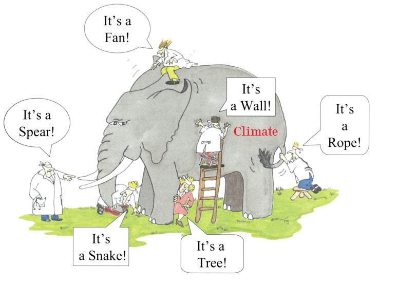
In the aftermath of Glasgow COP, many have noticed how incredible were the pronouncements and claims from UK hosts as well as other speakers intending to inflame public opinion in support of the UN agenda.  No one in the media applies any kind of critical intelligence examining the veracity of facts and conclusions trumpeted before, during and after the conference.  In the interest of presenting an alternate, unalarming paradigm of earth’s climate, I am reposting a previous discussion of how wrongheaded is the IPCC “consensus science.”

Background

With all the fuss about the “Green New Deal” and attempts to blame recent cold waves on rising CO2, it is wise to remember the logic of the alarmist argument.  It boils down to two suppositions:

Rising atmospheric CO2 makes the planet warmer.

Rising emissions from humans burning fossil fuels makes atmospheric CO2 higher.

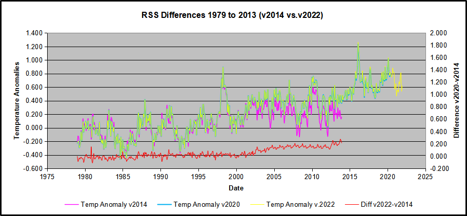
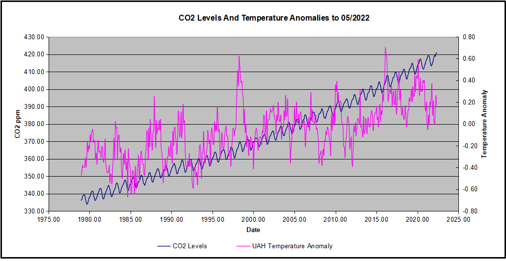
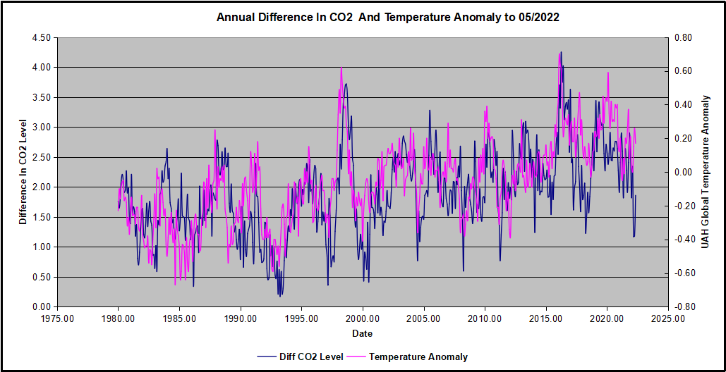
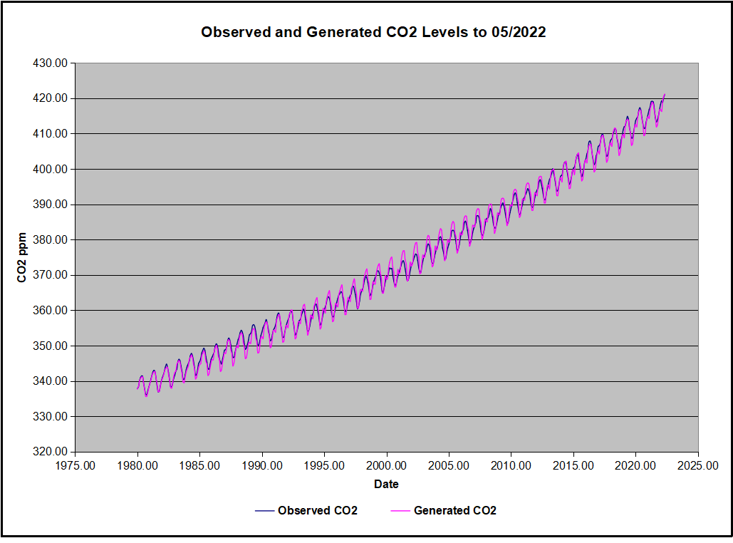
The second assertion is challenged in a post: Who to Blame for Rising CO2?

This post addresses the first claim.  Remember also that all of the so-called “lines of evidence” for global warming do not distinguish between human and natural causes.  Typically the evidence cited falls into these categories:

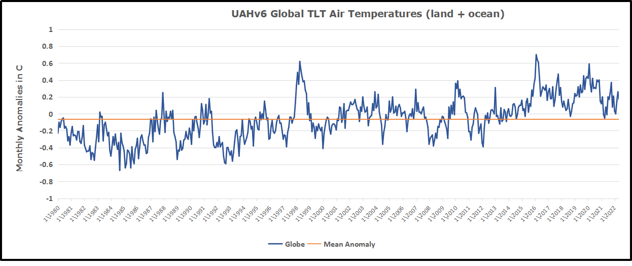
Global temperature rise
Warming oceans
Shrinking ice sheets
Glacial retreat
Decreased snow cover
Sea level rise
Declining Arctic sea ice
Extreme events

However, all of these are equivocal, involving signal and noise issues. Note also that all of them are alleged impacts from the first one.  And in any case, the fact of any changes does not in itself prove human causation.  That attribution rests solely on unvalidated climate models.  Below is a discussion of the reductionist mental process by which climate complexity and natural forces are systematically excluded to reach the pre-determined conclusion.

Original Post:  Climate Reductionism


Reductionists are those who take one theory or phenomenon to be reducible to some other theory or phenomenon. For example, a reductionist regarding mathematics might take any given mathematical theory to be reducible to logic or set theory. Or, a reductionist about biological entities like cells might take such entities to be reducible to collections of physico-chemical entities like atoms and molecules.
Definition from The Internet Encyclopedia of Philosophy

Some of you may have seen this recent article: Divided Colorado: A Sister And Brother Disagree On Climate Change

The reporter describes a familiar story to many of us.  A single skeptic (the brother) is holding out against his sister and rest of the family who accept global warming/climate change. And of course, after putting some of their interchanges into the text, the reporter then sides against the brother by taking the word of a climate expert. From the article:

“CO2 absorbs infrared heat in certain wavelengths and those measurements were made first time — published — when Abraham Lincoln was president of the United States,” says Scott Denning, a professor of atmospheric science at Colorado State University. “Since that time, those measurements have been repeated by better and better instruments around the world.”

CO2, or carbon dioxide, has increased over time, scientists say, because of human activity. It’s a greenhouse gas that’s contributing to global warming.

“We know precisely how the molecule wiggles and waggles, and what the quantum interactions between the electrons are that cause everyone one of these little absorption lines,” he says. “And there’s just no wiggle room around it — CO2 absorbs heat, heat warms things up, so adding CO2 to the atmosphere will warm the climate.”

Denning says that most of the CO2 we see added to the atmosphere comes from humans — mostly through burning coal, oil and gas, which, as he puts it, is “indirectly caused by us.”

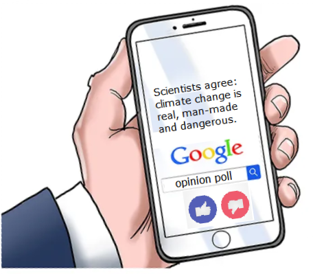
When looking at the scientific community, Denning says it’s united, as far as he knows.

earth-science-climatic-change-Climate-System-3-114-g001

A Case Study of Climate Reductionism

Denning’s comments, supported by several presentations at his website demonstrate how some scientists (all those known to Denning) engage in a classic form of reductionism.

The full complexity of earth’s climate includes many processes, some poorly understood, but known to have effects orders of magnitude greater than the potential of CO2 warming. The case for global warming alarm rests on simplifying away everything but the predetermined notion that humans are warming the planet. It goes like this:
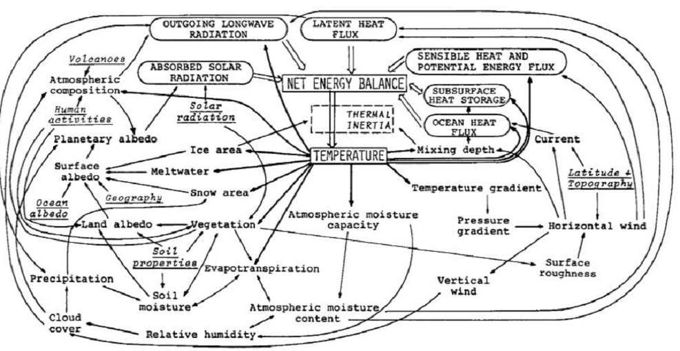
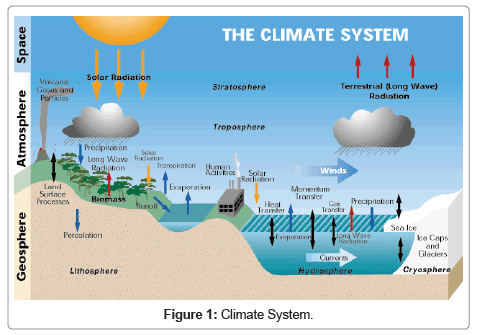
Our Complex Climate

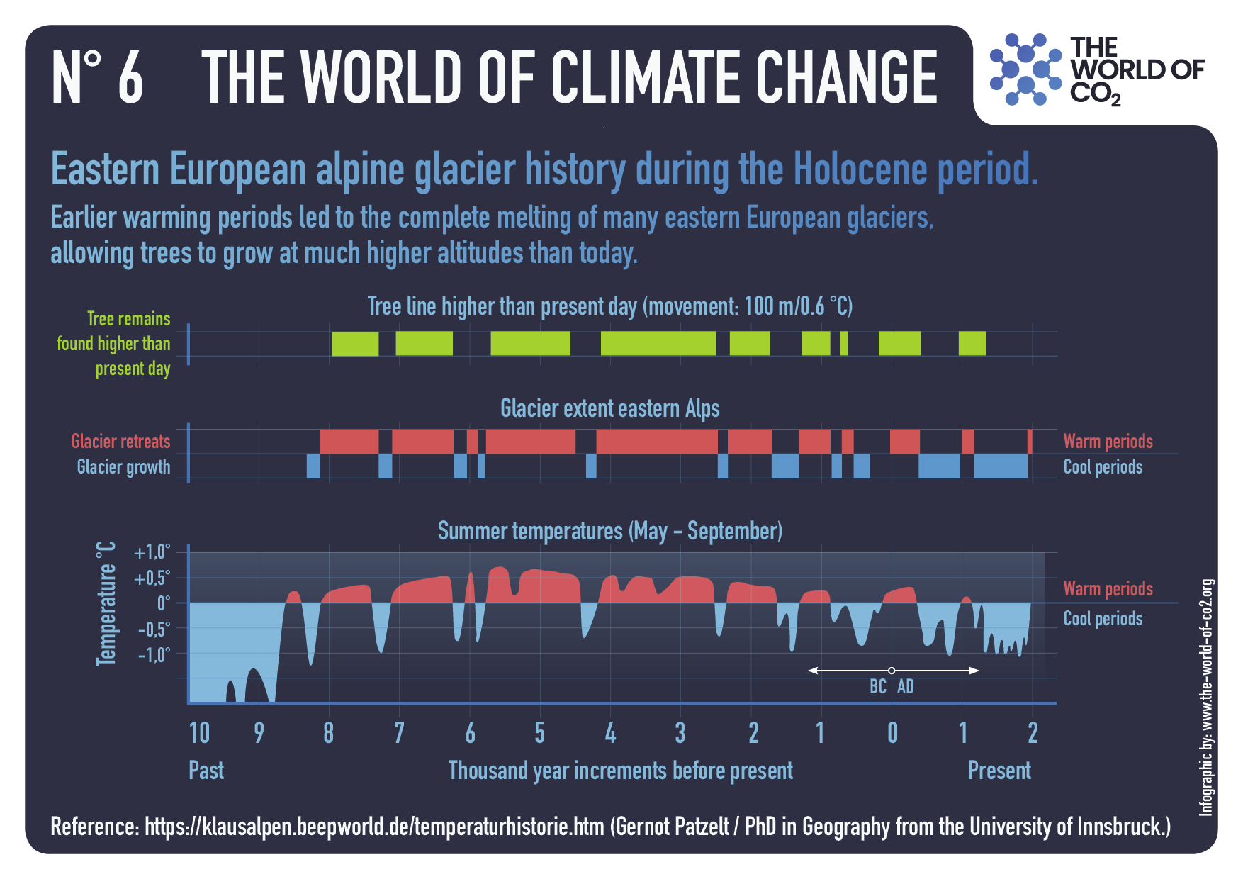
Earth’s climate is probably the most complicated natural phenomenon ever studied. Not only are there many processes, but they also interact and influence each other over various timescales, causing lagged effects and multiple cycling. This diagram illustrates some of the climate elements and interactions between them.

Flows and Feedbacks for Climate Models

The Many Climate Dimensions

Further, measuring changes in the climate goes far beyond temperature as a metric. Global climate indices, like the European dataset include 12 climate dimensions with 74 tracking measures. The set of climate dimensions include:

  • Sunshine
  • Pressure
  • Humidity
  • Cloudiness
  • Wind
  • Rain
  • Snow
  • Drought
  • Temperature
  • Heat
  • Cold

And in addition there are compound measures combining temperature and precipitation. While temperature is important, climate is much more than that.  With this reduction, all other dimensions are swept aside, and climate change is simplified down to global warming as seen in temperature measurements.

Climate Thermodynamics: Weather is the Climate System at work.

Another distortion is the notion that weather is bad or good, depending on humans finding it favorable. In fact, all that we call weather are the ocean and atmosphere acting to resolve differences in temperatures, humidities and pressures. It is the natural result of a rotating, irregular planetary surface mostly covered with water and illuminated mostly at its equator.

The sun warms the surface, but the heat escapes very quickly by convection so the build-up of heat near the surface is limited. In an incompressible atmosphere, it would *all* escape, and you’d get no surface warming. But because air is compressible, and because gases warm up when they’re compressed and cool down when allowed to expand, air circulating vertically by convection will warm and cool at a certain rate due to the changing atmospheric pressure.

Climate science has been obsessed with only a part of the system, namely the atmosphere and radiation, in order to focus attention on the non-condensing IR active gases. The climate is framed as a 3D atmosphere above a 2D surface. That narrow scope leaves out the powerful non-radiative heat transfer mechanisms that dominate the lower troposphere, and the vast reservoir of thermal energy deep in the oceans.

As Dr. Robert E Stevenson writes, it could have been different:

“As an oceanographer, I’d been around the world, once or twice, and I was rather convinced that I knew the factors that influenced the Earth’s climate. The oceans, by virtue of their enormous density and heat-storage capacity, are the dominant influence on our climate. It is the heat budget and the energy that flows into and out of the oceans that basically determines the mean temperature of the global atmosphere. These interactions, plus evaporation, are quite capable of canceling the slight effect of man-produced CO2.”

The troposphere is dominated by powerful heat transfer mechanisms: conduction, convection and evaporation, as well as physical kinetic movements.  All this is ignored in order to focus on radiative heat transfer, a bit player except at the top of the atmosphere.

There’s More than the Atmosphere

Once the world of climate is greatly reduced down to radiation of infrared frequencies, yet another set of blinders is applied. The most important source of radiation is of course the sun. Solar radiation in the short wave (SW) range is what we see and what heats up the earth’s surface, particularly the oceans. In addition solar radiation includes infrared, some absorbed in the atmosphere and some at the surface. The ocean is also a major source of heat into the atmosphere since its thermal capacity is 1000 times what the air can hold. The heat transfer from ocean to air is both by way of evaporation (latent heat) and also by direct contact at the sea surface (conduction).

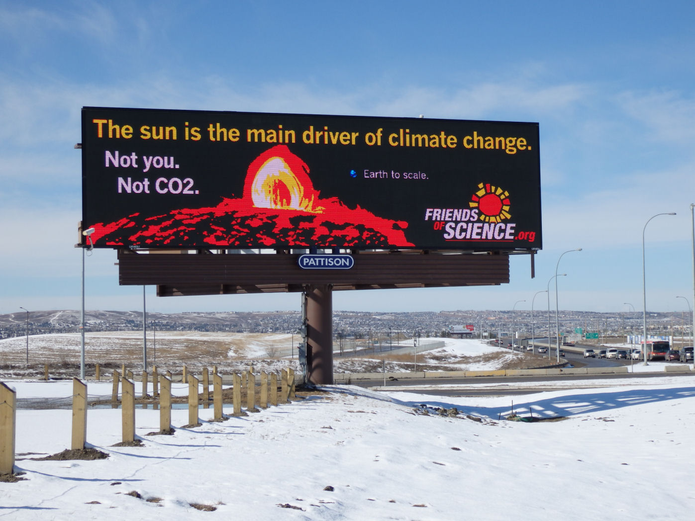
Yet conventional climate science dismisses the sun as a climate factor saying that its climate input is unvarying. That ignores significant fluctuations in parts of the light range, for example ultraviolet, and also solar effects such as magnetic fields and cosmic rays. Also disregarded is solar energy varying due to cloud fluctuations. The ocean is also dismissed as a source of climate change despite obvious ocean warming and cooling cycles ranging from weeks to centuries. The problem is such oscillations are not well understood or predictable, so can not be easily modeled.

With the sun and the earth’s surface and ocean dismissed, the only consideration left is the atmosphere.

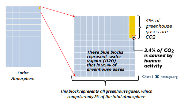
The Gorilla Greenhouse Gas

Thus climate has been reduced down to heat radiation passing through the atmosphere comprised of gases. One of the biggest reductions then comes from focusing on CO2 rather than H20. Of all the gases that are IR-active, water is the most prevalent and covers more of the spectrum.

The diagram below gives you the sense of proportion.

GHG blocks

The Role of CO2

We come now to the role of CO2 in “trapping heat” and making the world warmer. The theory is that CO2 acts like a blanket by absorbing and re-radiating heat that would otherwise escape into space. By delaying the cooling while solar energy comes in constantly, CO2 is presumed to cause a buildup of heat resulting in warmer temperatures.

How the Atmosphere Processes Heat

There are 3 ways that heat (Infrared or IR radiation) passes from the surface to space.

1) A small amount of the radiation leaves directly, because all gases in our air are transparent to IR of 10-14 microns (sometimes called the “atmospheric window.” This pathway moves at the speed of light, so no delay of cooling occurs.

2) Some radiation is absorbed and re-emitted by IR active gases up to the tropopause. Calculations of the free mean path for CO2 show that energy passes from surface to tropopause in less than 5 milliseconds. This is almost speed of light, so delay is negligible. H2O is so variable across the globe that its total effects are not measurable. In arid places, like deserts, we see that CO2 by itself does not prevent the loss of the day’s heat after sundown.

3) The bulk gases of the atmosphere, O2 and N2, are warmed by conduction and convection from the surface. They also gain energy by collisions with IR active gases, some of that IR coming from the surface, and some absorbed directly from the sun. Latent heat from water is also added to the bulk gases. O2 and N2 are slow to shed this heat, and indeed must pass it back to IR active gases at the top of the troposphere for radiation into space.

In a parcel of air each molecule of CO2 is surrounded by 2500 other molecules, mostly O2 and N2. In the lower atmosphere, the air is dense and CO2 molecules energized by IR lose it to surrounding gases, slightly warming the entire parcel. Higher in the atmosphere, the air is thinner, and CO2 molecules can emit IR into space. Surrounding gases resupply CO2 with the energy it lost, which leads to further heat loss into space.

This third pathway has a significant delay of cooling, and is the reason for our mild surface temperature, averaging about 15C. Yes, earth’s atmosphere produces a buildup of heat at the surface. The bulk gases, O2 and N2, trap heat near the surface, while IR active gases, mainly H20 and CO2, provide the radiative cooling at the top of the atmosphere. Near the top of the atmosphere you will find the -18C temperature.
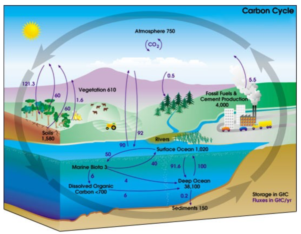
Sources of CO2

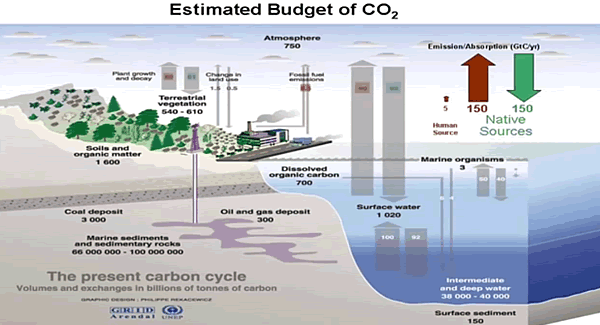
Note the size of the human emissions next to the red arrow.

A final reduction comes down to how much of the CO2 in the atmosphere is there because of us. Alarmists/activists say any increase in CO2 is 100% man-made, and would be more were it not for natural CO2 sinks, namely the ocean and biosphere. The claim overlooks the fact that those sinks are also sources of CO2 and the flux from the land and sea is an order of magnitude higher than estimates of human emissions. In fact, our few Gigatons of carbon are lost within the error range of estimating natural emissions. Insects produce far more CO2 than humans do by all our activity, including domestic animals.

Why Climate Reductionism is Dangerous

Reducing the climate in this fashion reaches its logical conclusion in the Activist notion of the “450 Scenario.”  Since Cancun, IPCC is asserting that global warming is capped at 2C by keeping CO2 concentration below 450 ppm. From Summary for Policymakers (SPM) AR5

Emissions scenarios leading to CO2-equivalent concentrations in 2100 of about 450 ppm or lower are likely to maintain warming below 2°C over the 21st century relative to pre-industrial levels. These scenarios are characterized by 40 to 70% global anthropogenic GHG emissions reductions by 2050 compared to 2010, and emissions levels near zero or below in 2100.

Thus is born the “450 Scenario” by which governments can be focused upon reducing human emissions without any reference to temperature measurements, which are troublesome and inconvenient. Almost everything in the climate world has been erased, and “Fighting Climate Change” is now code to mean accounting for fossil fuel emissions.

Conclusion

All propagandists begin with a kernel of truth, in this case the fact everything acting in the world has an effect on everything else. Edward Lorenz brought this insight to bear on the climate system in a ground breaking paper he presented in 1972 entitled: “Predictability: Does the Flap of a Butterfly’s Wings in Brazil Set Off a Tornado in Texas?”  Everything does matter and has an effect. Obviously humans impact on the climate in places where we build cities and dams, clear forests and operate farms. And obviously we add some CO2 when we burn fossil fuels.

But it is wrong to ignore the major dominant climate realities in order to exaggerate a small peripheral factor for the sake of an agenda. It is wrong to claim that IR active gases somehow “trap” heat in the air when they immediately emit any energy absorbed, if not already lost colliding with another molecule. No, it is the bulk gases, N2 and O2, making up the mass of the atmosphere, together with the ocean delaying the cooling and giving us the mild and remarkably stable temperatures that we enjoy. And CO2 does its job by radiating the heat into space.

Since we do little to cause it, we can’t fix it by changing what we do. The climate will not stop changing because we put a price on carbon. And the sun will rise despite the cock going on strike to protest global warming.

Footnote: For a deeper understanding of the atmospheric physics relating to CO2 and climate, I have done a guide and synopsis of Murry Salby’s latest textbook on the subject:  Fearless Physics from Dr. Salby

How Climatists Eclipsed the Sun

Recently, Dr. John Robson of the Climate Discussion Nexus (CDN) interviewed CERES co-team leader, Dr. Ronan Connolly, on the role of the Sun in recent climate change. Excerpts from ICECAP in italics with my bolds, followed by a video and my transcript from the closed captions.

CDN have now published their 20 minute “explainer” video including extracts from this interview and discussion of some of CERES’ recent scientific research. Although the video covers quite a few technical points, they are explained in a very clear and accessible manner.

Topics covered include:

The significance of the debates between the two main rival satellite estimates of solar activity trends since 1978, i.e., PMOD and ACRIM.

How using either PMOD or ACRIM to calibrate the pre-satellite era solar data can give very different estimates of how much solar activity has changed since the 19th century and earlier.

How politics and the UN’s Intergovernmental Panel on Climate Change (IPCC) reports have downplayed the possible role of solar activity in recent climate change.

The urbanization bias problem of current thermometer-based estimates of global temperature trends since the 19th century.

They say you should not look directly at the sun but when it comes to climate a lot of people take that advice to ridiculous extremes. That bright yellow ball in the sky is basically earth’s only source of energy though a very small amount radiates from the planet’s hot core. The sun’s output has been measured to a high degree of precision by satellites in orbit since the late 1970s. and we now know that it varies over time.

Since it is our only source of energy, if it gets stronger it stands to reason
that it could warm the climate.

Indeed there was a time about 20 years ago when many scientists believed that the sun had gotten a bit brighter during the 1980s and 1990s. And they even argued it was enough to explain much of the warming that had taken place.

But now agencies like the UN IPCC ( intergovernmental panel on climate change), NASA and others insist the change in solar output never happened. They say the warming can only be explained by greenhouse gases, so do not look at the sun.

People, something pretty basic doesn’t add up here.

If satellites are measuring the sun’s energy precisely, how can there be disagreement about what it’s been doing? The answer unfortunately is that there’s a gap in the satellite record, a gap that came about after the 1986 space shuttle challenger disaster. And as happens too much in this field, the gap quickly went from being a scientific problem to a political one. And the way that gap was handled is a story that deserves a little sunlight.

I’m John Robson and this is a climate discussion nexus backgrounder on the ACRIM gap controversy

The name ACRIM comes from an instrument called the Active Cavity Radiometer Irradiance Monitor that satellites use to measure solar output. And the amount of solar energy that hits the earth’s atmosphere is called the total solar irradiance or TSI measured in watts per square meter.

On average the sun provides about 1367 watts of energy per square meter continuously on the upper atmosphere. For comparison, all the carbon dioxide ever released from using fossil fuels is estimated by the IPCC to have added about 2 watts per square meter of energy to the atmosphere. And so given the overwhelming role of solar output in the total it shouldn’t take much of a change in the sun’s output to have a global influence on the climate.

We also have data on solar output from the pre-satellite era. For centuries astronomers have been keeping track of the number of dark circles or sunspots that appear on the surface of the sun. Galileo even wrote a book about them. The sunspot count rises and falls on a roughly 11-year cycle which provides clues to the changing strength of solar energy in the past. Scientists can also use evidence from chemical signatures in the earth, called cosmogenic isotopes, to reconstruct solar activity. As usual when you go backward in time on climate it’s only proxy data, and it’s considerably less precise than modern measurements.

Source IPCC Assessment Report #1

But by comparing proxies to satellite data since 1979 we get some idea of how to interpret the clues. In the IPCC’s first report in 1990 they presented a graph that summarized the prevailing view of the sun’s history over the 19th and 20th centuries. It showed the familiar sunspot cycle and also suggested average solar output grew stronger in the second half of the century but they said the changes were not large enough to cause much warming unless there are positive feedback mechanisms that amplify those changes.

But that qualification is not trivial because in fact the notion that carbon dioxide is the driver of warming itself depends on a series of positive feedback mechanisms. Because on its own the warming effect of CO2 is quite small. So there have been various proposals for amplifying mechanisms to increase its impact, which we’ll look at in more detail on another day.

When it comes to the sun basically the argument is that the sun doesn’t just affect how bright it is outside, it also influences how cloudy it is. And since some kinds of clouds have a major role in reflecting heat back into space if more solar output not only adds a bit of heat but also suppresses that kind of cloud formation, it can translate into a lot of surface warming.

So key point here: By the time of the IPCC’s third assessment report in 2001, their views about the sun’s history were getting more uncertain not less uncertain.  In AR3 in 2001, instead of having just one reconstruction of solar output, the IPCC now had multiple different ones to choose from. The reconstructions all agreed that solar output followed the sunspot cycle and they all agreed that solar output had increased over the 20th century.

Fig. 6.5 Reconstructions of total solar irradiance (TSI) by Lean et al. as well as Hoyt and Schatten 1993 updated.

But they disagreed over whether the increase was a lot or little and whether it had happened all at once early in the century or more gradually over the whole span. Since these differences arose from statistical estimates using proxy records, it didn’t look as though there would be an easy way to resolve the disagreements.

So attention turned to the modern satellite record with precise measurements of TSI available since 1978. It should have been possible to compare them with surface temperatures to see if there was any relationship. Unfortunately there was the problem we referred to at the outset: A big gap in the data. The satellites that carried the ACRIM system were first launched in 1978. From time to time satellites wear out and need to be replaced. A replacement satellite is supposed to be launched early enough so its ACRIM system overlaps with the existing one allowing the instruments to be calibrated to each other giving scientists a continuous record.

But as you can see, there’s a gap in the ACRIM record from June 1989 to October 1991. and that gap was a consequence of the space shuttle challenger disaster in January of 1986 that caused NASA’s satellite launch program to be suspended for several years.

By the time a new ACRIM system could be put into orbit in 1991 the old one had already been offline for two years. And the only data available to fill the gap was from a different monitor called the earth radiation budget system or ERB which flew on the Nimbus 7 satellite launched in 1978 as part of a separate series. That satellite didn’t have an acronym and unfortunately the ERB system was not meant to monitor solar output with much precision. Its sensors were pointed toward the earth so it could monitor the climate system and it only had a view of the sun during brief intervals of its orbit.. Also it generated two data series, called ERB and ERBS in the diagram, and they disagreed with each other regarding what the sun did during the ACRIM gap.

Still it was something to work with. In 1997 the lead scientist working on the ACRIM system RIchard Willson of Columbia University used the satellite data and all available information on the behavior of the onboard sensors in the various satellites to construct a composite ACRIM record. A comparison of the minimum points in the solar cycle suggested an increase in TSI from the early 1980s through to the end of the 1990s, after which solar output flattened out.

Since this broadly matched the progress of temperatures after 1980 it opened the door to the possibility that the sun might be responsible for some or all of recent climate changes. The alarmists didn’t like that result at all. In fact they reacted like that far side cartoon with the astronauts going blast the controls are jammed we’re headed right for Mr Sun.

So a few years later a different team led by Claus Fröhlich and Judith Lean published a new reconstruction of the same data that showed: Voila, no upward step, just the standard solar cycle steady downward trend after 1980. It’s called the PMOD reconstruction after the name of Fröhlich’s institute the Physical Meteorological Observatory in Davos. It had the convenient effect of ruling out the sun as a factor in climate change.

Now when I say convenient I do mean in the political sense. The authors made no secret of their motivation. In a recent article reviewing the whole episode scientist Ronan Connolly of the center for environmental research in earth science (CERES) massachusetts found some telling quotes from the authors and others working in the field. In a 2003 interview discussing the motivation for their research author Judith Lean stated the fact that some people could use Willson’s results as an excuse to do nothing about greenhouse gas emissions. It is one reason we felt we needed to look at the data ourselves. And in a later review published in 2014 Pia Zacharis of the international space science institute in switzerland conceded that the data adjustments are still a matter of active debate and have prevented the TSI community from coming up with a conclusive TSI composite so far.

But she went on to observe a conclusive TSI time series is not only desirable from the perspective of the scientific community but also when considering the rising interest of the public in questions related to climate change issues, “thus preventing climate skeptics from taking advantage of these discrepancies within the TSI community by for example putting forth a presumed solar effect as an excuse for inaction on anthropogenic warming.”

We spoke with scientist Ronan Connolly recently to discuss the ACRIM gap and how the IPCC handled the controversy. So the PMOD rival group took the ACRIM data and they’ve applied a series of adjustments which got rid of that rise in solar activity in the 80s and 90s, replacing it with a decline. The net effect shows a declining, effectively according to the PMOD, solar activity has been generally decreasing since at least 1970s.

If the ACRIM composite is correct then that would be consistent with a solar contribution because some of the warming in the 80s and 90s could be due to the solar activity. And then the reduction in warming, the pause or even a slight decline depending on the metric, that could be due to a reduction in solar activity. But if PMOD is correct then solar activity can’t really explain any of the global temperature trends during the satellite era.

Which gives us two things to think about. One is that if the sun’s output did get stronger over the 1980s and 1990s that means it bears some of the blame or gets some of the credit for warming the planet over that interval. Which is a valid argument for not blaming everything on greenhouse gases, especially since the sun’s subsequently quieting down coincides with two long pauses in any warming detected by satellites.

Second, the other thing is that we have scientists talking as if their motivation is not just finding the truth. It’s preventing so-called inaction on climate change and feeling no need to hide such a motive. On the  contrary they seem to be broadcasting it. And if you’re going to come right out and tell us that your goal is to push a policy agenda whether it’s scientifically justified or not, don’t act surprised when we ell you we’re skeptical about your results.

One group that wasn’t skeptical was the IPCC in their fourth assessment report or AR4 in 2007 they showed both the Willson series here in violet and the Piedmont series which is green. But in their next report in 2013 while they still mentioned the Willson series they dropped it from their calculations and said from now on they would only use the PMOD series that told them what they wanted to hear.

Namely that with no increase in solar output there’s no way to blame the sun for global warming so it must be all your fault

Which is one way to do science but what kind of way? My own experience is that there’s a lot of scientists that feel a lot of pressure to conform their work to the IPCC. The IPCC has become a very dominant political body within the scientific community.

How did the PMOD team come up with a different answer than Willson’s group? By arguing that one of the sensors on the ERB system was defective and experienced an increase in its sensitivity during its time in orbit, adding an artificial upward trend to its readings. The PMOD team corrected this supposed defect by pushing the later part of their data downward, thus erasing the increase and getting the result they were looking for.

But did the ERB system actually suffer this malfunction? In 2008 Richard Willson and another of
his co-authors physicist Nicola Scafetta of the university of Naples tracked down Dr Douglas Hoyt, the scientist who’d been in charge of the ERB satellite mission at the time but had since retired. And they asked him and Hoyt emailed them back the following:

Dear Dr. Scafetta:

Concerning the supposed increase in Nimbus 7 sensitivity at the end of September 1989 and other matters as proposed by Fröhlich’s PMOD TSI composite:

1.there is no known physical change in the electrically calibrated nimbus 7 radiometer or its electronics that could have caused it to become more sensitive. At least neither Lee Kyle nor I could never imagine how such a thing could happen. And no one else has ever come up with a physical theory for the instrument that could cause it to become more sensitive.

2.  The Nimbus-7 radiometer was calibrated electrically every 12 days. The calibrations before and after the September shutdown gave no indication of any change in the sensitivity of the radiometer. Thus, when Bob Lee of the ERBS team originally claimed there was a change in Nimbus 7 sensitivity, we examined the issue and concluded there was no internal evidence in the Nimbus 7 records to warrant the correction that he was proposing. Since the result was a null one, no publication was thought necessary.

3. Thus Fröhlich’s  PMOD TSI composite is not consistent with the internal data or physics of the Nimbus 7 cavity radiometer.

4. The correction of the Nimbus 7 tsi values for 1979 through 1980 proposed by Fröhlich is also puzzling. The raw data was run through the same algorithm for these early years and the subsequent years and there is no justification for Freulich’s adjustment in my opinion.

Sincerely Douglas Hoyt

Yeah puzzling, though we can think of other words like suspicious. So let’s look again at the various reconstructions of solar output. In the 2007 IPCC report here’s the range they admitted was possible from the 1600s to the turn of the century. And typically the uncertainty increases as you go backwards, but there are ways to try to decrease it. In that review article I mentioned by Ronan Connolly and 22 co-authors, when they surveyed the various ways experts have used the satellite and proxy records, they found 16 possible reconstructions of solar activity since 1600: Eight yielding fairly low variability and eight fairly high variability.

To illuminate solar influence on temperature these authors also took a close look at the other side of the equation, surface temperature data, and constructed a new climate record for the northern hemisphere using only rural weather stations and data collected over the sea surface to avoid contamination from urban heat islands. Then they coupled this with tree ring proxy data to assemble a temperature estimate covering the same interval as the solar series.

Putting the solar and temperature data together depending on which solar reconstruction you pick the sun turns out to explain either none of the observed warming or all of it or somewhere in between. So we can get a result from nothing to almost all of the temperature changes since 19th century in terms of solar activity depending on whether ACRIM is correct or PMOD is correct.

Now that result doesn’t mean we get to cherry pick the result we like and say, aha we’ve proven that the sun causes all climate change. But neither can the alarmists go, aha we’ve proven that the sun causes none of it. And the trouble is they do it when they put out reports confidently declaring that warming is all due to greenhouse gases.

They don’t tell you that their calculation is based on using one specific solar reconstruction and a lot of temperature data from cities which have grown bigger and hotter since the start of the 21st century.

I’m going to leave you here with one more quote from another scientist working in the solar measurement field. In a 2012 review paper physicist Michael Lockwood discussed all the difficulties in trying to reconstruct solar output and measure its current effects and lamented:
“The academic reputation of the field of sun climate relations is poor because many studies do not address all or even some of the limitations listed above. It is also a field that in recent years has been corrupted by unwelcome political and financial influence as climate change skeptics have seized upon putative solar effects as an excuse for inaction on anthropogenic warming.”

It’s strange when scientists insist that there’s political and financial corruption in their field but it only ever goes in one direction. And it’s not the direction the funders want because, don’t forget, climate research is funded overwhelmingly by governments who believe in a man-made global warming crisis.  And it’s also weird when they say that people drawing logical conclusions about the policy implications of the sun having a significant impact on climate are “just making excuses.”

I don’t expect these scientists want any advice from me but I’m going to give it to them anyway.

When you keep telling us that your motivation is to promote a costly policy agenda whether it’s scientifically justified or not;

and you keep getting caught trying to conceal the fact that you’re not nearly as certain about your conclusions as the IPCC keeps claiming;

and you keep getting caught fiddling data series;

and when challenged you substitute abuse for argument;

It makes the general public more skeptical and not less.

So please look up, because for the climate discussion nexus, I’m John Robson and I am looking at the Sun.

Europe’s Alps: From White to Green and Back Again

The usual suspects (BBC, Science Focus, Phys.org, The Independent, Metro UK, etc.) are worried that green spaces are visible from space, and snow cover will continue to retreat, with bad consequences for the Alpine eco-system, unless we stop burning fossil fuels.  This is triggered by a new paper by Sabine Rumpf et al. From white to green: Snow cover loss and increased vegetation productivity in the European Alps.  Excerpts from Science Focus in italics with my bolds.

Snow in the European Alps is melting and invasive plant species are outcompeting native Alpine plants, satellite imagery has shown. Both findings will reinforce climate change, say scientists.

The changes noticed in a new study, which uses satellite data from 1984 to 2021, show that as much as 77 per cent of the Alps has experienced greening, where areas with previously low vegetation have suddenly seen a boom in plant growth.

While the new plants do take a small amount of carbon out of the atmosphere by photosynthesis, scientists say the greening has a much bigger negative effect on climate change, as less of the Sun’s light will be reflected away from the Earth meaning the planet will get warmer.

The Alps are expected to see a reduction in snow mass of up to 25 per cent in the next 10-30 years, according to the Intergovernmental Panel on Climate Change’s 2019 report. As the snow melts, there will be more rock falls and landslides, which could have devastating consequences.

The new study shows that the Alps is experiencing snow cover recession that can already be seen from space, which the authors warn will only get worse as time goes on.

In the changing mountain environments, native Alpine plants have suffered while new species have thrived. This is because the plants specialised to higher elevations have had to focus on long-term living in the Alps, sacrificing the characteristics that could make them more competitive in the short term.

However, over time Alpine Temperatures and Snow are variable in quasi-cycles

For example, consider Change in temperature for the Greater Alpine Region, 1760–2007: Single years and 20-year smoothed mean series from the European Environment Agency (EEA)

Yes there are warming and cooling periods, and a rise recently.  However, summer minus winter half-years have declined the last century.  Calendar year averages peaked in 1994.  So the certainty about present conditions “only getting worse” is founded on faith rather than facts.

Then consider the record of snow cover over a longer period than the last thirty years.  Rutgers Snow Lab provides this graph:

So a lot of decadal variation is evident.  While 2020-21 snow extent is down from a peak in 2016, it was lower in 2007, and very much lower in 1988-1990.  True, the last 30 years had generally less snow than 30 years prior to 1990. But who is to say that the next 30 won’t see a return to earlier levels, still with large decadal fluxes.

And a longer term view of Alpine glaciers, shows how much climate change has gone on without the benefit of CO2 from humans.


Summer Temperatures (May – September) A rise in temperature during a warming period will result in a glacier losing more surface area or completely vanishing. This can happen very rapidly in only a few years or over a longer period of time. If temperatures drop during a cooling period and summer temperatures are too low, glaciers will begin to grow and advance with each season. This can happen very rapidly or over a longer period in time. Special thanks to Prof. em. Christian Schlüchter / (Quartärgeologie, Umweltgeologie) Universität Bern Institut für Geologie His work is on the Western Alps and was so kind to help Raymond make this graphic as correct as possible.

Summary

The combination of mild warming and higher CO2 has greatly benefited the biosphere globally, resulting in setting crop yield records nearly every year.  It should not be surprising that Europe’s Alps participated in this greening of the land.  But I object to the notion that humans caused it or can stop it by reducing emissions.  We do not control the climate or weather, and both warming and cooling periods will come and go as they always have.


UAH Shows May Reversed April Warming Blip

The post below updates the UAH record of air temperatures over land and ocean.  But as an overview consider how recent rapid cooling  completely overcame the warming from the last 3 El Ninos (1998, 2010 and 2016).  The UAH record shows that the effects of the last one were gone as of April 2021, again in November 2021 and February 2022. (UAH baseline is now 1991-2020).

For reference I added an overlay of CO2 annual concentrations as measured at Mauna Loa.  While temperatures fluctuated up and down ending flat, CO2 went up steadily by ~55 ppm, a 15% increase.

Furthermore, going back to previous warmings prior to the satellite record shows that the entire rise of 0.8C since 1947 is due to oceanic, not human activity.

gmt-warming-events

The animation is an update of a previous analysis from Dr. Murry Salby.  These graphs use Hadcrut4 and include the 2016 El Nino warming event.  The exhibit shows since 1947 GMT warmed by 0.8 C, from 13.9 to 14.7, as estimated by Hadcrut4.  This resulted from three natural warming events involving ocean cycles. The most recent rise 2013-16 lifted temperatures by 0.2C.  Previously the 1997-98 El Nino produced a plateau increase of 0.4C.  Before that, a rise from 1977-81 added 0.2C to start the warming since 1947.

Importantly, the theory of human-caused global warming asserts that increasing CO2 in the atmosphere changes the baseline and causes systemic warming in our climate.  On the contrary, all of the warming since 1947 was episodic, coming from three brief events associated with oceanic cycles. 

Update August 3, 2021

Chris Schoeneveld has produced a similar graph to the animation above, with a temperature series combining HadCRUT4 and UAH6. H/T WUWT

image-8


mc_wh_gas_web20210423124932

See Also Worst Threat: Greenhouse Gas or Quiet Sun?

May Update NH Land and SH Ocean Warming Reversed

banner-blog

With apologies to Paul Revere, this post is on the lookout for cooler weather with an eye on both the Land and the Sea.  While you will hear a lot about 2020-21 temperatures matching 2016 as the highest ever, that spin ignores how fast the cooling set in.  The UAH data analyzed below shows that warming from the last El Nino was fully dissipated with chilly temperatures in all regions.  Last month NH land and SH ocean showed temps matching March, reversing an upward blip in April.

UAH has updated their tlt (temperatures in lower troposphere) dataset for May 2022.  Previously I have done posts on their reading of ocean air temps as a prelude to updated records from HadSST3 (which is now discontinued). So I have separately posted on SSTs using HadSST4 April Cool Ocean Temps.  This month also has a separate graph of land air temps because the comparisons and contrasts are interesting as we contemplate possible cooling in coming months and years. Sometimes air temps over land diverge from ocean air changes.  However, last month showed that while air temps over Tropical ocean warmed slightly,  strong cooling over NH and SH, both land and sea, brought the Global anomaly down, back to March 2022 level. 

Note:  UAH has shifted their baseline from 1981-2010 to 1991-2020 beginning with January 2021.  In the charts below, the trends and fluctuations remain the same but the anomaly values change with the baseline reference shift.

Presently sea surface temperatures (SST) are the best available indicator of heat content gained or lost from earth’s climate system.  Enthalpy is the thermodynamic term for total heat content in a system, and humidity differences in air parcels affect enthalpy.  Measuring water temperature directly avoids distorted impressions from air measurements.  In addition, ocean covers 71% of the planet surface and thus dominates surface temperature estimates.  Eventually we will likely have reliable means of recording water temperatures at depth.

Recently, Dr. Ole Humlum reported from his research that air temperatures lag 2-3 months behind changes in SST.  Thus the cooling oceans now portend cooling land air temperatures to follow.  He also observed that changes in CO2 atmospheric concentrations lag behind SST by 11-12 months.  This latter point is addressed in a previous post Who to Blame for Rising CO2?

After a change in priorities, updates are now exclusive to HadSST4.  For comparison we can also look at lower troposphere temperatures (TLT) from UAHv6 which are now posted for May.  The temperature record is derived from microwave sounding units (MSU) on board satellites like the one pictured above. Recently there was a change in UAH processing of satellite drift corrections, including dropping one platform which can no longer be corrected. The graphs below are taken from the revised and current dataset.

The UAH dataset includes temperature results for air above the oceans, and thus should be most comparable to the SSTs. There is the additional feature that ocean air temps avoid Urban Heat Islands (UHI).  The graph below shows monthly anomalies for ocean temps since January 2015.

Note 2020 was warmed mainly by a spike in February in all regions, and secondarily by an October spike in NH alone. In 2021, SH and the Tropics both pulled the Global anomaly down to a new low in April. Then SH and Tropics upward spikes, along with NH warming brought Global temps to a peak in October.  That warmth was gone as November 2021 ocean temps plummeted everywhere. A upward bump 01/2022 was reversed in 02/2022 before temps rose again in 03/2022.  Last month ocean temps in both NH and SH dropped sharply, pulling down the Global anomaly, despite some Tropical warming.

Land Air Temperatures Tracking Downward in Seesaw Pattern

We sometimes overlook that in climate temperature records, while the oceans are measured directly with SSTs, land temps are measured only indirectly.  The land temperature records at surface stations sample air temps at 2 meters above ground.  UAH gives tlt anomalies for air over land separately from ocean air temps.  The graph updated for May is below.

Here we have fresh evidence of the greater volatility of the Land temperatures, along with extraordinary departures by SH land.  Land temps are dominated by NH with a 2021 spike in January,  then dropping before rising in the summer to peak in October 2021. As with the ocean air temps, all that was erased in November with a sharp cooling everywhere. Land temps dropped sharply for four months, even more than did the Oceans. March and April saw some warming, reversed In May when all land regions cooled pulling down the global anomaly.

The Bigger Picture UAH Global Since 1980

The chart shows monthly Global anomalies starting 01/1980 to present.  The average monthly anomaly is -0.06, for this period of more than four decades.  The graph shows the 1998 El Nino after which the mean resumed, and again after the smaller 2010 event. The 2016 El Nino matched 1998 peak and in addition NH after effects lasted longer, followed by the NH warming 2019-20.   A small upward bump in 2021 has been reversed with temps having returned close to the mean as of 2/2022.  March and April brought warmer Global temps, reversed in May and with little indication for another El Nino this summer.

TLTs include mixing above the oceans and probably some influence from nearby more volatile land temps.  Clearly NH and Global land temps have been dropping in a seesaw pattern, nearly 1C lower than the 2016 peak.  Since the ocean has 1000 times the heat capacity as the atmosphere, that cooling is a significant driving force.  TLT measures started the recent cooling later than SSTs from HadSST3, but are now showing the same pattern.  It seems obvious that despite the three El Ninos, their warming has not persisted, and without them it would probably have cooled since 1995.  Of course, the future has not yet been written.


Silence of Conservative Lambs

The 1991 blockbuster movie revolved around meek, silent victims preyed upon by malevolent believers in their warped, twisted view of the world.  A comparison can be drawn between how today’s conservative thinkers and politicians respond to advocates of the pernicious global warming/climate change ideology. Instead of challenging and pushing back against CO2 hysteria, and speaking out with a rational climate perspective, Republicans in the US, and Conservatives in Canada and elsewhere are meek and silent lambs in the face of this energy slaughter.  Worse, when they do speak it is to usually to pander and try to appease offering proposals for things like carbon taxes or other non-remedies for a non-problem, essentially ceding the case to leftists.

Tom Harris of International Climate Science Coalition – Canada explains in his Financial Post article Tom Harris: The Tories should shape climate opinion, not just respond to it.  Excerpts in italics with my bolds and added images from Friends of Science billboard campaign.

Grassroots conservatives need to ask CPC leadership candidates why, if they really support Canadian energy, they don’t contest climate alarmism

When CPC leadership candidates defend Canadian oil and gas, they either support, acquiesce to, or say nothing about the climate scare. PHOTO BY JOE RAEDLE/GETTY IMAGES

The common wisdom among candidates for leadership of the Conservative Party of Canada (CPC) is that the party must have a credible plan to reduce greenhouse gas emissions if it is to have a fighting chance to form the next government. As former Quebec premier Jean Charest said in the Edmonton debate on May 11, “we will not be elected as a political party if we’re not credible” about putting a price on carbon for large emitters.

The strategists’ thinking is that, given current public support for reducing emissions to “stop climate change,” the CPC has no choice but to follow along or risk electoral defeat. And public opinion polls, like one from Abacus Data last October, do typically find that a majority of Canadians, in that poll 66 per cent, “would like to see governments in Canada put more emphasis on reducing emissions.”

[For the politics of climate polling see Uncensored: Canadians View Global Warming]

But the strategists are wrong. The candidates are giving up a golden opportunity to win the votes, not just of the many grassroots conservatives who oppose the climate scare,
but of Canadians at large in the next election.

A 2012 paper published in the journal Climatic Change suggests why. Three scholars — Robert J. Brulle of Drexel University, Jason Carmichael of McGill and J. Craig Jenkins of Ohio State — looked at 74 separate surveys over a nine-year period to try to figure out which factors had the greatest influence on public views on climate change. They considered five possibilities: extreme weather events, scientific information, media coverage, advocacy, and what politicians and political parties were saying on the subject. Surprisingly, they found that neither extreme weather events nor the promulgation of scientific information had a significant impact. Media coverage did, but the strongest effect came from the positions of competing politicians and political parties.

When politicians across the political spectrum supported the narrative
of man-made climate change, the public’s demand for action rose.

We see that today in Canada, with all major political parties supporting action on greenhouse gas emissions. On the other hand, when politicians questioned the narrative, as Congressional Republicans frequently did, the public’s demand for action dropped — substantially. The scholars’ analysis supported the 2009 conclusion of Harvard University’s Susan McDonald that: “When elites have consensus, the public follows suit and the issue becomes mainstreamed.

When elites disagree, polarization occurs, citizens rely on other indicators
to make up their minds.”

These findings are consistent with other studies that have demonstrated the leading role politicians and political parties play in shaping public opinion on issues. It’s a little like the tail wagging the dog but public opinion supporting government climate policy seems at least partly due to the lack of coherent opposition to the policy on the part of opinion-makers — especially elected officials.

If that’s true, then instead of citing public opinion polls that support climate policies they may be skeptical of, why don’t politicians and political strategists work to change public opinion? As conservative strategist and former policy aide to Stephen Harper, Joseph Ben-Ami, put it in a 2021 study for ICSC-Canada: “The answer may come down to inexperienced politicians and their advisers not understanding their power to influence public opinion. They look at polls and conclude that they have no hope of getting elected unless they climb onto the current public opinion bandwagon.

They fail to understand that the reason the public believes what it does is largely because they (politicians) aren’t making the opposite case.”

This phenomenon is widespread in Canada, and on many topics, not just climate change. At all levels of government, politicians use language and promote policies they very likely disagree with because they think public opinion leaves them no choice. As Ben-Ami argues, the result is a “feedback loop” where politicians’ “response” to public opinion is in reality the principal driver of the public opinion to which they are supposedly responding. The more obsequious their responses, the more entrenched that public opinion becomes, which then results in even more obsequious responses from even more frightened politicians.

Climate activists don’t pull their punches. They want an end
to all of Canada’s oil and gas development as soon as possible.

And, sadly, they are being helped by many in the press, government and other institutions. But a fast phase-out would be immensely costly. Besides contributing $105 billion to Canada’s GDP in 2020, oil and gas provided $10 billion in average annual revenue to governments between 2017 and 2019. Yet, when CPC leadership candidates defend Canadian oil and gas, they either support, acquiesce to, or say nothing about the climate scare.

Grassroots conservatives need to ask the candidates why, if they really support Canadian energy, they don’t contest climate alarmism, which is by far the greatest threat to that energy.

Tom Harris is executive director of International Climate Science Coalition – Canada.

Footnote: 

The billboards are from a campaign to inform the public by Friends of Science, not to be confused with the predatory Fiends  Friends of the Earth in the UK.

Calgary Climate Change Billboard campaign shows
Five Key Points of Cli-Sci Uncertainty says Friends of Science