AWI sea-ice physicists have erected an ice camp to investigate melt ponds on Arctic sea ice. Credit: Photo : Alfred-Wegener-Institut / Mar Fernandez
Two recent papers enrich our understanding of interactions between oceans, ice and dissolved methane. The latest one is described in a Science Daily article Wandering greenhouse gas Climate models need to take into account the interaction between methane, the Arctic Ocean and ice by E. Damm et al. of Alfred Wegener Institute March 16, 2018. Excerpts with my bolds.
On the seafloor of the shallow coastal regions north of Siberia, microorganisms produce methane when they break down plant remains. If this greenhouse gas finds its way into the water, it can also become trapped in the sea ice that forms in these coastal waters. As a result, the gas can be transported thousands of kilometres across the Arctic Ocean and released in a completely different region months later.
AWI geochemist Dr Ellen Damm tested the waters of the High North for the greenhouse gas methane. In an expedition to the same region four years later, she had the chance to compare the measurements taken at different times, and found significantly less methane in the water samples.
Ellen Damm, together with Dr Dorothea Bauch from the GEOMAR Helmholtz Centre for Ocean Research in Kiel and other colleagues, analysed the samples to determine the regional levels of methane, and the sources. By measuring the oxygen isotopes in the sea ice, the scientists were able to deduce where and when the ice was formed. To do so, they had also taken sea-ice samples. Their findings: the ice transports the methane across the Arctic Ocean. And it appears to do so differently every year.
“As more seawater freezes it can expel the brine contained within, entraining large quantities of the methane locked in the ice,” explains AWI researcher Ellen Damm. As a result, a water-layer is formed beneath the ice that contains large amounts of both salt and methane. Yet the ice on the surface and the dense saltwater below, together with the greenhouse gas it contains, are all pushed on by the wind and currents. According to Thomas Krumpen, “It takes about two and a half years for the ice formed along the coast of the Laptev Sea to be carried across the Arctic Ocean and past the North Pole into the Fram Strait between the east cost of Greenland and Svalbard.” Needless to say, the methane trapped in the ice and the underlying saltwater is along for the ride.
The rising temperatures produced by climate change are increasingly melting this ice. Both the area of water covered by sea ice and the thickness of the ice have been decreasing in recent years, and thinner ice is blown farther and faster by the wind. “In the past few years, we’ve observed that ice is carried across the Arctic Ocean faster and faster,” confirms Thomas Krumpen. And this process naturally means major changes in the Arctic’s methane turnover. Accordingly, quantifying the sources, sinks and transport routes of methane in the Arctic continues to represent a considerable challenge for the scientific community.
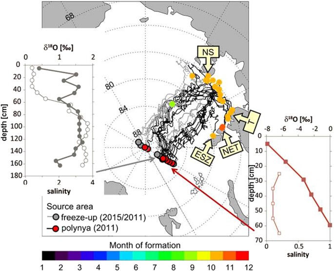
Sea ice drift trajectories leading to the 60°E section and δ18O isotopic composition (filled symbols) and salinity (open symbols) in sea ice at this section. Backward drift trajectories from the 60°E section show the sea ice formation areas, i.e. off shore within the Laptev Sea and in the coastal polynya areas. Trajectories were calculated based on a combination of sea ice motion and concentration products from passive microwave satellite data. The colour of the end node indicates the source area of sampled sea ice. Trajectories with red end nodes were formed in polynyas, namely the New Siberian (NS) Polynya, Taymyr (T) Polynya, Northeastern Taymyr (NET) Polynya and East Severnaya Zemlya (ESZ) Polynya. Grey end nodes refer to trajectories that were formed during freeze-up further offshore. The colour coding of the start node characterizes the month of formation (primarily October) of the individual trajectories. The δ18O ice isotopic composition reflects the δ18O composition of the water column from which each segment of the ice core was formed. Light values below about −4‰ indicate formation in coastal polynyas while values above −2‰ indicate freeze-up formation offshore. Salinity of the ice cores is in all cases below 4. The map is generated with IDL (Interactive Data Langue), software for analysis and visualization of data provided by Harris Geospatial Solutions (http://www.harrisgeospatial.com).
Abstract: Methane sources and sinks in the Arctic are poorly quantified. In particular, methane emissions from the Arctic Ocean and the potential sink capacity are still under debate. In this context sea ice impact on and the intense cycling of methane between sea ice and Polar surface water (PSW) becomes pivotal. We report on methane super- and under-saturation in PSW in the Eurasian Basin (EB), strongly linked to sea ice-ocean interactions.
In the southern EB under-saturation in PSW is caused by both inflow of warm Atlantic water and short-time contact with sea ice. By comparison in the northern EB long-time sea ice-PSW contact triggered by freezing and melting events induces a methane excess. We reveal the Transpolar Drift Stream as crucial for methane transport and show that inter-annual shifts in sea ice drift patterns generate inter-annually patchy methane excess in PSW.
Using backward trajectories combined with δ18O signatures of sea ice cores we determine the sea ice source regions to be in the Laptev Sea Polynyas and the off shelf regime in 2011 and 2015, respectively. We denote the Transpolar Drift regime as decisive for the fate of methane released on the Siberian shelves.
From the study conclusions: Our study is focused on sea ice-ocean interaction, while the role of sea ice–air fluxes and oxidation as pathways of methane in the Arctic need further investigation.
Our study confirms that methane release from sea ice is coupled to the ice freeze and melt cycle. Hence the intensity of freeze events in winter and the amount of summer sea ice retreat primarily triggers how much methane is released during transport within the TDS in the central Arctic.
To which extent the interior Arctic Ocean might act as a final or just a temporal sink, i.e. with final efflux to the atmosphere, is another open question. Furthermore, sea ice retreat, thinning, and decreasing multiyear and increasing first-year sea ice will have, yet, unconsidered consequences for the sea ice-air exchange and the source-sink balance of the greenhouse gas methane in the Arctic. In addition to the potential source capacity for efflux from the northern Eurasian Basin, the potential sink capacity of the southern EB for atmospheric methane might be enhanced if the volume of inflowing AW increases and the region becomes seasonally ice free in the future.
Trapped in ocean sediments near continents lie ancient reservoirs of methane called methane hydrates. These ice-like water and methane structures encapsulate so much methane that many researchers view them as both a potential energy resource and an agent for environmental change. In response to warming ocean waters, hydrates can degrade, releasing the methane gas. Scientists have warned that release of even part of the giant reservoir could significantly exacerbate ongoing climate change.
However, methane only acts as a greenhouse gas if and when it reaches the atmosphere — a scenario that would occur only if the liberated methane travelled from the point of release at the seafloor to the surface waters and the atmosphere.
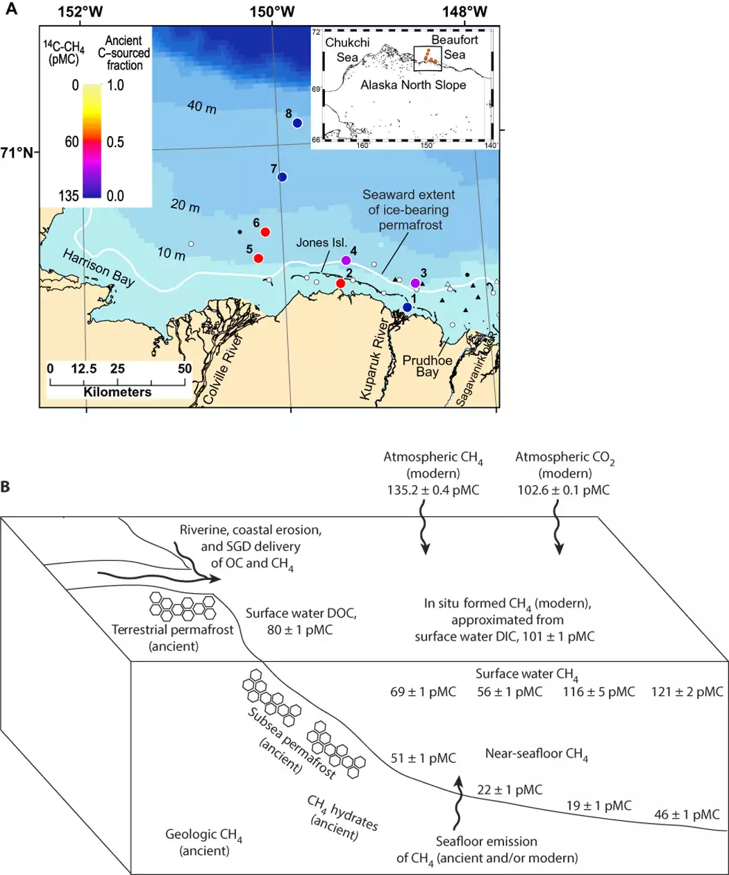
A team of scientists conducted fieldwork just offshore of the North Slope of Alaska, near Prudhoe Bay. Sparrow calls the spot “ground zero” for oceanic methane emissions resulting from ocean warming. In some parts of the Arctic Ocean, the shallow regions near continents may be one of the settings where methane hydrates are breaking downnow due to warming processes over the past 15,000 years. In addition to methane hydrates, carbon-rich permafrost that is tens of thousands of years old — and found throughout the Arctic on land and in seafloor sediments — can produce methane once this material thaws in response to warming. With the combination of the aggressive warming occurring in the Arctic and the shallow water depths, any released methane has a short journey from emission at the seafloor to release into the atmosphere.
“We do observe ancient methane being emitted from the seafloor to the overlying seawater, confirming past suspicions,” Kessler says. “But, we found that this ancient methane signal largely disappears and is replaced by a different methane source the closer you get to the surface waters.” The methane at the surface is instead from recently produced organic matter or from the atmosphere.
“We found that very little ancient methane reaches surface waters even in the relatively shallow depths of 100 feet. Exponentially less methane would be able to reach the atmosphere in waters that are thousands of feet deep at the very edge of the shallow seas near continents, which is the area of the ocean where the bulk of methane hydrates are,” Sparrow says. “Our data suggest that even if increasing amounts of methane are released from degrading hydrates as climate change proceeds, catastrophic emission to the atmosphere is not an inherent outcome.”
It seems our knowledge of Arctic methane is incomplete but growing. It is good news to understand how ancient methane released from sediment is neutralized by ocean processes before it can be released. And it is also good that methane captured by shelf sea ice is transported to the North Pole.
Footnote:
The news releases repeat the erroneous claim that methane (CH4) is 25 times more powerful GHG than CO2. That exaggerated number comes from comparing the two gases on a mass basis. Because CH4 has a lesser atomic weight, a kilogram will have more molecules than the same mass of CO2. But radiative activity depends on the volume, not the mass.
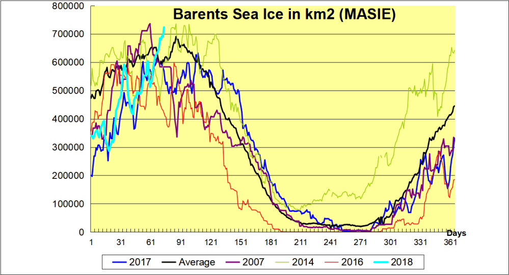
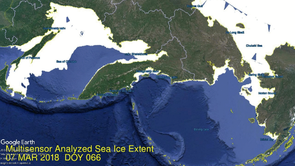
After stalling first week of March, Arctic ice is coming on strong now. The image above shows the last week, setting new maximums for 2018 for NH overall, as well in Barents Sea. The graph below shows that as of yesterday, Barents is well above the 11 year average, and even ahead of 2014 the highest year in the decade.
Meanwhile ice extent is increasing on the Pacific side as well. Bering rapidly grew 200k km2 in a week, setting a new 2018 maximum, while Okhotsk added 110k km2 for a new max ice extent there.
The graph below shows how strongly the Arctic is now freezing over.
Note the average max on day 62 and 2018 max yesterday on day 74, now matching 2007 and 120k km2 above last year. SII (NOAA) continues to show ~200k km2 less extent.
Drift ice in Okhotsk Sea at sunrise.
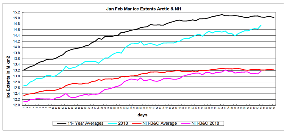
The graph below shows 2018 NH ice extents since day 1, with and without the Pacific basins Bering and Okhotsk, compared to 11 year averages (2007 to 2017 inclusive).
The deficit is almost entirely due to Bering, with the shortfall closing in the last week.
Over land the northern hemisphere Globsnow snow-water-equivalent SWE product and over sea the OSI-SAF sea-ice concentration product. Credit: Image courtesy of Finnish Meteorological Institute
Excerpts below include both factual and speculative content (with my bolds.)
The new Arctic Now product shows with one picture the extent of the area in the Northern Hemisphere currently covered by ice and snow. This kind of information, which shows the accurate state of the Arctic, becomes increasingly important due to climate change.
In the Northern Hemisphere the maximum seasonal snow cover occurs in March. “This year has been a year with an exceptionally large amount of snow, when examining the entire Northern Hemisphere. The variation from one year to another has been somewhat great, and especially in the most recent years the differences between winters have been very great,” says Kari Luojus, Senior Research Scientist at the Finnish Meteorological Institute.
The information has been gleaned from the Arctic Now service of the Finnish Meteorological Institute, which is unique even on a global scale. The greatest difference compared with other comparable services is that traditionally they only tell about the extent of the ice or snow situation.
“Here at the Finnish Meteorological Institute we have managed to combine data to form a single image. In this way we can get a better situational picture of the cryosphere — that is, the cold areas of the Northern Hemisphere,” Research Professor Jouni Pulliainen observes. In addition to the coverage, the picture includes the water value of the snow, which determines the water contained in the snow. This is important information for drafting hydrological forecasts on the flood situation and in monitoring the state of climate and environment in general.
Information on the amount of snow is also sent to the Global Cryosphere Watch service of the World Meteorological Organisation (WMP) where the information is combined with trends and statistics of past years. Lengthy series of observation times show that the total amount of snow in the Northern Hemisphere has declined in the spring period and that the melting of the snow has started earlier in the same period. Examination over a longer period (1980-2017) shows that the total amount of snow in all winter periods has decreased on average.
Also, the ice cover on the Arctic Ocean has grown thinner and the amount and expanse of perennial ice has decreased. Before 2000 the smallest expanse of sea ice varied between 6.2 and 7.9 million square kilometres. In the past ten years the expanse of ice has varied from 5.4 to 3.6 million square kilometres. Extreme weather phenomena — winters in which snowfall is sometimes quite heavy, and others with little snow, will increase in the future. (Speculation for sure.)
Here is the MASIE chart from yesterday, confirming extensive snow this year:
An update to yesterdays post Premature Arctic Ice Fears which discussed lop-sided media coverage of a temporary ice shortfall in Bering Sea. Now today, the image above shows that in just five days, that deficit has been obliterated. Since day 66, Bering added 170k km2 to go over 400k km2, close to the previous Bering high in 2018 on day 34. That was the last Arctic region where some alarm could be raised. Overall, 2018 is now higher than 2017 at this date, having reached a new maximum of 14.6M km2.
The alarms are sounding about lack of ice extent in Bering Sea, studiously ignoring what else is happening in the Arctic. For instance the above image shows the last 10 days on the European side, with Barents Sea on the right growing steadily to a new maximum. On the left, Gulf of St. Lawrence ice is retreating as usual while Baffin Bay holds steady.
The Barents recovery is interesting and bears watching. See how 2018 compares with other years in the Graph below.
Note the recent 2018 dramatic rise above average. Meanwhile on the Pacific side the seesaw between Bering and Okhotsk continues:
In the last ten days, Bering has gone up, then down, and back up to arrive at the same extent. In the same period Okhotsk added 70k km2.
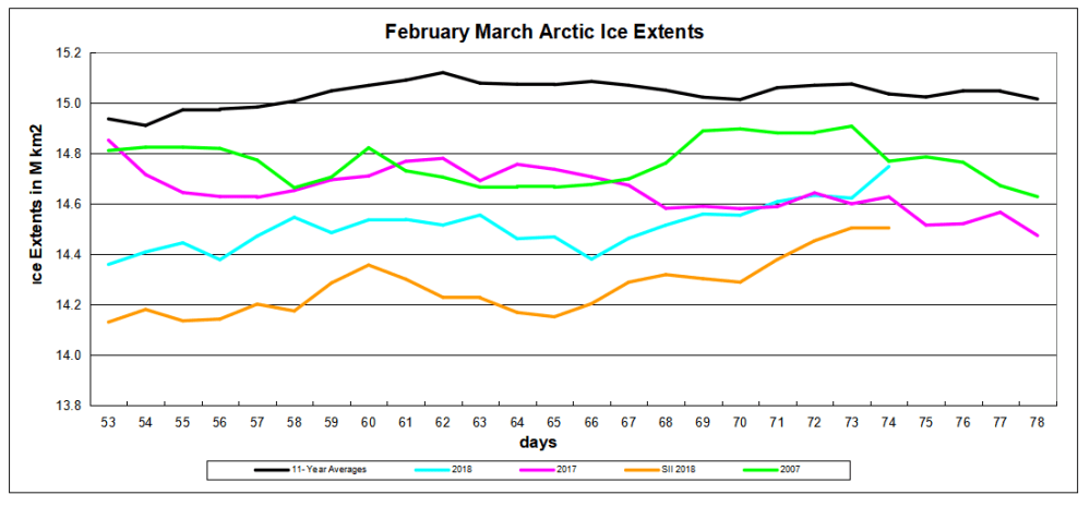
Ice extents for February and March appear in the graph below; 11 year average is 2007 to 2017 inclusive.
Note that ice growth slows down in February and March since the Arctic core is frozen and extent can only be added at the margins. MASIE shows 2018 is now matching 2017, while SII is running about 200k km2 lower. The 11 year average maxed on day 62 at 15.1M km2 while this year max was on day 69, ~560k km2 lower . It remains to be seen what max will end up in 2018
It is natural for alarmists to focus on Bering Sea, since that is the only place where a sizable deficit appears (for the moment). The graph below show NH ice extent from day 1, with and without B and O (Bering and Okhotsk, the Pacific basins that will melt out by September anyway.)
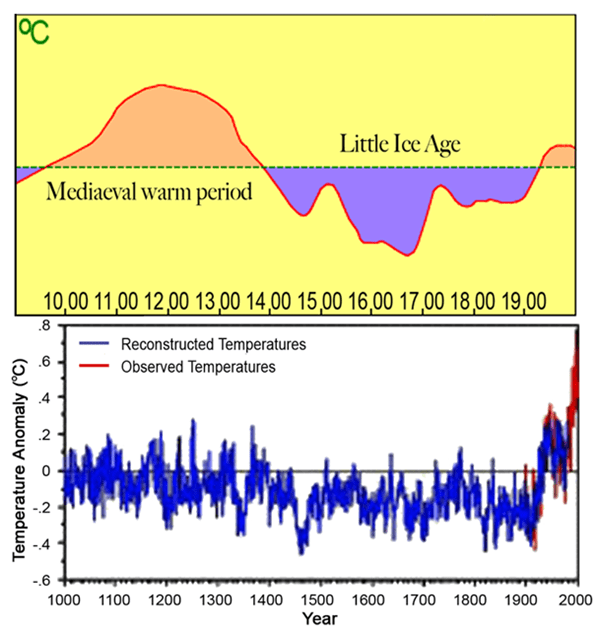
The first graph appeared in the IPCC 1990 First Assessment Report (FAR) credited to H.H.Lamb, first director of CRU-UEA. The second graph was featured in 2001 IPCC Third Assessment Report (TAR) the famous hockey stick credited to M. Mann.
A previous post Rise and Fall of CAGW described the process that began with Hansen’s flashy Senate testimony in 1988, later supported by Santer’s flashy paper in 1996. This post traces a second iteration that ensued following Michael Mann’s production of the infamous Climate Hockey Stick graph in 1998. The image at the top comes from the 2001 IPCC TAR (Third Assessment Report) signifying the immediate embrace of this alarmist tool by consensus climatists. The message of the graph was to assert a spike in modern warming unprecedented in the last 1000 years. This claim of a “Modern Warming Spike” required a flat temperature profile throughout the Middle Ages (since 1000 AD).
The background to the process steps (image below) from Ross Pomeroy’s paper is provided followed by text and references for the rise and fall of the theory intended to erase Medieval Warming comparable to the present day. Sources of material are listed at the end and included here with my bolds.
How Theories Advance and Collapse
Seeing how disarray defines psychology, it makes perfect sense that the field’s leading theories are vulnerable to collapse. Having watched this process play out a number of times, a clear pattern has emerged. Let’s call it the “Six Stages of a Failed Psychological or Sociological Theory.”
Stage 1: The Flashy Finding. An intriguing report is published with subject matter that lends itself to water cooler conversation, say, for example, that sticking a pen in your mouth to force a smile makes things seem funnier. Media outlets provide gushing coverage.
Stage 1 Modern Warming Spike Theory
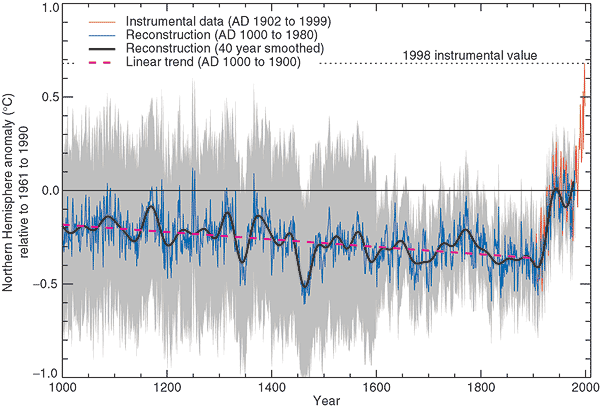
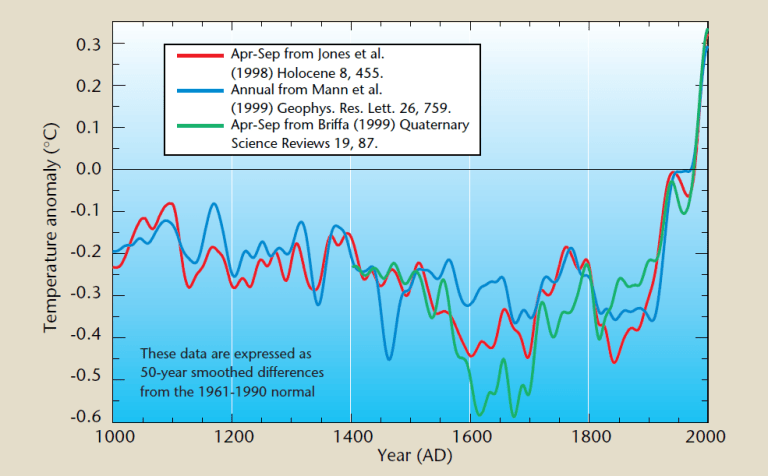
Figure 2.20: Millennial Northern Hemisphere (NH) temperature reconstruction (blue) and instrumental data (red) from AD 1000 to 1999, adapted from Mann et al. (1999). Smoother version of NH series (black), linear trend from AD 1000 to 1850 (purple-dashed) and two standard error limits (grey shaded) are shown. Source: IPCC Third Assessment Report
Since the IPCC believes that the warming from 1975 to 1998 was mainly man-made, but not the warming in earlier centuries, it would like to be able to demonstrate that recent warming is ‘unprecedented’. But it isn’t. Temperatures in many parts of the world appear to be lower than they were in the Medieval Warm Period (MWP, c. 900-1400), and also in the earlier Roman Warm Period (c. 200 BC – 600 AD). During the MWP the Vikings tilled now-frozen farms in Greenland and were buried there in ground that is now permafrost (archaeology.org). Hundreds of peer-reviewed articles show that the MWP was a global phenomenon (Idso & Singer, 2009, 69-94; wattsupwiththat.com; co2science.org), and was not confined to parts of the northern hemisphere, as the IPCC likes to assert.
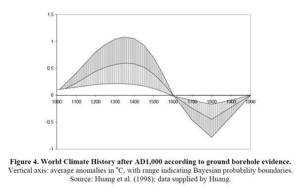
Those wanting to “get rid of” the MWP run into the problem that it shows up strongly in the data. Shortly after Deming’s article appeared, a group led by Shaopeng Huang of the University of Michigan completed a major analysis of over 6,000 borehole records from every continent around the world. Their study went back 20,000 years. The portion covering the last millennium is shown in Figure 4.
The similarity to the IPCC’s 1995 graph is obvious. The world experienced a “warm” interval in the medieval era that dwarfs 20th century changes. The present-day climate appears to be simply a recovery from the cold years of the “Little Ice Age.”
Huang and coauthors published their findings in Geophysical Research Letters 6 in 1997. The next year, Nature published the first Mann hockey stick paper, commonly called “MBH98.”7 Mann et al. followed up in 1999 with a paper in GRL (“MBH99”) extending their results from AD1400 back to AD1000.8 In early 2000 the IPCC released the first draft of the TAR. The hockey stick was the only paleoclimate reconstruction shown in the Summary, and was the only one in the whole report to be singled out for repeated presentation. The borehole data received a brief mention in Chapter 2 but the Huang et al. graph was not shown. A small graph of borehole data taken from another study and based on a smaller sample was shown, but it only showed a post-1500 segment, which, conveniently, trended upwards.
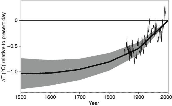
Figure 2.19: Reconstructed global ground temperature estimate from borehole data over the past five centuries, relative to present day. Shaded areas represent ± two standard errors about the mean history (Pollack et al., 1998). Superimposed is a smoothed (five-year running average) of the global surface air temperature instrumental record since 1860 (Jones and Briffa, 1992). Source: IPCC Third Assessment Report WG 1
Stage 2: The Fawning Replications. Other psychologists, usually in the early stages of their careers, leap to replicate the finding. Most of their studies corroborate the effect. Those that don’t are not published, perhaps because the researchers don’t want to step on any toes, or because journal editors would prefer not to publish negative findings.
Stage 2 Modern Warming Spike Theory
As the hockey stick began to appear in the scientific literature, it emerged that 1998 was the warmest year in Phil Jones’s 150-year record of thermometer data. The length of the hockey stick blade just grew. Those in charge of publicizing the work of climate scientists and making the case for man-made climate change were understandably excited. Controversial science swiftly morphed into a propaganda tool.
The World Meteorological Organization put the hockey stick on the cover of its 1999 report on climate change. Then IPCC chiefs decided to give it pride of place in their 2001 IPCC report. Moreover, based on the hockey stick, they stated that “it is likely that the 1990s was the warmest decade and 1998 the warmest year during the past thousand years”. That attracted attention — and trouble. The doubts expressed in that paper title about “uncertainties and limitations” were melting away.
1999 WMO statement on the Climate.
An article in the Guardian (here) describes the struggle leading to victory for the Hockey Stick.
Emails exchanged in September 1999 reveal intense disagreement about whether Mann’s hockey stick should go into the IPCC summary for policymakers – the only bit of the report that usually gets read outside the scientific community – or whether other reconstructions using tree ring data alone should get priority. One of the main tree-ring constructions was by Briffa. The emails also expose major tensions between a desire for scrupulous honesty about uncertainties, and the desire for a simple story to tell the policymakers. The IPCC’s core job is to present a “consensus” on the science, but in this critical case there was no easy consensus.
The tensions were summed up in an email sent on 22 September 1999 by Met Office scientist Chris Folland, in which he alerted key researchers that a diagram of temperature change over the past thousand years “is a clear favourite for the policy makers’ summary”
But there were two competing graphs – Mann’s hockey stick and another, by Jones, Briffa and others. Mann’s graph was clearly the more compelling image of man-made climate change. The other “dilutes the message rather significantly,” said Folland. “We want the truth. Mike [Mann] thinks it lies nearer his result.” Folland noted that “this is probably the most important issue to resolve in chapter 2 at present.”
Mann, Jones and Briffa eventually settled their differences. And the hockey stick was given pride of place in the IPCC report. Folland says: “My recollection is that the final version [of the IPCC summary], which contains the hockey stick, satisfied Keith and everyone else in the end — after the usual vigorous scientific debate.” And after the three came under attack from climate sceptics, all reference to these past spats disappeared from the emails as they faced a common foe.
Stage 3: A Consensus Forms. The finding is now taken for granted, regularly appearing in pop psychology stories and books penned by writers like Malcolm Gladwell or Jonah Lehrer. Millions of people read about it and “armchair” explain it to their friends and family.
Stage 3 Modern Warming Spike Theory
In its 2001 Third Assessment Report, the IPCC used the iconic ‘hockey stick’ graph to try and show that modern warming was indeed ‘unprecedented’. The graph was produced by Michael Mann (now at Penn State University in the US), Ray Bradley and Malcolm Hughes (MBH), and published in Nature and Geophysical Research Letters in 1998 and 1999. At that time, the standard view was that the Medieval Warm Period and subsequent Little Ice Age (c. 1400-1850) were global events. But some climatologists saw the MWP as an embarrassment and spoke of the need to ‘get rid of it’. MBH’s temperature reconstruction did exactly that: it showed 900 years of gradually declining temperatures followed by a dramatic increase in the 20th century. The hockey stick played a central role in mobilizing political and public opinion in favour of drastic action to curb greenhouse gas emissions.
Al Gore with a version of the Hockey Stick graph in the 2006 movie An Inconvenient Truth
“As soon as the IPCC Report came out, the hockey stick version of climate history became canonical. Suddenly it was the “consensus” view, and for the next few years it seemed that anyone publicly questioning the result was in for a ferocious reception.” Ross McKitrick.What is the ‘Hockey Stick’ Debate About?
Stage 4: The Rebuttal. After a few decades, a new generation of researchers look to make a splash by questioning prevailing wisdom. One team produces a more methodologically-sound study that debunks the initial finding. Media outlets blare the “counterintuitive” discovery.
Stage 4 Modern Warming Spike Theory
The hockey stick was based on historical temperature proxies (mainly tree rings), with the 20th-century instrumental temperature record tacked on the end. Incredibly, although the MBH articles were peer reviewed, nobody tried to replicate and verify the work, even though it overturned well-established views on climate history. It was only several years later that Steve McIntyre, a Canadian mathematician and retired mining consultant, began to investigate the matter.Mann did his best to obstruct him; he refused to release his computer code, saying that ‘giving them the algorithm would be giving in to the intimidation tactics that these people are engaged in’.
McIntyre, with the help of economist Ross McKitrick, went on to write several articles in 2003 and 2005, exposing the flaws in the hockey-stick reconstruction. They showed that the shape of the graph was determined mainly by suspect bristlecone/foxtail tree-ring data, and that Mann’s computer algorithm was so biased that it could produce hockey sticks even out of random noise; in short, Mann’s statistical methods ‘mined’ for hockey-stick signals in the proxy data, which were then assigned exaggerated weight in the reconstruction – thereby giving a whole new meaning to the term ‘Man(n)-made warming’!
In 2006 McIntyre & McKitrick’s criticisms were upheld by two expert committees in the US – the National Academy of Sciences (NAS) panel and a congressional panel headed by statistician Edward Wegman. Wegman pointed out that the palaeoclimate field is dominated by ‘a tightly knit group of individuals who passionately believe in their thesis’, and that ‘the work has been sufficiently politicized that they can hardly reassess their own public positions without losing credibility’.
McKitrick wrote in 2005:
Since our work has begun to appear we have enjoyed the satisfaction of knowing we are winning over the expert community, one at a time. Physicist Richard Muller of Berkeley studied our work last year and wrote an article about it:
“[The findings] hit me like a bombshell, and I suspect it is having the same effect on many others. Suddenly the hockey stick, the poster-child of the global warming community, turns out to be an artifact of poor mathematics.”
In an article in the Dutch science magazine Natuurwetenschap & Techniek, Dr. Rob van Dorland of the Dutch National Meteorological Agency commented “It is strange that the climate reconstruction of Mann passed both peer review rounds of the IPCC without anyone ever really having checked it. I think this issue will be on the agenda of the next IPCC meeting in Peking this May.”
In February 2005 the German television channel Das Erste interviewed climatologist Ulrich Cubasch, who revealed that he too had been unable to replicate the hockey stick (emphasis added):
He [Climatologist Ulrich Cubasch] discussed with his coworkers – and many of his professional colleagues – the objections, and sought to work them through… Bit by bit, it became clear also to his colleagues: the two Canadians were right. …Between 1400 and 1600, the temperature shift was considerably higher than, for example, in the previous century. With that, the core conclusion, and that also of the IPCC 2001 Report, was completely undermined.
Recently Steve MacIntyre and I received an email from Dr. Hendrik Tennekes, retired director of the Royal Meteorological Institute of the Netherlands. He wrote to convey comments he wished to be communicated publicly: “The IPCC review process is fatally flawed. The behavior of Michael Mann is a disgrace to the profession.”
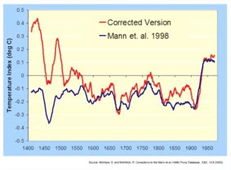
The original MBH graph compared to a corrected version produced by MacIntyre and McKitrick after undoing Mann’s errors.
Stage 5: Proper Replications Pour In. Research groups attempt to replicate the initial research with the skepticism and precise methodology that should’ve been used in the first place. As such, the vast majority fail to find any effect.
Stage 5 Modern Warming Spike Theory
The IPCC dealt with the devastating rebuttal by hiding the hockey stick within a spaghetti graph of various paleo proxies to diffuse the issue, while still claiming unprecedented modern warming.
In the IPCC’s 2007 Fourth Assessment Report, the hockey stick was included in a ‘spaghetti diagram’ alongside six other temperature reconstructions, which showed greater variability in the past but still no pronounced MWP. These ‘independent’ studies are the work of Mann’s colleagues and make use of the same flawed proxies as well as dubious statistical techniques (Montford, 2010, 266-308). The data were carefully cherry-picked to exclude tree-ring series that showed a prominent MWP (climateaudit.files.wordpress.com). Palaeoclimatologist Rosanne D’Arrigo actually told the NAS panel that cherry-picking was necessary if you wanted to make cherry pie (i.e. hockey sticks). And Jan Esper has stated: ‘The ability to pick and choose which samples to use is an advantage unique to dendroclimatology’ – a statement that would make any reputable scientist shudder (Montford, 236, 288-9).
Sixteen of the articles cited in AR4 failed to meet the IPCC’s own publication deadlines for cited references; all of them were written by IPCC contributing authors in support of the AGW cause. The most notable case is a paper by Eugene Wahl and Caspar Ammann. The authors of chapter 6 desperately needed this paper to counter McIntyre & McKitrick’s criticisms of the hockey stick, as the authors claimed to have validated Mann’s results. The leaked emails show that members of the Team pressurized Climatic Change editor Stephen Schneider to ensure that the paper was processed quickly enough to meet IPCC deadlines, though this was not entirely successful. Wahl and Ammann referred to arguments in another unpublished paper they had written, which was not even submitted until well after the first paper had gone forward for IPCC review. Jones advised the authors to be dishonest: ‘try and change the Received date! Don’t give those skeptics something to amuse themselves with’ (1189722851). Both papers finally appeared in September 2007. The authors conceded that the hockey stick failed a key test for statistical significance, but claimed it passed another test and promised to provide details in their Supplementary Information. When this was finally made available a year later, it became clear that torturous statistical manipulations were required to enable the test to be passed (Montford, 2010, 201-19, 338-42, 424-6; bishophill.squarespace.com). The shenanigans involved in the Wahl & Ammann saga are quite breathtaking.
But the credibility of the hockey stick claims was attacked repeatedly:
Stage 6: The Theory Lives On as a Zombie. Despite being debunked, the theory lingers on in published scientific studies, popular books, outdated webpages, and common “wisdom.” Adherents in academia cling on in a state of denial – their egos depend upon it.
Stage 6 Modern Warming Spike Theory
There are still hardcore alarmist blogs that defend the hockey stick graph, but IPCC itself has dropped it without explicitly disowning it.
About 1000 years ago, large parts of the world experienced a prominent warm phase which in many cases reached a similar temperature level as today or even exceeded present-day warmth. While this Medieval Warm Period (MWP) has been documented in numerous case studies from around the globe, climate models still fail to reproduce this historical warm phase. The problem is openly conceded in the most recent IPCC report from 2013 (AR5, Working Group 1) where in chapter 5.3.5. the IPCC scientists admit (pdf here):
“Continental-scale surface temperature reconstructions show, with high confidence, multi-decadal periods during the Medieval Climate Anomaly (950 to 1250) that were in some regions as warm as in the mid-20th century and in others as warm as in the late 20th century.” pg.386
“The timing of warm and cold periods is mostly consistent across reconstructions (in some cases this is because they use similar proxy compilations) but the magnitude of the changes is clearly sensitive to the statistical method and to the target domain (land or land and sea; the full hemisphere or only the extra-tropics; Figure 5.7a). Even accounting for these uncertainties, almost all reconstructions agree that each 30-year (50-year) period from 1200 to 1899 was very likely colder in the NH than the 1983–2012 (1963–2012) instrumental temperature NH reconstructions covering part or all of the first millennium suggest that some earlier 50-year periods might have been as warm as the 1963–2012 mean instrumental temperature, but the higher temperature of the last 30 years appear to be at least likely the warmest 30-year period in all reconstructions (Table 5.4). However, the confidence in this finding is lower prior to 1200, because the evidence is less reliable and there are fewer independent lines of evidence. There are fewer proxy records, thus yielding less independence among the reconstructions while making them more susceptible to errors in individual proxy records. The published uncertainty ranges do not include all sources of error (Section 5.3.5.2), and some proxy records and uncertainty estimates do not fully represent variations on time scales as short as the 30 years considered in Table 5.4. Considering these caveats, there is medium confidence that the last 30 years were likely the warmest 30-year period of the last 1400 years.” Pg.410
Meanwhile a multitude of studies confirm that medieval warming was widespread and not limited to regions in the Northern Hemisphere, as Mann and others have claimed. For example the MWP Mapping Project led by Dr. Sebastian Luening, Prof. Dr. Fritz Vahrenholt (authors of ‘The neglected sun‘).
red: MWP warming
blue: MWP cooling (very rare)
yellow: MWP more arid
green: MWP more humid
grey: no trend or data ambiguous
Most of western North America and Africa were experiencing drought conditions during the MWP (except some areas in Southwest Africa). In contrast, Australia and the Carribean was more humid. Globally, 99% of all paleoclimatic temperature studies compiled in the map so far show a prominent warming during the MWP. This includes Antarctica and the Arctic.
Conclusion:
“Regarding the Hockey Stick of IPCC 2001 evidence now indicates, in my view, that an IPCC Lead Author working with a small cohort of scientists, misrepresented the temperature record of the past 1000 years by (a) promoting his own result as the best estimate, (b) neglecting studies that contradicted his, and (c) amputating another’s result so as to eliminate conflicting data and limit any serious attempt to expose the real uncertainties of these data.” – John Christy, Examining the Process concerning Climate Change Assessments, Testimony 31 March 2011
Todays temperatures are cooler than the Medieval Warming Period, which was preceded by an even warmer Roman Warm Period, which followed an even warmer Minoan Warm Period. We are in an Interglacial age about 11,500 years old, and the overall trend is cooling.
Figure 37. Holocene global temperature change reconstruction. a. Red curve, global average temperature reconstruction from Marcott et al., 2013, figure 1. The averaging method does not correct for proxy drop out which produces an artificially enhanced terminal spike, while the Monte Carlo smoothing eliminates most variability information. b. Black curve, global average temperature reconstruction from Marcott et al., 2013, using proxy published dates, and differencing average. Temperature anomaly was rescaled to match biological, glaciological, and marine sedimentary evidence, indicating the Holocene Climate Optimum was about 1.2°C warmer than LIA. c. Purple curve, Earth’s axis obliquity is shown to display a similar trend to Holocene temperatures. Source: Marcott et al., 2013.
Source:Judith Curry Nature Unbound III: Holocene climate variability (Part A)
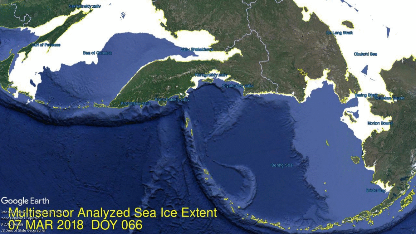
Last month came breathless headlines from Inside Climate News: Alaska’s Bering Sea Lost a Third of Its Ice in Just 8 Days
The good news was that the ice was found just next door in Okhotsk Sea. As the image above showed, Bering did reduce its coverage, but Okhotsk was gaining at the same time. Over those 12 days, Bearing lost 173k km2 of ice extent while Okhotsk gained 185k km2.
Now we have perhaps already passed the annual maximum, which on average was 15.1M km2 on day 62.
2018 has reduced ice extent the last three days since peaking on day 63. It came near to 2007 and 2016 before retreating. And as in the past, SII is tracking about 200k km2 lower. The regional extents are shown in the table below.
Region
2018066
Day 066 Average
2018-Ave.
2017066
2018-2017
(0) Northern_Hemisphere
14380231
15084354
-704123
14706492
-326261
(1) Beaufort_Sea
1070445
1070178
267
1070445
0
(2) Chukchi_Sea
965161
966001
-840
966006
-845
(3) East_Siberian_Sea
1087120
1087134
-14
1087137
-18
(4) Laptev_Sea
897845
897842
3
897845
0
(5) Kara_Sea
934934
926489
8445
912664
22270
(6) Barents_Sea
624841
647307
-22466
597521
27320
(7) Greenland_Sea
537737
641220
-103484
615726
-77989
(8) Baffin_Bay_Gulf_of_St._Lawrence
1557754
1560371
-2617
1545548
12206
(9) Canadian_Archipelago
853109
852753
356
853214
-106
(10) Hudson_Bay
1260838
1259900
938
1260903
-66
(11) Central_Arctic
3152831
3219866
-67035
3223471
-70640
(12) Bering_Sea
232461
757199
-524738
628542
-396081
(13) Baltic_Sea
138089
94664
43425
69380
68708
(14) Sea_of_Okhotsk
1041074
1070088
-29014
953551
87522
The 2018 deficit to average is almost entirely due to Bering Sea lack of refreezing, now 525k km2 below recent normal. On the European side, Barents and Kara are nearly average, with Greenland Sea down about 20%. It remains to be seen if this year’s maximum is past or if more extent is gained in the coming week.
Drift ice in Okhotsk Sea at sunrise.
The graph below shows 2018 NH ice extents since day 1, with and without the Pacific basins Bering and Okhotsk, compared to 11 year averages (2007 to 2017 inclusive). Clearly 2018 is an average year except for the Pacific basins, especially Bering Sea.
A previous post (Feel Good Climatism) pointed to the controlling power of progressive PC institutions in today’s societies.
Short version: The right attempts political persuasion. The left, on the other hand, attempts social persuasion — basically seizing the commanding heights of culture-making institutions and then deciding that espousing some political claims (being pro-gay-marriage) increase social status and that espousing other political claims (being against gay marriage) decrease social status and, indeed, make one a social pariah, fit for ostracism, mass mockery, and internal exile.
The left’s method works much better than the right’s. It always has and it always will. Because most people don’t care about politics all that much — but nearly everyone (except for the crankiest of contrarians, including some of the current assembled company) cares about their social status.
Contemporary socio-political orientations no longer fit traditional liberal/conservative definitions. The left is now committed to “post-modern” philosophy and “progressive” political action, deriving from identity politics and cultural warfare. Traditionalists are now on the far right sideline and “conservatives” are tarred with that same brush. People in the middle are a mix of classical liberals and conservatives who still embrace the western rational, free enterprising democracy frame. Progressives want to overturn that heritage with tactics from social class conflict, supercharged in the age of Internet, social media and 24/7 buzz. The middle alternative on the right is more properly termed “libertarian” since the focus is on individual liberty, free enterprise and limited government. The same concerns motivated those drafting the US Constitution.
The Masses Push Back
Recent events suggest a rise of libertarian views among the masses, portending a growing backlash against the progressive, post-modern views of ruling elites around the world. From Brexit to Trump to Germany, and now Italian voters are trashing the establishment.
Italy’s voters choose populists, deliver stinging rebuke to Europe (CNN)
Italy was plunged into political uncertainty Monday after parliamentary elections delivered victories for populist, euroskeptic parties but left no clear path forward for a new government.
No party or coalition received enough votes to rule alone, and Italy now faces a hung parliament, in what European Commission chief Jean-Claude Juncker described last month as the “worst-case scenario” for Europe.
Cultural Exploitation Unmasked
Apart from electoral results, there are more voices ready, willing and able to speak out against the PC narrative and the bullying behavior that goes with it. For weeks, Parkland school survivors were adored as celebrities, but now some realism and analysis shows the political and social exploitation that has occurred.
All the reasons for refusing to allow ourselves to be led by children were summed up in the latest coronation of the Parkland kids, this time by ancient leftist Bill Maher. He invited David Hogg and Cameron Kasky on his show so Hogg could boast about hanging up on the President of the United States, and so Kasky could give us this sanctimonious little lecture: “I mean this sincerely, I really do, to all the generations before us, we sincerely accept your apology. We appreciate that you are willing to let us rebuild the world that you f—ed up.”
This sums up everything that’s wrong with these kids’ astroturfed ride to fame. They get flown around the country, they get invited on TV, they get puffball interviewers like Bill Maher, all because they are willing to repeat in a cloyingly self-righteous manner the message favored by their adult handlers. But not because they actually know what they’re talking about.
Let’s look at their arrogant presumption that previous generations messed up the world, so that today’s kids, in their superior wisdom, have to “rebuild” it.
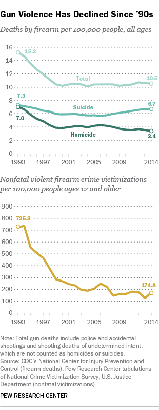
Start with the issues most directly at hand here. School shootings are actually down over the last 20 years. Northeastern University Professor James Alan Fox analyzed the data and concluded that mass school shootings are “extremely rare events” and that “there is not an epidemic of school shootings.”
Moreover, Fox adds that “over the past 35 years, there have been only five cases in which someone ages 18 to 20 used an assault rifle in a mass shooting,” meaning that the most common proposed new gun control measure would have little effect.
Speaking of guns, you might think that without gun control, we’re living in a lawless post-apocalyptic hellscape. In fact, crime is down. Murders are down. Violent crimes committed with guns are way down.
But cite these statistics and you will be told that you cannot contradict the Parkland kids because being present at the scene of a mass shooting makes them unquestionable experts on the topic. No, really. Kasky tells us, “We’ve seen our friends text their parents goodbye. We are the experts.” I can hear Tom Nichols grinding his teeth from here. Obviously, being an expert on guns, crime, and mass shootings requires actual knowledge and research, including the ability to read and understand crime statistics.
This presumption that we adults have ruined the world has wider roots. Today’s young people are bombarded with a lot of doom and gloom that tells them everything is getting worse, pushed onto them by people who have an interest in recruiting them as activists.
They may be surprised to learn, for example, that in addition to crime being down, war has decreased across the globe. The number of wars and the number of deaths in wars decreased dramatically after World War II, of course, but it decreased dramatically again when the Soviet Union collapsed, almost as if Communism was an engine of global conflict.
And so on. The world we older generations have given today’s kids is actually pretty awesome. We can’t protect them from every danger and every risk, and we can’t stop every tragedy like the Parkland shooting. But by historical standards, our kids will be safer, healthier, and wealthier, and they can expect to live longer and more untroubled lives than we did, or than our parents did, or than our grandparents did.
I can see, though, why they wouldn’t realize any of this, because there are some who have a political interest in making things look worse. If you want young people to think capitalism is the cause of war — a view they hear often — you don’t want them to find out that the triumph of the capitalist countries in the Cold War led to a decrease in war. If you want them to rail against “global capitalism” — I can’t decide if this is a cause of the left or of the right these days — you can’t have them realizing that capitalism and trade are wiping out global poverty. If you want them to think free markets are inferior to socialism, you don’t want them to understand the massive increases in prosperity in free market societies, or to question the latest environmentalist panic. And if you want them to become televised activists for gun control, you have to create the impression that there is an epidemic of gun crimes and mass shootings.
The Parkland kids have swallowed all of this, and hence their ignorant ranting to us about how the older generations have messed everything up.
To be sure, the kids we’re seeing on TV are not representative of their peers. We don’t hear much about the Parkland students who don’t fit the left’s narrative. Instead, we’re mostly getting a couple of the high-school debate club types. Once I found out that detail, it all fell into place, because we all remember the guys from high-school debate club. They weren’t the smartest kids, just the most preening and self-important.
The important point is that too many of today’s young people are not being taught to see and appreciate what has made the world as good a place as it really is for them. They have no idea who designed the large and complex systems that produce the peace and prosperity they enjoy, no idea how those systems work, and no idea how much they can foul them up by knocking out pins and levers and constitutional amendments just because they’re angry.
So the lesson from this is to show a little humility, kids. You’re still learning, and you would be well served not to be content to repeat what you learn at school, but to go do your own reading and research and listen to people who disagree with you. It’s not as traumatic an experience as you have been led to believe. When you can show that you understand what’s good about the world we are giving you, and you have some idea of how it got to be that way — then we’ll listen to your ideas for changing it.
Waking Up to Social Thought Control
At a deeper and more personal level, people are waking up to the oppressive cultural regime attempting to control individual thoughts and behavior.
This post by Dreher contains thoughtful emails from people realizing how mobbing done by PC twitter gangs threatens the roots of liberal social democracies. Just a few paragraphs to show why you should read the whole thing (my bolds).
In the near future, a lot of us are going to be James Damore.
A reader writes:
I read what you said about having spoken with four people recently who didn’t vote for Trump in 2016 but are considering it now because of the left’s recent behavior. I’m not quite in that camp, but am close to it; I suspect my progress on the issue largely resembles those of your friends and (I suspect) a substantial minority of other Americans as well.
The firing of James Damore back in August was what really made me start hesitating about my previous view that “political correctness” was, as Vox, the New Yorker, and all the other right-thinking people say, a Fox News attempt to discredit politeness. Here was a guy who was making a calm, carefully reasoned argument that some of Google’s diversity initiatives might not be the best way to achieve diversity, and that Googlers should be free to criticize such policies. In response, not only was he fired (and with a publicity that basically guarantees he’ll never work for a Silicon Valley firm again), but he was subjected to a regularly scheduled bout of Two Minutes’ Hate every day for weeks.
That got me paying more attention to the way the Left handles speech, and it made me realize that “political correctness” was most definitely alive and well, and hardly restricted to trivialities like whether the Washington Redskins should be named something else. In Europe, as Douglas Murray has documented, people who raised concerns prior to 2015 about the influx of immigration were silenced with accusations of racism, until things finally reached a boiling point and spilled out with the growth in populist fascist movements. 20 years ago, Theodore Dalrymple was already writing about how the police in the UK were already growing hesitant to investigate Muslim immigrants’ tendency to keep their daughters out of school for fear of being called racist, and more recent data indicate that such social problems (and the continued fear of being labeled racist for trying to address them) are hardly going away. Things that ought to be the subject of legitimate debate in the United States are being categorically ruled out in the same way: could innate biological differences affect, even if only in a small way, the pay gap between men and women? Sexist. Is it really a good idea to let in a large influx of Muslim immigrants in light of the problems Europe has had in that regard? Islamaphobe. Does IQ vary, on average, by race, and does this create the risk of widening the inequality gap because society increasingly rewards high IQ? Racist. Is Obamacare actually as successful as is claimed? You want poor people to die. Is letting in lots of low-skilled immigrants good for the economy? Racist, nationalist, white supremacist.
The fact is, I don’t want to live in a country where the only views permitted in public debates (if they can be termed “debates” at all) are the ones deemed acceptable by enraged Twitter mobs, and where expressing a perfectly reasonable, measured claim (“America should prioritize its own working class over that of illegal immigrants, while still doing what we can to help the Dreamers”) publicly can put you at quite reasonable fear of getting doxxed and subsequently losing your job and health insurance. It’s bad enough that people like Zack Ford are on social media. The last thing I want is for candidates people like him favor to get political power on top of the formidable socio-cultural power the Left already possesses.
Summary
What a strange twist. Marx gave us the notion of ideology, which he understood to be the system of beliefs and values that the ruling class used to control the working class and ensure continued power and privileges. Today’s Marxist wannabes who are mostly in the entitled class are employing the ideology of environmentalism to mount an anti-capitalist crusade under the banner of Climate Change, advocating policies which will further the misery of the downtrodden.
What is a law school for? According to the University of Windsor, revolution. Earlier this month, Windsor’s law school released a statement on the jury verdict that acquitted Saskatchewan farmer Gerald Stanley of the second-degree murder of Coulton Boushie. According to the statement, the Canadian legal system is oppressive. “Canada has used law to perpetuate violence against Indigenous Peoples,” it states, “a reinvention of our legal system is necessary.”
The statement reveals how legal education has lost its way. One could be forgiven for thinking that the purpose of law schools was to train lawyers to understand legal principles and to think logically and critically. Instead, some law schools portray themselves as political actors working for a cause. At Windsor’s law school, “we strive toward social justice. We take that commitment seriously.” Indeed they do. So do other law schools in Canada, some more explicitly than others. Social justice means defeating oppression and righting historical wrongs — by favouring or blaming people as members of groups, and by undermining Western legal principles such as the rule of law, equal application of the law, presumption of innocence, and freedom of expression, thought, conscience and religion.
There is an old saying that at any trial there are four versions of the truth: what the prosecution says, what the accused says, what the jury finds, and what actually happened. I have no idea what transpired at that farm in Saskatchewan. But Windsor’s law professors seem to know — an impressive feat, since they were neither at the scene nor in the courtroom to hear the evidence. Due process exists, in part, to protect us all from the self-righteousness of mobs.
One might expect Justin Trudeau and his ministers to jump on ideological bandwagons, but it is telling when law schools want to ride along too. Windsor’s says that “the law’s response to Coulton Boushie’s death is tragic, unnecessary and unacceptable.” Boushie’s death was indeed tragic and unnecessary, but the law’s response was not. Even the lawyer for Boushie’s family, Chris Murphy, said that “based on the evidence, the submissions made and the charges that the judge gave to the jury, a route of acquittal was a possibility.”
Human history is rife with oppression. Women were oppressed when only men could own property, slaves when they had no right to liberty, Indigenous people when they were forced to attend residential schools. Oppression results when some people do not have the same legal rights as others. But today’s law schools resist the idea of equal application of the law and openly advocate progressive policies. For instance, when Trinity Western University, an independent religious institution that receives no government funding beyond its charitable status, proposed to open a law school, the established schools urged provincial law societies to ban TWU’s graduates on the grounds that its community covenant did not reflect progressive values. The law societies in Ontario and B.C. obliged. The Supreme Court’s decision on TWU’s challenge of those decisions is pending.
Law schools may not need to preach revolution much longer. If you haven’t noticed, the tipping point is near. Courts and academics are transforming the Charter of Rights and Freedoms from a roster of fundamental liberties into a social-justice charter that justifies curbing individual freedoms instead of protecting them. The words of section 15(1) of the Charter, which guarantee that “every individual is equal before and under the law,” suggest that the same rules should apply to everyone. However, the Supreme Court has held that the law can nevertheless treat people differently if doing so produces equal outcomes, and that treating people the same — for instance, requiring the same qualifications from a minority job applicant as from others — might even violate section 15(1) if it produces unequal results.
The Law Society of Ontario has begun to compel its members to expressly acknowledge an obligation to promote progressive values. Individual liberties are no longer fundamental. Everyone is not subject to the same rules. The legal ground is shifting.
Not all law professors endorse the path that we are on, and fortunately they can still choose what to teach in their own courses. Not all lawyers or judges agree either. Many have kept their heads. Give them credit for thinking for themselves. After all, they probably went to a Canadian law school.
Bruce Pardy is professor of law at Queen’s University and a member of the Law Society of Ontario.
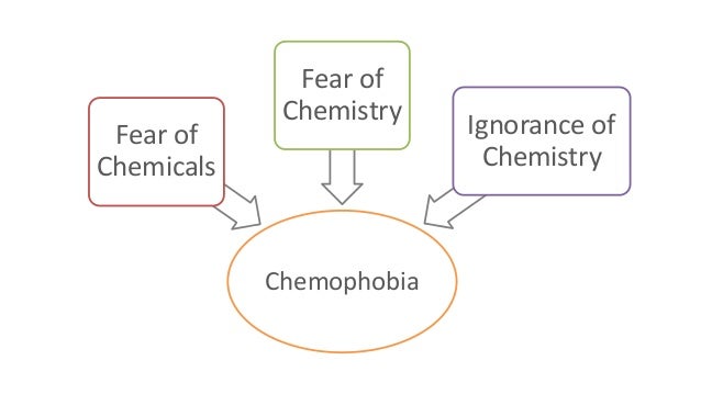
Now this one I take personally having earned a degree in Organic Chemistry. Alex Beresow exposes a liberal journalist who disparages all chemicals with no comprehension of the science. In this case Nicholas Kristof demonstrates how his employer, the New York Times, misleads and spreads irrational fears in its mission to sell copies to its clientèle on the upper west side of NYC. He seems to be channeling Rachel Carson (Silent Spring) who wrote about carcinogens everywhere as she was dying of the disease.
It’s often helpful for journalists who do not have specialized knowledge of complex scientific topics to write about them anyway, because if they can understand them and figure out how to communicate them, they can perform a tremendous public service. However, if journalists don’t take the time to understand complex topics and get the very basics wrong, they do the public a massive disservice and end up looking like buffoons.
Which brings us to veteran New York Times columnist Nicholas Kristof, who studied law and fancies himself an expert in chemistry and toxicology. Chemists and toxicologists disagree.
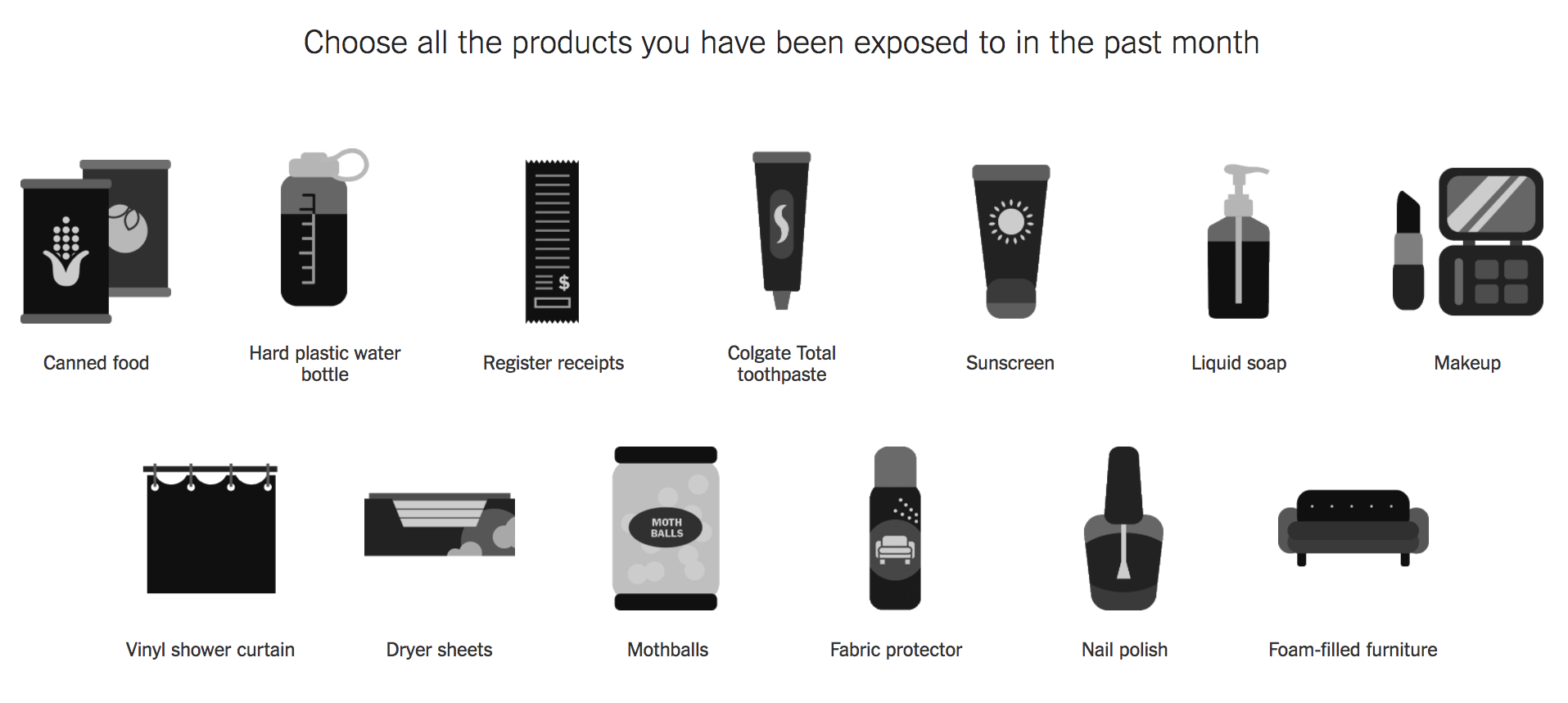
His latest diatribe — which was easily and thoroughly debunked by my colleagues Dr. Chuck Dinerstein and Ana Dolaskie — begins with the single most shameless act of fearmongering I have ever seen from a major media outlet. He shows a bunch of common household products, all of which are perfectly safe, and asks, “What poisons are in your body?”
Look at all these lethal things: toothpaste, soap, shower curtains. It’s amazing we all aren’t dead yet. Mr. Kristof’s “research” — if you can even call it that — relied heavily on well-known anti-science activists, such as the Environmental Working Group.
When we criticized his scientific ignorance, Mr. Kristof doubled down, as the scientifically ignorant always do.
It’s interesting that his immediate defense is to lie about his writings. He isn’t only afraid of endocrine disruptors; he’s afraid he’ll get cancer from popcorn, and he’s worried that some enigmatic chemicals somewhere out there are causing diabetes, obesity, and autism. This level of paranoia is what we would expect from a chemtrail conspiracy theorist, not a public intellectual.
Mr. Kristof’s reference to DES is typical chemophobic scaremongering. He points out a chemical that really is bad (DES), which in his mind justifies his demonization of every other chemical of which he is afraid. That’s the chemistry equivalent of saying that all Muslims are suspicious because 9/11 happened.
Mr. Kristof has demonstrated time and again that he is entirely ignorant of the basic principles of chemistry and toxicology. And given that he has been widely criticized from all sorts of science writers, he’s also completely impervious to being educated by actual experts.
Consider what Deborah Blum, a chemistry writer, wrote about him:
“Whenever Nicholas Kristof writes a piece about the evil, awful world of chemicals out there, I feel a twitchy need to kick something. Or someone. Possibly right there in The New York Times newsroom.”
In perhaps the biggest indication that Mr. Kristof is fundamentally anti-science, he ignores evidence that he dislikes. That’s utterly taboo for scientists, but par-for-the-course for NYT op-ed columnists. Writing in Forbes, Trevor Butterworth says:
“[Kristof] applies no statistical or experimental criticism to these studies: they always “really” find what they claim to have found; and he seems unaware of the many non-industry funded studies or regulatory agency assessments that contradict them. There is no mention, for instance, of the 15-page point-by-point rebuttal written by the Food and Drug Administration to the Natural Resources Defense Council’s petition to ban BPA, a rebuttal which relies, primarily, on non-industry funded research.
Chemjobber, a blog that promotes jobs in chemistry, had this to say of Mr. Kristof:
“I am a little at wit’s end to understand how to help intelligent people like Mr. Kristof see past their clear fear of chemicals, the distrust they have of chemical companies and their seeming dismissal of regulatory agencies. It seems to me that he is all too credulous to the claims of organizations like the Silent Spring Institute that are incentivized to generate as much fear and doubt around chemicals as possible. “
The New York Times Has Only One Editorial Standard
The real problem is that the New York Times has only one editorial standard: To publish whatever sells more copies to their Upper West Side clientele. That means throwing biotechnology and chemistry under the bus while embracing organic food, acupuncture, and other forms of witchcraft.