Historic Climate Change

Orbital Climate Factors: E for eccentricity, T for tilt, and P for precession

My recent post The Coming Climate included a description of the orbital factors inducing natural cycles of warming and cooling far larger than any possible effect from CO2.

Yesterday commenter Alberto Zaragoza Comendador took this further into a discussion of the uncertainties in paleoclimatology. He started by referring to a paper by Lindzen, which focused on only one of these dynamics: fluxes of equator-to-pole heat transport.

Lindzen et al. 1993 concluded:
The present note shows the importance of aspects of the forcing which lead to changes in meridional (i.e., tropics to higher latitudes) heat fluxes. These aspects are seasonal, and involve the distribution of heating; they do not necessarily involve changes in globally and/or annually averaged insolation. Thus, simple, commonly used notions of climate sensitivity as employed in Houghton et al. (1990) are not relevant. Indeed, the present mechanism can readily produce major changes in climate (including, as a by product, changes in the globally averaged temperature) in systems which are profoundly insensitive to a doubling of CO2. To assume (as was done in Hoffert and Covey 1992, for example) that major climate changes necessarily require high sensitivity to such changes in gross averaged forcing is clearly inappropriate.

The full text of comment by Comendador is below from Climate Etc. (here)

Alberto Zaragoza Comendador | June 11, 2016 at 3:19 pm |

Somebody mentioned Milankovitch which reminded me of other thing.

http://www-eaps.mit.edu/faculty/lindzen/171nocephf.pdf (Lindzen et al 1993)

Check out the last paragraph. It explains why every paleo estimate of sensitivity is hopeless: even if you knew the temperatures, which you don’t really but even if you did, you’d have no idea what caused them. Lindzen uses the example of equator-to-pole heat transport but there are many more things that can cause climate to change, and we mostly know nothing about how they affected climate in the past.

We have records of methane and CO2, but we don’t have records of cloud albedo, ozone, water vapor, vegetation… someone might quibble that we do have some records of vegetation and dust for example, but unlike CH4 and CO2 you cannot assume these dust or vegetation ‘levels’ applied globally.

(Hell, until recently the greening trend of the last half-century was in dispute, even though we can look at the world’s plants and trees with seven billion pairs of eyes plus a few billion cameras, including some mounted on satellites. To assume we can now estimate greening or browning trends from twenty thousand years ago is preposterous.)

And we have estimates of how much area was covered in ice, but we have no idea how much dust that ice was covered with, or if the radiative forcing one could expect from the ice was really ‘apples to apples’ (i.e. of the same efficacy) as that of CO2. Now we know that as sea ice recedes the Arctic gets cloudier so the overall effect is about 1/3 of what you would expect simply looking at the decline in ice; we have no idea if the same thing would happen upon the disappearance of an ice sheet because we have never observed such a thing. Until recently we thought Greenland was reflecting less sunlight because it was getting dustier; it then turned out that, rather, the satellites’ sensors were getting degraded.

We still have little idea how aerosols affect climate… yet some guys are trying to model the aerosols of the past. And they’re not even the same kind (today the main agent is sulphuric acid, before dust).

(It’s funny that the ‘forcing efficacy’ issue has been raised about instrumental studies, and not about paleo papers that would be devastated if efficacy really changed much between forcing agents. For example, only about 20% of the forcing in LGM reconstructions is CO2).

You cannot simply assume that whatever change in GHG concentration (or other ‘forcings’) took place at the time of these temperature changes was responsible for said changes. In fact, by excluding other factors (which you know nothing about) you will systematically overestimate sensitivity. That’s why paleo sensitivity disagrees with both energy budget and inter-annual (ERBE/CERES) estimates. It also explains in part why the range of sensitivity in paleo is so wide.

Admittedly this is also a strike against sensitivity estimates using the instrumental record, but less so – because we have observations that allow us to rule out a good many ‘natural’ causes of climate change. We know that in the last 150 years the AMOC hasn’t shut down and there hasn’t been a massive change in equator-to-pole heat transfer. We know that since 1980 the amount of cloud cover has remained more or less the same, within a 5% band; the warming trend since then would be very difficult to explain from changes in cloud cover alone. And so on.

Whenever one mentions natural climate change the response from a certain side is something like ‘the ocean cannot create heat’ or ‘the clouds cannot change by themselves’. While technically true these statements are meaningless and reveal at best ignorance and at worst deception. All climate changes will involve a radiative change at some point, but said radiative change (forcing, feedback, whatever you call it) does NOT have to originate from a radiative source. It can all start with a change in air currents, or ocean currents, or tree cover, or sea ice, or methane emissions from bacteria, or…

Asking ‘yeah but what caused the clouds to change?’ is like asking why are there planets.

The best example of non-radiative climate change is in fact Milankovitch cycles, which affect not the amount but the distribution of sunlight (well eccentricity changes the amount of sunlight, but precession and tilt don’t). Technically speaking, the forcing is zero; paleo estimates consider GHGs, ice sheets and vegetation/dust forcings but if one is strict they should be considered feedbacks. Sensitivity, calculated the way it’s done for observational estimates, would be infinite.

You can also see how simply switching one of these radiative ‘things’ from forcing to feedback, or viceversa, can allow a researcher to arrive at a radically different sensitivity number. It’s all meaningless.

The one advantage of the paleo method is that since there is enough time for the ocean to reach equilibrium you avoid that source of uncertainty. But that also means you cannot use it to estimate TCR.

Anyway, as time goes on the estimates of aerosol forcing and heat uptake will get better and better. The instrumental studies will arrive at a number, if not for what sensitivity ‘is’, at least for what it has been for the last 150 years. The paleos will never arrive at anything.

Conclusion:

Thanks Alberto for that summation.  It deserves wide appreciation

Geological Time Spiral

Geological Time Spirial

Wave Drowns CO2 Warming


Update May 13 below

This post presents key findings from the recently published paper: Anthropogenic CO2 warming challenged by 60-year cycle (here) by François Gervais
Department of Physics, Faculty of Sciences & Techniques, François Rabelais University, Parc de Grandmont, 37200 Tours, France

In the synopsis below, Gervais puts his study in context, followed by his conclusions.

The Global Warming Debate Rages

The impact on climate of the CO2 emitted by burning of fossil fuels is a long-standing debate illustrated by 1637 papers found in the Web of Science by crossing the keywords

“anthropogenic” AND “greenhouse OR CO2” AND “warming”

This is to be compared to more than 1350 peer-reviewed papers which express reservations about dangerous anthropogenic CO2 warming and/or insist on the natural variability of climate.

Signatures of 60-year Climate Wave

Time series of sea-level rise are fitted by a sinusoid of period ~ 60 years, confirming the cycle reported for the global mean temperature of the earth. This cycle appears in phase with the Atlantic Multidecadal Oscillation (AMO). The last maximum of the sinusoid coincides with the temperature plateau observed since the end of the 20th century. A 60-year climate cycle is confirmed in sea-level rise and global sea ice area, as well as in measured temperature series.

Onset of the Declining Phase

The four following indicators sign for the onset of the declining  phase of the 60-year cycle.

  1. The recent change of sign of global sea ice area anomaly which
    reveals an excess in Fig. 3, a sensitive indicator of climate, is unexpected
    from model projections (AR5, 2013).
  2. The AMO index indicates the onset of a declining phase.
  3. A negative temperature slope is measured from 2002 to 2015 independently by different satellites in the low troposphere by Remote Sensing System (RSS, 2015) and by UAH (Spencer et al., 2015) as shown in Fig. 4. The plot is voluntarily restricted to 13 years, viz. less than 1/4 of the 60 year-cycle, to evaluate the sign of the tangent to the sinusoid.
  4. A deceleration of the sea-level rise measured by satellite altimetry is also found since 2002 (Chen et al., 2014; Cazenave et al.,2014).

Rising Temperatures cause rising CO2

The correlation of yearly CO2 increase, therefore, appears not with MEI or SOI but with global mean temperature to which El Niño and La Niña contribute. This temperature/CO2 correlation may be tentatively explained, at least partly, by the solubility of CO2 into water which decreases with temperature, consistent with sea pH maps (Byrne et al., 2010). Warm temperature fluctuations favor CO2 release from the oceans which contain 60 times more CO2 than the atmosphere (AR5, 2013), whereas cooler fluctuations favor its oceanic Capture.

Summary: 60-year Wave Rules

Dangerous anthropogenic warming is questioned (i) upon recognition of the large amplitude of the natural 60–year cyclic component and (ii) upon revision downwards of the transient climate response consistent with latest tendencies shown in Fig. 1, here found to be at most 0.6 °C once the natural component has been removed, consistent with latest infrared studies (Harde, 2014). Anthropogenic warming well below the potentially dangerous range were reported in older and recent studies. On inspection of a risk of anthropogenic warming thus toned down, a change of paradigm which highlights a benefit for mankind related to the increase of plant feeding and crops yields by enhanced CO2 photosynthesis is suggested.

The whole paper is well worth the read, and is chock full of links to sources and references supporting his analysis.

Here is a recent Youtube video of Francois Gervais presenting his findings (with English translation)

Update May 13

In the comments below ren points to the declining NAO, with the implication that a cooling phase is underway in the North Atlantic SSTs.  The cold blob in the North Atlantic was subject of a post here and elsewhere, and Paul Homewood posts today on the increasing cold water, not only surface but coming from below.

Dr. Gerard McCarthy is a lead researcher on the RAPID array project measuring the AMO heat transport and provides a good context on their observations and the implications for the climate cooling in coming decades.

Our results show that ocean circulation responds to the first mode of Atlantic atmospheric forcing, the North Atlantic Oscillation, through circulation changes between the subtropical and subpolar gyres – the intergyre region. This a major influence on the wind patterns and the heat transferred between the atmosphere and ocean.

The observations that we do have of the Atlantic overturning circulation over the past ten years show that it is declining. As a result, we expect the AMO is moving to a negative (colder surfer waters) phase. This is consistent with observations of temperature in the North Atlantic.

https://www.weforum.org/agenda/2015/06/how-the-atlantics-cool-phase-will-change-the-worlds-weather/


India: Show Us the Climate Money

Playing his cards close to the vest, India’s prime minister first promised they would soon ratify the Paris accord, then said the climate reparation money must be on the table first.  Details are at GWPF:

INDIA LINKS RATIFICATION OF PARIS AGREEMENT TO CLIMATE FINANCE, DENIES IT WILL RATIFY DEAL THIS YEAR

The climate charade reminds me of what Russians said privately during the Soviet era:  “We pretend to work, and they pretend to pay.”

cg565e788a82606

The Coming Climate

Update July 4 below

When you see a graph like that below, it is obvious that an unusually strong El Nino just happened in our climate system. It resulted in higher global temperatures the last two years and so far in 2016. But that event is over now, and naturally we wonder what to expect in the months and years ahead.

cdas_v2_hemisphere_2016june2
For example some comments from a recent thread at WUWT (here) were intriguing:

It will be interesting to see what comes next. The major difference between the 1998 el nino and this one is that in 1998 the sun was increasing in solar activity, while this one solar activity is decreasing. (rishrac)

Nino3,4 and UAH LT dC Anomalies, and UAH LT Scaled *3 and Lagged 4 Months h/t Allan MacRae

And richard takes the long view of the situation:

While we all stare at the short-term ups and downs of the global temperatures, pay a little thought to the fact that the Earth’s orbit around the Sun causes snow in the winter and warmth during the summer, so it may be important?

Perihelion presently occurs around January 3, (Northern hemisphere winter, Southern summer) while aphelion is around July 4. Therefore, the southern hemisphere receives more solar radiation and is therefore warmer in summer and colder in winter (aphelion). The Northern hemisphere has cooler summers and milder winter (solar radiation-wise).

Also the northern hemispheres autumn and winter are slightly shorter than spring and summer, because the Earth is moving faster around the Sun in winter slower in summer.

This alone could account for “Global Warming” attributed to CO2, (which no doubt plays some part in it).

Over the next 10,000 years, northern hemisphere winters will become gradually longer and summers will become shorter, due to the change in the Earth’s Orbital Eccentricity.

Couple this with changes in the Earth’s tilt, which varies from 22.1 degrees to 24.5 degrees, (currently at 23.4 degrees). More tilt means more solar radiation gets to the poles (global warming) and less tilt means less radiation gets to the poles (global cooling). The last maximum tilt occurred in 8700 BC (Holocene maximum) and the next minimum tilt will happen in 11,800 AD (the advance of the ice sheets), precisely at the time of longer northern winters and shorter summers.

Orbital Climate Factors: E for eccentricity, T for tilt, and P for precession

Predicting the Future is Tough

Chiefio (E.M. Smith) has a good post (here) reminding us that statistical projections do not help us much in this case. Temperature series produced by our climate system have special qualities. The patterns are auto-correlated, meaning that tomorrow’s weather will be similar to today’s; the occurrence is not totally independent, like the flip of coin. IOW there is momentum in the climate characteristics, which can and do fluctuate over seasons, decades, centuries and more. Our attempts to use linear regressions to forecast are thwarted by temperature time series that do not follow a normal gaussian distribution, and are semi-chaotic and non-stationary.

Four Possibilities Forward From Today

From past experience, the next few years could logically follow one of four temperature scenarios:
1. The Plateau since 1998 continues.
2. The Warming prior to 1998 resumes.
3. A new Plateau begins with 2016 at a higher (step up) level.
4. A Cooling begins comparable to the years after 1940.

All of these have analogues in our recent climate observations. If this now finished El Nino triggers a regime change comparable to the 1998 event, then a step-up plateau can result. If warmists are right, and there is a release of pent-up heat in the system, then a warming trend would resume.

If this El Nino is not strong enough to shift the regime, then the Plateau could continue at the same level. Finally, it could be that several factors align to reverse the warming since the 1970’s, and bring a return to cooler 1950’s weather.

Those who see a quasi-60 year cycle in weather patterns note that it is about time for the PDO in the Pacific and the AMO in the Atlantic to be in cooler phases, along with a quiet sun, which went spotless last week. There are also those attending to orbital climate patterns, which gave us the Modern Warming Period and will eventually take it away.


Changes in climate due to earth’s orbit around the sun

Update July 4

In the thread below is a chart from J Martin displaying the effects of the changing tilt of earth’s axis.  As shown, the long term pattern is toward cooling.

In addition, ren provides interesting links to studies showing SA (Sunspot numbers) correlating to Middle Ages Warm period and LIA, and a 2012 study forecasting the next 2 cycles.

Figure 1. Bottom plot: the summary component of the two PCs (solid curve) and the decaying component (dashed curves) for the “historical” data (cycles 21–23) and predicted data (cycles 24–26). The cycle lengths (about 11 yr) are marked with different colors.
shepherd etalfig1

Again, to the extent that SSNs are a proxy for changes in heat content within the earth’s climate system, the graph is also indicating future cooling.

For quantification of climate effects from Solar Activity, see:
Quantifying Natural Climate Change

Climate Partly Cloudy

Dr. Curry has a new very informative post (here) on clouds and climate, including links to several studies recently announced from CERN and others. It reminded me of Joni Mitchell’s song Both Sides Now:

Bows and flows of angel hair
And ice cream castles in the air
And feather canyons everywhere
I’ve looked at clouds that way
But now they only block the sun
They rain and snow on everyone
So many things I would have done
But clouds got in my way

I’ve looked at clouds from both sides now
From up and down and still somehow
It’s clouds’ illusions I recall
I really don’t know clouds at all
– Joni Mitchell – Both Sides Now Lyrics

The above chorus could serve as an anthem for climate modelers. Clouds are arguably the least understood and most unpredictable of factors in climate change. We are getting much better at the weather connection between storms and cloud formation. But the long-term effects of clouds and cloudiness are still uncertain. Dr. Curry helpfully separates the cloud problem into two issues: cloud microphysics and cloud dynamics. She observes that the latter is much more difficult and also has much more impact on climate.

Some things are known and described in textbooks of Atmospheric Physics. In introducing Chapter 9: Aerosols and Clouds in his updated volume, Murray Salby (here) suggests the complexities involved:

Radiative transfer is modified importantly by cloud. Owing to its high reflectivity in the visible, cloud shields the Earth-atmosphere system from solar radiation. It therefore introduces cooling in the SW energy budget of the Earth’s surface, offsetting the greenhouse effect. Conversely, the strong absorptivity in the IR of water and ice sharply increases the optical depth of the atmosphere. Cloud thus introduces warming in the LW energy budget of the Earth’s surface, reinforcing the greenhouse effect. We develop cloud processes from a morphological description of atmospheric aerosol, without which cloud would not form. The microphysics controlling cloud formation is then examined. Macrophysical properties of cloud are developed in terms of environmental conditions that control the formation of particular cloud types. These fundamental considerations culminate in descriptions of radiative and chemical processes that involve cloud.

Cloud Formation

The microphysics is mostly related to how clouds form, and the role of aerosols. Even though clouds can form simply from enough water vapor, in practice the required conditions for such “homogenous” formation are higher than those needed for “heterogenous” formation from ever-present aerosols, termed CCN. From Salby (pg. 272):

The simplest means of forming cloud is through homogeneous nucleation, wherein pure vapor condenses to form droplets. . . Yet, the formation of most cloud cannot be explained by homogeneous nucleation. Instead, cloud droplets form through heterogeneous nucleation, wherein water vapor condenses onto existing particles of atmospheric aerosol. Termed cloud condensation nuclei (CCN), such particles support condensation at supersaturations well below those required for homogeneous nucleation.

Cloudiness Impact on Radiative Balance

The extent of cloudiness varies a lot, as shown by measures of OLR (Outgoing Longwave Radiation) by satellites above TOA (h/t greensand). Notice that the scale has a range of 100 W m^2 compared to estimated CO2 sensitivity of ~4 W m^2.

OLR or ‘Cloudiness’ at the equatorial dateline 7.5S – 7.5N, 170E – 170W (large sea surface area) has been below norm for 15/16 months. Below average OLR is the result of increased cloud cover, which in turn = reduced insolation, less incoming solar energy. Yet as Salby says, cloud tops can reflect SW solar energy away while the cloud mass absorbs IR from the surface, delaying cooling. Different types of clouds have different impacts on radiative forcing. Not to mention water changing between all 3 phases inside.

Therein lies the cloud conundrum: How much warming and how much cooling from changes in cloudiness?

giphy

Clouds Complicating Climate
Salby, 9.5.1.pg.315ff

A quantitative description of how cloud figures in the global energy budget is complicated by its dependence on microphysical properties and interactions with the surface. These complications are circumvented by comparing radiative fluxes at TOA under cloudy vs clear-sky conditions. Over a given region, the column-integrated radiative heating rate must equal the difference between the energy flux absorbed and that emitted to space.

Shortwave cloud forcing represents cooling. It is concentrated near the Earth’s surface, because the principal effect of increased albedo is to shield the ground from incident SW. Longwave cloud forcing represents warming. It is manifest in heating near the base of cloud and cooling near its top (Fig. 9.36b).

That radiative forcing depends intrinsically on the vertical distribution of cloud. For instance, deep cumulonimbus and comparatively shallow cirrostratus can have identical cloud-top temperature, yielding the same LW forcing of the TOA energy budget. However, they have very different optical depths, producing very different vertical distributions of radiative heating. The strong correlation between water vapor and cloud cover introduces another source of uncertainty.

Summary

Since 90% of water in the atmosphere comes from the ocean, clouds are another way that Oceans Make Climate. And as Roger Andrews demonstrates (here) cloudiness correlates quite positively with SSTs.

Bottom Line: Any CO2 effect is lost in the Clouds

Globally averaged values of CLW and CSW are about 30 and −45 W m−2, respectively. Net cloud forcing is then −15 W m−2. It represents radiative cooling of the Earth atmosphere system. This is four times as great as the additional warming of the Earth’s surface that would be introduced by a doubling of CO2. Latent heat transfer to the atmosphere (Fig. 1.32) is 90 W m−2. It is an order of magnitude greater. Consequently, the direct radiative effect of increased CO2 would be overshadowed by even a small adjustment of convection (Sec. 8.7).


Rise and Fall of El Nino (illustrated)

cdas_v2_hemisphere_2016june2
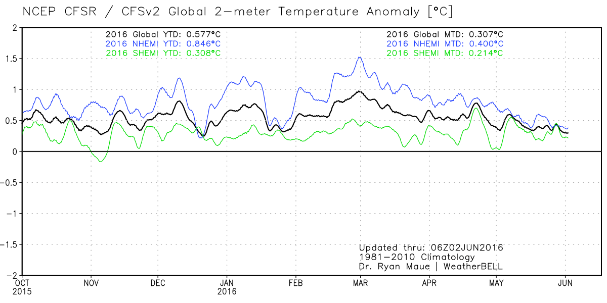
Here is a great view of how the 2015-16 El Nino caused higher surface temperatures last year and this, displayed in 2-meter temp anomalies (weather station height). The satellites’ data show the uptick began in earnest October 2015 and returned to neutral in May 2016. SSTs are now firmly in neutral.
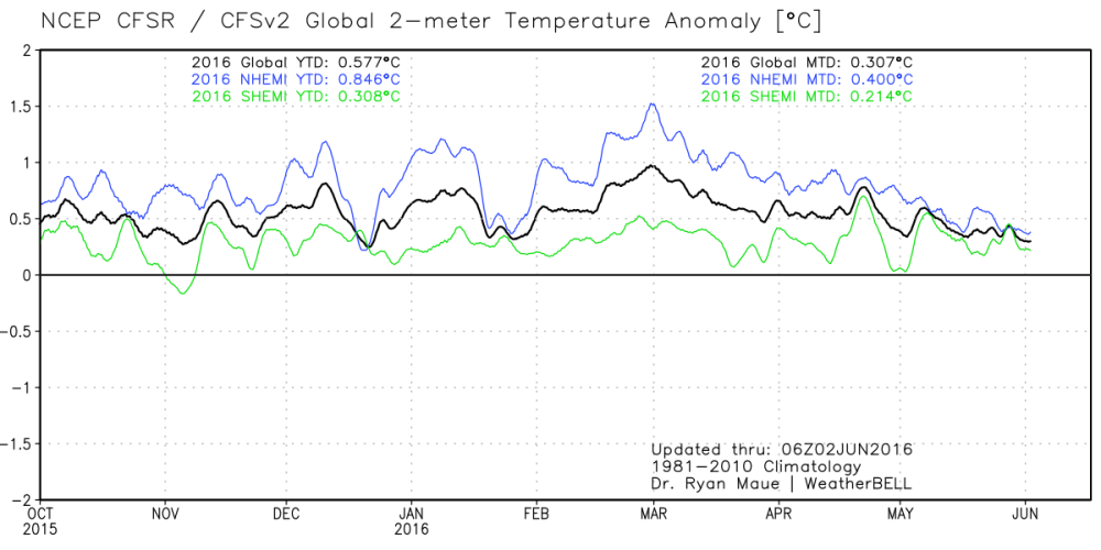
h/t Joe Bastardi

Summary

The temperature variations portrayed above were 100% Natural, no additives were involved.   Keep your popcorn handy as we await temperature measurements for the second half of 2016.

Source: Weatherbell

So-So Arctic Melting May 31


Arctic scientists examining sea ice and melt ponds in the Chukchi Sea in high north. NASA photo.

In the chart below MASIE shows May Arctic ice extent is below average and lower than 2015 at this point in the year.

MASIE 2016 day152

Comparing the first 5 months of the melt season shows why 2016 so far is a so-so melt season, meaning not very good, not very bad; or same old, same old if you prefer.

Monthly 2016 2015 2016-2015
Averages MASIE MASIE MASIE
Jan 13.922 13.941 -0.019
Feb 14.804 14.683 0.121
Mar 14.769 14.668 0.101
Apr 13.917 14.121 -0.204
May 12.086 12.646 -0.560
YTD Ave. 13.900 14.012 -0.112

Until May, the two years had the same average extents.

Looking into the details, the difference arises from some marginal seas melting earlier than last year, while the central, enduring ice pack is relatively unaffected.  In fact, the overall difference between 2016 and 2015 is similar to comparable losses from maximums in a single place: Sea of Okhotsk:  To date 1231k km2 of ice lost this year vs. 696k km2 lost in 2015 in that sea at the same date.

Ice Extents Ice Extent
Region 2015152 2016152 km2 Diff.
 (0) Northern_Hemisphere 11451596 11019134 -432462
 (1) Beaufort_Sea 964315 826699 -137616
 (2) Chukchi_Sea 842142 851939 9797
 (3) East_Siberian_Sea 1079340 1067698 -11641
 (4) Laptev_Sea 866996 879446 12450
 (5) Kara_Sea 765985 805737 39752
 (6) Barents_Sea 249999 79548 -170451
 (7) Greenland_Sea 536081 515701 -20380
 (8) Baffin_Bay_Gulf_of_St._Lawrence 1015753 863421 -152333
 (9) Canadian_Archipelago 806783 814863 8080
 (10) Hudson_Bay 1005981 1040263 34282
 (11) Central_Arctic 3219508 3131102 -88406
 (12) Bering_Sea 14523 61632 47108
 (13) Baltic_Sea 0 1441 1441
 (14) Sea_of_Okhotsk 82806 78103 -4703

Of interest this year is the Beaufort Gyre cranking up ten days into May, compacting ice and reducing extent by about 150k km2, and putting the loss there ahead of last year.  As Susan Crockford points out (here), this is not melting but ice breaking up and moving. Of course, warmists predict that will result in more melting later on, which remains to be seen. In any case, Beaufort extent is down 23% from its max, which amounts to 5% of losses from all Arctic seas so far.

Comparing the Arctic ice extents with their maximums shows the melting is occurring mostly in the marginal seas, as expected in May.

2016152 NH Max Loss % Loss Sea Max % Total Loss
 (0) Northern_Hemisphere 4058466 26.92% 100%
 (1) Beaufort_Sea 243746 22.77% 5%
 (2) Chukchi_Sea 114050 11.81% 3%
 (3) East_Siberian_Sea 19422 1.79% 0%
 (4) Laptev_Sea 18363 2.05% 0%
 (5) Kara_Sea 129252 13.82% 3%
 (6) Barents_Sea 519831 86.73% 12%
 (7) Greenland_Sea 144011 21.83% 3%
 (8) Baffin_Bay_Gulf_of_St._Lawrence 781161 47.50% 18%
 (9) Canadian_Archipelago 38316 4.49% 1%
 (10) Hudson_Bay 220608 17.50% 5%
 (11) Central_Arctic 115608 3.56% 3%
 (12) Bering_Sea 706600 91.98% 16%
 (13) Baltic_Sea 96141 98.52% 2%
 (14) Sea_of_Okhotsk 1230594 94.03% 28%

Note: Some seas are not at max on the NH max day.  Thus, totals from adding losses will vary from NH daily total.

It is clear from the above that the bulk of ice losses are coming from Okhotsk, Barents and Bering Seas, along with Baffin Bay-St. Lawrence; all of them are marginal seas that will go down close to zero by September, and only Baffin has more than 15% of its ice left. The entire difference between 2016 and 2015 arises from Okhotsk starting with about 500k km2 more ice this year, and arriving at this date virtually tied with 2015.

CPC shows the Arctic Oscillation waffling between positive and negative values, recently negative and forecasted to rise back toward neutral. Generally, negative AO signifies higher pressures over Arctic ice, with less cloud, higher insolation and more melting.  The outlook at this point is mixed.

ao-fcst

The first panel shows the observed AO index (black line) plus forecasted AO indices from each of the 11 GFS ensemble members starting from the last day of the observations (red lines). From NOAA Climate Prediction Center

September Minimum Outlook

Historically, where will ice be remaining when Arctic melting stops? Over the last 10 years, on average MASIE shows the annual minimum occurring about day 260. Of course in a given year, the daily minimum varies slightly a few days +/- from that.

For comparison, here are sea ice extents reported from 2007, 2012, 2014 and 2015 for day 260:

Arctic Regions 2007 2012 2014 2015
Central Arctic Sea 2.67 2.64 2.98 2.93
BCE 0.50 0.31 1.38 0.89
Greenland & CAA 0.56 0.41 0.55 0.46
Bits & Pieces 0.32 0.04 0.22 0.15
NH Total 4.05 3.40 5.13 4.44

Notes: Extents are in M km2.  BCE region includes Beaufort, Chukchi and Eastern Siberian seas. Greenland Sea (not the ice sheet). Canadian Arctic Archipelago (CAA).  Locations of the Bits and Pieces vary.

As the table shows, low NH minimums come mainly from ice losses in Central Arctic and BCE.  The great 2012 cyclone hit both in order to set the recent record. The recovery since 2012 shows in 2014, with some dropoff last year, mostly in BCE.

Summary

We are only beginning the melt season, and the resulting minimum will depend upon the vagaries of weather between now and September.  At the moment, 2016 was slightly higher than 2015 in March, and is now trending toward a lower May extent.  OTOH 2016 melt season is starting without the Blob, with a declining El Nino, and a cold blob in the North Atlantic.  The AO hovering around neutral, giving no direction whether cloud cover will reduce the pace of melting or not.

A so-so year is like a glass half full or half empty.  If you are hoping for an Arctic ice decline, 2016 so far is good, but not very.  If you want Arctic ice to hold steady, the year is bad, but not very.

Meanwhile we can watch and appreciate the beauty of the changing ice conditions.

8068809257_23359afc39_z

Arctic Sunset Chukchi Sea Ice Wrangel Island UNESCO World Heritage Site Russia

Brad Keyes, Climatism Fortune Teller

It is a wickedly satirical look into the future of the climate debate by Brad Keyes (here). The comic relief is welcome as a refreshment from pushing back against the relentless fictional claims and alarms. Lots of inside jokes and sceptics’ wish dreams concerning future misfortunes of leading alarmist figures.

The post covers a lot of ground as Keyes looks into his crystal ball and reports on happenings he sees from 2017 up to 2052. Everyone’s funny bone is different, but these were especially entertaining, IMO:

2017 – Michael Mann’s courtroom loss decried as “a death knell for free speech.”

2018 – ECHR agrees “Holocaust denier” is an intentionally demeaning reference to climate denial.

2018 – James Hansen blames eclipse on global warming, but others hesitate to attribute any specific EAE (extreme astronomical event) to carbon emissions.

2019 – The Trenberth Travesty is captured by satellite imagery.

2020 – Psychiatric Manual of Mental Disorders updated to deal with Weather control delusional disorder, Munchhausen’s by proxy and Medieval global warming denial.

2023 – Weary of the emotive, polarizing nature of the debate, scientists will now refer to global warming as “climate 9/11.”

2024 – Drawing heavily on the principles of the Delphi Technique, Naomi Oreskes changes the scientific method to the Delphi Technique.

2025 – In simultaneous media releases around the globe, every scientific body of international or national standing announces that the only safe atmospheric CO2 concentration is zero ppm. They explain: “Lowballing” is the only way to achieve 300-400 ppm.

2027 – The first climatically-correct chemistry textbooks appear in Australian high schools. The dioxide anion has been renamed ‘pollution’; chemical symbol C now stands for ‘cancer.’

2028 – It’s official: reputable science website SkepticalScience quietly removes “Consensus levels have plateaued” from its list of myths.

2031 – A Climateball stadium becomes the scene of ugly rioting today after a supporter of the denier (pro-cancer-pollutionist) side is overheard using the hate term “w_rmist.”

2034 – Spring is silent this year after a wind turbine kills the last American bald eagle.

2037 – As sea level rise continues to defy expectations, tracking almost 1m (3ft.) below ensemble model projections, science’s newest fear is that the Earth’s surface will be completely dry by the year 51000.

2038 – An attempt to replicate the Doran and Zimmermann [2009] consensus survey instead finds most of the scientists now deny the science, with almost 85% endorsing the statement that “According to the weight of the data, the evidence is wrong.”

Ocean Trumps Global Warming

Internal Climate Variability Trumps Global Warming (here) is a
great post by hydrologist Rob Ellison confirming how the Oceans Make Climate. He was intrigued by discovering that rivers in eastern Australia changed form – from low energy meandering to high energy braided forms and back – every few decades. For almost 30 years he looked for the source and import of this variability, and has found it in the ocean.

Turns out that it is a combination of conditions in the northern and central Pacific Ocean that is of immense significance. A 20 to 30 year change in the volume of frigid and nutrient rich water upwelling from the abysmal depths. A generally warmer or cooler sea surface in the northern Pacific and greater frequency and intensity of El Niño or La Niña respectively. This sets up changes in patterns of wind, currents and cloud that cause changes in rainfall, biology and temperature globally. In the cool pattern shown above – booming ecologies, drought in the Americas and Europe, rainfall in Australia, Indonesia, Africa, China and India and cooler global temperatures. The reverse in the warm phase. Warming to 1944, cooling to 1976, warming again to 1998 and – at the least – not warming since. It leads to a prediction that the La Niña currently emerging is likely to be large.

A Persistent Ocean Cycle

Changes in the Pacific Ocean state can be traced in sediment, ice cores, stalagmites and corals. A record covering the last 12,000 years was developed by Christopher Moy and colleagues from measurements of red sediment in a South American lake. More red sediment is associated with El Niño. The record shows periods of high and low El Niño activity alternating with a period of about 2,000 years. There was a shift from La Niña dominance to El Niño dominance 5000 years ago that is associated with the drying of the Sahel. There is a period around 3,500 years ago of high El Niño activity associated with the demise of the Minoan civilisation (Tsonis et al, 2010).

Tessa Vance and colleagues devised a 1000 year record from salt content in an Antarctic ice core. More salt is La Niña as a result of changing winds in the Southern Ocean. It revealed several interesting facts. The persistence of the 20 to 30 year pattern. A change in the period of oscillation between El Niño and La Niña states at the end of the 19th century. A 1000 year peak in El Niño frequency and intensity in the 20th century which resulted in uncharacteristically dry condition since 1920.

Conclusion

The whole post is worth reading and a solid contribution to our understanding. Ellison’s summary is pertinent, compelling and wise.

It is quite impossible to quantify natural and anthropogenic warming in the 20th century.  The assumption that it was all anthropogenic is quite wrong.  The early century warming was mostly natural – as was at least some of the late century warming.  It seems quite likely that a natural cooling with declining solar activity – amplified through Pacific Ocean states – will counteract rather than add to future greenhouse gas warming.   A return to the more common condition of La Niña dominance – and enhanced rainfall in northern and eastern Australia – seems more likely than not.

I predict – on the balance of probabilities – cooler conditions in this century.  But I would still argue for returning carbon to agricultural soils, restoring ecosystems and research on and development of cheap and abundant energy supplies.  The former to enhance productivity in a hungry world, increase soil water holding capacity, improve drought resilience, mitigate flooding and conserve biodiversity.  We may in this way sequester all greenhouse gas emissions for 20 to 30 years.  The latter as a basis for desperately needed economic growth.  Climate change seems very much an unnecessary consideration and tales of climate doom – based on wrong science and unfortunate policy ambitions – a diversion from practical and measured development policy.

Australia’s River Systems ABC

Chameleon Climate Models

Chameleon2

Paul Pfleiderer has done a public service in calling attention to
The Misuse of Theoretical Models in Finance and Economics (here)
h/t to William Briggs for noticing and linking

He coins the term “Chameleon” for the abuse of models, and explains in the abstract of his article:

In this essay I discuss how theoretical models in finance and economics are used in ways that make them “chameleons” and how chameleons devalue the intellectual currency and muddy policy debates. A model becomes a chameleon when it is built on assumptions with dubious connections to the real world but nevertheless has conclusions that are uncritically (or not critically enough) applied to understanding our economy. I discuss how chameleons are created and nurtured by the mistaken notion that one should not judge a model by its assumptions, by the unfounded argument that models should have equal standing until definitive empirical tests are conducted, and by misplaced appeals to “as-if” arguments, mathematical elegance, subtlety, references to assumptions that are “standard in the literature,” and the need for tractability.

Chameleon Climate Models

Pfleiderer is writing about his specialty, financial models, and even more particularly banking systems, and gives several examples of how dysfunctional is the problem. As we shall see below, climate models are an order of magnitude more complicated, and abused in the same way, only more flagrantly.

As the analogy suggests, a chameleon model changes color when it is moved to a different context. When politicians and activists refer to climate models, they assert the model outputs as “Predictions”. The media is rife with examples, but here is one from Climate Concern UK

Some predicted Future Effects of Climate Change

  • Increased average temperatures: the IPCC (International Panel for Climate Change) predict a global rise of between 1.1ºC and 6.4ºC by 2100 depending on some scientific uncertainties and the extent to which the world decreases or increases greenhouse gas emissions.
  • 50% less rainfall in the tropics. Severe water shortages within 25 years – potentially affecting 5 billion people. Widespread crop failures.
  • 50% more river volume by 2100 in northern countries.
  • Desertification and burning down of vast areas of agricultural land and forests.
  • Continuing spread of malaria and other diseases, including from a much increased insect population in UK. Respiratory illnesses due to poor air quality with higher temperatures.
  • Extinction of large numbers of animal and plant species.
  • Sea level rise: due to both warmer water (greater volume) and melting ice. The IPCC predicts between 28cm and 43cm by 2100, with consequent high storm wave heights, threatening to displace up to 200 million people. At worst, if emissions this century were to set in place future melting of both the Greenland and West Antarctic ice caps, sea level would eventually rise approx 12m.

Now that alarming list of predictions is a claim to forecast what will be the future of the actual world as we know it.

Now for the switcheroo. When climate models are referenced by scientists or agencies likely to be held legally accountable for making claims, the model output is transformed into “Projections.” The difference is more than semantics:
Prediction: What will actually happen in the future.
Projection: What will possibly happen in the future.

In other words, the climate model has gone from the bookshelf world (possibilities) to the world of actualities and of policy decision-making.  The step of applying reality filters to the climate models (verification) is skipped in order to score political and public relations points.

The ultimate proof of this is the existence of legal disclaimers exempting the modellers from accountability. One example is from ClimateData.US

Disclaimer NASA NEX-DCP30 Terms of Use

The maps are based on NASA’s NEX-DCP30 dataset that are provided to assist the science community in conducting studies of climate change impacts at local to regional scales, and to enhance public understanding of possible future climate patterns and climate impacts at the scale of individual neighborhoods and communities. The maps presented here are visual representations only and are not to be used for decision-making. The NEX-DCP30 dataset upon which these maps are derived is intended for use in scientific research only, and use of this dataset or visualizations for other purposes, such as commercial applications, and engineering or design studies is not recommended without consultation with a qualified expert. (my bold)

Conclusion:

Whereas some theoretical models can be immensely useful in developing intuitions, in essence a theoretical model is nothing more than an argument that a set of conclusions follows from a given set of assumptions. Being logically correct may earn a place for a theoretical model on the bookshelf, but when a theoretical model is taken off the shelf and applied to the real world, it is important to question whether the model’s assumptions are in accord with what we know about the world. Is the story behind the model one that captures what is important or is it a fiction that has little connection to what we see in practice? Have important factors been omitted? Are economic agents assumed to be doing things that we have serious doubts they are able to do? These questions and others like them allow us to filter out models that are ill suited to give us genuine insights. To be taken seriously models should pass through the real world filter.

Chameleons are models that are offered up as saying something significant about the real world even though they do not pass through the filter. When the assumptions of a chameleon are challenged, various defenses are made (e.g., one shouldn’t judge a model by its assumptions, any model has equal standing with all other models until the proper empirical tests have been run, etc.). In many cases the chameleon will change colors as necessary, taking on the colors of a bookshelf model when challenged, but reverting back to the colors of a model that claims to apply the real world when not challenged.

A model becomes a chameleon when it is built on assumptions with dubious connections to the real world but nevertheless has conclusions that are uncritically (or not critically enough) applied to understanding our economy. Chameleons are not just mischievous they can be harmful − especially when used to inform policy and other decision making − and they devalue the intellectual currency.

Thank you Dr. Pfleiderer for showing us how the sleight-of-hand occurs in economic considerations. The same abuse prevails in the world of climate science.

Paul Pfleiderer, Stanford University Faculty
C.O.G. Miller Distinguished Professor of Finance
Senior Associate Dean for Academic Affairs
Professor of Law (by courtesy), School of Law

Footnote:

There are a series of posts here which apply reality filters to attest climate models.  The first was Temperatures According to Climate Models where both hindcasting and forecasting were seen to be flawed.

Others in the Series are:

Sea Level Rise: Just the Facts

Data vs. Models #1: Arctic Warming

Data vs. Models #2: Droughts and Floods

Data vs. Models #3: Disasters

Data vs. Models #4: Climates Changing